Microsoft Azure Machine Learning
Chapter 3. Data Exploration and Visualization
Before you do any analysis and find results from your dataset, you need to understand the data. You can do so by data exploration and visualization. ML Studio provides a very basic option to do so, but with the most essential information. To use the tool and understand the data, you need to be familiar with some of the basic concepts such as mean, standard deviation, variables, or features in a dataset, and basic plotting techniques, such as histogram, box plot, scatter plot, and so on. The first part of this chapter will familiarize you with these concepts and then you will find the use of these inside ML Studio to apply them to a sample dataset. If you are a practitioner or are familiar with statistics, feel free to skip the basic concepts section and move on to the next.
The basic concepts
The following is a very simple dataset with four features or variables: name, age, gender, and monthly income in dollars ($). A dataset may also be known as a set of observations. The term's features and variables are used interchangeably in most places and also in this book. Let's take a look at the following table:
<-----------------Features ---------->
|
Name |
Age |
Gender |
Monthly Income($) |
|
Person A |
20 |
Male |
2000 |
|
Person B |
45 |
Female |
5000 |
|
Person C |
36 |
Male |
3000 |
|
Person D |
55 |
Male |
6500 |
|
Person E |
27 |
Female |
2800 |
|
Person F |
31 |
Male |
5900 |
|
Person G |
33 |
Male |
4800 |
|
Person X |
59 |
Female |
2400 |
|
Person Y |
42 |
Male |
7200 |
|
Person Z |
29 |
Female |
3100 |
Rows or records in the dataset are also known as examples in the machine learning context. There are 10 examples in this dataset. Here, the Name column represents the unit of observation—the unit described by the data that one analyzes. So, you may say that Person A has the features: 20, Male, and 2000.
A feature can be numeric or categorical. A numeric feature contains numeric values, such as Age and Monthly Income($) in this case. You can apply mathematical operations to a numeric feature. A categorical feature usually contains string values for a set of categories. For example,Gender can be of two categories, as in this dataset—Male or Female. In some cases, a categorical feature can also assume values that are numeric, for example, you may like to represent Male with the number 0 and Female with 1. So, the feature Gender will have values 0 and 1, but it will still be a categorical feature or variable.
The mean
The mean is the average of numbers. It is simple to calculate: add up all the numbers and then divide by how many numbers there are. In other words, it is the sum divided by the count.
For example, the mean of the five values: 5, 18, 37, 20, and 85 is:
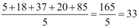
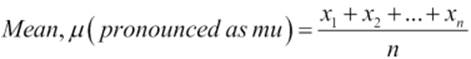
Now to get more formal, you can express the mean, the arithmetic mean, of a sample as:
![]()
It is the sum of the sampled values divided by the number of items in the sample: µ
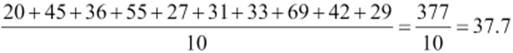
Now, you can find out what the mean of age in the dataset is (refer to table 3.1).
The median
The median is the middle number in a sorted list of numbers. If you have the numbers: 5, 18, 37, 20, and 85. To find the median, sort them in the ascending order: 5, 18, 20, 37, and 85. As you can find out, the middle number is in position 3, where there are 5 numbers. The median here is 20.
In a set of numbers where the count is even, say 10, the median will be average of the middle two numbers, so at the position of 5 and 6.
Now, you can find out what is the median of the age variable in the dataset (refer to table 3.1). Sort them in the following order:
20, 27, 29, 31, 33, 36, 42, 45, 55, and 59
The median here can be calculated as (33 + 36)/2 = 69/2 = 34.5.
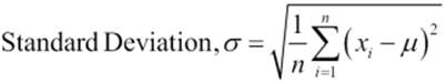
Standard deviation and variance
Standard deviation is the square root of variance. It is usually represented by the Greek letter sigma, σ, and the variance is represented as σ2. You may be wondering now, how the variance, or σ2, is calculated. It is the average of the squared differences from the mean. The following figures provide the mathematical formula for calculating variance and standard deviation:
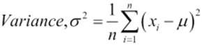
If you calculate the standard deviation for the age variable in the dataset (refer to table 3.1), you will find the answer to be 12.4637.
Variance and standard deviation explain how the data is spread around the mean. When variance is large, it shows that data is spread more widely around the mean. The standard deviation shows that on an average, how much a value differs from the mean. So, in the dataset (refer to table 3.1), each value on an average differs by 12.4637 from the mean, which is 37.7.
Putting it all together for the dataset, ML studio can show you the following statistics:
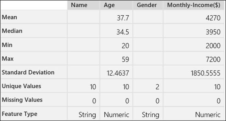
Note that, here Min means the minimum value and Max means the maximum value. So, the maximum monthly income is 7200 where the minimum age is 20. The Unique Values variable shows how many unique values there are for that feature, for example, for Gender, there are two: male and female. The Missing Values variable identifies the number of cases where the value is not present for a feature. Though it is included here, the unit of observation is not included (referred to here as Name) during analysis.
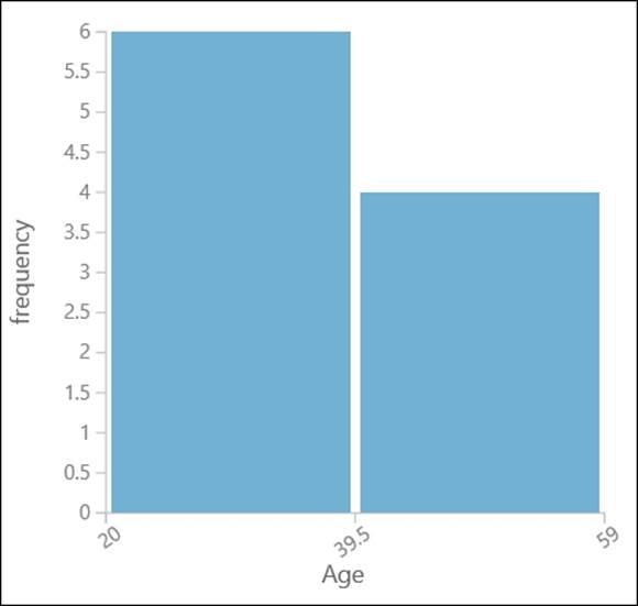
Understanding a histogram
A histogram visually shows how data is distributed using bars of different heights. You may consider the dataset (refer to table 3.1) and say you are interested in knowing how age is distributed. You can split all the ages in two groups or two bins. Let's take a look at the following table:
|
Age group |
No of people |
|
20 to 39.5 |
6 |
|
39.5 to 59 |
4 |
So, you will have the histogram for age with two bins, shown as follows:
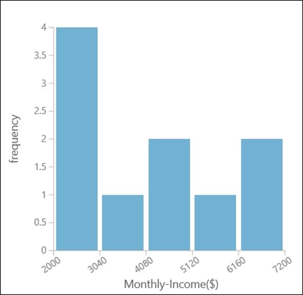
Similarly, the histogram for Monthly Income (refer to table 3.1) with five bins would look something like as shown in the following graph:
The box and whiskers plot
The Box plot is another way to graphically show how the data is distributed. It shows three quartiles of data, Q1, Q2 and Q3 at the bottom, middle, and top of the box, respectively. Considering the dataset from table 3.1, the quartile values will be as follows:
· Q1 = 25th percentile = 29.5
· Q2 = Median (50th percentile) = 34.5
· Q3 = 75th percentile = 44.25
Based on these values, the IQR (Interquartile Range) can be calculated as Q3 – Q1 and the Lower Boundary or Lower Whisker can be calculated as Q1 – 1.5 * IQR.
If the Min value is greater than Q1 – 1.5 * IQR, then Lower Boundary or Lower Whisker = min value. So, for our example, we are considering the Upper Boundary or Upper Whisker = 20
Upper Boundary or Upper Whisker = Q3 + 1.5 * IQR
If the Max value is less than Q3 + 1.5 * IQR, then Upper Boundary or Upper Whisker = max value. For our example, we are considering Upper Boundary or Upper Whisker = 59.
Let's take a look at the following diagram:
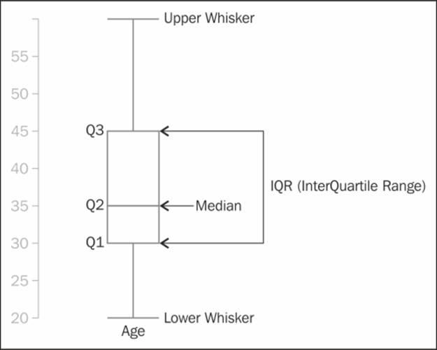
In a box and whiskers plot, if for any quartile the distance is short, then the data is bunched in that region and when the distance is longer, it signifies that the data is more spread out for that region. In the preceding plot, Q2 is the shortest, which means that the data points are more compact in that quartile, whereas Q4 is longer, which indicates that the data points have been spread out.
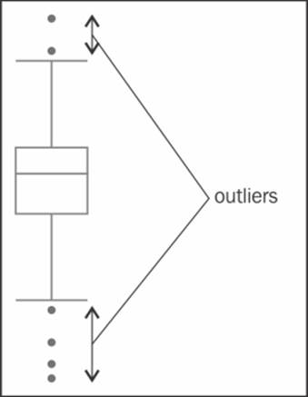
The outliers
Any value that falls outside the lower or upper whiskers is known as an outlier. On a plot, these are represented as simple dots, as shown in the following diagram:
A scatter plot
A scatter plot is a graphical representation of two sets of variables. The data is displayed as a collection of points on a 2D space with one variable projected on the x axis and another on the y axis. The following is a scatter plot with Age on the x axis and Monthly-Income on the y axis (refer to the dataset in table 3.1):
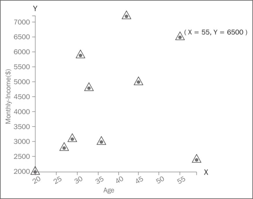
For the sake of illustration, we have labeled one point of x axis as 55 and one point of y axis as 6500. So this represents the values of Age and Monthly-Income on the 2D space. If you draw a perpendicular line vertically from the point to the x axis, it would touch 55 and if you draw a perpendicular line horizontally from the point on y axis, it would touch 6500.
A scatter plot visually shows the relationship between two sets of data.
Data exploration in ML Studio
Now, it's time to apply these concepts and start with data exploration and visualization using ML Studio. You will use some of the sample datasets, which comes by default, and do some basic exploration.
Visualizing an automobile price dataset
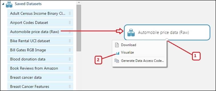
The Automobile price data (Raw) module is available on the left-hand side modules palette under Saved Datasets. This dataset is about automobiles distinguished by their make and model, including the price and features, such as the number of cylinders and MPG and an insurance risk score known to actuaries as symboling. If symboling has a value of +3, this indicates that the auto is risky and a value of -3 indicates that it is probably pretty safe.
Expand the Saved Datasets section in the modules palette. Drag the Automobile price data (Raw) module to the canvas. To get the visualized graph of the data, follow the steps:
1. Right-click on the output port.
2. Click on Visualize.
The visualization window will be displayed as a popup:
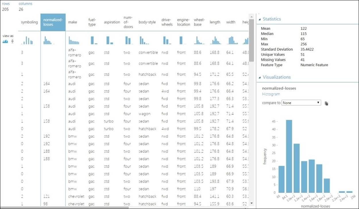
You can find the following information in the visualization window:
· The total number of rows and columns are 205 rows and 26 columns.
· It displays the first 100 rows of data.
· In the Statistics Area, when you click on any column, it would display the basic statistics on the right-hand side of the screen: the mean, median, minimum value, maximum standard deviation value, number of unique values, and number of missing values. It also shows the feature type of the selected column.
· In the Visualizations Area, at the bottom right-hand side of the screen is the graph area for the selected feature. Click anywhere on the feature column to see the graph for that column.
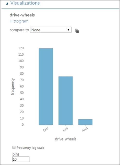
A histogram
Any feature whether numeric or string can be displayed as a histogram. It is the default graph that appears on the screen. On the visualization window, click on the drive-wheels column and you can find the following histogram:
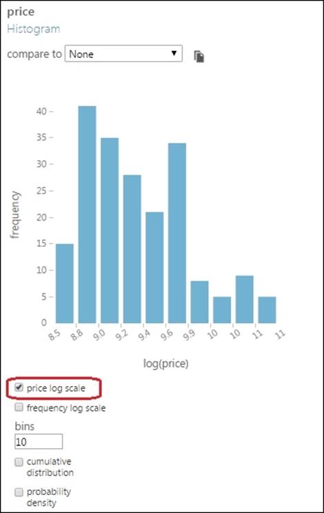
When you click on a numeric variable, such as price, you will find the following graph:
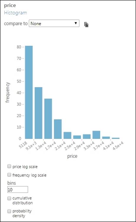
The price value in the preceding graph appears in a scientific notation, but if you hover your cursor on any one, you can see the actual value as a tooltip. For example, if you hover your mouse cursor on 1.3e+4, you would see the value 13174.4.
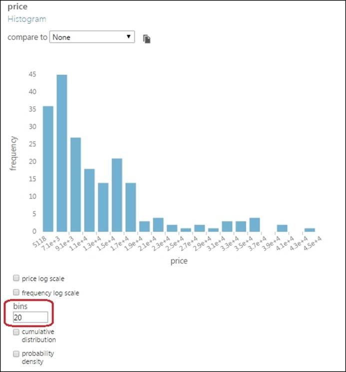
In the graph, the bin size is set to the default value of 10. However, you can change it to make more sense of the graph. In the previous graph, change the bins to 20 and press Tab on the keyboard to find the changed graph.
When there is large range of values, sometimes, the log scale is used so that they can be better represented. Click on the checkbox for price log scale to find the following modified graph:
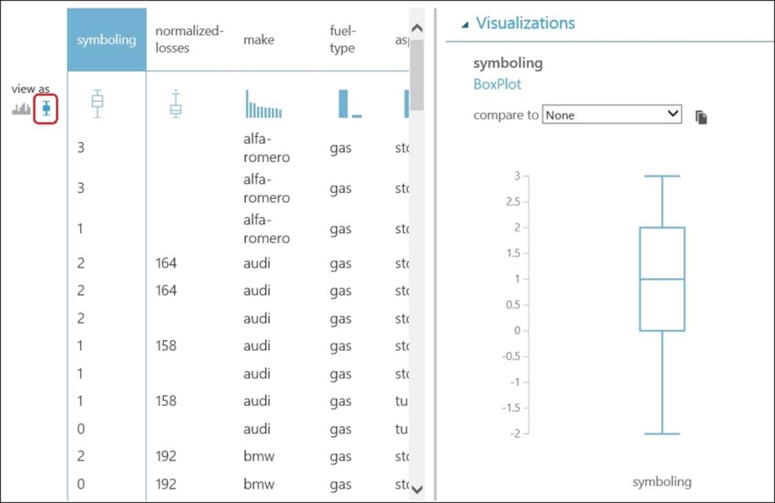
The box and whiskers plot
While histogram can be made from both numerical and string variables, a box plot can only be made from numerical variables. When you click on the little icon of the box plot in the view as section, you can see all the columns that can be represented as a box and whiskers plot on the top columns in the visualization window.
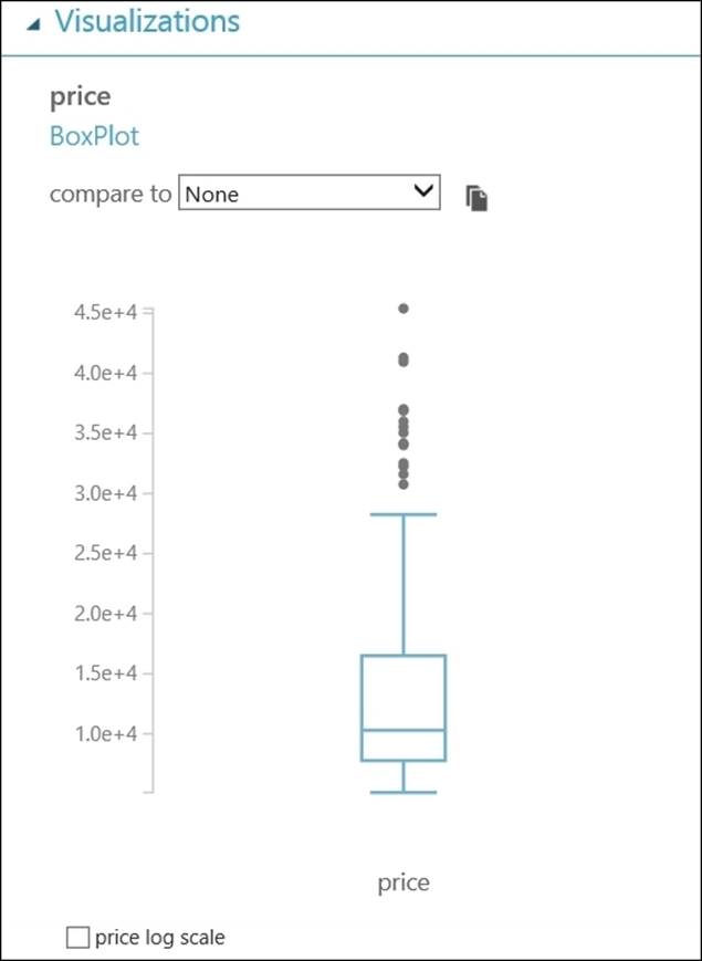
Now, click on price column and notice the outliers in the box plot, as shown in the following screenshot:
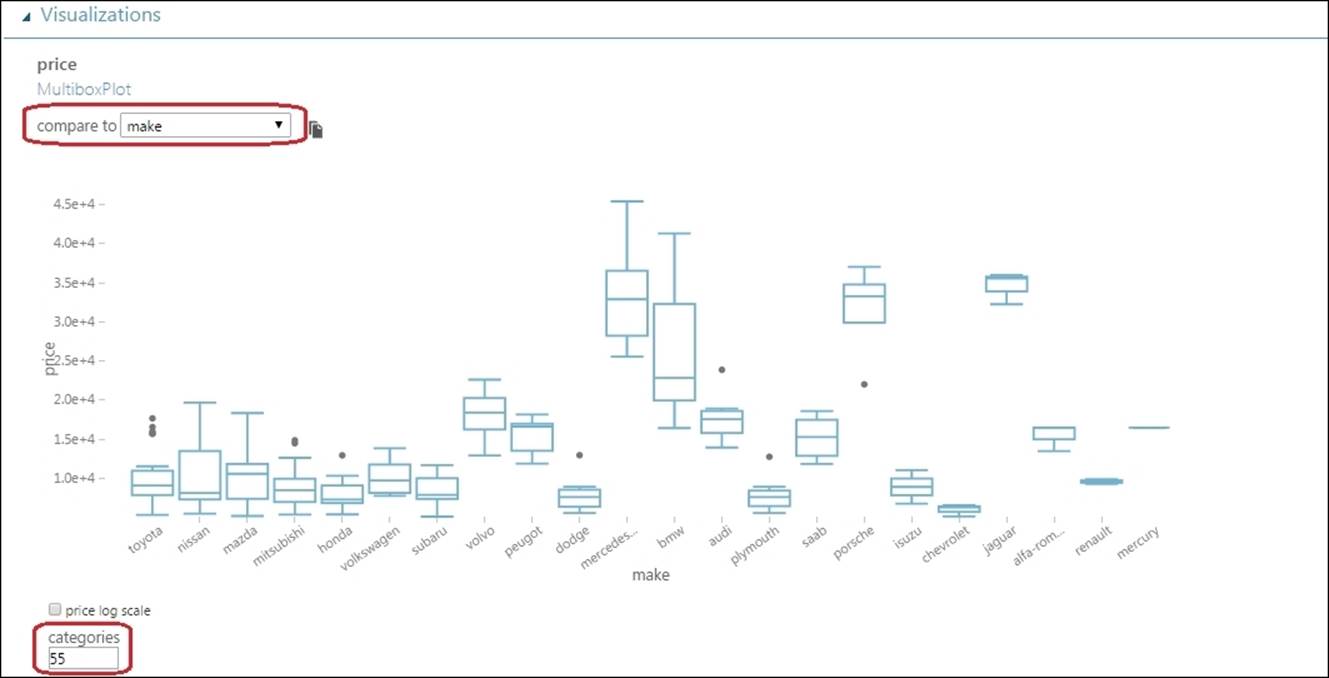
Comparing features
You can select one feature and compare it with another feature. If both the features are numeric (and are not marked as a label), then the comparison is displayed as a scatter plot. If either of the features is nonnumeric (string), then the comparison is displayed as a box plot.
Click on the price section and then select make from the compare to drop-down list in the graph area. Note how the price is distributed for different manufacturers in the graph. The make column contains the name of different manufacturers.
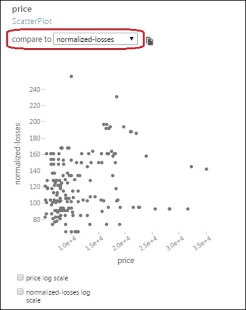
Now, you may try comparing two numerical features. Select the price column and then compare it to normalized-losses.
A snapshot
You can create a snapshot of a graph by clicking on the snapshot icon at the upper-right corner of the graph. This creates an image of the current graph and displays it to the right of the graph, as shown in the following screenshot:
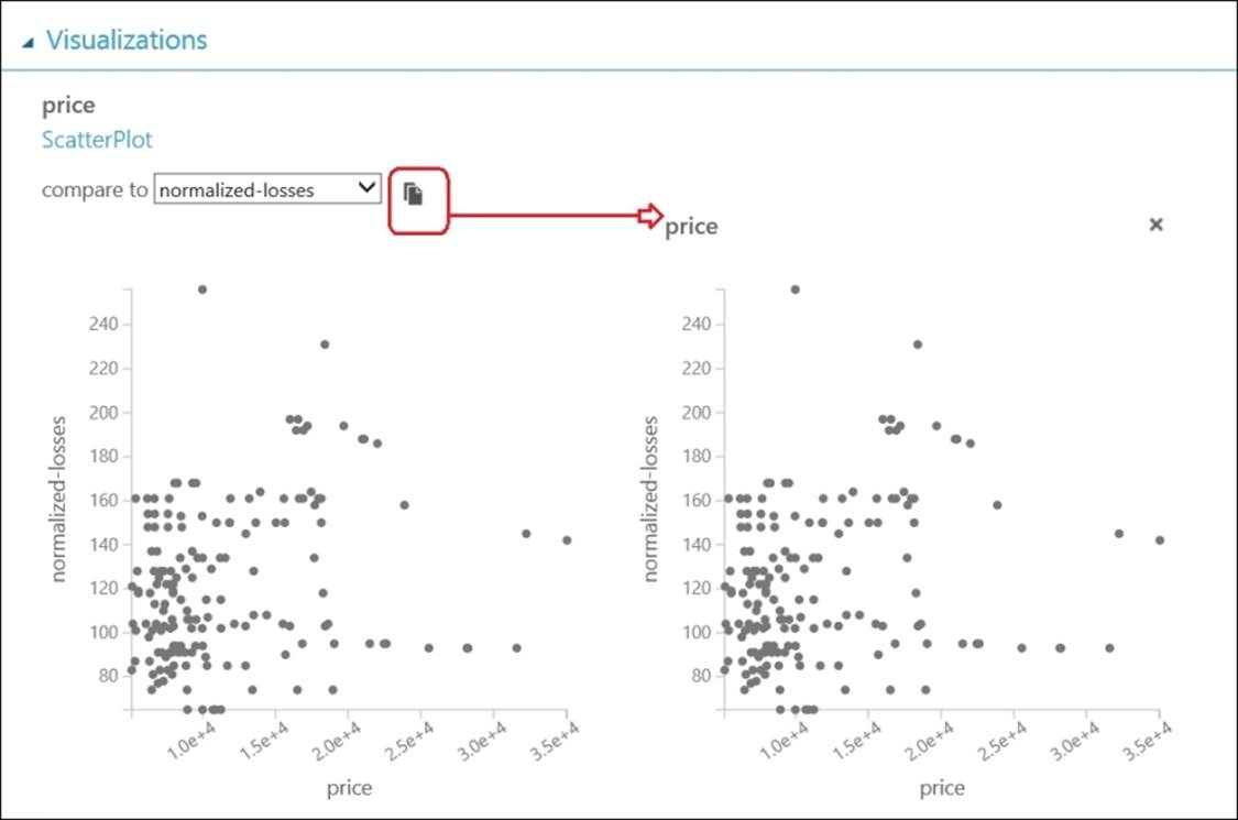
You can create as many snapshots as you want—they will be displayed consecutively to the right of the graph. To close a snapshot, click on the X symbol in the upper-right corner of the image.
Do it yourself
The Energy Efficiency Regression data module is another sample dataset available by default in ML Studio under the Saved Dataset section. Use the dataset to:
· Visualize the dataset
· Find out the number of rows and columns
· Find out all the numerical and string features
· Find out the basic statistics, such as mean, standard deviation, missing values, and so on
· Plot a histogram for the Heating Load feature
· Plot a box plot for the Cooling Load feature
· Compare the Heating Load feature with the Cooling Load feature and to observe the scatter plot
Summary
You have just finished an important chapter. You started with exploring the basic concepts in statistics, such as the mean, standard deviation, and also basic visualization techniques, such as histogram, box and whiskers plot, and scatter plot. You then moved on to explore a dataset by visualizing it in ML Studio. On a visualization pop-up window in ML Studio, you found a report of basic statistics of a dataset. Then, you plotted the features in a graph using a histogram and box plot. You are also capable of comparing two features in a graph.
When you need to work on any data analysis, you need data and you need to import data from different sources. In the next chapter, you will explore different ways you can import data to ML Studio and also ways to export data from ML Studio.
All materials on the site are licensed Creative Commons Attribution-Sharealike 3.0 Unported CC BY-SA 3.0 & GNU Free Documentation License (GFDL)
If you are the copyright holder of any material contained on our site and intend to remove it, please contact our site administrator for approval.
© 2016-2026 All site design rights belong to S.Y.A.