Excel Data Analysis For Dummies, 2nd Edition (2014)
Part II. PivotTables and PivotCharts
Chapter 6. Working with PivotCharts
In This Chapter
![]() Why in the world would you use a pivot chart?
Why in the world would you use a pivot chart?
![]() Running the PivotChart Wizard
Running the PivotChart Wizard
![]() Fooling around with your pivot chart
Fooling around with your pivot chart
![]() Customizing how pivot charts work and look
Customizing how pivot charts work and look
In Chapter 4, I discuss how cool it is that Excel easily cross-tabulates data in pivot tables. In this chapter, I cover a closely related topic: how to cross-tabulate data in pivot charts.
You might notice some suspiciously similar material in this chapter compared with Chapter 4. But that’s all right. The steps for creating a pivot chart closely resemble those that you take to create a pivot table.
 If you’ve just read the preceding paragraphs and find yourself thinking, “Hmmm. Cross-tabulate is a familiar-sounding word, but I can’t quite put my finger on what it means,” you might want to first peruse Chapter 4. Let me also say that, as is the case when constructing pivot tables, you build pivot charts by using data stored in an Excel table. Therefore, you should also know what Excel tables are and how they work and should look. I discuss this information a little bit in Chapter 4 and a bunch in Chapter 1.
Why Use a Pivot Chart?
Before I get into the nitty-gritty details of creating a pivot chart, stop and ask a reasonable question: When would you or should you use a pivot chart? Well, the correct answer to this question is, “Heck, most of the time you won’t use a pivot chart. You’ll use a pivot table instead.”
Pivot charts, in fact, work only in certain situations: Specifically, pivot charts work when you have only a limited number of rows in your cross-tabulation. Say, less than half a dozen rows. And pivot charts work when it makes sense to show information visually, such as in a bar chart.
These two factors mean that for many cross-tabulations, you won’t use pivot charts. In some cases, for example, a pivot chart won’t be legible because the underlying cross-tabulation will have too many rows. In other cases, a pivot chart won’t make sense because its information doesn’t become more understandable when presented visually.
How about just charting pivot table data?
You can chart a pivot table, too. I mean, if you just want to use pivot table data in a regular old chart, you can do so. Here’s how. First, copy the pivot table data to a separate range, using the Paste Special command to just grab values. Then chart the data by clicking the Insert tab’s charting commands.
Getting Ready to Pivot
As with a pivot table, in order to create a pivot chart, your first step is to create the Excel table that you want to cross-tabulate. You don’t have to put the information into a table, but working with information that’s already stored in a table is easiest, so that’s the approach that I assume you’ll use.
Figure 6-1 shows an example data table — this time, a list of specialty coffee roasts that you can pretend sell to upscale, independent coffeehouses along the West Coast.
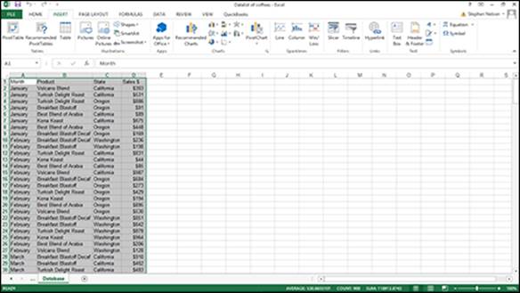
Figure 6-1: A simple Excel data table that shows sales for your imaginary coffee business.
 The roast coffee list workbook is available in the example Excel workbooks related to this book that you can find on this book's companion website. You might want to download this list in order to follow along with the discussion here. See this book's Introduction for more on how to access the companion site.
Running the PivotTable Wizard
Because you typically create a pivot chart by starting with the Create PivotChart Wizard, I describe that approach first. At the very end of the chapter, however, I describe briefly another method for creating a pivot chart: using the Insert Chart command on an existing pivot table.
 In Excel 2007 and Excel 2010, you use the PivotTable and PivotChart Wizard to create a pivot chart, but despite the seemingly different name, that wizard is the same as the Create PivotChart Wizard.
To run the Create PivotChart Wizard, take the following steps:
1. Select the Excel table.
To do this, just click a cell in the table. After you’ve done this, Excel assumes you want to work with the entire table.
2. Tell Excel that you want to create a pivot chart by choosing the Insert tab’s PivotChart button.
In Excel 2007 and Excel 2010, to get to the menu with the PivotChart command, you need to click the down-arrow button that appears beneath the PivotTable button. Excel then displays a menu with two commands: PivotTable and PivotChart.
No matter how you choose the PivotChart command, when you choose the command, Excel displays the Create PivotChart dialog box, as shown in Figure 6-2.
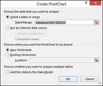
Figure 6-2: Create pivot tables here.
3. Answer the question about where the data that you want to analyze is stored.
I recommend you store the to-be-analyzed data in an Excel Table/Range. If you do so, click the Select a Table or Range radio button.
4. Tell Excel in what worksheet range the to-be-analyzed data is stored.
If you followed Step 1, Excel should already have filled in the Range text box with the worksheet range that holds the to-be-analyzed data, but you should verify that the worksheet range shown in the Table/Range text box is correct. Note that if you’re working with the sample Excel workbook shown in Figure 6-1, Excel actually fills in the Table/Range box with Database! $A$1:$D$225 because Excel can tell this worksheet range is a list.
If you skipped Step 1, enter the list range into the Table/Range text box. You can do so in two ways. You can type the range coordinates. For example, if the range is cell A1 to cell D225, you can type $A$1:$D$225. Alternatively, you can click the button at the right end of the Range text box. Excel collapses the Create PivotChart dialog box, as shown in Figure 6-3. Now use the mouse or the navigation keys to select the worksheet range that holds the list you want to pivot.
After you select the worksheet range, click the range button again. Excel redisplays the Create PivotChart dialog box. (Refer to Figure 6-2.)
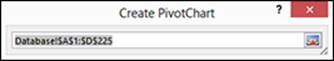
Figure 6-3: Enter a pivot table range here.
5. Tell Excel where to place the new pivot table report that goes along with your pivot chart.
Select either the New Worksheet or Existing Worksheet radio button to select a location for the new pivot table that supplies the data to your pivot chart. Most often, you want to place the new pivot table onto a new worksheet in the existing workbook — the workbook that holds the Excel table that you’re analyzing with a pivot chart. However, if you want, you can place the new pivot table into an existing worksheet. If you do this, you need to select the Existing Worksheet radio button and also make an entry in the Existing Worksheet text box to identify the worksheet range. To identify the worksheet range here, enter the cell name in the top-left corner of the worksheet range.
You don’t tell Excel where to place the new pivot chart, by the way. Excel inserts a new chart sheet in the workbook that you use for the pivot table and uses that new chart sheet for the pivot table.
6. When you finish with the Create PivotChart dialog box, click OK.
Excel displays the new worksheet with the partially constructed pivot chart in it, as shown in Figure 6-4.
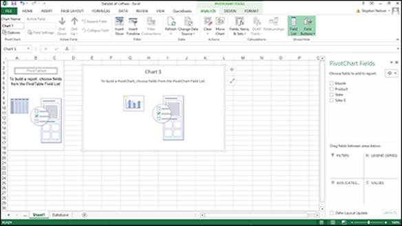
Figure 6-4: A cross-tabulation before you tell Excel what to cross-tabulate.
7. Select the data series.
You need to decide first what you want to plot in the chart — or what data series should show in a chart.
If you haven’t worked with Excel charting tools before, determining what the right data series are seems confusing at first. But this is another one of those situations where somebody’s taken a ten-cent idea and labeled it with a five-dollar word. Charts show data series. And a chart legend names the data series that a chart shows. For example, if you want to plot sales of coffee products, those coffee products are your data series.
After you identify your data series — suppose that you decide to plot coffee products — you drag the field from the PivotTable Field List box to the Legend Field (Series) box. To use coffee products as your data series, for example, drag the Product field to the Legend Field (Series) box. Using the example data from Figure 6-1, after you do this, the partially constructed, rather empty-looking Excel pivot chart looks like the one shown in Figure 6-5.
People with sharper vision than I possess may notice that sitting behind the empty pivot chart in Figure 6-5 is something that looks like a half-baked pivot table. If you’re one of these sharp-eyed readers, good job. If like me you’re a reader who can hardly make out this new unasked-for addition to your workbook, don’t worry. Just know that Excel builds a pivot table to supply data to the pivot chart.
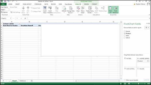
Figure 6-5: The cross-tabulation after you select a data series.
8. Select the data category.
Your second step in creating a pivot chart is to select the data category. The data category organizes the values in a data series. That sounds complicated, but in many charts, identifying the data category is easy. In any chart (including a pivot chart) that shows how some value changes over time, the data category is time. In the case of this example pivot chart, to show how coffee product sales change over time, the data category is time. Or, more precisely, the data category uses the Month field.
After you make this choice, you drag the data category field item from the PivotTable Field list to the box marked Axis Fields. Figure 6-6 shows the way that the partially constructed pivot chart looks after you specify the data category as Months.
9. Select the data item that you want to chart.
After you choose the data series and data category for your pivot chart, you indicate what piece of data that you want plotted in your pivot chart. For example, to plot sales revenue, drag the Sales $ item from the PivotTable Field List to the box labeled Σ Values.
Figure 6-7 shows the pivot table after the Data Series (Step 7), Data Category (Step 8), and Data (Step 9) items have been selected. This is a completed pivot chart. Note that it cross-tabulates information from the Excel list shown in Figure 6-1. Each bar in the pivot chart shows sales for a month. Each bar is made up of colored segments that represent the sales contribution made by each coffee product. Obviously, you can’t see the colors in a black-and-white image like the one shown in Figure 6-7. But on your computer monitor, you can see the colored segments and the bars that they make.
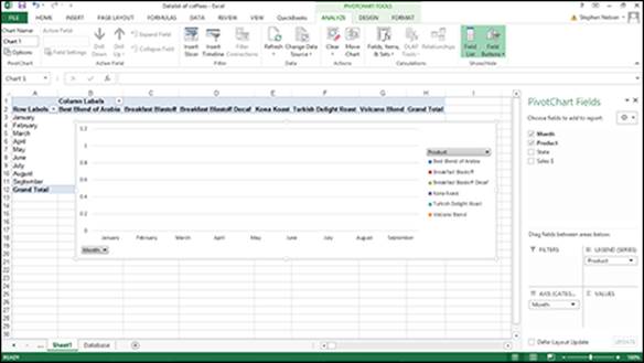
Figure 6-6: And it just gets better.
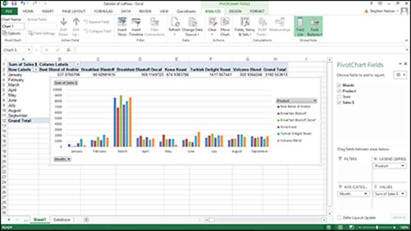
Figure 6-7: The completed pivot chart. Finally.
Fooling Around with Your Pivot Chart
After you construct your pivot chart, you can further analyze your data. Here I briefly describe some of the cool tools that Excel provides for manipulating information in a pivot chart.
Pivoting and re-pivoting
The thing that gives the pivot tables and pivot charts their names is that you can continue cross-tabulating, or pivoting, the data. For example, you could take the data shown in Figure 6-7 and by swapping the data series and data categories — you do this merely by dragging the State and Product buttons — you can flip-flop the organization of the pivot chart.
One might also choose to pivot new data. For example, the chart in Figure 6-8 shows the same information as Figure 6-7. The difference is that the new pivot chart uses the State field rather than the Month field as the data category. The new pivot chart continues to use the Product field as the data series.
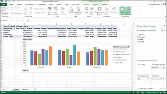
Figure 6-8: A re-pivoted pivot chart.
Filtering pivot chart data
You can also segregate data by putting information on different charts. For example, if you drag the Month data item to the Report Filter box (in the bottom half of the PivotTable Field List), Excel adds a Month button to the worksheet (in Figure 6-9, this button appears in cells A1 and B1). This button, which is part of the pivot table behind your pivot chart, lets you view sales information for all the months, as shown in Figure 6-9, or just one of the months. This box is by default set to display all the months (All), so the chart in Figure 6-9 looks just like Figure 6-8. Things really start to happen, however, when you want to look at just one month's data.
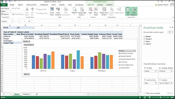
Figure 6-9: Whoa. Now I use months to cross-tabulate.
To show sales for only a single month, click the down-arrow button to the right of the Month drop-down list. When Excel displays the drop-down list, select the month that you want to see sales for and then click OK. Figure 6-10 shows sales for just the month of January. This is a little hard to see in Figure 6-10, but try to see the words Month and January in cells A1 and B1.
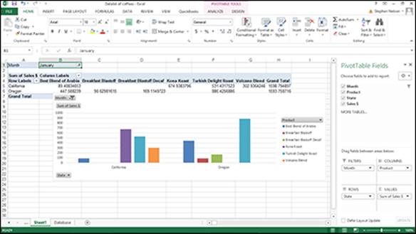
Figure 6-10: You can filter pivot chart information, too.
 To remove an item from the pivot chart, simply drag the item’s button back to the PivotTable Field list.
You can also filter data based on the data series or the data category. In the case of the pivot chart shown in Figure 6-10, you can indicate that you want to see only a particular data series information by clicking the arrow button to the right of the Column Labels drop-down list. When Excel displays the drop-down list of coffee products, select the coffee that you want to see sales for. You can use the Row Labels drop-down list in a similar fashion to see sales for only a particular state.
Let me mention one other tidbit about pivoting and re-pivoting. If you’ve worked with pivot tables, you might remember that you can cross-tabulate by more than one row or column items. You can do something very similar with pivot charts. You can become more detailed in your data series or data categories by dragging another field item to the Legend Fields or Axis Fields box.
Figure 6-11 shows how the pivot table looks if you use State to add granularity to the Product data series.
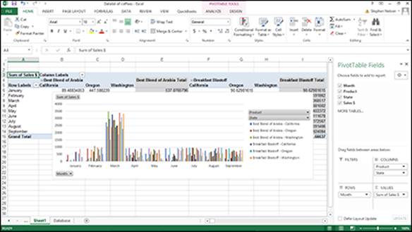
Figure 6-11: Yet another cross-tabulation of the data.
Sometimes lots of granularity in a cross-tabulation makes sense. But having multiple row items and multiple column items in a pivot table makes more sense than adding lots of granularity to pivot charts by creating superfine data series or data categories. Too much granularity in a pivot chart turns your chart into an impossible-to-understand visual mess, a bit like the disaster that I show in Figure 6-11.
Refreshing pivot chart data
As the data in an Excel table changes, you need to update the pivot chart. You have two methods for telling Excel to refresh your chart:
· You can click the Refresh command on the PivotTable Tools Options tab. (See Figure 6-12.)
· You can choose the Refresh Data command from the shortcut menu that Excel displays when you right-click a pivot chart.
 Point to an Excel ribbon button, and Excel displays pop-up ScreenTips that give the command button name.
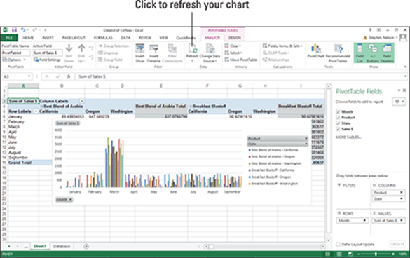
Figure 6-12: The PivotTable Tools Option tab provides a Refresh command.
Grouping and ungrouping data items
You can group together and ungroup values plotted in a pivot chart. For example, suppose that you want to take the pivot chart shown in Figure 6-13 — which is very granular — and hide some of the detail. You might want to combine the detailed information shown for Breakfast Blend and Breakfast Blend Decaf and show just the total sales for these two related products. To do this, select a Row Labels cell or the Column Labels cell that you want to group, right-click your selection, and choose Group from the shortcut menu. Next, right-click the new group and choose Collapse from the shortcut menu.
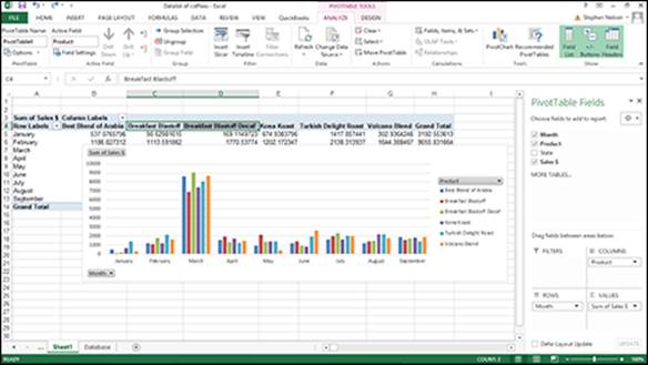
Figure 6-13: A pivot chart with too much detail.
After you group and collapse, Excel shows just the group totals in the Pivot chart (and in the supporting pivot table). As shown in Figure 6-14, the combined Breakfast Blast sales are labeled as Group1.
To show previously collapsed detail, right-click the Row Labels or Column Labels cell that shows the collapsed grouping. Then choose Expand/Collapse⇒Expand from the menu that appears.
To show previously grouped detail, right-click the Row Labels or Column Labels cell that shows the grouping. Then choose Ungroup from the menu that appears.
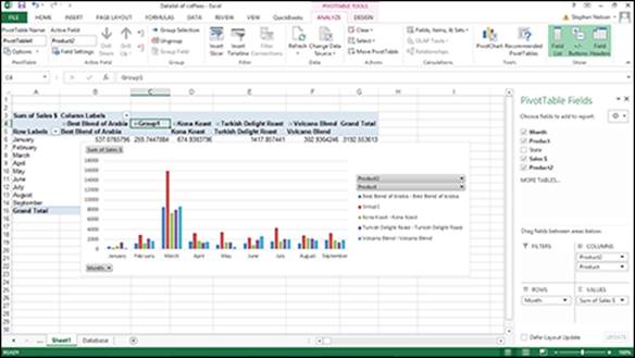
Figure 6-14: A pivot chart that looks a little bit better.
Using Chart Commands to Create Pivot Charts
You can also use Excel’s standard charting commands to create charts of pivot table data. You might choose to use the Charts toolbar on the Insert tab when you’ve already created a pivot table and now want to use that data in a chart.
To create a regular old chart using pivot table data, follow these steps:
1. Create a pivot table.
For help on how to do this, refer to Chapter 4 for the blow-by-blow account.
2. Select the worksheet range in the pivot table that you want to chart.
3. Tell Excel to create a pivot chart by choosing the appropriate charting command from the Insert tab.
The Chart Wizard creates a pivot chart that matches your pivot table. Figure 6-15, for example, shows a column chart created from the Excel worksheet that summarizes sales from your imaginary coffee business. I created a pivot table for the data and then told Excel to put the pivot table’s data into a column chart.
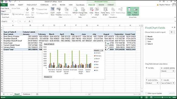
Figure 6-15: A regular old column chart based on a pivot table becomes, voila, a pivot chart.
For normal charting, by the way, you set up a worksheet with the data that you want to plot in a chart. Then you select the data and tell Excel to plot the data in a chart by choosing one of the Insert tab’s chart commands.
By the way, in this chapter, I don’t describe how to customize the actual pivot chart … but I didn’t forget that topic. Pivot chart customization as a subject is so big that it gets its own chapter: Chapter 7.
All materials on the site are licensed Creative Commons Attribution-Sharealike 3.0 Unported CC BY-SA 3.0 & GNU Free Documentation License (GFDL)
If you are the copyright holder of any material contained on our site and intend to remove it, please contact our site administrator for approval.
© 2016-2026 All site design rights belong to S.Y.A.