Excel® 2016 Formulas and Functions (2016)
Part II: Harnessing the Power of Functions
12. Working with Statistical Functions
In This Chapter
Excel’s Statistical Functions
Understanding Descriptive Statistics
Counting Items with the COUNT() Function
Calculating Averages
Calculating Extreme Values
Calculating Measures of Variation
Working with Frequency Distributions
Using the Analysis ToolPak Statistical Tools
Excel’s statistical functions calculate all the standard statistical measures, such as average, maximum, minimum, and standard deviation. For most of the statistical functions, you supply a list of values (which could be an entire population or just a sample from a population). You can enter individual values or cells, or you can specify a range.
Excel’s Statistical Functions
Excel has dozens of statistical functions, many of which are rarely, if ever, used in business. Table 12.1 lists those statistical functions that have some utility in the business world.
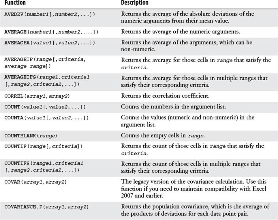
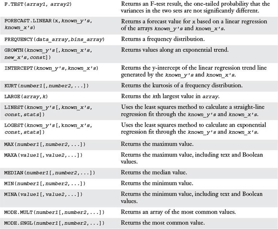
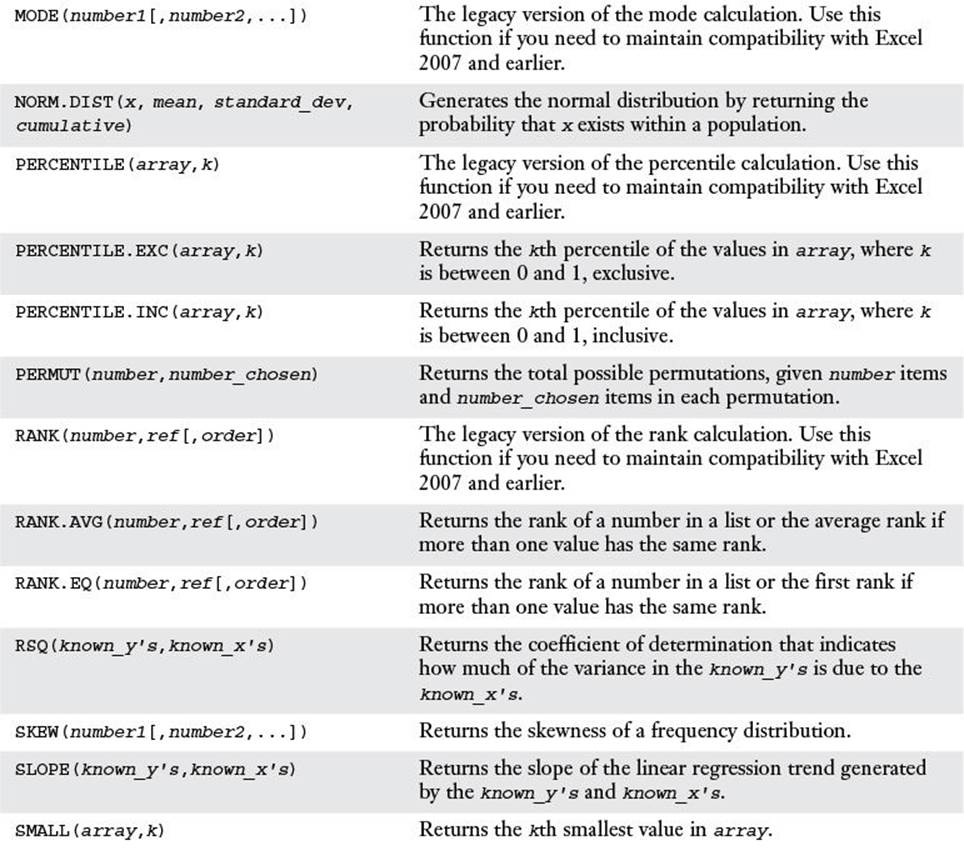
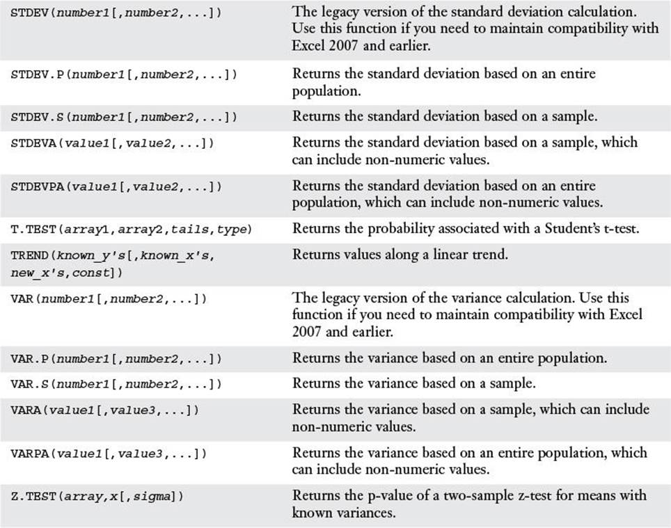
Table 12.1 Statistical Functions of Use in the Business World
![]() For the details of the regression functions—FORECAST(), GROWTH(), INTERCEPT(), LINEST(), LOGEST(), RSQ(), SLOPE(), and TREND()—see Chapter 16, “Using Regression to Track Trends and Make Forecasts,” p. 371.
For the details of the regression functions—FORECAST(), GROWTH(), INTERCEPT(), LINEST(), LOGEST(), RSQ(), SLOPE(), and TREND()—see Chapter 16, “Using Regression to Track Trends and Make Forecasts,” p. 371.
Understanding Descriptive Statistics
One of the goals of this book is to show you how to use formulas and functions to turn a jumble of numbers and values into results and summaries that give you useful information about the data. Excel’s statistical functions are particularly useful for extracting analytical sense out of data nonsense. Many of these functions might seem strange and obscure, but they reward a bit of patience and effort with striking new views of your data.
This is particularly true of the branch of statistics known casually as descriptive statistics (or summary statistics). As the name implies, descriptive statistics are used to describe various aspects of a data set, to give you a better overall picture of the phenomenon underlying the numbers. In Excel’s statistical repertoire, 16 measures make up its descriptive statistics package: sum, count, mean, median, mode, maximum, minimum, range, kth largest, kth smallest, standard deviation, variance, standard error of the mean, confidence level, kurtosis, and skewness.
In this chapter, you’ll learn how to wield all of these statistical measures (except sum, which you’ve already seen earlier in this book). The context is the worksheet database of product defects shown in Figure 12.1.
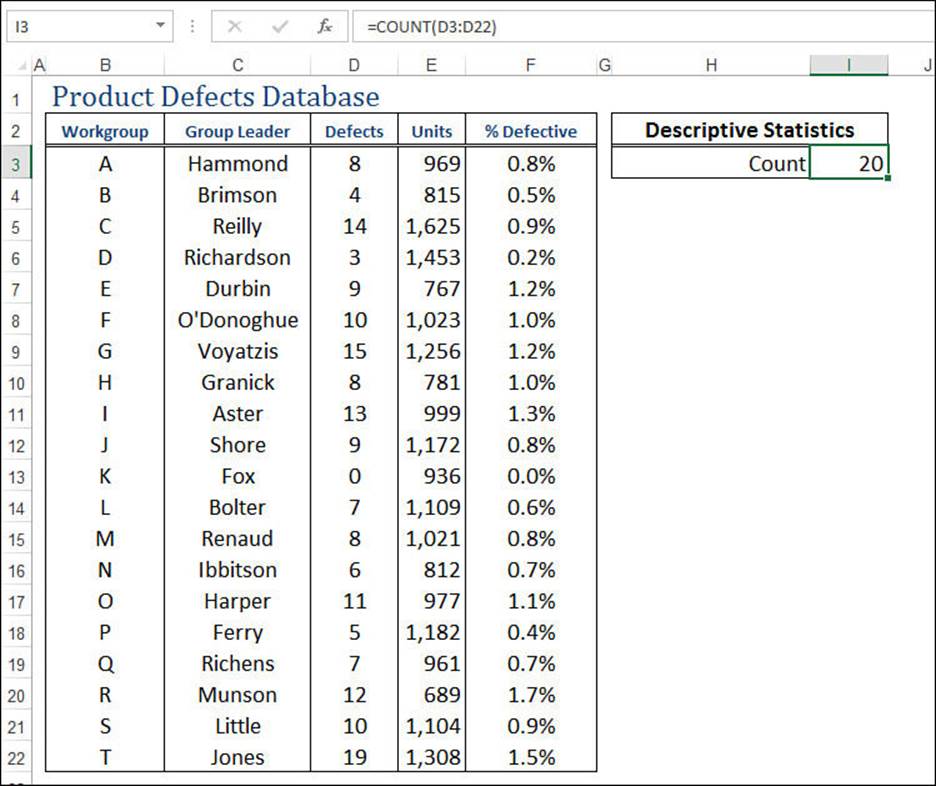
Figure 12.1 To demonstrate Excel’s descriptive statistics capabilities, this chapter uses the data shown here in a database of product defects.
Note
You can download this chapter’s sample workbook at www.mcfedries.com/books/book.php?title=excel-2016-formulas-and-functions.
Counting Items with the COUNT() Function
The simplest of the descriptive statistics is the total number of values, which is given by the COUNT() function:
COUNT(value1[,value2,...])

The COUNT() function counts only the numeric values that appear in the list of arguments. Text values, dates, logical values, and errors are ignored. (If you want to include these non-numeric values, use the COUNTA() function instead.) In the worksheet shown in Figure 12.1, the following formula is used to count the number of defect values in the database:
=COUNT(D3:D22)
Tip
To get a quick look at the count, select the range or, if you’re working with data in a table, select a single column in the table. Excel displays the count in the status bar. If you want to know how many numeric values are in the selection, right-click the status bar and then click the Numerical Count value.
Calculating Averages
The most basic statistical analysis worthy of the name is probably the average, although you always need to ask yourself which average you need: mean, median, or mode. The next few sections show you the worksheet functions that calculate them.
The AVERAGE() Function
The mean is what you probably think of when someone uses the term average. That is, it’s the arithmetic mean of a set of numbers. In Excel, you calculate the mean by using the AVERAGE() function:
AVERAGE(number1[,number2,...])
![]()
For example, to calculate the mean of the values in the defects database, you use the following formula:
=AVERAGE(D3:D22)
Tip
If you need just a quick glance at the mean value, select the range. Excel displays the average in the status bar.
Caution
The AVERAGE() function (as well as the MEDIAN() and MODE() functions, discussed in the next two sections) ignores text and logical values. It also ignores blank cells, but it does not ignore cells that contain the value 0. If you want to include non-numeric values, use theAVERAGEA() function, which treats text values as 0 and the Boolean values TRUE and FALSE as 1 and 0, respectively.
The MEDIAN() Function
The median is the value in a data set that falls in the middle when all the values are sorted in numeric order. That is, 50% of the values fall below the median, and 50% fall above it. The median is useful in data sets that have one or two extreme values that can throw off the mean result because the median isn’t affected by extremes.
You calculate the median by using the MEDIAN() function:
MEDIAN(number1[,number2,...])
![]()
For example, to calculate the median of the values in the defects database, you use the following formula:
=MEDIAN(D3:D22)
The MODE() Function
The mode is the value in a data set that occurs most frequently. The mode is most useful when you’re dealing with data that doesn’t lend itself to being either added (necessary for calculating the mean) or sorted (necessary for calculating the median). For example, you might be tabulating the result of a poll that included a question about the respondent’s favorite color. The mean and median don’t make sense with such a question, but the mode will tell you which color was chosen the most.
You calculate the mode using one of the following functions:
MODE.MULT(number1[,number2,...])
MODE.SNGL(number1[,number2,...])
MODE(number1[,number2,...])
![]()
The MODE.SNGL() function returns the most common value in the list, so it’s the function you’ll use most often in Excel 2010 and later. If your list has multiple common values, use MODE.MULT() in Excel 2010 and later to return those values as an array. If you need to maintain compatibility with Excel 2007 and earlier versions, use the MODE() function.
For example, to calculate the mode of the values in the defects database, you use the following formula:
=MODE.SNGL(D3:D22)
Calculating the Weighted Mean
In some data sets, one value might be more important than another. For example, suppose that your company has several divisions, the biggest of which generates $100 million in annual sales and the smallest of which generates only $1 million in sales. If you want to calculate the average profit margin for the divisions, it doesn’t make sense to treat the divisions equally because the largest is two orders of magnitude bigger than the smallest. You need some way of factoring the size of each division into your average profit margin calculation.
You can do this by calculating the weighted mean. This is an arithmetic mean in which each value is weighted according to its importance in the data set. Here’s the procedure to follow to calculate the weighted mean:
1. For each value, multiply the value by its weight.
2. Sum the results from step 1.
3. Sum the weights.
4. Divide the sum from step 2 by the sum from step 3.
I’ll make this more concrete by tying this into our database of product defects. Suppose you want to know the average percentage of product defects (the values in column F). Simply applying the AVERAGE() function to the range F3:F22 doesn’t give an accurate answer because the number of units produced by each division is different. (The maximum is 1,625 in division C, and the minimum is 689 in division R.) To get an accurate result, you must give more weight to those divisions that produced more units. In other words, you need to calculate the weighted mean for the percentage of defective products.
In this case, the weights are the units produced by each division, so the weighted mean is calculated as follows:
1. Multiply the percentage defective values by the units. (The sharp-eyed reader will note that this just gives the number of defects. I’ll ignore this for now for illustration purposes.)
2. Sum the results from step 1.
3. Sum the units.
4. Divide the sum from step 2 by the sum from step 3.
You can combine all of these steps into the following array formula, as shown in Figure 12.2:
{=SUM(F3:F22 * E3:E22) / SUM(E3:E22)}
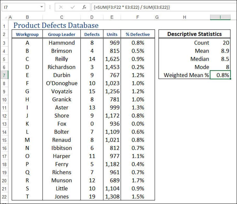
Figure 12.2 This worksheet calculates the weighted mean of the percentage of defective products.
Calculating Extreme Values
The average calculations tell you things about the “middle” of the data, but it can also be useful to know something about the “edges” of the data. For example, what’s the biggest value, and what’s the smallest? The next two sections take you through the worksheet functions that return the extreme values of a sample or population.
The MAX() and MIN() Functions
If you want to know the largest value in a data set, use the MAX() function:
MAX(number1[,number2,...])
![]()
For example, to calculate the maximum value in the defects database, you use the following formula:
=MAX(D3:D22)
To get the smallest value in a data set, use the MIN() function:
MIN(number1[,number2,...])
![]()
For example, to calculate the minimum value in the defects database, you use the following formula:
=MIN(D3:D22)
Tip
If you need just a quick glance at the maximum or minimum value, select the range, right-click the status bar, and then click the Maximum or Minimum value.
Note
If you need to determine the maximum or minimum over a range or an array that includes text values or logical values, use the MAXA() or MINA() functions instead. These functions ignore text values and treat logical values as either 1 (for TRUE) or 0 (for FALSE).
The LARGE() and SMALL() Functions
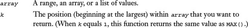
Instead of knowing just the largest value, you might need to know the kth largest value, where k is some integer. You can calculate this by using Excel’s LARGE() function:
LARGE(array, k)
For example, the following formula returns 15, the second-largest defects value in the product defects database:
=LARGE(D3:D22, 2)
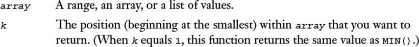
Similarly, instead of knowing just the smallest value, you might need to know the kth smallest value, where k is some integer. You can determine this value by using the SMALL() function:
SMALL(array, k)
For example, the following formula returns 4, the third-smallest defects value in the product defects database (see Figure 12.3):
=SMALL(D3:D22, 3)
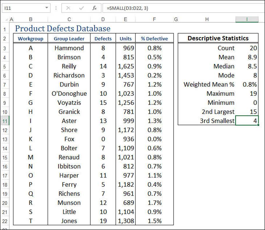
Figure 12.3 The product defects database with calculations derived using the MAX(), MIN(), LARGE(), and SMALL() functions.
Performing Calculations on the Top k Values
Sometimes, you might need to sum only the top three values in a data set or take the average of the top 10 values. You can do this by combining the LARGE() function and the appropriate arithmetic function (such as SUM()) in an array formula. Here’s the general formula:
{=FUNCTION(LARGE(range, {1,2,3,...,k}))}
Here, FUNCTION() is the arithmetic function, range is the array or range containing the data, and k is the number of values you want to work with. In other words, LARGE() applies the top k values from range to the FUNCTION().
For example, suppose you want to find the mean of the top five values in the defects database. Here’s an array formula that does this:
{=AVERAGE(LARGE(D3:D22,{1,2,3,4,5}))}
Performing Calculations on the Bottom k Values
You can probably guess that performing calculations on the smallest k values is similar to performing calculations on the top k values. In fact, the only difference is that you substitute the SMALL() function for LARGE():
{=FUNCTION(SMALL(range, {1,2,3,...,k}))}
For example, the following array formula sums the smallest three defect values in the defects database:
{=SUM(SMALL(D3:D22,{1,2,3}))}
Calculating Measures of Variation
Descriptive statistics such as the mean, median, and mode fall under what statisticians call measures of central tendency (or sometimes measures of location). These numbers are designed to give you some idea of what constitutes a “typical” value in a data set.
This is in contrast to the so-called measures of variation (or sometimes measures of dispersion), which are designed to give you some idea of how the values in a data set vary with respect to one another. For example, a data set in which all the values are the same would have no variability; in contrast, a data set with wildly different values would have high variability. Just what is meant by “wildly different” is what the statistical techniques in this section are designed to help you calculate.
Calculating the Range
The simplest measure of variability is the range (also sometimes called the spread), which is defined as the difference between a data set’s maximum and minimum values. Excel doesn’t have a function that calculates the range directly. Instead, you first apply the MAX() and MIN()functions to the data set. Then, when you have these extreme values, you calculate the range by subtracting the minimum from the maximum.
For example, here’s a formula that calculates the range for the defects database:
=MAX(D3:D22) - MIN(D3:D22)
In general, the range is a useful measure of variation only for small sample sizes. The larger the sample is, the more likely it becomes that an extreme maximum or minimum will occur, and the range will be skewed accordingly.
Calculating the Variance
When computing the variability of a set of values, one straightforward approach is to calculate how much each value deviates from the mean. You can then add those differences and divide by the number of values in the sample to get what might be called the average difference. The problem, however, is that, by definition of the arithmetic mean, adding the differences (some of which are positive and some of which are negative) gives the result 0. To solve this problem, you need to add the absolute values of the deviations and then divide by the sample size. This is what statisticians call the average deviation.
Unfortunately, this simple state of affairs is still problematic because (for highly technical reasons) mathematicians tend to shudder at equations that require absolute values. To get around this, they instead use the square of each deviation from the mean, which always results in a positive number. They sum these squares and divide by the number of values, and the result is then called the variance. This is a common measure of variation, although interpreting it is difficult because the result isn’t in the units of the sample: It’s in those units squared. What does it mean to speak of “defects squared,” for example? This doesn’t matter that much for our purposes because, as you’ll see in the next section, the variance is used chiefly to get to the standard deviation.
Note
Keep in mind that this explanation of variance is simplified considerably. If you’d like to know more about this topic, you can consult an intermediate statistics book.
In any case, variance is usually a standard part of a descriptive statistics package, so that’s why I’m covering it. Excel calculates the variance by using the VAR.P(), VAR.S(), and VAR() functions:
VAR.P(number1[,number2,...])
VAR.S(number1[,number2,...])
VAR(number1[,number2,...])
![]()
You use the VAR.P() function in Excel 2010 or later if your data set represents the entire population (as it does, for example, in the product defects case); you use the VAR.S() function in Excel 2010 or later if your data set represents only a sample from the entire population. If you need to maintain compatibility with Excel 2007 and earlier versions, use the VAR() function (which assumes that your data represents a sample from the entire population).
For example, to calculate the variance of the values in the defects database, you use the following formula:
=VAR.P(D3:D22)
Note
If you need to determine the variance over a range or an array that includes text values or logical values, use the VARPA() and VARA() functions instead. These functions ignore text values and treat logical values as either 1 (for TRUE) or 0 (for FALSE).
Calculating the Standard Deviation
As I mentioned in the previous section, in real-world scenarios, the variance is really used only as an intermediate step for calculating the most important of the measures of variation: the standard deviation. This measure tells you how much the values in the data set vary with respect to the average (the arithmetic mean). What exactly this means won’t become clear until you learn about frequency distributions in the next section. For now, however, it’s enough to know that a low standard deviation means that the data values are clustered near the mean, and a high standard deviation means that the values are spread out from the mean.
The standard deviation is defined as the square root of the variance. This means that the resulting units will be the same as those used by the data. For example, the variance of the product defects is expressed in the meaningless defects squared units, but the standard deviation is expressed indefects.
You could calculate the standard deviation by taking the square root of the VAR() result, but Excel offers a more direct route:
STDEV.P(number1[,number2,...])
STDEV.S(number1[,number2,...])
STDEV(number1[,number2,...])
![]()
You use the STDEV.P() function in Excel 2010 or later if your data set represents the entire population (as in the product defects case); you use the STDEV.S() function in Excel 2010 or later if your data set represents only a sample from the entire population. If you want to maintain compatibility with Excel 2007 and earlier versions, use the STDEV() function (which assumes that your data represents a sample from the entire population).
For example, to calculate the standard deviation of the values in the defects database, you use the following formula (see Figure 12.4):
=STDEV.P(D3:D22)
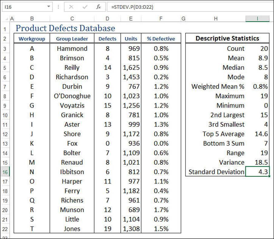
Figure 12.4 The product defects worksheet, showing the results of the VAR.P() and STDEV.P() functions.
Note
If you need to determine the standard deviation over a range or an array that includes text values or logical values, use the STDEVPA() and STDEVA() functions instead. These functions ignore text values and treat logical values as either 1 (for TRUE) or 0 (for FALSE).
Working with Frequency Distributions
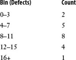
A frequency distribution is a data table that groups data values into bins—ranges of values—and shows how many values fall into each bin. For example, here’s a possible frequency distribution for the product defects data:
The size of each bin is called the bin interval. How many bins should you use? The answer usually depends on the data. If you want to calculate the frequency distribution for a set of student grades, for example, you’d probably set up six bins: 0-49, 50-59, 60-69, 70-79, 80-89, and 90+. For poll results, you might group the data by age into four bins: 18-34, 35-49, 50-64, and 65+.
If your data has no obvious bin intervals, you can use the following rule:
If n is the number of values in the data set, enclose n between two successive powers of 2 and take the higher exponent to be the number of bins.
For example, if n is 100, you’d use 7 bins because 100 lies between 26 (64) and 27 (128). For the product defects, n is 20, so the number of bins should be 5 because 20 falls between 24 (16) and 25 (32).
Tip
Here’s a worksheet formula that implements the bin-calculation rule:
=CEILING(LOG(COUNT(input_range), 2), 1)
The FREQUENCY() Function
To help you construct a frequency distribution, Excel offers the FREQUENCY() function:
FREQUENCY(data_array, bins_array)
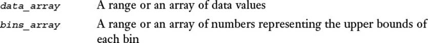
Here are some things you need to know about this function:
![]() For the bins_array, you enter only the upper limit of each bin. If the last bin is open ended (such as 16+), you don’t include it in the bins_array. For example, here’s the bins_array for the product defects frequency distribution shown earlier: {3, 7, 11, 15}.
For the bins_array, you enter only the upper limit of each bin. If the last bin is open ended (such as 16+), you don’t include it in the bins_array. For example, here’s the bins_array for the product defects frequency distribution shown earlier: {3, 7, 11, 15}.
Caution
Make sure you enter your bin values in ascending order.
![]() The FREQUENCY() function returns an array (the number of values that fall within each bin) that is one greater than the number of elements in bins_array. For example, if the bins_array contains four elements, FREQUENCY() returns five elements. (The extra element is the number of values that fall in the open-ended bin.)
The FREQUENCY() function returns an array (the number of values that fall within each bin) that is one greater than the number of elements in bins_array. For example, if the bins_array contains four elements, FREQUENCY() returns five elements. (The extra element is the number of values that fall in the open-ended bin.)
![]() Because FREQUENCY() returns an array, you must enter it as an array formula. To do this, select the range in which you want the function results to appear (again, make this range one cell bigger than the bins_array range), type in the formula, and press Ctrl+Shift+Enter.
Because FREQUENCY() returns an array, you must enter it as an array formula. To do this, select the range in which you want the function results to appear (again, make this range one cell bigger than the bins_array range), type in the formula, and press Ctrl+Shift+Enter.
Figure 12.5 shows the product defects database with a frequency distribution added. The bins_array is the range K4:K7, and the FREQUENCY() results appear in the range L4:L8, with the following formula entered as an array in that range:
{=FREQUENCY(D3:D22, K4:K7)}
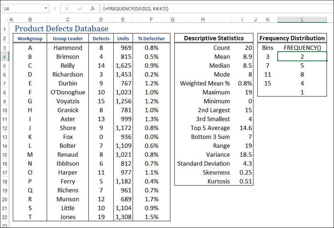
Figure 12.5 The product defects worksheet with the frequency distribution added.
Understanding the Normal Distribution and the NORMDIST() Function
The next few sections require some knowledge of perhaps the most famous object in the statistical world: the normal distribution (also called the normal frequency curve). This distribution refers to a set of values that are symmetrically clustered around a central mean, with the frequencies of each value highest near the mean and falling off as farther from the mean (either to the left or to the right).
Figure 12.6 shows a chart that displays a typical normal distribution. In fact, this particular example is called the standard normal distribution, and it’s defined as having mean 0 and standard deviation 1. The distinctive bell shape of this distribution is why it’s often called the bell curve.
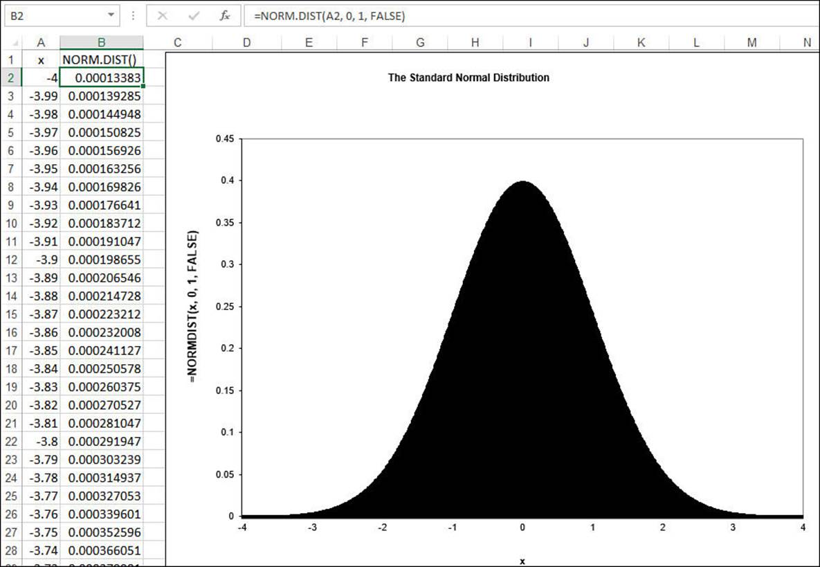
Figure 12.6 The standard normal distribution (mean 0 and standard deviation 1) generated by the NORMDIST() function.
To generate this normal distribution, I used Excel’s NORM.DIST() function, which returns the probability that a given value exists within a population:
NORM.DIST(x, mean, standard_dev, cumulative)
NORMDIST(x, mean, standard_dev, cumulative)
Use the NORM.DIST() function in Excel 2010 or later; use the NORMDIST() function if you need to maintain compatibility with Excel 2007 and earlier versions.
For example, consider the following example, which computes the standard normal distribution—mean 0 and standard deviation 1—for the value 0:
=NORM.DIST(0, 0, 1, TRUE)
With the cumulative argument set to TRUE, this formula returns 0.5, which makes intuitive sense because, in this distribution, half of the values fall below 0. In other words, the probabilities of all the values below 0 add up to 0.5.
Now consider the same function, but this time with the cumulative argument set to FALSE:
=NORM.DIST(0, 0, 1, FALSE)
This time, the result is 0.39894228. In other words, in this distribution, about 39.9% of all the values in the population are 0.
For our purposes, the key point about the normal distribution is that it has direct ties to the standard deviation:
![]() Approximately 68% of all the values fall within one standard deviation of the mean (that is, either one standard deviation above or one standard deviation below).
Approximately 68% of all the values fall within one standard deviation of the mean (that is, either one standard deviation above or one standard deviation below).
![]() Approximately 95% of all the values fall within two standard deviations of the mean.
Approximately 95% of all the values fall within two standard deviations of the mean.
![]() Approximately 99.7% of all the values fall within three standard deviations of the mean.
Approximately 99.7% of all the values fall within three standard deviations of the mean.
The Shape of the Curve I: The SKEW() Function
How do you know if your frequency distribution is at or close to a normal distribution? In other words, does the shape of your data’s frequency curve mirror that of the normal distribution’s bell curve?
One way to find out is to consider how the values cluster around the mean. For a normal distribution, the values cluster symmetrically about the mean. Other distributions are asymmetric in one of two ways:
![]() Negatively skewed—The values are bunched above the mean and drop off quickly in a “tail” below the mean.
Negatively skewed—The values are bunched above the mean and drop off quickly in a “tail” below the mean.
![]() Positively skewed—The values are bunched below the mean and drop off quickly in a “tail” above the mean.
Positively skewed—The values are bunched below the mean and drop off quickly in a “tail” above the mean.
Figure 12.7 shows two charts that display examples of negative and positive skewness.
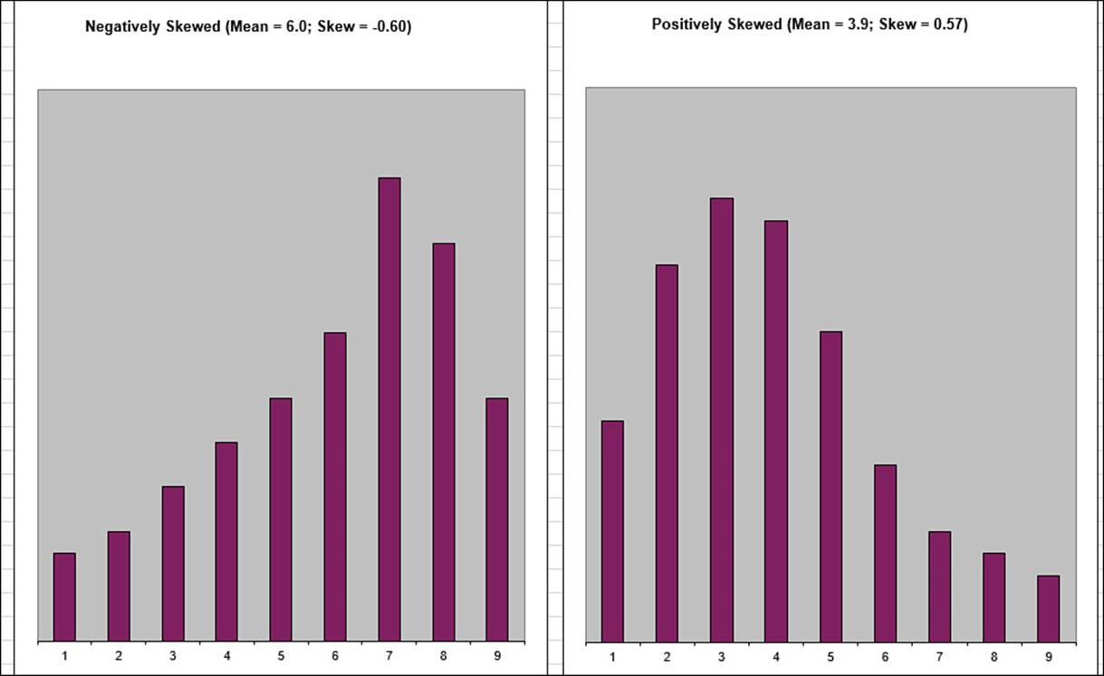
Figure 12.7 The distribution on the left is negatively skewed; the distribution on the right is positively skewed.
In Excel, you calculate the skewness of a data set by using the SKEW() function:
SKEW(number1[,number2,...])
![]()
For example, the following formula returns the skewness of the product defects:
=SKEW(D3:D22)
The closer the SKEW() result is to 0, the more symmetric the distribution is, so the more like the normal distribution it is.
The Shape of the Curve II: The KURT() Function
Another way to find out how close your frequency distribution is to a normal distribution is to consider the flatness of the curve:
![]() Flat—The values are distributed evenly across all or most of the bins.
Flat—The values are distributed evenly across all or most of the bins.
![]() Peaked—The values are clustered around a narrow range of values.
Peaked—The values are clustered around a narrow range of values.
Statisticians call the flatness of the frequency curve the kurtosis. A flat curve has a negative kurtosis, and a peaked curve has a positive kurtosis. The further these values are from 0, the less the frequency is like the normal distribution. Figure 12.8 shows two charts that display examples of negative and positive kurtosis.
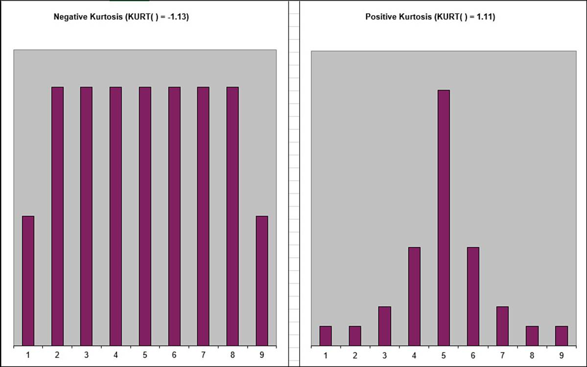
Figure 12.8 The distribution on the left has a negative kurtosis; the distribution on the right has a positive kurtosis.
In Excel, you calculate the kurtosis of a data set by using the KURT() function:
KURT(number1[,number2,...])
![]()
For example, the following formula returns the kurtosis of the product defects:
=KURT(D3:D22)
Figure 12.9 shows the final product defects worksheet, including values for the skewness and kurtosis.
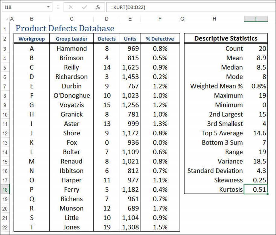
Figure 12.9 The final product defects worksheet, showing the values for the distribution’s skewness and kurtosis.
Using the Analysis ToolPak Statistical Tools
When you load the Analysis ToolPak, the add-in inserts a new Data Analysis button in the Ribbon’s Data tab. Click this button to display the Data Analysis dialog box shown in Figure 12.10. This dialog box gives you access to 19 new statistical tools that handle everything from an analysis of variance (anova) to a z-test.
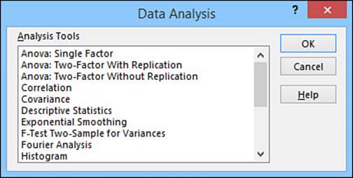
Figure 12.10 The Data Analysis dialog box contains 19 powerful statistical-analysis features.
![]() To learn how to activate the Analysis ToolPak add-in, see “Loading the Analysis ToolPak,” p. 136.
To learn how to activate the Analysis ToolPak add-in, see “Loading the Analysis ToolPak,” p. 136.
Here’s a summary of what each statistical tool can do for your data:
![]() Anova: Single Factor—Performs a simple (that is, single-factor) analysis of variance. An analysis of variance (anova) tests the hypothesis that the means from several samples are equal.
Anova: Single Factor—Performs a simple (that is, single-factor) analysis of variance. An analysis of variance (anova) tests the hypothesis that the means from several samples are equal.
![]() Anova: Two-Factor with Replication—Performs a single-factor anova and includes more than one sample for each group of data.
Anova: Two-Factor with Replication—Performs a single-factor anova and includes more than one sample for each group of data.
![]() Anova: Two-Factor Without Replication—Performs a two-factor anova that doesn’t include more than one sampling per group.
Anova: Two-Factor Without Replication—Performs a two-factor anova that doesn’t include more than one sampling per group.
![]() Correlation—Returns the correlation coefficient: a measure of the relationship between two sets of data. This is also available via the following worksheet function:
Correlation—Returns the correlation coefficient: a measure of the relationship between two sets of data. This is also available via the following worksheet function:
CORREL(array1, array2)

![]() Covariance—Returns the average of the products of deviations for each data point pair. Covariance is a measure of the relationship between two sets of data. This is also available via the following worksheet functions:
Covariance—Returns the average of the products of deviations for each data point pair. Covariance is a measure of the relationship between two sets of data. This is also available via the following worksheet functions:
COVARIANCE.P(array1, array2)
COVARIANCE.S(array1, array2)
COVAR(array1, array2)
![]() Descriptive Statistics—Generates a report showing various statistics (such as median, mode, and standard deviation) for a set of data.
Descriptive Statistics—Generates a report showing various statistics (such as median, mode, and standard deviation) for a set of data.
![]() Exponential Smoothing—Returns a predicted value based on the forecast for the previous period, adjusted for the error in that period.
Exponential Smoothing—Returns a predicted value based on the forecast for the previous period, adjusted for the error in that period.
![]() F-Test Two-Sample for Variances—Performs a two-sample F-test to compare two population variances. This tool returns the one-tailed probability that the variances in the two sets aren’t significantly different. This is also available via the following worksheet functions:
F-Test Two-Sample for Variances—Performs a two-sample F-test to compare two population variances. This tool returns the one-tailed probability that the variances in the two sets aren’t significantly different. This is also available via the following worksheet functions:
F.TEST(array1, array2)
FTEST(array1, array2)

![]() Fourier Analysis—Performs a fast Fourier transform. You use Fourier analysis to solve problems in linear systems and to analyze periodic data.
Fourier Analysis—Performs a fast Fourier transform. You use Fourier analysis to solve problems in linear systems and to analyze periodic data.
![]() Histogram—Calculates individual and cumulative frequencies for a range of data and a set of data bins. The FREQUENCY() function, discussed earlier in this chapter, is a simplified version of the Histogram tool.
Histogram—Calculates individual and cumulative frequencies for a range of data and a set of data bins. The FREQUENCY() function, discussed earlier in this chapter, is a simplified version of the Histogram tool.
![]() Moving Average—Smoothes a data series by averaging the series values over a specified number of preceding periods.
Moving Average—Smoothes a data series by averaging the series values over a specified number of preceding periods.
![]() Random Number Generation—Fills a range with independent random numbers.
Random Number Generation—Fills a range with independent random numbers.
![]() Rank and Percentile—Creates a table containing the ordinal and percentage rank of each value in a set. These are also available via the following worksheet functions:
Rank and Percentile—Creates a table containing the ordinal and percentage rank of each value in a set. These are also available via the following worksheet functions:
RANK.AVG(number,ref[,order])
RANK.EQ(number,ref[,order])
RANK(number,ref[,order])
PERCENTILE.EXC(array, k)
PERCENTILE.INC(array, k)
PERCENTILE(array, k)

![]() Regression—Performs a linear regression analysis that fits a line through a set of values using the least squares method.
Regression—Performs a linear regression analysis that fits a line through a set of values using the least squares method.
![]() Sampling—Creates a sample from a population by treating the input range as a population.
Sampling—Creates a sample from a population by treating the input range as a population.
![]() t-Test: Paired Two-Sample for Means—Performs a paired two-sample Student’s t-test to determine whether a sample’s means are distinct. This is also available via the following worksheet functions (set type equal to 1):
t-Test: Paired Two-Sample for Means—Performs a paired two-sample Student’s t-test to determine whether a sample’s means are distinct. This is also available via the following worksheet functions (set type equal to 1):
T.TEST(array1, array2, tails, type)
TTEST(array1, array2, tails, type)
![]() t-Test: Two-Sample Assuming Equal Variances—Performs a paired two-sample Student’s t-test, assuming that the variances of both data sets are equal. You can also use the TTEST() worksheet function with the type argument set to 2.
t-Test: Two-Sample Assuming Equal Variances—Performs a paired two-sample Student’s t-test, assuming that the variances of both data sets are equal. You can also use the TTEST() worksheet function with the type argument set to 2.
![]() t-Test: Two-Sample Assuming Unequal Variances—Performs a paired two-sample Student’s t-test, assuming that the variances of both data sets are unequal. You can also use the TTEST() worksheet function with the type argument set to 3.
t-Test: Two-Sample Assuming Unequal Variances—Performs a paired two-sample Student’s t-test, assuming that the variances of both data sets are unequal. You can also use the TTEST() worksheet function with the type argument set to 3.
![]() z-Test: Two-Sample for Means—Performs a two-sample z-test for means with known variances. This is also available via the following worksheet functions:
z-Test: Two-Sample for Means—Performs a two-sample z-test for means with known variances. This is also available via the following worksheet functions:
Z.TEST(array,x[,sigma])
ZTEST(array,x[,sigma])
The next few sections look at five of these tools in more depth: Descriptive Statistics, Correlation, Histogram, Random Number Generation, and Rank and Percentile.
Using the Descriptive Statistics Tool
You saw earlier in this chapter that Excel has separate statistical functions for calculating values such as the mean, maximum, minimum, and standard deviation values of a population or sample. If you need to derive all of these basic analysis stats, entering all those functions can be a pain. Instead, use the Analysis ToolPak’s Descriptive Statistics tool. This tool automatically calculates 16 of the most common statistical functions and lays them all out in a table. Follow these steps to use this tool:
Note
Keep in mind that the Descriptive Statistics tool outputs only numbers, not formulas. Therefore, if your data changes, you’ll have to repeat the following steps to run the tool again.
1. Select the range that includes the data you want to analyze (including the row and column headings, if any).
2. Select Data, Data Analysis to display the Data Analysis dialog box.
3. Select the Descriptive Statistics tool and click OK. Excel displays the Descriptive Statistics dialog box. Figure 12.11 shows the completed dialog box.
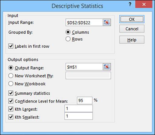
Figure 12.11 Use the Descriptive Statistics dialog box to select the options you want to use for the analysis.
4. Use the Output Options group to select a location for the output. For each set of data included in the input range, Excel creates a table that is 2 columns wide and up to 18 rows high.
5. Select the statistics you want to include in the output:
• Summary Statistics—Select this option to include statistics such as the mean, median, mode, and standard deviation.
• Confidence Level for Mean—Select this option if your data set is a sample of a larger population and you want Excel to calculate the confidence interval for the population mean. A confidence level of 95% means that you can be 95% confident that the population mean will fall within the confidence interval. For example, if the sample mean is 10 and Excel calculates a confidence interval of 1.5, you can be 95% sure that the population mean will fall between 8.5 and 11.5.
• Kth Largest—Select this option to add a row to the output that specifies the kth largest value in the sample. The default value for k is 1 (that is, the largest value), but if you want to see any other number, enter a value for k in the text box.
• Kth Smallest—Select this option to include the sample’s kth smallest value in the output. Again, if you want k to be something other than 1 (that is, the smallest value), enter a number in the text box.
6. Click OK. Excel calculates the various statistics and displays the output table. (See Figure 12.12 for an example.)
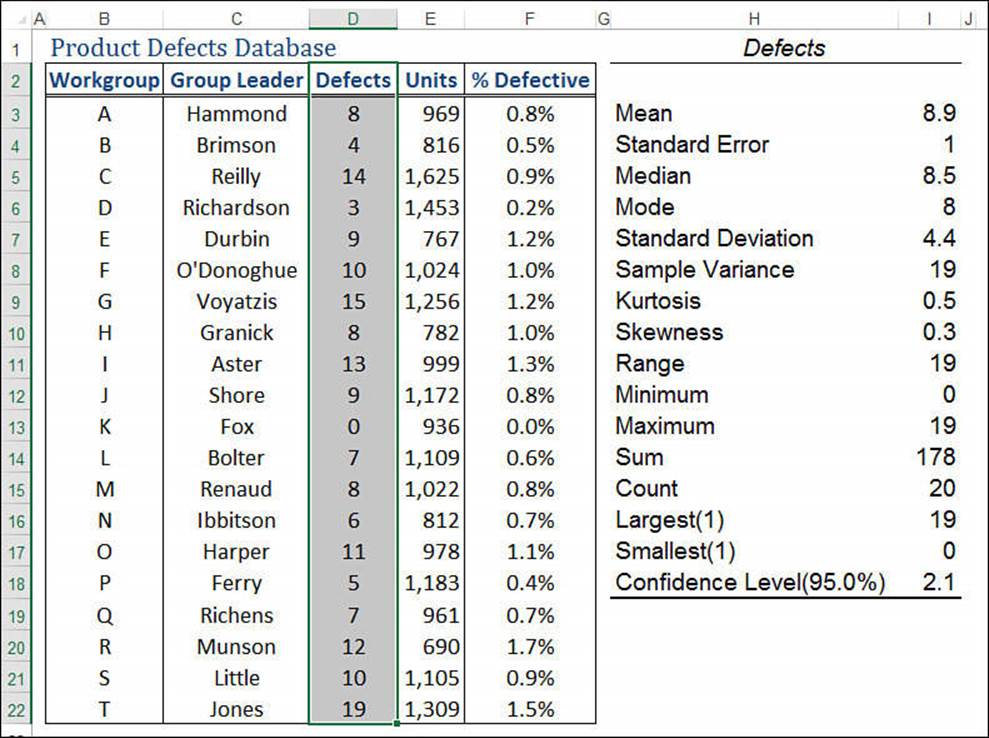
Figure 12.12 Use the Analysis ToolPak’s Descriptive Statistics tool to generate the most common statistical measures for a sample.
Determining the Correlation Between Data
Correlation is a measure of the relationship between two or more sets of data. For example, if you have monthly figures for advertising expenses and sales, you might wonder whether they’re related. That is, do higher advertising expenses lead to more sales?
To determine this, you need to calculate the correlation coefficient. The coefficient is a number between −1 and 1 that has the following properties:
To calculate the correlation between data sets, follow these steps:
1. Select Data, Data Analysis to display the Data Analysis dialog box.
2. Select the Correlation tool and then click OK. The Correlation dialog box, shown in Figure 12.13, appears.
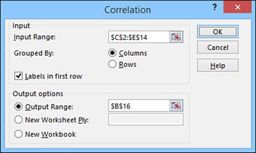
Figure 12.13 Use the Correlation dialog box to set up the correlation analysis.
3. Use the Input Range box to select the data range you want to analyze, including the row or column headings.
4. If you included labels in your range, select the Labels in First Row check box. (If your data is arranged in rows, this check box reads Labels in First Column.)
5. Because Excel displays the correlation coefficients in a table, use the Output Range box to enter a reference to the upper-left corner of the table. (If you’re comparing two sets of data, the output range is three columns wide by three rows high.) You also can select a different sheet or workbook.
6. Click OK. Excel calculates the correlation and displays the table.
Figure 12.14 shows a worksheet that compares advertising expenses with sales. For a control, I’ve also included a column of random numbers (labeled Tea in China). The Correlation table lists the various correlation coefficients. In this case, the high correlation between advertising and sales (0.74) means that these two factors are strongly (and positively) correlated. As you can see, there is (as you might expect) almost no correlation among advertising, sales data, and the random numbers.
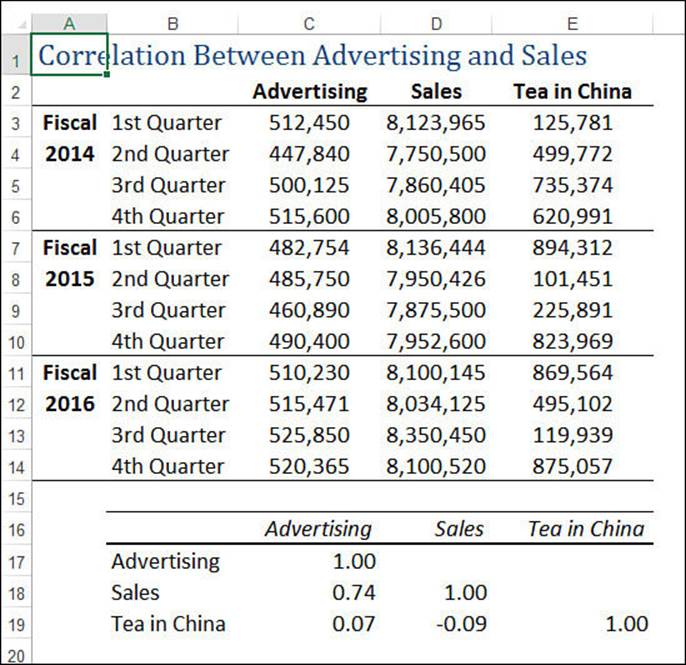
Figure 12.14 The correlation among advertising expenses, sales, and a set of randomly generated numbers.
Note
The 1.00 values that run diagonally through the Correlation table signify that any set of data is always perfectly correlated to itself.
To calculate a correlation without going through the Correlation dialog box, use the CORREL(array1, array2) function. This function returns the correlation coefficient for the data in the two ranges given by array1 and array2. (You can use references, range names, numbers, or an array for the function arguments.)
Working with Histograms
The Analysis ToolPak’s Histogram tool calculates the frequency distribution of a range of data. It also calculates cumulative frequencies for your data and produces a bar chart that shows the distribution graphically.
Before you use the Histogram tool, you need to decide which groupings (or bins) you want Excel to use for the output. These bins are numeric ranges, and the Histogram tool works by counting the number of observations that fall into each bin. You enter the bins as a range of numbers, where each number defines a boundary of the bin.
For example, Figure 12.15 shows a worksheet with two ranges. One is a list of student grades. The second range is the bin range. For each number in the bin range, Histogram counts the number of observations that are greater than or equal to the bin value and less than (but not equal to) the next higher bin value. Therefore, in Figure 12.15, the six bin values correspond to the following ranges:
0 <= Grade < 50
50 <= Grade < 60
60 <= Grade < 70
70 <= Grade < 80
80 <= Grade < 90
90 <= Grade < 100
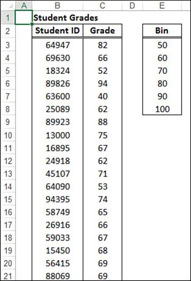
Figure 12.15 A worksheet set up to use the Histogram tool. Notice that you have to enter the bin range in ascending order.
Caution
For an accurate result, make sure you enter your bin values in ascending order.
Follow these steps to use the Histogram tool:
1. Select Data, Data Analysis to display the Data Analysis dialog box.
2. Select the Histogram tool and then click OK. Excel displays the Histogram dialog box. Figure 12.16 shows the dialog box already filled in.
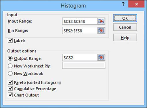
Figure 12.16 Use the Histogram dialog box to select the options you want to use for the histogram analysis.
3. Use the Input Range and Bin Range text boxes to enter the ranges holding your data and bin values, respectively.
4. Use the Output Options group to select a location for the output. The output range will be one row taller than the bin range, and it could be up to six columns wide (depending on which of the following options you select).
5. Select the other options you want to use for the frequency distribution:
• Pareto—If you select this check box, Excel displays a second output range with the bins sorted in order of descending frequency. (This is called a Pareto distribution.)
• Cumulative Percentage—If you select this option, Excel adds a new column to the output that tracks the cumulative percentage for each bin.
• Chart Output—If you select this option, Excel automatically generates a chart for the frequency distribution.
6. Click OK. Excel displays a histogram and its data, as shown in Figure 12.17.
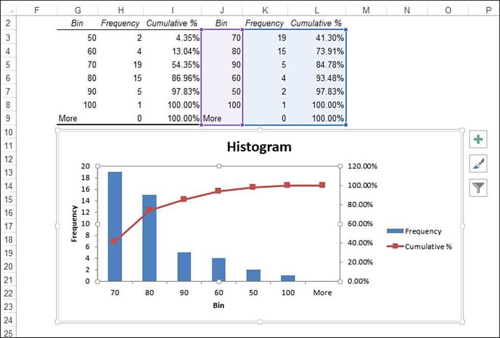
Figure 12.17 The output of the Histogram tool.
Using the Random Number Generation Tool
Unlike the RAND() function, which generates real numbers only between 0 and 1, the Analysis ToolPak’s Random Number Generation tool can produce numbers in any range and can generate different distributions, depending on the application. Table 12.2 summarizes the seven available distribution types.
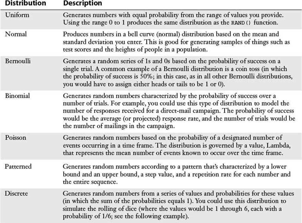
Table 12.2 The Distributions Available with the Random Number Generation Tool
The following steps show how to use the Random Number Generation tool:
Note
If you’ll be using a discrete distribution, be sure to enter the appropriate values and probabilities before starting the Random Number Generation tool.
1. Select Data, Data Analysis to display the Data Analysis dialog box.
2. Select the Random Number Generation tool and then click OK. The Random Number Generation dialog box appears, as shown in Figure 12.18.
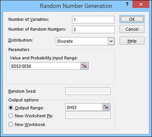
Figure 12.18 Use the Random Number Generation dialog box to set up the options for your random numbers.
3. If you want to generate more than one set of random numbers, enter the number of sets (or variables) you need in the Number of Variables box. Excel enters each set in a separate column. If you leave this box blank, Excel uses the number of columns in the Output Range.
4. Use the Number of Random Numbers text box to enter how many random numbers you need. Excel enters each number in a separate row. If you leave this box blank, Excel fills the Output Range.
5. Use the Distribution drop-down list to select the distribution you want to use.
6. In the Parameters group, enter the parameters for the distribution you selected. (The options you see depend on the selected distribution.)
7. Use the Random Seed box to specify the value Excel should use to generate the random numbers. If you leave this box blank, Excel generates a different set each time. If you enter a value (which must be an integer between 1 and 32,767), you can reuse the value later to reproduce the same set of numbers.
8. Use the Output Options group to select a location for the output.
9. Click OK. Excel calculates the random numbers and displays them in the worksheet.
As an example, Figure 12.19 shows a worksheet that is set up to simulate rolling two dice. The Probabilities box shows the values (the numbers 1 through 6) and their probabilities (=1/6 for each). A discrete distribution is used to generate the two numbers in cells H3 and H4. The discrete distribution’s Value and Probability Input Range parameter is the range $D$3:$E$8. Figure 12.20 shows the formulas used to display Die #1 and Die #2. (Notice that the formulas for Die #2 are similar to those for Die #1, except that $H$3 is replaced with $H$4.)
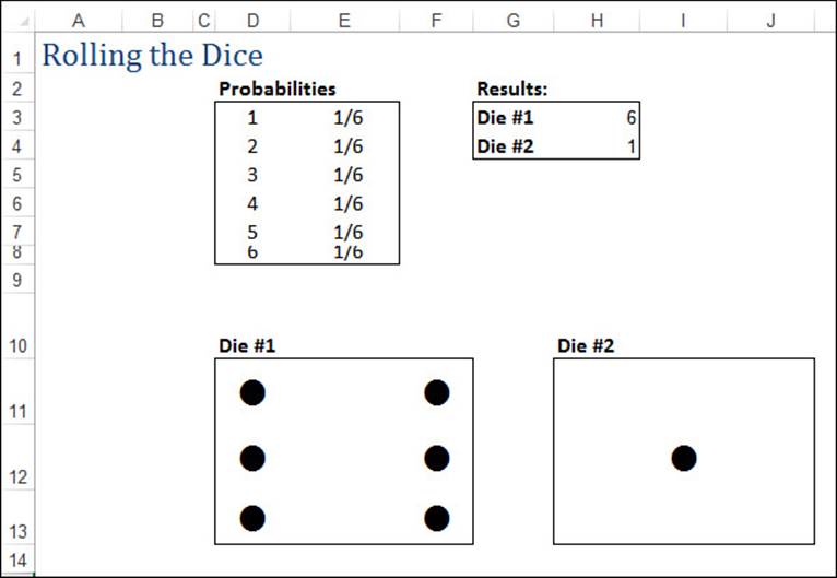
Figure 12.19 A worksheet that simulates the rolling of a pair of dice.
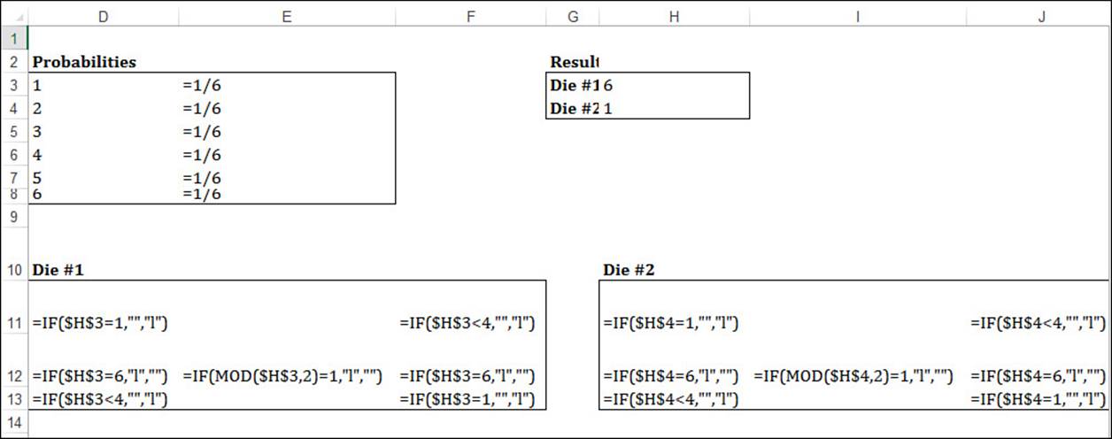
Figure 12.20 The formulas used to display Die #1 and Die #2.
Note
The die markers in Figure 12.19 were generated using a 24-point Wingdings font.
Working with Rank and Percentile
If you need to rank data, use the Analysis ToolPak’s Rank and Percentile tool. This command not only ranks your data from first to last but also calculates the percentile—the percentage of items in the sample that are at the same level or a lower level than a given value. Follow these steps to use the Rank and Percentile tool:
1. Select Data, Data Analysis to display the Data Analysis dialog box.
2. Select the Rank and Percentile tool and then click OK. Excel displays the Rank and Percentile dialog box, shown in Figure 12.21.
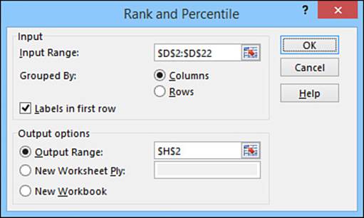
Figure 12.21 Use the Rank and Percentile dialog box to select the options you want to use for the analysis.
3. Use the Input Range text box to enter a reference for the data you want to rank.
4. Click the appropriate Grouped By option (Columns or Rows).
5. If you included row or column labels in your selection, select the Labels in First Row check box. (If your data is arranged in rows, the check box will read Labels in First Column.)
6. Use the Output Options group to select a location for the output. For each sample, Excel displays a table that is four columns wide and the same height as the number of values in the sample.
7. Click OK. Excel calculates the results and displays them in a table similar to the one shown in the range H2:K22 in Figure 12.22.
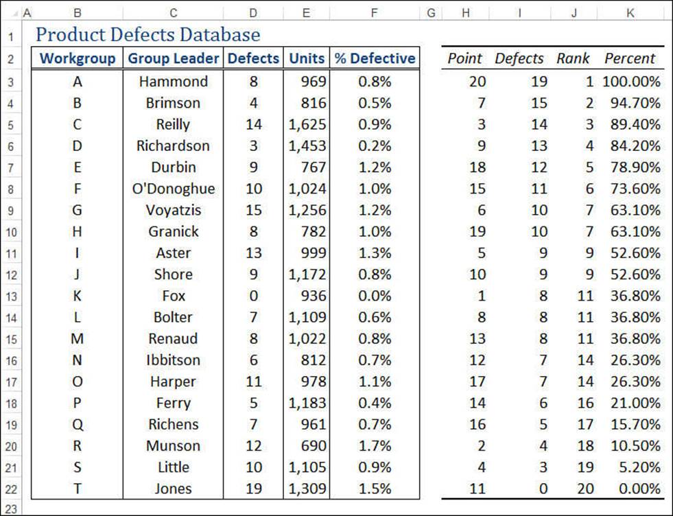
Figure 12.22 Sample output from the Rank and Percentile tool.
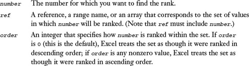
Note
Use the RANK.AVG(number,ref[,order]) and RANK.EQ(number,ref[,order]) functions to calculate the rank of a number in the range ref. If order is 0 or is omitted, Excel ranks number as though ref were sorted in descending order. If order is any nonzero value, Excel ranks number as though ref were sorted in ascending order.
For the percentile, use the PERCENTRANK.EXC(range, x, significance) or PERCENTRANK.INC(range, x, significance) function, where range is a range or an array of values, x is the value of which you want to know the percentile, and significance is the number of significant digits in the returned percentage. (The default is 3.)
From Here
![]() Many of the descriptive statistics functions are also available in a list (or database) version that enables you to apply criteria. See “Table Functions That Require a Criteria Range,” p. 313.
Many of the descriptive statistics functions are also available in a list (or database) version that enables you to apply criteria. See “Table Functions That Require a Criteria Range,” p. 313.
![]() Excel’s AVERAGEIF() function calculates the mean of the items in a range that meet your specified criteria. See “Using AVERAGEIF(),” p. 315.
Excel’s AVERAGEIF() function calculates the mean of the items in a range that meet your specified criteria. See “Using AVERAGEIF(),” p. 315.
![]() Excel’s COUNTIF() function counts the number of items in a range that meet your specified criteria. See “Using COUNTIF(),” p. 313.
Excel’s COUNTIF() function counts the number of items in a range that meet your specified criteria. See “Using COUNTIF(),” p. 313.
![]() Regression analysis is an important statistical method for business. To read all about it, see Chapter 16, “Using Regression to Track Trends and Make Forecasts,” p. 371.
Regression analysis is an important statistical method for business. To read all about it, see Chapter 16, “Using Regression to Track Trends and Make Forecasts,” p. 371.
All materials on the site are licensed Creative Commons Attribution-Sharealike 3.0 Unported CC BY-SA 3.0 & GNU Free Documentation License (GFDL)
If you are the copyright holder of any material contained on our site and intend to remove it, please contact our site administrator for approval.
© 2016-2026 All site design rights belong to S.Y.A.