Microsoft Excel 2016 Step by Step (2015)
Part 2: Analyze and present data
10. Create dynamic worksheets by using PivotTables
In this chapter
![]() Analyze data dynamically by using PivotTables
Analyze data dynamically by using PivotTables
![]() Filter, show, and hide PivotTable data
Filter, show, and hide PivotTable data
![]() Edit PivotTables
Edit PivotTables
![]() Format PivotTables
Format PivotTables
![]() Create PivotTables from external data
Create PivotTables from external data
![]() Create dynamic charts by using PivotCharts
Create dynamic charts by using PivotCharts
Practice files
For this chapter, use the practice files from the Excel2016SBS\Ch10 folder. For practice file download instructions, see the introduction.
When you create Excel 2016 worksheets, you must consider how you want the data to appear when you show it to your colleagues. You can change the formatting of your data to emphasize the contents of specific cells, sort and filter your worksheets based on the contents of specific columns, or hide rows containing data that isn’t relevant to the point you’re trying to make.
One limitation of the standard Excel worksheet is that you can’t easily change how the data is organized on the page. There is an Excel tool with which you can create worksheets that can be sorted, filtered, and rearranged dynamically to emphasize different aspects of your data. That tool is the PivotTable.
This chapter guides you through procedures related to creating and editing PivotTables from an existing worksheet, focusing your PivotTable data by using filters and Slicers, formatting PivotTables, creating a PivotTable with data imported from a text file, and summarizing your data visually by using a PivotChart.
Analyze data dynamically by using PivotTables
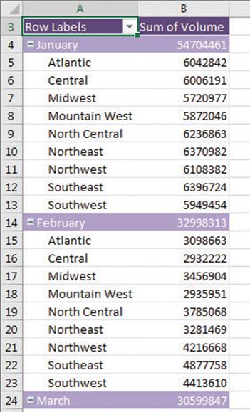
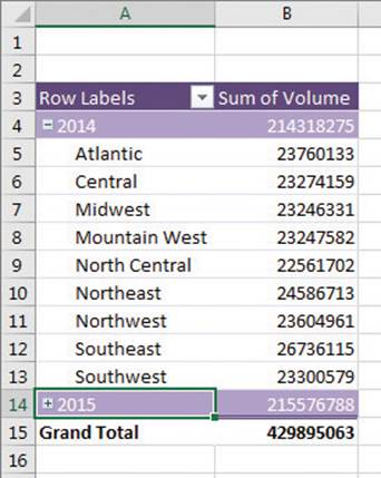
In Excel worksheets, you can gather and present important data, but the standard worksheet can’t be changed from its original configuration easily. As an example, consider a worksheet that records monthly package volumes for each of nine distribution centers in the United States.
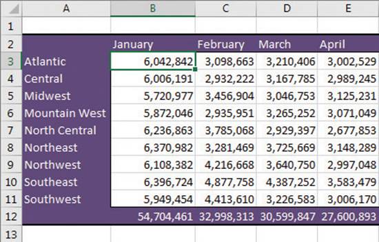
Static worksheets summarize data one way
The data in the worksheet is organized so that each row represents a distribution center and each column represents a month of the year.
Such a neutral presentation of your data is useful, but it has limitations. First, although you can use sorting and filtering to restrict the rows or columns shown, it’s difficult to change the worksheet’s organization. For example, in this worksheet, you can’t easily reorganize the contents of your worksheet so that the months are assigned to the rows and the distribution centers are assigned to the columns.
The Excel tool you can use to reorganize and redisplay your data dynamically is the PivotTable. In Excel 2016, you can quickly create a PivotTable from the Recommended PivotTables dialog box.
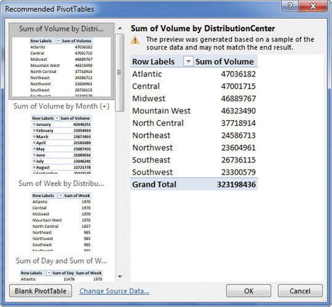
Excel analyzes your data and recommends PivotTable layouts
Pointing to a recommended PivotTable shows a preview of what that PivotTable would look like if you clicked that option, so you can view several possibilities before deciding which one to create.
![]() Tip
Tip
If Excel 2016 has no recommended PivotTables for your data, it gives you the option to create a blank PivotTable.
If none of the recommended PivotTables meet your needs, you can create a PivotTable by adding individual fields. For instance, you can create a PivotTable with the same layout as the worksheet described previously, which emphasizes totals by month, and then change the PivotTable layout to have the rows represent the months of the year and the columns represent the distribution centers. The new layout emphasizes the totals by regional distribution center.
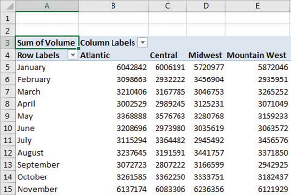
Reorganize your PivotTable by changing the order of fields
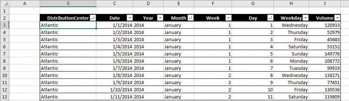
To create a PivotTable quickly, you must have your data collected in a list. Excel tables mesh perfectly with PivotTable dynamic views; Excel tables have a well-defined column and row structure, and the ability to refer to an Excel table by its name greatly simplifies PivotTable creation and management.
In an Excel table used to create a PivotTable, each row of the table should contain a value representing the attribute described by each column. Columns could include data on distribution centers, years, months, days, weekdays, and package volumes, for example. Excel needs that data when it creates the PivotTable so that it can maintain relationships among the data.
![]() Important
Important
It’s okay if some cells in the source data list or Excel table are blank, but the source shouldn’t contain any blank rows. If Excel encounters a blank row while creating a PivotTable, it stops looking for additional data.
Use an Excel table or list of data to create a PivotTable
After you identify the data you want to summarize, you can start creating your PivotTable.
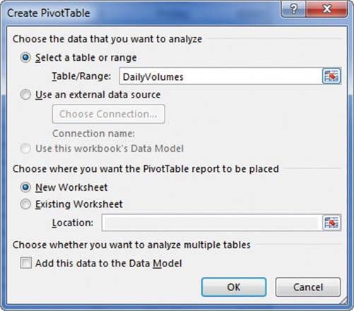
Verify the data source and target location of your PivotTable
In most cases, the best choice is to place your new PivotTable on its own worksheet to avoid cluttering the display. If you do want to put it on an existing worksheet, perhaps as part of a summary worksheet with multiple visualizations, you can do so.
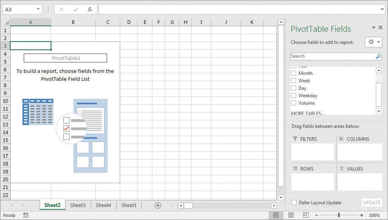
Add a blank PivotTable to a worksheet, then add data and organization
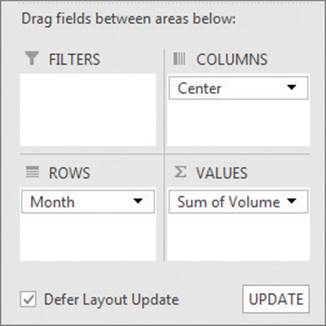
PivotTables have four areas where you can place fields: Rows, Columns, Values, and Filters. To define your PivotTable’s data structure, drag field names from the PivotTable field list to the four areas at the bottom of the PivotTable Fields task pane.
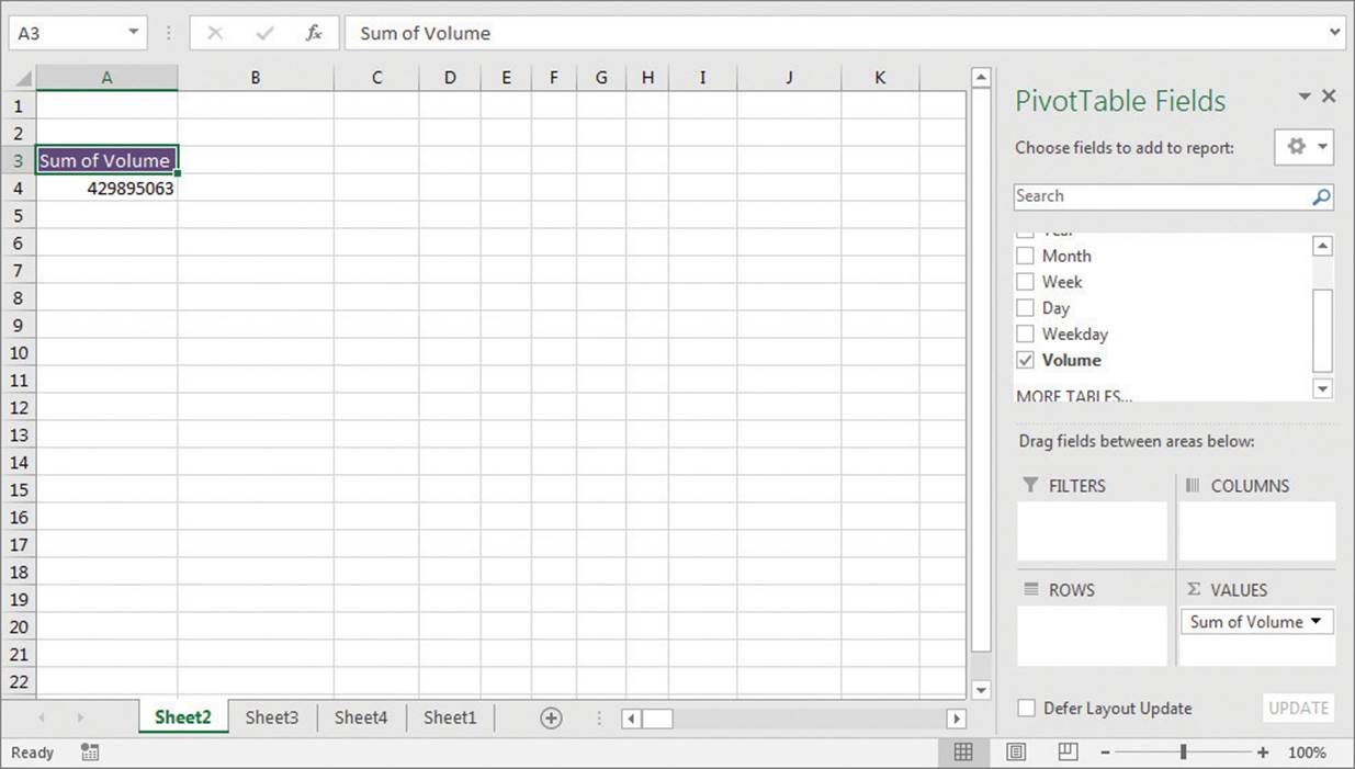
Adding a data field to the Values area summarizes all values in that field
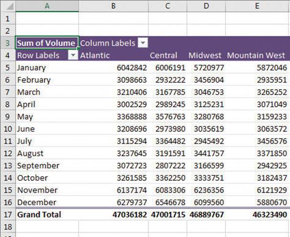
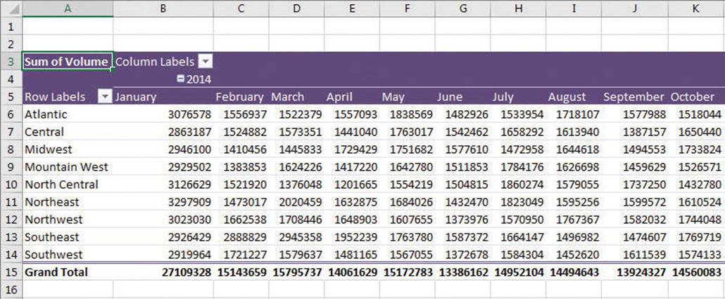
It’s important to note that the order in which you enter the fields in the Rows and Columns areas affects how Excel organizes the data in your PivotTable. As an example, consider a PivotTable that groups the PivotTable rows by distribution center and then by month.
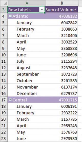
A PivotTable with package volume data arranged by distribution center and then by month
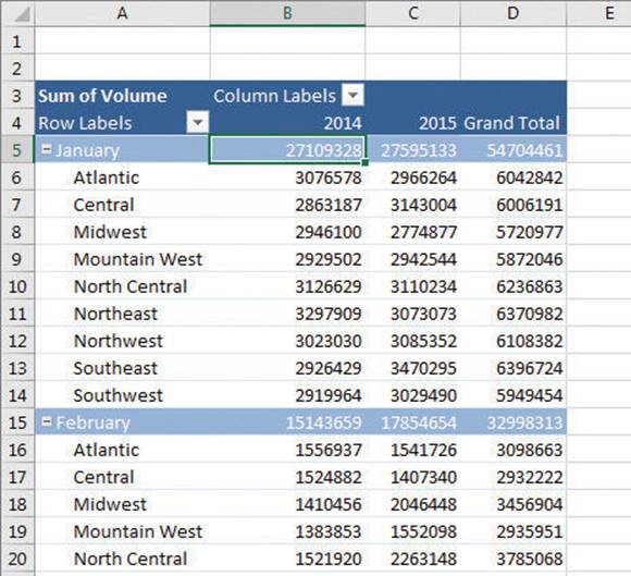
The same PivotTable data could also be organized by month and then by distribution center.
A PivotTable with package volume data arranged by month and then by distribution center
In the preceding examples, all the field headers are in the Rows area. If you drag the Distribution Center header from the Rows area to the Columns area in the PivotTable Fields pane, the PivotTable reorganizes (pivots) its data to form a different configuration.
A PivotTable arranged in cross-tabular format
If your data set is large or if you based your PivotTable on a data collection on another computer, it might take some time for Excel to reorganize the PivotTable after a pivot. You can have Excel delay redrawing the PivotTable until you’re ready for Excel to display the reorganized contents.
If you expect your PivotTable source data to change, such as when you link to an external database, you should ensure that your PivotTable summarizes all the available data. To do that, you can refresh the PivotTable connection to its data source. If Excel detects new data in the source table, it updates the PivotTable contents accordingly.
To organize your data for use in a PivotTable
1. Do either of the following:
• Create an Excel table.
• Create a data list that contains no blank rows or columns and has no extraneous data surrounding the list.
To create a recommended PivotTable
1. Click a cell in the Excel table or data list you want to summarize.
2. On the Insert tab of the ribbon, in the Tables group, click Recommended PivotTables.
3. In the Recommended PivotTables dialog box, click the recommended PivotTable you want to create.
4. Click OK to create the recommended PivotTable on a new worksheet.
To create a PivotTable
1. Click a cell in the Excel table or data list you want to summarize.
2. In the Tables group, click PivotTable.
3. In the Create PivotTable dialog box, verify that Excel has correctly identified the data source you want to use.
4. Click New Worksheet.
Or
Click Existing Worksheet, click in the Location box, and click the cell where you want the PivotTable to start.
5. Click OK.
To add fields to a PivotTable
1. If necessary, click a cell in the PivotTable and then, on the Analyze tool tab of the ribbon, in the Show group, click Field List to display the PivotTable Fields pane.
2. In the PivotTable Fields pane, drag a field header from the field list to the Data, Columns, Rows, or Filters area.
To remove a field from a PivotTable
1. In the PivotTable Fields pane, drag a field header from the Data, Columns, Rows, or Filters area to the field list.
To pivot a PivotTable
1. In the PivotTable Fields pane, drag a field header from the Data, Columns, Rows, or Filters area to another area.
To defer PivotTable updates
1. In the PivotTable Fields pane, select the Defer Layout Update check box.
Defer PivotTable updates that might take a while to execute
2. When you want to update your PivotTable, click Update.
3. To turn updating back on, clear the Defer Layout Update check box.
Filter, show, and hide PivotTable data
PivotTables often summarize huge data sets in a relatively small worksheet. The more details you can capture and write to a table, the more flexibility you have in analyzing the data. As an example, consider all the details captured in a table in which each row contains a value representing the distribution center, date, month, week, weekday, day, and volume for every day of the year. You could filter this data to only display values for Mondays.
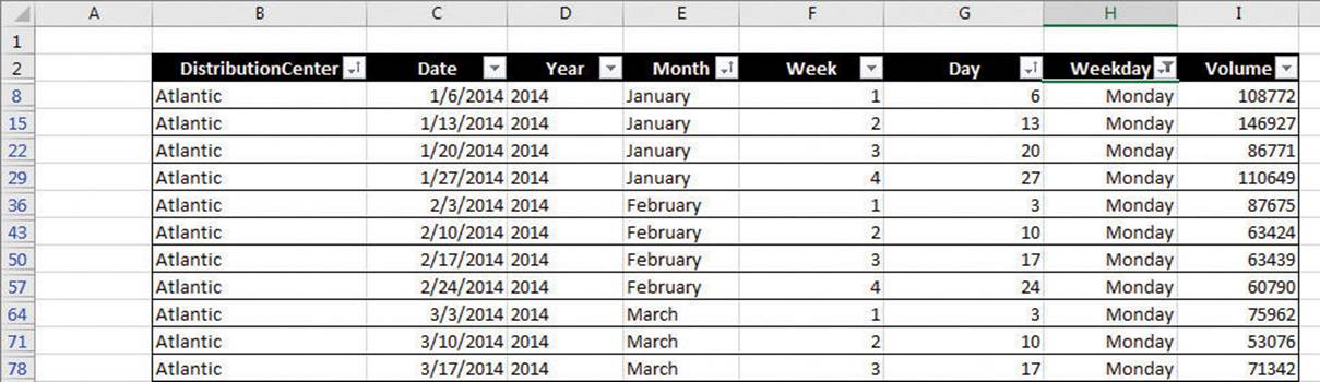
Filter Excel tables to focus on relevant data
Each column, in turn, contains numerous values: there are nine distribution centers, data from two years, 12 months in a year, seven weekdays, and as many as five weeks and 31 days in a month. Just as you can filter the data that appears in an Excel table or other data collection, you can filter the data displayed in a PivotTable by selecting which values you want the PivotTable to include.
Filter a PivotTable by clicking a filter arrow
![]() See Also
See Also
For more information about filtering an Excel table, see “Limit data that appears on your screen” in Chapter 5, “Manage worksheet data.”
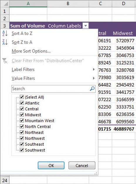
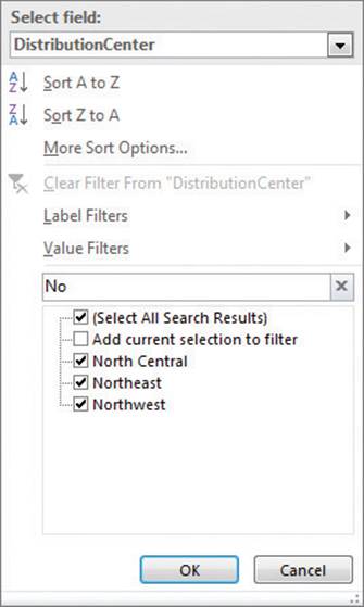
Clicking the column header in the PivotTable displays several sorting options, commands for different categories of filters, and a list of items that appear in the field you want to filter. Every list item has a check box next to it. Items whose check boxes are selected are currently displayed in the PivotTable, and items whose check boxes are cleared are hidden.
The first entry at the top of the item list is the Select All check box. The Select All check box can have one of three states: displaying a check mark (selected), displaying a black square, or cleared. If the Select All check box contains a check mark, the PivotTable displays every item in the list. If the Select All check box is cleared, no filter items are selected. Finally, if the Select All check box contains a black square, it means that some, but not all, of the items in the list are displayed. Selecting only the Northwest check box, for example, leads to a PivotTable configuration in which only the data for the Northwest center is displayed.
Limit data by using selection filters
If you’d rather display PivotTable data on the entire worksheet, you can hide the PivotTable Fields pane and filter the PivotTable by using the filter arrows on the Row Labels and Column Labels headers within the body of the PivotTable. Excel indicates that a PivotTable has filters applied by placing a filter indicator next to the Column Labels or Row Labels header, as appropriate, and next to the filtered field name in the PivotTable Fields task pane.
So far, all the fields by which we’ve talked about filtering the PivotTable will change the organization of the data in the PivotTable. Adding some fields to a PivotTable, however, might create unwanted complexity. For example, you might want to filter a PivotTable by month, but adding the Month field to the body of the PivotTable expands the table unnecessarily.
Adding multiple fields to an area expands PivotTables substantially
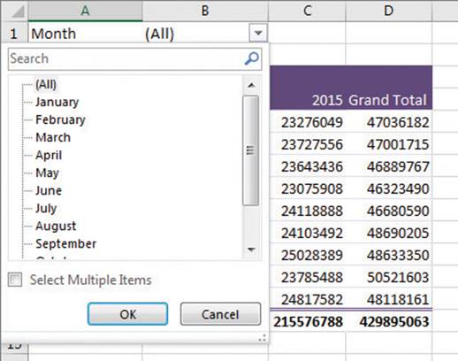
Instead of adding the Month field to the Rows or Columns area, adding the field to the Filters area leaves the body of the PivotTable unchanged, but adds a new filter control above the PivotTable in its worksheet. When you click the filter arrow of a field in the Filters area, Excel displays a list of the values in the field. You can choose to filter based on one or more values.
Add a field to the Filter area to filter a PivotTable without changing its organization
![]() Tip
Tip
In Excel 2003 and earlier versions, the Filter area was called the Page Field area.
If your PivotTable has more than one field in the Rows area of the PivotTable Fields pane, you can filter values in a PivotTable by hiding and collapsing levels of detail within the report. To do that, you click the Hide Detail control (which looks like a box with a minus sign in it) or the Show Detail control (which looks like a box with a plus sign in it) next to a header.
Summarize levels of data by using the Show Detail and Hide Detail controls
![]() Tip
Tip
If a PivotTable area, such as Rows or Columns, contains more than one field, you can select the field by which to filter by clicking the Select Field arrow and clicking the field you want.
Excel 2016 provides two other ways for you to filter PivotTables: search filters and Slicers. By using a search filter, you can enter a series of characters for Excel to use to filter that field’s values.
Filter a PivotTable field by using a search filter
![]() Tip
Tip
Search filters look for the character string you specify anywhere within a field’s value, not just at the start of the value. In the previous example, the search filter string “cen” would return both Central and North Central.
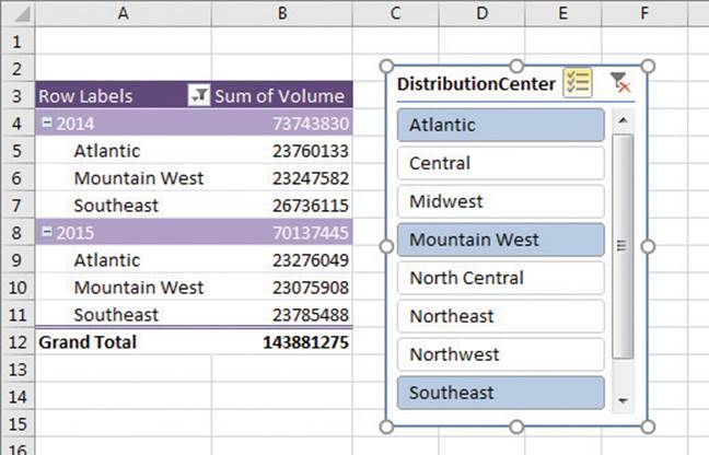
In versions of Excel prior to Excel 2013, the only visual indication that you had applied a filter to a field was the indicator added to a field’s filter arrow. The indicator told users that there was an active filter applied to that field but provided no information on which values were displayed and which were hidden. In Excel 2016, Slicers provide a visual indication of which items are currently displayed or hidden in a PivotTable.
When you’re ready to create a Slicer, you display the Insert Slicers dialog box and select the data you want to filter.
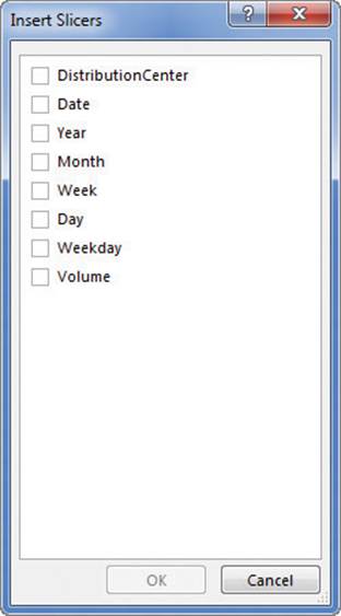
Select fields for which you want to display a Slicer
After you make your selections, Excel displays a Slicer for each field you identified.
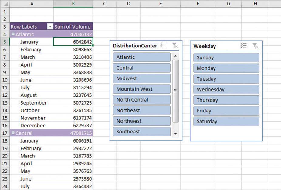
Slicers provide visually summarized values affected by filters
![]() Tip
Tip
If you have already applied a filter to the field for which you display a Slicer, the Slicer reflects the filter’s result.
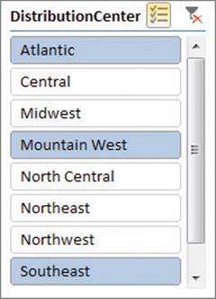
A Slicer displays the values within the PivotTable field you identified. Any value displayed in color (or gray if you have a gray-and-white color scheme) appears within the PivotTable. Values displayed in light gray or white do not appear in the PivotTable.
Clicking an item in a Slicer changes that item’s state—if a value is currently displayed in a PivotTable, clicking it hides it. If it’s hidden, clicking its value in the Slicer displays it in the PivotTable. As with other objects in an Excel 2016 workbook, you can use the Shift and Ctrl keys to help define your selections.
Clicking a value creates a filter that limits the data displayed to only that value, and clicking a selected value removes it from the filter. If you want to display values related to multiple items in the Slicer, click the Multi-Select button on the Slicer’s title bar.
Select multiple items in a Slicer by using Multi-Select
Now when you click additional items, Excel adds them to the Slicer instead of replacing the original selection. You can also select multiple values by holding down the Ctrl key and clicking individual values, or by holding down the Shift key and clicking two values in sequence, which selects the two values you clicked and all values between them.
Slicers provide a visual reference for filtered fields
As with other drawing objects in Excel, you can move and resize the Slicer as needed. When you’re done filtering values, you can clear the Slicer filter and get rid of the Slicer entirely.
![]() Tip
Tip
You can change a Slicer’s formatting by clicking the Slicer and then, on the Slicer Tools Options tool tab on the ribbon, clicking a style in the Slicer Styles gallery.
To filter a PivotTable by using the values in a field
1. In the body of a PivotTable, click the filter arrow at the right edge of a field header.
2. Use the controls in the filter list to create your filter.
3. Click OK.
To hide the PivotTable Fields pane
1. Click the Close button in the upper-right corner of the PivotTable Fields pane.
Or
1. Click a cell in the body of the PivotTable.
2. On the Analyze tool tab of the ribbon, in the Show group, click the Field List button.
To show the PivotTable Fields task pane
1. Click a cell in the body of the PivotTable.
2. Click the Field List button.
To filter a PivotTable by using a field in the Filters area of the PivotTable Fields pane
1. Display the PivotTable Fields pane.
2. Drag a field to the Filters area.
3. In the Filter area of the PivotTable, click the field’s filter arrow.
4. Click the value by which you want to filter.
Or
Select the Select Multiple Items check box and select the check boxes next to the items you want to appear in the PivotTable.
To hide a level of detail in a PivotTable
1. Click the Hide Detail control next to a PivotTable field’s row header.
To show a level of detail in a PivotTable
1. Click the Show Detail control next to a PivotTable field header.
To add a Slicer to your workbook
1. Click a cell in the body of the PivotTable.
2. On the Analyze tool tab, in the Filter group, click the Insert Slicer button.
3. In the Insert Slicers dialog box, select the check box next to the field for which you want to create a Slicer.
4. Click OK.
To select multiple values in a Slicer filter
1. On the Slicer title bar, click the Multi-Select button.
2. Click the values you want to appear in the PivotTable.
To filter a field by using a Slicer
1. In the body of the Slicer, do any of the following:
• Click the single value you want to display.
• Hold down the Ctrl key and click the values you want to display.
• Hold down the Shift key and click two values to display those values and all values between them.
To clear the filter in a Slicer
1. On the Slicer title bar, click the Clear Filter button.
To change the appearance of a Slicer
1. Right-click the Slicer’s title bar and then click Size and Properties.
2. Use the settings in the Format Slicer pane to change the Slicer’s appearance.
3. Click the pane’s Close button to close it and apply the changes.
To remove a Slicer
1. Right-click the Slicer and then click Remove field.
Edit PivotTables
After you create a PivotTable, you can rename it, edit it to control how it summarizes your data, and use the PivotTable cell data in a formula. As an example, consider a PivotTable named PivotTable1 that summarizes package volume data.
PivotTables summarize large data sets in a compact format
Excel assigns the PivotTable a name, such as PivotTable1, when you create it. Of course, the name PivotTable1 doesn’t help you or your colleagues understand the data the PivotTable contains, particularly if you use the PivotTable data in a formula on another worksheet. You can provide more information about your PivotTable and the data it contains by changing its name to something more descriptive.
When you create a PivotTable with at least one field in the Rows area and one field in the Columns area of the PivotTable Fields pane, Excel adds a grand total row and column to summarize your data. You can control which totals and subtotals appear, and where they appear, to best suit your data and analysis goals.
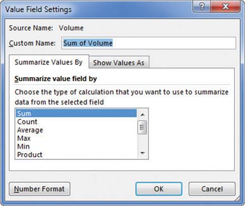
After you create a PivotTable, Excel determines the best way to summarize the data in the column you assign to the Values area. For numeric data, for example, Excel uses the SUM function, but you can change the function used to summarize your data.
Control how your PivotTable summarizes your values
You can also change how the PivotTable displays the data in the Values area. Some of those methods include displaying each value as a percentage of the grand total, row total, or column total, or as a running total.
You can change how Excel summarizes values in the body of a PivotTable
If you want, you can create a formula that incorporates a value from a PivotTable cell. When you get to a point in your formula where you want to use PivotTable data, click the cell that contains the value you want to include in the formula. When you do, a GETPIVOTDATA formula appears in the formula bar of the worksheet that contains the PivotTable. When you press the Enter key, Excel creates the GETPIVOTDATA formula and displays the contents of the PivotTable cell in the target cell.
To rename a PivotTable
1. Click any cell in the body of the PivotTable.
2. On the Analyze tool tab, in the PivotTable group, click in the PivotTable Name box.
3. Enter a new name for the PivotTable, and press the Enter key.
To show or hide PivotTable subtotals
1. Click any cell in the body of the PivotTable.
2. On the Design tool tab of the ribbon, in the Layout group, click the Subtotals button.
3. In the list, click any of the following items:
• Do Not Show Subtotals
• Show all Subtotals at Bottom of Group
• Show all Subtotals at Top of Group
To show or hide PivotTable grand totals
1. Click any cell in the body of the PivotTable.
2. In the Layout group, click the Grand Totals button.
3. In the list, click any of the following items:
• Off for Rows and Columns
• On for Rows and Columns
• On for Rows Only
• On for Columns Only
To change the summary operation for the Values area
1. Click any cell in the body of the PivotTable that contains data.
2. On the Analyze tool tab, in the Active Field group, click Field Settings.
3. In the Value Field Settings dialog box, on the Summarize Values By tab, click the operation you want to use to summarize your PivotTable data.
4. Click OK.
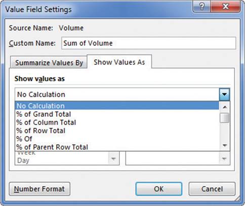
To change how Excel displays data in the Values area
1. Click any cell in the body of the PivotTable that contains data.
2. In the Value Field Settings dialog box, on the Show Values As tab, click the Shows values as arrow.
3. Click the calculation you want to use.
4. If necessary, in the Base item list, click the value you want to base your calculation on.
5. Click OK.
To use PivotTable data in a formula
1. Start entering a formula in a cell.
2. When you want to use data from a PivotTable cell in your formula, click the PivotTable cell that contains the data you want to use.
3. Complete the formula and press Enter.
Format PivotTables
PivotTables are the ideal tools for summarizing and examining large data tables, even those containing more than 10,000 or even 100,000 rows. Although PivotTables often end up as compact summaries, you should do everything you can to make your data more comprehensible. One way to improve your data’s readability is to apply a number format to the PivotTable Values field.
![]() See Also
See Also
For more information about selecting and defining cell formats by using the Format Cells dialog box, see “Format cells” in Chapter 4, “Change workbook appearance.”
Analysts often use PivotTables to summarize and examine organizational data for the purpose of making important decisions about the company. Excel extends the capabilities of your PivotTables by enabling you to apply a conditional format to the PivotTable cells. Additionally, you can select whether to apply the conditional format to every cell in the Values area, to every cell at the same level as the selected cell (that is, a regular data cell, a subtotal cell, or a grand total cell), or to every cell that contains or draws its values from the selected cell’s field.
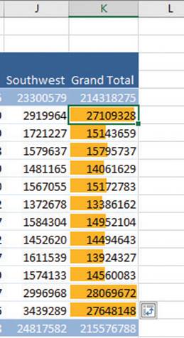
Summarize values visually by adding a conditional format
When you apply a conditional format to a PivotTable, Excel displays a Formatting Options action button, which offers three options for applying the conditional format:
![]() Selected Cells Applies the conditional format to the selected cells only
Selected Cells Applies the conditional format to the selected cells only
![]() All Cells Showing Sum of field_name Values Applies the conditional format to every cell in the body of the PivotTable that contains data, regardless of whether the cell is in the data area, a subtotal row or column, or a grand total row or column
All Cells Showing Sum of field_name Values Applies the conditional format to every cell in the body of the PivotTable that contains data, regardless of whether the cell is in the data area, a subtotal row or column, or a grand total row or column
![]() All Cells Showing Sum of field_name Values for Fields Applies the conditional format to every cell at the same level (for example, data cell, subtotal, or grand total) as the selected cells
All Cells Showing Sum of field_name Values for Fields Applies the conditional format to every cell at the same level (for example, data cell, subtotal, or grand total) as the selected cells
![]() See Also
See Also
For more information about creating conditional formats, see “Change the appearance of data based on its value” in Chapter 4, “Change workbook appearance.”
In Excel, you can take full advantage of the Microsoft Office system enhanced formatting capabilities to apply existing formats to your PivotTables. Just as you can create Excel table formats, you can also create your own PivotTable formats to match your organization’s preferred color scheme. After you give the new style a name, you can format each element of PivotTables to which you apply the style.
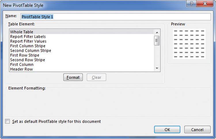
Define custom styles by using the New PivotTable Style dialog box
The Design tool tab contains many other tools you can use to format your PivotTable, but one of the most useful is the Banded Columns check box. If you select a PivotTable style that offers banded rows as an option, selecting the Banded Rows check box turns banding on. If you prefer not to have Excel band the rows in your PivotTable, clearing the check box turns banding off.
To apply a number format to PivotTable data
1. Click any data cell in the body of the PivotTable.
2. On the Analyze tool tab, in the Active Field group, click Field Settings.
3. In the Value Field Settings dialog box, click the Number Format button.
4. Use the tools on the Number tab of the Format Cells dialog box to define a number format for your PivotTable data field.
5. Click OK to close the Format Cells dialog box, and again to close the Value Field Settings dialog box.
To apply a conditional format to a PivotTable
1. Click any data cell in the body of the PivotTable.
2. On the Home tab of the ribbon, in the Styles group, click the Conditional Formatting button, and define the conditional format you want to apply.
3. Next to the cell you selected, click the Formatting Options action button.
4. Do any of the following:
• Click Selected Cells to only apply the conditional format to the cell you clicked before creating the format.
• Click All cells showing “Summary of Field” values to format all data cells, including subtotals and grand totals.
• Click All cells showing “Sum of field” values for “Field1” and “Field2” to format all data cells that are not subtotals or grand totals.
To apply an existing PivotTable style
1. Click any cell in the PivotTable.
2. On the Design tool tab, in the PivotTable Styles group, click the style you want to apply.
To create a new PivotTable style
1. Click any cell in the PivotTable.
2. In the PivotTable Styles group, click the More button (which looks like a downward-pointing black triangle) in the lower-right corner of the PivotTable Styles gallery.
3. Click New PivotTable Style.
4. In the New PivotTable Style dialog box, click in the Name box and enter a name for the new PivotTable Style.
5. In the Table Element list, click the element for which you want to define a format.
6. Click the Format button.
7. Define a format for the selected element by using the settings in the Format Cells dialog box.
8. Click OK.
9. Repeat steps 5 through 8 to define formats for other PivotTable elements.
10. Click OK to close the New PivotTable Style dialog box and apply the style.
To apply banded rows to a PivotTable
1. Click any cell in the body of a PivotTable.
2. If necessary, apply a PivotTable Style that includes banded rows.
3. On the Design tool tab, in the PivotTable Style Options group, select the Banded Rows check box.
Create PivotTables from external data
Although most of the time you will create PivotTables from data stored in Excel worksheets, you can also bring data from outside sources into Excel. For example, you might need to work with data created in another spreadsheet program with a file format that Excel can’t read directly. Fortunately, you can export the data from the original program into a text file, which Excel then translates into a worksheet.
![]() Tip
Tip
The data import technique shown here isn’t exclusive to PivotTables. You can use this procedure to bring data into your worksheets for any purpose.
Spreadsheet programs store data in cells, so the goal of representing spreadsheet data in a text file is to indicate where the contents of one cell end and those of the next cell begin. The character that marks the end of a cell is a delimiter, in that it marks the end (or “limit”) of a cell. The most common cell delimiter is the comma, so the delimited sequence 15, 18, 24, 28 represents data in four cells. The problem with using commas to delimit financial data is that larger values—such as 52,802—can be written by using commas as thousands markers. To avoid confusion when importing a text file, some financial data programs export their data by using the tab character as a delimiter.
![]() Tip
Tip
You can open files in which the values are separated by commas, called comma-separated value files, directly into Excel. These files often have .csv extensions.
To start importing data from a text file, you identify the file that contains the data you want to work with.
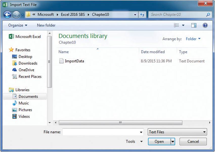
Identify the file you want to import in the Import Text File dialog box
After you identify the file that holds the data you want to import, Excel launches the Text Import wizard.
Identify whether the data file has delimited or fixed-width fields
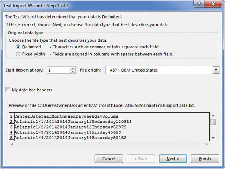
On the first page of the Text Import Wizard, you can indicate whether the data file you are importing is delimited or fixed-width; fixed-width means that each cell value will fall within a specific position in the file. After you choose the proper setting, which with contemporary data programs will almost always be Delimited, you can move to the next page of the wizard.
Identify the delimiter character and verify that your data appears to be separated correctly
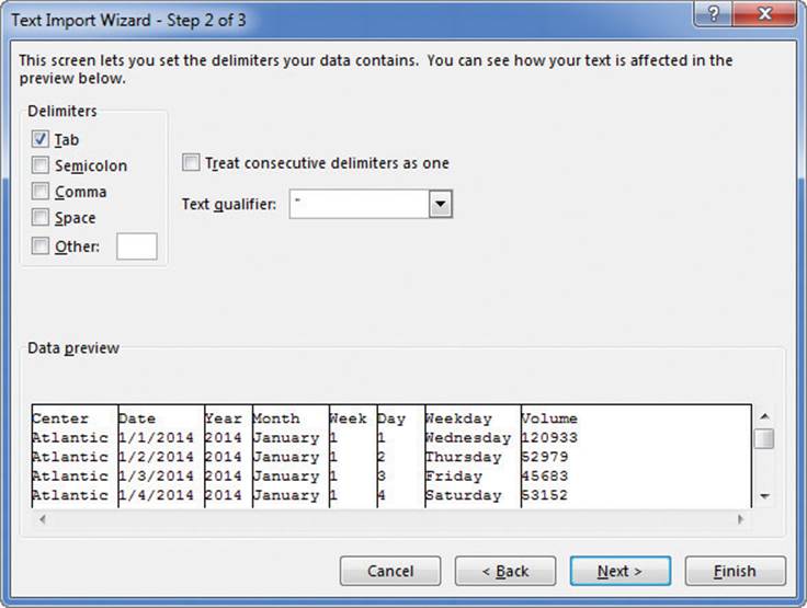
On the second page, you can choose the delimiter for the file (for example, if Excel detected tabs in the file, it will select the Tab check box for you) and view a preview of what the text file will look like when imported. Clicking Next advances you to the final wizard page.
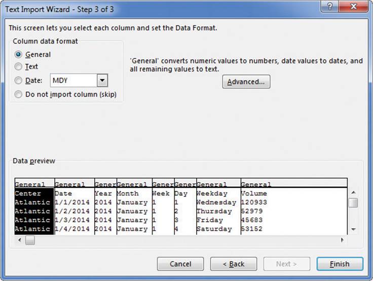
You can identify the data types for your text file’s columns
On this page, you can change the data type and formatting of the columns in your data. Because you’ll assign formatting after you create the PivotTable, you can click Finish to import the data into your worksheet. After the data is in Excel, you can work with it normally.
To import data from a text file
1. Display the worksheet where you want the imported data to appear.
2. On the Data tab, in the Get External Data group, click From Text.
3. In the Import Text File dialog box, navigate to the folder that contains the file you want to import, click the file, and then click Import.
4. On the first page of the Text Import Wizard, verify that Delimited is selected, and then click Next.
5. On the second page of the Text Import Wizard, select the check box next to the file’s delimiter character, and then click Next.
6. If you want to identify data formats for individual columns, click the column in the Data preview area, and then use the options in the Column data format section of the wizard to set options for the column.
7. If necessary, repeat step 6 for additional columns.
8. Click Finish.
9. Using the tools in the Import Data dialog box, select a destination for the imported data, and then click OK.
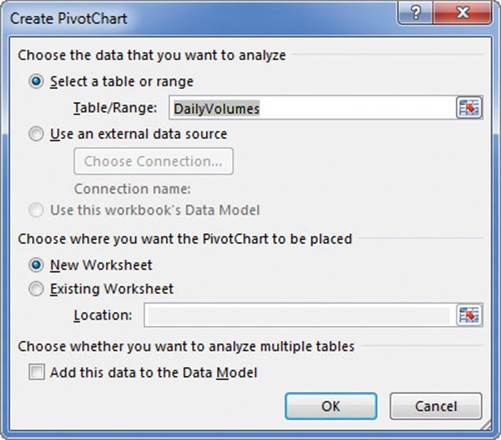
To create a PivotTable from imported data
1. Click a cell in the imported data list.
2. On the Insert tab, in the Tables group, click PivotTable.
3. In the Create PivotTable dialog box, verify that Excel has correctly identified the data source you want to use.
4. Select the New Worksheet option button.
Or
Select the Existing Worksheet option button, click in the Location box, and click the cell where you want to the PivotTable to start.
5. Click OK.
Create dynamic charts by using PivotCharts
Just as you can create a PivotTable that you can reorganize whenever you want, to emphasize different aspects of the data in a list, you can also create a dynamic chart, or PivotChart, to reflect the contents and organization of a PivotTable.
Define a PivotChart in the Create PivotChart dialog box
You can create a PivotTable and its associated PivotChart at the same time, or you can create a PivotChart from an existing PivotTable. If you create the PivotTable and PivotChart at the same time, blank outlines for each appear in your worksheet.
Creating a PivotChart also creates a PivotTable
Any changes to the PivotTable on which the PivotChart is based are reflected in the PivotChart. For example, applying a PivotTable filter that limits the data displayed to values for the year 2014 focuses the chart on that data.
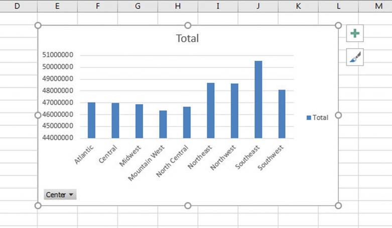
Summarize your data visually by using a PivotChart
You can also filter a PivotChart by using tools available in the body of the PivotChart, or change the PivotChart’s chart type to represent your data differently.
![]() Important
Important
If your data is the wrong type to be represented by the chart type you select, Excel displays an error message.
To create a PivotTable and PivotChart at the same time
1. Click a cell in the Excel table or data list you want to summarize.
2. On the Insert tab, in the Charts group, click the PivotChart arrow.
3. In the PivotChart list, click PivotChart & PivotTable.
4. In the Create PivotTable dialog box, verify that Excel has correctly identified the data source you want to use.
5. Select the New Worksheet option button.
Or
Select the Existing Worksheet option button, click in the Location box, and click the cell where you want to the PivotTable to start.
6. Click OK.
To create a PivotChart from an existing PivotTable
1. Click a cell in the PivotTable.
2. In the Charts group, click the PivotChart button.
3. In the Insert Chart dialog box, click the category of chart you want to create.
4. If necessary, click the subtype of chart you want to create.
5. Click OK.
To change the chart type of a PivotChart
1. Click the PivotChart.
2. On the Design tool tab, in the Type group, click Change Chart Type.
3. In the Change Chart Type dialog box, click the category of chart you want to create.
4. If necessary, click the subtype of chart you want to create.
5. Click OK.
Skills review
In this chapter, you learned how to:
![]() Analyze data dynamically by using PivotTables
Analyze data dynamically by using PivotTables
![]() Filter, show, and hide PivotTable data
Filter, show, and hide PivotTable data
![]() Edit PivotTables
Edit PivotTables
![]() Format PivotTables
Format PivotTables
![]() Create PivotTables from external data
Create PivotTables from external data
![]() Create dynamic charts by using PivotCharts
Create dynamic charts by using PivotCharts
 Practice tasks
The practice files for these tasks are located in the Excel2016SBS\Ch10 folder. You can save the results of the tasks in the same folder.
Analyze data dynamically by using PivotTables
Open the CreatePivotTables workbook in Excel, and then perform the following tasks:
1. Click a cell in the Excel table on Sheet1 and create a PivotTable based on that data.
2. In the PivotTable Fields pane, add the Year field to the Columns area, the Center field to the Rows area, and the Volume field to the Values area.
3. Pivot the PivotTable so the Year field is above the Center field in the Rows area.
Filter, show, and hide PivotTable data
Open the FilterPivotTables workbook in Excel, and then perform the following tasks:
1. Using the Month field, create a selection filter that displays data for January, April, and July.
2. Remove the filter.
3. Add the Weekday field to the Filters area and limit the data shown to Tuesday.
4. Change the Weekday field’s filter to include multiple values, and then set it to display values for Tuesday and Wednesday.
5. Create a Slicer for the Month field, and then display values for the month of December.
6. Change the Slicer filter to allow multiple selections, and then display values for January and December.
7. Clear the Slicer filter, and then delete the Slicer.
Edit PivotTables
Open the EditPivotTables workbook in Excel, and then perform the following tasks:
1. Change the name of the PivotTable on Sheet2 to PackageVolume.
2. Change the PivotTable’s subtotals so they appear at the bottom of each group.
3. Change the summary function for the body of the PivotTable from Sum to Average.
4. In cell E3, create a formula that displays the data from cell B4 (the Sum of Volume value for the Atlantic center).
Format PivotTables
Open the FormatPivotTables workbook in Excel, and then perform the following tasks:
1. Change the format of the Volume field, currently providing data for the Values area, so that the numbers are displayed in the Comma number format with no digits after the decimal point.
2. Click any cell in the data area of the PivotTable, and then create a conditional format that changes the fill color of cells that contain a value that is above average for the field.
3. Apply a different PivotTable style to the PivotTable.
4. Create a new PivotTable style and apply it.
Create PivotTables from external data
Open the ImportPivotData workbook in Excel, and then perform the following tasks:
1. On the Data tab, use the tools in the Get External Data group to start importing data from the text file ImportData.txt.
2. In the Text Import Wizard, identify the tab character as the data file’s delimiter and finish importing the data.
3. Create a PivotTable from the data list consisting of the data you just imported.
Create dynamic charts by using PivotCharts
Open the CreatePivotCharts workbook in Excel, and then perform the following tasks:
1. Click any cell in the Excel table on Sheet1 and create a clustered column PivotChart with the Center field in the Legend (Series) area and Volume (which will be displayed as Sum of Volume) in the Values area.
2. Remove the Center field from the body of the PivotTable, and then drag the Year field to the Axis (Category) area.
3. Change the chart type of the PivotChart to a line chart.
4. Add the Center field to the Legend (Series) area.
All materials on the site are licensed Creative Commons Attribution-Sharealike 3.0 Unported CC BY-SA 3.0 & GNU Free Documentation License (GFDL)
If you are the copyright holder of any material contained on our site and intend to remove it, please contact our site administrator for approval.
© 2016-2026 All site design rights belong to S.Y.A.