Microsoft Excel 2016 Step by Step (2015)
Part 4: Perform advanced analysis
16. Create forecasts and visualizations
In this chapter
![]() Create Forecast Worksheets
Create Forecast Worksheets
![]() Define and manage measures
Define and manage measures
![]() Define and display Key Performance Indicators
Define and display Key Performance Indicators
![]() Create 3D maps
Create 3D maps
Practice files
For this chapter, use the practice files from the Excel2016SBS\Ch16 folder. For practice file download instructions, see the introduction.
The new business intelligence tools built into Excel 2016 greatly extend the app’s analytical and visualization capabilities. For example, though you have always been able to forecast future data based on current trends, you can now use an advanced technique called exponential smoothing to give greater weight to recent values instead of considering all historical data in the same light.
You can also use the Excel Data Model to create Forecast Worksheets, measures, Key Performance Indicators (KPIs), and 3D maps to visualize your data. Forecast Worksheets use exponential smoothing formulas to project future values in a visual display; measures and KPIs summarize and evaluate business data against goals you set; and 3D maps represent your data geographically, using maps to show static values and how your data changes through time.
This chapter guides you through procedures related to creating Forecast Worksheets, forecasting data by using formulas that define and manage measures, defining and displaying Key Performance Indicators, and creating 3D maps.
Create Forecast Worksheets
Excel 2016 extends your ability to analyze business data by creating forecasts. Analyzing trends in Excel isn’t new—you’ve been able to guess at future values based on historical data for quite some time. For example, you can create a linear forecast by using the FORECAST.LINEAR()function, which has the syntax FORECAST.LINEAR(x, known_ys, known_xs). The known_xs argument contains a range of independent variables, such as years, and the known_ys describe dependent variables, such as package volumes for a specified year. The FORECAST.LINEAR() function takes those historical values and projects the package volume for future year x if current trends continue.
A quick way to extend a data series is to select the cells that contain your historical data and then drag the fill handle down to extend the series. Excel analyzes the pattern of the available values and adds new values based on that analysis.
![]() Important
Important
The values used to create your Forecast Worksheet must be evenly spaced, such as every day, every seven days, or the first day of each month or year.
The standard exponential smoothing function, FORECAST.ETS(), returns the forecasted value for a specific future target date by using an exponential smoothing algorithm. This function has the syntax FORECAST.ETS(target_date, values, timeline, [seasonality], [data_completion], [aggregation]). The arguments used by this function are:
![]() target_date (required) The date for which you want to predict a value, expressed as either a date/time value or a number. The target_date value must come after the last data point in the timeline.
target_date (required) The date for which you want to predict a value, expressed as either a date/time value or a number. The target_date value must come after the last data point in the timeline.
![]() values (required) Refers to the historical values Excel uses to create a forecast.
values (required) Refers to the historical values Excel uses to create a forecast.
![]() timeline (required) Refers to the dates or times Excel uses to establish the order of the values data. The dates in the timeline range must have a consistent step between them, which can’t be zero.
timeline (required) Refers to the dates or times Excel uses to establish the order of the values data. The dates in the timeline range must have a consistent step between them, which can’t be zero.
![]() seasonality (optional) A number value indicating the presence, absence, or length of a season in the data set. A value of 1 has Excel detect seasonality automatically, 0 indicates no seasonality, and positive whole numbers up to 8,760 (the number of hours in a year) indicate to the algorithm to use patterns of this length as the seasonality period.
seasonality (optional) A number value indicating the presence, absence, or length of a season in the data set. A value of 1 has Excel detect seasonality automatically, 0 indicates no seasonality, and positive whole numbers up to 8,760 (the number of hours in a year) indicate to the algorithm to use patterns of this length as the seasonality period.
![]() data_completion (optional) FORECAST.ETS() allows, and can adjust for, up to 30 percent of missing data in a time series. A value of 0 directs the algorithm to account for missing points as zeros, whereas the default value of 1 accounts for missing points by computing them as the average of the neighboring points.
data_completion (optional) FORECAST.ETS() allows, and can adjust for, up to 30 percent of missing data in a time series. A value of 0 directs the algorithm to account for missing points as zeros, whereas the default value of 1 accounts for missing points by computing them as the average of the neighboring points.
![]() aggregation (optional) This argument tells FORECAST.ETS() how to aggregate multiple points that have the same time stamp. The default value of 0 directs the algorithm to use AVERAGE, whereas other options available in the AutoComplete list are SUM, COUNT, COUNTA, MIN,MAX, and MEDIAN.
aggregation (optional) This argument tells FORECAST.ETS() how to aggregate multiple points that have the same time stamp. The default value of 0 directs the algorithm to use AVERAGE, whereas other options available in the AutoComplete list are SUM, COUNT, COUNTA, MIN,MAX, and MEDIAN.
FORECAST.ETS.SEASONALITY() follows exactly the same syntax as FORECAST.ETS(), but it returns the length of the seasonal period the algorithm detects. As with FORECAST.ETS(), the maximum seasonal period is 8,760 units.
You will often use FORECAST.ETS.SEASONALITY() and FORECAST.ETS() together, or FORECAST.ETS() by itself. The output of FORECAST.ETS.SEASONALITY() isn’t very useful without a forecast.
The final function, FORECAST.ETS.CONFINT(), returns a confidence interval for the forecast value at the specified target date. The confidence interval is the value that the actual value will differ from the forecast, plus or minus a certain value that Excel calculates, a specified percentage of the time. The function has the following syntax: FORECAST.ETS.CONFINT(target_date, values, timeline, [confidence_level], [seasonality], [data_completion], [aggregation]).
![]() Tip
Tip
Smaller confidence_level values allow for smaller confidence intervals because the actual result doesn’t have to be within the confidence interval as often. Larger confidence_level values require a larger interval to account for the greater probability of unlikely results.
The new argument, confidence_level, is an optional argument that lets you specify how certain you want the estimate to be. For example, a confidence_level value of 80 percent would require the actual value to be within the confidence interval (plus or minus a certain value that Excel calculates) 80 percent of the time.
![]() Tip
Tip
The default confidence_level value is 95 percent.
Excel 2016 includes a new capability to create a Forecast Worksheet, which uses the FORECAST.ETS() function to create a line or column chart showing a forecast when given historical data. The Forecast Worksheet provides a striking visual summary of the exponential smoothing forecast. In addition to creating the forecast, you can control the start date, set seasonality, and determine how to handle missing or duplicate values.
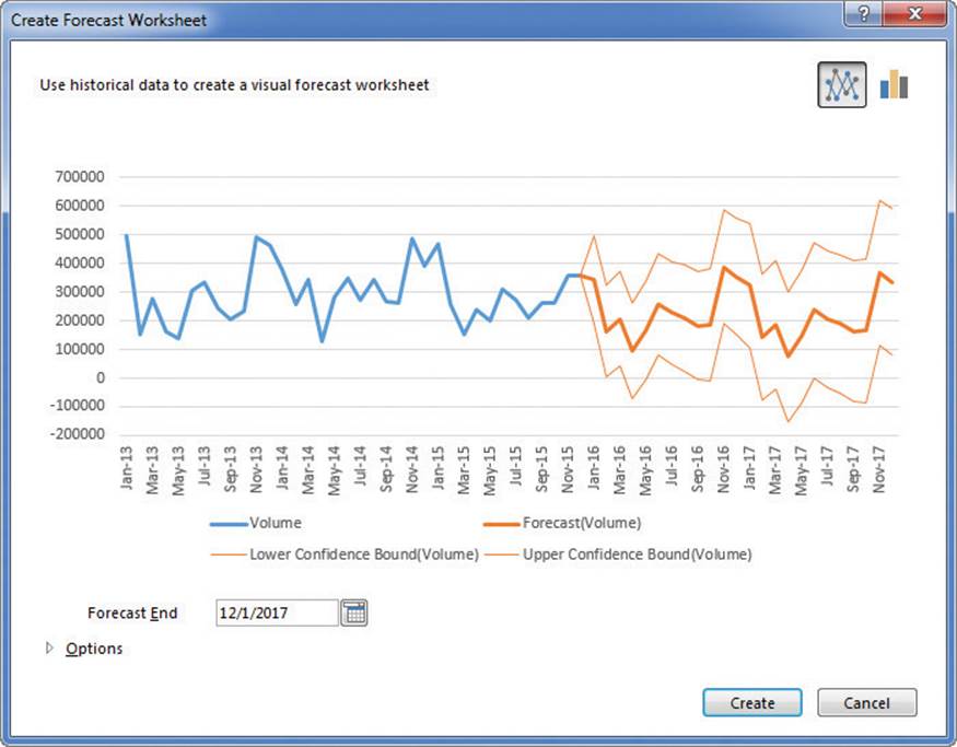
Forecast Worksheets show projections for future values
To create a linear forecast by using a formula
1. Create a list of data that contains pairs of independent variables (known_xs) and dependent variables (known_ys).
2. In a separate cell, enter a future value of x.
3. In another cell, create a formula that follows the syntax FORECAST.LINEAR(x, known_ys, known_xs).
4. Press the Enter key.
To create a simple forecast by using the fill handle
1. Select the cells that contain the historical data.
2. Drag the fill handle down the number of cells that represents the number of periods by which you want to extend the trend.
To create a Forecast Worksheet
1. Click any cell in an Excel table that contains a column with date or time data and another column with numerical results.
2. On the Data tab of the ribbon, in the Forecast group, click the Forecast Sheet button.
3. In the upper-right corner of the Create Forecast Worksheet dialog box, do one of the following:
• Click the Create a line chart button to create a line chart.
• Click the Create a column chart button to create a column chart.
4. Click the Forecast End calendar to specify an end for the forecast.
5. Click Create.
To create a Forecast Worksheet with advanced options
1. Click any cell in an Excel table that contains a column with date or time data and another column with numerical results.
2. Click Forecast Sheet.
3. Identify the chart type and forecast end, and then click Options.
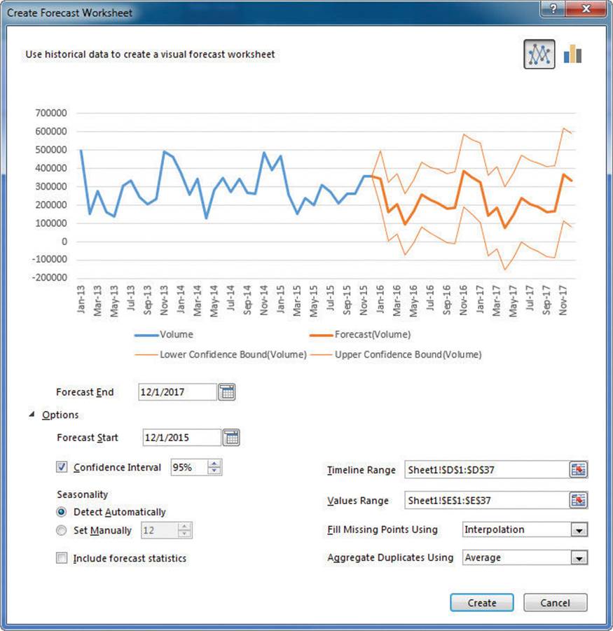
Set advanced options and manage data used to create a Forecast Worksheet
4. Using the tools in the Options area of the Create Forecast Worksheet dialog box, do any of the following:
• Identify the cell range that contains the timeline values.
• Identify the cell range that contains the numerical values.
• Set a new forecast start date.
• Change the confidence interval.
• Set seasonality manually or automatically.
• Include or exclude forecast statistics.
• Select a method for filling in missing values.
• Select a method for aggregating multiple values for the same time period.
5. Click Create.
To calculate a forecast value by using exponential smoothing
1. Create a list of data that contains pairs of independent variables (timeline) and dependent variables (values).
2. In a separate cell, enter a future date (target_date).
3. In another cell, create a formula that follows the syntax FORECAST.ETS(target_date, values, timeline, [seasonality], [data_completion], [aggregation]).
4. Press Enter.
To calculate the confidence interval for a forecast by using exponential smoothing
1. Create a list of data that contains pairs of independent variables (timeline) and dependent variables (values).
2. In a separate cell, enter a future date (target_date).
3. In another cell, create a formula that follows this syntax:
FORECAST.ETS.CONFINT(target_date, values, timeline, [confidence_level], [seasonality], [data_completion], [aggregation])
4. Press Enter.
To calculate the length of a seasonally repetitive pattern in time series data
1. Create a list of data that contains pairs of independent variables (timeline) and dependent variables (values).
2. In a separate cell, enter a future date (target_date).
3. In another cell, create a formula that follows this syntax:
FORECAST.ETS.SEASONALITY(target_date, values, timeline, [seasonality], [data_completion], [aggregation])
4. Press Enter.
Define and manage measures
You can use Power Pivot to analyze huge data collections that include millions or even hundreds of millions of rows of values. Although the details are important, it’s also valuable to examine your data in aggregate. This type of aggregate summary, such as the average of values in a column, is called a measure.
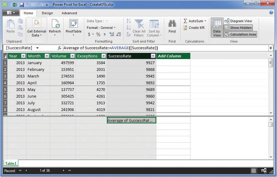
Measures summarize columns of data in Power Pivot
![]() See Also
See Also
For more information about using Power Pivot to analyze data, see “Analyze data by using Power Pivot” in Chapter 15, “Perform business intelligence analysis.”
There are two main ways to define a measure in Power Pivot. The first is to use a version of AutoSum, which calculates a sum, average, median, or other summary of a Power Pivot column. The other method is to create a calculated column manually. Regardless of the technique you use to create your measure, you can always edit it or delete it if necessary.
To create a measure by using AutoSum
1. Open a workbook in which you have added at least one Excel table to the Excel Data Model.
2. On the Power Pivot tab of the ribbon, in the Data Model group, click Manage to display the Power Pivot for Excel window.
3. If necessary, in Power Pivot, on the Home tab of the ribbon, in the View group, click the Calculation Area button to display the Calculation Area of the grid.
4. In the Calculation Area, click the first cell below the column on which you want to base your measure.
5. On the Home tab, in the Calculations group, do either of the following:
• Click the AutoSum button to create a measure by using the SUM function.
• Click the AutoSum arrow, and then click the function you want in the list.
To create a calculated column
1. In the Power Pivot for Excel window, display an Excel table that is part of the Data Model.
2. Click the first blank cell in the Add Column column.
3. Enter =, followed by the formula.
![]() Tip
Tip
To refer to fields in the Excel table, enclose the name in square brackets; for example, [Exceptions].
To edit a measure
1. Open a workbook in which you have added at least one measure to the Data Model.
2. If necessary, in Power Pivot, click the Calculation Area button to display the Calculation Area of the grid.
3. Click the cell that contains the measure, and then, in the formula bar, change the text of the measure’s formula.
4. Press Enter.
To delete a measure
1. Open a workbook in which you have added at least one measure to the Data Model.
2. If necessary, in Power Pivot, click the Calculation Area button to display the Calculation Area of the grid.
3. Click the cell that contains the measure, and then press Delete.
4. In the Confirm dialog box, click Delete from Model.
Define and display Key Performance Indicators
Businesses of all sizes can evaluate their results by using measures, which summarize overall business performance by summarizing operations data. The next step in this analysis is to compare results from a specific part of the business, whether for a department or for the entire company’s overall performance for a month, to determine whether the company is meeting its goals.
One popular way to measure business performance is by using Key Performance Indicators (KPIs). A KPI is a measure that the company’s officials have determined reflects the underlying health and efficiency of the organization. A shipping company might set goals for maintaining a low level of package handling errors, or a charitable organization could set a goal for returning as much of its donation income as possible to their clients through service and direct support.
KPIs are most often implemented through a dashboard that summarizes organizational performance. In Excel 2016, you add KPIs to your workbooks by creating PivotTables based on data stored in the Data Model.
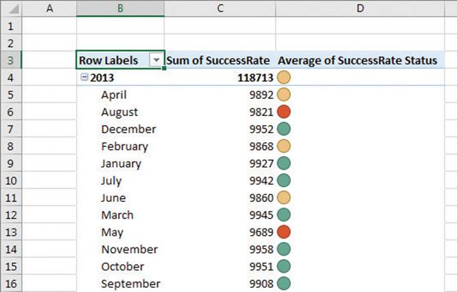
A PivotTable that includes a Key Performance Indicator created in Power Pivot
In some cases, high values are good, whereas in other cases low values are preferred. Both reducing package handling errors and maximizing operating profit would represent success for a shipping company, for example. A manufacturing firm might want to reduce variance in the items they fabricate for their customers. In that case, variance from the target value in either direction, high or low, would indicate a fault in the process.
Select the pattern used to evaluate data in a Key Performance Indicator
After you create a KPI, you can edit or delete it as required to meet your organization’s needs.
To create a KPI
1. Open a workbook in which you have added at least one measure to the Data Model.
2. If necessary, in Power Pivot, on the Home tab, in the View group, click the Calculation Area button to display the Calculation Area of the grid.
3. In the Calculation Area, right-click the cell that contains the measure you want to use as the basis for your KPI, and then click Create KPI.
4. In the Key Performance Indicator (KPI) dialog box, click Measure and select the measure to use as the comparison for the KPI.
Or
Click Absolute Value and enter the target value in the box to the right of the label.
5. In the Target group, click the pattern that represents the distribution of good, neutral, and bad values in the data set.
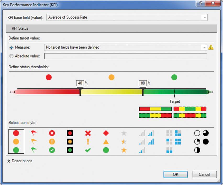
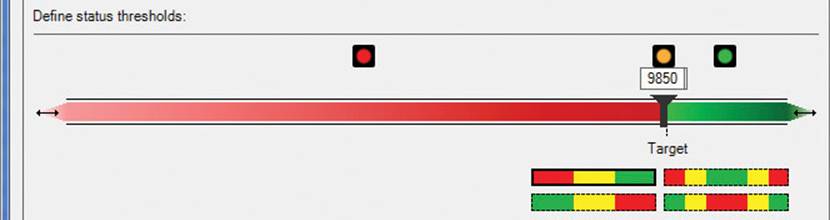
Create Key Performance Indicators to summarize your organization’s performance
6. In the Define status thresholds area, drag the sliders to indicate where the bad, neutral, and good zones start.
Or
Click in the box above a slider and enter a value that defines where the zone starts.
7. Click the icon set you want to apply to the KPI.
8. Click OK.
To use a KPI in a PivotTable
1. On the Data tab, in the Data Tools group, click Manage Data Model.
2. In the Power Pivot for Excel window, on the Home tab, click PivotTable.
3. In the Create PivotTable dialog box, click New Worksheet, and then click OK.
4. If necessary, in the PivotTable Fields task pane, click the name of the Excel table that contains your data.
5. Add fields to the Rows and Columns areas to organize your data, and then add the field that contains the data to the Values area.
6. At the bottom of the field list, expand the field name of the measure you used to create your KPI.
7. Drag the Status field to the Values area.
To edit a KPI
1. Open a workbook in which you have added at least one KPI to the Data Model.
2. If necessary, in Power Pivot, on the Home tab, in the View group, click the Calculation Area button to display the Calculation Area of the grid.
3. In the Calculation Area, right-click the cell that contains the measure you are using as the basis for your KPI, and then click Edit KPI Settings.
4. Use the controls in the Key Performance Indicator (KPI) dialog box to change the KPI’s settings.
5. Click OK.
To delete a KPI
1. Open a workbook in which you have added at least one KPI to the Data Model.
2. If necessary, display the Calculation Area of the grid.
3. In the Calculation Area, right-click the cell that contains the measure you are using as the basis for your KPI, and then click Delete KPI.
4. In the Confirm dialog box, click Delete from Model.
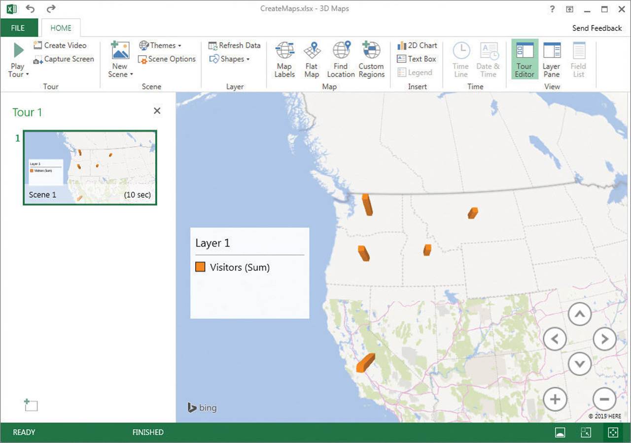
Create 3D maps
Much of the business data you collect will refer to geographic entities such as countries/regions, cities, or states. In Excel 2016, you can plot your data on 3D maps by using the built-in Power Map facilities.
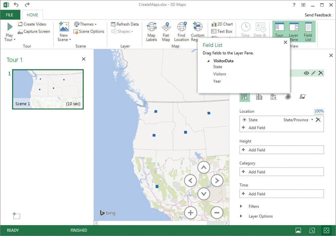
Summarize data by using a 3D map
After you add an Excel table to the Data Model, you can summarize its data geographically. All you need to do is click a cell in the Excel table and indicate that you want to create a 3D map. Excel examines your data source and, if it recognizes geographic entities such as cities or countries/regions, it adds the field to the map’s layout.
![]() Tip
Tip
If you haven’t clicked a cell in an Excel table that contains data you can use to create a map, Excel doesn’t add a geographic data field to the Location area of the Layers task pane.
With the 3D map in place, you can add data fields to its layout, supplement the display by adding a 2D line or column chart of the data, or change the fields used in the visualization. If you have multiple geographic data levels available, such as country/region, state, and city, you can change the level of analysis before closing your map and returning to the main Excel workbook.
Summarize data by geographical entity by using a 3D map
![]() Tip
Tip
After you close the 3D Maps window, Excel adds a text box to the worksheet from which the 3D map draws its data, indicating that the workbook has 3D Maps tours available.
One real strength of 3D maps in Excel 2016 is the ability to create tours, which are animations of the data summarized in your map. If your data has a date or time component, such as years, months, and days (or specific dates), you can create an animation that shows how the data changes over time.
![]() Important
Important
The field you add to the Time box must be formatted by using a Date or Time data type.
After you create your map, you can copy an image of the screen to the Clipboard, save the animation as a video, edit the map, or delete the map entirely.
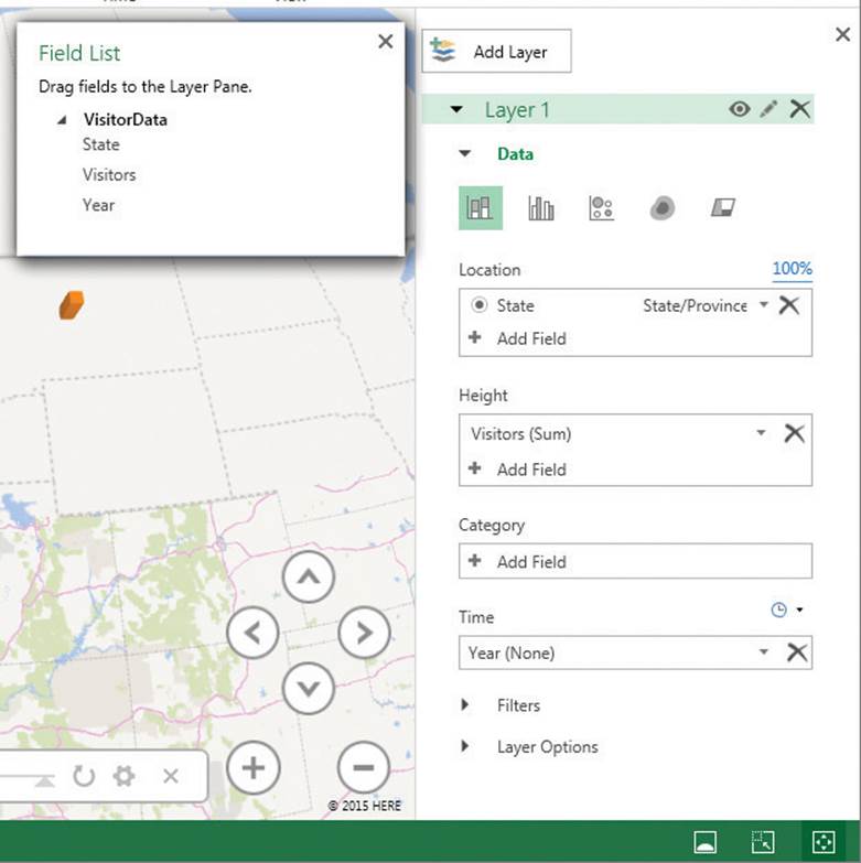
To create a 3D map
1. Click a cell in the Excel table that contains the data you want to map.
2. On the Insert tab of the ribbon, in the Tours group, click 3D Map.
3. If necessary, in the 3D Maps window, on the Home tab of the ribbon, in the View group, click Field List to display the Field List pane.
4. If necessary, drag the field that contains geographic information, such as states, from the Field List to the Location box.
5. Drag the field that contains the summary data from the Field List to the Height box.
6. If your data contains a third component, such as a company, drag the field that contains this category data from the Field List to the Category box.
To return to the main Excel workbook
1. Perform either of these steps:
• In the 3D Maps window, display the Backstage view, and then click Close.
• On the title bar of the 3D Maps window, click the Close button.
To launch a 3D map
1. On the Insert tab of the ribbon, in the Tours group, click 3D Map.
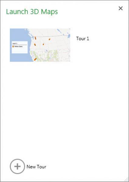
Select an existing 3D map to launch
2. In the Launch 3D Maps dialog box, click the tour you want to launch.
To summarize mapped data by using a 2D chart
1. Launch the 3D map you want to summarize.
2. On the Home tab, in the Insert group, click 2D Chart.
3. If necessary, point to the chart, click the Change the chart type button in the upper-right corner of the chart, and then click a new chart type.
To change the geographical type of a visualization
1. Launch the 3D map you want to edit.
2. If necessary, in the View group, click Layer Pane to display the Layer task pane.
3. Also, if necessary, click Field List to display the Field List pane.
4. In the Location box, click the geographical type.
5. In the list that appears, click the new level at which you want to summarize the data.
To animate your data over time
1. Create a 3D map that includes summary and location data.
2. If necessary, click Layer Pane to display the Layer task pane.
3. If necessary, click Field List to display the Field List pane.
4. Drag a field containing time data from the Field List pane to the Time box of the Layer task pane.
Animate data by using a time series from your data set
5. On the Home tab, in the Tour group, click Play Tour.
To filter 3D map data
1. Launch the 3D map you want to edit.
2. If necessary, click Layer Pane to display the Layer task pane.
3. In the Layer task pane, click Filters, click Add Filter, and then click the field by which you want to filter your map.
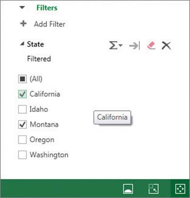
Apply a filter to focus on specific data in your map
4. Use the controls in the Filters area of the Layer task pane to create your filter.
5. Click Apply Filter.
To remove a 3D map filter
1. Display the 3D map from which you want to remove the filter.
2. In the Layer task pane, display the available filters.
3. Point to the filter you want to remove, and then click Delete.
To capture a screenshot of a 3D map
1. Display the 3D map whose image you want to capture.
2. On the Home tab, in the Tour group, click Capture Screen to copy an image of the map to the Clipboard.
3. Open the document in which you want to paste the image of the map.
4. Press Ctrl+V (or use the appropriate paste command for the app you opened) to paste the map image into the open document.
To play a 3D map tour as a video
1. Display a 3D map tour that has a time component.
2. On the Home tab, in the Tour group, click Play Tour.
3. When the tour has finished running, point to the bottom of the screen to display the control bar, and then click the Click to go back to Edit View button.
To save a 3D map video
1. Display a 3D map tour that has a time component.
2. In the Tour group, click Create Video.
3. In the Create Video dialog box, click the button that represents the video quality and resolution you want.
4. Click Create.
5. In the Save Movie dialog box, navigate to the folder where you want to save the video.
6. In the File name box, enter a name for the video.
7. Click Save.
To delete a 3D map
1. In an Excel workbook that contains 3D maps, on the Insert tab, click 3D Map.
2. In the Launch 3D Maps dialog box, point to the 3D map tour you want to delete, and click the Delete button in the upper-right corner of the tour.
3. In the Delete Tour dialog box, click Yes to confirm that you want to delete the tour.
4. Close the Launch 3D Maps dialog box.
Skills review
In this chapter, you learned how to:
![]() Create Forecast Worksheets
Create Forecast Worksheets
![]() Define and manage measures
Define and manage measures
![]() Define and display Key Performance Indicators
Define and display Key Performance Indicators
![]() Create 3D maps
Create 3D maps
 Practice tasks
The practice files for these tasks are located in the Excel2016SBS\Ch16 folder. You can save the results of the tasks in the same folder.
Create Forecast Worksheets
Open the CreateForecastSheets workbook in Excel, and then perform the following tasks:
1. In cell I5, create a formula that uses exponential smoothing to forecast the value for January 2016 (found in cell I3) based on the values in the MonthYear and Volume columns in the Excel table.
2. Using the same inputs, calculate the 95 percent confidence interval (the default value) for your forecast.
3. In cell I9, calculate the length of the season implied by the data used in the previous two formulas.
4. Create a Forecast Worksheet by using the data in the MonthlyVolume table.
5. If necessary, edit the Forecast Worksheet so its Timeline Range is cells D1:D37 and the Values Range is cells E1:E37.
6. Change the Forecast Worksheet’s Confidence Interval to 90 percent.
Define and manage measures
Open the DefineMeasures workbook in Excel, and then perform the following tasks:
1. Display the Data Model.
2. Create a measure for the Exceptions field that finds the sum of the Exceptions values.
3. Create a measure for the SuccessRate field that finds the sum of the SuccessRate values.
4. Delete the measure that finds the sum of the Exceptions values.
5. Edit the measure that finds the sum of the SuccessRate values so that it finds the average of those values.
Define and display Key Performance Indicators
Open the CreateKPIs workbook in Excel, and then perform the following tasks:
1. Display the Data Model.
2. Create a KPI based on the Average of SuccessRate measure with the following characteristics:
• An absolute value of 9925
• A green lower limit of 9900
• A yellow lower limit of 9825
• The black-bordered traffic-light icon set
3. While still within Power Pivot, create a PivotTable on a new worksheet.
4. In the PivotTable Fields task pane, add the Year and Month columns to the Rows area, and then the Success Rate and Status fields to the Values area.
Create 3D maps
Open the CreateMaps workbook in Excel, and then perform the following tasks:
1. Create a 3D map based on the data in the VisitorData Excel table. Show the visitors by state.
2. Add the Year field to the Time area, and then play the tour.
3. Create and save a video based on the tour you created.
4. Add a 2D chart that summarizes your data in a clustered column chart.
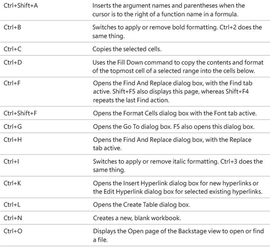
Appendix: Keyboard shortcuts
This list of shortcuts is a comprehensive list derived from Excel 2016 Help. Some of the shortcuts might not be available in every edition of Excel 2016.
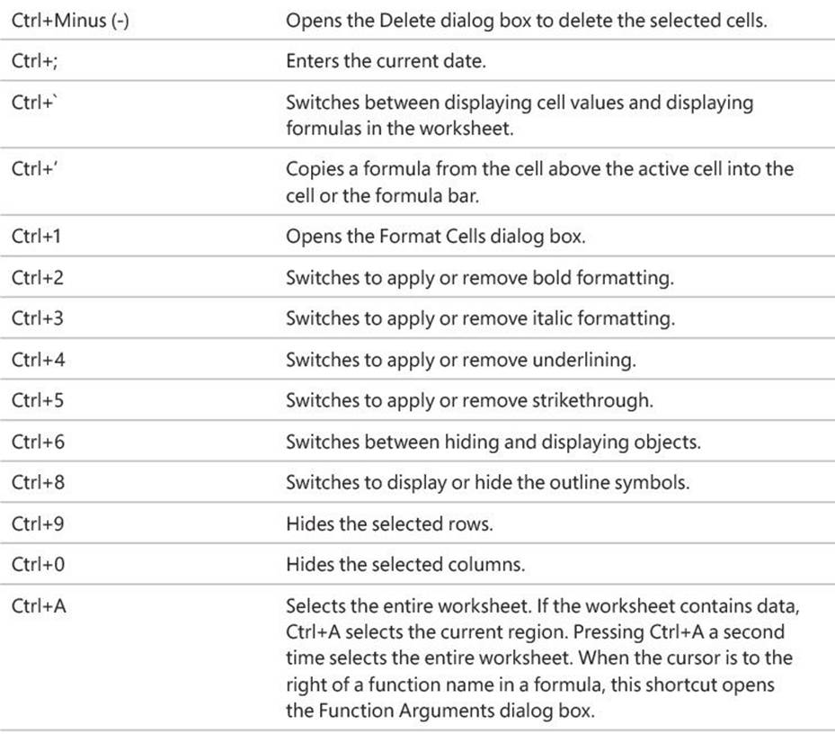
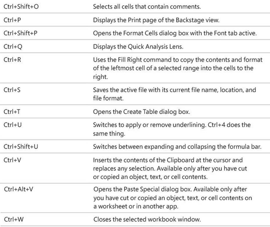
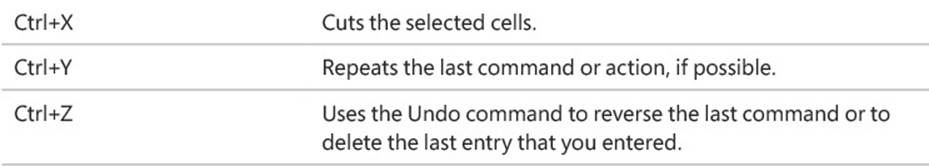
Ctrl-combination shortcut keys

![]() Tip
Tip
The Ctrl combinations Ctrl+E, Ctrl+J, and Ctrl+M are currently unassigned to any shortcuts.
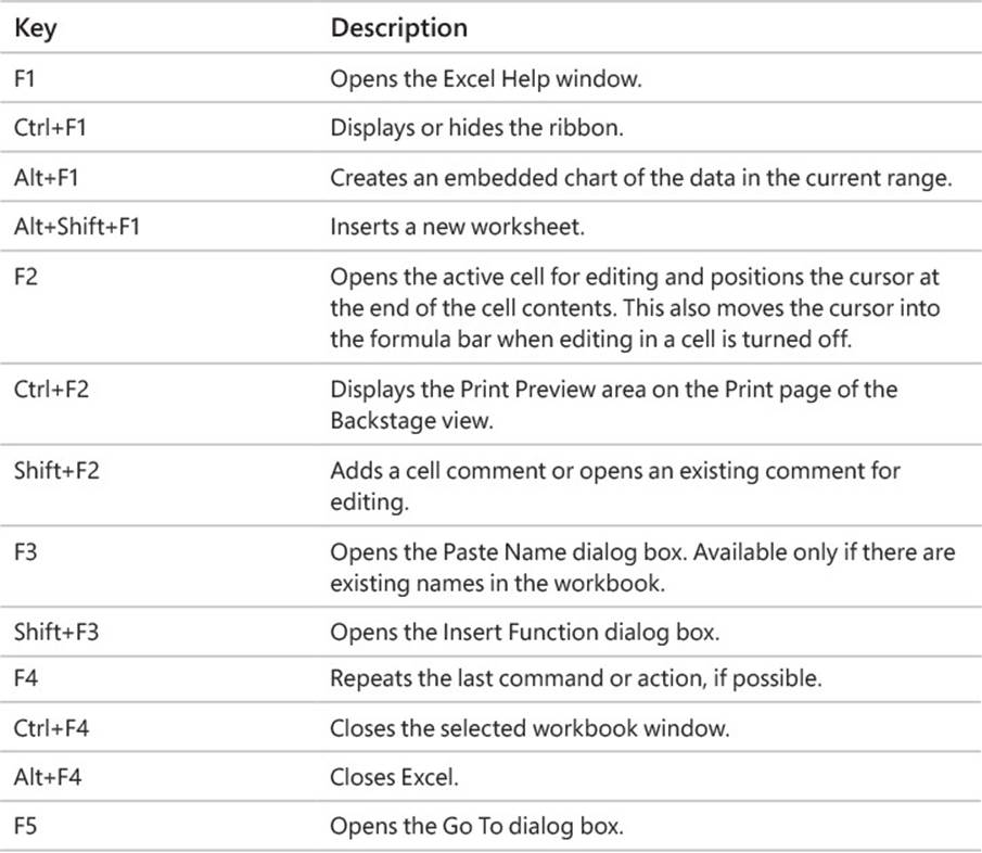
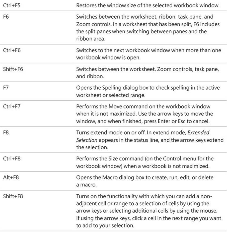
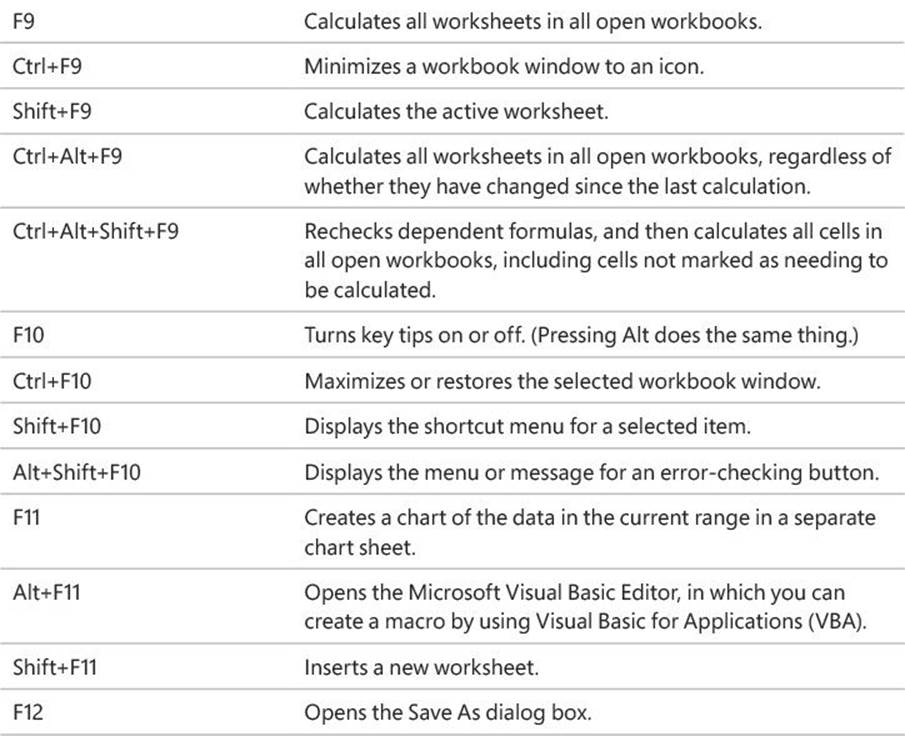
Function keys
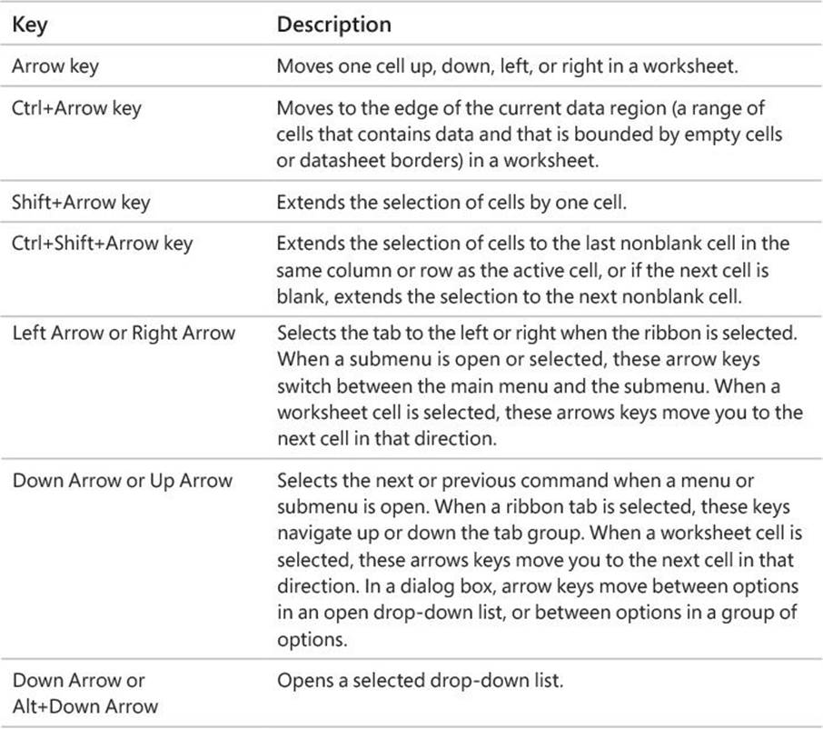
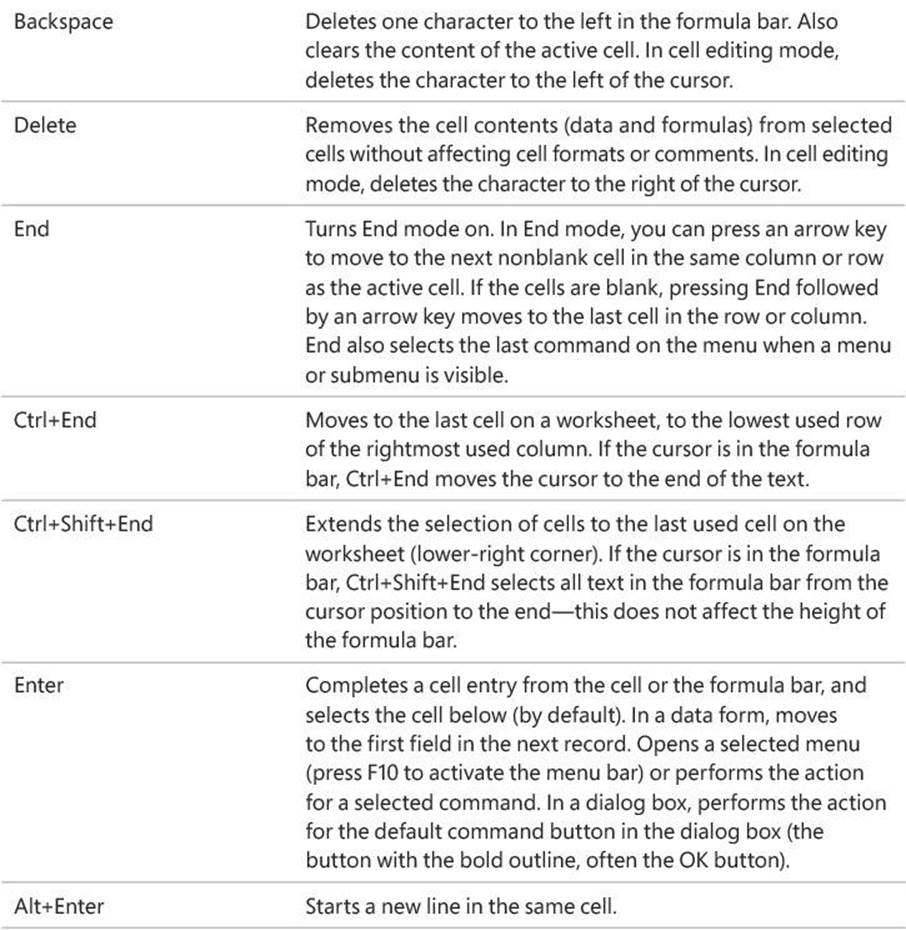
Other useful shortcut keys
All materials on the site are licensed Creative Commons Attribution-Sharealike 3.0 Unported CC BY-SA 3.0 & GNU Free Documentation License (GFDL)
If you are the copyright holder of any material contained on our site and intend to remove it, please contact our site administrator for approval.
© 2016-2026 All site design rights belong to S.Y.A.