My Excel 2016 (2016)
14. Creating Charts and Sparklines
This chapter will show you how easy it is to add and customize a chart. Topics in this chapter include the following:
→ Quickly adding a chart to a sheet
→ Creating a chart mixing bars and lines
→ Resizing and editing charts
→ Making a pie chart easier to read
→ Inserting sparklines into a report
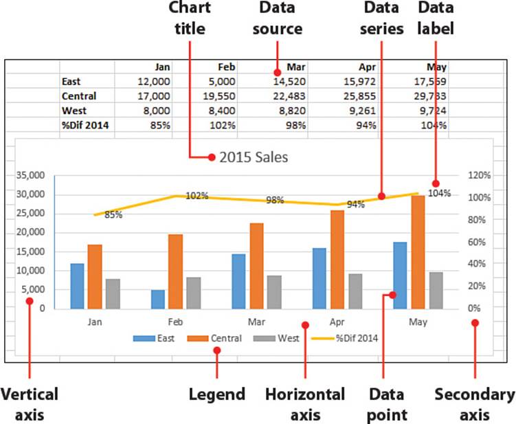
Using charts is a great way to graphically portray data. They provide a quick and simple way to emphasize trends in data. Some people prefer to look at charts instead of trying to make sense of rows and columns of numbers. Excel offers two methods for charting data—charts and sparklines. Charts, which you are most likely familiar with, are large graphics with a title and numbers and/or text along the left and bottom. Sparklines are miniature charts in cells with only markers to represent the data. This chapter provides you with the tools to create simple, but useful, charts.
Adding a Chart
A chart can make it easier to interpret a lot of numbers at a glance—for example, by showing a trend by how a line moves across time or how two values compare by the heights of the columns in the chart.
Add a Chart with the Quick Analysis Tool
Using the Quick Analysis tool is a fast way to insert a chart based on the selected data. You can choose one of Excel’s recommendations based on its interpretation of the data.
1. Select the data you want to create a chart from, including any column headers and row labels.
2. On the Quick Analysis tool, select Charts.
3. Select a recommended chart.
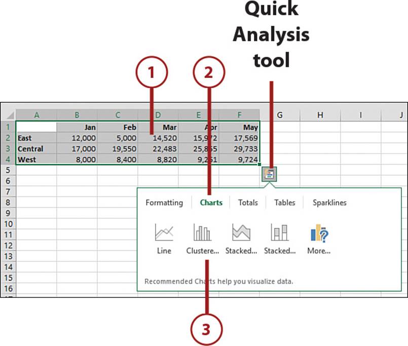
Preview Charts
As you move your pointer over the recommended charts, a preview appears, showing how the data would look in the selected chart type.
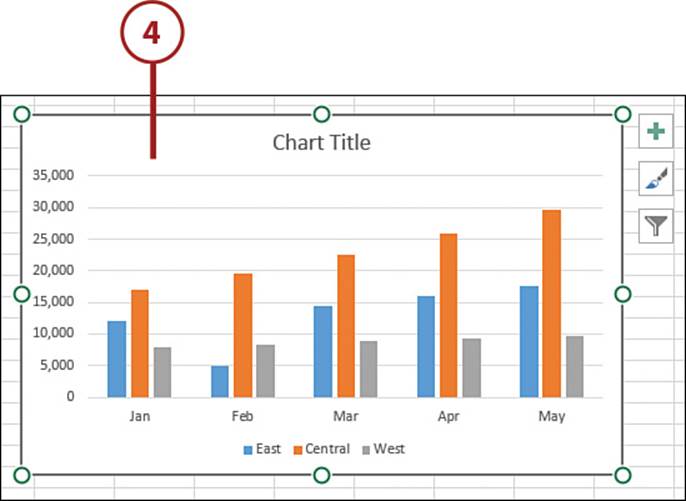
4. The selected chart is added to the sheet.
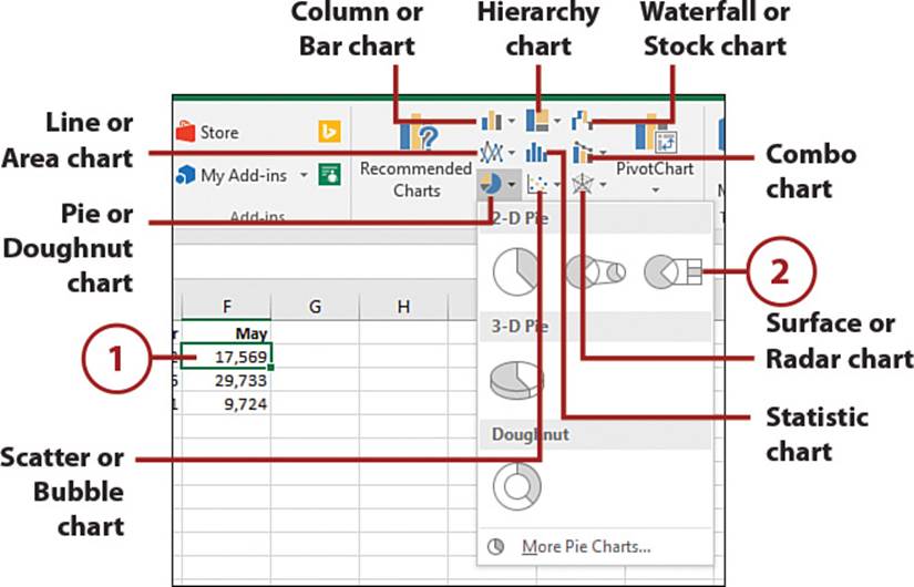
>>>Go Further: Manually Add a Chart
If you know what chart you want and don’t need Excel’s recommendations, choose the chart type directly from the ribbon.
1. Select a cell in the dataset.
2. Select a specific chart from the drop-down of the desired chart type on the Insert tab.
3. The chart is added to the sheet.
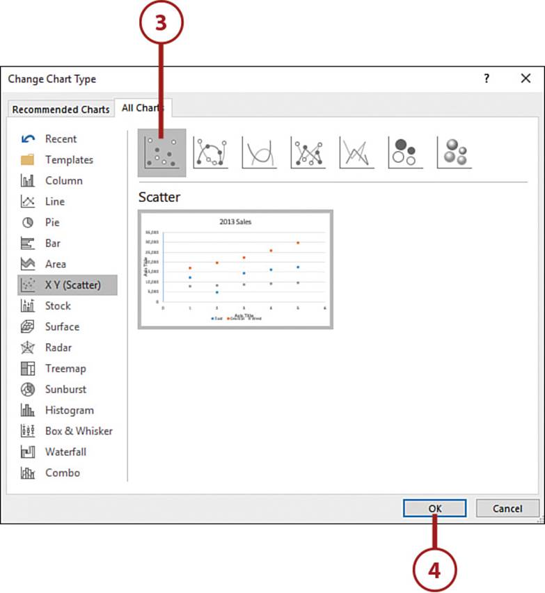
Preview All Charts
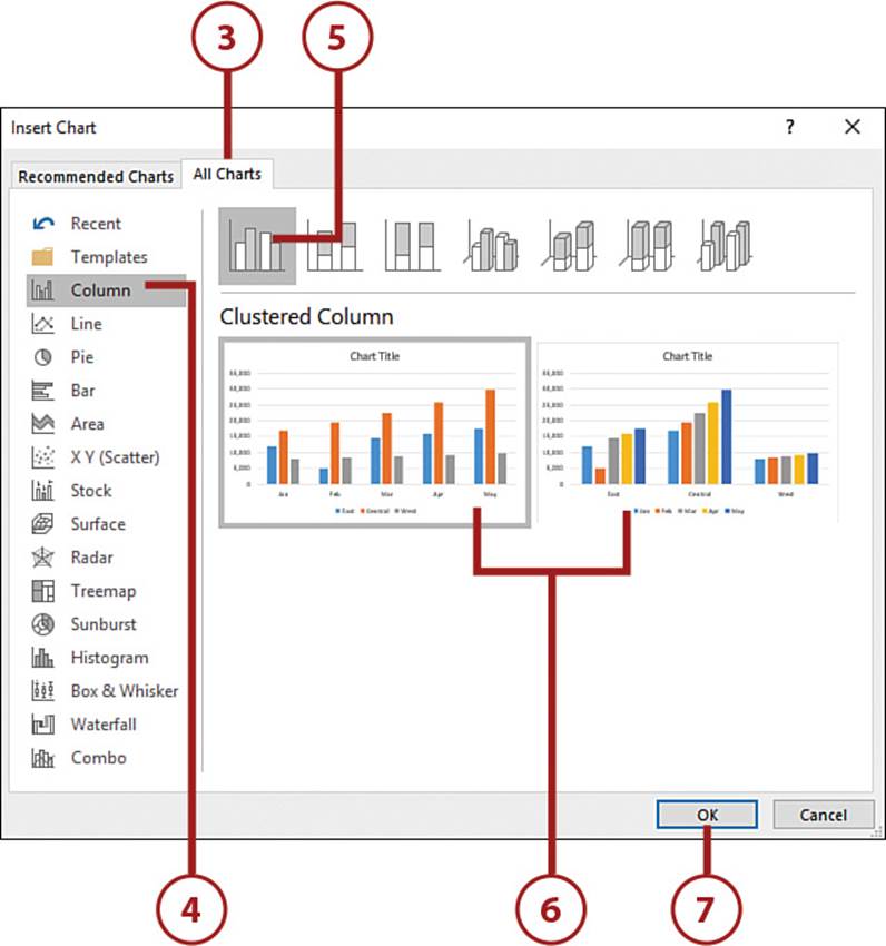
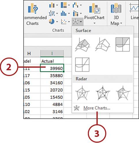
You can easily preview your data in all possible chart configurations through the All Charts tab on the Insert Chart dialog box.
1. Select a cell in the dataset.
2. On the Insert tab, select Recommended Charts.
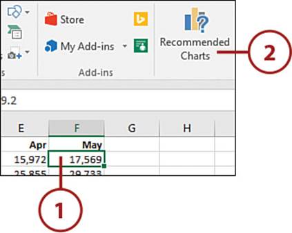
3. Click the All Charts tab.
4. Choose a chart type.
5. Click a chart subtype.
6. The preview frame will update to show how the data would look with the selected chart. If there are multiple previews, select the one you want.
7. Click OK when you find the desired chart, and it will be added to the sheet.
Switch Rows and Columns
You can switch what range is used for a series and what range is used for the category labels in an existing chart.
1. Select the chart.
2. On the Chart Tools, Design tab, click the Switch Row/Column button.
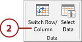
3. Excel switches the range used for the series and the range used for the category labels.
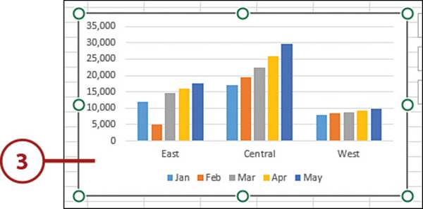
Apply Chart Styles or Colors
Once you’ve inserted a chart, you may want to move the chart title, move the legend, add a background, change the color of the series, or apply any number of changes to make the chart more attention getting. You can apply each change yourself, or you can see what chart styles and color palettes Excel has available.
1. Select the chart.
2. Click the Chart Styles button.
3. Select a chart style, and it will be applied to the chart.
4. Select the Color tab.
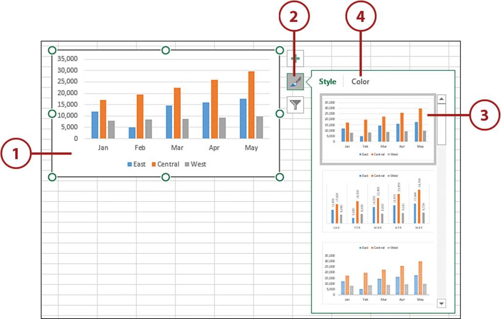
5. Select a color palette, and it will be applied to the chart.
6. Click the Chart Style button again to close it.
See More Styles at a Time
You can also access the list of styles by selecting your chart and opening the Chart Styles drop-down on the Chart Tools, Design tab.
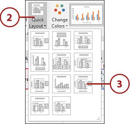
Apply Chart Layouts
Chart layouts are predefined layouts offering different combinations of the chart elements: legend, chart title, axis title, data labels, and data table.
1. Select the chart.
2. On the Chart Tools, Design tab, select the Quick Layout drop-down.
3. Click the desired chart layout, and the chart will update.
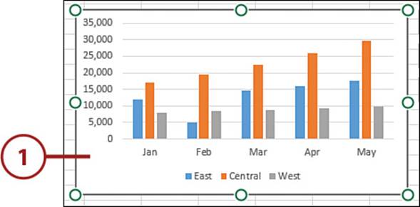
Resizing or Moving a Chart
The default location for a chart is the same sheet as the data. If you create your chart using the Quick Analysis tool or the Recommended Charts options, you have no control over where the chart is initially placed. However, a chart can be moved to another location on the same sheet, to a new sheet, or to its own chart sheet.
Resize a Chart
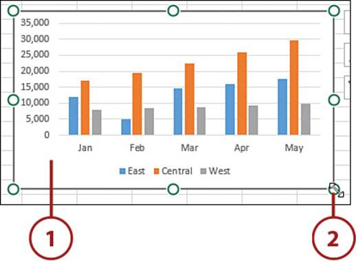
Use the resize handles around a chart to change its size.
1. Select the chart.
2. Place the pointer over any of the circles along the frame. When the pointer changes to a double-headed arrow, click and drag the chart to the desired size.
Move to a New Location on the Same Sheet
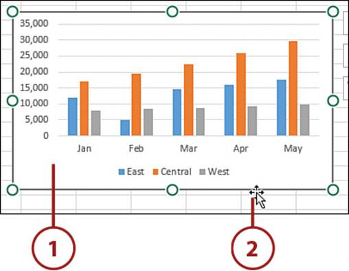
You can drag a chart to any location on a sheet.
1. Select the chart.
2. Place the pointer along any edge. When the pointer changes to a four-headed arrow, click and drag the chart to the new location.
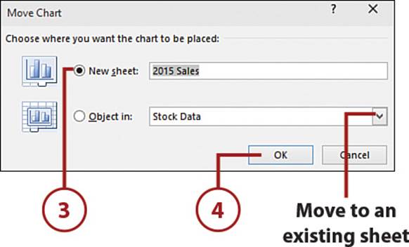
Relocate to Another Sheet
A chart can be moved to another existing sheet or turned into a chart sheet. A chart sheet is a special type of sheet in Excel used to display only charts. It doesn’t have cells like the other sheets, and you can’t add any information to it, other than the chart components.
1. Select the chart.
2. On the Chart Tools, Design tab, select Move Chart.
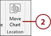
3. Select New Sheet to move the chart to a chart sheet. Enter a new name for the chart sheet.
Select an Existing Sheet
You can also select an existing sheet from the Object In drop-down.
4. Click OK, and the chart will be moved to the new location.
Editing Chart Elements
Depending on the selected element, different settings are available that you can configure as needed. From the task pane, you can make changes to the element’s formatting, such as the color, 3D design, and alignment.
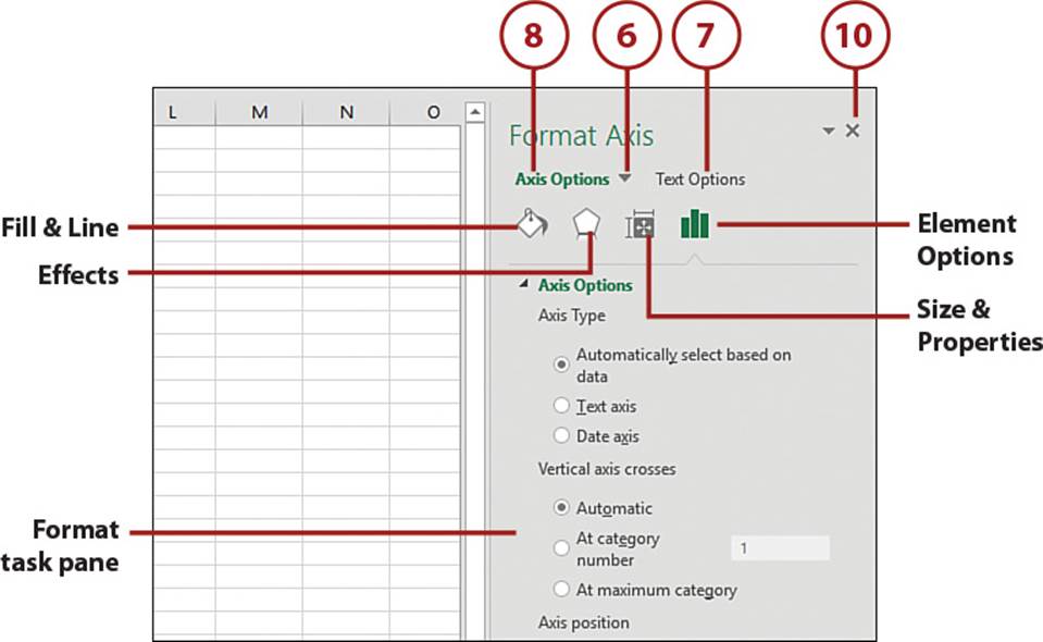
Use the Format Task Pane
The Format task pane allows you to format the various chart elements. Formatting options include colors, borders, size, location, and configuration options.
1. Select the chart.
2. Click the Chart Elements icon.
3. Selected elements are active on the chart. Unselected elements are inactive.
4. Place your pointer over an element and click the menu arrow that appears.
5. Select More Options to open the Format task pane.
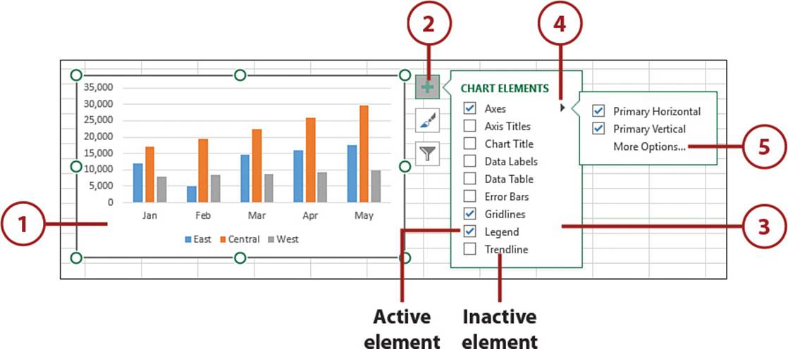
6. To edit a different element, select it from the Element drop-down.
7. Select Text Options to view text-formatting options for the selected element.
8. To view the various options available for an element, select Element Name Options. Not all elements have access to the same options.
9. Click an option icon to view the available settings. The chart updates as changes are made.
10. Click the X to close the pane.
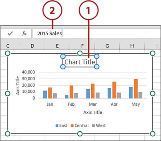
Edit the Chart or Axis Titles
Edit the chart or axis titles to clarify the purpose of the chart.
1. Select the frame of the title you want to change.
2. As you type the new title, the text appears in the formula bar. Press Enter when done.
Changing Part of a Title
To change a specific word in a title, select the title then double-click the word you want to change. Press Esc or click a cell on the sheet when you are done with your changes.
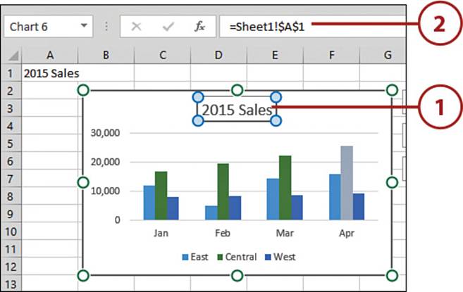
>>>Go Further: Dynamic Titles
Excel doesn’t have the built-in ability, but with a little work, you can create a dynamic chart or axis title linked to a cell.
1. Click once on the title, ensuring the selection frame is solid, not dashed.
2. Place the cursor in the formula bar, type an equal sign (=), and then click the cell containing the title text.
3. Press Enter, and the title updates to reflect the cell’s text. As the text in the cell changes, the chart title also updates.
If you decide to make the title static again, right-click the title, select Edit Text, and then clear the formula in the formula bar. You can also toggle the title on and off to reset the title.
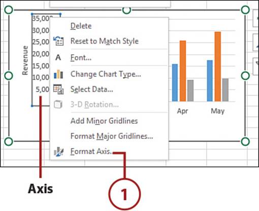
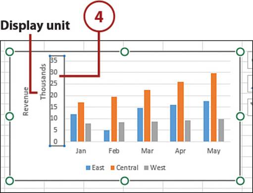
Change the Display Units in an Axis
Excel bases the units shown in an axis off the data. You can change the display units, reducing the amount of space used and making the axis easier to read.
1. Right-click the axis and select Format Axis.
2. Click the Axis Options icon.
3. Select the desired units from the Display Units drop-down.
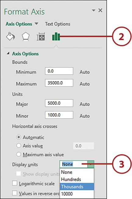
4. The axis will update, including a label showing the applied unit base.
Customize a Series Color
You can change the color of a single series on a chart without affecting the other series.
1. Click once on the series you want to change. All points of that series will be selected. If only the one point is selected, you clicked the point twice. Click elsewhere on the sheet and try again.
2. Right-click over the series and select Format Data Series.
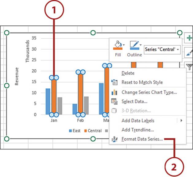
3. Click the Fill & Line icon in the Format task pane.
4. Expand the Fill category and select Solid Fill.
5. Select a color from the palette drop-down.
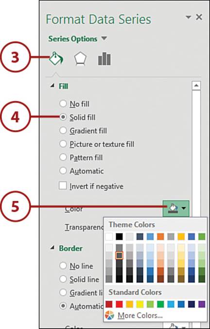
6. The selected series will update to reflect the new color.
Change Only One Point in a Series
If you click twice (two single clicks, not a double-click) on a specific data point in a series so that only it, not the entire series, is selected, you can apply a color to just that data point.
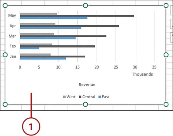
Changing an Existing Chart’s Type
You don’t have to re-create a chart from scratch if you want to change the chart type.
Change the Chart Type
It’s easy to change a chart’s type, finding the perfect chart to represent your data.
1. Select the chart.
2. On the Chart Tools, Design tab, select Change Chart Type.
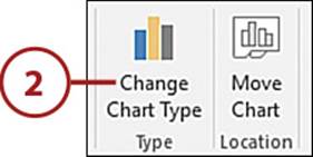
3. Select the new chart type.
4. Click OK, and the chart will change to the new type.
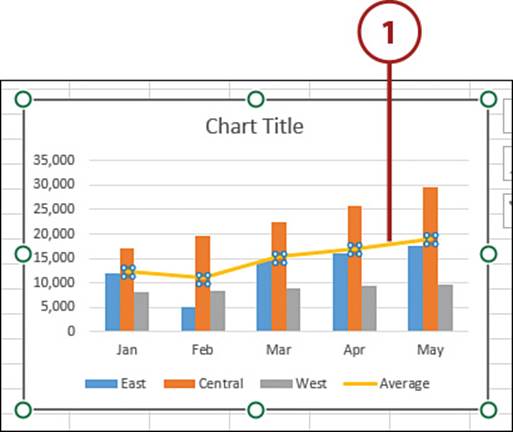
Creating a Chart with Multiple Chart Types
You can use some of the chart types together in a single chart by selecting Combo as the chart type.
Insert a Multiple Type Chart
Each series in a chart can have a different chart type.
1. Select a cell in the dataset.
2. Select Combo on the Insert tab.
3. Select Create Custom Combo Chart.
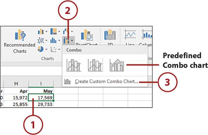
Choose Predefined Combo Chart
You don’t have to create a custom combo chart. The Combo drop-down has several predefined combo charts you can choose from. If you see the one you want, click it and the chart will be added to your sheet.
4. Select a chart type for each series.
5. Select Secondary Axis for a series if the series needs to be shown on a secondary axis.
6. Click OK, and the chart will be created.
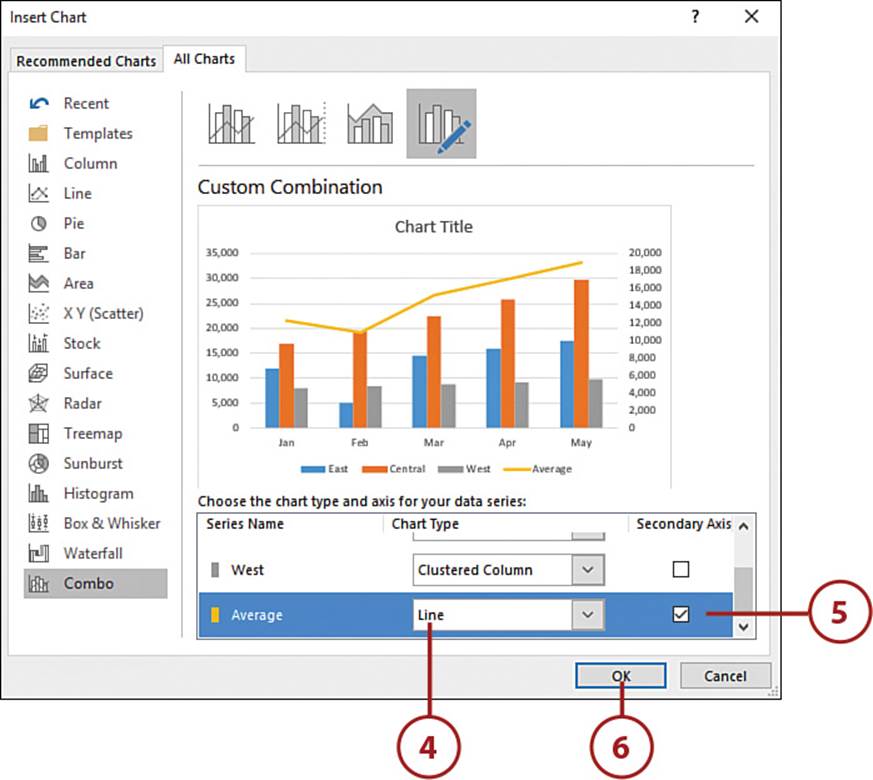
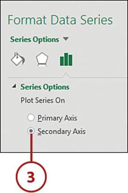
Add a Secondary Axis
A secondary axis is an axis that appears on the right side of the chart. It is often used for charting data of a different scale. For example, if you’re plotting units sold, with values in the hundreds, and revenue generated, with values in the millions, you won’t be able to clearly see the units sold. Adding a secondary axis allows the use of two different scales.
1. Click the series you want to chart on the secondary axis.
Another Way to Select a Series
Click the chart and then select the series from the Chart Elements drop-down on the Chart Tools, Format tab.
2. On the Chart Tools, Format tab, select Format Selection.
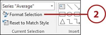
3. From the Format Data Series task pane, select Secondary Axis, and the chart will update.
Updating Chart Data
Unless the source data is a dynamic range, such as a table, the chart won’t automatically update as new rows or columns are added to the dataset. You’ll need to update the data source range to include the new data.
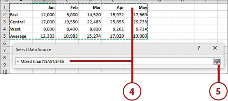
Change the Data Source
Change the data source to include new data to reference a completely new dataset.
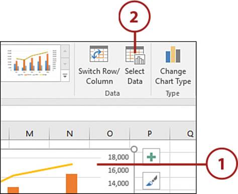
1. Select the chart.
2. From the Chart Tools, Design tab, click Select Data.
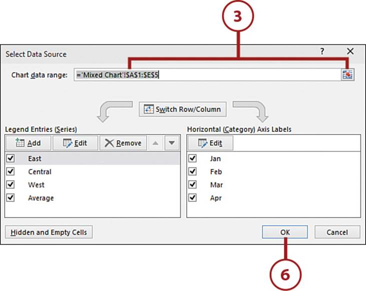
3. With the current range in the Chart Data Range field highlighted, click the range selector tool.
4. Select the updated range.
5. Select the range selector tool to return to the dialog box.
6. Click OK, and the chart will update to reflect the new data.
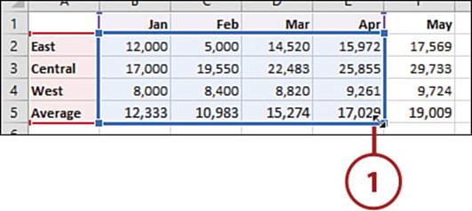
>>>Go Further: Update Manually
When a chart is selected, the data source is highlighted with a colored border. You can click and drag the fill handle on the border to include new data, thus changing the source range.
1. Place the pointer in the corner of the range, thus getting a double-headed arrow.
2. Click and drag to include new rows and/or columns. The chart will update to reflect the new data.
Adding Special Charts
Stock charts and bubble charts are two chart types that require a specific setup to chart the data properly.
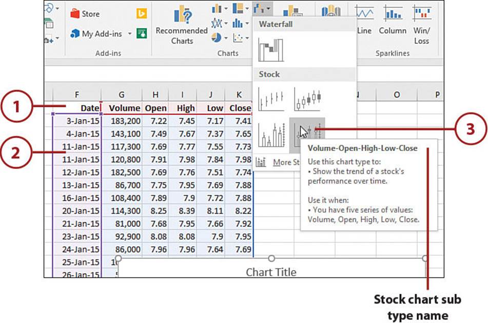
Create a Stock Chart
You can create four types of stock charts using historical stock data. Each type has specific requirements for included columns and their order. If the order of the data is not met, the chart will not be created.
• High-Low-Close—Requires four columns of data: Date, High, Low, Close
• Open-High-Low-Close—Requires five columns of data: Date, Open, High, Low, Close
• Volume-High-Low-Close—Requires five columns of data: Date, Volume, High, Low, Close
• Volume-Open-High-Low-Close—Requires six columns of data: Date, Volume, Open, High, Low, Close
1. Make sure the data columns are adjacent and in the required order, which is reflected in the chart’s subtype name.
2. Select a cell in the dataset.
3. On the Insert tab, from the Waterfall or Stock drop-down, select the specific stock chart matching the column configuration on the sheet. The chart will be inserted onto the sheet.
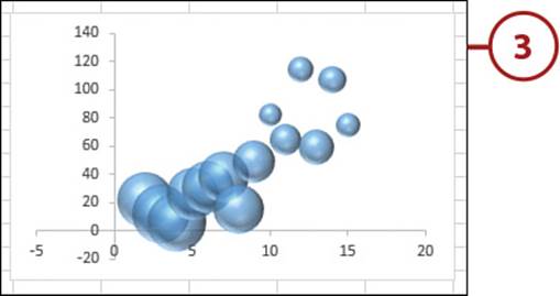
Create a Bubble Chart
A bubble chart displays a relationship among three variables. The x,y-coordinate represents two variables and the size of the bubble is the third.
• The first column of data is used for the horizontal axis, the x-coordinate.
• The second column of data is used for the vertical axis, the y-coordinate.
• The third column of data is used for the size of the bubble.
1. Select a cell in the dataset.
2. Select a Bubble chart from the Scatter or Bubble drop-down on the Insert tab.
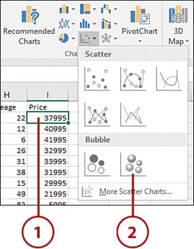
3. The chart is added to the sheet.
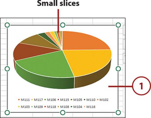
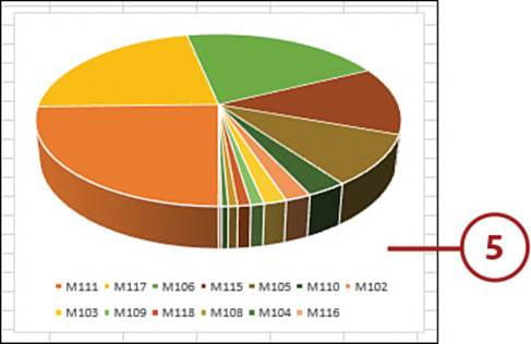
Pie Chart Issue: Small Slices
When creating a pie chart, you may end up with slices that are very difficult to see. Two possible ways of dealing with this are to rotate the pie or to create a “bar of pie” chart.
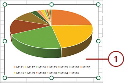
Rotate the Pie
Rotating the pie works best if the chart is 3D. By rotating the chart so the smaller slices are toward the front, you can make the slices easier to see.
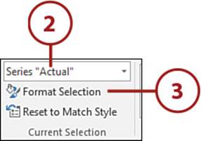
1. Select the chart.
2. On the Chart Tools, Format tab, from the Chart Elements drop-down, select the series.
3. Select Format Selection on the Chart Tools, Format tab.
4. Increase the Angle of First Slice setting on the Format task pane. The chart updates when you let go of the mouse button, so you can see how far you need to move the slider.
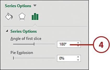
5. Rotate the pie so the smaller slices are to the front.
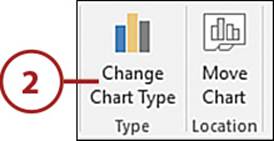
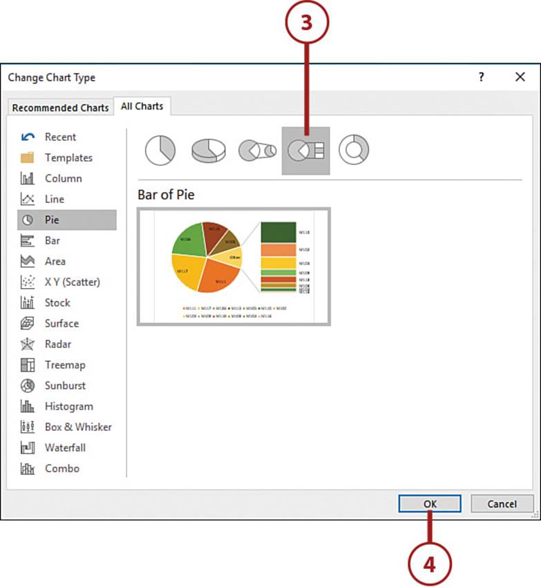
Create a Bar of Pie Chart
Bar of Pie is used to explode out the smaller pie slices into a stacked bar chart, making the smaller slices more visible. Excel creates a new slice called Other, which is a grouping of the slices now in the bar.
1. Select the pie chart.
2. Select Change Chart Type on the Chart Tools, Design tab.
3. Select Bar of Pie from the Pie options.
4. Click OK. The chart changes to a bar of pie chart.
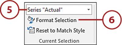
5. With the chart still selected, go to Chart Tools, Format, Current Selection, and select the series from the Chart Elements drop-down.
6. Click Format Selection. The Format Data Series task pane opens.
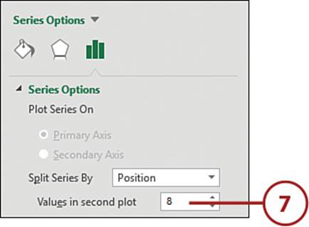
7. Click the Series Options icon. Change the number of slices in the bar chart by updating the Values In Second Plot field. As the value is changed using the spin buttons, the chart updates.
Using a User-Created Template
If you have a chart design you want to apply to multiple charts, you can save the design as a template. All the settings for colors, fonts, effects, and chart elements are saved and can be applied to other charts. Because the template is saved as an external file, you can share it with other users.
Save a Chart Template
Once the chart elements are configured as you want them, save the chart as a template.
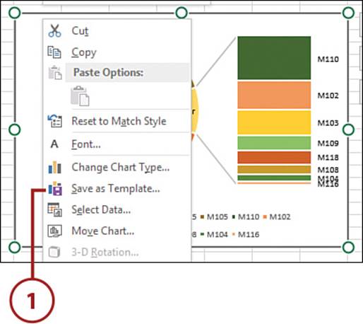
1. Right-click the chart and select Save as Template.
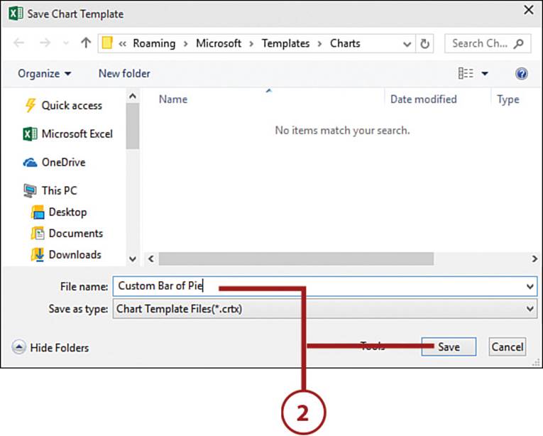
2. Give the template a name and then click Save.
3. The template is now available in the Templates option of the Insert Chart dialog box and can be applied just like the Excel-defined charts.
Required Save Location
You must use the default location in the Save Chart Template dialog box for saving charts so the chart template will appear in the Insert Chart dialog box.
Use a Chart Template
If you’re provided with a chart template, you’ll need to save it to the correct location on your PC before you can use it.
1. Save the chart template to the following location:
C:\Users\username\Appdata\Roaming\Microsoft\Templates\Charts
2. Select a cell in the dataset.
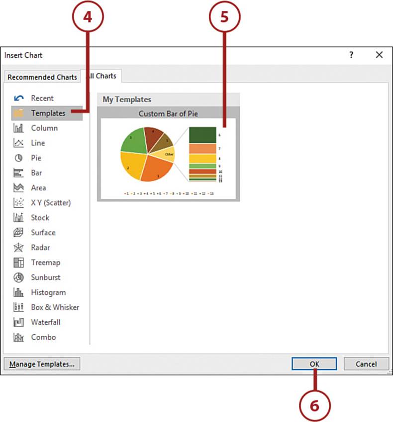
3. Select the More Charts option of any chart type’s drop-down on the Insert tab.
4. From the Insert Chart dialog box, select Templates.
5. Select a chart.
6. Click OK.
Adding Sparklines to Data
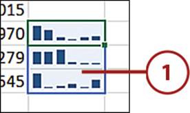
A sparkline is a chart inside of a single cell. The data source is a single row or column of data. The sparkline can be placed right next to the data it’s charting or on another sheet. Because the sparkline is in the background of the cell, you can still enter text in that cell.
Insert a Sparkline
Use a sparkline to show a trend in your data without losing valuable space to a chart.
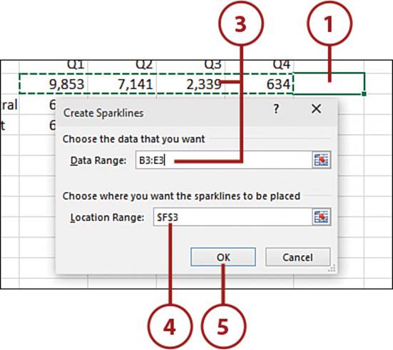
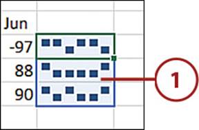
1. Select the cell that will hold the sparkline.
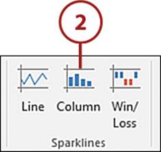
2. On the Insert tab, select the sparkline type. The Create Sparklines dialog box will open.
3. Select the data range.
4. Verify the address for the sparkline.
5. Click OK, and the sparkline is added to the cell.
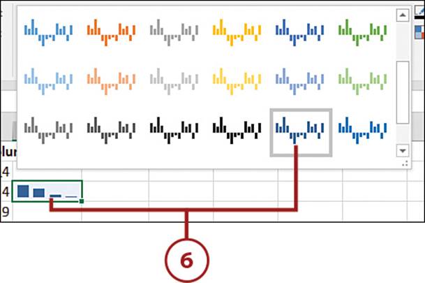
6. On the Sparkline Tools, Design tab, select a color style from the Style drop-down.
Select the Data Range First
If you prefer, you can select the data range first instead of the cell for the sparkline.
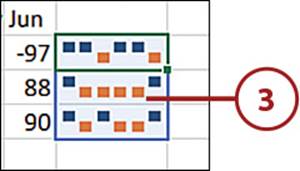
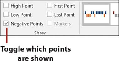
Emphasize Points on a Sparkline
After you’ve created a sparkline, you can choose to show the high point, low point, negative points, first point, last point, and markers (line charts only). Each point can have its own color.
1. Select the sparkline cells.
2. From the Marker Color drop-down on the Sparkline Tools, Design tab, select the desired point option, such as Negative Points, and then choose a color.
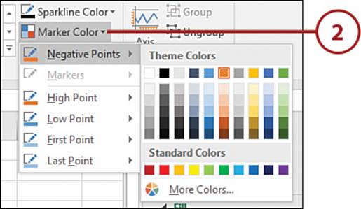
3. The sparkline will update, with the selected point(s) having a different color from the other data points.
Pointer Color Not Applied
By default, when changing a point color, Excel will toggle the point on. But if the point has been turned off at some point, Excel will not turn it on. In that case, select the point yourself from the Sparkline Tools, Design tab.
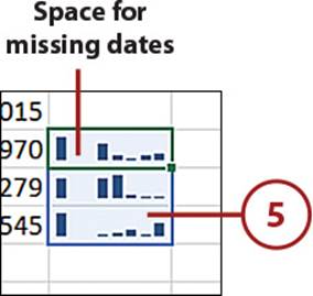
Space Markers by Date
The markers in a sparkline can be spaced out in respect to the dates of the dataset. The date range must include real dates.
1. Select the sparkline cell(s).
2. On the Sparkline Tools, Design tab, from the Axis drop-down, select Date Axis Type.
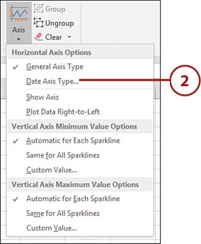
3. Select the date range.
4. Click OK.
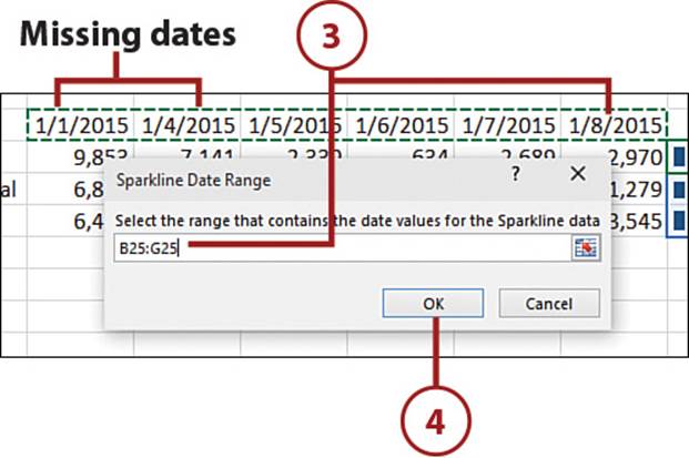
5. The sparkline updates to accommodate the spacing in the selected date range.
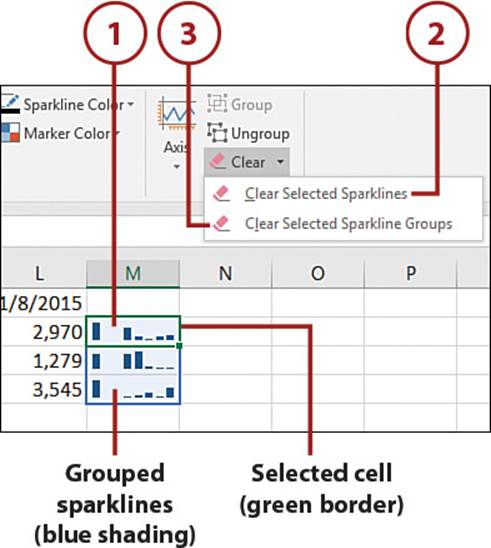
Delete Sparklines
You cannot simply highlight a sparkline and delete it.
1. Select the cell(s) with the sparkline(s).
2. If Excel is grouping your spark-lines together and you only want to delete the sparkline from the cell you selected, on the Sparkline Tools, Design tab, from the Clear drop-down, select Clear Selected Sparklines.
3. If you have multiple sparklines grouped together and want to clear them all, on the Sparkline Tools, Design tab, from the Clear drop-down, select Clear Selected Sparkline Groups.
All materials on the site are licensed Creative Commons Attribution-Sharealike 3.0 Unported CC BY-SA 3.0 & GNU Free Documentation License (GFDL)
If you are the copyright holder of any material contained on our site and intend to remove it, please contact our site administrator for approval.
© 2016-2026 All site design rights belong to S.Y.A.