My Excel 2016 (2016)
15. Summarizing Data with PivotTables
In this chapter, you’ll learn how to use a PivotTable to quickly summarize data. This chapter covers the following topics:
→ Creating a PivotTable
→ Sorting and filtering a PivotTable
→ Grouping dates in a PivotTable
→ Inserting slicers to help users filter a PivotTable
You can use a PivotTable to summarize a million rows with five clicks of the mouse button. For example, if you have sales data broken up by company and product, you can quickly summarize the sales by company, then product, or, with a few clicks, you can reverse the report and summarize by product, then company. Suppose you’re in charge of all the local kids’ soccer leagues and you want to create a report showing the number of boys versus girls, grouped by age. A PivotTable can do all this, and more.
They’re so powerful with so many options that this chapter cannot cover them all. This chapter provides you with the tools to create straightforward, but useful PivotTables. For even more details, refer to Excel 2016 Pivot Table Data Crunching (ISBN 978-0-7897-5629-9) by Bill Jelen and Michael Alexander.
PowerPivot
There is an advanced version of PivotTables called PowerPivot that this book does not review. PowerPivot is a powerful data analysis tool for working with very large amounts of data.
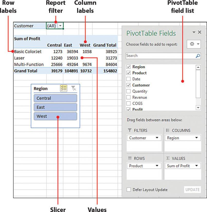
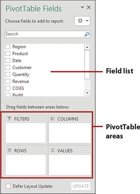
Creating a PivotTable
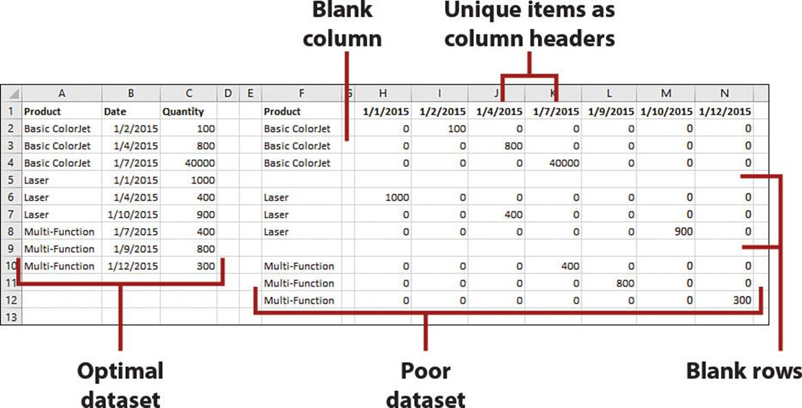
The dataset must be set up correctly to get the most out of a PivotTable. The column headers will become the fields you use to set the row labels, column labels, and report filters. This means the column headers can’t be a unique item, such as a date or specific product. Instead, you should have a column labeled Dates or Products with the unique items arranged below it. Here are the other requirements:
• There can’t be any blank rows or columns in the dataset.
• Every column must have a unique header.
Use the Quick Analysis Tool
The Quick Analysis tool provides a quick way to create a PivotTable.
1. Select the dataset, ensuring there are no blank rows or columns, and each column has a unique header.
2. From the Quick Analysis Tool, select Tables.
3. Excel will recommend some PivotTable configurations. Move your pointer over each one to see a preview. When you find the one you want, click its icon. If Excel doesn’t have any PivotTable recommendations, refer to the section “Create a PivotTable from Scratch.”
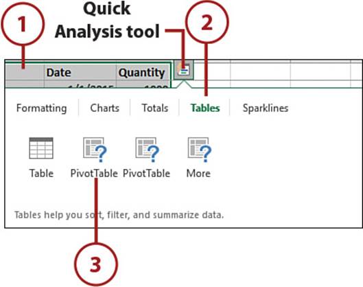
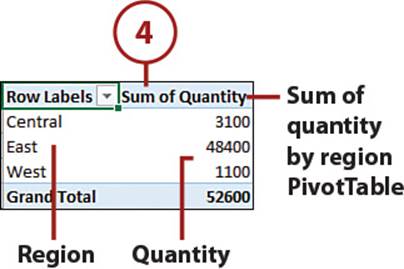
4. The selected PivotTable will be created on a new sheet.
Create a PivotTable from Scratch
Once you’ve told Excel what the data source is, you can quickly create a PivotTable by moving the desired fields in the field list to the correct PivotTable area.
The following example will create a region report summing the quantity and profit for each product, grouped by customer.
1. Select a cell in the dataset. Ensure there are no blank rows or columns, and each column has a unique header.
2. On the Insert tab, select PivotTable.
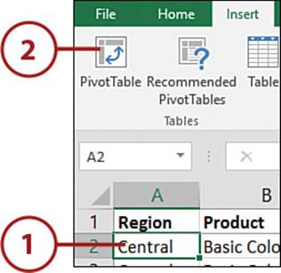
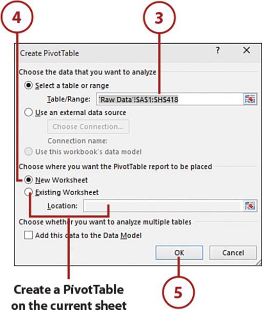
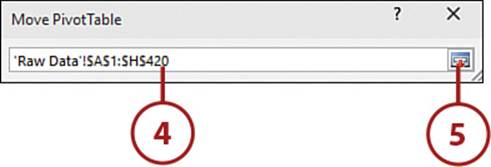
3. Verify the range shown. If it’s incorrect, inspect the dataset for blank rows or columns and start over.
4. Select New Worksheet to put the PivotTable on a new sheet.
Place a PivotTable on the Current Sheet
To place the PivotTable on the data sheet, select Existing Worksheet and select a location on the current sheet. If you choose this option, select a location for the PivotTable below the dataset so that as the report is pivoted, it doesn’t affect the data.
5. Click OK. The PivotTable template and field list appear on a new sheet (or on an existing sheet, if that is what you selected).
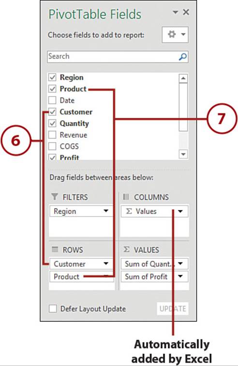
6. Click and drag Customer from the field list to the Rows area.
7. Click and drag Product from the field list to the Rows area.
Adding a Date Field
If you add a date field, Excel will recognize it as such and automatically group the dates into months, quarters, or years. To ungroup them, right-click over a grouped date in the PivotTable and select Ungroup.
8. Click and drag Quantity from the field list to the Values area.
9. Click and drag Profit from the field list to the Values area. When you select two or more fields to summarize, Excel adds a Values field to the Columns area.
10. Click and drag the Region field from the list to the Filters area.
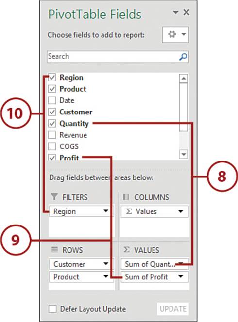
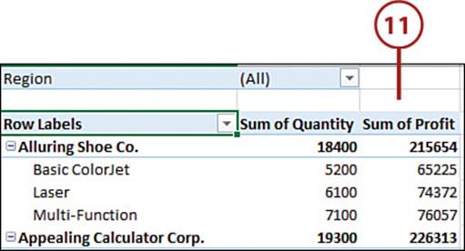
11. The report is complete. If you don’t like the order of the fields, you can click and drag them where you want from the PivotTable field list areas.
Remove a Field
To remove a field from a PivotTable, deselect it from the field list or click it in the area and select Remove Field. You can also click and drag the field from the area to the sheet until an X appears by the pointer. When the X appears, release the mouse button.
Use the Columns Area
Instead of placing the Product field in the Rows area, you could place it in the Columns area. You would then have a set of Quantity and Profit columns for each product.
Change the Calculation Type of a Field Value
When creating a PivotTable, if Excel identifies a Values field as numeric, it automatically sums the data. If it cannot identify the field as numeric, it will count the data. There are many other calculation options you can also choose from.
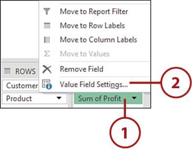
1. Select the field in the Values area of the PivotTable Fields task pane.
2. Select Value Field Settings.
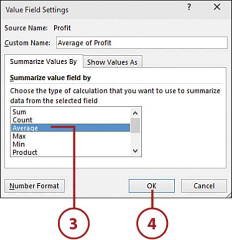
3. Choose the desired calculation type. For example, if the data is numeric, you can perform calculations, such as sum or average. If the data is not numeric, you can only count it.
4. Click OK.
A Numeric Column Was Counted
If you have a column of numbers but Excel returns a count instead, check the column. Either there are words in the column (other than the header) or the numbers are being treated as text.
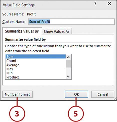
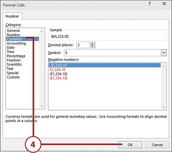
Format Values
If you use the numeric formatting tools on the Home tab or Format Cells dialog box, next time you refresh the PivotTable, the formatting will be lost. Use the PivotTable’s formatting options to set the numeric format the fields should use.
1. Right-click a calculated value in the PivotTable.
2. Select Value Field Settings.
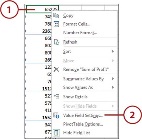
3. Click Number Format.
4. Select the desired number format from the Format Cells dialog box and click OK.
5. Click OK on the Value Field Settings dialog box.
More About Number Formats
Refer to “Applying Number Formats” in Chapter 6, “Formatting Sheets and Cells,” for more information on the different number formats.
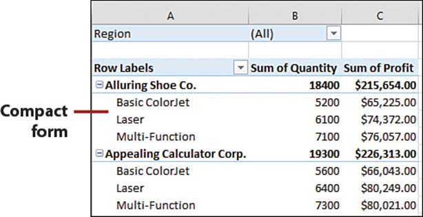
Changing the PivotTable Layout
The default layout of a PivotTable is the compact form, where the row labels are stacked, sharing the same column. Two other layouts are available, providing each row label with its own column. You can also repeat the labels using these other layouts.
• Compact—This is the default configuration. All the fields in the row labels area share the same column. The total appears in the same row as the field.
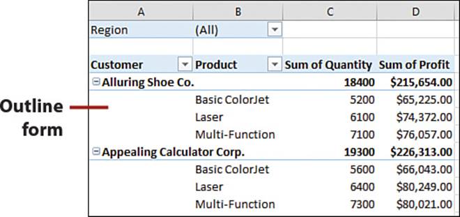
• Outline—The fields in the row labels area each have their own column. The total appears in the same row as the field.
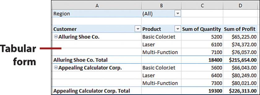
• Tabular—The fields in the row labels area each have their own column. The total appears in its own row beneath its group.
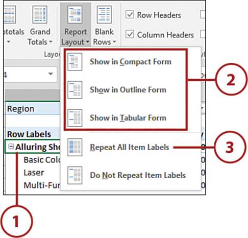
Choose a New Layout
You can replace the default Compact Form with a different layout. If you choose Outline or Tabular, you can also repeat the item labels.
1. Select a cell in the PivotTable.
2. On the PivotTable Tools, Design tab, from the Report Layout drop-down, select a different layout, such as Outline Form or Tabular Form.
3. On the PivotTable Tools, Design tab, from the Report Layout drop-down, select Repeat All Item Labels to fill the cells beneath a label.
PivotTable Sorting
Excel automatically sorts text data alphabetically when building a PivotTable. You can click and drag the fields to a new location or use the standard sorting tools to re-sort it.
Click and Drag
Any row label, column label, or record can be dragged to a new location.
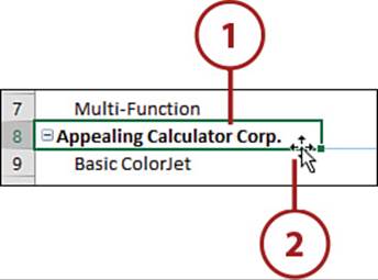
1. Select the row or column label you want to move.
2. Place the pointer on the edge of the selection. When it turns into a four-headed arrow, hold down the mouse button and drag it to a new location.
Reset the Table
To reset the table back to its default state, remove the affected field from the area, refresh the table, and then put the field back.
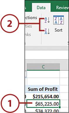
Use Quick Sort
The quick sort buttons offer one-click access to sorting cell values.
1. Select a cell in the column to sort by.
2. On the Data tab, select AZ to sort lowest to highest or ZA to sort highest to lowest.
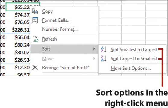
Sorting Data
There are other ways to sort data, including the following:
Right-click the cell and select Sort, Sort A to Z or Sort Z to A if your data is text; select Sort Smallest to Largest or Sort Largest to Smallest if the data is numerical; select Sort Oldest to Newest or Sort Newest to Oldest if the data is a date.
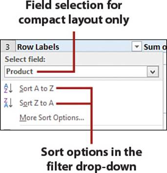
From the filter drop-down of a row or column field, select Sort A to Z or Sort Z to A. If you’re using the compact report layout, select the field to sort from the pivot label field drop-down. The sort descriptions change based on whether the label is text, numeric, or date.
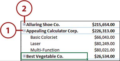
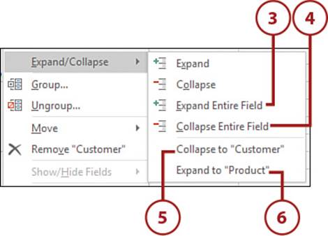
Expanding and Collapsing Fields
If the rows area contains multiple fields, row labels appear in groups that can be quickly expanded and collapsed by clicking the + and – icons.
Expand and Collapse a Field
Expand a field to view more details; collapse it to hide the details.
1. Click the – icon to collapse a single group.
2. Click the + icon to expand a single group.
3. Right-click and from the Expand/Collapse submenu, select Expand Entire Field to expand all the groups in the field.
4. Right-click and from the Expand/Collapse submenu, select Collapse Entire Field to collapse all the groups in the field.
5. Right-click and from the Expand/Collapse submenu, choose Collapse to “Fieldname” to collapse a specific field by name
6. Right-click and from the Expand/Collapse submenu, choose Expand to “Fieldname” to expand a specific field by name.
Grouping Dates
Excel will automatically group dates into month, years, or quarters, but if you don’t want those groupings, you can ungroup what Excel has provided and create your own group.
Grouping and Multiple Reports
If you have multiple reports based on the same data source, grouping a label on one report will group the labels on the others. To prevent this, unlink the reports you don’t want the same grouping on. See the section “Unlinking PivotTables” for more information.
It’s Not All Good: Cannot Group That Selection
A common issue with PivotTables occurs when someone tries to group a date field and receives the error “Cannot group that selection.” The reason may be that the dates are not real dates, but instead text that looks like dates. If that’s the case, see the “Fixing Numbers Stored as Text” section in Chapter 4, “Getting Data onto a Sheet,” to convert the text dates to real dates (because real dates are numbers).
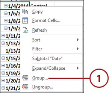
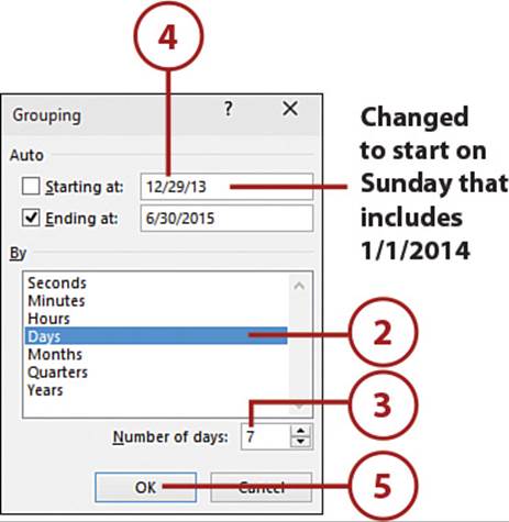
Group by Week
Use the Days option to group by week.
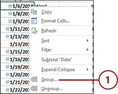
1. Right-click over a date in the PivotTable and select Group.
Dates Already Grouped
If you created a PivotTable and the dates are already grouped, but not how you need them to be, right-click and select Ungroup.
2. Select Days and unselect Months.
3. Enter 7 for Number of Days.
4. Excel will group the selected number of days based on the range in the dialog box, so if the weeks need to represent a normal week, such as Sunday to Saturday, change the starting date to be a Sunday that will include the first date in the dataset.
5. Click OK.
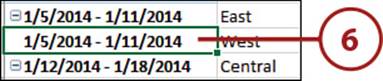
6. Excel will change the labels to show the days of week grouped together.
Group by Month and Year
When you group by month and year, the days are still available within each month.
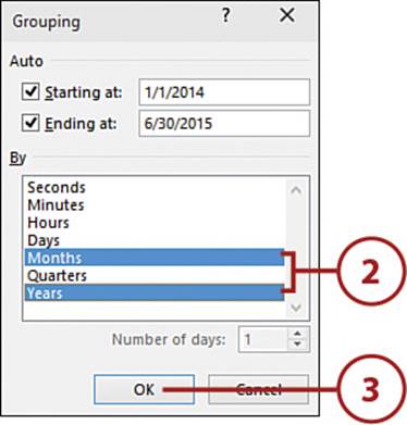
1. Right-click over a date in the PivotTable and select Group.
2. Select Months and Years from the list box.
3. Click OK.
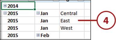
4. The data is grouped into months and years, and a Years field is added to the field list. You can move the Years field to a different area.
Filtering Data in a PivotTable
Filtering allows you to view only the data you want to see. Unlike Excel’s AutoFilter (see Chapter 11, “Filtering and Consolidating Data”), filtering a PivotTable doesn’t hide the rows. Instead, the rows are removed from the report.
Filter for Listed Items
The filter listing is probably the most obvious filter tool when you open the drop-down.
1. Click the drop-down arrow of the label you want to filter.
2. If using the compact report layout, select the field to filter from the pivot label field drop-down.
3. The selected items are the ones that will appear when the column is filtered. Unselect the items you want hidden.
4. Click OK.
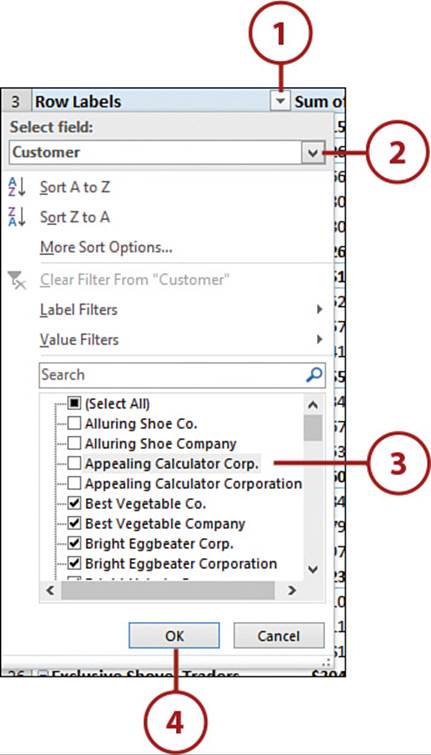
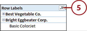
5. The report will update, removing the rows of the items you unselected. An icon that looks like a funnel will replace the arrow on the labels that have a filter applied.
Clear a Filter
A filter can be cleared from a specific label or for the entire PivotTable.
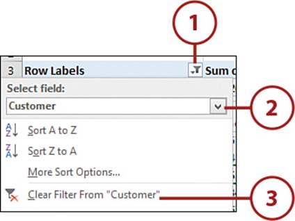
1. To clear a specific label, open the label’s drop-down.
2. If using the compact report layout, select the field to clear from the pivot label field drop-down.
3. Select the Clear Filter from “FieldName” option.
Clear All Filters
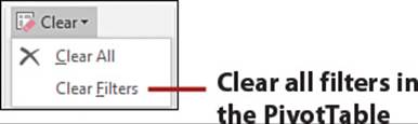
Select Clear Filters from the Clear drop-down on the PivotTable Tools, Analyze tab to clear all filters.
Creating a Calculated Field
A calculated field is a field you create by building a formula using existing fields and constants. Creating the formula isn’t that different from building one in the formula bar, but instead of cell references, you use the field names.
Add a Calculated Field
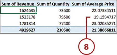
In the following example, the dataset has fields for revenue and quantity, but not for the price of the items sold. You could create a formula outside the PivotTable report, but when the table is updated, the formula may be overwritten. Instead, create a calculated field to calculate the average price.
1. Select a cell in the PivotTable.
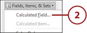
2. Select Calculated Field from the Fields, Items & Sets drop-down on the PivotTable Tools, Analyze tab.
3. Enter a name for the new field, such as Average Price.
4. Select Revenue and then click Insert Field.
5. Type / (a slash) in the Formula field.
6. Select Quantity and then click Insert Field.
7. Click OK. If you have more calculated fields to add, click Add instead.
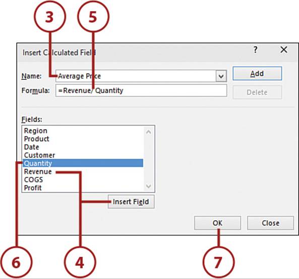
8. The calculated field is added as the last value, but you can move it as needed. You can also change the calculation type, as you would a regular field.
Edit or Delete a Calculated Field
To edit a calculated field, return to the Insert Calculated Field dialog box. Select the field from the Name field drop-down and then make the desired change.
To delete a calculated field, return to the Insert Calculated Field dialog box. Select the field from the Name field drop-down and then click Delete.
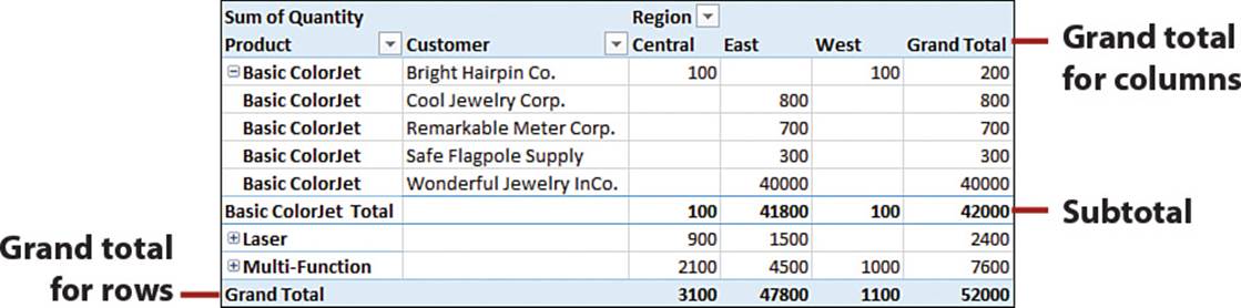
Hiding Totals
By default, subtotals and grand totals are automatically added to the PivotTable.
Hide Totals
You can choose which totals in your PivotTable will be shown.
1. To hide all totals, select Off for Rows and Columns from the Grand Totals drop-down on the PivotTable Tools, Design tab.
2. To show only column totals, select On for Columns Only from the Grand Totals drop-down on the PivotTable Tools, Design tab.
3. To show only row totals, select On for Rows Only from the Grand Totals drop-down on the PivotTable Tools, Design tab.
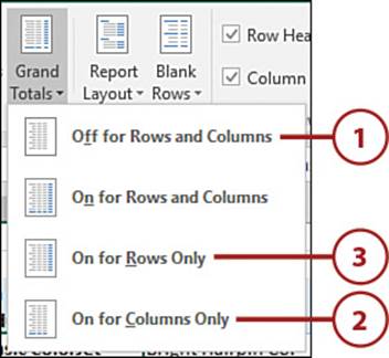
Show Grand Totals
To show all grand totals, select On for Rows and Columns from the Grand Totals drop-down on the PivotTable Tools, Design tab.
Hide Subtotals
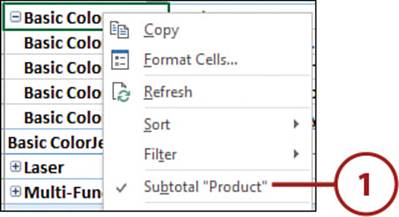
You can choose to hide specific subtotals or all subtotals in your PivotTable.
1. To hide a specific subtotal, right-click over its label and select Subtotal “Fieldname”, thus removing the check mark by the option.
2. To hide all subtotals, select Do Not Show Subtotals from the Subtotals drop-down on the PivotTable Tools, Design tab.
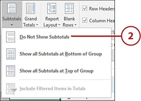
Show Subtotals
To show a specific subtotal, right-click over one of its labels and select Subtotal “Fieldname”. To show all subtotals, select either Show All Subtotals at Bottom of Group or Show All Subtotals at Top of Group from the Subtotals drop-down on the PivotTable Tools, Design tab.
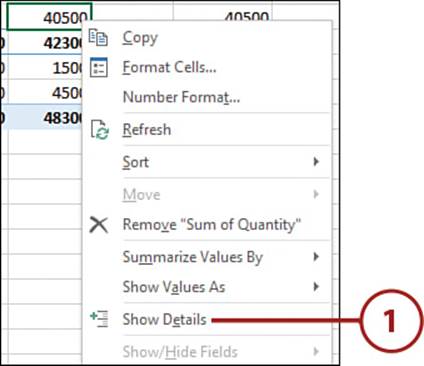
Viewing the Records Used to Calculate a Value
You can create a new report showing the records from which a specific value was derived. This is known as drilling down and can be useful if you notice a value in the PivotTable that stands out and you need to investigate it in more detail.
1. Right-click the value and select Show Details.
The Double-Click Method
You can also drill down by double-clicking on the value.
2. Excel inserts a new sheet with a table consisting of the records from the data source that were used to calculate the value.
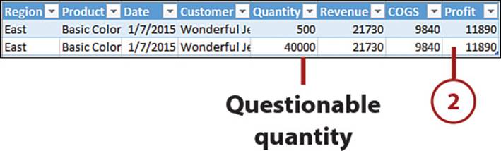
Correcting the Data
The new table is not linked to the original data or the PivotTable. If you need to make corrections to the data, make them to the original source and refresh the PivotTable. You can then delete the sheet that was created for the drill down.
Unlinking PivotTables
PivotTables created from the same data source share the same data cache. The data cache not only holds the records used by the PivotTable, but also configurations, such as grouped dates and calculated fields. This means if you group the dates on one report, all the linked reports will have grouped dates. You’ll need to assign the reports different data caches if you want to have different configurations on the different reports.
Unlink a PivotTable Report
The PivotTable Wizard isn’t available on the ribbon. You’ll have to use a keyboard shortcut to open it.
1. Select a cell in the report in which you want to break the link.
2. Press Alt+D and then P to open the PivotTable Wizard.
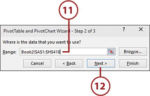
3. Since the wizard opens on its 3rd step, click Back to go to step 2.
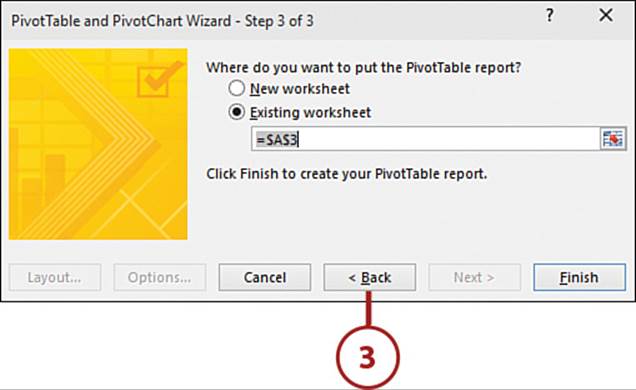
4. Change the range so that it uses one less row.
5. Click Next.
6. Select Existing Worksheet.
7. Make sure the range is the same as the report.
8. Click Finish. The report now has a separate, different cache.
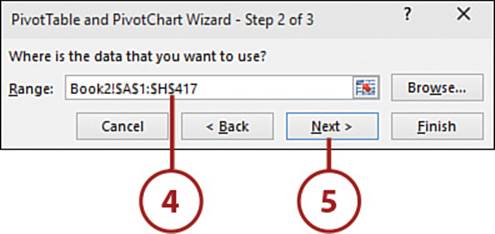
9. Press Alt+D and then P to open the PivotTable Wizard.
10. Click Back.
11. Change the Range field so that it includes the full range.
12. Click Next.
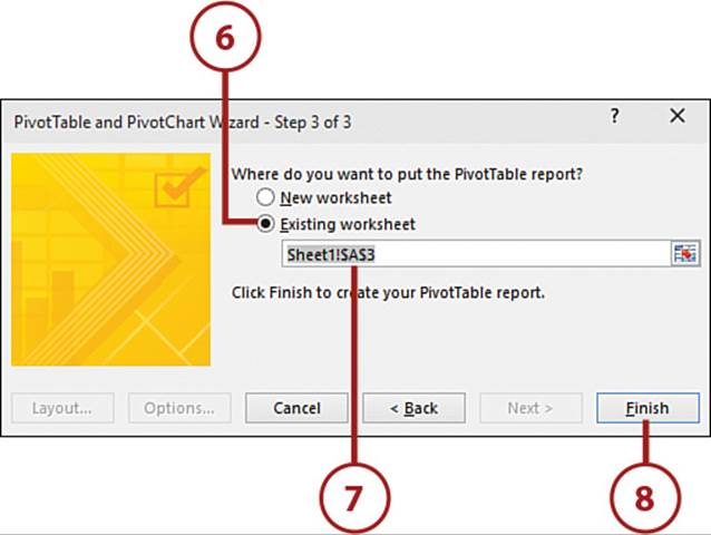
13. Select Existing Worksheet.
14. Make sure the range is the same as the report.
15. Click Finish.
Don’t Use Change Data Source
If you ever need to update the data source, you will have to do so through the PivotTable Wizard. Using the Change Data Source button will relink it with the other reports.
Planning Ahead
If you know you’re going to be creating multiple PivotTables from the same data source and don’t want them linked, start the reports with different data ranges. Then use the PivotTable Wizard to update the data source.
Refreshing the PivotTable
PivotTables don’t automatically refresh as the data source is changed. You have to manually update the PivotTables. You can configure the data to update when the workbook is opened, though this does not update the data source.
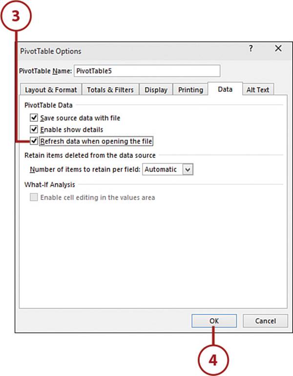
Refresh on Open
You can manually set a PivotTable to refresh the data when the file is opened. This will affect all reports created from the same data source.
1. Select a cell in the PivotTable.
2. Select Options from the PivotTables Tools, Analyze tab.
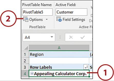
3. Select Refresh Data When Opening the File from the Data tab.
4. Click OK.
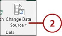
Refresh After Adding New Data
Unless you use a formatted table as the data source, you’ll need to update the data source range when new rows or columns are added it.
1. Select a cell in the PivotTable.
2. Select Change Data Source from the PivotTables Tools, Analyze tab.
3. With the current range in the field highlighted, click the range selector tool.
4. Select the updated range.
5. Select the range selector tool to return to the dialog box.
6. Click OK.
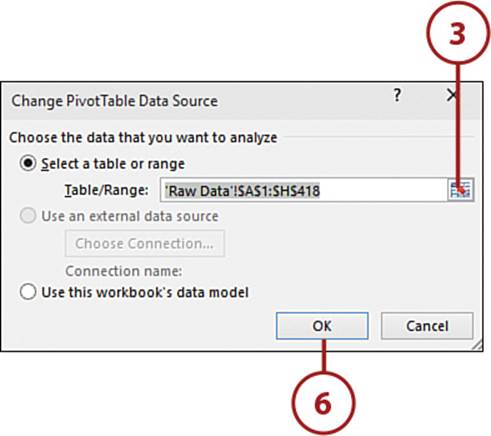
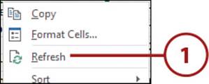
7. Right-click over the PivotTable and select Refresh.
Unlinked Reports
If you have multiple reports using the same data source and you followed the instructions in “Unlinking PivotTables” to separate their caches, you can’t use this method to update the data source because it will relink the reports. Instead, use the PivotTable Wizard to update the data range.
Refresh After Editing the Data Source
You have to refresh the PivotTable if you change a value in the data source.
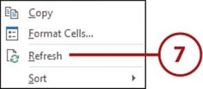
1. To refresh a specific PivotTable, right-click over the report and select Refresh.
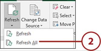
2. To refresh all the PivotTables in the workbook, select Refresh All from the Refresh drop-down on the PivotTables Tools, Analyze tab.
Working with Slicers
Slicers allow you to filter a PivotTable. Unlike the lists in filter drop-downs, slicer lists are always visible and you can change the dimensions of the slicer to better fit your sheet design.
Create a Slicer
Once inserted, a slicer can be sized and placed as needed.
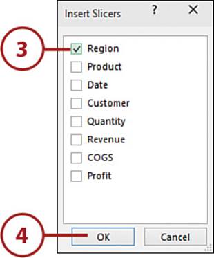
1. Select a cell in the PivotTable.
2. On the PivotTable Tools, Analyze tab, select Insert Slicer.
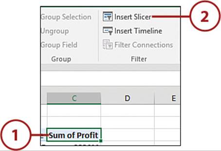
3. Select the field you want a slicer for. It does not have to be a field shown in the report.
4. Click OK. The slicer is added to the sheet.
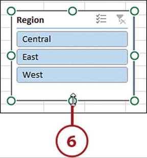
5. Place the pointer on the slicer’s edge so it turns into a four-headed arrow. Click and drag the slicer to a new location.
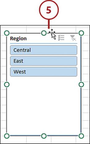
6. Place the pointer over one of the circles on the slicer’s edge so it turns into a two-headed arrow. Click and drag to resize the slicer.
Hide Filter Drop-Downs
If you set up slicers, you can hide the filter drop-downs by going to the Display tab of the PivotTable Options dialog box and unselecting Display Field Captions and Filter Drop Downs.
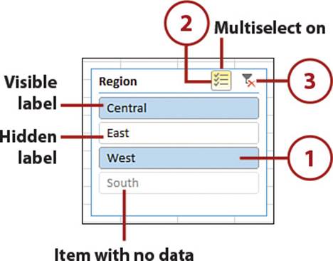
Use a Slicer
Use the slicer to filter the PivotTable.
1. Toggle a label to have it visible or hidden in the PivotTable. Colored labels are visible. White labels are hidden.
2. Toggle the multiselect option. When the button has a border, the option is active, allowing the user to select multiple labels.
3. Clear the filter, making all labels visible.
It’s Not All Good: Faded Slicers
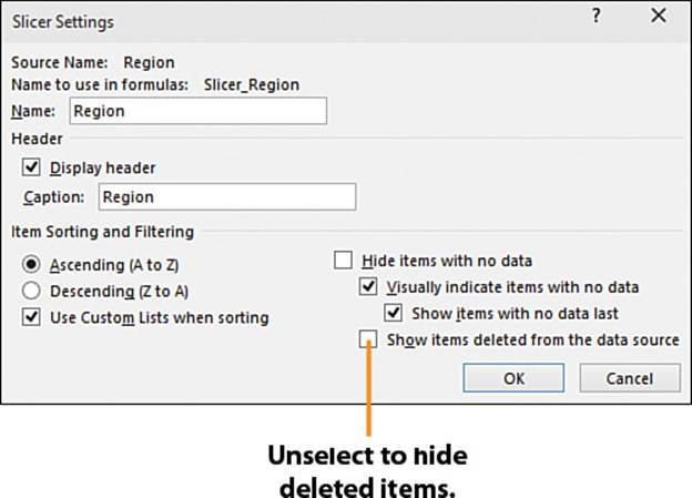
By default, a slicer will show labels that were once used by the slicer, even if those records no longer exist in the PivotTable. Even when there are no filters in effect, these old labels are greyed out but still selectable. You can hide them by unselecting Show Items Deleted from the Data Source from the Slicer Settings on the Slicer Tools, Options tab.
All materials on the site are licensed Creative Commons Attribution-Sharealike 3.0 Unported CC BY-SA 3.0 & GNU Free Documentation License (GFDL)
If you are the copyright holder of any material contained on our site and intend to remove it, please contact our site administrator for approval.
© 2016-2026 All site design rights belong to S.Y.A.