Excel 2016 for Windows Pivot Tables (2016)
6. Charting Pivot Tables
You can create charts based on the data in a pivot table. Pivot charts work the same as standard charts, but you may want to first filter a pivot table or remove excessive nesting to avoid creating charts with too many data series, which are hard to interpret and slow to refresh. Simple chart types like column and line charts work best (avoid 3-D effects, color gradients, gridlines, and other chartjunk ![]() ).
).
Tip: Pivot charts, like pivot tables, are dynamic. As you drag fields in the PivotTable Fields pane from one area to another, Excel automatically refreshes the pivot table and pivot chart.
Creating Pivot Charts
You insert a pivot chart on a worksheet in the same way that you insert a standard chart.
To create a pivot chart:
1. Select any cell in the pivot table.
2. Choose PivotTable Tools > Analyze tab > Tools group > PivotChart.
The Insert Chart dialog box opens.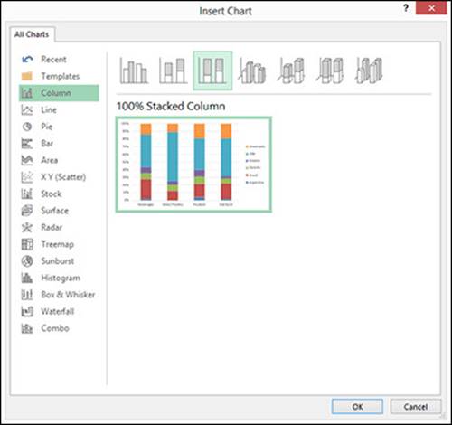
3. Select the type of chart that you want and then click OK.
The pivot chart appears on the worksheet.
The following 100% Stacked Column chart shows Quantity by Category and Ship Country. Each color-coded bar is subdivided by country (denoted by the legend). The pivot table is filtered to show only a few categories and countries.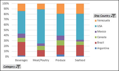
Differences from Standard Charts
Most of what you can do with standard charts, you can also do with pivot charts, except for the following differences.
Some chart types are prohibited
Pivot charts can’t be XY (scatter), bubble, stock, and some other types of charts.
Chart data range is defined differently
A standard chart is linked directly to worksheet cells, whereas a pivot chart is linked to a specific pivot table. You can’t use the Select Data Source dialog box (PivotChart Tools > Design tab > Data Group > Select Data) to change a pivot chart’s data range.
Some formatting isn’t preserved on refresh
Trendlines, data labels, error bars, and other changes to data sets are lost when you refresh the linked pivot table. Standard charts, in contrast, don’t lose their formatting when their source data recalculates.
Customizing Pivot Charts
You have several ways to manipulate and customize a pivot chart.
Format it
When you select (click) a pivot chart, the ribbon sprouts new tabs under the PivotChart Tools heading. These tabs, similar to the Chart Tools tabs for standard charts, change the formatting and layout of the chart, and configure chart elements such as titles, axes, and gridlines.
Move it
Excel places each pivot chart in a floating box. To move a chart, drag it (click an empty area of the chart to drag, or you may accidently drag or select only part of the chart). To move a chart to a new or different worksheet, click the chart and then choose PivotChart Tools > Analyze tab > Actions group > Move Chart. Alternatively, click the chart, press Ctrl+X (Home tab > Cut), switch to the target worksheet, and then press Ctrl+V (Home tab > Paste).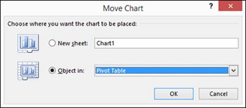
Apply group filters
You can apply group filters directly on a pivot chart. Click one of the field buttons on the chart to show a drop-down list of filtering options. It makes no difference whether you set the filtering options on the chart or on the pivot table itself. If these buttons clutter your chart, you can hide them: choose PivotChart Tools > Analyze tab > Show/Hide group > Field Buttons.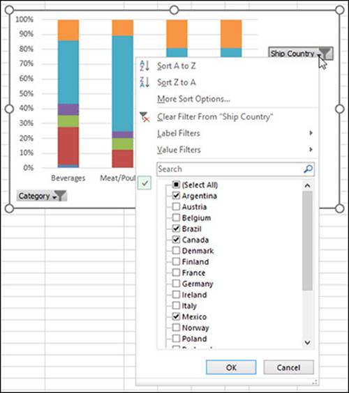
Tip: When you click a pivot chart, the section names in the PivotTable Fields pane change to reflect which parts of the pivot table are used to create the chart. The Rows box becomes Axis (Categories) and the Columns box becomes Legend (Series).
All materials on the site are licensed Creative Commons Attribution-Sharealike 3.0 Unported CC BY-SA 3.0 & GNU Free Documentation License (GFDL)
If you are the copyright holder of any material contained on our site and intend to remove it, please contact our site administrator for approval.
© 2016-2025 All site design rights belong to S.Y.A.