Marketing Analytics: Data-Driven Techniques with Microsoft Excel (2014)
Part I. Using Excel to Summarize Marketing Data
Chapter 1: Slicing and Dicing Marketing Data with PivotTables
Chapter 2: Using Excel Charts to Summarize Marketing Data
Chapter 3: Using Excel Functions to Summarize Marketing Data
Chapter 1. Slicing and Dicing Marketing Data with PivotTables
In many marketing situations you need to analyze, or “slice and dice,” your data to gain important marketing insights. Excel PivotTables enable you to quickly summarize and describe your data in many different ways. In this chapter you learn how to use PivotTables to perform the following:
· Examine sales volume and percentage by store, month and product type.
· Analyze the influence of weekday, seasonality, and the overall trend on sales at your favorite bakery.
· Investigate the effect of marketing promotions on sales at your favorite bakery.
· Determine the influence that demographics such as age, income, gender and geographic location have on the likelihood that a person will subscribe to ESPN: The Magazine.
Analyzing Sales at True Colors Hardware
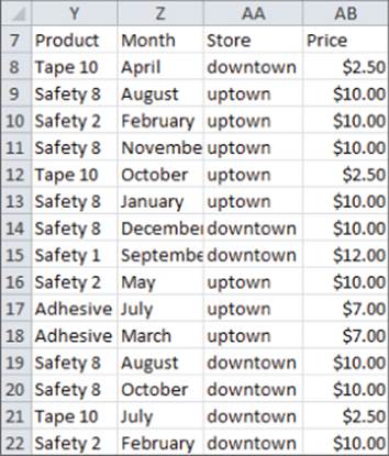
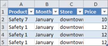
To start analyzing sales you first need some data to work with. The data worksheet from the PARETO.xlsx file (available for download on the companion website) contains sales data from two local hardware stores (uptown store owned by Billy Joel and downtown store owned by Petula Clark). Each store sells 10 types of tape, 10 types of adhesive, and 10 types of safety equipment. Figure 1.1 shows a sample of this data.
Figure 1-1: Hardware store data
Throughout this section you will learn to analyze this data using Excel PivotTables to answer the following questions:
· What percentage of sales occurs at each store?
· What percentage of sales occurs during each month?
· How much revenue does each product generate?
· Which products generate 80 percent of the revenue?
Calculating the Percentage of Sales at Each Store
The first step in creating a PivotTable is ensuring you have headings in the first row of your data. Notice that Row 7 of the example data in the data worksheet has the headings Product, Month, Store, and Price. Because these are in place, you can begin creating your PivotTable. To do so, perform the following steps:
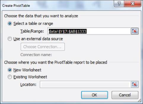
1. Place your cursor anywhere in the data cells on the data worksheet, and then click PivotTable in the Tables group on the Insert tab. Excel opens the Create PivotTable dialog box, as shown in Figure 1.2, and correctly guesses that the data is included in the range Y7:AB1333.
Figure 1-2: PivotTable Dialog Box
NOTE
If you select Use an External Data Source here, you could also refer to a database as a source for a PivotTable. In Exercise 14 at the end of the chapter you can practice creating PivotTables from data in different worksheets or even different workbooks.
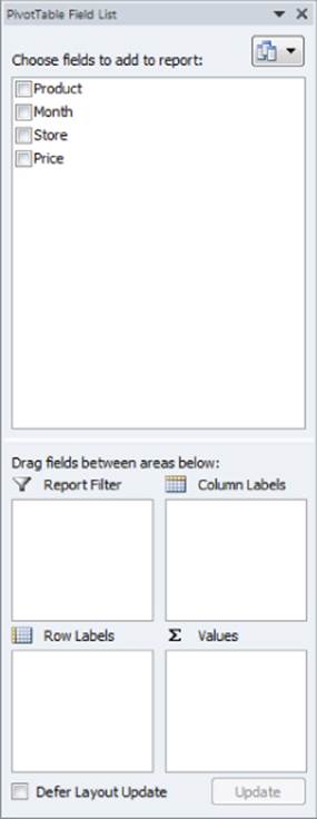
2. Click OK and you see the PivotTable Field List, as shown in Figure 1.3.
Figure 1-3: PivotTable Field List
3. Fill in the PivotTable Field List by dragging the PivotTable headings or fields into the boxes or zones. You can choose from the following four zones:
· Row Labels: Fields dragged here are listed on the left side of the table in the order in which they are added to the box. In the current example, the Store field should be dragged to the Row Labels box so that data can be summarized by store.
· Column Labels: Fields dragged here have their values listed across the top row of the PivotTable. In the current example no fields exist in the Column Labels zone.
· Values: Fields dragged here are summarized mathematically in the PivotTable. The Price field should be dragged to this zone. Excel tries to guess the type of calculation you want to perform on a field. In this example Excel guesses that you want all Prices to be summed. Because you want to compute total revenue, this is correct. If you want to change the method of calculation for a data field to an average, a count, or something else, simply double-click the data field or choose Value Field Settings. You learn how to use the Value Fields Setting command later in this section.
· Report Filter: Beginning in Excel 2007, Report Filter is the new name for the Page Field area. For fields dragged to the Report Filter zone, you can easily pick any subset of the field values so that the PivotTable shows calculations based only on that subset. In Excel 2010 or Excel 2013 you can use the exciting Slicers to select the subset of fields used in PivotTable calculations. The use of the Report Filter and Slicers is shown in the “Report Filter and Slicers” section of this chapter.
NOTE
To see the field list, you need to be in a field in the PivotTable. If you do not see the field list, right-click any cell in the PivotTable, and select Show Field List.
Figure 1.4 shows the completed PivotTable Field List and the resulting PivotTable is shown in Figure 1.5 as well as on the FirstorePT worksheet.
Figure 1-4: Completed PivotTable Field List
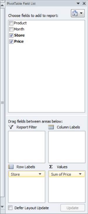
Figure 1-5: Completed PivotTable
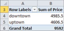
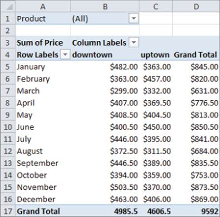
Figure 1.5 shows the downtown store sold $4,985.50 worth of goods, and the uptown store sold $4,606.50 of goods. The total sales are $9592.
If you want a percentage breakdown of the sales by store, you need to change the way Excel displays data in the Values zone. To do this, perform these steps:
1. Right-click in the summarized data in the FirstStorePT worksheet and select Value Field Settings.
2. Select Show Values As and click the drop-down arrow on the right side of the dialog box.
3. Select the % of Column Total option, as shown in Figure 1.6.
Figure 1-6: Obtaining percentage breakdown by Store
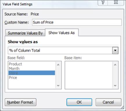
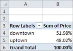
Figure 1.7 shows the resulting PivotTable with the new percentage breakdown by Store with 52 percent of the sales in the downtown store and 48 percent in the uptown store. You can also see this in the revenue by store worksheet of the PARETO.xlsx file.
Figure 1-7: Percentage breakdown by Store
NOTE
If you want a PivotTable to incorporate a different set of data, then under Options, you can select Change Data Source and select the new source data. To have a PivotTable incorporate changes in the original source data, simply right-click and select Refresh. If you are going to add new data below the original data and you want the PivotTable to include the new data when you select Refresh, you should use the Excel Table feature discussed in Chapter 2, “Using Excel Charts to Summarize Marketing Data.”
Summarizing Revenue by Month
You can also use a PivotTable to break down the total revenue by month and calculate the percentage of sales that occur during each month. To accomplish this, perform the following steps:
1. Return to the data worksheet and bring up the PivotTable Field List by choosing Insert PivotTable.
2. Drag the Month field to the Row Labels zone and the Price field to the Values zone. This gives the total sales by month. Because you also want a percentage breakdown of sales by month, drag the Price field again to the Values zone.
3. As shown in Figure 1.8, right-click on the first column in the Values zone and choose Value Field Settings; then choose the % of Column Total option. You now see the percentage monthly breakdown of revenue.
Figure 1-8: Monthly percentage breakdown of Revenue
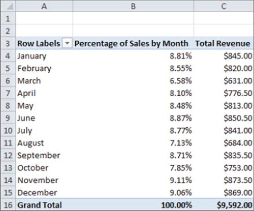
4. Double-click the Column headings and change them to Percentage of Sales by Month and Total Revenue.
5. Finally, double-click again the Total Revenue Column; select Number Format, and choose the Currency option so the revenue is formatted in dollars.
You can see that $845 worth of goods was sold in January and 8.81 percent of the sales were in January. Because the percentage of sales in each month is approximately 1/12 (8.33 percent), the stores exhibit little seasonality. Part III, “Forecasting Sales of Existing Products,” includes an extensive discussion of how to estimate seasonality and the importance of seasonality in marketing analytics.
Calculating Revenue for Each Product
Another important part of analyzing data includes determining the revenue generated by each product. To determine this for the example data, perform the following steps:
1. Return to the data worksheet and drag the Product field to the Row Labels zone and the Price field to the Values zone.
2. Double-click on the Price column, change the name of the Price column to Revenue, and then reformat the Revenue Column as Currency.
3. Click the drop-down arrow in cell A3 and select Sort A to Z so you can alphabetize the product list and obtain the PivotTable in the products worksheet, as shown in Figure 1.9.
Figure 1-9: Sales by Product
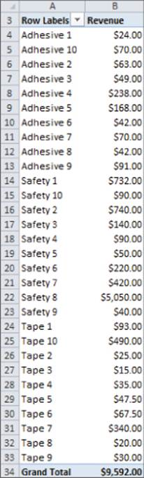
You can now see the revenue that each product generated individually. For example, Adhesive 1 generated $24 worth of revenue.
The Pareto 80–20 Principle
When slicing and dicing data you may encounter a situation in which you want to find which set of products generates a certain percentage of total sales. The well-known Pareto 80–20 Principle states that for most companies 20 percent of their products generate around 80 percent of their sales. Other examples of the Pareto Principle include the following:
· Twenty percent of the population has 80 percent of income.
· Of all possible problems customers can have, 20 percent of the problems cause 80 percent of all complaints.
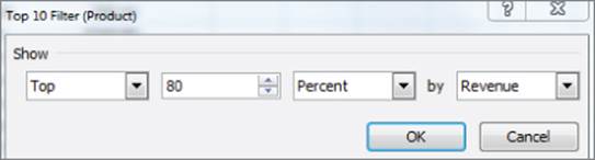
To determine a percentage breakdown of sales by product, perform the following steps:
1. Begin with the PivotTable in the products worksheet and click the drop-down arrow in cell A3.
2. Select Value Filters; then choose Top 10…
3. Change the settings, as shown in Figure 1.10, to choose the products generating 80 percent of the revenue.
Figure 1-10: Using Value Filters to select products generating 80% of sales
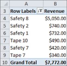
The resulting PivotTable appears in the Top 80% worksheet (see Figure 1.11) and shows that the six products displayed in Figure 1.11 are the smallest set of products generating at least 80 percent of the revenue. Therefore only 20 percent of the products (6 out of 30) are needed to generate 80 percent of the sales.
Figure 1-11: 6 Products Generate 80% of Revenue
NOTE
By clicking the funnel you may clear our filters, if desired.
The Report Filter and Slicers
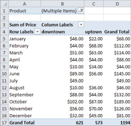
One helpful tool for analyzing data is the Report Filter and the exciting Excel 2010 and 2013 Slicers Feature. Suppose you want to break down sales from the example data by month and store, but you feel showing the list of products in the Row or Column Labels zones would clutter the PivotTable. Instead, you can drag the Month field to the Row Labels zone, the Store field to the Column Labels zone, the Price field to the Value zone, and the Product field to the Report Filter zone. This yields the PivotTable in worksheet Report filter unfiltered, as shown in Figure 1.12.
Figure 1-12: PivotTable used to illustrate Slicers
By clicking the drop-down arrow in the Report Filter, you can display the total revenue by Store and Month for any subset of products. For example, if you select products Safety 1, Safety 7, and Adhesive 8, you can obtain the PivotTable in the Filtered with a slicer worksheet, as shown inFigure 1.13. You see here that during May, sales of these products downtown are $10.00 and uptown are $34.00.
Figure 1-13: PivotTable showing sales for Safety 1, Safety 7 and Adhesive 8
As you can see from Figure 1.13, it is difficult to know which products were used in the PivotTable calculations. The new Slicer feature in Excel 2010 and 2013 (see the Filtered with a slicer worksheet) remedies this problem. To use this tool perform the following steps:
1. Put your cursor in the PivotTable in the Filtered with a Slicer worksheet and select Slicer from the Insert tab.
2. Select Products from the dialog box that appears and you see a Slicer that enables you to select any subset of products (select a product and then hold down the Control Key to select another product) from a single column.
3. Click inside the Slicer and you will see Slicer Tools on the ribbon. After selecting the Buttons section from Slicer Tools change Columns to 5. Now the products show up in five columns (see Figure 1.14).
Figure 1-14: Slicer selection for sales of Safety 1, Safety 7 and Adhesive 8.
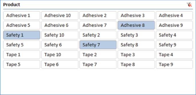
A Slicer provides sort of a “dashboard” to filter on subsets of items drawn from a PivotTable field(s). The Slicer in the Filtered with a slicer worksheet makes it obvious that the calculations refer to Safety 1, Safety 7, and Adhesive 8. If you hold down the Control key, you can easily resize a Slicer.
NOTE
If you double-click in a cell in a PivotTable, Excel drills down to the source data used for that cell's calculations and places the source data in a separate sheet. For example, if in the Report filtered unfiltered worksheet you double-click in the January downtown cell, you can obtain the source data in the worksheet January downtown, as shown in Figure 1.15.
Figure 1-15: Drilling down on January Downtown Sales
You have learned how PivotTables can be used to slice and dice sales data. Judicious use of the Value Fields Settings capability is often the key to performing the needed calculations.
Analyzing Sales at La Petit Bakery
La Petit Bakery sells cakes, pies, cookies, coffee, and smoothies. The owner has hired you to analyze factors affecting sales of these products. With a PivotTable and all the analysis skills you now have, you can quickly describe the important factors affecting sales. This example paves the way for a more detailed analysis in Part III of this book.
The file BakeryData.xlsx contains the data for this example and the file LaPetitBakery.xlsx contains all the completed PivotTables. In the Bakerydata.xlsx workbook you can see the underlying daily sales data recorded for the years 2013–2015. Figure 1.16 shows a subset of this data.
Figure 1-16: Data for La Petit Bakery
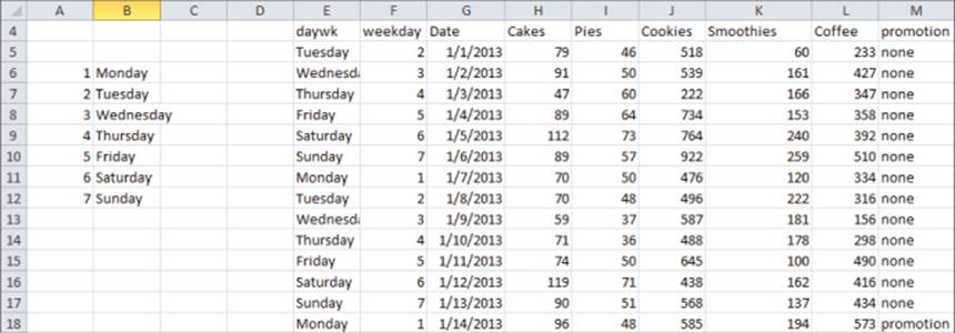
A 1 in the weekday column indicates the day was Monday, a 2 indicates Tuesday, and so on. You can obtain these days of the week by entering the formula = WEEKDAY(G5,2) in cell F5 and copying this formula from F5 to the range F6:F1099. The second argument of 2 in the formula ensures that a Monday is recorded as 1, a Tuesday as 2, and so on. In cell E5 you can enter the formula =VLOOKUP(F5,lookday,2) to transform the 1 in the weekday column to the actual word Monday, the 2 to Tuesday, and so on. The second argument lookday in the formula refers to the cell range A6:B12.
NOTE
To name this range lookday simply select the range and type lookday in the Name box (the box directly to the left of the Function Wizard) and press Enter. Naming a range ensures that Excel knows to use the range lookday in any function or formula containing lookday.
The VLOOKUP function finds the value in cell F5 (2) in the first column of the lookday range and replaces it with the value in the same row and second column of the lookday range (Tuesday.) Copying the formula =VLOOKUP(F5,lookday,2) from E5 to E6:E1099 gives you the day of the week for each observation. For example, on Friday, January 11, 2013, there was no promotion and 74 cakes, 50 pies, 645 cookies, 100 smoothies, and 490 cups of coffee were sold.
Now you will learn how to use PivotTables to summarize how La Petit Bakery's sales are affected by the following:
· Day of the week
· Month of the year
· An upward (or downward!) trend over time in sales
· Promotions such as price cuts
Summarizing the Effect of the Day of the Week on Bakery Sales
La Petit Bakery wants to know how sales of their products vary with the day of the week. This will help them better plan production of their products.
In the day of week worksheet you can create a PivotTable that summarizes the average daily number of each product sold on each day of the week (see Figure 1.17). To create this PivotTable, perform the following steps:
1. Drag the daywk field to the Row Labels zone and drag each product to the Values zone.
2. Double-click each product, and change the summary measure to Average. You'll see, for example, that an average of 96.5 cakes was sold on Sunday.
Figure 1-17: Daily breakdown of Product Sales
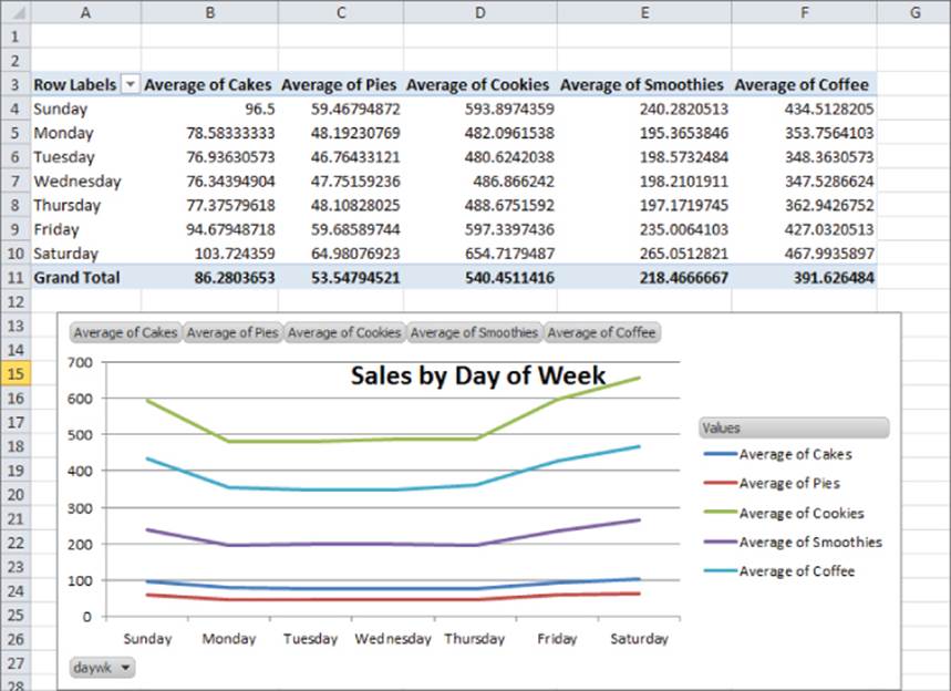
As the saying (originally attributed to Confucius) goes, “A picture is worth a thousand words.” If you click in a PivotTable and go up to the Options tab and select PivotChart, you can choose any of Excel's chart options to summarize the data (Chapter 2, “Using Excel Charts to Summarize Marketing Data,” discusses Excel charting further). Figure 1.17 (see the Daily Breakdown worksheet) shows the first Line option chart type. To change this, right-click any series in a chart. The example chart here shows that all products sell more on the weekend than during the week. In the lower left corner of the chart, you can filter to show data for any subset of weekdays you want.
Analyzing Product Seasonality
If product sales are approximately the same during each month, they do not exhibit seasonality. If, however, product sales are noticeably higher (or lower) than average during certain quarters, the product exhibits seasonality. From a marketing standpoint, you must determine the presence and magnitude of seasonality to more efficiently plan advertising, promotions, and manufacturing decisions and investments. Some real-life illustrations of seasonality include the following:
· Amazon's fourth quarter revenues are approximately 33 percent higher than an average quarter. This is because of a spike in sales during Christmas.
· Tech companies such as Microsoft and Cisco invariably have higher sales during the last month of each quarter and reach maximum sales during the last month of the fiscal year. This is because the sales force doesn't get its bonuses unless it meets quarterly or end of year quotas.
To determine if La Petit Bakery products exhibit seasonality, you can perform the following steps:
1. Begin with your cursor anywhere in the data in the BakeryData.xlsx workbook. From the Insert tab select PivotTable and the PivotTable Field List will appear. Drag the Date field to the Row Labels zone and as before, drag each product to the Values zone and again change the entries in the Values zone to average sales for each product.
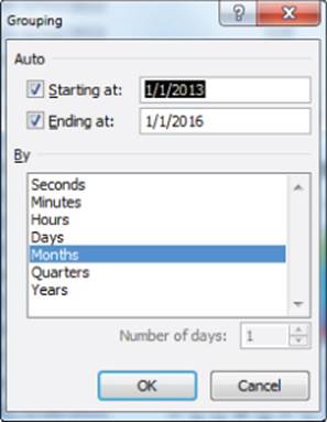
2. At first you see sales for every day, but you actually want to group sales by month. To do this, put the cursor on any date, right-click, and choose Group.
3. To group the daily sales into monthly buckets, choose Months from the dialog box, as shown in Figure 1.18.
Figure 1-18: Grouping data by Month
4. Now select PivotChart from the Options tab. After selecting the first Line chart option you obtain the PivotChart and PivotTable, as shown in the monthly breakdown worksheet of the LaPetitBakery.xlsx file (see Figure 1.19).
Figure 1-19: Monthly breakdown of Bakery Sales
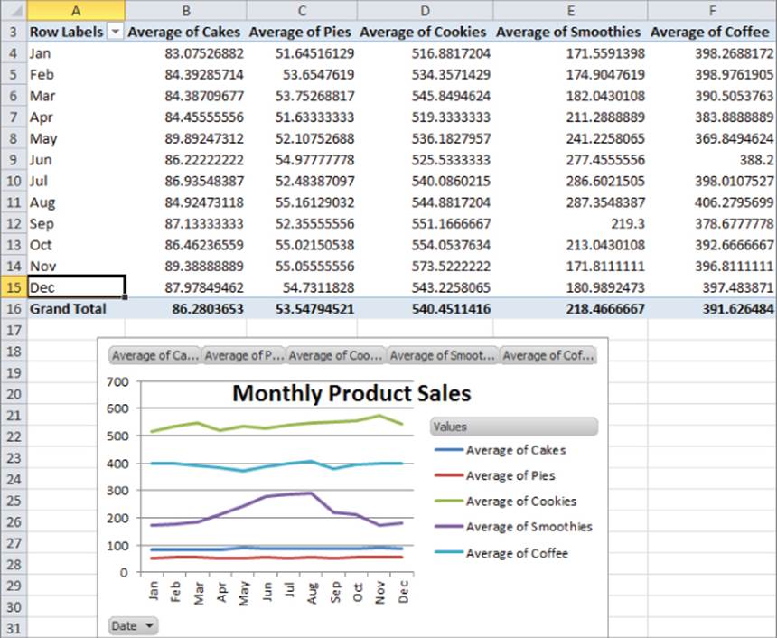
This chart makes it clear that smoothie sales spike upward in the summer, but sales of other products exhibit little seasonality. In Part III of this book you can find an extensive discussion of how to estimate seasonality.
Given the strong seasonality and corresponding uptick in smoothie sales, the bakery can probably “trim” advertising and promotions expenditures for smoothies between April and August. On the other hand, to match the increased demand for smoothies, the bakery may want to guarantee the availability and delivery of the ingredients needed for making its smoothies. Similarly, if the increased demand places stress on the bakery's capability to serve its customers, it may consider hiring extra workers during the summer months.
NOTE
If you right-click any month and select Ungroup, you can undo the grouping and return to a display of the daily sales data.
Analyzing the Trend in Bakery Sales
The owners of La Petit Bakery want to know if sales are improving. Looking at a graph of each product's sales by month will not answer this question if seasonality is present. For example, Amazon.com has lower sales every January than the previous month due to Christmas. A better way to analyze this type of trend is to compute and chart average daily sales for each year. To perform this analysis, complete the following steps:
1. Put your cursor inside the data in the Data worksheet of the BakeryData.xlsx file, create a PivotTable, and drag each product to the Values zone and again change the method of summary from Sum to Average.
2. Then drag the Date field to the Row Labels zone, place the cursor on any date, and right-click Group and choose Years. You see a monthly summary of average daily sales for each Month and Year.
3. Drag the Date field away from the Row Labels zone and you are left with the summary of product sales by year, as shown in Figure 1.20 (see the work in worksheet by Year).
Figure 1-20: Summary of Sales by Year
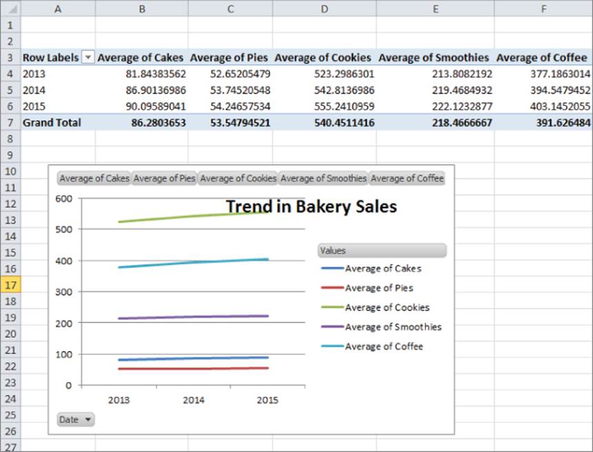
4. As you did before, create a Line PivotChart. The chart shows sales for each product are trending upward, which is good news for the client.
The annual growth rates for products vary between 1.5 percent and 4.9 percent. Cake sales have grown at the fastest rate, but represent a small part of overall sales. Cookies and coffee sales have grown more slowly, but represent a much larger percentage of revenues.
Analyzing the Effect of Promotions on Sales
To get a quick idea of how promotions affect sales, you can determine average sales for each product on the days you have promotions and compare the average on days with promotions to the days without promotions. To perform these computations keep the same fields in the Value zone as before, and drag the Promotion field to the Row Labels zone. After creating a line PivotChart, you can obtain the results, as shown in Figure 1.21 (see the promotion worksheet).
Figure 1-21: Effect of Promotion on Sales
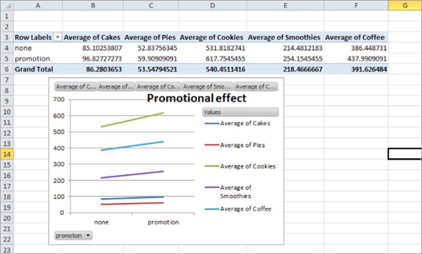
The chart makes it clear that sales are higher when you have a promotion. Before concluding, however, that promotions increase sales, you must “adjust” for other factors that might affect sales. For example, if all smoothie promotions occurred during summer days, seasonality would make the average sales of smoothies on promotions higher than days without promotions, even if promotions had no real effect on sales. Additional considerations for using promotions include costs; if the costs of the promotions outweigh the benefits, then the promotion should not be undertaken. The marketing analyst must be careful in computing the benefits of a promotion. If the promotion yields new customers, then the long-run value of the new customers (see Part V) should be included in the benefit of the promotion. In Parts VIII and IX of this book you can learn how to perform more rigorous analysis to determine how marketing decisions such as promotions, price changes, and advertising influence product sales.
Analyzing How Demographics Affect Sales
Before the marketing analyst recommends where to advertise a product (see Part IX), she needs to understand the type of person who is likely to purchase the product. For example, a heavy metal fan magazine is unlikely to appeal to retirees, so advertising this product on a television show that appeals to retirees (such as Golden Girls) would be an inefficient use of the advertising budget. In this section you will learn how to use PivotTables to describe the demographic of people who purchase a product.
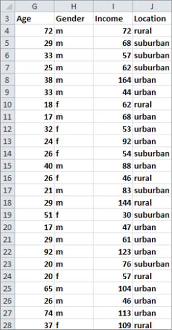
Take a look at the data worksheet in the espn.xlsx file. This has demographic information on a randomly chosen sample of 1,024 subscribers to ESPN: The Magazine. Figure 1.22 shows a sample of this data. For example, the first listed subscriber is a 72-year-old male living in a rural location with an annual family income of $72,000.
Figure 1-22: Demographic data for ESPN: The Magazine
Analyzing the Age of Subscribers
One of the most useful pieces of demographic information is age. To describe the age of subscribers, you can perform the following steps:
1. Create a PivotTable by dragging the Age field to the Row Labels zone and the Age field to the Values zone.
2. Unfortunately, Excel assumes that you want to calculate the Sum of Ages. Double-click the Sum of Ages heading, and change this to Count of Age.
3. Use Value Field settings with the % of Column Total setting to show a percentage breakdown by age.
4. Finally, right-click on any listed age in the PivotTable and select Group. This enables you to group ages in 10-year increments. You can also use the PivotChart feature using the first Column chart option to create a column chart (see Figure 1.23 and the age worksheet) to summarize the age distribution of subscribers.
Figure 1-23: Age distribution of subscribers
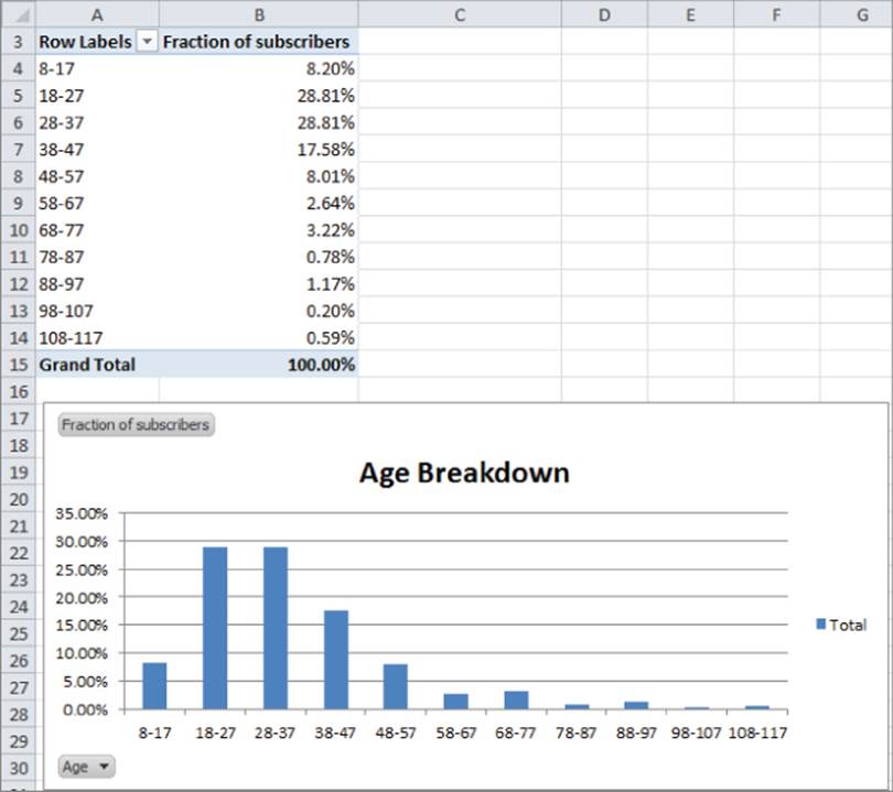
You find that most of the magazine's subscribers are in the 18–37 age group. This knowledge can help ESPN find TV shows to advertise that target the right age demographic.
Analyzing the Gender of Subscribers
You can also analyze the gender demographics of ESPN: The Magazine subscribers. This will help the analyst to efficiently spend available ad dollars. After all, if all subscribers are male, you probably do not want to place an ad on Project Runway.
1. In the data worksheet, drag the Gender field to the Column Labels zone and the Gender field to the Values zone.
2. Right-click the data and use Value Field Settings to change the calculations to Show Value As % of Row Total; this enables you to obtain the PivotTable shown in the gender worksheet (see Figure 1.24.)
Figure 1-24: Gender breakdown of subscribers
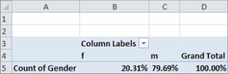
You find that approximately 80 percent of subscribers are men, so ESPN may not want to advertise on The View!
Describing the Income Distribution of Subscribers
In the Income worksheet (see Figure 1.25) you see a breakdown of the percentage of subscribers in each income group. This can be determined by performing the following steps:
1. In the data worksheet drag the Income field to the Row Labels zone and the Income field to the Values zone.
2. Change the Income field in the Values zone to Count of Income (if it isn't already there) and group incomes in $25,000 increments.
3. Finally, use Value Field Settings → Show Value As → % of Column Total to display the percentage of subscribers in each income bracket.
Figure 1-25: Income distribution of subscribers
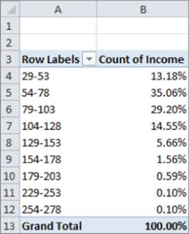
You see that a majority of subscribers are in the $54,000–$103,000 range. In addition, more than 85 percent of ESPN: The Magazine subscribers have income levels well above the national median household income, making them an attractive audience for ESPN's additional marketing efforts.
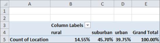
Describing Subscriber Location
Next you will determine the breakdown of ESPN: The Magazine subscribers between suburbs, urban, and rural areas. This will help the analyst recommend the TV stations where ads should be placed.
1. Put your cursor inside the data from the data worksheet and drag the Location field to the Column Labels zone and Value zone.
2. Apply Value Field Settings and choose Show Value As → % of Row Total to obtain the PivotTable, as shown in the Location worksheet and Figure 1.26. You find that 46 percent of subscribers live in the suburbs; 40 percent live in urban areas and 15 percent live in rural areas.
Figure 1-26: Breakdown of Subscriber Location
Constructing a Crosstabs Analysis of Age and Income
Often marketers break down customer demographics simultaneously on two attributes. Such an analysis is called a crosstabs analysis. In the data worksheet you can perform a crosstabs analysis on Age and Income. To do so, perform the following steps:
1. Begin by dragging the Age field to the Column Labels zone and the Income field to the Row Labels and Value Labels zones.
2. Next group ages in 10-year increments and income in $25,000 increments.
3. Finally, use Value Field Settings to change the method of calculation to Show Value As → % of Row Total. The Income and Age worksheet (shown in Figure 1.27) shows the resulting PivotTable, which indicates that 28.13 percent of subscribers in the $54,000 to $78,000 bracket are in the 28–37 age group.
Figure 1-27: Crosstabs Analysis of subscribers
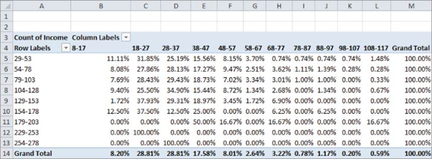
Crosstabs analyses enable companies to identify specific combinations of customer demographics that can be used for a more precise allocation of their marketing investments, such as advertising and promotions expenditures. Crosstabs analyses are also useful to determine where firms should notmake investments. For instance, there are hardly any subscribers to ESPN: The Magazine that are 78 or older, or with household incomes above $229,000, so placing ads on TV shows that are heavily watched by wealthy retiree is not recommended.
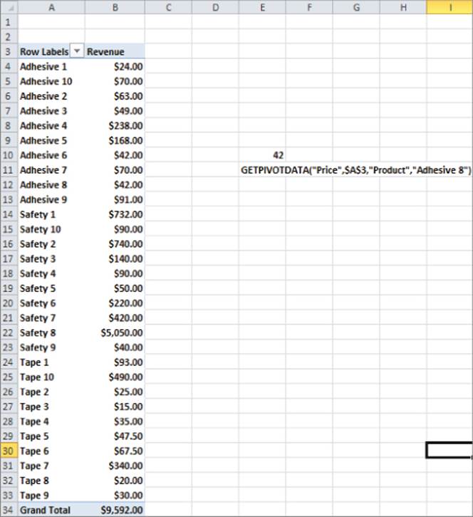
Pulling Data from a PivotTable with the GETPIVOTDATA Function
Often a marketing analyst wants to pull data from a PivotTable to use as source information for a chart or other analyses. You can achieve this by using the GETPIVOTDATA function. To illustrate the use of the GETPIVOTDATA function, take a second look at the True Colors hardware store data in theproducts worksheet from the PARETO.xlsx file.
1. With the cursor in any blank cell, type an = sign and point to the cell (B12) containing Adhesive 8 sales.
2. You will now see in the formerly blank cell the formula =GETPIVOTDATA("Price",$A$3,"Product","Adhesive 8"). Check your result against cell E10. This pulls the sales of Adhesive 8 ($42.00) from the PivotTable into cell E10.
This formula always picks out Adhesive 8 sales from the Price field in the PivotTable whose upper left corner is cell A3. Even if the set of products sold changes, this function still pulls Adhesive 8 sales.
In Excel 2010 or 2013 if you want to be able to click in a PivotTable and return a cell reference rather than a GETPIVOTTABLE function, simply choose File → Options, and from the Formulas dialog box uncheck the Use GetPivotData functions for the PivotTable References option (see Figure 1.28).
Figure 1-28: Example of GETPIVOTDATA function
This function is widely used in the corporate world and people who do not know it are at a severe disadvantage in making best use of PivotTables. Chapter 2 covers this topic in greater detail.
Summary
In this chapter you learned the following:
· Sketch out in your mind how you want the PivotTable to look before you fill in the Field List.
· Use Value Field Settings to change the way the data is displayed or the type of calculation (Sum, Average, Count, etc.) used for a Value Field.
· A PivotChart can often clarify the meaning of a PivotTable.
· Double-click in a cell to drill down to the source data that was used in the cell's calculation.
· The GETPIVOTDATA function can be used to pull data from a PivotTable.
Exercises
1. The Makeup2007.xlsx file (available for download on the companion website) gives sales data for a small makeup company. Each row lists the salesperson, product sold, location of the sale, units sold, and revenue generated. Use this file to perform the following exercises:
a. Summarize the total revenue and units sold by each person of each product.
b. Summarize the percentage of each person's sales that came from each location. Create a PivotChart to summarize this information.
c. Summarize each girl's sales by location and use the Report Filter to change the calculations to include any subset of products.
2. The Station.xlsx file contains data for each family including the family size (large or small), income (high or low), and whether the family bought a station wagon. Use this file to perform the following exercises:
a. Does it appear that family size or income is a more important determinant of station wagon purchases?
b. Compute the percentage of station wagon purchasers that are high or low income.
c. Compute the fraction of station wagon purchasers that come from each of the following four categories: High Income Large Family, High Income Small Family, Low Income Large Family, and Low Income Small Family.
3. The cranberrydata.xlsx file contains data for each quarter in the years 2006–2011 detailing the pounds of cranberries sold by a small grocery store. You also see the store's price and the price charged by the major competitor. Use this file to perform the following exercises:
a. Ignoring price, create a chart that displays the seasonality of cranberry sales.
b. Ignoring price, create a chart that shows whether there is an upward trend in sales.
c. Determine average sales per quarter, breaking it down based on whether your price was higher or lower than the competitor's price.
4. The tapedata.xlsx file contains data for weeks during 2009–2011 for the unit sales of 3M tape, price charged, whether an ad campaign was run that week (1 = ad campaign), and whether the product was displayed on the end of the aisle (1 = end cap). Use this file to perform the following exercises:
a. Does there appear to be an upward trend in sales?
b. Analyze the nature of the monthly seasonality of tape sales.
c. Does an ad campaign appear to increase sales?
d. Does placing the tape in an end-cap display appear to increase sales?
5. The files EAST.xlsx and WEST.xlsx contain information on product sales (products A–H) that you sell in January, February, and March. You want to use a PivotTable to summarize this sales data. The Field List discussed in this chapter does not enable you to create PivotTables on data from multiple ranges. If you hold down the ALT key and let go and hold down the D key and let go of the D key and hold down the P key, you can see the Classic PivotTable Wizard that enables you to select multiple ranges of data to key a PivotTable. Let Excel create a single page field for you and create a PivotTable to summarize total sales in the East and West during each month. Use the Filters so that the PivotTable shows only January and March sales of products A, C, and E.
All materials on the site are licensed Creative Commons Attribution-Sharealike 3.0 Unported CC BY-SA 3.0 & GNU Free Documentation License (GFDL)
If you are the copyright holder of any material contained on our site and intend to remove it, please contact our site administrator for approval.
© 2016-2026 All site design rights belong to S.Y.A.