Marketing Analytics: Data-Driven Techniques with Microsoft Excel (2014)
Part VII. Forecasting New Product Sales
Chapter 26: Using S Curves to Forecast Sales of a New Product
Chapter 27: The Bass Diffusion Model
Chapter 28: Using the Copernican Principle to Predict Duration of Future Sales
Chapter 26. Using S Curves to Forecast Sales of a New Product
In many industries for which new products require large research and development investments (particularly high tech and pharmaceuticals) it is important to forecast future sales after a product has been on the market for several years. Often a graph of new product sales on the y-axis against time on the x-axis looks like the letter S and is often referred to as an S curve. If a product's sales follows an S curve, then up to a certain point (called an inflection point) sales increase at an increasing rate, and beyond the inflection point the growth of sales slows. This chapter shows how S curves can be estimated from early product sales. The S curve equation enables you to know how large sales will eventually become and whether sales have passed the inflection point.
Examining S Curves
In his classic book Diffusion of Innovations (5th ed., Free Press, 2003), sociologist Everett Rogers first came up with the idea that the percentage of a market adopting a product, cumulative sales per capita of a product, or even sales per capita often follow an S-shaped curve (see Figure 26.1). Some examples include the following (see Theodore Modis, Predictions, Simon and Schuster, 1992):
· Sales of VAX minicomputers in the 1980s
· Registered cars in Italy: 1950s–1990s
· Thousands of miles of railroad tracks in the United States: 1850s–1930s
· Cumulative number of supertankers built: 1970–1985
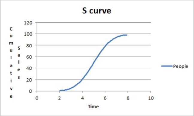
Figure 26-1: Example of S curve
If an S curve is estimated from a few early data points, the marketing analyst can glean two important pieces of information:
· The upper limit of sales: Refer to Figure 26.1 and you can see this upper limit is 100.
· The inflection point: Defined as the time t when the rate at which sales increase begins to decrease. The inflection point occurs around time 5 because the curve changes from convex (slope increasing) to concave (slope decreasing) (refer to Figure 26.1).
In assessing future profitability of a product, you must know if sales have passed the inflection point. After all, a product whose sales have passed the inflection point has limited possibilities for future growth. For example, 3M incorporates this idea into its corporate strategy by striving to have at least 30 percent of its product revenues come from new products that are less than 5 years old (http://money.cnn.com/2010/09/23/news/companies/3m_innovation_revival.fortune/index.htm). This ensures that a major portion of 3M's product portfolio comes from products whose sales are fast growing because their sales have not yet passed their inflection point.
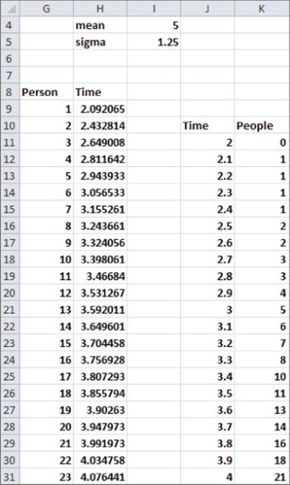
To see how an S curve may arise, suppose there are 100 possible adopters of a new product and the time for each person to adopt the product is normally distributed with a mean of 5 years and a standard deviation of 1.25 years (see Figure 26.2.) You can graph as a function of time t the total number of people who have adopted the product by time t. This graph will look like the S curve referred to in Figure 26.1. To create this graph, follow these steps in the workbook Scurvenormal.xlsx:
1. In H9 through H10:H107 compute an “average” time at which the nth person adopts the product. For example, in H18 compute the 10th percentile of the time to adoption and assume that the 10th person will adopt at this time.
2. Copy the formula =NORMINV(G9/100,$I$4,$I$5) from H9 to H10:H107 to compute your estimate of the average time that each person adopts the product. For example, in H18 this computes the 10th percentile of the time to adoption.
3. Copy the formula =COUNTIF($H$9:$H$107,"<="&J11) from K11 to K12:K70 to count the number of people that adopted the product by time t. For example, the formula in cell K21 computes the number of people (five) that have adopted the product by time 3.
4. Graph the range J10:K70 with a scatter chart to create the chart shown in Figure 26.1. Note the graph's inflection point appears to occur near t = 5.
Figure 26-2: Why S curves occur
Fitting the Pearl or Logistic Curve
The Logistic curve is often used to model the path of product diffusion. The Logistic curve is also known as the Pearl curve (named after the 20th century U.S. demographer Raymond Pearl). To find the Logistic curve, let x(t) = sales per capita at time t, cumulative sales by time t, or percentage of population having used the product by time t. If x(t) follows a Logistic curve then Equation 1 is true:
1 ![]()
Given several periods of data, you can use the Excel GRG MultiStart Solver (see Chapter 23, “Cluster Analysis,” where the GRG MultiStart Solver was used in your discussion of cluster analysis) to find the values of L, a, and b that best fit Equation 1. As t grows large the term ae-bt approaches 0 and the right side of Equation 1 approaches L. This implies the following:
· If you model cumulative sales, then cumulative sales per capita approach an upper limit of L.
· If you model actual sales per capita, then actual sales per capita approach L.
· If you model percentage of population to have tried a product, then the final percentage of people to have tried a product will approach L.
Together a and b determine the slope of the S curve at all points in time. For a Logistic curve it can be shown that the inflection point occurs when t = Ln a/b.
NOTE
In Exercise 10 you can show the inflection point of a Pearl curve occurs when x(t) reaches one-half its maximum value.
To try this out on your own, you can use Excel to fit an S curve to the number of worldwide cell phone subscribers per 100 people. The work is in file worldcellpearl.xlxs (see Figure 26.3).
Figure 26-3: World cell phones Pearl curve
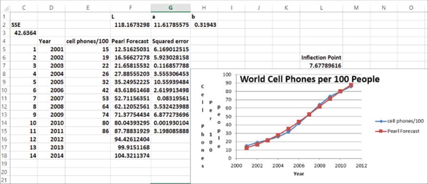
To estimate L, a, and b, create in Column F an estimate for each year's cell phones per 100 people based on Equation 1. Then in Column G compute the squared error for each estimate. Finally, you can use Solver to find the values of L, a, and b that minimize the sum of the squared estimation errors. Proceed as follows:
1. In F2:H2 enter trial values of L, a, and b.
2. Copy the formula =L/(1+a*EXP(−b*C5)) from F5 to F6:F15 and use Equation 1 to generate an estimate of cell phones per 100 people for the given parameters.
3. Copy the formula =(E5-F5)^2 from G5 to G6:G15 to compute the squared error for each observation.
4. In cell C3 compute the Sum of Squared Errors with the formula =SUM(G5:G15).
5. Using the Solver window in Figure 26.4, use the GRG MultiStart Engine to find your estimated Logistic curve to be the following:
![]()
Figure 26-4: Solver window for world cell phone Pearl curve
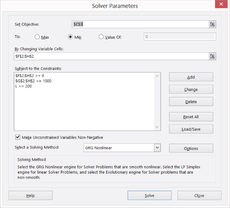
Recall from Chapter 23 that before you use the GRG MultiStart Engine, you need lower and upper bounds on changing cells. Setting relatively tight bounds speeds the solution process. You can set lower bounds of 0 for L, a, and b. It seems unlikely that the world will ever see 200 cell phones per person so you can also set L ≤200. Because you know little about a and b, you can set a large upper bound of 1,000 for a and b. If the Solver pushes the value of a changing cell against the bound for the changing cell, then you must relax the bound because Solver is telling you it wants to move beyond the bound.
Therefore, if you estimate cell phones per 100 people will level off at 118.17, then the inflection point for cell phones to occur for ![]() years. Because t = 1 was in 2001, your model implies that the inflection point for cell phone usage that occurred during 2008 and world cell phone usage is well past the inflection point.
years. Because t = 1 was in 2001, your model implies that the inflection point for cell phone usage that occurred during 2008 and world cell phone usage is well past the inflection point.
Copying the estimation formula in F15 to F16:F18 creates your forecasts (refer to Figure 26.2) for cell phones per 100 people during the years 2012–2014.
Fitting an S Curve with Seasonality
If a Logistic curve is fitted to quarterly or monthly data, then the seasonality (see Chapters 12–14 for a discussion of sales seasonality) of sales must be incorporated in the estimation process. To illustrate the idea, try and fit a Logistic curve with seasonality to quarterly iPod sales for the years 2002–2006. The work is in file iPodsseasonal.xls (see Figure 26.5).
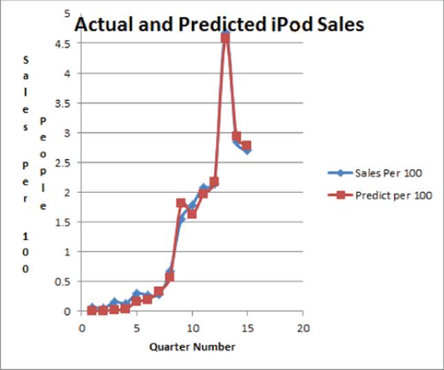
Figure 26-5: Actual and predicted iPod sales
To fit an S curve to quarterly data, multiply the forecast from the S curve in Equation 1 by the appropriate seasonal index. After adding the seasonal indices as changing cells, again choose the forecast parameters to minimize the sum of squared forecast errors.
To obtain forecasts proceed as follows:
1. Copy the formula =100*D5/E5 from F5 to F6:F19 to compute for each quarter the sales per 100 people.
2. Copy the formula =(L/(1+a*EXP(−b*A5)))*HLOOKUP(C5,seaslook,2) from G5 to G6:G19 to compute the forecast for each quarter's sales/100 by multiplying the S curve value from Equation 1 (which represents the level of sales in the absence of seasonality) by the appropriate seasonal index. This is analogous to the forecasting formula you developed in your discussion of Winter's Method in Chapter 14.
3. Copy the formula =(F5-G5)^2 from H5 to H6:H19 to compute the squared error for each prediction.
4. In cell H3 compute the Sum of Squared Errors with the formula =SUM(H5:H19).
5. The constraint $N$2=1 was added to ensure that the seasonal indices average to 1. Using the Solver window in Figure 26.6 and the GRG MultiStart Engine, obtain a solution in which a = 1,000. Therefore, you can raise the upper bound on a to 10,000 and obtain the solution shown inFigure 26.7.
Figure 26-6: Solver window for iPod sales
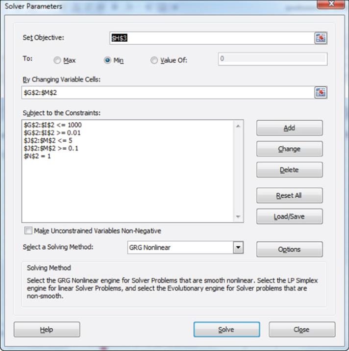
Figure 26-7: Fitting seasonal Pearl curve to iPod sales
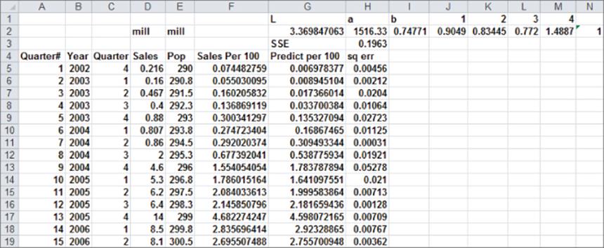
You can find an upper quarterly limit of 3.37 iPods per 100 people. As shown in Figure 26.7 the seasonal indices tell you first quarter sales are 10 percent less than average, second quarter sales are 17 percent less than average, third quarter sales are 23 percent less than average, and fourth quarter sales are 49 percent above average.
Fitting the Gompertz Curve
Another functional form that is often used to fit an S curve to data is the Gompertz curve, named after Benjamin Gompertz, a 19th century English actuary and mathematician. To define the Gompertz curve, let x(t) = sales per capita at time t, cumulative sales by time t, or percentage of population having used the product by time t. If x(t) follows a Gompertz curve then you model x(t) by Equation 2:
2 ![]()
As with the Pearl curve, you can use the GRG MultiStart Engine to find the values of a, b, and c that best fit a set of data. As t grows large, x(t) approaches a, and the inflection points of the Gompertz curve occurs for t = Ln c/b and x(t) = a/e.
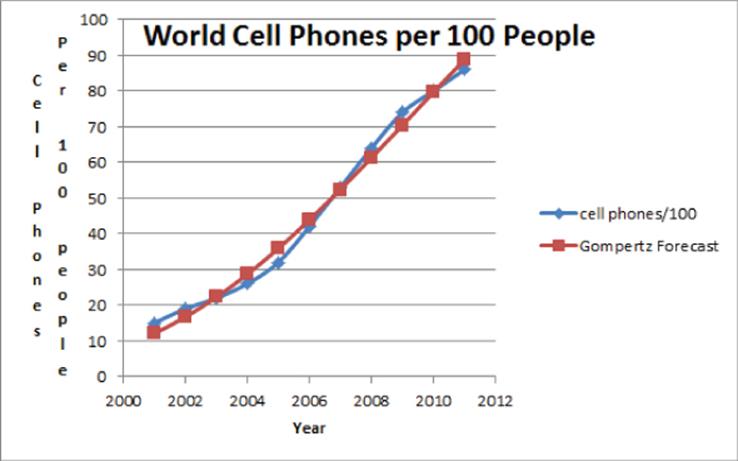
In the file worldcellgompertz.xlsx (See Figures 26.8 and 26.9) you can see a Gompertz curve fit to the world cell phone data.
Figure 26-8: Fitting Gompertz curve for world cell phone sales
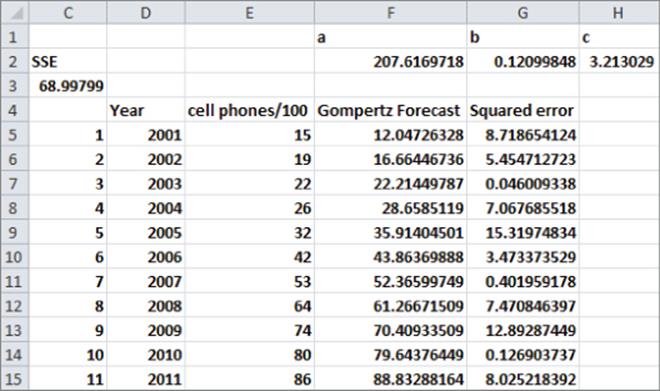
Figure 26-9: Gompertz curve for world cell phone sales
To fit the Gompertz curve to your cell phone data, proceed as follows:
1. Copy the formula =a*EXP(−c_*EXP(−b*C5)) from F5 to F6:F15 that uses Equation 2 to estimate the Gompertz forecast for each year's cell phones per 100 people.
2. Copy the formula =(E5-F5)^2 from G5 to G6:G15 to compute the squared error for each year.
3. In cell C3 compute the Sum of Squared Errors with the formula =SUM(G5:G15).
4. As shown in Figure 26.10, use the Solver window to find the least-squares estimate of the Gompertz curve parameters a, b, and c.
Figure 26-10: Solver window for world cell phone sales

You can find a = 207.6, b = .121, and c = 3.21.
In this example you tried to forecast future cell phone usage when the product was past its inflection point. In Exercise 11 you will explore whether the S curve methodology yielded accurate forecasts with only five years of data.
Pearl Curve versus Gompertz Curve
If you fit both a Pearl curve and a Gompertz curve to sales data, which curve should be used to predict future sales? You would probably think the curve yielding the smaller Sum of Squared Errors would yield the better forecasts. This is not the case. Joseph Martino (Technological Forecasting for Decision-Making, McGraw-Hill, 1993) states that if future sales benefit from previous product sales, the Pearl curve should be used to generate forecasts, whereas if future sales do not benefit from previous sales, the Gompertz curve should be used. For example, in predicting cable TV adoptions for the years 1979–1989 from adoptions during 1952–1978 Martino points out that the many customers adopting cable in 1952–1978 helped generate additional, higher quality cable programming, which would make cable more attractive to later adopters. Therefore, Martino used the Pearl curve to forecast future cable TV adoptions. The same reasoning would apply to your world cell phone example. It seems obvious that the more people that have cell phones, the more apps are developed. Also, when more people have cell phones, it becomes easier to reach people, so a phone becomes more useful to nonadopters.
Summary
In this chapter you learned the following:
· Cumulative sales per capita, percentage of population adopting a product, and actual sales per capita often follow an S curve.
· Usually the analyst uses the GRG MultiStart Engine with a target cell of minimizing the Sum of Squared Errors to fit either a Pearl or Gompertz curve.
· If the likelihood of future adoptions increases with the number of prior adoptions, use the Pearl curve to generate future forecasts. Otherwise, use the Gompertz curve to generate future forecasts.
Exercises
Exercises 1–4 use the data in the file Copyofcellphonedata.xls, which contains U.S. cell phone subscribers for the years 1985–2002.
1. Fit a Pearl curve to this data, and estimate the inflection point and upper limit for cell phones per capita.
2. Fit a Gompertz curve to this data, and estimate the inflection point and upper limit for cell phones per capita.
3. Forecast U.S. cell phones per capita for the years 2003–2005.
4. In 2002 were U.S. cell phones per capita past the inflection point?
Exercises 5–9 use the data in the file Internet2000_2011.xls. This file contains the percentage of people with Internet access for the years 2000–2011. Use this data to answer the following questions:
5. Estimate the percentage of people in Nigeria who will eventually be on the Internet. Is Internet usage in Nigeria past the inflection point?
6. Estimate the percentage of people in the United States who will eventually be on the Internet. Is Internet usage in the United States past the inflection point?
7. Estimate the percentage of people in India who will eventually be on the Internet. Is Internet usage in India past the inflection point?
8. Estimate the percentage of people in Sweden who will eventually be on the Internet. Is Internet usage in Sweden past the inflection point?
9. Estimate the percentage of people in Brazil who will eventually be on the Internet. Is Internet usage in Brazil past the inflection point?
10. Show that for a Logistic curve the inflection point occurs when x(t) = L/2.
11. Suppose it is now the end of 2004. Using the data in the file worldcellpearl.xlsx, develop predictions for world cell phone usage. How accurate are your predictions?
12. The file Facebook.xlsx gives the number of users of Facebook (in millions) during the years 2004–2012. Use this data to predict the future growth of Facebook.
13. The file Wikipedia.xlsx gives the number of Wikipedia articles (in English) for the years 2003–2012. Use this data to predict the future growth of Wikipedia.
All materials on the site are licensed Creative Commons Attribution-Sharealike 3.0 Unported CC BY-SA 3.0 & GNU Free Documentation License (GFDL)
If you are the copyright holder of any material contained on our site and intend to remove it, please contact our site administrator for approval.
© 2016-2026 All site design rights belong to S.Y.A.