Microsoft Excel 2016 BIBLE (2016)
Part III
Creating Charts and Graphics
The five chapters in this part deal with charts and graphics. You'll discover how to use Excel's graphics capabilities to display your data in a chart or as Sparkline graphics. In addition, you'll learn to use Excel's other drawing and graphics tools to enhance your worksheets.
In This Part
1. Chapter 19
Getting Started Making Charts
2. Chapter 20
Learning Advanced Charting
3. Chapter 21
Visualizing Data Using Conditional Formatting
4. Chapter 22
Creating Sparkline Graphics
5. Chapter 23
Enhancing Your Work with Pictures and Drawings
Chapter 19
Getting Started Making Charts
IN THIS CHAPTER
1. Charting overview
2. Seeing how Excel handles charts
3. Comparing embedded charts and chart sheets
4. Identifying the parts of a chart
5. Looking at examples of each chart type
6. Exploring the new Excel 2016 chart types
When most people think of Excel, they think of crunching rows and columns of numbers. But as you probably know already, Excel is no slouch when it comes to presenting data visually in the form of charts. In fact, Excel is probably the most commonly used software in the world for creating charts.
This chapter presents an introductory overview of Excel's charting ability. Chapter 20, “Learning Advanced Charting,” continues with some more advanced techniques.
What Is a Chart?
A chart is a visual representation of numeric values. Charts (also known as graphs) have been an integral part of spreadsheets since the early days of Lotus 1-2-3. Charts generated by early spreadsheet products were quite crude, but they've improved significantly over the years. Excel provides you with the tools to create a variety of highly customizable professional-quality charts.
Displaying data in a well-conceived chart can make your numbers more understandable. Because a chart presents a picture, charts are particularly useful for summarizing a series of numbers and their interrelationships. Making a chart can often help you spot trends and patterns that may otherwise go unnoticed. If you're unfamiliar with the elements of a chart, see the sidebar later in this chapter, “Parts of a Chart.”
Figure 19.1 shows a worksheet that contains a simple column chart that depicts a company's sales volume by month. Viewing the chart makes it very apparent that sales were down in the summer months (June through August), but they increased steadily during the final four months of the year. You could, of course, arrive at this same conclusion simply by studying the numbers. But viewing the chart makes the point much more quickly.
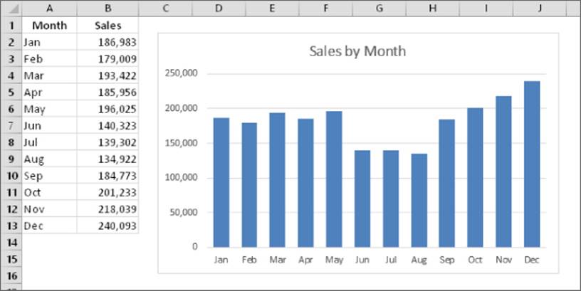
Figure 19.1 A simple column chart depicts the monthly sales volume.
A column chart is just one of many different types of charts that you can create with Excel. Later in this chapter, I discuss all chart types so you can make the right choice for your data.
Understanding How Excel Handles Charts
Before you can create a chart, you must have some numbers — sometimes known as data. The data, of course, is stored in the cells in a worksheet. Normally, the data that a chart uses resides in a single worksheet, but that's not a strict requirement. A chart can use data that's stored in a different worksheet or even in a different workbook.
A chart is essentially an object that Excel creates upon request. This object consists of one or more data series, displayed graphically. The appearance of the data series depends on the selected chart type. For example, if you create a line chart that uses two data series, the chart contains two lines, each representing one data series. The data for each series is stored in a separate row or column. Each point on the line is determined by the value in a single cell and is represented by a marker. You can distinguish each of the lines by its thickness, line style, color, or data markers (squares, circles, and so on).
Figure 19.2 shows a line chart that plots two data series across a 12-month period. I used different data markers (squares versus circles) to identify the two series, as shown in the legend at the bottom of the chart. The chart clearly shows that the sales in the Eastern Region are declining steadily, while Western Region sales are increasing a bit after remaining level for the first six months.
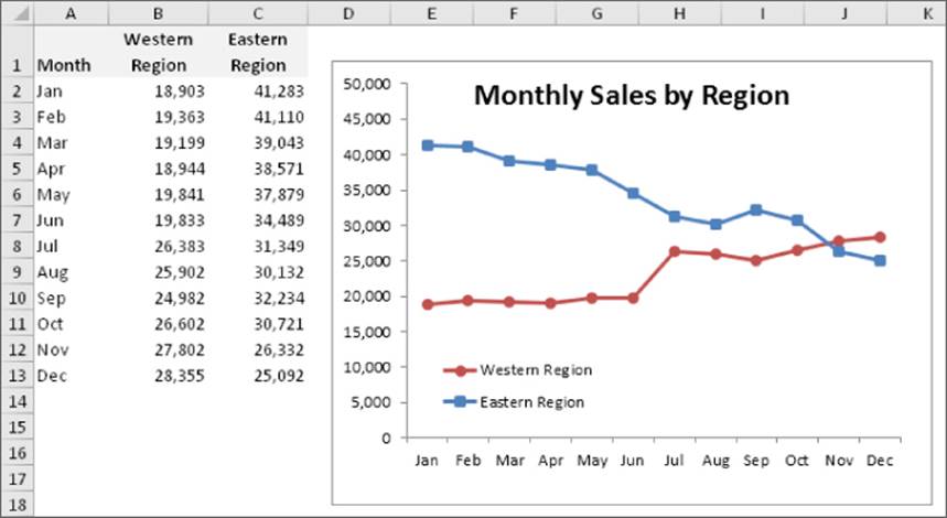
Figure 19.2 This line chart displays two data series.
A key point to keep in mind is that charts are dynamic. In other words, a chart series is linked to the data in your worksheet. If the data changes, the chart is updated automatically to reflect those changes.
After you create a chart, you can always change its type, change the formatting, add or remove specific elements (such as the title or legend), add new data series to it, or change an existing data series so that it uses data in a different range.
A chart is either embedded in a worksheet or displayed on a separate chart sheet. It's easy to move an embedded chart to a chart sheet (and vice versa).
Embedded charts
An embedded chart basically floats on top of a worksheet, on the worksheet's drawing layer. Both charts shown previously in this chapter are embedded charts.
As with other drawing objects (such as Shapes or SmartArt), you can move an embedded chart, resize it, change its proportions, adjust its borders, and perform other operations. Using embedded charts enables you to print the chart next to the data that it uses.
To make any changes to the actual chart in an embedded chart object, you must click it to activate the chart. When a chart is activated, Excel displays the Chart Tools context tab. The Ribbon provides many tools for working with charts, and even more tools are available in the Format task pane.
With one exception, every chart starts out as an embedded chart. The exception is when you create a default chart by selecting the data and pressing F11. In that case, the chart is created on a chart sheet.
Chart sheets
When a chart is on a chart sheet, you view it by clicking its sheet tab. A chart sheets contains a single chart (and no cells). Chart sheets and worksheets can be interspersed in a workbook.
To move an embedded chart to a chart sheet, click the chart to select it and then choose Chart Tools ![]() Design
Design ![]() Location
Location ![]() Move Chart. The Move Chart dialog box, shown in Figure 19.3, appears. Select the New Sheet option and provide a name for the chart sheet (or accept Excel's default name). Click OK, the chart is moved, and the new chart sheet is activated.
Move Chart. The Move Chart dialog box, shown in Figure 19.3, appears. Select the New Sheet option and provide a name for the chart sheet (or accept Excel's default name). Click OK, the chart is moved, and the new chart sheet is activated.
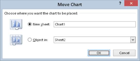
Figure 19.3 The Move Chart dialog box lets you move a chart to a chart sheet.
Tip
This operation also works in the opposite direction: You can select a chart on a chart sheet and relocate it to a worksheet as an embedded chart. In the Move Chart dialog box, choose Object In, and then select the worksheet from the drop-down list.
When you place a chart on a chart sheet, the chart occupies the entire sheet. If you plan to print a chart on a page by itself, using a chart sheet is often your better choice. If you have many charts, you may want to put each one on a separate chart sheet to avoid cluttering your worksheet. This technique also makes locating a particular chart easier because you can change the names of the chart sheets' tabs to provide a description of the chart that it contains.
The Excel Ribbon changes when a chart sheet is active, similar to the way it changes when you select an embedded chart. You have access to the same editing tools for embedded charts and charts on chart sheets.
If the chart isn't fully visible in the window, you can use the scrollbars to scroll it or adjust the zoom factor to make it smaller. You can also change its orientation (tall or wide) by choosing Page Layout ![]() Page Setup
Page Setup ![]() Orientation.
Orientation.
Parts of a Chart
Refer to the accompanying chart as you read the following description of the chart's elements.
The particular chart is a combination chart that displays two data series: Sales Calls and Units Sold. Sales Calls are plotted as vertical columns, and the Units Sold are plotted as a line with circle markers. Each column (or marker on the line) represents a single data point (the value in a cell). The chart data is stored in the range A1:C7.
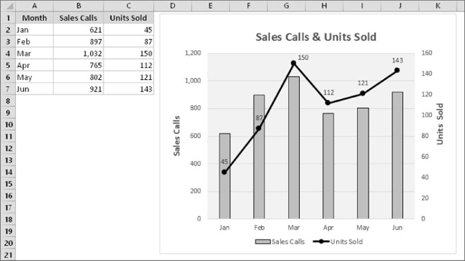
It has a horizontal axis, known as the category axis. This axis represents the category for each data point (January, February, and so on).
It has two vertical axes, known as value axes, and each one has a different scale. The axis on the left is for the columns (Sales Calls), and the axis on the right is for the line (Units Sold).
The value axes also display scale values. The axis on the left displays scale values from 0 to 1,200, in major unit increments of 200. The value axis on the right uses a different scale: 0 to 160, in increments of 20.
Why two value axes? A chart with two value axes is appropriate because the two data series vary dramatically in scale. If the Sales data were plotted using the left axis, the line would barely be visible.
Most charts provide some method of identifying the data series or data points. A legend, for example, is often used to identify the various series in a chart. In this example, the legend appears on the bottom of the chart. Some charts also display data labels to identify specific data points. This chart displays data labels for the Units Sold series, but not for the Sales Calls series. In addition, most charts (including the example chart) contain a chart title and additional labels to identify the axes or categories.
It also contains horizontal gridlines (which correspond to the left value axis). Gridlines are basically extensions of the value axis scale, which makes it easier for the viewer to determine the magnitude of the data points.
All charts have a chart area (the entire background area of the chart) and a plot area. The plot area shows the actual chart, and in this example, the plot area has a different background color.
Charts can have additional parts or fewer parts, depending on the chart type. For example, a pie chart has slices and no axes. A 3-D chart may have walls and a floor. You can also add many other types of items to a chart. For example, you can add a trend line or display error bars. In other words, after you create a chart, you have a great deal of flexibility in customizing it.
Creating a Chart
Creating a chart is fairly simple:
1. Make sure that your data is appropriate for a chart.
2. Select the range that contains your data.
3. Select the Insert tab and select a chart type from the Charts group. These icons display drop-down lists that display subtypes. Excel creates the chart and places it in the center of the window.
4. (Optional) Use the various tools and commands to change the look or layout of the chart or add or delete chart elements.
Tip
You can create a chart with a single keystroke. Select the range to be used in the chart and then press Alt+F1 (for an embedded chart) or F11 (for a chart on a chart sheet). Excel displays the chart of the selected data using the default chart type. The default chart type is a column chart, but you can change it. To change the default chart type, select any chart and choose Chart Tools ![]() Design
Design ![]() Change Chart Type. The Change Chart Type dialog box appears. Choose a chart type from the list on the left, and then right-click a chart in the row of thumbnails and choose Set As Default Chart.
Change Chart Type. The Change Chart Type dialog box appears. Choose a chart type from the list on the left, and then right-click a chart in the row of thumbnails and choose Set As Default Chart.
Hands On: Creating and Customizing a Chart
This section contains a step-by-step example of creating a chart and applying some customizations. If you've never created a chart, this is a good opportunity to get a feel for the way the process works.
Figure 19.4 shows a worksheet with a range of data. This data shows customer survey results by month, broken down by customers in three age groups. In this case, the data resides in a table (created by choosing Insert ![]() Tables
Tables ![]() Table), but that's not a requirement to create a chart.
Table), but that's not a requirement to create a chart.
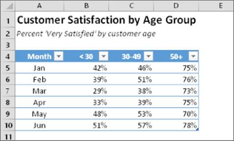
Figure 19.4 The source data for the hands-on chart example.
 This workbook, named hands-on example.xlsx, is available on this book's website at www.wiley.com/go/excel2016bible
Selecting the data
The first step is to select the data for the chart. Your selection should include such items as labels and series identifiers (row and column headings). For this example, select the entire table (range A4:D10). This range includes the category labels but not the title (which is in A1).
Tip
If you want to chart all data in a table (or a rectangular range separated from other data), you can select just a single cell. Excel will almost always guess the range for the chart accurately. If you don't want to plot all data in the table, just select the specific columns or rows.
Note
The data that you use in a chart needs not be in contiguous cells. You can press Ctrl and make a multiple selection. The initial data, however, must be on a single worksheet. If you need to plot data that exists on more than one worksheet, you can add more series after the chart is created. In all cases, however, data for a single chart series must reside on one sheet.
Choosing a chart type
After you select the data, select a chart type from the Insert ![]() Charts group. Each control in this group is a drop-down list, which lets you further refine your choice by selecting a subtype.
Charts group. Each control in this group is a drop-down list, which lets you further refine your choice by selecting a subtype.
For this example, let Excel recommend a chart type. Choose Insert ![]() Charts
Charts ![]() Recommended Charts. Excel displays the dialog box shown in Figure 19.5. This dialog box shows several recommended charts, using your actual data. Select the first choice, Clustered Column, and click OK. Excel inserts the chart in the middle of the workbook window. You can move the chart by dragging any of its borders. You can also resize it by clicking and dragging in one of its corners. Figure 19.6 shows the chart after I moved it next to the data range.
Recommended Charts. Excel displays the dialog box shown in Figure 19.5. This dialog box shows several recommended charts, using your actual data. Select the first choice, Clustered Column, and click OK. Excel inserts the chart in the middle of the workbook window. You can move the chart by dragging any of its borders. You can also resize it by clicking and dragging in one of its corners. Figure 19.6 shows the chart after I moved it next to the data range.
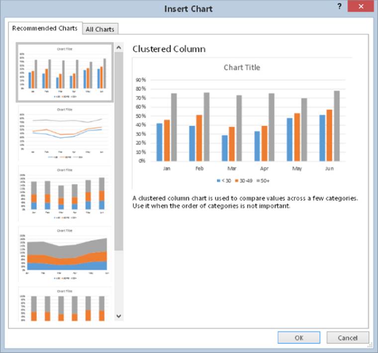
Figure 19.5 Letting Excel recommend a chart type.
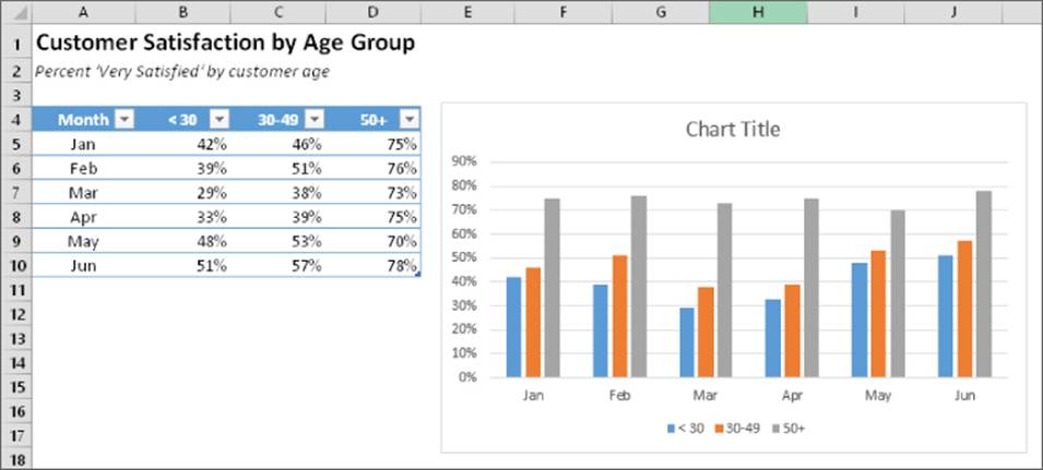
Figure 19.6 A clustered column chart created from the data in the table.
Experimenting with different styles
The chart looks pretty good, but it's just one of several predefined styles for a clustered column chart.
To see some other looks for the chart, select the chart (click it) and check out a few other predefined styles in the Chart Tools ![]() Design
Design ![]() Chart Styles group. Just hover your mouse over a thumbnail image, and your chart temporarily takes on the new style. If you find a style you like, click the thumbnail to make it permanent. Notice that this Ribbon group also includes a Change Colors tool, which lets you quickly modify the colors used in the chart.
Chart Styles group. Just hover your mouse over a thumbnail image, and your chart temporarily takes on the new style. If you find a style you like, click the thumbnail to make it permanent. Notice that this Ribbon group also includes a Change Colors tool, which lets you quickly modify the colors used in the chart.
Tip
You can also access the chart styles and colors by using the Chart Styles icon, which appears to the right of the chart when you select it. (The icon displays a paintbrush.) The choices are presented in a scrollable list. The choices are the same as those displayed in the Chart Tools ![]() Design
Design ![]() Chart Styles group.
Chart Styles group.
Experimenting with different layouts
Every chart type has a set of layouts that you can choose from. A layout contains additional chart elements, such as a title, data labels, and axes. You can add your own elements to your chart, but often, using a predefined layout saves time. Even if the layout isn't exactly what you want, it may be close enough that you need to make only a few adjustments.
To try a different predefined layout, select the chart and choose Chart Tools ![]() Design
Design ![]() Chart Layouts
Chart Layouts ![]() Quick Layout.
Quick Layout.
To manually add or remove elements from the chart, click the Chart Elements icon, which appears to the right of the chart and has an image of a plus sign. Note that each item expands to provide more options, such as the location of the element within the chart. The Chart Elements icon contains the same option as the Chart Tools ![]() Design
Design ![]() Chart Layouts
Chart Layouts ![]() Add Chart Element control.
Add Chart Element control.
Figure 19.7 shows the chart after selecting a different style and changing the colors. I chose a layout that displays the legend on the right and includes axis titles. I customized the generic title and vertical axis title and deleted the horizontal axis title because it's obvious that the axis displays months.
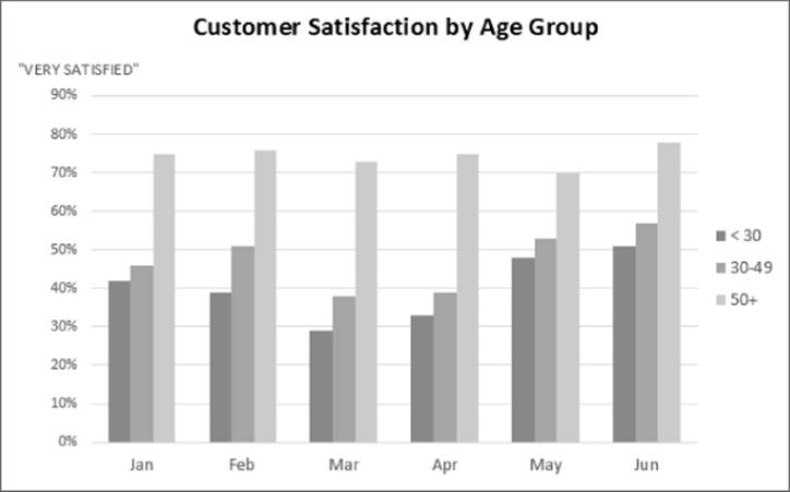
Figure 19.7 The chart, after selecting a different style and layout.
Tip
You can link the chart title to a cell so the title always displays the contents of a particular cell. To create a link to a cell, click the chart title, type an equal sign (=), click the cell, and press Enter. Excel displays the link in the Formula bar. In the example, the text in cell A1 is perfect for the chart title.
Experiment with the Chart Tools ![]() Design Ribbon to make other changes to the chart. Also try the tools that appear to the right of the chart when you click it. For example, you can remove the gridlines add axis titles, relocate the legend, and so on. Making these changes is easy and fairly intuitive.
Design Ribbon to make other changes to the chart. Also try the tools that appear to the right of the chart when you click it. For example, you can remove the gridlines add axis titles, relocate the legend, and so on. Making these changes is easy and fairly intuitive.
Up until now, the changes made to the chart have been strictly cosmetic. The following sections describe how to make more substantial changes to a chart.
Trying another view of the data
The chart, at this point, shows six clusters (months) of three data points in each (age groups). Would the data be easier to understand if you plotted the information in the opposite way?
Try it. Select the chart and then choose Chart Tools ![]() Design
Design ![]() Data
Data ![]() Switch Row/Column. Figure 19.8 shows the result of this change.
Switch Row/Column. Figure 19.8 shows the result of this change.
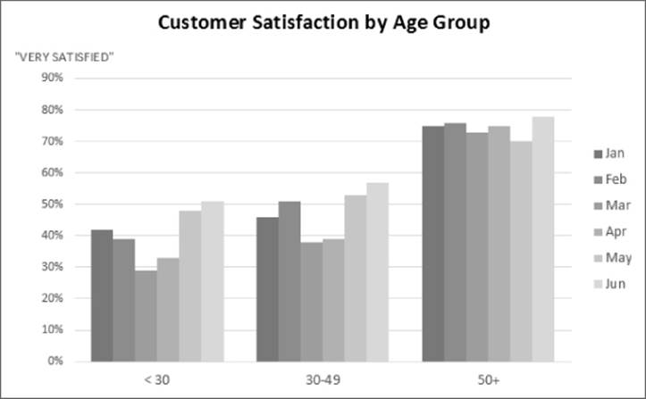
Figure 19.8 The chart, after changing the row and column orientation.
Note
The orientation of the data has a drastic effect on the look of your chart. Excel has its own rules that it uses to determine the initial data orientation when you create a chart. If Excel's orientation doesn't match your expectation, it's easy enough to change.
The chart, with this new orientation, reveals information that wasn't so apparent in the original version. The <30 and 30–49 age groups both show a decline in satisfaction for March and April. The 50+ age group didn't exhibit this pattern, however.
Trying other chart types
Although a clustered column chart seems to work well for this data, there's no harm in checking out some other chart types. Choose Chart Tools ![]() Design
Design ![]() Type
Type ![]() Change Chart Type to experiment with other chart types. This command displays the Change Chart Type dialog box, shown in Figure 19.9. The figure shows how the data would look as a line chart.
Change Chart Type to experiment with other chart types. This command displays the Change Chart Type dialog box, shown in Figure 19.9. The figure shows how the data would look as a line chart.
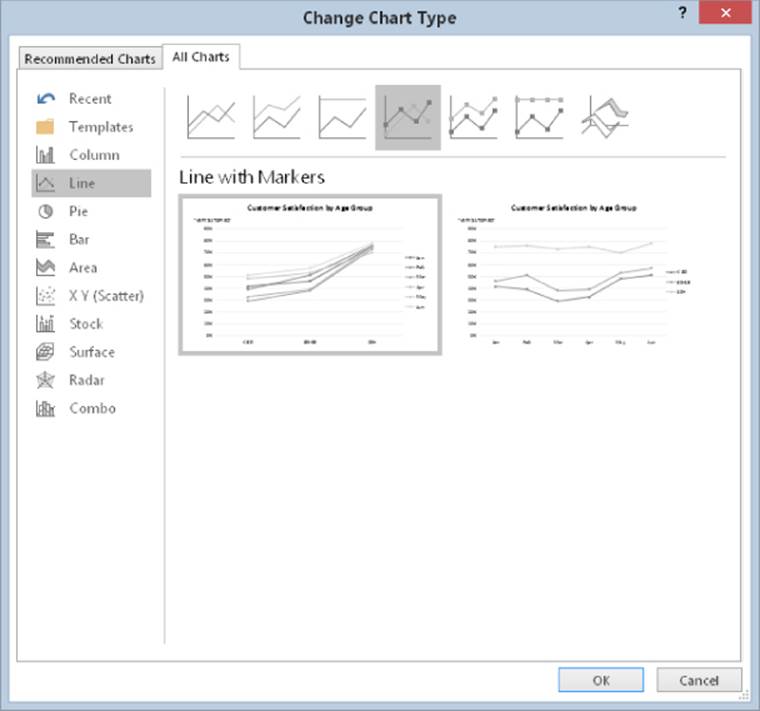
Figure 19.9 Use this dialog box to change the chart type.
The main chart categories are listed on the left, and the subtypes are shown as a horizontal row of icons. Select an icon and the display shows how the chart will look in both data orientations. When you find a suitable chart type, click OK and Excel changes the chart. Notice that this dialog box has a tab at the top that lets you access Excel's recommended chart types for the data.
If you don't like the result after clicking OK, select Undo from the Quick Access toolbar.
Tip
You can also change the chart type by selecting the chart and using the controls in the Insert ![]() Charts group.
Charts group.
Figure 19.10 shows a few different chart type options using the customer satisfaction data.
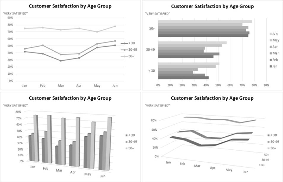
Figure 19.10 The customer satisfaction data, displayed using four different chart types.
Tip
The styles displayed in the gallery depend on the workbook's theme. When you choose Page Layout ![]() Themes
Themes ![]() Themes to apply a different theme, you'll have a new selection of chart styles and colors designed for the selected theme.
Themes to apply a different theme, you'll have a new selection of chart styles and colors designed for the selected theme.
Working with Charts
This section covers some common chart modifications:
· Resizing and moving charts
· Copying a chart
· Deleting a chart
· Adding chart elements
· Moving and deleting chart elements
· Formatting chart elements
· Printing charts
Note
Before you can modify a chart, the chart must be activated. To activate an embedded chart, click it. Doing so activates the chart and selects the element that you click. To activate a chart on a chart sheet, just click its sheet tab.
Resizing a chart
If your chart is an embedded chart, you can easily resize it with your mouse. Click the chart, and round handles appear on the chart's corners and edges. Move the mouse pointer to a corner, and when the mouse pointer turns into a double arrow, click and drag to resize the chart.
Another way to resize a chart: when a chart is selected, choose Chart Tools ![]() Format
Format ![]() Size and use the two controls to adjust the height and width of the chart. Use the spinners or type the dimensions directly into the Height and Width controls.
Size and use the two controls to adjust the height and width of the chart. Use the spinners or type the dimensions directly into the Height and Width controls.
Moving a chart
To move an embedded chart to a different location on a worksheet, click the chart and drag one of its borders. You can use standard cut-and-paste techniques to move an embedded chart. In fact, this is the only way to move a chart from one worksheet to another. Select the chart and choose Home ![]() Clipboard
Clipboard ![]() Cut (or press Ctrl+X). Then activate a cell near the desired location and choose Home
Cut (or press Ctrl+X). Then activate a cell near the desired location and choose Home ![]() Clipboard
Clipboard ![]() Paste (or press Ctrl+V). The new location can be in a different worksheet or even in a different workbook. If you paste the chart to a different workbook, the chart will be linked to the data in the original workbook.
Paste (or press Ctrl+V). The new location can be in a different worksheet or even in a different workbook. If you paste the chart to a different workbook, the chart will be linked to the data in the original workbook.
To move an embedded chart to a chart sheet (or vice versa), select the chart and choose Chart Tools ![]() Design
Design ![]() Location
Location ![]() Move Chart; the Move Chart dialog box appears. Choose New Sheet and provide a name for the chart sheet (or use the Excel proposed name).
Move Chart; the Move Chart dialog box appears. Choose New Sheet and provide a name for the chart sheet (or use the Excel proposed name).
Copying a chart
To make an exact copy of an embedded chart on the same worksheet, click the chart's border, press and hold the Ctrl key, and drag. Release the mouse button, and a new copy of the chart is created.
To make a copy of a chart sheet, use the same procedure, but drag the chart sheet's tab.
You also can use standard copy-and-paste techniques to copy a chart. Select the chart (an embedded chart or a chart sheet) and choose Home ![]() Clipboard
Clipboard ![]() Copy (or press Ctrl+C). Then activate a cell near the desired location and choose Home
Copy (or press Ctrl+C). Then activate a cell near the desired location and choose Home ![]() Clipboard
Clipboard ![]() Paste (or press Ctrl+V). The new location can be in a different worksheet or even in a different workbook. If you paste the chart to a different workbook, it will be linked to the data in the original workbook.
Paste (or press Ctrl+V). The new location can be in a different worksheet or even in a different workbook. If you paste the chart to a different workbook, it will be linked to the data in the original workbook.
Deleting a chart
To delete an embedded chart, press Ctrl and click the chart (to select the chart as an object). Then press Delete. When the Ctrl key is pressed, you can select multiple charts and then delete them all with a single press of the Delete key.
To delete a chart sheet, right-click its sheet tab and choose Delete from the shortcut menu. To delete multiple chart sheets, select them by pressing Ctrl while you click the sheet tabs.
Adding chart elements
To add new elements to a chart (such as a title, legend, data labels, or gridlines), activate the chart and use the controls in the Chart Elements “+” icon, which appears to the right of the chart. Note that each item expands to display additional options.
You can also use the Add Chart Element control on the Chart Tools ![]() Design
Design ![]() Chart Layouts tab.
Chart Layouts tab.
Moving and deleting chart elements
Some elements within a chart can be moved: titles, legend, and data labels. To move a chart element, simply click it to select it and then drag its border.
The easiest way to delete a chart element is to select it and then press Delete. You can also use the controls on the Chart Elements icon, which appears to the right of the chart.
Note
A few chart elements consist of multiple objects. For example, the data labels element consists of one label for each data point. To move or delete one data label, click once to select the entire element and then click a second time to select the specific data label. You can then move or delete the single data label.
Formatting chart elements
Many users are content to stick with the predefined chart styles and layouts. For more precise customizations, Excel allows you to work with individual chart elements and apply additional formatting. You can use the Ribbon commands for some modifications, but the easiest way to format chart elements is to right-click the element and choose Format <Element> from the shortcut menu. The exact command depends on the element you select. For example, if you right-click the chart's title, the shortcut menu command is Format Chart Title.
The Format command displays a task pane with options for the selected element. Changes that you make are displayed immediately. When you select a new chart element, the dialog box changes to display the properties for the newly selected element. You can keep this task pane displayed while you work on the chart. It can be docked along the left or right part of the window or made free floating and sizable.
Tip
If the Format task pane isn't displayed, you can double-click a chart element to display it.
Refer to the “Exploring the Format Task Pane” sidebar for an explanation of how the Format task panes work.
Tip
If you apply formatting to a chart element and decide that it wasn't such a good idea, you can revert to the original formatting for the particular chart style. Right-click the chart element and choose Reset to Match Style from the shortcut menu. To reset the entire chart, select the chart area when you issue the command.
Exploring the Format Task Pane
The Format task pane can be a bit deceiving. It contains many options that aren't visible, and you sometimes have to do quite a bit of clicking to find the formatting option you're looking for. The accompanying figure shows the task pane for the chart title. The name of the task pane depends on which chart element is selected. The task pane varies quite a bit, depending on which chart element is selected.
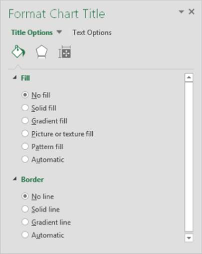
Notice that the task pane displays two tabs along the top: Title Options and Text Options. Click the Title Options tab, and you see three icons: Fill & Line, Effects, and Size & Properties. Each of these icons has its own set of controls, which can be expanded or contracted.
Similarly, the Text Options tab has three icons: Text Fill & Outline, Text Effects, and Textbox. Again, each of these icons has its own set of options.
So, if you want to change the color of the text in a chart's title by using the Format Chart Title task pane, you would follow these steps:
1. If the Format task pane is displayed, click the chart's title; if the task pane is not displayed, double-click the chart's title.
2. In the Format Chart Title task pane, select the Text Options tab.
3. Click the Text Fill & Outline icon.
4. Expand the Text Fill section.
5. Choose a color from the Color control.
At first, the Format task pane will seem complicated and confusing. But as you get acquainted with it, using the task pane gets much easier.
Also, keep in mind that many formatting choices are available on the Ribbon. For example, a quicker way to change the text color in a chart title is to select the title, click the Home tab on the Ribbon, and use the Font Color control.
 See Chapter 20 for more information about customizing and formatting charts.
Printing charts
Printing embedded charts is nothing special; you print them the same way that you print a worksheet. As long as you include the embedded chart in the range that you want to print, Excel prints the chart as it appears onscreen. When printing a sheet that contains embedded charts, it's a good idea to preview first (or use Page Layout view) to ensure that your charts don't span multiple pages. If you created the chart on a chart sheet, Excel always prints the chart on a page by itself.
Tip
If you select an embedded chart and choose File ![]() Print, Excel prints the chart on a page by itself and does not print the worksheet.
Print, Excel prints the chart on a page by itself and does not print the worksheet.
If you don't want a particular embedded chart to appear on your printout, access the Format Chart Area task pane and select the Size & Properties icon. Then Expand the Properties section and clear the Print Object check box.
Understanding Chart Types
People who create charts usually do so to make a point or to communicate a specific message. Often, the message is explicitly stated in the chart's title or in a text box within the chart. The chart itself provides visual support.
Choosing the correct chart type is often a key factor in the effectiveness of the message. Therefore, it's often well worth your time to experiment with various chart types to determine which one conveys your message best.
In almost every case, the underlying message in a chart is some type of comparison. Examples of some general types of comparisons include
· Comparing an item to other items: A chart may compare sales in each of a company's sales regions.
· Comparing data over time: A chart may display sales by month and indicate trends over time.
· Making relative comparisons: A common pie chart can depict relative proportions in terms of pie “slices.”
· Comparing data relationships: An XY chart is ideal for this comparison. For example, you might show the relationship between monthly marketing expenditures and sales.
· Comparing frequency: You can use a common histogram, for example, to display the number (or percentage) of students who scored within a particular grade range.
· Identifying outliers or unusual situations: If you have thousands of data points, creating a chart may help identify data that isn't representative.
Choosing a chart type
A common question among Excel users is “How do I know which chart type to use for my data?” Unfortunately, this question has no cut-and-dried answer. Perhaps the best answer is a vague one: use the chart type that gets your message across in the simplest way. A good starting point is Excel's recommended charts. Select your data and choose Insert ![]() Charts
Charts ![]() Recommended Charts to see the chart types that Excel suggests. Remember that these suggestions are not always the best choices.
Recommended Charts to see the chart types that Excel suggests. Remember that these suggestions are not always the best choices.
Note
In the Ribbon, the Charts group of the Insert tab shows the Recommended Charts button, plus nine other drop-down buttons. All of these drop-down buttons display multiple chart types. For example, column and bar charts are all available from a single drop-down button. Similarly, scatter charts and bubble charts share a single button. Probably the easiest way to choose a particular chart type is to select Insert ![]() Charts
Charts ![]() Recommended Charts, which displays the Insert Chart dialog box. Select the All Charts tab, and you'll have a concise list of all chart types and subchart types.
Recommended Charts, which displays the Insert Chart dialog box. Select the All Charts tab, and you'll have a concise list of all chart types and subchart types.
Figure 19.11 shows the same set of data plotted by using six different chart types. Although all six charts represent the same information (monthly website visitors), they look quite different from one another.
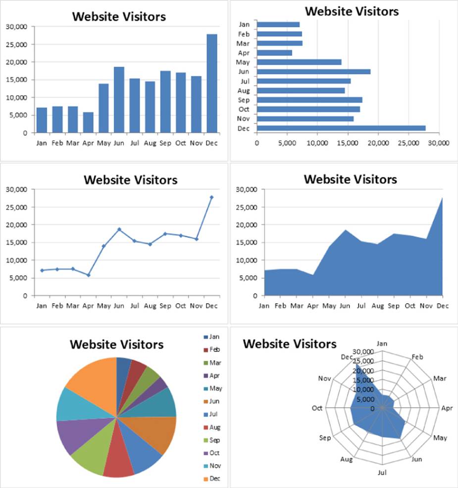
Figure 19.11 The same data, plotted by using six chart types.
This workbook is available this book's website at www.wiley.com/go/excel2016bible. The file is named six chart types.xlsx.
The column chart (upper left) is probably the best choice for this particular set of data because it clearly shows the information for each month in discrete units. The bar chart (upper right) is similar to a column chart, but the axes are swapped. Most people are more accustomed to seeing time-based information extend from left to right rather than from top to bottom, so this isn't the optimal choice.
The line chart (middle left) may not be the best choice because it can imply that the data is continuous — that points exist in between the 12 actual data points. This same argument may be made against using an area chart (middle right).
The pie chart (lower left) is simply too confusing and does nothing to convey the time-based nature of the data. Pie charts are most appropriate for a data series in which you want to emphasize proportions among a relatively small number of data points. If you have too many data points, a pie chart can be impossible to interpret.
The radar chart (lower right) is clearly inappropriate for this data. People aren't accustomed to viewing time-based information in a circular direction!
Note
Excel's first recommendation for this data is a line chart, followed by column chart and area chart. This is a case in which I disagree with Excel.
Fortunately, changing a chart's type is easy, so you can experiment with various chart types until you find the one that represents your data accurately, clearly, and as simply as possible.
The remainder of this chapter contains more information about the various Excel chart types. The examples and discussion may give you a better handle on determining the most appropriate chart type for your data.
Column charts
Probably the most common chart type is the column chart, which displays each data point as a vertical column, the height of which corresponds to the value. The value scale is displayed on the vertical axis, which is usually on the left side of the chart. You can specify any number of data series, and the corresponding data points from each series can be stacked on top of each other. Typically, each data series is depicted in a different color or pattern.
Column charts are often used to compare discrete items, and they can depict the differences between items in a series or items across multiple series. Excel offers seven column-chart subtypes.
 A workbook that contains the charts in this section is available on this book's website at www.wiley.com/go/excel2016bible. The file is named column charts.xlsx
Figure 19.12 shows an example of a clustered column chart that depicts monthly sales for two products. From this chart, it's clear that Sprocket sales have always exceeded Widget sales. In addition, Widget sales have been declining over the five-month period, whereas Sprocket sales are increasing.
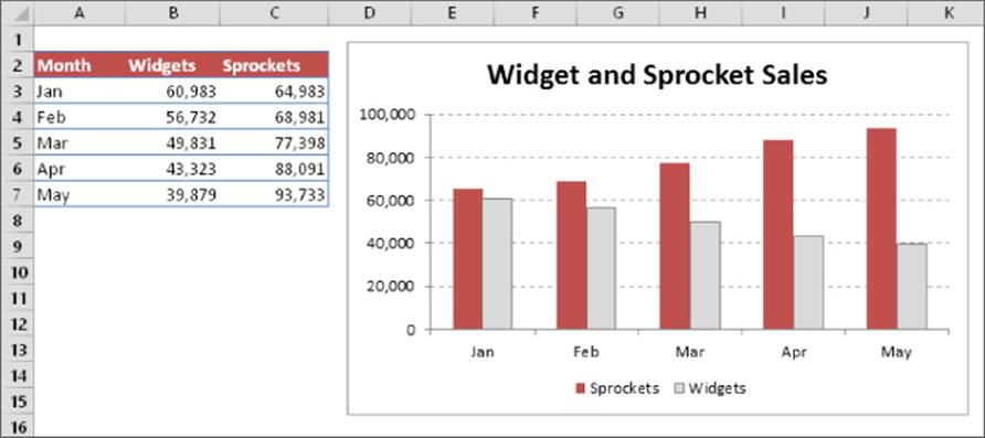
Figure 19.12 This clustered column chart compares monthly sales for two products.
The same data, in the form of a stacked column chart, is shown in Figure 19.13. This chart has the added advantage of depicting the combined sales over time. It shows that total sales have remained fairly steady each month, but the relative proportions of the two products have changed.
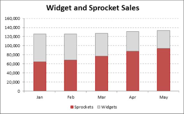
Figure 19.13 This stacked column chart displays sales by product and depicts the total sales.
Figure 19.14 shows the same sales data plotted as a 100% stacked column chart. This chart type shows the relative contribution of each product by month. Notice that the vertical axis displays percentage values, not sales amounts. This chart provides no information about the actual sales volumes, but such information could be provided using data labels. This type of chart is often a good alternative to using several pie charts. Instead of using a pie to show the relative sales volume in each year, the chart uses a column for each year.
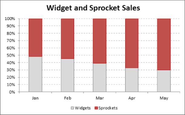
Figure 19.14 This 100% stacked column chart displays monthly sales as a percentage.
The data is plotted with a 3-D clustered column chart in Figure 19.15. The name is a bit deceptive because the chart uses only two dimensions, not three. Many people use this type of chart because it has more visual pizzazz. Compare this chart with a “true” 3-D column chart (which has a second category axis), shown in Figure 19.16. This type of chart may be appealing visually, but precise comparisons are difficult because of the distorted perspective view.
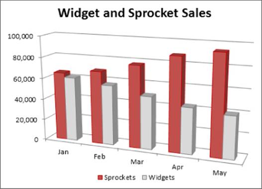
Figure 19.15 A 3-D column chart.
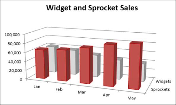
Figure 19.16 A true 3-D column chart.
For the 3-D columns, you can choose a different column shape in the Format Data Series dialog box. Excel offers variations such as cylinder, cone, and pyramids.
Bar charts
A bar chart is essentially a column chart that has been rotated 90 degrees clockwise. One distinct advantage to using a bar chart is that the category labels may be easier to read. Figure 19.17 shows a bar chart that displays a value for each of ten survey items. The category labels are lengthy, and displaying them legibly with a column chart would be difficult. Excel offers six bar chart subtypes.
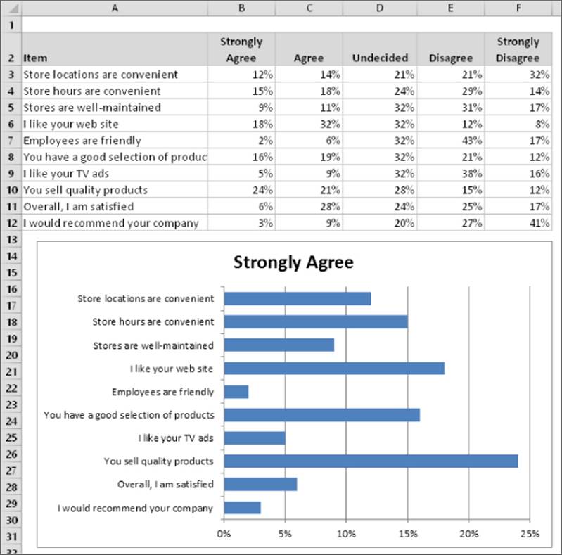
Figure 19.17 If you have lengthy category labels, a bar chart may be a good choice.
A workbook that contains the chart in this section is available on this book's website. The file is named bar charts.xlsx.
Note
Unlike a column chart, no subtype displays multiple series along a third axis. (That is, Excel does not provide a 3-D Bar Chart subtype.) You can add a 3-D look to a bar chart, but it will be limited to two axes.
You can include any number of data series in a bar chart. In addition, the bars can be “stacked” from left to right.
Line charts
Line charts are often used to plot continuous data and are useful for identifying trends. For example, plotting daily sales as a line chart may enable you to identify sales fluctuations over time. Normally, the category axis for a line chart displays equal intervals. Excel supports seven line chart subtypes.
See Figure 19.18 for an example of a line chart that depicts monthly data (676 data points). Although the data varies quite a bit on a monthly basis, the chart clearly depicts the cycles.
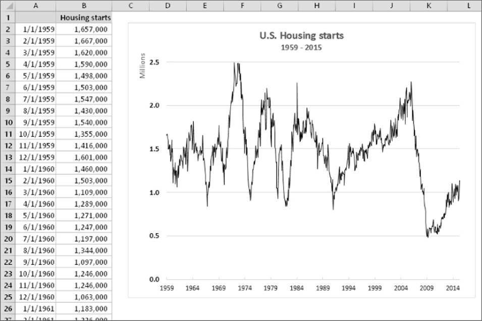
Figure 19.18 A line chart often can help you spot trends in your data.
A workbook that contains the charts in this section is available on this book's website. The file is named line charts.xlsx.
A line chart can use any number of data series, and you distinguish the lines by using different colors, line styles, or markers. Figure 19.19 shows a line chart that has three series. The series are distinguished by markers (circles, squares, and triangles) and different line colors. When the chart is printed on a noncolor printer, the markers are the only way to identify the lines.
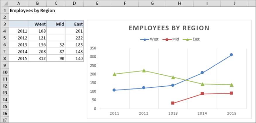
Figure 19.19 This line chart displays three series.
The final line chart example, shown in Figure 19.20, is a 3-D line chart. Although it has a nice visual appeal, it's certainly not the clearest way to present the data. In fact, it's fairly worthless.
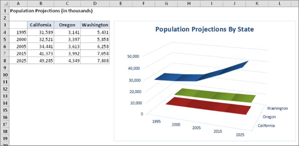
Figure 19.20 This 3-D line chart does not present the data very well.
Pie charts
A pie chart is useful when you want to show relative proportions or contributions to a whole. A pie chart uses only one data series. Pie charts are most effective with a small number of data points. Generally, a pie chart should use no more than five or six data points (or slices). A pie chart with too many data points can be difficult to interpret.
Caution
All the values in a pie chart must be positive numbers. If you create a pie chart that uses one or more negative values, the negative values will be converted to positive values, which is probably not what you intended.
You can “explode” one or more slices of a pie chart for emphasis (see Figure 19.21). Activate the chart and click any pie slice to select the entire pie. Then click the slice that you want to explode and drag it away from the center.
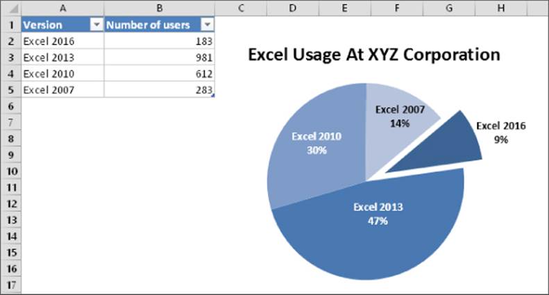
Figure 19.21 A pie chart with one slice exploded.
A workbook that contains the charts in this section is available on this book's website at www.wiley.com/go/excel2016bible. The file is named pie charts.xlsx.
The pie of pie and bar of pie chart types enable you to display a secondary chart that provides more detail for one of the pie slices. Figure 19.22 shows an example of a bar of pie chart. The pie chart shows the breakdown of four expense categories: Rent, Supplies, Miscellaneous, and Salary. The secondary bar chart provides an additional regional breakdown of the Salary category.
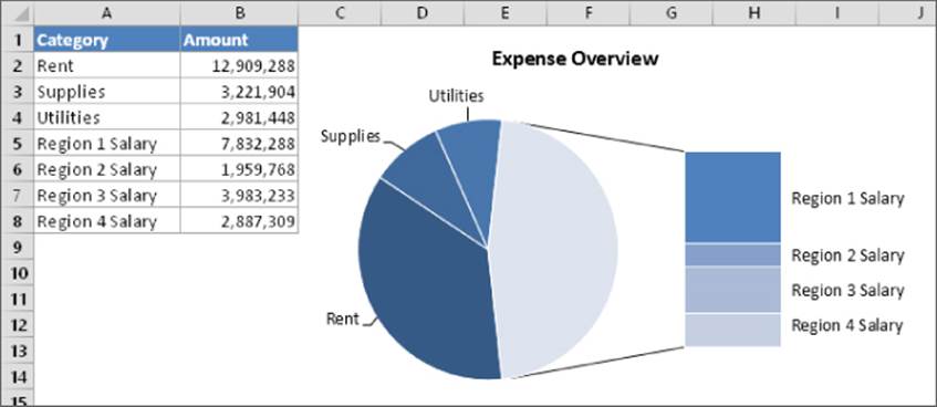
Figure 19.22 A bar of pie chart that shows detail for one of the pie slices.
The data used in the chart resides in A2:B8. When the chart was created, Excel made a guess as to which categories belong to the secondary chart. In this case, the guess was to use the last three data points for the secondary chart — and the guess was incorrect.
To correct the chart, right-click any of the pie slices and choose Format Data Series. In the Format Data Series task pane, select the Series Options icon and make the changes. In this example, I chose Split Series by Position and specified that the second plot contains four values in the series.
A pie chart subtype is called a doughnut chart. It's basically a pie chart with a hole in the middle.
XY (scatter) charts
Another common chart type is an XY chart (also known as scattergrams or scatter plots). An XY chart differs from most other chart types in that both axes display values. (An XY chart has no category axis.)
This type of chart often is used to show the relationship between two variables. Figure 19.23 shows an example of an XY chart that plots the relationship between sales calls made (horizontal axis) and sales (vertical axis). Each point in the chart represents one month. The chart shows that these two variables are positively related: months in which more calls were made typically had higher sales volumes.
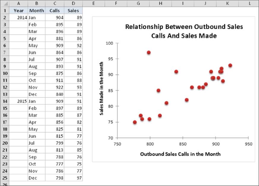
Figure 19.23 An XY chart shows the relationship between two variables.
A workbook that contains the charts in this section is available on this book's website at www.wiley.com/go/excel2016bible. The file is named xy charts.xlsx.
Note
Although these data points correspond to time, the chart doesn't convey any time-related information. In other words, the data points are plotted based only on their two values.
Figure 19.24 shows another XY chart, this one with lines that connect the XY points. This chart plots a hypocycloid curve with 200 data points. It's set up with three parameters. Change any of the parameters, and you'll get a completely different curve. This is a minimalist chart. I deleted all the chart elements except the data series itself.
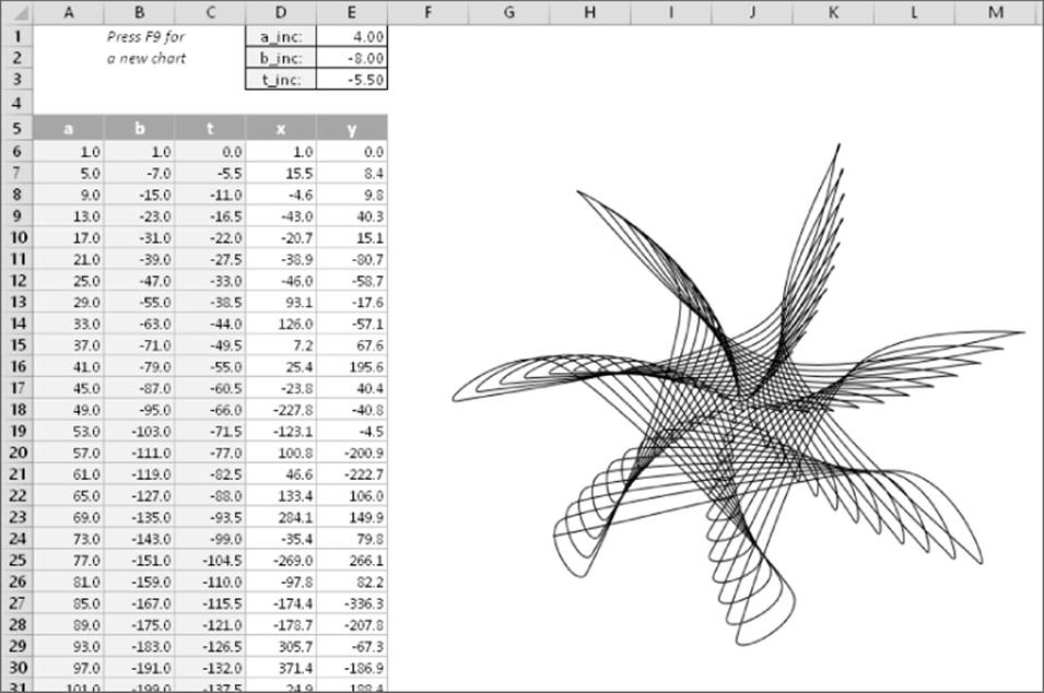
Figure 19.24 A hypocycloid curve, plotted as an XY chart.
If this type of design looks familiar, it's because a hypocycloid curve is the basis for a popular children's drawing toy.
Area charts
Think of an area chart as a line chart in which the area below the line has been colored in. Figure 19.25 shows an example of a stacked area chart. Stacking the data series enables you to clearly see the total, plus the contribution by each series.
A workbook that contains the charts in this section is available on this book's website at www.wiley.com/go/excel2016bible. The file is named area charts.xlsx.
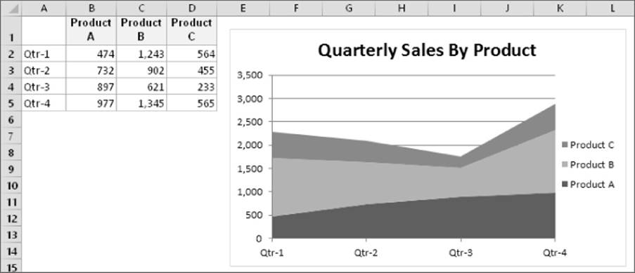
Figure 19.25 A stacked area chart.
Figure 19.26 shows the same data, plotted as a 3-D area chart. As you can see, it's not an example of an effective chart. The data for products B and C is obscured. In some cases, the problem can be resolved by rotating the chart or using transparency. But usually the best way to salvage a chart like this is to select a new chart type.
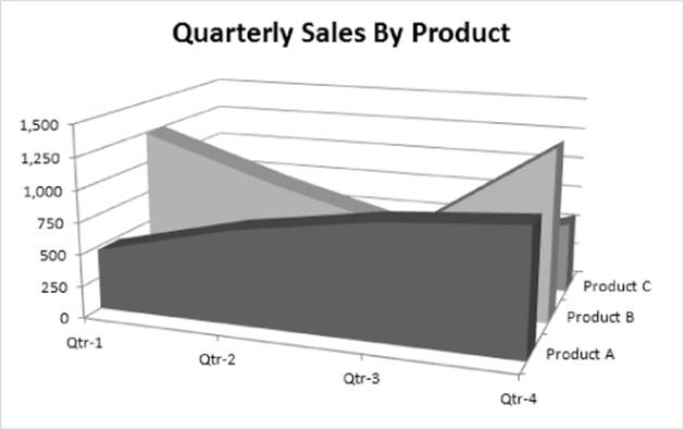
Figure 19.26 This 3-D area chart is not a good choice.
Radar charts
You may not be familiar with this type of chart. A radar chart is a specialized chart that has a separate axis for each category, and the axes extend outward from the center of the chart. The value of each data point is plotted on the corresponding axis.
Figure 19.27 shows an example of a radar chart. This chart plots two data series across 12 categories (months) and shows the seasonal demand for snow skis versus water skis. Note that the water-ski series partially obscures the snow-ski series.
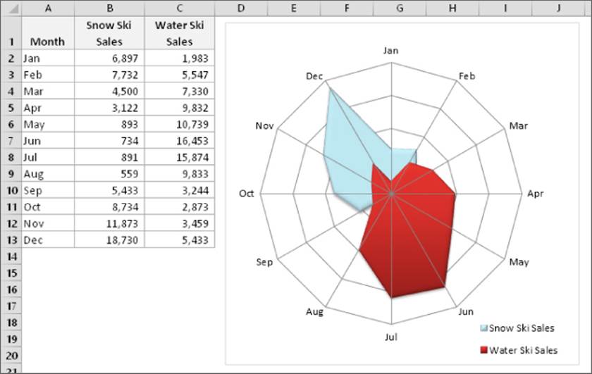
Figure 19.27 Plotting ski sales using a radar chart with 12 categories and two series.
A workbook that contains the charts in this section is available at this book's website at www.wiley.com/go/excel2016bible. The file is named radar charts.xlsx.
Using a radar chart to show seasonal sales may be an interesting approach, but it's certainly not the best chart type. As you can see in Figure 19.28, a stacked bar chart shows the information much more clearly.
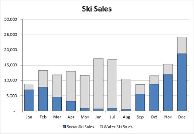
Figure 19.28 A stacked bar chart is a better choice for the ski sales data.
A more appropriate use for radar charts is shown in Figure 19.29. These four charts each plot a color. More precisely, each chart shows the RGB components (the contributions of red, green, and blue) that make up a color. Each chart has one series and three categories. The categories extend from 0 to 255.
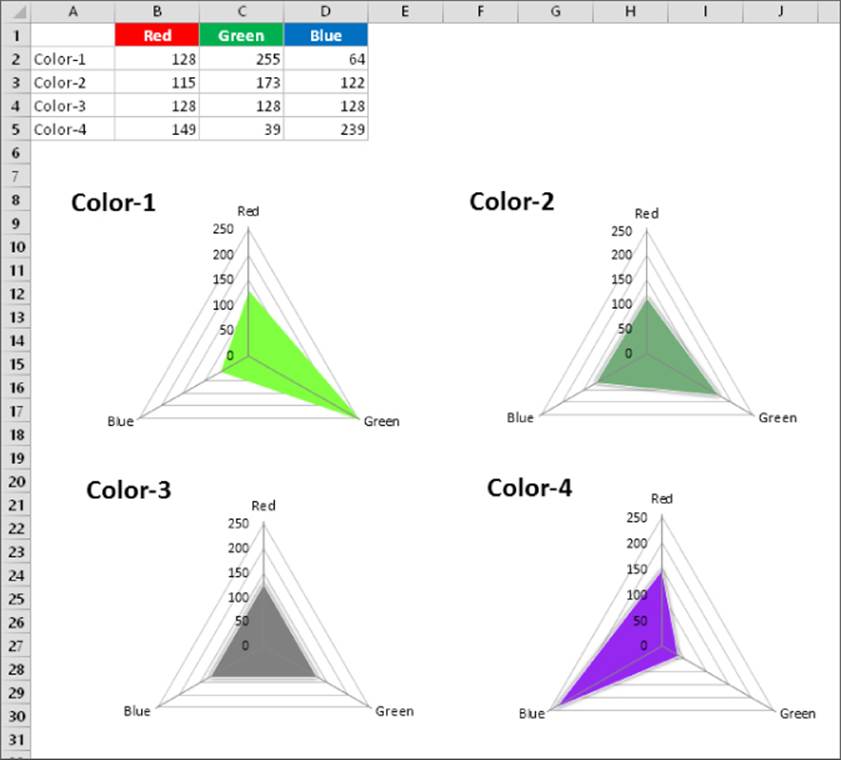
Figure 19.29 These radar charts depict the red, green, and blue contributions for each of four colors.
Note
If you view the charts in color, you'll see that they actually depict the color that they describe. The data series colors were applied manually.
Surface charts
Surface charts display two or more data series on a surface. As Figure 19.30 shows, these charts can be quite interesting. Unlike other charts, Excel uses color to distinguish values, not to distinguish the data series. The number of colors used is determined by the major unit scale setting for the value axis. Each color corresponds to one major unit.
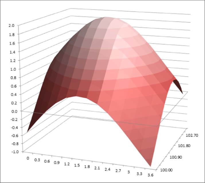
Figure 19.30 A surface chart.
A workbook that contains the charts in this section is available on this book's website at www.wiley.com/go/excel2016bible. The file is named surface charts.xlsx.
Note
A surface chart does not plot 3-D data points. The series axis for a surface chart, as with all other 3-D charts, is a category axis — not a value axis. In other words, if you have data that is represented by x, y, and z coordinates, it can't be plotted accurately on a surface chart unless the x and y values are equally spaced.
Bubble charts
Think of a bubble chart as an XY chart that can display an additional data series, which is represented by the size of the bubbles. As with an XY chart, both axes are value axes. (There is no category axis.)
Figure 19.31 shows an example of a bubble chart that depicts the results of a weight-loss program. The horizontal value axis represents the original weight, the vertical value axis shows the number of weeks in the program, and the size of the bubbles represents the amount of weight lost.
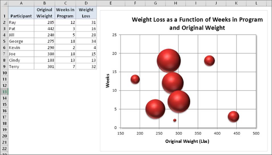
Figure 19.31 A bubble chart.
A workbook that contains the charts in this section is available on this book's website. The file is named bubble charts.xlsx.
Figure 19.32 shows another bubble chart, made up of nine series that represent mouse face parts. The size and position of each bubble required some experimentation.
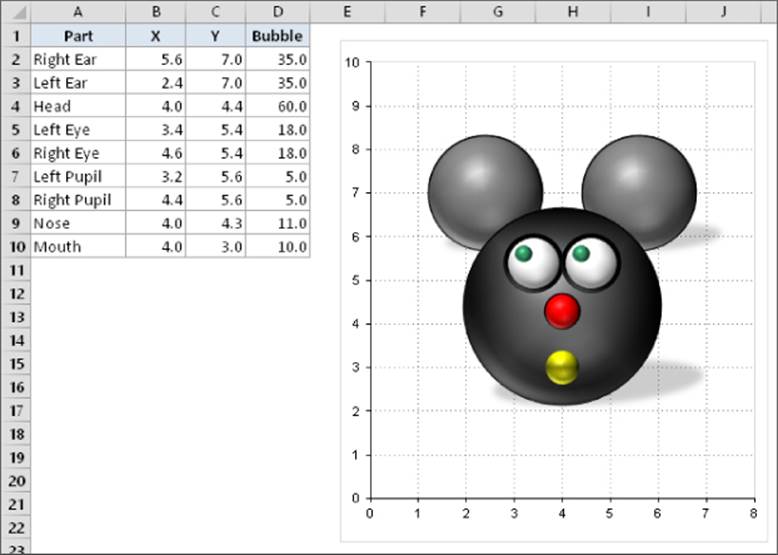
Figure 19.32 This bubble chart depicts a mouse.
Stock charts
Stock charts are most useful for displaying stock-market information. These charts require three to five data series, depending on the subtype.
Figure 19.33 shows an example of each of the four stock chart types. The two charts on the bottom display the trade volume and use two value axes. The daily volume, represented by columns, uses the axis on the left. The up-bars, sometimes referred to ascandlesticks, are the vertical lines that depict the difference between the opening and closing price. A black up-bar indicates that the closing price was lower than the opening price.
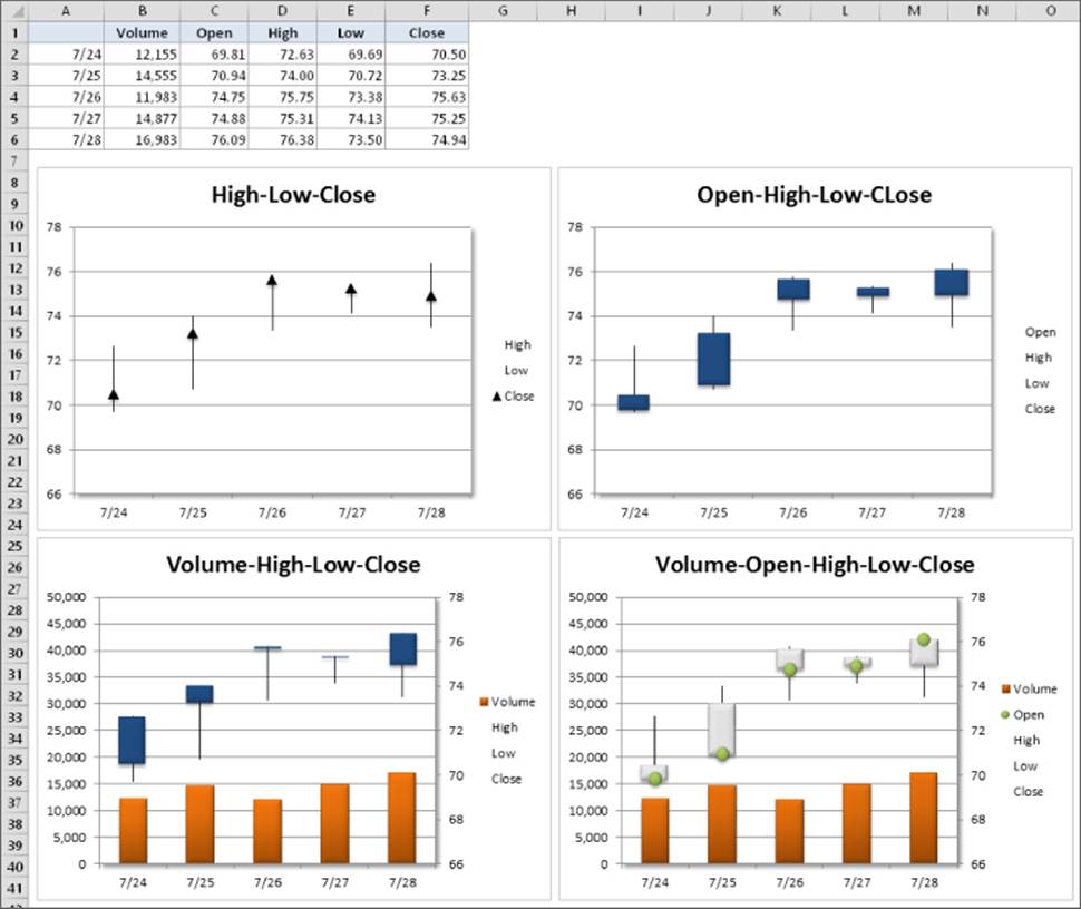
Figure 19.33 The four stock chart subtypes.
A workbook that contains the charts in this section is available on this book's website at www.wiley.com/go/excel2016bible. The file is named stock charts.xlsx.
Stock charts aren't just for stock price data. Figure 19.34 shows a stock chart that depicts the high, low, and average temperatures for each day in May. This is a high-low-close chart.
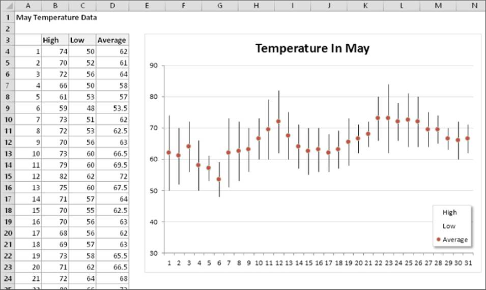
Figure 19.34 Plotting temperature data with a stock chart.
New Chart Types for Excel 2016
Excel 2016 includes six new chart types. This section presents an example of each new chart type, along with an explanation of the type of data required. If you plan to share your workbook with users of previous versions of Excel, you should avoid these charts.
A workbook that contains the charts in this section is available on this book's website at www.wiley.com/go/excel2016bible. The file is named new chart types.xlsx.
Histogram charts
A histogram displays the count of data items in each of several discrete bins. With a bit of effort, you can create a histogram by using a standard column chart or by using the Analysis ToolPak (see Chapter 37, “Analyzing Data with the Analysis ToolPak”). But using the new histogram chart type makes it easier.
Figure 19.35 shows a histogram created from 105 student test scores. The bins are displayed as category labels. You control the number of bins by using the Axis Options section of the Format Axis task pane. In this example, I specified eight bins, and Excel took care of all the details.
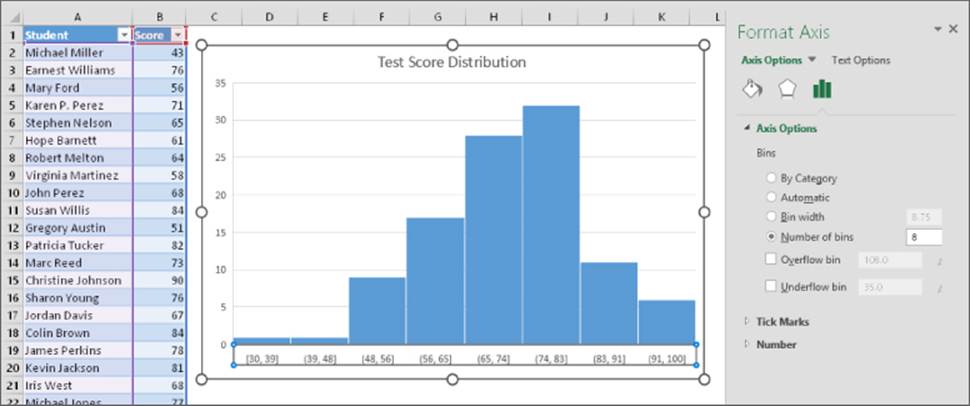
Figure 19.35 Displaying a student grade distribution using a histogram chart.
Pareto charts
A Pareto chart is a combination chart in which columns are displayed in descending order, and the columns use the left axis. The line shows the cumulative percentage and uses the right axis.
Figure 19.36 shows a Pareto chart created from the data in range A2:B14. Notice that Excel sorted the items in the chart. The line shows, for example, that approximately 50 percent of all complaints are in the top three categories.
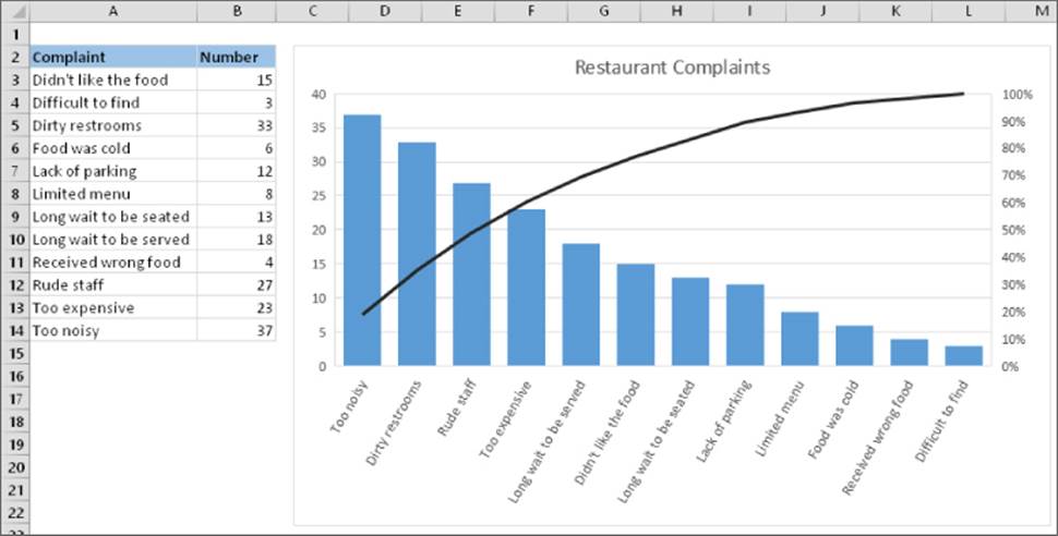
Figure 19.36 A Pareto chart displays the number of complaints graphically.
Waterfall charts
A waterfall chart is used to show the cumulative effect of a series of numbers, usually both positive and negative numbers. The result is a staircase-like display.
Figure 19.37 shows a waterfall chart that uses the data in Column D. Waterfall charts typically display the ending total as the last bar, with its origin at zero. To display the total column correctly, select the column, right-click, and choose Set As Total from the shortcut menu.
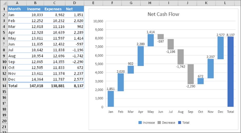
Figure 19.37 A waterfall chart showing positive and negative net cash flows.
Box & whisker charts
A box & whisker chart (also known as a box plot or a quartile plot) is often used to visually summarize data. In the past, it was possible to create such charts using Excel, but it required quite a bit of setup work. In Excel 2016, it's simple.
Figure 19.38 shows a box & whisker chart created for four groups of subjects. The data is in a two-column table. In the chart, the vertical lines extending from the box represent the numerical range of the data (minimum and maximum values). The “boxes” represent the 25th through the 75th percentile. The horizontal line inside the box is the median value (or 50th percentile), and the X is the average. This type of chart enables the viewer to make quick comparisons among groups of data.
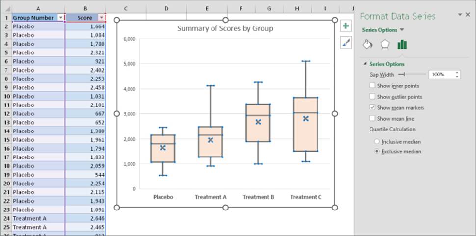
Figure 19.38 A box & whisker chart that summarizes data for four groups.
As you can see in Figure 19.38, the Series Options section of the Format Data Series task pane contains some options for this chart type.
Sunburst charts
A sunburst chart is like a pie chart with multiple concentric layers. This chart type is most useful for data that's organized hierarchically. Figure 19.39 shows an example of a sunburst chart that depicts a music collection. It shows the number of tracks by genre and subgenre. Note that some genres have no subgenres.
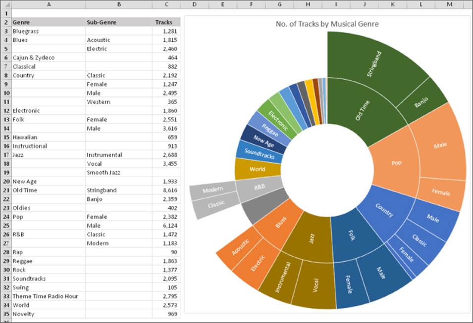
Figure 19.39 A sunburst chart that depicts a music collection by genre and subgenre.
A potential problem with the chart type is that some slices are so small that the data labels can't be displayed.
Treemap charts
Like a sunburst chart, a treemap chart is suited for hierarchical data. The data, however, is represented as rectangles. Figure 19.40 shows the data from the previous example, plotted as a treemap chart.
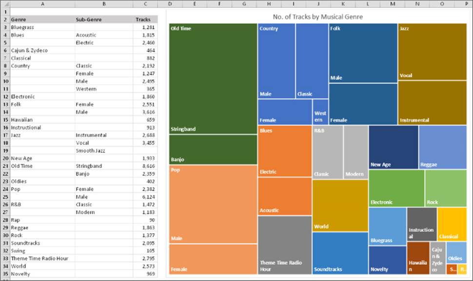
Figure 19.40 A treemap chart that depicts a music collection by genre and subgenre.
Learning More
This chapter introduced Excel charts, including examples of the types of charts that you can create. For many people, the information in this chapter is sufficient to create a variety of charts.
Those who require control over every aspect of their charts can find the information they need in the next chapter. It picks up where this one leaves off and covers the details involved in creating the perfect chart.
All materials on the site are licensed Creative Commons Attribution-Sharealike 3.0 Unported CC BY-SA 3.0 & GNU Free Documentation License (GFDL)
If you are the copyright holder of any material contained on our site and intend to remove it, please contact our site administrator for approval.
© 2016-2026 All site design rights belong to S.Y.A.