Microsoft Excel 2016 BIBLE (2016)
Part V
Analyzing Data with Excel
Chapter 33
Introducing Pivot Tables
IN THIS CHAPTER
1. Understanding pivot tables
2. Identifying types of data appropriate for a pivot table
3. Getting clear on pivot table terminology
4. Creating pivot tables
5. Looking at pivot table examples that answer specific questions about data
The pivot table feature is perhaps the most technologically sophisticated component in Excel. With only a few mouse clicks, you can slice and dice a data table in dozens of different ways and produce just about any type of summary you can think of.
If you haven't yet discovered the power of pivot tables, this chapter provides an introduction, and Chapter 34, “Analyzing Data with Pivot Tables,” continues with many examples that demonstrate how easy it is to create powerful data summaries using pivot tables.
About Pivot Tables
A pivot table is essentially a dynamic summary report generated from a database. The database can reside in a worksheet (in the form of a table) or in an external data file. A pivot table can help transform endless rows and columns of numbers into a meaningful presentation of the data — and do it so quickly you'll be amazed.
For example, a pivot table can create frequency distributions and cross-tabulations of several different data dimensions. In addition, you can display subtotals and any level of detail that you want.
Perhaps the most innovative aspect of a pivot table is its interactivity. After you create a pivot table, you can rearrange the information in almost any way imaginable and even insert special formulas that perform new calculations. You even can create post hoc groupings of summary items (for example, combine Northern Region totals with Western Region totals). And the icing on the cake: with a few mouse clicks, you can apply formatting to a pivot table to convert it into an attractive report.
One minor drawback to using a pivot table is that, unlike a formula-based summary report, a pivot table does not update automatically when you change information in the source data. This drawback doesn't pose a serious problem, however, because a single click of the Refresh button forces a pivot table to update itself with the latest data.
Pivot tables were introduced in Excel 97, and this feature improves with every new version of Excel. Unfortunately, many users avoid this feature because they think it's too complicated. My goal in this chapter is to dispel that myth.
A pivot table example
The best way to understand the concept of a pivot table is to see one. Start with Figure 33.1, which shows a portion of the data used in creating the pivot table in this chapter. This range happens to be in a table (created by using Insert ![]() Tables
Tables ![]() Table), but that's not a requirement for creating a pivot table.
Table), but that's not a requirement for creating a pivot table.
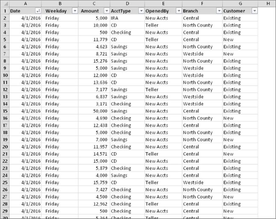
Figure 33.1 This table is used to create a pivot table.
This table consists of a month's worth of new account information for a three-branch bank. The table contains 712 rows, and each row represents a new account opened at the bank. The table has the following columns:
· The date the account was opened
· The day of the week the account was opened
· The opening deposit amount
· The account type (CD, checking, savings, or IRA)
· Who opened the account (a teller or a new-account representative)
· The branch at which it was opened (Central, Westside, or North County)
· The type of customer (an existing customer or a new customer)
 This workbook, named bank accounts.xlsx, is available on this book's website at www.wiley.com/go/excel2016bible.
The bank accounts database contains quite a bit of information. In its current form, though, the data doesn't reveal much. To make the data more useful, you need to summarize it. Summarizing a database is essentially the process of answering questions about the data. Following are a few questions that may be of interest to the bank's management:
· What is the daily total new deposit amount for each branch?
· Which day of the week accounts for the most deposits?
· How many accounts were opened at each branch, broken down by account type?
· What's the dollar distribution of the different account types?
· What types of accounts do tellers open most often?
· In which branch do tellers open the most checking accounts for new customers?
You can, of course, spend time sorting the data and creating formulas to answer these questions. But almost always, a pivot table is a better choice. Creating a pivot table takes only a few seconds, doesn't require a single formula, and produces a nice-looking report. In addition, pivot tables are much less prone to error than creating formulas.
Later in this chapter, you'll see several pivot tables that answer the preceding questions.
Figure 33.2 shows a pivot table created from the bank data. This pivot table shows the amount of new deposits, broken down by branch and account type. This particular summary is one of dozens of summaries that you can produce from this data.
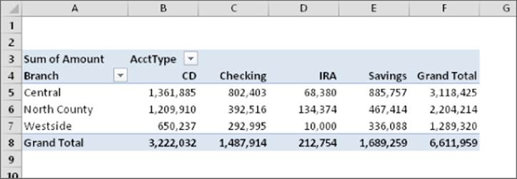
Figure 33.2 A simple pivot table.
Figure 33.3 shows another pivot table generated from the bank data. This pivot table uses a drop-down Report Filter for the Customer item (in row 2). In the figure, the pivot table displays the data only for existing customers. (The user can also select New or All from the drop-down control.)
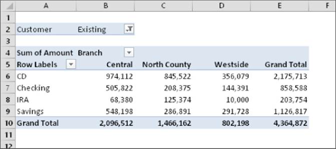
Figure 33.3 A pivot table that uses a report filter.
Notice the change in the orientation of the table? For this pivot table, branches appear as column labels, and account types appear as row labels. This change, which took about five seconds to make, is another example of the flexibility of a pivot table.
Why Pivot?
Are you curious about the term pivot?
Pivot, as a verb, means to rotate or revolve. If you think of your data as a physical object, a pivot table lets you rotate the data summary and look at it from different angles or perspectives. A pivot table allows you to move fields around easily, nest fields within each other, and even create ad hoc groups of items.
If you were handed a strange object and asked to identify it, you'd probably look at it from several different angles in an attempt to figure it out. Working with a pivot table is similar to investigating a strange object. In this case, the object happens to be your data. A pivot table invites experimentation, so feel free to rotate and manipulate the pivot table until you're satisfied. You may be surprised at what you discover.
Data appropriate for a pivot table
A pivot table requires that your data be in the form of a rectangular database table. You can store the database in either a worksheet range (which can be a table or just a normal range) or an external database file. And although Excel can generate a pivot table from any database, not all databases benefit.
Generally speaking, fields in a database table consist of two types of information:
· Data: Contains a value or data to be summarized. For the bank account example, the Amount field is a data field.
· Category: Describes the data. For the bank account data, the Date, Weekday, AcctType, OpenedBy, Branch, and Customer fields are category fields because they describe the data in the Amount field.
Note
A database table that's appropriate for a pivot table is said to be “normalized.” In other words, each record (or row) contains information that describes the data.
A single database table can have any number of data fields and category fields. When you create a pivot table, you usually want to summarize one or more of the data fields. Conversely, the values in the category fields appear in the pivot table as rows, columns, or filters.
Exceptions exist, however, and you may find the Excel PivotTable feature useful even for databases that don't contain actual numerical data fields.
Chapter 34 has an example of a pivot table created from nonnumeric data.
Figure 33.4 shows an example of an Excel range that is not appropriate for a pivot table. You might recognize this data from the outline example in Chapter 27, “Creating and Using Worksheet Outlines.” Although the range contains descriptive information about each value, it does not consist of normalized data. In fact, this range actually resembles a pivot table summary, but it's much less flexible.
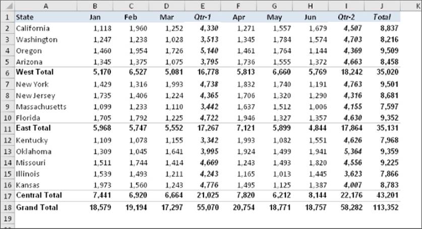
Figure 33.4 This range is not appropriate for a pivot table.
Figure 33.5 shows the same data, but normalized. This range contains 78 rows of data — one for each of the six monthly sales values for the 13 states. Notice that each row contains category information for the sales value. This table is an ideal candidate for a pivot table and contains all information necessary to summarize the information by region or quarter.
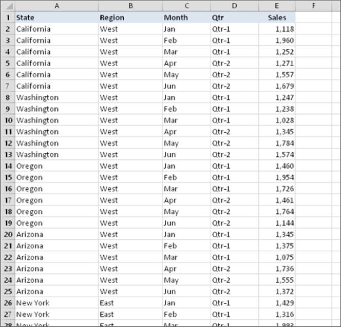
Figure 33.5 This range contains normalized data and is appropriate for a pivot table.
Figure 33.6 shows a pivot table created from the normalized data. As you can see, it's virtually identical to the nonnormalized data shown in Figure 33.4. Working with normalized data provides ultimate flexibility in designing reports.
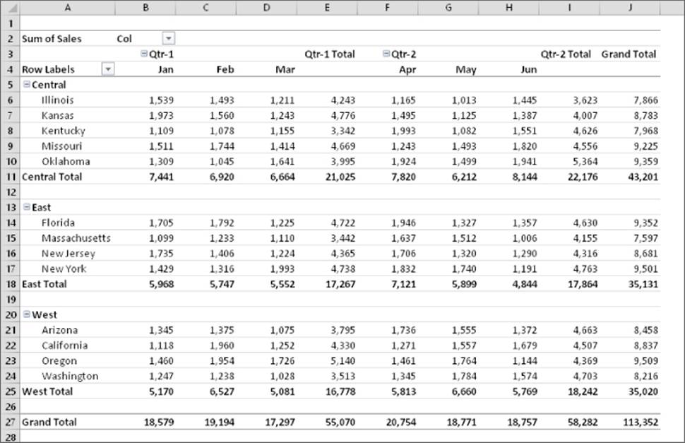
Figure 33.6 A pivot table created from normalized data.
This workbook, named normalized data.xlsx, is available on this book's website at www.wiley.com/go/excel2016bible.
Creating a Pivot Table Automatically
How easy is it to create a pivot table? This task requires practically no effort if your data is appropriate and you choose a Recommended PivotTable.
If your data is in a worksheet, select any cell within the data range and choose Insert ![]() Tables
Tables ![]() Recommended PivotTables. Excel quickly scans your data, and the Recommended PivotTables dialog box presents thumbnails that depict some pivot tables that you can choose from. Figure 33.7 shows the Recommended PivotTables dialog box for the bank account data.
Recommended PivotTables. Excel quickly scans your data, and the Recommended PivotTables dialog box presents thumbnails that depict some pivot tables that you can choose from. Figure 33.7 shows the Recommended PivotTables dialog box for the bank account data.
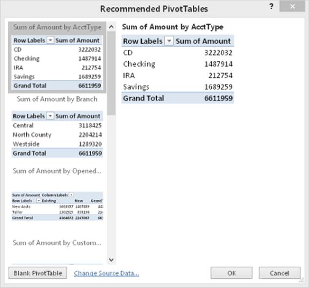
Figure 33.7 Selecting a Recommended PivotTable.
The pivot table thumbnails use your actual data, and there's a good chance that one of them will be exactly what you're looking for — or at least close to what you're looking for. Select a thumbnail, click OK, and Excel creates the pivot table on a new worksheet.
When any cell in a pivot table is selected, Excel displays the PivotTable Fields task pane. You can use this task pane to make changes to the layout of the pivot table.
Note
If your data is in an external database, start by selecting a blank cell. When you choose Insert ![]() Tables
Tables ![]() Recommended PivotTables, the Choose Data Source dialog box appears. Select Use an External Data Source, and then click Choose Connection to specify the data source. You'll see the thumbnails of the list of recommended pivot tables.
Recommended PivotTables, the Choose Data Source dialog box appears. Select Use an External Data Source, and then click Choose Connection to specify the data source. You'll see the thumbnails of the list of recommended pivot tables.
If none of the Recommended PivotTables is suitable, you have two choices:
· Create a pivot table that's close to what you want, and then use the PivotTable Fields task pane to modify it.
· Click the Blank PivotTable button (at the bottom of the Recommended PivotTables dialog box) and create a pivot table manually.
Creating a Pivot Table Manually
In this section, I describe the basic steps required to create a pivot table, using the bank account data described earlier in this chapter. Creating a pivot table is an interactive process. It's not at all uncommon to experiment with various layouts until you find one that you're satisfied with. If you're unfamiliar with the elements of a pivot table, see the sidebar “Pivot Table Terminology.”
Specifying the data
If your data is in a worksheet range, select any cell in that range and then choose Insert ![]() Tables
Tables ![]() PivotTable. The Create PivotTable dialog box, shown in Figure 33.8, appears.
PivotTable. The Create PivotTable dialog box, shown in Figure 33.8, appears.
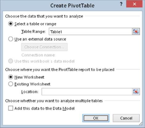
Figure 33.8 In the Create PivotTable dialog box, you tell Excel where the data is and where you want the pivot table.
Excel attempts to guess the range, based on the location of the active cell. If you're creating a pivot table from an external data source, you need to select that option and then click Choose Connection to specify the data source.
Tip
If you're creating a pivot table from data in a worksheet, it's a good idea to first create a table for the range. (Choose Insert ![]() Tables
Tables ![]() Table.) Then, if you expand the table by adding new rows of data, Excel will refresh the pivot table without the need to manually indicate the new data range.
Table.) Then, if you expand the table by adding new rows of data, Excel will refresh the pivot table without the need to manually indicate the new data range.
Specifying the location for the pivot table
Use the bottom section of the Create PivotTable dialog box to indicate the location for your pivot table. The default location is on a new worksheet, but you can specify any range on any worksheet, including the worksheet that contains the data.
Click OK, and Excel creates an empty pivot table and displays a PivotTable Fields task pane, as shown in Figure 33.9.
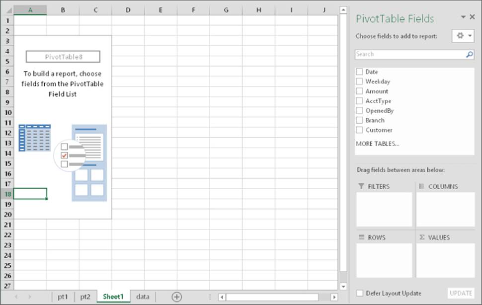
Figure 33.9 Use the PivotTable Fields task pane to build the pivot table.
Tip
The PivotTable Fields task pane is typically docked on the right side of the Excel window. Drag its title bar to move it anywhere you like. Also, if you click a cell outside the pivot table, the task pane is temporarily hidden.
Laying out the pivot table
Next, set up the actual layout of the pivot table. You can do so by using of the following techniques:
· Drag the field names (at the top of the PivotTable Fields task pane) to one of the four boxes at the bottom of the task pane.
· Place a check mark next to the item at the top of the PivotTable Fields task pane. Excel places the field into one of the four boxes at the bottom. You can drag it to a different box, if necessary.
· Right-click a field name at the top of the PivotTable Fields task pane and choose its location from the shortcut menu (for example, Add to Row Labels).
The following steps create the pivot table presented earlier in this chapter (see “A pivot table example”). For this example, I drag the items from the top of the PivotTable Fields task pane to the areas in the bottom of the PivotTable Fields task pane.
1. Drag the Amount field into the Values area. At this point, the pivot table displays the total of all the values in the Amount column.
2. Drag the AcctType field into the Rows area. Now the pivot table shows the total amount for each of the account types.
3. Drag the Branch field into the Columns area. The pivot table shows the amount for each account type, cross-tabulated by branch. The pivot table updates itself automatically with every change you make in the PivotTable Fields task pane.
4. Right click any cell in the pivot table and choose Number Format. Excel displays the Number tab of the Format Cells dialog box.
5. Select a number format and click OK. Excel applies the format to all numeric cells in the pivot table.
Figure 33.10 shows the completed pivot table.
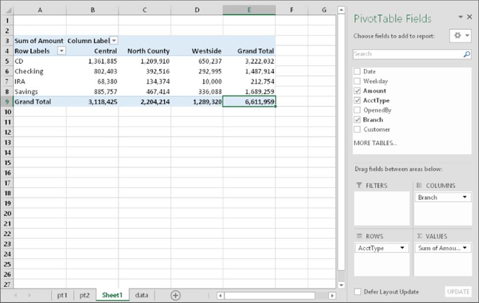
Figure 33.10 After a few simple steps, the pivot table shows a summary of the data.
Pivot Table Terminology
Understanding the terminology associated with pivot tables is the first step in mastering this feature. Refer to the accompanying figure to get your bearings.
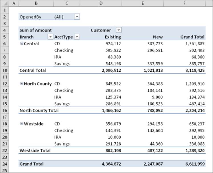
· Column labels: A field that has a column orientation in the pivot table. Each item in the field occupies a column. In the figure, Customer represents a column field that contains two items (Existing and New). You can have nested column fields.
· Grand totals: A row or column that displays totals for all cells in a row or column in a pivot table. You can specify that grand totals be calculated for rows, columns, or both (or neither). The pivot table in the figure shows grand totals for both rows and columns.
· Group: A collection of items treated as a single item. You can group items manually or automatically (group dates into months, for example). The pivot table in the figure does not have defined groups.
· Item: An element in a field that appears as a row or column header in a pivot table. In the figure, Existing and New are items for the Customer field. The Branch field has three items: Central, North County, and Westside. AcctType has four items: CD, Checking, IRA, and Savings.
· Refresh: Recalculates the pivot table after making changes to the source data.
· Row labels: A field that has a row orientation in the pivot table. Each item in the field occupies a row. You can have nested row fields. In the figure, both Branch and AcctType represent row fields.Source data: The data used to create a pivot table. It can reside in a worksheet or an external database.
· Subtotals: A row or column that displays subtotals for detail cells in a row or column in a pivot table. The pivot table in the figure displays subtotals for each branch, below the data. You can also display subtotals above the data or hide subtotals.
· Table Filter: A field that has a page orientation in the pivot table — similar to a slice of a three-dimensional cube. You can display one item, multiple items, or all items in a page field at one time. In the figure, OpenedBy represents a page field that displays All (that is, not filtered).
· Values area: The cells in a pivot table that contain the summary data. Excel offers several ways to summarize the data (sum, average, count, and so on).
Formatting the pivot table
By default, pivot tables use General number formatting. To change the number format for all data, right-click any value and choose Number Format from the shortcut menu. Then use the Format Cells dialog box to change the number format for the displayed data.
You can apply any of several built-in styles to a pivot table. Select any cell in the pivot table and then choose PivotTable Tools ![]() Design
Design ![]() PivotTable Styles to select a style. Fine-tune the display by using the controls in the PivotTable Tools
PivotTable Styles to select a style. Fine-tune the display by using the controls in the PivotTable Tools ![]() Design
Design ![]() PivotTable Style Options group.
PivotTable Style Options group.
You can also use the controls from the PivotTable ![]() Design
Design ![]() Layout group to control various elements in the pivot table. You can adjust any of the following elements:
Layout group to control various elements in the pivot table. You can adjust any of the following elements:
· Subtotals: Hide subtotal, or choose where to display them (above or below the data).
· Grand Totals: Choose which types, if any, to display.
· Report Layout: Choose from three different layout styles (compact, outline, or tabular). You can also choose to hide repeating labels.
· Blank Row: Add a blank row between items to improve readability.
The PivotTable Tools ![]() Analyze
Analyze ![]() Show group contains additional options that affect the appearance of your pivot table. For example, you use the Show Field Headers button to toggle the display of the field headings.
Show group contains additional options that affect the appearance of your pivot table. For example, you use the Show Field Headers button to toggle the display of the field headings.
Still more pivot table options are available from the PivotTable Options dialog box. To display this dialog box, choose PivotTable Tools ![]() Analyze
Analyze ![]() PivotTable
PivotTable ![]() Options. Or right-click any cell in the pivot table and choose PivotTable Options from the shortcut menu.
Options. Or right-click any cell in the pivot table and choose PivotTable Options from the shortcut menu.
The best way to become familiar with all these layout and formatting options is to experiment.
Pivot Table Calculations
Pivot table data is most frequently summarized using a sum. However, you can display your data using a number of different summary techniques, specified in the Value Field Settings dialog box. The quickest way to display this dialog box is to right-click any value in the pivot table and choose Value Field Settings from the shortcut menu. This dialog box has two tabs: Summarize Values By and Show Values As.
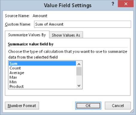
Use the Summarize Values By tab to select a different summary function. Your choices are Sum, Count, Average, Max, Min, Product, Count Numbers, StdDev, StdDevp, Var, and Varp.
To display your values in a different form, use the drop-down control on the Show Values As tab. You have many options to choose from, including as a percentage of the total or subtotal.
This dialog box also provides a way to apply a number format to the values. Just click the button and choose your number format.
Modifying the pivot table
After you create a pivot table, changing it is easy. For example, you can add further summary information by using the PivotTable Fields task pane. Figure 33.11 shows the pivot table after I dragged a second field (OpenedBy) to the Rows section in the PivotTable Fields task pane.
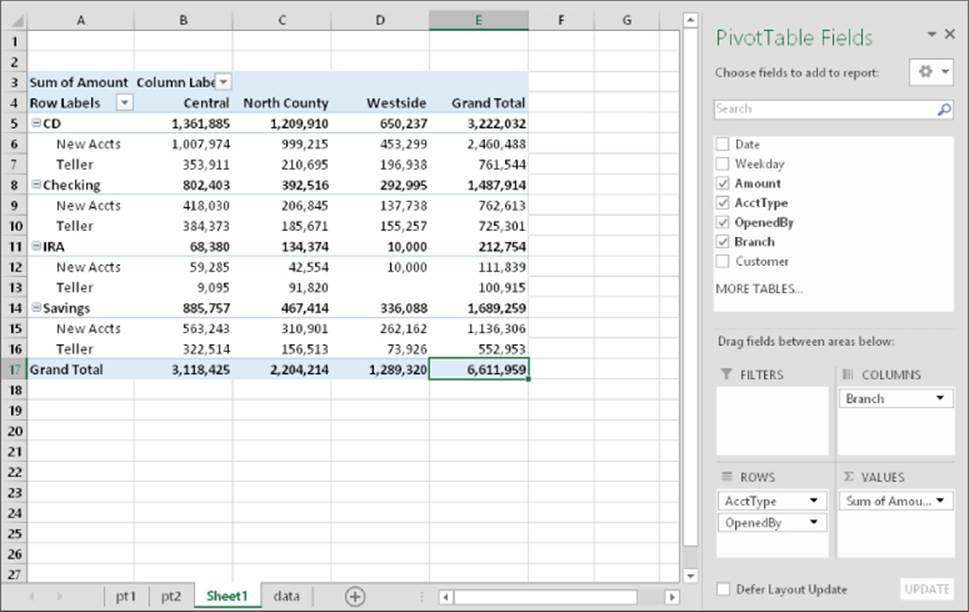
Figure 33.11 Two fields are used for row labels.
Here are some tips on other pivot table modifications you can make:
· To remove a field from the pivot table, select it in the bottom part of the PivotTable Fields task pane and then drag it away.
· If an area has more than one field, you can change the order in which the fields are listed by dragging the field names. Doing so determines how nesting occurs and affects the appearance of the pivot table.
· To temporarily remove a field from the pivot table, remove the check mark from the field name in the top part of the PivotTable Fields task pane. The pivot table is redisplayed without that field. Place the check mark back on the field name, and it appears in its previous section.
· If you add a field to the Filters section, the field items appear in a drop-down list, which allows you to filter the displayed data by one or more items. Figure 33.12 shows an example. I dragged the Date field to the Filters area. The pivot table is now showing the data only for a single day (which I selected from the drop-down list in cell B1).
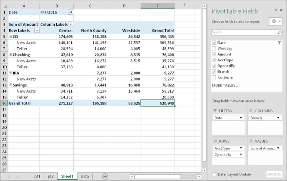
Figure 33.12 The pivot table is filtered by date.
Copying a Pivot Table's Content
A pivot table is flexible, but it does have some limitations. For example, you can't add new rows or columns, change any of the calculated values, or enter formulas within the pivot table. If you want to manipulate a pivot table in ways not normally permitted, make a copy of it so it's no longer linked to its data source.
To copy a pivot table, select the entire table and choose Home ![]() Clipboard
Clipboard ![]() Copy (or press Ctrl+C). Then activate a new worksheet and choose Home Clipboard
Copy (or press Ctrl+C). Then activate a new worksheet and choose Home Clipboard ![]() Paste
Paste ![]() Paste Values. The pivot table formatting is not copied — even if you repeat the operation and use the Formats option in the Paste Special dialog box.
Paste Values. The pivot table formatting is not copied — even if you repeat the operation and use the Formats option in the Paste Special dialog box.
To copy the pivot table and its formatting, use the Office Clipboard to paste. If the Office Clipboard is not displayed, click the dialog box launcher in the bottom right of the Home ![]() Clipboard group.
Clipboard group.
The contents of the pivot table are copied to the new location so that you can do whatever you like to them.
Note that the copied information is not a pivot table, and it is no longer linked to the source data. If the source data changes, your copied pivot table will not reflect these changes.
More Pivot Table Examples
To demonstrate the flexibility of this feature, I created some additional pivot tables. The examples use the bank account data and answer the questions posed earlier in this chapter. (See “A pivot table example.”)
What is the daily total new deposit amount for each branch?
Figure 33.13 shows the pivot table that answers this question.
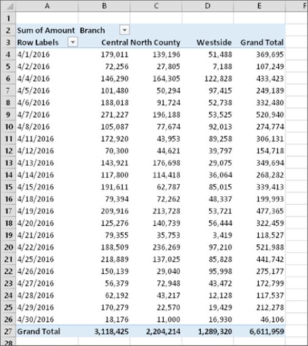
Figure 33.13 This pivot table shows daily totals for each branch.
· The Branch field is in the Columns section.
· The Date field is in the Rows section.
· The Amount field is in the Values section and is summarized by Sum.
Note that the pivot table can also be sorted by any column. For example, you can sort the Grand Total column in descending order to find out which day of the month had the largest amount of new funds. To sort, just right-click any cell in the column to sort and choose Sort from the shortcut menu.
Which day of the week accounts for the most deposits?
Figure 33.14 shows the pivot table that answers this question.
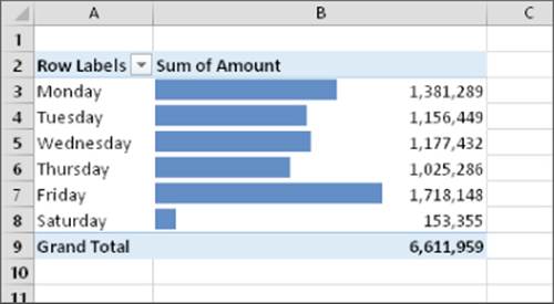
Figure 33.14 This pivot table shows new account totals by day of the week.
· The Weekday field is in the Rows section.
· The Amount field is in the Values section and is summarized by Sum.
I added conditional formatting data bars to make it easier to see how the days compare. As you see, the largest deposit days are Fridays.
See Chapter 21, “Visualizing Data Using Conditional Formatting,” for more information about conditional formatting.
How many accounts were opened at each branch, broken down by account type?
Figure 33.15 shows a pivot table that answers this question.
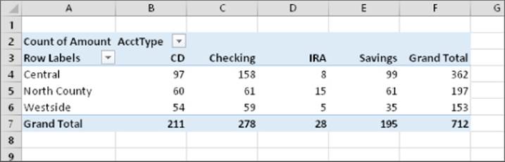
Figure 33.15 This pivot table uses the Count function to summarize the data.
· The AcctType field is in the Columns section.
· The Branch field is in the Rows section.
· The Amount field is in the Values section and is summarized by Count.
So far, all the pivot table examples have used the Sum summary function. In this case, I changed the summary function to Count. To change the summary function to Count, right-click any cell in the Values area and choose Summarize Values By ![]() Count from the shortcut menu.
Count from the shortcut menu.
What's the dollar distribution of the different account types?
Figure 33.16 shows a pivot table that answers this question. For example, 253 (or 35.53%) of the new accounts were for an amount of $5,000 or less.
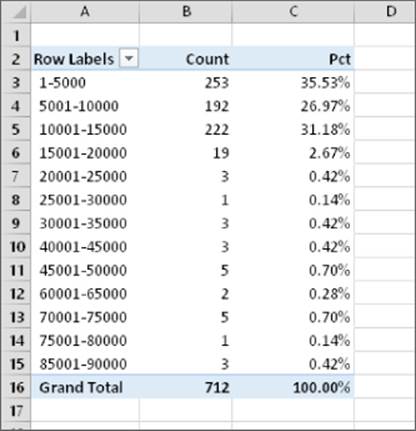
Figure 33.16 This pivot table counts the number of accounts that fall into each value range.
This pivot table is unusual because it uses only one field: Amount.
· The Amount field is in the Rows section (grouped, to show dollar ranges).
· The Amount field is also in the Values section and is summarized by Count.
· A third instance of the Amount field is the Values section, summarized by Count and summarized by Percent of Column Total.
When I initially added the Amount field to the Rows section, the pivot table showed a row for each unique dollar amount. To group the values, I right-clicked one of the Row labels and chose Group from the shortcut menu. Then I used the Grouping dialog box to set up bins of $5,000 increments. Note that the Grouping dialog box does not appear if you select more than one Row label.
The second instance of the Amount field (in the Values section) is summarized by Count. I right-clicked a value and chose Summarize Data By ![]() Count from the shortcut menu.
Count from the shortcut menu.
I added another instance of Amount to the Values section, and I set it up to display the percentage. I right-clicked a value in column C and chose Show Values As ![]() % of Column Total. This option is also available in the Show Values As tab of the Value Field Settings dialog box.
% of Column Total. This option is also available in the Show Values As tab of the Value Field Settings dialog box.
What types of accounts do tellers open most often?
The pivot table in Figure 33.17 shows that the most common account opened by tellers is a checking account.
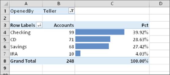
Figure 33.17 This pivot table uses a filter to show only the teller data.
· The AcctType field is in the Rows section.
· The OpenedBy field is in the Filters section.
· The Amount field is in the Values section (summarized by Count).
· A second instance of the Amount field is in the Values section (summarized by % of Column Total).
This pivot table uses the OpenedBy field as a filter and is showing the data only for tellers. I sorted the rows so that the largest value is at the top, and I used conditional formatting to display data bars for the percentages.
See Chapter 21 for more information about conditional formatting.
In which branch do tellers open the most checking accounts for new customers?
Figure 33.18 shows a pivot table that answers this question. At the Central branch, tellers opened 23 checking accounts for new customers.
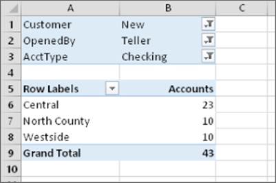
Figure 33.18 This pivot table uses three filters.
· The Customer field is in the Filters section.
· The OpenedBy field is in the Filters section.
· The AcctType field is in the Filters section.
· The Branch field is in the Rows section.
· The Amount field is in the Values section, summarized by Count.
This pivot table uses three Report Filters. The Customer field is filtered to show only New, the OpenedBy field is filtered to show only Teller, and the AcctType field is filtered to show only Checking.
Learning More
The examples in this chapter should give you an appreciation for the power and flexibility of Excel pivot tables. The next chapter digs a bit deeper and covers some advanced features — with lots of examples.
All materials on the site are licensed Creative Commons Attribution-Sharealike 3.0 Unported CC BY-SA 3.0 & GNU Free Documentation License (GFDL)
If you are the copyright holder of any material contained on our site and intend to remove it, please contact our site administrator for approval.
© 2016-2025 All site design rights belong to S.Y.A.