Microsoft Excel 2016 BIBLE (2016)
Part VI
Programming Excel with VBA
Chapter 42
Using UserForm Controls in a Worksheet
IN THIS CHAPTER
1. Understanding why you may want to use controls on a worksheet
2. Using controls
3. Looking at the Controls Toolbox controls
Chapter 41, “Creating UserForms,” presented an introduction to UserForms. If you like the idea of using dialog box controls but you don't like the idea of creating a custom dialog box, this chapter is for you. It explains how to enhance your worksheet with a variety of interactive controls, such as buttons, list boxes, and option buttons.
Why Use Controls on a Worksheet?
The main reason to use controls on a worksheet is to make it easier for the user to provide input. For example, if you create a model that uses one or more input cells, you can create controls to allow the user to select values for the input cells.
Adding controls to a worksheet requires much less effort than creating a dialog box. In addition, you may not have to create any macros because you can link a control to a worksheet cell. For example, if you insert a CheckBox control on a worksheet, you can link it to a particular cell. When the CheckBox is checked, the linked cell displays TRUE. When the CheckBox is not checked, the linked cell displays FALSE.
Figure 42.1 shows an example that uses three types of controls: a Checkbox, two sets of OptionButtons, and a ScrollBar. The user's selections are used to display a loan amortization schedule on another worksheet. The workbook is interactive, but it uses no macros.
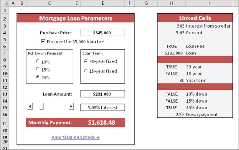
Figure 42.1 This worksheet uses UserForm controls.
 This workbook is available on this book's website at www.wiley.com/go/excel2016bible. The file is named mortgage loan.xlsx.
Adding controls to a worksheet can be a bit confusing because Excel offers two different sets of controls, both of which you access by choosing Developer  Controls Insert:
· Form controls: These controls are unique to Excel.
· ActiveX controls: These controls are a subset of those that are available for use on UserForms.
Figure 42.2 shows the controls that appear when you choose Developer Controls Insert. When you move your mouse pointer over a control, Excel displays a ToolTip that identifies the control.
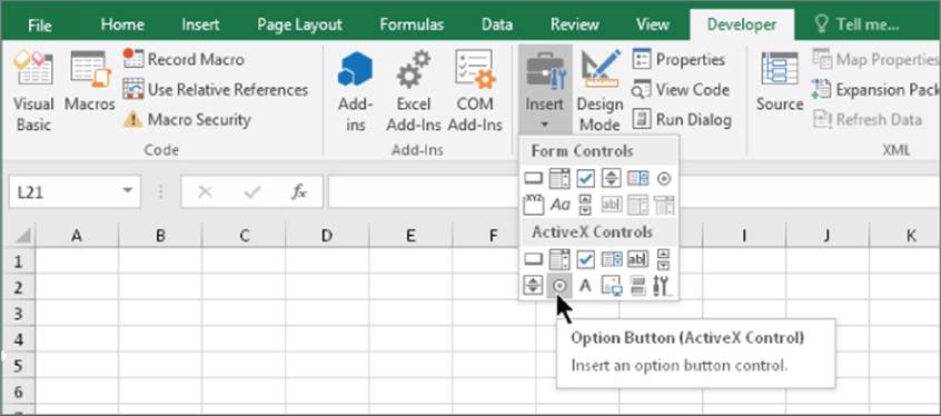
Figure 42.2 Excel's two sets of worksheet controls.
To add to the confusion, many controls are available from both sources. For example, a control named ListBox is listed in both Forms controls and ActiveX controls. However, they're two entirely different controls. In general, Forms controls are easier to use, but ActiveX controls provide more flexibility.
Note
This chapter focuses exclusively on ActiveX controls. If the Developer tab isn't displayed in the Ribbon, right-click any Ribbon control and select Customize the Ribbon from the shortcut menu. The Customize Ribbon tab of the Excel Options dialog box appears. In the list box on the right, place a check mark next to Developer. Click OK to return to Excel.
A description of ActiveX controls appears in Table 42.1.
Table 42.1 ActiveX Controls
|
Button |
What It Does |
|
Command Button |
Inserts a CommandButton control (a clickable button). |
|
Combo Box |
Inserts a ComboBox control (a drop-down list). |
|
Check Box |
Inserts a CheckBox control (to control Boolean options). |
|
List Box |
Inserts a ListBox control (to allow the user to select an item from a list). |
|
Text Box |
Inserts a TextBox control (to allow the user to type text). |
|
Scroll Bar |
Inserts a ScrollBar control (to specify a value by dragging a bar). |
|
Spin Button |
Inserts a SpinButton control (to specify a value by clicking up or down). |
|
Option Button |
Inserts an OptionButton control (to allow a user to select from multiple options). |
|
Label |
Inserts a Label control (a container for text). |
|
Image |
Inserts an Image control (to hold an image). |
|
Toggle Button |
Inserts a ToggleButton control (to control Boolean options). |
|
More Controls |
Displays a list of other ActiveX controls that are installed on your system. Not all these controls work with Excel. |
Using Controls
Adding ActiveX controls in a worksheet is easy, but you need to learn a few basic facts about how to use them.
Adding a control
To add a control to a worksheet, choose Developer Controls Insert. From the Insert drop-down list, click the control that you want to use and then drag in the worksheet to create the control. You don't need to be too concerned about the exact size or position because you can modify those properties at any time.
Caution
Make sure that you select a control from the ActiveX controls, not from the Forms controls. If you insert a Forms control, the instructions in this chapter will not apply. When you choose Developer Controls Insert, the ActiveX controls appear in the lower half of the list.
About Design mode
When you add a control to a worksheet, Excel goes into Design mode. In this mode, you can adjust the properties of any controls on your worksheet, add or edit macros for the control, or change the control's size or position.
Note
When Excel is in Design mode, the Design Mode icon in the Developer Controls group appears highlighted. You can click this icon to toggle Design mode on and off.
When Excel is in Design mode, the controls aren't enabled. To test the controls, you must exit Design mode by clicking the Design Mode icon. When you're working with controls, you'll probably need to need to switch in and out of Design mode frequently.
Adjusting properties
Every control that you add has various properties that determine how it looks and behaves. You can adjust these properties only when Excel is in Design mode. When you add a control to a worksheet, Excel enters Design mode automatically. If you need to change a control after you exit Design mode, click the Design Mode icon in the Controls section of the Developer tab.
To change the properties for a control, follow these steps:
1. Make sure that Excel is in Design mode.
2. Click the control to select it.
3. If the Properties window isn't visible, click the Properties icon in the Controls section of the Developer tab. The Properties window appears, as shown in Figure 42.3.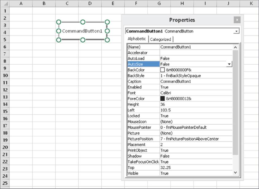
Figure 42.3 Use the Properties window to adjust the properties of a control — in this case, a CommandButton control.
4. Select the property and make the change.
The manner in which you change a property depends on the property. Some properties display a drop-down list from which you can select from a list of options. Others (such as Font) provide a button that, when clicked, displays a dialog box. Other properties require you to type the property value. When you change a property, the change takes effect immediately.
Tip
To find out about a particular property, select the property in the Properties window and press F1.
The Properties window has two tabs. The Alphabetic tab displays the properties in alphabetical order. The Categorized tab displays the properties by category. Both tabs show the same properties; only the order is different.
Common properties
Each control has its own unique set of properties. However, many controls share properties. This section describes some properties that are common to all or many controls, as set forth in Table 42.2.
Table 42.2 Properties Shared by Multiple Controls
|
Property |
Description |
|
AutoSize |
If True, the control resizes itself automatically based on the text in its caption |
|
BackColor |
The background color of the control |
|
BackStyle |
The style of the background (either transparent or opaque) |
|
Caption |
The text that appears on the control |
|
LinkedCell |
A worksheet cell that contains the current value of a control |
|
ListFillRange |
A worksheet range that contains items displayed in a ListBox or ComboBox control |
|
Value |
The control's value |
|
Left and Top |
Values that determine the control's position |
|
Width and Height |
Values that determine the control's width and height |
|
Visible |
If False, the control is hidden |
|
Name |
The name of the control. By default, a control's name is based on the control type. You can change the name to any valid name. However, each control's name must be unique on the worksheet. |
|
Picture |
Enables you to specify a graphics image to display |
Note
Some ActiveX control properties are required (for example, the Name property). In other words, you can't leave the property empty. If a required property is missing, Excel will always tell you by displaying an error message.
Linking controls to cells
Often, you can use ActiveX controls in a worksheet without using macros. Many controls have a LinkedCell property, which specifies a worksheet cell that is linked to the control.
For example, you may add a SpinButton control and specify cell B1 as its LinkedCell property. After doing so, cell B1 contains the value of the SpinButton, and clicking the SpinButton changes the value in cell B1. You can, of course, use the value contained in the linked cell in your formulas.
Note
When specifying the LinkedCell property in the Properties window, you can't “point” to the linked cell in the worksheet. You must type the cell address or its name (if it has one).
Creating macros for controls
To create a macro for a control, you must use the Visual Basic (VB) Editor. The macros are stored in the code module for the sheet that contains the control. For example, if you place an ActiveX control on Sheet2, the VBA code for that control is stored in the Sheet2code module. Each control can have a macro to handle any of its events. For example, a CommandButton control can have a macro for its Click event, its DblClick event, and various other events.
Tip
The easiest way to access the code module for a control is to double-click the control while in Design mode. Excel displays the VB Editor and creates an empty procedure for the control's default event. For example, the default event for a CheckBox control is the Click event. Figure 42.4 shows the autogenerated code for a control named CheckBox1, located on Sheet1.
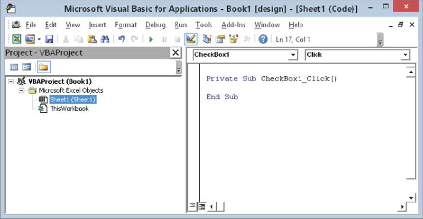
Figure 42.4 Double-clicking a control in Design mode activates the VB Editor and enters an empty event-handler procedure.
The control's name appears in the upper-left portion of the code window, and the event appears in the upper-right area. If you want to create a macro that executes when a different event occurs, select the event from the list in the upper-right area.
The following steps demonstrate how to insert a CommandButton and create a simple macro that displays a message when the button is clicked:
1. Choose Developer Controls Insert.
2. Click the CommandButton tool in the ActiveX Controls section.
3. Click and drag in the worksheet to create the button. Excel automatically enters Design mode.
4. Double-click the button. The VB Editor window is activated, and an empty Sub procedure is created.
5. Enter the following VBA statement before theEnd Substatement:
MsgBox "Hello, it's " & Time
6. Press Alt+F11 to return to Excel.
7. (Optional) Adjust any other properties for theCommandButtonusing the Properties window. Choose Developer Controls Properties if the Properties window isn't visible.
8. Click the Design Mode button in the Developer Controls section to exit design mode.
After you perform the preceding steps, when you click the CommandButton, the message box appears and displays the current time.
Note
You must enter the VBA code manually. You can't create macros for controls using the VBA macro recorder. However, you can record a macro and then execute it from an event procedure. For example, if you've recorded a macro named FormatCells, you can insert Call FormatCells as a VBA statement in the event procedure. Or you can copy the recorded code and paste it to your event procedure.
Reviewing the Available ActiveX Controls
The following sections describe the ActiveX controls that are available for use in your worksheets.
This book's website at www.wiley.com/go/excel2016bible contains a file that includes examples of all the ActiveX controls. This file is named worksheet controls.xlsm.
CheckBox
A CheckBox control is useful for getting a binary choice: yes or no, true or false, on or off, and so on.
The following is a description of the most useful properties of a CheckBox control:
· Accelerator: A letter that enables the user to change the value of the control by using the keyboard. For example, if the accelerator is A, pressing Alt+A changes the value of the CheckBox control. The accelerator letter is underlined in the caption of the control.
· LinkedCell: The worksheet cell that's linked to the CheckBox. The cell displays TRUE if the control is checked or FALSE if the control is not checked.
ComboBox
A ComboBox control is similar to a ListBox control. A ComboBox, however, is a drop-down list, and it displays only one item at a time. Another difference is that, with a ComboBox, the user may be allowed to enter a value that doesn't appear in the list of items.
Figure 42.5 shows a ComboBox control that uses the range D1:D12 for the ListFillRange and cell A1 for the LinkedCell.
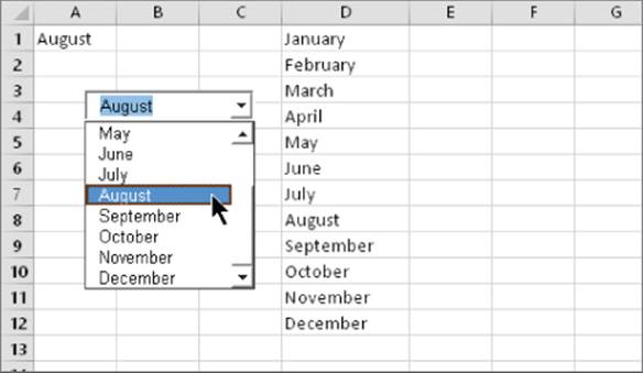
Figure 42.5 A ComboBox control.
The following is a description of the most useful properties of a ComboBox control:
· BoundColumn: If the ListFillRange contains multiple columns, this property determines which column contains the returned value.
· ColumnCount: The number of columns to display in the list.
· LinkedCell: The worksheet cell that displays the selected item.
· ListFillRange: The worksheet range that contains the list items.
· ListRows: The number of items to display when the list drops down.
· ListStyle: Determines the appearance of the list items.
· Style: Determines whether the control acts like a drop-down list or a ComboBox. A drop-down list doesn't allow the user to enter a new value.
You can also create a drop-down list directly in a cell by using data validation. See Chapter 26, “Using Data Validation,” for details.
CommandButton
A CommandButton control is used to execute a macro. When a CommandButton is clicked, it executes an event procedure with a name that is made up of the CommandButton name, an underscore, and the word Click. For example, if a CommandButton is named MyButton, clicking it executes the macro named MyButton_Click. This macro is stored in the code module for the sheet that contains the CommandButton.
Image
An Image control is used to display an image.
These are the most useful properties of an Image control:
· AutoSize: If TRUE, the Image control is resized automatically to fit the image.
· Picture: The path to the image file. Click the button in the Properties window, and Excel displays a dialog box so you can locate the image. Or copy the image to the Clipboard, select the Picture property in the Properties window, and press Ctrl+V.
Tip
You can also insert an image on a worksheet by choosing Insert  Illustrations Picture. In fact, using an Image control offers no real advantage.
Label
A Label control simply displays text. This control isn't very useful for use on worksheets; a TextBox control (described later in this chapter) gives you more versatility.
ListBox
A ListBox control presents a list of items, and the user can select an item (or multiple items). It's similar to a ComboBox. The main difference is that a ListBox displays more than one item at a time.
The following is a description of the most useful properties of a ListBox control:
· BoundColumn: If the list contains multiple columns, this property determines which column contains the returned value.
· ColumnCount: The number of columns to display in the list.
· IntegralHeight: This is TRUE if the height of the ListBox adjusts automatically to display full lines of text when the list is scrolled vertically. If FALSE, the ListBox may display partial lines of text when it's scrolled vertically.
· LinkedCell: The worksheet cell that displays the selected item.
· ListFillRange: The worksheet range that contains the list items.
· ListStyle: Determines the appearance of the list items.
· MultiSelect: Determines whether the user can select multiple items from the list.
Note
If you use a MultiSelect ListBox, you can't specify a LinkedCell; you need to write a macro to determine which items are selected.
OptionButton
OptionButton controls are useful when the user needs to select from a small number of items. OptionButtons are always used in groups of at least two.
The following is a description of the most useful properties of an OptionButton control:
· Accelerator: A letter that lets the user select the option by using the keyboard. For example, if the accelerator for an OptionButton is C, pressing Alt+C selects the control.
· GroupName: A name that identifies an OptionButton as being associated with other OptionButtons with the same GroupName property.
· LinkedCell: The worksheet cell that's linked to the OptionButton. The cell displays TRUE if the control is selected or FALSE if the control isn't selected.
Note
If your worksheet contains more than one set of OptionButton controls, you must ensure that each set of OptionButtons has a different GroupName property. Otherwise, all OptionButtons become part of the same set.
ScrollBar
A ScrollBar control is useful for specifying a cell value. Figure 42.6 shows a worksheet with three ScrollBar controls. These ScrollBars are used to change the color in the rectangle shape. The value of the ScrollBars determines the red, green, or blue component of the rectangle's color. This example uses a few simple macros to change the colors.
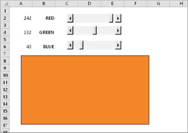
Figure 42.6 This worksheet has three ScrollBar controls.
The following is a description of the most useful properties of a ScrollBar control:
· Value: The current value of the control
· Min: The minimum value for the control
· Max: The maximum value for the control
· LinkedCell: The worksheet cell that displays the value of the control
· SmallChange: The amount that the control's value is changed by a click
· LargeChange: The amount that the control's value is changed by clicking either side of the button
The ScrollBar control is most useful for selecting a value that extends across a wide range of possible values.
SpinButton
A SpinButton control lets the user select a value by clicking the control, which has two arrows (one to increase the value and the other to decrease the value). A SpinButton can display either horizontally or vertically.
The following is a description of the most useful properties of a SpinButton control:
· Value: The current value of the control.
· Min: The minimum value of the control.
· Max: The maximum value of the control.
· LinkedCell: The worksheet cell that displays the value of the control.
· SmallChange: The amount that the control's value is changed by a click. Usually, this property is set to 1, but you can make it any value.
TextBox
On the surface, a TextBox control may not seem useful. After all, it simply contains text — you can usually use worksheet cells to get text input. In fact, TextBox controls are useful not so much for input control as for output control. Because a TextBox can have scrollbars, you can use a TextBox to display a great deal of information in a small area.
Figure 42.7 shows a TextBox control that contains Lincoln's Gettysburg Address. Notice the vertical scrollbar, displayed using the ScrollBars property.
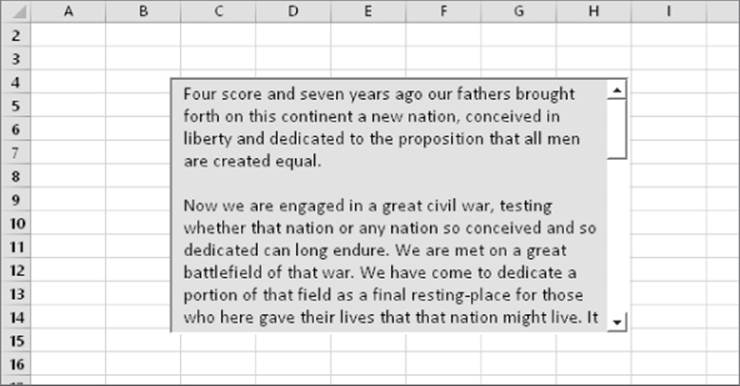
Figure 42.7 A TextBox control with a vertical scrollbar.
The following is a description of the most useful properties of a TextBox control:
· AutoSize: Determines whether the control adjusts its size automatically, based on the amount of text.
· IntegralHeight: If TRUE, the height of the TextBox adjusts automatically to display full lines of text when the list is scrolled vertically. If FALSE, the ListBox may display partial lines of text when it's scrolled vertically.
· MaxLength: The maximum number of characters allowed in the TextBox. If 0, no limit exists on the number of characters.
· MultiLine: If TRUE, the TextBox can display more than one line of text.
· TextAlign: Determines the way the text is aligned in the TextBox.
· WordWrap: Determines whether the control allows word wrap.
· ScrollBars: Determines the type of ScrollBars for the control: horizontal, vertical, both, or none.
ToggleButton
A ToggleButton control has two states: on and off. Clicking the button toggles between these two states, and the button changes its appearance. Its value is either TRUE (pressed) or FALSE (not pressed). You can often use a ToggleButton in place of a CheckBox control.
All materials on the site are licensed Creative Commons Attribution-Sharealike 3.0 Unported CC BY-SA 3.0 & GNU Free Documentation License (GFDL)
If you are the copyright holder of any material contained on our site and intend to remove it, please contact our site administrator for approval.
© 2016-2026 All site design rights belong to S.Y.A.