Microsoft Business Intelligence Tools for Excel Analysts (2014)
PART I: Leveraging Excel for Business Intelligence
Chapter 6: Adding Location Intelligence with Power Map
In This Chapter
· Installing Power Map
· Loading data into Power Map
· Adding and managing map visualizations
· Customizing map components
· Sharing your Power Map tours
Location intelligence is an area of business intelligence where data is represented in terms of geospatial plots on a map. With it, you can show your audience a visual representation of how certain data points relate to others in terms of location.
The Power Map Add-In is a tool that facilitates location intelligence by leveraging Microsoft Bing maps to plot geographic and temporal data. With Power Map, your audience can analyze data in an interactive map, offer new geographical perspectives and understandings, and create cinematic video tours that engage audiences like never before.
In this chapter, you explore the Power Map Add-In and discover how you can leverage it to add location intelligence to your cache of BI solution offerings.
Installing and Activating the Power Map Add-In
The Power Map Add-In does not come with Excel out of the box. If you find a Power Map button on the Insert tab (see Figure 6-1), then the Power Map Add-In is already activated.
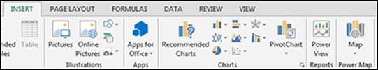
Figure 6-1: The Power Map Add-In is on the Insert tab.
If you don't see a Power Map button, then you have to download and install it.
As of this writing, the Power Map Add-In is only available if you have one of the following editions of Office or Excel:
· Office 2013 Professional Plus: Available through volume licensing only
· Office 365 Pro Plus: Available with an ongoing subscription to Office365.com
· Excel 2013 Stand-alone Edition: Available for purchase through any retailer
If you have any of these editions, you can install and activate the Power Map Add-In. Type the term “Excel Power Map Add-In” into your favorite search engine to find the free installation package.
After it is installed, activate the Add-In by following these steps:
1. Choose File → Options.
2. Select the Add-Ins option on the left, select COM Add-Ins from the Manage drop-down menu, and click Go.
3. Look for Power Map for Excel in the list of available COM Add-Ins. Select the box next to each one of these options and then click OK.
4. Close and restart Excel 2013.
You now find the Power Map button on the Insert tab.
Loading Data into Power Map
To start loading data into Power Map, all you need is a named Excel table that contains geographical data. Note that when you load a table into Power Map, it automatically gets added to the Excel’s internal Data Model.
![]() You can convert your data range to named Excel tables by clicking anywhere inside your data range and pressing Ctrl+T. In the Create Table dialog box, ensure that the range for the table is correct and click OK.
You can convert your data range to named Excel tables by clicking anywhere inside your data range and pressing Ctrl+T. In the Create Table dialog box, ensure that the range for the table is correct and click OK.
The data you utilize needs at least one geographical data point per row, as shown in Figure 6-2. You don’t necessarily need a full address along with the latitude and longitude. Power Map accepts any combination (but at least) of one of these geographic points:
· Latitude/Longitude pair
· City name
· Country name
· Zip code/postal code
· State/province name
· Address
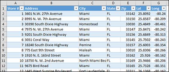
Figure 6-2: Start with a named Excel table that contains at least one valid geographic data column.
![]() Whenever you can, use Latitude and Longitude as your geographic points. Latitude/Longitude processes much faster than standard address elements. You also get better plotting accuracy.
Whenever you can, use Latitude and Longitude as your geographic points. Latitude/Longitude processes much faster than standard address elements. You also get better plotting accuracy.
When your data is ready to go, click the Map button on the Insert tab. Excel immediately opens the Power Map window and starts processing the geographic points in the table. It passes the points to Microsoft Bing, receives the geospatial data back, and then draws a plot point on the map.
After all points have been plotted, you see the window shown in Figure 6-3. There are three main sections: the Tour task pane, an interactive Bing map, and the Layer Manager task pane.
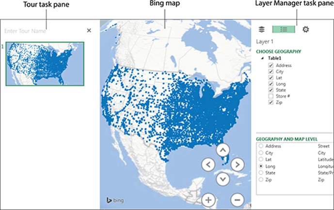
Figure 6-3: The Power Map window provides a Tour task pane, the Bing map, and a Layer Manager task pane.
![]() Because your data is geocoded with Microsoft Bing, you need access to the Internet to use the Power Map Add-In. As the data points are processed, the status bar displays the progress of plotting all the required data points.
Because your data is geocoded with Microsoft Bing, you need access to the Internet to use the Power Map Add-In. As the data points are processed, the status bar displays the progress of plotting all the required data points.
Choosing geography and map level
It’s important to note that Power Map initially plots the points on your map based on what it thinks you’re trying to do regarding your geographical data. If you have multiple geographical data points, you need to tell Power Map which geospatial level you want to plot.
When you add data to Power Map, it creates a map “layer” that can be configured and customized to show a particular geospatial visualization. The first layer is, by default, called Layer 1.
Select the geography level you want to see in the Layer Manager task pane, which determines the data points plotted. For example, selecting Address gives you the map shown at the top of Figure 6-4. Selecting State gives you the map shown at the bottom of Figure 6-4. Click Next when you’ve selected your geography.
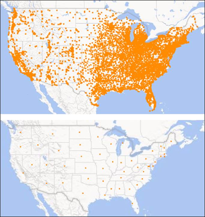
Figure 6-4: Geography level determines the data points plotted on your map.
Handling geocoding alerts
Bing Maps can’t always plot all your geographical points. If it doesn’t, you can find its success rate at the top of the pane, as shown in Figure 6-5. Only 87 percent of data points were plotted with a high confidence.
You need to investigate which data points Bing couldn’t plot so you can fix them. Click the percentage shown to open the Geocoding Alerts dialog box shown in Figure 6-6. You see each problematic geographical data point and how Bing handled it. Some data is tagged as “No resolution for this address.” In these cases, the data is simply excluded from the final map.
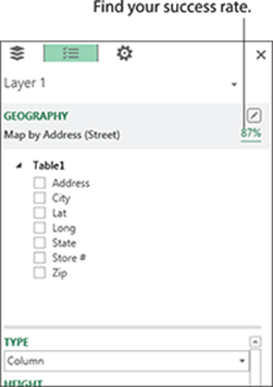
Figure 6-5: The Geography header alerts you if Bing Maps had trouble plotting any of the geographical data points.
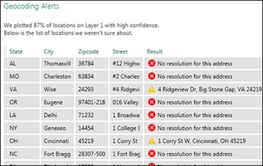
Figure 6-6: The Geocoding Alerts dialog box shows you each problematic geographical data point and how Bing handled it.
If you encounter geocoding alerts, it’s best to step back and try resolving the errors by correcting your source data table. Consider taking any of these actions:
· If possible, use latitude and longitude as your geographic points. You’ll get much better plotting accuracy.
· Try to include the full address, city, state, and zip or postal code for your data. Each should be in its own column. Remember that the more geographic data you can include, the better.
· Check to make sure your address field is not truncated.
· Ensure that your city and state names are spelled correctly.
After you’ve made all the changes to your source Excel table, you need to refresh your data. To do so, click the Refresh Data button on the Power Map Ribbon.
Navigating the map
The map initially starts out looking like a globe. You can flatten the map by clicking the Flat Map button on the Ribbon (see Figure 6-7).
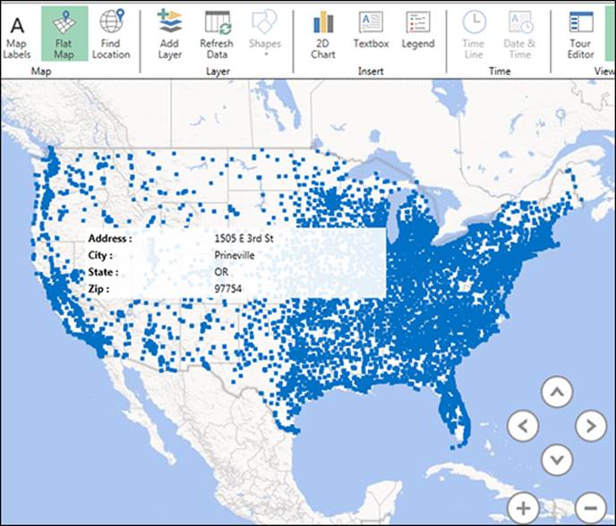
Figure 6-7: The interactive map enables you to navigate intuitively and see details by hovering over any data point.
The navigation buttons in the lower right-hand corner of the map allow you to zoom, pan, and change pitch. You can also navigate the map by taking any of the following actions using your mouse or keyboard:
· To zoom
· Double-click in any portion of the map to zoom in.
· Use the scroll wheel on your mouse to zoom in and zoom out.
· Press the plus (+) to zoom in or minus (-) key on your keyboard to zoom out.
· To pan
· Click and drag the map in any direction to pan left, right, up, or down.
· Press the arrow keys on your keyboard to pan up, down, left, or right.
· To change the pitch
· Hold the Alt key, and then click and drag.
· Press and hold the Alt key while pressing the arrow keys on your keyboard.
Hovering over any point on the map opens a pop-up window that shows you the details of that data point.
![]() To snap the map back to the center of your screen, click the Reset View icon at the bottom-right corner of the Power Map status bar.
To snap the map back to the center of your screen, click the Reset View icon at the bottom-right corner of the Power Map status bar.
Managing and Modifying Map Visualizations
After the geography is plotted, you can start visualizing your data by using the Layer Manager task pane shown in Figure 6-8. You can select a visualization type and a quantitative value to aggregate.
Figure 6-8 shows Column as the visualization type and the Orders field as the quantitative value.
![]() The quantitative input box is named differently based on the visualization type you select. In Figure 6-8, this box is called Height when the Column visualization type is selected. When you select the Bubble visualization type, this box is called Size. When you select Heat Map or Region, this box is called Value.
The quantitative input box is named differently based on the visualization type you select. In Figure 6-8, this box is called Height when the Column visualization type is selected. When you select the Bubble visualization type, this box is called Size. When you select Heat Map or Region, this box is called Value.
Figure 6-9 shows the resulting map. Note that the sum of orders is represented by the height of each plotted column. This gives the user a comparative view between each county.
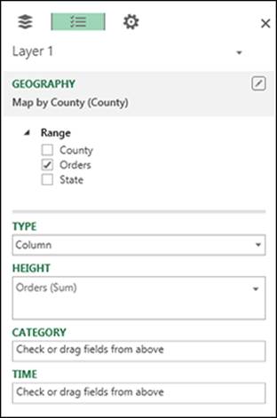
Figure 6-8: Use the Layer Manager task pane to build your visualization.
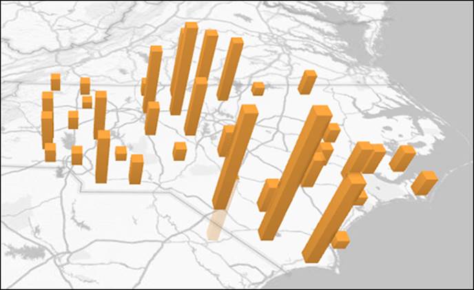
Figure 6-9: The resulting map shows orders as columns for each plotted county.
Click the drop-down arrow next to your quantitative field (see Figure 6-10) to select a different aggregation type. Power Map defaults to Sum in most cases, but you can select Average, Count, Maximum, Minimum, or No Aggregation. You can also select Remove to remove the field.
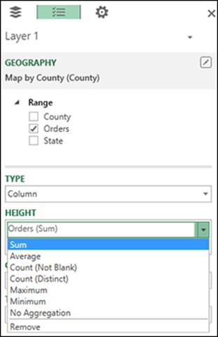
Figure 6-10: Click the drop-down arrow next to your quantitative field to select a different aggregation type.
Visualization types
In terms of visualization types, you can choose Column, Bubble, Heat Map, or Region. Simply click the drop-down arrow in the Type field to select the one you want.
Column
The Column visualization type lets you present your quantitative values as columns with varying heights. This is the default type. You can format the columns by clicking the Scene Options icon (it looks like a gear) in the Layer Manager task pane. As shown in Figure 6-11, the Layer Options allow you to adjust the overall height and thickness of the columns; change the color of the columns; and specify whether to show zeroes, negative values, or nulls.
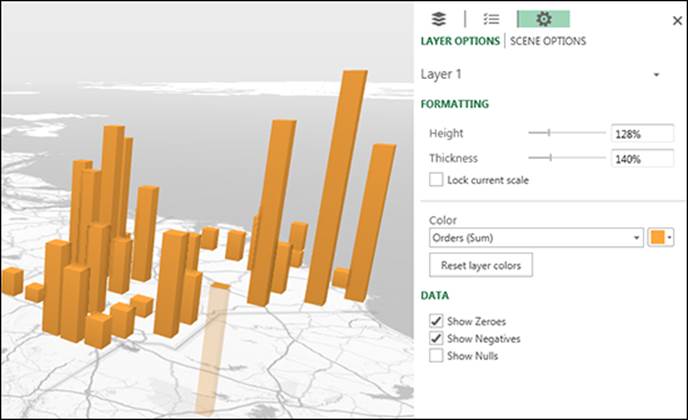
Figure 6-11: The Column visualization type.
Bubble
The Bubble visualization type lets you present your quantitative values as bubbles with varying sizes. You can format the bubbles by clicking the Scene Options icon (it looks like a gear) in the Layer Manager task pane. As shown in Figure 6-12, the Layer Options allow you to adjust the size and thickness of the bubbles; change the color of the bubbles; and specify whether to show zeroes, negative values, or nulls.
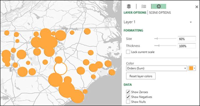
Figure 6-12: The Bubble visualization type.
Heat Map
The Heat Map visualization type lets you present your quantitative values as color scales where the intensity of the colors is based on the data. You can format the heat map by clicking the Scene Options icon (it looks like a gear) in the Layer Manager task pane. As shown in Figure 6-13, the Layer Options allow you to adjust the color scale; adjust the radius of influence; and specify whether to show zeroes, negative values, or nulls.
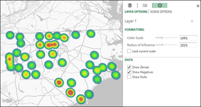
Figure 6-13: The Heat Map visualization type.
Region
The Region visualization type lets you present your quantitative values as color scales plotted within county, state, or other regional boundaries. The intensity of the colors is based on the data values as they compare to one another. You can format the region by clicking the Scene Options icon (it looks like a gear) in the Layer Manager task pane. As shown in Figure 6-14, the Layer Options allow you to define the colors and specify whether to show zeroes, negative values, or nulls.
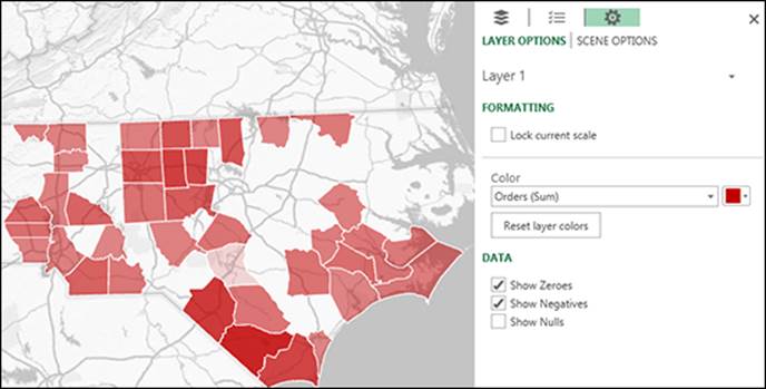
Figure 6-14: The Region visualization type.
Adding categories
You can add analyses to your maps by selecting different dimension fields from the Category menu. You can turn your ordinary column plots into multicolored clustered or stacked columns.
Figure 6-15 shows the path of Hurricane Katrina in the Column visualization type and the Wind Speed measure in the Height field. So the varying column sizes are based on wind speed.
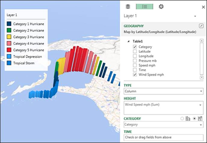
Figure 6-15: Dimensions enhance your map visualizations.
To enhance the map, we’ve added the Hurricane Category field to the Category field. This adds a legend to the map and gives each column a different color based on the Hurricane Category status defined at each plot point.
Use the two chart icons next to the Category box to switch between seeing the data as clustered columns or stacked columns.
![]() If you add a dimension field to the Category box and you leave the Height box blank, Power Map automatically adds that same field to Height and draws a visual that represents the count of each category.
If you add a dimension field to the Category box and you leave the Height box blank, Power Map automatically adds that same field to Height and draws a visual that represents the count of each category.
Visualizing data over time
Power Map can create time-based animations, allowing you to visualize how your data points change over time.
Figure 6-16 shows the Time dimension in the Time input box found in the Layer Manager task pane. You can then choose the appropriate behavior from the Time drop-down menu. The behavior option you choose dictates how your time animation will play:
· Data accumulates over time: Plot data points over time.
· Data shows for an instant: Plot each data point for its respective location at each particular time.
· Data stays until it is replaced: Show the last plotted data point for each location as time progresses until that point is replaced by a new one. This setting ignores a null or 0 value.
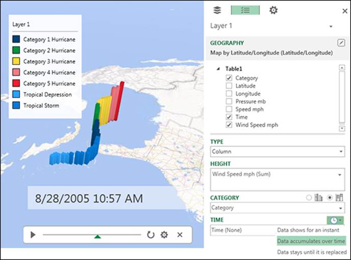
Figure 6-16: You can create a time-based animation by placing a Time field into the Time input box.
When a time dimension is added to the Time input box, a new player shows up on your map. Clicking the Play button starts the animation, showing a label that displays the time increments as the animation plays.
![]() Click the Settings icon (it looks like a gear) in the player at the bottom of the map to open the Time task pane, where you can adjust the properties of the player. You can slow down or speed up playback as well as specify a start and end time.
Click the Settings icon (it looks like a gear) in the player at the bottom of the map to open the Time task pane, where you can adjust the properties of the player. You can slow down or speed up playback as well as specify a start and end time.
Adding layers
After building the visualizations for one layer of your map, you may want to add another perspective on your data. Power Map supports the use of multiple layers so you can stack and present geospatial visualizations on the same map at the same time.
To add a layer, click the Add Layer button on the Power Map Ribbon. The Layer Manager task pane opens with the configuration settings for your new layer; see Figure 6-17. At this point, you can build the visualization needed just as you did for the first layer.
The new layer (Layer 2) enhances the map with a Heat Map visualization representing the air pressure at each point in Hurricane Katrina’s path. This new layer is presented on the same map as the first layer, which shows wind speed and category.
You can manage the layers in your Power Map model by clicking the Layers icon (see Figure 6-18) in the Layers Manager task pane. The Layers pane shows all of the existing layers, allowing you to hide, delete, or edit each layer.
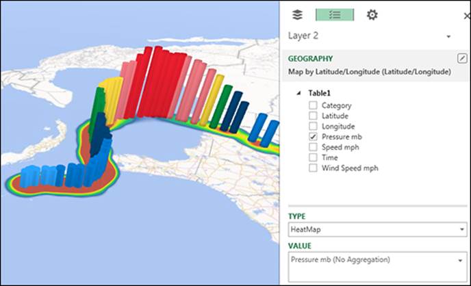
Figure 6-17: You can add multiple layers to enhance your Power Map analysis.
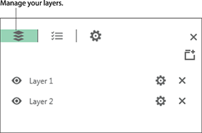
Figure 6-18: Click the Layers icon to activate a panel of all existing layers, which you can use to manage the layers in your Power Map model.
Adding Custom Components
To help support the geospatial visualizations you build, Power Map offers a few additional components. These custom components give you a way to add supplemental analyses, useful annotations, and clarifying comments.
Adding a top/bottom chart
The Power Map Add-In lets you add rudimentary charts to your maps. Although these charts don’t come with the full functionality of Power View or standard Excel charts, they do offer a relatively easy way to expose the highest or lowest data points on your map.
To add a chart, click the 2D Chart button on the Power Map Ribbon. If your Power Map model has more than one layer, you see a dialog box asking you to choose the layer for which you want to show the chart. Otherwise, the chart is automatically created.
Power Map charts always show either the top or bottom locations based on the data used to geocode and aggregate the data. For example, in Figure 6-19, the chart shows the top 100 locations based on the Orders (Sum) by County.
After the chart is created, you can take the following actions:
· Resize the chart: Click it and use the resize handles.
· Switch between top and bottom: Click the word Top above the chart to toggle to the bottom view.
· Change the number of columns displayed on the chart: Drag each end of the chart’s slider bar (or scroll bar). The smaller you make the slider bar, the fewer columns show in the chart at one time.
· Change the chart type: Click the chart type drop-down menu next to the chart title.
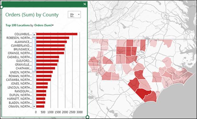
Figure 6-19: Power Map charts offer a way to expose the highest and lowest locations based on the data used to geocode and aggregate the data.
![]() Clicking any column in the chart highlights both that column and the associated data point on the map. The other data points and columns are grayed out, allowing you to see where the selected value is located. The map also pans so that the selected data point is centered in the map viewing area.
Clicking any column in the chart highlights both that column and the associated data point on the map. The other data points and columns are grayed out, allowing you to see where the selected value is located. The map also pans so that the selected data point is centered in the map viewing area.
Adding annotations and text boxes
You can highlight noteworthy data points by using annotations. Figure 6-20 shows an annotation on the data point with the highest wind speed.
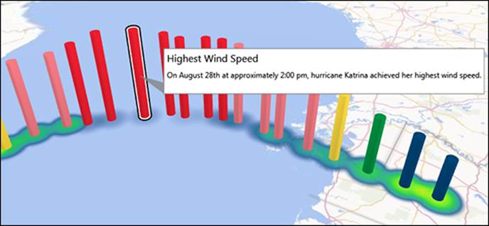
Figure 6-20: Annotations provide textual context for noteworthy data points.
To add an annotation, right-click the target data point and select Add Annotation. In the dialog box that appears, enter your desired title and text for the annotation.
After the annotation is associated with a data point, Power Map automatically places the annotation so that it’s always visible.
![]() Annotations are not available for Heat Map visualizations.
Annotations are not available for Heat Map visualizations.
Text boxes work similar to annotations, but they aren’t tied to a specific data. Text boxes retain their position within the Power Map window. Because of this, they are handy mechanisms for adding titles and other textual commentary.
To add a text box, click the Text Box button on the Power Map Ribbon. Then enter your desired title and text in the dialog box.
Adding legends
As we mentioned earlier in this chapter, legends are automatically added when a field is added to the Category box. If you accidentally remove a legend, you can add it back by clicking the Legend button on the Power Map Ribbon. Legends can be resized, but not edited or formatted.
Customizing map themes and labels
Power Map comes with a predefined gallery of themes that can be accessed via the Themes drop-down menu on the Power Map Ribbon; see Figure 6-21. The themes range from standard monochromatic maps to satellite imagery. Clicking Map Labels button on the Ribbon toggles map labels on and off.
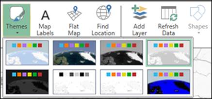
Figure 6-21: Power Map offers a handful of predefined map themes.
Customizing and Managing Power Map Tours
A tour is essentially a saved Power Map model. You can think of a tour as a document that saves all your data and visualization settings. When you load data into Power Map, a tour is automatically created. From there, Power Map continuously saves any changes you make to that tour. Tours automatically save in the last state they were in when they were closed.
After you saved tours in Power Map, you can open it again by opening the Power Map window. You can open an existing Power Map tour or create a new tour; see Figure 6-22. You can create as many tours as you wish in a workbook.
![]() You can also duplicate or delete tours. Right-click the desired tour and select either Duplicate or Delete. Be absolutely certain you want to delete a tour — once you do, you can’t get it back.
You can also duplicate or delete tours. Right-click the desired tour and select either Duplicate or Delete. Be absolutely certain you want to delete a tour — once you do, you can’t get it back.
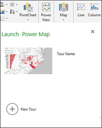
Figure 6-22: You can either open an existing Power Map tour or create a new tour.
Understanding scenes
When you open a tour, you see a Tour task panel on the left side of the Power Map window. This panel contains scenes. Each tour contains at least one scene. The default scene always represents the state of your map the last time it was closed. You can think of scenes as storyboards that, when viewed together, create a narrative around the data in your map.
You can add as many new scenes as you’d like by following these steps:
1. Navigate your map to a location and view what you want shown in your scene.
2. Click the Add Scene button on the Power Map Ribbon.
3. Navigate to another location, focusing on another aspect of your map.
4. Repeat Steps 2 and 3 until you build a collection of scenes that tell a story.
Configuring scenes
After adding your scenes, each scene is shown as a thumbnail in the Tour task panel. You need to configure each scene to define the duration of the scene, the transition effect, and the animation during the scene. Power Map uses your defined scene settings to create a cinematic animation that seamlessly transitions from one scene to another.
Double-click each scene to see the Scene Options in the Layer Manager task pane (see Figure 6-23).
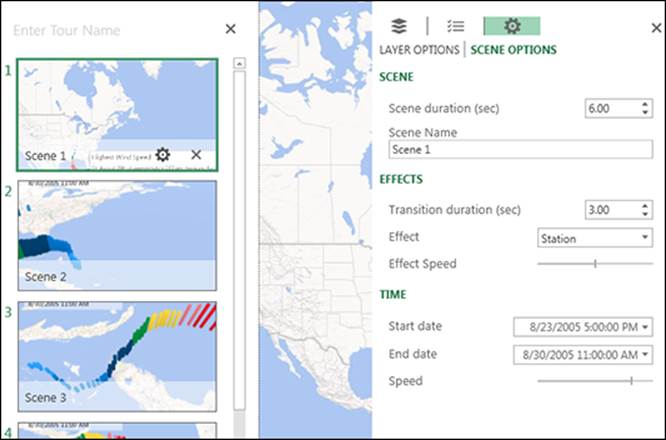
Figure 6-23: Double-click a scene to see its settings in the Layer Manager task pane.
The settings under Scene Options are as follows:
· Scene Duration: Specify how long, in seconds, a particular scene is in focus. By default, the duration of each scene is 6 seconds. You can boost this up to 30 minutes.
· Scene Name: Give the scene a friendly name.
· Transition Duration: Dictate how many seconds a particular transition effect takes to complete its animation. Set the Transition Duration to 0 to get a “cut”-style transition from one scene to the next.
· Effect: By default, the transition effect is set to Station; meaning no motion. You can alter this setting to use other transaction effects, including Fly-Over, Push-In, Dolly, Figure 8, and Circle. Effects last for the duration of the scene. For example, if you select the Circle effect, the camera goes in a circle in that scene until the scene ends.
· Effect Speed: Increase or decrease the speed the camera moves. Note that depending on the duration of the scene versus the effect speed, your transition effect may or may not fully complete before the scene ends and transitions to the next scene.
· Time settings: The settings in the Time section determine how the time-based animations in your tour are handled during a scene. You can choose to limit the range of time that plays in the scene. You can also define how quickly time animation goes from the defined start date to the end date.
Playing and sharing a tour
After configuring your scenes, you can play the entire tour by clicking the Play Tour button on the Power Map Ribbon.
You can also share your cinematic tour by creating a video. Click the Create Video button on the Power Map Ribbon. Power Map asks you to specify the desired video quality and location to output the final video. After a few minutes of processing, you get an MP4 file, which you can publish to SharePoint, Facebook, YouTube, and other sites.
Sharing screenshots
Power Map makes it easy to share screenshots of your Power Map analysis. Navigate your map to the location and view that you want shown in your screenshot, and then click the Capture Screen button on the Power Map Ribbon. From there, you can paste the screen capture to Word, PowerPoint, Outlook, and so on.
All materials on the site are licensed Creative Commons Attribution-Sharealike 3.0 Unported CC BY-SA 3.0 & GNU Free Documentation License (GFDL)
If you are the copyright holder of any material contained on our site and intend to remove it, please contact our site administrator for approval.
© 2016-2026 All site design rights belong to S.Y.A.