Office 2016 For Dummies (2016)
Part III
Playing the Numbers with Excel
Chapter 10
Charting and Analyzing Data
In This Chapter
![]() Understanding the parts of a chart
Understanding the parts of a chart
![]() Creating a chart
Creating a chart
![]() Editing a chart
Editing a chart
![]() Modifying the parts of a chart
Modifying the parts of a chart
![]() Playing with pivot tables
Playing with pivot tables
Look at any Excel spreadsheet loaded with rows and columns of numbers and you may wonder, “What do all these numbers really mean?” Long lists of numbers can be intimidating and confusing, but fortunately, Excel has a solution.
To help you analyze and understand rows and columns of numbers quickly and easily, Excel can convert data into a variety of charts such as pie charts, bar charts, and line charts. By letting you visualize your data, Excel helps you quickly understand what your data means so you can spot trends and patterns.
Understanding the Parts of a Chart
To create charts that clarify your data (rather than confuse you even more), you need to understand the parts of a chart and their purposes, as shown in Figure 10-1:
· Data Series: The numeric data that Excel uses to create the chart
· X-axis: Defines the width of a chart
· Y-axis: Defines the height of a chart
· Legend: Provides text to explain what each visual part of a chart means
· Chart Title: Explains the purpose of the entire chart
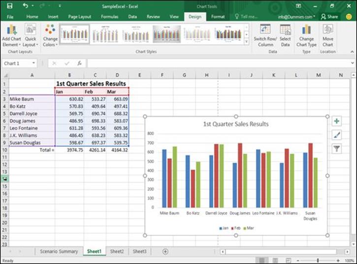
Figure 10-1: Each part of a typical Excel chart displays information about your data.
Charts typically use two data series to create a chart. For example, one data series may be sales made that month, while a second data series may be the products actually sold.
The X-axis of such a chart would list the names of different sales people while the Y-axis would list a range of numbers that represent amounts. The chart itself could display different colors that represent products sold in different months, and the legend would explain what each color represents.
By glancing at the column chart in Figure 10-1, you can quickly identify
· Sales results for each sales person
· How each sales person performed in each month
· Whether sales are improving for each sales person (or getting worse)
All this data came from the spreadsheet in Figure 10-1. By looking at the numbers in this spreadsheet, identifying the information just mentioned is nearly impossible. However, by converting these numbers into a chart, identifying this type of information is so simple even your boss can do it.
Although Figure 10-1 shows a column chart, Excel can create a variety of other types of charts so you can look at your data in different ways, as shown in Figure 10-2. Some other types of charts Excel can create include
· Column chart: Displays quantities as vertical columns that “grow” upward. Useful for creating charts that compare two items, such as sales per month or sales per salesperson.
· Line chart: Displays quantities as lines. Essentially shows the tops of a column chart.
· Area chart: Identical to a line chart except that it shades the area underneath each line.
· Bar chart: Essentially a column chart turned on its side where bars “grow” from left to right.
· Pie chart: Compares multiple items in relation to a whole, such as which product sales make up a percentage of a company’s overall profits.
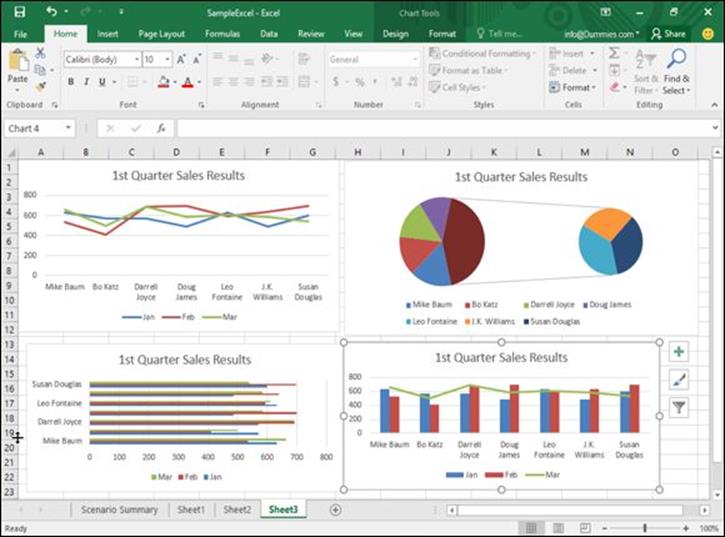
Figure 10-2: Common types of charts that Excel can create to help you visualize your data in different ways.
 Excel can create both two- and three-dimensional charts. A 3-D chart can look neat, but sometimes the 3-D visual can obscure the true purpose of the chart, which is to simplify data and make it easy for you to understand in the first place.
Creating a Chart
Before you create a chart, you need to type in some numbers and identifying labels because Excel will use those labels to identify the parts of your chart. (You can always edit your chart later if you don’t want Excel to display certain labels or numbers.)
To create a chart, follow these steps:
1. Select the numbers and labels that you want to use to create a chart.
2. Click the Insert tab.
A list of chart type icons appears in the Charts group.
3. Click a Chart icon in the Charts group, such as the Pie or Line icon.
A menu appears, displaying the different types of charts you can choose as shown in Figure 10-3.
4. Click a chart type.
Excel creates your chart and displays a Chart Tools Design/Format tab, as shown in Figure 10-4.
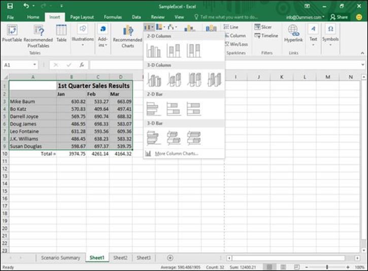
Figure 10-3: Clicking a chart icon displays different chart options.
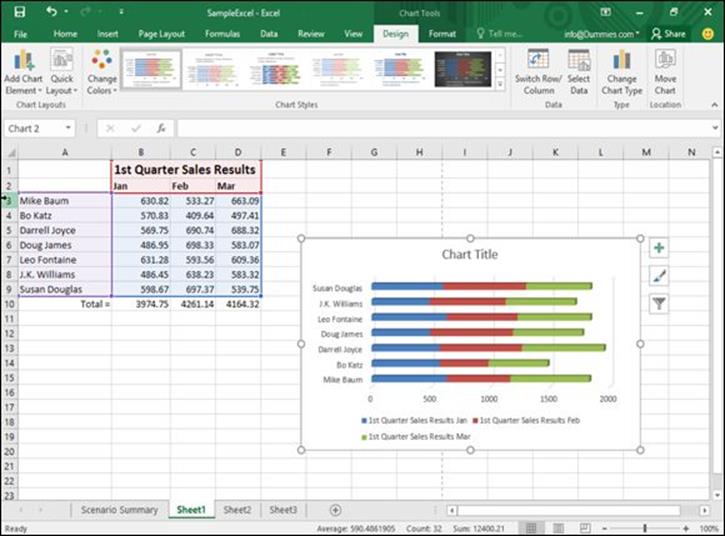
Figure 10-4: The Chart Tools Design tab appears so you can modify a chart after you create it.
In case you aren’t sure what type of chart would best display your data, click the Recommended Charts icon on the Insert tab. This displays an Insert Chart dialog box that lists the recommended chart types as shown in Figure 10-5.
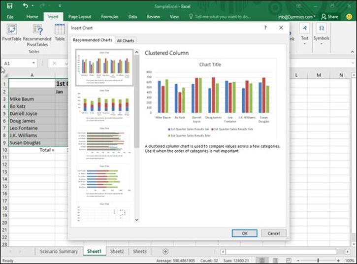
Figure 10-5: The Insert Chart dialog box displays a list of recommended charts for your data.
Editing a Chart
After you create a chart, you may want to edit it. Editing a chart can mean moving it to a new location, changing the data source (the numbers that Excel uses to create the chart), modifying parts of the chart itself (such as switching to a different chart type), or editing text (such as the chart title or legend).
Moving a chart on a worksheet
When you create a chart, Excel plops it right on your displayed spreadsheet, which may not be exactly where you want it to appear. Excel gives you the option of moving a chart to a different place on the current worksheet page or on a different worksheet page altogether.
To move a chart to a different location on the same worksheet, follow these steps:
1. Move the mouse pointer over the border of the chart until the mouse pointer turns into a four-way pointing arrow.
2. Hold down the left mouse button and drag (move) the mouse.
The chart moves with the mouse.
3. Move the chart where you want it to appear and release the left mouse button.
Moving a chart to a new sheet
Rather than move a chart on the same sheet where it appears, you can also move the chart to another worksheet. That way your data can appear on one worksheet, and your chart can appear on another.
To move a chart to an entirely different sheet, follow these steps:
1. Click the chart you want to move to another worksheet.
The Chart Tools tab appears.
2. Click the Design tab.
3. Click the Move Chart icon in the Location group.
The Move Chart dialog box appears, as shown in Figure 10-6.
 As an alternative to Steps 1 through 3, you can right-click a chart; then when the pop-up menu appears, choose Move Chart.
4. Select one of the following radio buttons:
· New Sheet: Creates a new worksheet and lets you name it
· Object In: Lets you choose the name of an existing worksheet
5. Click OK.
Excel moves your chart.
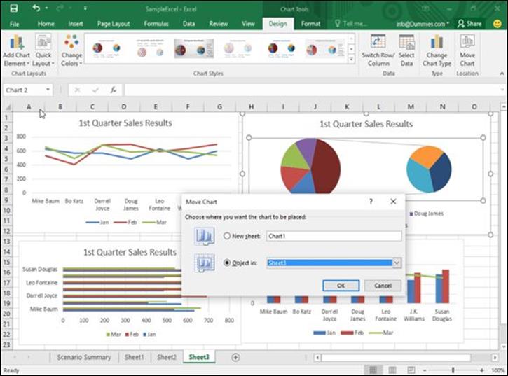
Figure 10-6: Specify a worksheet where you want to move your chart.
Resizing a chart
You can always resize any chart to make it bigger or smaller. To resize a chart, follow these steps:
1. Move the mouse pointer over any corner of the chart until the mouse pointer turns into a two-way pointing arrow.
2. Hold down the left mouse button and drag (move) the mouse to shrink or expand your chart.
3. Release the left mouse button when you’re happy with the new size of your chart.
Using the Chart Tools
As soon as you create a chart or click an existing chart, Excel displays the Chart Tools tabs (Design and Format). If you click the Design tab, you’ll see tools organized into five categories:
· Chart Layouts: Lets you change the individual parts of a chart, such as the chart title, X- or Y-axis labels, or the placement of the chart legend (top, bottom, left, right).
· Chart Styles: Provides different ways to change the appearance of your chart.
· Data: Lets you change the source where the chart retrieves its data or switch the data from appearing along the X-axis to the Y-axis and vice versa.
· Type: Lets you change the chart type.
· Location: Lets you move a chart to another location.
Changing the chart type
After you create a chart, you can experiment with how your data may look when displayed as a different chart, such as switching your chart from a bar chart to a pie chart. To change chart types, follow these steps:
1. Click the chart you want to change.
The Chart Tools tabs (Design and Format) appear.
2. Click the Design tab under Chart Tools.
3. Click the Change Chart Type icon in the Type group.
The Change Chart Type dialog box appears, as shown in Figure 10-7.
4. Click a chart type, such as Pie or Column.
The dialog box displays a list of chart designs in the right panel of the dialog box.
5. Click the chart design you want in the right panel.
6. Click OK.
Excel displays your new chart.
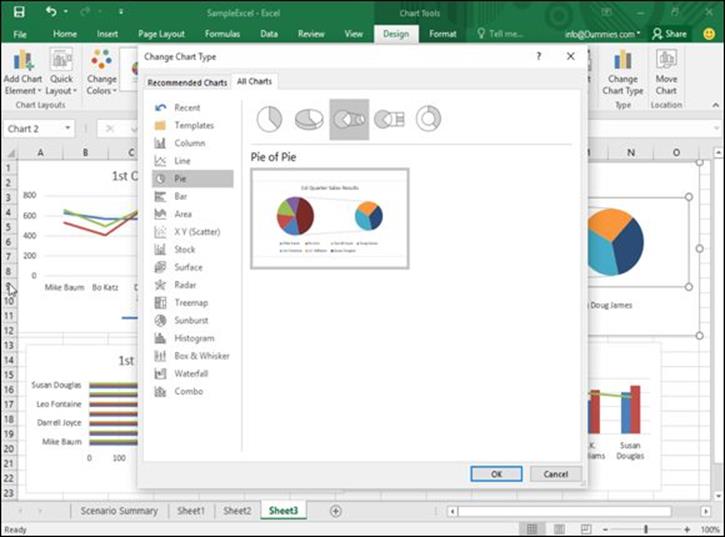
Figure 10-7: The Change Chart Type dialog box lets you pick a different chart.
If you don’t like how your chart looks, just press Ctrl+Z to return your chart to its original design.
Changing the data source
Another way to change the appearance of a chart is to change its data source (the cells that contain the actual data that the chart uses). To change a chart’s data source, follow these steps:
1. Click the chart you want to change.
The Chart Tools tabs (Design and Format) appear.
2. Click the Design tab under the Chart Tools category.
3. Click the Select Data icon in the Data group.
The Select Data Source dialog box appears, as shown in Figure 10-8.
4. (Optional) Click the Shrink Dialog Box icon to shrink the Change Data Source dialog box so you can see more of your spreadsheet.
5. Select all the cells that contain data to create a chart, including any cells that contain labels, numbers, and formulas.
6. Click OK.
Excel displays your chart, using the data you selected in Step 5.
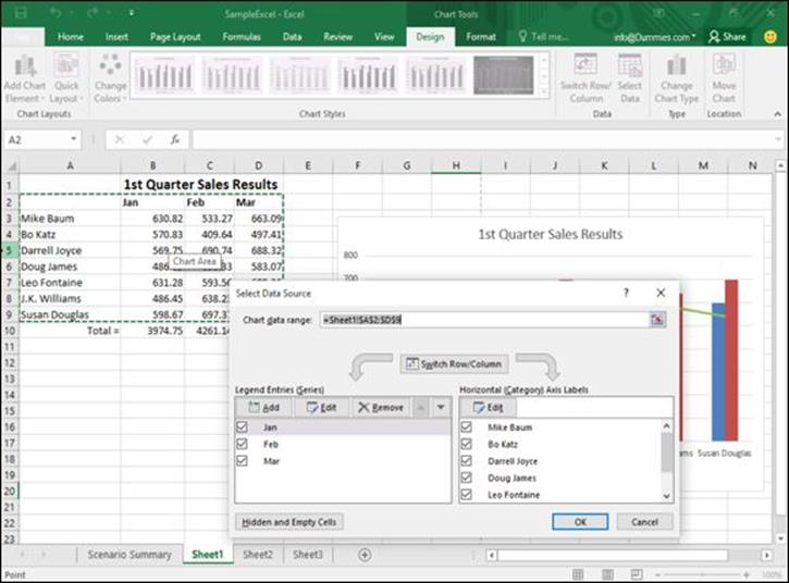
Figure 10-8: Choose new data to create a chart.
Switching rows and columns
When Excel creates a chart, it displays your data’s labels on the X- and Y-axes. However, you can switch these around, and Excel can show you how your chart may change.
To switch the rows and columns used to create a chart, follow these steps:
1. Click the chart you want to change.
The Chart Tools tabs (Design and Format) appear.
2. Click the Design tab under the Chart Tools category.
3. Click the Switch Row/Column icon in the Data group.
Excel switches the X-axis data to appear on the Y-axis and vice versa.
Changing the parts of a chart
To make your charts more informative, you can add additional text, such as
· A chart title
· A legend
· Data labels
· Axis labels
· Axes
· Gridlines
With each part of a chart, Excel can either hide it completely or move it to a different location. To modify any part of a chart, follow these steps:
1. Click the chart you want to change.
The Chart Tools tabs (Design and Format) appear.
2. Click the Design tab under the Chart Tools category.
3. Click the Add Chart Element icon.
A menu of different chart elements appears, as shown in Figure 10-9.
4. Choose an option, such as Legend.
A submenu of options appears as shown in Figure 10-10.
5. Choose an option.
As you move the mouse pointer over an option, Excel shows you how that option will change your chart. Now you no longer have to guess but can see exactly how each option will modify your chart.
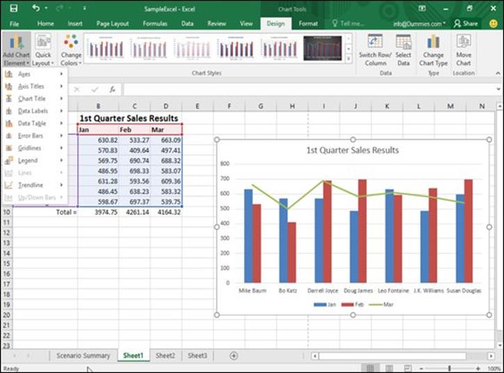
Figure 10-9: The Add Chart Element menu lets you choose a chart item to modify.
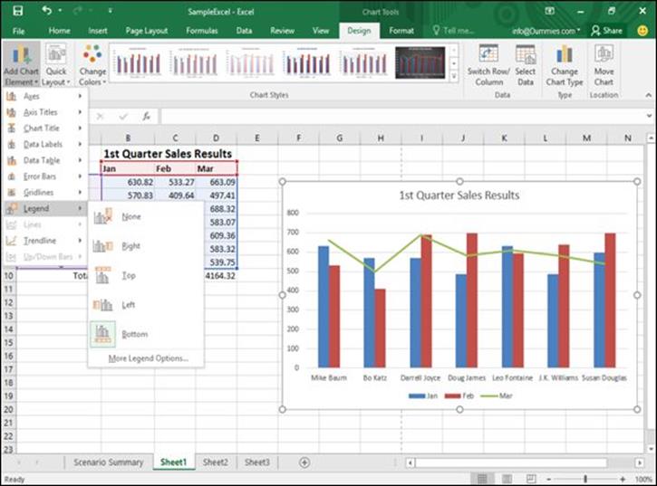
Figure 10-10: A submenu lets you choose different ways to modify a chart element.
Designing the layout of a chart
Although you can add and modify the individual parts of a chart yourself, such as the location of the chart title or legend, you may find it faster to choose a predefined layout for your chart. To choose a predefined chart layout, follow these steps:
1. Click the chart you want to modify.
The Chart Tools tabs (Design and Format) appear.
2. Click the Design tab under the Chart Tools category.
3. Click the Quick Layout icon in the Chart Layouts group, as shown in Figure 10-11.
A pull-down menu appears. As you move the mouse pointer over each option, Excel shows you how that option will change the appearance of your chart.
4. Click a chart layout.
Excel changes your chart.
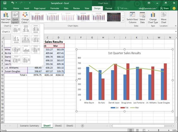
Figure 10-11: The Quick Layout icon displays a pull-down menu to display the different chart layouts available.
Deleting a chart
Charts may be nice to look at, but eventually you may want to delete them. To delete a chart, follow these steps:
1. Click the chart you want to delete.
2. Press Delete.
You can also right-click a chart; then when the pop-up menu appears, choose Cut.
Using Sparklines
Creating a chart can help you visualize your data, but sometimes a massive chart with legends, titles, and X/Y-axis can seem like too much trouble for just identifying trends in your data. For a much simpler tool, Excel offers Sparklines.
Sparklines allow you to see, at a glance, the relationship between values stored in multiple cells. Rather than look at a row or column of numbers to determine if the values are increasing or decreasing over time, you can create a Sparkline that condenses this information in a single cell that you can see at a glance. Excel offers three types of Sparklines, as shown in Figure 10-12:
· Line
· Column
· Win/Loss
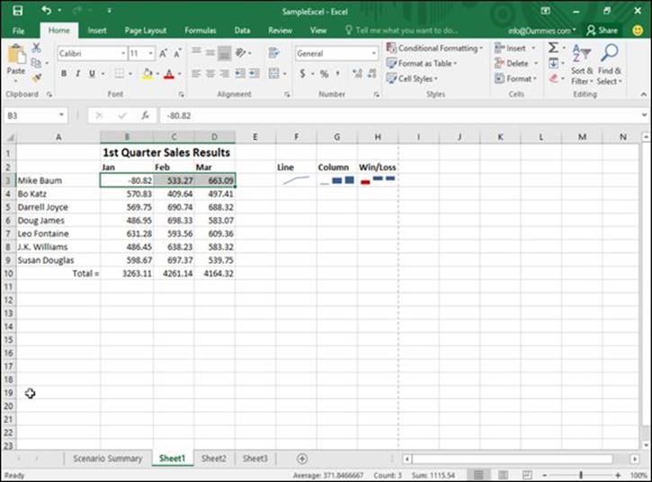
Figure 10-12: The three types of Sparklines you can create and display in one or more cells.
Creating a Sparkline
To create and display a Sparkline in a spreadsheet, follow these steps:
1. Select the cells that contain the data you want to turn into a Sparkline.
2. Click the Insert tab.
3. Click the Line, Column, or Win/Loss icon in the Sparklines group.
The Create Sparklines dialog box appears, as shown in Figure 10-13.
4. Click the cell where you want the Sparkline to appear. (You can select two or more cells.)
The Location Range text box displays the cell reference that you chose.
5. Click OK.
Excel displays your chosen Sparkline in the cell that you selected.
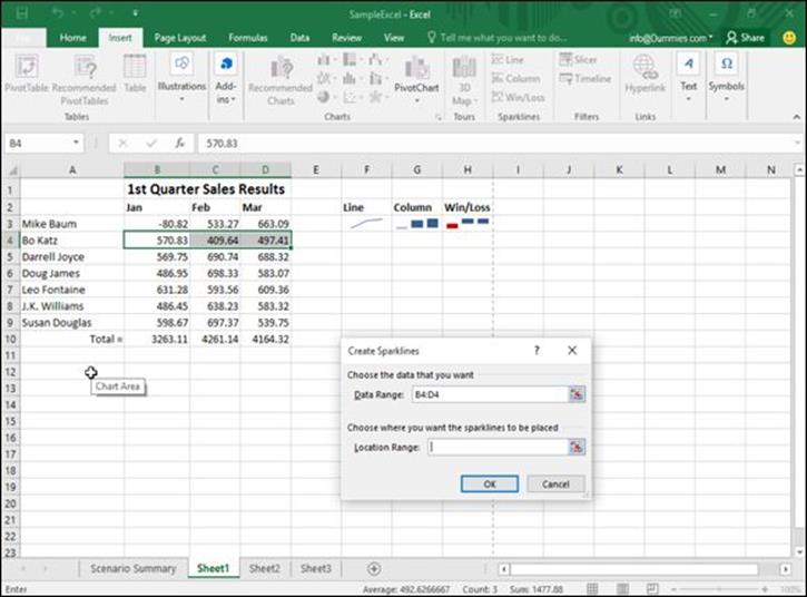
Figure 10-13: The Create Sparklines dialog box lets you define where to get data and where to display the Sparkline.
Customizing a Sparkline
After you’ve created one or more Sparklines, you can modify their appearance. To modify a Sparkline, follow these steps:
1. Click the cell that contains a Sparkline.
The Sparkline Tools Design tab appears.
2. Click the Design tab.
3. Click a style in the Style group.
If you click the More button, you can view all the available styles.
4. Click the Sparkline Color icon and click a color.
5. Click the Marker Color icon.
A menu appears, as shown in Figure 10-14.
6. Move the mouse over an option such as Low Point or First Point.
A color palette appears.
7. Click a color.
Your Sparkline appears with the changes you chose.
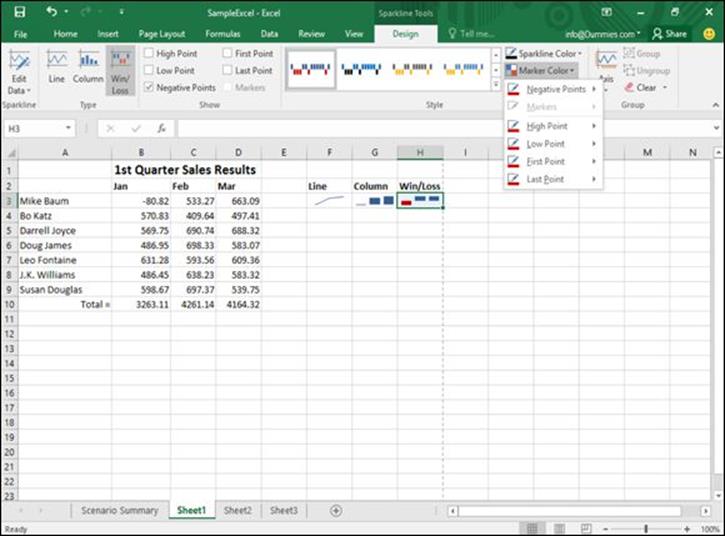
Figure 10-14: The Marker Color icon lets you define different colors for parts of your Sparkline.
Deleting a Sparkline
After you’ve created one or more Sparklines, you may want to delete them. To delete a Sparkline, follow these steps:
1. Click the cell that contains a Sparkline.
2. Click the Design tab.
3. Click the Clear icon in the Group category.
Your chosen Sparkline disappears.
Organizing Lists in Pivot Tables
Ordinary spreadsheets let you compare two sets of data such as sales versus time or products sold versus the salesperson who sold them. Unfortunately, if you want to know how many products each salesperson sold in a certain month, deciphering this information from a spreadsheet may not be easy.
That’s where pivot tables come in. A pivot table lets you yank data from your spreadsheet and organize it in different ways in a table. By rearranging (or pivoting) your data from a row to a column (and vice versa), pivot tables can help you spot trends that may not be easily identified trapped within the confines of an ordinary spreadsheet.
Creating a pivot table
Pivot tables use the column headings of a spreadsheet to organize data in a table. Ideally, each column in the spreadsheet should identify a different type of data, such as the name of each salesperson, the sales region he or she works in, and the total amount of sales made, as shown in Figure 10-15.
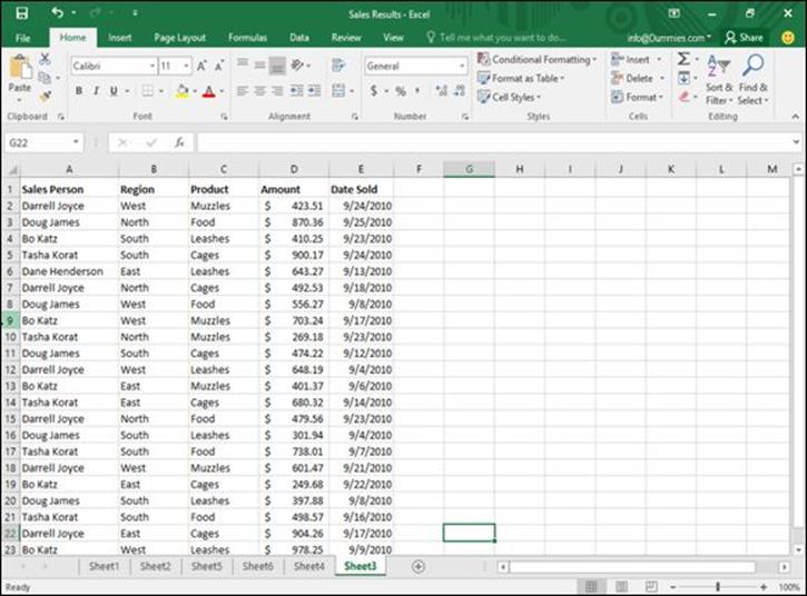
Figure 10-15: Before you create a pivot table, you must create a spreadsheet where each column identifies a different set of data.
After you design a spreadsheet with multiple columns of data, follow these steps to create a pivot table:
1. Select the cells (including column labels) that you want to include in your pivot table.
2. Click the Insert tab.
3. Click the PivotTable icon in the Tables group.
The Create PivotTable dialog box appears, as shown in Figure 10-16.
4. (Optional) Select the cells that contain the data you want to use in your pivot table.
You only need to follow Step 4 if you didn’t select any cells in Step 1, or if you change your mind and want to select different cells than the ones chosen in Step 1.
5. Select one of the following radio buttons:
· New Worksheet: Puts the pivot table on a new worksheet.
· Existing Worksheet: Puts the pivot table on an existing worksheet.
6. Click OK.
Excel displays a PivotTable Fields pane, as shown in Figure 10-17.
7. Mark (select) one or more check boxes inside the PivotTable Fields pane.
Each time you select another check box, Excel modifies how data appears in your pivot table, as shown in Figure 10-18.
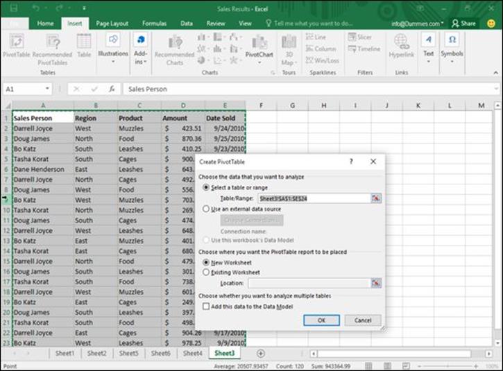
Figure 10-16: Define the cells to use and a location to place your pivot table.
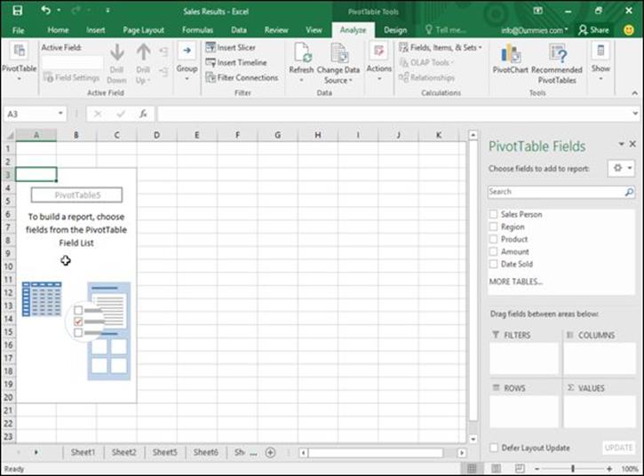
Figure 10-17: The PivotTable Fields pane lets you choose which data to display in the pivot table.
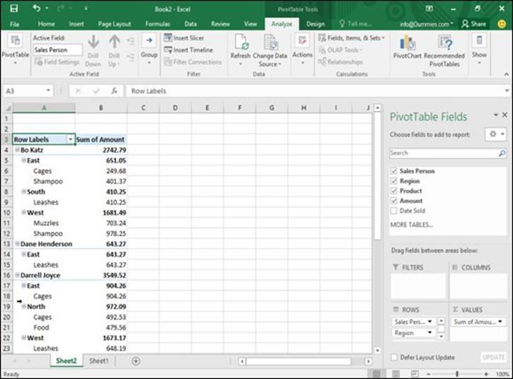
Figure 10-18: Adding column headings increases the information a pivot table displays.
Rearranging labels in a pivot table
A pivot table organizes data according to your spreadsheet’s column headings (which appear in a pivot table as row labels). The pivot table shown in Figure 10-18 shows sales divided by salesperson. Each salesperson’s amounts are further divided by sales region, and the names of the products sold.
However, you may be more interested in seeing the sales organized by sales region. To do this, you can modify which column heading your pivot table uses to organize your data first. To rearrange column headings in a pivot table, follow these steps:
1. Click the pivot table you want to rearrange.
The PivotTable Tools heading displays an Analyze and Design tab.
2. Click the Analyze tab under the PivotTable Tools heading.
3. Click the Field List icon in the Show group.
The PivotTable Fields pane appears. A group called Rows appears in the bottom-left corner of the PivotTable Fields pane. This Rows box displays the names of your different PivotTable categories, such as Region, Product, and Sales Person.
4. Click a label in the Row box.
A menu appears, as shown in Figure 10-19.
Select one of the following:
· Move Up: Moves the label one level closer to the beginning
· Move Down: Moves the label one level down to the end
· Move to Beginning: Makes the label the dominant criteria for sorting data
· Move to End: Makes the label the last criteria for sorting data
Figure 10-20 shows different ways a pivot table can organize the same data.
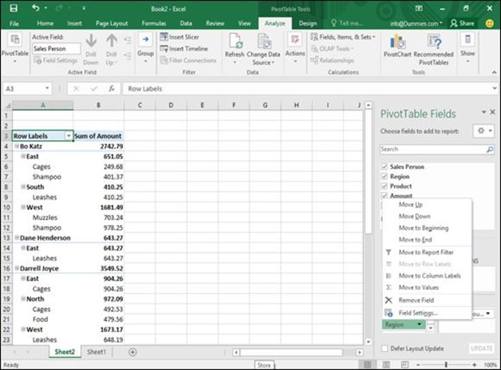
Figure 10-19: The Rows box lets you rearrange a pivot table to view data in different ways.
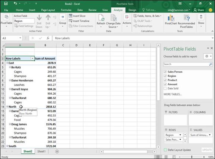
Figure 10-20: Moving labels up or down defines how the pivot table displays data.
Modifying a pivot table
Rows let you organize data according to different criteria, such as sales per region and then by product. For greater flexibility, you can also turn a row into a column heading. Figure 10-21 shows a pivot table where row labels are stacked on top of each other, and then the same pivot table where one row label (Products) is turned into a column heading.
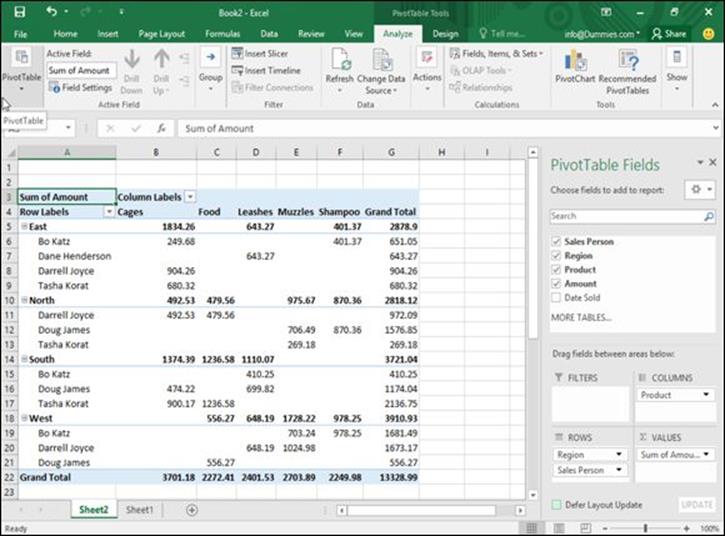
Figure 10-21: Displaying row labels as column headings can compare spreadsheet data in multiple ways.
To turn row labels into column headings in a pivot table (or vice versa), follow these steps:
1. Click the pivot table you want to modify.
2. Click the Analyze tab under the PivotTable Tools heading.
3. Click the Show icon.
A pull-down menu appears.
4. Click the Field List icon.
The PivotTable Field List pane appears.
5. Click a heading in the Rows box near the bottom-left corner of the PivotTable Field List pane.
A pop-up menu appears.
6. Choose Move to Column Labels.
You can also drag headings from the Rows box to the Columns box and vice versa.
Filtering a pivot table
The more information your pivot table contains, the harder it can be to make sense of any of the data. To help you out, Excel lets you filter your data to view only certain information, such as sales made by each salesperson or total sales within a region. To filter a pivot table, follow these steps:
1. Click the pivot table you want to filter.
2. Click the Analyze tab under the PivotTable Tools heading.
3. Click the Show icon.
A pull-down menu appears.
4. Click the Field List icon.
The PivotTable Fields pane appears.
5. Click a heading in the Rows or Columns group in the PivotTable Fields pane.
A pop-up menu appears.
6. Click Move to Report Filter.
Excel moves your chosen label into the Report Filter group in the PivotTable Field List pane, as shown in Figure 10-22.
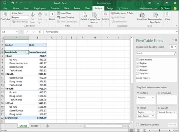
Figure 10-22: A filtered pivot table displays only the information you want to see, such as only sales results for each salesperson regardless of the region where it was sold.
Summing a pivot table
A pivot table not only displays information, but it can also count the number of occurrences of information, such as the number of sales per sales region. To display a count of data, you need to move a heading in the Values group inside the PivotTable Field List pane by following these steps:
1. Click the pivot table you want to modify.
2. Click the Analyze tab under the PivotTable Tools heading.
3. Click the Show icon.
A pull-down menu appears.
4. Click the Field List icon.
The PivotTable Fields pane appears.
5. Click a heading that you want to count in the PivotTable Field List pane.
A pop-up menu appears.
6. Click Move to Values.
Excel moves your chosen heading to the Values group inside the PivotTable Field List pane and displays a count of items under your chosen heading, as shown in Figure 10-23.
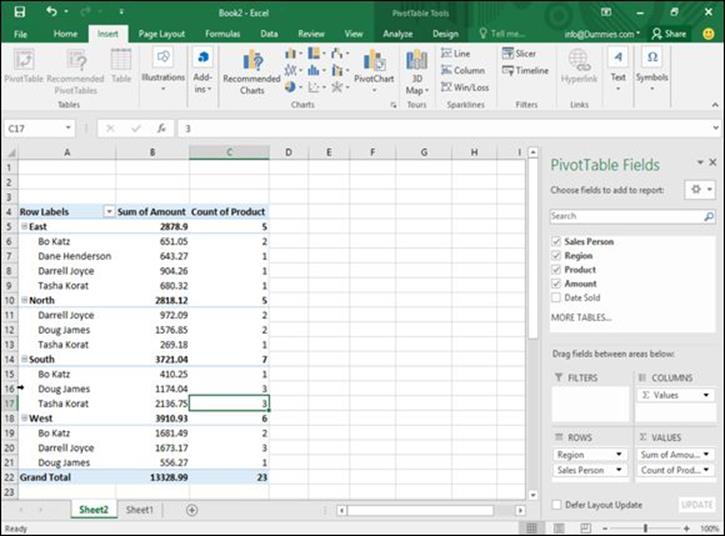
Figure 10-23: A pivot table can count occurrences of certain data, such as the number of different products sold in each sales region.
Slicing up a pivot table
If your pivot table contains large amounts of data, trying to decipher this information can be difficult. Rather than display all your pivot table’s data, you can choose to slice the pivot table so it shows only the specific data you want to view.
To turn rows into columns in a pivot table (or vice versa), follow these steps:
1. Click anywhere inside the pivot table you want to modify.
The PivotTable Tools tabs (Analyze and Design) appear.
2. Click the Analyze tab, click the Insert Slicer icon in the Filter group, and choose Insert Slicer.
The Insert Slicers dialog box appears, as shown in Figure 10-24.
3. Select one or more check boxes in the Insert Slicers dialog box and click OK.
Slicer panes appear, listing the types of data. For example, a Sales Person slicer pane would list the names of all the salespeople while a Product slicer pane would list the names of all products sold as shown in Figure 10-25.
4. Click each slicer pane to select it, and then move the mouse pointer over the slicer pane border and drag the mouse to move the slicer pane to a more convenient location on the screen.
5. Click the item inside each slicer pane to display that data in the pivot table. (Hold down the Ctrl key and click to choose multiple items.)
If you want to view sales results from a single salesperson, select that salesperson’s name and select all the products you want to examine to see how many sales that person made for each product, as shown in Figure 10-26.
 You can remove a slicer pane by right-clicking the slicer pane and, when a pop-up menu appears, choosing Remove.
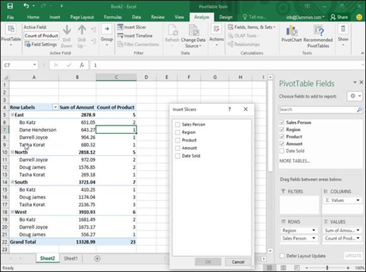
Figure 10-24: The Insert Slicers dialog box lets you define the data you want to view.
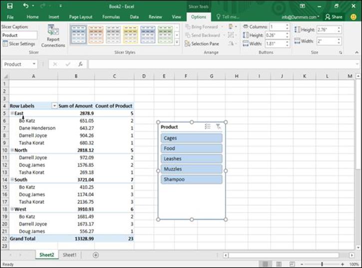
Figure 10-25: Slicer panes let you choose which items to display.
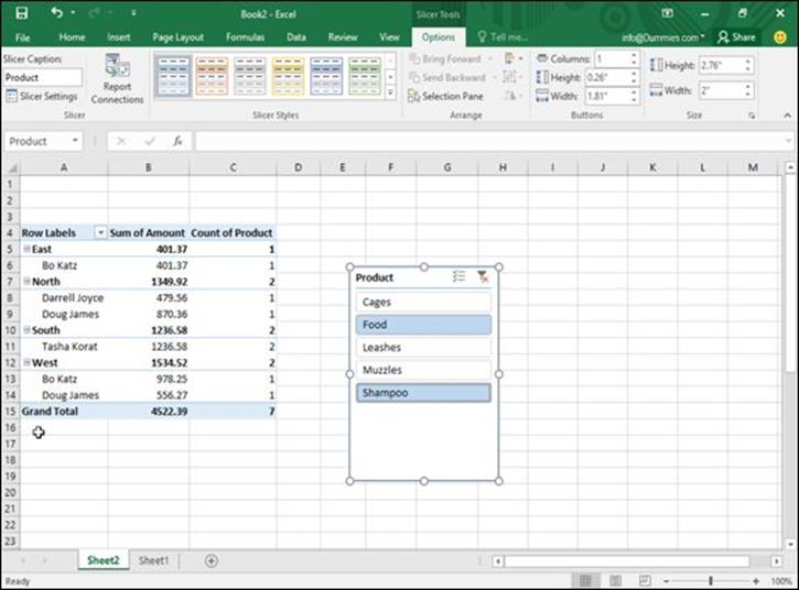
Figure 10-26: Slices help you zero in on specific information in your pivot table.
Creating PivotCharts
Pivot tables can contain rows and columns of numbers that you may find easier to understand by converting them into a chart, called a PivotChart.
PivotCharts are like other types of charts except you can selectively display (or hide) different data. This lets you create a chart showing sales from all your salespeople, and then selectively hide all data except anything sold by a single salesperson, as shown in Figure 10-27.
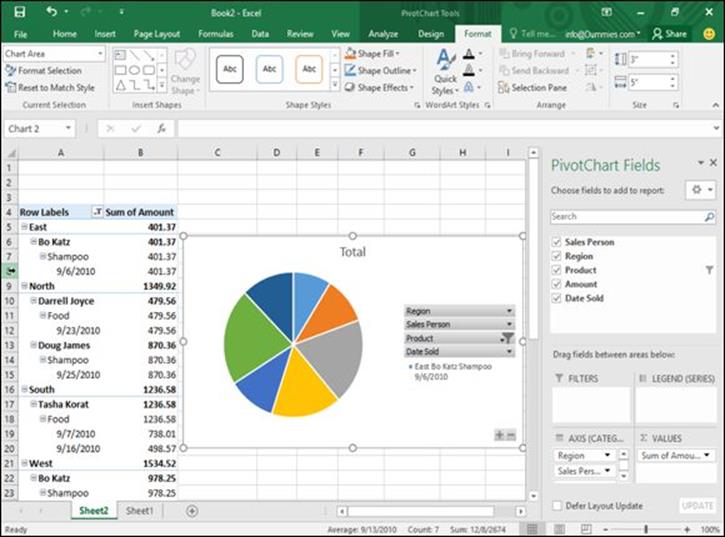
Figure 10-27: A PivotChart lets you choose how much data to view from your PivotTable.
To create a PivotChart, follow these steps:
1. Click the pivot table you want to turn into a chart.
The PivotTable Tools tabs (Analyze and Design) appear.
2. Click the Analyze tab and click the PivotChart icon in the Tools group.
An Insert Chart dialog box appears.
3. Click a chart type (such as Pie or Line), click a specific chart design, and click OK.
Your PivotChart appears, displaying your categories directly on the chart.
4. Click the downward-pointing arrow of a category that appears on your PivotChart. A menu appears, as shown in Figure 10-28.
5. Clear the check boxes next to the items that you don’t want to display and select the check boxes next to the items that you do want to display.
Your PivotChart displays a chart that represents only your selected data, as shown in Figure 10-29.
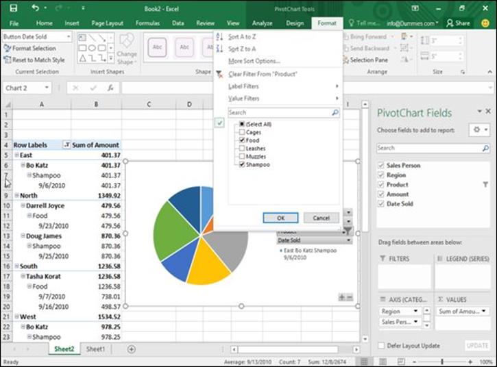
Figure 10-28: A PivotChart displays categories to let you modify the chart.
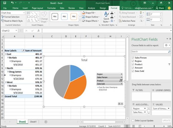
Figure 10-29: A PivotChart can display only the data you want to examine.
All materials on the site are licensed Creative Commons Attribution-Sharealike 3.0 Unported CC BY-SA 3.0 & GNU Free Documentation License (GFDL)
If you are the copyright holder of any material contained on our site and intend to remove it, please contact our site administrator for approval.
© 2016-2026 All site design rights belong to S.Y.A.