Scenario-Focused Engineering (2014)
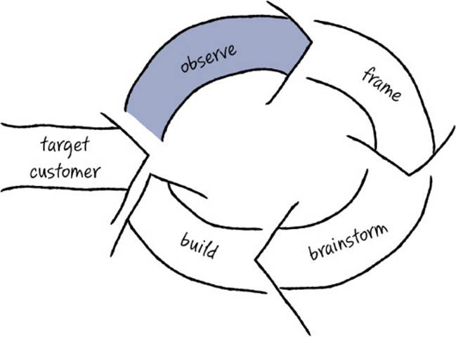
Part II: The Fast Feedback Cycle
Chapter 5. Observing customers: Building empathy
Now that you know who your target customers are, the next step is to learn all about them—to figure out what their needs are, what problems they have, and what motivates them. Having a deep understanding of your customers allows you to discover what an outstanding solution looks like from their point of view—a solution that meets their functional needs as well as their emotional wants.
In this first stage of the Fast Feedback Cycle, you do the research required to make data-based decisions about which experiences to build for your customers. This stage is all about data collection and the synthesis of that data. In gathering this data, stay grounded in observation, whether you are observing customers directly, observing customer behavior through instrumentation or A/B testing, or observing industrywide patterns and trends. Rather than basing decisions on opinions, judgments, or assumptions, you want to remain data-driven and base your decisions on actual customer research.
This chapter presents some of our favorite research techniques for collecting the data you need to kick off your project and inform your decisions. As in each stage of the Fast Feedback Cycle, there are many tools that you can use to achieve the intent of this stage. Remember that the tools and techniques presented in this chapter (and throughout this book, for that matter) are items in your toolbox, and you decide which techniques work best for you in any particular situation. By no means does this chapter list every available research technique. We just describe our favorites—those we’ve found most useful in our experience.
As with many of the techniques we discuss in this book, don’t feel as though you have to be an expert in customer research techniques to get worthwhile results. Even small improvements in collecting valid customer data can have a tremendous impact on your product. In short, don’t let the perfect get in the way of the good enough.
You are not the customer
To deeply understand your customers, you first have to accept that your customers’ situation, background, experience, motivations, and needs are different from your own. Let’s go out on a limb and posit that as a software professional you understand a lot more about technology than your customers do. You probably have a degree in computer science, math, or engineering (or the equivalent professional experience). You have firsthand knowledge of how software is made. You understand how 1s and 0s at the machine level relate to a programming language and compiler. When someone says that data is accessed “in the cloud,” you have a good sense of local versus remote persistence. When using software you unconsciously avoid bugs because you have a sense for what software typically can and cannot do.
Now think about your customers. Do the qualities that describe you also describe them? What is their level of computer science experience or education? How do they spend their time, day in and day out? What are their priorities and motivations? Almost certainly, your customers’ lives are quite different from yours. When it comes to software, you are a power user. (Remember the dangers associated with focusing on power users described in the previous chapter?) While building for power users is often tempting—because those needs are so familiar to you—solutions that address that audience likely won’t generate much carryover to (or revenue from) broader, more mainstream customer segments.
Let’s say, for example, that your customer is a tax accountant or a teenage gamer. Acknowledging that you are not the customer here is simple logic. You are not a tax accountant or a teenage gamer (sorry, as much as you’d like to be that person again, you aren’t now). You went to a different school, you have a different degree and a different type of job. Your work schedule and cycle of output is different. The tools you use to get your job done are different, as is the style in which you communicate with your customers, peers, and managers. In cases where the customer’s background is so obviously different from yours, it’s not hard to accept that you are different from them.
However, internalizing that you are not the customer becomes more difficult when the domain you work in is well aligned with your target customer’s domain. What if you are a regular user of the software you create? Or what if you are an avid photographer and your company is creating photo software? Or what if you work in what’s mostly a consumer domain, where nearly everyone uses products such as mobile phones, televisions, game systems, refrigerators, and so on. In situations such as these, it is still extremely dangerous and short-sighted to assume that you are a mirror of your customer and that if you build software that you like, your customers will like it as well.
Sure, you may also have a smartphone, but unlike the average home user, you know exactly how to customize it, can debate whether syncing your mail with IMAP or POP3 is a better bet, and know what to do when your kid bricks it by mistake or a new app fails to install. In those cases, the average consumer probably heads to the Genius Bar to get help, or calls the teenager next door. Remember that you’re getting paid to write this software, while your customers are paying to use it. Given that fact alone, the motivation gap is pretty huge.
Here’s a short case study of a team whose target customer mirrored the team itself . . . or so they thought. The team named this quintessential customer Ellen and gave her the tagline “the vigilant tester.” You’ll learn more about Ellen later in this chapter.
SFE in action: Ellen, the vigilant tester
Steven Clarke, Principal UX Researcher, Microsoft Visual Studio
As part of the Visual Studio 2005 release, we integrated a set of test tools, code-named Camano, into the Visual Studio suite of developer tools. Prior to that release, Visual Studio had contained no significant support for testing software, as it was primarily used by software developers to write, compile, and debug code. Given a very short time frame, the Camano team set out to build what we believed would become a compelling set of test tools that would compete with the handful of sophisticated test-tool offerings already in the market.
We utilized multiple sources of information available to us at the time to figure out what we should build. We performed competitive analyses of existing tools, spent time talking to testers at Microsoft about the tools they used and why they used them, did extensive market research, and studied the work of recognized experts in the field. All of the information that we collected pointed us in the direction of building tools for automating the creation and running of test scripts and code. At that time, this was what almost all of the competitor tools did, and it was also what the vast majority of testers at Microsoft did. Given this information, we assumed that most customers would place a high value on tools that allowed them to easily create and manage their automated tests.
But after we shipped two releases of the Camano test tools, the product had not achieved the market share and revenue goals we had hoped for, so we started another round of analysis. We first brought in a handful of customers to the Microsoft usability lab. What we observed surprised us. Customers said things like, “Why are you making me do this? You are making me think like a developer!” And while the customers were able to perform their assigned tasks in the lab, when we listened carefully to what they were saying, the tone was not very complimentary, and it was clear that they were not having a good time completing their tasks.
We followed up these usability studies by observing professional software testers at work in their own environments—to observe their workflow, to see what tools they used, and to understand the context of their work. Previously we had observed testers at Microsoft to understand how testers work. Now we were looking outside Microsoft, and our observations were in stark contrast to what we had learned internally. In hindsight, it’s interesting to see that though we felt like we had done enough solid research to get the first version completed quickly, we hadn’t taken the time to talk to any external customers directly.
What we learned when we did talk to external customers was that testers outside Microsoft had different demands, worked in different situations, and required different tools. It wasn’t that they were naïve or inexperienced—far from it! In fact, they were quite sophisticated in how they approached their jobs. It’s just that their approach to testing software was different from the way the Microsoft testers worked. This was a pretty big new idea for us. Frankly, many of us were shocked to hear this because we had been thinking about the customer differently for such a long time.
There were certainly common attributes. We learned that great testers, no matter where they worked, were driven by raising the quality of the product they tested. They take pride in representing their customers and making their customers’ lives easier. The big difference between our customers and testers at Microsoft was the type of team they worked on and the type of product they worked on. This had a large impact on the approach they took. For a variety of reasons (resources, type of application being built, etc.), testers outside Microsoft relied heavily on manual and exploratory testing to find product bugs. Occasionally they’d use automation to speed up the process for some often-repeated tasks, but, by and large, manual tests allowed the tester to focus on seeing the user’s experience, which they found to be a more productive way to find bugs.
It was now clear why the previous releases had not been as successful as we had hoped. Customers who purchase and use Camano want to spend their time acting like their own end users, finding and removing bugs. They do not want to write automated tests. They seek out and use tools that make the process of finding and reporting good bugs easy. We learned that if the Camano team could find a way to make running and managing manual tests easier, and at the same time improve the communication flow between testers and developers, we would have a very good chance of creating a product that a large segment of the general testing community would genuinely want to use, and it would solve a real need for them.
Invariably, after presenting this case study in our workshops, someone shouts out, “But what about the C++ team?” You might think that surely Visual C++ is a product for which Microsoft engineers would make excellent proxies for the target customer, but it turns out even that’s not true. One difference is in the libraries that are used. It’s quite common for Visual C++ customers to use high-level libraries such as DirectX/Direct3D in their solutions. But the developers on the VC++ team don’t typically use these libraries; instead they are authoring the libraries, as well as writing the low-level code for the compiler itself. Also, the build systems used inside Microsoft are often specialized (and optimized) for extremely large projects such as Windows and Office, whereas many VC++ customers use the Visual Studio build system or an open source system such as Git. Also, the developers working on the back end of the C++ optimizing compiler tend to spend much more time debugging assembly-level code than do typical VC++ customers. The list goes on and on. At the core, it’s true that both Visual C++ developers at Microsoft and their customers are coding in C++, but the use of the C++ language, the available libraries, and the supporting tools are different enough that the VC++ team at Microsoft still has a very strong need for studying its customers—because they simply are not the customer.
Building empathy
After you accept the fact that you are not the customer and cannot rely on your own experiences to know what’s important to build, the natural next question is, “How will I know what my customer wants?” The answer is that you need to do a bunch of customer research to figure that out. But as we explore in this chapter, doing extensive research alone is not enough. Research and data alone don’t provide you with answers to all of your questions. Delighting a customer is not simply an equation, nor is there an algorithm to guide you. During the design and implementation of software, you are going to make judgment calls—many of them, every day—and you need empathy for your customer to inform your judgments.
![]() Vocab
Vocab
Empathy is the capacity to deeply understand the inner experience of another person, allowing you to see and understand from that person’s point of view.
Scott Cook, founder and former CEO at Intuit, is largely credited with turning that company around from the brink of bankruptcy. Cook talks about gaining understanding by walking in your customers’ shoes. Here’s a wonderful excerpt from an interview with Scott Cook about what it takes to build customer empathy:1
How do you develop and nurture the kind of culture that can continue to innovate?
First you have to understand the customers intimately, deeply, from observing them working in their offices. The key is face-to-face, regular close contact with the customer. It’s crucial. You can’t do it fly-by-wire, you can’t do it by remote control. It’s just got to be full frontal contact. Otherwise you misunderstand their needs. There’s a proverb that I teach people in the company. It goes something like “Empathy is not just about walking in another’s shoes. First you must remove your own shoes.” You have to get past your own blinders and biases and assumptions before you can see with clear eyes what’s really going on. And building a culture where that is valued, where engineers want to do that, where that’s what’s known to be valued, is very hard. Most companies don’t have that culture. A company has to be willing to stop believing its own beliefs and believe what it’s hearing from customers. Then you’ve got to translate that into products that are such a breakthrough that they transform business, and people can’t imagine going back to the old way.
The idea behind empathy is to become so immersed in your customers’ perspective that you can imagine what they see, hear what they hear, and understand the world from their point of view. To do this, you must take off your own “shoes”—you must shed your own biases, attitudes, and preconceived notions, which are largely based on your own lifetime of personal experiences.
This deep level of understanding helps you predict what your customers would say or how they might react to various designs you consider, so empathy helps you streamline decision making. It helps you to narrow the places where you get feedback and to focus on a few concepts that you believe are most important to your customers. You need empathy because you simply can’t collect conclusive data about every possible question that might emerge during the product-design process—you won’t always have directly relevant data to inform each decision point. This isn’t to say that you should make every decision from your empathetic gut instincts, but you need to become comfortable making progress using decisions based on empathy, trusting in the iterative process to provide course corrections if you get off track.
![]() Tip
Tip
Talk to real customers, not proxies. Some teams hire employees to be a proxy for the end customer and to bring that perspective inside the company in an ever-present way. Their job is to talk to lots of customers and convey those needs to the development team. This approach has a nugget of potential value, but we have rarely seen it work well in practice—usually it results in a distorted view of what customers’ needs are. If you want to be customer-focused and want to build empathy, the team needs to talk to real live customers, not proxies.
Evoking empathy across a team encourages people to do their best work, to really, deeply care about their customers not because their boss told them to or because their bonus depends on it, but because they genuinely want to help customers achieve their goals. This allows the team to be intrinsically motivated to solve a customer’s problem, rather than feel as though it is simply earning a paycheck. And as the psychologist Mihaly Czikszentmihalyi suggests in his famous work on “flow,” intrinsic motivation is linked to more creative and successful solutions.2
Empathy is not an inborn talent that only some people have. Rather, empathy can be developed in nearly everyone with a little time, experience, and effort. A curious, customer-focused mindset gets you started, and from there it is a continuous process of learning more and more about a customer to build up a body of knowledge and experience over time.
![]() Tip
Tip
Everyone, not just the boss, needs to develop empathy for the customer. Every team member needs to be able to step into the customer’s shoes from time to time to consider an alternative or evaluate a potential solution or decide whether to take a bug fix late in the project. Having empathy for the customer helps every individual person on the team make better decisions on the customer’s behalf.
The data-gathering techniques described later in this chapter show how to collect information about your customers. As that customer data is compiled, shared, and analyzed, it becomes the basis for creating broadly based, deep empathy for your customers across the entire team.
SFE in action: Trading places
Susan Palmer, Program Manager, Microsoft Bing Advertising
As a program manager on the Bing Ads team, I saw a need to have our engineers connect more directly with our customers. I ended up creating a program called “Trade Places with an Advertiser,” which was designed to provide our team’s engineers with an opportunity to step into the shoes of a real small-business owner who has to figure out how to create, manage, and monitor paid search advertising using both the Bing Ads platform and Google AdWords, our main competitor.
Here’s how it works. When engineers on the team sign up for the program, they’re paired with a small business and are tasked with creating and managing a real ad campaign using Bing Ads and Google AdWords. The program takes place entirely in the live environment, where participants have a real budget and real deadlines. For a period of four weeks, participants behave as though they were the real owner of that business. During that time, our participating engineers must navigate the experience of paid search advertising across two different platforms in the same way our customers do—through trial and error. They’re not allowed to use any internal Microsoft resources or support. They have access only to the same resources that our customers have access to. The engineers who participate in this program also have to continue to manage their very full-time jobs, just like our customers. This full immersion program is a great opportunity for our engineers to actually use the platform they work on in the same way that our customers do.
The results have been remarkable. Through weekly one-hour group discussions, engineers explain the challenges, frustrations, and surprises they experienced acting as customers, and they brainstorm ways they can make using our platform easier for our customers. It’s not uncommon to hear participants request that everyone joining the Bing Ads platform team be required to participate in the Trade Places program because the experience is so eye opening. It’s also not uncommon for a participant to reprioritize a feature request once he or she has gone through the program and truly understands the benefit and impact of the request on our customers. The Trade Places program has enabled our engineers to gain deep customer empathy by living through a real-world, end-to-end experience of what our customers do and feel every day.
What customers won’t tell you
The obvious approach to gaining empathy is to ask customers what they want. And this does work to a degree. Customers are usually glad to answer your questions, share their experiences, complain about their pain points, and even suggest improvements that they’d like to see. But have you ever noticed that when you ask customers why they want what they’re asking for, they tend to talk about their surface needs, most likely in the context of fixing or improving a specific task at hand? That’s great information to have, but when you’re looking for future needs and root causes, what customers say doesn’t quite give you all the information you’re looking for.
The truth is that customers usually find that articulating their deep needs is difficult or impossible. Often they fixate on their wish list, so you hear more about their surface-level wants than the real needs they forget to mention, or they take for granted that you already understand those basics. Sometimes, however, customers don’t really know what they need, they just have a vague feeling that’s difficult to put into words. (Remember the story about purchasing the car? Part of the criteria was “I’ll know it when I see it?”) Sometimes customers can’t imagine the future, or they limit what they ask for on the basis of what they believe is technically feasible. Sometimes customers are trying their best to tell you, but because you don’t understand their context, you don’t understand the full implications of what they’re saying.
People often see only what is broken in their individual situation and tend to miss the larger picture. Customers won’t be able to tell you what is wrong with the entire end-to-end system because they see only what is broken with the portion they use. Deeper needs and more important problems become visible only when you zoom out to see issues and opportunities across several different roles or steps in a process, which gives you a more systemic perspective.
Furthermore, it may be difficult for customers to pinpoint their needs because, frankly, that need has not yet been discovered. People are so used to doing things the usual way that no one has noticed the opportunity to make something even better. Some of the most exciting needs might lie dormant, waiting for someone to do the digging necessary to reveal them.
Unearthing unarticulated needs
Henry Ford, the inventor of the Model T car that began the automobile age, has a famous quote about customers’ ability to articulate their needs: “If I had asked people what they wanted, they would have said faster horses.” You need to look beyond what people are saying and read between the lines to figure out what they really need. This is why many people say that listening to customers is dangerous, that giving them what they ask for is rarely the right plan. The answer, however, is not to stop asking but to listen more deeply, to watch customer behavior and read between the lines, and to be ready to analyze patterns and triangulate different sources to figure out what customers really need. The goal is to identify unarticulated needs.
![]() Vocab
Vocab
Unarticulated needs, sometimes referred to as latent needs, are the deeper needs that customers can’t quite tell you. They are the deep desires and underlying needs that drive customer behaviors.
An unarticulated need is one that is present but is hidden or not obvious. Customers are generally not aware of these needs on a conscious level. However, after you identify such a need and state it out loud, both the team and your customers usually recognize it as “obvious” and wonder why they did not notice it before. Identifying and solving a novel, unarticulated need is a great way to delight customers by solving a problem that they didn’t even realize they had. Once they see the solution, they can’t imagine how they’ve ever lived without it.
Think back to Chapter 2, “End-to-end experiences, not features.” The Nintendo Wii Fit tapped into the unarticulated needs of customers by giving them not just a game but new hope for losing weight in a fast and fun way. The milk shake vendor discovered a surprising unarticulated need—that people purchased milk shakes to pass the time during a boring commute. 3M’s invention of its ubiquitous Post-it notes also hinges on unarticulated needs, and it reminds us how hard those needs can be to notice. 3M unintentionally came up with a glue that was only a little bit sticky, but 10 years passed before the company found a use for it, when a 3M engineer carrying a dog-eared Bible with lots of paper tabs sticking out had the eureka moment that maybe those paper tabs would mark pages better if they were a little bit sticky.3 Even needs that in hindsight are patently obvious weren’t so obvious in the moment.
![]() Tip
Tip
Be careful about getting distracted by wants instead of needs. Even though customers can spin a passionate story, if what they are asking for is a surface-level desire or a nice-to-have feature, solving that problem may not really be your priority. You will likely find that customers are not as willing to pay for a solution that satisfies their wants if it doesn’t also satisfy a true need.
It turns out that uncovering unarticulated needs can be one of the best ways to create a breakthrough product or service. If you can uncover a hidden need that your competition hasn’t noticed yet, and can come up with a great solution that addresses that need, that can give you a significant competitive advantage in attracting customers to your offering.
That said, it’s true that not every great product or service has based its success on unarticulated needs. Sometimes just getting the basics done, and done extremely well, with an eye toward fulfilling your customers’ end-to-end problems, is all that you need. However, as the market continues to mature, we expect that an increasing number of major advances will be tied back to novel, unarticulated needs.
You won’t end up acting on every unarticulated need that you discover. Instead, you will prioritize and probably blend some, winnow others, and synthesize your discoveries into a few highly meaningful needs—which you then combine with obvious, clearly stated needs—that you target in your solution.
Generating insights about customers
When you identify an important customer need, whether it’s articulated or not, the crucial next step is to back up and understand why that need is so important. Good questions to ask are “What is the customer’s motivation behind this need?” or “Why does the customer care about this?” Sometimes the answer is very obvious, while other times it requires some interpolation and triangulation between different data points for you to come up with a hypothesis. Other times you must go beyond identifying a pain point and take it a few steps further, looking for the root cause of that failure. Once you get to the reason for that need, and the reason explains something central about the customers you are targeting, those nuggets are referred to as insights.
![]() Vocab
Vocab
An insight boils down customer needs and desires to a root cause—not a symptom or side effect, but the original motivation or deep need behind the customer’s behavior. An insight tells you something new from observations, synthesis, or understanding. It is not a new fact, but a new meaning of the facts, derived from observations. Insights tell you why customers are doing what they’re doing, not just what they are doing.
The deepest insights about your customers are the ones that are laced with what Annette Simmons, author of The Story Factor, calls “big T” truth.4 That is, they pinpoint fundamental truths about human needs and desires that span cultures and epochs—the desire to belong to a community, to feel safe and secure, to express love, or to feel vengeful when wronged. As with an unarticulated need, when you hit upon one of these big-T truths, it can seem so obvious in retrospect. How could you have not ever realized that the reason teens spend hours texting each other well after they should be asleep is that they don’t want to feel left out of something? That behavior is not about being addicted to technology, as parents might assume. Rather, it’s about a teenager yearning to fit in with a group and to always be in the know.
The power of direct observation
Your first instinct may be to do research at arm’s length—to make use of online discussion boards, email contacts, Twitter feeds, and analyst reports and to interview people over the phone. While these can be good sources of information and worthwhile activities, the richest source of unarticulated needs is often direct observation of customers in their native habitat, whether that is at work, at home, on the bus, or in a coffee shop. When you observe customers directly, you see their end-to-end needs in the context of their real-world situations. The Lean Startup movement has created a memorable acronym for this principle called “GOOB”—Get Out of the Building.”5 Don’t just sit in your office building. You need to go to where your customers are.
While you observe customers, you likely won’t be silent. You’ll want to ask questions to understand their beliefs about what they do and their attitudes about those tasks. But many of those questions will be spurred by watching what your customers are doing and how they’re doing it (which, by the way, will often not be what you predicted you’d see). You will notice things that people would never think to mention in an interview, such as the fact that they are using an awkward workaround to smooth the integration between two pieces of software (but they don’t think of it as awkward—“That’s just the way we’ve always done it”), or that they aren’t using the new automation for a key task and continue doing it the old, laborious way (“I don’t have time to figure it out,” “It doesn’t actually work because I need it to do this slightly different thing, and the old way still works fine”).
Direct customer observation also gives you clues about the potentially biggest areas for delight—perhaps the customer has an irrational hatred for a particular part of your service, and fixing what appears to be a minor annoyance could yield huge delight for the customer, which you wouldn’t have predicted. You will also learn more about your customers’ context just by being in their space—seeing how much paper clutter is on the average kitchen counter or tacked to the fridge is an important piece of situational context if you are building a family calendar appliance, for instance. Or you notice how much of knowledge workers’ desk space is taken up by family photos, helping you see where the workers’ true emotional priorities are, despite the business software you are building for them. This style of observational customer research is sometimes called design ethnography.
![]() Vocab
Vocab
Design ethnography is a style of customer research that relies heavily on observation to learn deeply about a particular individual in the context of that person’s group, culture, environment, etc. The science of ethnography is rooted in anthropology and often includes detailed, in-depth descriptions of everyday life and practices.
The power of observing customers as a way to alert you to possible unarticulated needs is greatly underappreciated. Many teams tell us that they were skeptical at first but found that visiting just a handful of customers was transformative for helping the team unearth insights that they would not likely have found any other way.
![]() Tip
Tip
If some team members are having particular difficulty establishing empathy with the chosen target customer, sending them on a visit to observe a customer is a particularly good way to help them refocus. It’s tough to sit with live customers and not start seeing the world a bit more from their perspective. Site visits like this can be an eye-opening experience, and it’s not uncommon for the experience to stimulate exhilarating discoveries and new insights, even from recalcitrant team members.
Neuroscience break, by Dr. Indrė Viskontas
How do we empathize with others? What is the mechanism underlying our ability to imagine how someone else might feel or what he or she might be thinking? It turns out that our brains have evolved a pretty simple solution to this problem: if you want to know what it feels like to be someone else, activate the parts of your brain that would be active if you were in the same situation. That is, when we see someone perform a goal-oriented action, and we are motivated to empathize with him or her, our brains behave as if we’re the ones doing whatever it is that our demonstrator is doing.
First discovered in monkeys, so-called mirror neurons are active not only when a monkey or a person performs a specific action, but also when that person or monkey watches another person or monkey do the same thing, effectively mirroring what’s happening in the other brain. These neurons are not morphologically or structurally different from other brain cells—they are simply defined by their receptive fields, by which stimuli in the environment cause them to fire. And it turns out that they are part of a neural circuit that underlies empathy. This is the same circuit that seems to be impaired in people with autism spectrum disorders, who have difficulty empathizing with others. When we cry at a movie or feel embarrassed on behalf of a colleague’s faux pas, that mirror neuron circuit is active.
So if you want to empathize or put yourself in someone else’s shoes, go observe them. Pay close attention to what they are doing, how they are behaving, and what they may be expressing in terms of emotions. That will set off your mirror neuron network and allow your brain to mimic the activity in the brain of the person you are observing.
Here are a couple of examples illustrating the power of direct observation. When the company OXO looked at how to redesign measuring cups, customers never mentioned the biggest problem with a traditional glass measuring cup: that you have to bend down to check the level. But this problem was plainly visible when OXO observed customers in the kitchen. Based on this observation, OXO designed a new cup with a ramp along the inside edge of the cup, marked with graduated measurements. (See Figure 5-1.) The result is that users can measure liquid in the cup simply by looking down as they pour. This created a surprisingly simple solution that solved a problem the customer didn’t even realize could be solved. The measuring cup OXO designed was a huge success and sold a couple of million units within the first 18 months after it launched.6

FIGURE 5-1 A standard measuring cup (left) requires a user to bend down to check the level of the liquid being measured. In an OXO measuring cup (right), you can read the level of the liquid by looking down as you stand.
The power of observation isn’t just for consumer products. While on a site visit, members of the Microsoft Visual Studio team observed a group of their customers, software developers, attempting to use instant messaging (IM) to communicate with each other. A member of the Visual Studio team took note of this behavior and got to thinking about what it might be like to incorporate some form of IM directly in the Visual Studio user interface.
When the team went back to that same set of developers to explore this idea further, they asked them to demonstrate how they currently use IM in their work. The developers pointed out something that annoyed them greatly—when they copied code from Visual Studio into an IM window, the code became scrambled. The team probed further and asked why the developers were copying code into the IM window. They learned that these customers were trying to use IM to do informal code reviews. That was their primary use of IM in the first place.
After observing and interviewing this set of customers, the Visual Studio team concluded that the solution to the customer need was not to embed IM into Visual Studio. Rather, their customers needed to do code reviews and were looking for a better mechanism than looking over each other’s shoulders to share and review sections of code, especially when they weren’t located in the same place. Once the team realized that key insight, it shifted its approach to focus on supporting code reviews and code sharing rather than building a general purpose IM solution.
This is a great example of how building just what the customer asked for would never have solved the full, underlying need. In the end, the Visual Studio team built a rich suite of code-sharing features that was much simpler and more integrated with developers’ natural workflow. Even the best embedded IM solution would have paled in comparison had the team not stopped to understand the reason behind their customers’ behaviors.
Needs versus insights
We’ve talked a lot about the need to develop empathy with customers to truly understand them. You need to dig beyond surface-level needs to get to the insights that explain why those needs are important to solve. Take a look at the following table for some examples of companies that have capitalized on the powerful, motivating insights behind their customers’ needs.
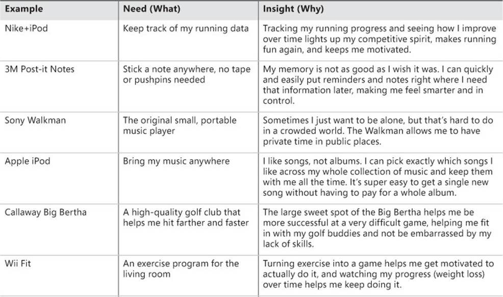
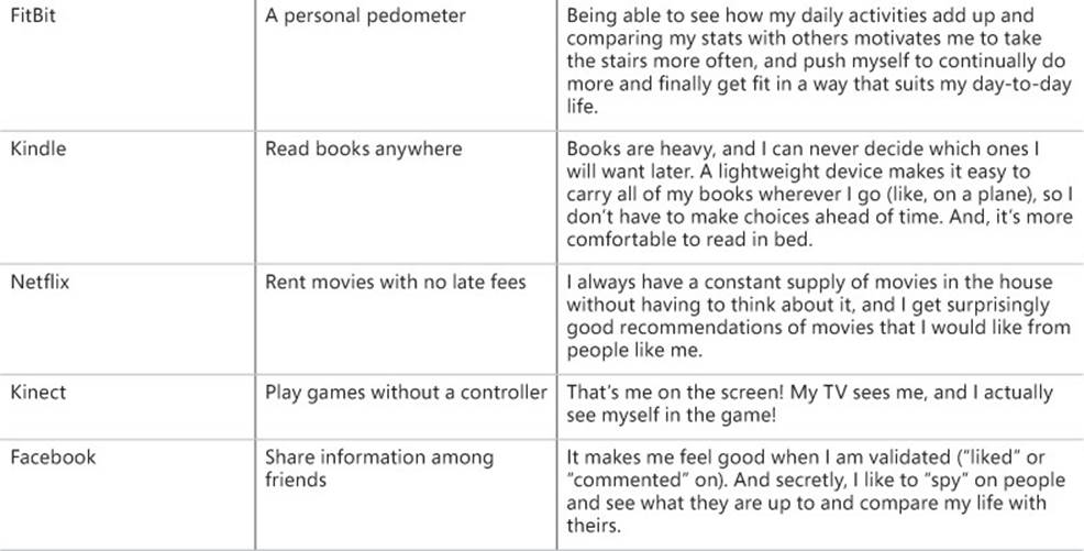
This table illustrates the difference between a surface need and an insight. It’s important to realize that these companies could have created other solutions that might have addressed the same identified need but been out of sync with the insight behind that need, and likely would not have been as successful. Each of these insights reveals why customers don’t just appreciate a product’s functionality but have an emotional connection with it. There is an element of deep surprise or delight or a big-T human truth embedded in every one of these insights.
The multiple dimensions of customer research
The good news is that there are decades of experience and practice on how to research customers quickly and efficiently and get valid information you can trust. You don’t have to reinvent the wheel here or talk to hundreds of customers to find the patterns. It’s a lot more doable than it looks, but there are a few gotchas to be aware of. In this section we take a high-level look at several approaches for how you find, record, and interpret customer data. Understanding how these different types of research fit together is critical to creating a balanced research plan—you need to use a rich mix of approaches to get the most accurate results.
Generative versus evaluative research
The first time through the Fast Feedback Cycle, you build empathy for customers so that you can start exploring ideas that are likely to resonate well with them. Gathering customer data with the intent of generating new ideas is called generative research. The insights that result from generative research provide the meat of the scenarios you’ll write, which in turn help you create solution ideas that address the problems those scenarios describe.
![]() Vocab
Vocab
Generative research is used to collect data that helps create an understanding of customer needs and inspire solution ideas.
Later in the iterative cycle, another kind of customer research becomes important. Once you have a prototype, product, service, or website and you want to evaluate how well your proposed solutions are meeting customer needs and whether customers actually like them, you gather data with the intent of evaluating a specific solution, which is called evaluative research.
![]() Vocab
Vocab
Evaluative research is used to measure or evaluate something you have created.
In the rest of this chapter we focus mainly on generative research approaches. As we explore the Fast Feedback Cycle in the chapters that follow, we’ll peel the onion to see how some of these same approaches can be used in an evaluative mode, and we’ll discuss evaluative research in detail in Chapter 9, “Observing customers: Getting feedback.”
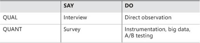
Do as I SAY, or as I DO?
If you had some magic crystal ball and the ability to interact with any customer, any time, what do you think would be most effective? To interview a customer in depth? To track a customer’s actions via software instrumentation? To observe the customer’s behavior in person, maybe with the ability to interrupt in real time to ask questions? The common thread in all of these actions is observation, yet each approach is profoundly different in what you observe and what kind of data you collect. Some of these techniques are about watching what a customer actually does, while others are about listening to what a customer says. Which is better? Of course, you already know the answer. Both approaches are valuable, and you ideally want a mix.
![]() Vocab
Vocab
DO data, sometimes called objective data, focuses on watching what customers actually do when faced with a decision or a particular situation. SAY data, sometimes called subjective data, focuses on listening to what customers say about their experience, behavior, needs, or desires.
However, some researchers and businesspeople feel strongly that a customer taking action is ultimately the only thing that matters. Did the customer purchase the product or not? Was the customer able to complete the task or not? Did she use the new feature, or didn’t she? It’s true that customers often say that they would do one thing but actually do the other in a real situation, so DO data is pretty important. We’ve seen some teams go so far as to convince themselves that the only valid type of customer research is objective DO data, such as instrumentation, A/B testing, or other types of usage analytics.
On the other hand, SAY data is usually captured by asking questions during customer observations and interviews, as well as through surveys. By asking questions, you can learn about subtleties of your customers’ behavior and attitudes, such as how they perform a task or why they like a particular feature so much or what annoys them about it. Remember that to generate insights, you need to understand why a customer is motivated to solve this problem in the first place. Because no one has figured out yet how to read minds, to get WHY data you need to be able to ask the customer some questions and get SAY data.
So what about those teams that believe DO data is all that matters? Although it’s important to observe and measure a customer’s actions, DO data on its own can hardly ever explain why customers did what they did and leaves you guessing. Relying exclusively on DO data makes it very easy to oversimplify cause and effect or to make assumptions that may or may not be true. Furthermore, by looking at your instrumentation, you might see the customer succeeding at the tasks you are watching, but if you don’t question them, you might never realize that they were irritated the whole time because they found the experience unsatisfying, frustrating, or just plain annoying. You are aiming to build a positive emotional connection with your customers, so it’s vitally important to understand their emotional state as well, and that requires getting robust SAY data. Luckily, some of the most powerful techniques inherently capture a mix of SAY and DO data at the same time. We’ll highlight these in the “Observe stage: Key tools and techniques” section later.
QUANT versus QUAL
Another dimension that differentiates customer research techniques is whether the approach generates primarily quantitative data or qualitative data.
![]() Vocab
Vocab
Quantitative data, or QUANT, focuses on capturing measurements, usually in a numerical or other well-structured way.
Quantitative data is what many engineers are most familiar with, and it typically gets reported as graphs, charts, statistics, trends, and other types of numerical analysis. When applied to DO data, QUANT can answer questions such as “What is the customer doing?” or “How much are they doing it, and how often?” This is usually done by capturing and analyzing usage data to produce metrics. Many people assume that QUANT research is always focused on studying large numbers of participants so that you get statistically significant results. This is intensified by the current trend to harness and leverage the jewels hidden in “big data.”
Big data refers to a data set that is so large it cannot easily be managed, queried, charted, and viewed using traditional data management tools such as spreadsheets and databases. While the term is applicable to many sciences—meteorology, genomics, and biology, for example—it is especially applicable to computer science because of the vast amounts of data captured through instrumentation of online services, otherwise known as “data exhaust.” Think of the data that your mobile phone, your favorite apps, and the websites you visit are collecting about your actions every second of every day. As of 2012, it’s estimated that we create 2.5 quintillion bytes of data daily.7 The field of data science is emerging and is focused on extracting meaningful analysis from these extremely large data sets. Analyzing big data is a fundamentally quantitative technique.
However, QUANT approaches do not always need to rely on large data sets. Particularly when focusing on SAY data, you can use quantitative approaches to capture subjective data from customers, such as to ask about attitudes or overall satisfaction via a short survey at the end of a usability test. Customers could be asked to answer each question on a scale of 1 to 5, which would result in numerical data that can be graphed and trended over time. Those trends can serve as an early warning system for new problems that may have inadvertently been introduced (such as usability issues when multiple new experiences are integrated). Those statistics can also serve as a progress meter on how close your solution is to being ready to ship.
![]() Vocab
Vocab
Qualitative data, or QUAL, focuses on gaining understanding by gathering and analyzing data such as descriptions, verbatim quotes, photos, videos, and other unstructured but rich data sources.
Qualitative data is typically gathered by doing research with a small number of participants, going deep with each participant to fully understand his or her situation. Qualitative research is about collecting detailed descriptions and narratives about an individual customer and is most often done through observations and interviews, which can capture both DO and SAY data. QUAL often answers questions such as “How is the customer doing that, and why is he doing it?”
Just like with DO data, teams can get into a bad habit of believing that QUANT is the only true source of valid data. But like DO data, QUANT rarely explains why things are happening—it only helps you quantify what is going on and how much it’s happening. This means that QUANT will never be enough on its own for you to form insights about your customers, no matter how much big data is behind it. You need to use QUAL to figure out why. To get the best picture of what your customers are doing, and why they are doing it, you need to use QUANT and QUAL techniques together.
![]() Mindshift
Mindshift
Data is data. We hear lots of stories from the user experience researcher, product planner, marketing guy, or field person that she is the lone voice in her company, desperately trying to get the engineers to add some qualitative research to the mix. This person should not have to be an underdog, the customer-focused David fighting the numbers-driven Goliath. Data is data, and qualitative data is just as valid and important as quantitative data. Each has its role in helping you figure out what customers are doing and what they might need in the future.
Using complementary research approaches
Have you heard the ancient Indian story of the group of blind men, each touching a different part of an elephant? The man touching the tusk proclaims the elephant is like a spear, while the one touching the skin says it is like a wall. Another, touching the tail, says it’s like a rope, and the man touching the trunk says it is like a spout. Just like the men touching the elephant one part at a time, different research methods highlight different aspects of the same situation. The reality is that every research method is imperfect, so to see the whole elephant, you must have multiple data points from multiple sources using multiple research techniques. Only by triangulating those data points do you come away with a valid picture of what’s really going on for the customer, and you can begin to see the whole elephant.
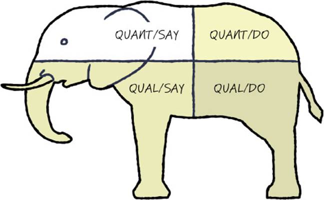
When you look at SAY versus DO and QUANT versus QUAL approaches, their cross-products combine to form a grid that describes four main classes of research activities:
Most research techniques boil down to applying one or more of these four basic approaches. The more important the decision you are making, the more important it is to get robust data from all four of these research quadrants. Some of the more powerful research techniques span these cells, and this greater coverage is the very reason they are so powerful. For instance, site visits often incorporate elements of both direct observation (QUAL/DO) and interview (QUAL/SAY)—you observe your customers in their native habitat and ask a few probing questions along the way. Similarly, usability testing can combine direct observation (QUAL/DO) of customers attempting to use a solution with a short questionnaire (QUANT/SAY) about their satisfaction afterward.
This grid is an excellent tool for making sure that you’ve chosen complementary research approaches and not just different forms of the same basic approach. For instance, consider a research plan that includes both a big-data analysis of instrumentation usage data and A/B testing of concepts on a live service. This plan seems good—until you realize that both of these techniques are fundamentally QUANT/DO techniques. Even though you are using two different techniques, you’re still looking at only one-fourth of the elephant.
When complementary approaches are used together, they can help you find deep insights and give you the statistical confidence you need, and they do it in an efficient, cost-effective way. There are a couple of basic patterns that come up often. The classic approach is to start with QUAL/SAY and QUAL/DO methods, observe a small number of customers, and understand their specific situations in detail. When you do qualitative observation of a few customers, you’re likely to develop several hypotheses about unarticulated needs that seem to be driving those customers’ behavior. However, because you talked with only a handful of people, you can’t be sure whether the patterns you see will hold with a larger population.
The next step is to use QUANT approaches to validate whether your hypotheses ring true to a statistically significant population of your target customers.8 If the QUANT checks out, you can feel confident that you have unearthed a valid insight. Practically speaking, professional user researchers find that most insights generated through QUAL research are surprisingly correct and bear out in QUANT research with the larger population, despite the initially small sample size.
![]() Tip
Tip
Our personal experience concurs that even with small sample sizes, going deep with a few customers is the most efficient way to get insights that are almost always correct. If you have time for only one research approach, start with direct customer observation, which will get you both QUAL/DO and QUAL/SAY data.
However, if you already have some QUANT data on hand, you can start your research from a different direction. Perhaps you have usage data (DO) that you got through instrumentation, or perhaps you crawled through your database of customer support reports (SAY). Start by analyzing the existing data set for patterns. You may find some patterns about pain points, usage patterns, and the like, but also keep an eye out for anomalies in the data, for places where the data doesn’t quite make sense. Sometimes you’ll find outlying data points that you would just as soon throw out because they don’t fit the curve. Sometimes a statistic that you expected to be high turns out low.
Instead of ignoring those cases, use the anomalies as jumping-off points to do some QUAL research to try to figure out what’s going on. Go deep with a few people in your target segment, observe them, ask questions, and try to understand why customers might be behaving in a way that would generate that unusual statistic. Chances are you will learn something new, and maybe something that your competitors haven’t noticed yet. Often these anomalies represent lead users, who can be very productive research subjects for identifying potential new unarticulated needs.
![]() Mindshift
Mindshift
Addicted to QUANT? Gathering and analyzing quantitative data can be addictive, especially to someone with a strong engineering mindset. We’ve observed many teams, organizations, and companies that have recently adopted a strong data-driven culture, which is fantastic. Having a penchant for data is a great skill to have in the business world. And in the age of big data, having the ability to understand how to collect and synthesize massive amounts of data is transitioning from a “nice to have” to a “must-have” for our industry. But this focus on vast quantities of data can sometimes lead to problems. We’ve seen many teams fall into the trap of relying solely on quantitative data for most of their decision making, and that data usually represents only DO data. It is extremely easy to jump to incorrect conclusions based on quantitative data and analysis paired with your personal experience and opinions. This is a particularly insidious way to forget that you are not the customer.
Here’s a final example that illustrates the need to go beyond QUANT. Several years ago, the Microsoft Exchange team collected email usage data from several large enterprise companies, as well as within Microsoft itself. The following table shows the average number of email messages that were received by each mailbox, in each of these companies (listed by industry for the sake of anonymity).
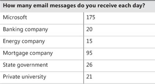
During our workshops, before we reveal this data, we ask the class to guess how many messages per day Microsoft employees receive on average. It turns out that Microsoft engineers have a pretty good idea about themselves and give pretty accurate estimates of their email usage patterns. However, it’s consistently a surprise that other companies’ use of email is dramatically lower in comparison.
Furthermore, when you look at the numbers, you can’t just create an average and say something like “non-software companies use email one-fifth the time that software companies do.” Because that’s not what the data shows. Take a look at the mortgage company. Why is it that its employees receive almost four times as much email as the other companies? Is there a business reason? A cultural reason? Looking at this data also leads to other statements, such as “I’m pretty sure workers in government and academia communicate with each other regularly, yet their email traffic seems to be low. If they aren’t relying on email so much, how are they communicating with each other?”
Then we look at how many messages the average employee sends each day, including original emails, replies, and forwards.
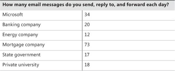
Again, we ask the audience to guess the numbers. When we reveal the actual numbers, some people are again surprised. Despite the lower number of messages they receive per day, the companies studied still send almost as much email as a Microsoft employee. Most people notice a pattern that the number of messages received is roughly proportional to the number of messages sent—but this pattern isn’t true for Microsoft, and there is still the anomaly of the mortgage company, which has a higher level of mail traffic overall.
At this point, after pausing to let the class consider the data, a discussion emerges. At first no one speaks, but then someone chimes in with an explanation for why these companies all send about the same amount of email as they receive: “I think they must not use distribution lists like we do,” and “They must not get nearly as much automatically generated status emails as we do,” and “I bet they actually respond to all of their email!” Someone points out the anomaly (the mortgage company), and another begins to explain to the class all of the business reasons why it makes sense that a mortgage company employee sends more than twice the amount of email in a day than someone at Microsoft. The class actually comes up with some very compelling reasons (at least they sound compelling), such as “Mortgage companies have to send all of their documents around to be signed,” or “In a mortgage company you are dealing with financial transactions and you need to send email to all of the parties in order to have accurate records of intent.”
We then interrupt them and announce to the class that they are all liars. Bald-faced liars. We then plead with the class—don’t tell lies. Don’t make up stories to explain why the numbers are the way they are. It’s so easy to jump to conclusions, to see a pattern and believe that you understand the reason for that pattern. In fact, you may be right about some of your hypotheses, but you simply do not know for sure, so don’t make it up. Instead, notice anomalies like these and use them to trigger some QUAL research to help explain the WHY behind the data. You might generate some educated guesses, a point of view about what may be occurring based on the data as well as your empathy for the customer. You might even consider your own intuition and life experience if that is relevant and not too biased. But then it’s essential to go do some further research to validate that what you think is happening is actually happening, and find out if you are correct.
We hope that everyone gets a laugh and egos remain intact. However, the point remains—don’t make up lies. Be curious and use QUAL to understand what customers are actually doing and why. And be careful with quantitative analysis so that you don’t interpret more than is there in the data.
Where do I find customers?
Gaining easy access to a robust pipeline of target customers to study is an activity where the value of having a strong user researcher or product planner on the team becomes apparent. If you have a researcher on your team already, he probably has a pretty good head start on understanding your customers and knowing where to find them. So if you have a researcher on your team, buy him a cup of coffee and see what he has to say. It may be the most valuable cup of coffee you’ve ever purchased.
If you don’t have a researcher dedicated to your team, and you don’t have the resources to hire a consultant, you need to do the work of creating a customer pipeline. Develop a list of people who match the profile of your target customers and who you can contact for ongoing research, whether that is the generative research that we’re focused on right now, or evaluative research that you will do once you have some initial concepts and prototypes to show. It’s important to have a deep bench of people available, because generally you don’t want to go back to the same individuals over and over again. If you start using the same people repeatedly, you’ll notice that they’ve learned too much about you and your offerings and can no longer provide unbiased, impartial, unvarnished feedback that is representative of the larger population of customers out there in the real world. Additionally, although most customers are flattered that you genuinely care what they think and that their feedback might make a difference, they will also become fatigued if you call on them too often.
Where do you find customers? Here are some good places to start looking:
![]() Online groups Post a request online in a discussion forum, social network group, or Twitter hashtag related to your industry or specialty.
Online groups Post a request online in a discussion forum, social network group, or Twitter hashtag related to your industry or specialty.
![]() Go where your customers are If you are looking for skiers, go to a ski area. If you are looking for parents, try local PTA meetings. If you’re looking for small-business owners, go to a conference that attracts lots of small businesses. You get the idea.
Go where your customers are If you are looking for skiers, go to a ski area. If you are looking for parents, try local PTA meetings. If you’re looking for small-business owners, go to a conference that attracts lots of small businesses. You get the idea.
![]() Ask around Use your network of friends, family, and colleagues to recommend people who match your target customer profile.
Ask around Use your network of friends, family, and colleagues to recommend people who match your target customer profile.
![]() Get recommendations Once you gather an initial base of customers, ask them to recommend friends or colleagues who they think might also be interested in providing feedback.
Get recommendations Once you gather an initial base of customers, ask them to recommend friends or colleagues who they think might also be interested in providing feedback.
Be sure that you have a clear list of criteria that matches the profile of your target customer. This is sometimes called a screener. The screener typically consists of about a dozen questions that cover basic demographic information such as age and gender, as well as several specific questions that are unique to your target customer profile. When recruiting customers for research, you typically ask the screener questions over the phone before scheduling a time to meet, which ensures that it’s worth your time (and theirs) to study them.
![]() Mindshift
Mindshift
Make sure you’re talking to the right people. One of the biggest mistakes teams make when they do their own customer research, without the help of an expert, is to start gathering data from people outside the target customer demographic. They don’t do it intentionally—the people they talk with seem close enough, and time is of the essence, so they take what they can get. But later on they often regret not being more careful when they realize that some of their data was contradictory or actually pointed them in the wrong direction. It’s easy to see how this could happen when you mistakenly interview a power-user photographer instead of a more novice point-and-shoot-camera user who is your intended target. A more subtle problem happens when you run an Internet survey that gets a strong response rate from a demographic you hadn’t intended, but you forgot to include screener questions that would have alerted you to this fact. Take the time to build a screener and use it. If, after repeated attempts, you have trouble finding people who are a reasonable match for your target customer’s profile, maybe that target customer doesn’t actually exist. You may need to return to the activities described in Chapter 4, “Identifying your target customer,” and reconsider your business strategy and target customer.
How many customers should I study?
Your instincts may lead you to want to do research with large numbers of people to maximize statistical significance and the validity of the data you find. However, doing deep, observational research with large numbers of people can easily become prohibitively expensive and time-consuming. Thankfully, it turns out that you can discover unarticulated needs extremely effectively by going deep with just a small number of research subjects. In fact, you need to observe only about a half-dozen customers, provided that each is aligned to your target segment. Once you start interviewing the seventh, eighth, or ninth customer in that same profile, it’s very likely that you will have diminishing returns and not learn anything substantially new. The important thing is that you specify a customer profile based on your target customer segment and identify people who match that profile. Nonetheless, once engineers get bitten by the research bug, they tend to overdo research in an attempt to be “sure.” Chances are that you don’t need to do as much research as you think to inform any single iteration of the Fast Feedback Cycle.
Sometimes just having a strong and persistent curiosity can lead to valuable time with a customer. We know a former colleague, Prashant, who years ago traveled to New Orleans for a conference about some aspect of the latest version of Visual Basic. He was excited to travel to New Orleans because, it turns out, he had a few hidden tattoos and had made an appointment to get another from a well-known artist in the city. To his surprise and delight, the artist happened to be an avid part-time VB programmer, and as long as the tattoo session went on, Prashant had a captive audience of a terrific representative customer. Prashant shared his knowledge of the new product, and the artist engaged him in deep technical conversation. He filled Prashant with feedback, ideas, and a wealth of well-thought-out opinions on what he needed and why.
![]() Mindshift
Mindshift
Lead users can be a gold mine for insights. Sometimes you may explicitly choose to study a lead user, even if she isn’t exactly your target customer. As we mentioned in Chapter 4, lead users have deeper and sharper needs than others. But you’ll find that “average” customers will have most of these same needs, just not to as great a degree. Because of this, spotting unarticulated needs by studying a lead user may be easier than by studying a more average customer. For instance, if you’re aiming your service at a typical point-and-shoot photographer, you might study a complete beginner to notice more clearly what he stumbles on. An early adopter lead user may help you discover a new trend before it goes mainstream. A lead user may also help you uncover the true root cause behind a particular behavior. The flip side of studying lead users is that you need to carefully validate that the lead user’s needs actually carry over and are representative of the larger target market you are going after. It’s worth repeating: beware of studying power users who know the ins and outs of every bit of software they use and have figured out exactly how it was built. Their needs rarely carry over to a broader market.
How do you know you are done, that you have talked with enough customers? The answer is quite subjective. If you are looking for new insights, what you should hope occurs is that you hear something interesting within your first few customer encounters, something deep that leads you to a new possible insight about your customers. If you hear similar statements or see behaviors that point to the same insight from a few different people, that should be plenty of evidence to trigger your curiosity and excitement that you are on to something. You’ll have opportunities in future iterations to further validate that insight with more customers, so you don’t need to be completely sure, you just need a well-informed hunch. You might need only a few qualified people to develop a promising hypothesis that is worth moving forward with.
![]() Tip
Tip
If the data you’re collecting doesn’t seem rich enough for distilling interesting insights, instead of talking to more customers, focus on gathering different types of data and using different research techniques. Have you looked at all four quadrants of the elephant: QUANT/SAY, QUANT/DO, QUAL/SAY, QUAL/DO?
On the other hand, you may talk to plenty of customers, feel like you have lots of data, but still not see any clear patterns or insights. Or perhaps you see so many possible needs that it’s hard to prioritize which are the most important. In this case, the synthesis techniques discussed later in this chapter will be of particular interest. These techniques help you find the needle in a haystack of data, help you make sense of what customers are telling you, and help you identify more subtle patterns in your data.
It’s important to realize that collecting data and understanding customers is ongoing and cumulative. It’s not a waterfall process where you stop everything, learn everything there is to know, and then proceed. You target your data gathering such that you learn enough to at least partially answer your current questions and move forward, but you remain open to new data and even new questions because you know you’ll never have the complete picture. More data won’t necessarily lead you to more or better insights, especially not right away, before you have explored some possible solutions and seen how customers react to them.
Do I need an expert?
A lot of science exists about how to do solid customer research, whether it’s knowing exactly how many people you need to observe to get good coverage, how to interpret results, how many survey respondents you need to get statistical significance for a given target population, how best to capture data, or what inherent biases lurk in each technique. It’s possible to hire a consultant to help you with your research, and many small and midsize companies go this route rather than employ their own full-time researchers. Professional researchers might have job titles such as user researcher, design researcher, ethnographer, market researcher, usability engineer, or product planner. The User Experience Professionals Association (UXPA) has consultancy listings on their website at www.uxpa.org. If you can afford it, it’s well worth hiring a professional.
However, it is also possible to do research on your own. As we walk through the techniques later in this chapter, we’ll point out some of the most salient gotchas to help you avoid pitfalls. The most common mistake is to introduce bias into your data without realizing it. One way to mitigate many biases is to simply be sure you have multiple observers. But every technique has inherent biases and blind spots, so picking the right technique for the job depends a lot on deciding which kinds of problems you can live with and which you can’t. Despite the risks, we do strongly encourage you to give it a try. Getting started isn’t as hard as it looks. You will gain some important benefits, even from an imperfect, first-time effort.
Conducting customer research is considered a branch of social science research in most contexts, and as such is subject to certain rules about the ethical treatment of research subjects. Generally, you have an obligation to inform research subjects about how their data will be used and that they have the right to decline to answer any question or to cease their participation at any point. You also are required to get the research subject’s consent before recording them in any way, so no hidden cameras. Please learn your local laws and abide by them.
![]() Mindshift
Mindshift
Will the real researcher please stand up? We often see teams of engineers fail to recognize the difference in approach used by two main types of customer-research experts. The crux lies between user researchers, who usually come from a social-science background, and market researchers or product planners, who often come from a business or marketing background. User researchers tend to focus more on ethnographic, qualitative approaches, whereas product planners tend to use more quantitative approaches, often starting from a business or competitive-landscape perspective. Both approaches are valid and important, but sometimes a bit of tension can arise between these two types of experts because they employ different points of view. Both are passionate about uncovering the deep insights about customers that should inform the project team’s plans and strategies, and both have a tendency to think their methods are superior.
As the client who needs to make decisions based on research, ideally you want to be informed by both types of expertise and to take the time to understand the findings across both of them to gain the sharpest, most robust insights. If you decide to hire a consultant, clarify which approaches and techniques the consultant will use, and ideally draw from both schools of thought or link the consultant with staff in your company to bring in a complementary approach. It’s worth the effort to help ensure that everyone works together and synthesizes their insights in harmony—otherwise, you might end up with two different sets of data that don’t quite jibe, which could encourage an engineering team under stress to ignore both of them.
What is the engineering team’s role in research?
Even if you hire some professional help, that doesn’t mean the rest of the team is off the hook. It’s vital for members of the engineering team to be involved in the research effort, including attending site visits, interviews, and focus groups; developing surveys; examining competitive data; and synthesizing the data into insights. But who exactly on the team should be involved, and how many people should participate firsthand?
Some teams we’ve worked with take the approach that every member of the project team needs to have a personal hand in some part of the customer research. These teams are more likely to dedicate a block of time at the beginning of a new project for the whole team to become familiar with the available research or do a consolidated push of interviews, site visits, and other studies. They might require every member of the team to attend at least one in-person research activity over the course of a project or during the year. These teams believe that there is no substitute for experience when it comes to developing deep empathy with your target customer.
Other teams have decided that it’s better to have a small team of people, a mix of professional researchers and engineers, lead the research effort. It becomes that small group’s job to keep everyone informed so that the rest of the team can also build empathy for its customers. Even if you have a dedicated research team, it is important that a few engineers be an intimate part of this group to help provide a translation layer when it is time to explain the insights to the rest of the team and also to bring their engineering mindset to bear on understanding the context or technical implications of comments customers may make during the course of an observation, interview, or other encounter.
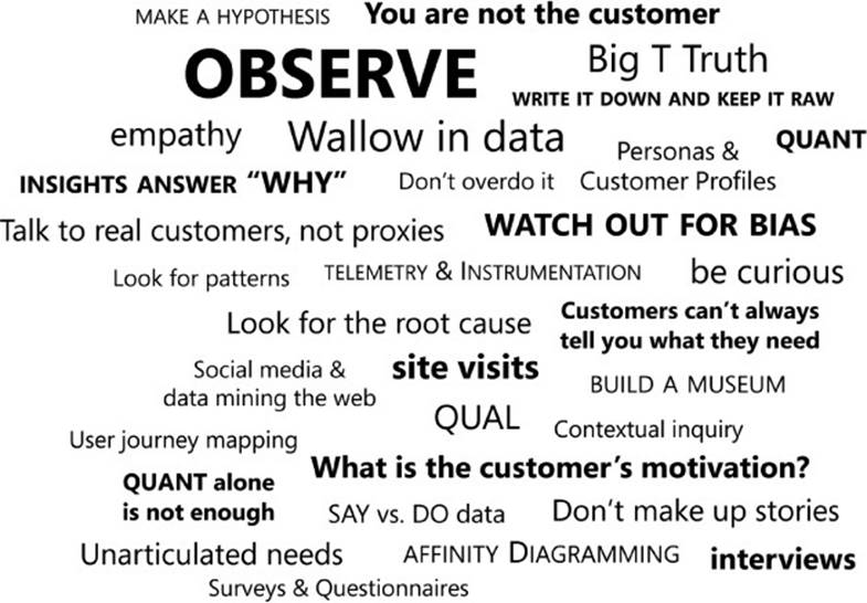
Observe stage: Key tools and techniques
Now it’s time to get to the nitty-gritty and talk about how to actually do generative research about customers. This section offers an overview of our favorite tools and techniques. The techniques are broken into two large categories: data-gathering techniques that help you collect generative customer data, and synthesis techniques that help you sort through and synthesize your data to find customer insights. The chapter finishes with a deep dive into one of our favorite techniques: affinity diagramming.
Of course, you won’t use all the tools and techniques outlined here. Pick the ones (or one) that are most relevant to your situation, and remember that you probably don’t have to do as much research as you think to kick off a rapid iterative process. Once you have a hypothesis for some key insights that seem promising, you are ready to move on to the next stage of the Fast Feedback Cycle.
![]() Mindshift
Mindshift
Write it down and keep it raw. When doing customer research of any type, it’s essential to capture the data that you collect in a robust way. For even a moderate amount of research, you will amass a lot of information, and you can easily forget the details if you don’t write them down and keep them catalogued. Also, don’t just go for rough impressions—you need all the details at your fingertips to do this well.
Data can come in a lot of forms. You might get multimedia data such as photos, video, or audio clips. You might also amass piles of quantitative data that will be processed into charts, graphs, and other visualizations. You should keep detailed notes of every customer encounter, which will give you transcripts, verbatim quotes, and other notes about what you’ve noticed about the customer’s environment, motivation, or attitude. Think about what synthesis techniques you plan to use. This might affect how you capture your data—whether that means writing each separate quote or idea on its own sticky note or index card, capturing it electronically, or using a particular tool set.
The most important thing to remember when capturing data is to keep it as “raw” as possible. Especially when you talk with customers directly, write down as much as possible and exactly what the person says. Do not mix in your own interpretation of what was said or your ideas for what themes you see emerging at this stage. You can keep notes for potential hypotheses and insights separately, but it’s better to spend your mental energy paying attention to the specific person or case at hand, capturing it as accurately as you can, and not try to draw conclusions. Save that for later when you can look across all of your data points. Also, don’t zoom in too quickly on one specific case that may turn out to be fairly exclusive to a single individual. At the data collection stage, your primary attitude should be one of curiosity and of trying to understand your customers’ environment, situation, tasks, pain points, and desires in as much detail as possible. Save the interpretation for later.
Data-gathering techniques
Here we’ll introduce you to techniques that we find most useful for doing primary research, where you study your customers directly. These techniques represent a variety of DO and SAY approaches. Some approaches produce QUANT data, others produce QUAL data, and many produce a mix. We’ll point out which techniques are best for different situations and where the major sources of potential bias stem from. Remember that no technique is perfect; each has its pros and cons.
Site visits and interviews
Primary usage: QUAL/DO data (observing behavior), QUAL/SAY data (interviews).
Best for: In-person observation to understand context, attitudes, and behaviors and to notice needs that customers may not be aware of.
The nice thing about watching customers in their own environment is that you may notice things that customers do that you would never have thought to ask about. When visiting with customers, you need to decide whether you are going to observe them quietly (as a fly on the wall) or engage in some contextual inquiry and ask them questions while you observe.
![]() Vocab
Vocab
Contextual inquiry is a research technique with which the researcher asks directed questions while observing a customer in the customer’s environment.
Asking questions when you see a customer take a certain action can allow you to explore and gain deep insights that would have been impossible or difficult to deduce otherwise. You may find yourself in conversations like this: “Why did you just do that 10-step workaround? Did you know there is a feature that does that for you automatically? You did? Oh . . . it doesn’t work exactly as you need it, and it’s easier for you to do it by hand in 10 steps than it is to use the built-in feature and then fix it the way you want it?” However, when you visit customers in person, be aware that your presence alone can alter their behavior. A video camera or an audio tape can also cause people to be nervous or censor what they say, especially at first.
If you decide to engage in contextual inquiry, be sure that you don’t ask leading questions. It is very easy to bias customers to behave the way you would like them to rather than the way they would naturally. To avoid influencing customers, it’s often best to remain silent while a customer is working on a task and to save your questions for a natural pause. Also try to resist correcting their answers no matter how wrong they might be. Try not to complete their sentences; let a pause be a pause. And when they ask a question of you, turn it back on them by asking what they think the answer might be.
![]() Mindshift
Mindshift
Not all customers are chatty. As you begin to interact directly with customers, you’ll soon discover that humans have a wide range of styles and that they communicate differently. Some people talk a mile a minute and can tell you every thought that is running through their heads, moment to moment. Others find it difficult to reveal their thoughts, even to the most experienced interviewer. Perhaps they are shy and tend toward introversion, needing some processing time before they’re ready to tell you what they think. Or, even more probably, they just haven’t thought much about what you are asking them and aren’t saying much because they’re coming up blank—they just don’t know.
You’ll likely need to talk with several customers to find a few who are able to express their thoughts clearly in a way that you can understand and react to. But the fact that these customers are able to tell you what they think is inherently biasing as well. You’re hearing from talkative extroverts, but it could be that more introverted customers have different opinions and preferences. This potential personality bias is a bigger factor with techniques that focus more on SAY than DO data, so keep this in mind as you select which techniques to use.
When on a site visit, be sure to get the most out of being in a customer’s space. Aside from watching customers perform particular tasks or observing them go about their daily lives, use these other channels of information while you are there:
![]() What does the building look like? Observe the physical surroundings—the size, the walls, general decor, and so on.
What does the building look like? Observe the physical surroundings—the size, the walls, general decor, and so on.
![]() What kind of space does the customer bring you to? Is it a traditional workspace or a couch at home? What decorates the customer’s personal space—what’s on the desk, bulletin board, or walls or hanging on the fridge?
What kind of space does the customer bring you to? Is it a traditional workspace or a couch at home? What decorates the customer’s personal space—what’s on the desk, bulletin board, or walls or hanging on the fridge?
![]() What is the noise level like? If there is noise, what’s causing it? People, machines, kids in the playroom, a TV playing in the distance?
What is the noise level like? If there is noise, what’s causing it? People, machines, kids in the playroom, a TV playing in the distance?
![]() Is the environment crowded or sparsely populated? Will people overhear each other’s conversations? What would people do if they needed privacy?
Is the environment crowded or sparsely populated? Will people overhear each other’s conversations? What would people do if they needed privacy?
![]() While the customer is doing her thing, is she focused on a task or being interrupted by other people or tasks? How frequent are the interruptions?
While the customer is doing her thing, is she focused on a task or being interrupted by other people or tasks? How frequent are the interruptions?
Sometimes, you don’t have the luxury of connecting with customers in their own environment. In this case, you can still learn a tremendous amount by interviewing a customer in a neutral environment or even on the phone. You just need to be a little bit more skilled in interview techniques because the context of the environment will not be aiding the customer to behave and answer most questions naturally.
Don’t underestimate the amount of skill and practice required to interview customers in an unbiased manner. There are a handful of interview best practices that you can learn. These practices are valid regardless of whether you are on a site visit, in a studio, in a usability lab, trading emails, or talking on the phone.
![]() Tip
Tip
When doing interviews, make time immediately afterward to clean up your notes while they are fresh in your mind. A good practice is to schedule interviews with an hour in between so that you have the time to do this. Don’t wait until the end of the day or, worse, another day and risk being unable to recall the details and nuances that might be important.
SFE in action: How to interact with customers
Karl Melder, UX Researcher, Microsoft Developer Division
Having worked in Microsoft’s Developer Division for more than a dozen years and been a design researcher for more than 20, I’ve learned to never underestimate the challenges in asking users the right questions and correctly interpreting what I’m seeing and hearing. From those experiences I’ve derived a working set of basic principles that I teach and apply broadly in multiple products and contexts at Microsoft. I hope you find them equally useful for successfully engaging with customers to deeply understand their needs.
Code of conduct
First, understand that how we treat our customers dramatically affects our ability to get high-quality and honest feedback. In the past I’ve seen team members judge our users, talk over our users, and dismiss their feedback when it contradicted their assumptions. Code of conduct is about establishing genuine trust and creating an environment where customers feel comfortable enough to give you their honest feedback.
The code of conduct has four main components:
![]() Acknowledging the customer’s situation and emotions For example, for our users who are software developers, they may have made poor API choices and written suboptimal code. However, if they have a bug that has stalled progress for days and their stakeholders are panicking, you need to accept that perspective and validate their circumstances rather than lecture them on their choices.
Acknowledging the customer’s situation and emotions For example, for our users who are software developers, they may have made poor API choices and written suboptimal code. However, if they have a bug that has stalled progress for days and their stakeholders are panicking, you need to accept that perspective and validate their circumstances rather than lecture them on their choices.
![]() Giving unqualified respect to everyone Seems like a “duh” point, but in our very technical industry I’ve seen a caste-like attitude where the more technically astute engineers are treated differently from the less-experienced or less-educated engineers.
Giving unqualified respect to everyone Seems like a “duh” point, but in our very technical industry I’ve seen a caste-like attitude where the more technically astute engineers are treated differently from the less-experienced or less-educated engineers.
![]() Being modest When interacting with customers, people sometimes feel it necessary to proclaim their qualifications, power, and overall greatness to a customer—often leading to intimidation instead of creating a collaborative atmosphere where the customer feels welcomed to contribute.
Being modest When interacting with customers, people sometimes feel it necessary to proclaim their qualifications, power, and overall greatness to a customer—often leading to intimidation instead of creating a collaborative atmosphere where the customer feels welcomed to contribute.
![]() Being patient Communication styles are varied. I’ve seen interviewers not slow down to the customer’s pace and who stomp on their feedback. You need to pace yourself to your customer rather than the other way around.
Being patient Communication styles are varied. I’ve seen interviewers not slow down to the customer’s pace and who stomp on their feedback. You need to pace yourself to your customer rather than the other way around.
Active Listening
Listening well can be a challenge for many. I like Active Listening as a framework for getting high-quality feedback. It is simple and sets a great tone. The basics are these:
![]() Listening And I don’t just mean with your ears. People communicate through many channels—their facial expressions, body movement, tone of voice, hesitations, etc. The words they use represent only a small part of that communication. Make sure you listen by observing more than just the words being spoken.
Listening And I don’t just mean with your ears. People communicate through many channels—their facial expressions, body movement, tone of voice, hesitations, etc. The words they use represent only a small part of that communication. Make sure you listen by observing more than just the words being spoken.
![]() Probing Ask really great questions that drive toward understanding the root cause of a problem or the core of their underlying motivations. Phrase questions to get a more grounded, richer, and deeper understanding of your users and what they need. (See the next section for more information.)
Probing Ask really great questions that drive toward understanding the root cause of a problem or the core of their underlying motivations. Phrase questions to get a more grounded, richer, and deeper understanding of your users and what they need. (See the next section for more information.)
![]() Validating Mirroring what you think you heard is your chance to make sure you understand what is going on and demonstrate to your customer that you understand.
Validating Mirroring what you think you heard is your chance to make sure you understand what is going on and demonstrate to your customer that you understand.
In a nutshell, you ask great questions, listen and watch intently, and keep checking back with your customer to make sure you understand what is going on. A critical component in this cycle is an environment of openness and trust. Trust and openness are qualities you need to actively work toward, not just by saying “trust me,” but by being trustworthy and open in your actions.
Asking great questions
Asking great questions is about being open ended, nonleading, neutral, and grounded. What you want to achieve is a richer and deeper understanding of what your customers need and desire. Initially, you may ask whether your customers do X. However, the substance of what you learn comes about when you dig deeper and ask them to tell you more about X: When does X happen? How often? What happens right before X? What happens right after X? Walk me through the details of the last time X happened. How does it make you feel when X happens?
The last question (how does it make you feel) is an interesting one and a worthwhile tangent. A software development team is a bunch of engineers. We love facts. We tend to forget the emotional content. However, we do want our users to feel great when using our product. So don’t shy away from asking them how using your product makes them feel. Did they feel nervous or not in control? Satisfied or underwhelmed? Understanding how they feel when they use your product versus how they feel when using a competitor’s product can evoke game-changing ideas rather than lead just to feature parity.
Ask questions that are open, nonleading, and neutral. Avoid using biasing words or phrases in your questions. If you ask “What did you like about X,” you basically invite the person to come up with something plausible about liking X. Similarly, if you ask “Was X better in version 7.0 than 6.0,” you invite them to find something good to say. Instead, just ask them to tell you what they thought of X—giving them permission to tell you the good, the bad, and the ugly.
In contrast, a closed-ended question is one that can be answered with a simple yes or a no. They are typically good only for shutting down a conversation, not for engaging a customer in deeper conversation. Avoid these.
Asking for stories is important. Prompt for them by asking “Can you tell me about a time when . . . “If you don’t have a long list of questions but have areas you’re interested in, focus on asking questions that follow up from the initial prompt for a story. For people who need warming up, find where they’re comfortable sharing: do they like to complain, do they like to promote themselves? Then change your prompts subtly. For the self-promoter, ask “Can you tell me about a time when you . . . ” For the complainer, try “Can you tell me about a time when things failed?”
Finally, if you reinforce the privacy of the interviews and observations, people tend to be more willing to reveal themselves.
Show me!
Probably the most profitable action you can take when you’re interacting with a user is to observe. In my experience, this is arguably the hardest technique for software teams to learn and remember to use. Mostly I see interviewers who want to ask questions and get answers. However, it can sometimes be difficult for a user to articulate what it is the user really wants or needs. It can be hard for a user to recall the details of how he or she uses your product. For our users, many of their actions are so automated that they don’t think about them anymore.
The answer is to ask the user to “show me.” It’s about asking users to spin up the tools they use and walk you through how they do an activity. This can take the form of a usability study where you give a user a task to do or a site visit where the user walks you through some key activity. Regardless, watching people use a product makes for the easiest interview because their specific actions will help you know what to ask and when.
Where do most customer interactions go wrong? Engineers instinctually want to jump in and help. It is very hard to watch a customer struggle or be blocked. You want to make the pain stop. However, imagine the impact you might have if you can observe that painful event, uncover why it happened, and fix the core problem! Biting your tongue and letting the badness happen to uncover its root cause is an integral part of the observation process.
Diary and camera studies
Primary usage: QUAL/SAY data.
Best for: Getting customer data over time or when observing the customer in person is impractical.
Many times, it’s difficult to capture the essence of a customer’s day in a single interview or observation. For some customers, a more longitudinal approach to observing might be useful. A diary or camera study is an easy way to get observational data about a customer over a period of time.
![]() Vocab
Vocab
Longitudinal research is research that is done over a longer time period, such as weeks or months, not just a couple of hours in a lab or a single snapshot of a point in time.
The idea of a diary study is simple. Give a diary to a customer and ask him to write in it daily. You might provide specific prompts to answer, which could be the same every day or vary. Or perhaps you give a camera to a customer and ask her to take a photo or video of the important parts of each day as well, or to take a snapshot at prescribed times to capture the moments that you’re most interested in. The potential bias in a diary or camera study is obvious—customers have the leeway to be selective in what they choose to share with you, especially for more intimate or personal moments. However, this approach still raises the odds that you hear about things that are salient to a customer’s everyday life and that are unlikely to come up in an interview, focus group, or even a site visit.
SFE in action: Customer safaris
Ulzi Lobo, Senior Software Engineer, Microsoft Office; Christine Bryant, Design Researcher, Microsoft Office
Our team had just taken the SFE workshop, and we were feeling inspired to go out and observe customers directly. Our challenge was to find a way to do this at a scale that would enable a large percentage of the team to participate. But more important, we had to figure out how to create a sense of empathy for the customer that the entire team would share. Our solution was to create a program we called “customer safaris.” These safaris helped our team feel the pulse of our customers and understand their needs and pain points, and it provided an opportunity to share and extend customer communications with a large cross section of the product team, including program managers, testers, and developers.
Several important, and potentially nonobvious, components are part of a customer safari. First, each safari is led by a professional user researcher (the guide). The researcher (along with help from hired vendors) does all the work of locating and screening the target customers to observe. The researcher also establishes a focus for the safari by putting together a rough set of relevant topics and issues to be explored—essentially, what are we hunting for? In signing up for a safari, participants agree to spend a short amount of time with the researcher learning how to prepare for and conduct informal meetings with customers. During the day of observation, teammates are free to observe, ask questions, and generally do whatever they think makes for a productive use of time with the customers. But the safari leader is there, too, to provide guidance (perhaps restating a line of questioning to avoid bias, for example), take additional notes, and help the team get the most value from the day.
Team members use customer safaris to broaden their understanding of customers through one-on-one interactions and to help uncover and answer questions about products and trends. The scale and focus of a safari can be adjusted to fit team needs. On the Office team, we had 50 team members and 25 customers participating in safaris. Our primary goal was to expose the entire team to customers, with a secondary focus on specific product explorations. We found that meeting in a neutral location, like a coffee shop, created a more relaxed atmosphere for both customers and team members. It offered a comfortable and unbiased environment where the participants could more easily arrange to meet and have a discussion.
Once team members return from a safari, they present post-safari brown bag reports to the rest of their team. These sessions are very important, as they enable many different teams and groups of engineers (some who went on their own safari, others who didn’t) to share their observations. These sharing sessions often unearth common patterns that teams saw with customers. Soon after we started the safari program, we began to hear statements in engineering meetings that quoted customers directly, and developers would offer observations that they either learned firsthand or learned through a post-safari brown bag. To the research team, hearing these statements was evidence that the safaris were having a direct impact on the daily routine and decision making of the engineering team.
Surveys and questionnaires
Primary usage: QUANT/SAY data.
Best for: Validating hypotheses and understanding attitudes and beliefs of the target population.
The basic idea behind a survey is to ask customers to answer a bunch of questions on paper or online. Surveys are a relatively easy and quick way to get data from a large population. A questionnaire is the same idea but asks only a handful of questions. A number of good websites are available where you can create, run, and administer online surveys or questionnaires.
Keep in mind that surveys are not observational. They are about SAY data—what people’s attitudes and beliefs are. Surveys are most often thought about and used in a large-scale, quantitative setting, where you survey a large population of people to get statistically significant results. But not all surveys have to be that way. Many usability lab studies include a short survey, or questionnaire, at the end, asking a few questions about satisfaction. There are two reasons for doing this. The first is to stimulate a short conversation or interview before the participant leaves. The second is to collect data over time to establish a norm for successive rounds of usability tests. If the satisfaction results begin to stray too far to the right or the left of the norm, that tells you something.
As a quantitative research tool, surveys are well suited for validating hypotheses. You might be tempted to also use surveys as a qualitative, generative technique aimed at discovering new insights or unarticulated needs. But you really can’t. The problem occurs when you assume that you can ask open-ended questions in an attempt to catch everything you forgot to ask directly in the survey. You can usually find some interesting patterns and themes by creating an affinity diagram from open-ended survey results. However, depending on the frame of mind of your participants, they may not think to tell you things that are actually relevant. Remember that you are hoping to find unarticulated needs that customers are largely unable to identify in the first place, never mind write cogently about while filling out a survey form.
However, if you already have a hypothesis about an unarticulated need, you absolutely can write up your hypothesis as a statement and ask survey respondents to rate their level of agreement, for instance, to give you some feedback about whether your hypothesis is on the right track. Validating and quantifying hypotheses is a great use for surveys.
Surveys are fairly simple to create and administer, but there are some issues and limitations that are important to understand. For example, as easy as it is to create a survey, it’s even easier to create a bad survey. At best, a poorly designed survey will not give you the data you are looking for. Worse, a poorly designed survey will lead you to very wrong hypotheses. (Note that we didn’t say conclusions, because you are always going to triangulate the results of your survey with other research approaches to validate it, right?)
People often ask how many responses they need from a survey for the data to be meaningful. The question of statistical significance of survey data is a particularly deep topic. A lot of smart people spend entire careers analyzing the details of survey data to get statistical significance. Our colleague Paul Elrif, who has been doing user research for more than 20 years, offers this advice as to how many responses you should target in a survey:
Ideally, you will want 200-300 completed surveys per population segment. However, it’s often impractical to survey very large groups of people. If a high degree of accuracy is not needed, you can get meaningful data from a survey if you collect 25 completed, valid surveys from customers that are in the same target audience. You should consider 15 survey respondents per segment as a bare minimum. If you have several different target customer segments, then you’ll need to get this number of survey responses for each of the segments.
When you design a survey, understand that it may be difficult, if not impossible, to remove all bias. Are the respondents an accurate representation of your target population? Are they selected randomly? Will the respondents respond differently from the ones who opted out? Survey results can be easily biased based on who chooses to answer the survey. You may get a heavier representation of frequent Internet users or younger demographics if you do an online survey. Also, certain personality types are more likely to fill out surveys in general or for a modest reward. Depending on your target customer, this kind of selection bias may be a big issue to keep in mind.
It’s also important to understand that people have a difficult time assessing themselves. Memories are not as strong as you might think, emotional state can inflict strong bias, it’s difficult to observe and report on one’s own habits and behavior, and many people will tend to answer questions in terms of what they think is socially desirable or expected. Furthermore, when looking at survey results, you are more likely to notice the data that confirms your current thinking and not notice or discount the data that contradicts it. We encourage you to find a professional to help you build an unbiased survey. But despite these issues, surveys can be helpful tools for confirming an insight with a larger population or sizing the relevance of that insight or opportunity.
Neuroscience break with Dr. Indrė Viskontas
Psychological studies are often conducted “double-blind,” with neither the experimenter nor the subjects knowing which condition they have been assigned for very good reason: expectations change our behavior and how we interpret the results. Our minds have evolved such that we search for patterns in the environment—and our search is biased. We look for evidence that confirms what we already believe, instead of being good scientists and seeking only to disprove hypotheses.
This confirmation bias is particularly nefarious during remembering—what we remember, and how we remember it, depends on our current state of mind and on what it is that we expect to find. When we feel blue, we tend to remember the negative aspects of previous events. But in general, we see the world through rose-colored glasses: we’re more likely to remember the good times than the bad.
What’s more, most of us tend toward pleasing people in authoritative positions: experimenters, surveyors, anyone wearing a white coat. We want to meet or exceed expectations. So if you make your expectations known to your survey takers, you might bias them to respond just how you hope they will. That’s why psychologists often ask the same questions twice in a survey, with opposite spins. For example, when trying to discover whether someone prefers function over fashion, the relevant questions might be posed as follows: “Do you agree with the statement ‘Aesthetics are important to me and I am careful to choose only objects that are beautiful, even if I know they aren’t practical’” and “Do you agree with the statement ‘I’m a practical person—no matter how nice something looks, I care most about how it works and how durable it is.’”
In surveys, you want a range of responses, which is why psychologists often ask people to rate items on a scale. It’s important to use an odd number for the rating system—5 or 7 works best—or else you are preventing your consumers from indicating that they are neutral or undecided on an item. In an even-numbered scale, people are forced to have an opinion, even if they really don’t have one.
SFE in action: Seven steps for creating a survey
Robert Graf, PhD, Senior Design Researcher, Microsoft Engineering Excellence
In my work as a user researcher, I am often presented with a need to answer questions about our customers’ demographics, attitudes, self-reported behaviors, or opinions. Surveys are a great tool for quickly and inexpensively collecting a large amount of data to answer these questions. Over the years, I’ve developed a process that I use to make sure surveys give you clear and actionable data. Here are seven guidelines that I’ve developed to help keep me on track:
1. What is the primary purpose of the survey? Make a list of what you want to learn. Prioritize the list. You will need to keep the survey short, so you probably can’t ask everything. The shorter the survey, the higher the response rate you are likely to get.
2. For each item, write a simple question that asks just one thing. Otherwise, you will not know which thing people responded to.
• Do not create compound questions—avoid use of “and” and “or.”
• Determine whether the question is (a) mutually exclusive, single response; (b) multiple response; or (c) completion (fill in the blank).
• A common survey format is to ask the person’s level of agreement with a particular statement on a scale of strongly agree, agree, neutral, disagree, strongly disagree.
• Provide the user with the chance to select options such as none, not applicable, or don’t know (as appropriate).
3. Create mock data for survey responses and generate a model report, table, chart, list, etc., to make sure that your reports work in the exact format in which your data will be returned.
4. For each question, determine how the results in step 3 would actually be used to make decisions about the customer, scenario, or solution. If it is not clear what you would actually do differently if you had that data, rework the question or eliminate it. It is remarkably common to ask survey questions that you only later realize don’t produce actionable feedback, so the goal is to avoid that ahead of time.
5. Pilot the survey in person with three to five people to determine whether the questions are correctly understood and the respondents are interpreting the questions correctly. If not, rework or eliminate questions that aren’t clear.
6. Stage the release of the survey by first sending it to a small, random subset of the intended audience. If you answer no to any of the following questions, rework the problematic questions and resend the survey to a different small subset. Repeat until you answer yes to all three questions.
• Is the data returned in the format that you expect?
• Can you analyze the data by using the procedure in step 3?
• Are the results actionable?
7. Send the survey to the full intended audience.
Telemetry and instrumentation
Primary usage: QUANT/DO data.
Best for: Real-life usage analysis of existing applications and services with an active user base.
Instrumenting your code so that you can collect real-life usage data for your product or service is a great way to get a more detailed look at customer behavior. You might keep statistics on how many people use various features, how many attempts to purchase or complete a multistep action were abandoned midway through, or whether people are more likely to use the button or the menu item to access certain functionality. If you have an existing offering that is instrumented, analyzing this kind of data can be a great starting point for identifying current usage scenarios as well as pain points. Such data can also be a rich source of outliers—individual users or small groups of users whose usage patterns differ from the norm. Rather than discount these data points as irrelevant, you may discover a new user need by asking why they occur and digging into these situations with more qualitative approaches.
Microsoft has had a lot of success understanding how customers use its products with instrumentation programs such as Dr. Watson and SQM (software quality metrics). Dr. Watson is an error-detection tool that gathers information from a customer’s computer when an error occurs. That error data is placed in a text file, and customers can then choose to automatically send that file to product support engineers for analysis and debugging. SQM is a tool used by some Microsoft teams (Office is one of them) to gather product usage data from customers. Typically, the team first identifies a handful of questions it wants answers for. When using Office, how do people use charts? Can we optimize the experience of the default set of chart types by understanding how the population is using them?
Recent advances in capturing data exhaust from online services means that more and more of this type of data is available. The volume of usage data can be very large, so be sure to budget the time for analysis. We will discuss big-data analysis in more detail in Chapter 9.
Web analytics
Primary usage: QUANT/DO data.
Best for: Existing websites with an active user base.
One specific kind of common telemetry is usage data for your website. Many tools are available for measuring the behavior of people using your website. Today, Google Analytics is one of the more popular web-analytics services. Typically, web-analytics tools and services provide web traffic information: how many hits did you get on your website, how many hits represent unique individuals, how did people get to your site, what search keywords were used, what length of time did a user spend on the site or page, what links did they click, and so on. These usage patterns can provide clues about what customers are doing that you may not have anticipated and what customers are not doing. They also might help identify areas for further qualitative research.
Customer support data
Primary usage: QUANT/DO data (incident metrics), QUAL/SAY data (verbatims).
Best for: Existing applications, services, etc., with an active user base.
Years ago, most customer support teams were organized as part of engineering groups. After all, if the customer support team is answering technically deep questions about the product, its members should sit close to the engineers who are creating the product. But it’s becoming more common for customer support to be aligned with marketing teams rather than engineering teams. Why? Because many times customer support personnel are the first (and perhaps the only) direct human contact customers have with your company, and that contact point is usually at a critical moment of stress.
The opportunities to collect meaningful data from customer support are tremendous. One of the first and easiest to measure is data about your support activity and costs—how many reported incidents, how many hours, how many phone calls and emails sent and by whom? You can then look at the support activity data using different pivots: by territory, product, customer segment, time of day, product version, etc. You can also view the trend of support activity over time and see spikes or dips.
Use customer support data to try to understand what topics or problems people are calling about. Remember that people are much, much more likely to call support to complain about a problem than to provide kudos, so that introduces bias in what topics come up in your analysis. You can categorize each call and look at the percentage of calls in each category. You can use a textual analysis tool to analyze and extract verbatim statements, categorized by topics or keywords. You can interview or survey support engineers as proxies to learn what customers are concerned about. You can “instrument” the calls by having the support personnel finish each support call by asking a certain set of predesigned questions.
Another way to gather customer support data is to instrument and analyze the usage of your customer support website. The site may have solutions to high-frequency problems where you can use web analytics to measure activity across different problem areas. You can look at repeat usage per user on a particular topic and the amount of time a user spends on the website. Both of these measures are proxies for identifying the more challenging, frustrating problems that probably point to a customer pain point (or a bug in the software). You can analyze the conversations on a support forum to see the frequency and trends of what customers are asking about. You can also see whether certain categories of questions aren’t getting answered or are getting answered within a very short or very long time period.
Listening to social media
Primary usage: QUAL/SAY data.
Best for: Creating hypotheses about the behavior, attitudes, and beliefs of the target population; identifying pain points.
You can get a constant stream of input about what customers think about various topics, whether it’s your current offerings, your competitors’ offerings, or just opinions about a topic in general. Tools and services can help you do sentiment analysis on a pile of unstructured text or use keywords to crawl particular websites or services looking for relevant information. Some companies even hang a monitor in the hallway that displays a real-time feed of relevant public comments. A couple of hours of manual labor is well spent reading what people cared enough about to take the time to actually post, write, tweet, or blog. For the long term, an automated system is a great investment to proactively identify problems in real time based on what people are saying on social media.
Keep in mind that the people who post online are likely to be a somewhat biased representation of the total population; be sure to consider whether they match your target customer profile. However, these avid posters are the ones whose opinions are being read, so they carry a somewhat larger megaphone than others. Word of mouth is an extremely powerful force, both positive and negative. You need to know what people are saying, and here are some places to look:
![]() Facebook comments Certainly, if your company has a Facebook page or another site that collects comments or discussion, that’s a great place to start.
Facebook comments Certainly, if your company has a Facebook page or another site that collects comments or discussion, that’s a great place to start.
![]() Amazon reviews If you are selling something—a device or an app or a service—it’s doubly good to sell through a marketplace such as Amazon because that gives you a channel for customer feedback. See what people say about your product in their reviews.
Amazon reviews If you are selling something—a device or an app or a service—it’s doubly good to sell through a marketplace such as Amazon because that gives you a channel for customer feedback. See what people say about your product in their reviews.
![]() Twitter Be sure to establish a consistent hashtag for your company or your key products or services. Keep an eye on both your own hashtags as well as those of your competitors and related industry keywords.
Twitter Be sure to establish a consistent hashtag for your company or your key products or services. Keep an eye on both your own hashtags as well as those of your competitors and related industry keywords.
![]() Discussion and message boards These are a good place to hear what people are asking about and also what “expert” users say to answer those questions, which may or may not be what you would expect them to say. When even experts don’t fully understand your offering, that’s an important data point.
Discussion and message boards These are a good place to hear what people are asking about and also what “expert” users say to answer those questions, which may or may not be what you would expect them to say. When even experts don’t fully understand your offering, that’s an important data point.
Usability testing
Primary usage: QUAL/DO data.
Best for: Evaluating an existing solution (yours or a competitor’s); identifying problems in a solution.
Usability testing is when you observe customers trying to perform specific tasks using your product. Typically, this is done in a controlled environment, such as a usability lab, but it can also be done informally. Usability testing is commonly performed to see how customers react and make sense of a potential solution. It is generally considered an evaluative technique, but it can also be used with your current offering to help identify existing pain points or to study competitive products to see how they fare with customers. We’ll discuss usability testing in more detail in Chapter 9, after you’ve read about the rest of the Fast Feedback Cycle.
Focus groups
Primary usage: QUAL/SAY data.
Best for: Getting a rough idea of customer perspectives on a topic.
Focus groups can be used for evaluative research, to hear what customers think about an existing product or an idea for a new service, as well as for generative research, to understand customer needs, perspectives, and pain points. The idea behind a focus group is to gather a reasonably homogenous group of target customers to have a guided discussion on a topic. You might ask questions such as “What kinds of problems do you run into when you use spreadsheets?” or “What are the most useful apps on your phone right now?” You might show pictures of people, situations, or products to get reactions. In a way, a focus group is like a giant group interview.
Focus groups can seem very efficient—you can talk to a dozen people in the same amount of time you might have needed to interview only one. However, there are many caveats and sources of bias for focus groups.
Focus groups are very often misused. People are misled to think that they can gather observational data about what people do via a focus group, and you just can’t. Focus groups can tell you only what people say. Focus groups are good for collecting data about attitudes, beliefs, and preferences. They are also good for getting directional feedback about a concept, to know whether you are on the right track and whether your proposed concepts are resonating. However, you are not likely to get very deep insights from a focus group. A room with a dozen strangers is not a particularly comfortable environment for people to share their honest selves and innermost thoughts. Especially for more personal topics or where you are looking for the big-T truth that is motivating customer behavior, focus groups are not likely to reveal the information you’re looking for.
By far the most insidious problem with focus groups is that they are highly susceptible to groupthink, a phenomenon that can introduce significant bias into the results. During the session, one or two people in the group may be particularly outspoken, and they may be perceived as leaders or experts. When this happens, others may begin to mimic and support their statements while suppressing their own beliefs and opinions. An expert facilitator knows how to recognize when this happens and can interpret the resulting data accordingly. It is only rarely possible to reverse groupthink, even with the best facilitator. Because of this, it is not uncommon to end up with pretty different feedback from a series of focus groups, and it can be hard to determine which data to listen to and which to ignore.
If you are going to gather data from a focus group, find an impartial third party who is experienced at this type of facilitation. It is nearly impossible to facilitate your own focus group without unintentionally introducing bias. If you can’t engage an experienced facilitator, try to find another person on your team who doesn’t have a vested interest or as much knowledge in the area you are asking about. The best way to include people who are connected to the team (and who have a vested interest in the outcome) is to allow them to watch but not to talk or participate in the conversation. For instance, have them sit behind a one-way mirror or watch a videotape of the session afterward.
Unfortunately, many organizations think of focus-group data as their primary source of qualitative data. This is really too bad, because the data gathered via focus groups is not particularly detailed and is more directional in nature. To build a quality product, getting deep insights is essential, and for that you need more observational approaches such as those mentioned earlier in this chapter. We strongly encourage teams not to use focus groups as their sole qualitative research approach. In our experience, going deep with a few customers is more efficient and gives more valuable data than a focus group.
Secondary research sources
Doing your own primary research is not the only way to learn about your customers. The modern world is full of data that can be helpful to you. Where and how you dig it up is limited only by your creativity. Here are a few ideas for secondary research sources that may be rich with information that can help you identify patterns or anomalies, make hypotheses, or validate hunches you already have.
Data mining the web
Best for: Hearing expert opinions, learning what topics are popular, identifying major pain points.
As we mentioned earlier, monitoring social media is a ripe source of primary data—what real customers are saying on the web. However, other places are ripe for data mining as well. Consider professional reviews and recommendations as one source. Mine what people are saying on the blogosphere. Read articles and reviews. Formal product reviews may not drive purchase decisions as much as they used to, but they are still read by some customer segments and represent an informed, external viewpoint. You can also track book sales data (which might indicate what people are interested in, not necessarily what they are currently using) or look through job websites to see who’s hiring and what skills, experience, and expertise employers are looking for. You can examine academic sites to see what research papers are being written or how undergraduate curriculum in a particular field of study might be changing. A plain old web search can turn up information that you may not have realized was even out there.
Competitive data
Best for: Understanding what problems your competitors have already solved, as well as deficiencies and pain points in competitor solutions.
It’s a good idea to learn more about your business and your customers by studying your competitors. By studying the public data available, you should be able to decipher what customer demographic your competitors are targeting and what assumptions they are making about their target audience. You can identify the needs they are attempting to satisfy and perhaps even get a glimpse of where they might be heading in the future.
You can get competitive data by looking at public records, financial statements, and annual reports. Even richer insights can be found by putting yourself in the position of being a prospective customer. Start searching the web, for example, and look for discussions on product forums, recommendations of which products to buy, and problems and solutions in product knowledge bases. (It may be interesting to you to objectively discover where your company turns up in this exercise.) Read your competitors’ marketing materials carefully. Download and use their free trials, or purchase their product outright.9 Get a feeling for their customers’ end-to-end experience. Call their product support and ask some questions. Just as you would do with your own product, spend time on forums and discussion groups and read blogs to see what your competitors’ customers are saying. You can even conduct a usability test on a competitor’s product to better understand its strengths and weaknesses, especially if you measure your own product on the same tasks and benchmark yourself against the competition. Through the process of learning about your competitors, you will likely discover a lot about your own company as well.
![]() Tip
Tip
Be careful about doing too much competitive research before you do your own customer research and investigations. Unconsciously, you can get locked into the way the industry is currently thinking about customer needs, end up following your competition’s taillights, and not be open to a new pattern that may help you blaze a trail.
Analyst reports and other third-party sources
Best for: Learning the basics about a new industry or market.
Depending on your industry or market, analyst reports or other third-party research reports may be available. Often, these sources can be quite expensive because they are generated by professional researchers who have made use of many of the techniques mentioned in this chapter—with both depth and significant sample sizes, and that is expensive research to perform. While the methods they use to do their research often span qualitative and quantitative approaches, from your perspective as a reader of the report, the insights provided are largely quantitative in nature, with usually only a few illustrative case studies, a broad-brushstrokes explanation of why customers are behaving in some way, or what general trends are at play.
While third-party sources can help you become familiar with the basic mechanisms of a new market, they rarely contain the deep, unique insights you are looking for to build a solution that will be meaningfully differentiated from your competition. And when you consider whatever insights the reports do mention, realize that your competition is probably reading them too, so the insights are not unique. That said, reading these reports alongside your other research can sometimes give you a hint about a place to dig deeper or reveal data that can help support a pattern you’ve noticed in your own research. This kind of triangulation of insights from different data sources can help you feel more confident as you develop your first set of hypotheses.
Turning the corner: Synthesizing data into insights
The reason you have collected all this data is to give you clarity; to help you see your customers as they are, not as you wish them to be. Now your objective is to reason about the data and use inductive thinking to transform that data into insights that will inform the rest of the Fast Feedback Cycle. We call this “turning the corner” because it is a moment when you go from collecting lots of data to making decisions about which patterns in that data are most important.
After doing your research, you will likely have a mountain of data. Even if you did only a half-dozen interviews, if you were to print every quote from every customer interviewed, every photo, every video snippet, every audio clip, every diary entry and pile it onto a table, you would indeed have a formidable pile. Making sense of a large amount of data is tricky; it can feel like finding a needle in a haystack. But while it’s not easy and does take some practice, it’s not as hard as it looks once you get the hang of it.
Remember that you’re looking for patterns across your data set. If you find that several different customers, asked in different ways, give a similar answer, that’s a pattern. However, because customers are human beings, the patterns may not be immediately obvious—customers may have used different words, different examples, or different approaches to explain what they mean. But in the end, themes may emerge that boil down to roughly the same thing. For each pattern or theme you find, look at the relevant data more closely to see whether you can identify the root cause behind it. By triangulating data points, asking why, and looking for root causes, you can start making hypotheses about those patterns, to begin to reason about what’s really driving your customers’ behaviors, needs, and wants. These hypotheses are the first round of insights that you’re looking for.
At this stage, you do not know for sure that a proposed insight is truly the reason behind the pattern you see, but you should have some evidence that points you in that direction. The rest of the Fast Feedback Cycle will quickly tell you if you are wrong, and if needed you can amend your thinking on the next iteration. Insights will be the backbone for telling stories about customers, which we cover in the next chapter.
![]() Tip
Tip
Sometimes the patterns and root causes you find are not so interesting, or your product already handles that need well or it is out of scope for your strategy. Not every pattern or insight you find will be important enough to carry forward. However, be careful that you don’t discount a pattern too quickly. If it’s important to the customer, it may point to an important insight that is ripe for the picking.
It’s not always easy or straightforward to turn a set of qualitative data into a compelling set of hypotheses or insights. Because the data is not quantitative, you can’t find insights by running calculations or by performing a query in a database—the data just isn’t quantifiable or analyzable in that way. Much of the difficulty in finding insights lies in the fact that the data is not from your own personal experience; it’s from your customers’ experience. You have to do some work to discover the stories, the reasons, and the truths that are buried in your observational data. The synthesis techniques we describe are designed to help you discover and extract these patterns from your observations.
Wallowing in data
Best for: Finding patterns and insights that weren’t obvious the first time you examined the data.
Spend some quality time with your data set, immerse yourself in it, and stay a while. Read everything, watch all the video footage again, look at the pictures, read the customer verbatim quotes, look at the analyst reports, and then read it all again a second time. Like a pig happily bathing in a mud puddle, you want to wallow in your data set.
![]() Vocab
Vocab
To wallow is to look at a collection of customer data deeply by immersing yourself in it, looking at it from different angles and considering and reconsidering that data over a period of a few days or longer.
Aside from the obvious goal of becoming very familiar with all the data at your disposal, the larger goal of wallowing is to give yourself more opportunities to notice connections between different data points. Those connections might help you identify a pattern. Asking why that pattern is happening, and reading the data one more time with that in mind, can lead to making a hypothesis about a possible new insight. If you can, you should not wallow alone. Wallowing with others helps create alignment on what the data says and also improves the odds of finding more and deeper patterns.
Build a museum
Best for: Creating empathy for the customer, showing visible progress, wallowing in data over time, getting broad-based feedback, informally engaging the team and management in customer data.
One useful technique that allows teams to wallow in data a little better is to dedicate a room or a hallway to your data. Sometimes this is called “building a museum.” Whenever new customer data comes in, print it out and hang it up on the wall. Whether it’s a set of verbatim quotes, a blow-by-blow account of a customer’s day, a graph of how long users spend doing particular tasks, or a series of photos documenting a task they are accomplishing, just make it all visible. If you have audio or video footage, play it in a constant loop on a monitor.
The room will be messy, and for this exercise it’s better to keep it unorganized at first to avoid imposing an orthodoxy that will limit your ability to see patterns. Part of the magic of building a museum of data is that it allows you to see a wide variety of research results in the same eyeful, helping you see possible interrelationships between data points. As you amass more data, move things around to group similar ideas near each other and label the themes that start popping out. Use a location where team members will naturally walk during the course of the day. Make sticky notes and markers available, and encourage people to make a note if they see a connection or a particular hypothesis strikes them. This is a great technique to use while you are collecting data, before you are ready to do a larger, more intentional analysis. Building a museum allows you to engage the whole team in the exercise in a passive way, which doesn’t take much focused time away from the members’ daily work but still allows everyone to become familiar with the research as it is unfolding. An example of what part of a museum might look like is shown in Figure 5-2.
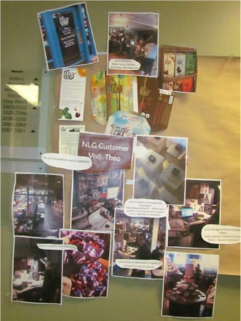
FIGURE 5-2 “We had customers take pictures of their home environment and then mounted the shots in a hallway, along with verbatim quotes and key insights. We called this hallway ‘Customer Avenue.’”—Bernard Kohlmeier, Principal Group Program Manager, Microsoft Natural Language Group.
![]() Tip
Tip
You can build an effective museum when you work with teams in different locations in a couple of ways. One is to appoint a person in the other location to build a mirror-image museum. Keeping it organized the same way is not important. In fact, it may be beneficial to let different sortings emerge, which may reveal additional patterns. Just be sure that as new data becomes available, it makes it onto the wall in both sites. If you can’t build a mirror museum, build an electronic variant that can be displayed in every office or even as a screen saver on team members’ desktops. Do keep in mind that screen size will severely limit how much data you can see at the same time, which makes it harder to see patterns. For this activity, good old paper, sticky notes, and walls really are a better modality.
Affinity diagrams
Best for: Finding patterns and insights within a large volume of qualitative data.
Our favorite technique for synthesizing qualitative data is affinity diagraming. We’ve found this to be a particularly effective and easy-to-use approach for discovering the patterns, themes, and stories buried inside mountains of qualitative data. The basic strategy is to group similar ideas together—to affinitize them. The resulting quantity, size, and contents of those affinity groups help you identify patterns or themes that run through your data set. Analyzing those patterns often leads to insights. We’ll cover the details on how to go about creating an affinity diagram later in this chapter, in the section “Deep dive: Creating an affinity diagram.”
![]() Vocab
Vocab
An affinity diagram is a visual collage of your data in which similar ideas are grouped together to make it easier to see patterns and trends in your data set. To affinitize is to group similar ideas together.
Case studies
Best for: Illustrating typical customer behavior or lessons to be learned from real world, factual stories.
A case study is a way to tell a meaningful story by using qualitative (and sometimes quantitative) data that has been collected through a variety of means. In the case study, you might use data gathered from interviews, observations, and surveys along with historical data, and you might also gather artifacts from the team that show specific tools or templates the members use. Typically, a case study focuses on a specific group (a team, company, and so on) and uses a lot of illustrative data to explain a situation that is representative of a larger class of people or groups. Case studies are particularly useful when your target customers are interrelated and exploring those relationships is more meaningful than looking at each customer individually.
Most often, a case study is written as a formal report that may range in length from a few pages to a hundred pages. For this reason, case studies can be expensive to produce. However, even a short written case study can be extremely valuable. Optionally, you can build a lighter-weight case study by building a museum, as described earlier, or as a series of PowerPoint slides.
Case studies can effectively communicate qualitative observations in a way that will help the team develop empathy for customers. Reading about an instance in detail can be easier to understand and relate to than is a set of more impersonal averages and patterns from the larger class of examples. The storytelling nature of case studies also makes them a good tool to help the team develop empathy. If you can, create several short case studies to begin to see the diversity of behavior, as well as the commonalities, behind the definition of a particular customer segment.
Personas and customer profiles
Best for: Communicating the most essential aspects of a target customer; aligning the team and partners on a target customer.
You can also write a case study about a single person, usually a target customer. Two different but related techniques are often used: personas and customer profiles. These can be a great way to communicate information about your customer to the entire team.
![]() Vocab
Vocab
A persona is a fictional character that generalizes the behavior, attitudes, and beliefs of a target customer, drawing from research across several people in that target group. A customer profile (or user profile) is a report about an actual, real-life person who has been studied as a good representative of a particular target segment. The profile contains information about the behavior, attitudes, and beliefs of that specific individual.
Both personas and customer profiles seek to describe the most important qualities to know about a target customer. Common elements that you might see include these:
![]() A photo of the customer This can be a formal headshot or a casual snapshot of the customer in the context of doing a relevant task, but either way it makes the customer feel real and human.
A photo of the customer This can be a formal headshot or a casual snapshot of the customer in the context of doing a relevant task, but either way it makes the customer feel real and human.
![]() A day in the life Writing out a blow-by-blow description or a narrative story about a typical day in the life of a customer is essential to build empathy and will help team members tune in to the environment, task, and attitudinal factors that may be different from their own.
A day in the life Writing out a blow-by-blow description or a narrative story about a typical day in the life of a customer is essential to build empathy and will help team members tune in to the environment, task, and attitudinal factors that may be different from their own.
![]() Bullet lists of key characteristics or insights Summarize key needs, desires, attitudes, and insights in a few bullet points.
Bullet lists of key characteristics or insights Summarize key needs, desires, attitudes, and insights in a few bullet points.
![]() Tip
Tip
Include true stories with your insights. Without contextual information that humanizes the customer, a short list of insights may not make sense to team members if the customer’s needs are very different from their own personal experience. Don’t forget to include photos and true anecdotes about the customer’s usage situations or needs if you want to build empathy. The trifecta of photo + stories + insights makes the customer easier to remember and is especially important when the target customer is very different from the members of the team.
Both personas and customer profiles are useful in a team setting to help ensure that every member of the team has a clear understanding of your customers’ needs and to build team-wide empathy for your customers. Generally, a team would pick one technique or the other. A customer profile is a better choice when you have gone deep with a representative customer who matches your target extremely well, has a vivid story to tell, and is willing to share it with the team. However, this person may not be willing to be the poster child for your team. If you go the route of a customer profile, it is important for the research subject to agree to share his or her name, photo, and other details with your team. Be sure that you get explicit, formal permission from the customer you’d like to profile.
Personas are a bit more common because they allow you to combine learnings from multiple customers to build up a profile and are a bit more anonymous by nature. However, there are a few gotchas about writing personas, and these have caused the technique to catch a bit of flak in certain circles. When creating a persona that illustrates information about your target customer, it’s vitally important that the information you convey is real and is backed up by data you have collected. And while it’s usually a good idea to have some information about your persona that places him or her in a human context (with opinions, hobbies, passions, family, and the like), don’t go overboard; keep those details grounded in what you observed during research. Make sure that the information you communicate about the persona is relevant to the task at hand—align the team around your target customer without getting confused about unnecessary distractions.
![]() Tip
Tip
One common mistake is to create what we refer to as a “franken-persona.” A franken-persona is based on real data from a set of real people, but that data is mistakenly from different customer demographics. These divergent details are then blended into a single persona description. The problem is that by doing this, you create something completely fictitious. No human on the planet represents all of those qualities. A better idea is to create a few separate personas that each represent a different customer segment. Or better yet, don’t be so wishy-washy and just focus on one of them.
Remember the story earlier in the chapter about the test team members who discovered that their customers’ approach to testing code was different from their own? Here’s the next installment . . .
SFE in action: Ellen, the vigilant tester (continued)
Steven Clarke, Principal UX Researcher, Microsoft Visual Studio
Through qualitative observation, the team learned that the customer’s behavior was quite different from its own. But we needed a way to create a deep sense of empathy for the customer throughout the entire team, and we needed that transformation to occur quickly. To help achieve this goal, the team created a persona to represent the work style of the customers the team had observed. To make that person feel more real, the persona was given a name—Ellen—a background, a life story, and so on. We created a poster and hung it throughout the building.
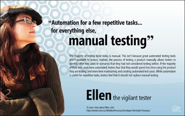
While there was initial skepticism on the team that Ellen existed, the management team used the persona to drive a shift in the organization’s mindset. The team held the general perception that it knew how to do things better than our customers, and therefore the customers should adapt to how our product works. Of course, we had to get to a place where we could abandon that type of thinking.
Team members were sent to conferences aimed at generalist testers so that they could spend time with real customers. I remember one great moment when we received a trip report from someone who said, “I met Ellen 150 times today!” The team began to believe in Ellen, and team members started to include real-life, external testers in their feedback loop. The team’s mindset toward customers shifted to, “If we had ideas and we didn’t know how to solve a particular problem, we’d ask them [the customers] what they think and which option we should pursue.”
The persona helped to humanize the design process. It had a huge impact on customer empathy throughout the team and motivated members to drive change for the user. Instead of focusing on what the team considered cool, the team was able to focus on what its actual customer considered cool.
User-journey mapping
Best for: Identifying the major steps in a lengthy end-to-end experience.
Another approach to synthesizing and communicating customer data is to create a user-journey map that plots out the sequence of activities that happens across an end-to-end job that the customer is trying to do. You do this by analyzing the data you collected to identify the major stages in a customer’s experience. This technique is excellent for analyzing existing experiences and helps you identify the biggest pain points, highlight possible causes of problems, and identify ways to optimize the overall experience. You might create a user journey for an existing experience that your company offers, to analyze a competitor’s experience, or to map out your learnings from studying a more generic experience, such as the steps involved in going on a train trip. The Amtrak Acela case study mentioned in Chapter 2, used the user-journey technique to describe the 10 stages that a customer goes through when using train travel, from buying a ticket, to entering the station, to checking luggage, to boarding the train, and so on.
The purpose behind constructing a user journey is to show the steps of a customer’s experience as a series of multiple stages. This lets you characterize the situation and problems at each stage separately yet also see how these stages thread together into a larger experience. Usually a journey map is linear and consists of 5 to 10 stages, but it may also have a few small decision points that create forks in the flow of the experience. Each stage may have different principal actors, locations, or problems to be solved. The key value of a user journey is to be able to stand back and see how all the individual factors in each of the individual stages connect to form the customer’s end-to-end experience.
Kerry Bodine and Harley Manning’s book Outside In details a variant of the user-journey technique that they developed at Forrester Research to help organizations identify the source of customer experience problems in an existing process or service experience.10 They recommend making a variant of a user journey that graphically details each individual step of a process—both the steps that are visible to the customer and the steps in the internal processes that are invisible to customers. They mark each step in either green, yellow, or red to show how well that particular step is currently being delivered. After using this technique with many companies, the remarkable insight they report is that poor end-to-end customer experiences commonly become visible only near the end of the process, when customers complain about an incorrect bill or they arrive at a train that wasn’t expecting them. But when they trace the root cause, the actual problem was caused many steps earlier in the process, often deep in the internal business of the company and, ironically, from internal processes that were believed to be working well and were rated “green.” From the inside view, everything looks good, but the customer experience from the external perspective may have significant problems. This is yet another reminder of how important it is to look across the end-to-end customer experience, including at the infrastructure and back-end processes and components that enable it, and not look only at the individual pieces one at a time.
Synthesizing quantitative data
Synthesizing quantitative data requires different approaches from when you are working with qualitative data. Working with QUANT usually requires manipulation and then visualization of the data using tools such as spreadsheets, databases, and specialized programming languages. These tools focus on querying, slicing, dicing, and pivoting the data in many different ways and then using the results of those queries to identify patterns or anomalies.
Sorting, analyzing, and visualizing quantitative data is obviously a very broad and deep topic and is beyond the scope of this book. It is also an active area of continual innovation with the advent of big data. The new breed of data scientists is developing methods for sophisticated quantitative analysis on very large and often unstructured data sets. However, whether your quantitative data comes in the form of big data or in more modest data sets, visualizing the data in some sort of graph, chart, or other graphical form is one of the best ways for human brains to make sense of it. Still, the most important thing to remember is that no matter how much quantitative data you have, you should always balance it with observational, qualitative research. Perhaps the new generation of data science methods will unearth more sophisticated patterns and connections than ever before, but it will be a long while before statistical analyses figure out the deep human reasons behind why people do the things they do. Be sure you use QUANT for what it’s good for, and keep it in balance with QUAL.
Deep dive: Creating an affinity diagram
Over the years we have gotten a lot of mileage out of creating affinity diagrams. It is a particularly approachable and straightforward technique that can yield some great benefits both in identifying patterns and insights and in helping a group of people wallow in data, build empathy, and develop a shared understanding about their needs. Creating an affinity diagram is a technique that helps you discern patterns and insights from a large set of qualitative data by physically sorting all of the data into groups, where each group is alike, or affinitized. Usually, affinity diagramming is a group activity.
It’s important to understand that gaining insights by using an affinity diagram is a dynamic process. The full implications and meaning of the data may not be immediately apparent, even after you have created the affinity diagram. You will discover that with affinity diagramming, the meaning tends to emerge over a period of time. Perhaps you can think of the affinitized data as a primordial soup from which life will eventually emerge. Remember to be open to the idea that new insights may emerge from this activity, not just the ideas and insights that you’ve already been thinking about.
Preparation
First, there’s a bit of prep work to do. However you collected the data, it needs to be printed on paper, with each individual quote, each separate thought, action, or behavior observed represented on a separate piece of paper. Do not attempt to summarize any of the data while doing this. If you come across the same idea in your notes multiple times, that’s okay. Print each item on a separate piece of paper. One practical step is to simply print your observation notes. Then take some scissors and start cutting—per paragraph, per sentence, whatever makes sense—to end up with one idea on each piece of paper.
![]() Tip
Tip
When you observe customers, take notes so that each idea ends up on a separate sticky note. This practice makes affinity diagramming as simple as possible later on.
As we walk through the steps in affinity diagramming, we’ll show examples that use data from a recent study we did of hikers on a trail in Washington State’s Cascade Mountains. Figure 5-3 shows what our unsorted pile of data looked like.
FIGURE 5-3 Unsorted notes taken while we observed and interviewed hikers on the trail.
Next, you need to set up a room in such a way that a handful of people can sort through that pile of paper. You need a table large enough to spread out the printed notes, and you need a whiteboard or, better, a large swath of butcher paper where you eventually tape up groups of notes. You also need a bunch of sticky notes, a lot of tape, and some Sharpie pens. A basic conference room should suffice for space.
Step 1: Initial sorting
You are now ready to begin sorting through the data. Have everyone on the team pick up and read through individual notes. It doesn’t matter where you start, just grab a few and get going. Soon, you’ll begin to find notes that seem like they belong together. When that happens, shout out to the group “Hey, I’m starting a pile here that’s kind of centered around people being too busy.” Put those notes into a pile, labeling it with a sticky note that says “I’m too busy.” Others will do the same, and in very short order you’ll have a set of piles that represent an initial sorting taxonomy.
![]() Tip
Tip
Do this initial affinity sort quickly. Don’t stress about the categories or worry about not getting it right. It will work out, and you will have time later to adjust and re-sort. The first step is just an initial grouping. Most affinities will shift categories substantially after the initial sort.
After the initial sort, you will probably have a small pile of leftover notes that are oddballs and defy categorization. Just set those aside for now; you’ll come back to them later. It’s common and expected during this sorting routine that people discuss (or perhaps even argue a little) about the meaning of a particular pile and whether certain notes fit in. “This pile is about people being too busy, it’s not about the number of tasks they have to do . . . that’s an entirely different thought . . . make a different pile!” Raucous engagement from all corners of the room is a sign that the process is going well.
![]() Mindshift
Mindshift
Let the data guide the categories. An important word of caution is needed here. Affinity groupings often fail when people enter into them with a set of categories already in mind and then try to assign the data into the categories. It’s okay and desirable to start having an opinion about how the different notes should be grouped. But the tendency will be to do this backward—to quickly come up with a handful of categories and then go through the data and assign each note to the closest-fitting category. This will not generate the results you want. Instead, you want the data itself to suggest the categories. Be open. Start some categories, and be open to changing them or breaking them up. Do not let the categories rule; let the data tell you what to do. This can take a little bit of time, and it can take a few passes. From personal experience, we know that it is particularly difficult to let go of your conclusions when you have deep domain knowledge of the customers you’re observing. If you are feeling uncomfortable at this point or feel that you aren’t doing it right, you’re probably on the right track.
![]() Tip
Tip
Invite at least one person who has little to no domain knowledge into your affinitizing session. This person’s view of the data may be much clearer and more objective than yours. Listen and don’t worry; your domain knowledge, ideas, and the connections that occur during the affinity will be invaluable later when you try to make connections and discern the deeper meaning of the data.
Step 2: Summaries
The next step is to go back to each pile and look in more detail at which ideas ended up in them. Read through each item in the pile and attempt to summarize the essence, main thought, or theme of each pile on a single sticky note. You’re aiming for a sentence or two at the most—less than a paragraph and more than just a couple of words. As you do this, you will surely find notes that are lost and that do not belong in the pile they’re in after all. Move those notes to where they belong and adjust piles as needed.
Figure 5-3 shows an unsorted pile of qualitative data collected while observing and interviewing hikers on a trail outside Seattle. Here’s a closer look at some of that data after the first round of sorting:
Did you notice that one of the summaries (“We rely on experts . . . ”) is starting to look something like an insight? None of the hikers actually said, “Hey, I need a leader to feel safe” or “Yeah, we always rely on the expert to guide us.” However, many of them indicated that in their hiking group, one person was indeed identified as the leader and expert who they all trusted to pick the trail, navigate to the summit, and make sure the group was prepared. That idea of “we rely on experts” is completely unarticulated, yet it shows up in a lot of the data.
![]() Tip
Tip
As you sort through the data, if you have aha moments where you discover a potential unarticulated need or make a connection between several seemingly disjointed groups of data, mention it to the group. Jot the idea down on a sticky note, preferably in a contrasting color, and stick it to your diagram for deeper discussion later.
Now take a look at the first column—“Gear/10 Essentials.” All of the data sorted under that category relates in some way to what gear the hikers carried with them. Is this pile of data meaningful as it is? Probably not. The category “gear” doesn’t tell you anything particularly insightful, but maybe something deeper is lurking in that list of what people were carrying in their packs that day. This category would be a great candidate to break up in the next round of sorting to see whether a deeper meaning exists beneath the specific data.
Step 3: Read out and re-sort
Once the first sort is done and each pile has a short summary, have each “summary author” read out loud what he or she wrote about the pile. Have each of them also read a few of the most relevant notes that led them to the meaning of the pile. Allow some time for team members to comment on what they hear and discuss ways that it might be related to other piles. Do this one pile at a time until you’ve covered all of them. This step helps the whole room become familiar with the total data set and will help people start making connections between ideas. At this point, some of those oddballs you set aside earlier may start to find a home.
As you continue the readout discussion, you might need to refine the statement of the pile’s meaning. If necessary, modify or rewrite that statement. You might even create a new category for some of the notes that didn’t quite fit in a group. With some group discussion, you will begin to have new clarity and precision around the meaning behind those notes. It’s even more exciting when you discover through discussion that a deeper, underlying theme is running through several categories. You may choose to re-sort and relabel the piles based on this realization, or you may simply note a cross-category insight or meta-theme. You may also discover that two piles are really referring to the same thing, so you might merge them. Or the inverse might happen, so that you split a pile if you realize that it represents two distinct ideas.
![]() Tip
Tip
At this point, summaries for each column should reflect an attitude or behavior of the customer. For example, “I can . . . ,” “We try to . . . ,” “We believe that . . . ,” and “How does . . . ” are all beginnings of descriptive statements. If you have a summary column that simply lists related facts, such as “Demographics,” “Equipment used,” or “Experience level,” you need to do more work to find the meaning behind those factual lists. You may end up removing the list entirely and moving each entry to a different pile, or you may merge several related lists that share a meta-theme.
In the example, something needs to be done with the “Gear” pile from the first sort. Currently, it’s just a list of related facts indicating what each hiker carried that day. Can you go one by one and move each of the stickies under “Gear” to find a new home? Or can you find a “why” behind the list of gear? For example, why is it that the hikers are carrying so few of the 10 essentials?11 When we looked across the data, we noticed that while most of the hikers carried a minimal amount of gear, they did so intentionally. Check out the “I did research ahead of time” grouping. Other data also indicates the hikers’ intention about the location, length, and difficulty of the trail they chose. In the GPS list (which is another fact-based list that needs to be reassigned), one hiker said, “I carry a GPS if it’s more than a short day hike.” Once we realized this connection, we combined the data in the “Gear,” “GPS,” and “I did research columns” and created a new heading that reads “I made a conscious decision about gear, safety, and route.”
![]() Tip
Tip
The only hard and fast rule for affinity diagramming is that you have to have at least three notes in a pile or grouping. Usually, the greatest value of an affinity sorting is finding the bigger themes that run through your data set. As such, it’s usually counterproductive to make your piles too small, separating out each nuance of an idea into a separate grouping. This can make the larger themes harder to pick out. If it is essential to create microcategories, be sure to keep similar categories near each other so that you can see their common thread more readily.
Step 4: Tape it up
Once you are satisfied with the groupings, tape all the notes onto the butcher paper. Spread out each pile so that you can read the text on each note, and affix the summary sticky note on top. A good format for spreading out the piles is in long vertical lines, overlapping each square of paper so that the words are visible but without showing any additional white space. Lay out a category in a line on a tabletop. Then take a piece of tape and run it down the length of the category line top to bottom. Hang the whole category up as a unit. Particularly large categories can be laid out as several long lines next to each other. Figure 5-4 shows what the final affinity looks like.
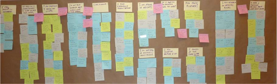
FIGURE 5-4 The final affinity diagram. Note the summaries in bold at the top of each column and some meta-themes (shown on a sticky note with a contrasting color) alongside several of the columns.
Step 5: Look for insights
At this point, you’ve probably already begun to identify some insights. In the hiker example, we’ve identified “I made a conscious decision” and “I rely on an expert” as insights. Now that you have the data spread out on the butcher paper, chances are you will continue seeing connections and themes among items. You might even rehang certain categories if you need to. However, the job for now is to look for unarticulated needs and especially insights that explain the WHY behind what you’re hearing from customers. Look at each category and ask yourself, “What is the root cause from the customer’s perspective that is motivating that category?” This is the time to refer back to any notes you made while sorting. Point out and discuss any thoughts, hidden connections, or big-T truths that might be underlying the categories you identified. Remember that you may not be sure about an insight at this stage in the Fast Feedback Cycle, so think of your insights more as hypotheses to consider and discuss. As you uncover potential insights, be sure to write them down and stick them to your affinity diagram as well. A sticky note of a contrasting color works well for these so that it’s easy to scan the diagram to see them.
Here are the kind of insights you might glean from an affinity diagram:
![]() Some of the category summaries themselves may point to unarticulated needs or even an insight if your customers are particularly articulate. No single customer may have captured it fully, but once you see a whole bunch of customers talking about the same thing from multiple perspectives, the underlying need or desire becomes easier to identify and articulate.
Some of the category summaries themselves may point to unarticulated needs or even an insight if your customers are particularly articulate. No single customer may have captured it fully, but once you see a whole bunch of customers talking about the same thing from multiple perspectives, the underlying need or desire becomes easier to identify and articulate.
![]() The relative size of each category may give an indication of relative need or priority with respect to other categories on the diagram. (Although be careful—depending on the questions you asked that spurred this data in the original research, some topics may be overrepresented in your diagram simply because you asked about them explicitly, whereas other topics were volunteered with a prompt.)
The relative size of each category may give an indication of relative need or priority with respect to other categories on the diagram. (Although be careful—depending on the questions you asked that spurred this data in the original research, some topics may be overrepresented in your diagram simply because you asked about them explicitly, whereas other topics were volunteered with a prompt.)
![]() You will likely notice themes that run across multiple categories, possibly pointing to deeper, more meta-level customer needs, trends, or insights.
You will likely notice themes that run across multiple categories, possibly pointing to deeper, more meta-level customer needs, trends, or insights.
![]() The lack of mention of certain topics might be interesting. Ask yourself what themes and categories you expected to see. If these aren’t represented, maybe they aren’t actually as important as you thought. Or maybe something about how you did the research kept a topic from coming up, which might inform a future round of research.
The lack of mention of certain topics might be interesting. Ask yourself what themes and categories you expected to see. If these aren’t represented, maybe they aren’t actually as important as you thought. Or maybe something about how you did the research kept a topic from coming up, which might inform a future round of research.
Affinity diagramming is a participatory technique. It is best done in groups of people who represent different points of view. Creating an affinity diagram is a great way to combine the perspectives of the participants and to get alignment about what problems are the most important ones to solve. This type of data sorting is a democratic analysis method—it is not about having an anointed few look at the data and decide what is valuable and what is not. There is no one right answer—any sufficiently interesting data set is complex enough to be able to be sorted in many different ways, but the same major insights should be visible whether they show up as explicit groupings or as meta-themes across groupings. By enlisting more brains, with different points of view, to digest and offer opinions on this data, you gain the ability to create a multidimensional view of the data. And having a multidimensional view is the best way to seek out the deepest insights from the data and to find the critical connections that are just out of sight.
Observe stage: How do you know when you are done?
Regardless of which techniques you used to research your customers, you know you’re ready for the next stage when you have generated the following:
![]() A collection of fact-based customer data that helps the team develop empathy for the real-world lives of its target customers. Ideally, the customer data you collect contains a mix of QUANT, QUAL, SAY, and DO data.
A collection of fact-based customer data that helps the team develop empathy for the real-world lives of its target customers. Ideally, the customer data you collect contains a mix of QUANT, QUAL, SAY, and DO data.
![]() A few promising insights about your customers that explain why they want and need the things they do.
A few promising insights about your customers that explain why they want and need the things they do.
![]() Insights and data about the target customers is published and readily accessible to the entire team, either online or in a physical format such as a customer museum.
Insights and data about the target customers is published and readily accessible to the entire team, either online or in a physical format such as a customer museum.
The big idea in this stage is empathy. If you have empathy for your customers and can begin to see from their eyes and hear with their ears, you will pick the right problems to solve for them and make better decisions. Empathy is perhaps the hardest thing for an engineering team to learn, but it is extremely powerful, and it’s worth taking the time to get the hang of it.
![]() Mindshift
Mindshift
Don’t overdo it. There’s one final piece of advice that applies to all the stages of the Fast Feedback Cycle but is particularly relevant to this first stage, especially early on in a new project. Don’t get stuck in analysis paralysis. Your goal is to turn the cycle as fast as possible, not to execute each stage to perfection. Trust in the feedback loop that underlies the Fast Feedback Cycle. If you have gained some customer understanding and empathy and have a hypothesis (otherwise known as a good evidence-based hunch) about some proposed insights, then it is time to move on.
You don’t have to be sure about your insights. Remember that you discovered them using abductive reasoning, which means you think they are probably true but can’t yet be sure. That is perfectly okay. Rely on the Fast Feedback Cycle to quickly let you know if you are on the right track. Similarly, you won’t have perfect customer empathy right away either. Like in a new relationship, you have much to learn about each other and you can’t rush it. Get a good foundation going, share it broadly, and be ready to continue layering in more information and sharing it as you iterate and learn more about what really makes your customer tick.
All materials on the site are licensed Creative Commons Attribution-Sharealike 3.0 Unported CC BY-SA 3.0 & GNU Free Documentation License (GFDL)
If you are the copyright holder of any material contained on our site and intend to remove it, please contact our site administrator for approval.
© 2016-2026 All site design rights belong to S.Y.A.