WordPress Responsive Theme Design (2015)
Chapter 1. Responsive Web Design with WordPress
Responsive web design (RWD) is a web design approach aimed at crafting sites to provide an optimal viewing experience—easy reading and navigation with a minimum of resizing, panning, and scrolling—across a wide range of devices (from mobile phones to desktop computer monitors).
Reference: http://en.wikipedia.org/wiki/Responsive_web_design.
To say it simply, responsive web design (RWD) means that the responsive website should adapt to the screen size of the device it is being viewed on.
When I began my web development journey in 2002, we didn't have to consider as many factors as we do today.
We just had to create the website for a 17-inch screen (which was the standard at that time), and that was it. Yes, we also had to consider 15, 19, and 21-inch monitors, but since the 17-inch screen was the standard, that was the target screen size for us. In pixels, these sizes were usually 800 or 1024. We also had to consider a fewer number of browsers (Internet Explorer, Netscape, and Opera) and the styling for the print, and that was it.
Since then, a lot of things have changed, and today, in 2015, for a website design, we have to consider multiple factors, such as:
· A lot of different web browsers (Internet Explorer , Firefox, Opera, Chrome, and Safari)
· A number of different operating systems (Windows (XP, 7, and 8), Mac OS X, Linux, Unix, iOS, Android, and Windows phones)
· Device screen sizes (desktop, mobile, and tablet)
· Is content accessible and readable with screen readers?
· How the content will look like when it's printed
Tip
Throughout the book, we will use the RWD abbreviation for responsive web design, the IE abbreviation for Internet Explorer, and the FF abbreviation for Firefox browsers.
Today, creating different design for all these listed factors and devices would take years. This is where a responsive web design comes to the rescue.
In this chapter, we will cover:
· The concepts of RWD
· Techniques in RWD
· Setting up the WordPress environment
The concepts of RWD
I have to point out that the mobile environment is becoming more important factor than the desktop environment. Mobile browsing is becoming bigger than the desktop-based access, which makes the mobile environment very important factor to consider when developing a website. Simply put, the main point of RWD is that the layout changes based on the size and capabilities of the device its being viewed on. The concepts of RWD, that we will learn next, are: Viewport, scaling and screen density.
Controlling Viewport
On the desktop, Viewport is the screen size of the window in a browser. For example, when we resize the browser window, we are actually changing the Viewport size.
On mobile devices, the Viewport size is also independent of the device screen size. For example, Viewport is 850 px for mobile Opera and 980 px for mobile Safari, and the screen size for iPhone is 320 px.
If we compare the Viewport size of 980 px and the screen size of an iPhone of 320px, we can see that Viewport is bigger than the screen size. This is because mobile browsers function differently. They first load the page into Viewport, and then they resize it to the device's screen size. This is why we are able to see the whole page on the mobile device.
If the mobile browsers had Viewport the same as the screen size (320 px), we would be able to see only a part of the page on the mobile device.
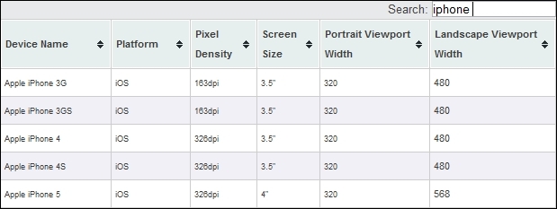
In the following screenshot, we can see the table with the list of Viewport sizes for some iPhone models:
We can control Viewport with CSS:
@viewport {width: device-width;}
Or, we can control it with the meta tag:
<meta name="viewport" content="width=device-width">
In the preceding code, we are matching the Viewport width with the device width.
Because the Viewport meta tag approach is more widely adopted, as it was first used on iOS and the @viewport approach was not supported by some browsers in this book, we will use the meta tag approach.
We are setting the Viewport width in order to match our web content with our mobile content, as we want to make sure that our web content looks good on a mobile device as well.
Tip
We can set Viewports in the code for each device separately, for example, 320 px for the iPhone. The better approach will be to use content="width=device-width".
Scaling
Scaling is extremely important, as the initial scale controls the zoom aspect of the content for the initial look of the page. For example, if the initial scale is set to 3, the content will be loaded in the size of 3 times of the Viewport size, which means 3 times zoom. Here is the look of the screenshot for initial scale=1 and initial scale=3:
As we can see from the preceding screenshots, on the initial scale 3 (three times zoom), the logo image takes the bigger part of the screen.
It is important to note that this is just the initial scale, which means that the user can zoom in and zoom out later, if they want to.
Here is the example of the code with the initial scale:
<meta name="viewport" content="width=device-width, initial-scale=1, maximum-scale=1">
In this example, we have used the maximum-scale=1 option, which means that the user will not be able to use the zoom here. We should avoid using the maximum-scale property because of accessibility issues. If we forbid zooming on our pages, users with visual problems will not be able to see the content properly.
The screen density
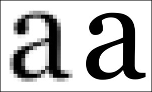
As the screen technology is going forward every year or even faster than that, we have to consider the screen density aspect as well. Screen density is the number of pixels that are contained within a screen area. This means that if the screen density is higher, we can have more details, in this case, pixels in the same area.
There are two measurements that are usually used for this, dots per inch (DPI) and pixels per inch (PPI). DPI means how many drops a printer can place in an inch of a space. PPI is the number of pixels we can have in one inch of the screen. If we go back to the preceding screenshot with the table where we are showing Viewports and densities and compare the values of iPhone 3G and iPhone 4S, we will see that the screen size stayed the same at 3.5 inch, Viewport stayed the same at 320 px, but the screen density has doubled, from 163 dpi to 326 dpi , which means that the screen resolution also has doubled from 320*480 to 640*960. The screen density is very relevant to RWD, as newer devices have bigger densities and we should do our best to cover as many densities as we can in order to provide a better experience for end users.
Pixels' density matters more than the resolution or screen size, because more pixels is equal to sharper display.
There are topics that need to be taken into consideration, such as hardware, reference pixels, and the device-pixel-ratio, which we will not cover here, as it's out of the scope of this book.
Problems and solutions with the screen density
Scalable vector graphics and CSS graphics will scale to the resolution.
This is why we will use Font Awesome icons in our project. Font Awesome icons are available for download at http://fortawesome.github.io/Font-Awesome/icons/.
Font Icons is a font that is made up of symbols, icons, or pictograms (whatever you prefer to call them) that you can use in a webpage just like a font. They can be instantly customized—size, drop, shadow, or anything you want can be done with the power of CSS.
The real problem triggered by the change in the screen density is images, as for high-density screens, we should provide higher resolution images.
There are several ways through which we can approach this problem:
· By targeting high-density screens (providing high-resolution images to all screens)
· By providing high-resolution images where appropriate (loading high-resolution images only on devices with high-resolution screens)
· By not using high-resolution images
As this book covers only the essentials, we will use the second approach, providing high-resolution images where appropriate.
Techniques in RWD
RWD consists of three coding techniques:
· Media queries (adapt content to specific screen sizes)
· Fluid grids (for flexible layouts)
· Flexible images and media (that respond to changes to screen sizes)
More detailed information about RWD techniques by Ethan Marcote, who is the person who coined the term Reponsive Web Design, is available at http://alistapart.com/article/responsive-web-design.
Media queries
Media queries are CSS modules, or as some people like to say, just a conditional statement, which tells the browsers to use a specific type of style, depending on the size of the screen and other factors, such as print (specific styles for print). They are here for a long time already, as I was using different styles for print in 2002.
Note
If you wish to know more about media queries, refer to W3C Candidate Recommendation 8 July 2002 at http://www.w3.org/TR/2002/CR-css3-mediaqueries-20020708/.
Here is an example of media query declaration:
@media only screen and (min-width:500px) {
font-family: sans-serif;
}
Let's explain the preceding code.
The "@media" code means that it is a media type declaration.
The "screen and" part of the query is an expression or condition (in this case, it means only screen and no print).
The following conditional statement means that everything above 500 px will have the font family of sans serif:
(min-width:500px) {
font-family: sans-serif;
}
Here is another example of a media query declaration:
@media only screen and (min-width: 500px), screen and (orientation: portrait) {
font-family: sans-serif;
}
In this case, if we have two statements and if one of the statements is true, the entire declaration is applied (either everything above 500 px or the portrait orientation will be applied to the screen)
Note
The only keyword hides the styles from older browsers.
As some older browsers don't support media queries, we will use a respond.js script, which will "patch" support for them.
Polyfill (or polyfiller) is code that provides features that are not built or supported by some web browsers. For example, a number of HTML5 features are not supported by older versions of IE (older than 8 or 9), but these features can be used if polyfill is installed on the web page. This means that if the developer wants to use these features, he/she can just include that polyfill library and these features will work in older browsers.
Breakpoints
Breakpoint is a moment when layout switches, from one layout to another, when some condition is fulfilled, for example, the screen has been resized. Almost all responsive designs cover the changes of the screen between the desktop, tablets, and smart phones.
Here is an example with comments inside:
@media only screen and (max-width: 480px) {
//mobile styles
// up to 480px size
}
Media query in the preceding code will only be used if the width of the screen is 480 px or less.
@media only screen and (min-width:481px) and (max-width: 768px) {
//tablet styles
//between 481 and 768px
}
Media query in the preceding code will only be used the width of the screen is between the 481 px and 768 px.
@media only screen and (min-width:769px) {
//desktop styles
//from 769px and up
}
Media query in the preceding code will only be used when the width of the screen is 769 px and more.
Note
The minimum width value in desktop styles is 1 pixel over the maximum width value in tablet styles, and the same difference is there between values from tablet and mobile styles. We are doing this in order to avoid overlapping, as that could cause problem with our styles.
There is also an approach to set the maximum width and minimum width with em values. Setting em of the screen for maximum will mean that the width of the screen is set relative to the device's font size. If the font size for the device is 16 px (which is the usual size), the maximum width for mobile styles would be 480/16=30. Why do we use em values? With pixel sizes, everything is fixed; for example, h1 is 19 px (or 1.5 em of the default size of 16 px), and that's it. With em sizes, everything is relative, so if we change the default value in the browser from, for example, 16 px to 18 px, everything relative to that will change.
Therefore, all h1 values will change from 19 px to 22 px and make our layout "zoomable". Here is the example with sizes changed to em:
@media only screen and (max-width: 30em) {
//mobile styles
// up to 480px size
}
@media only screen and (min-width:30em) and (max-width: 48em) {
//tablet styles
//between 481 and 768px
}
@media only screen and (min-width:48em) {
//desktop styles
//from 769px and up
}
Fluid grids
The major point in RWD is that the content should adapt to any screen it's viewed on. One of the best solutions to do this is to use fluid layouts where our content can be resized on each breakpoint.
In fluid grids, we define a maximum layout size for the design. The grid is divided into a specific number of columns to keep the layout clean and easy to handle. Then we design each element with proportional widths and heights instead of pixel based dimensions. So whenever the device or screen size is changed, elements will adjust their widths and heights by the specified proportions to its parent container.
Reference: http://www.1stwebdesigner.com/tutorials/fluid-grids-in-responsive-design/.
To make the grid flexible (or elastic), we can use the % points, or we can use the em values, whichever suits us better. We can make our own fluid grids, or we can use grid frameworks. As there are so many frameworks available, I would recommend that you use the existing framework rather than building your own.
Grid frameworks could use a single grid that covers various screen sizes, or we can have multiple grids for each of the break points or screen size categories, such as mobiles, tablets, and desktops.
Frameworks positives
The key positive features of frameworks are:
· Faster prototyping: Our clients can see and approve our prototypes faster.
· Faster development: The cost borne by the client is reduced. We can now complete more projects within the same time period.
Frameworks negatives
The key negative features of frameworks are:
· It takes some time to learn the framework rules
· They are usually class-based with non-semantic class names, which can clutter up our code
· They add extra container elements, which makes our HTML code bigger
· They are large in size and that increases the page loading time
Some of the notable frameworks are Twitter's Bootstrap, Foundation, and SemanticUI. I prefer Twitter's Bootstrap, as it really helps me speed up the process and it is the most used framework currently.
Flexible images and media
Last but not the least important, are images and media (videos). The problem with them is that they are elements that come with fixed sizes. There are several approaches to fix this:
· Replacing dimensions with percentage values
· Using maximum widths
· Using background images only for some cases, as these are not good for accessibility
· Using some libraries, such as Scott Jehl's picturefill
· Taking out the width and height parameters from the image tag and dealing with dimensions in CSS
We will tackle this quest in more detail in Chapter 7, Working with Images and Videos.
Setting up the WordPress environment
In order to achieve a responsive design for a WordPress site, you need a WordPress theme that employs the basic techniques of RWD.
In this section, we will cover:
· Installing and setting up WordPress
· Setting up underscores (the starter theme) and explaining why we use it
· Installing the WordPress theme's unit test data
· Installing the Developer plugin
Installing and setting up WordPress
Before we begin with any coding, we need to make sure that we set up our development environment. There are numerous ways we can do it, but my preference is to have:
· Local installation on the hard drive
· Automatic syncing to our server (this step is optional)
I perform autosyncing to my server because my local environment is Windows and my server environment is Linux (CentOS). Through many years of development, I've seen many times that local and server environment differences can cause a lot of headache, so I try to test the code on both while I am working.
In order to make your life easier, I would recommend that you download the PHP development environments. For Windows, there are three PHP development environments that I highly recommend:
· XAMPP (www.apachefriends.org/index.html)
· WAMP (www.wampserver.com/en/)
· Bitnami (www.bitnami.com/stack/wordpress)
These packages will install and configure Apache, Mysql, and PHP automatically for you. Only Bitnami will install WordPress for you as well. All of them are pretty good and the choice just depends on your preference. I use XAMPP as I am used to it.
For Mac OS X, I recommend:
· MAMP (www.mamp.info/en/)
· XAMPP (www.apachefriends.org/index.html)
· Bitnami (www.bitnami.com/stack/wordpress)
I was using MAMP on Mac OS X and had no issues. MAMP Pro is even better, as it provides more options to make our life easier, and it is well worth the investment. When these packages are installed, WordPress should be downloaded from http:/www.wordpress.org/download/. After it is downloaded, WordPress should be unpacked (unzipped) and placed in web server's public directory with the project name; in my case, on Windows with XAMPP installed, this is C:\xampp\htdocs\topcat.
Note
Our project, which we will use in this book as an example, is called topcat. Here is a great guide in how to install WordPress locally at http://codex.wordpress.org/Installing_WordPress.
After WordPress is installed, our _s or underscores starter theme should be downloaded and installed.
Setting up the underscores theme
Underscores (_s) is the starter theme for WordPress. It has been created by the people from Automattic (the company that stands behind WordPress) and numerous contributors. Why is this theme so good? It is good because it follows all the rules from WordPress.org, and it really makes our lives easier, as we don't have to start developing the theme from scratch. There are a number of starter themes that can be used for the projects, and I have closed this one as it's really popular and has a lot of features implemented (page templates, customizer, layouts, and languages) in order to make our lives easier.
If you are an inexperienced developer and you want to follow me from now on, I suggest that you go and download the same version of the theme as the one I downloaded from: https://github.com/dejanmarkovic/topcat_start. Make sure that the theme directory is named topcat and not topcat_start. If you want to start with the finished code, then please download this version from: https://github.com/dejanmarkovic/topcat. On the other hand, if you prefer to start with the latest _s version (at your own risk, as the code might change a lot further in this book), you can download it from https://github.com/Automattic/_s/, or from here http://underscores.me/.
Tip
The good thing about downloading the theme from the underscores website rather than from GitHub is that you can set a theme name there.
Now let's get started:
1. Put the theme in the themes directory. The theme location should look like this C:\xampp\htdocs\topcat\wp-content\themes\topcat (on Windows).
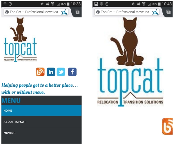
2. Activate the theme by clicking on the Activate button in wp-admin. Your screen should look like this:
Don't worry, we will soon be changing this flat-looking theme into a nice-looking responsive web design.
3. When installed, the theme's preview should look like this:
Installing the WordPress theme's unit test data
Unit test data fills the WordPress database with sample posts, pages and comments spanning across different post types, image sizes, tags, and categories. It makes our lives easier while developing the theme, as we don't have to add all that content ourselves and we are sure when we test the code of our theme with all that content loaded that we will be able to see if something breaks.
We can test the features of our theme by using the unit test data that is also used by the WordPress.org theme team when we submit our theme. It can be downloaded from: https://wpcom-themes.svn.automattic.com/demo/theme-unit-test-data.xml.
Note
More information about theme testing is available at http://codex.wordpress.org/Theme_Unit_Test and at http://codex.wordpress.org/Theme_Development#Theme_Testing_Process. If you have your own content that you want to use, you can use it. I certainly recommend that you use the WordPress theme's unit test data as it covers all the cases for themes, and the WordPress.org team uses it when they test your theme for approval.
Installing the Developer plugin
In the final step in this chapter, we have to install the Developer plugin. We can install it by going to plugin section of wp-admin and then by searching for that plugin at http://localhost/topcat/wp-admin/plugin-install.php. Here is the screenshot of how the exact result should look like:
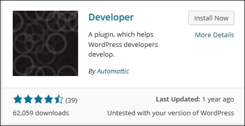
Note that the author of the plugin should be Automattic. Or, we can download the .zip file from https://wordpress.org/plugins/developer.
Now, perform the following steps:
1. During the installation, you will be prompted to choose between three options:
o The plugin for a self-hosted WordPress installation
o The theme for the self-hosted WordPress installation
o The theme for the WordPress.com VIP website
2. Please choose the second option.
3. Because the Developer plugin actually consists of many smaller plugins, we should install the ones that we need.
4. I am going to choose the following:
o Debug Bar (It provides a debug menu in the WordPress admin bar. In the debug menu, you can view query, cache, and other relevant debugging information).
o Debug Bar Console (It adds a PHP/MySQL console to the debug bar).
o Debug Bar Cron (It adds a new panel to Debug Bar that displays information about scheduled events within WordPress).
o Debug Bar Extender (It extends the debug bar with features such as variable lookup, profiler, and so on)
o Monster widget (It provides a quick and easy method to add all core widgets to a sidebar for testing purposes. This means that it will add all core widgets at one place so that we can easily see whether something had broke the layout.)
o Regenerate thumbnails (Each WordPress theme has its own image/thumbnail settings. So, if we switch from one theme to another, we should regenerate the thumbnails in order to make sure that thumbnails properties match the settings in the theme.
o Theme Check (It tests the theme against the latest standards and practices and provides the feedback.) We are going to use is in Chapter 10, Submitting Your Theme to WordPress.org, before we submit our theme to WordPress.org.
This is my choice of plugins within the developer pack that I use, and you are free to use others if you want. If you want to change any of the settings that you have already chosen, you can go to Tools | Developer in wp-admin and change them there.
Summary
In this chapter, we first covered RWD concepts such as Viewport scaling and the screen density. Secondly, we covered the RWD techniques: media queries, fluid grids, and flexible media. Finally, we spent some time setting up our WordPress environment by installing WordPress, underscores theme, WordPress theme's unit test data, and the Developer plugin.
In the next chapter, we will cover the WordPress theme architecture and the purpose of the most important template files.
All materials on the site are licensed Creative Commons Attribution-Sharealike 3.0 Unported CC BY-SA 3.0 & GNU Free Documentation License (GFDL)
If you are the copyright holder of any material contained on our site and intend to remove it, please contact our site administrator for approval.
© 2016-2026 All site design rights belong to S.Y.A.