WordPress Responsive Theme Design (2015)
Chapter 3. Getting Started with Responsive Layout
By now, you have familiarized yourself with the WordPress theme architecture, how to install and setup WordPress, as well as setup the WordPress environment.
Now, we are getting into more fun stuff.
In this chapter, we will get started with the responsive layout and we will cover the following in detail:
· Choosing the right tool for our project
· Setting up functions.php
· Setting up styles.css
· Setting fonts
· Setting font icons
· Adding essential scripts, such as modernizr.js and respond.js
· Adding media queries
Choosing the right tool for our project
Before we begin analyzing and editing the code, we should decide which IDE or editor we should use. Some people only use text editors, and for them, I recommend that they use the following:
· Notepad++
· SublimeText on Windows
· TextMate, Sublime Text, TextWrangler or BBEdit on Mac
If you prefer using Integrated Development Environment (IDE) tools as I do , then there are three tools in the market that can be used, as follows:
· PhpStorm: You have to pay for this tool but it's worth every penny. PhpStorm can be downloaded from: https://www.jetbrains.com/phpstorm/.
· NetBeans: This tool is available for free and can be downloaded from: https://netbeans.org/features/php/.
· PHPEclipse: This is also a free tool, which can be downloaded from: http://www.phpeclipse.com/.
I have tried both PHPEclipse and PhpStorm. PHPEclipse is a fine tool but it takes a lot of time to configure. When it is configured, it can be buggy as some features will not work. So, we would have to go online and search for fixes, and this can take some time. For example, source control (such as Git or SVN) integration is really good in PhpStorm, while it is just okay in PHPEclipse. I was working on a consulting project and had a lot of problems with PHPEclipse. My colleague, who is working for a reputable WordPress company, told me to try PhpStorm. I was resistant at first as PhpStorm is not free but when I tried it, I never looked back. I just got the newsletter last month from JetBrains (the makers of PhpStorm) and they now have a full WordPress integration in PhpStorm 8.0. For more information on PhpStorm's integration with WordPress you can: https://confluence.jetbrains.com/display/PhpStorm/WordPress+Development+using+PhpStorm.
The notable feature that is interesting is the WordPress coding style or the WordPress coding standards support. WordPress has its own coding standards that are really recommended, which are shown as follows, especially if you are planning to create a theme or plugin, so your code can be consistent with the WordPress core and with the code from other developers.
More information about WordPress Coding Standards is available here:
· WordPress PHP Coding Standards (https://make.wordpress.org/core/handbook/coding-standards/php/)
· WordPress HTML Coding Standards (https://make.wordpress.org/core/handbook/coding-standards/html/)
· WordPress CSS Coding Standards (https://make.wordpress.org/core/handbook/coding-standards/css/0)
· WordPress JavaScript Coding Standards (https://make.wordpress.org/core/handbook/coding-standards/javascript/)
Note
Note that when you set up the code style, Options works only when you type new code, which is fine. There is another option, PHP Code Sniffer, which will actually re-edit your code in order to match the WordPress Coding Standards.
If you are planning to submit your theme to WordPress.org, I highly recommend using PhpStorm with the WordPress support enabled. PhpStorm has 30-day trial option and maybe, this time will be enough for you to finish the project or at least to test the tool properly, as follows:
· Support for WordPress hooks: Hooks are the options that allow a custom plugin or theme to hook into the WordPress core. This means that the core will call your custom functionality and threat is a part of it.
· Search on WordPress.org from the editor: It is a great feature that saves time when opening a new tab or window in a browser and searching for stuff.
· Integration with WP-CLI: It's the WordPress command-line tool. With this, you can install, enable/disable plugins, integration, and so on. PhpStorm also has a great built-in integration for JavaScript technologies such as, Sass, Less, Stylus, Compass, JavaScript, CoffeeScript, AngularJS, TypeScript, Emmet, and Grunt. What more we can ask for!
Some of my friends are using NetBeans, and they are happy with it. I just didn't want to spend more time on a free tool when I can use a paid tool that works perfectly and saves me a lot of time.
How to set up functions.php
We have analyzed functions.php in detail in the previous chapter. Now, we are going to delve further into it and customize it to fulfill our needs.
In functions.php,on line 12, the line of code is shown as:
$content_width = 640;
Here, we have defined the size of the content part in our posts and pages.
Then, we also check to see whether the topcat_setup function is already declared somewhere else:
if ( ! function_exists( 'topcat_setup' ) )
We have analyzed this code previously, and we should also mention that it enables our theme to have child themes and makes our function pluggable. For example, if someone wants to create the child theme from our theme, they can create the function with the same name in the child theme's functions.php file. The function will overwrite our functions.php file as the child theme's functions.php file precedes our theme's functions.php file.
On line 45, we should uncomment the following line as this feature enables the image support integrated in our theme:
add_theme_support( 'post-thumbnails' );
On line 110, we should uncomment this code:
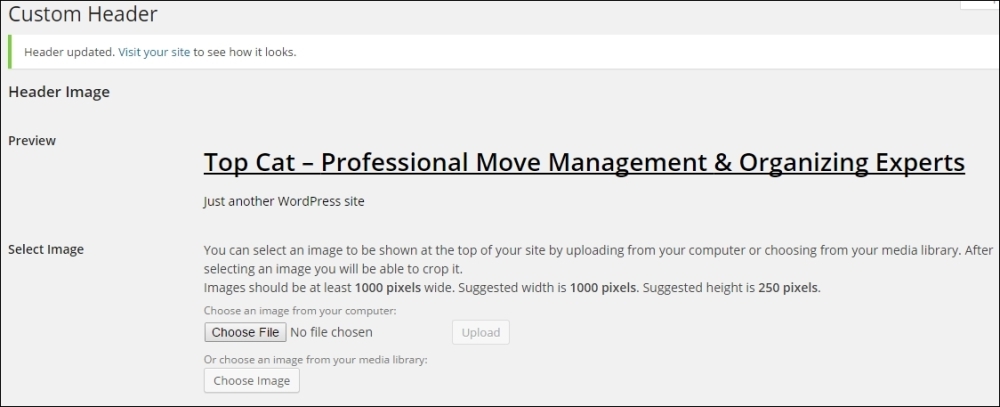
require get_template_directory() . '/inc/custom-header.php';
Here, this code adds the Header option to the Appearance menu (navigate to Appearance | Header), where a user can add the header image to our template as shown here:
Since this is 2015, we would rather choose custom fonts than basic and outdated fonts. This is why I have chosen two fonts for our use: one for headings (Open Sans) and other one for content (Ubuntu).
As we're using custom fonts, we should load the theme from somewhere. There are two options to consider:
· Firstly, to have the fonts available locally (within our theme).
· Then, to load fonts from an online repository like Google fonts (there are a number of repositories online. Google fonts is one of the most famous because of the Google brand).
Since we are going to submit our theme to WordPress.org repository and our theme has to pass the tests, we are going to use the first option. This option is also a bit better as the local fonts would load a little bit faster.
Note
Note that fonts and CSS files are available in the Code folder of this chapter, however, I will explain how we can obtain them anyway.
Firstly, we have to download the fonts and CSS code that will assign these fonts to the @font-face variable. In order to get the fonts and CSS code, we should search for the font face and name on Google. For example, one of the font faces is called Open Sans. I found the first result at http://www.fontsquirrel.com/fonts/open-sans. In order to download both, we should choose the Webfont Kit tab and click on the DOWNLOAD @FONT-FACE KIT button. When we download the fonts, we should put the font files in the fonts folder and the CSS files in the css folder.
Tip
A font should have multiple files, sometimes in three or more files.
For example, consider the following files:
· OleoScript-Regular.eot
· OleoScript-Regular.woff
· OleoScript-Regular.ttf
· OleoScript-Regular.svg
In this case, there are four files for this font.
How do we know how many files should be in our download?
To answer this question, we should open the CSS file attached to our download, and we will be able to see these file names in it:
font-face {
font-family: 'Oleo Script';
src: url('../fonts/OleoScripRegular/OleoScript-Regular.eot');
src: url('../fonts/OleoScripRegular/OleoScript-Regular.eot?#iefix') format('embedded-opentype'),url('../fonts/OleoScripRegular/OleoScript-Regular.woff') format('woff'),url('../fonts/OleoScripRegular/OleoScript-Regular.ttf') format('truetype'),
url('../fonts/OleoScripRegular/OleoScript-Regular.svg#OleoScript-Regular') format('svg');}
So, for each font, we should have a separate CSS file with the name as the font name (for example, oleo-script.css), where we define it as @font-face. In our case, we are going to use one font for headings (Open Sans) and two for the content (Ubuntu and Oleo Script).
Then, we should add this code in the topcat_scripts() function:
//font for the headings
wp_register_style( 'topcat-headings-font', get_template_directory_uri() . '/css/open-sans.css' );
wp_enqueue_style( 'topcat-headings-font' );
//font for the content
wp_enqueue_style( 'topcat-content-font', get_template_directory_uri() . '/css/ubuntu.css' );
wp_enqueue_style( 'topcat-description-font', get_template_directory_uri() .'/css/oleo-script.css' );
Tip
Downloading the example code
You can download the example code files for all Packt books you have purchased from your account at http://www.packtpub.com. If you purchased this book elsewhere, you can visit http://www.packtpub.com/support and register to have the files e-mailed directly to you.
As we can see from the preceding code, the font for the headings has more code. The problem is that I wanted to use the Open Sans font that is already used by the WordPress core, but our theme did not recognize it. The solution for this is to register our own font.
For icons, we will use font.awesome and this code should also be added to the topcat_scripts() function:
//font awesome icons
wp_enqueue_style( 'topcat-fontawesome', get_template_directory_uri() .'/css/font-awesome.min' );
Since we want to build a professional theme, we will also have to add some scripts that would help us add support to the latest technologies of older browsers. These scripts are:
· modernizr.js
· respond.js
Modernizr adds CSS classes to the <html> element for each feature that the user's browser supports, for example, borderradius. For features that a browser doesn't support, Modernizr adds a CSS class prefix of no-, for example, no-borderradius. So, in our CSS, we can target unsupported browsers and provide a fallback using either CSS or JavaScript.
Modernizr can be downloaded by clicking on the desired link on its home page, available at: http://modernizr.com/ or we can just call it from Content Delivery Network (CDN).
Modernizer can be downloaded using these two options:
· Development uncompressed version
· Production compressed version
It is recommended that you go with the development option, as it will be easier to debug if something is wrong. For final products or production websites, I certainly recommend the production version since it is compressed and, therefore, saves sites or pages during load time. There are many options to choose from and it is recommended, excluding the default options that are selected.
Since we are loading all the local scripts, we should load Modernizr with this code:
wp_enqueue_script( 'topcat-modernizr', get_template_directory_uri() . '/js/modernizr.min.js', array(), false, false );
Now, respond.js is the script that enables responsiveness for old browsers that do not support CSS3 media queries, for example, IE8 and older versions. We are going to load it from a local file, too, as follows:
wp_enqueue_script( 'topcat-respond', get_template_directory_uri() . '/js/respond.js', array(), false, false );
Tip
Please make sure to copy the code as it is, as there are options with enqueue scripts that have JavaScript code, which appear in the footer. Those two scripts should be in header.
This is the what the topcat_scripts() function looks like when all the code is added:
function topcat_scripts()
{
wp_enqueue_style( 'topcat-style', get_stylesheet_uri() );
wp_enqueue_script( 'topcat-navigation', get_template_directory_uri() . '/js/navigation.js', array(), '20120206', true );
//font for the headings
wp_deregister_style( 'open-sans' );
wp_register_style( 'topcat-headings-font', get_template_directory_uri() . '/css/open-sans.css' );
wp_enqueue_style( 'topcat-headings-font' );
//font for the content
wp_enqueue_style( 'topcat-content-font', get_template_directory_uri() . '/css/ubuntu.css' );
//font awesome icons
wp_enqueue_style( 'topcat-fontawesome', get_template_directory_uri() .'/css/font-awesome.min' );
wp_enqueue_script( 'topcat-skip-link-focus-fix', get_template_directory_uri() . '/js/skip-link-focus-fix.js', array(), '20130115', true );
wp_enqueue_script( 'topcat-modernizr', get_template_directory_uri() . '/js/modernizr.min.js', array(), false, false );
wp_enqueue_script( 'topcat-respond', get_template_directory_uri() . '/js/respond.js', array(), false, false );
if ( is_singular() && comments_open() && get_option( 'thread_comments' ) ) {
wp_enqueue_script( 'comment-reply' );
}
}
So, make sure your source code matches ours, especially the scripts that we have added.
How to set up styles.css
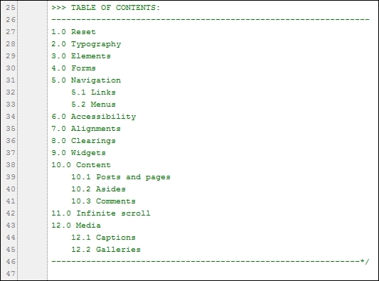
The styles.php file is where our theme settings are set and also where the styles are set. The following image shows you the theme settings that we have covered in the previous chapter; we have a table of contents where each section is shown as styles are broken down into twelve sections:
We will cover only the essential parts that we need to change here.
The Reset section is where the browsers default style sheet is overridden because each browser uses its own style sheets to display the layout. If we load the page with no CSS reset in it, the HTML elements will be styled differently in different browsers, since a default style sheet is used by each browser. By using the Reset CSS, we are making sure that all the browsers are have their default styles set to the initial values that are set by us, as shown here:
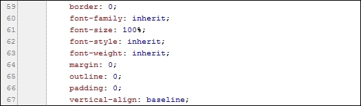
On line 60 of the preceding screenshot, font-family: inherit; and other fonts inherit options. This means that these settings will be inherited from the browser's default style.
On line 61, font-size: 100%; means that the browser will render the font size that is set in the user settings of that browser. For example, in Firefox, the default font size is 16 pixels and you can see these settings if you navigate to Tools | Options | Content. Setting the font size to 100% makes our life easier with rem and em values.
The em and rem values
Here, em is the current font size for the element that is associated to it. If the font is not set anywhere on the page, then the default size will be 16 pixels, as this is the default font size for the browser; in em, it will be 16 pixels as well.
Tip
The most popular method used when working with em values is to set the font size on the body to 62.5%. Since the default browser font size is 16 pixels, this makes it 10 pixels (without hard setting it to 10 pixels, which wouldn't cascade). Using 10 as a multiplier is much easier than using 16. This way, if you need a font size of 18 pixels, use a font size of 1.8 em.
What is a multiplier?
For example, if we have this CSS code { font-size: 1.2em; } CSS code, that 1.2 is essentially a multiplier of the current em value. So, if the current em size is 10 pixels, the list tag is going to turn out to be 12 pixels.
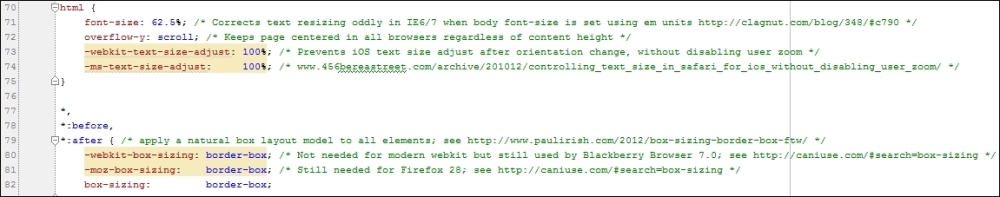
Note that in our style.css that we use in the CSS Reset section, we set the font to 62.5%:
html {
font-size: 62.5%; /* Corrects text resizing oddly in IE6/7 when body font-size is set using em units http://clagnut.com/blog/348/#c790 */
overflow-y: scroll; /* Keeps page centered in all browsers regardless of content height */
-webkit-text-size-adjust: 100%; /* Prevents iOS text size adjust after orientation change, without disabling user zoom */
-ms-text-size-adjust: 100%; /* www.456bereastreet.com/archive/201012/controlling_text_size_in_should be together_for_ios_without_disabling_user_zoom/ */
}
So, we can calculate our values easily as 1 em is 10 pixels, 2 em is 20 pixels, and so on. The problem with em is that it cascades. For example, if we have the em value set for a list to be 1.2 em and we have a paragraph within this list, the font size for this paragraph would be 1.2 em * 1.2 em.
Here is the CSS code, where we set the font size for the list and paragraph as 1.2 em:
li,p{
font-size: 1.2em;
}
Here is the HTML code where we nest the paragraph within the list:
<ul>
<li>list1</li>
<li><p>list1 with paragraph inside</p> </li>
</ul>
The outcome for this is:
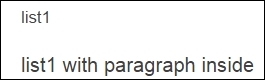
From the preceding image, we can clearly see how the second list with the paragraph has larger fonts. That is the result of cascading.
This is an instance where rem comes to the rescue. Rem is root of em, or for some people, it is the relative em size that is relative to the size defined in the root HTML element. This means that if you want to get 16 pixels in a rem value (that is 1.6 rem), set the font size to 62.5% in Reset CSS (as it is in the reset.css file) or for 18 pixels, it will be 1.8 rem.
We can also see some fixes/hacks for different browsers from line 70 through 82, in the following screenshot, where text and other hacks are applied. Comments beside the code are explained through out this code in more detail:
The unspoken rule is that we should never change the Reset CSS and we will follow this rule.
Since the fonts are loaded as we have checked our files earlier, we need to set them for the content and the headings.
We are going to do this in the typography section:
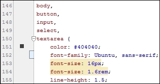
Here, we have added our custom Ubuntu font in front of sans-serif. We can also see that the font size defined in rem and pixels. Pixel sizes are used as fallback values for older browsers that do not support rem in CSS sections for headers:
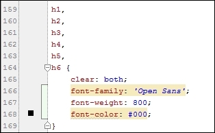
We have added the custom Open Sans family, with a font weight of 800, and the font color is black.
Note
Since the last couple of years, developers have also used hue-saturation-light (hsl) values for colors that are more customizable. For example, to define the light value of your blue color.
We will add separate layout files for pages that have sidebar, and those files are located in the layouts folder with the content-sidebar.css name (this means that the content is on the left-hand side and the sidebar is on the right-hand side).
We should add the call to enqueue that file in the functions.php topcat_scripts() function on line 97:
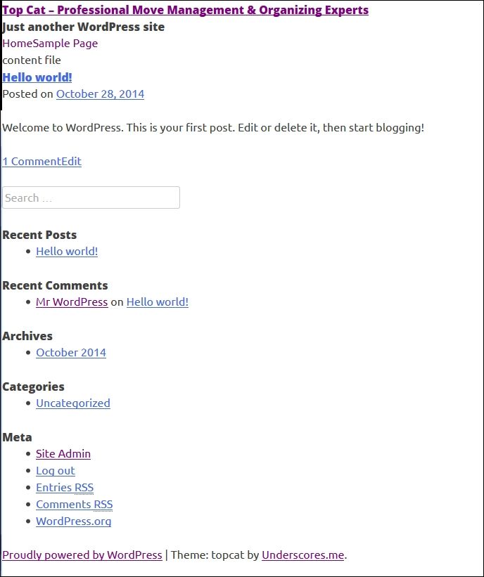
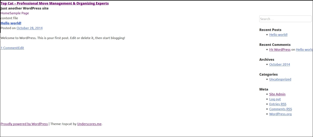
This is what the page looked like before layout CSS file was added. Note that sidebar items (such as Recent Posts and Recent Comments) are below the content, as shown here:
This is what the page looks like after the layout CSS file was added. Sidebar items (such as Recent Posts and Recent Comments) are on the right-hand side, as shown here:
The code for this is:
.site-content .widget-area {
float: right;
overflow: hidden;
width: 25%;
}
We will change it to:
.site-content .widget-area {
float: right;
width: 30%;
padding-left: 1rem; /*dejan added*/
background: none repeat scroll 0 0 #f8f8f8; /**/
}
Here, we have left the float option to right, as that is how the sidebar should float. Then, we added a width of 30%. We have also set the border: 1px red dashed option, since we want to see what's going on with sidebar (whether it's getting squeezed or not) when we resize the page. We have also added the padding-left: 1rem option for cosmetic purposes.
Now, we are going to change the code in the content area. The code here is:
.content-area {
float: left;
margin: 0 -25% 0 0;
width: 100%;
}
It is changed to:
.content-area {
float: left;
width: 70%;
border: 1px blue dashed; /*dejan added*/
}
We will let the content float on left, as it should, and we will also have width of 70% for the content, since the sidebar is taking another 30%. For testing purposes, we will have the border set to 1px blue dashed.
This is what the template will look like with dashed borders:
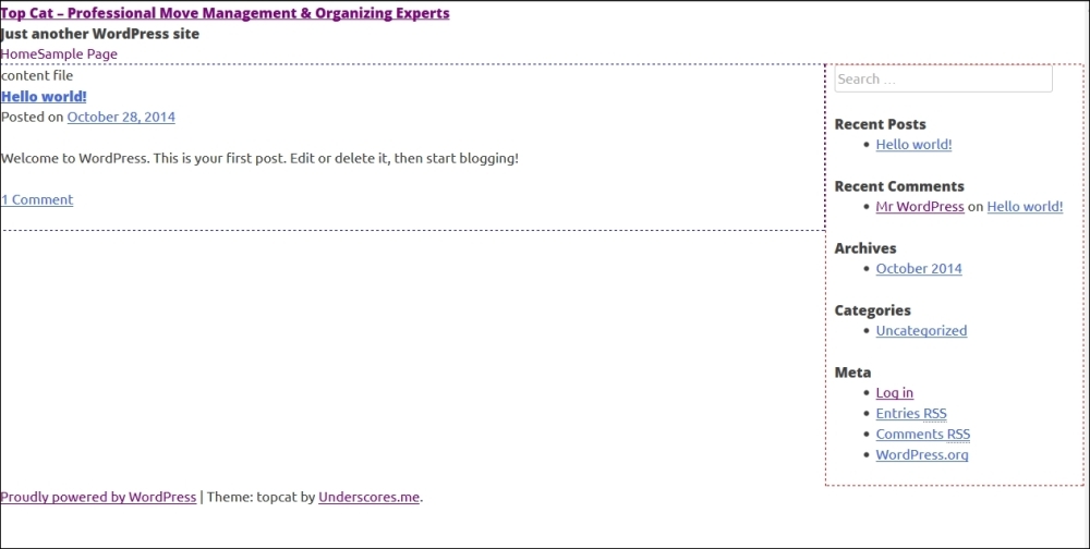
From the previous image, we can see that the content area is takes up 70% of the page and the sidebar takes up 30% of the remaining space.
Adding media queries
Our final step is to add media queries. There are many approaches for this and we will use the simplest one to make our life easier. Our media queries have only three categories:
· Mobile styles (@media only screen and (max-width:480px))
· Tablet styles (@media only screen and (min-width:481px) and (max-width:768px))
· Desktop styles (@media only screen and (min-width:769px))
As you can see from the previous code, mobile styles are for screens up to 480px, tablet styles are for the screens from 481px to 768px (note that there is one pixel difference from mobile styles), and finally, desktop styles are from 769px (note the one pixel difference from tablet styles).
If you want to use a more complex boilerplate CSS with media queries, you can find it at: http://www.paulund.co.uk/boilerplate-css-media-queries (this one supports both portrait and landscape modes for popular devices). For now, I highly recommend that you follow our book.
Now, we should cut and paste our content area CSS to our desktop media query, as that is how it should behave on a desktop:
/*desktop styles*/
@media only screen and (min-width:769px) {
.content-area {
float: left;
width: 100%;
border: 1px blue dashed;
margin-left: -300px;
padding-left: 300px;
}
}
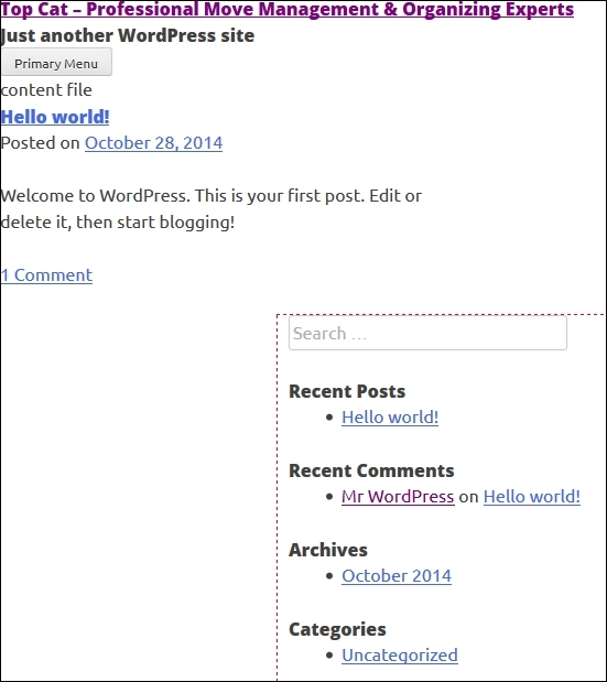
When we resize the screen to a tablet or phone size, our sidebar will still float on right-hand side, as shown here:
In order to fix this, we will add this code to tablet and phone media queries:
/* mobile styles */
@media only screen and (max-width:480px) {
.site-content .widget-area {
float: none;
width: auto;
}
}
/*tablet styles*/
@media only screen and (min-width:481px) and (max-width:768px) {
.site-content .widget-area {
float: none;
width: auto;
}
}
The float: none option fixes the problem and width: auto makes sure that our sidebar will only take up the space it needs. If, for example, we have used width: 100% (as many people do in those cases), we will have problem if we add the margin or padding, as then our section (in this case sidebar) will go beyond its size. The width: auto option makes sure it stays in proper size. The content-sidebar.css file is available in the Code folder of this chapter, so you can compare it with your changes.
Summary
In this chapter, we got started with the responsive layout, learned how to choose the right tool for our project IDE, set up functions.php and styles.css, set fonts and font icons, add essential modernizr.js and respond.js scripts, and add media queries.
In the next chapter, we will dive into the world of header, navigation, and search.
Don't waste any time and start with Chapter 4, Learn How to Create the Header and Navigation.