WordPress Responsive Theme Design (2015)
Chapter 7. Working with Images and Videos
In this chapter, we will start with something fun and explore, some might say, the most important visual item to look for when designing a website. As we are visual creatures, images and videos are crucial items that we can have on our website in order to attract viewers. This is something that we all want to do, right? Also, YouTube and similar sites have gained a lot of popularity and some people say that YouTube is even more visited than Google's search page. As videos are interactive in some way, they can really boost the viewing of your website, too!
Let's look into everything that we will cover in this chapter:
· Featured images
· How to set up and resize featured images
· Image captions
· Image galleries
· How to make image galleries responsive
· Videos
Featured images
Featured images are images that should represent a post or page on the side of the content. They are optional, which means that the post can have the featured image or may not have it. They used to be called post thumbnails, but lately, they have been renamed to featured images, as that is the more appropriate name.
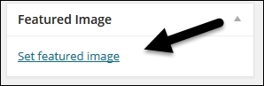
We can set a featured image by going to a single post editor, wpadmin, and choosing the post that we are going to edit. Inside the single post editor, there is the Featured Image option on the right side menu at the bottom of the post:
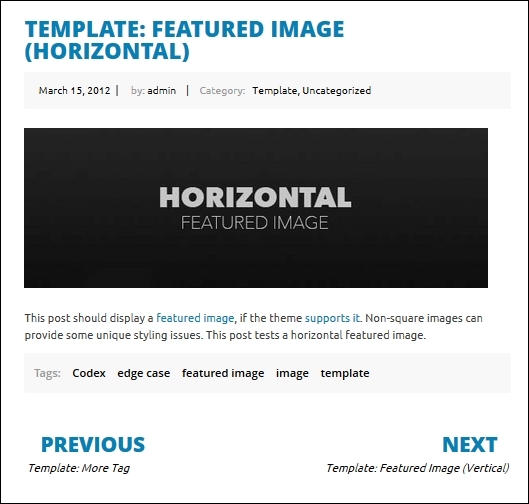
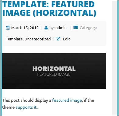
As we have loaded the theme unit test data, we don't have to create the testing page ourselves. We are going to use Template: Featured Image (Horizontal), and the post can be reached at: http://localhost/topcat/template-featured-image-horizontal/ (if you have the same setup as I have). If you can't find it there, then you should go to wpadmin | Posts and search for the post with the name Template: Featured Image (Horizontal). This post already has a feature image set:
Setting up a featured image
The post mentioned in the preceding screenshot, Template: Featured Image (Horizontal), should also display a featured image, but it doesn't. So, let's analyze the code to see what is going on. If we go to the single.php template, as that's the template for the single post, we will see this line:
<?php get_template_part( 'content', 'single' ); ?>
This line means that we are loading a content-single.php template. So, let's open a content-single.php template and look for any code that mentions the post thumbnail. As there is no such code, it means that the featured image functionality is not implemented yet, and we can implement it with just a single line of code:
<?php the_post_thumbnail(); ?>
Within the header section, we can find the post thumbnail:
<header class="entry-header">
<?php the_title( '<h1 class="entry-title">', '</h1>' ); ?>
<div class="entry-meta">
<?php topcat_posted_on(); ?>
</div><!-- .entry-meta -->
<?php the_post_thumbnail(); ?>
</header><!-- .entry-header -->
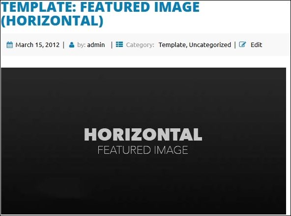
Here is the new look after our changes:
Note
Although WordPress is referring in the content editor as featured images, the function name(s) handling the featured images have the names such as the_post_thumbnail, meaning that functions with the "old name" era associations are still used.
As our users can now load images of all sizes, we should set sizes that we allow for our featured images. We are going to set this in functions.php just below the add_theme_support( 'post-thumbnails' ); line that we enabled previously:
add_theme_support( 'post-thumbnails' );
add_image_size('large-thumbnail', 600, 200, true);
add_image_size('small-thumbnail', 300, 100, true);
Here, we are using the add_image_size function with which we will set up two thumbnails sizes: 600 x 200 and 300 x 100. The latest parameter that we need to set true or false is Boolean. The true option (the hard crop mode) will just cut the image to fill the container that we set, and with the false option (soft crop mode), the image will be resized to its proposed value.
More information is available here:
· http://codex.wordpress.org/Function_Reference/add_image_size
· http://www.davidtan.org/wordpress-hard-crop-vs-soft-crop-difference-comparison-example/
Note
The cropping option should be used, but as with any important feature, it should be used with the caution, as it may not work for all cases. We highly recommend always testing thoroughly by adding images and seeing whether cropping options are working properly.
Resizing featured images
As we have seen so far, we can set thumbnail sizes for themes in functions.php, and that's really a great thing. A problem could arise if our end user loads our theme to their site that already had thumbnails set for their old theme. When they load our theme, thumbnails will look distorted, as they were set for the other theme.
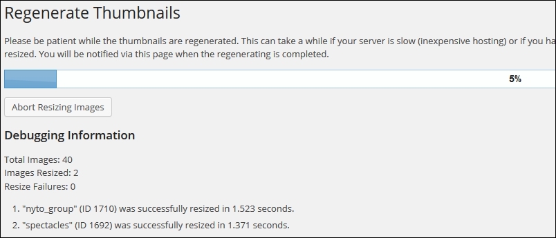
In order to fix this problem, we just have to run the Regenerate Thumbnails plugin, which we installed in the Chapter 1, Responsive Web Design with WordPress. We go to wpadmin | Tools | Regenerate Thumbnails, press the Regenerate Thumbnails button, and we will see the processing screen:
Tip
Every time we change the theme on any of our sites, we should run this plugin in order to be 100 percent sure that thumbnails in the current theme will be displayed properly.
As we have set the thumbnail sizes, we should implement the change in our content-single.php file from: <?php the_post_thumbnail(); ?> to this:
<?php the_post_thumbnail('large-thumbnail'); ?>
As we can see from this code, we added the 'large-thumbnail' parameter to the function and if we refresh the page now, the image will be resized.
Note
We have set the size for the thumbnail, but we haven't used small-thumbnail yet. We will use it in the next chapter, where we will explain index pages.
Finally, if we resize our browser to the mobile size screen, it will look like this:
We can see that the image has been resized (the image is responsive), and this is another functionality that was implemented by underscores.
That code is located in style.css around line 354:
img {
height: auto; /* Make sure images are scaled correctly. */
max-width: 100%; /* Adhere to container width. */
}
If you want to add more properties to this code, feel free to do so.
Image captions
Image captions are used a lot, and their purpose is to provide information about the image. They are optional, but they should be considered for every theme, as some people may use that feature. In order to see the caption, we should use the Markup: Image Alignment post. Then, we can scroll down to the example with the image captions:
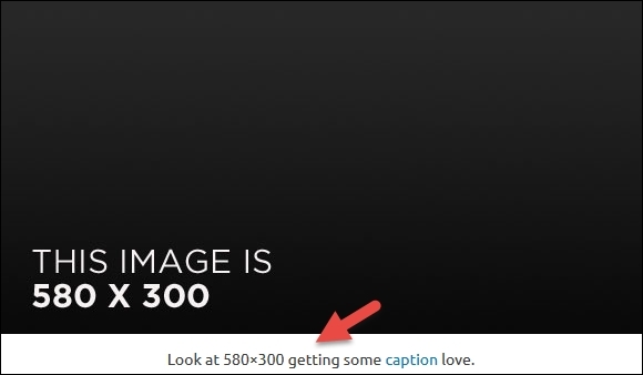
From the preceding screenshot, we can see that the caption below the image looks fine. My advice is to just style it a little bit in order to make it more distinguishable. If we inspect the following code, the image with Firebug, or any other code inspector, we will get this:
<figcaption class="wp-caption-text">
Look at 580×300 getting some
<a href="http://en.support.wordpress.com/images/image-settings/" title="Image Settings">caption</a>
love.
</figcaption>
The wp-caption-text item is the CSS class that we are looking for and it is located in style.css. So, the code that we are looking to delete is:
.wp-caption .wp-caption-text {
margin: 0.8075em 0;
}
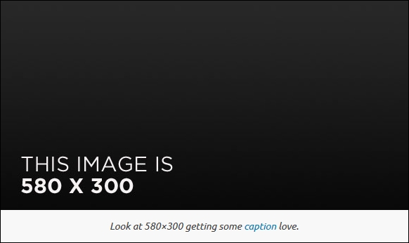
This code is located somewhere around the line 1,348. The change I suggest we do is to make the text more distinctive by making it italic and adding the same silver background that we used for the sidebar:
figcaption {
padding: 0.8075em 0;
background: #f8f8f8;
font-style: italic;
width: 150px;
margin: 0;
}
Let's see our result now:
Note
There are captions as a part of galleries too. We will cover this in our next section, Image galleries.
Image galleries
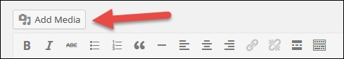
Image galleries are a great option to share images with end users. We can create the gallery by just going to the single post editor where we want to create the gallery, and simply clicking on the Add Media button:
After this, the Insert Media menu will show up:
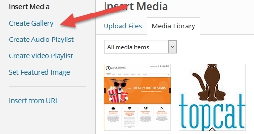
Here, we should click on the Create Gallery option. When we click on this option, we will see images loaded on the right-hand side. Then, we just have to click on images that we want to add to the gallery, click on the Create New Gallery button at the bottom on the right side, and that's it.
As we have loaded a Theme Unit Test data, we don't have to do all this, and we have two posts: Post Format: Gallery and Post Format: Gallery (Tiled).
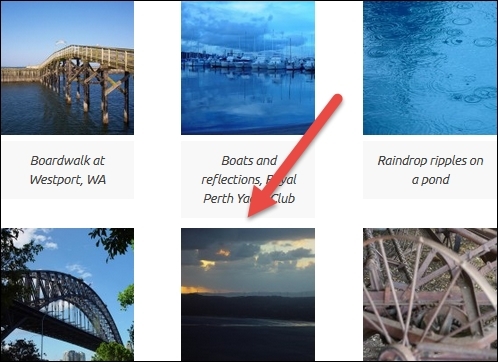
Here is the look of the Post Format: Gallery post:
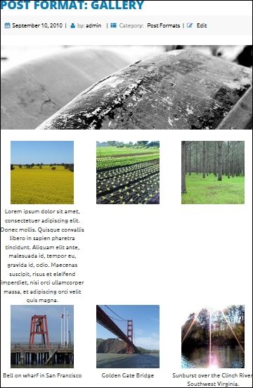
As we can see from the preceding screenshot, the captions are taking more space than images. In order to make sure that we are doing everything correctly, we have created a new test gallery, so we can double-check the default size of thumbnails. When we loaded all images, the individual sizes of thumbnails were 150 x 150, which is what we want. we added a CSS to style.css in order to get this 150 x 150 size for captions in our existing gallery:
.gallery-item figcaption {
width: 150px;
}
Our result is this:
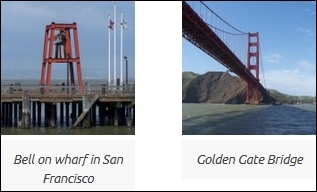
The caption is of the same width as the image now. After this, we should go to the 12.2 Galleries section and comment out text-align: center in the .gallery-item class:
.gallery-item {
display: inline-block;
/* text-align: center; */
vertical-align: top;
width: 100%;
}
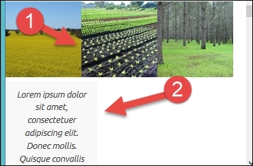
Now, if we scroll down in the gallery, we will see that some rows don't have enough space between them:
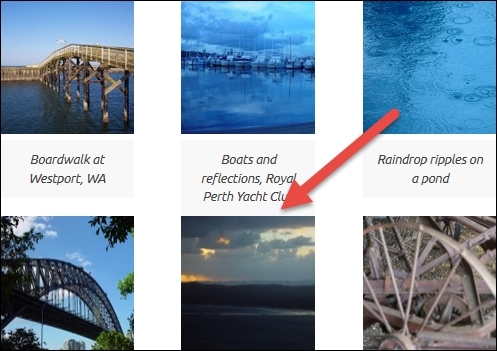
We can solve this problem with just one line of code in style.css:
figure
{
margin-bottom: 0.8075em !important;
}
Let's view our result now:
Making the gallery responsive
The final step in the creation of a gallery is to make it responsive. For example, if we, resize the browser to the phone size screen, we will get this:
The caption is bigger than its image and images are beside each other, because these images are responsive (they resize together with the screen, so they look good across all devices), and the caption has a fixed size of 150px, as you can see it from our code in style.css:
.gallery-item figcaption {
width: 150px;
}
As the phone screen is too small, we should put our images into their own rows and their captions just below them. Because we are now handling a mobile size screen, we should put our classes in @media screen and (max-width: 480px), which are located in style.css (the same media query that we used for the sidebar and comments):
.gallery-item {
width:100%;
display: block;
margin: 2em 1em;
text-align: center;
}
This code creates our gallery item with width of 100% and centers the item in its row too. If we refresh the browser now, we will see no changes to our div gallery:
<div id="gallery-1" class="gallery galleryid-555 gallery-columns-3 gallery-size-thumbnail">
This code has a class of gallery-columns-3, so we have to make sure that items in this class take 100% width:
.gallery-columns-3 .gallery-item,
.gallery-columns-4 .gallery-item,
.gallery-columns-5 .gallery-item,
.gallery-columns-6 .gallery-item,
.gallery-columns-7 .gallery-item,
.gallery-columns-8 .gallery-item,
.gallery-columns-9 .gallery-item
{
max-width: 100%;
}
If we go back to the gallery section of our style.css file, we will see that we have cases there for gallery-columns-3 up to gallery-columns-9, and the preceding code has covered it all. If we refresh our page in the mobile size view, we will see our images centered, but our captions left-aligned:
Let's make our captions take 100% width and align them to the center too:
.gallery-item figcaption {
width: 100%;
text-align: center;
}
Here is our final look:
Working with videos
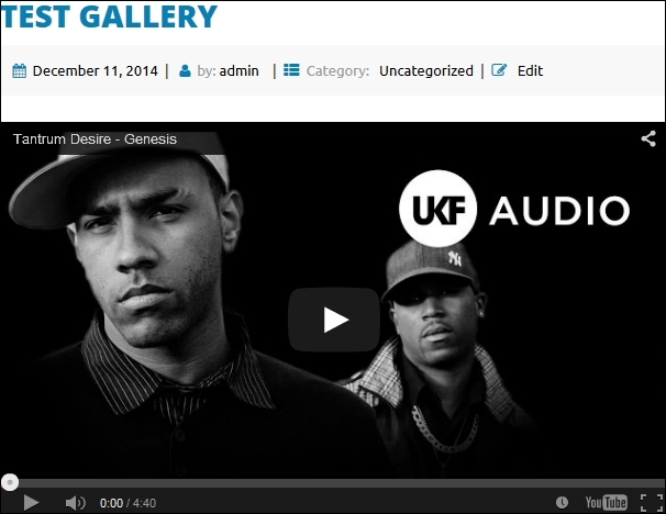
Working with videos in WordPress is really easy. For the major video sites (YouTube or Vimeo), we can just copy and paste the URL into the post editor and click on Publish, and embedded video will appear on our page or post:
Now, try to resize the screen to the mobile size and you will be pleasantly surprised that the video is a responsive, too. Isn't that great?
Tip
The list of supported video sites can be found here: http://codex.wordpress.org/Embeds.
As we can see from the link, the list of supported video sites is huge. If, in some case, you would like to post a video that is not located on these sites, you will have to create a custom code for it, and that's out of the scope of our book.
Tip
You should be aware that posting videos on these external sites is the way to go, as this way, you are using their bandwidth and not yours. As with most hosting companies, even with those that have unlimited packages, the bandwidth is limited (read the fine print).
Summary
In this chapter, at the beginning, we learned more about featured images and how to set up and resize them. Later on, we tackled the image caption and learned how to create the image gallery and make it responsive. Finally, we learned about videos.
In the next chapter, we will get familiar with template files.