Coding for Beginners in Easy Steps: Basic Programming for All Ages (2015)
11. Building interfaces
This chapter demonstrates how to code graphical windowed programs.
Launching interfaces
Responding buttons
Displaying messages
Gathering entries
Listing options
Polling radios
Checking boxes
Adding images
Summary
Launching interfaces
The standard Python module that you can use to create graphical applications is called “tkinter” – a toolkit to interface with the system GUI (Graphical User Interface).
The tkinter module can be imported into a program like any other module to provide attributes and methods for windowed apps. Every tkinter program must begin by calling the Tk() constructor to create a window object. The window’s size can optionally be specified as a ‘widthxheight’ string argument to the window object’s geometry() method. Similarly, the window’s title can be specified as a ‘title’ string argument to the window object’s title() method. If not specified default size and title values will be used.
There can be only one call to the Tk() constructor and it must be at the start of the program code.
Every tkinter program must also call the window object’s mainloop() method to capture events, such as when the user closes the window to quit the program. This loop should appear at the end of the program as it also handles window updates that may be implemented during execution.
With tkinter, all the graphical controls that can be included in the application window, such as buttons or checkboxes, are referred to as “widgets”. Perhaps the simplest widget is a non-interactive label object that merely displays text or an image in the app interface. A label object can be created by specifying the window object’s name and text=’string’ as arguments to a Label() constructor.
Once created, each widget, such as a label, must then be added to the window using one of these “geometry manager” methods:
•pack() – places the widget against a specified side of the window using TOP, BOTTOM, LEFT, or RIGHT constant values specified to its side= argument
•place() – places the widget at XY coordinates in the window using numerical values specified to its x= and y= arguments
•grid() – places the widget in a cell within the window using numerical values specified to row= and column= arguments

The grid() geometry manager method is demonstrated in the example here.
Optionally, the pack() method may include a fill argument to expand the widget in available space. For example, with fill = ‘x’. Alternatively, the pack() method may include padx and pady arguments to expand the widget along an axis a specified amount.
window.py
 Start a new program with a statement to make the “tkinter” module GUI methods and attributes available
from tkinter import *
 Next, add a statement to call upon a constructor to create a window object
window = Tk()
 Now, add a statement to specify a title for this window
window.title( ‘Label Example’ )
 Then, add a statement to call upon a constructor to create a label object
label = Label( window , text = ‘Hello World!’ )
 Use the packer to add the label to the window with both horizontal and vertical padding for positioning
label.pack( padx = 200 , pady = 50 )
 Finally, add the mandatory statement to maintain the window by capturing events
window.mainloop()
 Save then run the program – to see a window appear containing a label widget
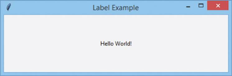

Widgets will not appear in the window when running the program unless they have been added with a geometry manager.
Responding buttons
A Button widget provides a graphical button in an application window that may contain either text or an image to convey the button’s purpose. A button object is created by specifying the window name and options as arguments to a Button() constructor. Each option is specified as an option=value pair. The command option must always specify the name of a function or method to call when the user clicks that button. The most popular options are listed below together with a brief description:
|
Option: |
Description: |
|
activebackground |
Background color when the cursor is over |
|
activeforeground |
Foreground color when the cursor is over |
|
bd |
Border width in pixels (default is 2) |
|
bg |
Background color |
|
command |
Function to call when clicked |
|
fg |
Foreground color |
|
font |
Font for button label |
|
height |
Button height in text lines, or pixels for images |
|
highlightcolor |
Border color when in focus |
|
image |
Image to be displayed instead of text |
|
justify |
Multiple text lines as LEFT, CENTER, or RIGHT |
|
padx |
Horizontal padding |
|
pady |
Vertical padding |
|
relief |
Border style of SUNKEN, RIDGE, RAISED or GROOVE |
|
state |
Enabled status of NORMAL or DISABLED |
|
underline |
Index number in text of character to underline |
|
width |
Button width in letters, or pixels for images |
|
wraplength |
Length at which to wrap text |
You can also call a button’s invoke() method to, in turn, call the function nominated to its command option.
The values assigned to other options determine the widget’s appearance. These can be altered by specifying a new option=value pair as an argument to the widget’s configure() method. Additionally, a current option value can be retrieved by specifying its name as a string argument to the widget’s cget() method.
button.py
Start a new program by making GUI features available then create a window and specify a title
from tkinter import *
window = Tk()
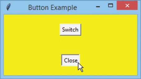
window.title( ‘Button Example’ )
Next, create a button to exit the program when clicked
btn_end = Button( window , text = ‘Close’ , command=exit )
Now, add a function to toggle the window’s background color when another button gets clicked
def tog() :
if window.cget( ‘bg’ ) == ‘yellow’ :
window.configure( bg = ‘gray’ )
else :
window.configure( bg = ‘yellow’ )
Then, create a button to call the function when clicked
btn_tog = Button( window , text = ‘Switch’ , command=tog )
Add the buttons to the window with positional padding
btn_end.pack( padx = 150 , pady = 20 )
btn_tog.pack( padx = 150 , pady = 20 )
Finally, add the loop to capture this window’s events
window.mainloop()
Save then run the program and click the button – to see the window’s background color change
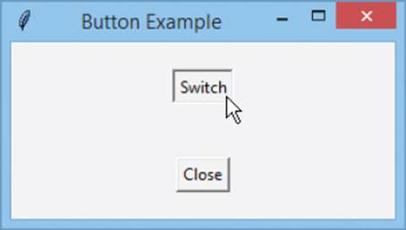
Only the function name is specified to the command option. Do not add trailing parentheses in the assignment.
The ‘gray’ color is the original default color of the window.
Displaying messages
A program can display messages to the user by calling methods provided in the “tkinter.messagebox” module. This must be imported separately and its lengthy name can usefully be assigned a short alias by an import as statement.
A message box is created by supplying a box title and the message to be displayed as the two arguments to one of these methods:
|
Method: |
Icon: |
Buttons: |
|
showinfo() |
|
OK |
|
showwarning() |
|
OK |
|
showerror() |
|
OK |
|
askquestion() |
|
Yes (returns the string ‘yes’) and |
|
askokcancel() |
|
OK (returns 1) and Cancel |
|
askyesno() |
|
Yes (returns 1) and No |
|
askretrycancel() |
|
Retry (returns 1) and Cancel |


Only the askquestion() method returns two values – the askyesno() No button and both Cancel buttons return nothing.
Those methods that produce a message box containing a single OK button return no value when the button gets clicked by the user. Those that do return a value can be used to perform conditional branching by testing that value.
message.py
Start a new program by making GUI features available and message box features available as a short alias
from tkinter import *
import tkinter.messagebox as box
Next, create a window object and specify a title
window = Tk()
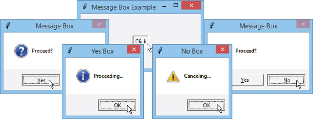
window.title( ‘Message Box Example’ )
Add a function to display various message boxes
def dialog() :
var = box.askyesno( ‘Message Box’ , ‘Proceed?’ )
if var == 1 :
box.showinfo( ‘Yes Box’, ‘Proceeding...’ )
else :
box.showwarning( ‘No Box’, ‘Canceling...’ )
Then, create a button to call the function when clicked
btn = Button( window , text = ‘Click’ , command=dialog )
Add the button to the window with positional padding
btn.pack( padx = 150 , pady = 50 )
Finally, add the loop to capture this window’s events
window.mainloop()
Save the file then run the program and click the button – to see the message boxes appear
Options can be added as a third argument to these method calls. For example, add type=’abortretryignore’ to get three buttons.
Gathering entries
An Entry widget provides a single-line input field in an application where the program can gather entries from the user. An entry object is created by specifying the name of its parent container, such as a window or frame name, and options as arguments to an Entry() constructor. Each option is specified as an option=value pair. Popular options are listed below together with a brief description:
|
Option: |
Description: |
|
bd |
Border width in pixels (default is 2) |
|
bg |
Background color |
|
fg |
Foreground color used to render the text |
|
font |
Font for the text |
|
highlightcolor |
Border color when in focus |
|
selectbackground |
Background color of selected text |
|
selectforeground |
Foreground color of selected text |
|
show |
Hide password characters with show=’*’ |
|
state |
Enabled status of NORMAL or DISABLED |
|
width |
Entry width in letters |
Multiple widgets can be grouped in frames for better positioning. A frame object is created by specifying the name of the window to a Frame() constructor. The frame’s name can then be specified as the first argument to the widget constructors to identify it as that widget’s container.
When actually adding widgets to the frame, you can specify which side to pack them to in the frame with TOP, BOTTOM, LEFT, or RIGHT constants. For example, entry.pack( side=LEFT ).
Use the Text widget instead of an Entry widget if you want to allow the user to enter multiple lines of text.
Typically, an entry widget will appear alongside a label describing the type of input expected there from the user, or alongside a button widget that the user can click to perform some action on the data they have entered, so positioning in a frame is ideal.
Data currently entered into an entry widget can be retrieved by the program using that widget’s get() method.
entry.py
Start a new program by making GUI features available and message box features available as a short alias
from tkinter import *
import tkinter.messagebox as box
Next, create a window object and specify a title
window = Tk()
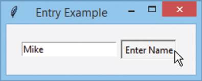
window.title( ‘Entry Example’ )
Now, create a frame to containing an entry field for input
frame = Frame( window )
entry = Entry( frame )
Then, add a function to display data currently entered
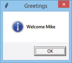
def dialog() :
box.showinfo( ‘Greetings’ , ‘Welcome ’ + entry.get() )
Now, create a button to call the function when clicked
btn = Button( frame, text = ‘Enter Name’ , command=dialog )
Add the button and entry to the frame at set sides
btn.pack( side = RIGHT , padx = 5 )
entry.pack( side = LEFT )
frame.pack( padx = 20 , pady = 20 )
Finally, add the loop to capture this window’s events
window.mainloop()
 Save the file and run the program, then enter your name and click the button – to see a greeting message appear
Use a Label widget instead of an Entry widget if you want to display text that the user cannot edit.
Listing options
A Listbox widget provides a list of items in an application from which the user can make a selection. A listbox object is created by specifying the name of its parent container, such as a window or frame name, and options as arguments to a Listbox() constructor. Popular options are listed below together with a brief description:
|
Option: |
Description: |
|
bd |
Border width in pixels (default is 2) |
|
bg |
Background color |
|
fg |
Foreground color used to render the text |
|
font |
Font for the text |
|
height |
Number of lines in list (default is 10) |
|
selectbackground |
Background color of selected text |
|
selectmode |
SINGLE (the default) or MULTIPLE selections |
|
width |
Listbox width in letters (default is 20) |
|
yscrollcommand |
Attach to a vertical scrollbar |
With tkinter, a scrollbar is a separate widget that can be attached to Listbox, Text, Canvas and Entry widgets.
Items are added to the listbox by specifying a list index number and the item string as arguments to its insert() method.
You can retrieve any item from a listbox by specifying its index number within the parentheses of its get() method. Usefully, a listbox also has a curselection() method that returns the index number of the currently selected item, so this can be supplied as the argument to its get() method to retrieve the current selection.
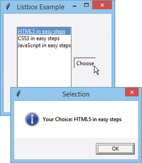
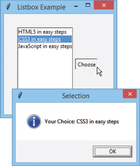
listbox.py
Start a new program by making GUI features available and message box features available as a short alias
from tkinter import *
import tkinter.messagebox as box
Next, create a window object and specify a title
window = Tk()
window.title( ‘Listbox Example’ )
Now, create a frame to contain widgets
frame = Frame( window )
Create a listbox widget offering three list items
listbox = Listbox( frame )
listbox.insert( 1 , ‘HTML5 in easy steps’ )
listbox.insert( 2 , ‘CSS3 in easy steps’ )
listbox.insert( 3 , ‘JavaScript in easy steps’ )
Next, add a function to display a listbox selection
def dialog() :
box.showinfo( ‘Selection’ , ‘Your Choice: ’ + \
listbox.get( listbox.curselection() ) )
Now, create a button to call the function when clicked
btn = Button( frame , text = ‘Choose’ , command = dialog )
Then, add the button and listbox to the frame at set sides
btn.pack( side = RIGHT , padx = 5 )
listbox.pack( side = LEFT )
frame.pack( padx = 30 , pady = 30 )
Finally, add the loop to capture this window’s events
window.mainloop()
 Save the file and run the program, then select an option and click the button – to see your selection confirmed
If the selectmode is set to MULTIPLE, the curselection() method returns a tuple of the selected index numbers.
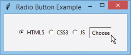
Polling radios
A Radiobutton widget provides a single item in an application that the user may select. Where a number of radio buttons are grouped together the user may only select any one item in the group. With tkinter, radio button objects are grouped together when they nominate the same control variable object to assign a value to upon selection. An empty string variable object can be created for this purpose using the StringVar() constructor or an empty integer variable object using the IntVar() constructor.
You cannot use a regular variable to store values assigned from a radio button selection – it must be an object.
A radio button object is created by specifying four arguments to a Radiobutton() constructor:
•Name of the parent container, such as the frame name
•Text for a display label, specified as a text=text pair
•Control variable object, specified as a variable=variable pair
•Value to be assigned, specified as a value=value pair
Each radio button object has a select() method that can be used to specify a default selection in a group of radio buttons when the program starts. A string value assigned by selecting a radio button can be retrieved from a string variable object by its get() method.
radio.py
Start a new program by making GUI features available and message box features available as a short alias
from tkinter import *
import tkinter.messagebox as box
Next, create a window object and specify a title
window = Tk()
window.title( ‘Radio Button Example’ )
Now, create a frame to contain widgets
frame = Frame( window )
Then, construct a string variable object to store a selection
book = StringVar()
Next, create three radio button widgets whose value will be assigned to the string variable upon selection
radio_1 = Radiobutton( frame , text = ‘HTML5’ , \
variable = book , value = ‘HTML5 in easy steps’ )
radio_2 = Radiobutton( frame , text = ‘CSS3’ , \
variable = book , value = ‘CSS3 in easy steps’ )
radio_3 = Radiobutton( frame , text = ‘JS’ , \
variable = book , value = ‘JavaScript in easy steps’ )
Now, add a statement to specify which radio button will be selected by default when the program starts
radio_1.select()
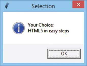
Then, add a function to display a radio button selection and a button to call this function
def dialog() :
box.showinfo( ‘Selection’ , \
‘Your Choice: \n’ + book.get() )
btn = Button( frame , text = ‘Choose’ , command = dialog )
Add the push button and radio buttons to the frame
btn.pack( side = RIGHT , padx = 5 )
radio_1.pack( side = LEFT )
radio_2.pack( side = LEFT )
radio_3.pack( side = LEFT )
frame.pack( padx = 30 , pady = 30 )
Finally, add the loop to capture this window’s events
window.mainloop()
 Save the file and run the program, then choose an option and click the button – to see your choice confirmed

A Radiobutton object has a deselect() method that can be used to cancel a selection programatically.
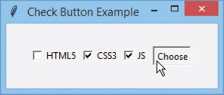
Checking boxes
A Checkbutton widget provides a single item in an application that the user may select. Where a number of check buttons appear together the user may select one or more items. Check button objects nominate an individual control variable object to assign a value to whether checked or unchecked. An empty string variable object can be created for this using the StringVar() constructor or an empty integer variable object using the IntVar() constructor.
A check button object is created by specifying five arguments to a Checkbutton() constructor:
•Name of the parent container, such as the frame name
•Text for a display label, as a text=text pair
•Control variable object, as a variable=variable pair
•Value to assign if checked, as an onvalue=value pair
•Value to assign if unchecked, as an offvalue=value pair
An integer value assigned by a check button can be retrieved from a integer variable object by its get() method.
check.py
Start a new program by making GUI features available and message box features available as a short alias
from tkinter import *
import tkinter.messagebox as box
Next, create a window object and specify a title
window = Tk()
window.title( ‘Check Button Example’ )
Now, create a frame to contain widgets
frame = Frame( window )
Then, construct three integer variable objects to store values
var_1 = IntVar()
var_2 = IntVar()
var_3 = IntVar()
Create three check button widgets whose values will be assigned to the integer variable whether checked or not
book_1 = Checkbutton( frame , text = ‘HTML5’ , \
variable = var_1 , onvalue = 1 , offvalue = 0 )
book_2 = Checkbutton( frame , text = ‘CSS3’ , \
variable = var_2 , onvalue = 1 , offvalue = 0 )
book_3 = Checkbutton( frame , text = ‘JS’ , \
variable = var_3 , onvalue = 1 , offvalue = 0 )
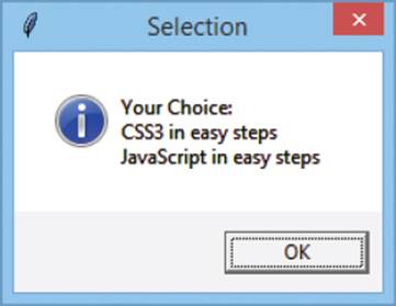
Next, add a function to display a check button selection
def dialog() :
s = ‘Your Choice:’
if var_1.get() == 1 : s += ‘\nHTML5 in easy steps’
if var_2.get() == 1 : s += ‘\nCSS3 in easy steps’
if var_3.get() == 1 : s += ‘\nJavaScript in easy steps’
box.showinfo( ‘Selection’ , s )
Now, create a button to call the function when clicked
btn = Button( frame , text = ‘Choose’ , command = dialog )
Then, add the push button and check buttons to the frame
btn.pack( side = RIGHT , padx = 5 )
book_1.pack( side = LEFT )
book_2.pack( side = LEFT )
book_3.pack( side = LEFT )
frame.pack( padx = 30, pady = 30 )
Finally, add the loop to capture this window’s events
window.mainloop()
Save the file and run the program, then check boxes and click the button – to see your selection confirmed
A Checkbutton object has select() and deselect() methods that can be used to turn the state on or off. For example, check_1. select().
The state of any Checkbutton object can be reversed by calling its toggle() method.
Adding images
With the tkinter module, images in GIF or PGM/PPM file formats can be displayed on Label, Button, Text and Canvas widgets using the PhotoImage() constructor to create image objects. This simply requires a single file= argument to specify the image file. Interestingly, it also has a subsample()method that can scale down a specified image by stating a sample value to x= and y= arguments. For example, values of x=2, y=2 samples every second pixel – so the image object is half-size of the original.
Once an image object has been created it can be added to a Label or Button constructor statement by an image= option.
The PhotoImage class also has a zoom() method that will double the image size with the same x=2,y=2 values.
Text objects have an image_create() method with which to embed an image into the text field. This requires two arguments to specify location and image=. For example, ‘1.0’ specifies the first line and first character.
Canvas objects have a create_image() method that requires two arguments to specify location and image=. Here the location sets the x,y coordinates on the canvas at which to paint the image.
image.py
Start a new program by making GUI methods and attributes available then create a window object and specify a title
from tkinter import *
window = Tk()
window.title( ‘Image Example’ )
Now, create an image object from a local image file
img = PhotoImage( file = ‘python.gif’ )
python.gif
(200 x 200)
Then, create a label object to display the image above a colored background
label = Label( window , image = img , bg = ‘yellow’ )
Create a half-size image object from the first image object
small_img = PhotoImage.subsample( img , x = 2 , y = 2 )
Now, create a button to display the small image
btn = Button( window , image = small_img )
Create a text field and embed the small image then insert some text after it
txt = Text( window , width = 25 , height = 7 )
txt.image_create( ‘1.0’ , image = small_img )
txt.insert( ‘1.1’, ‘Python Fun!’ )
Create a canvas and paint the small image above a colored background then paint a diagonal line over the top of it
can = \
Canvas( window , width = 100 , height = 100 , bg = ‘cyan’ )
can.create_image( ( 50 , 50 ), image = small_img )
can.create_line( 0 , 0 , 100 , 100, width = 25 , fill = ‘yellow’ )
Then, add the widgets to the window
label.pack( side = TOP )
btn.pack( side = LEFT , padx = 10 )
txt.pack( side = LEFT )
can.pack( side = LEFT, padx = 10 )
Finally, add the loop to capture this window’s events
window.mainloop()
Save the file then run the program – to see the image on the Label, Button, Text and Canvas widgets
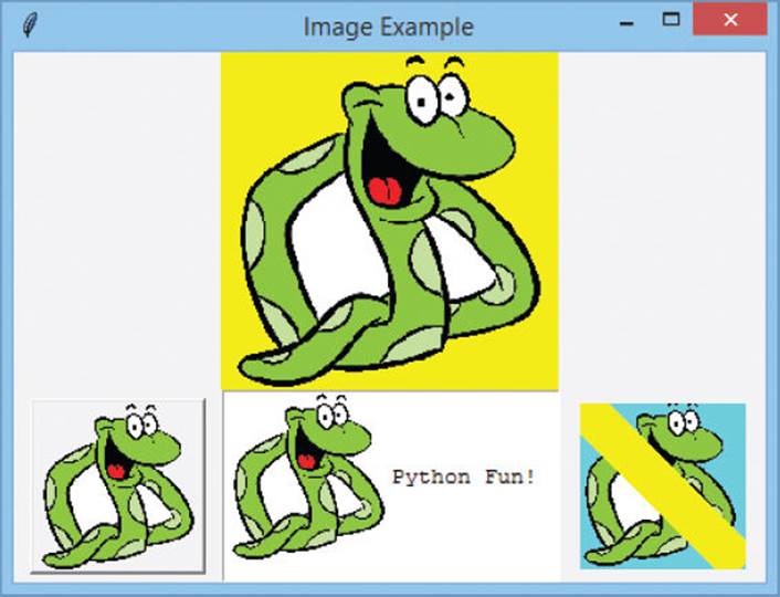
Notice that the Text method is image_ create() but the Canvas method is create_ image() – similar yet different.
Text and Canvas widgets are both powerful and flexible – discover more online at docs.python.org/3.3/library/tkinter.html
Summary
•The tkinter module can be imported into a Python program to provide attributes and methods for windowed applications
•Every tkinter program must begin by calling Tk() to create a window and call its mainloop() method to capture events
•The window object’s title is specified by its title() method
•A label widget is created by specifying the name of its parent container and its text as arguments to the Label() constructor
•Widgets can be added to an application using the pack(), grid() or place() geometry managers
•A button widget is created by specifying the name of its parent container, its text, and the name of a function to call when the user pushes it, as arguments to the Button() constructor
•The tkinter.messagebox module can be imported into a Python program to provide attributes and methods for message boxes
•Message boxes that ask the user to make a choice return a value to the program for conditional branching
•The Frame() constructor creates a container in which multiple widgets can be grouped for better positioning
•The Entry() constructor creates a single line text field whose current contents can be retrieved by its get() method
•Items are added to a Listbox object by its insert() method and retrieved by specifying their index number to its get() method
•Radiobutton and Checkbutton objects store values in the StringVar or IntVar object nominated by their variable attribute
•The PhotoImage() constructor creates an image object that has a subsample() method which can scale down the image
•Images can be added to Button and Label objects, embedded in Text objects, and painted on Canvas objects
All materials on the site are licensed Creative Commons Attribution-Sharealike 3.0 Unported CC BY-SA 3.0 & GNU Free Documentation License (GFDL)
If you are the copyright holder of any material contained on our site and intend to remove it, please contact our site administrator for approval.
© 2016-2026 All site design rights belong to S.Y.A.