Coding For Dummies (2015)
Part II. Building the Silent and Interactive Web Page
Chapter 6. Getting Stylish with CSS
In This Chapter
 Understanding CSS and its structure
Formatting text size, color, and style
Styling images
Using CSS in three different contexts
Create your own style … let it be unique for yourself and yet identifiable for others.
—Anna Wintour
The website code examples I have shown you in the preceding chapters resemble websites you may have seen from a previous era. Websites you browse today are different, and have a more polished look and feel. Numerous factors enabled this change. Twenty years ago you might have browsed the Internet with a dial-up modem, but today you likely use a very fast Internet connection and a more powerful computer. Programmers have used this extra bandwidth and speed to write code to further customize and style websites.
In this chapter you learn modern techniques to style websites using Cascading Style Sheets (CSS). First, I discuss basic CSS structure, and then the CSS rules to style your content. Finally, I show you how to apply these rules to your websites.
What Does CSS Do?
CSS styles HTML elements with greater control than just using HTML. Take a look at Figure 6-1. On the left, Facebook appears as it currently exists; on the right, however, the same Facebook page is shown without all the CSS styling. Without the CSS, all the images and text appear left-justified, borders and shading disappear, and text has minimal formatting.

Figure 6-1: Left: Facebook with CSS. Right: Facebook without CSS.
CSS can style almost any HTML tag that creates a visible element on the page, including all the HTML tags used to create headings, paragraphs, links, images, lists, and tables that I showed you in previous chapters. Specifically, CSS allows you to style:
· Text size, color, style, typeface, and alignment
· Link color and style
· Image size and alignment
· List bullet styles and indentation
· Table size, shading, borders, and alignment
 CSS styles and positions the HTML elements that appear on a web page. However, some HTML elements (such as, for example, <head>) are not visible on the page and are not styled using CSS.
You may wonder why creating a separate language like CSS to handle styling was considered a better approach than expanding the capabilities of HTML. There are three reasons:
· History: CSS was created four years after HTML as an experiment to see whether developers and consumers wanted extra styling effects. At the time, it was unclear whether CSS would be useful, and only some major browsers supported it. As a result, CSS was created separately from HTML to allow developers to build sites using just HTML.
· Code management: Initially, some CSS functionality overlapped with existing HTML functionality. However, specifying styling effects in HTML results in cluttered and messy code. For example, specifying a particular font typeface in HTML requires that you include the fonttypeface attribute in every paragraph (<p>) tag. Styling a single paragraph this way is easy, but applying the font to a series of paragraphs (or an entire page or website) quickly becomes tedious. By contrast, CSS requires the typeface to be specified only once, and it automatically applies to all paragraphs. This feature makes it easier for developers to write and maintain code. In addition, separating the styling of the content from the actual content itself has allowed search engines and other automated website agents to more easily process the content on web pages.
· Inertia: Currently millions of web pages use HTML and CSS separately, and every day that number grows. CSS started as a separate language for reasons stated above, and it remains a separate language because its popularity continues to grow.
CSS Structure
CSS follows a set of rules to ensure that websites will be displayed in the same way no matter the browser or computer used. Sometimes, because of varying support of the CSS standard, browsers can and do display web pages differently. Nevertheless, generally speaking, CSS ensures that users have a consistent experience across all browsers.
 You can use any browser to see CSS you write style your HTML files, though I strongly recommend you download, install, and use Chrome or Firefox.
Choosing the element to style
CSS continues to evolve and support increased functionality, but the basic syntax for defining CSS rules remains the same. CSS modifies HTML elements with rules that apply to each element. These rules are written as follows:
selector {
property: value;
}
A CSS rule is comprised of three parts:
· Selector: The HTML element you want to style.
· Property: The feature of the HTML element you want to style, such as, for example, font typeface, image height, or color.
· Value: The options for the property that the CSS rule sets. For example, if color was the property, the value could be red.
The selector identifies which HTML element you want to style. In HTML, an element is surrounded by angle brackets, but in CSS the selector stands alone. The selector is followed by a space, an opening left curly bracket ({), property with a value, and then a closing right curly bracket (}). The line break after the opening curly bracket, and before the closing curly bracket is not required by CSS — in fact, you could put all your code on one line with no line breaks or spaces. Using line breaks is convention followed by developers to make CSS easier to modify and read.
 You can find curly brackets on most keyboards to the right of the P key.
The following code shows you an example of CSS modifying a specific HTML element. The CSS code appears first, followed by the HTML code that it modifies:
The CSS:
h1 {
font-family: cursive;
}
And now the HTML:
<h1>
Largest IPOs in US History
</h1>
<ul>
<li>2014: Alibaba - $20B</li>
<li>2008: Visa - $18B</li>
</ul>
The CSS selector targets and styles the HTML element with the same name (in this case, <h1> tags). For example, in Figure 6-2, the heading “Largest IPOs in US History,” created using the opening and closing <h1> tag is styled using the h1 selector, and the font-family property with cursive value.
 CSS uses a colon instead of the equals sign (=) to set values against properties.
The font in Figure 6-2 likely does not appear to be cursive, as defined in the code above, because cursive is the name of a generic font family, and not a specific font. Generic font families are described later in this chapter.
My property has value
CSS syntax requires that a CSS property and its value appear within opening and closing curly brackets. After each property is a colon, and after each value is a semi-colon. This combination of property and value together is called a declaration, and a group of properties and values is called a declaration block.
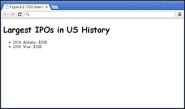
Figure 6-2: CSS targeting the heading h1 element.
Let us look at a specific example with multiple properties and values:
h1 {
font-size: 15px;
color: blue;
}
In this example, CSS styles the h1 element, changing the font-size property to 15px, and the color property to blue.
You can improve the readability of your code by putting each declaration (each property/value combination) on its own line. Additionally, adding spaces or tabs to indent the declarations also improves the readability. Adding these line breaks and indentions doesn’t affect browser performance in any way, but it will make it easier for you and others to read your code.
Hacking the CSS on your favorite website
In Chapter 2, you modified a news website’s HTML code. In this chapter, you modify its CSS. Let’s take a look at some CSS rules in the wild. In this example, you change the CSS on huffingtonpost.com (or your news website of choice) using the Chrome browser. Just follow these steps:
1. Using a Chrome browser, navigate to your favorite news website, ideally one with many headlines. (See Figure 6-3.)
2. Place your mouse pointer over a headline, right-click, and from the menu that appears select Inspect Element.
A window opens at the bottom of your browser.
3. Click the Style tab on the right side of this window to see the CSS rules being applied to HTML elements. (See Figure 6-4.)
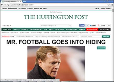
Figure 6-3: The Huffington Post website before modification.
4. Change the color of the headline using CSS. To do this, first find the color property in the element.style section; note the square color box within that property that displays a sample of the current color. Click on this box and change the value by selecting a new color from the pop-up menu, and then press Enter.
Your headline now appears in the color you picked. (See Figure 6-5.)
If the element.style section is blank and no color property appears, you can still add it manually. To do so, click once in the element.style section, and when the blinking cursor appears, type color: purple. The headline changes to purple.
As with HTML, you can modify any website’s CSS using Chrome’s Inspect Element feature, also known as Developer Tools. Most modern browsers, including Firefox, Safari, and Opera, have a similar feature.
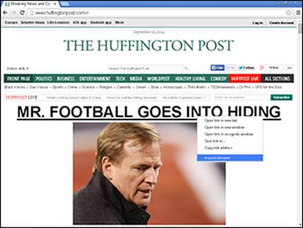
Figure 6-4: The CSS rules that style the Huffington Post website.
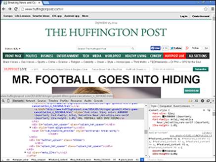
Figure 6-5: Changing the CSS changes the color of the headline.
Common CSS Tasks and Selectors
Although CSS includes over 150 properties, and many values for each property, on modern websites a handful of CSS properties and values do the majority of the work. In the previous section, when you “hacked” the CSS on a live website, you changed the heading color — a common task in CSS. Other common tasks performed with CSS include:
· Changing font size, style, font family, and decoration
· Customizing links including color, background color, and link state
· Adding background images and formatting foreground images
Font gymnastics: size, color, style, family, and decoration
CSS lets you control text in many HTML elements. The most common text-related CSS properties and values are shown in Table 6-1. I describe these properties and values more fully in the sections that follow.
Table 6-1 Common CSS Properties and Values for Styling Text
|
Property name |
Possible values |
Description |
|
font-size |
pixels (#px) % em (#em) |
Specifies the size of text measured either in pixels, as a percentage of the containing element’s font size, or with an em value which is calculated by desired pixel value divided by containing element font size in pixels. Example: font-size: 16px; |
|
color |
name hex code rgb value |
Changes the color of the text specified using names (color: blue;), hexadecimal code (color: #0000FF;), or RGB (red, green, and blue) value (color: rgb(0,0,255);). |
|
font-style |
normal italic |
Sets font to appear in italics (or not). |
|
font-weight |
normal bold |
Sets font to appear as bold (or not). |
|
font-family |
font name |
Sets the font typeface. Example: font-family: "serif"; |
|
text-decoration |
none underline line-through |
Sets font to have an underline or strikethrough (or not). |
Setting the font-size
As in a word processor, you can set the size of the font you’re using with CSS’s font-size property. You have a few options for setting the font size, and the most common is to use pixels, as in the following:
p {
font-size: 16px;
}
In this example, I used the p selector to size the paragraph text to 16 pixels. One disadvantage of using pixels to size your font occurs when users who prefer a large font size for readability have changed their browser settings to a default font size value that’s larger than the one you specify on your site. In these situations, the font size specified in the browser takes precedence, and the fonts on your site will not scale to adjust to these preferences.
Percentage-sizing and em values, the other options to size your fonts, are considered more accessibility-friendly. The default browser font-size of normal text is 16 pixels. With percentage-sizing and em values, fonts can be sized relative to the user-specified default. For example, the CSS for percentage-sizing looks like this:
p {
font-size: 150%;
}
In this example, I used the p selector to size the paragraph text to 150% of the default size. If the browser’s default font size was set at 16 pixels, this paragraph’s font would appear sized at 24 pixels (150% of 16).
 A font-size equal to 1px is equivalent to one pixel on your monitor, so the actual size of the text displayed varies according to the size of the monitor. Accordingly, for a fixed font size in pixels, the text appears smaller as you increase the screen resolution.
Setting the color
The color property sets the color in one of three ways:
· Name: 147 colors can be referenced by name. You can reference common colors, such as black, blue, and red, along with uncommon colors, such as burlywood, lemon chiffon, thistle, and rebeccapurple.
Rebecca Meyer, the daughter of prominent CSS standards author Eric Meyer, passed away in 2014 from brain cancer at the age of six. In response, the CSS standardization committee approved adding a shade of purple called rebeccapurple to the CSS specification in Rebecca’s honor. All major Internet browsers have implemented support for the color.
· Hex code: Colors can be defined by component parts of red, green, and blue, and when using hexadecimal code over 16 million colors can be referenced. In the code example, I set the h1 color equal to #FF0000. After the hashtag, the first two digits (FF) refers to the red in the color, the next two digits (00) refers to the green in the color, and the final two digits (00) refers to the blue in the color.
· RGB value: Just like hex codes, RGB values specify the red, green, and blue component parts for over 16 million colors. RGB values are the decimal equivalent to hexadecimal values.
Don’t worry about trying to remember hex codes or RGB values. You can easily identify colors using an online color picker such as the one at www.w3schools.com/tags/ref_colorpicker.asp.
The following example shows all three types of color changes:
p {
color: red
}
h1 {
color: #FF0000
}
li {
color: rgb(255,0,0)
}
li is the element name for a list item in ordered or unordered lists.
All three colors in the code example above reference the same shade of red. For the full list of colors that can be referenced by name see here: www.w3.org/TR/css3-color/#svg-color.
Setting the font-style and font-weight
The font-style property can set text to italics, and the font-weight property can set text to bold. For each of these properties, the default is normal, which doesn’t need to be specified. In the example below, the paragraph is styled so the font appears italicized and bold. Here’s an example of each:
p {
font-style: italics;
font-weight: bold;
}
Setting the font-family
The font-family property sets the typeface used for text. The property is set equal to one font, or to a list of fonts separated by commas. Your website visitors will have a variety of different fonts installed on their computers, but the font-family property displays your specified font only if that font is already installed on their system.
The font-family property can be set equal to two types of values:
· Font name: Specific font names such as Times New Roman, Arial, and Courier.
· Generic font family: Modern browsers usually define one installed font for each generic font family. These five generic font families include
· serif (Times New Roman, Palantino)
· sans-serif (Helvetica, Verdana)
· monospace (Courier, Andale Mono)
· cursive (Comic Sans, Florence)
· fantasy (Impact, Oldtown)
When using font-family it’s best to define two or three specific fonts followed by a generic font family as a fallback in case the fonts you specify aren’t installed, as in the following example:
p {
font-family: "Times New Roman", Helvetica, serif;
}
In this example, the paragraph’s font family is defined as Times New Roman. If Times New Roman isn’t installed on the user’s computer, the browser then uses Helvetica. If Helvetica is not installed, the browser will use any available font in the generic serif font family.
When using a font name with multiple words (such as Times New Roman) enclose the font name in quotes.
Setting the text-decoration
The text-decoration property sets any font underlining or strikethrough. By default, the property is equal to none, which does not have to be specified. In the following example, any text with an h1 heading is underlined whereas any text inside a paragraph tag is made strikethrough:
h1 {
text-decoration: underline;
}
p {
text-decoration: line-through;
}
Customizing links
In general, browsers display links as blue underlined text. Originally, this default behavior minimized the confusion between content on the page and an interactive link. Today, almost every website styles links in its own way. Some websites don’t underline links; others retain the underlining but style links in colors other than blue, and so on.
The HTML anchor element (a) is used to create links. The text between the opening and closing anchor tag is the link description, and the URL set in the href attribute is the address the browser visits when the link is clicked.
The anchor tag has evolved over time and today has four states:
· link: A link that a user has not clicked or visited.
· visited: A link that a user has clicked or visited.
· hover: A link that the user hovers the mouse cursor over without clicking.
· active: A link the user has begun to click but hasn’t yet released the mouse button.
CSS can style each of these four states, most often by using the properties and values shown in Table 6-2.
Table 6-2 Common CSS Properties and Values for Styling Links
|
Property name |
Possible values |
Description |
|
color |
name hex code rgb value |
Link color specified using names (color: blue;), hexadecimal code (color: #0000FF;), or RGB value (color: rgb(0,0,255);). |
|
text-decoration |
none underline |
Sets link to have an underline (or not). |
The following example styles links in a way that’s similar to the way they’re styled in articles at Wikipedia, where links appear blue by default, underlined on mouse hover, and orange when active. As shown in Figure 6-6, the first link to Chief Technology Officer of the United States appears underlined as it would if my mouse was hovering over it. Also, the link to Google appears orange as it would if active and my mouse was clicking it.
a:link{
color: rgb(6,69,173);
text-decoration: none;
}
a:visited {
color: rgb(11,0,128)
}
a:hover {
text-decoration: underline
}
a:active {
color: rgb(250,167,0)
}
Remember to include the colon between the a selector and the link state.
Although explaining why is out of the scope of this book, CSS specifications insist that you define the various link states in the order shown here — link, visited, hover, and then active. However, it is acceptable to not define a link state, as long as this order is preserved.
The various link states are known as pseudo-class selectors. Pseudo-class selectors add a keyword to CSS selectors and allow you to style a special state of the selected element.
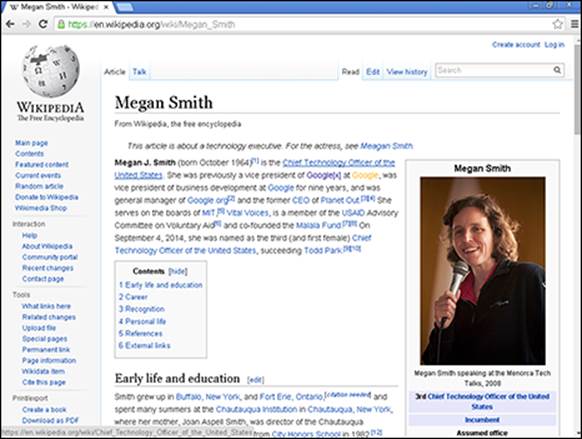
Figure 6-6: Wikipedia.org page showing link, visited, hover, and active states.
Adding background images and styling foreground images
You can use CSS to add background images behind HTML elements. Most commonly, the background-image property is used to add background images to individual HTML elements such as div, table, and p, or (when applied to the body element) to entire web pages.
Background images with smaller file sizes load more quickly than larger images. This is especially important if your visitors commonly browse your website using a mobile phone, which typically has a slower data connection.
The properties and values in Table 6-3 show the options for adding background images.
Table 6-3 CSS Properties and Values for Background Images
|
Property name |
Possible values |
Description |
|
background-image |
url("URL") |
Adds a background image from the image link specified at URL. |
|
background-size |
auto contain cover width height (#px, %) |
Sets background size according to the value: auto (default value) displays the image as originally sized. contain scales the image’s width and height so that it fits inside element. cover scales the image so element background is not visible. Background size can also be set by specifying width and height in pixels or as a percentage. |
|
background-position |
keywordsposition (#px, %) |
Positions the background in element using keywords or exact position. Keywords are comprised of horizontal keywords (left, right, center), and vertical keywords (top, center, and bottom). The placement of the background can also be exactly defined using pixels or a percentage to describe the horizontal and vertical position relative to the element. |
|
background-repeat |
repeat repeat-x repeat-y no-repeat |
Sets the background image to tile, or repeat, as follows: horizontally (repeat-x) vertically (repeat-y) horizontally and vertically (repeat) don’t repeat at all (no-repeat). |
|
background-attachment |
scroll fixed |
Sets the background to scroll with other content (scroll), or to remain fixed (fixed). |
Setting the background-image
As shown in the following example, the background-image property can set the background image for the entire web page or a specific element.
body {
background-image:
url("http://upload.wikimedia.org/wikipedia/commons/e/e5/Chrysler_Building_Midtown_Manhattan_New_York_City_1932.jpg ");
}
You can find background images at sites such as images.google.com, www.flickr.com, or publicdomainarchive.com.
 Check image copyright information to see if you have permission to use the image, and comply with image’s licensing terms, which can include attributing or identifying the author. Additionally, directly linking to images on other servers is called hotlinking. It is preferable to download the image, and host and link to the image on your own server.
If you’d prefer a single-color background instead of an image, use the background-color property. This property is defined in much the same way as the background-image property. Just set it equal to a color name, RGB value, or hex code, as I describe earlier in this chapter in the section “Setting the color.”
Setting the background-size
By specifying exact dimensions using pixels or percentages, the background-size property can scale background images to be smaller or larger, as needed. In addition, this property has three dimensions commonly used on web pages, as follows (see Figure 6-7):
· auto: This value maintains the original dimensions of an image.
· cover: This value scales an image so all dimensions are greater than or equal to the size of the container or HTML element.
· contain: This value scales an image so all dimensions are less than or equal to the size of the container or HTML element.
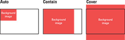
Figure 6-7: Setting the background size to three different values.
Setting the background-position
The background-position sets the initial position of the background image. The default initial position is in the top left corner of the web page or specific element. You change the default position by specifying a pair of keyword or position values, as follows:
· Keywords: The first keyword (left, center, or right) represents the horizontal position, and the second keyword (top, center, or bottom) represents the vertical position.
· Position: The first position value represents the horizontal position, and the second value represents the vertical. Each value is defined using pixels or percentages, representing the distance from the top-left of the browser or the specified element. For example, background-position: center center is equal to background-position: 50% 50%. (See Figure 6-8.)
Setting the background-repeat
The background-repeat property sets the direction the background will tile as follows:
· repeat: This value (the default) repeats the background image both horizontally and vertically.
· repeat-x: This value repeats the background image only horizontally.
· repeat-y: This repeats the background image only vertically.
· no-repeat: This value prevents the background from repeating at all.
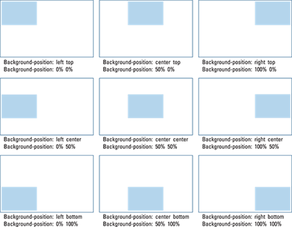
Figure 6-8: The initial background image positions specified using keywords or position.
Setting the background-attachment
The background-attachment property sets the background image to move (or not) when the user scrolls through content on the page. The property can be set to:
· scroll: The background image moves when the user scrolls.
· fixed: The background image does not move when the user scrolls.
The following code segment uses several of the properties discussed earlier to add a background image that stretches across the entire web page, is aligned in the center, does not repeat, and does not move when the user scrolls. (See Figure 6-9.)
body {
background-image: url("http://upload.wikimedia.org/wikipedia/commons/thumb/a/a0/USMC-090807-M-8097K-022.jpg/640px-USMC-090807-M-8097K-022.jpg");
background-size: cover;
background-position: center center;
background-repeat: no-repeat;
background-attachment: fixed;
}
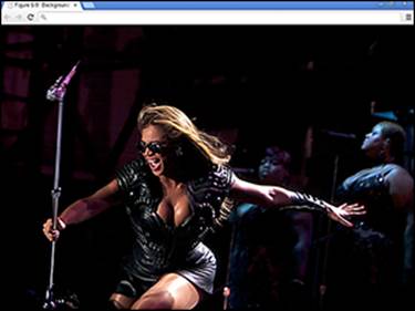
Figure 6-9: An image set as the background for entire page.
Styling Me Pretty
The CSS rules discussed in this chapter give you a taste of a few common styling properties and values. Although you aren’t likely to remember every property and value, with practice the property and value names will come to you naturally. After you understand the basic syntax, the next step is to actually incorporate CSS into your web page and try your hand at styling HTML elements.
Adding CSS to your HTML
There are three ways to apply CSS to a website to style HTML elements:
· In-line CSS: CSS can be specified within an HTML file on the same line as the HTML element it styles. This method requires placing the style attribute inside the opening HTML tag. Generally, in-line CSS is the least preferred way of styling a website because the styling rules are frequently repeated. Here’s an example of in-line CSS:
<!DOCTYPE html>
<html>
<head>
<title>Record IPOs</title>
</head>
<body>
<h1 style="color: red;">Alibaba IPO expected to be biggest IPO of all time</h1>
</body>
</html>
· Embedded CSS: With this approach, CSS appears within the HTML file, but separated from the HTML tags it modifies. The CSS code appears within the HTML file between an opening and closing <style> tag, which itself is located between an opening and closing <head>tag. Embedded CSS is usually used when styling a single HTML page differently than the rest of your website.
In this example, the embedded CSS styles the header red, just like the in-line CSS does above.
<!DOCTYPE html>
<html>
<head>
<title>Record IPOs</title>
<style type="text/css">
h1 {
color: red;
}
</style>
</head>
<body>
<h1>Alibaba IPO expected to be biggest IPO of all time</h1>
</body>
</html>
· Separate style sheets: CSS can be specified in a separate style sheet — that is, in a separate file. Using a separate style sheet is the preferred approach to storing your CSS because it makes maintaining the HTML file easier and allows you to quickly make changes. In the HTML file, the <link> tag is used to refer to the separate style sheet, and has three attributes:
· href: Specifies the CSS filename.
· rel: Should be set equal to "stylesheet".
· type: Should be set equal to "text/css".
With three different ways of styling HTML elements with CSS, all three ways could be used with contradictory styles. For example, say your in-line CSS styles h1 elements as red, whereas embedded CSS styles them as blue, and a separate style sheet styles them as green. To resolve these conflicts, in-line CSS has the highest priority and overrides any other CSS rules. If no in-line CSS is specified, then embedded CSS has the next highest priority, and finally in the absence of in-line or embedded CSS, the styles in a separate style sheet are used. In the example, with the presence of all three styles, the h1 element text would appear red because in-line CSS has the highest priority and overrides the embedded CSS blue styling, and the separate CSS green styling.
The following example uses a separate CSS style sheet to style the header red, as in the previous two examples:
CSS: style.css
h1 {
color: red;
}
HTML: index.html
<DOCTYPE html>
<html>
<head>
<title>Record IPOs</title>
<link href="style.css" text="text/css" rel="stylesheet">
</head>
<body>
<h1>Alibaba IPO expected to be biggest IPO of all time</h1>
</body>
</html>
Building your first web page
Practice your HTML online using the Codecademy website. Codecademy is a free website created in 2011 to allow anyone to learn how to code right in the browser, without installing or downloading any software. You can practice all of the tags (and a few more) discussed in this chapter by following these steps:
1. Open your browser, go to www.dummies.com/go/codingfd, and click on the Codecademy link.
2. Sign in to your Codecademy account.
Signing up is discussed in Chapter 3. Creating an account allows you to save your progress as you work, but it’s optional.
3. Navigate to and click on Get Started with HTML.
4. Background information is presented in the upper left portion of the site, and instructions are presented in the lower left portion of the site.
5. Complete the instructions in the main coding window. As you type, a live preview of your code is generated.
6. After you have finished completing the instructions, click the Save and Submit Code button.
If you have followed the instructions correctly, a green checkmark appears, and you proceed to the next exercise. If an error exists in your code a warning appears with a suggested fix. If you run into a problem, or have a bug you cannot fix, click on the hint, use the Q&A Forums, or tweet me at @nikhilgabraham and include hashtag #codingFD.
All materials on the site are licensed Creative Commons Attribution-Sharealike 3.0 Unported CC BY-SA 3.0 & GNU Free Documentation License (GFDL)
If you are the copyright holder of any material contained on our site and intend to remove it, please contact our site administrator for approval.
© 2016-2026 All site design rights belong to S.Y.A.