Coding For Dummies (2015)
Part II. Building the Silent and Interactive Web Page
Chapter 7. Next Steps with CSS
In This Chapter
 Formatting lists and tables
Styling web pages using parent and child selectors
Naming pieces of code using id and class
Using the box model to position HTML elements on the page
Design is not just what it looks like and feels like. Design is how it works.
—Steve Jobs
In this chapter, you continue building on the CSS you learned in the previous chapter. So far, the CSS rules you’ve seen applied to the entire web page, but now they get more specific. You learn how to style several more HTML elements, including lists, tables, and forms, and how to select and style specific parts of a web page, such as the first paragraph in a story or the last row of a table. Finally, you learn how professional web developers use CSS and the box model to control down to the pixel the positioning of elements on the page. Understanding the box model is not necessary to build our app in Chapter 10.
Before diving in, remember the big picture: HTML puts content on the web page, and CSS further styles and positions that content. Instead of trying to memorize every rule, use this chapter to understand CSS basics. CSS selectors have properties and values that modify HTML elements. There is no better way to learn than by doing, so feel free to skip ahead to the Codecademy practice lessons at the end of the chapter. Then, use this chapter as a reference when you have questions about specific elements you are trying to style.
Styling (More) Elements on Your Page
In this section, you discover common ways to style lists and tables. In the previous chapter, the CSS properties and rules you learned like color and font-family can apply to any HTML element containing text. By contrast, some of the CSS shown here is used only to style lists, tables, and forms.
Styling lists
In Chapter 5 you learned how to create ordered lists, which start with markers like letters or numbers, and unordered lists, which start with markers like bullet points. By default, list items in an ordered list use numbers (for example, 1, 2, 3), whereas list items in unordered lists use a solid-black-circle (⦁).
These defaults may not be appropriate for all circumstances. In fact, the two most common tasks when styling a list include:
· Changing the marker used to create a list: For unordered lists, like this one, you can use a solid disc, empty circle, or square bullet point. For ordered lists, you can use numbers, roman numerals (upper or lower case), or case letters (upper or lower).
· Specifying an image to use as the bullet point: You can create your own marker for ordered and unordered lists instead of using the default option. For example, if you created an unordered bulleted list for a burger restaurant, instead of using a solid circle as a bullet point you could use a color hamburger icon image.
You can accomplish either of these tasks by using the properties in Table 7-1 with an ol or ul selector to modify the list type.
 CSS selectors using properties and rules modify HTML elements by the same name. For example, Figure 7-1 has HTML <ul> tags that are referred to in CSS with the ul selector, and styled using the properties and rules in Table 7-1.
Table 7-1 Common CSS Properties and Values for Styling Lists
|
Property Name |
Possible Values |
Description |
|
list-style-type (unordered list) |
disc circle square none |
Sets the markers used to create list items in an unordered list to disc (⦁), circle (⚬), square (◾), or none. |
|
list-style-type (ordered list) |
decimal upper-roman lower-roman upper-alpha lower-alpha |
Sets the markers used to create list items in an ordered list to decimal (1, 2, 3), uppercase roman numerals (I, II, III), lowercase roman numerals (i, ii, iii), uppercase letters (A, B, C), or lowercase letters (a, b, c). |
|
list-style-image |
url(“URL”) |
When URL is replaced with the image link sets an image as the marker used to create a list item. |
 Many text website navigation bars are created using unordered bulleted lists with the marker set to none. You can see an example in the Codecademy CSS Positioning course starting with exercise 21.
CSS properties and values apply to a CSS selector and modify an HTML element. In the following example, embedded CSS (between the opening and closing <style> tags) and in-line CSS (defined with the style attribute in the HTML) is used to:
· Change the marker in an unordered list to a square using list-style-type
· Change the marker in an ordered list to uppercase roman numerals again using list-style-type
· Set a custom marker to an icon using list-style-image
The code for this is shown below and in Figure 7-1. Figure 7-2 shows this code rendered in the browser.
<html>
<head>
<title>Figure 7-1: Lists</title>
<style>
ul {
list-style-type: square;
}
ol {
list-style-type: upper-roman;
}
li {
font-size: 27px;
}
</style>
</head>
<body>
<h1>Ridesharing startups</h1>
<ul>
<li>Hailo: book a taxi on your phone</li>
<li>Lyft: request a peer to peer ride</li>
<li style="list-style-image: url('car.png');">Uber: hire a driver</li>
</ul>
<h1>Food startups</h1>
<ol>
<li>Grubhub: order takeout food online</li>
<li style="list-style-image: url('burger.png');">Blue Apron: subscribe to weekly meal delivery</li>
<li>Instacart: request groceries delivered the same day</li>
</ol>
</body>
</html>
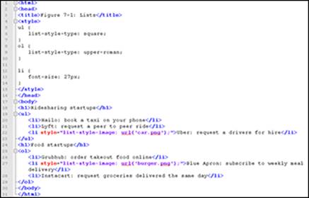
Figure 7-1: Embedded and in-line CSS.
If the custom image for your marker is larger than the text, your text may not align vertically with the marker. To fix this, you can either increase the font size of each list item using font-size, as shown in the example, increase the margin between each list item usingmargin, or set list-style-type to none and set a background image on the ul element using background-image.
There are three ways to apply CSS — inline CSS using the style attribute, embedded CSS using an opening and closing <style> tag, and in a separate CSS style sheet.
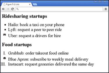
Figure 7-2: Ordered and unordered lists modified to change the marker type.
Designing tables
In Chapter 5, you found out how to create basic tables. By default, the width of these tables expands to fit content inside the table, content in individual cells is left aligned, and no borders are displayed.
These defaults may not be appropriate for all circumstances. Deprecated (unsupported) HTML attributes can modify these defaults, but at any time browsers could stop recognizing these attributes, and any tables created with these attributes would display incorrectly. As a safer alternative, CSS can style tables with greater control. Three common tasks CSS can perform for tables include the following:
· Setting the width of a table, table row, or individual table cell with the width property.
· Aligning text within the table with the text-align property.
· Displaying borders within the table with the border property. (See Table 7-2.)
Table 7-2 Common CSS Properties and Values for Styling Tables
|
Property Name |
Possible Values |
Description |
|
width |
pixels (#px) % |
Width of table measured either in pixels on-screen or as a percentage of the browser window or container tag. |
|
text-align |
left right center justify |
Position of text relative to the table according to the value of the attribute. For example, text-align=“center” positions the text in the center of the table cell. |
|
border |
width style color |
Defines three properties in one — border-width, border-style, and border-color. The values must be specified in this order: Width (pixel), style (none, dotted, dashed, solid), and color (name, hexadecimal code, RBG value). For example, border: 1px solid red. |
In the following example, the table is wider than the text in any cell, the text in each cell is centered, and the table border is applied to header cells:
<html>
<head>
<title>Figure 7-2: Tables</title>
<style>
table {
width: 700px;
}
table, td {
text-align: center;
border: 1px solid black;
border-collapse: collapse;
}
</style>
</head>
<body>
<table>
<caption>Desktop browser market share (August 2014)</caption>
<tr>
<th>Source</th>
<th>Chrome</th>
<th>IE</th>
<th>Firefox</th>
<th>Safari</th>
<th>Other</th>
</tr>
<tr>
<td>StatCounter</td>
<td>50%</td>
<td>22%</td>
<td>19%</td>
<td>5%</td>
<td>4%</td>
</tr>
<tr>
<td>W3Counter</td>
<td>38%</td>
<td>21%</td>
<td>16%</td>
<td>16%</td>
<td>9%</td>
</tr>
</table>
</body>
</html>
The HTML tag <caption> and the CSS property border-collapse further style the table below. The <caption> tag adds a title to the table. Although you can create a similar effect using the <h1> tag, <caption> associates the title with the table. The CSSborder-collapse property can have a value of separate or collapse. The separate value renders each border separately (refer to Figure 5-9), whereas collapse draws a single border when possible (see Figure 7-3).
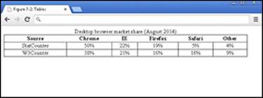
Figure 7-3: Table with width, text alignment, and border modified using CSS.
Selecting Elements to Style
Currently, the CSS you have seen styles every HTML element that matches the CSS selector. For example, in Figure 7-3 the table and td selectors have a text-align property that centered text in every table cell. Depending on the content, you may want to only center text in the header row, but left-align text in subsequent rows. Two ways to accomplish this include:
· Styling specific HTML elements based on position to other elements.
· Naming HTML elements, and only styling elements by name.
Styling specific elements
When styling specific elements, it is helpful to visualize the HTML code as a family tree with parents, children, and siblings. In the following code example (also shown in Figure 7-4), the tree starts with the html element, which has two children head and body. The head has a child element called title. The body has h1, ul, and p elements as children. Finally, the ul element has li elements as children, and the p element has a elements as children. Figure 7-5 shows how the following code appears in the browser, and Figure 7-6 shows a depiction of the following code using the tree metaphor. Note that Figure 7-6 shows each relationship once. For example, in the code below there is an a element inside each of three li elements, and Figure 7-6 shows this ul li a relationship once.
<html>
<head>
<title>Figure 7-3: DOM</title>
</head>
<body>
<h1>Parody Tech Twitter Accounts</h1>
<ul>
<li>
<a href="http://twitter.com/BoredElonMusk">Bored Elon Musk</a>
</li>
<li>
<a href="http://twitter.com/VinodColeslaw">Vinod Coleslaw</a>
</li>
<li>
<a href="http://twitter.com/Horse_ebooks">horse ebooks</a>
</li>
</ul>
<h1>Parody Non-Tech Twitter Accounts</h1>
<p><a href="http://twitter.com/SeinfeldToday">Modern Seinfeld</a></p>
<p><a href="http://twitter.com/Lord_Voldemort7">Lord_Voldemort7</a></p>
</body>
</html>
Bored Elon Musk is a parody of Elon Musk, the founder of PayPal, Tesla, and SpaceX. Vinod Coleslaw is a parody of Vinod Khosla, the Sun Microsystems co-founder and venture capitalist. Horse ebooks is a spambot that became an Internet phenomenon.
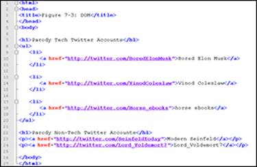
Figure 7-4: Styling a family tree of elements.
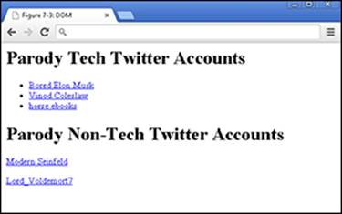
Figure 7-5: Parody Tech and Non-Tech Twitter accounts (browser view).
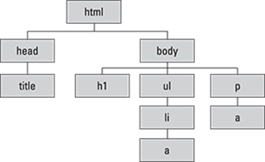
Figure 7-6: Parody Tech and Non-Tech Twitter account (HTML tree or Document Object Model view).
 The HTML tree is called the DOM or document object model.
Child selector
The Parody Non-Tech Twitter account anchor tags are immediate children of the paragraph tags. If you wanted to style just the Parody Non-Tech Twitter accounts, you can use the child selector, which selects the immediate children of a specified element. A child selector is created by first listing the parent selector, then a greater-than sign (>), and finally the child selector.
In the following example, the anchor tags that are immediate children of the paragraph tags are selected, and those hyperlinks are styled with a red font color and without any underline. The Parody Tech Twitter accounts are not styled because they are direct children of the list item tag. (See Figure 7-7.)
p > a {
color: red;
text-decoration: none;
}
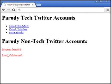
Figure 7-7: Child selector used to style the Parody Non-Tech Twitter accounts.
If you use just the a selector here, all the links on the page would be styled instead of just a selection.
Descendant selector
The Parody Tech Twitter account anchor tags are descendants, or located within, the unordered list. If you wanted to style just the Parody Tech Twitter accounts, you can use the descendant selector, which selects not just immediate children of a specified element but all elements nested within the specified element. A descendant selector is created by first listing the parent selector, a space, and finally the descendant selector you want to target.
In the following example, as shown in Figure 7-8, the anchor tags which are descendants of the unordered list are selected, and those hyperlinks are styled with a blue font color and are crossed out. The Parody Non-Tech Twitter accounts are not styled because they are not descendants of an unordered list.
ul a {
color: blue;
text-decoration: line-through;
}
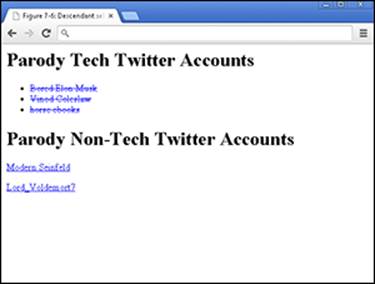
Figure 7-8: Child selector used to style the Parody Tech Twitter accounts.
 Interested in styling just the first anchor tag within a list, like the Modern Seinfeld Twitter account, or the second list item, like the Vinod Coleslaw Twitter account? Go to w3schools.com and read more about the first-child(www.w3schools.com/cssref/sel_firstchild.asp), and nth-child selectors (www.w3schools.com/cssref/sel_nth-child.asp).
Naming HTML elements
The other way of styling specific elements in CSS is to name your HTML elements. You name your code by using either the id or class attribute, and then style your code by referring to the id or class selector.
Naming your code using the id attribute
Use the id attribute to style one specific element on your web page. The id attribute can name any HTML element, and is always placed in the opening HTML tag. Additionally, each element can have only one id attribute value, and the attribute value must appear only once within the HTML file. After you define the attribute in the HTML file, you refer to the HTML element in your CSS by writing a hashtag (#) followed by the attribute value. Using the id attribute, the following code styles the Modern Seinfeld Twitter link the color red with a yellow background:
HTML:
<p><a href="http://twitter.com/SeinfeldToday" id="jerry">Modern Seinfeld</a></p>
CSS:
#jerry {
color: red;
background-color: yellow;
}
Naming your code using the class attribute
Use the class attribute to style multiple elements on your web page. The class attribute can name any HTML element, and is always placed in the opening HTML tag. The attribute value need not be unique within the HTML file. After you define the attribute in the HTML file, you refer to the HTML element by writing a period (.) followed by the attribute value. Using the class attribute, the following code styles all the Parody Tech Twitter account links the color red with no underline:
HTML:
<ul>
<li>
<a href="http://twitter.com/BoredElonMusk" class="tech">Bored Elon Musk</a>
</li>
<li>
<a href="http://twitter.com/VinodColeslaw" class="tech">Vinod Coleslaw</a>
</li>
<li>
<a href="http://twitter.com/Horse_ebooks" class="tech">Horse ebooks</a>
</li>
</ul>
CSS:
.tech {
color: red;
text-decoration: none;
}
Proactively use a search engine, such as Google, to search for additional CSS effects. For example, if you wanted to increase the spacing between each list item, open your browser and search for list item line spacing css. Links appearing in the top ten results should include:
· www.w3schools.com: A beginner tutorial site.
· www.stackoverflow.com: A discussion board for experienced developers.
· www.mozilla.org: A reference guide initially created by the foundation that maintains the Firefox browser, and now maintained by a community of developers.
Each of these sites is a good first place to start, and you should look for answers that include example code.
Aligning and Laying Out Your Elements
CSS not only allows control over the formatting of HTML elements, it also allows control over the placement of these elements on the page, known as page layout. Historically, developers used HTML tables to create page layouts. HTML table page layouts were tedious to create, and required that developers write a great deal of code to ensure consistency across browsers. CSS eliminated the need to use tables to create layouts, helped reduce code bloat, and increased control of page layouts.
Organizing data on the page
Before diving in to any code, let’s review in Figure 7-9 some of the basic ways we can structure the page and the content on it. Layouts have evolved over time, with some layouts working well on desktop computers but not displaying optimally on tablet or mobile devices.
Always ask yourself how your intended layout will appear on desktop, tablet, and mobile devices.
Hundreds of different layouts exist, and a few selected page layouts appear here along with example websites:
Left and right navigation toolbars are not usually seen on mobile devices. Top navigation toolbars are used both on desktop and mobile devices, and bottom navigation toolbars are most common on mobile devices.
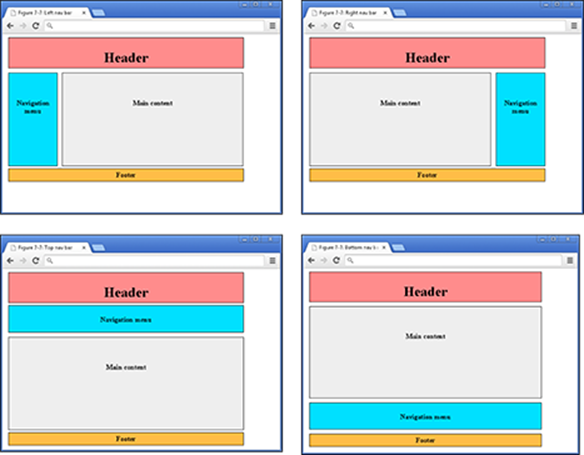
Figure 7-9: Vertical and horizontal navigation layouts.
The examples in Figure 7-10 show real websites with these layouts:
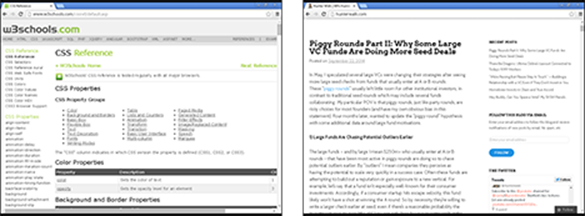
Figure 7-10: Use of left and right navigation toolbar on w3schools.com (left) and hunterwalk.com (right).
Vertical navigation aids reader understanding when hierarchy or relationship exists between navigational topics. In the w3schools.com example, HTML, JavaScript, Server Side, and XML relate to one another, and underneath each topic heading are related sub-topics.
Horizontal or menu navigation, as shown in Figure 7-11, helps reader navigation with weak or disparate relationships between navigational topics. In the eBay example, the Motors, Fashion, and Electronics menu items have different products and appeal to different audiences.
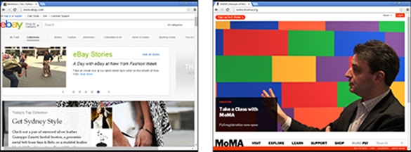
Figure 7-11: Use of top and bottom navigation toolbar on ebay.com (left) and moma.org (right).
Don’t spend too much time worrying about what layout to pick. You can always pick one, observe whether your visitors can navigate your website quickly and easily, and change the layout if necessary.
Shaping the div
The page layouts above are collections of elements grouped together. These elements are grouped together using rectangular containers created with an opening and closing <div> tag, and all of the layouts above can be created with these <div> tags. By itself, the <div> tag does not render anything on the screen, but instead serves as a container for content of any type like HTML headings, lists, tables, or images. To see the <div> tag in action, take a look at the Codecademy.com home page in Figure 7-12.
Notice how the page can be divided into three parts — the navigation header, the middle video testimonial, and then additional text user testimonials. <div> tags are used to outline these major content areas, and additional nested <div> tags within each part are used to group content like images and text.
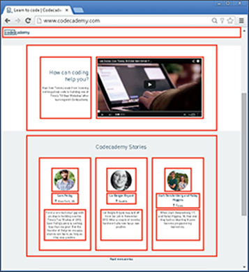
Figure 7-12: Codecademy.com homepage with visible borders for the <div> tags.
In the following example, as shown in Figure 7-13, HTML code is used to create two containers using <div> tags, the id attribute names each div, and CSS sizes and colors the div:
HTML:
<div id="first"></div>
<div id="second"></div>
CSS:
div {
height: 100px;
width: 100px;
border: 2px solid purple;
}
#first {
background-color: red;
}
#second {
background-color: blue;
}
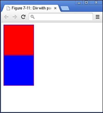
Figure 7-13: Two boxes created with HTML <div> tag and styled using CSS.
Understanding the box model
Just as we created boxes with the <div> tags above, CSS creates a box around each and every single element on the page, even text. Figure 7-14 shows the box model for an image that says “This is an element.” These boxes may not always be visible, but are comprised of four parts:
· content: HTML tag that is rendered in the browser
· padding: Optional spacing between content and the border
· border: Marks the edge of the padding, and varies in width and visibility
· margin: Transparent optional spacing surrounding the border
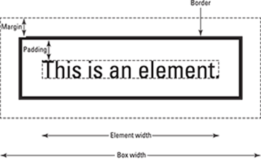
Figure 7-14: Box model for img element.
Using the Chrome browser, navigate to your favorite news website, then right-click an image and in the context menu choose Inspect Element. On the right side of the screen you see three tabs; click the Computed tab. The box model is displayed for the image you right-clicked, showing the content dimensions, and then dimensions for the padding, border, and margin.
The padding, border, and margin are CSS properties, and the value is usually expressed in pixels. In the following code, shown in Figure 7-15, padding and margins are added to separate each div.
div {
height: 100px;
width: 100px;
border: 1px solid black;
padding: 10px;
margin: 10px;
}
Positioning the boxes
Now that you understand how to group elements using HTML, and how CSS views elements, the final piece is to position these elements on the page. Various techniques can be used for page layouts, and a comprehensive overview of each technique is out of the scope of this book. However, one technique to create the layouts shown in Figure 7-16 is to use the float and clear properties (as described in Table 7-3).
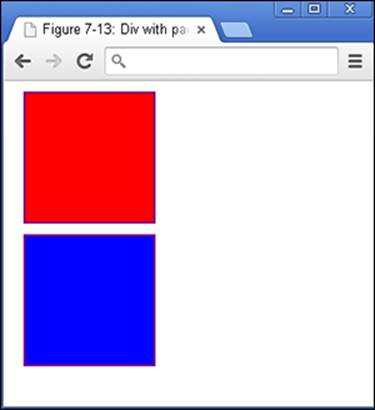
Figure 7-15: Padding and margin added to separate each div.
Table 7-3 Select CSS Properties and Values for Page Layouts
|
Property Name |
Possible Values |
Description |
|
float |
left right none |
Sends an element to the left or right of the container it is in. The none value specifies the element should not float. |
|
clear |
left right both none |
Specifies which side of an element to not have other floating elements. |
If the width of an element is specified, the float property allows elements that would normally appear on separate lines to appear next to each other, such as navigation toolbars and a main content window. The clear property is used to prevent any other elements from floating on one or both sides of current element, and the property is commonly set to both to place web page footers below other elements.
The following example code uses <div> tags, float, and clear to create a simple left navigation layout. (See Figure 7-16.) Typically, after grouping your content using <div> tags, you name each <div> tag using class or id attributes, and then style the div in CSS. There is a lot of code below, so let’s break it down into pieces:
· The CSS is embedded between the opening and closing <style> tag, and the HTML is between the opening and closing <body> tags.
· Between the opening and closing <body> tag, using <div> tags, the page is divided into four parts with header, navigation bar, content, and footer.
· The navigation menu is created with an unordered list, which is left-aligned, with no marker.
· CSS styles size, color, and align each <div> tag.
· CSS properties, float, and clear, are used to place the left navigation layout to the left, and the footer below the other elements.
<!DOCTYPE html>
<html>
<head>
<title>Figure 7-14: Layout</title>
<style>
#header{
background-color: #FF8C8C;
border: 1px solid black;
padding: 5px;
margin: 5px;
text-align: center;
}
#navbar {
background-color: #00E0FF;
height: 200px;
width: 100px;
float: left;
border: 1px solid black;
padding: 5px;
margin: 5px;
text-align: left;
}
#content {
background-color: #EEEEEE;
height: 200px;
width: 412px;
float: left;
border: 1px solid black;
padding: 5px;
margin: 5px;
text-align: center;
}
#footer{
background-color: #FFBD47;
clear: both;
text-align: center;
border: 1px solid black;
padding: 5px;
margin: 5px;
}
ul {
list-style-type: none;
line-height: 25px;
padding: 0px;
}
</style>
</head>
<body>
<div id="header"><h1>Nik's Tapas Restaurant</h1></div>
<div id="navbar">
<ul>
<li>About us</li>
<li>Reservations</li>
<li>Menus</li>
<li>Gallery</li>
<li>Events</li>
<li>Catering</li>
<li>Press</li>
</ul>
</div>
<div id="content"><img src="food.jpg" alt="Nik's Tapas"></div>
<div id="footer">Copyright © Nik's Tapas</div>
</body>
</html>
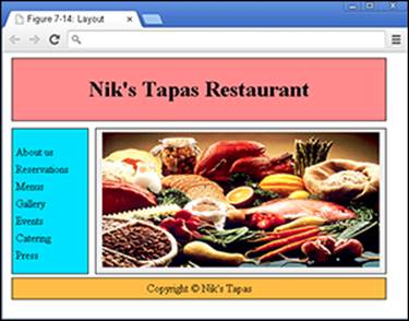
Figure 7-16: Left navigation web page layout created using <div> tags.
Writing More Advanced CSS
Practice your CSS online using the Codecademy website. Codecademy is a free website created in 2011 to allow anyone to learn how to code right in the browser, without installing or downloading any software. Practice all of the tags (and a few more) that you learned in this chapter by following these steps:
1. Open your browser, go to www.dummies.com/go/codingfd, and click on the Codecademy link.
2. Sign in to your Codecademy account.
Signing up is discussed in Chapter 3. Creating an account allows you to save your progress as you work, but it’s optional.
3. Navigate to and click on CSS: An Overview, CSS Selectors, and CSS Positioning to practice CSS styling and positioning.
4. Background information is presented in the upper left portion of the site, and instructions are presented in the lower left portion of the site.
5. Complete the instructions in the main coding window. As you type, a live preview of your code is generated.
6. After you have finished completing the instructions, click the Save and Submit Code button.
If you have followed the instructions correctly, a green checkmark appears, and you proceed to the next exercise. If an error exists in your code a warning appears with a suggested fix. If you run into a problem, or have a bug you cannot fix, click on the hint, use the Q&A Forums, or tweet me at @nikhilgabraham and include hashtag #codingFD.
All materials on the site are licensed Creative Commons Attribution-Sharealike 3.0 Unported CC BY-SA 3.0 & GNU Free Documentation License (GFDL)
If you are the copyright holder of any material contained on our site and intend to remove it, please contact our site administrator for approval.
© 2016-2026 All site design rights belong to S.Y.A.