Coding For Dummies (2015)
Part II. Building the Silent and Interactive Web Page
Chapter 8. Working Faster with Twitter Bootstrap
In This Chapter
 Understanding what Twitter Bootstrap does
Viewing layouts created with Twitter Bootstrap
Creating web page elements using Twitter Bootstrap
Speed, it seems to me, provides the one genuinely modern pleasure.
—Aldous Huxley
Twitter Bootstrap is a free toolkit that allows users to create web pages quickly and with great consistency. In 2011, two Twitter developers, Mark Otto and Jacob Thornton, created the toolkit for internal use at Twitter, and soon after released it to the general public. Before Bootstrap, developers would create common web page features over and over again and each time slightly differently, leading to increased time spent on maintenance. Bootstrap has become one of the most popular tools used in creating websites, and is used by NASA and Newsweek for their websites. With a basic understanding of HTML and CSS, you can use and customize Bootstrap layouts and elements for your own projects.
In this chapter, you discover what Bootstrap does and how to use it. You also discover the various layouts and elements that you can quickly and easily create when using Bootstrap.
Figuring Out What Bootstrap Does
Imagine you are the online layout developer for The Washington Post, responsible for coding the front page of the print newspaper (see Figure 8-1) into a digital website version. The newspaper consistently uses the same font size and typeface for the main headline, captions, and bylines. Similarly, there are a set number of layouts to choose from, usually with the main headline at the top of the page accompanied by a photo.
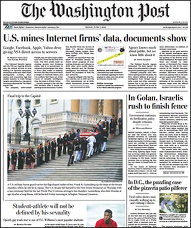
Figure 8-1: The front page of The Washington Post (June 7, 2013).
Every day you could write your CSS code from scratch, defining font typeface, sizes, paragraph layouts, and the like. However, given that the newspaper follows a largely defined format, it would be easier to define this styling ahead of time in your CSS file with class names, and when necessary refer to the styling you want by name. At its core, this is how Bootstrap functions.
Bootstrap is a collection of standardized prewritten HTML, CSS, and JavaScript code that you can reference using class names (for a refresher, see Chapter 7) and then further customize. Bootstrap allows you to create and gives you:
· Layouts: Define your web page content and elements in a grid pattern.
· Components: Use existing buttons, menus, and icons that have been tested on hundreds of millions of users.
· Responsiveness: A fancy word for whether your site will work on mobile phones and tablets in addition to desktop computers. Ordinarily, you would write additional code so your website appears properly on these different screen sizes, but Bootstrap code is already optimized to do this for you, as shown in Figure 8-2.
· Cross-browser compatibility: Chrome, Firefox, Safari, Internet Explorer, and other browsers all vary in the way they render certain HTML elements and CSS properties. Bootstrap code is optimized so your web page appears consistently no matter the browser used.
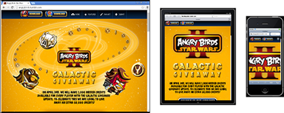
Figure 8-2: The Angry Birds Star Wars page optimized for desktop, tablet, and mobile using Bootstrap.
Installing Bootstrap
Install and add Bootstrap to your HTML file by following these two steps:
1. Include this line of code between your opening and closing <head> tag:
<link rel="stylesheet" href="http://maxcdn.bootstrapcdn.com/bootstrap/3.2.0/css/bootstrap.min.css">
 The <link> tag refers to version 3.2.0 of the Bootstrap CSS file hosted on the Internet, so you must be connected to the Internet for this method to work.
2. Include both these lines of code immediately before your closing HTML </body> tag.
<!--jQuery (needed for Bootstrap's JavaScript plugins) -->
<script src="http://ajax.googleapis.com/ajax/libs/jquery/1.11.1/jquery.min.js"></script>
<!--Bootstrap Javascript plugin file -->
<script src="http://maxcdn.bootstrapcdn.com/bootstrap/3.2.0/js/bootstrap.min.js"></script>
The first <script> tag references a JavaScript library called jQuery. JavaScript is covered in Chapter 9. Although jQuery is not covered in this book, at a high level, jQuery simplifies tasks performed using JavaScript. The second <script> tag references Bootstrap JavaScript plugins, including animated effects such as drop-down menus. If your website does not use any animated effects or Bootstrap JavaScript plugins, you don’t need to include this file.
Bootstrap is free to use for personal and commercial purposes, but does require including the Bootstrap license and copyright notice.
If you will not have reliable access to an Internet connection, you can also download and locally host the Bootstrap CSS and JavaScript files. To do this, after unzipping the Bootstrap file, use the <link> and <script> tags to link to the local version of your file. Visitwww.getbootstrap.com/getting-started/ to download the files, and to access additional instructions and examples.
Understanding the Layout Options
Bootstrap allows you to quickly and easily lay out content on the page using a grid system. You have three options when using this grid system:
· Code yourself: After you learn how the grid is organized, you can write code to create any layout you wish.
· Code with a Bootstrap editor: Instead of writing code in a text editor, drag and drop components and elements to generate Bootstrap code. You can then download and use this code.
· Code with a prebuilt theme: Download free Bootstrap themes or buy a theme where the website has already been created, and you fill in your own content.
Lining up on the grid system
Bootstrap divides the screen into a grid system of 12 equally-sized columns. These columns follow a few rules:
· Columns must sum to a width of 12 columns. You can use one column that is 12 columns wide, 12 columns that are each one column wide, or anything in between.
· Columns can contain content or spaces. For example, you could have a 4-column-wide column, a space of 4 columns, and another 4-column-wide column.
· Unless you specify otherwise, these columns will automatically stack into a single column on smaller browser sizes or screens like mobile devices, and expand horizontally on larger browser sizes or screens like laptop and desktop screens. See Figure 8-3.
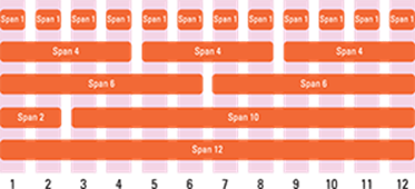
Figure 8-3: Sample Bootstrap layouts.
Now that you have a sense for how these layouts appear on the screen, let us take a look at example code used to generate these layouts. To create any layout, follow these steps:
1. Create a <div> tag with the attribute class="container".
2. Inside the first <div> tag, create another nested <div> tag with the attribute class="row".
3. For each row you want to create, create another <div> tag with the attribute class="col-md-X". Set X equal to the number of columns you want the row to span.
For example, to have a row span 4 columns, write <div class="col-md-4">. The md targets the column width for desktops, and I show you how to target other devices later in this section.
 You must include <div class="container"> at the beginning of your page, and have a closing </div> tag or your page will not render properly.
The following code, as shown in Figure 8-4, creates a simple three-column centered layout:
<div class="container">
<!-- Example row of columns -->
<div class="row">
<div class="col-md-4">
<h2>Heading</h2>
<p>Lorem ipsum dolor sit amet, consectetur adipisicing elit, sed do eiusmod tempor incididunt ut labore et dolore magna aliqua. Ut enim ad minim veniam, quis nostrud exercitation ullamco laboris nisi ut aliquip ex ea commodo consequat.
</p>
</div>
<div class="col-md-4">
<h2>Heading</h2>
<p>Lorem ipsum dolor sit amet, consectetur adipisicing elit, sed do eiusmod tempor incididunt ut labore et dolore magna aliqua. Ut enim ad minim veniam, quis nostrud exercitation ullamco laboris nisi ut aliquip ex ea commodo consequat.
</p>
</div>
<div class="col-md-4">
<h2>Heading</h2>
<p>Lorem ipsum dolor sit amet, consectetur adipisicing elit, sed do eiusmod tempor incididunt ut labore et dolore magna aliqua. Ut enim ad minim veniam, quis nostrud exercitation ullamco laboris nisi ut aliquip ex ea commodo consequat.
</p>
</div>
</div>
</div>
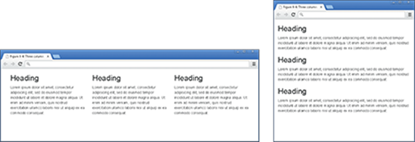
Figure 8-4: Bootstrap three-column layout with desktop (left) and mobile (right) versions.
To see another example, go to the Codecademy site, and resize the browser window. You will notice that as you make the browser window smaller, the columns will automatically stack on top on one another to be readable. Also, the columns are automatically centered. Without Bootstrap, you would need more code to achieve these same effects.
 The Lorem ipsum text you see above is commonly used to create filler text. Although the words don’t mean anything, the quotation originates from a first-century BC Latin text by Cicero. You can generate filler text when creating your own websites by usingwww.lipsum.org or www.socialgoodipsum.com.
Dragging and dropping to a website
After looking at the code above, you may want an even easier way to generate the code without having to type it yourself. Bootstrap editors allow you to drag and drop components to create a layout, and after which the editor will generate Bootstrap code for your use.
Bootstrap editors you can use include the following:
· Layoutit.com: Free online Bootstrap editor (as shown in Figure 8-5) that allows you to drag and drop components and then download the source code.
· Jetstrap.com: Paid online drag and drop Bootstrap editor.
· Pingendo.com: Free downloadable drag and drop Bootstrap editor.
· Bootply.com: Free online Bootstrap editor with built-in templates to modify.
These sites are free, and may stop working without notice. You can find additional options by using any search engine to search for Bootstrap editors.
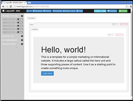
Figure 8-5: Layoutit.com interface with drag and drop Bootstrap components.
Using predefined templates
Sites exist with ready-to-use Bootstrap themes; all you need to do is add your own content. Of course, you can also modify the theme if you wish. Some of these Bootstrap theme websites are:
· Blacktie.co: Free Bootstrap themes (shown in Figure 8-6), all created by one designer.
· Bootstrapzero.com: Collection of free, open-source Bootstrap templates.
· Bootswatch.com and bootsnipp.com: Includes pre-built Bootstrap components that you can assemble for your own site.
· Wrapbootstrap.com: Bootstrap templates available for purchase.
Bootstrap themes may be available for free, but follow the licensing terms. The author may require attribution, email registration, or a tweet.

Figure 8-6: One page Bootstrap template from blacktie.co.
Adapting layout for mobile, tablet, and desktop
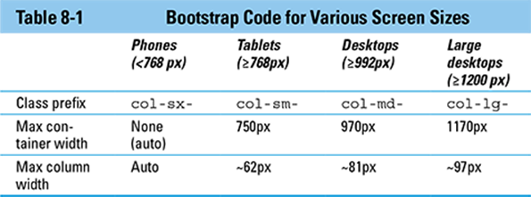
On smaller screens Bootstrap will automatically stack the columns you create for your website. However, you can exercise more control than just relying on the default behavior over how these columns appear. There are four device screen sizes you can target – phones, tablets, desktops, and large desktops. As shown in Table 8-1, Bootstrap uses a different class prefix to target each device.
Based on Table 8-1, if you wanted your website to have two equal sized columns on tablets, desktops, and large desktops you would use the col-sm- class name as follows:
<div class="container">
<div class="row">
<div class="col-sm-6">Column 1</div>
<div class="col-sm-6">Column 2</div>
</div>
</div>
After viewing your code on all three devices, you decide that on desktops you prefer unequal instead of equal columns such that the left column is half the size of the right column. You target desktop devices using the col-md- class name and add it to the class name immediately aftercol-sm-:
<div class="container">
<div class="row">
<div class="col-sm-6 col-md-4">Column 1</div>
<div class="col-sm-6 col-md-8">Column 2</div>
</div>
</div>
Some elements, such as the <div> tag above, can have multiple classes. This allows you to add multiple effects, such as changing the way a column is displayed, to the element. To define multiple classes, use the class attribute and set it equal to each class; separate each class with a space. For an example, refer to the preceding code: The third <div> element has two classes, col-sm-6 and col-md-4.
Finally, you decide that on large desktop screens you want the left column to be two columns wide. You target large desktop screens using the col-lg- class name, as shown in Figure 8-7, and add to your existing class attribute values:
<div class="container">
<div class="row">
<div class="col-sm-6 col-md-4 col-lg-2">Column 1</div>
<div class="col-sm-6 col-md-8 col-lg-10">Column 2</div>
</div>
</div>
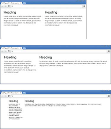
Figure 8-7: A two-column site displayed on tablet, desktop, and large desktop.
Coding Basic Web Page Elements
In addition to pure layouts, Bootstrap can also create web page components found on almost every website. The thought here is the same as when working with layouts — instead of recreating the wheel every time by designing your own button or toolbar, it would be better to use pre-built code, which has already been tested across multiple browsers and devices.
The following examples show how to quickly create common web components.
Designing buttons
Buttons are a basic element on many web pages, but usually can be difficult to set up and style. As shown in Table 8-2, buttons can have various types and sizes.
Table 8-2 Bootstrap Code for Creating Buttons
|
Attribute |
Class prefix |
Description |
|
Button type |
btn-defaultbtn-primarybtn-successbtn-danger |
Standard button type with hover effectBlue button with hover effectGreen button with hover effectRed button with hover effect |
|
Button size |
btn-lgbtn-defaultbtn-sm |
Large button sizeDefault button sizeSmall button size |
To create a button, write the following HTML:
· Begin with the button HTML element.
· In the opening <button> tag include type="button".
· Include the class attribute, with the btn class attribute value, and add additional class prefixes based on the effect you want. To add additional styles, continue adding the class prefix name into the HTML class attribute.
As shown in Figure 8-8, the following code combines both button type and button size:
<p>
<button type="button" class="btn btn-primary btn-lg">Large primary button</button>
<button type="button" class="btn btn-default btn-lg">Large default button</button>
</p>
<p>
<button type="button" class="btn btn-success">Default Success button</button>
<button type="button" class="btn btn-default">Default default button</button>
</p>
<p>
<button type="button" class="btn btn-danger btn-sm">Small danger button</button>
<button type="button" class="btn btn-default btn-sm">Small default button</button>
</p>
For additional button type, button size, and other button options see http://getbootstrap.com/css/#buttons.
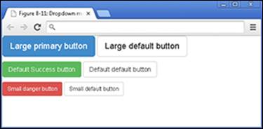
Figure 8-8: Bootstrap button types and sizes.
Navigating with toolbars
Web pages with multiple pages or views usually have one or more toolbars to help users with navigation. Some toolbar options are shown in Table 8-3.
Table 8-3 Bootstrap Code for Creating Navigation Toolbars
|
Attribute |
Class Prefix |
Description |
|
Toolbar type |
nav-tabsnav-pills |
Tabbed navigation toolbarPill, or solid button navigation toolbar |
|
Toolbar button type |
dropdowncaretdropdown-menu |
Marks button or tab as dropdown menuDown-arrow dropdown menu iconDropdown menu items |
To create a pill or solid button navigation toolbar, write the following HTML:
· Begin an unordered list using the ul element.
· In the opening <ul> tag, include class="nav nav-pills".
· Create buttons using the <li> tag. Include class="active" in one opening <li> tag to designate which tab on the main toolbar should appear as visually highlighted when the mouse hovers over the button.
· To create a drop-down menu, nest an unordered list. See the code next to “More” with class prefixes "dropdown", "caret", and "dropdown-menu". You can link to other web pages in your drop-down menu by using the <a> tag.
The following code, as shown in Figure 8-9, creates a toolbar using Bootstrap:
<ul class="nav nav-pills">
<li class="active"><a href="timeline.html">Timeline</a></li>
<li><a href="about.html">About</a></li>
<li><a href="photos.html">Photos</a></li>
<li><a href="friends.html">Friends</a></li>
<li class="dropdown">
<a class="dropdown-toggle" data-toggle="dropdown" href="13_9781118951309-ch08.xhtml#">More
<span class="caret"></span>
</a>
<ul class="dropdown-menu">
<li><a href="places.html">Places</a></li>
<li><a href="sports.html">Sports</a></li>
<li><a href="music.html">Music</a></li>
</ul>
</li>
</ul>
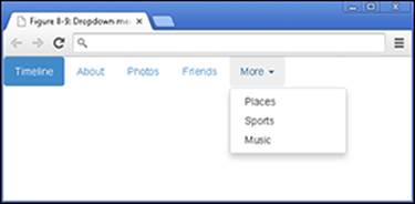
Figure 8-9: Bootstrap toolbar with drop-down menus.
The dropdown-toggle class and the data-toggle="dropdown" attribute and value work together to add drop down menus to elements like links. For additional toolbar options, see http://getbootstrap.com/components/#nav.
Adding icons
Icons are frequently used with buttons to help convey some type of action. For example, your email program likely uses a button with a trash can icon to delete emails. Icons quickly communicate a suggested action to users without much explanation.
These icons are called glyphs, and www.glyphicons.com provides the glyphs used in Bootstrap.
Bootstrap supports more than 200 glyphs, which you can add to buttons or toolbars using the <span> tag. As shown in Figure 8-10, the example code below creates three buttons with a star, paperclip, and trash can glyph.
<button type="button" class="btn btn-default">Star
<span class="glyphicon glyphicon-star"></star>
</button>
<button type="button" class="btn btn-default">Attach
<span class="glyphicon glyphicon-paperclip"></star>
</button>
<button type="button" class="btn btn-default">Trash
<span class="glyphicon glyphicon-trash"></star>
</button>
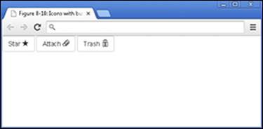
Figure 8-10: Bootstrap buttons with icons
For the names of all the Bootstrap glyphs, see www.getbootstrap.com/components/#glyphicons.
Build the Airbnb Home Page
Practice Bootstrap online using the Codecademy website. Codecademy is a free website created in 2011 to allow anyone to learn how to code right in the browser, without installing or downloading any software. Practice all of the tags (and a few more) that you learned in this chapter by following these steps:
1. Open your browser, go to www.dummies.com/go/codingfd, and click on the link to Codecademy.
2. Sign in to your Codecademy account.
Signing up is discussed in Chapter 3. Creating an account allows you to save your progress as you work, but it’s optional.
3. Navigate to and click on Make a Website to practice Bootstrap.
4. Background information is presented, and instructions are presented on the site.
5. Complete the instructions in the main coding window.
6. After you have finished completing the instructions, click the Got It or Save and Submit Code button.
If you have followed the instructions correctly, a green checkmark appears and you proceed to the next exercise. If an error exists in your code a warning appears with a suggested fix. If you run into a problem, or have a bug you cannot fix, click on the hint, use the Q&A Forum, or tweet me at @nikhilgabraham and include hashtag #codingFD.
All materials on the site are licensed Creative Commons Attribution-Sharealike 3.0 Unported CC BY-SA 3.0 & GNU Free Documentation License (GFDL)
If you are the copyright holder of any material contained on our site and intend to remove it, please contact our site administrator for approval.
© 2016-2026 All site design rights belong to S.Y.A.