Development with the Force.com Platform: Building Business Applications in the Cloud, Third Edition (2014)
6. User Interfaces
Force.com’s native user interface provides a consistent and simple way to search, create, update, and delete database records. It combines the definition of database objects with user interface metadata such as page layouts to produce user interfaces through configuration rather than code. For developers and administrators, this makes customization straightforward. For users, the uniformity means that learning to use one screen in Force.com provides the experience to learn all screens with minimal incremental effort.
For applications that require a greater level of control over the appearance and behavior of the user interface, Visualforce offers a solution. Visualforce is a technology in the Force.com platform for building custom user interfaces. Visualforce user interfaces can be built to look nothing like Force.com, exactly like Force.com, or your own unique blend of the two.
This chapter covers the basics of Visualforce in the following sections:
 Introduction to Visualforce—Learn the concepts and terminology of Visualforce.
Visualforce controllers—See how controllers contain the business logic that drives the user interface.
View components—Learn how view components define the appearance of Visualforce pages.
Visualforce and the native user interface—Understand where and how Visualforce pages coexist with the native user interface of Force.com.
Visualforce in production—Look at how security, governor limits, error handling, and testing are handled with Visualforce.
Sample application—Implement a feature of the Services Manager sample application called the Skills Matrix. It is a Visualforce page for viewing and editing the skill sets of consultants.
Note
The code listings in this chapter are available in a GitHub Gist at http://goo.gl/SQAI0.
Introduction to Visualforce
This section presents an introduction to Visualforce. It covers the following topics:
Overview of Visualforce—Examine the pieces of Visualforce and how they’re put together to aid in understanding this chapter and online reference materials.
Getting started with Visualforce—Take a brief look at how Visualforce development projects work, learn the tools for Visualforce development, and build a “hello world” example.
Overview of Visualforce
Visualforce is a combination of a page containing the presentation and Apex classes containing the business logic. The presentation is usually HTML rendered in the Web browser, but Visualforce also supports content types such as XML and PDF. HTML output is typically interactive, building up state by collecting user input across a series of related pages.
Force.com processes Visualforce pages on its servers. Only the final rendered page and partial page updates are returned to the Web browser—never the raw data or business logic. Visualforce is driven by metadata. It can use the definition of fields in the database to provide the appropriate user interface, without custom code. For example, a Visualforce page with an input field mapped to a Date field in the database is rendered with a calendar picker component, consistent with the Force.com native user interface.
The architecture of Visualforce follows the Model-View-Controller (MVC) pattern. This pattern dictates the separation of presentation (View), business logic (Controller), and data (Model). In Visualforce, business logic and data are combined in the controller, named after its MVC counterpart. The presentation lives in the page.
Figure 6.1 shows the relationship between the page and the controller in Visualforce, as well as some of Visualforce’s internals.
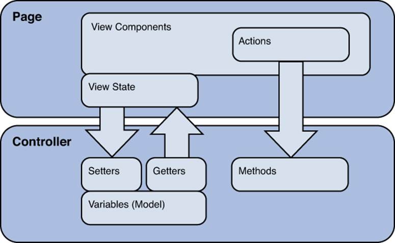
Figure 6.1 Visualforce architecture
Controller
The controller is Apex code that reads and writes data in the model, typically the Force.com database. The interaction of the controller with the user interface is accomplished through variables and action methods. Variables are exposed to the presentation layer through getter and setter methods. Getter methods allow the page to retrieve the value of a variable and display it for the user. Setter methods allow the user to modify the value of a variable through a user interface component such as a text input box.
Action methods perform the processing work on behalf of the user. They are wired up to buttons, links, and even asynchronous events on the user interface.
Force.com provides default controller implementations, called standard controllers. Standard controllers replicate the behavior of the native user interface, such as editing and creating records, but allow customization of its user interface without code. Custom behavior can be added to standard controllers using controller extensions, which are classes written in Apex. You can also implement a controller from scratch in Apex. This is called a custom controller.
Page
The Visualforce page defines the appearance of your user interface using a mixture of standard HTML and Visualforce-specific XML markup. The XML markup is used to add view components to the page. View components bind the controller to the page, defining how data and user actions are to be rendered in the user interface. Force.com provides a standard set of view components to support common HTML user interface patterns and supports user-defined components.
In Figure 6.1, the arrows between the page and the controller represent expressions. Expressions are embedded in view components to allow the page to reference methods in the controller or in system classes such as UserInfo. Expressions in Visualforce use the same language as formula fields in the database, with a special prefix and suffix added. For example, {!save} is an expression that invokes the save method of the controller.
Note
Visualforce maintains a strict separation of business logic and presentation. No business logic is allowed in a Visualforce page, not even for trivial formatting tasks.
Getting Started with Visualforce
This subsection offers a path to getting your hands on Visualforce, divided into three parts, as follows:
1. Development process—Begin your development contrasting Visualforce with standard Web application development.
2. Development tools—Take a look at Visualforce development in the Force.com IDE and the native user interface.
3. “Hello World” example—Build your first Visualforce page with a custom controller.
Development Process
Visualforce development projects are much like standard Web application development projects. They have server-side logic to be coded, and user interfaces to be designed, wired up, and tested. User interface developers must collaborate closely with their server-side counterparts to make sure that the necessary data and logic are available to them. The user interfaces themselves are changing rapidly to satisfy the aesthetic and usability demands of project stakeholders.
Unlike with other Web application projects, Force.com eliminates much of the work of choosing and integrating Web frameworks. In terms of simply serving data-driven Web content, Force.com is the only framework you need. The important task then becomes strategizing on how best to use the platform to minimize custom development effort and maintenance cost while maximizing reuse and flexibility.
Walk through the native user interface and think carefully about what features you can reuse, extend, and override. Force.com offers a lot of user interface functionality by default and exposes a variety of hooks into it. Work with the native user interface where possible, rather than circumventing it. The further your project goes toward a fully custom user interface, the more work you spend to implement things that are potentially already provided, maintained, and constantly improved by Force.com.
Development Tools
The two tools for working with Visualforce are the native user interface and the Force.com IDE. The examples in this book can be built in either tool, but all screenshots are shown from the Force.com IDE.
In the native user interface, developers can enable a footer on the bottom of all Visualforce pages that includes syntax highlighting and an integrated help system. Called development mode, it’s enabled on a per-user basis; you can enable it by visiting the Personal Setup area and clicking My Personal Information, Personal Information and checking both the Development Mode and Show View State in Development Mode boxes. You must have Customize Application permission enabled on your profile to select these options. With development mode enabled, you can create new Visualforce pages on the fly by visiting them (for example, /apex/myPage) as well as edit existing pages. Figure 6.2 shows an example of editing a Visualforce page in development mode.
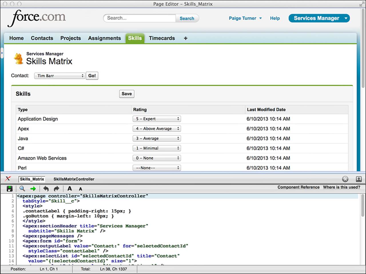
Figure 6.2 Visualforce page in development mode
Force.com IDE integrates Visualforce pages and controllers into the familiar Eclipse user interface. In Figure 6.3, the Visualforce page editor is active. You’ve already worked with the Force.com IDE to create triggers. Visualforce controllers are displayed in the folder named classes. Visualforce pages are in a separate folder named pages.
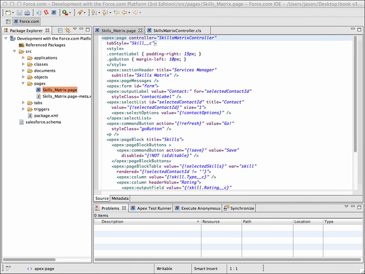
Figure 6.3 Force.com IDE’s Visualforce page editor
“Hello World” Example
To get a sense for Visualforce controllers and pages, follow these steps to create a simple working example:
1. Open the Force.com IDE, select a Force.com Project, and select File, New, Visualforce Page. Alternatively, you can right-click any object within a Force.com Project to reach the New menu.
2. Enter MyPage6_1 for the label, press Tab, and click the Finish button.
3. In the page editor, enter the code shown in Listing 6.1. Do not save it yet. If you do, it will fail to compile because it references a controller class that doesn’t exist.
Listing 6.1 MyPage6_1 Code
<apex:page controller="MyPageController6_1">
<apex:form>
Your name: <apex:inputText value="{!name}" />
<apex:outputText value="{!message}" />
<apex:commandButton action="{!hello}" value="Say Hi" />
</apex:form>
</apex:page>
4. Select File, New, Apex Class. Enter MyPageController6_1 for the name and click the Finish button.
5. In the Apex code editor, enter the code shown in Listing 6.2. Select File, Save All to save both the controller and the page code. Check the Problems view to make sure that there are no compilation errors.
Listing 6.2 MyPageController6_1 Code
public class MyPageController6_1 {
public String name { get; set; }
public String message { get; private set; }
public PageReference hello() {
message = 'Hello, ' + name;
return null;
}
}
6. In your Web browser, log in to Force.com and edit the URL to remove everything after the hostname, replacing it with /apex/MyPage6_1. Your URL should look something like this: https://na6.salesforce.com/apex/MyPage6_1. You should see your custom Visualforce page. Enter your name and click the Say Hi button to see the hello message.
Visualforce Controllers
Controllers provide the business logic behind Visualforce pages. They supply data to the page, accept input from users through the page, perform actions on behalf of the user, and redirect the browser to new pages. Controllers come in three flavors:
Standard controllers—Force.com provides default controller implementations called standard controllers. They contain the same functionality as found in the native user interface. No custom Apex code is involved in a standard controller.
Custom controllers—Custom controllers are the opposite of standard controllers, providing no default functionality and consisting entirely of custom Apex code.
Controller extensions—Controller extensions are the middle ground between standard and custom controllers. They begin with a standard controller and extend or override its functionality with custom Apex code.
Standard Controllers
Every database object, both standard and custom, has a standard controller. Its name is simply the name of the object. No Apex code exists for a standard controller. The controller implementation is already provided by Force.com.
Working with a Single Record
By default, the standard controller operates on a single record at a time. It receives this record from the id parameter in the URL. Try this for yourself by creating a new Visualforce page named MyPage6_3 with the code in Listing 6.3.
Listing 6.3 Visualforce Page Using Standard Controller
<apex:page standardController="Project__c">
The current project is: {!Project__c.Name}
<apex:form >
<apex:commandButton action="{!edit}" value="Edit {!Project__c.Name}" />
<apex:commandButton action="{!list}" value="Go To List" />
</apex:form>
</apex:page>
If you visit the page in your browser (/apex/mypage6_3) without providing an id, you’ll see no current project named in the page. If you append an id value for a Project record (for example, /apex/MyPage6_3?id=a008000000CTwEw), you can get the name of the project and working edit and list buttons.
Listing 6.3 demonstrates a few actions provided by the standard controller, leveraged using expression language in view components. For example, access to the current project record is provided through {!Project__c}, and access to the navigation actions through {!edit} and{!list}. In general, the following expressions are available in a page that uses a standard controller:
Data—{!id} is the unique identifier of the current record, and {! object} is the current record itself, where object is the lowercase name of your object. All fields of the object are automatically available, including related child objects but not parent objects.
Navigation—{!cancel} navigates to the cancel page, {!edit} to the standard edit page, and {!view} to the standard view page.
Action and navigation—{!delete} deletes the current record and navigates to the standard delete page, and {!save} saves the current record and refreshes the page.
Action only—{!quicksave} saves the current record without navigation.
Working with Multiple Records
A variation of the standard controller exists called the standard set controller. It operates on a list of records rather than a single record. The list is produced by executing a view, a user-defined set of column names, filter criteria, and sort criteria for an object. To try it, create another Visualforce page named MyPage6_4 with the code given in Listing 6.4.
Listing 6.4 Visualforce Page with Standard Set Controller
<apex:page standardController="Project__c" recordSetVar="projects">
<apex:repeat value="{!projects}" var="p">
{!p.Name}<br />
</apex:repeat>
</apex:page>
Visit /apex/myPage6_4 with your browser, and you’ll see a list of all projects. Force.com has used the user’s most recently executed view to obtain a list of project records, sorted by the first column in the view, even if that column is not displayed in the Visualforce page. The records are available to your page in the variable projects, specified by the page attribute recordSetVar. The recordSetVar indicates to Force.com that the standard set controller should be used.
The standard set controller allows you to work with up to 10,000 records at once and supports pagination with a variable page size. It also supports multiple selection and actions on a selected set of records.
The following expressions are valid in any page that uses a standard set controller:
Data—The variable name you set in recordSetVar is bound to the current list of records, {!selected} is an array of SObjects that are selected, {!resultsSize} sets or gets the number of records currently displayed, and {!completeResult} is a Boolean containingfalse if more than 10,000 records exist.
Pagination—Navigate across multiple pages of data using the {!first}, {!last}, {!next}, and {!previous} actions. {!pageNumber} sets or gets the current page number, and {!pageSize} sets or gets the number of records in a page. {!hasPrevious} returnstrue if a previous page exists, and {!hasNext} returns true if a subsequent page exists.
Filters—{!filterId} is the unique identifier of the currently selected filter (list view), and {!listViewOptions} is an array of SelectOption objects containing the names and identifiers of the available list views.
Navigation—{!cancel} navigates to the cancel page, and {!edit} to the standard edit page.
Action and navigation—{!delete} deletes the current record and navigates to the standard delete page, and {!save} saves the current record and refreshes the page.
Action only—{!quicksave} saves the current record without navigation.
Custom Controllers
Custom controllers provide complete control over the behavior of a page with no default implementation. A custom controller is simply an Apex class designed to be bound to a Visualforce page. There is no new syntax to learn. At a high level, building a custom controller consists of defining the data to make available to the page and the actions that the page can invoke.
Exposing Data
The purpose of exposing data in a controller is to make it available to the page. Within a page, page components can use expressions to bind to it and render HTML or some other representation of the data. This binding is by reference, so data modified in the page can also be modified in the controller.
Simply making a variable public does not provide a Visualforce page access to it. The variable must have a getter method, a setter method, or both, depending on whether you intend to provide read-only or read and write access to the data.
For example, the page component inputText is an input and output component. It renders any existing or default value by invoking the getter and then invokes the setter to update the value after it is changed by the user and the page is submitted.
Expression language allows traversal of an object through dot notation, so providing separate getters and setters for every field in a database record, for example, is not necessary. Expose the object itself and use dot notation to access its fields. For example, the code in Listing 6.5 exposes a Project record for read-only access using the automatic properties feature of the Apex language. The read-only access is accomplished using the private access modifier keyword for the set accessor. Thanks to the Project getter, the page can contain expressions like {!project.Name}and even {!project.Account__r.BillingCity} because you’ve made the parent object’s field available through a SOQL statement in the constructor.
Listing 6.5 Custom Controller, Read-Only Access to Project Record
public class MyPageController6_5 {
public Project__c project { get; private set; }
public MyPageController() {
project = [ SELECT Name, Account__r.BillingCity FROM Project__c
WHERE Name = 'GenePoint' LIMIT 1 ];
}
}
Caution
Placing business logic in the getter and setter methods is bad practice and, in many cases, prohibited at runtime. Make a habit of exposing data through Apex automatic properties rather than full getter or setter methods. Automatic properties do not allow a code body to be added.
Expressions are the closest you can get to business logic on the page without resorting to JavaScript. For example, you can combine expressions to form more complex expressions. The expression {!isVisible && isEditable} invokes both the getIsVisible andgetIsEditable methods on the controller and evaluates to true if they are both true. Conditionals are also supported. For example, the condition expression {!IF(tabSelected, 'currentTab', 'secondaryPalette')} uses the value of the tabSelected method to determine whether to return one string (currentTab if true) versus another (secondaryPalette if false).
Writing Action Methods
Actions on a page are wired up to action methods in the controller, again by expression language. Action methods are public, nonstatic controller methods that return a PageReference object or null. If null, the current page is refreshed. If not, the PageReference is used to determine the location of the new page.
Actions have three purposes:
1. Preserve view state—The view state is maintained by Force.com within your page at runtime and posted back to its servers for the invocation of an action. It consists of the values of all of your controllers’ accessible, nontransient variables. It allows you to build stateful interactions consisting of multiple pages without writing boilerplate code to copy values around in hidden fields, in the URL, or by using stateful patterns in the controller such as session objects, which are not supported by Force.com. You can opt out of actions entirely, redirecting the user at a browser level using standard HTML anchors and forms. But by doing so, you’re circumventing some of the value provided by Visualforce and giving yourself extra work.
2. Invoke custom logic—Actions can perform some custom logic, such as using DML methods to upsert a record to the database. Other than the constructor, action methods are the only place you should write new business logic or call existing Apex code in a Visualforce controller.
3. Trigger page navigation—The PageReference object returned by an action determines the page to be refreshed in the browser. Construct a PageReference from a page name, such as new PageReference('MyPage'). The URL of the browser remains the same, but the body is refreshed with the contents of MyPage. This is not always desirable behavior, because a user can click the Reload button in the browser and potentially trigger the same action with the same input data. For example, this would result in duplicate records if the action code performs an insert DML operation. You can tell Force.com to redirect the user to the new page by calling the setRedirect method on the PageReference and passing true. A redirect updates the browser’s URL and resets the view state, giving the user a fresh start and preventing any problems with the browser’s Reload button.
Listing 6.6 is a sample controller to illustrate a common pattern in Visualforce: wrapping a database object with an Apex class. The wrapper object allows you to enhance a class for participation in user interface tasks, such as formatting data. In Listing 6.6, the wrapper exists to add aselected attribute. This attribute is bound to an inputCheckbox view component, shown in Listing 6.7, allowing the user to select multiple items. The action can then perform a mass update based on the selection. In the sample code, it simply outputs the unique identifier of each selected Project record to the debug log.
Listing 6.6 Controller with Wrapper Pattern
public class MyPageController6_6 {
public List<ContactWrapper> contacts { get; set; }
public MyPageController6_6() {
contacts = new List<ContactWrapper>();
List<Contact> records = [ SELECT Name FROM Contact ];
for (Contact record : records) {
contacts.add(new ContactWrapper(record));
}
}
public PageReference doSomething() {
for (ContactWrapper wrapper : contacts) {
if (wrapper.selected) {
System.debug(wrapper.data.Id);
}
}
return null;
}
class ContactWrapper {
public Contact data { get; private set; }
public Boolean selected { get; set; }
public ContactWrapper(Contact data) {
this.data = data;
this.selected = false;
}
}
}
Listing 6.7 Page with Wrapper Pattern
<apex:page controller="MyPageController6_6">
<apex:form>
<apex:pageBlock title="Sample Code">
<apex:pageBlockButtons >
<apex:commandButton action="{!doSomething}"
value="Do Something" />
</apex:pageBlockButtons>
<apex:pageBlockTable
value="{!contacts}" var="contact">
<apex:column headerValue="Selected">
<apex:inputCheckbox value="{!contact.selected}" />
</apex:column>
<apex:column headerValue="Contact Name">
{!contact.data.Name}
</apex:column>
</apex:pageBlockTable>
</apex:pageBlock>
</apex:form>
</apex:page>
Tip
To clearly differentiate your controller code from triggers and other Apex code, adopt a naming convention and stick to it. A good one is to suffix your class name with the word Controller.
Controller Extensions
The final type of controller is the controller extension. A controller extension is a custom controller that extends the behavior of a standard controller. Controller extensions are primarily used to integrate Visualforce more tightly with the native user interface. Many features of Visualforce integration such as overriding standard buttons are not supported for pages that use custom controllers.
Custom controllers can be easily retrofitted to become controller extensions. Multiple extensions can be used in a single page, enabling a large monolithic controller to be divided into smaller controllers by behavior, where some pages might use only a subset of the behaviors.
Listing 6.8 illustrates a trivial controller extension class, and Listing 6.9 shows a page that uses it. The only difference between it and a custom controller is that a constructor is required, allowing the standard controller (StandardController for a single record orStandardSetController for multiple records) to be passed to the class. In a page that uses the controller extension, all the built-in actions from the standard controller are available implicitly, without any code.
Listing 6.8 Sample Controller Extension with Single Action Method
public class MyPageController6_8 {
private ApexPages.StandardController controller;
public MyPageController6_8(ApexPages.StandardController controller) {
this.controller = controller;
}
public PageReference doSomething() { return null; }
}
Listing 6.9 Page Using Sample Controller Extension
<apex:page standardController="Project__c"
extensions="MyPageController6_8">
<apex:form>
<apex:commandButton action="{!doSomething}"
value="Do Something" />
</apex:form>
</apex:page>
View Components
View components work with the controller to define the appearance and behavior of a Visualforce user interface. They connect variables in the controller to input and output elements, such as text boxes and labels, and methods in the controller to action-oriented elements, such as buttons and links. Force.com provides a library of standard view components to support common Web user interface design patterns.
This section contains the following subsections:
View component basics—Here, you’ll learn how to add any view component to a page and some of the common characteristics. This material is preparation for the five subsections to follow, which cover specific types of standard view components.
Data components—Data components enable Visualforce pages to move data in and out of the controller using standard HTML elements.
Action components—Action components invoke methods on the controller, updating the view state and refreshing the page or navigating to a new page.
Primitive components—Several components exist with similar syntax to HTML tags, bridging the gap between Visualforce functionality and standard HTML.
Force.com-styled components—These components allow Visualforce pages to inherit the appearance of the Force.com native user interface.
Force.com user interface components—The Force.com UI components inherit the appearance of the native user interface as well as its behavior. They are large-scale building blocks for incorporating native Force.com user interface functionality wholesale into your custom pages.
View Component Basics
The three important areas to understand about view components are the following:
View component syntax—View components are embedded in a Visualforce page using XML markup.
Page definition—Every user interface page must begin with the page component. All Visualforce components must be declared within the page component.
Component visibility—The rendered attribute, present on most components, allows conditional rendering of its HTML.
View Component Syntax
Adding view components to a Visualforce page involves constructing XML markup. The markup consists of three parts: the component name, an optional set of attributes, and an optional component body. Listing 6.10 is a sample usage of the view component dataList. It demonstrates all three parts of referencing a view component in a Visualforce page.
Listing 6.10 Sample View Component Usage
<apex:dataList value="{!contacts}" var="contact">
<b>{!contact.Name}</b>
</apex:dataList>
Component Name
The component name is specified in the name of the tag. The component is dataList, prefaced with the apex namespace to instruct Force.com that this is a standard view component. The dataList component renders an HTML list, which is a series of LI tags within a UL tag.
Attributes
Each view component has its own shape. The shape is the set of attributes accepted by the view component and their data types. Attribute values are either static names or expressions.
The dataList component iterates over the values in the controller, creating LI HTML tags for each. The value attribute specifies the source of these values. The value {!contacts} is expression language syntax that retrieves the reference of the contacts variable from the controller using its getter method, getContacts. If this method is not available, its access modifier is not public, or it returns an incompatible data type, then the Visualforce page cannot be compiled. The var attribute specifies a variable name that can be referenced in the component body to access each element of the collection.
Note
Almost every Visualforce component accepts an id attribute. This attribute is used to provide a unique identifier to the component. The unique identifier can be used to obtain a reference to the component at runtime, from JavaScript or other Visualforce components. Chapter 7, “Advanced User Interfaces,” includes more information on using the id attribute.
Component Body
The component body is the text between the start and the end of the XML tag. If no component body is specified, the tag is said to be self-closing. Each component can define its own treatment of the component body.
For example, dataList uses the component body to format its list elements. In the sample code, the name of each resource in the list is displayed in bold. The behavior of a self-closing instance of dataList depends on the collection type. If you pass a list of primitive types, Force.com can simply return their string representation in the page. But if you pass a list of complex types such as Contact records as in this example, how to dereference the records to produce text for the list items is not clear. If this example had no component body, a list of empty LI tags would be produced.
Page Definition
Every Visualforce user interface page must begin with the page component. Its main purpose is to connect the page to a controller and optionally override the global appearance of the page.
The page component requires either a standard or a custom controller to be specified. The standardController attribute is used to reference a standard controller, and its value is the name of a standard or custom object. Optionally, an extensions attribute can be provided with a comma-separated list of custom Apex classes that extend the standard controller. To specify a custom controller instead, set the controller attribute to the name of a custom controller class.
By default, pages are styled consistently with the Force.com native user interface. They include its stylesheet, sidebar, and header region containing application tabs, banner, and drop-down list of applications. You can override this behavior by setting the standardStylesheets,sidebar, and showHeader Boolean attributes.
Controlling Component Visibility
The rendered attribute is available on most standard Visualforce components. It is a Boolean value that indicates whether the component is included in the page. Setting rendered to false does not hide the component using CSS. It omits it entirely from the rendered page.
For some applications, this server-side approach to visibility is a strong alternative to CSS or JavaScript techniques such as using the display: none style directive to hide page elements. The rendered attribute is especially powerful when used in conjunction with the partial page refresh feature of Visualforce, discussed in Chapter 7.
Data Components
Data components allow fields and records from the Force.com database to be manipulated within a Visualforce page. They are divided into three categories:
Metadata-aware components—The HTML rendered by these smart components varies based on the definition of the field. These components are valid only when bound to database objects.
Primitive data components—If your field data is contained in a variable in Apex code rather than a database object, use primitive data components to render input and output HTML elements bound to their values.
Repeating components—If you have a list of any type of object, you can iterate over it with a repeating component to render its contents.
Metadata-Aware Components
Metadata-aware components use the definition of database objects to determine the appearance of the component on the page. There are two components: one for input (inputField) and one for output (outputField).
The inputField component displays the appropriate input element in HTML for the database field it’s bound to. Its value attribute defines the binding. For example, an inputField bound to a picklist renders HTML including the valid picklist values and selected value. TheinputField also provides a visual indicator when the database field is required, consistent with the native user interface. The inputField component must be contained within a form component. Listing 6.11 shows an example of its usage.
Listing 6.11 Sample Usage of inputField Component
<apex:form>
<apex:inputField value="{!project.Stage__c}" />
</apex:form>
The outputField formats the value of a field using the correct pattern for that field’s data type. For example, an outputField bound to a currency field displays the currency type and decimal point. The value attribute binds the component to data in the controller. In Listing 6.12, the page expression {!project.Billable_Hours__c} provides the source of data for the outputField.
Listing 6.12 Sample Usage of outputField Component
<apex:outputField value="{!project.Billable_Hours__c}" />
Primitive Data Components
Primitive data components add Visualforce functionality to standard HTML tags. Use these components when you are working with data that is not contained in a database object or when the standard Visualforce rendering or behavior is not desirable.
Table 6.1 describes the primitive data components. With the exception of outputLabel, all components listed in the table must be contained in a form component or a compilation error results.
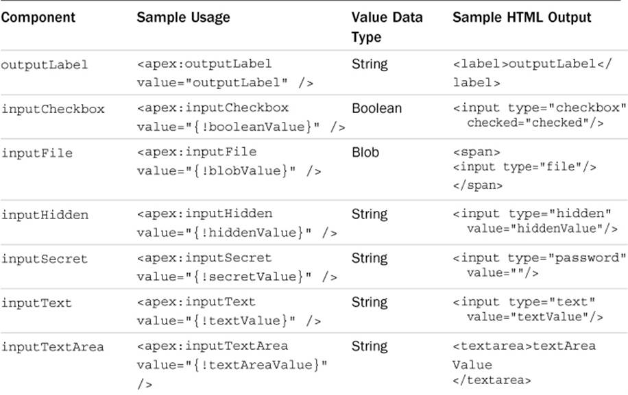
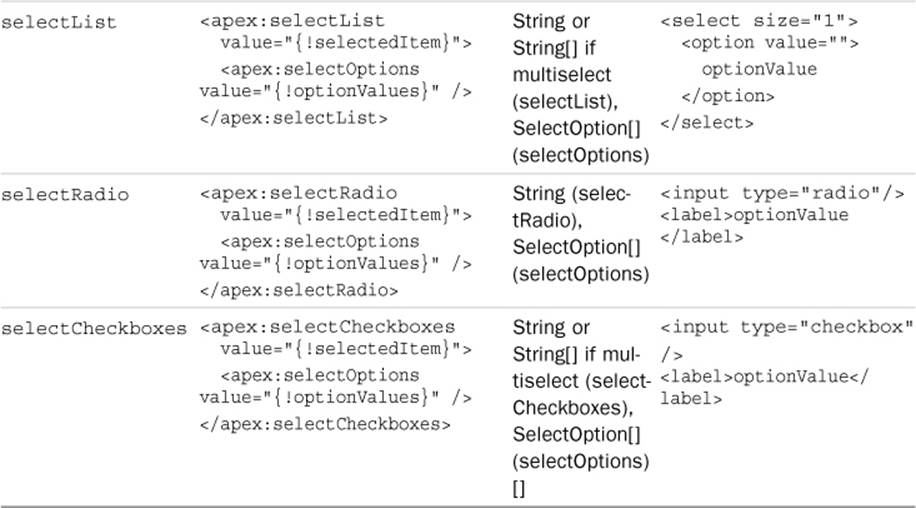
Table 6.1 Primitive Data Components
Repeating Components
Repeating components are bound to a list or set of values. They iterate over them, rendering the component body for each child in the collection.
The three types of repeating components are dataList, dataTable, and repeat. They all require two attributes: value, a binding to the collection, and var, the name of the variable that contains a reference to the current child.
The difference between the three components is in how the HTML is rendered. The dataList component is rendered as an HTML list, with each element of the collection rendered as a list item (LI tag). The dataTable component is rendered as an HTML table, with each element in a table row (TR tag). The repeat component provides no HTML formatting, leaving that entirely up to the Visualforce developer.
Listing 6.13 demonstrates usage of the repeat component to loop over the elements of the collection Skills__r. Each element of the collection is assigned to the variable skill. This variable is valid within the body of the repeat so that you can render its data—in this case, using anoutputField component to display each child’s Type__c field. A common use of the repeat component is in conjunction with a custom controller method that returns a list of records. You can iterate over the list with repeat, outputting HTML elements as you go.
Listing 6.13 Sample Usage of repeat Component
<apex:repeat value="{!Skills__r}" var="skill">
<apex:outputField value="{!skill.Type__c}" />
</apex:repeat>
Action Components
Action components allow the page to invoke a method on the controller. The controller method typically performs some operation on the contents of the page, such as updating the database, and then either refreshes the page or navigates to a new page.
Before any refreshing or navigation takes place, the state of the user interface input elements on the page is injected into the variables of the controller using setters. This way, they are accessible from within your action code.
The two basic action components are commandButton and commandLink. The commandButton is rendered as an HTML button, whereas the commandLink is rendered as an anchor. Both are valid only inside a form component. They are typically used with an action attribute that specifies the name of the controller method to invoke or the URL of a new page to navigate to and a value attribute that displays a label to the user. Listing 6.14 is an example of using the commandButton, which invokes the doSomething method of the controller when clicked.
Listing 6.14 Sample Usage of commandButton Component
<apex:form>
<apex:commandButton action="{!doSomething}"
value="Do Something" />
</apex:form>
The page component also has an action, specified in the init attribute. This action is called automatically upon page load but should not be used for initialization code. Its purpose is to immediately redirect the user to a new page.
Before invoking a controller method, all action components perform validation on data components, accepting user input that is contained within their parent form. For example, if an input component is required but no value is provided, an error results. Errors can be displayed using thepageMessages or messages component (described in the “Error Handling” subsection of this chapter) and beside any inputField components if their database field is defined to do so. You can disable this validation behavior by setting the action component’s immediate attribute to true.
Note
Visualforce includes actions that operate asynchronously, allowing modifications to the page without a full page refresh. These actions are discussed in Chapter 7.
Primitive Components
Many standard components mirror standard HTML tags, summarized in Table 6.2. These primitive components might seem unnecessary because you can always write the equivalent HTML without using a Visualforce component. But one thing plain HTML cannot do is server-side conditional rendering.
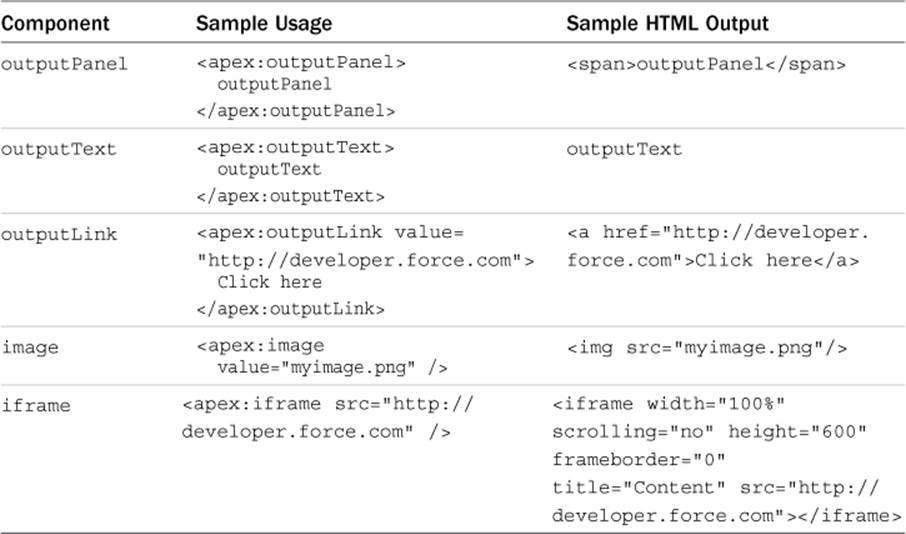
Table 6.2 Primitive Components
With regular HTML, your markup always appears in the page, increasing its size and load time, and hiding it requires JavaScript or CSS. Visualforce provides the rendered attribute, allowing you to improve the performance of your pages by conditionally rendering markup based on the state of the controller.
There are two additional primitive components: includeScript and stylesheet. They both accept a value attribute to specify the URL of a script or stylesheet resource to load. These components do not have a rendered attribute, but using them instead of their HTML counterparts can improve page performance and maintainability. The script and stylesheets are included directly in the HTML HEAD tag for the page, which is not possible to do from a Visualforce page using HTML. Additionally, these components ensure that scripts and stylesheets are not duplicated on the page.
Force.com-Styled Components
Force.com’s native user interface makes heavy use of CSS and JavaScript within its Web pages to provide a consistent look and feel across the platform. Many Visualforce components deliver this same styling to developers, without requiring any knowledge of Force.com’s CSS or other implementation details. The following list groups these components into five categories based on their function:
Page structure—sectionHeader, pageBlock, pageBlockSection, and pageBlockSectionItem are the native structural elements used by Force.com to organize a page into a hierarchy of clearly identifiable sections, subsections, and sets of label/field pairs.
Action containers—pageBlockButtons and toolbar/toolbarGroup organize a series of buttons or links for performing actions on the page.
Table—pageBlockTable is used like a dataTable but renders rows and columns in the Force.com native style.
Paging components—panelBar/panelBarItem and tab/tabPanel group components into pages that can be dynamically shown and hidden.
Notifications—pageMessages displays errors and information.
Figure 6.4 illustrates all the components in use on a single Visualforce page.
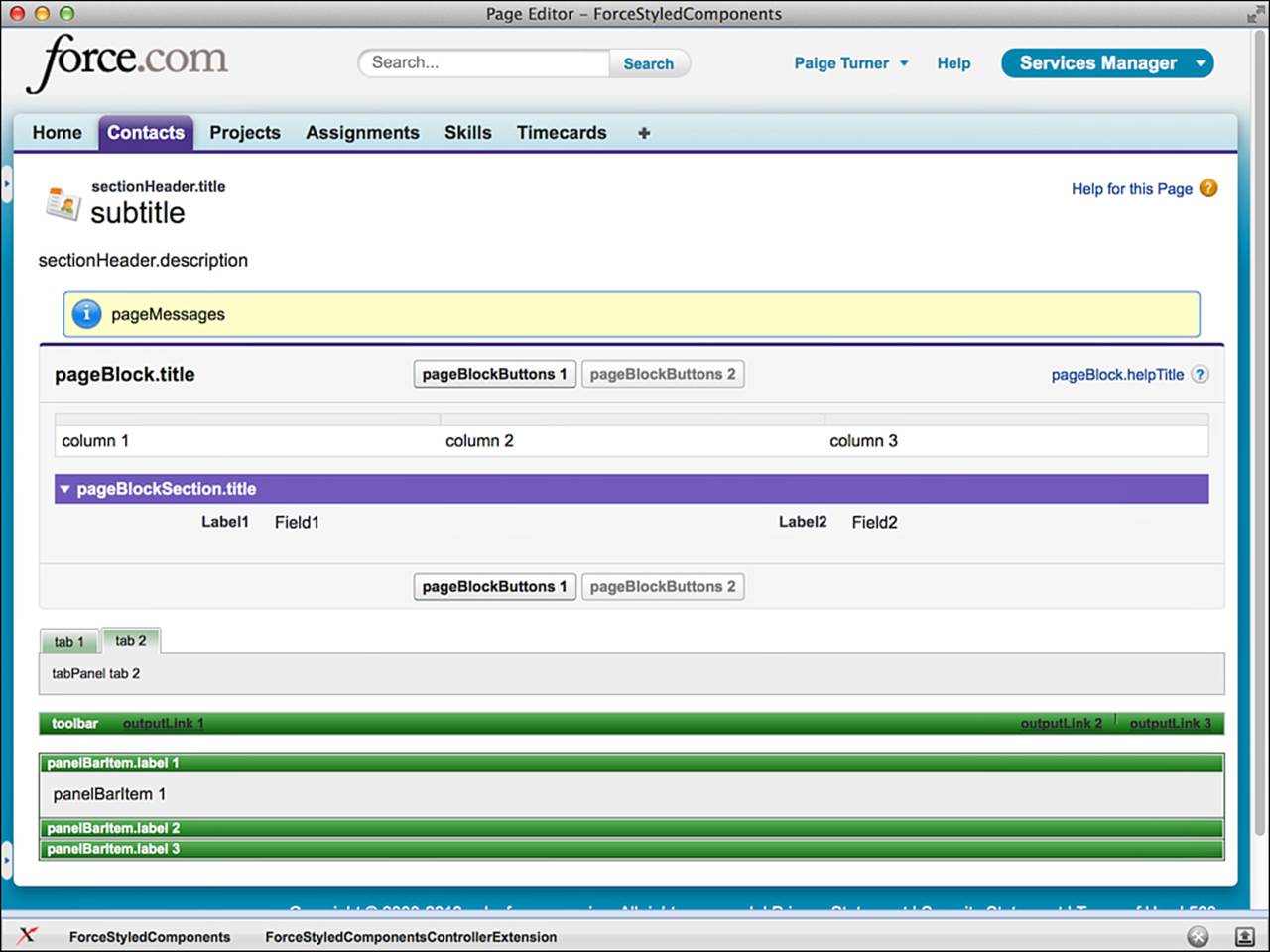
Figure 6.4 Force.com-styled components
Listings 6.15 and 6.16 implement the controller and page shown in Figure 6.4.
Listing 6.15 Sample Controller with Force.com-Styled Components
public class ForceStyledComponentsControllerExtension {
private final List<Contact> contacts;
public ForceStyledComponentsControllerExtension(
ApexPages.StandardSetController stdController) {
this.contacts = (List<Contact>)stdController.getRecords();
}
public PageReference initPage() {
ApexPages.addMessage(new ApexPages.Message(
ApexPages.Severity.INFO, 'pageMessages'));
return null;
}
}
Listing 6.16 Sample Page with Force.com-Styled Components
<apex:page standardController="Contact"
recordSetVar="contacts"
extensions="ForceStyledComponentsControllerExtension"
action="{!initPage}">
<apex:form>
<apex:sectionHeader title="sectionHeader.title"
subtitle="subtitle"
description="sectionHeader.description"
help="http://developer.force.com" />
<apex:pageMessages />
<apex:pageBlock title="pageBlock.title"
helpUrl="http://developer.force.com"
helpTitle="pageBlock.helpTitle">
<apex:pageBlockButtons>
<apex:commandButton action="{!save}"
value="pageBlockButtons 1"/>
<apex:commandButton action="{!save}"
value="pageBlockButtons 2" disabled="true" />
</apex:pageBlockButtons>
<apex:pageBlockTable var="r" value="{!contacts}"
title="pageBlockTable.title" rows="1">
<apex:column>column 1</apex:column>
<apex:column>column 2</apex:column>
<apex:column>column 3</apex:column>
</apex:pageBlockTable>
<p />
<apex:pageBlockSection title="pageBlockSection.title"
columns="2">
<apex:pageBlockSectionItem>
<apex:outputPanel>Label1</apex:outputPanel>
<apex:outputPanel>Field1</apex:outputPanel>
</apex:pageBlockSectionItem>
<apex:pageBlockSectionItem>
<apex:outputPanel>Label2</apex:outputPanel>
<apex:outputPanel>Field2</apex:outputPanel>
</apex:pageBlockSectionItem>
</apex:pageBlockSection>
</apex:pageBlock>
<p />
<apex:tabPanel switchType="client" selectedTab="name2">
<apex:tab label="tab 1"
name="name1">tabPanel tab 1</apex:tab>
<apex:tab label="tab 2"
name="name2">tabPanel tab 2</apex:tab>
</apex:tabPanel>
<p />
<apex:toolbar>
<apex:outputText>toolbar</apex:outputText>
<apex:outputLink value="http://developer.force.com">
outputLink 1</apex:outputLink>
<apex:toolbarGroup itemSeparator="line" location="right">
<apex:outputLink value="http://">outputLink 2</apex:outputLink>
<apex:outputLink value="http://">outputLink 3</apex:outputLink>
</apex:toolbarGroup>
</apex:toolbar>
<p />
<apex:panelBar>
<apex:panelBarItem label="panelBarItem.label 1">panelBarItem 1
</apex:panelBarItem>
<apex:panelBarItem label="panelBarItem.label 2">panelBarItem 2
</apex:panelBarItem>
<apex:panelBarItem label="panelBarItem.label 3">panelBarItem 3
</apex:panelBarItem>
</apex:panelBar>
</apex:form>
</apex:page>
Force.com User Interface Components
Four view components are available that each replicate coarse-grained areas of Force.com’s native user interface functionality. These components are a single reference on your Visualforce page, but they expand to produce many subordinate user interface elements when rendered to users. They are summarized in the following list:
1. listViews—The listViews component is rendered by Force.com on the list page of an object tab when the Enable Enhanced Lists option is disabled for the organization.
2. enhancedList—The enhancedList component consists of a drop-down list of view names and a table of records returned by executing the view.
3. relatedList—The relatedList component renders the records of any one of an object’s child objects.
4. detail—The detail component provides a subset of the native user interface’s detail page for an object.
listViews Component
The listViews component includes the capability to create and edit list views, as well as execute them and render their records. The only required attribute of listViews is type, which binds a database object type to the component.
enhancedList Component
The enhancedList component is a more modern version of the listViews component. It has the same functionality but also includes drag-and-drop reorderable columns, sortable columns, and results pagination with dynamic page sizes. It appears in the native user interface only when Enable Enhanced Lists is enabled for the organization.
The required attributes of enhancedList are height (the height of the component in pixels) and either type (the database object type displayed by the component) or listId (the unique identifier of the list view).
relatedList Component
The relatedList component renders a list of child records. It is the same component that appears in the native interface below the detail for a record. It is paginated and allows related records to be edited, deleted, and created, depending on the object permissions of the current user.
The required attributes of relatedList are list, the name of the child relationship to be rendered in the list, and subject, an expression language reference to the parent record on the controller (defaults to the id parameter of the page if not provided). Both Master-Detail and Lookup relationships are supported by relatedList.
detail Component
The detail component replicates the functionality of the native user interface on the detail page of a record. It respects the page layout of the record, including page layouts defined per record type. It also supports in-line editing for the edit mode of an object.
Like the relatedList component, detail requires a subject or it attempts to read a record identifier from the page’s id URL parameter. By default, all related lists are rendered below the detail section unless the relatedList parameter is set to false.
Visualforce and the Native User Interface
Force.com provides many places for Visualforce pages to be integrated into its native user interface. You can embed Visualforce pages inside standard user interface pages, override the buttons that navigate between pages, override the standard pages entirely, and add buttons and tabs to navigate to an entirely custom user interface. Areas of the native user interface extensible through Visualforce are summarized here:
Standard pages—Standard pages provide the default user interface for maintaining records in the Force.com database. These pages can be overridden with your custom Visualforce pages.
Standard buttons—Standard buttons normally navigate the user to standard pages, such as the New button, which moves the user to the edit page for a new record. But these buttons can be remapped to your custom Visualforce pages, to inject an additional visual step before the standard page or to hide it altogether.
Page layouts—Page layouts define the position of fields, buttons, and related lists in the native user interface. Visualforce pages can be embedded within page layouts.
Custom buttons and links—Custom buttons appear at the top and bottom of standard pages and links within a detail page. They can navigate the user to a Visualforce page.
Custom tabs—Custom tabs are added to an application and appear at the top of the Web browser under the application banner. A Visualforce page can be configured as a custom tab.
Standard Pages
The native user interface consists of four standard pages for working with database records. These can all be overridden, as described here:
1. Tab—The tab page appears when a custom object tab is clicked. Figure 6.5 provides an example of this page.
Figure 6.5 Standard tab page
2. List—The list page displays a series of records in a tabular view, as shown in Figure 6.6. You reach it by clicking the Go button from the tab page.
Figure 6.6 Standard list page
3. View—The view page is a read-only view of a single record and its related records. Figure 6.7 is the view page for the Contact object. A page layout, determined by profile and optionally record type, is used to determine the appearance of the view page.
Figure 6.7 Standard view page
4. Edit—The edit page uses the same layout as the view page but allows the values of a record to be modified and saved. This is shown in Figure 6.8 for the Contact object.
Figure 6.8 Standard edit page
Caution
Override the standard edit page with caution. The standard edit page provides deep functionality, such as page layouts and record types, that cannot be replicated in a Visualforce page without a significant amount of custom code.
To override a standard page, go to the App Setup area and click Create, Objects and select the object. Scroll to the Buttons, Links, and Actions section. Tab, view, and edit pages can be overridden only with Visualforce pages that use a standard, single record controller. The list page must use a standard set controller. Controller extensions are supported in all pages.
Standard Buttons
Visualforce pages can be shown as the result of clicking a native user interface button, overriding the button’s standard behavior. The following standard buttons can be overridden:
New—The New button normally navigates the user to the edit page on a new record.
Delete—This is the page navigated to after a record is deleted. The default behavior is to navigate to the tab page.
Clone—The Clone button copies the values from the current record into a new record and places the user in edit mode on that record. This behavior can be customized by overriding the Clone button.
Accept—The Accept button applies to records owned by a queue rather than a single user. It enables a user to remove a record from the queue, assigning ownership of the record to himself. This button appears on the list page only when it is displaying records owned by a queue.
To override a standard button, go to the App Setup area and click Create, Objects and select the object. Scroll to the Buttons, Links, and Actions section. Your Visualforce page must use a standard, single record controller, with or without extensions.
Page Layouts
A Visualforce page can be embedded in an object’s page layout alongside its fields. Figure 6.9 shows a new section called My Section, defined using the page layout editor. My Page is the name of a Visualforce page that has been dragged into My Section and is now visible whenever a record of that object is viewed or edited.
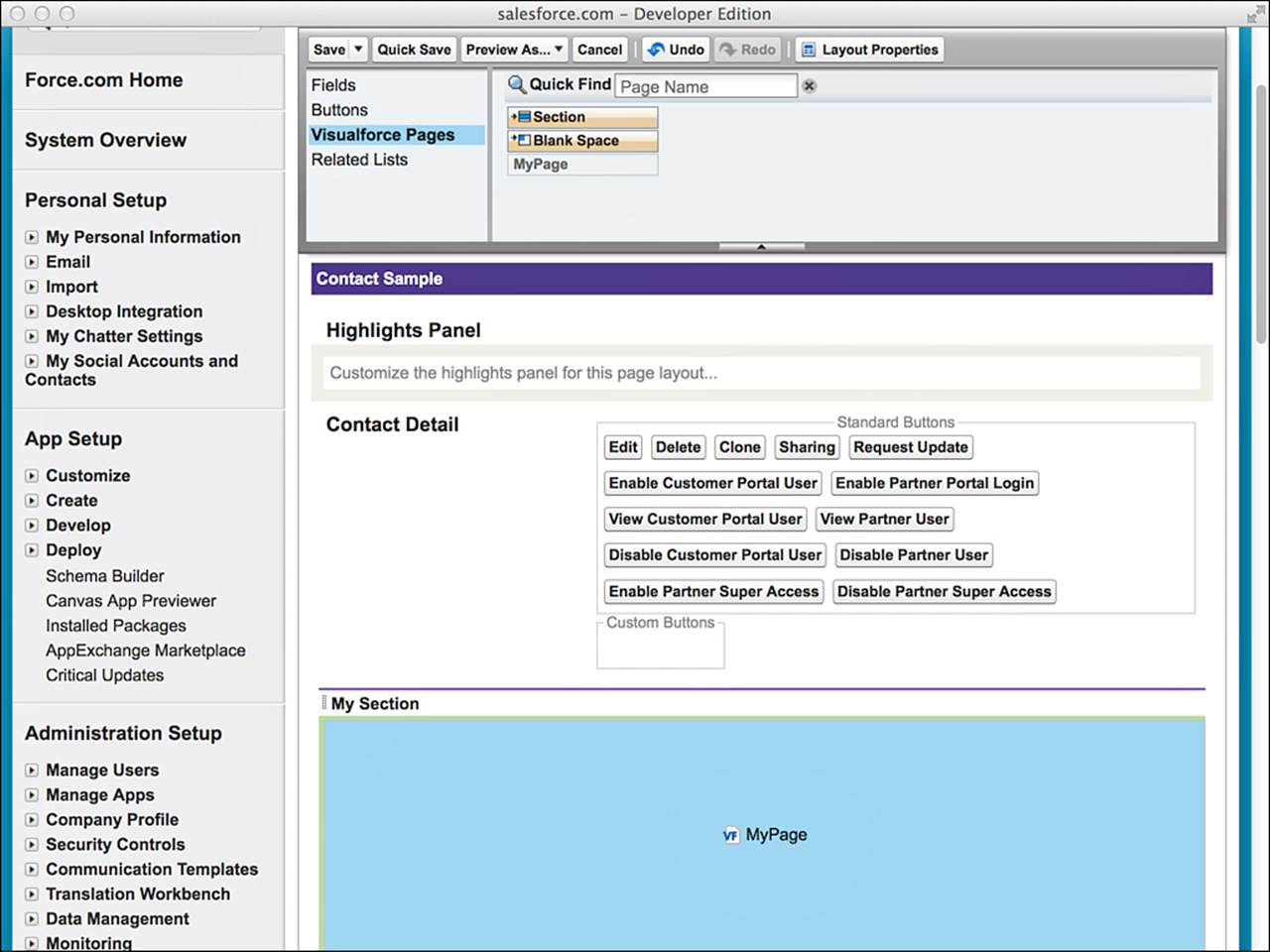
Figure 6.9 Adding a Visualforce page to page layout
The result of adding the Visualforce page called My Page to the layout for the Contact object is shown in Figure 6.10. The text “Hello Visualforce” is being rendered by the Visualforce page embedded within the record’s detail page.
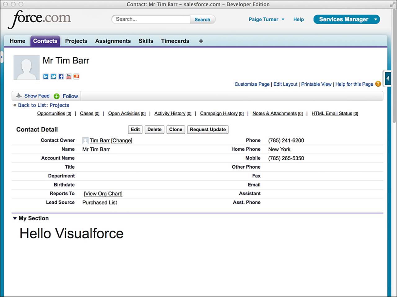
Figure 6.10 Embedded Visualforce page
To add a Visualforce page to a page layout, go to the App Setup area and click Create, Objects and select the object. Scroll to the Page Layouts section and click the Edit link for the page layout. For your Visualforce pages to appear in the page layout editor, they must conform to the following guidelines:
They cannot already be in use by a tab.
They use a standard, single record controller, with or without extensions.
Their controller’s object type matches that used by the page layout. For example, for a Visualforce page to appear on the Contact page layout, it must use a standard Contact controller.
Custom Buttons and Links
You can configure buttons and links that navigate to any Visualforce page. These buttons and links are then added to page layouts. Buttons and links are defined on the database object. In the App Setup area, click Create, Objects, and then click the object. Scroll to the Buttons, Links, and Actions area and click the New button.
Custom buttons and links tied to Visualforce pages can be added to the object’s detail page layout or a related list page layout. The detail page layout requires a standard controller. The related list layout requires a standard set controller. Controller extensions can be used with either.
Custom Tabs
You can configure any Visualforce page as a new tab in the Force.com native user interface. To add a new Visualforce tab, go to the App Setup area and click Create, Tabs. Click the New button in the Visualforce Tabs section to create a tab. Select a Visualforce page, give the new tab a unique label and name, select a tab label and style, set tab visibility on profiles and applications, and click Save.
Visualforce in Production
This section describes areas of focus for real-world user interfaces written in Visualforce. It includes the following subsections:
Debugging and tuning—Force.com provides Web-based tools for debugging and tuning Visualforce pages.
Security—Securing Visualforce pages is an important task. Visualforce pages can expose users to records they should not see under record sharing rules and cause runtime errors due to lack of object or field visibility.
Error handling—Error handling in Visualforce is a process of catching all exceptions and handling them thoughtfully, with both the integrity of the database and the user experience in mind.
Governor limits—The code running in Visualforce controllers is subject to governor limits, applied within the scope of each user-initiated action.
Unit tests—Force.com requires test coverage on the code in Visualforce controllers and provides system methods to assist.
Debugging and Tuning
Developer Console is the first place to look to troubleshoot unexpected behavior from a Visualforce user interface. While Developer Console is open, every interaction with Force.com is logged and can be examined in depth. In Figure 6.11, Developer Console is active and contains six entries, shown in the bottommost table.
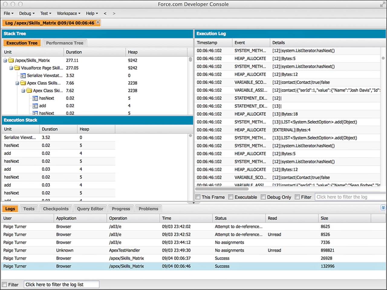
Figure 6.11 Developer Console
The last log entry has been clicked, and the other panels of Developer Console are refreshed with detailed information. This information is centered around the Apex code executed in the controller associated with the page, as well as any Apex code executed as a result of controller code. If a bug exists in your controller code, it should be obvious in the Execution Tree, Execution Log, and Stack Tree panels as you trace the flow of instructions.
The next place to look for bugs is the Visualforce page markup. If Force.com encounters something invalid in the course of rendering a Visualforce page, such as a null reference in your controller, it can interrupt the processing of your page entirely and display an error message. Trial and error can be helpful in these situations. Comment out portions of your Visualforce page using HTML comment tags (<!-- sample comment -->) until the page functions again and you’ve isolated the troublesome portion. An in-browser development tool such as Firebug or Chrome Developer Tools is also helpful if the page renders successfully but has a client-side presentation or logic issue. These tools enable close inspection of the JavaScript, HTML, and CSS in the page.
When you’re ready to improve the performance of your Visualforce page, examine the view state. The view state contains the values of local variables in your controller. They are encoded and embedded in the page itself in a hidden field and sent back to Force.com upon every user action. Sending the view state back and forth to the browser and processing it in Force.com can reduce the responsiveness of your user interface. View state is limited to 128K, but performance can be impacted well before the limit is reached.
The Visualforce development mode footer contains a tab called View State, shown in Figure 6.12. With it, you can examine the contents of the view state: the variables saved there, along with their sizes and contents. Double-clicking one of the folders opens a dialog with charts showing the contribution of various types of view state toward the limit.
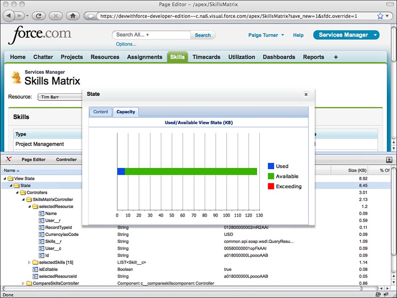
Figure 6.12 View state
Your goal is to minimize the view state. Look for controller variables that do not need to persist across page views, and add the transient keyword to them. The transient keyword tells Force.com not to save the state of the variable in the Web page, removing the round-trip cost of transporting that data to and from the Web browser. Avoid querying extraneous information from the database in your SOQL calls. Also, simplify and streamline any nested data structures that are required in the view state.
Note
Performance tuning Visualforce pages is a complex subject beyond the scope of this book. An excellent resource is a best-practices document from Salesforce itself, available athttp://www.salesforce.com/docs/en/cce/salesforce_visualforce_best_practices/salesforce_visualforce_best_practices.pdf. Learning these best practices early in the development process can prevent costly rework. Additionally, test all of your Visualforce pages with realistic data volumes. This helps to expose performance issues prior to a production deployment.
Security
Securing a Visualforce user interface involves controlling access to the objects, the records, and the page itself. Visualforce obeys the object and field-level security rules configured in profiles. Record security is handled by the controller through special keywords in Apex in conjunction with custom code that can be written to enforce application-specific security rules. Access to the page is granted by the user’s profile.
Note
As Visualforce is a Web technology, it’s also critical to guard your Visualforce pages against vulnerabilities native to the Web. This includes Cross-Site Scripting (XSS), SOQL Injection, and Cross-Site Request Forgery (CSRF). There are many built-in features of Visualforce and Apex that address these vulnerabilities transparently to the developer, but it’s a good idea to be aware of them. Depending on the nature of your Visualforce pages, additional effort may be needed to protect against them. For more information, consult the Secure Coding Guideline document published by Salesforce, available at http://wiki.developerforce.com/page/Secure_Coding_Guideline.
Object-Level Security
Access to database objects and fields is determined by the profile and is consistent with the native user interface. This protects the database and maintains the centralized control of data security, but also exposes the user interface to various runtime errors if improperly configured. For example, if the user’s profile denies all access to an object, this object is essentially invisible. When a Visualforce controller attempts to select from it, the page fails with an exception. Other configuration problems are handled more transparently to the user. If the user’s profile lacks edit access on an object and a Visualforce page binds an inputField to that object, it is automatically rendered as an outputField, appropriately blocking user input.
When developing a controller, check that the SOQL, SOSL, and DML operations are fully compatible with the set of profiles expected to use the page. As a developer, you have full visibility to every object and field, but do not assume that your users have the same level of access. Test the Visualforce pages by logging in as a test user or cycling through profiles on a single test user. You can also write unit tests that run under the privileges of a specific user using the System.runAs method, covered in more detail in the “Unit Tests” subsection.
Record-Level Security
Standard controllers always honor the record-level security of the current user. But by default, record sharing rules are ignored by code in custom controllers. These controllers run in a system context, like a trigger.
Note
Record sharing rules are still honored by the methods of standard controllers that have extensions defined, but the code in an extension class itself still runs in system mode.
For example, if a user’s profile grants the user access to a particular object, your custom controller queries it, and your Visualforce page displays the results, the user can read every record in the object, regardless of the sharing settings.
You can change this behavior in the controller code by specifying a security mode in the class definition. Two security modes are available: with sharing and without sharing. The controller definition in Listing 6.17 uses with sharing to configure the controller to honor record sharing rules.
Listing 6.17 Custom Controller Using Record Sharing Rules
public with sharing class MyController {
// the code in this controller honors record sharing rules
}
The without sharing security mode indicates that a class should not obey record sharing rules, which is the default state. You do not need to change this unless your code accesses objects that have record sharing rules defined that you would like to enforce in your user interface. Subclasses inherit the security mode from their parent class, but inner classes do not. In nested calls, where one class calls another class, the current security mode is applied unless explicitly specified.
After a security mode is chosen, no additional work is required. SOSL and SOQL statements automatically return the correct subset of records based on the sharing rules for each object. But if a record is referenced directly that is not shared with the user, such as through a DML method updating a foreign key, a runtime error is thrown. Use a try, catch block around DML methods to make sure that this situation is properly handled.
Page-Level Security
Profiles determine which users are able to use a Visualforce page. Pages must be explicitly enabled for each profile that requires access. If this is not done, users will receive an error page titled Insufficient Privileges when attempting to view the page.
To grant a profile access to a page, go to the Administration Setup and click Manage Users, Profiles. Select the desired profile, scroll to the Enabled Visualforce Page Access section and click the Edit button. Select pages from the Available Visualforce Pages list and click the Add button to add them to the Enabled Visualforce Pages list. Click Save when you’re done.
Note
Users with the Customize Application permission can access all Visualforce pages in the organization.
Error Handling
The two main concerns when handling errors in Visualforce are how uncaught exceptions impact the user interface and how to communicate caught exceptions to users.
Uncaught Exceptions
Allowing an uncaught exception in a trigger is often an appropriate way to notify the user of a problem because Force.com displays a nicely formatted error message to the user in the native user interface. But in a Visualforce page, uncaught exceptions result in an alarming, generic Force.com error page whose appearance cannot be controlled or customized in any way.
As this is typically not consistent with the usability and look and feel of a custom user interface, one of the goals of error handling in Visualforce is to avoid these uncaught exceptions. Place a try, catch block around every action method, or at least those that perform SOSL, SOQL, or DML operations.
A benefit of uncaught exceptions in triggers is that they roll back the current transaction. Catching all exceptions in your Visualforce controller forces your code to roll back explicitly if required by your application. For example, if your controller has two DML statements in an action method and fails on the second with a caught exception, the first statement is still committed to the database at the conclusion of the method. If this leaves the database in an undesirable state for your application, set a savepoint at the beginning of the method and roll back to it in the catch block. For an example of using savepoints, refer to Listing 5.19 in Chapter 5, “Advanced Business Logic.”
Error Communication
Visualforce provides page components and corresponding data objects for communicating errors to the user in a consistent way. The page components are messages and pageMessages, which display the page-level errors returned by a controller. These components are placed on pages, typically at the top, and render the ApexPages.Message objects added to the page. Message objects contain a message and optional severity. Severity is used to style the message when displayed in the pageMessages component and can also be filtered on in test methods.
Listing 6.18 is an example of code to add an error-severity message to the page. To be visible, it must be rendered by a messages or pageMessages component.
Listing 6.18 Sample Usage of Page Messages
ApexPages.addMessage(new ApexPages.Message(
ApexPages.Severity.ERROR, 'Something went wrong'));
Governor Limits
Visualforce controllers have the same set of governor limits as all Apex code. Table 6.3 reviews these limits.
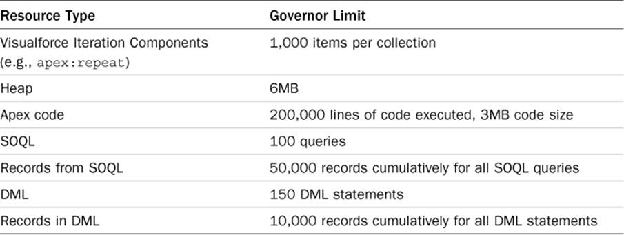
Table 6.3 Subset of Governor Limits
Governor limits apply during execution of user-initiated actions and are not cumulative. When an action is complete, the governor limits reset. For example, if your controller contains a save method bound to a commandButton, the governor limits apply during the execution of the savemethod. When the user clicks the button again or takes another action that invokes a method, the governor limits begin counting your resource consumption again from zero.
If you need to work with larger data sets in your Visualforce pages and are bumping into governor limits, consider whether you can partition the user interface into a series of read-only and read-write subpages. If so, you can take advantage of higher governor limits on the read-only pages by adding the readOnly="true" attribute to the apex:page element. The governor limit increases are shown in Table 6.4.
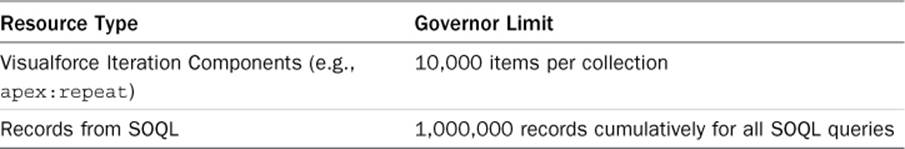
Table 6.4 Relaxed Governor Limits for Read-Only Visualforce Pages
Unit Tests
Unit tests are mandatory for all Apex code, including Visualforce controllers but not the pages themselves. Your application code must have at least 75% test coverage before it can be deployed to a production environment.
The mechanics of writing unit tests for controllers is similar to that of triggers, with some additional system methods for test setup. But the strategy for testing controllers is unique, because controller code normally relies on the Web browser to drive it.
Listing 6.19 provides an example of the test setup code. It starts by creating an instance of the controller class and getting a reference to the Visualforce page to test. This is a PageReference instance, created by passing the page name as an argument. The Test.setCurrentPagemethod sets the context of the test method to the page you want to test.
Listing 6.19 Sample Controller Test Method
static testMethod void sampleTestMethod() {
MyPageController controller = new MyPageController();
PageReference page = new PageReference('MyPage');
Test.setCurrentPage(page);
}
The body of your tests can employ one or more of the following test strategies to exercise code in the controller:
Directly invoke controller methods and getters/setters.
Add a test harness to constructor code to read URL arguments to establish controller state or perform actions.
Verify data in the database using SOQL and SOSL queries.
Use System.runAs blocks to simulate different users, such as System.runAs(user) { block; }.
Caution
Even 100% test coverage on the controller class does not guarantee a bug-free user interface. Testing Visualforce pages is like testing any Web application. Test it manually with your Web browser or with an automated Web testing tool.
Sample Application: Skills Matrix
One of the features of the Services Manager sample application is skill set management. The skills of consultants are tracked using the Skill object, a child of the Contact object. Entering skills in the native user interface involves navigating to the Contact’s record and clicking the New button in the Skills related list and then selecting a skill type and a rating.
Users of the application have requested a more streamlined way to enter and view skills, called the Skills Matrix. The requirements of the Skills Matrix follow:
Reduce navigation clicks—Provide a single screen for entering and viewing all skill-related information. The screen shows the skills and ratings of a single contact at a time in tabular format: skill types as rows and a single column to view and edit ratings.
Encourage data completeness—All skill types are shown at all times. This is in contrast with the native user interface, which shows only the skills containing ratings. Showing all skill types, including those lacking a rating, encourages users to treat the user interface like a survey and should increase data completeness.
Allow all to view, restrict editing—Whether a rating is editable or read-only depends on the current user. If the user is editing her own contact record, all ratings are editable. If the user is a manager, vice president, or system administrator (by profile), the user is allowed to edit the skills of any contact. If the user does not meet any of the previous criteria, the skill ratings are read-only.
This section describes building the feature in three parts. The first part is a basic implementation, to allow the selection of a contact and editing of its skills. The second part adds the finishing touches to implement the full set of requirements. The final section provides a sample, full implementation of the feature, shown in Figure 6.13, and comments on portions of the code.
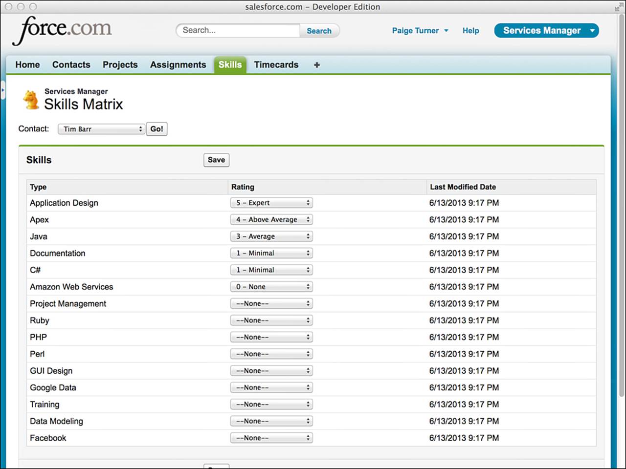
Figure 6.13 Skills Matrix sample implementation
Basic Implementation
In the basic implementation, build a Visualforce page with a drop-down list at the top containing contact names and a table below it with the skills and ratings. The only skills shown are those that already contain ratings for the contact. The ratings can be edited and saved by any user.
Start by creating the page and controller in the Force.com IDE. Add a selectList component and a corresponding getter in the controller to return a list of SelectOption objects, constructed from the names and unique identifiers of records of the Contact object. Add a refreshcommandButton to fetch the skills for the currently selected contact.
Build and test the drop-down list of contacts before moving on to the list of skills. Then flesh out the controller, querying the Type__c and Rating__c fields of the Skill__c records belonging to the selected contact. Iterate over that list in the page, displaying the ratings as drop-down lists. Add an action method to the controller to save changes to the skills list. Use the upsert database method, as later your skills list will contain both new and edited records. Add a commandButton on the page to invoke the action method.
Test your user interface frequently during development. Add your page to the native user interface with a Visualforce tab or override the Skills custom object tab. To override the tab, in the App Setup area, click Create, Objects and select Skill. Scroll to the Buttons, Links, and Actions section. Click the Edit link for the action Skills Tab. For the Override With, select the Visualforce Page radio button. Select your Skills Matrix page from the drop-down list and click the Save button.
Full Implementation
After you get the basic implementation into a working state, move on to the more challenging requirements: the complete list of skill types and data security.
To get the complete list of types, use the metadata methods to query the values of the Skill__c.Type__c picklist. Iterate over the values, checking for the presence of corresponding Skill records for the contact. Create Skill records where they are missing.
For data security, you cannot rely on built-in Force.com record-level security alone. It operates on the OwnerId field, the unique identifier of the user who has ownership rights to a record. In the Skills Matrix, ownership of a contact record does not determine who is allowed to edit or view its skills. An administrator might import contact data from a legacy system, or a user in human resources might be the owner of the contact.
The assumption is that every consultant and other user of the Services Manager application has a license to log in to Force.com as an independent user with his own credentials. Each full user license carries with it a unique record in the standard User object. This user identity can be correlated to the contact record to determine at runtime the behavior of the Skills Matrix. To create this correlation, add a lookup field to the Contact object called User, setting its parent to the standard User object. For each contact record, provide a value of the new User field. This lookup of the User from Contact can drive the decision of the controller to make a set of skills editable or not.
When you’re done with the implementation, test it against the three user scenarios: privileged user, consultant editing his or her own skills, and consultant viewing the skills of another consultant.
Tip
Only users with the System Administrator profile will have access to your new Skills Matrix page. To open the page to nonadministrative users, in the Administration Setup area, click Manage Users, Profiles and select the profile of the users. Scroll to the Enabled Visualforce Page Access section and click the Edit button. Select your page from the Available Visualforce Pages list and click the Add button to move it to the Enabled Visualforce Pages list. Click the Save button when you’re done.
Implementation Walk-Through
This subsection provides the code for a sample implementation of the Skills Matrix. It includes the controller, the page, and controller test cases.
Skills Matrix Controller
Listing 6.20 contains a sample implementation of the Skills Matrix controller class. The controller has four variables, each with a getter method for access by the Visualforce page. The selectedContactId variable contains the unique identifier of the contact selected for editing or viewing. isEditable is a flag used by the page to enable or disable the Save button and to determine whether to render skills as text fields or editable drop-down lists. The selectedContact variable contains several fields from the Contact object needed throughout the controller, queried using the selectedContactId. The selectedSkills list contains the skill types and ratings to be displayed and edited in the user interface, and this same list is used to update the database upon a save action.
The controller has two actions: save and refresh. The save action applies the changes from the drop-down lists of skill ratings by upserting them into the database. The refresh action uses the unique identifier of the currently selected contact (selectedContactId) to query the database for Skill records. It compares them against the complete list of skill types via the database metadata call getPicklistValues. Finally, it updates the isEditable variable based on whether the current user is privileged or is associated with the currently viewed contact.
Several helper methods are in the controller. addError and addInfo are shortcuts for adding notifications to the page, displayed using the pageMessages component. The getCurrentUserContact method queries the Contact record corresponding to the current user. TheisManager method returns true if the user is privileged, enabling the user to edit the skills of any contact.
Listing 6.20 Skills Matrix Controller
public class SkillsMatrixController {
public String selectedContactId { get; set; }
public Boolean isEditable { get; private set; }
public Contact selectedContact { get; private set; }
public List<Skill__c> selectedSkills { get; private set; }
public List<SelectOption> getContactOptions() {
List<SelectOption> options = new List<SelectOption>();
options.add(new SelectOption(
'', '-- Select Contact --'));
List<Contact> contacts = [ SELECT Id, Name
FROM Contact ORDER BY LastName ];
for (Contact contact : contacts) {
options.add(new SelectOption(contact.Id,
contact.Name));
}
return options;
}
public PageReference refresh() {
if (selectedContactId == null) {
addError('Select a contact');
return null;
}
selectedContact = [ SELECT Id, Name,
User__r.UserRoleId,
User__r.ProfileId,
(SELECT Type__c, Rating__c, LastModifiedDate
FROM Skills__r ORDER BY Rating__c DESC)
FROM Contact
WHERE Id = :selectedContactId
LIMIT 1 ];
Set<String> skillTypes = new Set<String>();
selectedSkills = new List<Skill__c>();
for (Skill__c skill : selectedContact.Skills__r) {
skillTypes.add(skill.Type__c);
selectedSkills.add(skill);
}
Schema.DescribeFieldResult field = Skill__c.Type__c.getDescribe();
String picklistValue = null;
for (Schema.PicklistEntry entry : field.getPicklistValues()) {
picklistValue = entry.getLabel();
if (!skillTypes.contains(picklistValue)) {
selectedSkills.add(
new Skill__c(Contact__c = selectedContact.Id,
Type__c = picklistValue));
}
}
if (isManager()) {
isEditable = true;
} else {
Contact userContact = getCurrentUserContact();
isEditable =
selectedContact != null && userContact != null
&& selectedContact.Id == userContact.Id;
}
return null;
}
private void addError(String msg) {
ApexPages.addMessage(new ApexPages.Message(
ApexPages.Severity.ERROR, msg));
}
private void addInfo(String msg) {
ApexPages.addMessage(new ApexPages.Message(
ApexPages.Severity.INFO, msg));
}
public Contact getCurrentUserContact() {
List<Contact> userContact = [ SELECT Id, Name,
User__r.UserRoleId, User__r.ProfileId
FROM Contact
WHERE User__c = :UserInfo.getUserId()
LIMIT 1 ];
if (userContact.size() == 0) {
addError('No contact associated with user');
return null;
} else {
return userContact.get(0);
}
}
private Boolean isManager() {
List<Profile> profiles = [ SELECT Id
FROM Profile WHERE Name IN (
'Project Manager', 'Vice President', 'System Administrator')
AND Id = :UserInfo.getProfileId() LIMIT 1 ];
return profiles.size() == 1;
}
public PageReference save() {
try {
upsert selectedSkills;
addInfo('Changes saved');
} catch(DmlException e) {
addError('Could not save changes: ' + e.getMessage());
}
return null;
}
}
Skills Matrix Visualforce Page
Listing 6.21 contains sample code for the Skills Matrix Visualforce page. It uses Force.com-styled view components to achieve an appearance that resembles the native user interface. The pageBlock and pageBlockButtons components visually separate the selection of the resource from the skills data and Save button, and the sectionHeader component mimics the appearance of a native object tab.
The pageBlockTable component iterates over the list of skills, displaying them as a table using standard Force.com styling. Each row of the table includes two columns. The first column contains the skill type. The second contains two components: one for editing the skill rating and another strictly for viewing it. Only one of these components is shown at a time. They are rendered conditionally based on whether the controller has determined the data to be editable. If the skills data is editable, only the inputField component is rendered. If the current user does not have the rights to edit the ratings, only the outputField is rendered.
Listing 6.21 Skills Matrix Visualforce Page
<apex:page controller="SkillsMatrixController"
tabStyle="Skill__c">
<style>
.contactLabel { padding-right: 15px; }
.goButton { margin-left: 10px; }
</style>
<apex:sectionHeader title="Services Manager"
subtitle="Skills Matrix" />
<apex:pageMessages />
<apex:form id="form">
<apex:outputLabel value="Contact:" for="selectedContactId"
styleClass="contactLabel" />
<apex:selectList id="selectedContactId" title="Contact"
value="{!selectedContactId}" size="1">
<apex:selectOptions value="{!contactOptions}" />
</apex:selectList>
<apex:commandButton action="{!refresh}" value="Go!"
styleClass="goButton" />
<p />
<apex:pageBlock title="Skills">
<apex:pageBlockButtons>
<apex:commandButton action="{!save}" value="Save"
disabled="{!NOT isEditable}" />
</apex:pageBlockButtons>
<apex:pageBlockTable value="{!selectedSkills}" var="skill"
rendered="{!selectedContactId != ''}">
<apex:column value="{!skill.Type__c}" />
<apex:column headerValue="Rating">
<apex:outputField value="{!skill.Rating__c}"
rendered="{!NOT isEditable}" />
<apex:inputField value="{!skill.Rating__c}"
rendered="{!isEditable}" />
</apex:column>
<apex:column value="{!skill.LastModifiedDate}" />
</apex:pageBlockTable>
</apex:pageBlock>
</apex:form>
</apex:page>
Controller Tests
The test cases in Listing 6.22 achieve 96% coverage of the Skills Matrix controller. They begin with a static initializer and init method to prepare the database for the tests by adding test data. This data is not permanent. All database actions during testing are rolled back automatically upon test completion.
The test cases rely on two Contact records: Tim and Barry. To test the behavior of the Skills Matrix on existing data, Tim is given a single Skill record, whereas Barry is left without skills. For testing security, Tim’s Contact record is associated with a User record named Tim, whereas Barry’s Contact record is not mapped to a User record. Update the query for the users in the static initializer to match two usernames in your own organization.
Listing 6.22 Skills Matrix Unit Test Class
@isTest
private class TestSkillsMatrixController {
static PageReference page;
static SkillsMatrixController controller;
static Contact barry, tim;
static User barryUser, timUser;
static {
timUser = [ SELECT Id FROM User WHERE Name = 'Tim Barr' LIMIT 1 ];
barryUser = [ SELECT Id FROM User WHERE Name = 'Barry Cade' LIMIT 1 ];
init();
}
private static void init() {
barry = new Contact(FirstName = 'Barry', LastName = 'Cade');
tim = new Contact(FirstName = 'Tim', LastName = 'Barr',
User__c = timUser.Id);
insert new Contact[] { barry, tim };
Skill__c[] skills = new Skill__c[] {
new Skill__c(Type__c = 'Java', Rating__c = '3',
Contact__c = tim.Id) };
insert skills;
page = new PageReference('SkillsMatrix');
Test.setCurrentPage(page);
controller = new SkillsMatrixController();
}
static testMethod void testAsUser() {
System.runAs(timUser) {
init();
controller.selectedContactId = barry.Id;
controller.refresh();
System.assert(!controller.isEditable);
controller.selectedContactId = tim.Id;
controller.refresh();
System.assert(controller.isEditable);
}
}
static testMethod void testNoContactForUser() {
System.runAs(barryUser) {
init();
controller.selectedContactId = barry.Id;
controller.refresh();
System.assert(ApexPages.hasMessages(ApexPages.Severity.ERROR));
}
}
static testMethod void testNoSkills() {
controller.getContactOptions();
controller.selectedContactId = barry.Id;
controller.refresh();
System.assert(controller.selectedSkills.size() > 0);
System.assert(controller.isEditable);
}
static testMethod void testWithSkills() {
controller.getContactOptions();
controller.selectedContactId = tim.Id;
controller.refresh();
System.assert(controller.selectedSkills.size() > 0);
System.assert(controller.selectedSkills.get(0).Type__c == 'Java');
}
static testMethod void testNoContactSelected() {
controller.selectedContactId = null;
PageReference ref = controller.refresh();
System.assert(ApexPages.hasMessages());
}
static testMethod void testSave() {
final String skillRating = '5 - Expert';
controller.getContactOptions();
controller.selectedContactId = barry.Id;
controller.refresh();
List<Skill__c> selectedSkills = controller.selectedSkills;
Skill__c skill = selectedSkills.get(0);
skill.Rating__c = skillRating;
String skillType = skill.Type__c;
controller.save();
System.assert(ApexPages.hasMessages(ApexPages.Severity.INFO));
Skill__c savedSkill = [ SELECT Rating__c FROM Skill__c
WHERE Contact__c = :barry.Id AND
Type__c = :skillType LIMIT 1 ];
System.assert(savedSkill != null &&
savedSkill.Rating__c == skillRating);
}
}
The test methods are described here in the order in which they appear in the code:
testAsUser—This test uses the System.runAs method to assume the identity of Tim. Tim is assigned to a User, so when his corresponding Contact record is selected and the list of skills is refreshed, the isEditable flag should be set to true. If Barry is selected, the flag should be false.
testNoContactForUser—System.runAs is used again, this time to test for an error condition. Barry’s user does not have a child Contact record, so he should receive an error when visiting the Skills Matrix. Without a mapping to the User object, the application cannot determine whether the current user has access to edit skills.
testNoSkills—This test method runs as a System Administrator. It selects Barry from the contact list and refreshes, asserting that there are Skills records. These records are created from the Skill object’s Type__c field’s picklist values. Another assertion is made that the skill ratings are editable because an administrator can edit the skills of all contacts.
testWithSkills—This test retrieves the skills for Tim and asserts that the Java skill is first in the list. This is because Tim already has a Skill record for Java, and existing records should be placed at the top of the user interface.
testNoContactSelected—The selected contact is set to null to verify that an information message is added to the page. This message instructs the user to select a contact.
testSave—This test uses the controller to rate Barry as an expert in the first skill on the skills list. It then queries the database independently to verify that the controller saved the data correctly.
Summary
This chapter has covered the basics of Visualforce. Visualforce is a challenging but rewarding area of the Force.com platform, enabling the development of custom, data-intensive Web user interfaces using high-level languages for both logic and presentation. Mastering Visualforce requires the application of all of your Force.com skills and knowledge: the database, security model, and Apex code.
Use this chapter as a jumping-off point to the online documentation and Visualforce Developer’s Guide. The Visualforce Developer’s Guide contains the most current and complete information on the standard Visualforce view components.
Before moving on to the next chapter, consider what you’ve learned about Visualforce:
A strong distinction exists between the controller and the page. No business logic is allowed on the page.
The state of your pages at runtime is maintained automatically by Force.com. This enables you to design stateful interactions across one or many pages without writing custom state transfer code, assuming you always use Visualforce action components rather than raw HTML tags such as anchors.
Custom controller code runs as the system user by default, meaning record-level security is not honored.
All materials on the site are licensed Creative Commons Attribution-Sharealike 3.0 Unported CC BY-SA 3.0 & GNU Free Documentation License (GFDL)
If you are the copyright holder of any material contained on our site and intend to remove it, please contact our site administrator for approval.
© 2016-2026 All site design rights belong to S.Y.A.