Autodesk Smoke Essentials: Autodesk Official Press (2014)
Chapter 12. Adding Titles
You know that you’re getting finished with a program when you start adding titles to it. The Autodesk® Smoke® platform has a complete set of titling tools that let you add everything from an interstitial title page, to a lower third, to a scrolling credit sequence for the end of a movie.
Topics in this chapter include the following:
· Adding text effects on the timeline
· Saving and reusing styles
· Arranging and styling text
Adding Text Effects on the Timeline
In this first exercise, you’ll apply the Text effect on the timeline as a gap effect in order to create a simple lower-third title.
1. If necessary, open the Hallway Scene sequence you created in Chapter 11, and press Option+1 to put the viewport into Player mode.
2. Select the first clip in track V1.1, and then press Shift+V to select a gap of the same length in track V1.3.
3. Click the FX ![]() Text button in the FX Ribbon to create a Text gap effect, and double-click it to open the Text editor. Set the Zoom pop-up menu to Fit.
Text button in the FX Ribbon to create a Text gap effect, and double-click it to open the Text editor. Set the Zoom pop-up menu to Fit.
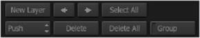
4. Click the New Layer button to create a new text layer at the top of the screen. Text is entered within layers, and you can create as many layers as you like to organize different pieces of text. Next to the New Layer button are additional buttons for setting layer priority (which layer is in front), selecting layers, deleting layers, and grouping layers (these buttons are shown in Figure 12.1).
FIGURE 12.1 Text layer-creation and management buttons
While you can also apply text effects directly to media clips in the timeline, by applying them to gap effects on a separate track, you can easily turn all titles off when you need to output a textless version of the program.
5. Type U of M High Energy Physics Lab, press Return, and type Two years later . . . on the next line. By default, the text is left justified and uses the Discreet font that accompanies the Autodesk Smoke installation. However, you’ll probably want to customize this for your particular program.
6. Click quickly four times within the text layer box to select all of the text inside, and then click the Font field that currently reads “Discreet” to enter the font browser. Then choose Auto from the Font Type pop-up menu that’s underneath the browser columns and to the left of the Font Preview area. Otherwise, you won’t see any other fonts as you browse.
7. Click System Fonts in the Subdirectories column of the browser, and the Files column will show a long list of every font installed on your computer. This can be difficult to navigate, however, so click the Library View button at the upper-left corner of the screen to switch the browser to a thumbnail preview of each font. Initially, you won’t see anything but empty outlines; so click the Generate Proxy button to build a set of font proxies that you can see.
8. Scroll down the list, and click the Futura.ttc proxy to select it, and then click the Load button to load that font into the current text layer. The selected text should now be restyled.
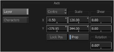
9. To make this a lower-third title, you’ll need to reposition the text layer, so make sure that the Axis button is currently selected and use the Y parameter slider (within the Axis control group) to move the text down (see Figure 12.2). In order to see the title and action-safe borders of the screen while you work, click the Grid button; then choose Action & Title from the Safe pop-up menu, and click the Grid button again to hide these controls. Position the text at the bottom-left corner of the inner green title-safe box.
FIGURE 12.2 The Axis controls, set to alter the entire layer
10. At this point, the text looks a bit boring, so triple-click the text “Two years later . . .” to select it, and change the Font Size parameter to 37. Now it’s a bit close to the line of text above it, so change the Leading parameter so that the text box once again sits right on top of the inner green title-safe box.
The Text Mode pop-up menu, near the lower-left corner, lets you choose an editing tool to use within the viewport. If at any point you find you cannot edit or select text, choose Edit from this menu.
11. You might have noticed that the “U of M” text has a bit too much space between the three sets of characters. Adjust the kerning by placing the text cursor to the right of “U” and adjusting the Kern parameter until it reads −10.
12. A faster way to work is to select the line of text you want to kern, choose Rekern from the Text Mode pop-up menu (or press Option+K), then use the left- and right-arrow keys to position the text cursor (in this case, to the right of “of”), and use the up- and down-arrow keys to adjust the Kern parameter until it reads −7. If you’re typographically inclined, go ahead and kern the rest of the title as you see fit. As you can see, any selected text within a text layer can be individually styled and adjusted.
The Kern parameter updates to show the individual kern setting applied to whichever character the text cursor is placed on.
You may have noticed that there are numerous styling options appearing as a stack of buttons that let you turn on the Fill, Underline, Outline, Back, Shadow, and Blur options for text (see Figure 12.3). would be convenient to add a Back (background) color behind the lower-third text that you’ve just created, but if you want to customize this background beyond the default size of the text, it can be easier to apply it as a second text layer.
FIGURE 12.3 Text options can be turned on and off via buttons with accompanying options.
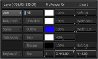
It would be convenient to add a Back (background) color behind the lower-third text that you’ve just created, but if you want to customize this background beyond the default size of the text, it can be easier to apply it as a second text layer.
13. Click the New Layer button again to create a second layer. This time, don’t type anything, but instead turn on the Back button in order to enable the colored background option. Click the Layer Axis button (which currently reads Top/Left) to set it to Centre, and then adjust either of the Scale parameters to make the bar stretch all the way from the left to the right of the screen.
14. Next, adjust the Y parameter to move the white bar down until it’s centered between the two lines of text, turn the Prop (proportional) button off, and raise the Scale Y parameter until the white box is slightly taller than the text itself.
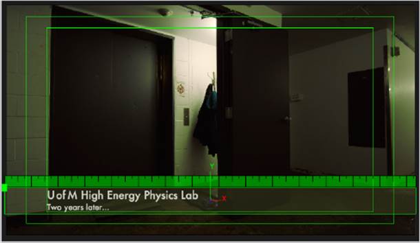
15. Drag the percentage parameter slider to the right of the Back button to the left to increase the transparency of the background. Then, to change its color, click the Back color swatch button to open the color picker; then click the Pick button and sample some of the green from the wall, and click OK. The end result should look something like Figure 12.4.
If you’re creating titles for broadcast, you won’t want to use the default maximum white value, since that can cause quality-control errors. Instead, alter the Fill color to create 95 percent white.
FIGURE 12.4 The lower-third title that you’ve created
16. Finally, click the text-ordering pop-up menu (underneath the New Layer button), and choose Bottom to move the green background bar behind the white text.
17. Click the EXIT button to return to the timeline. It’s time to refine the title’s timing. Press R to choose the Trim tool, select the end point of the gap effect clip, move the positioner to the halfway point of the first clip in track V1.1 of the timeline, and then press E to make an extend edit, resizing the gap effect clip so that the selected output moves to the frame of the positioner.
18. Right-click the end of the clip and choose Add Dissolve from the context menu to fade the title away.
Saving and Reusing Titles
Now that you have a fully built title, you may want to use a version of it again. There are several ways that you can save titles and styles for recycling later.
1. Create a new library in the Media Library and name it Titles.
2. Press Option+Shift and drag the gap title effect you created into the Titles library. This saves the effect into the library without removing it from the timeline.
3. Select the title clip you moved into the library, wait a moment, and then click the name to select it for renaming, type Lower Third, and press Return. Now you can edit the Lower Third clip into any sequence where you want a lower-third title.
Now it’s time to create an end credit style for individual title cards.
4. Right-click the Titles library in the Media Library, choose New Sequence, change the name to End Credits, and click Create.
5. Right-click the Titles library, navigate to the Downloaded Smoke Media folder you created, open the Audio folder, select CUE07_FINAL, and click Import.
6. Open the End Credits sequence you created, and drag CUE07_FINAL in its entirety into tracks A1.L and A1.R (by default a stereo pair of tracks). You’ll use this music cue to time the end credits.
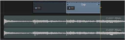
7. Zoom out of the timeline a bit, and play through from the beginning of the audio track, stopping at the first guitar chord (10:00:04+12).
8. Edit the Lower Third clip you saved into track V1.1 so that it cuts in at that frame. Remove the fade-out, and use the Trim tool to extend the duration so that the clip ends just before the first frame of the next bar of music; the waveform should make the correct position clear (10:00:09+16). The result should look like Figure 12.5. You’re using this gap effect as your starting point for the title that you really want to create.
FIGURE 12.5 Timing a title to the second bar of music
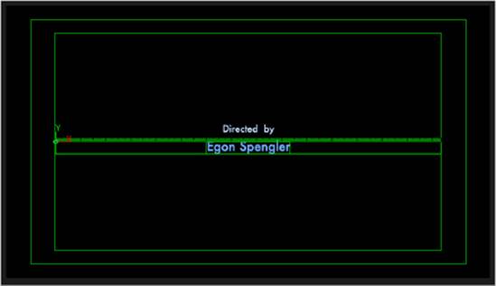
9. Double-click the gap effect that you just edited to open the Text editor, and then click Delete All to eliminate all text layers.
10. Click the New Layer button to create a new text layer; then click the Layer Axis button to change the transform point to the center of the layer, choose Centre from the Paragraph Justification pop-up menu, and, if necessary, set Kern to 0. The font settings are remembered from the last text layer you created, which is sometimes good and sometimes not so good; you need to keep an eye on your text settings whenever you want to create a new layer.
11. Type Directed by as the only text in this layer.
12. Double-click the text in this layer; then click the Fill color control, use the Colour Picker controls to select a pale eggshell blue color, previewing the result in the viewport, and click OK.
13. Drag the Y-Axis parameter slider to the left to move the current text layer until it appears a little bit above the center of the screen.
14. Click New Layer to create a second text layer; then change the Font Size parameter to 50, type Egon Spengler, and reposition it vertically to appear below the first text layer at the center point, which is a Y coordinate of 0. If necessary, use the arrow buttons next to the New Layer button to choose the first layer and reposition it to fit more pleasingly.
15. Double-click the “Egon Spengler” text, use the Fill color control to choose a slightly more vivid color of blue, and click OK. The result should look something like Figure 12.6.
FIGURE 12.6 The first title card
Now that you have two differently styled text layers, it might be a good idea to save the style you’ve applied to each layer for future use.
16. Click the Styles button to reveal the controls for saving and applying style presets.
17. To save an individual style, select a text layer, click the Define Style button (underneath the grid of nine style buttons), and then click the numbered style button to which you want to apply it. That button updates to show the saved style, along with information about the size and font used (the keyboard shortcut for applying that style appears as well).
18. To reset that style button, click and hold the Define Style button (which is actually the Style Option button), choose Clear Style, and click the button to which you just saved a style to clear it.
19. To save all current styles in use, click and hold the Style Option button and choose AutoStyle. Each of the two styles you’ve used is automatically saved.
20. Click the EXIT button to return to the timeline.
Arranging and Styling Text
In this next exercise, you’ll learn how to use more of the features of the Text editor to style title cards in different ways.
1. Select the title clip, press ![]() +C to copy it, then move the positioner to snap to the end of it (press Shift if the Snap button is turned off to turn snapping on temporarily), and press
+C to copy it, then move the positioner to snap to the end of it (press Shift if the Snap button is turned off to turn snapping on temporarily), and press ![]() +V three times to paste three more copies of the title clip.
+V three times to paste three more copies of the title clip.
2. Open the second title, and change the two text layers to Written by and Dana Barrett. If you find that you are unable to edit text, either click the Text Mode pop-up menu and choose Edit, or press the Escape key, which toggles you between editing text and moving text within the Text editor. Click EXIT when you’re finished.
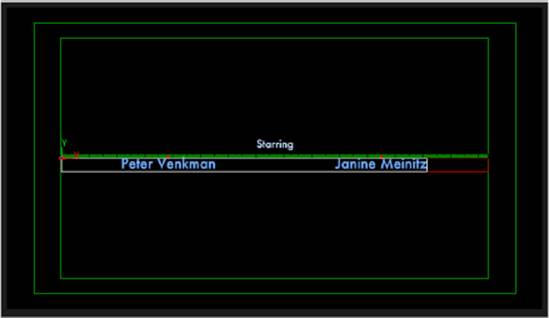
3. Open the third title, and change the first text layer to Starring. For this title card, you need to have two names side by side (stipulated in the contract, don’t you know).
4. Select the second text layer, delete the name, and then click the Tabulation button. The Tabulation controls let you add multiple columns to text layers via tabs with individual justification.
5. Choose Left from the Paragraph Justification pop-up menu so that the second text layer is left justified overall.
6. Click the Add button (in the Tab group shown in Figure 12.7) twice to add two tabs.
FIGURE 12.7 The Tabulation controls
The tab widgets you added to the top ruler of the second text layer can be dragged, or manipulated, via the Position parameter to approximately equidistant positions from the center of the screen, or you could calculate the exact placement mathematically. Fortunately, you don’t have to do any of this, because every parameter in Smoke has a built-in calculator.
7. You know that the overall width of text layer 2 is 1535 because of the Paragraph Width parameter, so select the first tab in the layer ruler, click the Position parameter of the Tabulation controls, and use the calculator to enter 1535/4. This places the first tab at exactly one-fourth of the total width of the layer, or 384.
8. Now select the second tab you created, click the Position parameter, and use the calculator to enter 384*3 to place it three-fourths of the total width of the layer.
9. Select each tab marker, and choose Centre from the Justification control in the Tabulation controls (not the Paragraph controls). Notice that the direction of the tab marker changes to indicate its justification. Now any text added at these tabs will be center justified, so you can use these tabs as if they were columns.
10. Press the Tab key, type Peter Venkman, then press the Tab key again, and type Janine Meinitz. When you’re finished, the title card should resemble Figure 12.8.
FIGURE 12.8 Horizontally arranged titles using tabulation
11. Click the EXIT button to return to the timeline, and open the fourth title clip.
Once you’ve created a set of tabs, each new line of text you add to a text layer inherits the same tabs, so you can create long columns of text on as many rows as you need.
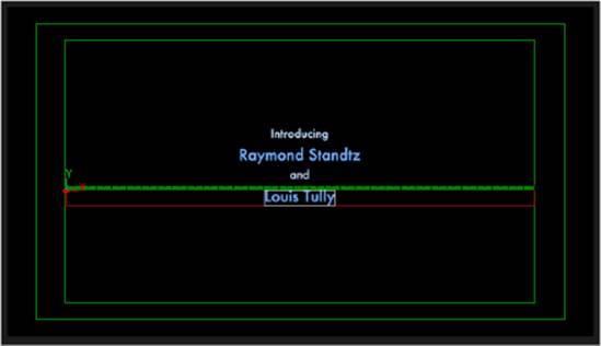
For this last example, you need to create an “Introducing” title card with two actors’ names, one over the other, separated by “and.”
12. Replace the text on the first text layer with Introducing, and replace the text on the second layer with Raymond Standtz.
13. This layer isn’t styled correctly, so select all of the text on this third layer, click the Styles button, and click Style 1, which should correspond to the paler text color.
14. Click the Axis button, then click New Layer, type and, and then use the Y-Axis parameter to move this layer below the first name in the credits.
15. Click New Layer again, and type Louis Tully. Again, this text isn’t styled correctly for names, so select the text, click Styles, and then click the Style 2 button. Now click Axis, and use the Y-Axis parameter to move this layer to the bottom so that each line of text is correctly spaced vertically.
When you’re happy with the vertical spacing, you’ll no doubt notice that the entire set of titles appears a bit low. There’s an easy way to fix this so that you don’t end up moving each layer separately.
16. Click the Select All button, and then use the Y-Axis parameter to move all of the layers up by the same amount. The end result should resemble Figure 12.9.
FIGURE 12.9 Vertically arranged text layers
Other Ways of Working with Text
The Text effect, applied either as a gap effect or directly to a clip (which can be useful for subtitles that you want to travel along with a clip during re-edits), is but one way of working with text. In addition, a Text node is available from within ConnectFX, which you can use for compositing text in 2D, extruding text in 3D using Action, or as a matte for creating text-shaped adjustments via other combinations of nodes. Furthermore, Smoke gives you the ability to import Photoshop files with rasterized text from within the Action node bin by double-clicking the Import node and selecting Photoshop as the Import Type.
The Essentials and Beyond
The exercises in this chapter only scratch the surface of the capabilities of text effects. These techniques lay the foundation for all other effects, however, and it’s worth spending some time making sure that you’re comfortable with the essentials that go into creating the ubiquitous title card.
Additional Exercises
· Create two additional styles of lower thirds, using different fonts, arrangements, and background layers.
· Build a new set of end credit cards, using different fonts and colors.
· Use the keyframing controls to animate the Axis controls of the text layers to create slow zoom-ins for each of the alternate title cards.
All materials on the site are licensed Creative Commons Attribution-Sharealike 3.0 Unported CC BY-SA 3.0 & GNU Free Documentation License (GFDL)
If you are the copyright holder of any material contained on our site and intend to remove it, please contact our site administrator for approval.
© 2016-2026 All site design rights belong to S.Y.A.