Freemium Economics: Leveraging Analytics and User Segmentation to Drive Revenue (2014)
Chapter 4. Freemium Metrics
This chapter, “Freemium Metrics,” explores the metrics that must be tracked in order to engage in truly data-driven design for freemium products. Because the freemium model is so data-driven, a minimum set of metrics must be tracked in order to optimize the product for user behavior; this concept is introduced as minimum viable metrics. The chapter begins with an introduction of the minimum viable metrics model and a description of the professional roles that must be present in an analytics team: the analyst, the data engineer, and the data scientist. The chapter then addresses each of the four categories of minimum viable metrics: retention, which tracks how often users return to the product; monetization, which tracks the revenue contributed to the product by users; engagement, which tracks how frequently and for what length of time users interact with the product; and virality, which tracks the degree to which the product grows through usage by existing users. The chapter ends with a practical overview of how metrics can be adopted by an organization through reports and dashboards, as well as a discussion of why an analytics group should not be considered a cost center but a revenue center.
Keywords
average revenue per user; retention; monetization; engagement; virality; k-factor; dashboard; freemium measurement; freemium instrumentation; retention profile; conversion
Instrumenting freemium products
The minimum viable product (MVP) model has data at its functional core: the develop-release-measure-iterate feedback loop drives the product, from its earliest state through to release, based on behavioral data harvested from users, not product team intuition. But the need for data—actionable, reliable data—is greater within the context of the freemium business model than perhaps any other commercial configuration because only a very small fraction of the user base can ever be expected to contribute revenue. In the freemium model, a second-order requirement is imposed on the data the MVP produces: it must provide for identifying the 5 percent.
Minimum viable metrics
Without robust behavioral data, a freemium MVP cannot effectively undergo the iterative metamorphosis process that results in a finished product. This reality places a requirement on the freemium development process: the necessity of tracking a minimum set of metrics needed to optimize development in pursuit of greater user engagement. This set is known as the minimum viable metrics (MVM).
In non-freemium business models, almost all data produced by the MVP is actionable because the average use case, and thus, high-level aggregate data, provides valuable, revenue-relevant insight into product usage. But in the freemium model, only data generated by the users who will eventually pay can be used to make product decisions that lead to increased revenue. The difficulty presented by this model dynamic is that the MVP requires a data sample large enough to ensure that revenue predictions are possible; such a data sample can be collected only from a user base so large that a company can assume that a meaningfully sized contingent of highly engaged users is present.
Minimum viable metrics are necessarily more extensive in the freemium model than in other business models because freemium behavioral data must provide enough volume and enough diversity to make informed product development decisions that drive revenue. Minimum viable metrics cover a broad range of product characteristics, which can be broken down into four high-level categories: retention, engagement, monetization, and virality. While each metric category contributes to the picture of a product’s overall health, the retention metrics are considerably more decisive than the others are; user retention is the principal measure of freemium product performance.
Since analytics are largely invisible to users, minimum viable metrics might seem to be incompatible with the concept of an MVP. But a traditional MVP release simply doesn’t work under freemium conditions; the business model requires a minimum level of user insight that is an order of magnitude greater than what is needed in other models. Since business models fund development methodologies—not the other way around—an MVP must first and foremost facilitate the generation of revenue. In freemium product development, that is accomplished through minimum viable metrics.
Working with metrics in the freemium model
The core requirement of robust freemium analytics blurs and complicates the traditional professional designations within the realm of business intelligence. In non-freemium businesses, analytics infrastructure development and maintenance can be accomplished almost entirely independent of analysis; production programming is required only of database administrators, and analysis can be conducted capably with knowledge of only SQL and, in extreme cases, a scripting language. Generally speaking, outside of the freemium model, analysts conduct analysis and database administrators maintain the data warehouses from which data is extracted.
Analysis in a freemium context is contingent on the existence of very large data sets, and these can be accessed and analyzed only programmatically. If analysts lack proficiency in a programming language, large data sets are inaccessible to them without complete reliance on a database administrator or software engineer. Perhaps more importantly, large data sets are practically useless without some knowledge of programming, because the true value in massive volumes of data can be extracted only through statistical techniques that are too sophisticated to be implemented non-programmatically.
The challenges posed by the size and character of the data sets produced by freemium products (and data-intensive products from traditional business models) have spawned a new class of analyst: the data scientist. A data scientist employs predictive statistical techniques to large volumes of data to produce granular insight into behavioral patterns. With a background in a quantitative field such as statistics, economics, mathematics, or computer science, a data scientist can utilize large volumes of data to the fullest extent possible by employing what are known as machine learning techniques: pattern-based predictive algorithms that become more accurate with increased exposure to data.
In a freemium data environment, the data scientist sits somewhere between the product and the back-end, training and implementing algorithms that optimize the user experience using data collected either directly from raw data dumps (usually in the form of server logs) or from the data warehouse. The data scientist’s principal role is to glean insight from the data that can be used directly to improve the product; rather than analyze data sets and make product recommendations, the data scientist builds automated mechanisms for optimizing product features dynamically.
Given the data scientist’s focus on product feature optimization, the analyst in the freemium environment is freed to focus purely on revenue optimization through a broader managerial lens. In freemium product development, the locus of the analyst’s focus shifts away from product feature optimization and toward product prioritization and general management insight. The analyst’s data is provided primarily in aggregated format by the data warehouse and need not be precisely current—a lag time of a few hours or even a day is acceptable. The analyst leads reporting efforts, builds dashboards, and circulates key performance indicator reports.
The raw and aggregated data in the freemium environment is the purview of the data engineer, whose principal duties include maintaining the back-end and the events library to ensure data consistency and availability. The data engineer also manages the product’s data warehouse infrastructure, ensuring that data is consistent, accurate, and aggregated according to business logic determined by the analyst. The data engineer doesn’t interface directly with the product except to make changes to the events library for tracking purposes.
The titles mentioned here, illustrated in Figure 4.1, are less important than the separation of roles implicitly dictated by the freemium focus on revenue maximization. The data scientist handles all aspects of product optimization through deep statistical analysis of the large data sets afforded by freemium data. Data scientists may even develop what are known as data products—meta products within the product that are built entirely algorithmically (these are discussed in Chapter 6)—to enhance the performance of various product features. The analyst complements this product optimization effort with a singular focus on product revenue. The data engineer provides operational support by unifying the data available to the data scientist with that which is available to the analyst so that reporting and product initiatives can reconcile.
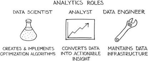
FIGURE 4.1 The roles comprising an analytics team.
Retention
Retention is a retroactive, time-based measure of product use. Retention is generally calculated and presented for a specific day and is aggregated over a segment of the user base in terms of days since those users first interacted with the product. A retention dashboard might display values for a product’s day 1, day 3, day 7, and day 14 retention metrics, which respectively communicate the percentage of users returning to the product one, three, seven, and fourteen days after interacting with it for the first time.
At the user level, retention metrics are binary indications (true/false) of whether or not a user returned to the product some specific number of days after first using it. For example, if a user first interacted with a product on a Monday and returned to it the next day, then that user’s day 1 retention value would be true (or 1). If the user didn’t return on Wednesday but did return on Thursday, then the day 2 retention value would be false (or 0) and the day 3 retention value would be true (or 1).
At the product level, retention metrics are aggregated across the user base; the values for all users’ retention metrics are summed for each metric, then each value is divided by the number of users who first interacted with the product on the day being consider for analysis, in order to produce a percentage. For instance, to calculate a product’s day 1 retention for yesterday, the number of users who first used the product yesterday and returned to it today would be summed and then divided by the total number of users who first used the product yesterday, regardless of whether they used it again today. A retention metric should be attributed to the day on which users first interacted with the product.
The retention profile
The purpose of retention metrics is to track the frequency and longevity of product use; through a portfolio of retention metrics, a product team can track the length of time, in days, over which users generally interact with a product before churning out of the user base. Retention metrics, when graphed, provide a valuable visual “funnel” that describes the timeline of the average use case for the product. Retention metrics can likewise be aggregated by any number of dimensions to provide granular analysis of use patterns.
Conceptually, retention is most beneficial to the product development process when thought of as a profile as opposed to a collection of disparate, independent metrics. The retention profile is the measurable, quantifiable curve that can be constructed by unifying the retention metrics into a singular property of product use. (See Figure 4.2.) In practice, the shape of this curve provides high-level visual cues about when, relative to first use, users generally abandon the product.
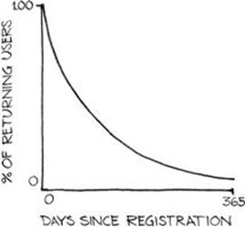
FIGURE 4.2 A freemium product’s retention curve, with percentage of returning users on the y-axis and days since registration on the x-axis.
The retention profile is a useful measure of user behavior for another reason: it provides the product team with a quantitative basis for estimating user lifetime through a set of metrics that can be aggregated around any number of dimensions. In other words, the retention profile provides insight into how specific user segments interact with the product and can be used to estimate how long they will use the product.
As a general rule, the retention profile decays in a pattern such that day 7 retention is 50 percent of day 1 retention, and day 30 retention is 50 percent of day 7 retention. For example, in a product in which 80 percent of new users return the next day, 40 percent of new users can be expected to return seven days after first use, and 20 percent can be expected to return 30 days later.
The area under the retention profile curve represents total likely lifetime, given that each point on the curve serves as a probability of a user returning to the product a corresponding number of days after first using it. Because the area under the curve extends theoretically indefinitely along the x-axis, calculating terminal retention—the point at which the curve descends to 0, or the point at which no users are expected to be retained—is impractical. In modeling the retention profile, a useful rule of thumb is to set day 365 retention to some terminal value (for example, 1 percent). Constraining the retention curve to a finite space allows for a more constructive calculation of total user lifetime.
The nature of the retention profile curve provides some guidance in the product development process when designing features to boost retention. The area of the curve (and, by proxy, total user lifetime) increases most when the entire curve is shifted up. But absent the possibility of a universal shift—which is generally implemented through fundamental product improvement and not at the individual feature level—increases to early-stage retention have a greater effect on total lifetime than increases to late-stage retention, assuming the decay pattern holds constant.
As stated earlier, retention is the most significant metrics category that a product team must address in the freemium development process, as retention metrics communicate delight: the extent to which a product meets users’ needs. Higher retention corresponds to a better product experience, greater personal investment, and a higher level of fulfillment in the product’s fundamental use case. Without a strong retention profile, no other metrics group is worth addressing; the retention profile measures the usefulness of a product, and a basic lack of usefulness cascades across monetization, engagement, and virality to broadcast poor performance.
Retention metrics
The most basic metrics related to retention are daily new users (DNU) and daily active users (DAU), which are simply counts of activity. A new user is generally defined as a user interacting with the product for the first time. The level of activity that represents an interaction is left intentionally ambiguous, as it can vary between platforms; for instance, for a mobile application, the point of first interaction could be defined as the initial application download, but for a web application, first interaction might be defined as a specific event that takes place after registration.
DAU is defined as the number of users who interact with the product on a given day; as with DNU, the definition of an interaction is left to the discretion of the product team. DAU and DNU can be rendered on a daily basis as bar or line graphs. Since DNU is typically significantly lower than DAU, the metrics should either be rendered on different charts or on one chart with two y-axes, as in Figure 4.3.
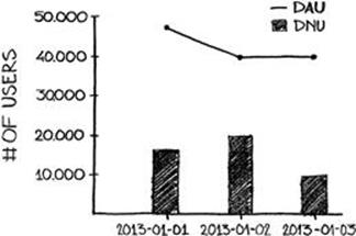
FIGURE 4.3 DNU and DAU graphed on the same chart.
In practice, daily retention metrics are tracked individually for days 1 through 7, day 14, day 28, and then intermittently, based on the age of the product and the product team’s development agenda. (See Figure 4.4.) The purpose of tracking day 28 retention as opposed to that of day 30 is that, in multiples of seven, weekly cyclicality can be captured; if there is a pattern of product use on a specific day of the week, the pattern will be visible when retention metrics are tracked in seven-day intervals.
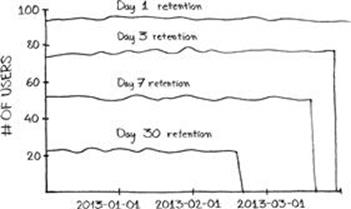
FIGURE 4.4 A retention chart tracking day 1, day 3, day 7, and day 30 retention over time.
Retention is best calculated retrospectively, which means that the values of retention metrics are calculated for previous days, given activity on the current day. In other words, users returning to a product don’t affect the current day’s retention metrics but affect the retention metrics for the various days on which those users first interacted with the product. This type of grouping is an implementation of cohort analysis, a topic explored in more detail in Chapter 7.
Associating retention metrics with the days on which users first interact with a product allows retention changes to be tracked with product changes. For instance, in the retrospective model, a user who joins today and will return tomorrow is associated with today’s day 1 retention metric (which is calculated retrospectively, tomorrow). If a change to the product is integrated today, all of today’s retention metrics will reflect that change, making it easy to identify the effects of that change on the entire portfolio of retention metrics.
When retention metrics are not tracked retrospectively but are tracked as a function of the current day, the retention metrics relevant to a product change—especially long-term metrics like day 28 retention—are distributed across an extended reporting timeline and are more difficult to associate with any given product change.
Retention metrics are best depicted as individual line graphs on one time series chart. This allows for seeing changes in retention over time while still providing for broad trends to be understood. Since retention metrics depicted this way displays specific values for each day (as opposed to averages over a period of time), small data sets can produce results that may not make sense, giving, for instance, a day 1 retention that is below day 4 retention for a given day. With a large enough data set, these irregularities, which arise out of users returning to a product after a period of inactivity, generally correct themselves, and retention metrics converge to consistency.
When retention values are charted over a trailing period—that is, the graph depicts a time range up through the most recent date—the values for each individual retention graph will drop to zero for days not far back enough to calculate values for (since retention is attributed to the date of registration). For example, on a chart tracking retention values for the previous 90 days, day 30 retention values will be available only for dates at least 30 days in the past. Dates more recent than that—yesterday, for example—will exhibit day 30 retention values of zero. See Figure 4.4.
Churn can be an interesting metric to track alongside retention metrics, but its definition is subjective and prone to error. When churn is defined as a user who has left the product and is not expected to return, then, like retention metrics, it is most usefully tracked retroactively. The problem with calculating churned users is defining the threshold for likelihood to not return. If the threshold for likelihood to not return is determined to be the minimum point, measured in days since last interaction with the product, past which the majority of users do not return, then the metric will almost certainly overestimate churn. But if churn is determined to be the point past which no user has ever returned, churn will likely be underestimated. A happy medium exists between these two extremes, but the nature of the user base and the product dictate where that point lies. A good compromise might be defining churn as the point past which 80 percent of users do not return.
Variable historical metrics—metrics for which historical values can change—are generally considered to run counter to best practices because they obstruct the decision-making process. Therefore, churn is best defined in the abstract, as a measure of disengagement, or likelihood to abandon the product, and reported consistently, with exceptions not accommodated for. Bar or line graphs, reported daily, work well to represent churn.
Tracking retention
The calculation of retention metrics is highly dependent on how a product interaction is defined, which is a decision that should be made by the product team early in the development process. If an interaction is defined as the start of any use session, no matter the length or quality of the session, then interaction is simple. But if a minimum threshold is required in order for a session to count as an interaction, such as a login or progress past some point in the user interface, then that threshold should be precisely defined, documented, and rendered auditable in the events library.
Once a product interaction has been defined, tracking the retention metrics is fairly straightforward. DAU is a count of all users who interact with the product on a given day; DNU is a count of all users who interact with the product for the first time on a given day.
The calculation of daily retention metrics is more complex. For any given daily retention metric, the analytics system must calculate the day of product use for each user and group users accordingly. These values—the number of users who registered a given number of days ago and interacted with the product on that day—are then divided by the DNU from the given number of days ago and attributed to that date. For these values to be calculated, the analytics system must track the date of first use for each user. Once a given retention metric is calculated retroactively, its value should be recorded in the analytics system for that day and made available for reporting. See Figure 4.5.
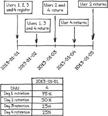
FIGURE 4.5 A data table with calculated retention metrics for a given day.
Churn should be defined with precision before it is reported, as a product interaction is. Once the threshold for churn has been set (in terms of number of days), the churn metric can be calculated by counting the number of users from the entire user base that, as of today, have not interacted with the product in exactly that number of days. That value of churn can be stored in the analytics system. As with retention, this calculation delay creates an effect in which churn is not available for any trailing days, relative to today, below the defined threshold (e.g., if the threshold for churn is three days without product interaction, then churn metrics won’t be available for yesterday or the day before).
Accurately tracking retention is eminently important. The events library should be designed to accommodate the idiosyncrasies of the product with respect to defining churn and product interactions; these are significant strategic determinations that should receive adequate consideration in the earliest stage of the development process. Conceptual ambiguity or insufficiently rigorous case consideration could result in a situation, after product launch, where retention metrics must be retroactively updated, or worse, where multiple versions of the retention metrics must be tracked to accommodate a use case that wasn’t predicted at the design stage.
Monetization
Tracking monetization at a reasonable level of granularity is an important component of revenue optimization. Given the primacy of revenue concerns in the freemium development process, the fact that monetization metrics are relegated to a less decisive position than are retention metrics may seem counterintuitive. But strong user retention sets the premise for monetization (and other user behavior); a product that doesn’t retain users to an acceptable degree will likewise not monetize to a degree that utilizes the advantages presented by the freemium model. Strong retention is a prerequisite in the freemium model, and retention metrics are therefore of the highest priority in scheduling the development pipeline.
That said, monetization metrics are a critical focal point in the product team’s reporting regimen. Monetization metrics communicate not only volume of revenue but also crucial shifts in spending patterns over time and the degree to which the freemium model is being leveraged to produce highly monetizing users. Perhaps most crucially, monetization metrics elucidate the highly influential conversion rate, which is the percentage of users who convert to revenue producers through direct purchases. This number, tracked over time, provides valuable insight into how well the value proposition of paid features has been communicated to users.
Conversion
Conversion is a measure of monetization relative to the entire size of the user base. It is usually presented as a percentage of users who have made a purchase either on a specific day or over the lifetime of a product. Under freemium circumstances, conversion rates are usually extremely low; under the 5% rule, this book posits the percentage of users likely to ever directly contribute revenue through purchases in a freemium product at a universal value of 5 percent or less. Members of the 5 percent are considered as “converted users.”
Conversion is not as straightforward a metric as it might seem. This is because many freemium products draw revenue from two sources: advertising and the purchase of premium functionality. Advertising revenue muddies the definition of a converted user; if conversion is considered simply the process of contributing revenue to the freemium product, then viewing advertising is a means of converting. But the act of showing advertising to a user can have a significant negative impact on that user’s likelihood of contributing revenue to the freemium product through a direct purchase of premium functionality, which is the more traditional definition of conversion.
Some freemium products refrain from showing ads to users until those users have been deemed unlikely to convert in the traditional sense, meaning advertising is a form of anti-conversion; it is a method of monetizing users who will not otherwise convert. Pursuing this strategy, classifying the viewing of an ad as a form of conversion would result in an artificially high conversion rate (in some cases, 100 percent), since any user who made it past a behavioral threshold for purchase prediction would either be shown advertising or convert with a high probability. Artificially high metrics aren’t useful; they are noisy distractions from true signal.
Viewing advertising shouldn’t be considered a form of conversion in freemium metrics. The crux of the freemium product is that, through building massive scale with a price point of $0, the loss of upfront revenue can be compensated for and eclipsed by rigorous monetization of highly engaged users. This principle should inform the development and monetization strategy of a freemium product from the earliest stage of development.
Advertising and high engagement are, at a conceptual level, mutually exclusive: the purpose of advertising is to encourage a user to consider another product, whereas the purpose of the freemium model is to cater to the needs of the most highly engaged users. By definition, exposing a user to an ad could potentially discourage that user from engaging with the product to the greatest extent possible. Since conversion is a proxy measure of engagement, viewing advertising cannot be considered a form of conversion.
This doesn’t mean advertising has no place in freemium products; when advertising represents a stream of revenue that in no way affects a freemium product’s ability to monetize highly engaged users, then it effectively is a revenue optimization technique. The problem with implementing advertising into a freemium product is determining when that advertising negatively affects monetizing highly engaged users, which it can do in myriad indirect ways. The most obvious way is by alienating users who have not yet made a purchase but would otherwise become highly engaged users; unless a product’s predictive models for purchase behavior are irreproachably accurate, any advertising shown to users will likely have a negative impact on future monetization. Calculating the impact of the advertising revenue versus the lost revenue by alienated potential purchasers is time-consuming and prone to erroneous results. The second way advertising can have a negative impact on the monetization behavior of highly engaged users is not intuitive; advertising can turn away users who will never pay. Passion for a product can’t be completely captured through monetization; a user’s enthusiasm for a product may not be reflected in the amount of disposable income that user has available to spend on it. Product advocacy can happen serendipitously and independent of spending patterns; this effect is amplified by the viral properties of modern social networks and social media channels, where an influential user’s testimony might contribute far more aggregate revenue than any set of purchases that user could make directly in the product.
Users who will never make a direct purchase in a product, or non-paying users (NPUs), should be celebrated by a freemium product, as they not only represent a portion of the scale that freemium products so desperately need to achieve full business model optimization, but they can also serve as product ambassadors, recruiting through social or physical channels the future highly engaged users who contribute to the product’s revenue streams. Advertising can estrange NPUs as easily as it can highly engaged users.
A product’s conversion rate, therefore, should be calculated as the number of users who make direct in-product payments divided by the total number of users. Conversion rate is valuable when calculated over the lifetime of a product but also should be reported on a daily basis to highlight changes over time. When depicted in a report, conversion rate can take the form of a bar or line graph over time, as shown in Figure 4.6.
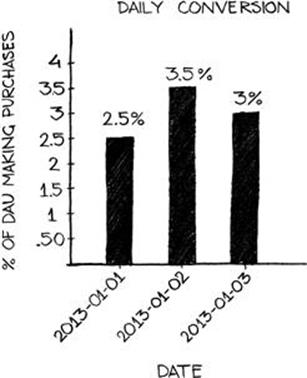
FIGURE 4.6 A daily conversion bar chart.
Revenue metrics
Revenue metrics should communicate the extent to which money is being spent through direct purchases in the product. This is best articulated through average revenue per user (ARPU) and average revenue per paying user (ARPPU).
ARPU is an average measure of revenue contribution on a per-user basis. The obvious value of this metric is, when calculated over the lifetime of the product, as an indicator of how much any individual user is worth. Lifetime ARPU, or the average revenue contributed per user over the lifetime of a product, can provide some insight into the habits of a large group of users within the product. But as stated earlier, the concept of an average user in freemium products is specious; when implemented properly, the freemium model produces a stratified distribution of behavioral profiles. Given the Pareto distribution, the word “average” is of little substance in analyzing a freemium product at the level of the entire population.
Lifetime ARPU, then, is not instructive when considered for the entire user base, but daily ARPU is. Daily ARPU communicates the average revenue contributed per user on a daily basis, or the total revenue from direct purchases divided by the number of users who interact with the product on any given day. Daily ARPU can be used to gauge the effectiveness of the product catalogue or the quality of users entering the product’s user base; a declining daily ARPU value over time can point to a fading value proposition for the product’s premium features. Daily ARPU is sometimes referred to as average revenue per daily active user, or ARPDAU.
Note that lifetime ARPU can be a valuable metric when considered for a specific, well-defined user segment, especially at the high end of the monetization scale. But lifetime ARPU is also susceptible to being rendered obsolete over an extended timeline; as a product evolves, the spending patterns of users from weeks or months in the past may not serve as valid indicators of how new users will behave with the improved product. When a product has undergone rapid, significant iteration, a user whose engagement is 180 days old likely had a completely different experience in the first week of use than a user registering today. Thus, lifetime ARPU, while important in ascribing value to user segments, can be difficult to interpret at later stages of product use.
Lifetime ARPPU is a bit more instructive with respect to the entire user base than is lifetime ARPU because the number of paying users in any freemium system will necessary be far lower than the number of total users, rendering ARPPU a more contextualized metric. But despite its increased relevance, lifetime ARPPU is still easily misinterpreted and applied; lifetime ARPPU is not a measure of how much the average paying user is worth because no average paying user should exist in a freemium product.
Both daily ARPPU and daily ARPU present useful pictures of patterns in monetization, but daily ARPPU has the added benefit of being more significantly affected by changes in monetization mechanics. Thus, daily ARPPU is very effective as a measure of improvement to changes to the product catalogue and to promotional offers because it is more susceptible to shocks, given that the denominator in the calculation—paying users—is so much smaller than in ARPU. Daily ARPPU provides insight into how well and how persistently changes meant to affect revenue generation perform.
Both ARPU and ARPPU can be calculated over any period of time for which data is available, but calculating values of these metrics for longer time periods than a day requires the analytics system to be able to distinguish between total users and unique users. Given that a user can interact with a product on multiple days within a prolonged time period, calculating a non-daily value of ARPU or ARPPU, such as a weekly value, requires the analytics system to first calculate unique users within that time period.
ARPU and ARPPU are best depicted as line or bar charts on different graphs, given the different scales on which they sit, as seen in Figure 4.7. A direct relationship exists between conversion, ARPU, and ARPPU; the smaller the difference between ARPU and ARPPU, the higher the conversion rate must be.
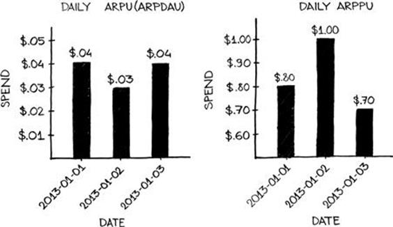
FIGURE 4.7 Daily ARPU (ARPDAU) bar chart (left), and ARPPU bar chart (right).
To contextualize the daily average monetization metrics, a product catalogue distribution can be depicted as a histogram to provide visual cues as to where revenue is being derived. The product catalogue distribution is a set of bar charts, displayed horizontally, representing the individual items within the product catalogue as either a percentage of total revenues, as illustrated in Figure 4.8, or as absolute revenue amounts. The product catalogue distribution helps the product team understand where the bulk of revenues are derived from, given a diverse product catalogue. The shape of the product catalogue distribution shouldn’t necessarily match the shape of the distribution of prices within the product catalogue, although price points contribute to purchasing behavior.
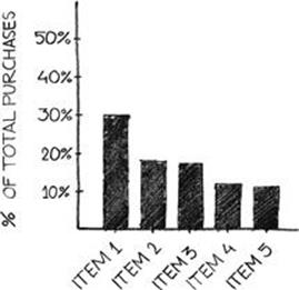
FIGURE 4.8 The product catalogue distribution by percentage of total product revenues.
Aggregating the product catalogue distribution by day would create a chart too hectic to extract value from; instead, the distribution should be aggregated over a trailing time period—a week, for example—in order for the graph to capture a meaningful volume of purchase data. For more detailed daily trend analysis, the product team might create a separate report displaying daily purchases of each item within the product catalogue.
Another useful implementation of the product catalogue distribution is the first purchase distribution, illustrated in Figure 4.9, which graphs the items in the product catalogue as the percentage of first purchases the items represent. In other words, the number of times each item was purchased as a user’s first purchase in the product is counted and divided by the total number of first purchases made in the time period being considered.
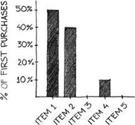
FIGURE 4.9 The first purchase distribution.
This graph is useful in determining which products most compel users to convert; it may provide valuable insights into the impetuses that convince users the product is worth contributing revenues to. This distribution is best depicted on the basis of a trailing time period.
Engagement
Engagement metrics capture user behaviors relating to product interaction. The most obvious of these metrics track length and frequency of use, both of which the product team should use in crafting the experience that takes the most advantage of the freemium model’s benefits.
In the freemium model, consistent, daily use is the highest ambition: when a user interacts with a product on a daily basis, embedding the product within the user’s lifestyle, then the user is likely value the product as a source of genuine delight. Put another way, when a user interacts with a product on a daily basis, the user is much more likely to apportion appreciable amounts of disposable income to it. Engagement metrics, especially session frequency and session length, not only measure the extent to which users interact with products but also help curate those interactions.
No prescribed interaction session length or daily frequency count can describe the most revenue-advantageous use case for the vast number of platforms and product genres in which the freemium model can be successfully employed. Instead, engagement metrics should be used in the develop-release-measure-iterate feedback loop to measure and maximize users’ satisfaction with the product.
The onboarding funnel
A user’s first session with a product is a critical determinant of the user’s lifetime with the product; it is therefore worthy of the product team’s when trying to optimize the user experience. In any freemium product—especially when massive scale is achieved through large-scale organic user base growth and aggressive paid acquisition—a percentage of new users will churn out during their first sessions. While this concept should be taken as a rule, effort should be expended to ensure that this percentage is as low as possible.
The onboarding funnel is an events-based graph of user fall-off, or product abandonment within the formative first moments of interaction between the user and the product. The onboarding process should be defined by the product team from an early stage in the development cycle; in some cases, the onboarding period is a very explicit sequence of events within the first interaction session, and in others it might be subtly implemented over multiple sessions. At a conceptual level, the purpose of the onboarding process is to introduce a new user to the product and equip the user with the knowledge necessary to interact competently with the product’s feature set, given some level of compatibility between the user’s needs and the product’s fundamental use case.
This level of compatibility is an important point of consideration when designing the use case. An aggressive onboarding process will very quickly alert a user for whom the product’s use case isn’t entirely valuable that the product won’t meet the user’s needs. Such an aggressive salvo will cause a greater amount of churn during the onboarding process than will a more subtle process, during which users may not realize until later that the product isn’t an appropriate match for their purposes.
While a mismatch in fit between the product’s use case and the user’s needs precludes revenue generation (or at least, mutually beneficial revenue generation), a user engaged with a product is a potential source of virality. At the same time, users who aren’t satisfied with a product are more likely to serve as negative publicists for that product, especially if they feel their time has been wasted.
The net effect of these conflicting consequences must be estimated and measured during the implementation of the onboarding process; keeping users engaged when the product can’t possibly meet their needs isn’t necessarily the best course of action when introducing them to the product’s functionality.
To create the onboarding funnel, the onboarding process must be demarcated into a specific set of event flags that create countable indicators of user activity. Auditing these events should produce, in aggregate, a decreasing behavioral map: as users churn out before reaching various events, the counts for those events decrease from the total for the events preceding them. This map can easily be superimposed onto a line chart to produce a decreasing funnel shape, as shown in Figure 4.10. The number at the far left represents the total number of users who entered the onboarding process (new users), and the number at the far right represents the number of users who completed the onboarding process. The events that describe the onboarding process make up the space between these two points; as more events are added, the line chart grows less inflected.
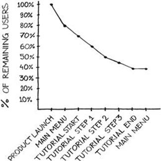
FIGURE 4.10 An onboarding funnel.
Constructing the onboarding funnel from event counts, and not counts of time (e.g., a count of the number of users who remained in the product after 20 seconds), normalizes the curve for all types of behavior. Users will negotiate the onboarding process at varying speeds, and measuring engagement by time spent in the onboarding process could create false signals. But time is a valuable measure when a company seeks to understand whether churn is attributable to a mismatch between the product’s use case and the user’s needs, or the onboarding process’s failure to explain how the product works. As such, timing should be recorded with each event flag and represented independently from the onboarding funnel to communicate to the product team how well users understand the product’s feature set as it is explained.
The onboarding funnel can be thought of as a measure of intra-session retention; as its downward slope levels, it should approach day 1 retention. A large discrepancy between the end point of the onboarding funnel and day 1 retention (which measures the percentage of users who returned to the product a day after their first interaction with it) conveys a distinct mismatch between the needs of users and the product’s use case. While the onboarding funnel should be used to measure how well the use case is communicated and instructed, the leap from the onboarding process to day 1 retention should be used to measure how well the product meets a real market need.
Session metrics
Session metrics capture the length and frequency of sessions. Session metrics are used to evaluate user interaction with the product from an aggregate level; when taken alongside other indicators of user behavior and analyzed within the context of a rich events library, session metrics provide insight into how successfully the freemium model has been implemented.
Average session length is calculated, usually daily, by dividing the total length of all sessions over a specific time period (usually a period of minutes) by the total number of product sessions completed in that time period. Because session lengths can vary wildly, the median session length should also be tracked to indicate whether session lengths at either extreme are skewing the average.
Average sessions per day and median sessions per day track interaction frequency on a per-user basis (i.e., the average and median number of sessions in which users interact with the product each day). Average sessions per day is calculated by dividing the number of product sessions on a given day by the number of unique users who interacted with the product on that day. See Figure 4.11.
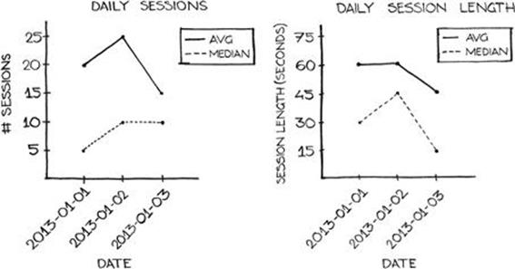
FIGURE 4.11 Line charts depicting daily session numbers (left) and daily session lengths (right).
Because session numbers are less granular and usually exist on a more restricted scale than do session lengths (products generally experience a wider range of session lengths, in minutes, than they do session numbers), average sessions per day is less susceptible to skew than is average session length, but tracking median sessions per day is still valuable.
Both session length and session frequency metrics can be rendered as either a bar or a line graph. These graphs can then be grouped into separate charts (i.e., average and median session lengths on one chart, average and median number of sessions on another). As stated earlier, there exists no universal target number for any of the metrics; the optimal number can only be backed into through testing and experimentation.
Striking a balance between session lengths and frequency ensures that users are compelled to return to the product but not so frequently that they become bored with it. Session length and frequency metrics should be contrasted with daily churn and ARPU and examined for patterns that negatively impact the total user lifetime.
Net promoter score
The net promoter score is a measure of customer loyalty developed by Satmetrix and by Fred Reichheld of Bain & Company and introduced by Reichheld in his 2003 Harvard Business Review article, “The One Number You Need to Grow.” The crux of the metric is that key insights into organic growth through word-of-mouth recommendations and repeat purchases can be gleaned by tracking only the users at the extremes of a business’ satisfaction scale; those insights would be lost in a more nuanced but thorough analysis.
The foundation of the metric is the belief that customers are either promoters, extremely satisfied users who will serve as enthusiastic brand ambassadors as well as sources of key repeat revenue, or detractors, extremely dissatisfied users who will undermine brand growth by spreading unflattering testimony of a product experience. The concept’s authors claim that, by taking the net difference between these two groups, a business can effectively measure the loyalty of its user base.
The net promoter score is a quantitative interpretation of qualitative data points. To calculate a net promoter score, a business must first collect the results of a single survey question that asks, “On a scale from 1 to 10, how likely are you to recommend this product to others?” The scores are then grouped into three sets: those who respond with either a 9 or a 10 are considered “promoters,” those who respond with a 7 or an 8 are “neutral,” and those who respond with a 6 or lower are “detractors.”
Neutral responses are thrown out, and the percentage of the detractors is subtracted from the percentage of the promoters to produce the net promoter score, which spans a scale ranging from -100 to 100. Any net promoter score above zero is considered good, with scores above 50 considered exceptional. A negative score implies a user base with stronger negative sentiment than positive and which thus spreads more negative than positive testimony to potential clients.
While qualitative measurement is largely antithetical to the freemium model given the model’s reliance on comprehensive measurement and instrumentation, the net promoter score can be instructive because of its focus on highly engaged users and its reliance on one decision point across which all users who respond to the questionnaire can be examined.
One of the greatest problems in conducting freemium data analysis is the incomparability of user segments due to the vast differences in their behavioral profiles. This incomparability is an asset when examining quantifiable, auditable records such as revenue, since analysis of many freemium metrics, which are highly stratified, benefits from excluding large swaths of the user base via some bimodal characteristic (usually payer or non-payer). But incomparability is a liability when attempting to draw broad, qualitative conclusions about the general appeal of the product.
A net promoter score adds depth to a product team’s analysis arsenal through a qualitative measure of engagement against which the quantitative metrics can be contextualized. And because a net promoter score focuses attention on the extremes of satisfaction, it serves as a capable signal of how well the long tail of the monetization curve is developing. Likewise, a net promoter score can inform an estimation of how much value NPUs provide to the product, allowing for more enlightened decisions to be made about utilizing advertising to monetize users who haven’t paid beyond some minimum threshold. If the net promoter score indicates that NPUs are serving as enthusiastic promoters for the product, then an evaluation of the benefits of advertising can be undertaken with more awareness of how it might negatively affect the product.
The net promoter score is not without its critics; arguments can be made that it is overly simplistic, and any qualitative, questionnaire-based data point is vulnerable to dishonesty and respondent bias (i.e., only the most engaged users would be willing to fill out a questionnaire in the first place). But in a freemium environment, with massive scale, these considerations are at least somewhat ameliorated by the availability of a large volume of data, which should help correct for biases. Given that most quantitative metrics are singularly focused on granular, quantitative behavioral patterns, the net promoter score, when taken within the context of the entire portfolio of minimum viable metrics, accommodates a level of balance between observed behavior and opinion on the part of the user.
In other words, the net promoter score contrasts what users with what they do, painting a more detailed picture of product engagement. A qualitative indicator of user engagement can serve as a useful waypoint in achieving the delicate balance that must be struck between frequency of use and session lengths; engagement is an outgrowth of satisfaction, which is largely subjective, and a more complete assessment of it can be made through a metric grounded in subjective opinion.
Virality
Virality, as it relates to freemium product development, describes the extent to which products are distributed without any active marketing participation from a business. Viral products “spread,” or acquire new users organically, through word-of-mouth referrals or Internet-based user advocacy. A passionate user base can be far more effective at distributing a freemium product than can a well-funded marketing campaign; as such, virality is a chief concern during the development phase of a freemium product, given that marketing costs must be at least partially borne up front in a product launch.
Achieving virality is a worthwhile pursuit, but true virality is largely serendipitous and the product team’s control. Virality is dependent on several factors that are not only beyond influence during the pre-launch product development phase but are also mostly unknowable. How well a product is received upon release is affected by market conditions immediately pre- and post-launch, similar products in competitors’ pipelines, and user tastes. Given these exogenous influences, designing a product around some expectation of virality is imprudent; rather, a product should be engineered to facilitate virality but financial projections should be constructed, pre-launch, around a rational assumption of normal levels of organic growth.
Virality hooks
Engineering virality requires the placement of virality hooks within a product—mechanics or product features that connect to a third-party API and can broadcast an aspect of the user’s activity. The most common implementation of virality hooks is through social networks, where the user’s activity is broadcast to friends who, presumably, share similar interests with the user.
Social networks are not the sole destination of virality hooks; in fact, social networks may categorize activity generated by third-party products as spam. Additionally, notifications automatically created and sent from a freemium product to a social network tend to lack any personalization. This not only alienates the user’s connections on the social network, discouraging those friends from adopting the product themselves, but also alienates the user, who believes the freemium product has abused its access to the social network. Given that such access can provide valuable demographic data about the user, respecting it is of paramount concern; if access is revoked, product development decisions lose precious context.
The difficulty faced in designing virality hooks lies in their ability to be tracked; calculating virality requires a set of inputs describing the number of people reached through viral tactics, and virality hooks must supply this number. Connecting virality hooks to social networks allows for a fair amount of transparency on the part of the product, as virality hooks can emit events when they’ve been triggered. But once virality hooks have been triggered, tracking the recipients’ responses to those hooks—especially on some mobile platforms, where almost all information about the source of a new user is truncated—is extremely difficult. In this sense, engineering truly auditable virality hooks requires the hooks to be deeply integrated with the product.
Virality hooks thus must be designed with two independent and sometimes conflicting features in mind: auditability and effectiveness. Superficial virality hooks—for example, a viral mechanic in a mobile application that publishes a screenshot to the user’s social network feed—are generally incapable of being tracked but can also be implemented with relatively little effort and utilized (usually with the push of a button) by users without presenting much friction.
The effectiveness of superficial virality hooks is difficult to measure; use counts can be compiled, but identifying users who adopt the product as a result of the virality hooks requires a level of transparency that doesn’t exist on many platforms.
A deep virality hook—for example, a web-hosted social layer in an app that allows for and traces friendship invitations via email—provides for auditing but is likely to experience less use given the barrier to execution and the high level of engagement assumed before use makes sense. A blanket, untargeted broadcast of activity on a social network does not presume any interest from the parties who will be exposed to it; a personal request from a user, sent to a specific individual, does. Therefore, the possible recipients of such a hook are fewer in number, but they will most likely convert to a greater extent. A deep hook often requires more development time to implement, both in the planning and production stages. Deep hooks must be fundamentally engineered into a freemium product; they’re not insignificant undertakings.
The trade-off between a deep virality hook and a superficial one is the extent to which the hook can be iterated and improved upon through the develop-release-measure-iterate feedback loop. Superficial hooks, which produce very little verifiable data, cannot be meaningfully improved by a data-driven iteration process; they are added to the nearly completed product at the latest stages of the development process and generally left alone.
Deep virality hooks do, however, produce actionable data artifacts and can be improved upon as product features, which they are. And while this flavor of hook requires more development throughout the lifetime of the product, it can be evaluated and measured, allowing for development decisions to be made on the basis of expected revenue.
Whichever option is chosen, the events library can accommodate the product user’s use of a virality hook, producing a record of execution. Virality hook use, which is often referred to as viral invitations, can then be displayed as a top-line metric in a dashboard. This metric reveals the degree to which these mechanics are utilized by the user base and can be used as a proxy for not only organic growth (when correlated with user base growth) but also as engagement. Viral invitations are usually represented as daily counts on a line graph, as illustrated in Figure 4.12.

FIGURE 4.12 A line chart tracking viral invitations sent per day.
The success of viral invitations, which is solely represented by the number of new users who adopt the product as a result of receiving an invitation— is more difficult to trace. But when results can be capably traced, they should be used to attribute the applicable virality hook as the source of each new user. Source attribution allows users to be segmented by source, which is necessary when allocating resources to virality hook development and iteration. Virally acquired users segmented by source are usually represented with a stacked daily bar chart, where each layer of the chart represents a specific source and the chart sums to a total count of users acquired virally on a given day.
The k-factor
The most fundamental concept in measuring a product’s virality is that of the k-factor, which is the average number of new users each user recruits into the product. A k-factor of more than 1 represents true virality, in which each user recruited into the product in turn recruits more than one new user. It also means that the viral effects of the product compound, or grow over time.
A product’s virality curve depicts the number of users acquired through viral mechanics over time. When the k-factor equals 1—that is, each user introduces one additional user to the product through viral mechanics—the curve is linear. But when the k-factor sits above 1, the curve is bowed, representing geometric growth. This is because each user introduces more than one additional user to the product, and each one of those users in turn introduces more than one user to the product. In a product with a k-factor of 2, the first user of the product introduces two users to the product, each of whom introduces two new users to the product, and so on, as seen in Figure 4.13.
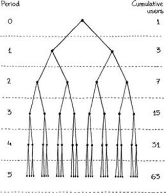
FIGURE 4.13 A model of viral growth at a k-factor of 2.
A k-factor is generally measured by dividing the number of users acquired virally by the number of users who were not acquired virally, both of which can be difficult to quantify precisely. The number of users acquired virally is a reflection of the number of viral invitations generated through virality hooks times the conversion rate of those invitations; when the conversion rate is not measurable (via a success indicator), then the number of total virally acquired users is not measurable. The number of users not acquired virally is derived from a diverse set of possible acquisition sources: organic discovery, word-of-mouth referrals, and paid acquisition. While paid acquisitions are at least countable (although not always attributable on a per-user basis), organic discovery and word-of-mouth referrals are essentially impossible to accurately identify.
Given the difficulties faced in attributing new users to acquisition sources, the k-factor is usually not considered a precision metric but rather a heavily informed estimate. To the extent that the inputs of the k-factor are nebulous, so too is the k-factor itself; its value is not measured in how accurately it predicts the source composition of new users but rather how it informs paid acquisition campaigns.
Users acquired virally are free, meaning they not only increase revenue but also decrease the average cost of acquisition on a per-user basis. This characteristic means that virality amplifies the effects of paid marketing, resulting in more acquired users than there would be without virality. When a product does not experience virality, the return on an acquisition budget—which can be fairly accurately calculated—must be weighed against the potential return on further development of virality hooks (or other product features).
Because the k-factor is an imprecise metric, it is best represented on the dashboard as a long-term product estimate rather than a daily calculation. This is usually accomplished through publishing the k-factor in numerical format alongside the “viral invitations” line graph and the “virally acquired users by source” bar chart.
When publishing an estimated metric, it is important to explain to a team that the metric is inexact and influenced by some level of error, which can be done either in writing or by coding estimated metrics with a visual indicator explained in a legend.
Using metrics in the freemium model
The freemium model’s focus on metrics is satisfied only when those metrics are made available and, more importantly, put to use in the develop-release-measure-iterate feedback loop. Data can trump intuition only when it is readily available at the time decisions must be made; when it is not available as timely, easily comprehended data sets, freemium’s minimum viable metrics are nothing but an intellectual exercise. Product data must be available, configurable, and actionable.
Availability is achieved through data portal centralization, allowing for access via simple, standardized desktop or mobile tools. Configurable data is data that can be aggregated around multiple dimensions and scrutinized from a number of analytical perspectives. And actionable data is timely, relatively error-free, and complete.
Data infrastructure is an obvious prerequisite to data-driven product development, but an organizational emphasis on data is as important, if not more so. Each individual on the product team must acknowledge the importance of data in the freemium decision-making process in order for data to be leveraged to its utmost informative extent. Likewise, each member of the product team should be aware of how data can be accessed and be at least familiar with a product’s high-level metrics at any given point in time. Reporting is a critical operational requirement in the freemium development process, and the team must share enthusiasm and responsibility for taking full advantage of it.
Metrics and the organization
Given the required ubiquity of data and the massive scale over which data must be collected, a centralized reporting portal may be the easiest way to disseminate product metrics. The large volumes of data that must be accommodated present problems when distributing metrics calculations to desktop solutions; calculating metrics through regular batch processes and making those aggregates available through hosted dashboards speeds up the rate at which they can be accessed and absorbed. At the very least, the minimum viable metrics portfolio should be made available as pre-calculated metrics for each product being analyzed so that a baseline set of metrics, defined universally, is available throughout the organization.
The question of when to build an internal reporting infrastructure versus license third-party reporting technology often arises in freemium product development, given its orientation toward data-driven design. A custom-purpose reporting system is an expensive, time-consuming undertaking, and it is difficult to estimate the return on such a system, in terms of increased revenues, before it is fully implemented.
In almost all cases, a custom-built reporting system will perform to a higher and more granular standard than an off-the-shelf solution if the product teams are committed to data-driven development. When product teams consider reporting to be a reference point, or a source of evidence to support decisions that have already been made, then the development of a completely customized reporting system will likely never be justified unless internal attitudes toward data are changed. And when product teams are ready but not able to use data as the basis for product feature decisions, such a system will likewise go underutilized.
Interpreting data correctly in order to produce action points requires specific expertise; if that expertise is not present on a product team, then no collection of sophisticated tools, bespoke or not, can render data useful. An organization will benefit from a customized reporting infrastructure when it possesses the expertise to properly interpret metrics and implement new features based on experimentation and quantitative behavioral patterns. These two requirements relate as much to data science as they do to product development; the product team must be able to communicate clearly with the analysis team in order to interpret the results of analyses.
Freemium reporting is optimally implemented through human resources as well as technology. But legacy software development techniques don’t always translate well into freemium environments; experience is not always transferable and can sometimes represent a liability. In fact, the entire product team must be able to work in small iterations, at a swift pace, as the need arises, in order to properly implement the business model. Spotting these characteristics in potential hires requires a keen eye and an understanding of the business model by those hiring new employees.
The product team should be comfortable with metrics and make them as visible as possible within the organization. Visibility in this sense goes beyond availability; metrics should be circulated internally in reports, cited in presentations, and even displayed in the office to keep teams abreast of how the company’s products are performing.
Absolute transparency around metrics creates a strong sense of quantitative, data-driven focus in an organization, which is a dominant concern when developing freemium products. Intuition in a freemium environment is not necessarily a bad thing, but it must be qualified with data; by fostering an atmosphere of total data awareness and making data readily available, a freemium organization tempers any individual’s urge to let intuition trump quantitative feedback.
Dashboard design
The design of a dashboard can affect how frequently it is used and how authoritative users consider it to be. Dashboard functionality needs to be intuitive, but when data is displayed too abstractly, it may not be considered definitive. Dashboard aesthetics must achieve a balance between scientific and artistic; likewise, dashboard functionality, such as aggregating metrics around various dimensions like date or geographical features, should be obvious and easy to understand.
A dashboard’s console is its set of control functions that allows the user to limit and aggregate the data being displayed. A console generally features drop-down menus, radio buttons, checkboxes, and sliding scales to facilitate data aggregation around various data dimensions. The dimensions of the data being displayed depend on the underlying data set and the features of the product; at the very least, almost all data sets should include a date dimension that allows data to be limited to a specific date range.
Often, the best way to view date ranges is relative to the current date, so a mechanism that automatically reduces the data set to data points within the “last seven days,” “last fourteen days,” “last twenty-eight days,” etc. can be useful. Dates are otherwise manipulated using a sliding menu with two selectors to specify start and end dates. Because date is such a fundamental dimension, the date selector usually appears at the top of the console.
Demographic data dimensions should also appear in the dashboard console to allow aggregation. Attributes such as a user’s country, age, language, and gender allow for valuable insights about product usage to be gleaned when aggregated around their individual values. Since dimensions of this nature can take multiple values such as country and age, grouping the dimensions into age ranges or continents, for example, can render the dashboard more useful.
Where appropriate, it its also important to aggregate around platform dimensions. Segmenting data by operating system, screen resolution, and device model, for example, can highlight sources of product deficiencies or poor performance, especially as they influence engagement and monetization. Such console aggregations can also highlight platforms and devices on which the product performs especially well, potentially impacting the priority of future feature development.
Generally speaking, dashboards are most effective when they’re succinct and thematic, as illustrated in Figure 4.14. An all-purpose dashboard containing dozens of graphs and charts will likely not be used as often as will several specific dashboards segmented by metric theme, since navigating a massive dashboard slows the metrics interpretation.
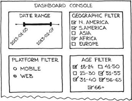
FIGURE 4.14 A dashboard console with filters for date, geography, platform, and age groups.
The dashboard should contain some sort of navigation scheme to allow for graph themes to be either added to the current set of displays or displayed independently. One theme methodology for the various metrics is the same used to define the minimum viable metrics: retention, monetization, engagement, and virality. Splitting the metrics into these groups and displaying them on separate dashboard pages serves to keep the looks of all dashboards streamlined, preventing potential information overload.
Only so much data can be interpreted at once; if a dashboard contains too many graph items, users may be inclined to spot patterns where none exist or, conversely, become so overwhelmed by the amount of information presented that they focus on only one or two graphs. “Dashboard stuffing”—the act of putting every conceivable metric onto a dashboard under the assumption that it might be found useful either now or in the future—should be avoided. Not every metric belongs on a dashboard; some metrics are only relevant for a specific period of time or to specific people. The dashboard is a universal gauge of performance and should contain high-level metrics significant to the organization; metrics with a narrow scope should be reported to interested parties through separate reports.
Ad-hoc analysis
When a set of metrics is relevant for a limited amount of time, or when it is only relevant to a specific segment of an organization, then it doesn’t belong on an all-purpose, organization-wide dashboard. When a group-specific metric is perennial and important enough to be referenced every day, then a dashboard for that specific group should be developed. But when a set of metrics is needed only for a discrete, time-constrained purpose—a presentation or due diligence on a potential partnership, for example—then adding that set of metrics to a dashboard is inappropriate. Instead, those metrics should be fetched with ad-hoc analysis.
Ad-hoc analysis is the process of querying data directly from the database in order to investigate a trend or hypothesis. Ad-hoc analysis is required when the granularity of the analysis precludes the use of dashboard data, such as when comparing user segments that are too specifically defined to be sensibly included on the dashboard.
Generally speaking, ad-hoc analysis is performed by either an analyst on the product team or by the organization’s analysis group. Analysis is easiest to conduct when it is well-defined and the goals are understood. For instance, if the purpose of an analysis is simply to check for the existence of an ambiguous pattern, then the results of the analysis will surely beget more analysis, creating an analysis rabbit hole from which little actionable insight will likely be gained.
If analysis is entered into under the premise of a null hypothesis, then the results of the analysis can be used to drive decisions. Analyst resources are as valuable as any other; the analyst should take care to achieve maximum impact on the product and, eventually, on revenues.
When conducting analysis, the analyst will most likely query raw data from the data warehouse. When data structures get complicated enough, querying data can become not only cumbersome but shapeless; there may not exist one obvious, straightforward query string but rather several equally complex, inscrutable query strings, each of which derive the same resultant data. Mistakes are easily made when constructing convoluted query strings; for this reason, the analyst should have the query string reviewed by someone else familiar with the underlying data structure. The analyst should also conduct a “smell test” on the results, or a subjective evaluation of the feasibility of the results in the context of historical patterns. Most of the time, when the results of an analysis conflict dramatically with existing notions about a product, an error is present in the analysis. And even if an error isn’t present, conclusions that encourage change to a model of thought always benefit from a second review, even when the conclusions are correct.
The conclusions from an analysis are usually distributed in spreadsheet format. If the analyst believes that the conclusions might need updates on a regular basis, the spreadsheet should be formatted in a way that makes such updates easy. This is best accomplished by separating into individual worksheets the outputs of the analysis from the underlying data used to derive them; this method allows new data to be pasted onto each data worksheet without changing the calculation of output statistics.
Revisions to the analysis should be indicated in the filename; a good filename convention for an analysis document is MMDDYY_AnalysisDescription_versionX, where MMDDYY represents the date the file was last modified, AnalysisDescription represents a concise description of what is being analyzed, and X represents a version number. Version control is not easily implemented with most spreadsheet software, but saving files in this manner lessens the risk of irreversible mistakes by allowing for versions to be “rolled back.”
When requests for an updated analysis model happen often, the model becomes a good candidate for inclusion on a dashboard. The benefit of initiating dashboard items as ad-hoc analyses is that the analysis process checks the validity of the metrics being calculated, identifies the sources of the data points needed for calculation, and defines the best format for presenting conclusions. By the time several iterations of analysis identify a set of metrics as a candidate for dashboard inclusion, those metrics and the format they are reported in are concrete; the analyst can simply explain the query string and output to a data engineer and the new dashboard metrics can be implemented without any ambiguity. Using the analysis process as a filter for dashboard metric introduction helps deter dashboard stuffing and ensures that all metrics included on the dashboard are trustworthy and credible.
Minimum viable metrics as a source of revenue
One innovation the freemium model brings to bear is analytics as a fundamental component of the product development life cycle. Since distribution (and thus customer adoption costs) are zero, behavioral customer data is available with enough volume to develop new streams of revenue from it. The freemium model gives an analytics team the opportunity to conceptualize new sources of revenue; under traditional models, the minimum viable metrics can at best merely optimize existing revenue streams, and at worst they simply reduce expenses.
This phenomenon is an outgrowth of the inverse relationship between user base size and barrier to purchase (cost), which is illustrated in Figure 4.15. At a price point of $0, the size of a product’s potential user base is unlimited; as the price point increases, the number of potential customers decreases. This is obvious, but what is less obvious is how that relationship empowers the minimum viable metrics portfolio as a product development tool.
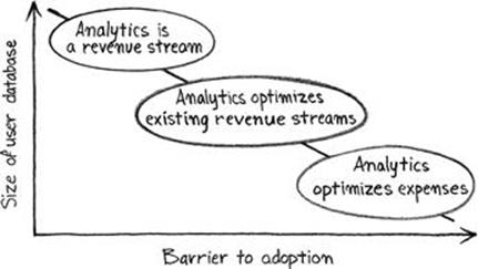
FIGURE 4.15 The analytics value continuum.
As a product’s user base increases, the data artifacts it creates become more valuable because their volumes render them actionable. Optimizing a 1 million-user revenue stream is easier than optimizing a 100-user revenue stream; the data used to make decisions is more reliable, trends are easier to spot, and results are easier to communicate to management because black box argumentation is rendered unnecessary.
The phrase “black box argumentation” is defined within this context as a faith-based description of a specific result that relies on statistical or algorithmic techniques too complicated to explain to management in a presentation. These are “trust me, I’m a scientist” means of influencing a decision based on the results of an experiment or analysis, and they are very rarely persuasive—the more opaque a process is, the less likely its results are to influence decision-making. Analyses are most effective when they are based on a simple conclusion that can be clearly communicated and understood.
The freemium model facilitates the development of autonomous data products seeking green lights from management, without relying on black box argumentation, by providing large volumes of data on which to conduct straightforward analyses. This is one of the primary benefits of Big Data as a business strategy; it shifts complexity away from analysis and onto data architecture and processing, allowing results to be communicated more clearly and convincingly. Thus, within the context of the freemium model, data products are easier to pitch and implement at the organizational level, imbuing the organization’s analytics team with a product development and management directive.
So the belief that analytics systems exist simply to reinforce product maxims that an organization already believes to be true doesn’t apply under the freemium model; since large volumes of data serve as the foundation of the freemium model, analytics is a product driver. Analytics is not an intellectual or philosophical initiative; it is the scientific framework used to generate revenue.
This perspective is at odds with some inherited definitions of analytics, which generally fall along the lines of “a reporting system that alerts the organization to problems.” In the freemium model, analytics should describe the current state of the product: its usage, its growth, revenue statistics, etc. But analytics should also be useful in delivering metadata that can be used to enhance a product’s current functionality as well as to develop additional functions that may not have existed in the product’s original development scope.
The question, then, is how the generation of revenue through analytics is achieved. The most obvious means of using analytics to produce new revenue is to invest in it sufficiently through hiring the right people and building out the right infrastructure. But for an analytics group to be serious about producing new revenue streams, the entire organization must be dedicated to data-driven product development. This is probably the hardest aspect of implementing the freemium model: integrating reporting and design functions under the product umbrella group as opposed to segmenting them.
Metrics can form the foundation of the freemium model only if analytics is approached with genuine intent. Analytics can’t be pursued part-time or with minimal expenditure in mind; as a fundamental constituent of the product development process, analytics must be staffed, resourced, and prioritized with the same commitment as any other product-focused initiative. Thus, the minimum viable metrics portfolio represents two things: a hard launch requirement that must be met before the product can be exposed to the public, and a genuine source of new revenue.
All materials on the site are licensed Creative Commons Attribution-Sharealike 3.0 Unported CC BY-SA 3.0 & GNU Free Documentation License (GFDL)
If you are the copyright holder of any material contained on our site and intend to remove it, please contact our site administrator for approval.
© 2016-2026 All site design rights belong to S.Y.A.