Introducing GitHub: A Non-Technical Guide (2014)
Chapter 2. Viewing
In this chapter we’ll look at how you can view the state of a project to see what’s going on. We’ll use the popular Bootstrap open source project as an example.
Introducing the Project Page
Bootstrap is a project that allows developers to quickly develop attractive web applications. Go to the project page on GitHub. There is a lot of information on the home page. Let’s start by reviewing some of the most important elements on the page (see Figure 2-1).
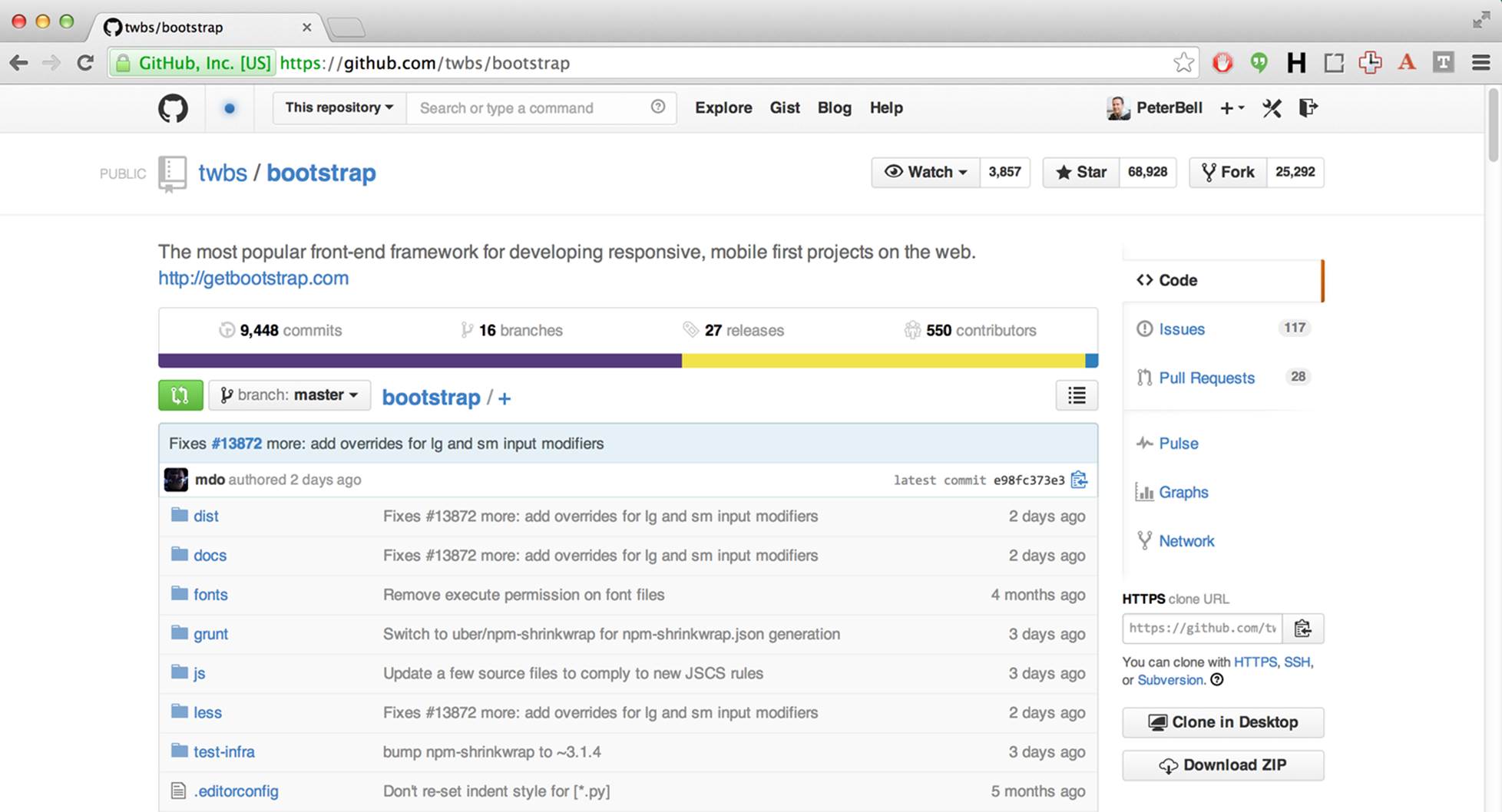
Figure 2-1. The Bootstrap project home page on GitHub
One of the first things you see looking at the top left of the page is that the project name is “bootstrap” and that it’s owned by a user (or in this case an organization) called “twbs.” If you were to go to https://github.com/twbs, you’d see a list of all of the projects hosted by that organization at GitHub. To the left of the organization name you’ll also see an icon that makes it clear that this is a public repository that anyone can see. A lot of the projects you work on will have a closed lock icon instead, signifying that they are private and can be viewed only by people who have been explicitly added as collaborators.
To the right of the project name, you can see in Figure 2-1 that at the time the screenshot was taken, 3,857 people were watching the repository to get notified every time new changes were made to it, 68,928 people had starred it to mark it as one of their favorite projects, and 25,292 people had forked the repository, making their own copy on GitHub where they could upload changes to the project and share them with others.
Further down the page, you can see a short description of the project, and below that you’ll see that there have been a total of 9,448 changes to the project (commits), 16 different streams of history are currently being developed (branches), 27 versions of the software have been recommended over time for people to use (releases), and 550 people wrote some part of the code (contributors).
You can also see that we’re currently viewing the master branch, that we’re in the root bootstrap folder, that the latest commit on master was “Fixes #13872 more: add overrides for lg and sm input modifiers” (whatever that means), and that the commit was made by GitHub user “mdo.” As you look further down the figure, you can see the folders (sometimes called directories) and files that are in the root (top-level) folder in the project.
Viewing the README.md File
If there is a file in the root of a project named README.md, the contents of that file will be displayed just below the list of folders and files on the project home page. This file provides an introduction to the project and additional information that would be useful to collaborators, such as how to install the software, how to run any automated tests, how to use the code, and how to make contributions to the project.
These days, README files will often also include badges—images used to show the current state of things, like the automated test suite to let you know the current state of the project. In Figure 2-2, the Bootstrap project is showing the version of two other projects that Bootstrap depends on. It’s also showing that the automated tests are passing, that the dependencies are up-to-date, and the versions of browsers and operating systems that Bootstrap should work for.
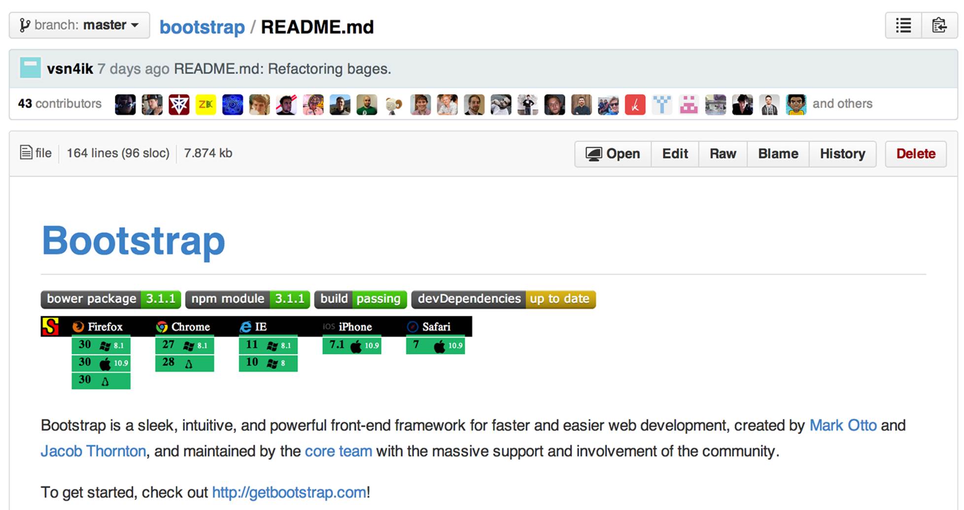
Figure 2-2. The contents of the Bootstrap project’s README.md file
Viewing the Commit History
The commit history is a great way to get a sense of the most recent small units of work that have been completed on any given branch. Go to the Bootstrap page on GitHub and click the “9,448 commits” link (the number of commits will have changed by the time you do this). You’ll see a list of commits—most recent first (see Figure 2-3).
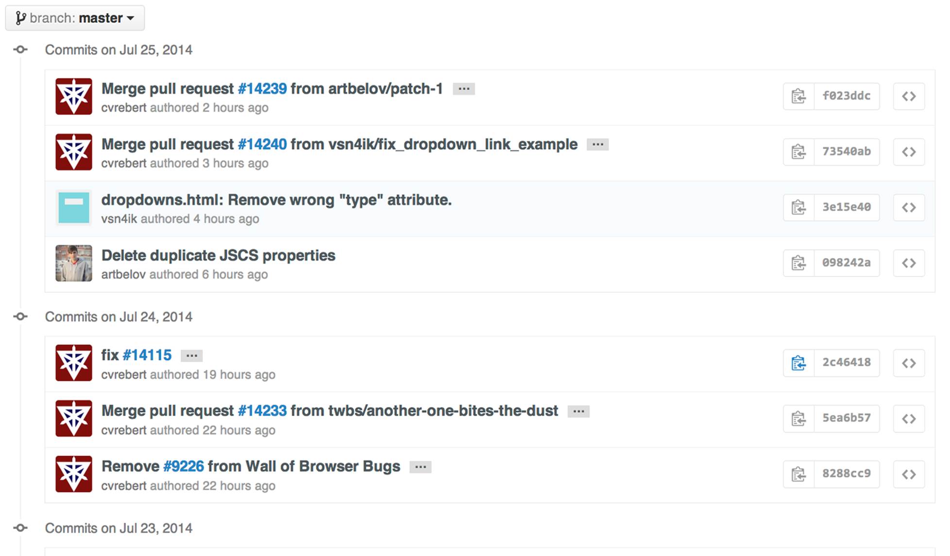
Figure 2-3. A list of the recent commits on the project
Clicking any of the commits will show you the commit message that should explain why the changes were made. Below that you will see each file that was added, removed, or modified as part of the commit, with content that was removed displaying in red and content that was added displaying in green (see Figure 2-4).
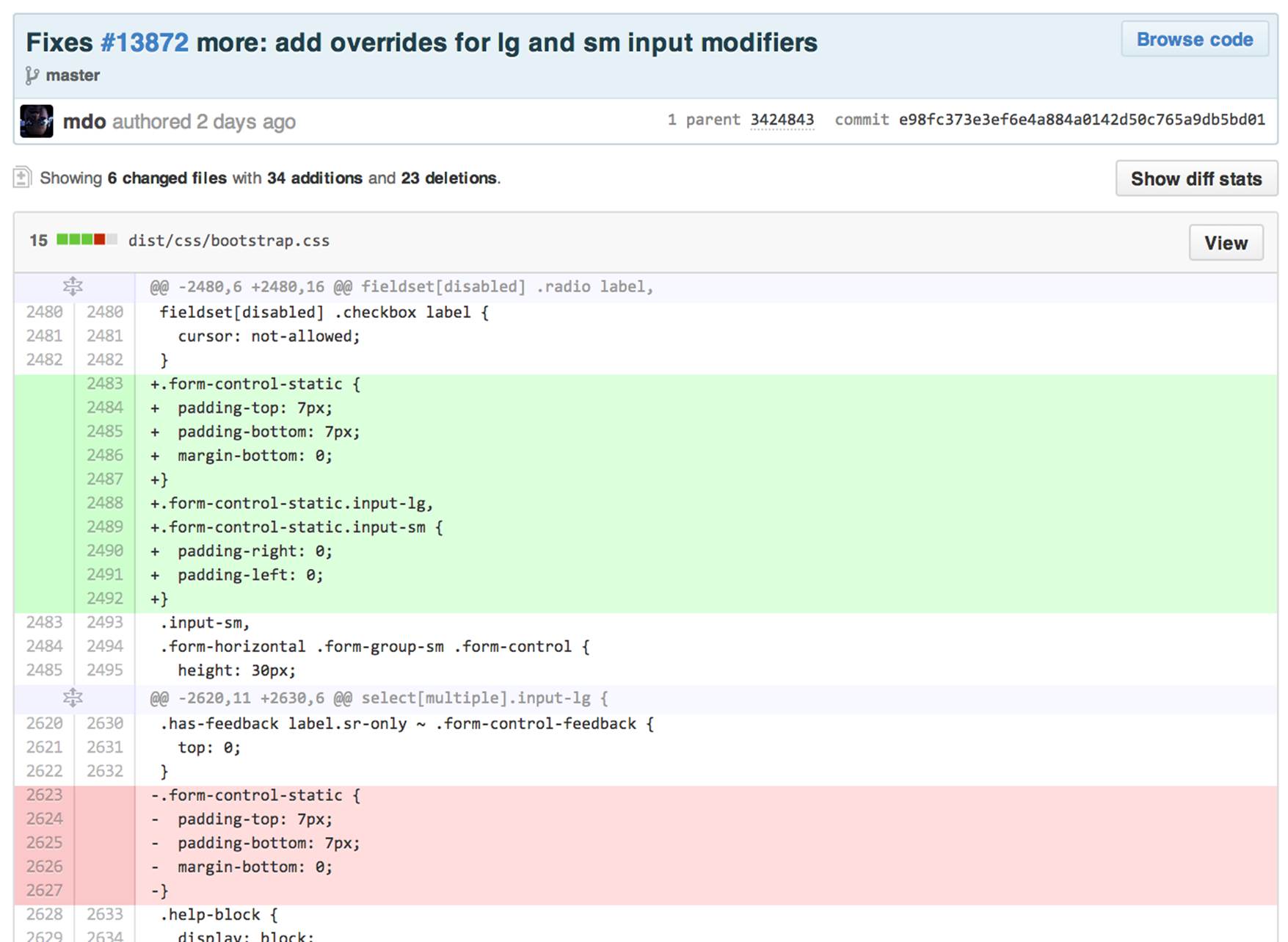
Figure 2-4. A recent commit on the project
Viewing Pull Requests
Pull requests give you a sense of the current work in progress. Go back to the home page and click the “Pull requests” link in the top-right and you’ll see a list of open pull requests. These are the outstanding features or fixes that people are currently working on (see Figure 2-5).
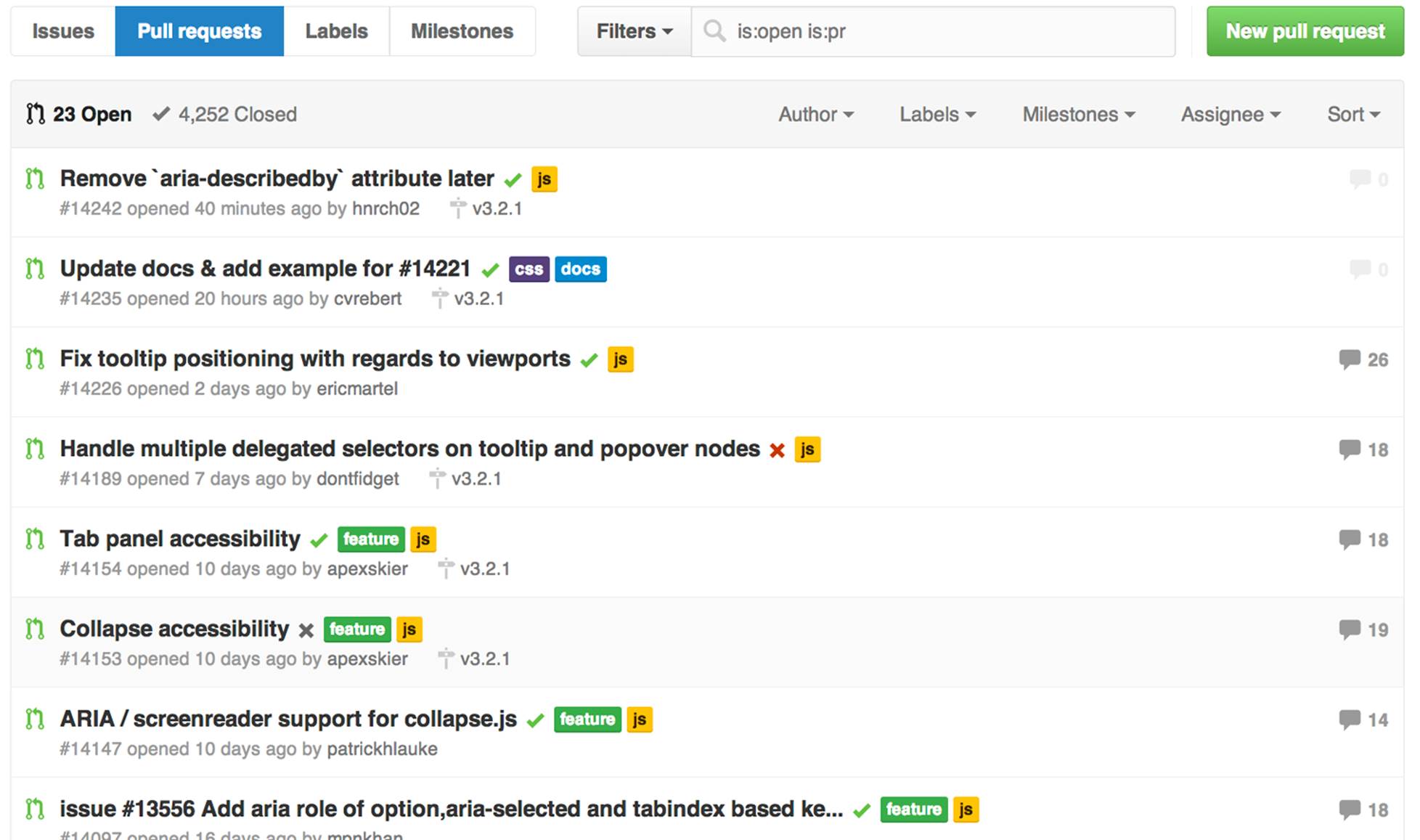
Figure 2-5. Open pull requests for the project
Click one of the pull requests and you’ll see a short title describing the pull request. There are one or more commits with the proposed changes, and there may be a number of comments from people discussing the proposed changes (see Figure 2-6).
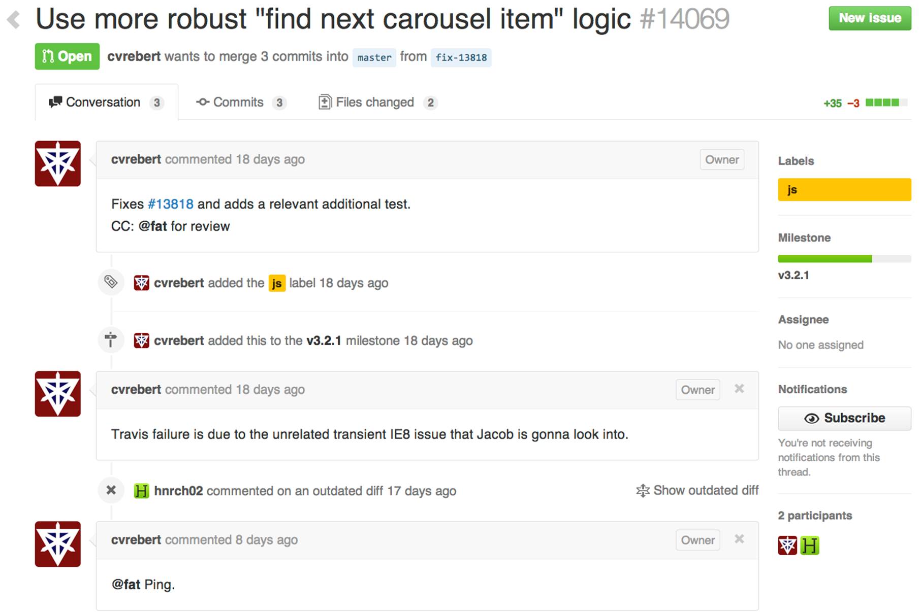
Figure 2-6. A recent pull request
Looking at the pull requests is a great way to get a sense of what people are working on now and the current state of play of each of those changes—whether bug fixes or proposed features.
Viewing Issues
While pull requests give you a sense of the current bug fixes and features being worked on, issues can give you a wider sense of the outstanding work that still needs to be done on a project. Pull requests are often linked to an issue, but there will usually also be issues that nobody has started working on yet, so they don’t yet have a pull request.
If you click the link to view the list of issues, by default you’ll see a list of all of the open issues (see Figure 2-7).
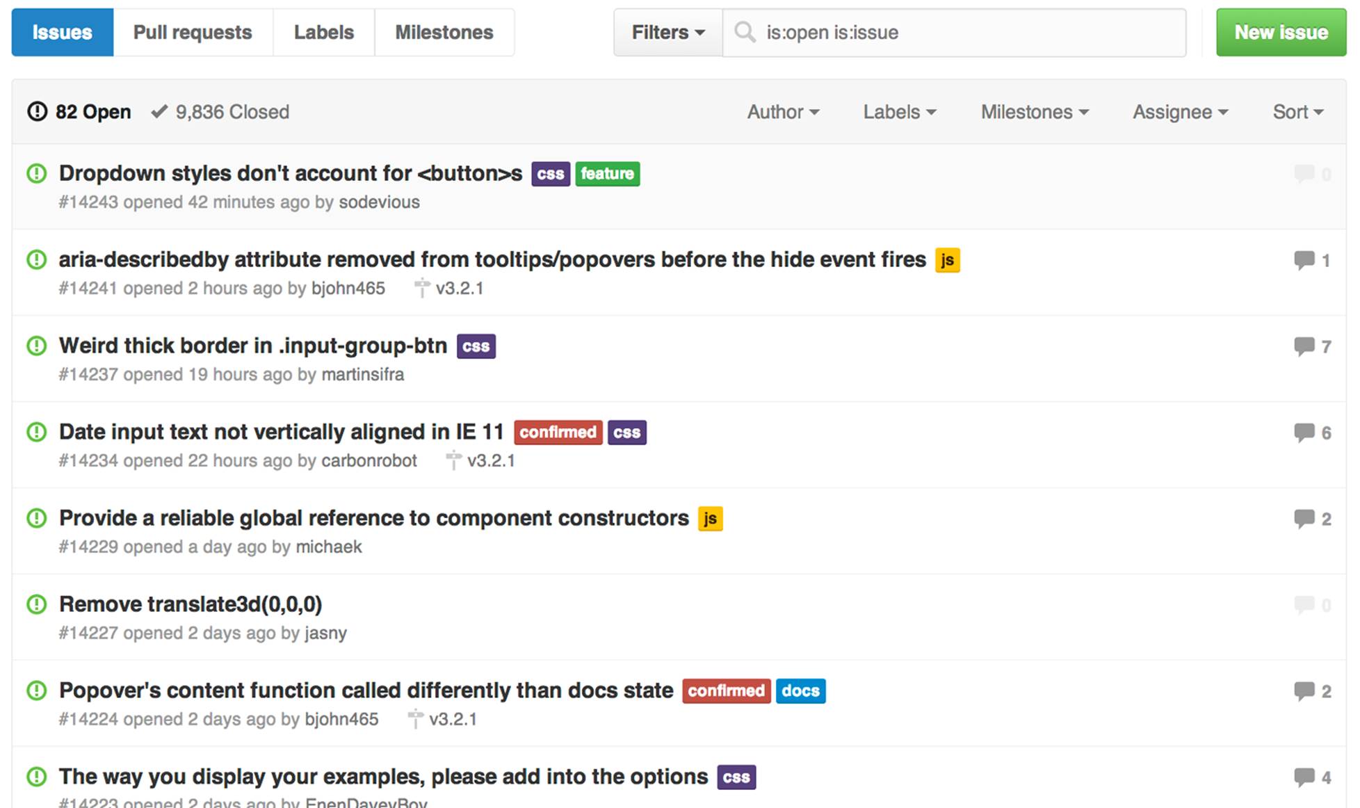
Figure 2-7. Open issues for the project
Click an issue and you’ll see the title and any comments related to the issue. If any work has been done and pushed to GitHub, and if the commit message references an issue, it’ll show up on the Issue page so you can see what’s being done. In Figure 2-8 someone appears to be having a problem with one of the Bootstrap features.
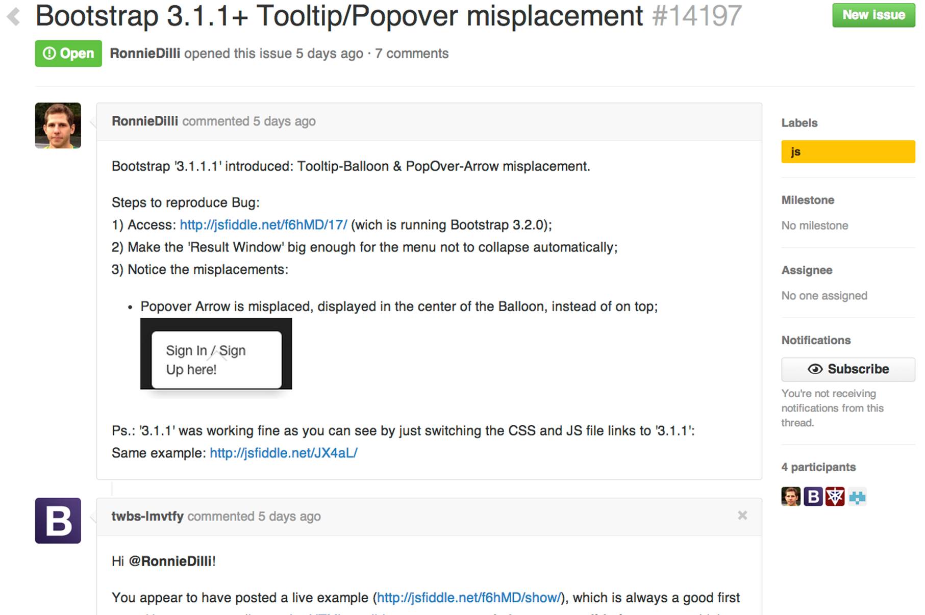
Figure 2-8. A recent issue
Viewing the Pulse
The pulse is a great way to get a sense for the recent activity on a project. Notice in the top right of Figure 2-9 that you can customize the pulse to be for the last day, three days, week, or month.
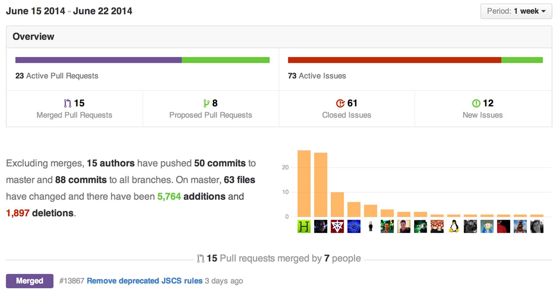
Figure 2-9. The pulse for Bootstrap
The pulse starts with an overview of the number of pull requests that have been merged (completed) and proposed (added). It also shows how many issues were closed or opened. It’s important to understand that when the pulse refers to the number of active pull requests and issues, this is not the outstanding number of each but rather the number of requests and issues that have been started and finished in the time period you selected. For example, at the time of writing, Bootstrap had 15 merged and 8 proposed pull requests for a total of 23 “active” pull requests in the last week, but it had a total of 28 open pull requests.
The next paragraph on the screen is a concise summary of recent changes, listing the number of authors, commits on master, total commits on all branches, and the number of files added, removed, or modified on the master branch. It then gives you the number of lines of content that have been added or removed, although it’s important to realize that if a line of text in a file is modified, Git will treat it as if one line was removed and another different line was added in its place.
To the right is a bar chart showing the contributors who have made the most commits during the period. Below that is a list of the titles of the merged and proposed pull requests, followed by the closed and then opened issues. The pulse view ends with a list of “unresolved conversations,” which is a list of all of the issues and pull requests that have received additional comments but have not yet been closed.
Viewing GitHub Graphs
While the pulse gives you a summary of recent activity, the graph pages allow you to get a sense of the work that has been done on a project over a longer period of time.
The Contributors Graph
The contributors graph in Figure 2-10 shows you the number of contributions over time based on the number of commits, additions, or deletions. It shows a graph for all of the contributions, followed by smaller graphs showing the contributions by the individual developers—from the most to the least prolific.
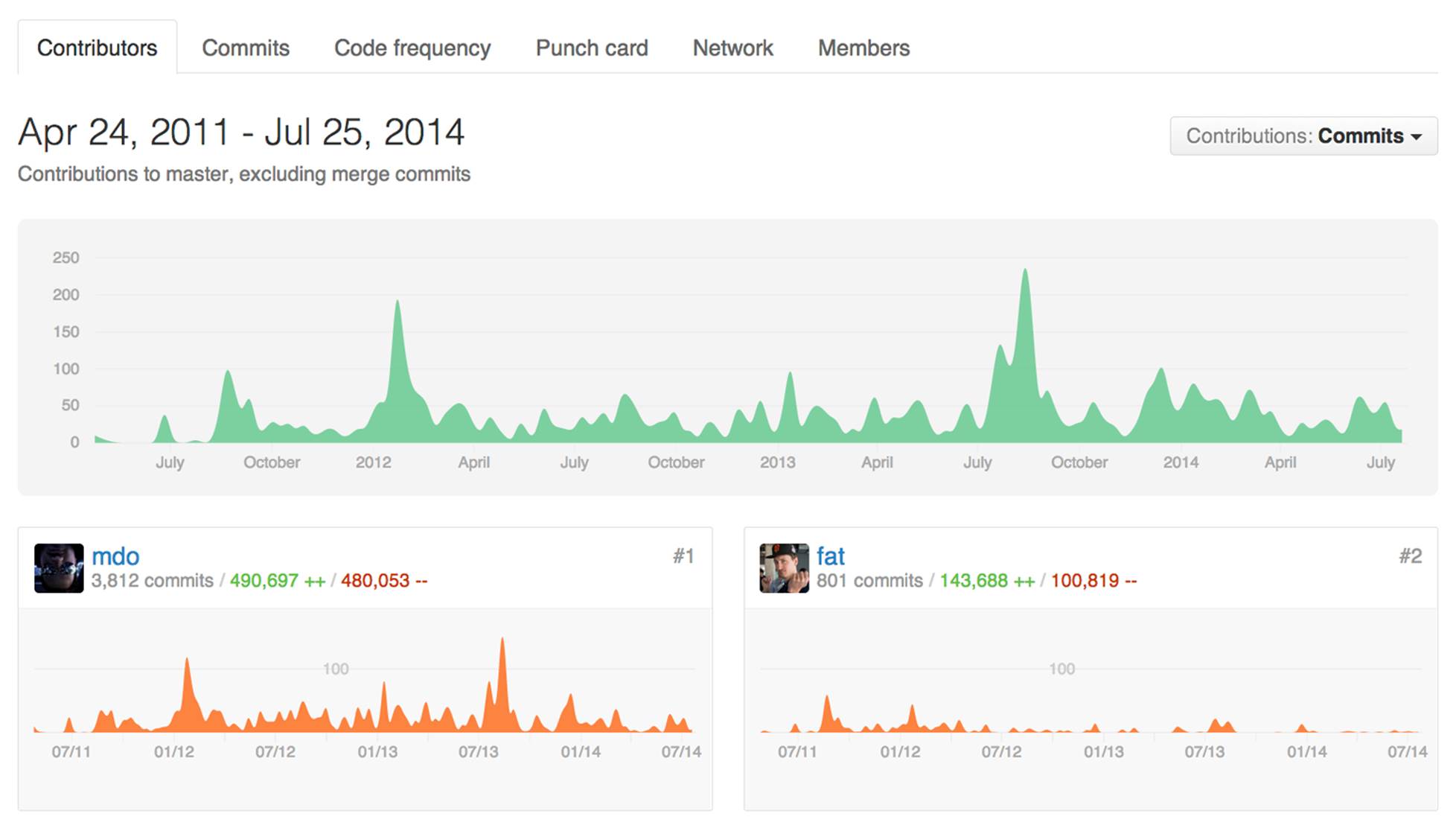
Figure 2-10. The contributors graph for Bootstrap
The default commits graph shows the number of commits that have been made over time to the master branch. It’s important to realize that it shows only the commits that have been merged into the master branch. If you have someone on your team who has been working on a feature branch all week and whose work has not yet been merged in, none of those contributions will show up until they are ready for release and have been merged into the master branch.
By default, the time period for the graph is the entire lifetime of the project. If you’d like to pick a shorter time, just click the starting point you’d like on the main graph and then drag and release on the time you’d like the new graph to end. Figure 2-11 shows the results of doing this to focus on the commits over the summer of 2013. You can see that the main graph at the top of the page stays the same, but at the top-left it shows the time period we’re focused on (June 30 through September 2). The commit graphs of the individual contributors shows the number of commits and how they were spread out over that time period.
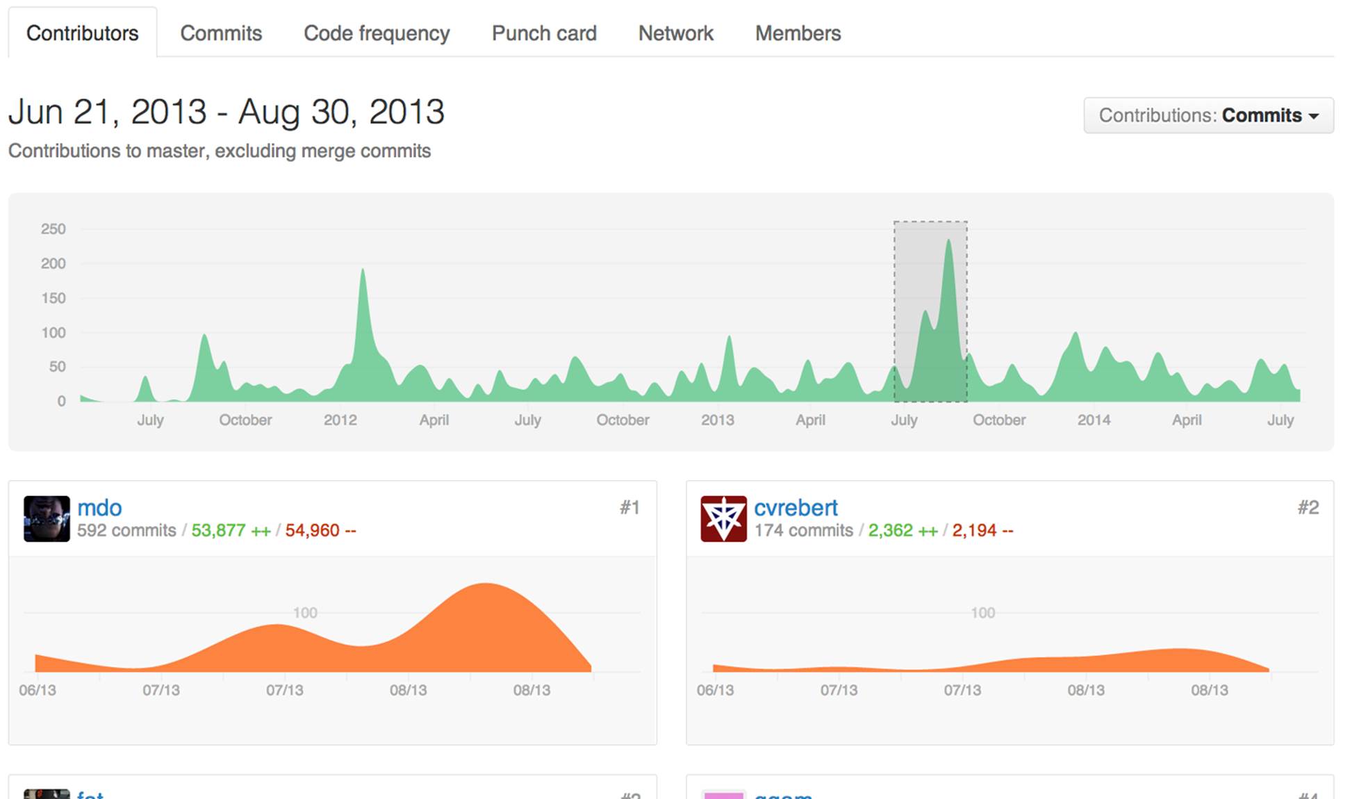
Figure 2-11. The contributors graph for the summer of 2013
There is no standard size for a commit. A good rule of thumb is that if developers are writing code as opposed to researching a problem or testing something, they should probably be committing every 5 to 10 minutes. However, depending on the team you’re working with, you might find that some developers create many fewer commits than others, even if they’re doing a similar amount of work. If that is the case, you might want to change the “contribution type” for your contributor graphs to additions or deletions. In that way, you’ll get a sense of the number of lines of code that the developers have added or removed from the project. If they modify a line, it will show up as a deletion of the old line and an addition of the new one.
The Commits Graph
The commits graph in Figure 2-12 shows the number of commits per week over the life of the project, giving a very rough proxy for activity and how it has varied over time.
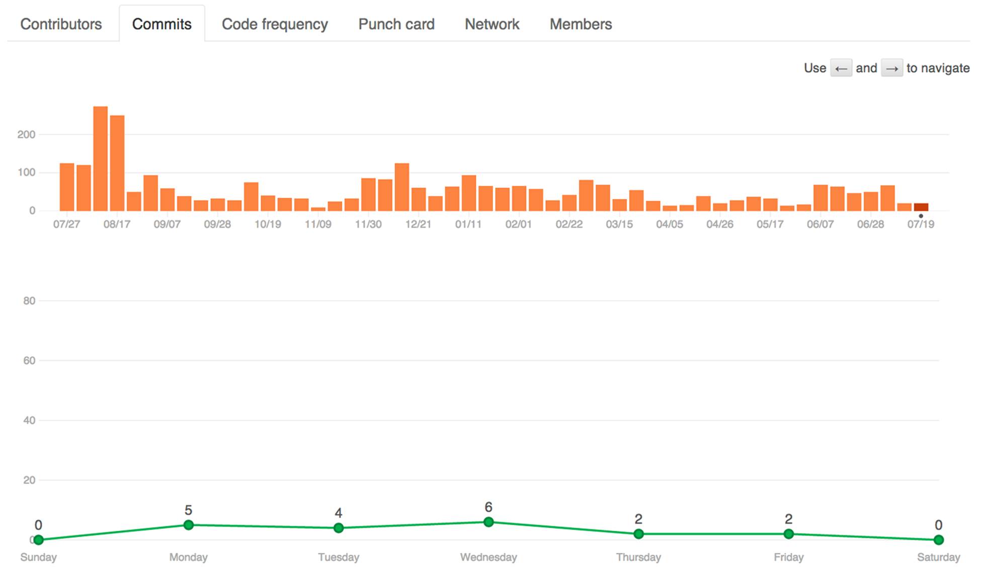
Figure 2-12. The commits graph for Bootstrap
The first reason to look at the commits graph is to get a sense of how many commits per week there have been over the lifetime of the project. It starts with a bar graph showing one bar per week and is a great way to see cyclical or long-term trends. Is the number of commits in your project slowly decreasing? If you have more developers, is the number of commits consistently increasing? Are most of your commits in the last week of every month, or are there seasonal trends? This graph can give you good insight into how the number of commits—which is a very rough proxy for productivity—are varying over time.
Below the bar graph is a line graph showing the average number of commits on each day of the week over the lifetime of the project. This graph can be useful for getting a sense of the cadence over the course of an average week. Are people not committing on Mondays because of too many meetings? Are they making most of their commits on a Thursday ahead of your Friday “demo days,” or are they working too much on the weekend, which isn’t good for long-term sustainability?
The Code Frequency Graph
The code frequency graph in Figure 2-13 shows you the number of lines added to and removed from your project over time and is particularly helpful for identifying large changes to your code base.
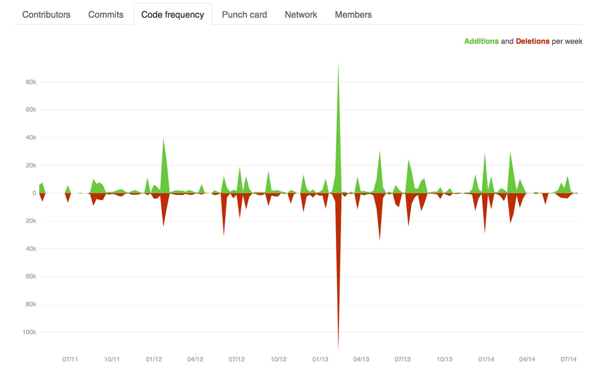
Figure 2-13. The code frequency graph for Bootstrap
The code frequency graph is a great way to see when there have been big changes on your project. Often when developers are doing a big refactoring, they’ll add and delete hundreds or even thousands of lines of code per commit, whereas in the usual course of business, a commit will probably contain only a few lines of added, modified, or deleted code. When such a refactoring is going on, the number of commits might not change much, but the number of lines added and deleted will spike, so if you want to get a sense of when the biggest changes happened to your code base, you should start by having a look at the code frequency graph. For example, you can see in Figure 2-13 that a big refactoring was done in February and March of 2013.
The Punch Card Graph
The punch card graph in Figure 2-14 shows what time of day and which day most commits get done.
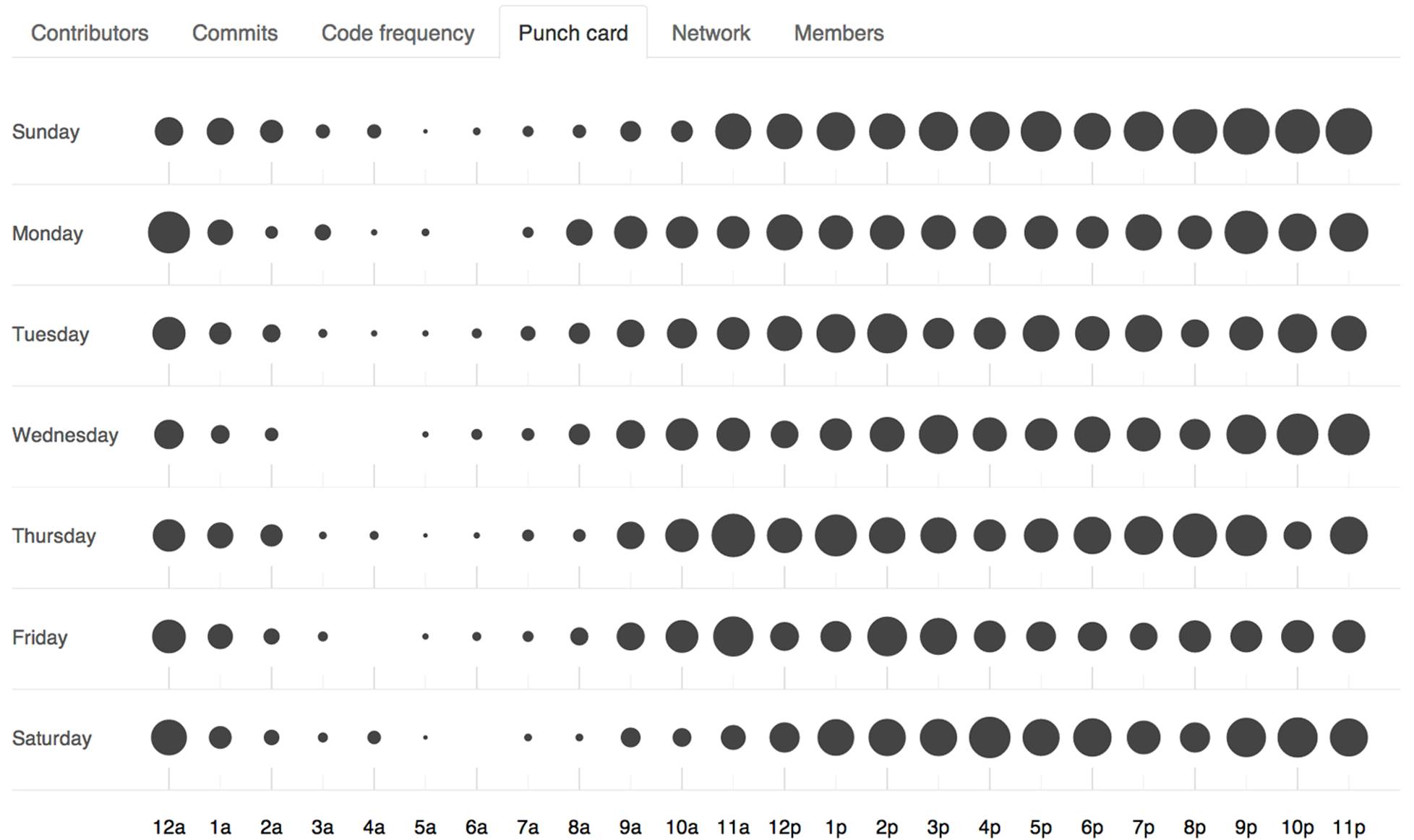
Figure 2-14. The punch card graph for Bootstrap
The punch card graph displays a circle for every hour of every day in the week. The diameters of the circles are a function of the percentage of the commits for the project made during that hour on that day. The bigger the circle, the more of your project commits have been made at that time. Again, this a great way to get insight into the times when your team is most productive.
The Network Graph
The network graph in Figure 2-15 shows the number of branches and commits on those branches throughout a project’s history. It also shows any forks that contributors have created.
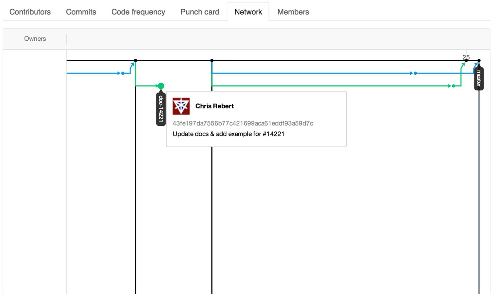
Figure 2-15. The network graph
The network graph is useful for seeing how far ahead one branch may be, or what kind of work someone may be working on in their own fork. When these commits make their way back into the original repository’s master, we’ll see this come in with an arrow and a merge commit if it was done via a pull request. We can also mouse over these commits to see who wrote them and what the commit message was.
The Members List
The last graph that everyone can see regardless of permissions is the members list. If there is an unusual number of forks, we’ll see a message like the one in Figure 2-16, displaying only a partial list of members.
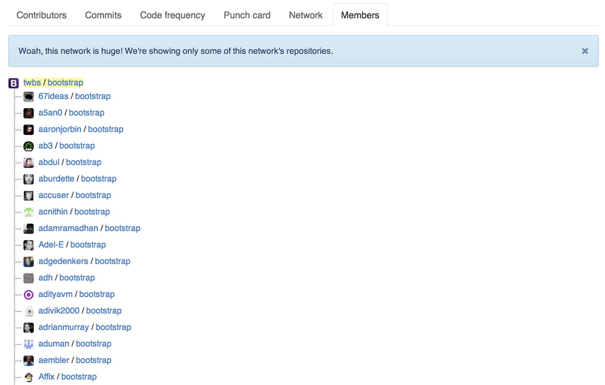
Figure 2-16. The members list
The members list shows just the people who have forked the repository or forks of forks. These people aren’t collaborators on the original parent repository and therefore needed their own copy of the repository in order to contribute to it through a pull request.
The Traffic Graph
One additional graph, which is available only to owners and collaborators on a project, is the traffic graph shown in Figure 2-17.
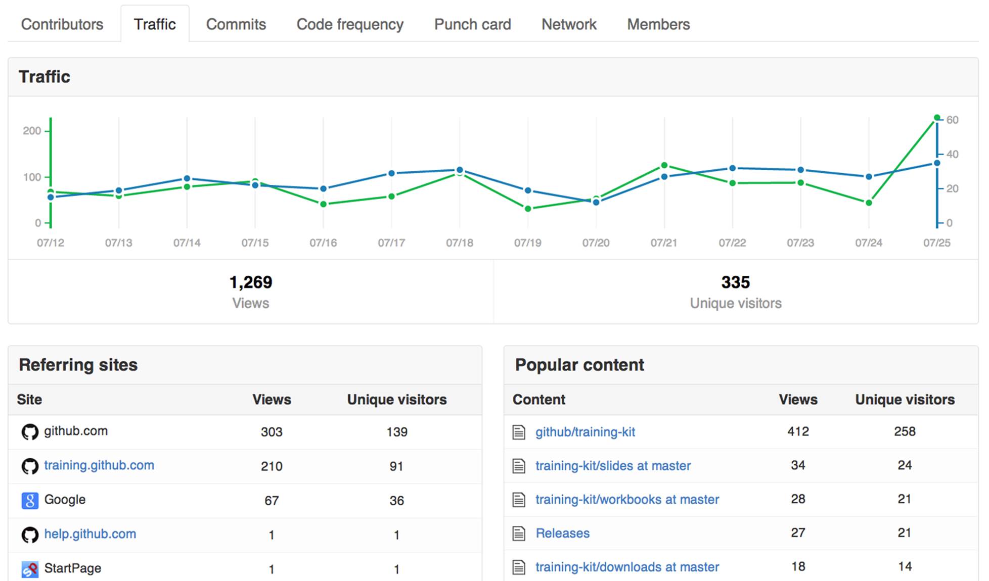
Figure 2-17. The traffic graph
The traffic graph shows you the number of views and unique visitors over time, lists the sites that people are linking from, and highlights the most popular content on your GitHub project site. It can be a great way to get a sense of the popularity for open source projects.
By now you should have a good sense of how to get up to speed with a project by looking at the README file, commits, pull requests, issues, the pulse, and the GitHub graphs. In the next chapter we’ll look at how you can start to contribute to a project.
All materials on the site are licensed Creative Commons Attribution-Sharealike 3.0 Unported CC BY-SA 3.0 & GNU Free Documentation License (GFDL)
If you are the copyright holder of any material contained on our site and intend to remove it, please contact our site administrator for approval.
© 2016-2026 All site design rights belong to S.Y.A.