Microinteractions (2014)
Chapter 6. Putting It All Together
On a cold Boston night in February 2008, Leah Busque and her husband realized their dog Kobe was out of dog food. They were headed out to dinner and a cab was even on its way, but the dog needed to be fed. She thought, “Wouldn’t it be nice to go somewhere online and say, ‘We need dog food,’ name a price we’d be willing to pay, and find someone in our neighborhood, maybe at the store that very moment, who could help us?” Before the cab had even arrived, she’d bought the domain name RunMyErrand.com.[43]
RunMyErrand eventually became the startup TaskRabbit, with Busque as its founder and CEO. TaskRabbit lets people locally outsource the small chores they don’t want to do like donating old clothes or buying dog food. By 2011, TaskRabbit had millions in funding, 35 employees, and was generating $4 million USD in business every month.
At the heart of TaskRabbit is a microinteraction: telling potential “TaskRabbits” what task needs doing so that the TaskRabbits can bid on the fee for doing it. Specifying the task that needs to be done is the microinteraction. The entire service rests on this one crucial, yet potentially unexciting, step. At first, this microinteraction was a very text-heavy form, where users would have to write out their tasks in some detail (see Figure 6-1). But in 2011, after the team had designed their simpler mobile app, they realized there was a better way: by making a set of Smart Defaults, Bringing the Data Forward, and breaking the task up into chunks. As detailed in “TaskRabbit Task posting forms”, then director of UX Sarah Harrison explained: “As time went on, we got more data about our Tasks, our software got more sophisticated, and we were able to categorize Tasks into main Task types. This allowed us to create specific forms for common Task types, simplifying by asking for relevant details, setting smart defaults, and hiding irrelevant questions.”
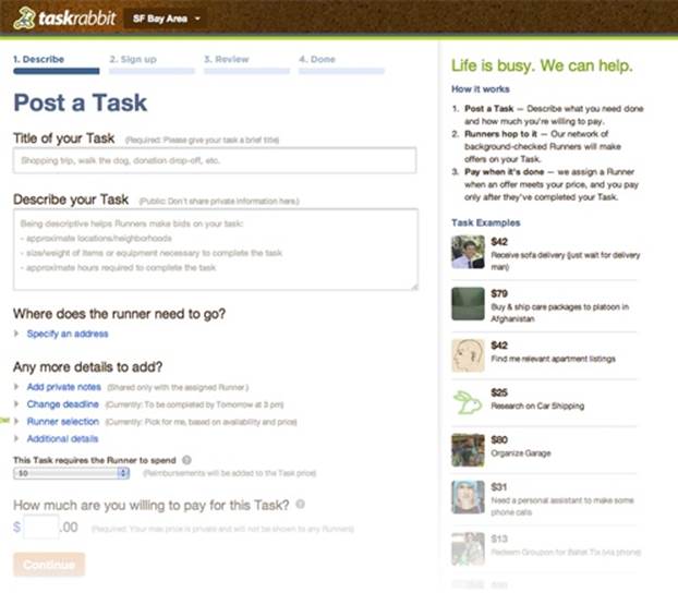
Figure 6-1. An early version of the TaskRabbit task-posting form. (Courtesy Sarah Harrison.)
The result is the (admittedly large) microinteraction in Figures 6-2 and 6-3. The user only has to pick a main task (Figure 6-2), then the next step of the microinteraction (Figure 6-3) is tailored based on that main task. Users were delighted. “They made the entire task a no-brainer,” said one. “They answer all the questions I have before I even ask them.” This is the sign of a great microinteraction (Figure 6-4).
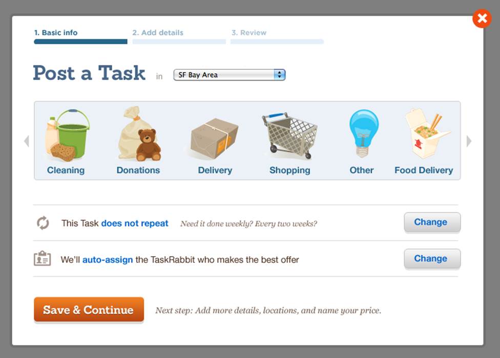
Figure 6-2. Step 1 of the redesigned TaskRabbit task microinteraction. (Courtesy Sarah Harrison.)
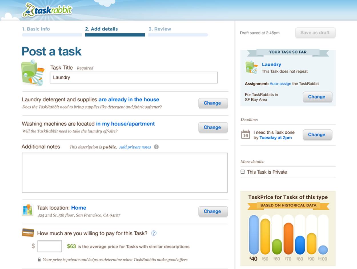
Figure 6-3. Step 2 of the form. Once the user picks a main task, the rest of the microinteraction is customized around it. (Courtesy Sarah Harrison.)
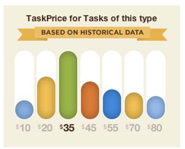
Figure 6-4. TaskRabbit brings the data forward here, answering the question, “How much should I offer?” (Courtesy Rishi Shah.)
In this chapter, we’re going to put everything we’ve discussed together to make three example microinteractions: a mobile app for setting an alarm, a web widget for a shared playlist, and the control panel for a dishwasher.
Example 1: Mobile App
In this first example, we’re going to look at an iPhone mobile app for setting an alarm. The microinteraction here is the entire app; all the app does is allow the user to set a time for an alarm to go off.
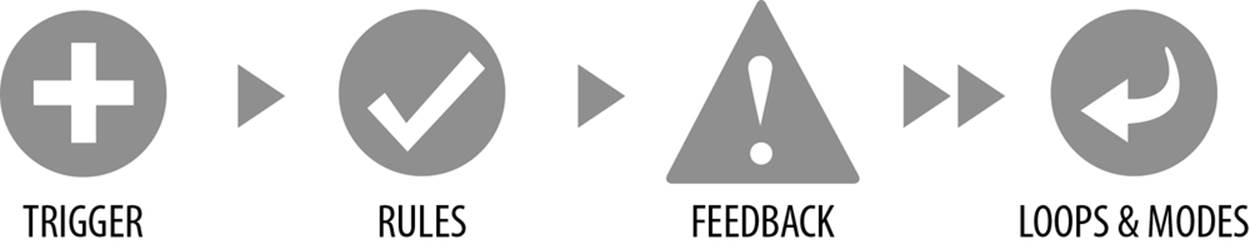
The first thing to think about is what the goal is: it’s to be alerted (usually woken up) at a particular time. It’s not to set an alarm: that’s just a rule. So let’s write out the rules we know we need at this point:
1. User selects a time for an alarm to go off.
2. The alarm goes off at the specified time.
3. The user turns off the alarm.
We’ll fill out the rules more later. Let’s now look at the trigger.
Since we’ve said the microinteraction is an iPhone app, the trigger is a given: it will be a standard icon that lives on the iPhone home screens. Since that’s solved for us, let’s see if we can Bring the Data Forward in any way.
What is the one piece of information that users would like to see before starting the microinteraction? In this case, it’s whether or not an alarm has been set, and what time the alarm is set for. The mechanism Apple has for showing information inside an app are badges. Here we run into a snag. In another OS, like Windows Phone using live tiles, we might be able to indicate in text and time whether there is an alarm and what time it’s set for, but as of this writing (March 2013) with iOS 6, only numbers are allowed in iOS badges, and only four of them at that. So what do we do? If the alarm was set to 6:30 you could possibly do a badge that was 630, but what if the alarm was 12:30? Does 1230 convey the message? This is an atypical use of badges, which are normally for indicators such as unread messages, so that gives us pause. Also, if we do a badge that indicates the time, we’re limiting ourselves to only one alarm; you can’t show multiple alarm times given these constraints! This isn’t necessarily a bad thing: only one alarm makes the rules much simpler. There is a way around showing multiple times in a badge, in that you would only show the next alarm in the badge. But this too could cause confusion, and confusion is the enemy of microinteractions. When in doubt, make it simpler. So until this constraint is changed (if ever) or we put our app on a different platform, the only data we’ll bring forward is the number of alarms set and active. It’s not as useful as knowing the time, but there is still some value in knowing at a glance if an alarm is set.
Our trigger needs a label, which in this case is the name of our app. Let’s call it AlarmD.
What happens when AlarmD is triggered? The app launches, but then what does it show? If the goal is to be alerted at a particular time, it should either be showing when the alarm(s) are going to go off, or else prompting the user to set an alarm.
At this point, we should pause and ask what we know about the user so that we Don’t Start from Zero. We know what platform the user is on and what device, so we also know what sensors are available to us (camera, microphone, accelerometer, compass). We know the time (obviously) and the location. If the app has been used before, we could know what previous alarms had been set, and how often. Does the user set the same alarm(s) every day, or just every weekday? We might also know what happened once those alarms went off: did the user press snooze at all? If so, for how many times? Let’s add in some rules to account for some of this data:
1. If the user has set the same alarm for three days in a row and the alarm isn’t set, prompt to set the same alarm when AlarmD is launched. If the user does set the prompted time, prompt whenever launched until the user does not select, then reset.
2. If the country the phone is in uses 24-hour format, use that.
3. Display any set alarms. Show the time until it goes off (e.g., “8 hours away”).
4. User selects a time for an alarm to go off.
5. The alarm goes off at the specified time.
6. If the user presses the snooze button, repeat the alarm in five minutes. All subsequent snoozes come one minute earlier until they are one minute apart.
7. If after a week of use, the user has never pressed snooze, remove it from the alert.
8. The user turns off the alarm.
Notice there is already a long loop in there (“three days in a row”) that engages a system trigger as well as some shorter loops (the snooze countdown). The display of “8 hours away” is a way to Prevent Human Error for setting an alarm too far in the future, by selecting P.M. instead of A.M., for example. The removal of the snooze button, while limiting options, could be controversial. We might need to be able to restore it via a setting somewhere. If our app weren’t on iOS, we could do some other tricks with snooze, like make the alarm louder each time the alarm goes off after a snooze, but iOS doesn’t allow apps to control the overall volume, so we’re stuck with that constraint.
Next, let’s take a look at the controls. The user has to be able to set an alarm, cancel an alarm, turn off an alarm, and snooze. These will all need visible controls of some sort in the UI, unless any of them could be hidden under a multitouch gesture. Almost all of them except for snooze are essential, and with snooze, you have users who are half asleep, so you cannot expect them to perform anything more complex than tapping a button. Setting an alarm time is the most complicated of these; everything else can be done via simple button taps. Setting the time could be done in various ways: using the built-in tumblers (as Apple’s Clock app does) or via a custom control, such as selecting a time on an analog clock.
This is where we should pause and consider whether we want setting the alarm time to be a Signature Moment for the microinteraction, or just accomplished quickly. Since there are about 1,000 alarm apps on the market, setting the alarm might be a good place to do something custom and interesting. I’ve always been a fan of those old-fashioned train tickers, so this app will make use of them. Since, honestly, who needs to set an alarm for particular minutes, the minutes flipper will move in five-minute increments. Optimize for what most people do most of the time.
What will really make this custom control come to life is the feedback while adjusting it. It has to have a very satisfying clack as the tiles flip, and the way the tiles visually flip has to look like they obey gravity. Another important piece of feedback is the alarm itself. You could let users use the standard iPhone sounds or pick songs from their iTunes library, but a default, custom sound would be memorable here. Other places for custom sounds would be when canceling an alarm or when turning it off: something like a very definitive mechanical click, such as those when turning off a gas stove. Perhaps the alarm itself fades away instead of an abrupt cutting off as well.
The last thing to consider are loops and modes. An obvious mode here would be the setting of the alarm time, although since it’s a single action, it could probably be accomplished in an One-off mode: tap it from a list of alarms, it opens up, the user sets the alarm, and it closes. A more traditional mode would be Settings, if we wanted to give users an option to set actions like the duration of snooze. I would advocate for not having settings. Make the defaults good enough to ship—at least in the first release.
As far as loops go, there are several. The alarm is several kinds of loops at once: the snooze is a count-controlled loop (make the alarm go off in five minutes, then four, then three, etc.) that turns into a condition-controlled loop (have the alarm go off once a minute). In fact, the whole alarm is one long condition-controlled loop, as the alarm goes off once the alarm time (the condition) is met, and continues to go off until manually stopped. Of course, we could—and probably should—put in a timer in the rules, so that if no one turns the alarm off for, say, 10 minutes, the alarm turns itself off.
Once again, the platform constrains us from using loops to their full potential. One nice addition would be for the app, two minutes before the alarm goes off, to check the light in the room via the phone camera. Then, if the room is dark, over the next two minutes gradually increase the light coming from the phone so that when the alarm does go off, the room is brighter. But on iOS, an app can’t open itself. (There’s certainly good reason behind this system rule, as it could be easily abused.) Only an alert can appear, which isn’t even close to the same thing.
There are some long loops built in: the prompt for an alarm the user does repeatedly, and the hiding of the snooze button. One thing we (deliberately) didn’t include is a way for the user to create a repeating alarm—that is, create their own loop. This adds a lot of complexity to the app, some of which we’ve moved to the microinteraction itself in the form of the initial long loop that checks to see if the user has set the same alarm repeatedly. We could add more nuance to the loop, to check to see if it is a weekday or a weekend and prompt accordingly, but to keep the rule simple, let’s end there.
So there we have our first example of a microinteraction designed using the principles outlined in this book. Let’s try another.
Example 2: Online Shared Playlist
The second example we’re going to use is for an online music service (albeit fake). Let’s say that as part of this music service’s offerings, there is a shared playlist, where users and their friends can drop songs for each other. Let’s also assume the service is sophisticated enough that you can use songs from other services or even a desktop app like iTunes. And finally, let’s say our playlist lives among other microinteractions like adding friends and playing music.
We can start with the goal. The reason people would want to use this microinteraction is twofold: to discover new music and to share music. Of course, the secret motivations to use this microinteraction might be to tell friends your emotional state or to demonstrate how good your musical taste is. Underlying motivations are important, too.
Let’s sketch out the basic rules first:
1. If a new song arrives, add it to the playlist.
2. The user can add a song to the playlist.
3. New songs are added to the top of the playlist.
Our microinteraction has two triggers: adding a song (a manual trigger), and a friend adding a song remotely (a system trigger). Let’s talk about manual first. If we assume there is a visual display of the songs in the playlist, how do users know they can add a song to it? Since you can add songs from anywhere and the system is smart enough to find a version of the song everyone can listen to, being able to drag a song to the playlist seems like one way to do that. Making that discoverable might mean putting an empty slot at the top of the playlist, saying Drop a Song Here. We can change the label after the user has successfully put a song in the playlist, to something like “What are you listening to?” Perhaps we could even rotate the label options occasionally, prompting the user with labels such as “What’s today’s tune?” or “What does today sound like?”
Are there other manual triggers? If our music service has a menu bar, you could put a menu item there: Add to Shared Playlist, although that would only work with selected songs from within the service itself, except if there was nothing selected, we opened a dialog box for users to search for a (music) file. It seems clunky—and too much like a chore—for what’s supposed to be a fun microinteraction. So let’s keep Add to Playlist as a menu item, but only for selected items from within the service. For anything outside the service, it has to be dragged to the playlist. Let’s also add a key command so frequent users can just select a song and use the command to add without fumbling around with menus or drag-and-drop.
We could also allow users to add songs by typing in a song title (and perhaps an artist name). But the more different kinds of triggers we have, the more complicated the microinteraction becomes. And besides, typing a song isn’t really a very standard way to add a song to a playlist.
Adding a song to the playlist, or especially when a song appears from a friend, is a great place for some feedback, particularly some animation. The whole playlist should slide down one slot, and the new song drops in from the top, sliding in with a musical plink. Since it’s an app about music, audible feedback makes some sense.
There is also the system trigger of your friends adding songs to the playlist. If you have the browser tab open to the service, you’ll certainly see (and hear) the song arrive. But if you don’t, it could be fun to change the browser tab slightly, just as an indicator something has happened. Let’s make our “badge” a musical note with a smile inside it. We’ll call it Notesy.
When the user does drag a song into the playlist, it might take a while for the system to match the song. We could just use a regular spinning icon, but why? Feedback is a place to add some personality. We’ll Use the Overlooked and use the loader to make use of Notesy again. We can have Notesy “looking around” for a match, then smiling as some are found.
The system might have to offer multiple choices if there are variations or it’s unsure. If there is only one match, and/or it matches both Artist and Song Name exactly, it should add the song directly to the playlist. Otherwise, it should offer possible matches. Presenting possible matches is where an algorithm comes into play. Since we don’t want to overwhelm the user, we’ll present no more than three possible matches for the song. Since it is more likely that the artist name will be correct than the song title, we can use that as an ordering factor in our algorithm: matches from that artist are first. If none of the three are correct, we can provide a mechanism to go get three more selections. If it can’t find any matches, Notesy can appear and look sad.
At this point, we could ask whether or not users can delete songs from the shared playlist. Let’s assume no, since in the worst case, users can always use the controls to skip over any tracks they don’t like. Let’s also assume that users can’t rearrange songs in the playlist. We might find in testing or after launch that these are deal-breakers for adopting and using the service, but for now, it keeps our rules simpler.
Let’s see what the rules look like now:
1. If a new song arrives, add it to the playlist. Show Notesy in the browser tab.
2. The user can add a song to the playlist by dragging it to the top of the playlist or by selecting a song and using the Add to Playlist menu item or by using a key command.
3. When new songs are added, search for a match. If matches are found, show them in groups of three and let the user select the correct one. If (or when) there is no match, show sad Notesy.
4. New songs are added to the end (top) of the playlist ordered by the time they are added.
Is there any way to get more depth from our microinteraction? What data is worth bringing forward? Well, it’s certainly nice to know whose song is in the playlist and when it was added. Playlist duration and the number of songs in it are also useful tidbits. Being able to send a brief comment to the song adder about that particular song (“Not another ’80s song!”) would also be a nice microinteraction to attach here as well.
Adding a long loop to encourage users to contribute songs would be a way to encourage engagement. You could show the last day/time the user contributed, just as a mild reminder, or do some actual nagging via the dropbox label: “Feed me!”
How does the microinteraction end? It really doesn’t as long as the user is logged in to the service, although we should probably put a cap on the number of songs in the playlist before a song drops off. Thirty songs seems reasonable.
And so ends this microinteraction. The next example moves us into the world of microinteraction devices.
Example 3: Dishwasher Control Panel
For our last example, we’re going to design a low-cost dishwasher control panel—but with the added challenge of the dishwasher being screenless. Let’s assume this very basic dishwasher has a speaker for sound and several settings for different washing cycles. Let’s also assume we know what cycles most users need and want, and that this is a small number of cycle options—let’s say four.
The goal for dishwashing is to clean dishes, glasses, and silverware. The basic rules are these:
1. The user loads the dishes and detergent into the dishwasher, then shuts the dishwasher door.
2. The user selects the washing cycle and turns on the dishwasher.
3. The dishwasher washes the dishes.
The trigger is so important here that we’ll revisit it in a moment. First, let’s figure out what we know so we Don’t Start from Zero. We should be able to know time (duration), the last setting the user selected, and historic data on what the user has selected and when. Since this is a low-cost dishwasher, other sensors (except perhaps those inside the device) are probably unlikely. It’s a very dumb appliance. We might not be starting from zero, but we’re barely at one.
The pieces of data that we can bring forward are whether or not the dishwasher is running, where it is in the cycle, and how long until it’s done. Most people probably don’t care where the dishwasher is in the cycle, except to know when the dishes will be done. Since we have no screen, we’ll have to come up with other feedback to indicate this. Perhaps we’ll be able to Use the Overlooked.
So let’s figure out the controls. We know we have (at least) two possible controls: turning the dishwasher on and setting the washing cycle. Turning the dishwasher on could easily be a button. And each washing cycle could also be a button. This would certainly be operationally simple: one button for everything, with perhaps an LED on or around the button to indicate what cycle has been selected and another on or around the on button to indicate the dishwasher is in operation. This set of controls doesn’t really help us Bring the Data Forward though. We’d have to add in another kind of display to indicate when the dishes will be done—perhaps a thin strip of LEDs that are lit at the beginning and extinguish as the cycles complete.
Another way to do the controls would be as a dial, similar to what washing machines have. Users turn the dial to the setting they want, then pull the dial out or push in to start. The dial would move as it goes through cycles until it stops. As an added bonus we could use the seam between the dial and the case or even inside the dial as an LED timer. A dial would certainly be more visually simple than a row of buttons.
However, dials are often ugly, and although our dishwasher is low-cost, we don’t want it to be ugly. Dials also protrude, and on a dishwasher, you might want a flatter surface so people don’t bump into a dial. And, unlike a washing machine where users may care about where the machine is in the cycle, the data users really value with a dishwasher is when the dishwasher will be done, not the cycles. Don’t show feedback for what the user doesn’t care about. So let’s do a row of buttons—perhaps nice capacitive buttons—one for each cycle, lined up from longest duration (Pots and Pans) on the left to the shortest (Quick Rinse) on the right, followed by (although separated from the cycles) a Start button. On the buttons: a label with the cycle name (or Start). Underneath the cycle buttons let’s put our thin strip of LEDs.
Let’s now look at our microinteraction as a sentence—both to make sure it makes sense and to figure out where the nouns and verbs are. The User selects a Cycle Button that turns on the LED Strip, and then presses the Start button that starts the countdown on the LED Strip. Examining our microinteraction nouns, each button has two possible states: selected or not. Objects that look the same should act the same, so let’s make a soft glow around each when selected, although perhaps a different color for the cycles than for the start. Each cycle could have its own color, but that’s probably overkill. Using the principle of Emphasize the Next Action, the Start button should also draw attention to itself once a cycle button has been pushed because that is the next action a user has to take in the process.
Since the LED is counting down the time until the dishwasher stops (it’s a Count-Controlled loop), its color should probably match that of the Start button. Our LED progress bar could be broken up into segments, each roughly 15 minutes—we probably don’t know exact time, because a cycle like Auto Wash makes use of internal sensors to determine how long to wash the dishes. If the water is still dirty, it will run another cycle.
A rule and crucial piece of feedback we’re missing is what happens when the dishwasher is done. After all, the goal is to have clean dishes, and the user wants to know when that goal is accomplished. We have a speaker, so one means of feedback could be a Signature Sound (a “Ta da!”) on finishing. But you can’t count on the user being within hearing range, and you definitely do not want to repeat the sound until the dishwasher is opened or reset. (Hey, what about Reset? We’ll get to that in a moment.) So let’s make the Start button and LED Strip red until the dishwashing cycle ends, then the LED strip turns off and the Start button glows green (or perhaps blue, so it’s easier read by the color blind) to indicate the dishes are now clean. So the Start button now has four states: Off, Push Me, Working, and Clean. Once the dishwasher is opened, it should reset itself to Off.
Oh, and let’s talk about Reset. There may be times our simple sentence doesn’t work as smoothly as we like. Users might open the dishwasher in the middle of the cycle—and leave it open. We could be Poka-Yoke and simply lock the dishwasher when it was running, but that seems overly restrictive. Thus, we need some rules around opening the dishwasher and a means to reset the dishwasher as well. We could have a separate button for reset, although since it would work differently than the other buttons (because it’s not a toggle—you can’t select it; there is no selected state) we’d have to have a different kind of button, since we don’t want an object that looks the same but acts differently. Another way is to simply use a Spring-Loaded mode on the Start button. Pressing and holding the Start button triggers a reset. I like that solution better, if for no other reason than it removes a button that would be used infrequently. We’re using fewer nouns to do more verbs. But the reset action isn’t particularly discoverable, so we probably need a label underneath: Hold to Reset. We might have to add a loop to do an automatic reset if the door is left open for too long.
The only remaining question is if we can use Don’t Start from Zero. We can collect data about the last cycle used and when, but it’s unclear if any of this information would actually be helpful. Yes, we could have the dishwasher display the last cycle the user requested, and with four options, this might save the user pressing the cycle button 25% of the time (if all the cycles are used equally, which is unlikely). We could put a long loop in there to see if we can’t save a button press occasionally, but it might make the microinteraction feel inconsistent: sometimes a cycle would light up automatically, sometimes not. Either we have to have it on the last cycle selected, or nothing at all.
Here are our final rules, once everything is put together:
1. The user loads the dishes and detergent into the dishwasher, then shuts the dishwasher door.
2. Unless Reset has been used, the last cycle used and accompanied estimated duration on the Progress Bar should be lit up and the Start button should pulse (Push Me state) until pressed.
3. The user can change the washing cycle, which changes the duration on the Progress Bar.
4. The user presses the Start button. The Start button glows red (Working).
5. The dishwasher starts washing the dishes. The LED progress bar counts down.
6. If the dishwasher is opened, pause the cycle. When re-closed, resume. If the door remains open for more than an hour, reset.
7. When the dishwasher is done, the cycle button and progress indicator turn off. The Start button glows green.
8. When the dishwasher door is opened, the Start button switches to off.
9. At any time, if the user presses and holds the Start button for three seconds, the microinteraction resets and dishwashing stops. All buttons go to the off state and the Progress Bar is cleared.
We never did make use of the speaker we have available for additional feedback. (If this was a higher-end appliance, we could possibly also make use of haptics, too.) We certainly have several moments to reinforce actions with sound. Especially if we’re using capacitive buttons, we could use sound to create button-press clicks. Pressing Start could certainly be a time to use an earcon for a Signature Sound. Although it seems obvious to create an earcon for when dishwashing has ended, broadcasting it in the middle of the night into an empty room could be anxiety-producing. If we were designing a more expensive dishwasher that could algorithmically check the time (via the network), the brightness of the room (via light sensor), and maybe even activity in the room (via motion sensor) it could only broadcast its earcon when it suspects people are awake and nearby. But alas, not on this model.
And so ends our example microinteractions. Hopefully, this provides a sense of how the structure and principles outlined in this book can be brought together to create well-crafted microinteractions.
Prototyping and Documenting Microinteractions
The reason to document and prototype any product is to communicate an idea: this is how it could (or should) work. With microinteractions, the most difficult idea to convey is the overall flow: how all the pieces fit together. It’s this overall flow that communicates how the microinteraction should feel.
There are a number of ways to accomplish this goal:
Prototype on the platform.
If you have technical skills or access to them, prototyping on the platform where the microinteraction will live is probably the best way to really understand how the microinteraction will work. However, it is also likely the most time-consuming way as well.
Make a movie.
Movies are fast ways to convey timing and flow. They can be actual movies with video (see Figure 6-5) and a post-production tool such as AfterEffects, or they can be animations, such as those created with HTML5.
Create frame-by-frame storyboards.
You can also show the microinteraction as a set of linked storyboards (see Figure 6-6). While this doesn’t show timing exactly, it at least demonstrates a sense of movement and shows the different states in context.
 London)" width="1250" height="698" />
Figure 6-5. A still from a prototype movie. The physical pause button on the left “shoots” a pause indicator out onto the screen. (Courtesy BERG London)
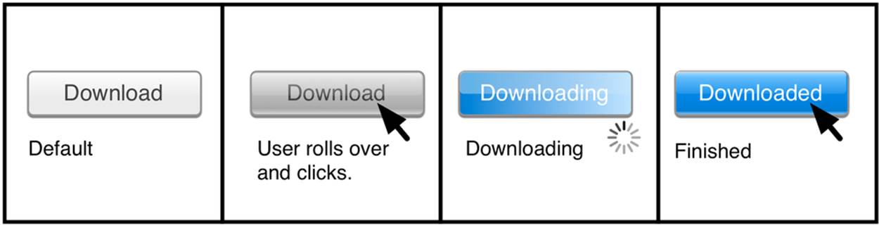
Figure 6-6. An example of a frame-by-frame storyboard
Probably the worst way to document a microinteraction is as static screenshots. Screenshots convey little of the microinteraction’s flow, while often removing states from any context that would make them understandable. The best documentation tells a story about what is happening and why.
TIP
To learn more about story-centered design documentation, see “Why good storytelling helps you design great products”, by Braden Kowitz.
If you have to use static screenshots or wireframes, include keyframes into the documentation. Keyframes are a concept that originated with animation, in which the senior animator would draw the essential frames of an animation (the “keyframes”), leaving the parts in between for junior animators to fill in. For microinteractions, keyframes might include the trigger, an essential moment in the rules, and how the microinteraction ends.
It often makes sense to use multiple methods to convey a microinteraction: a prototype or movie to show timing, frame-by-frame storyboards for detail and context, and wireframes with keyframes to call out any complicated rules.
Orchestrating Microinteractions
Unless it’s a distinct app or device, microinteractions seldom exist alone. More typically, they are found around, inside, or at the center of a larger feature, such as with TaskRabbit’s “Post a Task” microinteraction at the beginning of this chapter.
When designing interactions that are not stand-alone, the first action to take is to figure out what the relationship is between the microinteraction and the feature. Does it launch it (logging in), control it (the pause button on a video player), appear inside it (a formatting tool), or end it (the off switch)? Each of these will likely have a very different trigger, and the next thing to determine is how persistent the microinteraction is. That pause button might be there the whole time the app is open, but the formatting tool only appears when the user does something very specific.
What is essential to then determine is if the microinteraction should be a Signature Moment or not; that is, should it be something memorable. In most cases, the answer is no, it should not. It should be pleasing, of course, (which is the point of this book), but rapidity and effortlessness should be the goal, particularly when the microinteraction stands in the way of the overall goal of the product (such as a login microinteraction before the user can actually use the rest of the app).
Turning Microinteractions into Features
Microinteractions can also trigger other microinteractions, so that there is a kind of “daisy chain” effect, where one microinteraction can be the trigger for another, which is itself a trigger for another. For example, turning on a device or launching an app (a microinteraction) could be the system trigger to check to see when the user last used the app. If it’s been a while, it could launch another microinteraction (“Welcome back, here’s what’s new since you last used [App]”).
This is how you can build features from microinteractions: by orchestrating them so that where one microinteraction leaves off, another picks up. The details are the design.
The trick when working this way, just as with instruments in an orchestra, is to figure out which microinteractions inside the feature get prominence. Not all microinteractions are created equal. Some are important; some should be subtle. Feedback needs to be coordinated to give the right emphasis and to keep the tone consistent.
When designing this way, it can be helpful to have a master list of all the microinteractions that need to be designed to make the feature work properly. This can often be generated from a task list or flow or from functional requirements. From there, you can make a microinteraction map (seeFigure 6-7) that shows how the microinteractions all fit together.
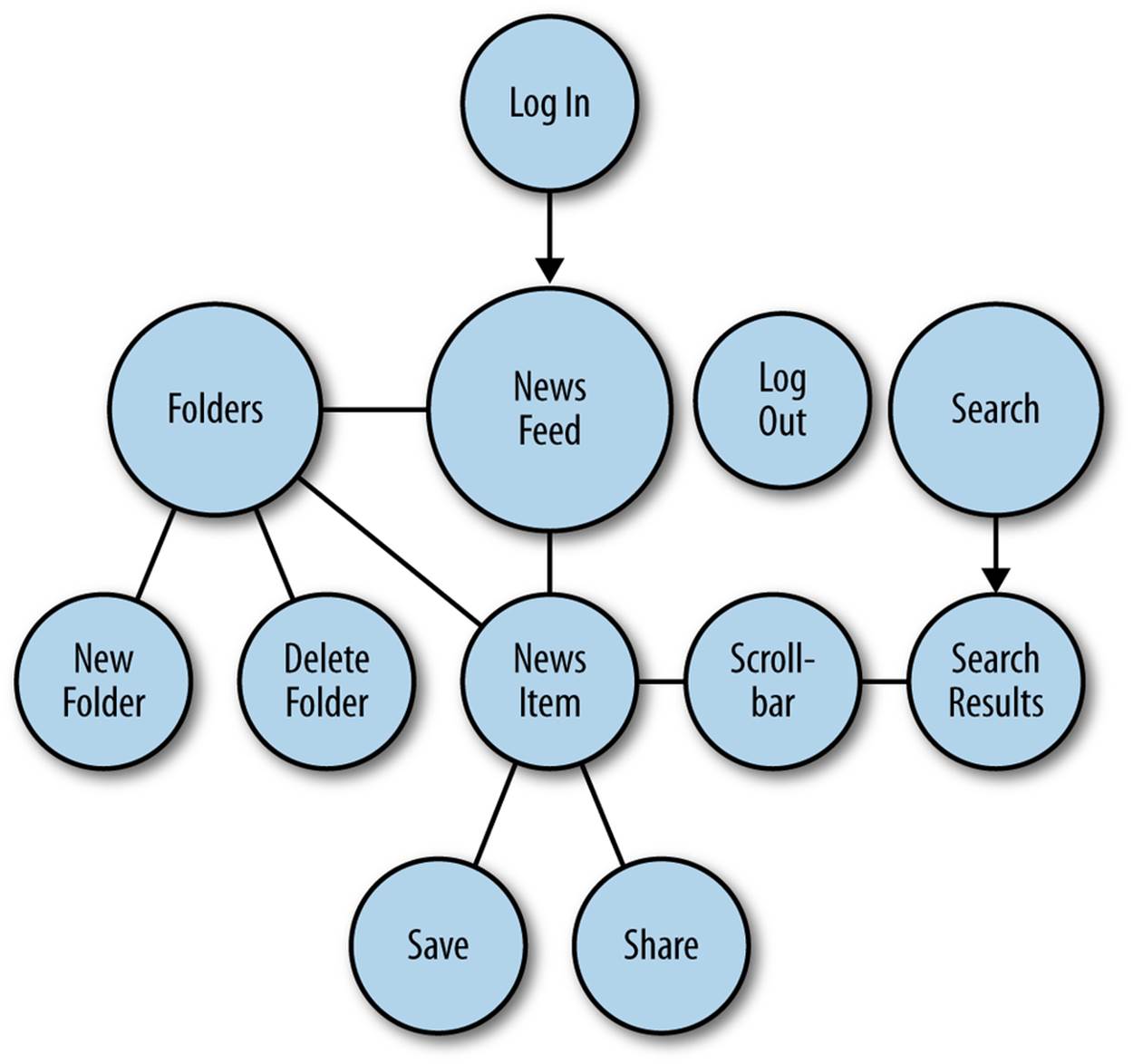
Figure 6-7. A simple example of a microinteractions map for a newsreader.
Pay attention to the handoffs: what microinteraction triggers what microinteraction, and where one microinteraction leaves off and another begins. This might not—in fact, in many cases probably should not—be obvious to the user. You don’t want your feature or your overall product to feel like a disjointed collection of tiny moments, but rather like an integrated whole.
It is easy to forget the whole when working this way. After crafting each microinteraction, step back and make sure the piece you just made fits with the other microinteractions. Particularly in sketches or wireframes, it’s easy to make a microinteraction that unintentionally conflicts with another microinteraction. For example, working on how a list displays may conflict with how scrolling works. A method to guard against this happening is to note before starting to design a microinteraction which other microinteractions touch it.
Although most of the time we should be concerned that our microinteractions are too much, too intrusive, sometimes they’re too dull and need more pizazz.
How to Fix a Dull Microinteraction
We don’t always get to start from a clean slate; sometimes there are existing microinteractions in the product we’re working on that are just ... there. Or sometimes we’ve focused on major features and are just now getting around to making our microinteractions shine. But where to begin?
Ask yourself a series of questions based on the principles outlined in this book:
§ Should this be a Signature Moment? In other words, how memorable should it be? The more memorable, the richer it can be in terms of controls (including custom controls) and feedback.
§ Am I starting from zero? What do I know about the user or the context that would improve this microinteraction?
§ What is the most important piece of data inside this microinteraction, and can I bring it forward? What does the user need to know at a glance?
§ Would a custom control be appropriate? A custom piece of UI practically guarantees the microinteraction will become more prominent.
§ Am I preventing human errors? If there are any situations where a user can cause an error, what can you do to prevent that automatically?
§ Am I using what is overlooked? Are there pieces of UI chrome or hardware that could be doing more?
§ Can I make an invisible trigger for advanced users? Is there a place to make a hidden shortcut (via a gesture or a command key) to get deeper into the rules faster?
§ Are the text and icons human? Does the microcopy sound like something another human would say out loud? Can you add a touch of humor?
§ Can you add animation to make it less static? Could you have transitions between screens or states, or an (nonintrusive) indicator of what the next step would be?
§ Can you add additional channels of feedback? Sound or haptics?
§ Ask what happens when the user returns to the microinteraction the second time. And the hundredth time. Figure out what the long loop could be.
By answering these questions and applying them to an existing microinteraction, you can’t help but make it more engaging. And that’s the whole purpose of this book.
Think Small
We’ve discussed many different microinteractions: the alarm that ruined Mahler’s Ninth Symphony, the touchscreen trigger that allows millions to start buying MetroCards for the New York subway, Apple’s bungled changes to the rules of Save As, the addictive feedback of slot machines, the loop and mode that almost destroyed a robot on Mars, and how being out of dog food led to a multimillion-dollar business. The small things matter. They always have, and they always will: now perhaps more than ever.
The problems of the 21st century come in all shapes and sizes. Some are massive, systemic problems with no easy solution. Some are small, discrete problems, the solutions to which can offer a brief respite of peace, of humor, or of success. We need people who can work on both kind of problems, big and small, and especially people who can work on both at the same time, making sure the large systems we design—our cities, our governments, our companies, our products—are built for humans. And it’s the tiny moments, the microinteractions, that can make these large systems humane. In an era of algorithms and self-driving cars, we need all the humaneness we can get.
Details demonstrate that some care, some thought, some attention has been paid. And this is ultimately what we all want to feel: that some attention has been paid to us and our needs. This is the gift we can give through microinteractions.
Think small, and change the world.
[43] As told to Alyson Shontell in “Founder Q&A: Make A Boatload Of Money Doing Your Neighbor’s Chores On TaskRabbit,” Business Insider, October 27, 2011.
All materials on the site are licensed Creative Commons Attribution-Sharealike 3.0 Unported CC BY-SA 3.0 & GNU Free Documentation License (GFDL)
If you are the copyright holder of any material contained on our site and intend to remove it, please contact our site administrator for approval.
© 2016-2026 All site design rights belong to S.Y.A.