Mobile User Experience: Patterns to Make Sense of it All (2014)
Chapter 3. Your Desktop Experience Is Not Your Mobile Experience
Abstract
Your mobile user experience is not your desktop experience, your desktop users are not your mobile users, and your business goals are not your mobile goals. Mobile is different from the desktop in every way. In this chapter, we discuss the characteristics of the mobile and the differences from desktop web experiences. The mobile is a craft and requires us to learn its rules and guiding principles before we move forward with creating a mobile experience. This chapter marks the beginning of thinking, planning, and asking the right questions about designing your first mobile user experience.
Keywords
User experience; Mobile; Desktop; Web; Usage; Differences; Users; User flow; Browser
Introduction
Like working in any medium (painting, sculpture, or even user experience), we need to learn a set of basic rules that act as guiding principles for our craft. For the mobile, I refer to these as mobile mantras. Like any mantra, these should be repeated, shared, and—if you want to—chanted. You might consider them practical, conceptual, or even spiritual; regardless, these mantras will help guide your journey when creating a mobile user experience. Let’s start.
MOBILE MANTRA #1: YOUR DESKTOP EXPERIENCE IS NOT YOUR MOBILE EXPERIENCE
The mobile experience is a completely separate entity from the desktop experience. If everything about the mobile is different—its screen size, Internet connection, device size, and the mindset of the person as they approach the site—why would you take your existing desktop experience and copy it? This would be like trying to fit 3 pounds of sugar in a 1-pound bag. I would even go as far as pushing the simile of a mobile from a 1-pound bag to a 1-ounce bag. This may sound a little overly dramatic, but in fact the differences between the desktop and mobile experiences are vast and provide the two with distinct strengths and weaknesses. Let’s take a look at a few.
Mobile Use Is Not Desktop Use
In reality, we spend too much time in front of our desktops; we are searching and researching and, when we are done, we search again. As a result, we create larger user experiences catering to the longer timeframe that users focus on a page. When taking time to use a desktop, users are usually at home, in a café, on a plane, or somewhere where they are seated and taking a few moments to open and boot up their computer. They are focused on the screen. When looking at the mobile, we are looking at smaller increments of time that a user spends in front of their smartphones. An average time per interaction on a mobile device is 17 minutes compared to 39 minutes on a desktop.1 When people are on their phones, they are in a conversation, commuting, or waiting for a meeting; they are interacting with the phone in another environment not centered on the phone. As a result, we need to take into account this bite-sized experience and design for it.
Mobile Users Are Not Your Desktop Users
Remember the great marketing debate between Apple and PC users? Each seems so different. In reality, the differences are miniscule compared to that of desktop versus mobile users. The difference between mobile users themselves is at times staggering; iPhone users are younger and more affluent (higher income bracket), Android users view more mobile content (while iPhone users are more engaged with the content), and iPhone users are more likely to make purchases on a mobile device than Android users.2 This is just a sampling of trends. Add into the mix your own customers and users, and you now have a more complex view of the mobile user ecosystem. Feels like that’s not enough? Add into the mix the differences between smartphone and tablet users, you have an even more complex view of your mobile users. Take all of this into account and include different devices, carriers, operating systems, and screen sizes (the Mobile Equation); your mobile users look more and more different from their desktop counterparts.
You Cannot Fit Everything on One Screen
Having desktop screens that are now 1200 pixels wide and growing has spoiled us. The typical web experience uses several columns of information and pages to organize its content and functionality. Good user experience for the desktop tells us to lay out all of the options as a large sitemap and use wizards to walk us through a step-by-step experience—the more options available on the page the better. The mobile takes this away and creates a single, linear story. The more screens a user has to scroll through means death for our mobile experience. Cramming everything on a screen and trying to make it readable is now replaced by delivering only the bare essentials, one easily digestible piece at a time.
Customers Determine Your User Mobile Experience
The role of customer feedback is more important than ever. A mobile customer will do less than your desktop customer. Finding out what they will be able to do is critical to building your mobile experience. Feedback and customer conversations play a critical role in designing your mobile strategy. What will they be willing to do on a tablet versus a smartphone? What do they want to do on a mobile? Does that compare with what you want them to do? Getting these answers will be the first step in creating your mobile experience. Remember that by not doing so, your phone number is just one touch away … and so is their complaint. Every complaint from an unhappy mobile customer to your call center will cost you money and brand equity.
Rethink Hyperlinking
Hyperlinking has always been the unique characteristic of the constant desktop web surfer. If you want to go somewhere new, it is just a click away. And while you are at it, open a few tabs, windows, or different browsers at the same time and toggle between all of them. This is a less fluid experience in a mobile. By necessity, the mobile provides a streamlined, linear experience. Going back to our point about knowing your mobile web user, you need to have a clear idea of what this path should be in order to construct it.
Our mobile browser is much smaller and more difficult to navigate. The concept of tabs on the mobile browser has been replaced with browser windows that open on another screen; the user experience of moving back and forth from one window to another is difficult, breaking the pattern of multi-window web surfing. If users are forced to open a new browser window, they are unlikely to go back. If a screen is too crowded, they are unlikely to take the time to sift through it to find what they want. The default browser loading into our devices has also limited unique user experience flows. Until recently, we have seen the rise of other browsers as apps and newer browser engines (Chrome app, Firefox app, Blink browser engine); all of which have their own user experiences and compatibility issues. This adds another layer of inconsistency for surfing our mobile experience.
Working on an app instead? As your workflow is limited to being only inside your app, you will need to rethink how to capture the user’s attention and focus; if not, one push of a home button and they are out of your mobile experience.
The Mobile Browser Is Less Forgiving
One way or another something in your mobile experience will be connected to the Internet or web browser. Most mobile apps use what’s called the embedded web view to open a mobile web window from inside the app; this is a very popular trend in app design. Gone are the days where we can launch websites that don’t have cross-browser compatibility. Impressed by your fancy parallax effect3 on your new website? Look at it again on a mobile browser; it more than likely won’t be working. Impressed by all the fancy AJAX script you have on your page? Be prepared to faint when it takes over 10 seconds to load. If you don’t think you are mobile, think again. Users are already accessing your web pages on mobile devices. Hello websites, welcome to the mobile.
Say Goodbye to the Mouse
I will be the first one to write the obituary when we finally bury our mice. For many years we have used the mouse as a crutch. By removing the pinpoint accuracy of the mouse with touch gestures, we are forced to rethink the user experience for inputting information. Without the pinpoint accuracy of a mouse, forms and complicated selections need to be completely redesigned. As a result, it has focused us on making smaller pages, cleaner information layouts, and larger user interface elements. We will have to optimize user experiences for mobiles, making them better for our users. Goodbye mouse, hello touch.
Building A Mobile Experience Is More Complicated
Unlike working on the desktop, building an app or mobile website requires user experience design, user interface design, and the development to be completely integrated from the start of the project. Want to change the UI of a button? Well, by doing so you have just changed the user experience pattern and development time. If you decide to change the experience pattern for a screen, you have just added more work for the user interface designer and developer. If you decide to do a quick change in your iOS and Android code, you have possibly changed the user experience and UI design across multiple screens or for multiple devices. Gone are the days of fly-by-night web development, where anyone with a text editor could change a web page. What has arrived is the integrated and interconnected world of mobile design and development. Finally we get to create great experiences as they are meant to be! But we do need to do a bit of planning to get there.
Planning Your Mobile Experience
The next step in preparing a mobile experience is to create a plan. Implementing a user flow, we can explore the differences between our desktop and mobile scenarios. A user flow allows us to lay out a preliminary schematic design of how our users will explore our experience before we get to wireframes. You might create different user flows for a desktop, iPhone, or Android experience; one design will not fit all. Implement a user flow to plan out specific mobile functionality.
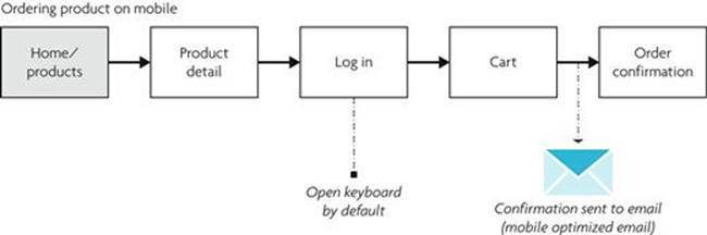
Example of Mobile User Flow #1.
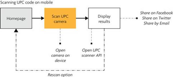
Example of Mobile User Flow #2.
Depending on the mobile experience you want to create; the user flow needs to answer a few important questions:
1. Is it small?—Show that the path is short enough for a mobile user to complete.
2. Is it optimized for mobile?—Show any use of the camera, accelerometers, or other mobile-specific features.
3. Is it optimized for our mobile users?—Show that the path is clear for what the mobile users want and expect; make it easy to complete this path or function.
4. Is it designed for a specific platform?—Create a flow tailored to the mobile specific platform that you are designing for.
5. Does it integrate the embedded web view if it’s an app?—Show areas in your app where you will display mobile web content.
Once you complete your plan, you can compare it with your desktop strategy. The mobile may have its own separate and unique strategy, but it does not mean that it cannot complement or supplement your desktop experience.
Let’s Move Forward
Sometimes you need to take two steps back to take one leap forward. Great user experiences have a tendency of being copied and reused. A good user experience you make today may show up in another application tomorrow. Don’t be afraid to look, learn, and experiment. Like my example of the mouse, mobile experiences are already having great influence on other mobile platforms and the desktop. Even if you have never designed or built for the desktop, your mobile experience may one day help influence a desktop experience. The differences in the desktop and mobile we see today might not be the same in a few years or even a few months. Remember that a growing number of users may never touch the desktop at all and at a minimum will visit your mobile experience first. Your mobile website will be their entire introduction to the brand, website, and customer experience you are trying to create. And we all know the importance of first impressions.
1Google, “The New Multi-screen World: Understanding Cross-Platform Consumer Behavior,” August 2012.
2Comscore, “Android vs. iOS: User Differences Every Developer Should Know,” March 6, 2013, http://www.comscore.com/Insights/Blog/Android_vs_iOS_User_Differences_Every_Developer_Should_Know#imageview/0/.
3Parallax Effect—Scrolling effect on desktop websites that overlaps images.