Learning Qlik Sense The Official Guide (2015)
Chapter 7. Creating Engaging Applications
In the previous chapters, we looked at the application life cycle and the different roles of users: the consumer and the contributor. Having established the basic requirements, in this chapter we will dive into the details of app creation and discuss how it is done. We'll also look at best practices of visualization and how to employ them using Qlik Sense.
In this chapter, we will discuss the following topics:
· The process of building an app
· Data connectors
· The data model viewer
· Sheet objects—Visualizations
· Best practices
· Migrating QlikView applications into Qlik Sense
Preparations and requirements
Often the initial step in building an app is that you have some data that you want to analyze, but you don't necessarily know exactly what you want to look for in the data. As a business user, you can—and should—just load this data into Qlik Sense and start developing. Our experience is that the best way to develop the app is to start without first defining the requirements.
The reason is that when you load data and start to create visualizations, you learn from data. This knowledge is very important once you start defining what you want to analyze. Hence, you should first develop a basic app, then take a break and evaluate what you learned. Now is the right time to start formulating the requirements.
Another common case is the opposite situation: you know that you want to calculate a specific KPI, for example, supplier efficiency, but you don't necessarily know what data you need to be able to do this. In this case, you need to start with some research about where to find the relevant information, that is, in which database and which tables.
The requirement specifications
If you define a larger project, you will use what you know as a starting point for the requirement specifications for your app. The following questions might pop up:
· Data: Which data sources should be used? Which tables should be used? How should the tables be linked? Are there common keys? Is there more than one source for the transactions? Are there tables missing? How should the customer hierarchy be resolved?
· KPIs: Which calculations should be made: turnover, profit, cost, delivery accuracy, or product quality? Which definition of gross margin should be used? How should the given discount affect the calculation of a salesman's bonus? Which accumulations are needed: year-to-date or month-to-date?
· Dimensions: How should the KPIs be displayed: per year, per customer, per salesman, per region, or per product? Which comparisons should be made: year-over-year or month-over-month? Are there drill-down hierarchies that need to be defined?
· Security: Is the data confidential? Who gets to see what? Can we allow offline usage? Is the authorization data-driven or static? Do we need to include authorization information in the data model, or can we postpone the decision around security?
You will soon realize that creating the requirement specification is not an easy task.
Discovery of requirements
Discovering exactly what users, stakeholders, and sponsors want you to create is often the most difficult part of a business intelligence project. The communication between IT experts and nontechnical business users is often full of misunderstandings and misinterpretations. Business users often don't know what they want until they see it, and they frequently can't articulate their expectations in languages that IT experts use to design systems.
Few business users will know what data model really means, so expecting them to be able to exactly define the requirements in technical terms is futile. Experienced authors can extract this information through discussions and clever questioning, but the number of people who are able to do this within an organization is limited.
IT professionals often frame their requirement questions in technical language, for example, "Which table in the database should be used?" or "Which fields should be used to calculate the KPI?". However, business users may not have the technical knowledge to respond to these questions. Business users often explain their expectations in a technically vague language, which is not specific enough for designers to develop solutions.
On the other hand, the business user is the customer. The very reason why we develop an app in the first place is to supply the business user with a tool to analyze and learn from data. So, the requirement specifications must focus on the business user.
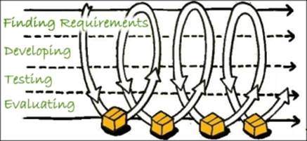
Step-wise implementation
The solution to the problem of business users understanding technical language is to use a step-wise implementation where the app developer iteratively finds the requirements, develops the app further, tests what has been done, and finally evaluates the app together with the business user. The evaluation will lead to new requirements and to changes or refinements of the old requirements. The steps must be small and the typical cycle is hours or days.
In other words, you discover the requirements together with the business user. As the development proceeds, the app will converge to the needs of the business user.
The iterative development process
This means that you cannot begin your app development with a detailed requirement specification. Rather, you should start with a very basic specification containing information about some of the needed data sources and ideas of some of the wanted visualizations.
Hence, irrespective of whether you are a business user or an app developer responsible for data modeling and difficult formulas, you should start by spending an hour or so to load the data and create some graphs with the goal to learn from data. Then, you are in a much better position to define or discuss requirements further.
The process
The first step in building the app is to load the data. The data can be one single table or several tables linked logically by key fields. Key fields are fields that exist in more than one table and link rows in one table with rows in another. Together, they form a data model.
When you have a data model, you can start building the layout, which consists of different objects, for example, lists, graphs, tables, and filter panes, placed on different worksheets. The objects can contain formulas that define different calculations that will be calculated as the user makes their selections.
The model explained previously assumes that you have both a developer and a business user that participate in the development process. In real life, you will notice that the initial development efforts will be like this, but as the app takes shape, the business users will want to do more and more on their own—which is good. After all, the goal is to have business users who are self-sufficient and create apps as much as possible on their own.
Getting started with the app creation
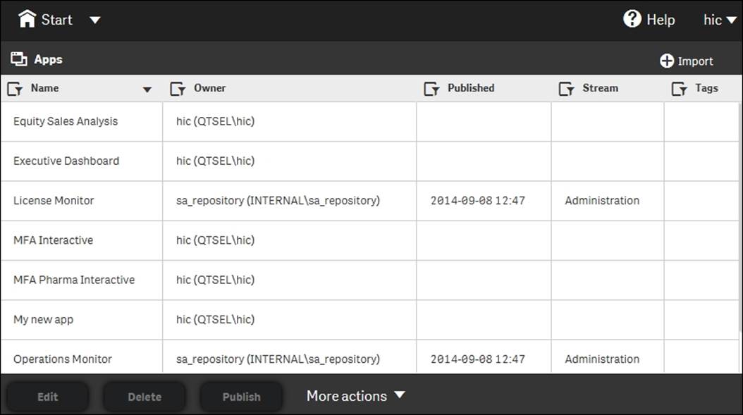
When you first open Qlik Sense, you come to the hub. This is the place where you have an overview of all your apps. The hubs look slightly different in the Desktop and server versions, but they are essentially the same. The following screenshot shows what a hub looks like:
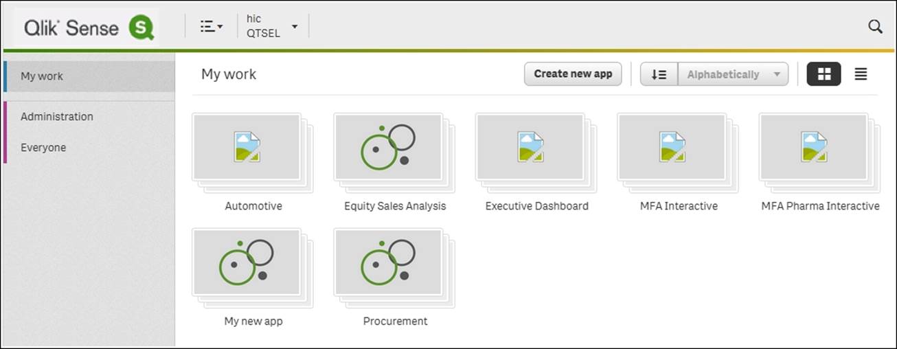
The Qlik Sense hub
Creating a new app
In Qlik Sense Desktop, you are greeted with a dialog where you are asked to create an app as shown in the following screenshot. In Qlik Sense server, you will find the corresponding functionality on a button on the right-hand side in the toolbar.
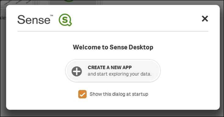
The Qlik Sense Desktop welcome dialog
Creating an app means that you will create a file that will hold both data and everything else needed to analyze it. In Qlik Sense Desktop, this file is created in C:\Users\hic\Documents\Qlik\Sense\Apps.
Loading your data
Once you have named and opened your app, you will get a screen where Qlik Sense asks you to load your data.
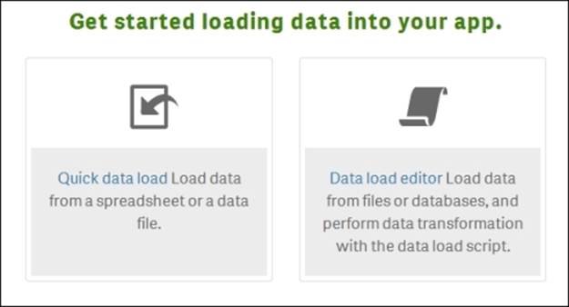
The getting started dialog
When you have this option before you, you can load data in several different ways. The easiest way is to drag and drop a spreadsheet or a file onto Qlik Sense, or to click on the Quick data load command and select the file in a file browser, as shown in the following screenshot:
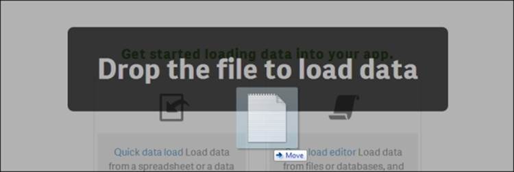
Dropping a file onto an app
This will open a file wizard where you can tweak the details of how the file should be loaded so that you get the data you want, as shown in the following screenshot:
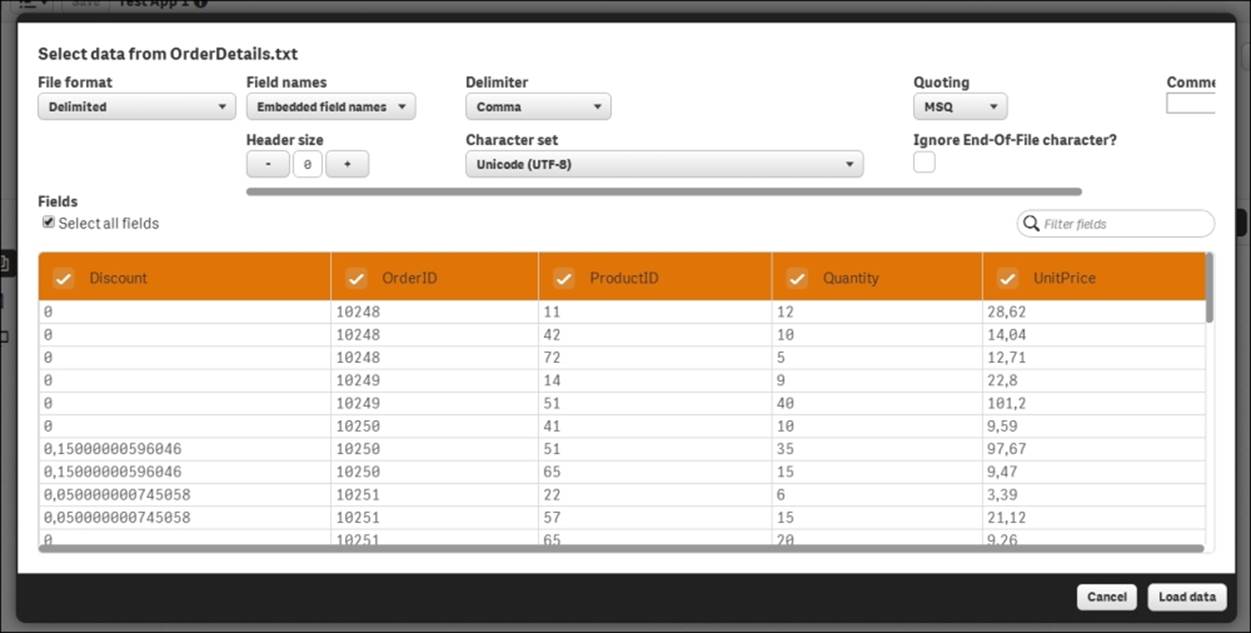
The file wizard
You can specify file type, whether the file contains empty lines at the top (before the data starts), whether the first line contains the field names or not, and so on. Make sure you get all the settings right before you click on Load data.
Clicking on Load data will store your settings and load the data; if everything goes well, you will get the following dialog:
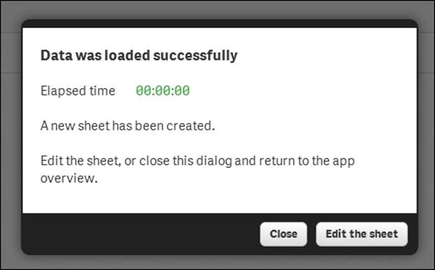
The success message, which is shown once data is loaded
At this stage, you can either start to edit the sheet or you can load additional tables.
Loading additional tables
It is very common that the data you want to analyze is stored in several different tables, for example:
· One table for the orders (one row per order)
· One table for the customers who placed the orders (one row per customer)
· One table for the order lines (one row per order line)
· One table for the products (one row per product)
In a normal database, there are rules about where different entities are stored. For instance, everything about the customers should be stored in the Customers table. If you need some information about a customer in another table, a unique customer identifier is stored in this table, which means that all the necessary data can be retrieved by a simple lookup in the Customers table.
For the previously discussed case, the Order Lines table will contain both the order ID and the product ID, and the Orders table will contain the customer ID. This way, all four tables are linked logically, as shown in the following screenshot:
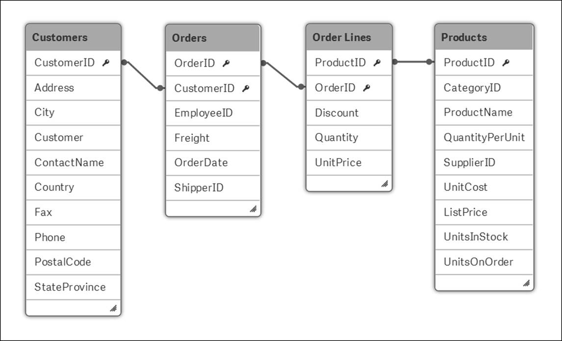
A simple data model made from four tables
To obtain this data model in your app, you need to repeat the procedure for loading data that we had discussed previously for each additional table. You can either drag and drop a file onto Qlik Sense, or you can use the Quick data load command in the toolbar menu.
In the Quick data load process, you need to make sure that the key fields are named the same in all tables and that no other fields have the same name.
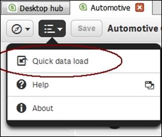
The Quick data load command
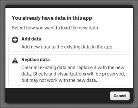
Either way, you will get a dialog asking you whether you want to add or replace data. You almost always want to add data. In this context, Replace data means that you remove all previously loaded data and replace it with the table you are about to load. These options are shown in the following screenshot:
This will take you to the familiar file wizard shown in the previous section, where you can define the file properties of the additional table.
Using Data load editor
On the screen where Qlik Sense asked you to load your data, there was a second option: Data load editor. Clicking on this option will open a new tab with a script editor, as shown in the following screenshot:
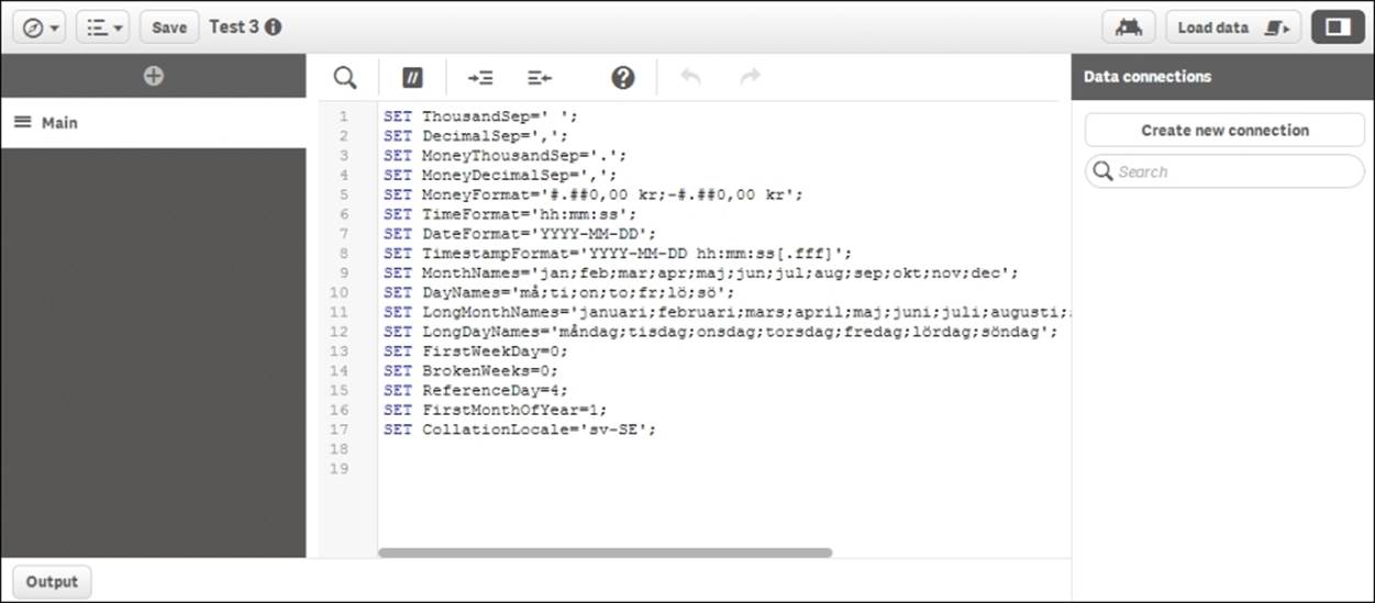
The Qlik Sense Data load editor
This editor is very similar to the QlikView script editor. It allows you to make very complex data transformations and basically load anything. However, as with all powerful tools, it is also easy to make mistakes. Use it with caution.
When you define your data using drag and drop or the Quick data load command, the data load sequence will be stored in the load script as one or several Load statements. This means that these can be edited in Data load editor if you want to tweak them after they have been created.
You can also create your script from scratch using Data load editor. If so, you must first create your data connections. These can be file folders, connections to regular databases, or connections to other data sources using other connectors. This is how you do it:
1. Open Data load editor from the initial dialog of the menu in the toolbar.
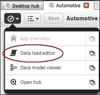
The Data load editor command
Tip
Clicking on the icon to the right in the menu will open Data load editor in a new tab.
2. Now you will have Data load editor open. To the right, you have the Data connections panel. If you click on the Create new connection button, you will open a menu where you can choose the connection type and then specify the properties of the connection in the following dialog:
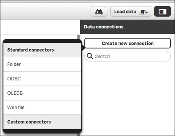
Adding a data connection
Creating a database connection
If you want to create a database connection using Open Database Connectivity (ODBC), you should choose ODBC. This opens the ODBC connection dialog, where you can choose which data source to use:
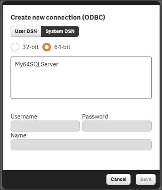
The ODBC connections dialog
The data sources that you see are the ones defined in the Windows operating system, which means that if you do the development on a server, the list is limited to those defined by the server administrator.
Once you have created these connections, you will have them displayed in a list of data connections, as shown in the following screenshot:
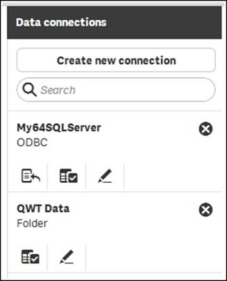
The list of data connections
Each data connection has several icons: an icon to create a Load or a Select statement and a second one to edit the connection itself. In addition, database connections have a third icon that is used to create a Connect statement.
Hence, to create a Load statement, you should click on ![]() and find the file that contains the table. This way, you can create a script in very much the same way as you would in QlikView if you are familiar with it.
and find the file that contains the table. This way, you can create a script in very much the same way as you would in QlikView if you are familiar with it.
The goal is to create a script that defines a logical, coherent data model that corresponds to the business situation. When you have created the script, you need to run it to load the data. This is done by clicking on the Load data button in the toolbar of Data load editor.
Associative model assumptions
In principle, each Load or Select statement creates one table in the data model. There are, however, some exceptions to this rule:
· If a loaded table contains exactly the same set of fields as an existing data table, the new table will not be created as a separate table. Instead, it will be appended to the existing table.
· If the Load or Select statement is preceded by the Concatenate keyword or Join, the loaded table will be merged with an existing data table.
· If the Load or Select statement is preceded by the Generic keyword, the loaded table will be transformed into several data tables.
· If the Load or Select statement is preceded by the Mapping or Semantic keyword, the loaded table will not be used as a normal data table.
· An existing table can be deleted using the Drop command.
Several Load statements will thus normally create a data model with several tables.
In the end of the script run, the existing tables will be evaluated. If the same field name is found in more than one table, this field will be considered to be a key that links the two tables. This way, a data model is created. The logic in the script evaluation is hence identical in Qlik Sense and QlikView.
The data model – the core of the logic
The data model defines how Qlik Sense's internal logical inference and calculations should be made.
A user selection implies a new logical situation. Other field values than the ones used before are possible; summations need to be made, so the charts and the KPIs get different values than what we got before. Everything needs to be recalculated, and the data model defines how this is done.
When the user makes a selection, Qlik Sense first evaluates which field values of other fields are possible and which records are possible. In this evaluation, the key fields are used to propagate the selection to other tables. The second step is to calculate all formulas based on the possible records. The data model thus defines how all calculations should be made.
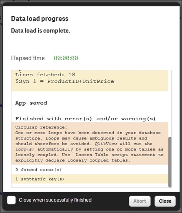
When you create your data model, you should look out for two potential problems: synthetic keys and circular references. Synthetic keys are simply Qlik Sense's way of managing composite keys. Usually, you do not want synthetic keys—you want one single key in each table link. However, if you know that you have multiple keys linking two tables, and that is the way you want your data model, then there is no problem in having synthetic keys.
This is not the case for circular references. If you have a circular reference, you should rethink your data model with the goal of removing the loop. Qlik Sense will, at the end of the script run, warn you about these potential problems, as shown in the following screenshot:
Using Data model viewer
The script defines the data model, but if you want to view it graphically, you should use Data model viewer. This is opened from the toolbar menu, as shown in the following screenshot:
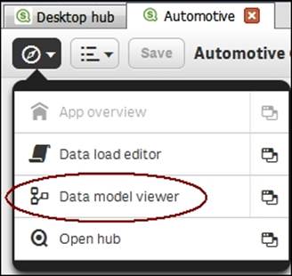
Clicking on the icon to the right in the menu will open Data model viewer in a new tab. Once this is open, you can visually see what the data model looks like. If you have more than one table, they should be linked by the key fields and look something similar to what is shown in the following screenshot:
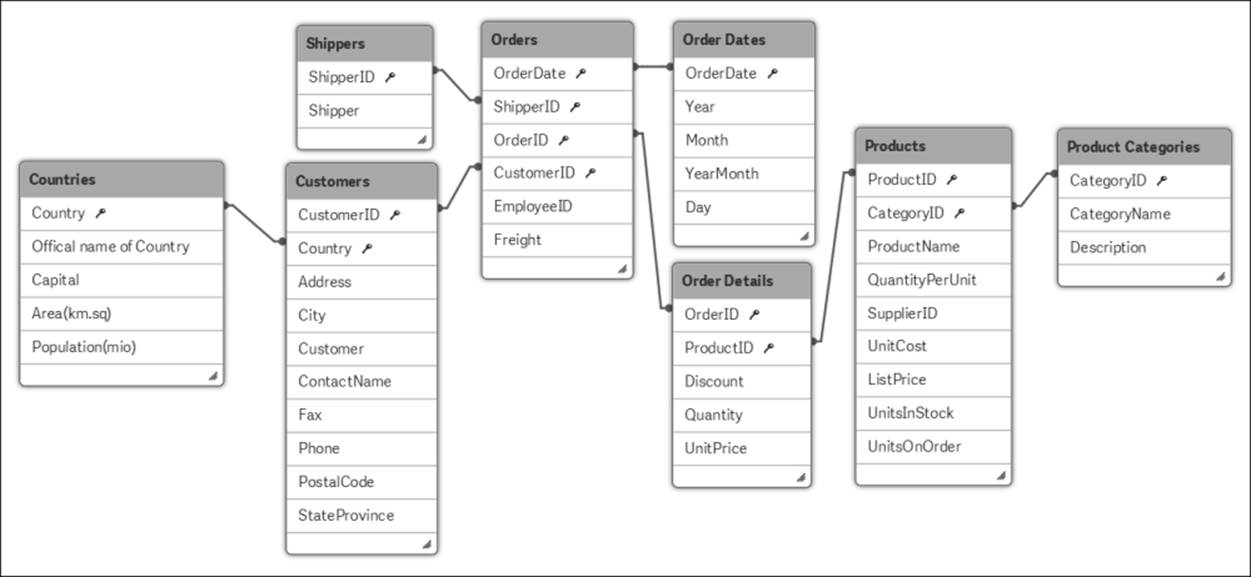
Data model viewer is an excellent tool to get an overview of the data model. It is also a very good debugging tool in the application development process.
Check that the data model looks the way you want it to and make sure that you have no circular references. Circular references will be marked with red links and synthetic keys will be named $Syn.
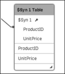
If the script execution creates a synthetic key, you will see this in the data model viewer.
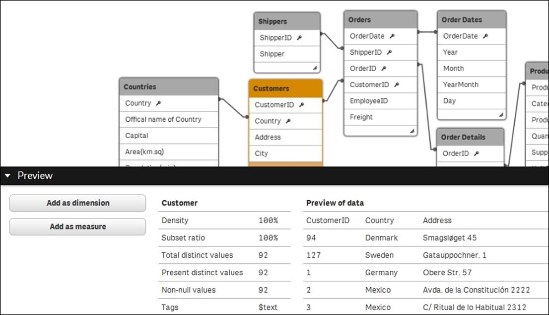
Using preview mode
The Data model viewer option has a useful additional feature: preview mode. This mode allows you to preview both data and metadata of a field.
Select a field in a table and click on the Preview button to the lower-left corner of the screen. This opens the Preview panel in which you can see data about the field and some sample data records from the table. In addition, you can define dimensions and measures based on the chosen field, as shown in the following screenshot:
Data connectors
In addition to loading data from files, Qlik Sense can connect to databases using the ODBC and OLEDB interfaces. To see which databases you can connect to, you need to open Data load editor and click on Create new connection.
When you select OLEDB and then Select provider, you will see a list of the installed OLEDB providers. If your database isn't listed, you need to install the appropriate software from your database provider.
If you choose ODBC, you will see the defined data sources. However, you may still have drivers installed for which there are no data sources defined. To find out whether this is the case, you must open ODBC Administrator in Windows and look in the Drivers tab (as shown in the following screenshot). If your database isn't listed, you need to install the appropriate software from your database provider.
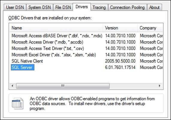
Windows ODBC Administrator
Tip
The default ODBC administrator is opened by navigating to Control Panel | Administrative tools | Data Sources (ODBC) in Windows. However, on a 64-bit OS, you may also want to use 32-bit drivers. To manage these, you need to openC:\Windows\SysWOW64\odbcad32.exe.
Once the ODBC driver is installed, you need to define a data source. We recommend that you do this on the System DSN tab in ODBC Administrator. When this is done, the data source will appear in the Qlik Sense ODBC dialog.
You can also use custom connectors with Qlik Sense, such as the Salesforce connector (as shown in the next screenshot) that you can download from the Qlik download page. These should be put in C:\Program Files\Common Files\Qlik\Custom Data. They will then appear in your list of connectors.
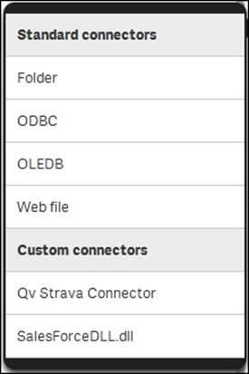
The list of connectors, including two custom connectors
The user interface – sheets and visualizations
Once you have loaded the data into Qlik Sense, it is time to create the visualizations in the graphical user interface. A basic set of sheets and visualizations should normally be supplied by the application developer, and additional ones can be created by the users themselves.
Creating a sheet
Perform the following steps to create a sheet:
1. Create an empty sheet from App overview, as shown in the next screenshot. So, if you have Data load editor open, you need to click on App overview:
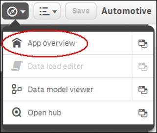
The App overview command
2. In App overview, you can create your first sheet by clicking on the sheet placeholder with a plus sign, as shown in the following screenshot:
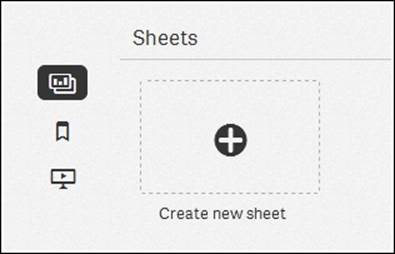
The Create new sheet button
3. Name it and hit Enter. You have now created an empty sheet and need to put some visualizations on it.
Adding visualizations
Perform the following steps to add visualizations:
1. Click on the newly created sheet. You are now looking at the empty sheet, but you have probably figured this out already, since the text The sheet is empty is located in the middle.
2. Click on the Edit button to the right in the toolbar to start adding things. Doing so will open the Assets panel to the left listing a number of object types: Bar chart, Combo chart, Filter pane, and so on. Now, you can drag and drop an object type onto your sheet, thereby creating such an object. If you, for instance, drag a bar chart onto the sheet, you will create an empty bar chart.
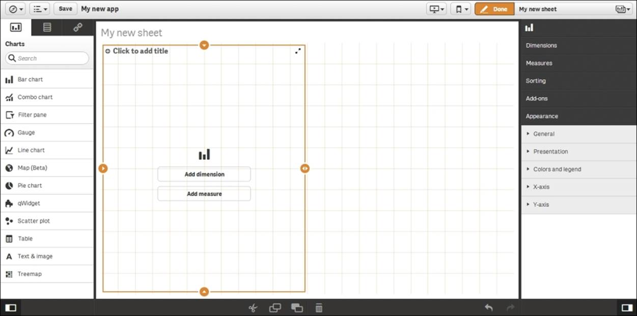
3. Depending on where you drop it, it will use all of the sheet or just half the sheet. Move the object around before you drop it, and you'll see. You can also adjust its size at a later stage.
4. Once you have dropped it, the bar chart will clearly show that it needs a dimension and a measure in order to display properly. You can click on the buttons on the bar chart to define these, but you can also use the Assets panel to the left.
The Assets panel shows object types, but if you look carefully, you will see that there are three tabs at its top: one for object types, one for fields, and one for the predefined library entities. So, if you click on the middle icon, you will see a list of fields that can be used as dimensions or as measures.
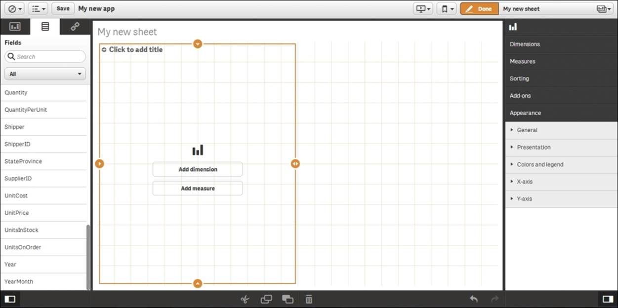
The Assets panel now shows a list of fields
Adding dimensions and measures
You can now drag and drop fields onto the bar chart, thereby creating the dimension and the measure.
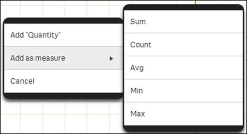
A dimension is a field with discrete values, for example customer, product, or month. A chart will create one number per dimensional value; hence, a bar chart will create one bar per distinct value in the chosen field.
A measure is usually a number, for example, sum of sales or number of orders, and this will constitute the height of the bars.
When you drag a field onto the empty bar chart, Qlik Sense will ask you what you want to do with this field. You can add it (as a dimension), or you can use it inside an aggregation function (Sum(), Count(), or Min()) to form a measure.
Adding measures
Defining bar charts
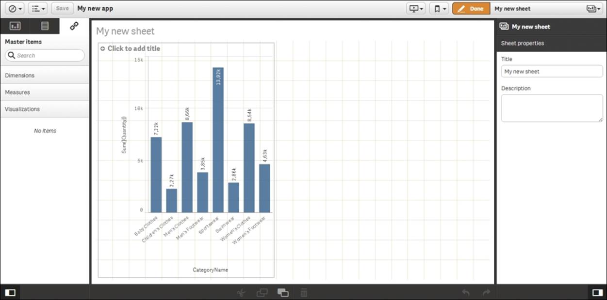
When you have added both dimension and measure, the bar chart will appear as shown in the next screenshot. To the right, you will have the properties of the bar chart, where you can set its properties: the sort order, the colors, and so on. You can also define the dimension and the measure directly in the chart properties.
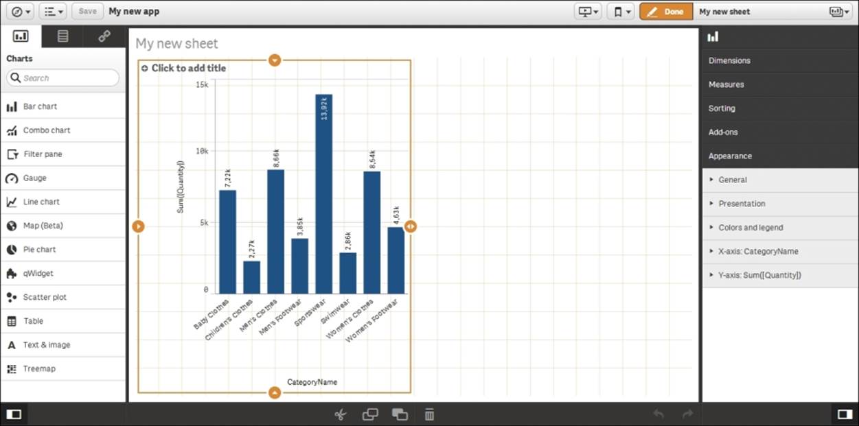
1. To see the final result, you need to click on Done in the toolbar, which takes you back to fullscreen.
Clicking on the Save button in Qlik Sense Desktop will save the application as a file with the extension .qvf in the application folder (C:\Users\<user>\Documents\Qlik\Sense\Apps). The file contains both data and script and it can be imported to other Qlik Sense installations. However, you may need to adjust the script so that it runs from the new location.
2. When you are done with the bar chart, you should click on Save and start creating your next visualization.
In the server version of Qlik Sense, you don't have a Save button. The changes are saved automatically.
Storytelling
A new exciting feature in Qlik Sense is storytelling. Storytelling is basically a presentation mode where you can first prepare a presentation—like a slide show—and then present it. Storytelling is also an excellent way to present an application and create its overview.
When you create an application, you can of course also create a story that can be used by anyone who uses the application. However, we believe that the more common use case is that stories will be created not by the application developer, but rather by contributors—power users who choose to add elements to the application. Hence, storytelling is described in Chapter 6, Contributing to Data Discovery.
The application library
As previously mentioned, the Assets panel can show object types and fields. However, it has a third tab for predefined library entities. If you click on this tab, you will see the application library.
The library contains predefined entities that can simplify the Qlik Sense usage for a business user. Dimensions, measures, or entire visualizations can be stored in the library.
You do not need to use the library—nothing has to be predefined for Qlik Sense to work. However, if you want to reuse formulas or you have a situation where your task is to deliver an app to a business user, it is a good idea to use the library.
Which fields should be exposed?
Often, you have many fields in an app, of which only a few should be exposed as dimensions. Then, you should use the library to define the fields that are appropriate as dimensions and name them in a way that they can be easily understood.
A dimension can also be a group of exposed fields, a drill-down group, or a cyclic group. It can also be a formula using an Aggr() function that defines an array of values. In all these cases, it is a good idea to define the dimension in the library.
Defining KPIs
Measures are formulas that define KPIs. These are often used in many places in an app, so it is convenient to store the definition in one place only. Then, should you want to change the definition, you need to do it in the library only. Also, this is a way to ensure that there is only one version of the truth.
Creating library entries
Library entries can be created in several different ways. The most obvious way is to enter the library and click on the Create new button.
An alternative way is to do it from Data model viewer. Here, you can mark a field and click on the Preview button (in the bottom-left corner of the screen). You have the options of adding the field as dimension or measure.
Whichever way you choose to use when you create your dimension, you will see the following dialog where you define your dimensions:
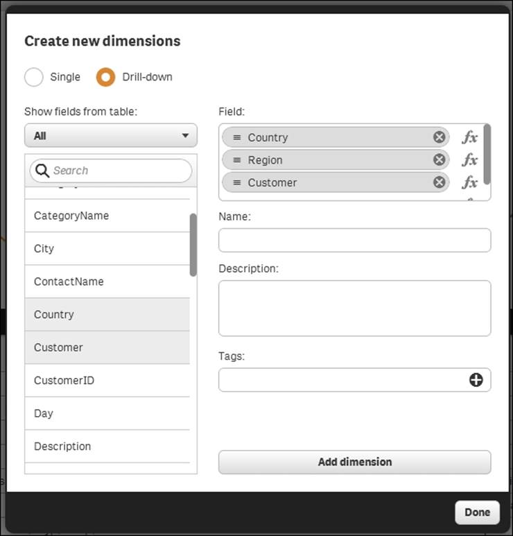
The Create dimension dialog
When you create a measure, you will see the following dialog. Make sure that you have an aggregation function, for example Sum(), Count(), or Min(), wrapping the field reference.
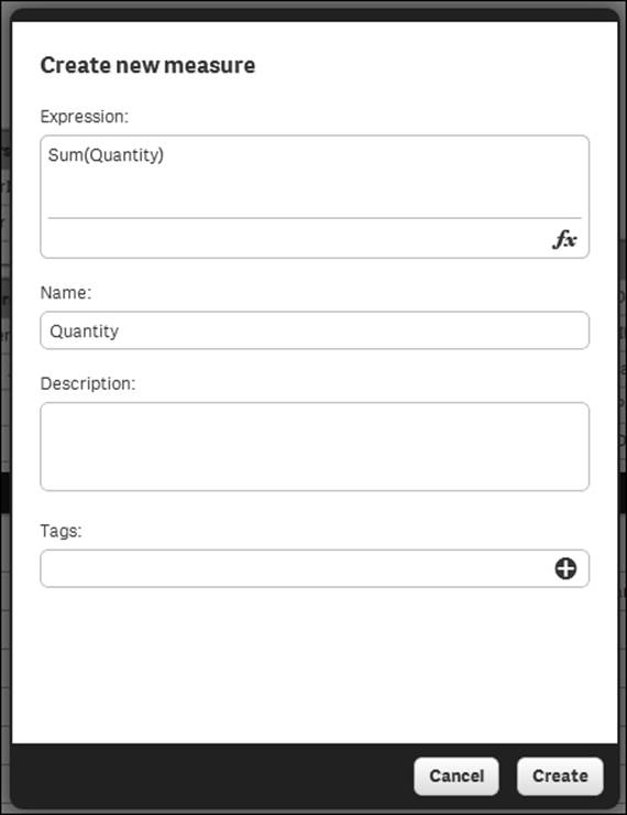
The Create measure dialog
Visualizations can only be entered into the library by the use of drag and drop, so you need to have created the visualization on the sheet first.
Best practices in data visualization
In the new world of ever increasing data volumes, the ability to visually communicate insights from data is an important skill set. Both the structure of an app and the chosen visualizations affect how data is perceived.
An app can contain many sheets, and the order of the sheets and what you put on them is the first consideration. Best practice can be summarized in three letters: dashboard, analysis, and report (DAR).
Dashboard
The dashboard is where the high-level perception takes place. It is usually the first sheet or the landing page, and it should give just the most important information and have the least amount of interactivity. Its main purpose is to help users get an overview and scan for status changes. The users can at a glance see whether things are working or not. It's a starting point, such as a table of contents; the user gets an idea of what is available and then heads off to other parts of the app based on what they have seen.
Some basic information about dashboards is as follows:
· Display data only on a high level
· Don't use too many KPIs
· Use no or very few filtering options
· The most important information should be large
Analysis
The analysis pages should be more interactive: they should help users explore the data and look for answers to questions they may have formed on the dashboard page. Analysis pages are where the user spends time and interacts with the data. Typically, each sheet has a theme and covers a specific aspect of the business. The analysis pages are where the user learns from data.
Here is some basic information about analysis pages:
· Allow filter panes or list boxes to facilitate selections
· Make sure an entire page is about a particular topic
· Use graphs
Reporting
The third type of sheet is the reporting sheet. It is not always necessary to have these, but often it is advantageous to gather the most granular information on dedicated sheets. This is the purpose of the reporting sheets: to give the most granular information with tabular data. This is where a user can spend a lot of time sorting and filtering through the details.
Here is some basic information about reporting sheets:
· Display transactional data in tabular form
· Give the users the ability to view every detail they need to take action on
Structuring a sheet
The structure within a sheet is also important. When you create an app, it's your job to prioritize information and display it in a way so the users better understand the data and find their way in the app.
The human eye scans most content in an F pattern. The first time we see a page, we read the first line, then a bit of the second line, and then work our way down the left-hand side of a page looking for keywords. This means that the content at the top of the page is the most important real-estate on a page, especially the top-left. The top of the sheet gives the users an idea of what content a page may contain and the scent of whether or not they are on the right track to finding what they are looking for. So, label the sheets appropriately.
It is also important that users easily find objects they are looking for. This applies to filter panes and listboxes, where the user makes selections. If used in several sheets, they should if possible be placed in the same place in all sheets. Further, given how a human eye scans the page, these objects should preferably be placed to the left.
Graphs and other visualizations
Visualization also includes choosing appropriate graphs. Getting the graph right is important; otherwise, the data can be misinterpreted. There are several highly regarded thought leaders who have written excellent reading material on this topic, for example, Edward Tufte and Stephen Few. If you have not read any book in this area and you intend to build business intelligence applications, we recommend that you do this. It will help you in your work.
Dimensions and measures
You should start by asking yourself, "What do I want to show?". The answer is usually sales, quantity, or some other number. This is your measure.
The second question you should ask yourself is, "How many times should this measure be calculated? Per what do I want to show this measure?". The answer could be once per month, once per customer, once per supplier, or something similar. This is yourdimension.
The dimension and the measure of a chart are the core of the visualization and often indicate what visualization to choose. It is important to understand which type of field is used as dimension. For example, when showing trends over time, you should usually use a line chart or a bar chart. The same is also true for any dimension with an implicit, intrinsic order. By the same token, you should never use a line chart unless the dimension has an implicit order.
The fields used as dimensions can be classified into the following groups:
· Nominals: These are fields with qualitative values that lack intrinsic order, for example, product, customer, color, gender, and so on.
· Ordinals: These are fields with qualitative values that have intrinsic order, for example, ratings such as unsatisfied, neutral, or satisfied that have no numeric meaning.
· Intervals: These are fields with quantitative values that lack a natural zero. They are like coordinates, for example, date, time, longitude, temperature, and so on.
· Ratios: These are fields with quantitative values that have a natural zero. They are like amounts, for example, quantity, sales, profit, weight, and so on.
With this classification in mind, it is easier to describe what you can and cannot do with some graph types.
The bar chart
The most common visualization is the bar chart. Bar charts can be used for almost any dimension, and it is easy to compare the sizes of two bars. Further, they are good for ordinal data, since the intrinsic order can be used. This also means that trends over time can easily be spotted.
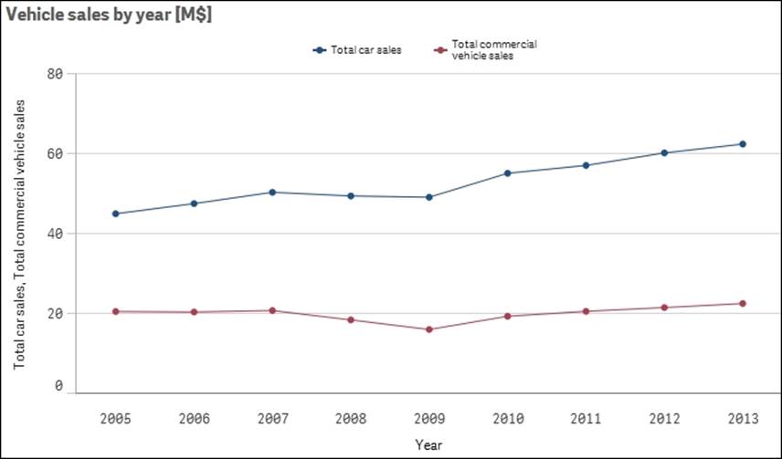
If a second measure is added to the bar chart, you will get two bar series so that you can make comparisons both between the measures and along the dimension. For example, in the following chart, you can compare not only the sales regions, but also the commercial vehicle sales with total sales:
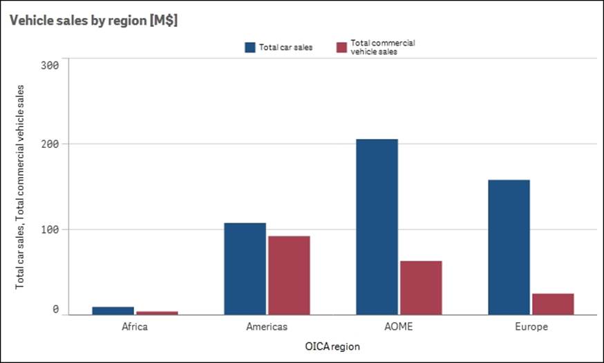
A bar chart is often the best visualization. By adding a second measure or a second dimension, you can get several series of bars.
The pie chart
The next visualization is the pie chart. This should only be used if the dimension is of the nominal type and you want to display the relative proportions. Pie charts are not good for ordinal data, since the order of the dimensional values isn't obvious. Pie charts are especially useful to convey an overview of the relative sizes. For instance, in the following pie chart, you can clearly see that the combined sales in USA and China constitute more than 50 percent—something that is not at all clear if you instead look at the corresponding bar chart:
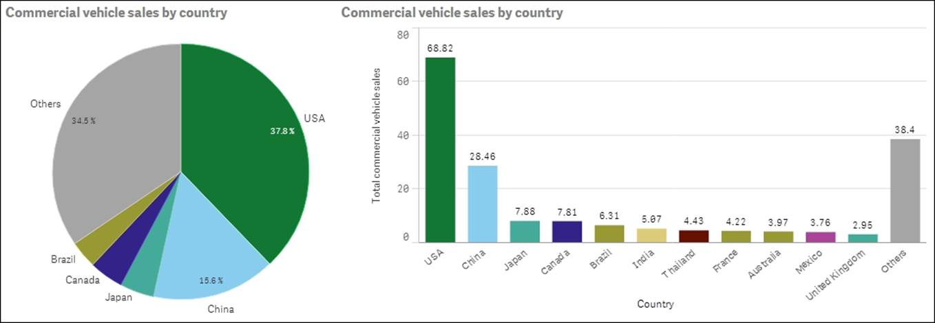
Normally, a bar chart is easier to read, but in this case the pie chart is better at showing the relative proportions of the largest countries. However, it can sometimes be hard to judge the relative sizes of the slices if there is only a small difference in between them. Then, a bar chart is a better choice.
The line chart
The next visualization is the line chart. This should only be used if the first dimension is of the interval type. Line charts are particularly useful for showing a change over time. Several lines can be used, either by using a second dimension or by adding measures.
Line charts are good when you want to analyze trends over time.
The scatter chart
Scatter charts are good if you want to compare two different quantitative measures for the same dimension, that is, pairs of data per some dimension. Such plots are useful to find clusters of values, linear arrangements, gaps, and values that are much different from the norm. These are the kinds of patterns that are meaningful in correlation relationships.
The unique strength of this chart type is its ability to encode values along two quantitative scales used as two axes. Note that the logical dimension is not used as an axis. Instead, two measures are used as axes.
The dimension, which should normally be of the nominal type, defines the number of points in the scatter chart.
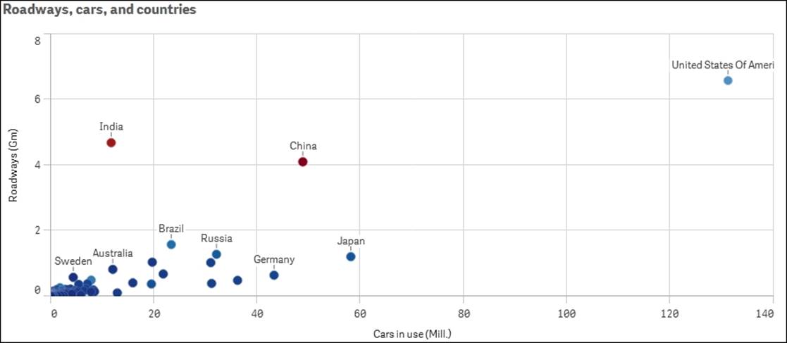
The preceding scatter chart shows the amount of roads per country (in million kilometers) versus the number of cars (in million units). The color indicates the country's population.
The tree map
Another chart type to mention is the tree map (called block chart in QlikView 11). This is an excellent visualization if you have two or more dimensions with a hierarchical relationship and one single measure. The reason why it is called tree map is that it was originally designed to display hierarchical relationships that have a structure like a tree. In Qlik Sense, you can use it for nonhierarchical relationships that have no resemblance with trees whatsoever. Again, the dimensions should be of the nominal type.
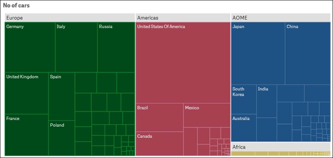
A tree map showing the number of cars in different countries
The geographical map
The last chart type to mention is the geographical map. This visualization is new in Qlik Sense, and you can display regions and areas on a map of a country or region. Also, here the dimension is of the nominal type.
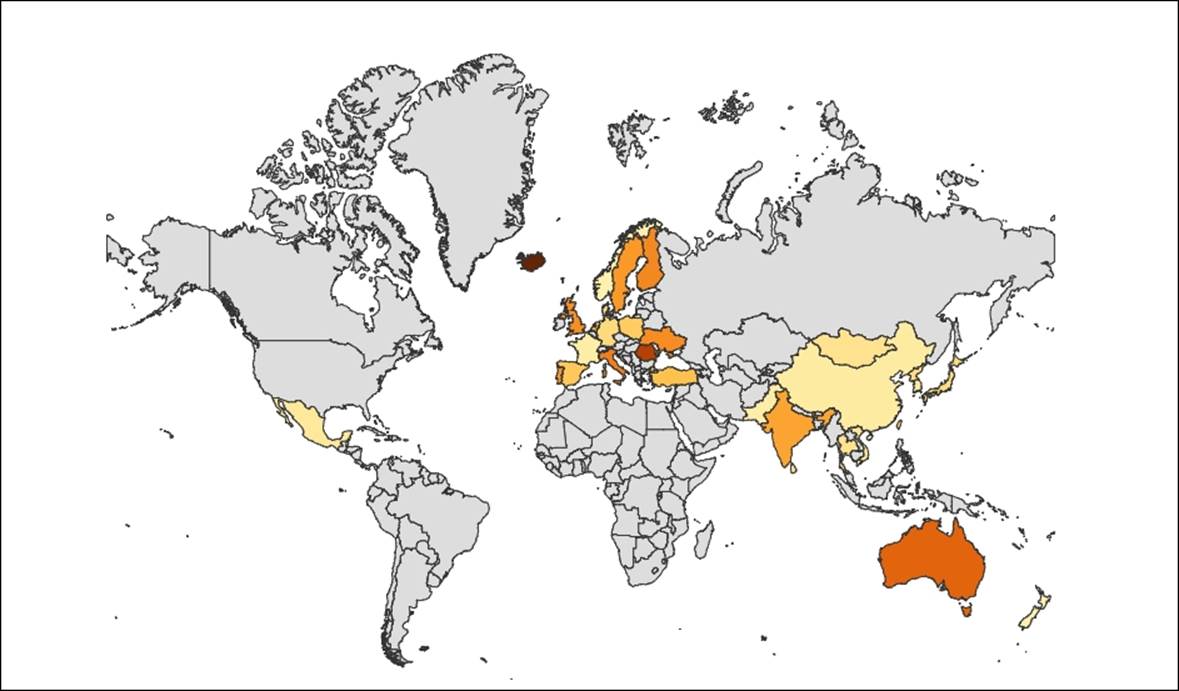
In Qlik Sense, you can connect maps to the data.
Sorting and colors
Once you have chosen the appropriate chart type, perform the following steps:
1. Choose the appropriate chart settings, for example, scale, sorting, and appearance. Nominals should be sorted alphabetically or by some form of measure, for example, the size of the bar. The other types should be sorted according to the intrinsic sort order.
2. You also need to label the chart, for example, add a title, descriptions, y axis units, and so on.
3. Finally, you should also make sure to use the appropriate colors, but be careful here.
Bright colors are beautiful, but when it comes to data visualization, it is best practice not to use highly saturated colors. Instead, it is good to tone it down a bit. The main reason is that lighter colors are much easier on the eyes, so they show data better for example when displayed on large screens. Further, bright colors draw attention, so they should only be used to highlight a specific field value or condition.
Tip
The color should never be a decoration only. It should always carry information.
One way is to use the same color everywhere for the same field value. This way, the user will easily identify the corresponding bars or slices in multiple visualizations.
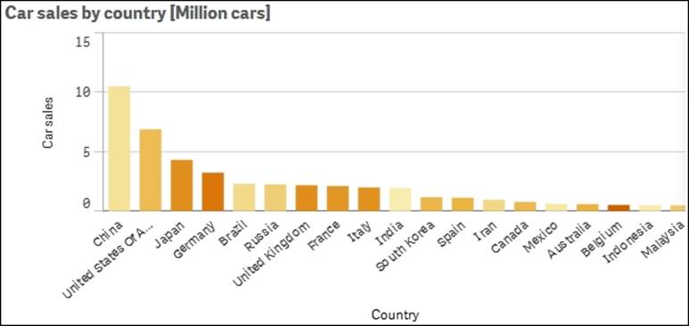
Another way is to use a color that has an intensity that is in proportion to a specific calculation. For instance, in the following bar chart, the bars indicate the total number of sold cars in different countries and the color intensity indicates the number of sold cars per capita. This is one good way of using colors.
Migrating applications from QlikView to Qlik Sense
All QlikView applications since QlikView Version 8 can easily be migrated. However, the conversion is only partial: the data and the script will be converted, but nothing from the layout is used. Perform the following steps to migrate applications:
1. Move the QlikView app—the .qvw file—to your Qlik Sense Desktop app folder at C:\Users\<user>\Documents\Qlik\Sense\Apps. The file will then appear in your Desktop hub as a legacy app. Its name will have (qvw) after it:
2. You can now open the app and see the data model and the existing script.
3. Once you make changes, you will need to save these; this is when the conversion takes place. The old app with the new changes will be saved into a file with extension .qvf, and the old .qvw file will be renamed to *.qvw.backup.
Changes to the script
Now, you must change the script. The structure of the script need not be changed, but all references to databases and files should be changed. In Qlik Sense, you need to use the data connections library. Hence, you must create the library entries that you need, and then replace connect strings and file references with references to the library.
Changes to the user interface
The modern layout in Qlik Sense with responsive design has very little to do with the old static layout in a QlikView app. A consequence is that you will need to recreate all objects: all charts, lists, and tables. In fact, you will often have to rethink your entire layout. If you are deploying your apps in an environment where users have tablets or smartphones, you would probably have had to do this anyway, since the old style QlikView apps display poorly on small screens.
The best way to do this is to have both Qlik Sense and QlikView displaying the same app simultaneously. Then you can go through the app sheet by sheet and decide how to design your new Qlik Sense app.
The syntax for formulas has not changed, so it is advisable to use copy and paste when moving complex formulas from QlikView objects into Qlik Sense objects.
Currently, there is no support for migration in the Qlik Sense server. So, if you want your old app on a server, you need to first convert it using Qlik Sense Desktop and then import the new file to the server.
Publishing your apps
When you have created an app, the next step is to make it available for other users. Perform the following steps if you have developed your app using Qlik Sense Desktop:
1. Import the app using the Apps sheet in the Qlik Sense Management Console. There, you will find an Import button in the top-right corner.
2. Once the file is imported, you may also need to assign the correct owner: mark the file, click on Edit, and change the owner if necessary. The file will then appear under My Work in the Qlik Sense hub.
Note
If you have developed the app using the server version, it will already be under My Work.
3. Before you publish the app, it is recommended that you make a copy of the file. Mark the file on the Apps page in the Qlik Sense Management Console and select Duplicate in the More Actions menu.
4. Now, you are ready to publish. You can publish the app by marking the file and clicking on the Publish button.
Publishing means that you move an app from your personal workspace to a stream, which means that the file can be accessed by many people. The properties of the stream, including security rules, will then be applied. Note that the file will be removed from your personal workspace. This is the reason why it might be a good idea to make a copy of it.
You will then be prompted to choose a stream for your use:
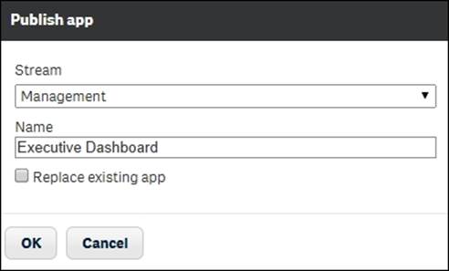
The Publish app dialog
Currently, there is no way to "unpublish" an app; if you want to remove it from a stream, you need to delete the app.
Visualization extensions
All objects in the Qlik Sense user interface are created with standard web technologies and use the standardized API to communicate with other parts of the product. This means that it is straightforward to create your own visualizations—given that you are familiar with programming and HTML5. Such visualizations are called extensions.
There are a number of extensions available that can be downloaded from the Internet. If you download extensions and want to use them with Qlik Sense Desktop, you should put them in C:\Users\<user>\Documents\Qlik\Sense\Extensions. If you want to use them in the Qlik Sense server, you need to import them using the Qlik Sense Management Console.
Once you have done this, the extensions will appear in the assets panel to the left when you edit a sheet.
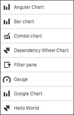
The Assets panel will display both the standard objects and extensions.
Using Workbench
If you want to create your own visualization, Workbench is a good place to start. Just start your Qlik Sense Desktop, open an Internet browser, and go to http://localhost:4848/Workbench.
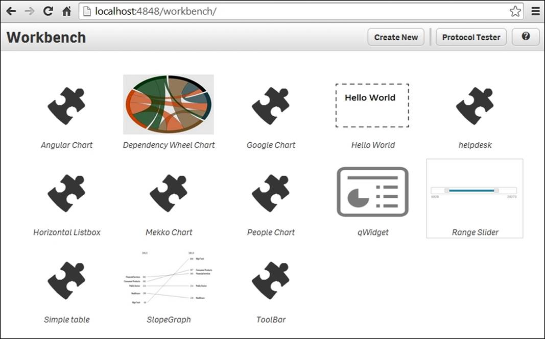
The Qlik Sense Workbench
This will open a web page that allows you to create extensions and edit the existing ones. If you click on Create new, you will be prompted for a name and on which template it should be based.
Once the visualization is created, you can edit all the files through this user interface: the JavaScript code, the CSS file, and the metadata.
Summary
In this chapter, we looked at the functions and commands you need to know to build engaging applications—both from a process perspective and, more practically, what you need to do to create an inviting user interface.
In the next chapter, we'll move away from app creation and start examining how a Qlik Sense server is managed and configured.
All materials on the site are licensed Creative Commons Attribution-Sharealike 3.0 Unported CC BY-SA 3.0 & GNU Free Documentation License (GFDL)
If you are the copyright holder of any material contained on our site and intend to remove it, please contact our site administrator for approval.
© 2016-2026 All site design rights belong to S.Y.A.