Don’t Make Me Think, Revisited: A Common Sense Approach to Web Usability (2014)
Part III. Making Sure You Got them Right
Chapter 9. Usability testing on 10 cents a day
KEEPING TESTING SIMPLE—SO YOU DO ENOUGH OF IT
Why didn’t we do this sooner?
—WHAT EVERYONE SAYS AT SOME POINT DURING THE FIRST USABILITY TEST OF THEIR WEB SITE
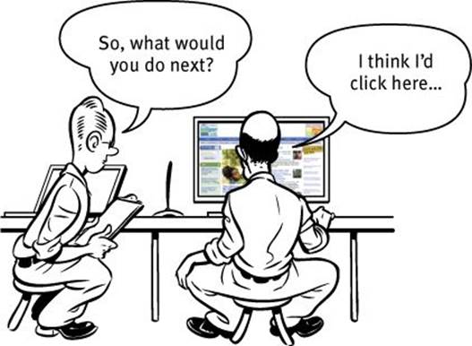
I used to get a lot of phone calls like this:
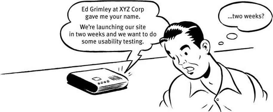
As soon as I’d hear “launching in two weeks” (or even “two months”) and “usability testing” in the same sentence, I’d start to get that old fireman-headed-into-the-burning-chemical-factory feeling, because I had a pretty good idea of what was going on.
If it was two weeks, then it was almost certainly a request for a disaster check. The launch was fast approaching and everyone was getting nervous, and someone had finally said, “Maybe we better do some usability testing.”
If it was two months, then odds were that what they wanted was to settle some ongoing internal debates—usually about something like aesthetics. Opinion around the office was split between two different designs; some people liked the sexy one, some liked the elegant one. Finally someone with enough clout to authorize the expense got tired of the arguing and said, “All right, let’s get some testing done to settle this.”
And while usability testing will sometimes settle these arguments, the main thing it usually ends up doing is revealing that the things they were arguing about weren’t all that important. People often test to decide which color drapes are best, only to learn that they forgot to put windows in the room. For instance, they might discover that it doesn’t make much difference whether you go with cascading menus or mega menus if nobody understands the value proposition of your site.
I don’t get nearly as many of these calls these days, which I take as a good sign that there’s more awareness of the need to make usability part of every project right from the beginning.
Sadly, though, this is still how a lot of usability testing gets done: too little, too late, and for all the wrong reasons.
Repeat after me: Focus groups are not usability tests.
Sometimes that initial phone call is even scarier:
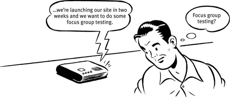
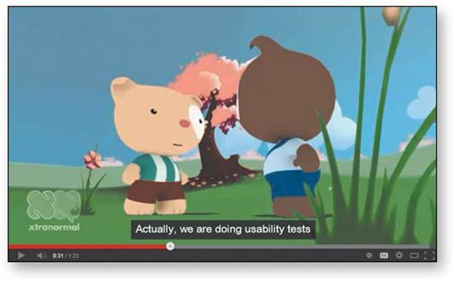
When the last-minute request is for a focus group, it’s usually a sign that the request originated in Marketing. If the Marketing people feel that the site is headed in the wrong direction as the launch date approaches, they may feel that their only hope of averting potential disaster is to appeal to a higher authority: market research. And one of the types of research they know best is focus groups. I’ve often had to work very hard to make clients understand that what they need is usability testing, not focus groups—so often that I finally made a short animated video about just how hard it can be (someslightlyirregular.com/2011/08/you-say-potato).
Here’s the difference in a nutshell:
![]() In a focus group, a small group of people (usually 5 to 10) sit around a table and talk about things, like their opinions about products, their past experiences with them, or their reactions to new concepts. Focus groups are good for quickly getting a sampling of users’ feelings and opinions about things.
In a focus group, a small group of people (usually 5 to 10) sit around a table and talk about things, like their opinions about products, their past experiences with them, or their reactions to new concepts. Focus groups are good for quickly getting a sampling of users’ feelings and opinions about things.
![]() Usability tests are about watching one person at a time try to use something (whether it’s a Web site, a prototype, or some sketches of a new design) to do typical tasks so you can detect and fix the things that confuse or frustrate them.
Usability tests are about watching one person at a time try to use something (whether it’s a Web site, a prototype, or some sketches of a new design) to do typical tasks so you can detect and fix the things that confuse or frustrate them.
The main difference is that in usability tests, you watch people actually use things, instead of just listening to them talk about them.
Focus groups can be great for determining what your audience wants, needs, and likes—in the abstract. They’re good for testing whether the idea behind your site makes sense and your value proposition is attractive, to learn more about how people currently solve the problems your site will help them with, and to find out how they feel about you and your competitors.
But they’re not good for learning about whether your site works and how to improve it.
The kinds of things you learn from focus groups—like whether you’re building the right product—are things you should know before you begin designing or building anything, so focus groups are best used in the planning stages of a project. Usability tests, on the other hand, should be used through the entire process.
Several true things about usability testing
Here are the main things I know about usability tests:
![]() If you want a great site, you’ve got to test. After you’ve worked on a site for even a few weeks, you can’t see it freshly anymore. You know too much. The only way to find out if it really works is to watch other people try to use it.
If you want a great site, you’ve got to test. After you’ve worked on a site for even a few weeks, you can’t see it freshly anymore. You know too much. The only way to find out if it really works is to watch other people try to use it.
Testing reminds you that not everyone thinks the way you do, knows what you know, and uses the Web the way you do.
I used to say that the best way to think about testing is that it’s like travel: a broadening experience. It reminds you how different—and the same—people are and gives you a fresh perspective on things.1
1 As the Lean Startup folks would say, it gets you out of the building.
But I finally realized that testing is really more like having friends visiting from out of town. Inevitably, as you make the rounds of the local tourist sites with them, you see things about your hometown that you usually don’t notice because you’re so used to them. And at the same time, you realize that a lot of things that you take for granted aren’t obvious to everybody.
![]() Testing one user is 100 percent better than testing none. Testing always works, and even the worst test with the wrong user will show you important things you can do to improve your site.
Testing one user is 100 percent better than testing none. Testing always works, and even the worst test with the wrong user will show you important things you can do to improve your site.
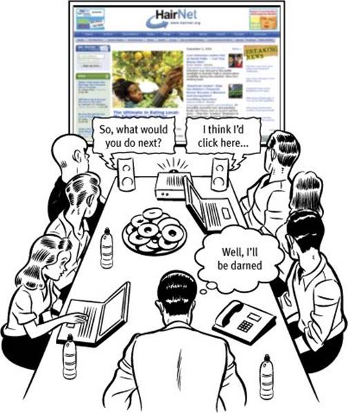
When I teach workshops, I make a point of always doing a live usability test at the beginning so that people can see that it’s very easy to do and it always produces valuable insights.
I ask for a volunteer to try to perform a task on a site belonging to one of the other attendees. These tests last less than fifteen minutes, but in that time the person whose site is being tested usually scribbles several pages of notes. And they always ask if they can have the recording of the test to show to their team back home. (One person told me that after his team saw the recording, they made one change to their site which they later calculated had resulted in $100,000 in savings.)
![]() Testing one user early in the project is better than testing 50 near the end. Most people assume that testing needs to be a big deal. But if you make it into a big deal, you won’t do it early enough or often enough to get the most out of it. A simple test early—while you still have time to use what you learn from it—is almost always more valuable than an elaborate test later.
Testing one user early in the project is better than testing 50 near the end. Most people assume that testing needs to be a big deal. But if you make it into a big deal, you won’t do it early enough or often enough to get the most out of it. A simple test early—while you still have time to use what you learn from it—is almost always more valuable than an elaborate test later.
Part of the conventional wisdom about Web development is that it’s very easy to go in and make changes. The truth is, it’s often not that easy to make changes—especially major changes—to a site once it’s in use. Some percentage of users will resist almost any kind of change, and even apparently simple changes often turn out to have far-reaching effects. Any mistakes you can correct early in the process will save you trouble down the line.
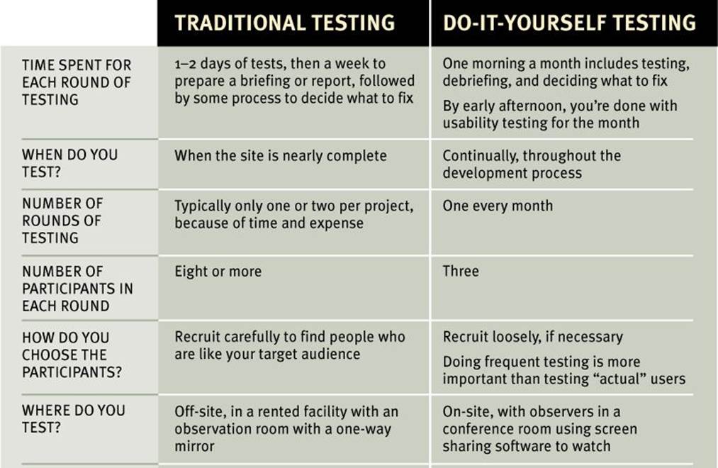
Do-it-yourself usability testing
Usability testing has been around for a long time, and the basic idea is pretty simple: If you want to know whether something is easy enough to use, watch some people while they try to use it and note where they run into problems.
In the beginning, though, usability testing was a very expensive proposition. You had to have a usability lab with an observation room behind a one-way mirror and video cameras to record the users’ reactions and the screen. You had to pay a usability professional to plan and facilitate the tests for you. And you had to recruit a lot of participants2 so you could get results that were statistically significant. It was Science. It cost $20,000 to $50,000 a shot. It didn’t happen very often.
2 We call them participants rather than “test subjects” to make it clear that we’re not testing them; we’re testing the site.
Then in 1989 Jakob Nielsen wrote a paper titled “Usability Engineering at a Discount” and pointed out that it didn’t have to be that way. You didn’t need a usability lab, and you could achieve the same results with far fewer participants. The price tag dropped to $5,000 to $10,000 per round of testing.
The idea of discount usability testing was a huge step forward. The only problem is that every Web site (and app) needs testing and $5,000 to $10,000 is still a lot of money, so it doesn’t happen nearly often enough.
What I’m going to commend to you in this chapter is something even simpler (and a lot less expensive): Do-it-yourself usability testing.
I’m going to explain how you can do your own testing when you have no time and no money.
Don’t get me wrong: If you can afford to hire a professional to do your testing, do it. Odds are they’ll be able to do a better job than you can. But if you can’t hire someone, do it yourself.
I believe in the value of this kind of testing so much that I wrote an entire (short) book about how to do it. It’s called Rocket Surgery Made Easy: The Do-It-Yourself Guide to Finding and Fixing Usability Problems.
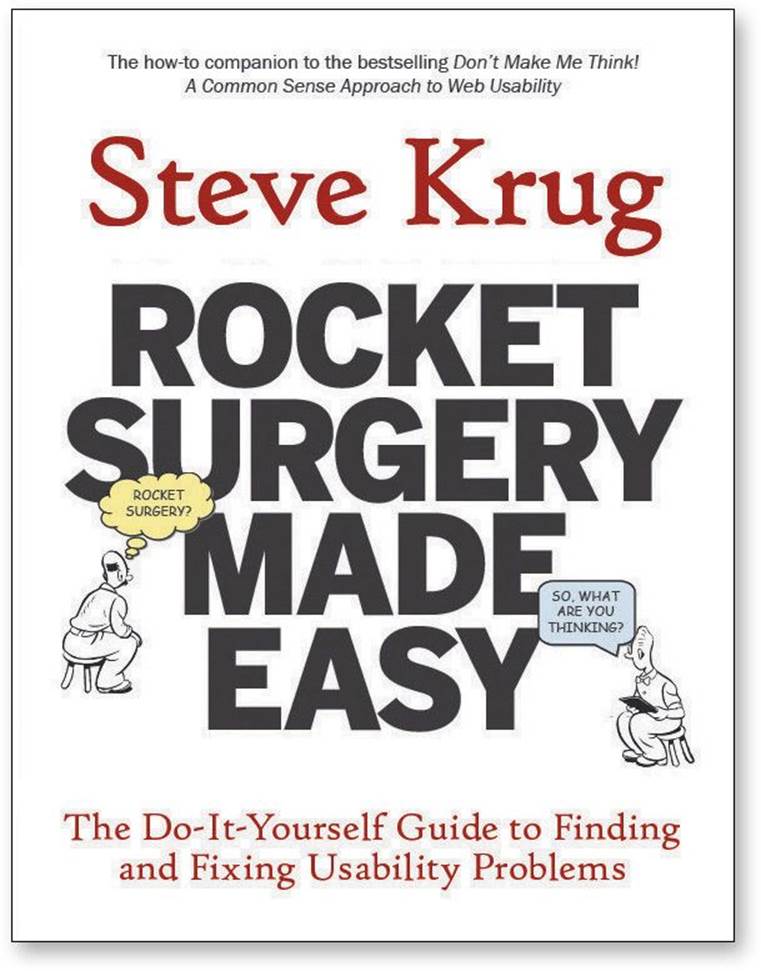
It covers the topics in this chapter in a lot more detail and gives you step-by-step directions for the whole process.
How often should you test?
I think every Web development team should spend one morning a month doing usability testing.
In a morning, you can test three users, then debrief over lunch. That’s it. When you leave the debriefing, the team will have decided what you’re going to fix before the next round of testing, and you’ll be done with testing for the month.3
3 If you’re doing Agile development, you’ll be doing testing more frequently, but the principles are still the same. For instance, you might be testing with two users every two weeks. Creating a fixed schedule and sticking to it is what’s important.
Why a morning a month?
![]() It keeps it simple so you’ll keep doing it. A morning a month is about as much time as most teams can afford to spend doing testing. If it’s too complicated or time-consuming, it’s much more likely that you won’t make time for it when things get busy.
It keeps it simple so you’ll keep doing it. A morning a month is about as much time as most teams can afford to spend doing testing. If it’s too complicated or time-consuming, it’s much more likely that you won’t make time for it when things get busy.
![]() It gives you what you need. Watching three participants, you’ll identify enough problems to keep you busy fixing things for the next month.
It gives you what you need. Watching three participants, you’ll identify enough problems to keep you busy fixing things for the next month.
![]() It frees you from deciding when to test. You should pick a day of the month—like the third Thursday—and make that your designated testing day.
It frees you from deciding when to test. You should pick a day of the month—like the third Thursday—and make that your designated testing day.
This is much better than basing your test schedule on milestones and deliverables (“We’ll test when the beta’s ready to release”) because schedules often slip and testing slips along with them. Don’t worry, there will always be something you can test each month.
![]() It makes it more likely that people will attend. Doing it all in a morning on a predictable schedule greatly increases the chances that team members will make time to come and watch at least some of the sessions, which is highly desirable.
It makes it more likely that people will attend. Doing it all in a morning on a predictable schedule greatly increases the chances that team members will make time to come and watch at least some of the sessions, which is highly desirable.
How many users do you need?
I think the ideal number of participants for each round of do-it-yourself testing is three.
Some people will complain that three aren’t enough. They’ll say that it’s too small a sample to prove anything and that it won’t uncover all of the problems. Both of these are true but they just don’t matter, and here’s why:
![]() The purpose of this kind of testing isn’t to prove anything. Proving things requires quantitative testing, with a large sample size, a clearly defined and rigorously followed test protocol, and lots of data gathering and analysis.
The purpose of this kind of testing isn’t to prove anything. Proving things requires quantitative testing, with a large sample size, a clearly defined and rigorously followed test protocol, and lots of data gathering and analysis.
Do-it-yourself tests are a qualitative method whose purpose is to improve what you’re building by identifying and fixing usability problems. The process isn’t rigorous at all: You give them tasks to do, you observe, and you learn. The result is actionable insights, not proof.
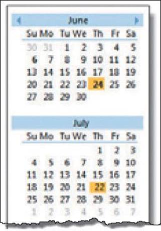
![]() You don’t need to find all of the problems. In fact, you’ll never find all of the problems in anything you test. And it wouldn’t help if you did, because of this fact:
You don’t need to find all of the problems. In fact, you’ll never find all of the problems in anything you test. And it wouldn’t help if you did, because of this fact:
You can find more problems in half a day than you can fix in a month.
You’ll always find more problems than you have the resources to fix, so it’s very important that you focus on fixing the most serious ones first. And three users are very likely to encounter many of the most significant problems related to the tasks that you’re testing.
Problems you can find with just a few test participants
Also, you’re going to be doing another round each month. It’s much more important to do more rounds of testing than to wring everything you can out of each round.
How do you choose the participants?
When people decide to test, they often spend a lot of time trying to recruit users who they think will precisely reflect their target audience—for instance, “male accountants between the ages of 25 and 30 with one to three years of computer experience who have recently purchased expensive shoes.”
It’s good to do your testing with participants who are like the people who will use your site, but the truth is that recruiting people who are from your target audience isn’t quite as important as it may seem. For many sites, you can do a lot of your testing with almost anybody. And if you’re just starting to do testing, your site probably has a number of usability flaws that will cause real problems for almost anyone you recruit.
Recruiting people who fit a narrow profile usually requires more work (to find them) and often more money (for their stipend). If you have plenty of time to spend on recruiting or you can afford to hire someone to do it for you, then by all means be as specific as you want. But if finding the ideal users means you’re going to do less testing, I recommend a different approach:
RECRUIT LOOSELY AND GRADE ON A CURVE
In other words, try to find users who reflect your audience, but don’t get hung up about it. Instead, loosen up your requirements and then make allowances for the differences between your participants and your audience. When somebody has a problem, ask yourself “Would our users have that problem, or was it only a problem because they didn’t know what our users know?”
If using your site requires specific domain knowledge (e.g., a currency exchange site for money management professionals), then you’ll need to recruit some people with that knowledge. But they don’t all have to have it, since many of the most serious usability problems are things that anybody will encounter.
In fact, I’m in favor of always using some participants who aren’t from your target audience, for three reasons:
![]() It’s usually not a good idea to design a site so that only your target audience can use it. Domain knowledge is a tricky thing, and if you design a site for money managers using terminology that you think all money managers will understand, what you’ll discover is that a small but not insignificant number of them won’t know what you’re talking about. And in most cases, you need to be supporting novices as well as experts anyway.
It’s usually not a good idea to design a site so that only your target audience can use it. Domain knowledge is a tricky thing, and if you design a site for money managers using terminology that you think all money managers will understand, what you’ll discover is that a small but not insignificant number of them won’t know what you’re talking about. And in most cases, you need to be supporting novices as well as experts anyway.
![]() We’re all beginners under the skin. Scratch an expert and you’ll often find someone who’s muddling through—just at a higher level.
We’re all beginners under the skin. Scratch an expert and you’ll often find someone who’s muddling through—just at a higher level.
![]() Experts are rarely insulted by something that is clear enough for beginners. Everybody appreciates clarity. (True clarity, that is, and not just something that’s been “dumbed down.”) If “almost anybody” can use it, your experts will be able to use it, too.
Experts are rarely insulted by something that is clear enough for beginners. Everybody appreciates clarity. (True clarity, that is, and not just something that’s been “dumbed down.”) If “almost anybody” can use it, your experts will be able to use it, too.
How do you find participants?
There are many places and ways to recruit test participants, like user groups, trade shows, Craigslist, Facebook, Twitter, customer forums, a pop-up on your site, or even asking friends and neighbors.
If you’re going to do your own recruiting, I recommend that you download the Nielsen Norman Group’s free 147-page report How to Recruit Participants for Usability Studies.4 You don’t have to read it all, but it’s an excellent source of advice.
4 ...at nngroup.com/reports/tips/recruiting. It’s from 2003, but if you factor in 20% inflation for the dollar amounts, it’s all still valid. And did I mention that it’s free?
Typical participant incentives for a one-hour test session range from $50 to $100 for “average” Web users to several hundred dollars for busy, highly paid professionals, like cardiologists for instance.
I like to offer people a little more than the going rate, since it makes it clear that I value their time and improves the chances that they’ll show up. Remember that even if the session is only an hour, people usually have to spend another hour traveling.
Where do you test?
To conduct the test, you need a quiet space where you won’t be interrupted (usually either an office or a conference room) with a table or desk and two chairs. And you’ll need a computer with Internet access, a mouse, a keyboard, and a microphone.
You’ll be using screen sharing software (like GoToMeeting or WebEx) to allow the team members, stakeholders, and anyone else who’s interested to observe the tests from another room.
You should also run screen recording software (like Camtasia from Techsmith) to capture a record of what happens on the screen and what the facilitator and the participant say. You may never refer to it, but it’s good to have in case you want to check something or use a few brief clips as part of a presentation.
Who should do the testing?
The person who sits with the participant and leads them through the test is called the facilitator. Almost anyone can facilitate a usability test; all it really takes is the courage to try it, and with a little practice, most people can get quite good at it.
I’m assuming that you’re going to facilitate the tests yourself, but if you’re not, try to choose someone who tends to be patient, calm, empathetic, and a good listener. Don’t choose someone whom you would describe as “definitely not a people person” or “the office crank.”
Other than keeping the participants comfortable and focused on doing the tasks, the facilitator’s main job is to encourage them to think out loud as much as possible. The combination of watching what the participants do and hearing what they’re thinking while they do it is what enables the observers to see the site through someone else’s eyes and understand why some things that are obvious to them are confusing or frustrating to users.
Who should observe?
As many people as possible!
One of the most valuable things about doing usability testing is the effect it can have on the observers. For many people, it’s a transformative experience that dramatically changes the way they think about users: They suddenly “get it” that users aren’t all like them.
You should try to do whatever you can to encourage everyone—team members, stakeholders, managers, and even executives—to come and watch the test sessions. In fact, if you have any money for testing, I recommend using it to buy the best snacks you can to lure people in. (Chocolate croissants seem to work particularly well.)
You’ll need an observation room (usually a conference room), a computer with Internet access and screen sharing software, and a large screen monitor or projector and a pair of external speakers so everyone can see and hear what’s happening in the test room.
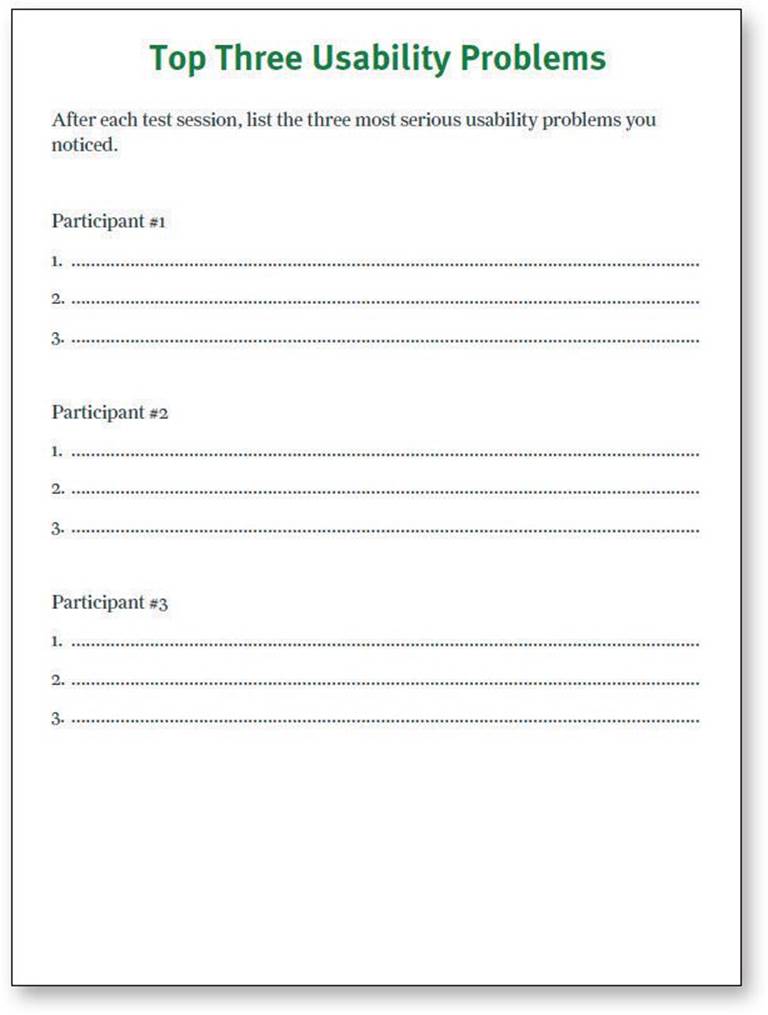
During the break after each test session, observers need to write down the three most serious usability problems they noticed during that session so they can share them in the debriefing. You can download a form I created for this purpose from my Web site. They can take as many notes as they want, but it’s important that they make this short list because, as you’ll see, the purpose of the debriefing is to identify the most serious problems so they get fixed first.
What do you test, and when do you test it?
As any usability professional will tell you, it’s important to start testing as early as possible and to keep testing through the entire development process.
In fact, it’s never too early to start. Even before you begin designing your site, for instance, it’s a good idea to do a test of competitive sites. They may be actual competitors, or they may just be sites that have the same style, organization, or features that you plan on using. Bring in three participants and watch them try to do some typical tasks on one or two competitive sites and you’ll learn a lot about what works and doesn’t work without having to design or build anything.
If you’re redesigning an existing site, you’ll also want to test it before you start, so you’ll know what’s not working (and needs to be changed) and what is working (so you don’t break it).
Then throughout the project, continue to test everything the team produces, beginning with your first rough sketches and continuing on with wireframes, page comps, prototypes, and finally actual pages.
How do you choose the tasks to test?
For each round of testing, you need to come up with tasks: the things the participants will try to do.
The tasks you test in a given round will depend partly on what you have available to test. If all you have is a rough sketch, for instance, the task may consist of simply asking them to look at it and tell you what they think it is.
If you have more than a sketch to show them, though, start by making a list of the tasks people need to be able to do with whatever you’re testing. For instance, if you’re testing a prototype of a login process, the tasks might be
Create an account
Log in using an existing username and password
Retrieve a forgotten password
Retrieve a forgotten username
Change answer to a security question
Choose enough tasks to fill the available time (about 35 minutes in a one-hour test), keeping in mind that some people will finish them faster than you expect.
Then word each task carefully, so the participants will understand exactly what you want them to do. Include any information that they’ll need but won’t have, like login information if you’re having them use a demo account. For example:
You have an existing account with the username delphi21 and the password correcthorsebatterystaple. You’ve always used the same answers to security questions on every site, and you just read that this is a bad idea. Change your answer for this account.
You can often get more revealing results if you allow the participants to choose some of the details of the task. It’s much better, for instance, to say “Find a book you want to buy, or a book you bought recently” than “Find a cookbook for under $14.” It increases their emotional investment and allows them to use more of their personal knowledge of the content.
What happens during the test?
You can download the script that I use for testing Web sites (or the slightly different version for testing apps) at rocketsurgerymadeeasy.com. I recommend that you read your “lines” exactly as written, since the wording has been carefully chosen.
A typical one-hour test would be broken down something like this:
![]() Welcome (4 minutes). You begin by explaining how the test will work so the participant knows what to expect.
Welcome (4 minutes). You begin by explaining how the test will work so the participant knows what to expect.
![]() The questions (2 minutes). Next you ask the participant a few questions about themselves. This helps put them at ease and gives you an idea of how computer-savvy and Web-savvy they are.
The questions (2 minutes). Next you ask the participant a few questions about themselves. This helps put them at ease and gives you an idea of how computer-savvy and Web-savvy they are.
![]() The Home page tour (3 minutes). Then you open the Home page of the site you’re testing and ask the participant to look around and tell you what they make of it. This will give you an idea of how easy it is to understand your Home page and how much the participant already knows your domain.
The Home page tour (3 minutes). Then you open the Home page of the site you’re testing and ask the participant to look around and tell you what they make of it. This will give you an idea of how easy it is to understand your Home page and how much the participant already knows your domain.
![]() The tasks (35 minutes). This is the heart of the test: watching the participant try to perform a series of tasks (or in some cases, just one long task). Again, your job is to make sure the participant stays focused on the tasks and keeps thinking aloud.
The tasks (35 minutes). This is the heart of the test: watching the participant try to perform a series of tasks (or in some cases, just one long task). Again, your job is to make sure the participant stays focused on the tasks and keeps thinking aloud.
If the participant stops saying what they’re thinking, prompt them by saying—wait for it—“What are you thinking?” (For variety, you can also say things like “What are you looking at?” and “What are you doing now?”)
During this part of the test, it’s crucial that you let them work on their own and don’t do or say anything to influence them. Don’t ask them leading questions, and don’t give them any clues or assistance unless they’re hopelessly stuck or extremely frustrated. If they ask for help, just say something like “What would you do if I wasn’t here?”
![]() Probing (5 minutes). After the tasks, you can ask the participant questions about anything that happened during the test and any questions that the people in the observation room would like you to ask.
Probing (5 minutes). After the tasks, you can ask the participant questions about anything that happened during the test and any questions that the people in the observation room would like you to ask.
![]() Wrapping up (5 minutes). Finally, you thank them for their help, pay them, and show them to the door.
Wrapping up (5 minutes). Finally, you thank them for their help, pay them, and show them to the door.
A sample test session
Here’s an annotated excerpt from a typical—but imaginary—test session. The participant’s name is Janice, and she’s about 25 years old.
Introduction
Hi, Janice. My name is Steve Krug, and I’m going to be walking you through this session. Before we begin, I have some information for you, and I’m going to read it to make sure I cover everything.
You probably already have a good idea of why we’ve asked you to come here today, but let me go over it again briefly. We’re testing a Web site that we’re working on so we can see what it’s like for people to use it. The session should take about an hour.
I want to make it clear right away that we’re testing the site, not you. You can’t do anything wrong here. In fact, this is probably the one place today where you don’t have to worry about making mistakes.
We want to hear exactly what you think, so please don’t worry that you’re going to hurt our feelings. We want to improve it, so we need to know honestly what you think.
As we go along, I’m going to ask you to think out loud, to tell me what’s going through your mind. This will help us.
I’m reading from the script that I use when I do usability tests.
You can download this script at rocketsurgerymadeeasy.com.
If you have questions, just ask. I may not be able to answer them right away, since we’re interested in how people do when they don’t have someone sitting next to them to help, but I will try to answer any questions you still have when we’re done.
And if you need to take a break at any point, just let me know.
It’s important to mention this, because it will seem rude not to answer their questions as you go along. You have to make it clear before you start that (a) it’s nothing personal and (b) you’ll try to answer them at the end if they still want to know.
You may have noticed the microphone. With your permission, we’re going to record what happens on the screen and what you say. The recording will be used only to help us figure out how to improve the site, and it won’t be seen by anyone except the people working on the project. It also helps me, because I don’t have to take as many notes.
Also, there are a few people from the Web design team observing the session in another room. (They can’t see us, just the screen.)
At this point, most people will say something like, “I’m not going to end up on america’s Funniest Home Videos, am I?”
If you would, I’m going to ask you to sign a simple permission form for us. It just says that we have your permission to record you, but that it will only be seen by the people working on the project.
Do you have any questions before we begin?
No. I don’t think so.
Give them the recording permission form to sign.
You’ll find a sample form and some other useful forms and checklists at rocketsurgerymadeeasy.com.
Background Questions
Before we look at the site, I’d like to ask you just a few quick questions. First, what’s your occupation? What do you do all day?
I’m a router.
I’ve never heard of that before. What does a router do, exactly?
I take orders as they come in and send them to the right office. We’re a big multinational company, so there’s a lot to sort out.
OK. Now, roughly how many hours a week would you say you spend using the Internet, including Web browsing and email? Just a ballpark estimate.
I find it’s good to start with a few questions to get a feel for who they are and how they use the Internet. It gives them a chance to loosen up a little and gives you a chance to show that you’re going to be listening attentively to what they say—and that there are no wrong or right answers.
Don’t hesitate to admit your ignorance about anything. Your role here is not to come across as an expert, but as a good listener.
Oh, I don’t know. Probably four hours a day at work, and maybe eight hours a week at home. Mostly that’s on the weekend. I’m too tired at night to bother. But I like playing games sometimes.
What’s the split between email and browsing—a rough percentage?
Well, at the office I spend most of my time checking email. I get a lot of email, and a lot of it’s junk but I have to go through it anyway. Maybe two-thirds of my time is on email and one-third is browsing.
Notice that she’s not sure how much time she really spends on the Internet. Most people aren’t. Don’t worry. Accurate answers aren’t important here. The main point here is just to get her talking and thinking about how she uses the Internet and to give you a chance to gauge what kind of user she is.
What kinds of sites are you looking at when you browse the Web?
At work, mostly our corporate intranet. And some competitors’ sites. At home, game sites and some shopping.
Do you have any favorite Web sites?
Well, Google, of course. I use it all the time. And something called Snakes.com, because I have a pet snake.
Really? What kind of snake?
A python. He’s about four feet long, but he should get to be eight or nine when he’s fully grown.
OK, great. We’re done with the questions, and we can start looking at things.
OK, I guess.
Don’t be afraid to digress and find out a little more about the user, as long as you come back to the topic before long.
The Home Page Tour
First, I’m just going to ask you to look at this page and tell me what you make of it: what strikes you about it, whose site you think it is, what you can do here, and what it’s for. Just look around and do a little narrative.
You can scroll if you want to, but don’t click on anything yet.
Until now, the browser has been opened to Google so there’s nothing distracting to look at.
At this point, I reach over and open a tab with the site we’re testing and give the mouse to the participant.
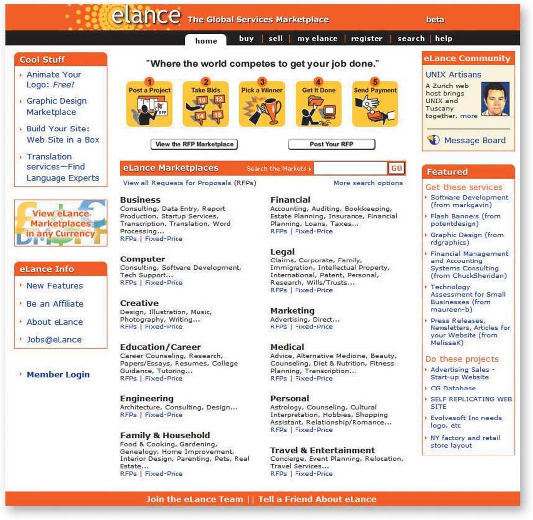
Well, I guess the first thing I notice is that I like the color. I like the shade of orange, and I like the little picture of the sun [at the top of the page, in the eLance logo].
Let’s see. [Reads.] “The global services market.” “Where the world competes to get your job done.”
In an average test, it’s just as likely that the next user will say that she hates this shade of orange and that the drawing is too simplistic. Don’t get too excited by individual reactions to site aesthetics.
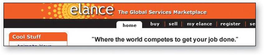
I don’t know what that means. I have no idea.
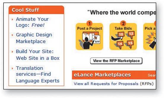
“Animate your logo: free.” [Looking at the Cool Stuff section on the left.] “Graphic design marketplace.” “View the RFP marketplace.” “eLance marketplaces.”
There’s a lot going on here. But I have no idea what any of it is.
If you had to take a guess, what do you think it might be?
Well, it seems to have something to do with buying and selling...something.
[Looks around the page again.] Now that I look at the list down here [the category list halfway down the page], I guess maybe it must be services. Legal, financial, creative... they all sound like services.
This user has been doing a good job of thinking out loud on her own. If she wasn’t, this is where I’d start asking her, “What are you thinking?”
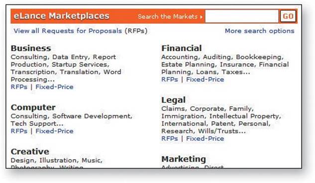
So I guess that’s what it is. Buying and selling services.
OK. Now, if you were at home, what would you click on first?
I guess I’d click on that graphic design thing. I’m interested in graphic design.
The Tasks
OK, now we’re going to try doing some specific tasks.
And again, as much as possible, it will help us if you can try to think out loud as you go along.
Can you think of some service that you need that you could use this site to get help with?
Hmm. Let me think. I think I saw “Home Improvement” there somewhere. We’re thinking of building a deck. Maybe I could find somebody to do that.
So if you were going to look for somebody to build your deck, what would you do first?
I guess I’d click on one of the categories down here. I think I saw home improvement. [Looks.] There it is, under “Family and Household.”
So what would you do?
Well, I’d click.... [Hesitates, looking at the two links under “Family and Household.”]
Now I give her a task to perform so we can see whether she can use the site for its intended purpose.
Whenever possible, it’s good to let the user have some say in choosing the task.
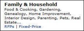
Well, now I’m not sure what to do. I can’t click on Home Improvement, so it looks like I have to click on either “RFPs” or “Fixed-Price.” But I don’t know what the difference is.
Fixed-price I sort of understand; they’ll give me a quote, and then they have to stick to it. But I’m not sure what RFPs is.
As it turns out, she’s mistaken. Fixed-price (in this case) means services available for a fixed hourly rate, while an RFP (or Request for Proposal) is actually the choice that will get her the kind of quote she’s looking for. This is the kind of misunderstanding that often surprises the people who built the site.
Well, which one do you think you’d click on?
Fixed-price, I guess.
Why don’t you go ahead and do it?
From here on, I just watch while she tries to post a project, letting her continue until either (a) she finishes the task, (b) she gets really frustrated, or (c) we’re not learning anything new by watching her try to muddle through.
I’d give her three or four more tasks to do, which should take not more than 45 minutes altogether.
Probing
Now that we’re done with the tasks, I have a few questions.
What about these pictures near the top of the page—the ones with the numbers? What did you make of them?
While the participant is doing the tasks, I’m careful not to ask leading questions because I don’t want to bias her.
But I always save some time at the end specifically to ask probing questions so I can understand more about what happened and why it happened.
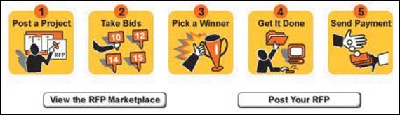
I noticed them, but I really didn’t try to figure them out. I guess I thought they were telling me what the steps in the process would be.
Any reason why you didn’t pay much attention to them?
No. I guess I just wasn’t ready to start the process yet. I didn’t know if I wanted to use it yet. I just wanted to look around first.
OK. Great.
In this case, I ask this question because the site’s designers think most users are going to start by clicking on the pictures of the five steps and that everyone will at least look at them.
That’s really all there is to it.
If you’d like to see a more complete test, you’ll find a twenty-minute video on my site. Just go to rocketsurgerymadeeasy.com and click on “Demo test video.”
Typical problems
Here are some of the types of problems you’re going to see most often:
![]() Users are unclear on the concept. They just don’t get it. They look at the site or a page and either they don’t know what to make of it or they think they do but they’re wrong.
Users are unclear on the concept. They just don’t get it. They look at the site or a page and either they don’t know what to make of it or they think they do but they’re wrong.
![]() The words they’re looking for aren’t there. This usually means that either you failed to anticipate what they’d be looking for or the words you’re using to describe things aren’t the words they’d use.
The words they’re looking for aren’t there. This usually means that either you failed to anticipate what they’d be looking for or the words you’re using to describe things aren’t the words they’d use.
![]() There’s too much going on. Sometimes what they’re looking for is right there on the page, but they’re just not seeing it. In this case, you need to either reduce the overall noise on the page or turn up the volume on the things they need to see so they “pop” out of the visual hierarchy more.
There’s too much going on. Sometimes what they’re looking for is right there on the page, but they’re just not seeing it. In this case, you need to either reduce the overall noise on the page or turn up the volume on the things they need to see so they “pop” out of the visual hierarchy more.
The debriefing: Deciding what to fix
After each round of tests, you should make time as soon as possible for the team to share their observations and decide which problems to fix and what you’re going to do to fix them.
I recommend that you debrief over lunch right after you do the tests, while everything is still fresh in the observers’ minds. (Order the really good pizza from the expensive pizza place to encourage attendance.)
Whenever you test, you’re almost always going to find some serious usability problems. Unfortunately, they aren’t always the ones that get fixed. Often, for instance, people will say, “Yes, that’s a real problem. But that functionality is all going to change soon, and we can live with it until then.” Or faced with a choice between trying to fix one serious problem or a lot of simple problems, they opt for the low-hanging fruit.
This is one reason why you can so often run into serious usability problems even on large, well-funded Web sites, and it’s why one of my maxims in Rocket Surgery is
FOCUS RUTHLESSLY ON FIXING THE MOST SERIOUS PROBLEMS FIRST
Here’s the method I like to use to make sure this happens, but you can do it any way that works for your team:
![]() Make a collective list. Go around the room giving everyone a chance to say what they thought were the three most serious problems they observed (of the nine they wrote down; three for each session). Write them down on a whiteboard or sheets of easel pad paper. Typically, a lot of people will say “Me, too” to some of them, which you can keep track of by adding checkmarks.
Make a collective list. Go around the room giving everyone a chance to say what they thought were the three most serious problems they observed (of the nine they wrote down; three for each session). Write them down on a whiteboard or sheets of easel pad paper. Typically, a lot of people will say “Me, too” to some of them, which you can keep track of by adding checkmarks.
There’s no discussion at this point; you’re just listing the problems. And they have to be observed problems; things that actually happened during one of the test sessions.
![]() Choose the ten most serious problems. You can do informal voting, but you can usually start with the ones that got the most checkmarks.
Choose the ten most serious problems. You can do informal voting, but you can usually start with the ones that got the most checkmarks.
![]() Rate them. Number them from 1 to 10, 1 being the worst. Then copy them to a new list with the worst at the top, leaving some room between them.
Rate them. Number them from 1 to 10, 1 being the worst. Then copy them to a new list with the worst at the top, leaving some room between them.
![]() Create an ordered list. Starting at the top, write down a rough idea of how you’re going to fix each one in the next month, who’s going to do it, and any resources it will require.
Create an ordered list. Starting at the top, write down a rough idea of how you’re going to fix each one in the next month, who’s going to do it, and any resources it will require.
You don’t have to fix each problem perfectly or completely. You just have to do something—often just a tweak—that will take it out of the category of “serious problem.”
When you feel like you’ve allocated all of the time and resources you have available in the next month for fixing usability problems, STOP. You’ve got what you came for. The group has now decided what needs to be fixed and made a commitment to fixing it.
Here are some tips about deciding what to fix—and what not to.
![]() Keep a separate list of low-hanging fruit. You can also keep a list of things that aren’t serious problems but are very easy to fix. And by very easy, I mean things that one person can fix in less than an hour, without getting permission from anyone who isn’t at the debriefing.
Keep a separate list of low-hanging fruit. You can also keep a list of things that aren’t serious problems but are very easy to fix. And by very easy, I mean things that one person can fix in less than an hour, without getting permission from anyone who isn’t at the debriefing.
![]() Resist the impulse to add things. When it’s obvious in testing that users aren’t getting something, the team’s first reaction is usually to add something, like an explanation or some instructions. But very often the right solution is to take something (or some things) away that are obscuring the meaning, rather than adding yet another distraction.
Resist the impulse to add things. When it’s obvious in testing that users aren’t getting something, the team’s first reaction is usually to add something, like an explanation or some instructions. But very often the right solution is to take something (or some things) away that are obscuring the meaning, rather than adding yet another distraction.
![]() Take “new feature” requests with a grain of salt. Participants will often say, “I’d like it better if it could do x.” It pays to be suspicious of these requests for new features. I find that if you ask them to describe how that feature would work—during the probing time at the end of the test—it almost always turns out that by the time they finish describing it they say something like “But now that I think of it, I probably wouldn’t use that.” Participants aren’t designers. They may occasionally come up with a great idea, but when they do you’ll know it immediately, because your first thought will be “Why didn’t we think of that?!”
Take “new feature” requests with a grain of salt. Participants will often say, “I’d like it better if it could do x.” It pays to be suspicious of these requests for new features. I find that if you ask them to describe how that feature would work—during the probing time at the end of the test—it almost always turns out that by the time they finish describing it they say something like “But now that I think of it, I probably wouldn’t use that.” Participants aren’t designers. They may occasionally come up with a great idea, but when they do you’ll know it immediately, because your first thought will be “Why didn’t we think of that?!”
![]() Ignore “kayak” problems. In any test, you’re likely to see several cases where users will go astray momentarily but manage to get back on track almost immediately without any help. It’s kind of like rolling over in a kayak; as long as the kayak rights itself quickly enough, it’s all part of the so-called fun. In basketball terms, no harm, no foul.
Ignore “kayak” problems. In any test, you’re likely to see several cases where users will go astray momentarily but manage to get back on track almost immediately without any help. It’s kind of like rolling over in a kayak; as long as the kayak rights itself quickly enough, it’s all part of the so-called fun. In basketball terms, no harm, no foul.
As long as (a) everyone who has the problem notices that they’re no longer headed in the right direction quickly, and (b) they manage to recover without help, and (c) it doesn’t seem to faze them, you can ignore the problem. In general, if the user’s second guess about where to find things is always right, that’s good enough.
Alternative lifestyles
Here are two other ways to do testing that have distinct advantages:
![]() Remote testing. The difference here is that instead of coming to your office, participants do the test from the comfort of their own home or office, using screen sharing. Eliminating the need to travel can make it much easier to recruit busy people and, even more significantly, it expands your recruiting pool from “people who live near your office” to “almost anyone.” All they need is high-speed Internet access and a microphone.
Remote testing. The difference here is that instead of coming to your office, participants do the test from the comfort of their own home or office, using screen sharing. Eliminating the need to travel can make it much easier to recruit busy people and, even more significantly, it expands your recruiting pool from “people who live near your office” to “almost anyone.” All they need is high-speed Internet access and a microphone.
![]() Unmoderated remote testing. Services like UserTesting.com provide people who will record themselves doing a usability test. You simply send in your tasks and a link to your site, prototype, or mobile app. Within an hour (on average), you can watch a video of someone doing your tasks while thinking aloud.5 You don’t get to interact with the participant in real time, but it’s relatively inexpensive and requires almost no effort (especially recruiting) on your part. All you have to do is watch the video.
Unmoderated remote testing. Services like UserTesting.com provide people who will record themselves doing a usability test. You simply send in your tasks and a link to your site, prototype, or mobile app. Within an hour (on average), you can watch a video of someone doing your tasks while thinking aloud.5 You don’t get to interact with the participant in real time, but it’s relatively inexpensive and requires almost no effort (especially recruiting) on your part. All you have to do is watch the video.
5 Full disclosure: I receive some compensation from UserTesting.com for letting them use my name. But I only do that because I’ve always thought they have a great product—which is why I’m mentioning them here.
Try it, you’ll like it
Whatever method you use, try doing it. I can almost guarantee that if you do, you’ll want to keep doing it.
Here are some suggestions for fending off any objections you might encounter:
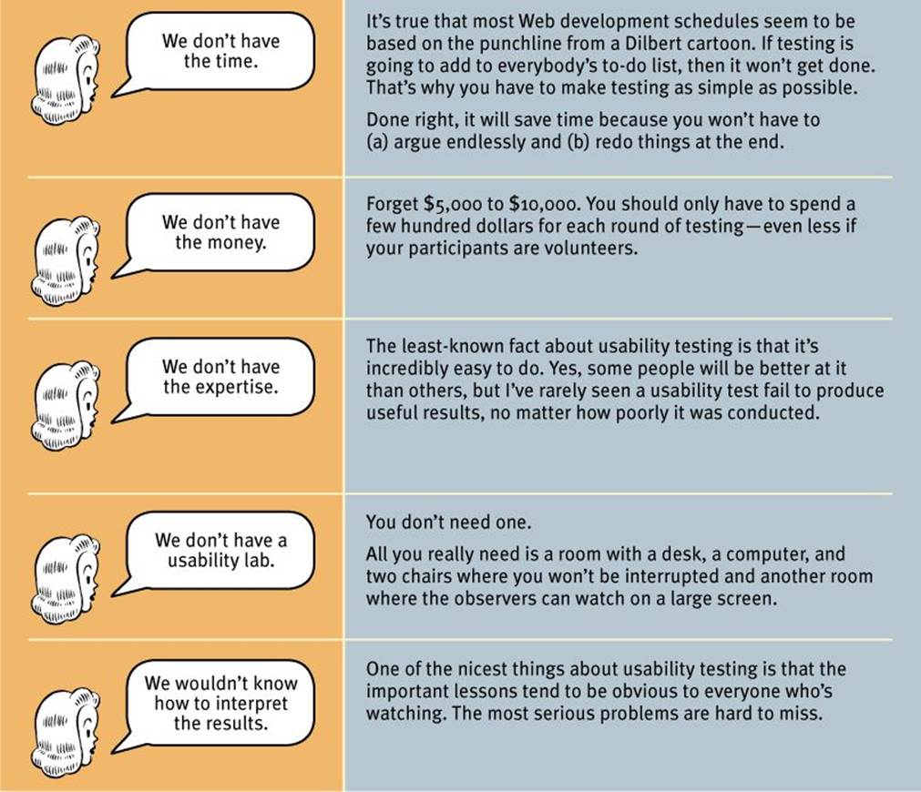
The Top Five Plausible Reasons for not Testing Web Sites
All materials on the site are licensed Creative Commons Attribution-Sharealike 3.0 Unported CC BY-SA 3.0 & GNU Free Documentation License (GFDL)
If you are the copyright holder of any material contained on our site and intend to remove it, please contact our site administrator for approval.
© 2016-2026 All site design rights belong to S.Y.A.