Designing for Performance: Weighing Aesthetics and Speed (2014)
Chapter 3. Optimizing Images
Images make up the majority of most sites’ total page weight. The number of image bytes has grown by more than 30% on the average web page in the last year (http://bit.ly/1ttROtq), with very little growth in requests. Thanks to their relatively large file size and the number of images included on the average site (see Figure 3-1), optimizing images is arguably the easiest big win when it comes to improving your site’s page load time.
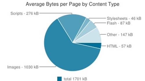
Figure 3-1. The HTTPArchive.org (http://httparchive.org/interesting.php) survey of page weight shows that images make up the majority of most sites’ total page weight.
You can make substantial improvements to both your main content images as well as the images that make up your site design by:
§ Finding the right balance of file size and quality for each image
§ Looking for ways to reduce the total number of image requests on your site
§ Optimizing your site’s image creation workflows for performance improvements
Let’s start by looking at the various image file types available, and then we’ll examine the options you have for optimizing your site’s images for page speed.
Choosing an Image Format
You have a range of file types to choose from when creating images for your site. When generating an image, ask yourself:
§ How compressed can this image be without a noticeable quality reduction?
§ How many colors are needed?
§ Can I simplify this image in any way?
§ Do I need any transparency?
§ Do I need any animation?
§ At what maximum height and width will this image be displayed?
§ How will this image be repurposed across the site?
The most common image file formats on the Web are JPEG, GIF, and PNG. Table 3-1 outlines each popular image file format, how it’s best used, and some optimization tips for it.
Table 3-1. Image format overview
|
Format |
Best for |
Optimization Options |
|
JPEG |
Photos, images with many colors |
Decrease quality, export as progressive, reduce noise |
|
GIF |
Animations |
Decrease dithering, decrease number of colors, increase horizontal patterns, reduce vertical noise |
|
PNG-8 |
Images with few colors |
Decrease dithering, decrease number of colors, increase horizontal and vertical patterns |
|
PNG-24 |
Partial transparency |
Reduce noise, reduce number of colors |
Let’s walk through the pros and cons of each of these file formats as well as how to export and optimize each kind of image.
JPEG
JPEGs are the ideal file format for photographs or other images with a large spectrum of colors. JPEGs are designed to compress files in ways that our eyes won’t notice at a high enough quality. At low quality, we’ll notice artifacting, banding, and graininess in JPEG images, as JPEG is alossy file format. Lossy file types discard pieces of information as they are saved; JPEGs choose which pieces of information to discard by using an algorithm based loosely on how humans see and perceive information.
WHAT IS “ARTIFACTING”?
An artifact is a loss of clarity within an area of an image. Artifacting may cause an image to look fuzzy, pixelated, or blurry.
JPEGs are very smart at discarding information over smooth gradients and areas of low contrast. Images with sharp contrasts between adjacent pixels are usually better suited for a different file format (such as PNG), since in a JPEG format you will likely see artifacting. But because JPEGs are excellent at creating relatively smaller files with a lot of information in them, it’s no surprise that the majority of the images on the Web are JPEGs. The smart compression in JPEGs will generally result in a smaller file size for complex images, which is one of our goals as we work to improve how long it takes to load a web page.
With any image file you generate, test out a few different qualities and file types in the Save for Web workflow within Photoshop. You’re aiming for a happy medium of acceptable quality and small file size. It’s important to play with the file size and see what level of compression is noticeable. Look for artifacts, messy contrast between elements, and blurry details and text.
In Figure 3-2, we can see a zoomed-in portion of a photograph that has been exported at various qualities using Photoshop’s Save for Web tool. As you compare the images exported at quality 25, 50, 75, and 100, notice that the lower qualities have more artifacting around the edges of high contrast.
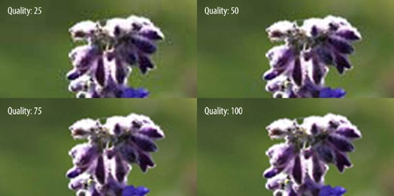
Figure 3-2. In this comparison of Photoshop’s Save for Web export quality, the lower-quality JPEG images have more artifacting around edges of high contrast, such as the green background surrounding the top white leaves.
WHY USE “SAVE FOR WEB”?
In Photoshop, you have two main ways to generate an image: the Save for Web tool, and Save As. Unlike Save As, Save for Web will provide additional optimizations for generated image files, and will also allow you to tweak the quality of the image and preview the result before saving. Save for Web will help you find a balance between aesthetics and file size for your images.
The more distinct colors in an image, the larger a JPEG’s file size will be, as it is harder for the JPEG’s algorithm to find easy areas in which to compress and blend colors. Noise and grain in a JPEG can greatly increase its file size, as you can see in Figure 3-3. When creating new images (particularly if you are creating repeating patterns), be judicious with the number of colors you are introducing.
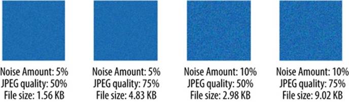
Figure 3-3. Comparison of JPEG image noise, quality, and resulting file size.
In Figure 3-3, you can see a comparison of JPEGs that have been exported via Photoshop’s Save for Web tool and then passed through ImageOptim, an additional image compression tool. Read more about compression tools in “Additional Compression.” The original JPEG was a blue square with a Noise filter added within Photoshop. The left two images have an added noise amount of 5%, and the right two images have added noise at 10%.
Comparing the images, you can see that the exported JPEGs with less noise are also smaller in file size; the images with 10% noise are nearly double the file size of the images with 5% noise. Again, JPEG quality also has an effect on total file size. As you optimize for page load time, keep both noise and JPEG quality in mind, and see where you can find savings in your images.
Your choice of JPEG type can also affect the perceived performance of how fast your site loads (read more in “Perceived Performance”). Baseline JPEGs (those typically found on the Web) are a full-resolution, top-to-bottom scan of an image. Progressive JPEGs are made up of a series of scans of increasing quality.
Because baseline JPEGs are a top-to-bottom scan, they appear this way in the browser, with pieces of them being slowly revealed in rows. Progressive JPEGs, on the other hand, appear all at once at low quality; then this low-quality version of the image is replaced with versions of progressively higher quality. Progressive JPEGs appear to load faster than baseline JPEGs because they fill in the space necessary all at once with a low-quality version instead of loading the image in chunks.
Progressive JPEGs are displayed in all browsers. However, not all browsers render progressive JPEGs as quickly as we’d hope. In browsers that don’t support progressive rendering, progressive JPEGs will display more slowly, as they appear after the file has completed downloading rather than progressively. In these cases, they will visually appear more slowly than baseline JPEGs, which arrive in stages. You can read more about progressive JPEG browser support in the PerfPlanet article “Progressive JPEGs: a new best practice” (http://bit.ly/1ttThzL).
One additional consideration when you are choosing a JPEG type is CPU usage. Each progressive scan requires about the same CPU power as one entire baseline JPEG would need to render on a page. On mobile devices, this can be a concern. Currently Mobile Safari does not renderprogressive JPEGs in a progressive manner, which is understandable considering the tax on the CPU. However, other mobile browsers, such as Chrome on Android, do render them progressively. Overall, progressive JPEGs are still an excellent improvement for the overall user experience, and the small CPU downside will likely be improved by browser vendors in the future.
If you’re interested in testing existing images by converting baseline JPEGs to progressive JPEGs, there are tools like SmushIt (http://www.smushit.com/) that can help. To create a progressive JPEG from scratch using the Save for Web dialog in Photoshop, simply check the Progressive checkbox in the top-right area of the Save for Web window, near the Quality picker (see Figure 3-4).
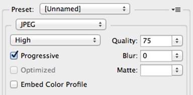
Figure 3-4. Create a progressive JPEG by checking the Progressive checkbox in Photoshop’s Save for Web window.
Lastly, be sure to run any exported JPEG through a compression tool after your initial export from Photoshop. You can gain additional file size savings at little or no quality loss. See “Additional Compression” for suggested compression tools and workflows.
GIF
GIFs are one of the oldest graphic file formats on the Web. The GIF file type was originally created in 1987 to store multiple bitmap images into a single file. It’s since seen a resurgence in popularity, thanks to its ability to include animation. GIFs support transparency as well as animation, but include only up to 256 colors within a frame. If a GIF includes an animation, each frame can support a separate palette of up to 256 colors. Unlike JPEGs, GIFs are a lossless file format.
There are two rare circumstances when you may want to choose a GIF for your image file format:
§ When the file size of the generated GIF is smaller than the file size of the same image generated as a PNG-8
§ When an animation cannot be replaced with CSS3
When you create a GIF, you have a few options to play with as you try to find the balance between aesthetics and file size. First, you can choose a dither amount as well as the number of colors included in the palette within the Save for Web tool, as you can see in Figure 3-5.
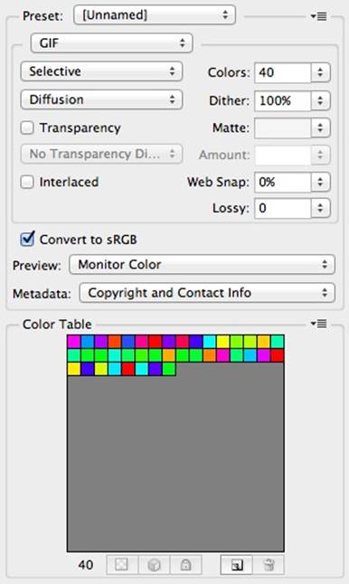
Figure 3-5. Creating a GIF in Photoshop.
Dithering helps create visually smoother transitions between colors. It examines adjacent pixels of different colors and chooses a new color somewhere in between to give the appearance of a smoother blend. For example, in this image with a maximum of 40 colors, you can see the smoothness with dithering set to 0 (Figure 3-6) versus the appearance with the dithering set to 100 (Figure 3-7).
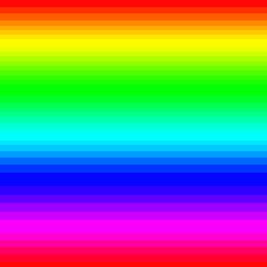
Figure 3-6. GIF with dithering set to 0: 4.8 KB.
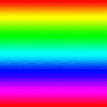
Figure 3-7. GIF with dithering set to 100: 9.7 KB.
The file size of the GIF is affected by the amount of dithering. In Figure 3-6 and Figure 3-7, when dithering is set to 0, the exported GIF is 4.8 KB. When dithering is set to 100, the exported GIF is 9.7 KB. Note that though both had a maximum of 40 colors included in the Save for Web palette, you may have up to 256 colors within your palette.
Interestingly, if we change the direction of this colorful gradient in the GIF and export it with dithering set to 100, we see a large change in file size in Figure 3-8.
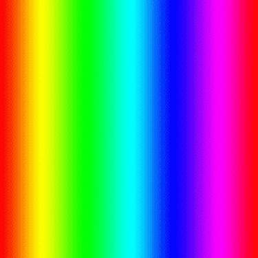
Figure 3-8. GIF with vertical patterns: 21 KB.
Why does the file size more than double in this case? GIFs follow a compression algorithm that removes horizontal redundancy. So by introducing extra vertical details or noise, we’ve increased the file size of the GIF. When you create a GIF, consider how successful it may be at optimizing your image and creating the smallest file size possible while still being aesthetically pleasing. Reduce vertical noise, as it will have a substantial impact on your GIF’s file size.
For most images that contain few colors and sharp edges, PNG-8 will be your file format of choice. PNGs use a different kind of compression method than GIFs; they look for repeated horizontal patterns in the image like GIFs do, but in addition, they also look for vertical patterns. It’s highly likely that a PNG-8 version of your image will be smaller in file size than a GIF, so be sure to test PNG-8 as you find a balance between file size and aesthetics.
Lastly, if you have a simple animation in a GIF, such as a spinner or loading indicator, consider replacing it with a CSS3 animation. CSS3 animations tend to be lighter weight and better for performance than GIFs, so it’s worth testing to see if you can replace GIFs on your site.
PNG
PNG is a lossless image format designed to improve upon the GIF file format. Photoshop allows you to export PNG-8 and PNG-24 images; each format has pros and cons you need to consider when optimizing for performance.
When you need transparency in your image, PNG will be your best choice. GIFs also support transparency, but they tend to be much heavier than PNGs. PNGs recognize horizontal patterns and compress them like GIFs do, but they also can find vertical patterns, which means you can benefit from additional compression in PNGs.
When you have a small number of colors in your image, PNG-8 is likely going to be your best choice for file format. PNG-8 files contain a maximum of 256 colors within the image, and generally result in a smaller file size.
In Figure 3-9, you can see that the image contains 247 total colors. In this particular example, all 247 colors in our palette are various shades of gray. PNG-8 images can contain a maximum of 256 colors, like GIFs. Just as with a GIF, we can also select our dither amount (read more in “GIF”), which will affect the total file size.
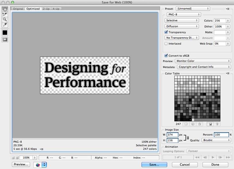
Figure 3-9. PNG-8 Export view in Photoshop.
We are also working with transparency in Figure 3-9. The text has a drop shadow, and the PNG-8 Export view has a white matte selected. The matte tells Photoshop what the background color of the image should be; this color should match the background of the element where you’ll be placing the exported PNG. Photoshop is choosing which pixels need to be transparent and how the original translucent drop shadow blends with our chosen matte in order to color the other pixels surrounding the text.
In Figure 3-10, we set the PNG to contain a maximum of 256 colors, but again we don’t need all 256. In this case, the PNG will export with just 4: white, blue, green, and red. Even though we’ve selected Transparency, the image actually doesn’t need it, as it has a white background exported as part of the image. Photoshop works to help you create an optimized file size of your image, but you’ll still need to run it through additional compression tools (read more in “Additional Compression”).
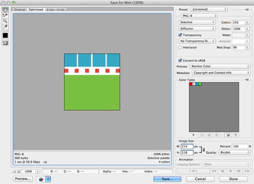
Figure 3-10. PNG-8 Export view with few colors.
PNG-24 files, on the other hand, do not have the same restriction in color palette. While you can use PNGs for photos, they will often be 5 to 10 times larger in file size than JPEGs because they are lossless. Just as with any other kind of image file, reducing noise and the number of colors will be beneficial to the overall file size of your PNGs. Let’s compare the two images in Figure 3-11: one with 5 different colored stripes, and one with 10.
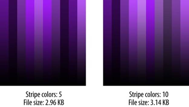
Figure 3-11. Comparing the file size difference between PNGs with 5 or 10 colors.
These images were exported as PNG-24 images via the Save for Web tool in Photoshop. By increasing the number of colors in the image, we increased the file size by 6%. If you can find ways to decrease the number of colors in your image, perhaps by normalizing the colors used in your site (as we’ll cover in “Creating Repurposable Markup”), you can save file size, which will have a positive effect on performance.
In Figure 3-12, we’re exporting the same file as in the initial PNG-8 example with transparency (Figure 3-9), but you’ll notice that the transparency in the PNG-24 file is handled very differently.
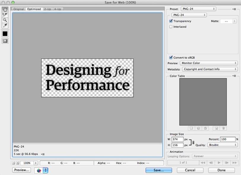
Figure 3-12. Transparent PNG-24 Export view.
In the PNG-8 file, Photoshop was working with a matte color to blend the drop shadow; there was no partial transparency, only fully transparent pixels beyond the drop shadow. In the PNG-24 file, we see partial transparency. This naturally results in a larger file size; the file size will also increase substantially in more complex images. If you don’t need the transparency but have lots of colors in your image, choose JPEG instead.
There are some other tools that can give you partial transparency in PNG-8s, such as Fireworks (an image editing tool like Photoshop) and pngquant (a lossy compression tool for PNG images). However, if you need partial transparency when exporting an image from Photoshop, you’ll want to use PNG-24. As always, run every image exported from Photoshop through an additional compression tool (read more in “Additional Compression”).
It’s important to note that older browsers, such as Internet Explorer 6, have limited support for PNGs. If you have enough traffic from older browsers that you need to optimize for them, be sure to test any exported PNGs to make sure they render as expected.
WHAT ABOUT NEWER IMAGE FORMATS?
Newer image formats like WebP (https://developers.google.com/speed/webp/), JPEG XR (http://en.wikipedia.org/wiki/JPEG_XR), and JPEG 2000 (http://en.wikipedia.org/wiki/JPEG_2000) are further optimized for performance. As they gain traction with browsers and image creation software, we may have more opportunities to use these newer formats and further optimize our sites’ images for page speed and perceived performance.
Additional Compression
Before you export an image, make sure that you are exporting it only at the maximum pixel width and height that you need for the image. Serving an image that is larger than necessary and scaling it down within an image tag will negatively impact your page load time, as you are forcing the user to download more bytes than needed. Read more about how to handle serving the correct image size in “Deliberately Loading Content.”
After you’ve exported the image, run it through a tool like ImageOptim (http://www.imageoptim.com/) or Smush.it (http://www.smushit.com/), which find the best compression technique for a variety of file types.
ImageOptim is software available for download for Macs. Drag and drop an image into ImageOptim, and watch it find the best lossless compression for your image and remove unnecessary color profiles and comments (see Figure 3-13). This software currently includes a number of existing compression tools, such as PNGOUT, Zopfli, Pngcrush, AdvPNG, extended OptiPNG, JpegOptim, jpegrescan, jpegtran, and Gifsicle. ImageOptim’s optimization works on JPEGs, PNGs, and even animated GIFs by choosing the best compression methods for your image. Because ImageOptim uses lossless compression methods, the end result is a smaller file size without sacrificing quality, which is exactly what we aim for when optimizing for web performance.
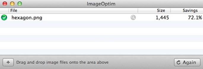
Figure 3-13. ImageOptim is software that uses lossless compression methods to find savings in your image files.
Smush.it is also a lossless compression tool. It lives on the Web rather than on your desktop. Just like ImageOptim, it can process JPEGs, PNGs, and GIFs. The compression tools included in Smush.it are ImageMagick, pngcrush, jpegtran, and Gifsicle. Once you upload your image or choose its URL, Smush.it will choose the best compression method for it and then display a table with links to downloadable, compressed versions of your images (see Figure 3-14).
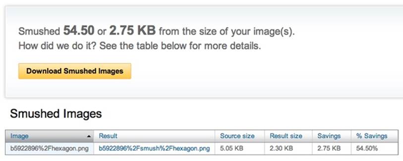
Figure 3-14. Smush.it is an online tool that uses lossless compression methods to find savings in your image files.
These tools can save you a ton of additional file size by finding ways to reduce the image size without reducing the quality of the image. In terms of weighing aesthetics and performance, running every image through one of these tools before uploading to the Web is a huge win.
If possible, automate the image optimization of any images uploaded to your website. You may have multiple content authors whose workflow shouldn’t be interrupted by the need to optimize individual images. Integrate tools like ImageOptim-CLI (https://github.com/JamieMason/ImageOptim-CLI) or WordPress plug-ins like EWWW Image Optimizer (http://bit.ly/1ttTF1t) into your site’s build process to ensure that any new images created and uploaded will still get the additional compression they need.
Replacing Image Requests
In addition to decreasing your images’ file sizes, it’s also important to decrease the number of image requests on the page to improve page load time (read more about the basics of page load time in Chapter 2). Being deliberate about how you are requesting and loading images on your site will help you optimize both the total page load time and how quickly your users can begin to see and interact with your site. There are two main ways to eliminate image requests:
§ Combine images into sprites
§ Replace image files with CSS3, data URIs, or SVG versions
Sprites
A common saying in the world of web performance is “the fastest request is a request not made.” One way to reduce the number of image requests on your page is to combine images into sprites. Your page weight will increase slightly because you’ll have one large image file and additional CSS to position and show the graphics within the image, but it’s likely that combining images into a sprite will be a win for your site’s page speed.
The best candidates for sprited images are small, repeated images incorporated into your site design. This may include icons, the site logo, and other CSS background images that are used around your site. Figure 3-15 is an example of a sprite.

Figure 3-15. This example sprite.png file contains a logo and heart, star, and other icons that we can use throughout a site’s design.
You can see that this sprite includes a main logo as well as various versions of stars and other icons. Let’s implement parts of this sprite using CSS and HTML. Figure 3-16 shows what we want the output to look like.

Figure 3-16. This screenshot shows how we want our sprite to be used on the page.
Without a sprite, we have individual images applied to each element. Here is our starter markup:
<h1>Designing for Performance</h1>
<p class="fave">We have a favorite!</p>
<p class="fave winner">We have a winner!!</p>
In this HTML, we are going to apply the logo to the h1 element, one of the stars to the first paragraph with the class fave, and a different class to the paragraph with the additional class of winner. Here is our starter CSS with each individual image applied:
h1, .fave:before {
background: transparent no-repeat; ➊
}
h1 {
background-image: url(h1.png);
text-indent: -9999px; ➋
height: 75px;
width: 210px;
}
.fave {
line-height: 30px;
font-size: 18px;
}
.fave:before { ➌
background-image: url(star.png);
display: block;
width: 18px;
height: 17px;
content: '';
float: left;
margin: 5px 3px 0 0;
}
.winner:before {
background-image: url(star-red.png);
}
1. We are applying a transparent background-color to these elements, and we’re telling it to not repeat the background-image across the entire width and height of the elements.
2. We use text-indent to move the text within the h1 off the visible area of the page and to allow the background-image to show through. There are a number of ways to move text off the visible section of the page but still make it available to screen readers; you can also try the following method for hiding visible text:
3. element {
4. text-indent: 100%;
5. white-space: nowrap;
6. overflow: hidden;
}
This text-indent: 100% method may also significantly increase performance on the iPad 1 in cases where you are applying many animations to this element.
7. To get the star to show up to the left of the paragraph text, I’m applying the image to the :before pseudoelement for the paragraph. The :before selector creates a new, inline element so you can insert content before the content of the selected element. :after is also a psuedoelement you can use. These pseudoelements are supported in modern browsers, with partial support in Internet Explorer 8 and no support in earlier versions of Internet Explorer.
Let’s change this over to use a sprite instead of individual images. We’ll use the preceding example sprite (Figure 3-15) and apply it to the h1 and .fave:before elements:
h1, .fave:before {
background: url(sprite.png) transparent no-repeat;
}
Figure 3-17 shows what our new paragraph styling looks like with the sprite applied to the :before element.

Figure 3-17. This screenshot shows our paragraphs with the sprite applied to the before element, but without proper placement.
Now we need to determine the new background-position of our sprite so that the stars appear. The h1 received the default background-position of 0 0, or the top left of the sprite. background-position can accept different kinds of value pairs that correspond to the x-axis and y-axis, respectively:
§ 50% 25%
§ 50px 200px
§ left top
In our case, we know where in the sprite our star images are, so we can use pixels to move the background-image over until each star shows. For the first star, we need to move the sprite 216px to the left and 15px up to show the sprite in our :before pseudoelement. We’ll apply the following CSS to .fave:before in addition to its existing styles:
.fave:before {
...
background-position: -216px -15px;
}
Our second star will automatically receive all of the styles we applied to the first, as both paragraphs share the class fave. We just need to choose a new background-position to show the red star icon:
.winner:before {
background-position: -234px -15px;
}
Here’s our final CSS with the sprite applied instead of individual images:
h1, .fave:before {
background: url(sprite.png) transparent no-repeat;
}
h1 {
text-indent: -9999px;
height: 75px;
width: 210px;
}
.fave {
line-height: 30px;
font-size: 18px;
}
.fave:before {
display: block;
width: 18px;
height: 17px;
content: '';
float: left;
margin: 5px 3px 0 0;
background-position: -216px -15px;
}
.winner:before {
background-position: -234px -15px;
}
Sprites can save a ton of page load time thanks to the decreased number of image requests. You’ll notice that total page weight may increase with sprites due to the larger sprite image file size as well as additional CSS to use the sprite. However, using the sprite has a much better chance of a faster page load time than using individual images, as the browser has to fetch only one image rather than make lots of additional HTTP requests.
I created two pages on my site to test this example: one before we combined these images into a sprite, and one after. I ran them through WebPagetest to get a feel for the performance that a user may experience in each version (see Figure 3-18). Note that for any example like this, total load time and overall speed will vary between each test, but this gives us a rough estimate of the potential performance impact of sprites.
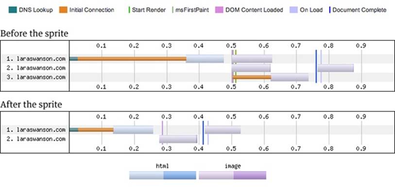
Figure 3-18. Connection view for our page before and after the sprite.
Figure 3-18 shows the connection view for our page before and after the sprite. Before the sprite, Chrome made three connections to retrieve the contents of the page. In the first connection, after the DNS lookup and initial connection, the browser grabbed the HTML for the page and then retrieved the first image. In the third connection, there is an initial connection time and then more image downloading. The last image to be downloaded (notice it begins in the second connection around document complete) is a favicon for the site.
After the sprite, Chrome made two connections to retrieve the contents of the page. In this connection, after the DNS lookup and initial connection, the browser retrieved the HTML and then the single sprite. Again, after document complete, the browser gets the favicon for the site. As you can see, document complete happens faster with the sprite than without it. Another way to visualize how much faster the sprited version feels is to look at the Speed Index metric (Figure 3-19).
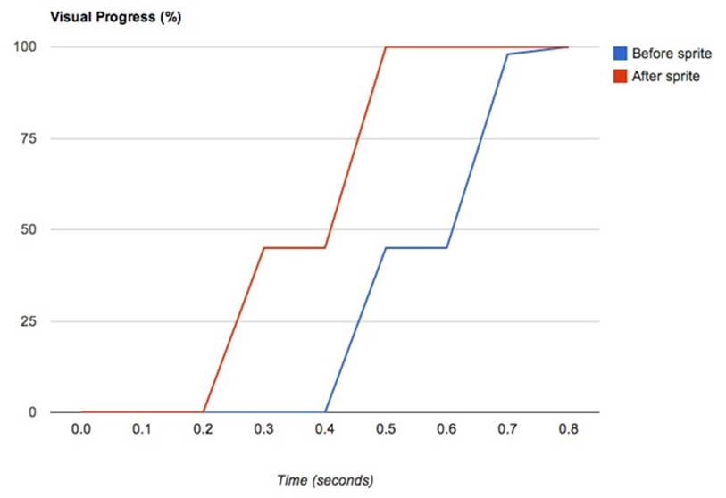
Figure 3-19. WebPagetest’s Speed Index metric helps illustrate when a page becomes visually complete. WebPagetest calculates Speed Index by figuring out how “complete” the page is at various points in time during the page load, shown over time in this visual progress graph.
As mentioned in “Critical Rendering Path,” Speed Index is the average time at which visible parts of the page are displayed. It’s an excellent metric to watch as you try to measure the perceived performance of your page, as it will tell you how quickly the “above the fold” content is populated for your users. In this example, our graph of visual progress (from which Speed Index is calculated) shows how much faster the page appears visually complete over time with the sprite.
WHAT ABOUT HTTP/2?
HTTP/2 is a major revision of the Web’s protocol that is currently being defined. Its focus is to help improve performance, and one of the major chief goals of HTTP/2 is to allow the use of a single connection from a browser to a server, helping to optimize how browsers request assets. With HTTP/2, web servers hosting your site’s files could hint or even push content back to your user’s browser instead of waiting for it to request individual page assets. This means that the need for spriting could be eliminated in the future!
There are some potential performance downsides to using sprites, however. If you need to change one image within the sprite, you’ll have to break the cache of the entire file. Also, by using the sprite you are forcing your users to download potentially unnecessary bytes; if the other icons in the sprite are never seen during a user’s visit to your site, the user will have downloaded and decoded the larger file size for no reason. Consider these drawbacks when creating your sprite and measuring its performance impact.
In one experiment my team ran, we had a small section of a page that featured 26 thumbnail images rotating in and out of 10 slots. We combined all 26 images into a sprite, which:
§ Increased the total page size by 60 KB due to the added CSS, JavaScript, and new image file needed to re-create this effect
§ Decreased the number of requests by 21%
§ Decreased the total page load time by 35%
These results demonstrate that it’s worth experimenting with page load time optimizations. We weren’t originally sure whether this technique would be an overall page speed win, but we knew it was worth an experiment so we could learn from it. Read more about measuring and iterating on performance wins in Chapter 6.
CSS3
Another way to decrease image requests is to replace them with CSS. You can create shapes, gradients, and animations using CSS. For example, CSS3 gradients:
§ Can handle transparency
§ Can be overlaid on a background color
§ Eliminate an image request
§ Are super easy to change
CSS can be a great, performant replacement for images. Don’t worry about the extra page weight from the vendor prefixes in CSS3 syntax; if you aren’t already, you should be using gzip on your site (read more about how to implement and optimize for gzip in “Minification and gzip”), which will take care of optimizing this code. Even though you will be loading more CSS, it’ll likely be a better-performing option than an image request.
One great place where CSS can replace images is a basic repeating gradient. Why use an image when you could use a simple, repurposable CSS3 gradient that eliminates an image request?
For example, you can create a single gradient that fades from white to transparent, and use this gradient on any element that you’d like to show with a bevel. Let’s try this on three buttons:
<a href="#">Click Me</a>
<a href="#" class="buy">Buy This</a>
<a href="#" class="info">More Info</a>
In our CSS, we will have already applied font and spacing styles to these buttons. To add the basic bevel gradient:
a {
background-image:
linear-gradient(to bottom, #FFF, transparent);
background-color: #DDD;
border: 1px #DDD solid;
}
NOTE
In this example, I’m including only the W3C gradient syntax. You’ll need to add syntaxes for other browsers, such as Firefox and Internet Explorer.
Based on this CSS, all of our links will have a gray background color, and overlaid on this background color will be our CSS3 gradient, applied as a background image. Each link also has a solid gray 1px border. To make the Buy This button green, and the More Info button blue, we simply change the background color and border color of each:
.buy {
background-color: #C2E1A9;
border-color: #D8E5CE;
}
.info {
background-color: #AFCCD3;
border-color: #DAE9EC;
}
The resulting buttons (Figure 3-20) will each have their own background color with a white-to-transparent gradient overlaid on top.

Figure 3-20. Buttons with CSS3 gradient backgrounds.
Using a gradient like this eliminates the need for an image request, which is excellent news for your page load time. You can do some pretty amazing things with CSS3 gradients because of the control they offer over where colors begin and end. Here is an example hexagon built for WebKit browsers using CSS3 gradients. We need only one element, so in this case I chose to use a div:
<div class="hexagon"></div>
Here is the corresponding CSS to turn this div into a colorful hexagon in WebKit browsers:
.hexagon {
width: 333px; height: 388px;
background-image:
-webkit-linear-gradient(120deg, #fff 83px, transparent 0,
transparent 419px, #fff 0),
-webkit-linear-gradient(-120deg, #fff 83px, transparent 0,
transparent 419px, #fff 0),
-webkit-linear-gradient(160deg, transparent 345px,
#1e934f 0),
-webkit-linear-gradient(140deg, transparent 376px,
#1e934f 0),
-webkit-linear-gradient(120deg, transparent 254px,
#085b25 0),
-webkit-linear-gradient(150deg, #053b17 183px,
transparent 0),
-webkit-linear-gradient(80deg, transparent 96px,
#085b25 0);
background-color: #053b17;
}
Figure 3-21 shows how the hexagon renders in Chrome.
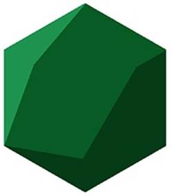
Figure 3-21. Hexagon made using only CSS3 gradients, inspired by Geometry Daily #286 (http://bit.ly/1ttUnvu).
To get started writing CSS3 gradients, check out tools like ColorZilla’s Gradient Editor (http://www.colorzilla.com/gradient-editor/). You can play with different colors, the direction of the gradients, and which browsers you’d like to support. Let’s try a cross-browser gradient that goes from top to bottom, starting at a light green and switching at the halfway point to a dark green. In this case, we’re intentionally creating a hard stop between the two greens, rather than a smooth transition between the two.
Let’s start with our fallback color, which would be applied to the background or background-color property of our element:
/* Old browsers should get a fallback color */
background: #7AC142;
I recommend setting a background-color for each element that has a gradient applied, so in the case where a CSS3 gradient isn’t supported, you still may have a readable contrast between the text and the background of the element. Be sure to test gradients across browsers to make sure they are working as expected, and that any text is still readable.
To support more browsers, you’d apply the following CSS to the background or background-image property of the element:
/* FF3.6+ */
-moz-linear-gradient(top, #e4f3d9 50%, #7ac142 0);
/* Chrome, Safari4+ */
-webkit-gradient(linear, left top, left bottom,
color-stop(0%,#e4f3d9), color-stop(50%,#e4f3d9),
color-stop(51%,#7ac142));
/* Chrome10+, Safari5.1+ */
-webkit-linear-gradient(top, #e4f3d9 50%, #7ac142 0);
/* Opera 11.10+ */
-o-linear-gradient(top, #e4f3d9 50%, #7ac142 0);
/* IE10+ */
-ms-linear-gradient(top, #e4f3d9 50%, #7ac142 0);
/* W3C */
linear-gradient(to bottom, #e4f3d9 50%, #7ac142 0);
In the preceding syntax, the light green will start at the top of the element and continue to stay light green until 50% down the height of the element. To create the hard stop between the two greens, we can set 0 as our second color stop for many of the browsers’ syntax. This indicates to the browser that the new color should start right away, after our 50% light green color stop. In the older Chrome and Safari syntax, however, we need to set multiple color stops and percentages to make sure it does what we want!
The resulting gradient will look like Figure 3-22.

Figure 3-22. CSS3 gradient with a hard stop.
BACKGROUND VERSUS BACKGROUND-IMAGE
What’s the difference between applying a gradient to a background instead of a background-image? Browsers are smart enough to know that when you declare a gradient for background, it should be applied as a background-image. The gradient will play nicely and not be overridden by any background-color declarations for the element. Your background-image will overlay the background-color declared. However, if you apply just a background declaration later in your CSS to an element with a background-image gradient, the new background declaration will override your gradient.
To support CSS3 gradients in older versions of Internet Explorer, you need to apply a filter property to the element. However, we can create only a smooth gradient using the filter property; we will be missing out on the hard color stop between our two greens:
/* IE6-9 */
filter: progid:DXImageTransform.Microsoft.gradient(
startColorstr='#e4f3d9',endColorstr='#7ac142',
GradientType=0 );
You should analyze the visitor traffic for your site to determine which browser versions you need to support with vendor prefixes.
The preceding CSS also includes the W3C standard for gradients: linear-gradient. Hopefully in the future, as more browser vendors come to agreement on CSS3 gradient syntax, we can clean up existing vendor prefixes from our CSS.
In addition to using CSS3 to create gradients, you can use CSS as a powerful image replacement tool in other areas: loading indicators, tool tips, and a variety of other simple graphics. There are plenty of examples on the Internet for CSS-only spinners (http://dabblet.com/gist/7615212), various shapes made with CSS (https://css-tricks.com/examples/ShapesOfCSS/), and repeating patterns using just CSS (http://lea.verou.me/css3patterns/).
That being said, be careful how your CSS affects repaint times, as there can be a cost to using a lot of CSS3. A repaint is an expensive operation performance-wise and can make your page look sluggish. If you find that your user interface does become sluggish, especially upon scrolling, you may have a CSS3 or JavaScript repaint issue and will want to diagnose what’s causing it using tools from JankFree.org (http://jankfree.org/). Read more about this topic in “Perceived Performance.”
Data URIs and Base64-Encoding Images
Replacing very small, simple images with data URIs is also a way to decrease the number of requests a web page has to make. To do this, change an image to a URI by converting it to text using a method called Base64 encoding. For example, let’s say we have a PNG-8 image of a small triangle (Figure 3-23) that we want to reuse in various places across a site.
Figure 3-23. Small triangle in PNG-8 format.
We can convert the image to its text equivalent (a data URI) using an online Base64 encoder. We upload our image and the encoder returns a data URI for us to use in our CSS. The result of Base64-encoding this triangle and applying it to the background-image of an element using CSS would look like this:
background-image: url(data:image/png;base64,iVBORw0KGgoAAAANSUh
EUgAAAAoAAAAQCAAAAAAKFLGcAAAAVUlEQVR4AWM4/B8GGOyfw5m6UQimx3
Y4c6PKTxjzUn4FnPmB7QaM+X+CDZz5P2E+nHlS6C2M+b86Ac78b3MYzlyq8
hPG/J/fAmSegQC22wzhxlBQAQBbjnsWelX9QwAAAABJRU5ErkJggg==);
Using Base64 to encode images saves an HTTP request by embedding the code for the image, which is generally a good rule of thumb for performance. It allows the image to be processed and display the image immediately rather than wait for the HTTP request for the image.
However, inlining images also removes your ability to cache the file, and it also makes your CSS larger (sometimes substantially, depending upon the length of the data URI). Be sure to measure the performance consequences of changing any images to data URIs before permanently implementing them on your site to make sure they’re actually a performance win for you.
SVG
Some icons and images are great candidates for replacement with scalable vector graphics (SVG). If you have a single-color or gradient image, transparency, or very little detail in your graphic, consider exporting it as an SVG. SVG uses XML to define basic properties of the image using paths, shapes, fonts, and colors.
The major advantage of using SVG images is that both nonretina and retina devices will display them beautifully. Rather than creating high-resolution duplicates of your images to serve up to high-resolution displays, you can replace them with SVGs. SVGs will appear at the right size and definition because they are vectors that scale smartly, unlike raster images. Also, by replacing an image file with inline SVG, you are eliminating an HTTP request to go and fetch the file from the server.
SVGs are not supported on Internet Explorer 8 or lower, nor are they supported on devices running Android 2.x. However, SVG feature detection is reliable, so you can use tools to fall back from SVG images to PNG versions. For example, Grunticon (https://github.com/filamentgroup/grunticon) allows you to upload a set of SVG files and generates CSS for applying icons as SVG background images along with fallback PNG images and CSS.
To create an SVG image using Adobe Illustrator, choose File > Save As and under Format, choose SVG. This will create a new SVG file that you can edit using a text editor. You’ll be given a number of export options (Figure 3-24).
Choose the following settings to create the simplest (and smallest) SVG file without compromising quality:
§ SVG Profiles: SVG 1.1. This is a well-supported version of SVG.
§ Font Type: SVG.
§ Subsetting: None (Use System Fonts).
§ Images: Embed. This will embed any bitmaps into the SVG rather than externally linking to them.
§ Preserve Illustrator Editing Capabilities: Deselect. We don’t need this functionality when using an SVG on our site.
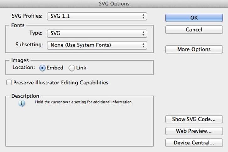
Figure 3-24. SVG export options.
For this example, I’ve created a star SVG (Figure 3-25) using Adobe Illustrator.

Figure 3-25. Star in SVG format.
Open your SVG file in a text editor. In your saved SVG, all you’ll need are a few XML tags, such as:
<svg>
<path/>
</svg>
However, upon opening this star file in plain text, I can see that Adobe Illustrator passed through quite a bit of unnecessary code into our SVG:
<?xml version="1.0" encoding="utf-8"?>
<!-- Generator: Adobe Illustrator 15.0.2, SVG Export Plug-In .
SVG Version: 6.00 Build 0) -->
<!DOCTYPE svg PUBLIC "-//W3C//DTD SVG 1.1//EN"
"http://www.w3.org/Graphics/SVG/1.1/DTD/svg11.dtd">
<svg version="1.1" xmlns="http://www.w3.org/2000/svg"
xmlns:xlink="http://www.w3.org/1999/xlink" x="0px" y="0px"
width="20px" height="20px" viewBox="0 0 20 20"
enable-background="new 0 0 20 20" xml:space="preserve">
<polygon fill="#FFFFFF" stroke="#000000" stroke-miterlimit="10"
points="10,2.003 11.985,8.112 18.407,8.112 13.212,11.887
15.196,17.996 10,14.221 4.803,17.996 6.789,11.887 1.592,
8.112 8.015,8.112 "/>
</svg>
Feel free to remove the following components from your exported SVG. They don’t affect the output of your SVG file in a browser, and we should optimize for the smallest file size possible for performance:
§ The <!DOCTYPE>... line
§ The <!-- Generator: Adobe Illustrator... comment
§ The <?xml... statement
You can also automate the cleanup of SVG files with tools like Scour (http://codedread.com/scour/) and SVGO (https://github.com/svg/svgo). Be sure to run this kind of cleanup only on your exported SVG, not on the original file.
There are a few ways to implement your SVG image on your site. You can apply the SVG to the source attribute of an image tag:
<img src="star.svg" width="83" />
Our wonderful SVG will crisply expand to the width you set for it. Rather than including an SVG in your main HTML document, you can also apply it as a background to an element using CSS:
.star {
background: url(star.svg);
display: block;
width: 83px;
height: 83px;
background-size: 83px 83px;
}
Or you could inline the SVG into your HTML:
<body>
<svg version="1.1" xmlns="http://www.w3.org/2000/svg"
xmlns:xlink="http://www.w3.org/1999/xlink" x="0px" y="0px"
width="20px" height="20px" viewBox="0 0 20 20"
enable-background="new 0 0 20 20" xml:space="preserve">
<polygon fill="#FFFFFF" stroke="#000000" stroke-miterlimit="10"
points="10,2.003 11.985,8.112 18.407,8.112 13.212,11.887
15.196,17.996 10,14.221 4.803,17.996 6.789,11.887 1.592,
8.112 8.015,8.112 "/>
</svg>
</body>
Some sites use SVG images, but rather than apply them using CSS or an image tag, they combine the SVG images into an icon font. Tools like IcoMoon (http://icomoon.io/) can help you build a custom font made up of your own SVG images. However, icon fonts are not supported across all browsers, and it can be much more difficult to create fallbacks for your images where icon fonts aren’t supported. Further, individually applied icons can be additionally complicated by the line-height and font-size styles applied to your elements, and they can be a challenge for accessibility (http://bit.ly/1ttVjQw).
Using a font does make it easier to change the color of an icon, as you can just apply the color CSS declaration to the character. However, individual SVG images tend to be easier to work with, and you can control the color of inline SVGs with CSS as well using the fill CSS property.
Though SVG isn’t supported in older browsers, the forward-friendliness of supporting retina devices and easy workflows for supporting older browsers—such as Grumpicon (http://www.grumpicon.com/) or Modernizr (http://modernizr.com/)—make SVG an excellent image replacement choice for improving the performance of your site. For additional optimization of SVG files, run them through a compression tool like SVG Optimiser (http://bit.ly/1ttVlb0), which simplifies decimals and removes unnecessary characters.
Replacing images with inline SVG has the same set of downsides as replacing images with data URIs: it can add more file size to your HTML and eliminates the opportunity to cache the file. Measure the performance impact of replacing any images with SVG on your site before committing to the SVG versions.
Image Planning and Iterating
Image efficiency on your site comes down to careful planning at the design stage. If you know up front how and where you’re going to be using images across your site, you can plan for things like transparency, size, gradients, and how you can reduce the total number of image requests.
As a site evolves, or as the number of designers contributing to image creation and updating increases, your images directory may grow out of control. There are a few things you can try to keep the file size and number of images on your site optimized and maintained, including scheduling routine checks on image directories and the makeup of your page weight, creating a style guide, and mentoring other image creators on the importance of optimized images.
Schedule Routine Checks
Schedule a routine check for your site to see what images can be reused, combined, or re-exported in a different format. When you look in the main directory (or directories) for the images that make up your site design, ask yourself:
§ Have any of these sprites been updated recently? Are there any outdated icons within the sprite that I can remove, or have new graphics been added that need to be optimized?
§ With new browser technology, or as our audience begins to use more modern browsers, which of these images can be replaced with modern techniques like CSS3 or SVG, or new technology like picturefill?
§ Are all of the new images created since I last checked in the ideal format? Are they as simple as possible, and have they been run through an additional compression tool?
§ Are all of the images scaled to the correct height and width? Am I displaying any images at a smaller scale than they’ve been exported, which means I should re-export at the right size to eliminate unnecessary overhead?
Similarly, routinely check the page weight of your site. Note the makeup of your total page weight, including what percentage of the total page weight is due to images. If the page weight has increased by a significant amount, figure out why, and see where you can make file size improvements. Read more about how to measure and iterate on page weight and other performance metrics in Chapter 6.
Create Style Guides
Consider creating a style guide as a reference point for how images are used across your site, especially when it comes to icon meaning and sprite usage. It could include:
§ An easy way to find which classes to apply to your HTML to show different icons
§ Definitions of icon usage and meaning so that designers and developers are able to create a consistent user experience across pages, with the added gain of reusing existing images that are cached
§ Examples of CSS gradients and other techniques used to improve the performance of your site so that others may repurpose it instead of adding their own, which can cause bloated CSS files
§ A definitive guide to which browsers you need to support so that other designers and developers know which syntaxes they must include in their CSS as well as what to test
A style guide has many other benefits for page load time beyond image documentation. In “Style Guides,” we will walk through why they’re so useful and what else you can include in them.
Mentor Other Image Creators
You are likely not the only person creating and updating the images on your site. There may be other designers and developers who need to understand these techniques, and there may also be other content creators who are not as well versed in image creation methods.
Make sure that there are well-defined workflows for how new images appear on the site. If a designer or developer is responsible for adding images, make sure that part of his or her workflow includes finding a balance of aesthetics and performance by testing qualities and running images through additional optimization. As much as possible, automate image optimization so that image creators don’t feel like they have a new, burdensome workflow.
It’s important to share this knowledge with others who contribute to the site so that you are not a sole “performance cop” or “performance janitor.” Helping others understand their impact on page load time will be as beneficial to your image directory as it will be to your stress level. Read more about empowering and incentivizing others to champion performance in Chapter 8.
Again, optimizing images is likely the biggest win for performance on your site. As you take a look at the images on your site, ask yourself:
§ Can I save on file size by choosing a different image format?
§ Have all of my images been run through an additional compression tool?
§ Would I be better served with a CSS3 gradient, data URI, SVG file, or sprite?
§ Is there any unnecessary noise or grain in my image, or is there another way I can reduce the total number of colors in my image?
§ How can I make sure that new images added to my site are optimized?
Continue to focus on the balance of aesthetics and performance as you create your images (read more about finding this balance in Chapter 7). Sometimes you’ll need to export a slightly larger image because it looks significantly better. Other times, you’ll be able to gain huge page speed savings by repurposing colors and icons rather than creating new, only slightly different versions. The important part is to be deliberate with your image creation and make choices about performance as you go.
In the next chapter, we’ll cover optimizing HTML and CSS. Just as with images, focusing on your markup’s size and how it renders in your browser is imperative as you optimize page load time. We can clean our HTML and CSS, find ways to document and repurpose design patterns to keep things clean, and optimize the loading of these assets. Often, cleaning HTML and CSS leads to cleaner stylesheet images, too. As a designer, you are in a unique position to create high-performing, easily editable, and repurposable markup for your site.
All materials on the site are licensed Creative Commons Attribution-Sharealike 3.0 Unported CC BY-SA 3.0 & GNU Free Documentation License (GFDL)
If you are the copyright holder of any material contained on our site and intend to remove it, please contact our site administrator for approval.
© 2016-2026 All site design rights belong to S.Y.A.