Adobe Creative Suite 6 Design and Web Premium All-in-One For Dummies (2012)
Book VI
Dreamweaver CS6
Contents at a Glance
Chapter 1: Getting Familiar with New Features in Dreamweaver
Chapter 2: Introducing Dreamweaver CS6
Chapter 3: Creating a Website
Chapter 4: Working with Images
Chapter 5: Adding and Formatting Text
Chapter 6: Linking It Together
Chapter 7: Creating Tables
Chapter 8: Creating CSS Layouts
Chapter 9: Publishing Your Website
Chapter 1: Getting Familiar with New Features in Dreamweaver
In This Chapter
 Exploring the improved Dreamweaver workspace
Previewing a page in multiscreen mode
Using the new HTML5 and CSS3 support
Working with CSS transitions
Building adaptable pages with fluid grids
Surveying the new mobile authoring options and tools
Dreamweaver CS6 lets you create and manage websites and applications across a variety of screens, including desktops, mobile phones, and tablet devices. Depending on their needs, users can use Dreamweaver to create all kinds of websites, from basic sites that consist only of simple links from one page to another to highly interactive websites that feature animation or drag-and-drop functionality. Dreamweaver users can even create more complex web and mobile applications capable of pulling data from databases, XML, or other sources.
As part of the Adobe Creative Suite, Dreamweaver CS6 works seamlessly with several other Adobe applications, such as Photoshop CS6, Illustrator CS6, and Bridge. Even if you’ve never used Dreamweaver, you’ll be impressed by its many tools, panels, and powerful features that make building desktop and mobile-ready sites and applications easy and intuitive. If you’re familiar with the layout of other Adobe applications, you may feel right at home the first time you open Dreamweaver CS6.
Dreamweaver’s new features speak to the evolution of the web, with heavy emphasis on mobile web and multiscreen development, extensive support for HTML5 and CSS3, and integration with popular frameworks such as jQuery that define today’s standard web languages.
It’s important to note that some of the features you’ll see made their introduction in CS5.5, although many have been polished and improved in CS6.
Exploring the New Additions to the CS6 Interface
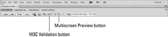
Dreamweaver CS6 includes a number of subtle but useful enhancements to its workspace, building on the abilities and features introduced in CS 5.5. The most noticeable of these additions include the Multiscreen preview and W3C Validation buttons on the toolbar shown in Figure 1-1.
Figure 1-1: The Dream-weaver Designer workspace.
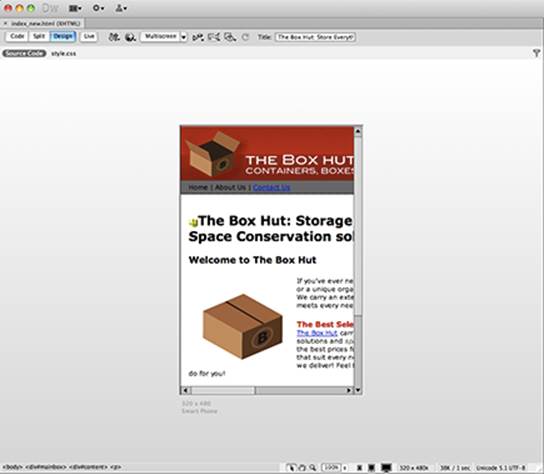
The bottom of the Document window (where you’ll be doing most of your work), contains additional options and toggles that allow you to view your page as it will appear in different desktop and mobile screen resolutions, as shown in Figure 1-2. This is one of many subtle additions that reinforce Dreamweaver’s commitment to development for the mobile web.
In the workspace, panels and panel groups appear tabbed, and you can separate them by dragging a tab to another location, as in other Adobe applications. Later in this minibook, you find out how to customize the workspace for different tasks and projects.
Previewing Pages in the Multiscreen Preview Window
Because there are so many different types of devices to design for these days, it’s necessary to know how your work will appear in a variety of screen sizes and resolutions. This information enables you to evolve and modify your design to give users the best experience possible regardless of whether they’re viewing on a desktop, smart phone, or tablet.
Dreamweaver’s new Multiscreen Preview window can be launched from the top of the Document window so that you can view and compare your page in a number of different viewports, which represent the viewable areas of certain devices and screen sizes. You can customize the viewports based on prefixed device sizes, or even specify your own. You can also use the drop-down arrow next to the Multiscreen button to tailor the viewport of the Document window itself.
Using Media Query Options
Even with the new and extensive preview capabilities in Dreamweaver, designing for multiple screens can be a challenge. The old approach of designing for the lowest common denominator has become far less useful now that the differences in size and behavior among mobile, desktop, and emerging platforms (such as set top boxes) can be vast. When you need to tailor your web experience to a specific screen, media queries allow you to target specific devices and to deliver style sheets created with those devices in mind.
Media query options can be found as part of the Multiscreen Preview window, and allow you to create layout and style variations between specific target devices and style sheets (CSS) within your project.
Taking Advantage of New HTML5 and CSS3 Support
The last couple of years have proved to be a revolution for the web; combined efforts to embrace open standards and pull away from plugin- based content has meant rapid adoption for HTML5 (the markup used to construct pages) and CSS3 (the language used to apply styling to pages). These web languages give you more creative and behavioral control than ever, enabling you to create sites that adapt to multiple screens without using plug-ins — which means they work with more consistency.
Dreamweaver includes new HTML5 layouts out of the box, so you can create a ready-to-modify HTML5-and-CSS3-based page in seconds that leverages new semantic markup elements (such as <header>), as shown in Figure 1-2. In addition, you’ll be able to make use of new CSS3 capabilities such as rounded corners, multicolumn text, and even animation.
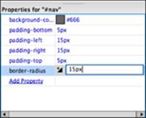
Several views (such as the Code view) now recognize and auto-complete the new HTML5 elements, and panels, such as the CSS Properties panel, include new CSS3 properties and suggested values, as shown in Figure 1-3.
 Although a number of HTML5 and CSS3 features have been adopted consistently in the latest versions of Firefox, Safari, Chrome, and Internet Explorer, the HTML5 spec still isn’t final, and support for many CSS3 properties still varies. This means certain features will be available only in certain browsers, and that success may vary. In certain cases, it may still be necessary to do a little hand-coding or tweaking to make sure things are backwards-compatible — or work at all, for that matter.
Figure 1-2:Create HTML5-based pages easier with support for new HTML5 tags in the Code view.
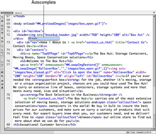
Figure 1-3:New CSS3 properties, such as border-radius, are recognized and can be added within the CSS Properties panel.
Exploiting the New, Enhanced jQuery Support
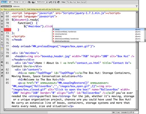
In addition to HTML and CSS, the jQuery JavaScript library has become one of the staple languages of the web, heavily utilized by countless sites for cool interactive behavior (such as animation and drag-and-drop), AJAX capabilities, and animation. Dreamweaver’s Code view recognizes and auto-completes jQuery commands, making it easier than ever to work with jQuery. (See Figure 1-4.)
Figure 1-4:Built-in jQuery support means easier coding and more cool stuff for your pages!
Bringing Your Pages to Life with CSS Transitions
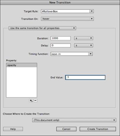
Traditionally, if you wanted to create cool fades, slides, and sizing effects without Flash you’d need some help from JavaScript or a JavaScript library such as Spry or jQuery. Although these are still very viable and common options, CSS3 now provides native transition properties that allow you to create these same effects without depending on JavaScript. The CSS Transitions panel has been added to allow you to design interesting interactive behavior and transitions using only CSS3.
Much like the Behaviors panel, which Dreamweaver has included for a long time and which now uses Adobe’s own Spry JavaScript framework, the CSS Transitions panel allows you to select an element in the Document window and apply transition behavior to any number of that element’s properties, including width, height, and opacity. You can trigger this transition on hover, focus, and other behaviors, as shown in Figure 1-5.
Figure 1-5:Add dynamic, interesting visual effects using pure CSS.
Working with Fluid Grids
Many of the new features in Dreamweaver are designed to make authoring across many different screens easier. Creating several versions of a website or application to suit specific devices can be time consuming and difficult to maintain. A great way to overcome this is the use of fluid grids, which are pages designed on a single grid system that can easily adapt to multiple screen sizes.
When working with fluid grids, Dreamweaver opens up a number of visual aids to help you build your page. In conjunction with the new Multiscreen Preview window, fluid grids allow you to easily design flexible pages that render well in most any screen or device setting, as shown in Figure 1-6.
Figure 1-6:Create new Fluid Grid layouts easily from the New Document window.
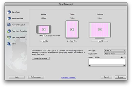
To create a new page based on a fluid grid, choose File⇒New Fluid Grid Layout as shown in Figure 1-7, or New⇒Fluid Grid Layout.
Exploring the New Mobile Authoring Options and Tools
Mobile-ready websites are no longer considered a luxury or novelty. Some experts predict that the use of mobile devices for online activity will soon surpass fixed desktop computer usage. This means that when creating a website you must think of smart phones, tablets, and other portable Internet-ready devices (such as Amazon’s Kindle Fire) as likely venues. Dreamweaver gets you off to a great start toward mobile site and application development with some exciting new features, including the following:
jQuery Mobile Projects: You can now create mobile projects in Dreamweaver using the increasingly popular jQuery Mobile framework, which allows for rapid development of cross-device mobile apps that look and feel like native apps. This is a great addition for new or experienced web designers looking to create mobile-ready sites without the overhead of complex coding, and using standard web languages such as HTML, CSS, and JavaScript. To create a new jQuery Mobile project, you can choose File⇒New⇒Page From Sample⇒Mobile Starters, as shown in Figure 1-7.
jQuery Mobile PhoneGap Projects: This new feature is much like the new jQuery Mobile project, but with the additional files and support necessary to make your mobile project ready for use with PhoneGap. PhoneGap is an open-source HTML5 framework that allows you to author native mobile applications with standard web languages, and to deploy them to iPhone, Android, and Blackberry platforms as native applications. Another huge advantage is PhoneGap’s ability to leverage native device APIs, so your applications can take advantage of hardware features, such as the accelerometer and GPS. To find out more about PhoneGap, visit www.phonegap.com.
Mobile device sizes and rendering: Several areas within Dreamweaver, such as the Document window, Multiscreen Preview, and Live view allow you to take advantage of common device screen sizes and presets, as shown in Figure 1-8.
Figure 1-7:Create rich mobile applications by using integrated jQuery Mobile projects.
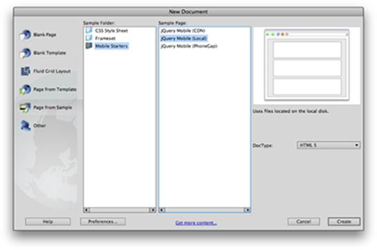
Figure 1-8: The various view options and Multiscreen Preview are great for seeing your work in context of smart phone and tablet devices.