Swift Development with Cocoa (2015)
Chapter 11. Cocoa Bindings
So far in this book, we’ve talked at length about how the model-view-controller paradigm works in Cocoa and Cocoa Touch, and how dividing up your application’s code into these separate areas of responsibility leads to easier-to-manage codebases.
However, sometimes it may seem like overkill to write separate models, views, and controllers, especially when all the controller needs to do is pass information directly from the model to the view and vice versa. In many cases, the only behavior you want is for a label to display information stored in a model object.
To solve this problem, Apple introduced bindings in OS X. Bindings are connections between views and objects, where the contents of the object are used to directly drive what the view displays. Bindings mean you can write less code for the same excellent features.
In this chapter, you’ll learn how to use bindings to connect your interface directly to data. You’ll also learn how to use the built-in controller classes that Apple provides to manage collections of objects. By the end of the chapter, you’ll have created a sophisticated note-taking application while writing minimal code.
NOTE
Bindings are only available on OS X. Sorry, iOS developers!
Binding Views to Models
A binding is simply an instruction that you give to a view about where its content comes from. The instruction is along the lines of, OK, text field, the text that you should show comes from this object over here. If it ever changes, update yourself. Likewise, when you change, tell the object to update the text it’s storing.
You bind views to objects by indicating which property on the object the view should show. For example, imagine that the app delegate has a property called myString. If you bound a label to that object’s property, the two would be linked—whatever the myString property contains, the label would display.
Bindings know about what data to display. More importantly, they also know about when that display should be updated. When the value of a property is changed, the bindings system informs every view bound to it that they should update themselves.
Bindings also work in reverse. If you have an editable view, such as a text field, the bindings system updates the object with updated content when the user makes changes.
You can bind many different properties of views to model object properties. The most common property you bind is the view’s value, which in most cases is the text that the view displays (for labels, text, views, etc.). You can also bind properties to things like whether the view should be enabled or hidden, what font or color the view should use, which image should be used, and so on. The specific view properties that can be bound vary from view to view.
Because bindings largely remove the work of mediating between your model code and your views, you can focus on simply building the user-facing features of your app. Simply put, using bindings means writing less code, which means that you get to make your end product faster and also reduce the potential for bugs.
A Simple Bindings App
To demonstrate how to bind views directly to model objects, let’s build a simple application that connects a slider and a text field to a property that we’ll add to the app delegate object:
1. Create a new Cocoa application and call it SimpleBindings.
2. We’ll start by adding the property to the AppDelegate object. This property will simply store a number. Open AppDelegate.swift and add the following property to it:
var numberValue : Int = 0
We’re now ready to create the interface. This application will show both a text field and a horizontal slider:
1. Open the interface and add the interface components.
First, open MainMenu.xib and then open the main window.
Drag in a text field and place it on the lefthand side of the window.
Next, drag in a horizontal slider, and place it on the right of the text field.
When you’re done, the interface should look like Figure 11-1.
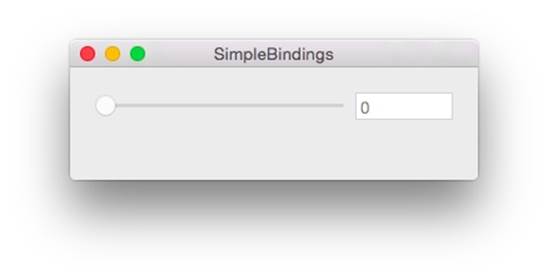
Figure 11-1. The interface for this application
2. Next, we need to make both controls continuous (i.e., we want both views to update the application as the user works with them). The controls will send their information out to the application the moment the user moves the mouse or types a key. If a control isn’t continuous, it waits until the user is done interacting with it before sending its new value (which can save work for the application).
To make the controls continuous, select both the text field and the slider and then open the Attributes Inspector, which is the fourth tab from the left in the Inspector pane. Turn the Continuous checkbox on.
Now that the interface has been set up, it’s time to create bindings.
NOTE
Remember that the AppDelegate object now has a property, called numberValue, which stores an integer. We’re going to bind both of these controls to this property, which will cause the property’s value to be displayed in the controls. Having both controls bound to the same thing also has the effect of making them control each other—by dragging the slider from left to right, the text field will update.
Here are the steps you’ll need to follow:
1. To bind the text field to the app delegate, you’ll need to start by selecting the text field and then the Bindings Inspector (it’s the second tab from the right, at the top of the Inspector pane—its icon looks like a little knot).
The Bindings Inspector displays the list of all possible bindable properties in the text field. In this case, we want to bind the text field’s value, which is the text that is displayed, so open the Value property.
When binding to an object, we need to provide two things: the object that we are binding to, and the key that we want to bind to. The key is simply the name of the property, method, or instance variable that has the content that we want to display.
In this case, the object that we want to bind to is the app delegate. The Bindings Inspector lists all top-level objects in the nib as things that you can bind to, which means you can easily select it. The key that we want to bind to is numberValue, because that’s the name of the property in the app delegate object.
NOTE
You’ll notice that there are two “key” fields shown: the controller key and the model key path. The controller key refers to the property exposed by the object that you’re binding to, while the model key path refers to the property inside the object that’s returned by accessing the controller key from the bound object. Because we’re not working with a controller object in this case, we provide a model key path that points directly to the property we want.
2. Next, bind the text field’s Value.
To accomplish this, select App Delegate in the “Bind to” drop-down list and set the model key path to numberValue.
NOTE
A little red alert icon may appear next to the word numberValue. This is because the text field usually expects a string to be provided, and the numberValue property is an Int. This is fine, because the bindings system knows how to convert integers to strings. However, if you see the red alert icon appear, double-check to make sure that you’re binding properties of the correct data types.
3. Just as the text field updates continuously, we want the binding to also update the rest of the application continuously.
To do this, turn on the Continuously Updates Value checkbox.
4. Now that the text field has been bound, we’ll do the same thing for the slider. Keep the Bindings inspector open and select the horizontal slider.
Open the Value binding.
Select App Delegate in the “Bind to” drop-down list, and set the model key path to numberValue.
You can now see the binding in action. Run the app, and note what happens when you drag the slider back and forth—the text field updates to show the current value of numberValue. If you change the text in the text field, the slider will update.
Binding to Controllers
In the previous example, we’ve bound views directly to properties that are stored in an object, bypassing a controller object. This works just fine for simple cases, but bindings are also capable of much more powerful work.
For example, it’s possible to bind views to data stored in the user defaults system (i.e., within the NSUserDefaults database). This has a number of useful results, such as being able to quickly and easily build a “settings” screen that binds the controls directly to the data stored in the user preferences system.
However, NSUserDefaults is simply a data storage system, and you can’t bind directly to it because its content isn’t directly observable by the key-value observing system that bindings rely on. To work with it, you need an object mediating between your views and the model. Sound familiar? That’s right—you need a controller object!
Apple provides just such an object to let you work with NSUserDefaults in bindings: NSUserDefaultsController. This object provides mechanisms for binding views to defaults stored in NSUserDefaults. It also provides a few more advanced features, such as the ability to make changes and then let the user cancel or apply them—so if you want the user to be able to cancel his changes in your preferences window, you can!
Because NSUserDefaultsController is such a common control, you don’t even need to create one to start using it. Simply binding a control to the defaults makes it appear in the Interface Builder’s outline.
To demonstrate how you can use this controller in your app, we’ll adapt our application to store user preferences:
1. First, we’ll add a checkbox whose value is stored in the user defaults system, which will also control whether the text field and horizontal slider are enabled (i.e., whether the user can interact with them). To do this, simply add a checkbox to the window and change its label toEnabled.
2. Next, bind the checkbox to the user defaults. You’ll need to select the checkbox and open the Bindings Inspector.
Bind its value to the Shared User Defaults Controller, which appears in the list of bindable objects.
Set the controller key to values and the model key path to controlsEnabled.
We haven’t set up a property in the code called controlsEnabled, but that’s OK—remember, when you use NSUserDefaults, you just set values for preferences you want to store.
3. Now that the checkbox has been set up, we’ll make the text field and horizontal slider become enabled or disabled based on the value of the controlsEnabled property stored in the user defaults. To accomplish this, we’ll bind the controls’ Enabled property.
To do this, select the text field and bind the Enabled property to the Shared User Defaults Controller. Set the controller key to values and the model key path to controlsEnabled.
Repeat this process for the horizontal slider.
When you’re done, the interface should looks like Figure 11-2.
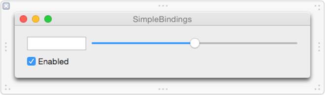
Figure 11-2. The updated interface, with the checkbox and text field added
We can now see it in action. Launch the app, and note that changing the state of the checkbox makes the text field and slider become enabled and disabled. Quit and relaunch the application, and note that the checkbox remembers its state.
Quietly marvel at the fact that you wrote no code at all for this feature!
Array and Object Controllers
As we’ve seen, controllers mediate between views and models, and allow you to make bindings that keep you from having to write lots of laborious code.
We’ve just seen NSUserDefaultsController in action, which allows you to bind views to the user preferences system. In this case, the model object is the NSUserDefaults object.
Other controllers exist, which you can use to mediate access to other data in your application. If you want your application to display a collection of data, you need parts of your interface to display the entire collection and other parts to display specific information about the currently selected item in the collection.
This is where NSArrayController comes in. NSArrayController is a controller object that manages an array, and provides access to the contents of the array. The array controller also provides the concept of “selected” objects, meaning that your code can display content relevant for only the items that have been selected by the user. Finally, the NSArrayController is also capable of adding and removing items from the array that it manages.
Another example of a controller object is NSObjectController, which acts as a controller for a single object. The typical use case for this class is where you bind your interface to the NSObjectController, and then your code gives an object to that controller. The moment the content object of the controller changes, the interface updates.
A More Complex Bindings App
Controllers allow you to create extremely sophisticated applications with minimal code. To demonstrate how this works, we’re going to create an application that lets the user create, edit, view, and delete small text notes, all while doing most of the work with bindings.
The application will work with a class that we’ll create called Note. This class will contain a number of properties: the note’s title, the text contained within it, and the date and time that the note was created and edited. The application will display a list of all notes that the user has created, as well as displaying and allowing the user to edit notes. When the user edits a note, the note will update itself to reflect the date and time that the note was changed.
Let’s get started on our app:
1. Create a new Cocoa application and call it ControllerBindings.
2. Create a new class by choosing File→New→File or by pressing ⌘-N.
Create a new Cocoa class called Note. Make this class a subclass of NSObject.
3. Now that the class has been created, we’ll add the following properties:
o title, a String
o text, an NSAttributedString
o created, an NSDate
o edited, an NSDate
Additionally, we want sensible defaults to be set when a new note is created. Specifically, the title should be “New Note,” the text should be the text “New Note,” and the created and edited date should both be the current date.
Additionally, when either the title or the text is changed, we want the edited date to be updated to be the current date. This can be done with Swift’s didSet syntax, which lets you add code that should run when a property changes.
NOTE
NSAttributedString is a type of string that stores additional information like font, style, and color. You can use NSAttributedString to store rich text.
Open Note.swift, and add the following code to the Note class:
class Note: NSObject {
// Created date is a constant—it's set upon creation, and never changes
var created : NSDate = NSDate()
// Edited date defaults to the current date
var edited : NSDate = NSDate()
// Title is a string that, when changed, updates the edited date
var title : String = "New Note" {
didSet {
edited = NSDate()
}
}
// Text is an NSAttributed string that does a similar thing
var text : NSAttributedString = NSAttributedString(string: "New Note") {
didSet {
edited = NSDate()
}
}
}
We’re now done with the Note class. It contains the data that we need it to, and will behave the way we want when it’s created and updated.
We now need a place to store the instances of the Note class. Because we don’t want to deal with the challenges of storing content on disk, this example project will simply store the Note objects in an array inside the application delegate object. This means that no information will be kept around when the app exits.
The array will be stored in a property. This is important because it means that the array controller object that we’ll create later will be able to bind to it.
To add the notes property to AppDelegate, open AppDelegate.swift. Add the following code to the AppDelegate class:
// An empty array of Note objects
var notes = [Note]()
NOTE
This syntax, where a property is defined as the result of a constructor, effectively tells the compiler two things:
§ The property is an array of Notes.
§ The array should be created when the instance is created.
We’re now completely done with all the code for this application. From here on out, it’s bindings all the way.
The first thing that we want to do is display a list of notes that the user has created, and provide a way to add and remove notes from the list. We need a way to provide access to the Note instances. Unlike in our first application, we can’t bind the controls directly to the notes property in the app delegate because that’s an array, and we want to be able to display individual notes.
To enable this, we use an NSArrayController. This class acts as the gateway to the contents of the array. It will be bound to the notes property, and other views will be bound to it.
The list view itself will be an NSTableView. This class is traditionally tricky to set up and requires that your code act as a data source, implementing several methods and providing all kinds of information to the class. Not so with bindings—in this case, we’ll be binding the table view’s contents directly to the array controller that manages the notes collection.
First, let’s create and set up the array controller:
1. Open MainWindow.xib. We’re going to start by adding the NSArrayController instance, which lives in the object library. Search for array controller, and you’ll find it. Drag one into the outline.
2. We’ll now instruct the array controller to access the notes property when it wants to know where the data it’s managing is stored.
Select the array controller, and open the Bindings Inspector.
Open the Content Array property, and bind it to the App Delegate. Set the model key path to notes.
3. We also need to let the array controller know about what class of object the array will contain. This is important because when the array controller is asked to add a new item to the array, it needs to know which class to instantiate.
With the array controller selected, open the Attributes Inspector. Set the Class Name to ControllerBindings.Note.
NOTE
When you set the Class Name in an array controller, you have to specify both the class’s name as well as the name of the module that the class can be found in. Because this example is called ControllerBindings, you set the Class Name to ControllerBindings.Note, but if the project was named something else, you’d change the part of the class name before the dot.
When you provide a content array to an array controller, the array controller can be bound to other objects. Some useful bindable properties include:
arrangedObjects
The total collection of objects in the array, arranged based on the array controller’s settings (such as any filters or sorting options that may have been applied).
selection
The currently selected object.
canAdd and canRemove
Bool properties that indicate whether the array controller is currently able to add or remove items. For example, canRemove will be false if there is no object selected.
These properties can be accessed by using them as controller keys in the Bindings Inspector.
The array controller is now set up, and we can start creating the interface. We’ll begin by adding the table view that lists all notes, as well as buttons that allow adding and removing items:
1. Drag in a table view and place it on the lefthand side of the window. Resize it so that it’s about a third of the width of the window.
When you add a table view, it’s placed inside a scroll view. We’re going to want to set up several different aspects of the table view, so expand the entire tree by holding down the Option key and clicking the arrow next to Scroll View—Table View in the outline. Select Table View in the items that appear.
Set the Columns counter in the Attributes Inspector to 1.
2. We want the table view controller to display note titles in the list. Select the Table Column in the outline and open the Bindings Inspector.
Bind the Value property to the array controller. Set the controller key to arrangedObjects and the model key path to title.
The table view will now show the value of the title property for all items in the notes array. Additionally, the table view will control which item is selected.
3. We’ll now add two buttons to the view to allow adding and removing items.
Drag in a gradient button from the object library. Resize it to a smallish square shape, and place it underneath the table view.
In the Attributes Inspector, set the button’s title to nothing (i.e., delete all the text). Set the image to NSAddTemplate, which will make the button show a plus icon.
Hold down the Option key and drag the button to the right. A copy will be made; place it next to the first button. Set the image of this new button to NSRemoveTemplate, which shows a minus icon.
4. We can now make these buttons instruct the array controller to add and remove items.
Control-drag from the add button to the array controller. Choose add: from the menu that appears.
Control-drag from the remove button to the array controller. Choose remove: from the menu that appears.
Now when these buttons are clicked, the array controller will add a new item to the array that it’s managing or delete the currently selected item.
5. For a finishing touch, we’re going to disable the remove button if there’s nothing to remove or if there’s no selected object. The array controller exposes a property called canRemove, to which we can bind the button’s Enabled property.
Select the remove button and open the Bindings Inspector.
Bind the Enabled property to the array controller, using the controller key canRemove.
When you’re done, the app’s interface should look like Figure 11-3.
You can now see this in action by launching the app. Clicking on the add and remove buttons will add and remove items from the list, and when nothing is selected, the remove button is disabled.
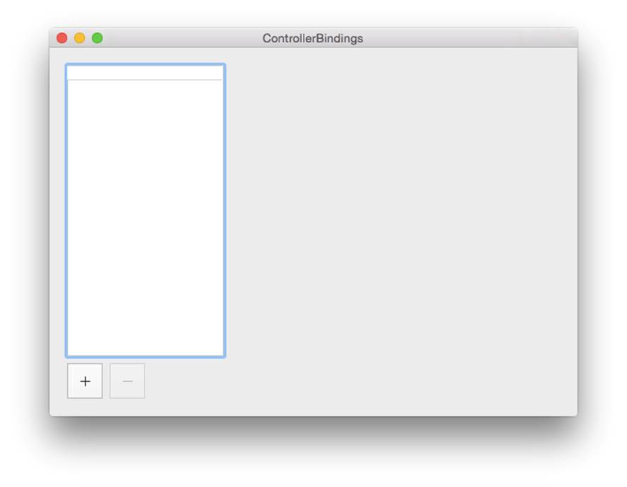
Figure 11-3. The initial interface for the new controller-based application
We’ll now make the notes work. All we need to do here is set up views and bind them to the selected object, which is provided to us by the array controller:
1. To create the interface, add a text field to the right side of the window and place it at the top. This text field will show the title property in the notes.
Add a text view underneath the text field. Make it rather tall to allow for plenty of room for adding text. This text view will show the text property.
2. Next, bind the controls: select the text field and bind its value to the array controller. Set the controller key to selection and the model key path to title. Turn Continuously Updates Value on.
Select the text view (note that it’s kept inside a scroll view, so you’ll need to expand it in the outline to get to it), and bind its attributed string to the array controller. Set the controller key to selection and the model key path to text. Turn Continuously Updates Value on here, too.
3. Finally, we’ll create the interface that shows the date and bind it. Add a label to the window. Set its text to Created: and place it under the text view.
Add another label and set its text to Edited:. Place it under the Created label.
Add a third label and put it to the right of the Created label. Resize it to the right edge of the window. This label will display the date that the note was created on.
Add a fourth label to the right of the Edited label. Resize it like the last one.
When you’re done, the user interface should look liker Figure 11-4.
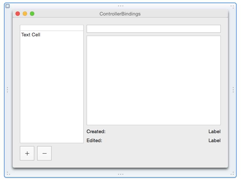
Figure 11-4. The completed user interface
4. Select the empty label to the right of the Created label and bind it to the array controller. Set the controller key to selection and the model key path to created.
Select the other label and bind it similarly, but with the model key path set to edited.
5. By default, when you bind a label to an NSDate property, that label will show the full date—down to the seconds and time zone. This can get a little huge, and it’d be better if we showed this as a shorter, more succinct version. You can do this by adding a date formatter to the label, which gives you control over how the date that’s being shown in the label is represented.
Search for “date formatter” in the object library, and drag one from the library to the Created date label.
A Date Formatter will appear in the outline. Select it, and configure it so that the Date Style is set to Medium Style, and the Time Style is set to Short Style. This will result in the label showing the date along the lines of “7 Jul 2014 3:21 pm.”
Repeat the same process with the Edited date label.
We’re done. You can now see the entire app in action! You can add and remove items, and store any text you like in the text field. Renaming the note updates live in the list, and changing the note’s contents updates the Edited label.