The Core iOS Developer’s Cookbook, Fifth Edition (2014)
Chapter 3. Alerting the User
At times, you need to grab your user’s attention. New data might arrive or some status might change. You might want to tell your user that there’s going to be a wait before anything more happens—or that the wait is over and it’s time to come back and pay attention. iOS offers many ways to provide such a heads-up to the user: from alerts and progress bars to audio pings. In this chapter, you’ll discover how to build these indications into your applications and expand your user-alert vocabulary. You’ll see real-life examples that showcase these classes and discover how to make sure your user pays attention at the right time.
Talking Directly to Your User through Alerts
Alerts speak to your user. Members of the UIAlertView and UIActionSheet classes pop up or scroll in above other views to deliver their messages. These lightweight classes add two-way dialog to your apps. Alerts visually “speak” to users and can prompt them to reply. You present your alert, get user acknowledgment, and then dismiss the alert to move on with other tasks.
If you think that an alert is nothing more than a message with an attached OK button, think again. Alert objects provide incredible versatility. You can build progress indicators, allow for text input, make queries, and more. In this chapter’s recipes, you’ll see how to create a wide range of useful alerts that you can use in your own programs, using the system-supplied alerts as well as some custom ones.
Building Simple Alerts
To create alerts, allocate a UIAlertView object. Initialize it with a title and an array of button titles. The title is an NSString, as are the button titles. In the button array, each string represents a single button that should be shown.
The method snippet shown here creates and displays the simplest alert scenario. It shows a message with a single OK button. The alert doesn’t bother with delegates or callbacks, so its lifetime ends when the user taps a button:
- (void)showAlert:(NSString *)theMessage
{
UIAlertView *av = [[UIAlertView alloc] initWithTitle:@"Title"
message:theMessage
delegate:nil
cancelButtonTitle:@"OK"
otherButtonTitles:nil];
[av show];
}
Add buttons by introducing them as parameters to otherButtonTitles:. Make sure you end your arbitrary list of buttons with nil. Adding nil tells the method where your list finishes. The following snippet creates an alert with three buttons (Cancel, Option, and OK). Because this code does not declare a delegate, there’s no way to recover the alert and determine which of these three buttons was tapped. The alert displays until a user taps, and then it automatically dismisses without any further effect:
- (void)showAlert:(NSString *)theMessage
{
UIAlertView *av = [[UIAlertView alloc] initWithTitle:@"Title"
message:theMessage
delegate:nil
cancelButtonTitle:@"Cancel"
otherButtonTitles:@"Option", @"OK", nil];
[av show];
}
When working with alerts, space is at a premium. Adding more than two buttons causes the alert to display in multiline mode. Figure 3-1 shows a pair of alerts depicting both two-button (side-by-side display) and three-button (line-by-line display) presentations. Limit the number of alert buttons you add at any time to no more than three or four. Having fewer buttons works better; one or two is ideal. If you need to use more buttons, consider using action sheet objects, which are discussed later in this chapter, rather than alert views.
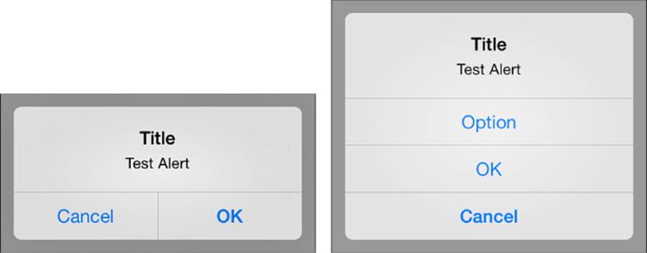
Figure 3-1 Alerts work best with one or two buttons (left). Alerts with more than two buttons stack the buttons as a list, producing a less elegant presentation (right).
UIAlertView objects provide simple “default” button highlights. These are based on the number of buttons, as shown in Figure 3-1. Two-button alerts highlight the rightmost button. This is defined by the single otherButtonTitles in the alert initialization. On alerts with more than two buttons, the bottom button is highlighted. This is usually represented by cancelButtonTitle. If you don’t supply one, the last button item acts as the default instead. As a rule, Cancel buttons appear at the bottom or left of alerts.
Alert Delegates
Need to know if a user tapped OK or Cancel? Alerts use delegates to recover user choices after they’ve been made, using a simple callback. Delegates should declare the UIAlertViewDelegate protocol. In normal use, you often set the delegate to your primary (active) view controller object.
Delegate methods enable you to react as different buttons are pressed. As you’ve already seen, you can omit that delegate support if all you need to do is show some message with an OK button.
After the user has seen and interacted with your alert, the delegate receives an alertView:clickedButtonAtIndex: callback. The second parameter passed to this method indicates which button was pressed. Button numbering begins with zero. The Cancel button defaults to button 0. Even though it appears at the left in some views and the bottom in others, its button numbering remains the same unless you adjust the Cancel button index (retrievable via the cancelButtonIndex property). This is not true for action sheet objects, which are discussed later in this chapter.
Here is a simple example of an alert presentation and callback, which prints out the selected button number to the debugging console:
@interface TestBedViewController : UIViewController
<UIAlertViewDelegate>
@end
@implementation TestBedViewController
- (void)alertView:(UIAlertView *)alertView
clickedButtonAtIndex:(int)index
{
NSLog(@"User selected button %d\n", index);
}
- (void)showAlert
{
UIAlertView *av = [[UIAlertView alloc]
initWithTitle:@"Alert View Sample"
message:@"Select a Button"
delegate:self
cancelButtonTitle:@"Cancel"
otherButtonTitles:@"One", @"Two", @"Three", nil];
// Tag your UIAlertView so it can be distinguished
// from others in your delegate callbacks.
av.tag = MAIN_ALERT;
[av show];
}
@end
If your controller works with multiple alerts, tags help identify which alert produced a given callback. Unlike controls that use target-action pairs, all alerts trigger the same methods. Adding an alert-tag-based switch statement lets you differentiate your responses to each alert.
Displaying the Alert
The show instance method tells your alert to appear. When shown, the alert works in a modal fashion. That is, it dims the screen behind it and blocks user interaction with your application outside the alert. This modal interaction continues until your user acknowledges the alert through a button tap, typically by selecting OK or Cancel. When the user does so, control passes to the alert delegate, allowing that delegate to finish working with the alert and respond to the selected button.
The alert properties remain modifiable after creation. You may customize an alert by updating its title or message properties. The message is the optional text that appears below the alert title and above its buttons. You can add more buttons via addButtonWithTitle:.
Kinds of Alerts
The alertViewStyle property allows you to create several alert styles. The default style (UIAlertViewStyleDefault) creates a standard alert, with a title and message text, followed by buttons, as shown in Figure 3-1. It is the bread and butter of the alert world, allowing you to query for button presses such as Yes/No, Cancel/OK, and other simple choices.
iOS offers three more styles, specifically for entering text:
 UIAlertViewStylePlainTextInput—This alert style enables users to enter text.
UIAlertViewStyleSecureTextInput—When security is an issue, this alert style allows users to enter text that is automatically obscured as they type it. The text appears as a series of large dots, but the input can be read programmatically by the delegate callback.
UIAlertViewStyleLoginAndPasswordInput—This alert style offers two entry fields, including a plain-text user account login field and an obscured text password field.
When working with text entry alerts, keep your button choices simple. Use no more than two side-by-side buttons—usually OK and Cancel. Too many buttons create improper visuals, with text fields floating off above or to the sides of the alert.
You can recover the text entered in each text field of the alert view. The textFieldAtIndex: method takes one argument, an integer index starting at 0, and returns the text field at that index. In real use, the only text field that is not at index 0 is the password field, which uses index 1. After you’ve retrieved a text field, you can query its contents by using its text property, as follows:
NSLog(@"%@", [myAlert textFieldAtIndex:0].text);
Recipe: Using Blocks with Alerts
Using an alert’s delegate callbacks can produce unnecessarily complex code. All your code handling ends up in a common routine. You must implement tagging to differentiate which alert your method must handle. You must vigilantly track which button corresponds to the functionality you wish to execute, such as the alert in Figure 3-2.
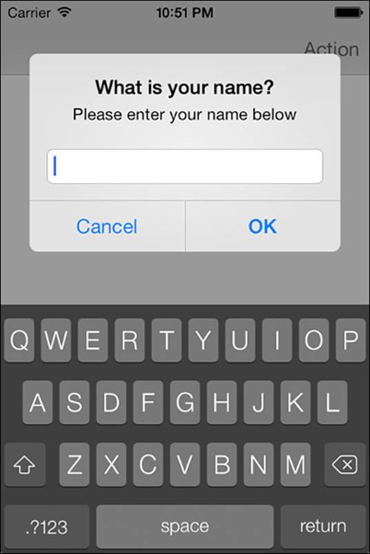
Figure 3-2 This alert processes responses in blocks passed at UIAlert button creation instead of in traditional delegate callbacks.
A much simpler solution is to assign the intended implementation when declaring the buttons themselves. Blocks were built just for this task.
Blocks
Blocks are an extension to the C language that were first supported in iOS 4. They are similar in concept to a method or function that can be stored in a variable. C provides a similar mechanism for storing functions: function pointers. Blocks go beyond function pointers by storing a copy of the enclosing scope in addition to the block of executable code.
When a block is defined, a copy of the local stack is created and attached to the block. When the block is finally executed, it has access to this copy of the stack. This is very powerful, allowing a block of code and its surrounding state to be passed to a method. This code can be executed at a future point or within a certain context, such as on another thread or in a certain order.
Block syntax can be a bit perplexing. It inherits much from C function pointers, which for those not familiar can seem a bit unnatural. The caret symbol (^) denotes a block. The general syntax includes a return type, argument list, and the code block itself:
^(return type)(argument list) { // code block }
The return type can be omitted if void. The argument list can be omitted completely if there are no arguments. The simplest block could then be defined as follows:
^{ // your code here }
The typedef syntax referring to a block is slightly modified from the above:
typedef (return type)(^typeName)(argument list);
Once a block has been defined, it can then be executed, like this:
typedef void (^SomeBlock)(BOOL);
SomeBlock myBlock = ^(BOOL success)
{
if (success)
NSLog(@"Successful!");
else
NSLog(@"FAILED!");
};
myBlock(YES);
This code does very little that could not be done in a standard method call. However, passing blocks as parameters to methods opens up numerous opportunities, such as calling a block while iterating through an array. The unique feature of blocks is the ability to access variables from the enclosing scope. The following example accesses the captured myBaseNumber:
NSInteger myBaseNumber = 7;
NSArray *numbers = @[@2, @3, @5, @8, @9, @11];
[numbers enumerateObjectsUsingBlock:^(id obj, NSUInteger idx, BOOL *stop)
{
NSInteger current = [obj integerValue];
NSLog(@"%d * %d = %d", myBaseNumber, current, myBaseNumber * current);
}];
Blocks can access their captured context even if they have left the scope of that variable.
The ability of blocks to capture their enclosing scope does come with a couple caveats. The stack stored with a block is a copy. Any modifications made to captured variables after the block is declared but before it is run will not be reflected in the block. Any modifications to captured variables in the block will be lost outside the block.
To modify a captured variable from within a block, the variable must be declared with the __block storage type modifier. The variable will reside in storage that is shared between both the enclosing scope of the original code as well as the block. Any changes in one will impact the other.
The second concern with blocks and captured scope is retain cycles.
Retain Cycles and Blocks
When using blocks, be wary of the creation of retain cycles. It is very easy to unintentionally retain self inside a block. This occurs by referencing self directly or by using an ivar, which captures self indirectly.
To avoid the retain cycle, capture a weak variant of self and then assign the weak reference to a strong reference prior to use within the block. Adding the strong reference at the very start of the block ensures that if a strong reference is possible, it endures throughout the entire block scope. Don’t forget to check that the strong reference to self is not nil. The following listing avoids issues with retain cycles and nil references:
__weak TestBedViewController *weakSelf = self;
[blockAlertView addButtonWithTitle:@"OK" actionBlock:^{
TestBedViewController *strongSelf = weakSelf;
if (strongSelf)
{
NSString *name = [strongSelf->blockAlertView
textFieldAtIndex:0].text;
NSLog(@"Tapped OK after entering: %@", name);
}
}];
Blocks enable clearer APIs and greatly simplified multithreaded programming. This section has only scratched the surface of the capabilities of and uses for blocks. The Apple documentation has a trove of information on blocks and Grand Central Dispatch that are worth exploring.
Note
Grand Central Dispatch (GCD) is a powerful tool for implementing parallel tasking. Introduced with iOS 4, GCD provides a function-based API utilizing blocks for building concurrent code that can take advantage of multicore hardware.
While most of Apple’s libraries are now fully integrated with blocks, a few classes have not been modernized. UIAlert, for example, desperately calls out for blocks. Once you start using them, you will see many new opportunities for their use.
Recipe 3-1 adds blocks to button creation on the standard UIAlertView, reducing complexity and centralizing the actions near the button declarations. You no longer need to implement delegates or the delegate callbacks.
While not provided in this recipe, the existing delegate methods can still be used with a bit of effort. The setDelegate method already saves off the externalDelegate for this usage. You can add proxy methods to BlockAlertView to forward each of the UIAlertView delegate calls to the external delegate:
- (void)didPresentAlertView:(UIAlertView *)alertView
{
if ([externalDelegate
respondsToSelector:@selector(didPresentAlertView:)])
{
[externalDelegate didPresentAlertView:alertView];
}
}
When the user taps a button in the alert view, the BlockAlertView executes the appropriate block associated with that button. Another enhancement left to the reader is providing more control over when that block is run. Currently, the block is executed in thealertView:clickedButtonAtIndex: delegate callback of UIAlertView. While this may be appropriate, you might require that the block be executed after the alert dismissal animation completes. You can add a simple Boolean property to BlockAlertView and check to determine which delegate callback should execute your block.
Recipe 3-1 Creating Blocks-Based Alerts
@implementation BlockAlertView
{
__weak id <UIAlertViewDelegate> externalDelegate;
NSMutableDictionary *actionBlocks;
}
- (instancetype)init
{
self = [super init];
if (self)
{
self.delegate = self;
actionBlocks = [[NSMutableDictionary alloc] init];
}
return self;
}
- (instancetype)initWithTitle:(NSString *)title
message:(NSString *)message
{
return [super initWithTitle:title
message:message delegate:self cancelButtonTitle:nil
otherButtonTitles:nil];
}
// Add cancel button to alert with title and block
- (NSInteger)setCancelButtonWithTitle:(NSString *)title
actionBlock:(AlertViewBlock)block
{
if (!title) return -1;
NSInteger index = [self addButtonWithTitle:title
actionBlock:block];
self.cancelButtonIndex = index;
return index;
}
// Add button to alert with title and block
- (NSInteger)addButtonWithTitle:(NSString *)title
actionBlock:(AlertViewBlock)block
{
if (!title) return -1;
NSInteger index = [self addButtonWithTitle:title];
if (block)
{
// Copy moves blocks from stack to heap
actionBlocks[@(index)] = [block copy];
}
return index;
}
- (id<UIAlertViewDelegate>)delegate
{
return externalDelegate;
}
// If the delegate is self, set on super, otherwise store
// for possible future use to proxy delegate methods.
- (void)setDelegate:(id)delegate
{
if (delegate == nil)
{
[super setDelegate:nil];
externalDelegate = nil;
}
else if (delegate == self)
{
[super setDelegate:self];
}
else
{
externalDelegate = delegate;
}
}
#pragma mark - UIAlertViewDelegate
// Execute the appropriate actionBlock.
// View will be automatically dismissed after this call returns
- (void)alertView:(UIAlertView *)alertView
clickedButtonAtIndex:(NSInteger)buttonIndex
{
AlertViewBlock actionBlock = actionBlocks[@(buttonIndex)];
if (actionBlock)
{
actionBlock();
}
}
@end
Get This Recipe’s Code
To find this recipe’s full sample project, point your browser to https://github.com/erica/iOS-7-Cookbook and go to the folder for Chapter 3.
Recipe: Using Variadic Arguments with Alert Views
Methods that can take a variable number of arguments are called variadic. You declare such an argument by using an ellipsis (...) after the last parameter. Both NSLog and printf are variadic. You can supply them with a format string along with any number of arguments.
Because most alerts center on text, it’s handy to build methods that create alerts from format strings. Recipe 3-2 creates a say: method that collects the arguments passed to it and builds a string with them. The string is then passed to an alert view, which is then shown, providing a handy instant display.
The say: method does not parse or otherwise analyze its parameters. Instead, it grabs the first argument, uses that as the format string, and passes the remaining items to the NSString initWithFormat:arguments: method. This builds a string, which is then passed to a one-button alert view as its title.
Defining your own utility methods with variadic arguments lets you skip several steps where you have to build a string with a format and then call a method. With say: you can combine this into a single call, as follows:
[NotificationAlert say:
@"I am so happy to meet you, %@", yourName];
This recipe, admittedly, uses a very thin example of variadic arguments. They can do a lot more than just get passed along to a string initialization.
Recipe 3-2 Using a Variadic Method for UIAlertView Creation
+ (void)say:(id)formatstring,...
{
if (!formatstring) return;
va_list arglist;
va_start(arglist, formatstring);
id statement = [[NSString alloc]
initWithFormat:formatstring arguments:arglist];
va_end(arglist);
UIAlertView *av = [[UIAlertView alloc]
initWithTitle:statement message:nil
delegate:nil cancelButtonTitle:@"Okay"
otherButtonTitles:nil];
[av show];
}
Get This Recipe’s Code
To find this recipe’s full sample project, point your browser to https://github.com/erica/iOS-7-Cookbook and go to the folder for Chapter 3.
Presenting Lists of Options
UIActionSheet instances create simple iOS menus. On the iPhone and iPod touch, they slide choices—basically a list of buttons representing possible actions—onto the screen and wait for the user to respond. On the iPad, they appear in popovers and do not display Cancel buttons. Instead, users cancel actions by tapping outside the popovers.
Action sheets are different from alerts, although both classes derive from the same origins. They were split into separate classes early in iPhone history. Alerts stand apart from the interface and are better used for demanding attention. Menus slide into a view and better integrate with ongoing application work. Cocoa Touch supplies five ways to present menus:
showInView:—On the iPhone and iPod touch, this method slides the menu up from the bottom of the view. On the iPad, the action sheet is centered in the middle of the screen.
showFromToolBar: and showFromTabBar:—For the iPhone and iPod touch, when you’re working with toolbars, tab bars, or any other kinds of bars that provide those horizontally grouped buttons that you see at the bottom of many applications, these methods align the menu with the top of the bar and slide it out exactly where it should be. On the iPad, the action sheet is centered in the middle of the screen.
showFromBarButtonItem:animated:—On the iPad, this method presents the action sheet as a popover from the specified bar button.
showFromRect:inView:animated:—This method shows the action sheet originating from the rectangle you specify in the coordinates of the view you specify.
Note
Do not use showInView with tabbed child view controllers. The action sheet appears properly, but the lower part with the Cancel button becomes unresponsive.
The following snippet shows how to initialize and present a simple UIActionSheet instance. Its initialization method introduces a concept that is missing from UIAlertView: the Destructive button. Colored in red, a Destructive button indicates an action from which there is no return, such as permanently deleting a file (see Figure 3-3). Its bright red color warns the user about the choice. Use this option sparingly.
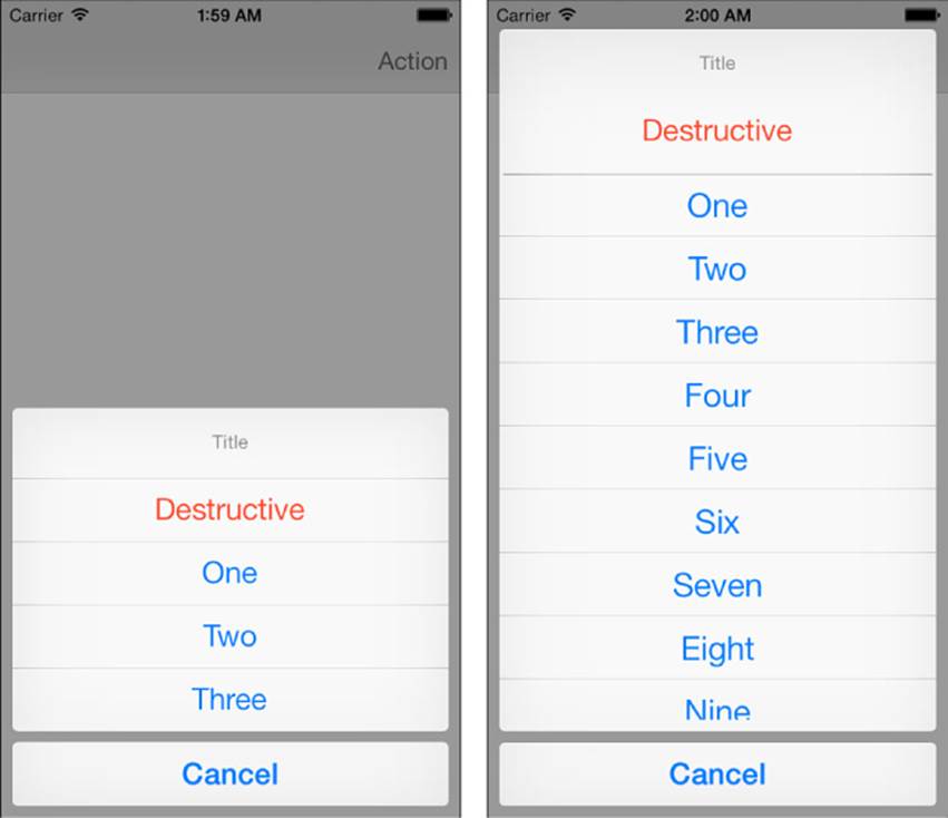
Figure 3-3 On the iPhone and iPod touch, action sheet menus slide in from the bottom of the view. The Destructive menu button appears red and indicates permanent actions with possible negative consequences to your users. Adding many menu items produces the scrolling list on the right.
Action sheet values are returned in button order. In the example on the left in Figure 3-3, the Destructive button is number 0, and the Cancel button is number 4. This behavior contradicts default alert view values, where the Cancel button returns 0. With action sheets, the Cancel button’s position sets its number. This may vary, depending on how you add your buttons. In some configurations (no Destructive button), Cancel defaults to the first item as choice 0. You also can check the Cancel button index via the sheet’s cancelButtonIndex property. This snippet prints the selected button index:
- (void)actionSheet:(UIActionSheet *)actionSheet
didDismissWithButtonIndex:(NSInteger)buttonIndex
{
self.title = [NSString stringWithFormat:@"Button %d", buttonIndex];
}
- (void)action:(UIBarButtonItem *)sender
{
// Destructive = 0, One = 1, Two = 2, Three = 3, Cancel = 4
UIActionSheet *actionSheet = [[UIActionSheet alloc]
initWithTitle:@"Title"
delegate:self
cancelButtonTitle:@"Cancel"
destructiveButtonTitle:@"Destructive"
otherButtonTitles:@"One", @"Two", @"Three", nil];
[actionSheet showFromBarButtonItem:sender animated:YES];
}
Avoid using Cancel buttons on the iPad. Allow users to tap outside the action sheet to cancel interaction after presenting a sheet:
UIActionSheet *actionSheet = [[UIActionSheet alloc]
initWithTitle:theTitle delegate:nil
cancelButtonTitle:IS_IPAD ? nil : @"Cancel"
destructiveButtonTitle:nil otherButtonTitles:nil];
Canceling an iPad action sheet returns a (default) value of –1. You can override this, but we cannot recommend doing so.
Note
You can use the same blocks-based approach shown in Recipe 3-1 to conveniently create action sheets similarly to alerts.
Scrolling Menus
As a rough rule of thumb, you can fit a maximum of about 10 buttons (including Cancel) into a portrait orientation and about 5 buttons into landscape on the iPhone and iPod touch. (There’s quite a bit more room on the iPad.) Going beyond this number triggers the scrolling presentation shown on the right in Figure 3-3. Notice that the Cancel button is presented below the list, even when scrolling is activated. The Cancel button is always numbered after any previous buttons. As Figure 3-3 demonstrates, this presentation falls fairly low on the aesthetics scale and should be avoided where possible.
Displaying Text in Action Sheets
Action sheets offer many of the same text presentation features as alert views, but they do so with a much bigger canvas. The following snippet demonstrates how to display a message using a UIActionSheet object. It provides a handy way to present a lot of text simultaneously:
- (void)show:(id)formatstring,...
{
if (!formatstring) return;
va_list arglist;
va_start(arglist, formatstring);
id statement = [[NSString alloc]
initWithFormat:formatstring arguments:arglist];
va_end(arglist);
UIActionSheet *actionSheet = [[UIActionSheet alloc]
initWithTitle:statement
delegate:nil cancelButtonTitle:nil
destructiveButtonTitle:nil
otherButtonTitles:@"OK", nil];
[actionSheet showInView:self.view];
}
“Please Wait”: Showing Progress to Your User
Waiting is an intrinsic part of the computing experience and will remain so for the foreseeable future. It’s your job as a developer to communicate that fact to your users. Cocoa Touch provides classes that tell your users to wait for a process to complete. These progress indicators come in two forms: as a spinning wheel that persists for the duration of its presentation and as a bar that fills from left to right as your process moves forward from start to end. The classes that provide these indications are as follows:
UIActivityIndicatorView—This progress indicator is a spinning circle that tells your user to wait without providing specific information about the degree of completion. iOS’s activity indicator is small, but its live animation catches the user’s eye and is best suited for quick disruptions in a normal application.
UIProgressView—This view presents a progress bar. The bar provides concrete feedback about how much work has been done and how much remains, while occupying a relatively small space. It presents as a thin, horizontal rectangle that fills itself from left to right as progress takes place. This classic user interface (UI) element works best for long delays, where users want to know to what degree the job has finished.
Be aware of blocking. Both of these classes must be used on your main thread, as is the rule with GUI objects. Computationally heavy code can block, keeping views from updating in real time. If your code blocks, your progress view may not update in real time as progress is actually made, getting stuck on its initial value instead.
If you need to display asynchronous feedback, use threading. For example, you may use UIActivityIndicatorView on the main thread and perform computation on a second thread. Your threaded computations can then perform view updates on the main thread to provide a steady stream of progress notifications that will keep your user in sync with the work being done.
Using UIActivityIndicatorView
UIActivityIndicatorView instances offer lightweight views that display a standard rotating progress wheel. The key word to keep in mind when working with these views is small. All activity indicators are tiny and do not look right when zoomed past their natural size.
iOS offers several different styles of the UIActivityIndicatorView class. UIActivityIndicatorViewStyleWhite and UIActivityIndicatorViewStyleGray are 20-by-20 points in size. The white version looks best against a black background, and the gray looks best against white. It’s a thin, sharp style. UIActivityIndicatorViewStyleWhiteLarge is meant for use on dark backgrounds. It provides the largest, clearest indicator, at 37-by-37 points in size:
UIActivityIndicatorView *aiv = [[UIActivityIndicatorView alloc]
initWithActivityIndicatorStyle:
UIActivityIndicatorViewStyleWhiteLarge];
You can tint an activity indicator by using the color property. When you set a color, it overrides the view style but retains the view size (regular or large):
aiv.color = [UIColor blueColor];
You need not center indicators on the screen. Place them wherever they work best for you. As a clear-backed view, the indicator blends over whatever backdrop view lies behind it. The predominant color of that backdrop helps select which color of indicator to use.
For general use, just add the activity indicator as a subview to the window, view, toolbar, or navigation bar you want to overlay. Allocate the indicator and initialize it with a frame or with Auto Layout constraints, preferably centered within whatever parent view you’re using. Start the indicator action by sending startAnimating. To stop, call stopAnimating. Cocoa Touch takes care of the rest, hiding the view when not in use.
Using UIProgressView
Progress views enable your users to follow task progress as it happens rather than just saying “Please wait.” They present bars that fill over time. The bars indicate the degree to which a task has finished. Progress bars work best for long waits where providing state feedback enables your users to retain the feeling of control.
To create a progress view, allocate a UIProgressView instance and set its frame. To use the bar, issue setProgress:. This takes one argument, a floating-point number that ranges between 0% (0.0, no progress) and 100% (1.0, finished). Progress view bars come in two styles: basic white and light gray. The setStyle: method chooses the kind you prefer, either UIProgressViewStyleDefault or UIProgressViewStyleBar. The latter is meant for use in toolbars.
Recipe: Modal Progress Overlays
Although UIAlertView and UIActionSheet provide straightforward communication and interaction with the user, you cannot add your own subviews. To provide a modal progress indicator, you must roll your own alert completely from scratch. Recipe 3-3 uses a simple tintedUIView overlay with a UIActivityIndicatorView.
As shown in Figure 3-4, the overlay view occupies the entire screen size. Using the entire screen lets the overlay fit over the navigation bar. The overlay view must be added to the application window and not, as you might think, to the main UIViewController’s view. That view only occupies the space under the navigation bar (the “application frame,” in UIScreen terms), allowing continued access to any buttons and other control items in the bar. Filling the window helps block that access.
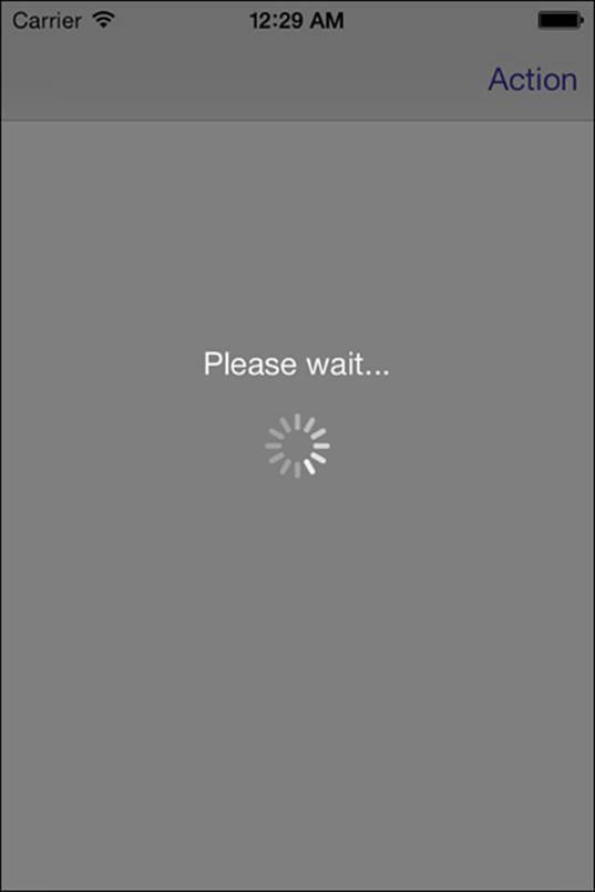
Figure 3-4 A UIActivityIndicator-augmented modal view provides user feedback during synchronous (blocking) actions. Always provide some way to cancel long-running functions without forcefully quitting the app in your real-world applications.
To prevent any user touches, the overlay sets its userInteractionEnabled property to YES. This catches any touch events, preventing them from reaching the GUI below the alert and creating a modal presentation where interaction cannot continue until the alert has finished. You can easily adapt this approach to dismiss an overlay with a touch, but be aware when creating alerts like this that the view does not belong to a view controller. It will not update itself during device orientation changes. If you need to work with a landscape-/portrait-aware system, you can catch the current orientation state before showing the overlay and subscribe to reorientation notifications.
Recipe 3-3 Presenting and Hiding a Custom Alert Overlay
- (void)removeOverlay:(UIView *)overlayView
{
[overlayView removeFromSuperview];
}
- (void)action
{
UIWindow *window = self.view.window;
// Create a tinted overlay, sized to the window
UIView *overlayView =
[[UIView alloc] initWithFrame:window.bounds];
overlayView.backgroundColor =
[[UIColor blackColor] colorWithAlphaComponent:0.5f];
overlayView.userInteractionEnabled = YES;
// Add an activity indicator
UIActivityIndicatorView *aiv =
[[UIActivityIndicatorView alloc]
initWithActivityIndicatorStyle:
UIActivityIndicatorViewStyleWhiteLarge];
[aiv startAnimating];
[overlayView addSubview:aiv];
PREPCONSTRAINTS(aiv);
CENTER_VIEW(overlayView, aiv);
UILabel *label = [[UILabel alloc] init];
label.textColor = [UIColor whiteColor];
label.text = @"Please wait...";
[overlayView addSubview:label];
PREPCONSTRAINTS(label);
CENTER_VIEW_H(overlayView, label);
CENTER_VIEW_V_CONSTANT(overlayView, label, -44);
[window addSubview:overlayView];
// Use a time delay to simulate a task finishing
[self performSelector:@selector(removeOverlay:)
withObject:overlayView afterDelay:5.0f];
}
Get This Recipe’s Code
To find this recipe’s full sample project, point your browser to https://github.com/erica/iOS-7-Cookbook and go to the folder for Chapter 3.
Tappable Overlays
A custom overlay can present information as well as limit interaction. You can easily expand the overlay approach from Recipe 3-3 so that the view dismisses itself on a touch. When tapped, the view removes itself from the screen. This behavior makes the view particularly suitable for showing information in a way normally reserved for the UIAlertView class:
@interface TappableOverlay : UIView
@end
@implementation TappableOverlay
- (void)touchesEnded:(NSSet *)touches withEvent:(UIEvent *)event
{
// Remove this view when it is touched
[self removeFromSuperview];
}
@end
Recipe: Custom Modal Alert View
The simplicity and lack of flexibility of the UIAlertView is often too limiting. While Recipe 3-3 provides a simple modal overlay that is perfect for providing progress during long-running tasks, sometimes you want a fully capable and configurable alert view that doesn’t have the artificial restrictions that Apple places on UIAlertView.
Recipe 3-4 provides an alert view that is nearly fully customizable. You can add subviews and configure any element of the UI to meet your needs, including borders, backgrounds, and subview placement. Bypassing the built-in alert allows for custom transition animations. Recipe 3-4provides a bounce effect during presentation and dismissal. The bounce is implemented with an affine scale transformation, which is covered in more detail in Chapter 5, “View Constraints.”
Note
Apple introduced Dynamics, a physics-based animation system, in iOS 7. While this example uses a view transform to simulate a bounce in the presentation and dismissal of the alert, Dynamics provides a declarative method of adding complex visual interactions.
As shown in Figure 3-5, rather than box you into a specific interface, the alert is a blank slate, ready for your use. A label and button are provided to get you started.
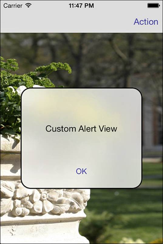
Figure 3-5 The iOS-supplied alert view can be very limiting. A fully custom alert provides full customization of both the user interface and interaction.
Frosted Glass Effect
An added flourish to the custom alert is a newly introduced visual effect found in iOS 7 and highlighted in the Control Center—the frosted glass appearance. Apple provides this effect by default in a number of UIKit elements: UITabBar, UINavigationBar, and UIToolbar.
Outside the embedded implementation in these bars, no mechanism is available to include this effect in your own views. Apple has provided sample code, a UIImage category, that simulates this effect. Unfortunately, it pales in comparison to the built-in implementation. The category is only a close approximation, and worse, is much slower than the embedded version, rendering it unusable as a live effect.
To work around this limitation, Recipe 3-4 subclasses a UINavigationBar to inherit the superior effect. In the future, Apple will hopefully expose this functionality directly to developers rather than require this subtle hack.
Recipe 3-4 Custom Alert
@implementation CustomAlert
{
UIView *contentView;
}
#pragma mark - Utility
- (void)observeValueForKeyPath:(NSString *)keyPath
ofObject:(id)object change:(NSDictionary *)change
context:(void *)context
{
if ([keyPath isEqualToString:@"bounds"])
contentView.frame = self.bounds;
}
#pragma mark - Instance Creation and Initialization
- (void)internalCustomAlertInitializer
{
// Add size observer
[self addObserver:self forKeyPath:@"bounds"
options:NSKeyValueObservingOptionNew context:NULL];
// Constrain the size and width based on the initial frame
self.translatesAutoresizingMaskIntoConstraints = NO;
CGFloat width = self.bounds.size.width;
CGFloat height = self.bounds.size.height;
for (NSString *constraintString in
@[@"V:[self(==height)]", @"H:[self(==width)]"])
{
NSArray *constraints = [NSLayoutConstraint
constraintsWithVisualFormat:constraintString options:0
metrics:@{@"width":@(width), @"height":@(height)}
views:NSDictionaryOfVariableBindings(self)];
[self addConstraints:constraints];
}
[self layoutIfNeeded];
// Add a content view for auto layout
contentView = [[UIView alloc] initWithFrame:self.bounds];
[self addSubview:contentView];
contentView.autoresizingMask =
UIViewAutoresizingFlexibleHeight |
UIViewAutoresizingFlexibleWidth;
// Add layer styling
self.layer.borderColor = [UIColor blackColor].CGColor;
self.layer.borderWidth = 2;
self.layer.cornerRadius = 20;
self.clipsToBounds = YES;
// Create label
_label = [[UILabel alloc] init];
[contentView addSubview:_label];
_label.translatesAutoresizingMaskIntoConstraints = NO;
_label.numberOfLines = 0;
_label.textAlignment = NSTextAlignmentCenter;
// Create button
_button = [UIButton buttonWithType:UIButtonTypeSystem];
[contentView addSubview:_button];
_button.translatesAutoresizingMaskIntoConstraints = NO;
// Layout subviews on content view
for (NSString *constraintString in
@[@"V:|-[_label]-[_button]-|",
@"H:|-[_label]-|", @"H:|-[_button]-|"])
{
NSArray *constraints = [NSLayoutConstraint
constraintsWithVisualFormat:constraintString
options:0 metrics:nil
views:NSDictionaryOfVariableBindings(_button, _label)];
[contentView addConstraints:constraints];
}
}
- (instancetype)initWithFrame:(CGRect)frame
{
if (!(self = [super initWithFrame:frame])) return self;
[self internalCustomAlertInitializer];
return self;
}
- (instancetype)initWithCoder:(NSCoder *)aDecoder
{
if (!(self = [super initWithCoder:aDecoder])) return self;
[self internalCustomAlertInitializer];
return self;
}
- (void)dealloc
{
[self removeObserver:self forKeyPath:@"bounds"];
}
#pragma mark - Presentation and Dismissal
- (void)centerInSuperview
{
if (!self.superview)
{
NSLog(@"Error: Attempting to present without superview");
return;
}
NSArray *constraintArray =
[self.superview.constraints copy];
for (NSLayoutConstraint *constraint in constraintArray)
{
if ((constraint.firstItem == self) ||
(constraint.secondItem == self))
[self.superview removeConstraint:constraint];
}
[self.superview addConstraints:CONSTRAINTS_CENTERING(self)];
}
- (void)show
{
self.transform =
CGAffineTransformMakeScale(FLT_EPSILON, FLT_EPSILON);
[self centerInSuperview];
CustomAnimationBlock expandBlock = ^{self.transform =
CGAffineTransformMakeScale(1.1f, 1.1f);};
CustomAnimationBlock identityBlock = ^{self.transform =
CGAffineTransformIdentity;};
CustomCompletionAnimationBlock completionBlock =
^(BOOL done){[UIView animateWithDuration:0.3f
animations:identityBlock];};
[UIView animateWithDuration:0.5f animations:expandBlock
completion:completionBlock];
}
- (void)dismiss
{
CustomAnimationBlock expandBlock = ^{self.transform =
CGAffineTransformMakeScale(1.1f, 1.1f);};
CustomAnimationBlock shrinkBlock = ^{self.transform =
CGAffineTransformMakeScale(FLT_EPSILON, FLT_EPSILON);};
CustomCompletionAnimationBlock completionBlock =
^(BOOL done){[UIView animateWithDuration:0.3f
animations:shrinkBlock];};
[UIView animateWithDuration:0.5f animations:expandBlock
completion:completionBlock];
}
@end
Get This Recipe’s Code
To find this recipe’s full sample project, point your browser to https://github.com/erica/iOS-7-Cookbook and go to the folder for Chapter 3.
Recipe: Basic Popovers
At the time of this writing, popovers remain an iPad-only feature. That may change as Apple introduces new iOS models or ports some of this functionality to the iPhone family of devices. Often you’ll want to present information using a popover as an alternative to presenting a modal view. There are several basic rules of popovers that you need to incorporate into your day-to-day development:
Always hang onto your popovers. Create strong local variables that retain your popovers until they are no longer needed. In Recipe 3-5, the variable is reset when the popover is dismissed.
Always check for existing popovers and dismiss them. This is especially important if you create popovers that have different roles in your apps. For example, you may provide popovers for more than one bar button item. Before you present any new popover, dismiss the existing one.
Always set your content size. The default iPad popover is long and thin and may not appeal to your design aesthetics. Setting the preferredContentSize property of your view controllers allows you to specify the dimensions the popover should use.
Always provide an iPhone option. Don’t sacrifice functionality when changing platforms. Instead, provide an iPhone-family alternative, usually a modally presented controller instead of a popover.
Never add a Done button to popovers. Although you normally add a Done button to a modal presentation, skip it in a popover. Users tap outside the popover to dismiss it, so a Done button is redundant.
Note
As of the initial release of iOS 7, Apple’s documentation states that popovers no longer present a graphical arrow pointing to the source of the popover. The popoverArrowDirection property on UIPopoverController is documented as having been deprecated. However, the arrow is still visible and the methods are not marked as deprecated in the provided SDK headers. This inconsistency in the documentation is likely a holdover from an abandoned design change that will be resolved in a future update.
Recipe 3-5 Basic Popovers
- (void)popoverControllerDidDismissPopover:
(UIPopoverController *)popoverController
{
// Stop holding onto the popover
popover = nil;
}
- (void)action:(id)sender
{
// Always check for existing popover
if (popover)
[popover dismissPopoverAnimated:YES];
// Retrieve the nav controller from the storyboard
UIStoryboard *storyboard =
[UIStoryboard storyboardWithName:@"Storyboard"
bundle:[NSBundle mainBundle]];
UINavigationController *controller =
[storyboard instantiateInitialViewController];
// Present either modally or as a popover
if (IS_IPHONE)
{
[self.navigationController
presentViewController:controller
animated:YES completion:nil];
}
else
{
// No Done button on iPads
UIViewController *vc = controller.topViewController;
vc.navigationItem.rightBarButtonItem = nil;
// Set the preferred content size to iPhone-sized
vc.preferredContentSize =
CGSizeMake(320.0f, 480.0f - 44.0f);
// Create and deploy the popover
popover = [[UIPopoverController alloc]
initWithContentViewController:controller];
[popover presentPopoverFromBarButtonItem:sender
permittedArrowDirections:UIPopoverArrowDirectionAny
animated:YES];
}
}
Get This Recipe’s Code
To find this recipe’s full sample project, point your browser to https://github.com/erica/iOS-7-Cookbook and go to the folder for Chapter 3.
Recipe: Local Notifications
Local notifications alert the user when your application is not running. They offer a simple way to schedule an alert that presents itself at a specific date and time. Unlike push notifications, local notifications do not require any network access and do not communicate with remote servers. As their name suggests, they are handled entirely on a local level.
Local notifications are meant to be used with schedules, such as calendar and to-do list utilities. You can also use them with multitasking applications to provide updates when the application is not running in the foreground. For example, a location-based app might pop up a notification to let a user know that the app has detected that the user is near the local library and that books are ready to be picked up.
The system does not present local notifications when the application is active, only when it’s suspended or running in the background. Recipe 3-6 forces the app to quit as it schedules the notification for 5 seconds in the future to allow the notification to appear properly. Don’t ever do this in App Store applications; we’ve done it here for demonstration purposes. If you don’t force the app to close, you’ll miss the notification.
As with push notifications, tapping the action button relaunches the application, moving control back into the application:didFinishLaunchingWithOptions: method. If you retrieve the options dictionary, the notification object can be found via theUIApplicationLaunchOptionsLocalNotificationKey key.
Some developers have used this relaunching capability to add features to the notification center, with varied success. The idea works like this: If you add a local notification, a tap will launch the app to perform some task such as tweeting. Thus, you are essentially offering features “through” the notification center. Apple doesn’t always respond well to those who use its center in nonstandard ways; your success will most certainly vary as Apple adjusts its policies to these clever but unsanctioned uses.
Best Practices
Don’t spam your users. Just because local notifications don’t require opt-in doesn’t mean that you should abuse them for marketing. Here’s a rule of thumb: If a notification doesn’t deliver information that your user specifically requested, don’t send it. (This goes for push notifications as well. When users opt in, they’re not opting in for spam.)
An unsolicited notification is not the user experience you should be aiming for. When your notification arrives in the middle of dinner or at 3 in the morning, you fail to win hearts, reviews, and customers.
Excess notifications are wrong, regardless of whether users can switch on “do not disturb” features. Apple regularly refuses applications that send ads through push notifications; you should note this for local notifications as well. Notification abuse is the easiest way to find your app, and your personal reputation, dragged through the mud.
And, as a final point, make sure to spell-check your notifications.
Recipe 3-6 Scheduling Local Notifications
- (void)action:(id)sender
{
UIApplication *app = [UIApplication sharedApplication];
// Remove all prior notifications
NSArray *scheduled = [app scheduledLocalNotifications];
if (scheduled.count)
[app cancelAllLocalNotifications];
// Create a new notification
UILocalNotification* alarm =
[[UILocalNotification alloc] init];
if (alarm)
{
alarm.fireDate =
[NSDate dateWithTimeIntervalSinceNow:5.0f];
alarm.timeZone = [NSTimeZone defaultTimeZone];
alarm.repeatInterval = 0;
alarm.alertBody = @"Five Seconds Have Passed";
[app scheduleLocalNotification:alarm];
// Force quit. Never do this in App Store code.
exit(0);
}
}
Get This Recipe’s Code
To find this recipe’s full sample project, point your browser to https://github.com/erica/iOS-7-Cookbook and go to the folder for Chapter 3.
Alert Indicators
When an application accesses the Internet from behind the scenes, it’s polite to let your user know what’s going on. You don’t have to create a full-screen alert because Cocoa Touch provides a simple application property that controls a spinning network activity indicator in the status bar.Figure 3-6 shows this indicator in action, to the right of the Wi-Fi indicator and to the left of the current time display.
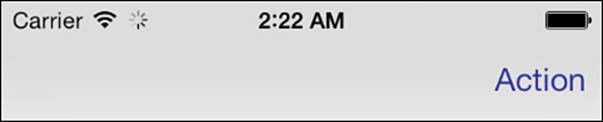
Figure 3-6 The network activity indicator is controlled by a UIApplication property.
The following snippet demonstrates how to access this property, which requires you to do little more than toggle the indicator on or off:
- (void)action:(id)sender
{
// Toggle the network activity indicator
UIApplication *app = [UIApplication sharedApplication];
app.networkActivityIndicatorVisible =
!app.networkActivityIndicatorVisible;
}
In a real-world deployment, you normally perform network activities on a secondary thread. At the same time, all UI updates must occur on the main thread. Using GCD, as in this code snippet, enables you to request GUI updates from other threads:
dispatch_async(dispatch_get_main_queue(), ^{
// set activity indicator here
});
You might want to keep count of network operations in your application and enable the indicator only when at least one is active.
Badging Applications
If you’ve used iOS for any time, you’ve likely seen the small red badges that appear over applications on the home screen. These might indicate the number of missed phone calls or unread e-mails that have accumulated since the user last opened Phone or Mail.
To set an application badge from within a program, set the applicationIconBadgeNumber property to a positive integer. To hide badges, set applicationIconBadgeNumber to 0.
Remove your badges predictably, such as on opening the application. Users expect that opening an application will clear the badge on the SpringBoard.
Recipe: Simple Audio Alerts
Audio alerts “speak” directly to your users. They produce instant feedback—for users who are not hearing impaired. Fortunately, Apple built basic sound playback into the Cocoa Touch SDK through System Audio services.
The alternatives include using Audio Queue calls or AVAudioPlayer. Audio Queue playback is time-consuming to program and involves much more complexity than simple alert sounds need. In contrast, you can load and play system audio with just a few lines of code.AVAudioPlayer also has drawbacks. It interferes with iPod audio. In contrast, System Audio can perform a sound without interrupting any music that’s currently playing, although that may admittedly not be the result you’re looking for, as alerts can get lost in the music.
Alert sounds work best when they’re kept short—preferably 30 seconds or shorter, according to Apple. System Audio plays PCM and IMA audio only. That means limiting your sounds to AIFF, WAV, and CAF formats.
System Sounds
To build a system sound, call AudioServicesCreateSystemSoundID with a file URL pointing to the sound file. This call returns an initialized system sound object, which you can then play at will. Just call AudioServicesPlaySystemSound with the sound object. That single call does all the work:
AudioServicesPlaySystemSound(mySound);
When iPod audio is playing, the system sound generally plays back at the same volume, without fading, so users may miss your alert. You can check the current playback state by testing as follows:
if ([MPMusicPlayerController iPodMusicPlayer].playbackState ==
MPMusicPlaybackStatePlaying)
If the music player is playing, you may choose to pause the existing music playback, substitute a visual element, or consider using an alert as described later in this chapter to add vibration to your sound. To access the MPMusicPlayerController, make sure you import theMediaPlayer module. Modules are discussed in more detail in the following section.
Add an optional system sound completion callback to notify your program when a sound finishes playing by calling AudioServicesAddSystemSoundCompletion(). Unless you use short sounds that are chained one after another, this is a step you can generally skip.
Clean up your sounds by calling AudioServicesDisposeSystemSoundID with the sound in question. This frees the sound object and all its associated resources.
Modules for System Frameworks
To use these system sound services, you must include the Audio Toolbox framework and headers. In iOS 7, Apple introduced modules support to Xcode, simplifying the process of adding system frameworks and headers to your code.
In the past, including support for a system framework required adding the framework to your application target and using the #include macro to include the header in your source code. With modules, a sole @import at the top of your source file will include the headers and Auto Link the framework into your project:
@import AudioToolbox;
Modules make it easier to add Apple-provided frameworks to your project. However, their primary purpose is to increase the performance of compilation and code indexing. Modules include a database of all symbols in the framework for quick lookup. Apple has anecdotally shown modules to improve build times and code indexing 200% or more, depending on the project.
Modules are enabled by default on new projects created with Xcode 5. Use modules on existing projects by selecting Enable Modules in the project Build Settings.
All system frameworks are available as modules. Unfortunately, there is no method currently available to convert your own frameworks into modules.
Vibration
As with audio sounds, vibration immediately grabs a user’s attention. What’s more, vibration works for nearly all users, including those who are hearing or visually impaired. Vibration is available, however, only on the iPhone platform at this time. Plus, it should be used sparingly. It puts a great drain on the device battery.
Using the same System Audio services, you can vibrate as well as play a sound. All you need is the following one-line call to accomplish it, as used in Recipe 3-7:
AudioServicesPlaySystemSound(kSystemSoundID_Vibrate);
You cannot vary the vibration parameters. Each call produces a short 1- to 2-second buzz. On platforms without vibration support (such as the iPod touch and iPad), this call does nothing—but does not produce an error:
- (void)vibrate
{
// Vibrate only works on iPhones
AudioServicesPlaySystemSound (kSystemSoundID_Vibrate);
}
Alerts
Audio Services provides a vibration/sound mashup called an alert sound, which you invoke as follows:
AudioServicesPlayAlertSound(mySound);
This call, which is also demonstrated in Recipe 3-7, plays the requested sound and, possibly, vibrates or plays an additional alert. On iPhones, when the user has set Settings > Sounds > Vibrate on Ring, it vibrates the phone. This vibration provides a tactile response to the user even if the sound volume is low or muted by the user, obscuring the audio portion of the alert.
iPad units and second-generation and later iPod touch units play the sound sans vibration (because it is unavailable on those units) through the onboard speaker. First-generation iPod touches (see if you can find one these days!) play a short alert melody in place of the sound on the device speaker while playing the requested audio through to the headphones.
iOS automatically lowers any currently playing music during alert playback. This property of alerts can be a useful alternative to system sounds when music playback has been detected.
Delays
The first time you play back a system sound on iOS, you might encounter delays. You may want to play a silent sound on application initialization to avoid a delay on subsequent playback.
Note
When testing on iPhones, make sure you have not enabled the silent ringer switch on the left side of the unit. Audio Services alerts do not play when that switch is enabled. This oversight has tripped up many iPhone developers. If your alert sounds must always play, consider using the AVAudioPlayer class.
Disposing of System Sounds
Don’t forget to dispose of system sounds. Your dealloc method is a natural place to wrap up matters at an object’s end of life. Always consider the life cycle of your sounds and find an approach to manage the disposal of the sound.
For many applications, a few sounds can persist for the duration of an object’s (or even an application’s) lifetime without placing a burden on memory. For others, you’ll want to clean up after yourself as soon as the sound is played. Make sure to design sound disposal into your applications and ensure that you dispose of resources when you’re done with them.
In recent versions of Xcode, the iOS simulator offers full sound playback.
Recipe 3-7 Playing Sounds, Alerts, and Vibrations Using Audio Services
@implementation SoundPlayer
void _systemSoundDidComplete(SystemSoundID ssID,
void *clientData)
{
AudioServicesDisposeSystemSoundID(ssID);
}
+ (void)playAndDispose:(NSString *)sound
{
NSString *sndpath = [[NSBundle mainBundle]
pathForResource:sound ofType:@"wav"];
if ((!sndpath) ||
(![[NSFileManager defaultManager]
fileExistsAtPath:sndpath]))
{
NSLog(@"Error: %@.wav not found", sound);
return;
}
CFURLRef baseURL =
(CFURLRef)CFBridgingRetain(
[NSURL fileURLWithPath:sndpath]);
SystemSoundID sysSound;
AudioServicesCreateSystemSoundID(baseURL, &sysSound);
CFRelease(baseURL);
AudioServicesAddSystemSoundCompletion(sysSound, NULL,
NULL, systemSoundDidComplete, NULL);
if ([MPMusicPlayerController iPodMusicPlayer].playbackState
== MPMusicPlaybackStatePlaying)
AudioServicesPlayAlertSound(sysSound);
else
AudioServicesPlaySystemSound(sysSound);
}
@end
Get This Recipe’s Code
To find this recipe’s full sample project, point your browser to https://github.com/erica/iOS-7-Cookbook and go to the folder for Chapter 3.
Summary
This chapter introduces ways for your application to reach out and interact directly with your user instead of the other way around. You’ve learned how to build alerts—visual, auditory, and tactile—that grab your user’s attention and can request immediate feedback. Use these examples to enhance the interactive appeal of your programs and leverage some unique iPhone-only features. Here are a few thoughts to carry away from this chapter:
Alerts take users into the moment. They’re designed to elicit responses while communicating information. While the system alerts are fairly rigid, they are quick and easy to implement. And, as you saw in this chapter, custom alerts can be very powerful interface components that provide a lot of flexibility and customization.
When a task will take a noticeable amount of time, be courteous to your user by displaying some kind of progress feedback. iOS offers many ways to do this, from heads-up displays (HUDs) to status bar indicators and beyond. You might need to divert the non-GUI elements of your task to a new thread to avoid blocking. It’s also courteous to provide a way for the user to cancel out of the operation, if possible.
Use local notifications sparingly. Never display them unless there’s a compelling reason the user would want them to be displayed. It’s very easy to alienate a user and get your app kicked off a device by overusing local notification alerts.
System-supplied features do not and should not match every application’s design needs. Whenever possible, build custom alerts and menus that fit with your app, using UIView instances and animation.
Audio feedback, including beeps and vibration, can enhance your programs and make your interaction richer. When using system sound calls, your sounds play nicely with iPod functionality and won’t ruin the ongoing listening experience. At the same time, don’t be obnoxious. Use alert sounds sparingly and meaningfully to avoid annoying your users.