Learn iOS 8 App Development, Second Edition (2014)
Chapter 2. Boom! App
In this chapter you’ll create an iOS app that does something. Not much—these are early days—but enough to call it useful. In the process, you will do the following:
· Use Xcode’s Interface Builder to design your app
· Add objects to your app
· Connect objects
· Customize your objects to provide content
· Add resource files to your project
· Use storyboards to create segues
· Control the layout of visual elements using constraints
Amazingly, you’re going to create this app without writing a single line of computer code. This is not typical, but it will demonstrate the flexibility of Xcode.
The app you’re going to create presents some interesting facts about women surrealists of the 20th century. Let’s get started.
Design
Before firing up Xcode and typing furiously, you need to have a plan. This is the design phase of app development. Over the lifetime of your app, you may revise your design several times as you improve it, but before you begin you need a basic idea of what your app will look like and how you want it to work.
Your design may be written out formally, sketched on a napkin, or just be in your head. It doesn’t matter, as long as you have one. You need to, at the least, be able to answer some basic questions. What kinds of devices will your app run on (iPhone/iPod, iPad, or both)? Will your app run in portrait mode, sideways, or both? What will the user see? How will the user navigate? How will they interact with it?
Figure 2-1 shows a rough sketch of this app. The app is simple, so it doesn’t require much in the way of initial design. The surrealist app will have an opening screen containing portraits of famous women surrealists. Tapping one will transition to a second screen showing a representative painting and a scrollable text field with information about the artist’s life. You’ve decided this is going to run only on an iPhone or iPod Touch and only in portrait orientation. This will simplify your design and development.
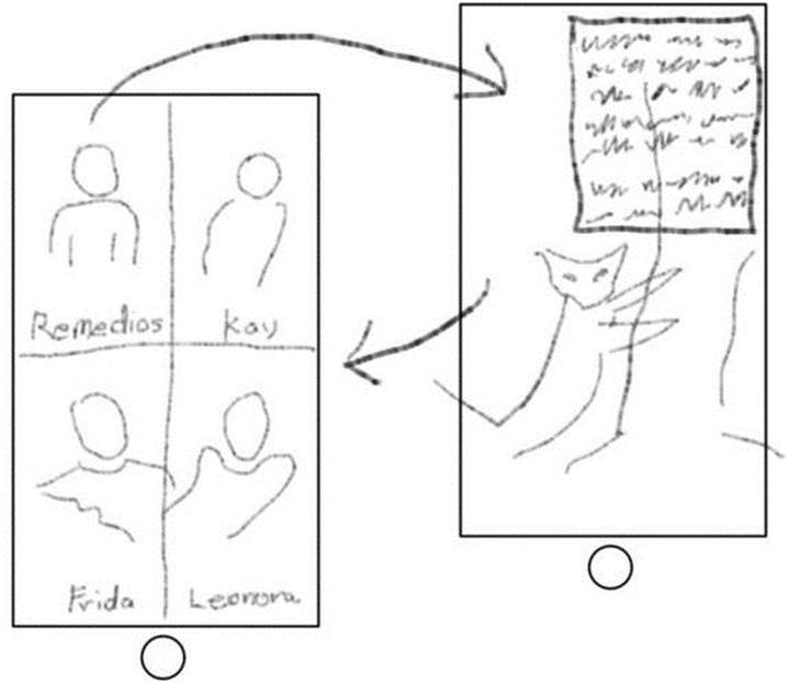
Figure 2-1. Sketch of Surrealist app
Creating the Project
The first step is to create your project. Click the New Project button in the startup window or choose the File  New Project command. Review the available templates, as shown in Figure 2-2.
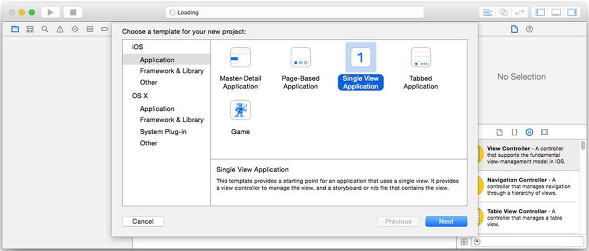
Figure 2-2. iOS project templates
Your design gives you a basic idea of how your app will work, which should suggest which Xcode project template to start with. Your app’s design isn’t a perfect fit with any of these, so choose the Single View Application template—it’s the simplest template that already has a view. Click the Next button.
The next step is to fill in the details about your project (see Figure 2-3). Name the project Surrealists and fill in your organization name and identifier. Consistent with your design choices, change the Devices option from Universal to iPhone, as shown in Figure 2-3. The choice of language doesn’t matter since, as I already mentioned, you won’t be writing any code for this app.
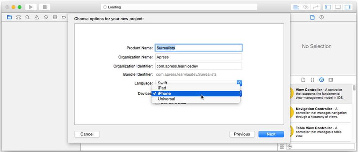
Figure 2-3. Setting the project details
Note Developing for the iPhone is the same as developing for the iPod Touch (unless your app uses features available only on the iPhone). From here on, I’ll mention the iPhone only, but please remember that this also includes the iPod Touch.
Click the Next button. Pick a location on your hard drive to save the new project and click Create.
Setting Project Properties
You now have an empty Xcode project; it’s time to start customizing it. Begin with the project settings by clicking the project name (Surrealists) in the project navigator, as shown in the upper left of Figure 2-4. The editor area will display all of the settings for this project. If your project’s targets are collapsed, pick the Surrealist target from the pop-up menu, in the upper-left corner of the editor (see the left side of Figure 2-4). If your project’s targets are expanded, simply select the target from the list, as shown in the middle of Figure 2-4. Once you’ve picked the target, select the General tab in the middle, as shown on the right in the same figure.
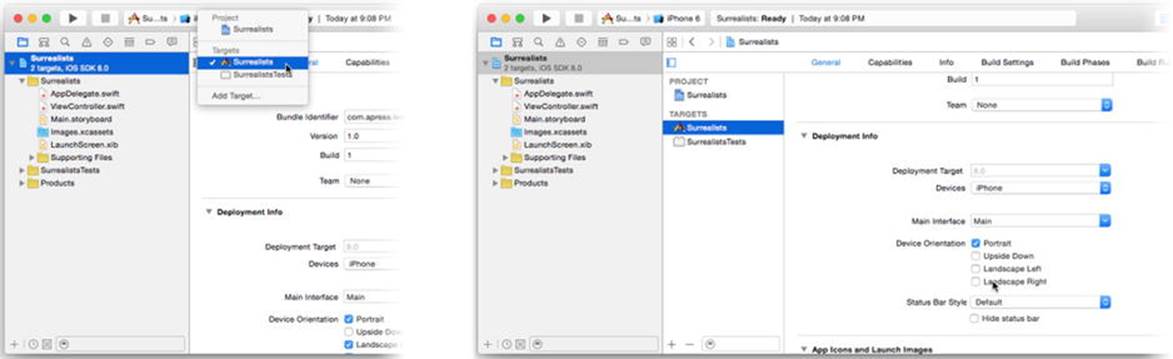
Figure 2-4. Target settings
Scroll down the target settings until you find the Deployment Info section. Uncheck the Landscape Left and Landscape Right boxes in Device Orientation so that only the Portrait orientation is checked.
To review, you’ve created an iPhone-only app project that runs exclusively in portrait orientation. You’re now ready to design your interface.
Building an Interface
Click the Main.storyboard file in the project navigator. Xcode’s Interface Builder editor appears in the edit area, as shown in Figure 2-5.
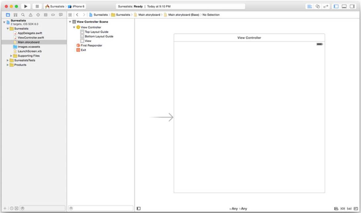
Figure 2-5. Interface Builder
Interface Builder is the secret sauce in Apple’s app kitchen. In a nutshell, it’s a tool that adds, configures, and interconnects objects within your app—without writing any code. You can define most of the visual elements of your app in Interface Builder. Interface Builder edits storyboard, xib, and (legacy) nib files.
Note Modern Interface Builder files have extensions of .xib or .storyboard. Legacy Interface Builder files have a .nib (pronounced “nib”) extension, and you’ll still hear programmers refer to all of them generically as “nib” files. The NIB acronym stands for Next Interface Builder because the roots of Xcode, Interface Builder, and the Cocoa Touch framework stretch all the way back to Steve Job’s “other” company, NeXT. Later in this book, you’ll see a lot of class names that begin with NS, which is an abbreviation for NeXTStep, the name of NeXT’s operating system.
Interface Builder displays the objects in the file in two views. On the left (see Figure 2-5) are the objects organized into a hierarchical list, called the outline. Some objects can contain other objects, just as folders can contain other folders, and the outline reflects this. Use the disclosure triangles to reveal contained objects.
Tip The outline can be collapsed to a dock of just the top-level object icons. Click the expand button, in the lower left of the canvas pane (bottom center in Figure 2-5), to toggle between the two views.
The view on the right is called the canvas. Here you’ll find the visual objects in your Interface Builder file. Only visual objects (such as buttons, labels, images, and so on) appear in the canvas. Objects that don’t have a visual aspect will be listed only the outline. If an object appears in both, it doesn’t matter which one you work with—they’re the same object.
Note If you’ve been learning an object-oriented programming language, then you know what an object is. If you don’t know what an object is, don’t panic. For now, just think of objects as Lego bricks—a discrete bundle that performs a specific task in your app and can be connected to others to make something bigger. Feel free to skip ahead to Chapter 6 if you want to learn about objects right now.
Adding Objects
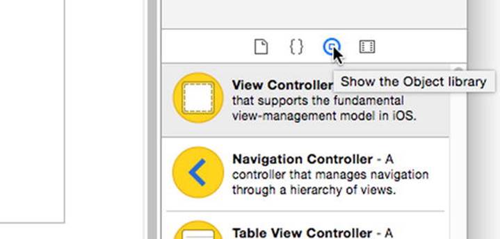
You get new objects from the library. Choose the View Utilities Show Object Library command. This will simultaneously make the utility area on the right visible and switch to the object library (the little round thing), like this:
To add an object to your app, drag it from the library and drop it into the Interface Builder editor. Your app needs a navigation controller object, so scroll down the list of objects until you find the Navigation Controller. You can simplify your search by entering a term (like nav) into the search field at the bottom of the library pane (see Figure 2-6).
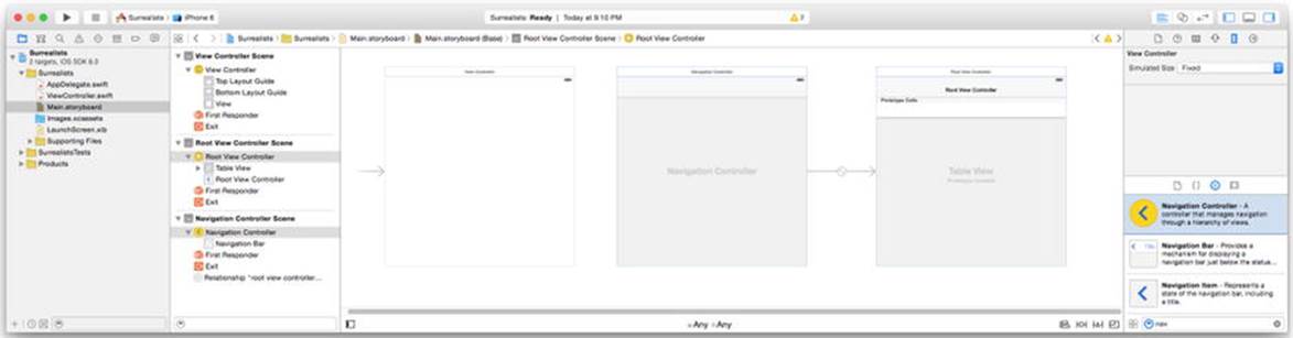
Figure 2-6. Adding a navigation controller
Drag the navigation controller object from the library into the canvas, as shown in Figure 2-6, and drop it anywhere in the blank space. You just added an object—several, actually—to your app.
Deleting and Connecting Objects
The library’s navigation controller object is really a cluster of objects. A navigation controller, as the name implies, manages how a user moves between multiple screens, each screen being controlled by a single view controller object. The navigation controller is connected to the view controller of the first screen that will appear, called its root view controller. Don’t worry about the details; you’ll learn more about navigation controllers in upcoming chapters.
For your convenience, the navigation controller in the library creates both a navigation controller object and the root view controller that it starts with. This root view controller happens to be a table view controller. This is a popular choice; navigation controllers and table views go together like bread and butter. Your project, however, doesn’t need a table view controller. Instead, you want this navigation controller to use the no-frills view controller you already have.
Start by discarding the superfluous table view controller. Select just the table view controller that’s connected to the navigation controller on the right, as shown in Figure 2-7. Press the Delete key, or choose Edit Delete.
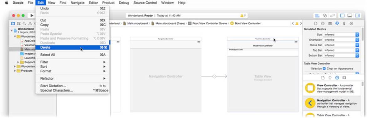
Figure 2-7. Deleting the table view controller
Now you need to connect your new navigation controller to the plain-vanilla view controller your project came with. Drag the original view controller and position it to the right of the navigation controller (see Figure 2-8). I tend to lay out my storyboards so they progress from left to right, but you can organize them however you want.
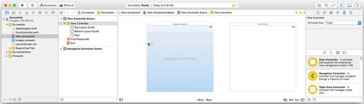
Figure 2-8. Designating the initial view controller
The unconnected arrow attached to the view controller indicates the initial view controller for your app. You want to make the navigation controller the first controller, so drag the arrow away from the original view controller and drop it into the navigation view controller, as shown in Figure 2-8.
The last step is to reestablish the navigation controller’s connection with its root view controller. There are numerous ways of making connections in Interface Builder. I’ll show you the two most popular. Right-click the navigation controller (or hold down the Control key and click) and then drag a line from it to the view controller, as shown in Figure 2-9.
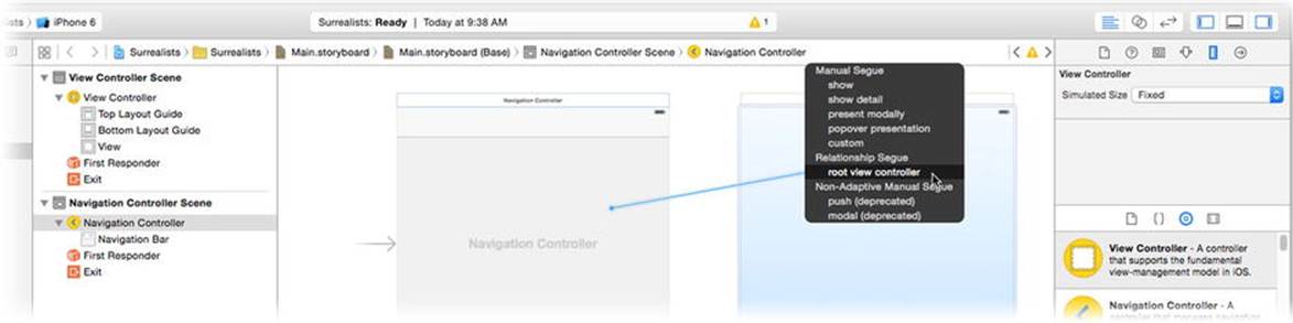
Figure 2-9. Setting the root view controller connection
When you release the mouse, a pop-up menu will appear listing all of the possible connections between these two objects. Click the root view controller connection. Now the navigation controller will present this view controller as the first screen when your app starts.
I did promise to teach you two ways of connecting objects. The second method is to use the connections inspector in the utility area. Choose View Utilities Show Connections Inspector, or click the little arrow icon in the utilities pane, as shown in Figure 2-10.
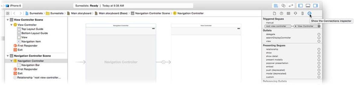
Figure 2-10. Using the connections inspector
To use the inspector, first choose an object. In this case, choose the navigation controller. The connections inspector will show all of the connections for that object. Find the connection labeled root view controller. To the right of each connection is a little circle. To set a connection, click and drag that circle to the object you want it connected to—in this case, the view controller. To clear (or “break”) a connection, click the small x next to the connection.
So far, you’ve created a new project. The project template included a simple view controller. You added a new navigation controller object (along with an unneeded table view controller, which you discarded) to your app. You designated the navigation controller as the one that takes control of your app when it starts, and you connected that controller to the empty view controller. Now it’s time to put something in that empty view.
Adding Views to a View
Now you get to the fun part of this project: creating your app’s content. Start by adding four buttons, which you’ll customize, to your opening screen. To do that, you need to work in your initial screen’s view object.
The view controller object is not a single object; it’s a bag of objects. I said earlier that some objects may contain other objects; view controllers and views are two such objects. Start by selecting the view object. There are two ways of doing this in Interface Builder. You can find the object in the outline on the left (see Figure 2-11) and select it. The other is to select the object directly in the canvas. Click in the center of the view controller (in the middle of Figure 2-11) to select its root view object—every view controller has a single root view object. You can confirm that you’ve selected the desired object in the outline.
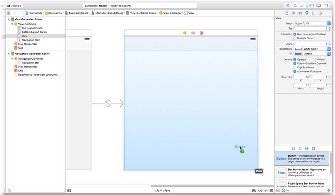
Figure 2-11. Selecting the view object
Tip Some visual objects are nested. A toolbar, for example, is a view object that contains individual button items. “Drill down” to select a nested object, click once to select the outer object (the toolbar), and then click again to select the nested object (an individual button item in that toolbar). If you’re unsure about what you’re selecting, use the outline.
Now it’s time to add some new view objects to your design. In the object library, find the Button object—type bu in the search field to make this easier. Grab a button object and drag it into the view object, as shown in Figure 2-11.
Repeat this three more times so you have four button objects inside the view, approximately like those shown in Figure 2-12. Now you want to resize these buttons so that each one approximately fills one-quarter of the screen. Figure 2-12 shows one button being resized—the background of the button was temporarily changed to gray so that it would be easier to see.
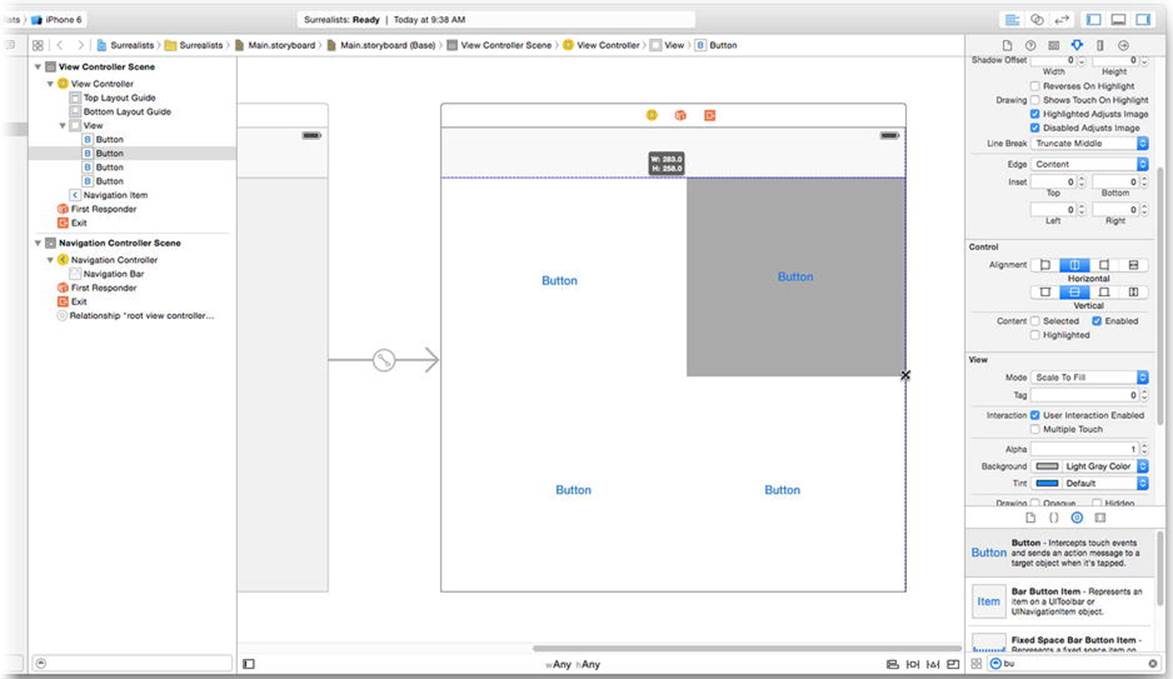
Figure 2-12. Positioning buttons
Editing Object Properties
Now it’s time to customize your buttons. Select all four buttons—click one button and then, while holding down the Shift key, click once on each of the other three. Choose View Utilities Show Attributes Inspector, or click the small control icon in the inspector pane, as shown in Figure 2-13.
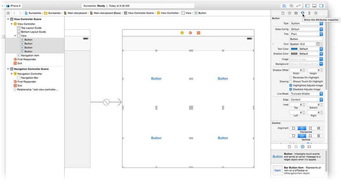
Figure 2-13. Customizing button objects
The attributes inspector is used to change various properties about an object (or objects). The properties in the inspector will change depending on what kind of object you have selected. If you select multiple objects, the inspector will present just those properties that all of those objects have in common.
With the four buttons selected, make the following changes using the attributes inspector:
· Change Type to Custom.
· Click the Font attribute and set it to System Bold 18.0.
· Click the Text Color pop-up menu and choose White Color.
· Find the Control group and select the bottom vertical alignment icon.
When you’re all done, your view should look like the one in Figure 2-14. The next step is to add an image and a label to each one, individually. To do that, you’re going to need to add some resources to your project.
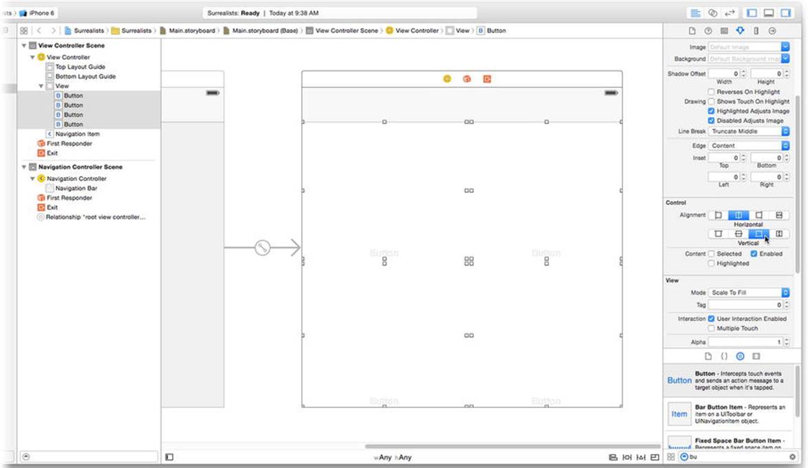
Figure 2-14. Customized buttons
Adding Resources
Everything that your app needs to run must be part of the app that you build. If your app needs an image, that image must be included in its resources. Image files, Interface Builder files, sound files, and anything else that’s not computer code are collectively referred to as resources.
You can add virtually any file as a resource to your app. Resource files are copied into your app’s bundle when it is built and are available to your app when it runs.
Xcode has a special way of organizing commonly used media resources, such as images, into a single resource called an asset catalog. To add new images to an asset catalog, select the catalog in the project navigator, as shown in Figure 2-15. Locate the resource files you want to add in the Finder. You’ll find these in the Learn iOS Development Projects folder you downloaded in Chapter 1. Inside the Ch 2 folder you’ll find the Surrealists (Resources) folder, which contains eight image files. With the files and your workspace window visible, drag the eight image files into the group list (left side) of the asset catalog, as shown in Figure 2-15.
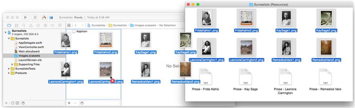
Figure 2-15. Dragging resource files into an asset catalog
The files will be copied to your project folder, added to the project navigator, and added to your app as a resource. Xcode can’t edit these files, but the preview pane (see Figure 2-16) lets you review thumbnails of them.
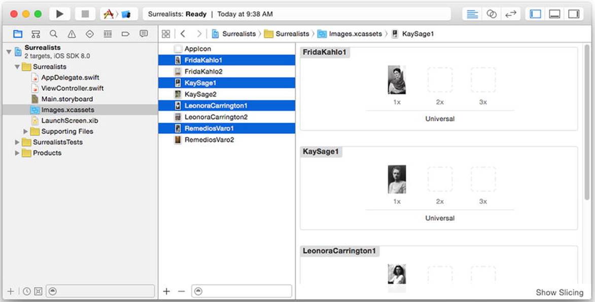
Figure 2-16. Previewing image files
THE RESOLUTION OF IMAGE ASSETS
Older iOS devices display one pixel per coordinate point of the interface. Newer iOS devices have Retina and Retina HD displays that have two or three pixels per coordinate point. To accommodate these higher-density displays, an assets catalog will organize multiple versions of each resource image.
In Figure 2-16, notice that each image has a 1x, 2x, and 3x version—the latter two being blank in this project. I supplied you only with 1x versions of these images, which is sufficient to get the app to work. Ideally, you should also include 2x and 3x versions of every asset image in your app so your app looks pin sharp on newer devices.
To add resolutions, simply prepare two more image files—one at exactly twice the resolution (pixel dimensions) and one at thrice the resolution. Drop these into the 2x and 3x image wells, respectively. The Cocoa Touch view classes work with the asset catalog to automatically load the version of the image that matches the resolution of the device your user is running. You don’t even have to write any code.
Customizing Buttons
With the necessary resource files added, it’s time to customize your buttons. Select the Main.storyboard file again and select the upper-left button. Reveal the attributes inspector (View Utilities Show Attributes Inspector) and change the title property to Remedios Varo and the background property to RemediosVaro1.png, as shown in Figure 2-17.
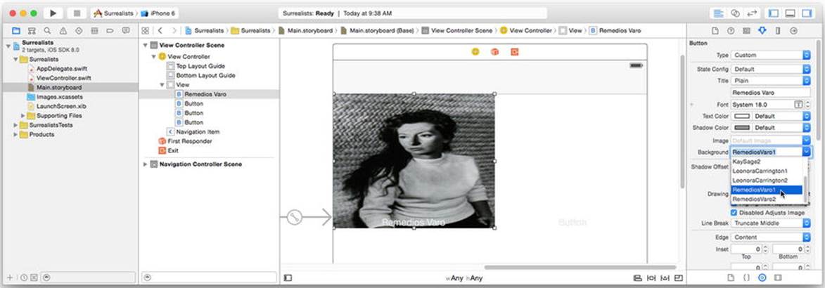
Figure 2-17. Customizing the first button
The background property is the resource name of the image you want the button to use for its background. You can type it in, but Xcode recognizes common image types and includes the image resources you just added to the drop-down list. Just select the filename from that list.
Note The background image will look distorted in your layout. Don’t worry about this; it will look OK in the running app. You’ll understand why later.
Customize the remaining three buttons (working clockwise), setting their title and background image as follows:
· Kay Sage, KaySage1.png
· Leonora Carrington, LeonoraCarrington1.png
· Frida Kahlo, FridaKahlo1.png
As a finishing touch, select Kay Sage’s button and change the Text Color to Black Color (so it’s easier to read). When you’re all done, your interface should look like Figure 2-18.
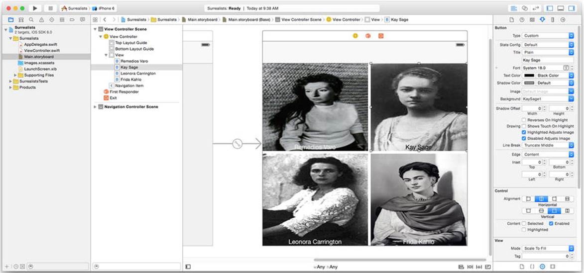
Figure 2-18. Finished buttons
Using Storyboards
Storyboards simplify your app development by allowing you to plan your app’s screens and define how the user will navigate between them. Before storyboards, you could design your screens in Interface Builder, but each was in a separate file, and you had to write code to move between them. It wasn’t a lot of code, and it wasn’t complex, but it was a chore. With storyboards, you can see everything in one document and connect them—often without writing any code at all.
FRICTIONLESS DEVELOPMENT
Repetitive code is a drag on development. The time you spend writing the same code, over and over again, is time you don’t have to develop cool new features. What you want is a frictionless development environment, where the simple tasks are taken care of for you, leaving you time to work on the stuff that makes your app special.
Apple works hard on making iOS and Xcode as frictionless as possible. Every release adds new classes and development tools to make developing high-quality apps easier. For example, before the introduction of gesture recognizers, writing code to detect multitouch gestures (such as a pinch or a three-fingered swipe) was a complicated task, often requiring a page or more of code. Today—as you might have guessed already—your app can detect these gestures simply by dropping a gesture recognizer object into your design and connecting it to an action.
Let’s use storyboards to define the remaining screens of your app and how the user will navigate between them.
Adding New Scenes
Before you can create a transition between two screens, called a segue (pronounced “seg-way”), you must first create another view controller (called a scene in storyboard-speak). Return to the object library and drag in a new view controller object into your Main.storyboard file, as shown in Figure 2-19.
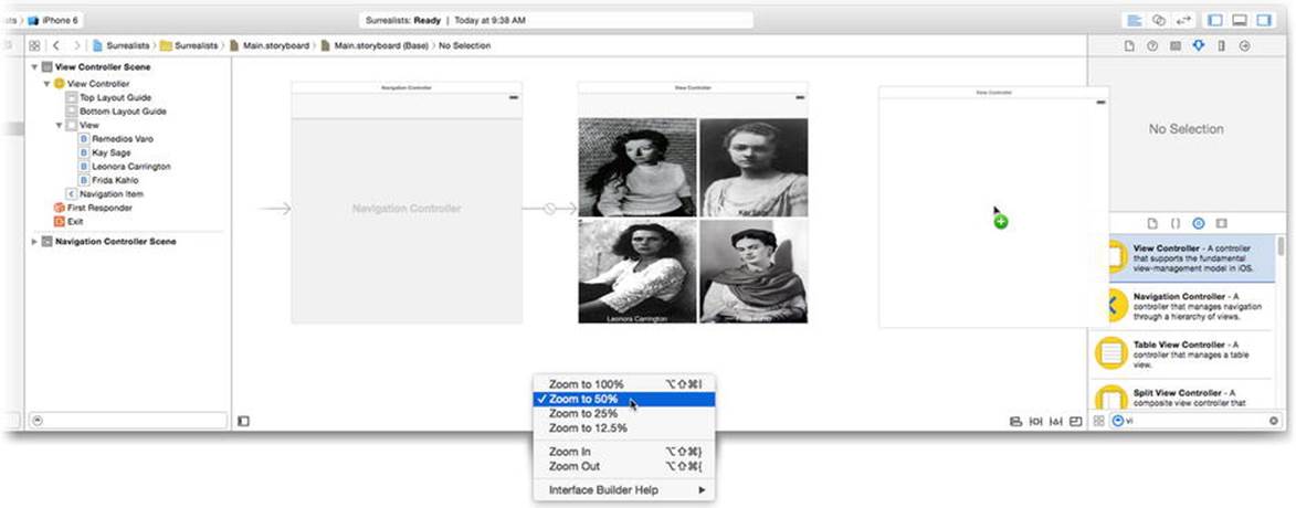
Figure 2-19. Adding a new view controller
Tip Sometimes storyboards can be a little unwieldy, especially on smaller screens like a laptop. To get a bird’s-eye view, zoom out by Control+clicking or right-clicking any blank portion of the Interface Builder canvas and choosing one of the zoom commands, as shown in Figure 2-19.
Locate the image view object in the library. Drag one into the empty view, as shown in Figure 2-20.
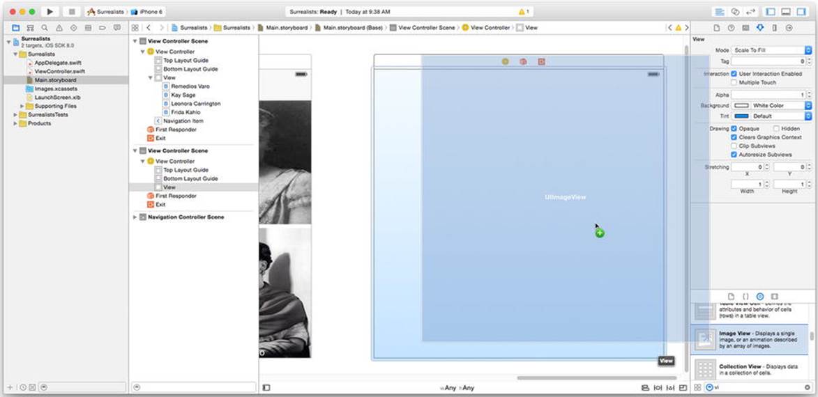
Figure 2-20. Adding an image view object
If the image view object didn’t snap to fill the whole view, drag it around until it does. With the new image view object still selected, switch to the attributes inspector. Change the Image property to RemediosVaro2.png and change the image mode to Aspect Fill, as shown in Figure 2-21.
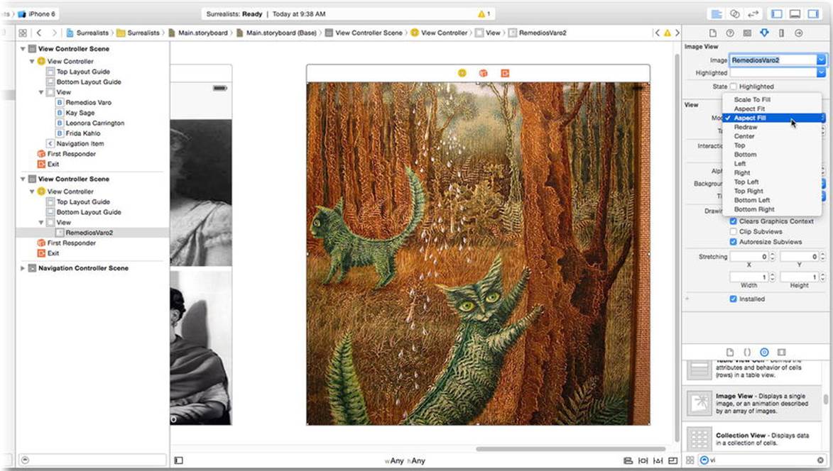
Figure 2-21. Customizing the image view
Now add a scrolling text field to this screen. Locate the text view (not the text field!) object in the library. Drag a new text view into the window and position it, using the automatic user interface guides, in the upper-right corner of the scene, as shown in Figure 2-22.
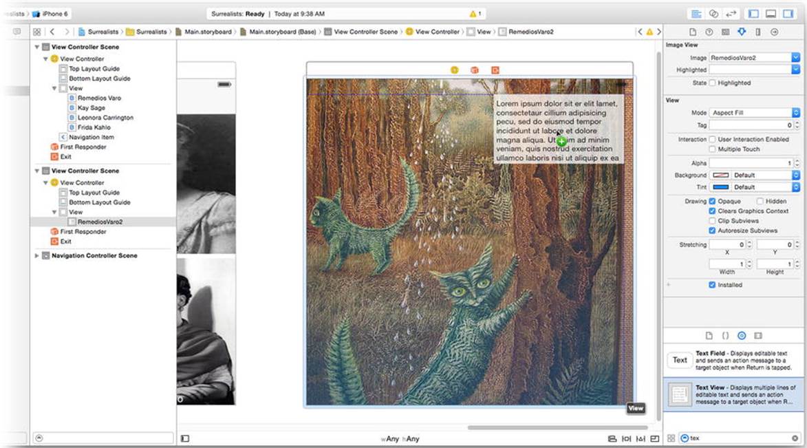
Figure 2-22. Adding a text view
With the text view selected, use the attributes inspector to change the following properties:
· Set text color to White Color.
· Reduce the font size to 12.0.
· Uncheck the Editable option.
· Further down, uncheck Shows Horizontal Indicator.
· Click the Background Color’s color well (the sample color on the left side of the pop-up). This will reveal a color picker palette. Use the gray slider to choose 50 percent gray with a 33 percent alpha or opacity (see Figure 2-23).
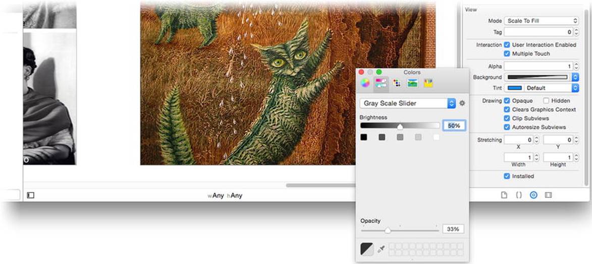
Figure 2-23. Setting a semitransparent background color
You can find the text for this object in the Surrealists (Resources) folder where you found the image files. You won’t add these files to your project, however. Instead, open the file named Prose - Remedios Varo, copy the text, switch back to Xcode, and paste it into the object’s Text property using the attributes inspector, as shown in Figure 2-24.
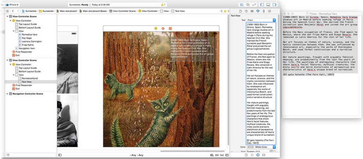
Figure 2-24. Pasting text into a text field object
Creating a Segue
With your initial scenes designed, it’s time to define the segue between the main screen and this one. You want this screen to appear when the user taps the Remedios Varo button. To create this segue, Control+click or right-click the Remedios Varo button, drag the connection to this new view controller, and release the mouse, as shown in Figure 2-25.
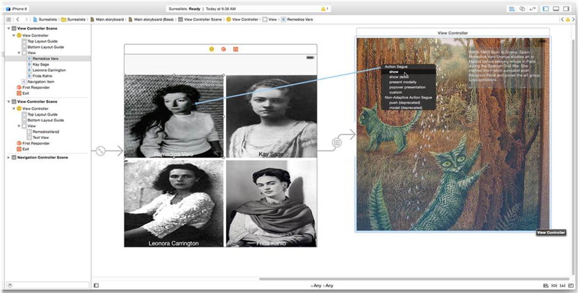
Figure 2-25. Creating a segue
When you release the mouse button, a pop-up menu will appear with the possible segue types. Choose show (see Figure 2-25). When your user taps the Remedios Varo button, your segue will perform a “show” transition. It works with the navigation controller to slide the new screen into view.
Setting Navigation Titles
The initial view controller is, itself, under the control of the navigation controller object you created at the beginning. The job of the navigation controller is to present a series of views underneath a navigation bar. The navigation bar—which you’ve seen a hundred times—displays the title of the screen you’re looking at and optionally has a back button to return you to the screen you came from. The navigation controller handles all of the details.
When you added a show segue to the second screen, the second screen falls under the control of the navigation controller too. When a show segue is used with a navigation controller, it replaces one view with another and makes the original view the target of the back button in the new view. This is called a push.
So that this is meaningful to your user, you’ll want to set the titles for each screen. This will make the navigation bar intelligible.
Select the navigation bar in the initial view controller and have the attributes inspector handy. Change the title of the navigation bar to Woman Surrealists and set the back button property to Surrealists. Most Interface Builder objects with a title can be edited simply by double-clicking the title in the canvas, as shown in Figure 2-26. Alternatively, you can select the object and edit its title property in the attributes inspector, also shown on the right of Figure 2-26. Setting the optional back button property will assign a more succinct title to the back button on screens that return to this one.
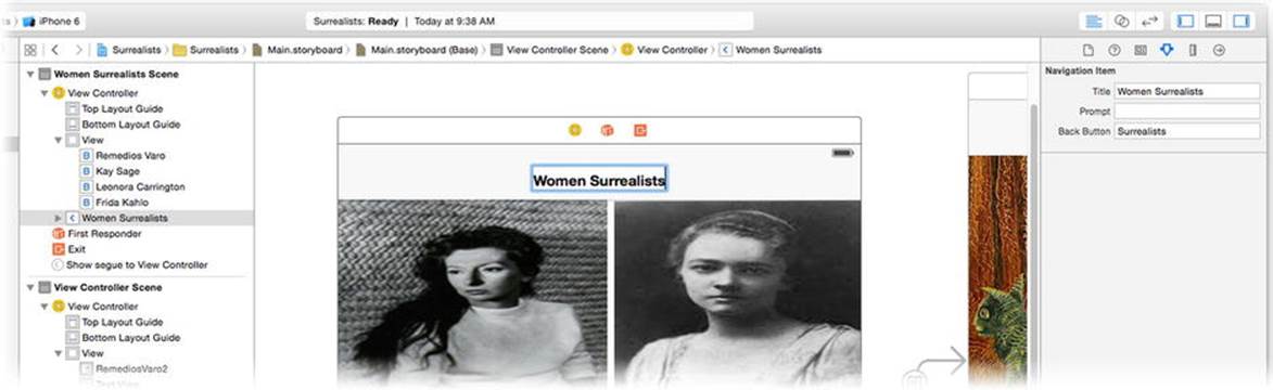
Figure 2-26. Editing the navigation bar title
Finally, select the view controller in the second scene and change its title to Remedios Varo, as shown in Figure 2-27.
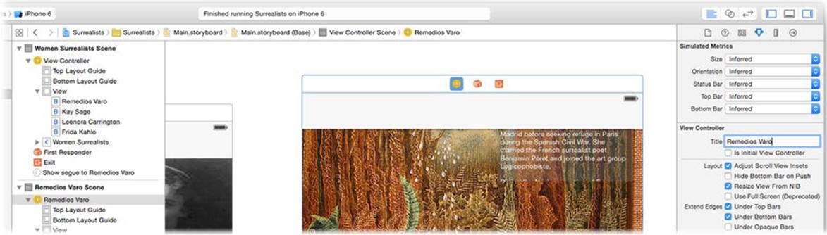
Figure 2-27. Setting the view controller’s title
Testing Your Interface
You’ve been very patient, but the moment of truth has finally arrived. You have now built enough of your app to see it in action! Make sure the run target is set to one of the iPhone simulators, as shown in Figure 2-28.
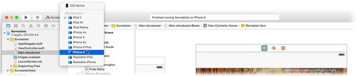
Figure 2-28. Selecting the run target
Click the Run button. Xcode will build your app and start it running in the simulator. If, for some unexpected reason, there are problems building your app, messages describing those problems can be found in the issue navigator (View  Navigator Show Issue Navigator).
Your app will appear in the iPhone simulator and should look like the one on the left in Figure 2-29.
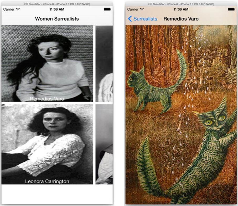
Figure 2-29. The first test of your app
Tap the button in the upper left, and the second screen slides smoothly into view. A navigation bar appears at the top with the name of the screen and a back button. Tap the back button to return to the initial screen. Your app has all of the standard behavior of an iOS app: a touch interface, title bars, animation, navigation, and everything works exactly as you expect it to. Well, not exactly.
Debugging Your App
You can run your app, and it—more or less—functions the way you designed it. But wow, does it look bad! The buttons on the first screen don’t fit, and there are weird gaps between some of them. The second screen shows the painting, but the text view isn’t anywhere to be seen. What’s going on?
I hate to tell you this, but your app has bugs. A bug is usually used to describe a flaw in computer code, but any defect in how your app behaves or operates is a bug, and you need to fix it. The process of tracking down and fixing bugs is called debugging. In this case, the issue has to do with how your views are resized, or repositioned, for different devices. The problem is that your interface didn’t adapt to the display size of the iPhone.
Note The term bug originated from a moth that expired in one of the earliest digital computers, causing it to malfunction. I’m not kidding. There’s a picture of the moth on Grace Hopper’s Wikipedia page (http://en.wikipedia.org/wiki/Grace_hopper).
iOS 8 introduces a new philosophy in interface design. Instead of designing your interface for specific devices, you design it once for a kind of “generic” device—the big square you’ve been working with in Interface Builder. This isn’t intended to represent any particular device or any particular orientation. It’s just a container you use to organize your views. When it comes time to present that view in your app, the view must be adapted to the actual device, screen size, resolution, and orientation. You haven’t told iOS how to do that yet.
There are lots of ways of adapting an interface, and you’ll explore most of them in later chapters, but the tool of choice is auto-layout. Auto-layout positions and resizes your view objects based on a set of constraints. A constraint is a rule describing some aspect of your view’s geometry. A constraint can be as simple as “the height of this view is 20 points.” Constraints can also be relative to other views, as in “the left edge of this view is exactly 8 points from the right edge of that button.” Create the right set of constraints, and iOS can reorganize your views no matter how big, small, tall, or wide the user’s device is.
Switch back to Xcode and select your Main.storyboard file. You’ll add some constraints to your interface so they adapt to an iPhone’s display.
Adding Basic Constraints
Even a “simple” interface, with only a few views, may require a dozen or more constraints to communicate your intent to auto-layout. Fortunately, Xcode provides lots of smart ways to add constraints and can often guess which ones you need, with some hints here and there.
Let’s start with the image view object (the one with the cat painting) in your second view controller. When you dropped a new image view into your design, Xcode took a guess that you wanted it to fill the entire view, which was correct. You need four constraints to have that image view fill the entire interface no matter what size the device display size is.
· The top edge of the view must be at the same position as the top edge of its enclosing view.
· The left edge of the view must be at the same position as the left edge of its enclosing view.
· The right edge of the view must be at the same position as the right edge of its enclosing view.
· The bottom edge of the view must be at the same position as the bottom edge of its enclosing view.
The image view’s enclosing view is the root view of the view controller. (You can see this relationship in the Interface Builder outline.) This root view is always the size of the display area for the view controller. You can’t change that, even if you try. The root view’s size becomes the first set of constants from which you can build constraints. When you give auto-layout a constraint that says “the top edge of the image view must be at the same position as the top edge of its superview,” it will move the position of the top edge of the image view to the top of the display. That’s its only choice; the superview is immovable, so moving the image view is the only solution. With all four constraints, the image view will always be the exact size of its superview.
At the bottom right of the canvas area you’ll find four controls (also shown in Figure 2-30). They are, from left to right, as follows:
· Alignment constraints
· Pin constraints
· Resolve auto-layout issues
· Reposition constraint preferences
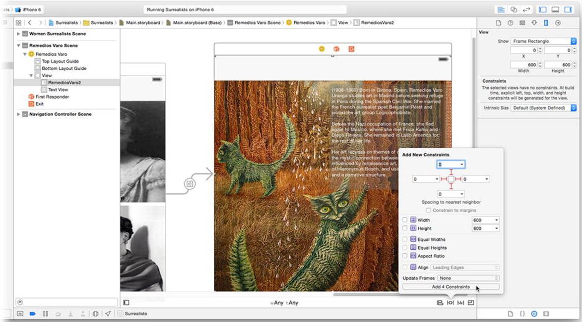
Figure 2-30. Adding edge constraints to the image view
With the image view selected, click the pin constraints control (second from the left). The pin constraints control lets you add common constraints that express either a fixed dimension or a fixed distance to another view. In the pop-up panel (see Figure 2-30) start by unchecking the Constrain to margins option. The margins are for content that’s inset from the edge, and that’s not the case here. Click the struts to add top, left, right, and bottom distance constraints, all set to 0 (also shown in Figure 2-30). If any default value is not 0, change it so it is. Click the Add 4 Constraints button.
With the image still selected, reveal the size inspector in the utility area (View Utilities Show Size Inspector). The size inspector displays all of the constraints that relate to this view. As you see, Xcode has added four new constraints: Top Space to, Leading Space to, Trailing Space to, and Bottom Space to. These are the four constraints listed earlier. Congratulations, you’re done with the constraints for the image view.
Note The left and right edges of a view can also be referred to as the leading and trailing edges. When your user’s language is one that reads from left to right (such as English), the leading edge is the left edge. If your user’s language reads from right to left (such as Hebrew), the leading edge is the right edge. This allows constraints to reverse the layout and alignment of your views for right-to-left readers. Xcode prefers to create leading/trailing constraints, but you can change them to right/left edge constraints if your layout should not be transposed for right-to-left languages.
Adding Missing Constraints
Now try a slightly different set of constraints. Drag the text view down a little and position it so it “snaps” to the human interface guidelines close to the right edge and just below the placeholder for the navigation bar at the top, as shown in Figure 2-31.
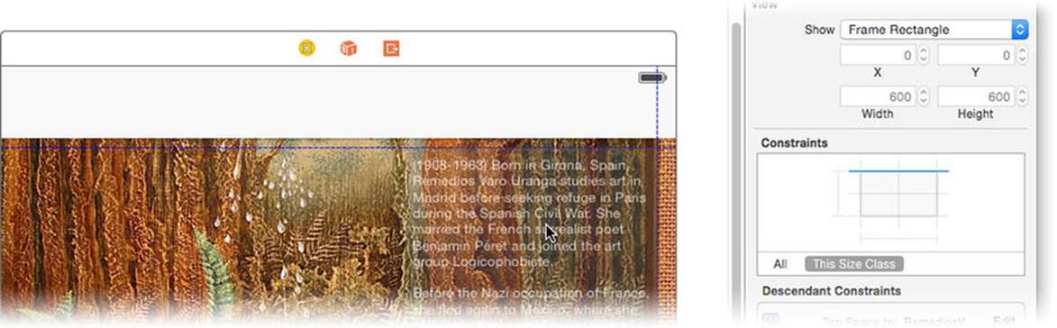
Figure 2-31. Repositioning text view
Tip When adding constraints, I recommend placing your views as close to their ultimate layout as you can. Xcode makes it easy to define constraints for relationships that already exist in your design.
With the text view still selected, choose the pin constraints control (second from the left) again. This time add a height of 270 points and a width constraint of 230 points, as shown on the left in Figure 2-32. Click the Add 2 Constraints button.
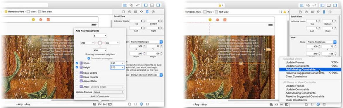
Figure 2-32. Adding size constraints
With the text view still selected, choose the resolve auto-layout issues control (third button from the left) and choose the Add Missing Constraints command, as shown on the right in Figure 2-32. Xcode can often infer what constraints your views needs if you first position it where they should be in the layout. By positioning the text view using the top and right layout guides, Xcode guessed (correctly) that you would like top and trailing edge constraints attached to the top layout guide and right margin. If your layout is obvious, the Add Missing Constraints command will save you a lot of time.
The layout objects are special view objects just to assist constraints. Each represent the position where the usable content of your view begins. Some visual elements are outside your view controller, like the status bar that’s normally at the top of the iPhone’s screen. Some visual elements, however, are inserted into your view, like the navigation bar that will be added by the navigation controller when your view is presented. In those cases, the top and bottom layout guides move to accommodate the new elements. Making your view relative to these guides keeps them visible and neatly positioned.
Tip If you have a view that disappears underneath a navigation or search bar, make sure you’re aligning to the top layout guide and not the edge of another view.
Editing Constraint Objects
Now take a moment to see how your design has changed, as shown in Figure 2-33. Constraints are objects, and they appear several different ways in Interface Builder. Select a view and the constraints associated with that view appear in both the size inspector (on the right in Figure 2-33) and the canvas. Distance and size constraints appear as struts, while alignment and zero-length distance constraints show up as straight lines.
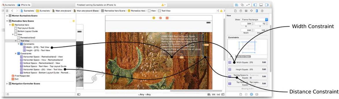
Figure 2-33. Examining view constraints
You can select a constraint in the canvas—although this can require a steady mouse hand because they can be very small. Constraint objects can also be selected in the outline (shown on the left in Figure 2-33). Edit the selected constraint with the attributes inspector or find the constraint in the size inspector and click its edit button.
Some constraints in your design appear orange and have a number attached to them. Xcode is telling you that the size or position of the object in your design doesn’t agree with the constraints. The number tells you how many points Xcode would like to adjust your view so it agrees. Specifically, you added a 270-point width constraint to the text view, but the text view in the canvas isn’t 270 points wide. When you run your app, that text view will be 270 points wide because that’s what the constraint demands. If you want to see your text view the same size in your design too, choose the Update Frames command from the resolve auto-layout issues control, as shown in Figure 2-34. These warnings are purely informational—ignoring them won’t change how your app runs.
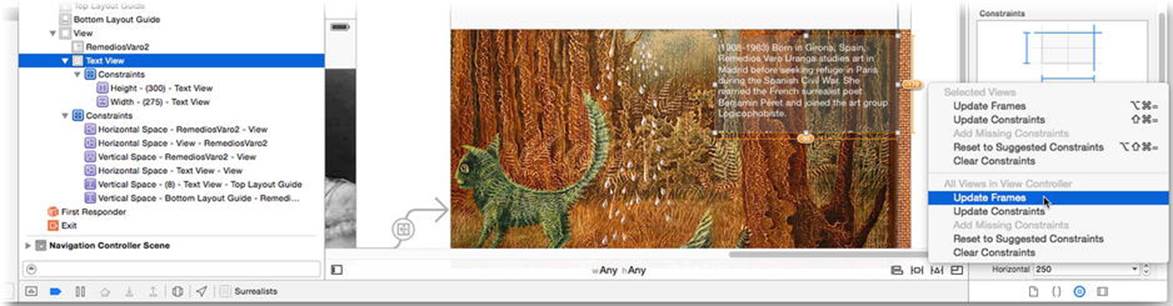
Figure 2-34. Updating frames to match their constraints
Note If you have insufficient or conflicting constraints, these will appear (in red) in the object outline.
Let’s try the constraints you’ve added so far. Run your app again, as shown in Figure 2-35, using the iPhone 6 simulator. The initial screen is still ugly—no surprise there. Tap the Remedios Varo button. This time, you have an attractive and usable interface, as shown in the middle of Figure 2-35.
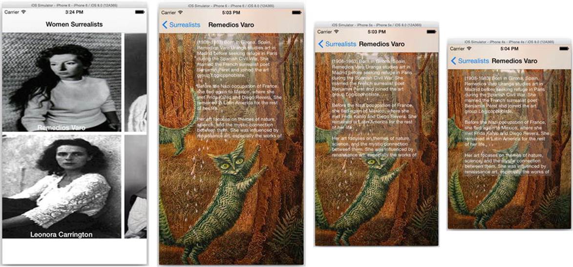
Figure 2-35. Testing constraints
More importantly, if you run your app again using the iPhone 5s and iPhone 4s simulators, your interface looks OK on those devices as well, as shown on the right in Figure 2-35. Now let’s fix those buttons.
Adding Relationship Constraints
The buttons present a little more of a challenge. You want to them fill the interface, and you want them to tile evenly. Filling the interface sounds a lot like the constraints you just added to the image view. And a few distance constraints between their inner edges should cause them to be flush and tile. That sounds like a plan.
Luckily, you can create all of these constraints in a single step. You essentially want the same constraints for all four buttons: the top, left, right, and bottom edges should touch the closest view or interface edge. Select all four button and click the pin constraints control, as shown in Figure 2-36.
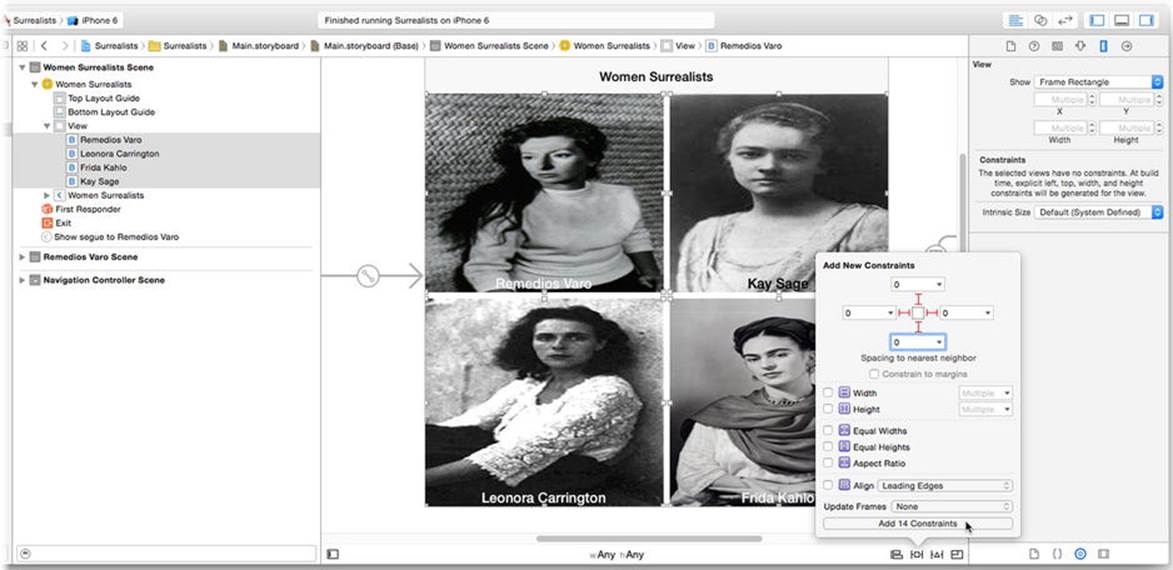
Figure 2-36. Pinning the buttons
Again, uncheck the Constrain to Margins option. Click the struts to add top, left, right, and bottom distance constraints to all four views. Edit the distances so that all four are 0, as shown in Figure 2-36. Click the Add 14 Constraints button.
Voilà! You’re done, right? Try selecting the Update Frames command from the resolve auto-layout issues control. You’ll probably get something that looks like Figure 2-37.
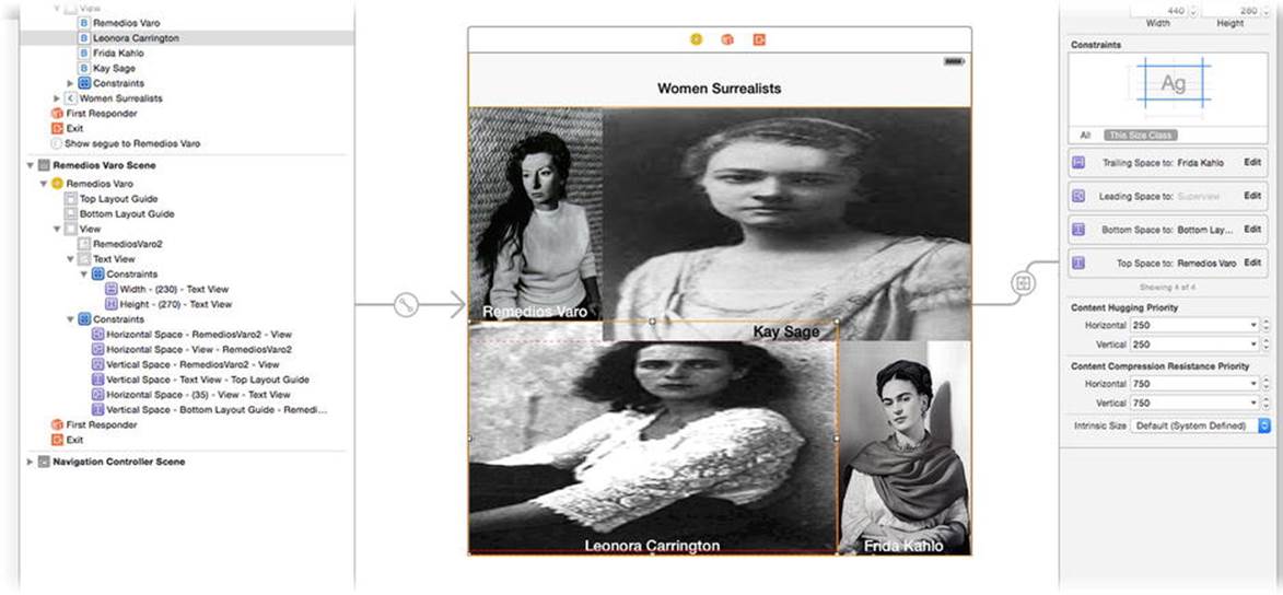
Figure 2-37. An unacceptable layout solution
Hilariously, the layout in Figure 2-37 satisfies all of the constraints but is clearly not what you want. You’ll need more, or different, constraints to get the desired geometry. Thinking about the problem, you want all four buttons to be the same size—and there’s a constraint for that.
Select the top two buttons and click the pin constraints control again. With multiple views selected, the Equal Widths constraint is available, as shown in Figure 2-38. Check the Equal Widths constraint and click the Add 1 Constraints button. You’ve now added a constraint that tells auto-layout that the width of these two view should be the same, whatever that is.
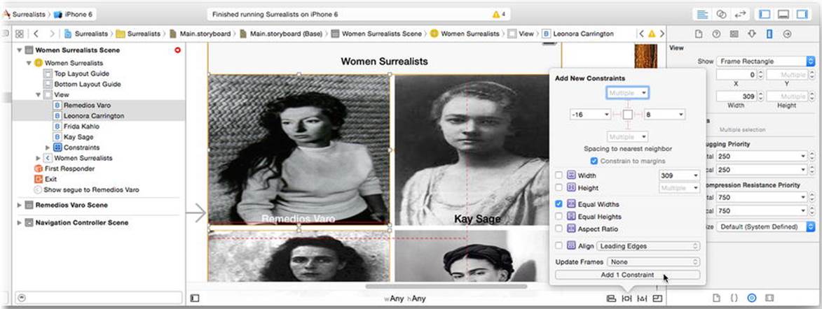
Figure 2-38. Adding an equal widths constraint
Now repeat with the bottom two buttons. Continuing the pattern, select the left two buttons and add an equal heights constraint. Repeat with the right two buttons.
Run your app again. Now things are looking like they should, as shown in Figure 2-39. Even on different devices, the buttons align and size to the available display.
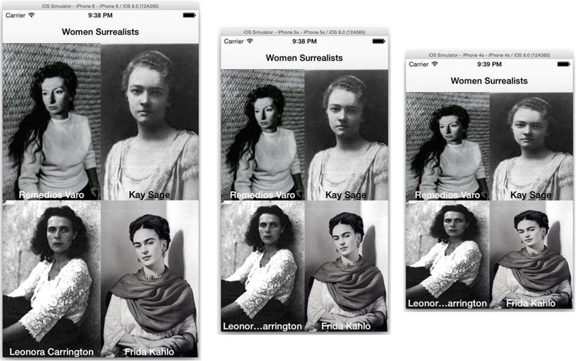
Figure 2-39. Tiled buttons using constraints
This isn’t the only solution to this problem. In fact, I can think of at least five different sets of constraints that would achieve the same layout. Like programming, that there is no single set of constraints that’s “correct.” Some constraint sets might be more elegant than others, but in the end either they work or they don’t. But enough about constraints, let’s wrap this app up.
Finishing Your App
Return to the Xcode workspace window and click the Stop button in the toolbar to stop your app. You could finish you app by repeating the steps in the “Adding New Scenes” section for each of the other three artist. But that sounds too much like work to me.
Select the view controller for Remedios Varo and copy it the clipboard, as shown in Figure 2-40. Click a blank portion of the canvas (to unselect any object) and paste in three more copies of the view controller. Arrange them so they don’t overlap.
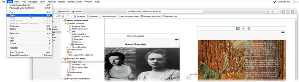
Figure 2-40. Copying the first view controller
Everything in the view controller has been duplicated. What didn’t get duplicated are objects and segues outside the view controller. Create three more segues by Control+clicking or right-clicking the other buttons and connecting each to one of the new view controllers, as shown in Figure 2-41. Choose the show segue, as before.
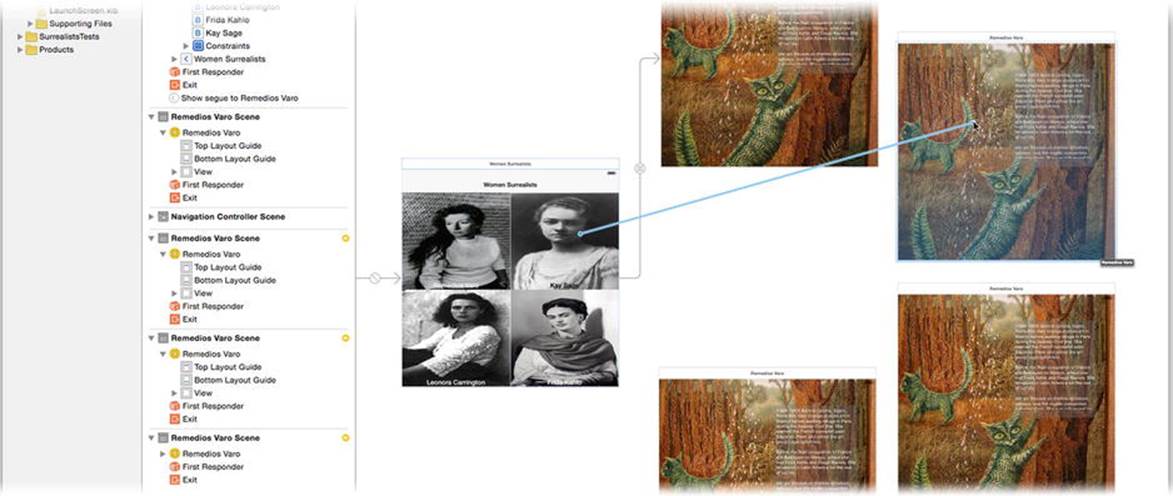
Figure 2-41. Connecting buttons to new view controllers
Now edit the contents of the new controllers with the information about the artist it’s connected to. Start with the scene connected to the Key Sage button. Edit its content as follows:
1. Select the image view and change its Image property to KeySage2.
2. Locate the Prose – Kay Sage text file and copy the text into the text view object.
3. Select the view controller object and change its title to Kay Sage.
Repeat with the remaining two view controllers, using the image, text, and title appropriate to the button it’s connected to. When you’re done, your design should look like Figure 2-42.
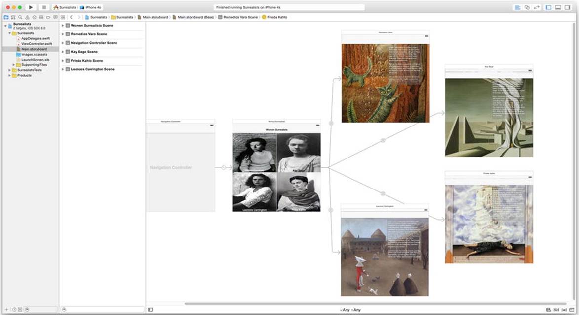
Figure 2-42. Finished app design
Now run your app and make sure everything works, as shown in Figure 2-43.
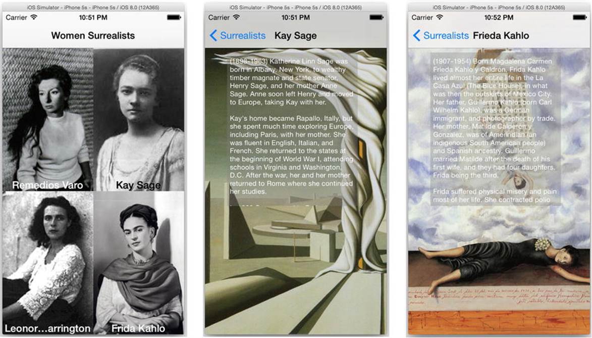
Figure 2-43. The working Surrealist app
This is a pretty simple app, but there are still a number of things you’ll want to test before pronouncing it finished.
· See that the layout of all screens looks pleasing on different devices.
· Make sure each button segues to the correct screen.
· Test that the text is correct and can be scrolled.
· Check all of the titles.
Does everything check out? Then your first iOS app is a success!
Summary
Give yourself a round of applause; you’ve covered a lot of ground in this chapter. You learned your way around Xcode, added resources to a project, and used Interface Builder to create, configure, and connect the objects of your interface; you also learned a lot about auto-layout constraints. Amazingly, you did that all without writing a single line of computer code.
The point of this chapter wasn’t to avoid writing Swift code. We are, after all, computer programmers. If we’re not writing code, what are we getting paid for? The point was to illustrate how much functionality you can add, and how much tedious detail you can avoid, using Interface Builder and iOS objects.
Are your coding fingers itchy? In the next chapter you’ll write a more traditional app—one with code.
All materials on the site are licensed Creative Commons Attribution-Sharealike 3.0 Unported CC BY-SA 3.0 & GNU Free Documentation License (GFDL)
If you are the copyright holder of any material contained on our site and intend to remove it, please contact our site administrator for approval.
© 2016-2026 All site design rights belong to S.Y.A.