Practical Auto Layout: Beginning Auto Layout Techniques for iOS8 (2015)
Chapter 1. About Autolayout and Size Classes
In iOS7 and earlier, storyboards were separate for iPads and iPhones. For a single device, there was extra code necessary to use the same app in landscape and portrait. With iOS 8 and new phone sizes, like the iPhone 6 plus, this has become a bit more of a problem. We could design a different storyboard for every size and orientation. That would be an excessive amount of work. Every new version of the phone or tablet would need to be different, with a separate storyboard. If you hear about device fragmentation this is what people are talking about: different devices need different layouts because their screens are different sizes. It's not just mobile devices that have this problem. Any window for a web page might be a different size. The web page needs to change to handle those differences.
Over that last few years, there have been many solutions to adaptive user interfaces, which are interfaces that adapt their size and shape automatically to the device or window they happen to be in. Apple's solution to this problem is auto layout, which lets the system do the hard work. Using relations between views, we describe how to layout the user interface.
In iOS 8, Apple introduced size classes, a way to describe any device in any orientation. Size classes rely heavily on auto layout. Until iOS 8 you could escape auto layout. Apple changed several methods for user interfaces and view controllers, in a way that you need auto layout to use them effectively.
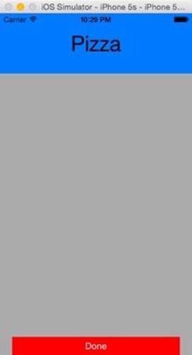
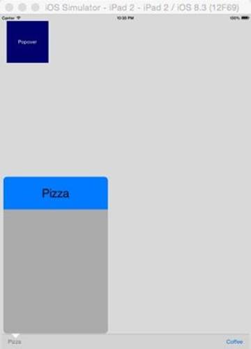
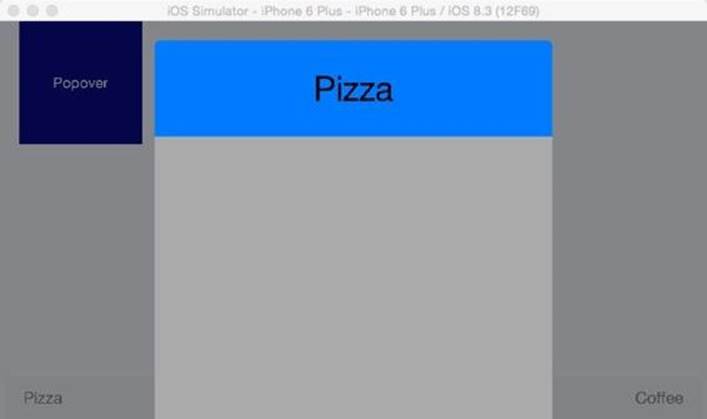
Size classes are not a cosmetic change. Many UIKit classes are completely revamped to handle them. Modal views, popovers, split views, and image assets directly use size classes to determine how to display an image. For example the same code to present a popover causes a iPhone to present a modal view:
an iPad to present a popover
And a iPhone 6 plus to open an form sheet in landscape
Size classes make it very easy compared to previous versions of iOS to make universal apps. The choice of iPad, iPhone or Universal becomes a simple question. More importantly, you cannot run away from them. In several cases, like split views or multitasking in iOS9 you have to use size classes and auto layout. Ignoring auto layout is no longer an option.
Auto layout and size classes are simple, once you know what you are doing. However that seems to be not so simple. Apple's documentation and videos are mostly theoretical, not a good practical introduction to getting a nice column of buttons. In this book, we'll demonstrate basic auto layout and size classes so it will make sense when we need to use them on the storyboard. We'll also explain the four problems you might encounter with auto layout and how to solve them.
A Visual Guide, Not a Coding Guide
This book is about auto layout on the storyboard and interface builder. We'll work on projects that make good looking and adaptable interfaces, without coding them. There are many active Swift and Objective-C developers. Developers need a guide to handle auto layout and size classes. For that reason, you will find no code here, only instruction to make .xibs and storyboards work using auto layout. You will find lots of screenshots to help explain what to do. We'll work through several examples to explain the auto layout concepts you need to know.