Practical Auto Layout: Beginning Auto Layout Techniques for iOS8 (2015)
Chapter 3. Beginning with Auto Layout
Let's try to put together a user interface using auto layout. We'll use three buttons, a label and a text view and make them appear properly sized and placed on any iPad or iPhone in both landscape and portrait.
Set Up the Project
Let's start with a new project. In Xcode, hit Command-Shift-N and make a new single view project named MySizePizzaDemo. Use Universal for the device and set Swift for the Language.
Once loaded, Go to the storyboard. On the bottom tool bar you will see the size classes like this:
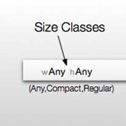
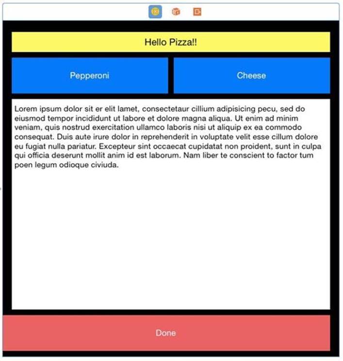
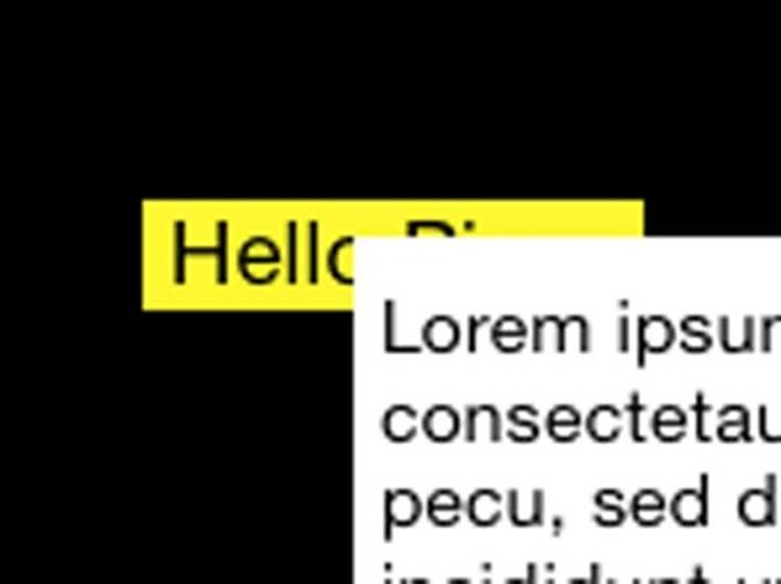
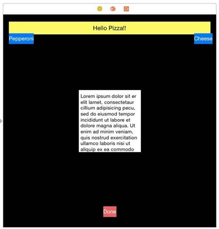
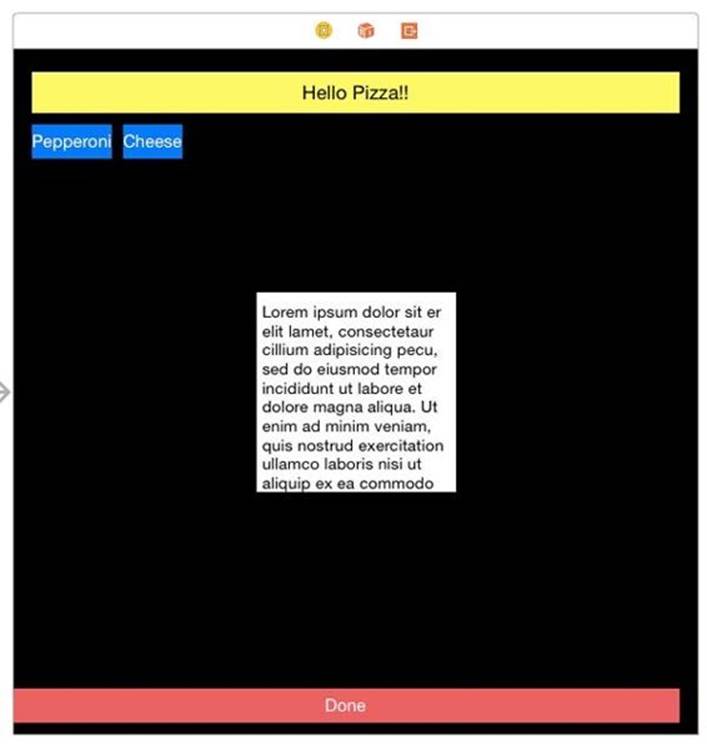
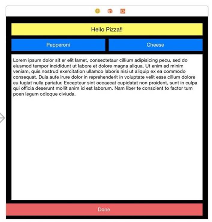
Make sure this reads wAny hAny. This is the most generic case, and thus works with everything. Drag onto the storyboard a label with a green background and black text centered. Make the label read Hello Pizza. Add a button with a red background with white text titled Done.
Add two more buttons with a blue background and white lettering. Title one Cheese and the other Pepperoni. Add a text view with the default black text on white background. Set the superview's background to black to see everything better.
Arrange the buttons so they look like this:
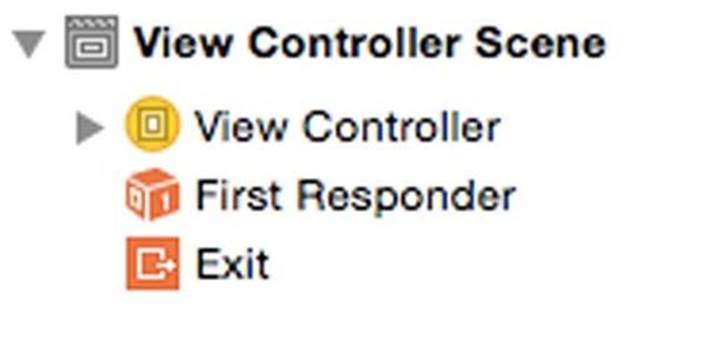
Stack Order in the Storyboard
If you do not have the document outline open, open it. It is the small icon  on the bottom left of the storyboard. You will see a new panel open. If it looks like this:
Click the arrow to next to View Controller. If it then looks like this:
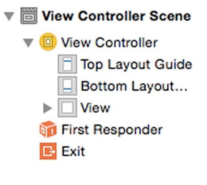
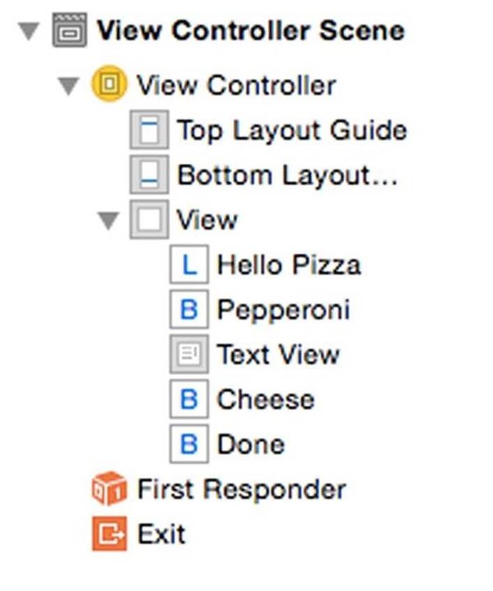
Click the arrow next to View. This opens up a list of the views we placed on the storyboard for this view controller.
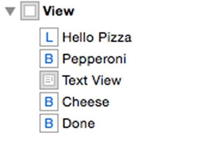
The document outline is one way of selecting any view on the storyboard. You will find this very useful the first time you find a view obscured by another view, or it seems to completely disappear. Click on the name of the view, and Xcode selects it on the storyboard.
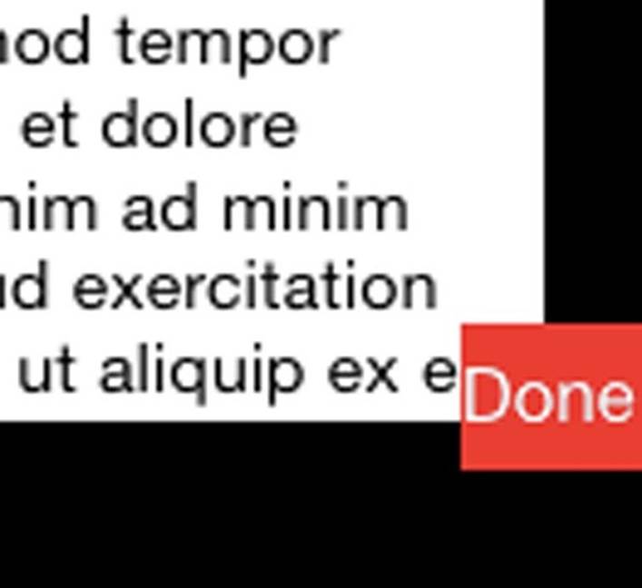
There is a little backward thinking here. The higher in the list a control appears, the farther back in the display order it appears. In the case above, the Hello Pizza label is in the back, the text view is in the middle and the Done button is on top. If you position the Done button over the text view, it will overlap it.
The label on the bottom of the stack order, will hide behind the text view:
The lessons that follows assume this stack order:
If you do not have this stack order, the instructions will give unexpected results. Some things will disappear. Auto layout will make bad assumptions. Click-drag the controls in the outline up and down until they match this stack order.
Center Align the Text View
To start using constraints, we will align the text field to the center of the superview. Select the text view and then click the alignment button. Check Horizontal Center in Container and Vertical Center in Container, and select Items of New Constraints like this:
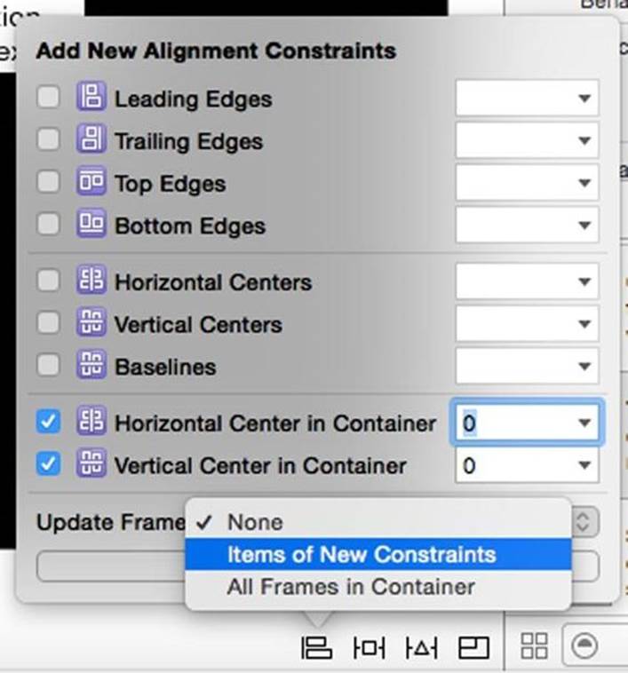
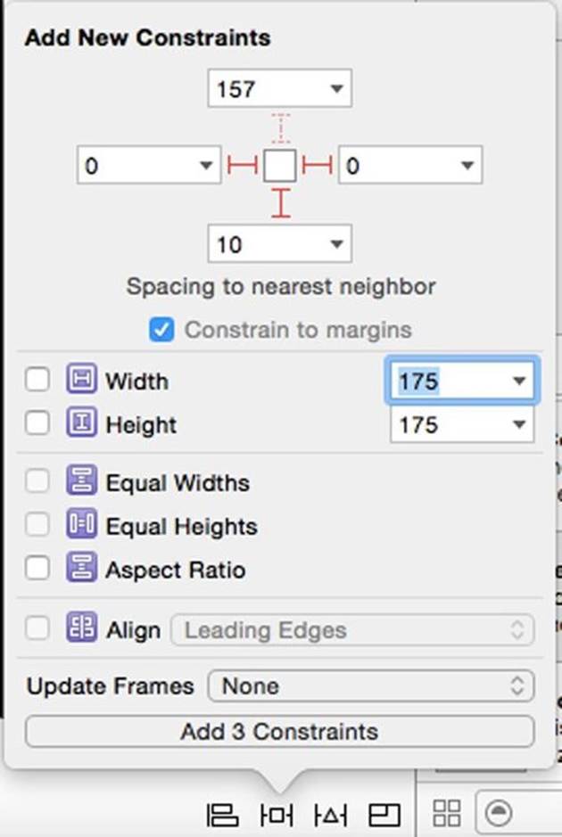
Add the two constraints. Your results are not very exciting. The text view almost disappears. This is why you might want to wait until you have set all your constraints to update a frame. The text view has no size, so auto layout assumes a size of 0 height and 0 width. If not still selected, select the text field in the document outline. Click the pin button and set the Width to 175 and the Height to 175. Again update the frames for Items of New Constraints then add the constraints. Our text field shows up again.
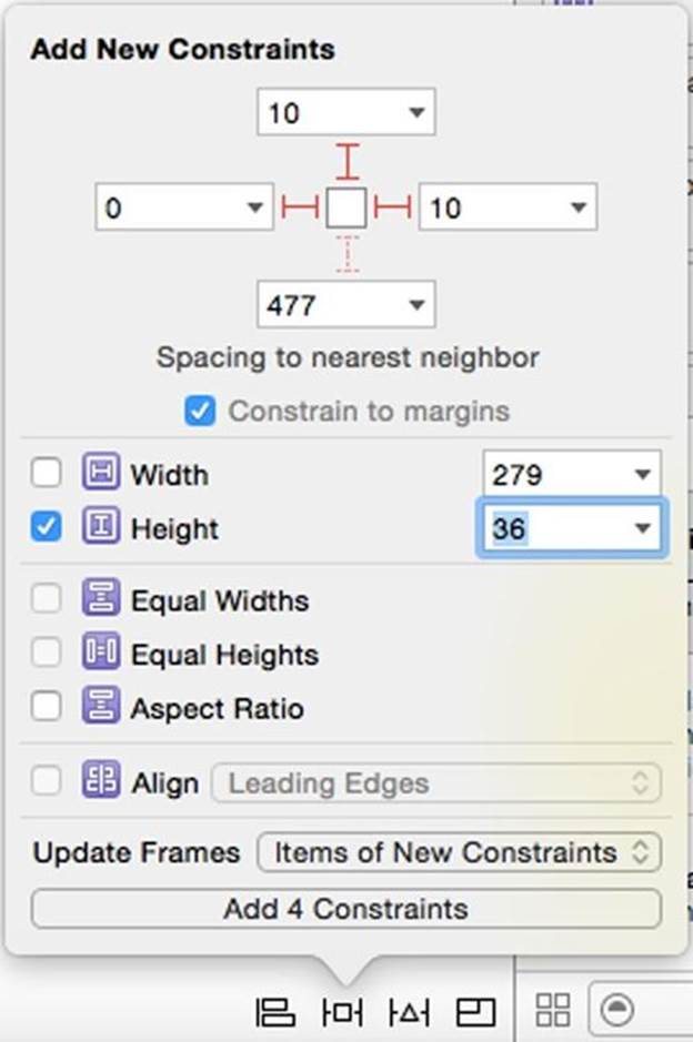
Pinning the Label
For the label, let's pin everything. Select the label. Pin to the Top, Left and Right with a value of 0 points. Set the Height to 36 points like this:
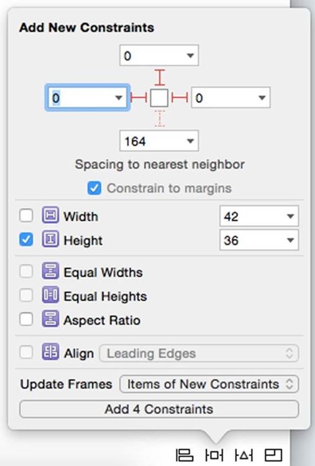
To turn on the I-beam in the menu, click on one of the dotted I-beams. When entering numbers into the fields, be sure to press tab after each entry or the value will revert to its previous value. This time everything is set on this one page. Update frames with Items of New Constraints. The storyboard should look like this:
We didn't specify a width. We pinned the leading and training edges of the label to the left and right margins, and let auto layout figure out the width for the device it will display on. The width will act as a rubber band - stretching and compressing to the width of the display.
Constraints with Control-Drag
We could set up constraints the same way for the Done button as we did with the label. There is another way to make a constraint which can be helpful. Using control-drag while on the storyboard brings up a menu of all possible constraints in this case. Select the Done button. Control-drag straight down from the button until your cursor is over the black of the superview. When the superview highlights, release the mouse button. You get this menu:
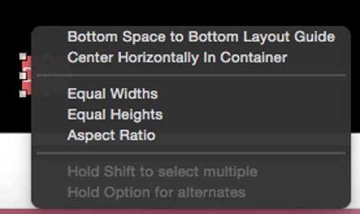
You can click to select one constraint, or shift-click to select more than one constraint. Click Bottom Space to Bottom Layout Guide.
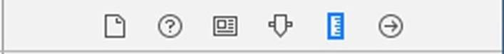
Nothing happens. Here is a drawback to this way of making constraints. It does not set the values correctly. Control-drag just keeps your current values. You need to go to the size inspector to set the values for the constraint. In the right panel on Xcode click the ruler button, which is next to the attributes inspector.
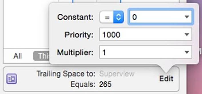
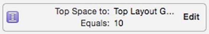
About halfway down, you will find the constraint:
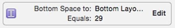
This tells us the constraint has a value of 29. It is 29 points away from the bottom layout guide. We want it to be 10 points away. Click the Edit button in the constraint, and change the Constant to 10.
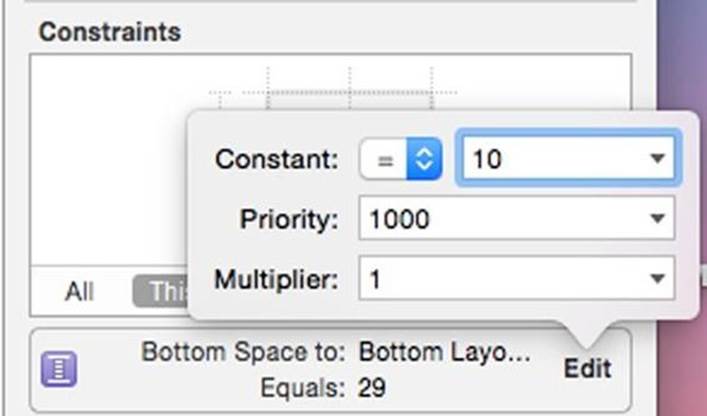
Press Return after you make the change. The Done button will respond with a misplacement error. Since we have not set enough constraints yet, we will wait to update the frame.
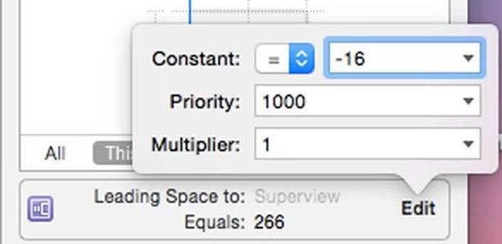
Select the Done button if not already selected. Control-drag directly left into the superview. You will get another menu, different than the first. These menus are context sensitive, and give only what applies to the situation.
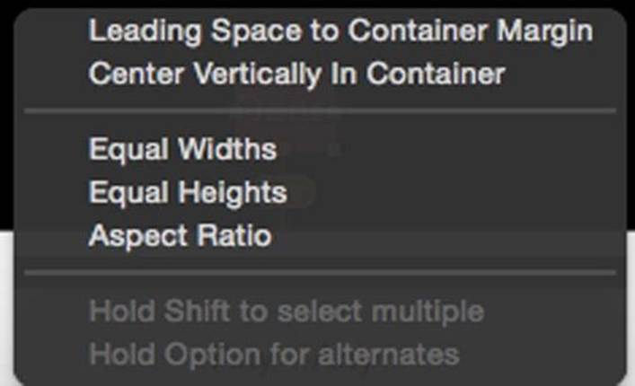
Select Leading Space to Container Margin. Now edit the constant to be -16. Usually we set this to the margin which is 16 points from the edge of the screen. In our case we want to start at the edge of the screen, so we use a constraint of -16. Set that in the size inspector.
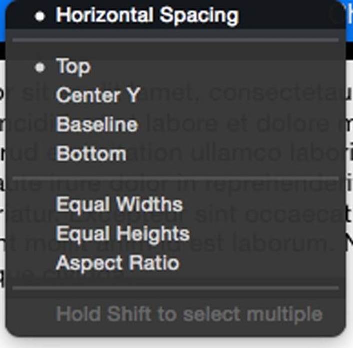
From the selected Done button, control-drag up and to the right. You get this menu.
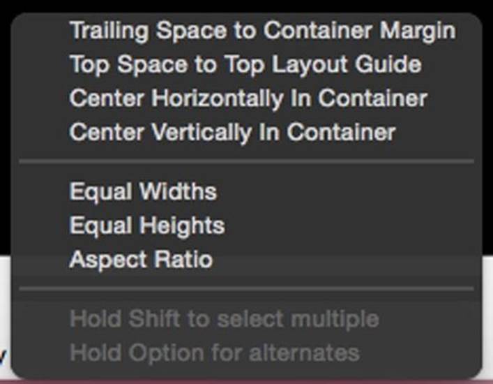
Diagonal drags will take both directions dragged as their context.By dragging up and to the right we got trailing and top space constraints. We only need a horizontal trailing space this time. Click Trailing Space to Container Margin. Change the constraint constant to 0 so we are flush with the margin.
We have all our constraints, but we can see they are misplaced:
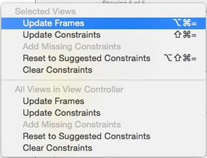
Re-select the Done button in the outline so it is selected blue. Click the resolver menu and in the top part for Selected views, click Update Frames.
Our Done button now looks right, and we have blue i-beams.
Nearest Neighbors For Pins
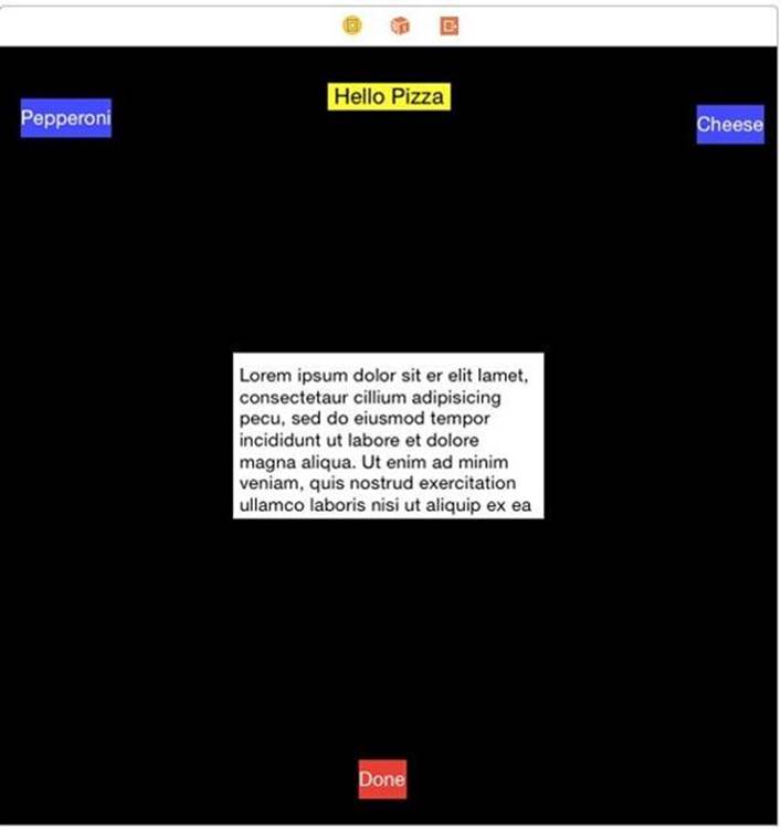
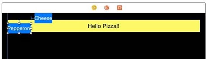
Select the Pepperoni button. If not overlapping the Hello Pizza label, drag it slightly up so it overlaps the Hello Pizza Label. Using the pin menu set the Top 10 points, Left 0 points and Right to 10 points. Set the Height to 36 points. Update the frames as well like this:
We may get something we did not expect:
The pin menu always relates to the nearest neighbor. The Pepperoni button started overlapping the label. Once one view overlaps another, it is no longer a neighbor. The nearest neighbor heading upward is the top margin, so the button placed itself 10 points from the top margin, overlapping the label even more. Since we placed one constraint between Cheese and Pepperoni, auto layout guesses at the vertical placement of cheese.
There are several ways to fix this. One is prevention. If we dragged the Pepperoni button down slightly so it did not overlap the button, our pin would have worked. Another option is change the constant for the Top Edge to Container Margin to 46 points so we have our button 10 points below the label. I'm not a fan of this. If our label height changes for some reason, we have the same overlap problem again.
The third solution is to make a new constraint between the Pepperoni button and the label. This is where control-drag is the most useful. When you need to make a constraint between two views that are not neighbors, use control-drag.
To prevent a conflict, delete the current constraint. Go to the size inspector and click on the left side of the constraint:
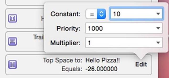
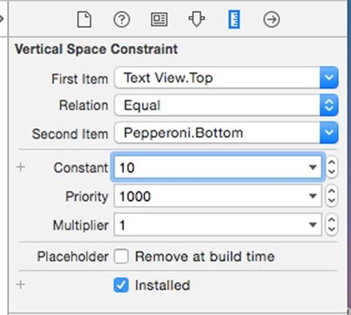
Press Delete on the keyboard. It disappears. Now select the Pepperoni button. Control-drag up from the Pepperoni button to the label. You will see the label highlight. Release the mouse button. The following menu appears.
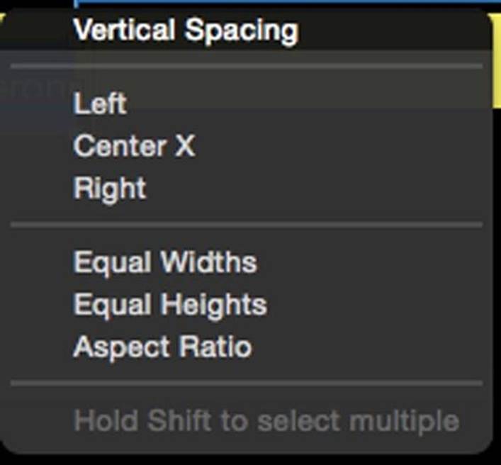
Select Vertical Spacing which is the same as pinning to the top. In the size inspector, you'll see the constraint Top Space to: Hello Pizza!! has a Constant of -26. Edit the constraint to have a Constant of 10.
Update the frame if necessary. You may find this change automatically updates.
Top Aligning The Cheese Button
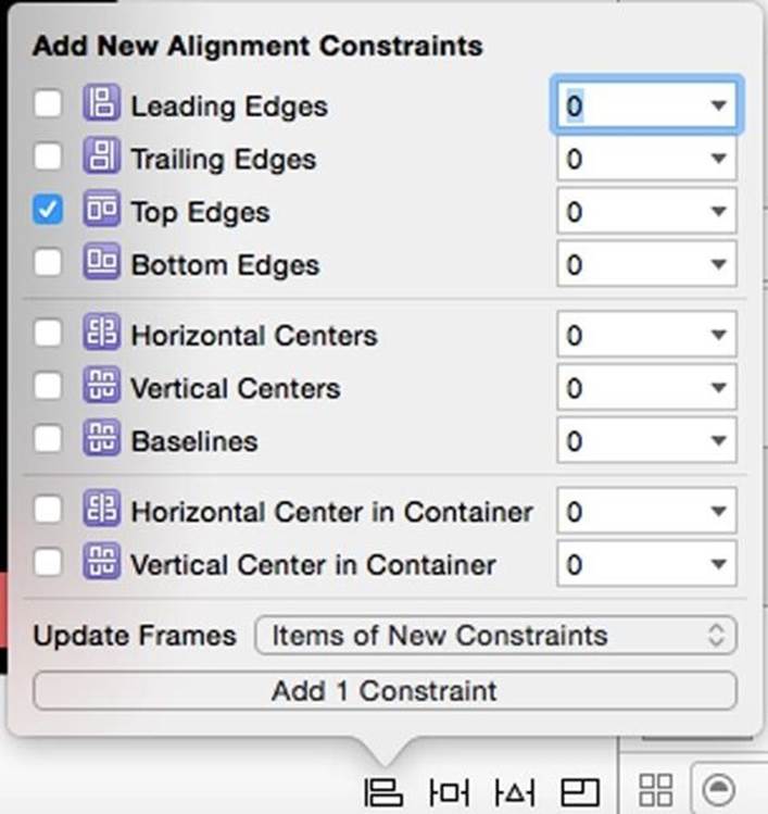
We have one more button to go. We already have a horizontal alignment, we just need a vertical. We will align the top of the Cheese button to the top of the Pepperoni button. Select the Cheese button and then shift-select the Pepperoni button. Click the align menu and select Top Edges.Keep the value at 0. Update frames to new constraints like this:
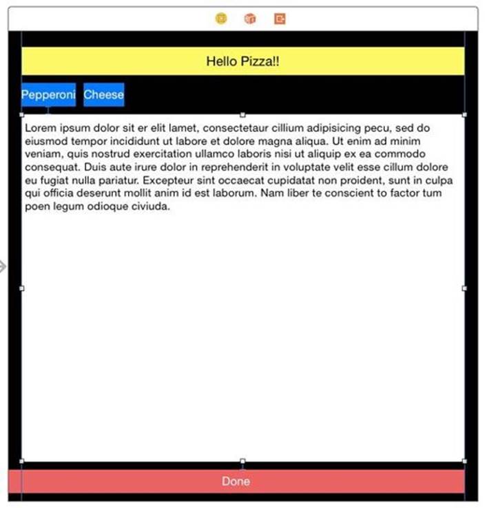
We satisfied all constraints and have no errors. It still doesn't look great. We need to make a few more changes.
Filling Space with the Text View
The first change is to fill the middle space with the text view. Select the text view. In the resolver, Clear Constraints for selected views. This is the easiest way to avoid conflicting constraints. Click the pin menu. Set Left 0 points, Right 0 points, and Bottom 10 points. Don't update the frames, but add the constraints.
Auto layout will guess the height is guessed to be 0, and the view will disappear if we update frames now. This is why we didn't update views just yet.
We have a slight problem here using pin for all four directions. Directly above the text view is the label. If we pinned the top with 10, it would pin to the label with 10, overlapping the buttons below. We want the text view to pin to the buttons, so we skip that pin and will use a control-drag to set it. But we have no top constraint or a height. Control-drag from the text view to the Pepperoni button. Select Vertical Spacing. You will get a blue vertical i-beam. Place your cursor in the beam and it will highlight. Click once on the i-beam. This is another way to edit the constant. You will see in the size inspector only information about this constraint. change the Constant to 10 like this:
Now the constraint shows a misplaced error. Select the text view again and for the selected views update the frames.
Using Equal Widths and Equal Heights
The buttons on the top are bit too small. They should be bigger and more consistent in size. Two constraints help with this: Equal Widths and Equal Heights. These two will take the size constraints of one view and use it for other views. To make them work correctly we need one more constraint on the Cheese button to anchor it to the right side. Control-drag the Cheese button to the right until the view highlights. Release the mouse button. Change the Trailing Space to Superview constraint Constant to 0. If necessary, update the frames.
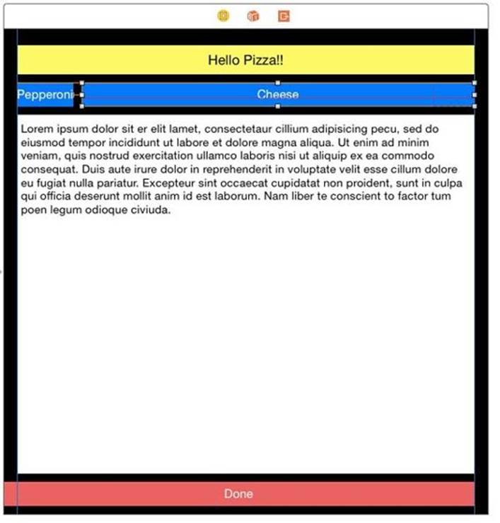
The Cheese button stretches across the superview. Control-drag from the Pepperoni button to the Cheese button. Holding down shift, select both Equal Widths and Equal Heights then press return
If necessary, Update Frames for All Views in View Controller. The two buttons now are the same size.
I'd like all my buttons to be the same height. I'd also like them a little taller than they are now for easy entry. Let's add one last constraint between the Pepperoni and the Done button. Since the text view is in the way, control-drag from Pepperoni to the Done button. Select Equal Heights on the menu that shows up. Select the Pepperoni button again. In the size inspector, find the height constraint and change the Constant to 64:
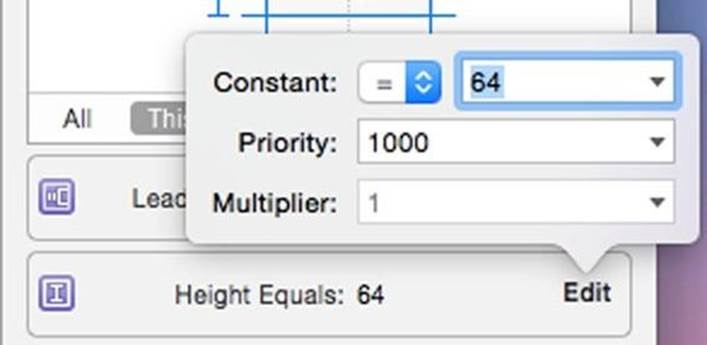
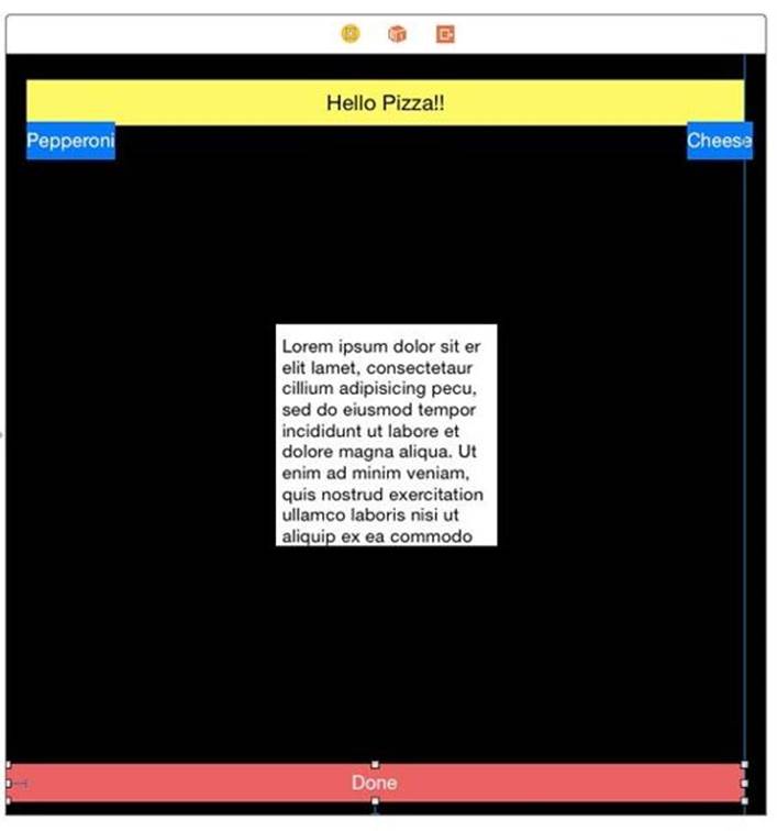
If necessary, Update Frames for All Views in View Controller. Your storyboard should look like this: