Using JMP 12 (2015)
Chapter 9. JMP Platforms
Launch and Report Windows
Most JMP platforms analyze and graph your data using launch windows and report windows. You specify your analysis in a launch window and your analysis and graphs appear in a report window. This chapter describes features that are common to all launch windows and reports.
Figure 9.1 Example of a JMP Launch Window and Report Window
Contents
Launch Windows
Platforms That Support Multithreading
Navigating Reports
Use the Hand Tool
Access Report Display Options
Show and Hide Parts of a Report
Combine Several Reports
Increase Font Sizes
How to Access Analysis Options
The Data Filter
Format Report Tables
Modify Display Box Properties in a Report
Select Points in Plots
Use Markers
Alter Plot and Chart Appearances
Resize Plots and Graphs
Change Line Widths
Change the Background Color in a Graph
Change the Color of Histogram Bars
Display Coordinates and Temporary Reference Lines
Scroll and Scale Axes
Customize Axes and Axis Labels in the Axis Settings Window
Customize Axes and Axis Labels Using the Right-Click Menu
Change the Order of Values
Change the Pattern and Format of Selected Objects
Add Geographical Images and Boundaries
Drag and Drop an Image into a Graph
Extract Data from an Image
Add Graphics Elements to a Report
Launch Windows
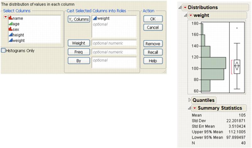
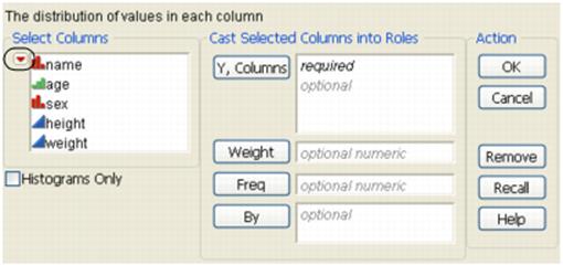
The launch window is your point of entry into a platform. Table 9.1 describes three panels that all launch windows have in common.
|
Table 9.1 Launch Window Panels |
|
|
Select Columns |
Lists all of the variables in your current data table. Note the following: •Right-click on a column name to change the modeling type. •Filter the columns using the options in the red triangle menu. See “Columns Filter Menu”. |
|
Cast Selected Columns into Roles |
Moves selected columns into roles (such as Y, X, and so on.) You cast a column into the role of a variable (like an actor is cast into a role). See “Cast Selected Columns into Roles Buttons”. This panel does not exist in the Graph Builder platform. |
|
Action |
OK performs the analysis. |
|
Cancel stops the analysis and quits the launch window. |
|
|
Remove deletes any selected variables from a role. |
|
|
Recall populates the launch window with the last analysis that you performed. |
|
|
Help takes you to the Help for the launch window. |
|
Cast Selected Columns into Roles Buttons
Table 9.2 describes buttons that appear frequently throughout launch windows. Buttons that are specific to certain platforms are described in the chapter for the specific platform.
|
Table 9.2 Descriptions of Role Buttons |
|
|
Y |
Identifies a column as a response or dependent variable whose distribution is to be studied. |
|
X |
Identifies a column as an independent, classification, or explanatory variable that predicts the distribution of the Y variable. |
|
Weight |
Identifies the data table column whose variables assign weight (such as importance or influence) to the data. |
|
Freq |
Identifies the data table column whose values assign a frequency to each row. This option is useful when a frequency is assigned to each row in summarized data. If the value is 0 or a positive integer, then the value represents the frequencies or counts of observations for each row when there are multiple units recorded. |
|
Validation |
Identifies the data table column whose values assign rows to training, validation, and test sets for crossvalidation in fitting models. Note the following: •For some platforms, KFold validation is available if you specify more than three levels in the Validation column. •If you click the Validation button with no columns selected in the Select Columns list, you have the option to create a Validation column. For more information about the Make Validation Column utility, see Basic Analysis. |
|
By |
Identifies a column that creates a report consisting of separate analyses for each level of the variable. |
Columns Filter Menu
A Column Filter menu appears in most of the launch windows. The Column Filter menu is a red triangle within the Select Columns panel. Use these options to sort columns, show or hide columns, or search columns.
Figure 9.2 The Columns Filter Menu
|
Reset |
Resets the columns to its original list. |
|
Sort by Name |
Sorts the columns in alphabetical order by name. |
|
Continuous |
Shows or hides columns whose modeling type is continuous. |
|
Ordinal |
Shows or hides columns whose modeling type is ordinal. |
|
Nominal |
Shows or hides columns whose modeling type is nominal. |
|
Numeric |
Shows or hides columns whose data type is numeric. |
|
Character |
Shows or hides columns whose data type is character. |
|
Match case |
(Only applicable to the Name options below) Makes your search case-sensitive. |
|
Name Contains |
Searches for column names containing specified text. To remove the text box, select Reset. |
|
Name Does Not Contain |
Searches for column names that do not contain specified text. To remove the text box, select Reset. |
|
Name Starts With |
Searches for column names that begin with specified text. To remove the text box, select Reset. |
|
Name Ends With |
Searches for column names that end with specified text. To remove the text box, select Reset. |
|
Exclude Formats |
Excludes columns with specific formats from the column selection list. Select from the following formats: date, time, duration, geographic, or all numeric formats. |
|
Column Groups |
Shows or hides groups of columns. See “Group Columns” in the “Enter and Edit Data” chapter. |
|
Ungrouped Columns |
Shows or hides columns that have not been grouped. |
Platforms That Support Multithreading
Some platforms in JMP are coded to take advantage of multiple CPUs on a machine, allowing these platforms to run significantly faster. This process is called multithreading.
As of JMP 11, the following platforms support multithreading:
•Choice
•Distribution
•Factor Analysis
•Fit Life by X
![]()
•Fit Model: Mixed Model, Generalized Regression
•Fit Model: Parametric Survival, Response Screening
•Life Distribution
•Multivariate
•Neural
•Nominal Logistic
•Nonlinear and Nonlinear Curve
![]()
•Partial Least Squares
•Partition
•Principal Components
•Profiler (does not apply to Profilers launched from within other platforms)
•Reliability Forecast
Navigating Reports
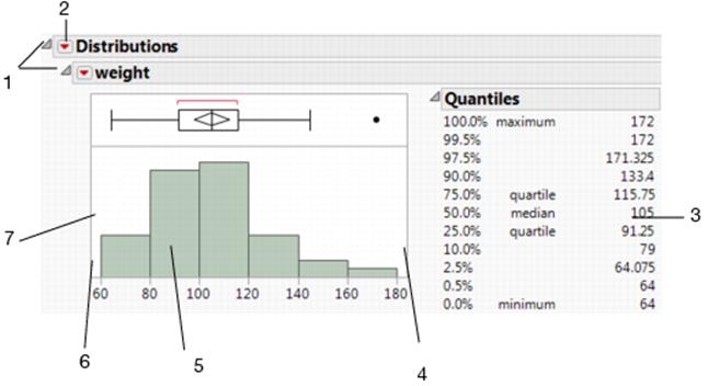
JMP reports are displayed in standard windows with scroll bars and options to resize. They also have other special buttons and menus like those illustrated in Figure 9.3 and those discussed in the following sections.
Figure 9.3 Basics of the Report Window
|
Table 9.3 Report Window Actions |
|
|
Number |
Action |
|
1 |
Click on the disclosure buttons to hide or show sections of the report. |
|
2 |
Click on the red triangle menus to access report options. |
|
3 |
Right-click in the table to access formatting options. |
|
4 |
Click and drag on the borders to resize graphs. |
|
5 |
Right-click anywhere in the graph to access formatting options. |
|
6 |
Right-click within the axis to access formatting options. |
|
7 |
The arrow cursor turns into a hand when you hold your mouse pointer over an axis. Click and drag using to scroll along the axis or to rescale the axis. See “Scroll and Scale Axes”. |
Use the Hand Tool
Select the hand tool using the Tools > Grabber option. There are many functions that you can use with the hand tool (also known as the grabber tool) in a report. Here are some examples of how the hand behaves in graphs and plots:
•On histograms, for continuous variables, use the hand tool to change the number of bars or to shift the boundaries of the bars.
•In all report tables, use the hand tool to click and drag columns for rearranging.
•Use the hand tool to change the displayed range of axis values. See “Scroll and Scale Axes”.
Access Report Display Options
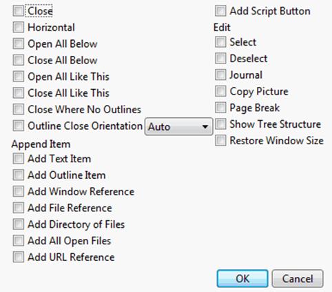
Right-click a disclosure button ![]() to show a menu that lets you rearrange the report and gives you control over report outline levels. The resulting menu has the following report formatting options:
to show a menu that lets you rearrange the report and gives you control over report outline levels. The resulting menu has the following report formatting options:
Close
Closes (hides) that section of the report. This can also be accomplished by clicking the disclosure button.
Horizontal
if available, the option switches the outline of the report between a vertical and horizontal layout.
Open All Below
Opens all outline levels beneath the level where this command is selected, including that level.
Close All Below
Closes all outline levels beneath the level where this command is selected, including that level.
Open All Like This
Opens all of the same type of reports as the one that is present in the analysis window. If you analyze several variables at a time, you often want to open many of the same type of report tables all at once. You might also want to open all of the same type of report tables at once when you select multiple options on a single analysis.
Close All Like This
Closes all of the same type of reports as the one that is present in the analysis window.
Close Where No Outlines
Closes all parts of the report that do not have sublevels. This command is usually used at the top level of the report outline. It is a quick way to see a nesting structure overview of a report.
Outline Close Orientation
Specifies the orientation of the outline box when the disclosure button is clicked closed. Available options are Auto, Horizontal, or Vertical. Default orientation is Auto.
Append Item
Displays a submenu, which lists ways that you can add structural items to the report. Items include text, outline title bars, references to other JMP files and windows, a list of all open JMP files, URLs, and scripts.
‒Add Text Item - Opens a window that enables you to add up to six text items. You can select whether the text items appear with a bullet or initially appear hidden. Note: You must click exactly on a hidden text box for the text item to become visible.
‒Add Outline Item - Open a window that enables you to add a titled outline box. Note: The appended outline box contains a red triangle menu listing the append menu items.
‒Add Window Reference - Opens a window that enables you to select an open JMP window for adding as a link to the selected outline box.
‒Add File Reference - Displays the Open Data File window that enables you to select a file for adding as a link to the selected outline box.
‒Add Directory Reference - Displays the Browse For Folder window that enables you to select a directory for adding as a link to the selected outline box. Note: Links to each file in the selected directory are appended to the outline box.
‒Add All Open Files - For each file open in JMP, a new outline box is added. It contains a link to the file.
‒Add URL Reference - Opens the Create Link to URL window that enables you to add a Link Name and URL. The URL reference link is added to the selected outline box.
‒Add Script Button - Opens the Add Script Button window that enables you to add a named link to the selected outline box. Clicking the added link runs the specified script.
Edit
Displays the submenu shown in Figure 9.4, which affect all reports at the outline level where they are used:
Select
Highlights all reports for that outline level.
Deselect
Deselects all selected reports for that outline level.
Journal
Duplicates the report in a separate window titled Journal so that you can edit it or append other reports to it. See “JMP Journals” in the “Save and Share Data” chapter.
Copy Picture
Copies the report to the clipboard. You can then open another application and paste it.
Page Break
Inserts a page break for printing purposes.
Show Tree Structure
Opens a window that shows the Display Boxes that make up the report. This is mainly used by JSL programmers who are manipulating or reading parts of the report. See the Display Trees chapter in the Scripting Guide book for details.
Restore Window Size
Returns the selected window to its original size.
An alternative way to access these options is to hold down the Alt key and right-click the disclosure button ![]() . This displays a window, as shown in Figure 9.4, with check boxes for commands and options so that you can select multiple actions at the same time. You can also do the same for the menu under a red triangle menu.
. This displays a window, as shown in Figure 9.4, with check boxes for commands and options so that you can select multiple actions at the same time. You can also do the same for the menu under a red triangle menu.
Figure 9.4 Outline Box Menu Items Window
Show and Hide Parts of a Report
JMP reports are organized in a hierarchical outline. Each level of the outline has a triangle-shaped disclosure button ![]() . Click the disclosure button to open and close that section of the report.
. Click the disclosure button to open and close that section of the report.
Combine Several Reports
Suppose that you perform multiple analyses and want to show all of the results (and the data table) in one window. You can select and combine the reports and the data table in several ways.
Note: You cannot combine scripts and journals with data tables or reports.
On Windows:
•Right-click the windows that you want to combine in the Home Window’s Window List and then select Combine.
•Select the check box in the lower right corner of the windows you want to combine. Select Combine selected windows next to the check box. Or select Window > Arrange Combine Selected Windows.
On Mac:
1.Select Window > Combine Windows.
2.Select the windows that you want to combine and clickOK.
In the combined window, using the options in the Report red triangle menu, you can do the following:
•Edit the existing layout in the Application Builder
•Save the script to a data table, journal, script window, or as an add-in.
Rename a Title
To rename a title in a report, double-click on any of the following titles:
•a title next to a red triangle menu
•a title next to a disclosure button
•a column title
Increase Font Sizes
On Windows, change the font size that JMP uses in reports and data tables by selecting Window > Font Sizes. Then choose from one of the submenu items:
Increase Font Size
Increases the font size. Select again to increase the font size again.
Decrease Font Size
Decreases the font size. Select again to decrease the font size again.
On Macintosh, select View > Make Text Bigger or View > Make Text Smaller.
How to Access Analysis Options
Click the red triangle menu in a report to access a list of options that apply for that particular report. In addition to clicking the red triangle menu, you can also:
•Select multiple actions at the same time. Hold down the Alt key and click the red triangle menu. A panel of all commands and options appears with check boxes.
•Apply a command to all similar reports in the report window. Hold down the Ctrl key and click the red triangle menu. For example, in a One-way analysis, if you hold down the Ctrl key, click the icon, and select Means/Anova/t Test, an analysis of variance is performed for all One-way analyses in the active report window.
The red triangle options applicable to each platform in the Analyze and Graph menus are described in the following books:
•Basic Analysis
•Consumer Research
•Essential Graphing
•Multivariate Methods
•Fitting Linear Models
•Profilers
•Specialized Models
•Quality and Process Methods
•Reliability and Survival Methods
Script Menus
The red triangle menu at the top level of every JMP report contains a Script menu. Most of these options are the same throughout JMP. A few platforms add extra options that are described in the specific platform chapters. Table 9.4 lists the Script menu options that are common to all platforms.
|
Table 9.4 Description of Script Menu Options |
|
|
Redo Analysis |
If the values in the data table that was used to produce the report have changed, this option duplicates the analysis based on the new data. The new analysis appears in a new report window. |
|
Relaunch Analysis |
Opens the platform Launch window and recalls the settings used to create the report. |
|
Automatic Recalc |
Automatically updates analyses and graphics when data table values change. See “Automatic Recalc”. |
|
Copy Script |
Places the script that reproduces the report on the clipboard so that it can be pasted elsewhere. |
|
Save Script to Data Table |
Saves the script to the data table that was used to produce the report. |
|
Save Script to Journal |
Saves a button that runs the script in a journal. The script is added to the current journal. |
|
Save Script to Script Window |
Opens a script editor window and adds the script to it. If you have already saved a script to a script window, additional scripts are added to the bottom of the same script window. |
|
Save Script to Report |
Adds the script to the top of the report window. |
|
Save Script for All Objects |
If you have By groups or similar multiple reports, a script for each object is saved to the script window. Otherwise, this option is the same as Save Script to Script Window. |
|
Save Script for All Objects To Data Table |
If you have By groups or similar multiple reports, a script for each object is saved to the current data table. |
|
Save Script to Project |
Saves the script in a project. If you have a project open that contains the report, the script is added to that project. If you do not have a project that contains the report, a new project is created and the script is added to it. |
|
Data Table Window |
Brings the corresponding data table used to create the report to the front. |
|
Local Data Filter |
If your data table contains row states and you do not want to affect them, use the Local Data Filter. The actions of this data filter are temporary and you can experiment with it. Note: Platforms that do not support the Automatic Recalc option also do not support the Local Data Filter option. |
|
Column Switcher |
Lets you interactively exchange one column for another on a graph. See “Column Switcher”. |
If you have specified a By variable in the platform launch window, the Script All By-Groups menu also appears. These options apply to the reports for all the levels of the By variable.
|
Table 9.5 Descriptions of Script All By-Groups Options |
|
|
Redo Analysis |
If the values in the data table that was used to produce the reports have changed, this option duplicates the analysis based on the new data and produces new reports. |
|
Relaunch Analysis |
Opens the platform Launch window and recalls the settings used to create the reports. |
|
Copy Script |
Places the script that reproduces the reports on the clipboard so that it can be pasted elsewhere. |
|
Save Script to Data Table |
Saves the script to the data table that was used to produce the reports. |
|
Save Script to Journal |
Saves a button that runs the script in a journal. The script is added to the current journal. |
|
Save Script to Script Window |
Opens a script editor window and adds the script to it. If you have already saved a script to a script window, additional scripts are added to the bottom of the same script window. |
Automatic Recalc
The Automatic Recalc feature immediately reflects changes that you make to the data table in the corresponding report window. You can make any of the following data table changes:
•exclude or unexclude data table rows
•delete or add data table rows
This powerful feature immediately reflects these changes to the corresponding analyses, statistics, and graphs that are located in a report window.
To turn on Automatic Recalc for a report window, click on the platform red triangle menu and select Script > Automatic Recalc. To turn it off, deselect the same option. You can also turn on Automatic Recalc using JSL.
Note: For some platforms, the Automatic Recalc feature is not appropriate and therefore is not supported. These platforms include the following: DOE, Profilers, Choice, Partition, Nonlinear, Neural, Neural Net, Partial Least Squares, Fit Model (REML, GLM, Log Variance), Gaussian Process, Item Analysis, Cox Proportional Hazard, Response Screening, and Control Charts (except Run Chart).
Column Switcher
Within a report, use the Column Switcher to quickly analyze different variables without having to re-create your analysis. To activate the Column Switcher, from a report window, click on the red triangle menu. Select Script > Column Switcher.
If you have multiple columns, use the buttons to animate the column switching or step through each column manually. Move the slider control to change the speed of the animation.
Note: You cannot copy or move the column switcher within a report. Also, a column switcher cannot be saved to a JMP journal.
Example of the Column Switcher
You have data about nutrition information for candy bars. You want to examine different factors, to see which factors best predict calorie levels.
1.Open the Candy Bars.jmp sample data table.
2.SelectGraph > Graph Builder.
3.ClickTotal fat gand drag to theXzone.
4.ClickCaloriesand drag to theYzone.
5.ClickCholesterol gand drag to theWrapzone.
6.From the red triangle next to Graph Builder, selectScript > Column Switcher.
Choose the column that you want to switch from:
7.SelectCholesterol gand clickOK.
Choose the columns that you want to switch to:
8.SelectSaturated fat g,Cholesterol g,Sodium mg,Carbohydrate g,Dietary fiber g, andSugars gand clickOK.
Figure 9.5 Column Switcher in Graph Builder Window
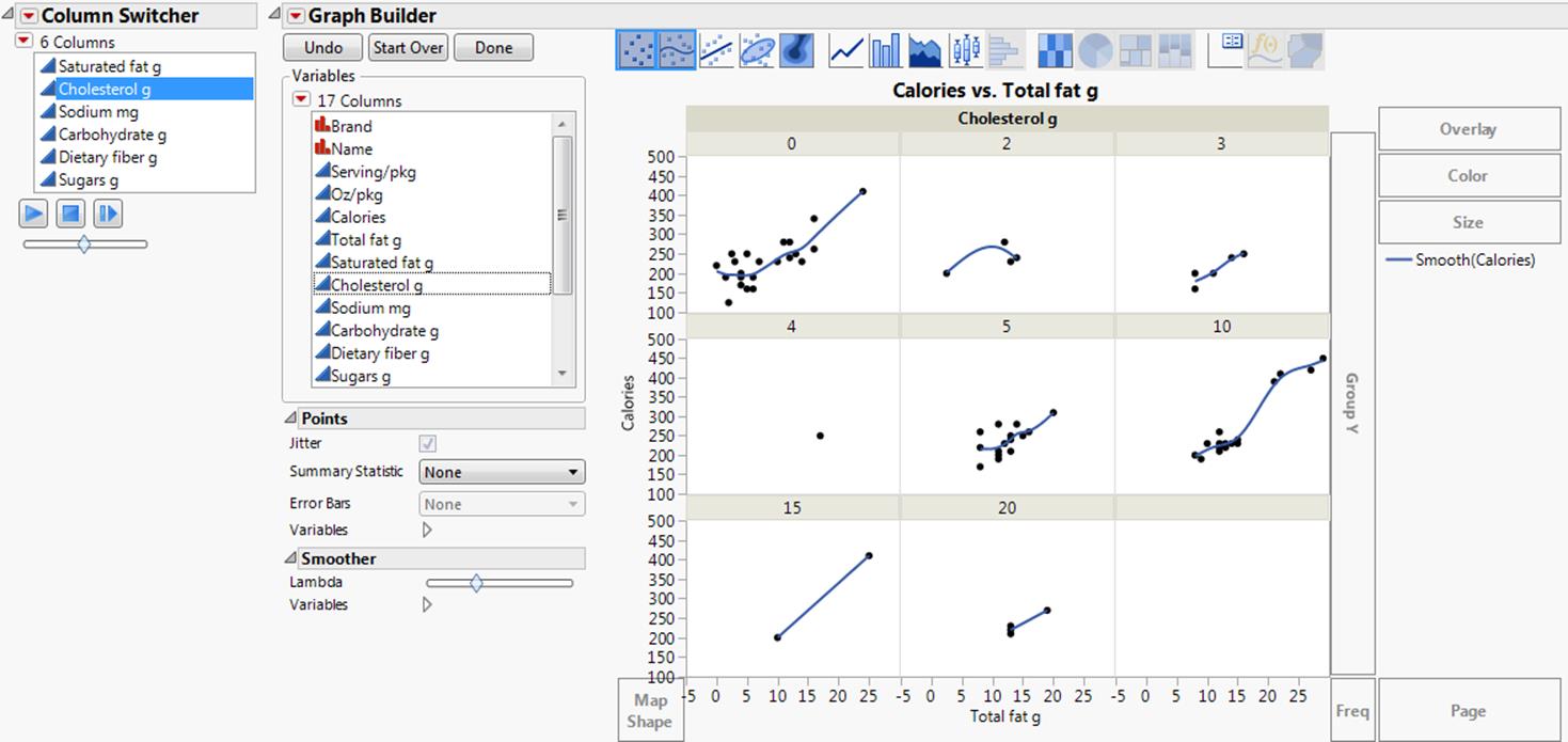
9.Click thePlaybutton to cycle between the different factors. Use the slider to control the speed of the animation. Alternatively, you can step through each factor individually.
You can see that the relationship between calories and fat is relatively strong for each level of carbohydrate. Therefore, Carbohydrate g appears to be the best predictor of calorie levels.
The Data Filter
The Data Filter gives you a variety of ways to identify subsets of data. You can interactively select complex subsets of data, hide these subsets in plots, or exclude them from analyses.
1.Select Rows > Data Filter.
Tip: In addition to the main Data Filter, you can also launch a local Data Filter within a platform report. Click the Local Data Filter icon ![]() from the Report toolbar, or select Script > Local Data Filter from the red triangle menu in a report.
from the Report toolbar, or select Script > Local Data Filter from the red triangle menu in a report.
Figure 9.6 Initial Data Filter Window
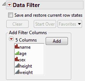
2.Select the columns that you want to use as filters, and then clickAdd.
Note the following:
•To restore your current row states when the Data Filter window is closed, select the Save and restore current row states option.
•If you have a long list of columns, you can sort, show, hide, or search for columns in the list. Use the options in the Add Filter Columns red triangle menu.
•By default, the Data Filter window is attached to the data table. You can detach it temporarily or persistently, as follows:
‒Detach it temporarily by deselecting the Use Floating Window option from the Data Filter red triangle menu.
‒Detach it persistently by selecting File > Preferences > Tables and deselecting the Use a Floating Window for Data Filters option.
Types of Filter Columns
There are three types of filter columns, as follows:
Continuous columns
Numeric columns whose modeling type is set to continuous. A continuous filter column is represented by a slider that spans the data range.
Categorical columns
Nominal and ordinal columns. For each categorical column, the Data Filter generates a set of distinct categories. These categories can be displayed in different forms.
Note: For categorical columns with value labels, if you want to include responses that are not present in the data, select the Include Responses Not in Data option from File > Preferences > Tables.
Multiple Response columns
Character columns that have the Multiple Response column property assigned. Each data cell of the column generally consists of multiple categories, separated by some common separator, like a comma. Since each data cell can contain more than one category, multiple response columns have a richer set of filtering options.
Filtering Modes
There are three modes of filtering: Select, Show, and Include. You can set and clear these modes using the corresponding check boxes in the Data Filter.
Note: The Select mode is not available for the local Data Filter.
Select
Shows the selected rows in the data table in a highlighted state.
You can turn off the automatic selection of this option using the Data Filter Select Check preference. See also “Changing the Row State in the Data Table After Making Data Filter Selections”.
Show
Shows the unselected rows with the Hide icon (![]() ).
).
You can turn on the automatic selection of this option using the Data Filter Show Check preference. For details about row states, see the “Row State Columns” in the “The Column Info Window” chapter.
Include
Shows the unselected rows with the Exclude icon (![]() ).
).
You can turn on the automatic selection of this option using the Data Filter Include Check preference. For details about row states, see the “Row State Columns” in the “The Column Info Window” chapter.
There are two additional options when filtering: Auto clear and Conditional. These options are available from the red triangle menu for the Data Filter. For more information, see “Red Triangle Options for the Data Filter”.
The Data Filter Control Panel
Once you have added columns in the initial window, the Data Filter control panel appears.
Figure 9.7 Data Filter Control Panel
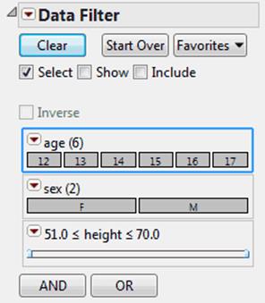
The main controls in the Data Filter include the following:
Clear
Clears all selections that you have made on variables in the Data Filter window.
Start Over
Closes the current Data Filter session and returns you to the original Data Filter window.
Favorites
Saves your current data filter criteria as a favorite. Once you have created a favorite, selecting it resets the current conditions to the criteria in the favorite. You can also remove the favorite. To retain favorites once the current session ends, save the data filter script by selecting one of theScript options from the Data Filter red triangle menu.
Select, Show, and Include
See “Filtering Modes”.
Inverse
Inverts the current selection state of the rows in the data table.
Note: Only the rows in the data table are inverted, not the selection in the Data Filter. To invert the selection in the Data Filter, from the column’s red triangle menu, select Invert Selection.
AND
The AND button opens the Add Filter Columns list. The and operator restricts the selection. You can add variables to the filter process at any time.
OR
The OR button opens the OR Add Filter Columns list. The or operator extends the selection. You can add variables to the filter process at any time.
Changing the Row State in the Data Table After Making Data Filter Selections
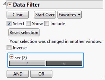
If you modify a row state that you have set in the Data Filter and subsequently alter row states in the data table, or select points in a graph or plot, the selections in the Data Filter might not match the selections in the data table. The Data Filter contains a warning message that says: “Your selection was changed in another window”. The Reset Selection button appears. Clicking the Reset Selection button changes the data table selections back to reflect the selections in the Data Filter.
Example of Modifying Selections
1.Open the Big Class.jmp sample data table.
2.SelectAnalyze > Distribution.
3.Selectageandsexand clickY, Columns.
4.ClickOK.
5.SelectRows > Data Filter.
6.Selectsexand clickAdd.
7.In the Data Filter control panel, select all of the males by clicking on the M block.
Figure 9.8 Rows Containing Males Highlighted in Data Table and Histograms
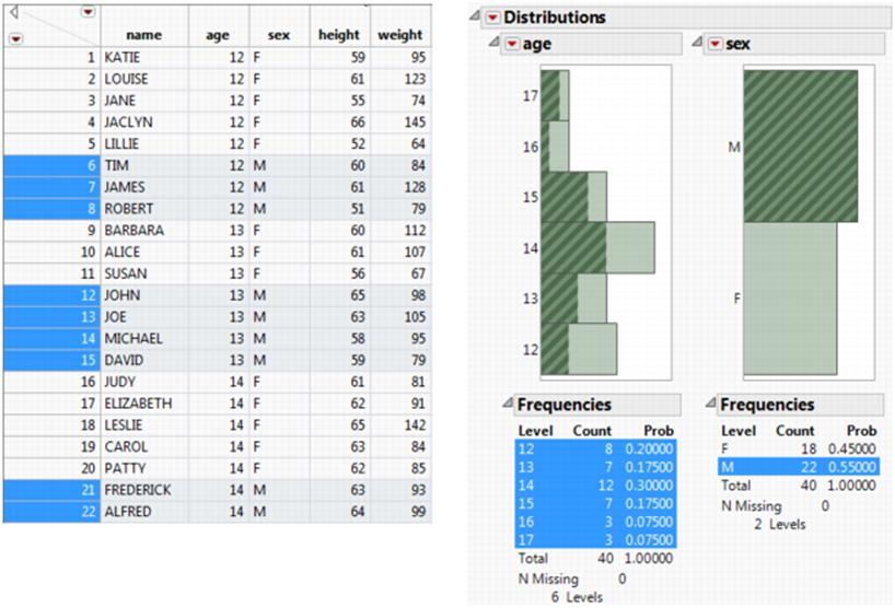
You can see that all of the rows containing males are highlighted in the data table and in the histograms. Now you decide that you only want to see the students who are age 12.
8.In the age histogram, select the bar representing age 12.
Now the selection does not match the Data Filter selection. A warning message and a Reset selection button appear in the Data Filter window.
Figure 9.9 Data Filter Warning Message and Reset Button
Red Triangle Options for the Data Filter
The red triangle menu next to Data Filter contains the following options:
Auto clear
If you have more than one nominal or ordinal column selected in the Data Filter, this option clears any other selections before making a new selection. For example, using Big Class.jmp, suppose that you have the columns sex (nominal) and age (ordinal) in your Data Filter. If you have males (M) selected for sex, and you click on an age group, say age 12, your selection of males will be automatically cleared. This means that selecting age 12 is not conditional on selecting males. Conversely, if you turn off Auto clear, you can then select both males and age 12 at the same time. Auto clear is on by default.
Conditional
Limits the categories displayed for the unselected filter column. See “Conditional”.
Use Floating Window
Keeps the Data Filter window on top of its associated data table. If you do not want the Data Filter window to remain on top, deselect this option.
Animation
Sequentially highlights the values of a single variable in the data table. See “Animation”.
Show Subset
Creates a new data table that contains only the following:
‒The rows identified by the Data Filter.
‒The columns selected in the active data table. If no columns are selected, then all columns are included.
This option is similar to the Tables > Subset command, only without subsetting options.
Save Where Clause
Builds a WHERE clause based on the value selections that you make.
Script
Provides options for saving scripts. See “Save Your Analysis as a Script” in the “Save and Share Data” chapter.
Conditional
For filter columns with hierarchy, you can use the Conditional option to filter what appears in the column lists. For example, you could filter by region so that only the states in the selected region appear in the list.
The following example illustrates how the Conditional option helps show the subcategories clearly, without the extra categories that do not belong.
1.Open the Cities.jmp sample data table.
2.SelectRows > Data Filter.
3.In the Data Filter window, selectcity,State, andRegion, and then clickAdd.
The Data Filter window appears, showing a list for each variable.
4.SelectConditionalfrom the Data Filter red triangle menu.
5.SelectMWin the Region list.
6.SelectOHfrom the State list.
The cities that are in Ohio and in the Midwest region are selected in the data table. In the Data Filter window, only midwestern states appear in the State list, and only cities in Ohio appear in the cities list. See Figure 9.10.
Figure 9.10 Using the Conditional Option
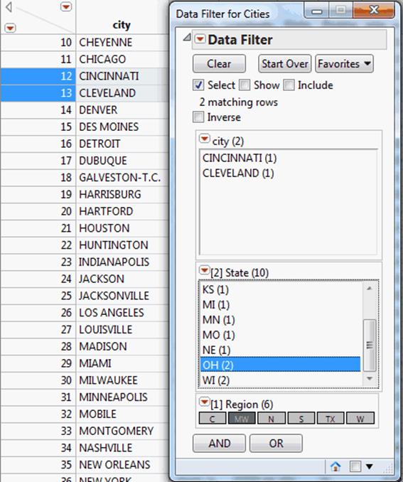
The bracketed number in front of the column name indicates the order in which the column values were selected. In Figure 9.10, Region was selected first, so it has a [1] in front of the column name. State was selected second, so it has a [2] in front of the column name.
When you rearrange hierarchical filters that are in ascending order, the filter number changes to match the ascending position in the hierarchy.
To clear the selections and reset the order of the hierarchy, click Clear.
Animation
The animation feature sequentially highlights the values of a single variable. The variable’s values highlight in the data table. However, patterns are more interesting if you first create a plot and then animate a variable using the Data Filter to see how it behaves on the plot.
To use the animation feature, from the red triangle menu next to Data Filter, select Animation. Then select the variable that you want to animate. The highlighted frame around the variable indicates which variable is selected for animation.
Figure 9.11 Animation Control Panel in the Data Filter
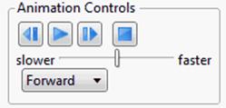
The Animation Control panel (Figure 9.11) contains the following controls:
The middle button (![]() ) starts and stops the animation. After you start the animation cycles, the button changes to a stop button (
) starts and stops the animation. After you start the animation cycles, the button changes to a stop button (![]() ). By default the animation begins with the first value of the topmost variable.
). By default the animation begins with the first value of the topmost variable.
The backward arrow (![]() ) moves the animation backward one cycle. Click more than once to go backward more than one cycle.
) moves the animation backward one cycle. Click more than once to go backward more than one cycle.
The forward arrow (![]() ) moves the animation forward one cycle. Click more than once to go forward more than one cycle.
) moves the animation forward one cycle. Click more than once to go forward more than one cycle.
The square button (![]() ) hides the Animation Control section on the Data Filter Window. Select Animation from the menu on the Data Filter title bar again to see the Animation Control.
) hides the Animation Control section on the Data Filter Window. Select Animation from the menu on the Data Filter title bar again to see the Animation Control.
Use the slider to adjust the speed of the animation (slower to faster).
The Animate drop-down menu contains the following options:
Forward
Highlights values from first to last.
Backward
Highlights values from last to first.
Bounce
Highlights forward and then backward repeatedly.
Save WHERE Clause
Once you have filtered variable values in the Data Filter, that information can be expressed as a JMP WHERE clause. The WHERE clause is used in JSL (JMP Scripting Language) programs to identify specific rows of data for processing or analysis. The Data Filter builds a WHERE clause based on the value selections that you make.
The options in the Save Where Clause menu include the following:
to Clipboard
Creates a WHERE clause from the filter criteria and puts it on the clipboard.
to Row State Column
Creates a row state column in the data table that has a formula equivalent to the filter criteria.
to Data Table
Creates a WHERE clause from the filter criteria and saves it as a JSL command with the current data table in a table property called Filter.
to Script Window
Creates a WHERE clause from the filter criteria and appends it to the current script text window, or creates a new script if one does not exist already.
to Journal
Creates the WHERE clause from the filter criteria and appends it to the current journal, or creates a new journal if one does not already exist.
Example of Saving a WHERE Clause
1.Open the Big Class.jmp sample data table.
2.SelectRows > Data Filter.
3.Selectage,sex, andheightand clickAdd.
Select all females who are twelve and fourteen years old and whose height is between 56 and 60 inches:
4.Hold down the Ctrl key and click on the 12 and 14 blocks and the F block.
5.Click on 51 and type 56.
6.Click on 70 and type 60.
7.From the red triangle menu next to Data Filter, selectSave Where Clause > to Script Window.
The WHERE clause that is created from this example appears in a script window, as follows:
Select Where(
(:age == 12 | :age == 14) & :sex == "F" & (:height >= 56 & :height <= 60)
);
Red Triangle Options for Variables
Some of the red triangle options for a variable can vary, depending on the type of variable.
Options for All Types of Variables
The red triangle menu next to any type of variable contains the following generic options:
Delete
Removes the variable from the Data Filter control panel.
Clear Selection
Clears any selection in effect for that variable only.
Invert Selection
Deselects any selected values, and selects all values previously not selected, for that variable only.
Options for Continuous Variables
For continuous variables, values appear in a range with a slider that you can adjust in one of the following ways:
•Click and drag the slider bar. You can drag from either end of the slider bar. The selected values appear above the slider bar.
•Click anywhere in the empty (not selected) part of the slider to set the filter range at that point.
•Click on the number to enter the value that you want.
By default, the range of values includes an equal sign, which includes the endpoints. You can remove the equal sign by holding down the Shift key and clicking on the ≤ or the ≥.
The Select Missing option highlights any missing values in the data table.
Options for Nominal or Ordinal Variables
For nominal and ordinal variables, values appear in blocks, in a list, or in a menu. If the variable contains only a small number of categories, the values appear in blocks. If the variable contains a large number of categories, the values appear in a list or in a menu. However, you can change these default settings.
The following options are available for nominal or ordinal variables only:
Display Options
Changes the appearance of the display. Options can include the following:
‒Blocks Display shows each level as a block.
‒List Display shows each level as a member of a list, followed by its frequency.
‒Single Category Display shows each level, followed by its frequency, in a menu.
‒Check Box Display adds a check box next to each value. To make this the default setting, select the Data Filter Check Box Display option in File > Preferences > Tables.
Order by Count
Orders the values in decreasing sort order by count.
Find
Provides a text box where you can enter a search string for the selected column. Press the Enter key to perform the search. Once Find is selected, the following Find options appear in the red triangle menu:
‒Clear Find clears the results of the Find operation and returns the window to its original state.
‒Match Case uses the case of the search string to return the correct results.
‒Contains searches the data for values that includes the search string.
‒Does not contain searches the data for values that do not include the search string.
‒Starts with searches the data for values that start with the search string.
‒Ends with searches the data for values that end with the search string.
Options for Variables with the Multiple Response Property
The following options are available for variables with the Multiple Response property set:
Match None
Selects only rows containing values that do not match any of the selections
Match Any
Selects all rows that contain values that match any of the selected values. By default, this option is selected.
Match All
Selects only rows with values that include all of the selected values.
Match Exactly
Selects only those rows with values that exactly match the checked values.
Match Only
Selects only those rows with contents exactly matching the checked values.
Match At Least
Selects at least n of the selected values.
Match At Most
Selects a maximum of n of the selected values.
Match Between
Selects between n and m of the selected values.
Note: For more details about the Multiple Response property, see the “Multiple Response” in the “The Column Info Window” chapter.
Format Report Tables
There are many ways to change the formatting of a report table. Right-click a report table to access the following formatting options:
Table Style
adds borders, shading, and dividing lines to the table. Select from the following options:
‒Underline Headings shows the preference setting for Underline Table Headings.
‒Shade Headings shows the preference setting for Shade Table Headings.
‒Column Borders contains borders outside columns and divider lines between columns.
‒Row Borders contains borders outside rows and divider lines between columns.
‒Shade Alternate Rows shades alternate rows.
‒Shade Cells shades the body of the table. When used with Shade Alternate Rows, a darker shade is used on alternate rows.
Note: Change the format of all report tables by selecting the preceding options in the JMP preferences. On Windows, the Report Tables options are in File > Preferences > Styles. On Macintosh, select the Report Tables options in JMP > Preferences > Styles.
Columns
shows or hides columns in the table.
Note: Columns whose names begin with a tilde (~), such as ~Bias, are not applicable to the analysis that you ran and do not appear in the table, even if you place checks next to their names.
Sort by Column
Sorts the columns in descending or ascending order by the selected column.
Make into Data Table
creates a JMP data table from the report table.
Make Combined Data Table
searches the report for other tables like the one you selected and combines them into a single data table.
Make Into Matrix
creates a JMP matrix from a report table. See “Turn a Report Table Into a Matrix”.
Copy Column
copies the contents of the right-click column to the Clipboard for pasting into another window or application.
Copy Table
copies the right-click table to the Clipboard for pasting into another window or application.
![]()
Bootstrap
approximates the sampling distribution of a statistic. For more information, see the Basic Analysis book.
Modify Display Box Properties in a Report
For each display box in a report, you can change properties such as the font, text color, padding, and alignment. Your changes are included when you save the report as a script, a graphic, or a journal.
To modify display box properties, follow these steps:
1.Right-click the disclosure icon next to the report and select Edit > Show Properties.
The Properties pane appears.
2.Modify the report properties.
3.Click the report to view your changes.
Tips:
In the Properties pane, use the arrow buttons to navigate among display boxes in the display tree.
After you open the Properties pane, use the Selection tool ![]() to select a specific report and change its properties.
to select a specific report and change its properties.
Turn a Report Table Into a Matrix
You can create a JMP matrix from a report table. For example, when working with JMP Scripting Language (JSL), you might want to access a report’s table that has been stored into a JSL variable. Or, you might want to store a report table’s values into a table property as either a table property or as a JSL assignment, which is stored within the data table and is accessible via a script or the Formula Editor.
To store a table in matrix form into a global variable, into a table property, or into a table property as an assignment:
1.Right-click anywhere in a report table.
2.SelectMake into Matrix.
3.In the window that appears, tell JMP how you want to store the table.
4.(Optional) Rename the variable or property by entering a new name into the box besideName.
Use Conditional Formatting
Note: You must enable Show conditional formatting in Reports preferences for your conditional formatting to appear in JMP reports.
To configure reports to use conditional formatting, you must first set your report preferences to enable showing conditional formatting. See “Reports” in the “JMP Preferences” chapter for details.
To configure conditional formatting:
1.Open the JMP Preferences window.
2.Select the Reports preference group.
3.ClickManage Rules.
The Conditional Format Rule window appears.
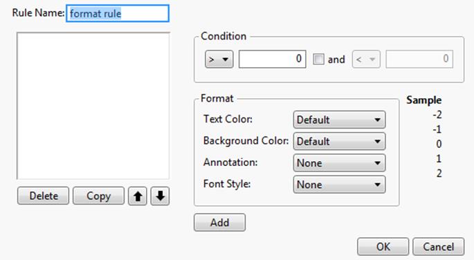
Figure 9.12 Conditional Format Rule Window
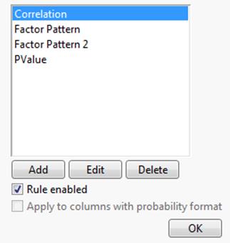
By default, JMP includes conditional formatting for Correlation, Factor Patterns, and PValue. These rules are enabled by default. The PValue rule is applied to columns that contain probability values.
From this window you can Add, Edit or Delete a rule.
Disable or Enable a Rule
To disable or enable a rule:
1.Open the JMP Preferences window.
2.Select the Reports preference group.
3.ClickManage Rules.
The Conditional Format Rule window appears.
4.Select the rule from the list.
5.IfRule enabledis selected, select to disable.
6.IfRule enabledis not selected, select to enable.
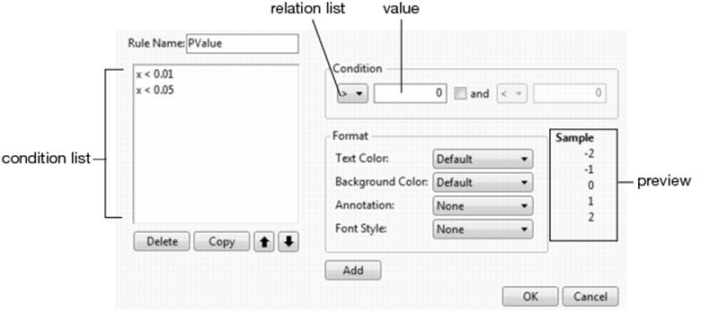
Add a Rule
To add a rule:
1.Open the JMP Preferences window.
2.Select the Reports preference group.
3.ClickManage Rules.
The Conditional Format Rule window appears.
4.ClickAdd.
A blank Conditional Format Rule window appears.
Figure 9.13 Blank Conditional Format Rule Window
5.Add and format conditions as described in“Add a Condition”.
6.ClickOKto save the new rule and return to the previous Conditional Format Rule window.
7.SelectRule enabledto enable the rule.
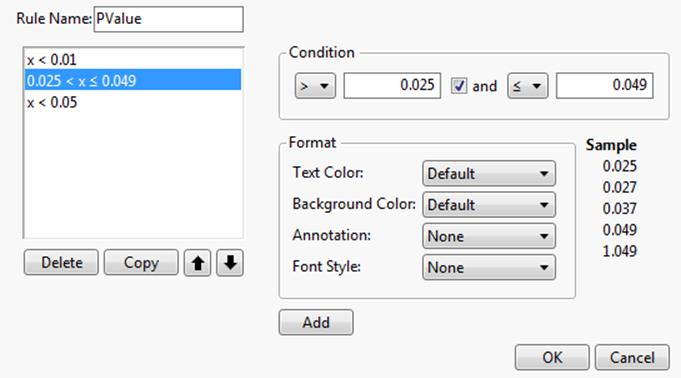
Edit a Rule
To change the conditional formatting of a rule:
1.In the Conditional Format Rule window, select the rule from the list.
2.ClickEdit.
The Conditional Format Rule window appears, showing the selected rule’s current conditions.
Figure 9.14 Conditional Format Rule Window
The default rule for PValue includes two conditions. The order of the list indicates the order that the rules are applied. For example, a p-value of 0.04 would not invoke the first rule (x < 0.01) but would invoke the second rule (x < 0.05).
Note: You cannot edit an existing condition within a rule. To edit an existing condition, you must delete the condition and then add it. See “Edit an Existing Condition” for details.
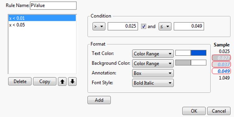
Add a Condition
To add a condition to a rule:
1.Open the rule to view the Conditional Format Rule window.
2.In the Condition area, select a relation from the drop list and enter a value in the text box.
Or
If you want the condition to include a value range:
‒Select > or ≥ from the relation drop list and enter the value in the text box.
‒Select the check box, select the < or ≤ relation, and enter the value.
3.Format the condition using the procedure described in“Format a Condition”.
Tip: When you click Add, the condition and its format settings are immediately added to the bottom of the condition list and the Condition and Format areas return to their default settings. Verify your settings before you click Add.
4.After verifying your settings, clickAddto add the condition to the rule.
5.Use the up and down buttons to position the condition within the list.
Figure 9.15 Example of an Added Condition
6.ClickOKto save your changes and return to the previous Conditional Format Rule window.
Delete a Condition
To delete a condition from a rule:
1.In the Conditional Format Rule window, select the condition and click Delete.
2.ClickOKto save your changes and return to the previous Conditional Format Rule window.
3.ClickOKto return to the Preferences window.
Format a Condition
To format values that fall within a condition:
1.With a Condition entered, select a Text Color from the drop list:
‒Default - The value appears without color.
‒Solid - The value appears in the specified color.
‒Dimmed - The value appears dimmed by the specified transparency.
‒Color Range - For ranged conditions, the values appear in color gradients within the specified color range.
‒Dimmed Range - For ranged conditions, values appear in dimmed gradients by the specified transparency range.
2.To specify a text color, click the color swatch and select a color.
3.To specify a transparency, enter the percent value (for example, ‘60%’).
The Sample area displays a preview of the appearance of the text column.
4.Select aBackground Colorfrom the drop list:
‒Default - The value appears without a color background.
‒Solid - The value appears with the specified color background.
‒Color Range - For ranged conditions, the values appear with background color gradients within the specified color range.
5.To specify a background color, click the color swatch and select a color.
The Sample area displays a preview of the appearance of the text column.
6.To have condition values noted, select anAnnotationfrom the drop list:
‒None - No notation is used on the value.
‒Box - The value appears in the table with a box around it.
‒Circle - The value appears in the table with an ellipse around it.
‒* (asterisk) - An asterisk (*) appears to the right of values in the table.
The Sample area displays a preview of the appearance of the text column.
7.To style the value text, select theFont Stylefrom the drop list:
‒None - No style is used to format the value.
‒Plain - No style is used to format the value.
‒Bold - The value appears bolded in the table.
‒Italic - The value appears italicized in the table.
‒Bold Italic - The value appears bolded and italicized in the table.
Figure 9.16 Example Formatting
Note: After configuring the formatting, remember to click Add to add the new condition to the rule.
Edit an Existing Condition
To change the formatting for an existing condition:
1.In the Conditional Format Rule window, select the condition and click Delete.
2.Re-create the condition by using the procedure described in“Add a Condition”.
3.Format the conditional using the procedure described in“Format a Condition”.
Tip: When you click Add, the condition and its format settings are immediately added to the bottom of the condition list and the Condition and Format areas return to their default settings. Verify your settings before you click Add.
4.After verifying your settings, clickAddto add the condition to the rule.
5.Use the up and down buttons to position the condition within the list.
6.ClickOKto save your changes and return to the previous Conditional Format Rule window.
Select Points in Plots
To select a point in a plot, click the point with the arrow cursor. This selects the point as well as the corresponding row in the current data table. To select multiple points, hold down the Shift key while you select points. A point’s label appears when you place the cursor over the point with or without clicking.
Select Rows in Graphs
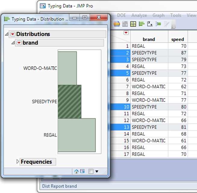
All graphs and plots that represent the same data table are linked to each other and to the corresponding data table. When you click points in plots or bars of a graph, the corresponding rows highlight in the data table. The example in Figure 9.17 shows a histogram with the SPEEDYTYPEbar highlighted, and the corresponding rows highlighted in the table. You can also extend the selection of bars in a histogram by holding down the Shift key and then making your selection.
Figure 9.17 Highlighting Rows in a Histogram
Select a Rectangular Area of Points
You can select all points that fall in a rectangular area using the arrow cursor. Click and drag the arrow to highlight points. Alternatively, you can use the brush tool. As you move the brush over the graph, points that fall within the rectangle are selected. Any points marked in the data table as hidden are not selected. See “Hide Rows and Columns” in the “Enter and Edit Data” chapter.
To select points using the brush tool:
1.Click the brush tool in the toolbar.
2.Click and hold the cursor (now brush-shaped) in a plot. A rectangle appears.
3.Move the rectangle over points. As it passes over them, they appear highlighted both in the plot and in the active data table.
‒To keep all points selected as you move the brush-shaped cursor over points, press the Shift key before you click on a point in the plot. The selected points are also selected in the data table.
Figure 9.18 Using the Brush Tool
4.Release the mouse. The points within the rectangle and the data table remain selected.
‒To change the size of the selection rectangle, press the Alt key before you click in the plot. Drag the cursor to resize the selection box. This shape acts like a slicing tool that can traverse and highlight slices of points across either axis. Note: The size of the selection box is remembered for the next time you use the brush tool.
‒If you press the Ctrl key and click the brush tool on selected points, the points within the selection rectangle are deselected. Points outside the selection rectangle remain selected.
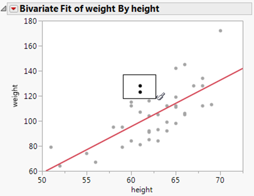
Select an Irregular-Shaped Area of Points
You can use the lasso tool to select points that fall in an irregular-shaped area. Any points marked in the data table as hidden are not selected. See “Hide Rows and Columns” in the “Enter and Edit Data” chapter.
To select points within an irregular-shaped area
1.Click the lasso tool in the toolbar.
2.Click and hold the cursor (now lasso-shaped) in a plot.
Note: To keep all points selected as you drag the lasso around several sets of points, press the Shift key before you click in the plot.
3.Drag the lasso around any set of points.
Figure 9.19 Using the Lasso Tool
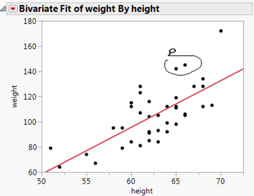
4.Release the mouse. JMP automatically closes the lasso and highlights the points within the enclosed area.
Use Markers
Markers are points on a graph that represent data. Once they are changed from their default setting, they also appear next to rows in the data table. The following sections show you how to change marker shape, size, color, and so on.
Change Marker Shape
You can assign a character from the JMP markers palette to replace the standard points in scatterplots. These markers also appear next to row numbers in the data table.
1.Highlight one or more markers whose shape you would like to change.
2.Right-click anywhere in the graph. In a histogram, right-click the box plot area on the right.
3.SelectRow Markers.
4.Select a marker shape from the options that appear, or clickCustomto enter a character to use as a marker.
Change Marker Colors
You can assign any color to highlighted rows. When you do this, the points in scatterplots appear in the color that you select from the colors palette. The active color assigned to a row appears next to the row number in the data grid.
To change the color of markers (points) on a graph:
1.Highlight one or more markers whose color you would like to change.
2.Right-click anywhere in a graph. In a histogram, right-click the box plot area on the right.
3.SelectRow Colors.
4.Select one of the colors, or clickCustomto apply a custom color.
Change Marker Size
To increase or decrease the size of markers (points) on a graph:
1.Right-click anywhere in a graph. Hold down the Ctrl key and right-click to broadcast the command and apply it to all plots of the same type located in the same window. In a histogram, right-click the box plot area on the right.
2.SelectMarker Size.
3.Select one of the marker sizes listed.
The default value, Preferred Size, is selected on the Graphs page in the JMP preferences.
Change the Marker Drawing Mode and Transparency
When working with a large number of markers on a graph, the markers can appear crowded. If this is the case, you might need to alter the transparency to gain a better view. Altering the transparency might also affect the marker drawing mode, which is the mode JMP uses when it refreshes a report window. As it draws markers on a plot, it uses one of two speeds: normal or fast.
To change the marker drawing speed:
1.Right-click anywhere in a graph. In a histogram, right-click the box plot area on the right.
2.SelectMarker Drawing Mode, and then select eitherNormalorFast.
Normal
If JMP is in normal drawing mode and the number of markers in a graph are more than the specified threshold number, JMP automatically switches to fast mode. See “Reports” in the “JMP Preferences” chapter, for details about setting the marker threshold.
Fast
Graphs displaying a large number of markers appear faster if you set the marker drawing speed to Fast. Note that when the drawing speed is set to Fast, marker size reverts to Preferred Size, and marker transparency settings revert to the default opaqueness.
Outlined
See “Add Outlines Around Markers”.
Add Outlines Around Markers
You can add a black outline, or frame, to markers in a plot. Outlined markers are available at the medium, larger, XL, XXL, and XXXL marker size. (See “Change Marker Size”, for details.)
To add outlines
1.Right-click a plot or graph.
2.SelectMarker Drawing Mode.
3.SelectOutlined.
To use an outline effectively, it is best if your marker is a color other than black.
To change marker colors
1.Highlight the markers whose color you want to change.
2.Right-click anywhere in the graph.
3.SelectRow Colors.
4.Select a marker color from the options that appear.
Marker Selection Modes
When you select markers on a graph, only the selected markers are highlighted. You can change how markers are highlighted on the current graph. The options are applied to the top two triangles in the following figure.
Figure 9.20 Examples of Highlighted Triangular Markers
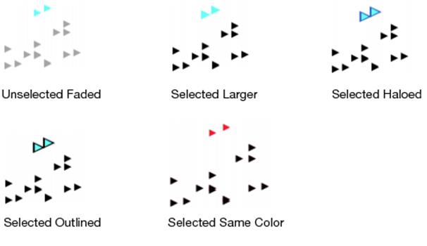
To change the marker highlighting on the current graph
1.Right-click anywhere in a graph and select Marker Selection Mode.
2.Select one of the following options:
Preferred Mode
the Marker Selection Mode that is selected on the Graphs page in the JMP preferences. The default value is Unselected Faded.
Unselected Faded
only the selected markers are highlighted. Everything else is dimmed by the percent specified by Faded amount for unselected markers in Preferences > Graphs.
Selected Larger
the selected markers are larger than the deselected markers.
Selected Haloed
the edges of the selected markers are outlined in blue.
Selected Outlined
the selected markers are outlined in black.
Selected Same Color
the selected markers are shaded with the Marker Selection Color that is selected in the Graphs preferences.
Specify Marker Transparency
You can change the transparency of markers (points) on a graph. For example, this enables you to control the visibility of overlapping points.
Note: When the drawing speed is set to Fast, marker transparency settings revert to the default opaqueness and marker size reverts to Preferred Size.
To adjust markers’ transparency:
1.In a graph, right-click anywhere and select Transparency. In a histogram, right-click the box plot area on the right and select Transparency.
2.Enter the level of transparency that you want the markers (points) to have on the graph, and clickOK.
A value of 1 indicates total opaqueness and 0 indicates invisibility. Values between 1 and 0 are semi-transparent.
Exclude and Hide Markers
Use the Rows > Hide and Exclude command to suppress the appearance and exclude from statistical analyses the highlighted rows. Data remains hidden and excluded until you select Rows > Hide and Exclude again.
Using the Exclude/Unexclude command, you can exclude highlighted rows from statistical analyses. Data remains excluded until you select Rows > Exclude/Unexclude for those highlighted rows.
Note: Excluded data are not automatically hidden in plots even though they are excluded from calculations in text reports and graphs.
Using the Hide/Unhide command, you can suppress (hide) the appearance of highlighted points in scatterplots. For example, you can exclude points from analysis and then hide those same points in scatterplots. The data remain hidden until you select Rows > Hide/Unhide for highlighted hidden rows.
Note: Hidden points are not automatically excluded from statistical computations that affect text reports and graphs, even though they are not displayed in the plots. To exclude hidden observations from analyses, you must highlight them and select Rows > Exclude/Unexcludecharacteristic.
To exclude or hide markers (points) from analyses
1.Highlight the marker(s) that you would like to exclude or hide.
2.Right-click anywhere in a graph.
3.SelectRow ExcludeorRow Hide.
Add Labels to Markers
When you position the arrow cursor over a point in a plot, the point’s label appears. By default, the label is the row number. There are three ways that you can customize the label:
•You can change the label so that it displays values found in one or more columns instead of the row number.
•You can enable the label to appear always, not just when you position the cursor over points.
•You can click the label with the Arrow tool and drag it to a new location. If a label is dragged a certain distance away from the marker, then a tail is added connecting the label to its point.
For details about changing the appearance of marker labels, see “Reports” in the “JMP Preferences” chapter.
To display values found in one or more columns instead of the row number
1.In the data table, highlight the column(s) whose values you want to appear as the label in plots.
2.SelectLabel/Unlabelfrom one of the following places:
‒the Cols menu
‒the red triangle menu in the Columns panel
‒the top red triangle menu in the upper left corner of the data grid
A label or yellow tag icon ![]() beside the column name in the Columns panel indicates that points on plots are identified by the column value. If there are multiple labeled columns, their values appear on plots separated by a comma. Data remains labeled until you highlight the column and select Label/Unlabel again.
beside the column name in the Columns panel indicates that points on plots are identified by the column value. If there are multiple labeled columns, their values appear on plots separated by a comma. Data remains labeled until you highlight the column and select Label/Unlabel again.
To enable the label to appear always, not just when you position the cursor over points
1.Highlight the point(s) whose label you want to always appear in plots.
2.Right-click anywhere in a graph. In a histogram, right-click the box plot area on the right.
3.SelectRow Label.
A label or yellow tag icon ![]() beside the row number in the data table indicates that points on plots corresponding to the row appear with a label.
beside the row number in the data table indicates that points on plots corresponding to the row appear with a label.
Change Marker Shape or Colors Based On Values
In some plots, you can change marker shapes or colors based on the values of points by adding a row legend. It is called a row legend because JMP automatically inserts a legend using row color or row marker settings. When you assign markers or colors in this way, it assigns the characteristic(s) to all points in a graph, regardless of what points you have selected. All previous marker and color settings are overwritten.
To add shapes or colors based on column values
1.Right-click anywhere in a graph. In a histogram, right-click the box plot area on the right.
2.SelectRow Legend.
3.In the window that appears (Figure 9.21), highlight the column whose values you want to color or mark. A preview of the legend is shown on the right.
Figure 9.21 Adding a Row Legend
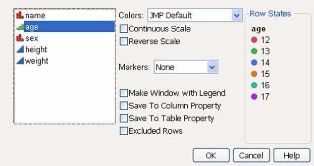
4.Refine your row legend using the following options:
Colors
Lets you choose among several pre-defined color schemes.
Continuous Scale
Assigns colors on a spectrum that corresponds to the ascending or descending order of the values. Use this option when the highlighted column contains continuous values.
Reverse Scale
Reverses the scale of colors.
Markers
Lets you choose among several marker schemes.
Make Window with Legend
Creates a separate legend window that tells you what colors and shapes correspond to which value.
Save Column Property
Adds a column property that stores the selected color theme.
Save Table Property
Adds a table property that preserves the selected color and marker configuration.
Excluded Rows
Assigns colors or markers to rows that are excluded.
Most legends have one column. However, the following platforms have multi-column legends when there are more than 20 levels:
•Recurrence
•Oneway (for CDF Plot and all three Densities red triangle commands)
•Fit Model (for the Regression Plot in Standard Least Squares)
•Survival
Remove the Row Legend
Delete a row legend by right-clicking it and selecting Remove.
Alter Plot and Chart Appearances
There are many ways that you can format your report to meet your needs. The sections below detail how to make changes to the graphical portions of your output reports.
Tip: If you have a touchscreen, you can pan and zoom most graphs and axes in JMP. Graphs and axes change scale and zoom out if pinched, and zoom in if stretched.
Resize Plots and Graphs
There are two main ways to resize plots and graphs: using the click and drag method or resizing it according to pixel size.
Note: You can also change the default size of a graph using the Graph Height option in File > Preferences > Graphs.
Use Click and Drag
To resize a plot or graph using the click and drag method:
1.Place the cursor on the right edge, bottom edge, or lower right corner of the plot frame. The cursor changes to a small double-arrow pointer.
2.Click and drag to change the size of the plot. When you resize, the height and width of all plots in that frame adjust independently of other frames in the same report window.Table 9.6describes how to adjust the plot.
|
Table 9.6 Resizing Actions |
|
|
Action |
Instructions |
|
Adjust the plot frame but preserve the proportions (aspect ratio) |
Hold down the Shift key and click and drag the corner of the frame. |
|
Adjust a plot in 8-pixel increments |
Hold down the ALT key and click and drag the corner of the frame. |
|
Adjust all plots of the same type simultaneously |
Hold down the CTRL key and click and drag the corner of one of the plots. If you do this for one scatterplot, the action is broadcast to all scatterplots in the window, and they resize together. Any other types of plots remain unchanged. |
Specify Size in Pixels
To resize a plot or graph to a specific pixel size:
1.Right-click the plot or graph.
2.SelectSize/Scale>Frame Size.
3.Enter the number of pixels for the frame’s height and width.
Note: For details about the other options in the Size/Scale menu, see “Scroll and Scale Axes”.
Zoom In and Out
The magnifier ![]() lets you automatically zoom in on any area of a plot. When you click the magnifier, the point or area where you click becomes the center of a new view of the data. The scale of the new view enlarges, giving you a closer look at interesting points or patterns. You can perform any of the following actions:
lets you automatically zoom in on any area of a plot. When you click the magnifier, the point or area where you click becomes the center of a new view of the data. The scale of the new view enlarges, giving you a closer look at interesting points or patterns. You can perform any of the following actions:
•Click and drag the magnifier to focus in on a particular region of the plot.
•On a ternary plot, drag the magnifier to zoom the triangular axes.
•Zoom repeatedly to look closer at the data.
•Hold down the Ctrl key and click the magnifier to return to your previous state before the last zoom.
•Double-click or hold down the Alt key and click the magnifier to restore the original plot.
Change Line Widths
After fitting a line to a graph, or producing a graph with a line already present, you can adjust the width of the line:
1.Right-click anywhere in a graph.
2.SelectLine Width Scale.
3.Select to increase the current line width one to three times its default width. Or, selectOtherand specify a larger or smaller number. SelectScale with Fontto increase the line size as you increase the display font size usingWindow > Font Sizes(Windows) andView > Make Text Bigger/Smaller(Macintosh).
Change the Background Color in a Graph
To change the background color in a graph, follow these steps:
1.Right-click anywhere in a graph. (To change only the color of a box plot, right-click the box plot area.)
2.SelectBackground Color.
3.Select one of the predefined colors, or create your own color.
4.ClickOK.
Change the Color of Histogram Bars
To change the color of histogram bars, follow these steps:
1.Right-click anywhere in a histogram and select Histogram Color.
2.Click a color, or clickOtherand create your own color.
See your operating system documentation for details about creating your own colors.
Display Coordinates and Temporary Reference Lines
You can measure points and distances in graphs, or easily find the exact value, or coordinates, of points and distances on plots and graphs. To do this, click the crosshairs tool ![]() and click and hold anywhere on a graph. The coordinate values appear where the crosshairs intersect the vertical and horizontal axis as you drag the crosshairs within a plot.
and click and hold anywhere on a graph. The coordinate values appear where the crosshairs intersect the vertical and horizontal axis as you drag the crosshairs within a plot.
Figure 9.22 Using the Crosshairs Tool
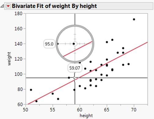
On a fitted line or curve, the crosshairs identify the response value for any predicted value. On a ternary plot, this tool displays triangular crosshair lines.
Scroll and Scale Axes
The hand tool (also known as the grabber tool) (![]() ) provides a way to change the axes and view of a plot:
) provides a way to change the axes and view of a plot:
On a y-axis, dragging ![]() scrolls the y-axis; dragging
scrolls the y-axis; dragging ![]() or
or ![]() scales the y-axis.
scales the y-axis.
On an x-axis, dragging ![]() scrolls the x-axis;
scrolls the x-axis; ![]() or
or ![]() scales the x-axis.
scales the x-axis.
Tip: When you drag an axis to change its scale, JMP automatically updates the major and minor tick increments based on the new axis width. To prevent this (retaining your original increments), hold down the Shift key while dragging.
You can also right-click in a plot or graph, and select Size/Scale (or Graph > Size/Scale). Choose one of the following options:
•To adjust the scale of the X axis, select X Axis. To adjust the scale of the Y axis, select Y Axis or Right Y Axis. For more details about this window, see “Customize Axes and Axis Labels in the Axis Settings Window”.
•For details about the Frame Size option, see “Specify Size in Pixels”.
•Select Size to Isometric when the x- and y-axes are measured in the same units and you want distances on the graph to be represented accurately regardless of direction.
Customize Axes and Axis Labels in the Axis Settings Window
Double-click a numeric axis to customize it using the Axis Settings window. Or, right-click the axis area and select Axis Settings to access the window.
Note: In the Graph Builder and Distribution platforms, you can also customize nominal axes using the Axis Settings window.
Customization features in the window depend on the data type of the axis and the specific platform JMP uses to create the plot or chart. Figure 9.23 shows a typical Axis Settings window for numeric (continuous) axes.
Figure 9.23 Axis Settings Window for a Numeric (Continuous) Axis
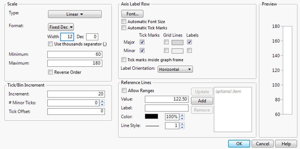
The Axis Settings window contains the following panels:
•“Scale”
•“Tick/Bin Increment”
•“Axis Label Row”
•“Reference Lines”
•The Preview panel shows how your current selections will appear on the axis.
Scale
In the Scale panel, you can do the following:
•“Change the Axis Scale Type”
•“Change the Numeric Format of an Axis”
•“Establish Minimum and Maximum Axis Values”
Change the Axis Scale Type
When viewing a graph with a numeric axis, you can change the axis scale to one of the following types:
•Linear
•Log
•Power
•Geodesic
•Geodesic US
•Probability Scales (Normal, Weibull, Fréchet, Logistic, and Exponential)
Note the following:
•Specific platforms might use other scale types that are fixed and cannot be changed.
•If you selected a scale type of Log, enter the Base to use.
•If you selected a scale type of Power, enter the Power to use.
To set a default scale type for a variable, which avoids making this change every time you run an analysis, see “Axis” in the “The Column Info Window” chapter.
Change the Numeric Format of an Axis
For plots and charts that contain a numeric axis area, you can change the format of the axis. For details about numeric formats, see “Numeric Formats” in the “The Column Info Window” chapter.
Note the following:
•If you selected Date, Time, or Duration, you need to specify the format of the increments. See “Add and Remove Axis Labels”. You can also specify label row nesting. See “Label Row Nesting”.
•If you selected Fixed Dec, enter the number of decimal places that you want JMP to display in the Dec box.
•If you selected Precision, select whether you want to keep trailing zeros and all whole digits.
•To add commas to values that equal a thousand or more, select the Use thousands separator option. You must account a space for each comma in the Width box, or else they might not appear. This option is available for the Best, Fixed Dec, Percent, and Currency formats.
•For a numeric axis, you can adjust the width of the tick mark labels using the Width box.
Note: When you change the numeric format of an axis, you do not change the numeric format of the way the values appear in the corresponding data table. To change how a date or time appears in a data table, see “Numeric Formats” in the “The Column Info Window” chapter.
Selecting a date interval from the date increment drop-down menu divides the JMP date (number of seconds) into the appropriate units. This gives the plot scale that you want for your data. The date axis must be a column with a JMP date value and appear in the Axis Settings window in the date format found in the Column Info window. However, you can use the Axis Settings window to format the date’s appearance in the plot.
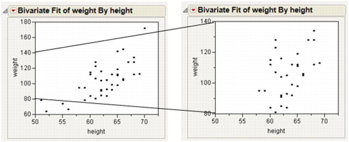
Establish Minimum and Maximum Axis Values
For plots and charts that contain a numeric axis area, you can change the minimum and maximum values that you want the graph to display.
Note the following:
•To restore the default minimum and maximum axis settings of a numeric axis, right-click a numeric axis and select Revert Axis.
•Select Reverse Order to reverse the axes by reversing the minimum and maximum values.
Tip: To set a default minimum and maximum axis value for a variable, which avoids making this change every time you run an analysis, see “Axis” in the “The Column Info Window” chapter.
The example on the right in Figure 9.24 is an enlargement of the point cluster that shows between 80 and 140 in the plot to the left. The enlarged plot is obtained by reassigning the maximum and minimum axis values and changing the number of minor tick marks to 1. (See “Extend Divider Lines and Frames for Categorical Axes”, for details.)
Figure 9.24 Rescale Axis to Enlarge a Plot Section
Tick/Bin Increment
In the Tick/Bin Increment panel, you can do the following:
•“Change Axis Increments”
•“Add Minor Tick Marks”
•“Change the Tick Offset”
•“Label Row Nesting”
Change Axis Increments
While viewing a graph, you can change the axis increments.
If the axis Format is set to Date, Time, or Duration, a format menu appears beside Increment. See Figure 9.25. Select which format you want the increments to take.
Figure 9.25 Selecting the Format for Date and Time Increments
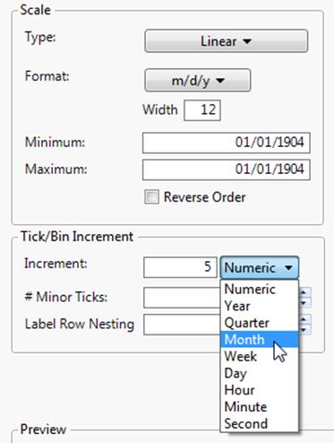
Tip: To set a default axis increment for a variable, which avoids making this change every time you run an analysis, see “Axis” in the “The Column Info Window” chapter.
Add Minor Tick Marks
You can add tick marks to a numeric axis, or change the number of minor tick marks that appear on a numeric axis. In the Axis Label Row panel, be sure to select the Minor Tick Marks box so that the tick marks appear on the axis.
Tip: To set default minor tick marks for a variable, which avoids making this change every time you run an analysis, see “Axis” in the “The Column Info Window” chapter.
Change the Tick Offset
To change the starting point of the tick marks, enter a number in the Tick Offset box. For example, if the Tick Offset is currently set to 0, setting it to 1 will move all the values on the axes up by 1.
Label Row Nesting
This option appears only if you have selected Date, Time, or Duration as the axis Format. Label row nesting enables you to split a date axis into multiple rows based on the format. For example, you might put the year on the outermost row, then the month, then the day:
1.Select Help > Sample Data Library and open Stock Prices.jmp.
2.SelectGraph > Graph Builder.
3.DragDateinto theXzone.
4.DragOpeninto theYzone.
5.Double-click the X axis.
6.ForFormat, selectDate > ddMonyyyy.
7.Increase the value forLabel Row Nestingto 3.
8.ClickOK.
9.ClickDoneto see the finished graph.
Figure 9.26 Example of Label Row Nesting
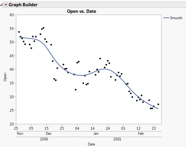
Axis Label Row
In the Axis Label Row panel, you can do the following:
•“Change Axis Label Font”
•“Add Tick Marks, Grid Lines, or Labels”
•“Change the Orientation for Tick Labels”
Note: In Graph Builder, if you have nested labels in an axis, tabs appear in the Axis Label Row panel. You can modify each row of labels separately in its own tab.
Change Axis Label Font
You can modify the axis label font on any axis type. Your changes only apply to the active graph. To set the default axis label font, see “Fonts” in the “JMP Preferences” chapter.
Note: Windows 7 does not support the Adobe Compact Font Format (CFF). As a result, JMP cannot render axis labels using CFF fonts (like certain OpenType fonts). Windows 8 supports CFF fonts. Therefore, JMP correctly renders axis labels using CFF fonts.
To change the current font type and size
•Right-click an axis label and select Font
or
•Right-click an axis and select Axis Settings. Click Font.
Note the following:
•To change the font color, right-click an axis label and select Font Color.
•Select Automatic Font Size to have JMP attempt to decrease the font size (down to a certain minimum) if all of the labels cannot fit at the default size.
Add Tick Marks, Grid Lines, or Labels
These options can vary depending on whether your axis is continuous or categorical.
Note: Remember that the Axis Settings window is only available for categorical axes in Graph Builder and Distribution.
Figure 9.27 Axis Label Row for a Continuous Axis (left) and a Categorical Axis (right)
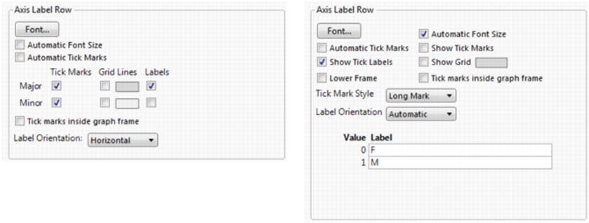
For continuous axes:
•Select Automatic Tick Marks to turn on tick marks only if one or more labels is hidden (due to insufficient space).
•Add major or minor tick marks, grid lines, or labels, by selecting the corresponding check boxes.
•Click the color box to change the color of grid lines.
•Select Tick marks inside graph frame to move the tick marks inside the graph.
For categorical axes:
•The default is to not show tick marks if all of the labels are visible. To add tick marks, select Show Tick Marks.
•Select Automatic Tick Marks to turn on tick marks only if one or more labels is hidden (due to insufficient space).
•Add grid lines by selecting Show Grid.
•Click the color box to change the color of grid lines.
•Select Tick marks inside graph frame to move the tick marks inside the graph.
•Select Lower Frame to add a frame around the labels.
•Change the Tick Mark Style by selecting one of the options.
•Modify the labels by entering different values in the Label boxes.
Tip: To set default tick marks for a variable, which avoids making this change every time you run an analysis, see “Properties That Control the Display of Columns” in the “The Column Info Window” chapter.
Change the Orientation for Tick Labels
To change the orientation for tick labels, select an option from the Label Orientation list.
Automatic
Tick labels are oriented automatically to be readable, depending on the tick increment and length of the labels.
Horizontal
Baseline at the bottom.
Vertical
Vertical with the baseline on the right.
Perpendicular
Horizontal for vertical axes and vertical for horizontal axes.
Note: Parallel and Perpendicular are useful with paired axes, like in Multivariate plots.
Parallel
Vertical for vertical axes and horizontal for horizontal axes.
Angled
Angled at about 45 degrees.
Reference Lines
To add references lines to graphs, proceed as follows:
1.Double-click a numeric axis. Or, right-click a numeric axis and select Axis Settings.
2.In theValuetext box, enter the value to which you want the reference line to correspond. This is the position on the graph at which the line is placed.
Note: If you opened the Axis Setting window by double-clicking on the graph, the default value corresponds to the point on the graph that you clicked.
3.Enter aLabelfor the line.
4.You can further customize the reference line by choosing either of these options:
‒Select Allow Ranges to enter a minimum and a maximum value, which define the beginning and the end of the reference line. The reference line appears over a range of data.
‒Color changes the line color. You can also specify the opacity.
‒Line Style specifies the line style (when Allow Ranges is not selected). You can also specify the line width.
5.ClickAdd. The value moves into the box to the right of theAddbutton, indicating that it will be placed on the graph. Your changes appear in the Preview window.
6.To add more lines, repeat the above steps.
7.To modify an existing reference line, make your changes, and then clickUpdate.
Tip: To set a default reference line for a variable, which avoids making this change every time you run an analysis, see “Properties That Control the Display of Columns” in the “The Column Info Window” chapter.
Customize Axes and Axis Labels Using the Right-Click Menu
Right-click on an axis to perform the following actions:
•“Extend Divider Lines and Frames for Categorical Axes”
•“Add and Remove Axis Labels”
•“Rotate Axis Labels and Tick Marks”
•“Copy and Paste Graph Contents”
•“Copy and Paste Axis Settings”
Extend Divider Lines and Frames for Categorical Axes
Extending the vertical divider line(s) between tick labels is useful when there are many levels of a nominal or ordinal (categorical) variable.
To extend the divider line to the x-axis labels:
1.Right-click a nominal or ordinal axis.
2.SelectTick Marks > Divider Linesto add the lines, orLower Frameto add a frame around the axis area.
Figure 9.28 Divider Lines
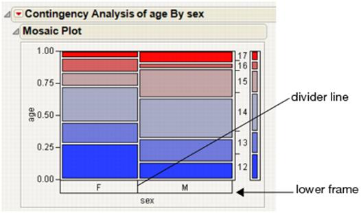
Add and Remove Axis Labels
You can add or remove labels in a numeric axis. To add an axis label:
1.Right-click a numeric axis and select Add Axis Label.
2.Enter a name for the axis label. The axis area enlarges to hold the number of label lines that you enter.
This command can be used multiple times to add multiple labels. To edit the label after it has been added to the axis, click it and it will turn into an edit box.
To remove an axis label, right-click a numeric axis and select Remove Axis Label. The last label added is removed.
Rotate Axis Labels and Tick Marks
You can modify the axis label on any axis type.
To rotate an axis label
1.Right-click an axis label.
2.SelectRotate Text.
3.Select which direction to rotate the text:Horizontal,Left, orRight.
Tip: To set a default axis label position for a variable, which avoids making this change every time you run an analysis, see “Properties That Control the Display of Columns” in the “The Column Info Window” chapter.
On a nominal axis, you can rotate tick marks. Right-click the tick label and select Rotated Tick Labels.
Copy and Paste Graph Contents
After customizing a graph by adding elements such as a fitted line, you can copy and paste the contents from one graph to another compatible graph:
1.Right-click the graph that you have customized.
2.SelectEdit > Copy Frame Contents.
3.Right-click the graph to which you would like to copy the settings.
4.SelectEdit > Paste Frame Contents.
Note: If you are having difficulty pasting histogram bars, see the JSL workaround in the Scripting Guide.
Copy and Paste Axis Settings
After customizing an axis (as described in “Customize Axes and Axis Labels in the Axis Settings Window”), you can copy and paste your new settings to another axis:
1.Right-click the axis that you have customized.
2.SelectEdit > Copy Axis Settings.
3.Right-click the axis to which you would like to copy the settings.
4.SelectEdit > Paste Axis Settings.
Change the Order of Values
Data in a JMP report might not appear in the order that you prefer. To give data a specific order so that it appears that way in a report, assign the column the Value Ordering property before running the analysis, as described in “Value Ordering” in the “The Column Info Window” chapter.
If your values include any of the following, they automatically appear in the appropriate order in reports:
•January, February, March, April, May, June, July, August, September, October, November, December
•Jan, Feb, Mar, Apr, May, Jun, Jul, Aug, Sep, Oct, Nov, Dec
•Sunday, Monday, Tuesday, Wednesday, Thursday, Friday, Saturday
•Very Low, Low, Medium Low, Medium, Medium High, High, Very High
•Strongly Disagree, Disagree, Neutral, Indifferent, Agree, Strongly Agree
•Failing, Unacceptable, Very Poor, Poor, Bad, Acceptable, Average, Good, Better, Very Good, Excellent, Best
Change the Pattern and Format of Selected Objects
Patterns appear on some objects such as bars and maps when you select them. You can change the pattern for a specific object in the legend.
Right-click the item in the legend and select Fill Pattern to select a new pattern.
To remove the pattern, right-click the item again and select Revert.
Modify the Format of Selected Objects in All Graphs
Select File > Preferences > Graphs (Windows) or JMP > Preferences > Graphs (Macintosh) to change the Filled Areas preferences.
•To change the highlight on selected objects, select one of the following Filled Selection Mode preferences:
‒Selected Patterned: a striped pattern (the default setting)
‒Selected Darkened: a solid darker color
‒Selected Outlined: an outline
‒Selected Same Color: The Fill Selection Color in the preferences formats the selected object.
•To change the color of selected rows in graphic objects when the Fill Selection Mode is “Selected Same Color”, click the Fill Selection Color bar. The default color is red.
Add Geographical Images and Boundaries
Adding map images and political boundaries to graphs provides visual context to geospatial data. For example, you can add a map to the graph that displays an image of the U.S. Another option is displaying the boundaries for each state (when data includes the latitudes and longitudes for the U.S.).
The data should have latitudinal and longitudinal coordinates. Otherwise, the map has no meaning in the context of the data. The x and y axes also have range requirements based on the type of map. These requirements are described in the following sections.
Two tools are especially helpful when you are viewing a map:
The grabber tool (![]() ) lets you scroll horizontally and vertically through a map.
) lets you scroll horizontally and vertically through a map.
The magnifier tool (![]() ) lets you zoom in and out.
) lets you zoom in and out.
The following sections describe the map images and boundaries that you can add to a graph.
For details about adding maps, see Essential Graphing.
Drag and Drop an Image into a Graph
To add an image that you created, generate your report and then drag and drop the image from your file system onto the graph in the report. After you add the image, JMP provides several options such as resizing, formatting, and rotating an image. Right-click the image and select Image to see these options.
The following example shows a bivariate plot of wind speeds in the Chicago area. The plot on the left includes arrows to illustrate the wind direction and speed. A map image was dropped onto the plot and resized to line up the markers with the stations that provided the wind data (each dot representing a station).
Figure 9.29 Example of a Custom Map Image
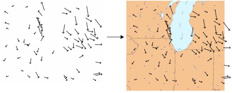
Image Processing
JMP includes a variety of image processing options. Image processing includes filters that can sharpen, blur, resize, and enhance. JMP also allows flipping, rotating, and locking images. Table 9.7 details the processing options.
Note: Repeated changes to images can degrade image quality. If you are not happy with the results of sizing, scaling, or applying filters to the image, remove the image and start again.
Note: All of the JMP image filters are supported at the operating system level. This means that images that are processed on Windows might differ from images processed on Macintosh.
|
Table 9.7 Descriptions of Image Options |
|
|
Lock |
Locks the image in place so that it cannot be moved. |
|
Size/Scale |
•Fill Graph: Resizes the image proportionately to fit the graph. •Specify Size: Resizes the image according to the values that you enter. (The units for these values are the same as your graph axes.) •Crop: Crops the image according to the values that you enter. (The units for these values are the same as your graph axes.) For example, the left edge might be positioned at 50. You enter 60 next to Left, and the portion of the image between 50 and 60 is removed from the image. |
|
Flip |
•Flip vertical: Flips the image top to bottom. •Flip horizontal: Flips the image left to right. •Flip both: Flips the image both horizontally and vertically. |
|
Rotate |
Rotates the image the specified number of degrees. Enter a negative value to rotate the image counterclockwise. |
|
Transparency |
Changes the image transparency level. Enter a value between 0 and 1 (where 1 is completely opaque). |
|
Filter |
Provides filters found in many graphic editing programs to change the appearance of the image. Select a filter repeatedly to increase its effects on the image. •Contrast: Optimizes the light and dark colors. Larger values lighten the image. •Despeckle: Removes pixels that do not blend with surrounding pixels. For example, a black pixel surrounded by white pixels is converted to a white pixel. •Edge: Darkens everything but the outlines of objects. •Enhance: Reduces the contrast between pixels in a noisy image. •Gamma: Balances the brightness of an image and the red, green, and blue (RGB) ratios. Larger values create a lighter image. •Gaussian Blur: Blurs pixels by the specified radius. Larger radii create a smoother image. (In JSL, you can also specify the sigma value. Larger sigma values create a smoother image.) •Median: Replaces each pixel color value with the median value of the surrounding pixels. •Negate: Converts each pixel to its complementary color (such as pink to green and white to black). •Normalize: Removes a percentage of the top and bottom color values. The color values are then stretched to fill the remaining image. This process increases the intensity of the colors. •Reduce Noise: Finds the minimum and maximum color values and replaces them with values more consistent with the surrounding pixels. Larger values create a smoother image. •Sharpen: Makes the edges of pixels more distinct. |
|
Remove |
Removes the image from the report. |
Extract Data from an Image
JMP provides the ability to extract information from images into a data table and then analyze that information. Researchers at WildTrack.org analyze digital footprint photos in JMP to track endangered species. They drag and drop a footprint image into a JMP report and draw data points to capture the size and shape of the print. A JMP Scripting Language (JSL) script extracts those measurements into a data table. At that point, the researchers can analyze the data and determine whether the footprint is from a new animal. This method helps them track populations of endangered species in specific regions of the world.
Figure 9.30 Example of Extracting and Analyzing Data
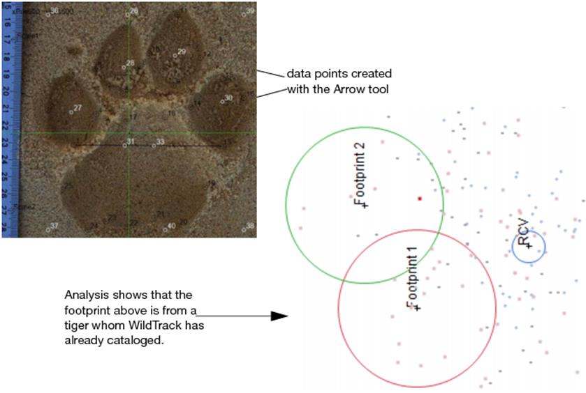
The details for implementing this feature are beyond the scope of this book, because the needs of the user vary widely. For details about writing JSL scripts, see the Scripting Guide.
Add Graphics Elements to a Report
You can add text notes, lines, polygons, ovals, and rectangles to a report using graphics tools found in the toolbar.
Annotations
You can add editable text notes to a JMP report using the annotate tool ![]() . To add an annotation:
. To add an annotation:
1.Select the annotate tool from the Tools menu or toolbar.
2.Click the location in the window where you want to add the annotation. Or, click and drag to size the annotation note. A white editable text box appears.
3.Enter text.
4.Click outside the annotation. The annotation turns yellow.
5.(Optional) Right-click the annotation to access the following options:
Background Color
Provides you with a color palette, from which you can select the background color for the annotation.
Text Color
Provides you with a color palette, from which you can select the color for the annotation’s text. The color of the font also defines the color of the annotation outline. If you select the same color for both the background and the font, the font does not show except for black and white. A black font on a black background changes to white, and a white font on a white background appears black.
Font
Lets you change the current font type, style, and size. To change the default font, see “Fonts” in the “JMP Preferences” chapter.
Tag Line
Attaches a line to the annotation that points to a place in the text, as shown below. To move the line with the annotation to a new position, press the Ctrl key and drag the annotation.
Filled
Removes the background color from the annotation so that it looks transparent. A transparent note is handy for putting titles and footnotes on a graph.
Editable
Makes the annotation editable by double-clicking on it.
Reanchor
Reanchors the annotation.
Delete
Deletes the entire annotation.
Note: When adding multiple annotations, press the Shift key when selecting the annotation tool for the first time. This causes subsequent clicks to add an annotation, and you do not have to select the annotate tool from the toolbar before the addition of each annotation.
Once you have added an annotation, you can do the following:
|
Table 9.8 Using Annotations |
|
|
Action |
Instructions |
|
Add to or edit an annotation |
Click inside the text box. |
|
Move an annotation |
Click inside the annotation box and drag it. When an annotation is moved, it becomes selected, as indicated by a double blue line with handles around the perimeter. |
|
Resize an annotation |
Place the cursor on the handle of a selected note (showing in the middle of the edges and in the corners). The cursor appears as a single crossed arrow; drag to resize the annotation. |
|
Delete an annotation |
Highlight the annotation by clicking the handle of a note. Then press the Delete (or Backspace) key. |
Add Shapes
You can add editable lines, polygons, and simple shapes (ovals or rectangles) to a JMP report using the drawing tools ![]()
![]()
![]() . The following sections describe how each of these tools can be used.
. The following sections describe how each of these tools can be used.
Note: Each graphics tool remembers the most recent options chosen. This is useful if you need many annotations or other graphics with the same characteristics. For example, suppose you want many thick green lines with an arrow on one end. Create a line the way you want it, set the options, and subsequent lines appear with those options in effect. The options persist until you change them.
Add a Line
To add a line to a report window:
1.Click the line tool in the tool palette.
2.Click and drag where you want to insert the line. The line appears selected, showing handles on both ends.
3.Click and drag the line to move it.
4.Click a handle and drag to rotate the line.
5.Right-click a line for a menu of options to customize the appearance of the line, as follows:
Point to and Point from
Places arrows on either end (or both ends) of the line.
Thick
Changes the width of a line to thick. Lines are thin by default.
Dashed
Changes the line to dashed. Lines are solid by default.
Color
Displays the JMP color palette to change the color of the shape.
Reanchor
Reanchors the shape.
Delete
Removes the shape from the report surface. You can also remove the shape by selecting it and then pressing the Delete (or Backspace) key.
Add a Polygon or Bezier Curve
To add a polygon (or Bezier curve) to a report window:
1.Click the polygon tool in the tool palette.
2.Click to create the beginning point for the first side of a polygon.
3.Click again at the location where you want to complete the first side and begin an adjacent side. A square selection box with handles appears around the polygon area.
4.Click a third time to complete the second side.
5.Continue this process until the polygon is the way you want it. Each time a side is complete, the selection box adjusts to encompass the polygon sides.
6.Double-click to release the polygon tool.
Once you have added a polygon, you can perform the following actions:
|
Table 9.9 Working with Polygons |
|
|
Action |
Instructions |
|
Select or deselect the polygon |
Click the edge of a completed polygon. |
|
Resize the polygon |
Select it and drag one of the selection box’s handles. |
|
Move the polygon |
Click between the box’s handles and drag the selection box. |
|
Change the number of sides of the polygon |
Click and drag the sides to form the new shape. |
Right-click a polygon for a menu of options to customize its appearance, as follows:
Filled
Fills or empties the area of the shape.
Raised
Displays thick shaded lines around the shape. If the shape is also filled, the lower edge of the figure appears raised, giving it a three-dimensional look.
Smooth
Smooths the vertices of a polygon to produce a Bezier curve. The smoothed figure is reshaped and resized the same way as the polygon, and can be filled and raised.
Closed
Opens or closes the last segment of a polygon.
Color
Displays the JMP color palette to change the color of the shape’s sides, and its fill color when the Filled option is in effect.
Reanchor
Reanchors the shape.
Delete
Removes the shape from the report. You can also remove the shape by selecting it and then pressing the Delete (or Backspace) key.
Add an Oval or Rectangle
To add an oval or rectangle to a report window:
1.Click the simple shape tool in the tool palette.
2.Click and drag where you want to insert the shape. An oval appears with a selection box around it.
3.(Optional) To turn the oval into a rectangle, right-click on the oval and selectShape > Rectangle.
4.Double-click to release the simple shape tool.
Once you have added the shape, you can do the following:
•Select the shape and drag one of the selection box handles to reshape or resize.
•Click and drag an edge of the selection box (located between the handles) to move it.
•Select the shape, and then right-click it for a menu of options to customize its appearance, as follows:
Filled
Fills or empties the area of the shape.
Raised
Displays thick shaded lines around the shape. If the shape is also filled, the lower edge of the figure appears raised, giving it a three-dimensional look.
Shape
Displays a submenu whose options transform the shape into either an oval or a rectangle when selected.
Color
Displays the JMP color palette to change the color of the shape’s sides and its fill color when the Filled option is in effect.
Reanchor
Reanchors the shape
Delete
Removes the shape from the report. You can also remove the shape by selecting it and then pressing the Delete (or Backspace) key.
Add Graphics
To enhance your graphs with logos, pictures, or any other type of graphic, you can paste it into a report in .bmp, .jpeg, or .png format. You can also drag and drop graphics into reports.
To add graphics
1.Open the graphic file and select the graphic. Copy it to the computer’s clipboard.
2.Right-click inside a graph.
3.SelectEdit > Paste Background Image. The graphic is inserted at the point in the graph that you right-clicked.
You can also add the graphic to the end of a report window: copy the graphic onto your computer’s clipboard, making sure the report is the active window and selecting Edit > Paste.
Customize Graphical Elements
Graphs consist of markers, lines, text, and other graphical elements that you can customize. For example, in a Scatterplot Matrix graph, you might want to highlight data points in one of the bivariate graphs with a pink solid marker. In a Contour Plot graph, you can increase the width or transparency of the contour lines.
Example of Customizing a Contour Plot
1.Open the Little Pond.jmp sample data table.
2.In the Table panel, click on the red triangle next to Contour Plot and selectRun Script.
3.Click on the red triangle next to Contour Plot for Z and deselectFill Areas.
Figure 9.31 Contour Plot before Customization
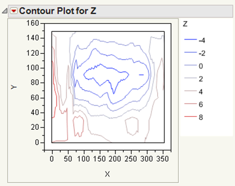
4.Right-click on the plot and selectCustomize.
The Customize Graph window appears.
5.ClickShape.
6.Change theLine Widthto 2.0.
7.Click on the color next toLine Colorand select a shade of green.
8.ClickOK.
Figure 9.32 Customized Contour Plot
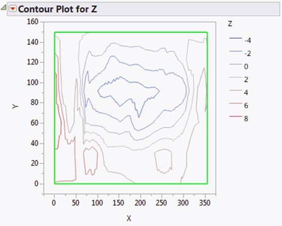
The graphical elements that you can customize differ on each graph. For example, in a Control Chart graph, there are three line elements (Marker, Lower Limit, Upper Limit and Connect Line). In other graphs, the line element might be named Line or Custom.
To customize graphical elements in the current graph
1.Right-click the graph and select Customize.
2.Select the element that you want to change, and then modify the properties.
Your changes are immediately shown on the graph.
3.ClickOKto save your changes to the current graph.
Each element can include properties for line color, marker style and size, text style, and so on. Here are some common properties:
Line Color
Changes the color of the line. Click to select any color in the window. Right-click to choose from more colors.
Line Style
Changes the style of the line. Click to select one of five different styles.
Line Width
Changes the width of the line. Click in the box and enter the desired line width in points.
Marker
Changes the marker shape or size. Click to change the shape. Right-click to change the size. For more information about markers, refer to “Use Markers”.
Arrow
Adds an arrowhead to a line at either None, Start, End, or Both ends of the line.
Line of Fit
Changes the color, width, or style of the line.
Text Color
Changes the color of the text.
Font
Changes the font, style, and point size of the text.
Text Style
Changes the text alignment to centered, left-aligned, or right-justified. The Fill option applies the selected color to the background.
Fill Color
Changes the color of objects such as box plots and Fit Confidence regions.
Transparency
Changes the marker or label transparency. Enter the level of transparency to draw markers (points) on the graph. The degrees of opacity ranges from 0 (clear) to 1 (opaque). For more information about changing the transparency of markers, see “Specify Marker Transparency”.
Create Scripts for Graphical Elements
In addition to customizing graphical elements, you can write JSL scripts that add elements. These scripts run when you display the graph. You can write the scripts from scratch, or you can select from the following lists of commands and scripts, accessed by clicking on the Add a new script button ![]() :
:
•Use the Templates list to insert a single JSL command. For example, the Polygon option inserts the Polygon command. The text enclosed in underscores are placeholders for point values, which you replace with your own values.
Polygon([_x0_, _x1_, ... ], [_y0_, _y1_, ...]);
•Use the Samples list to insert a script that creates elements such as bubble plots and sine waves. In this list, the Polygon option shows examples of the Transparency, Fill Color, and Polygon values, which you replace with your own values.
Figure 9.33 The Polygon Sample Script
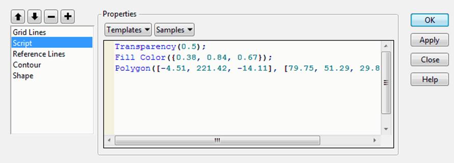
In some graphs, you can view the JSL that creates graphical elements. Figure 9.34 shows the Group Label script for a Discriminant Analysis graph. The script defines markers and text for group labels. The commands included in these built-in scripts cannot be modified or deleted. You can insert commands from the Templates or Samples list, but you cannot click in the window and type new commands.
Figure 9.34 Example of JSL That Creates Group Labels
For information about JSL, see the Scripting Guide book.
To create a graphics script
1.Right-click on the graph and select Customize.
2.Click theAdd a new scriptbutton (![]() ) to create a new script.
) to create a new script.
The default name, Script, is highlighted.
3.With the default name highlighted, type a more descriptive name, and then press Enter. (If you already moved the cursor and the name is no longer highlighted, double-click Script, and then enter the new name.)
4.Do one or more of the following:
‒Enter JSL in the Properties window.
‒Select one or more JSL commands from the Templates list, and modify the placeholder text. For example, change the Pen Color option from “blue” to “red.”
‒Select one or more sample scripts from the Samples list and modify, if necessary.
5.(Optional) ClickApplyto update the graph with your changes without closing the window. Unlike other property changes, script changes to not take effect until you clickApplyorOK.
6.ClickOKto save your changes.
One of the following occurs:
‒The element that you created appears on the graph.
‒An error message appears if the script contains an error. Select View > Log to read about the error, and then correct the script.
To delete a script that you created, select the script and then select the Delete selected object button (![]() ).
).
Change the Drawing Order of Graphical Elements
The graphical elements are drawn in the order in which they are listed. The first element on the list is drawn first, so it appears behind all other graphical elements. If one element hides another, you can rearrange the order of the elements.
To rearrange graphical elements
1.Right-click the graph and select Customize.
2.Select the element that you want to move.
3.Click theMove up in drawing orderbutton (![]() ) orMove down in drawing order(
) orMove down in drawing order(![]() ) button one or more times until the elements are in the order in which you want them drawn.
) button one or more times until the elements are in the order in which you want them drawn.
4.ClickOK.
Save Your Customizations
The graph customizations apply to the current graph and are also used when you redo an analysis. To re-create your graph at a later time with its customizations, select Script from the red triangle menu, and then select one of the Save options. For example, you can save the script to the data table, which applies your customized properties each time you run the script. See “Save Your Analysis as a Script” in the “Save and Share Data” chapter for details.
Copy Your Customizations
You can copy your customizations from one graph to another. All objects that you created or modified, such as colored text or lines, are pasted to the other graph.
To copy lines from one graph to another, see “Copy and Paste Graph Contents”.
To copy other objects
1.Right-click in the graph with custom elements and select Edit > Copy Customizations.
2.Right-click in the destination graph and selectEdit > Paste Customizations.
The objects appear on the current graph and are added to the list of customized elements.
Notes:
•The customizations are pasted into all similar graphs when you press Ctrl, click, and then paste.
•The copy customizations feature copies only the elements that you added or modified. It does not copy the other contents of the graph.
All materials on the site are licensed Creative Commons Attribution-Sharealike 3.0 Unported CC BY-SA 3.0 & GNU Free Documentation License (GFDL)
If you are the copyright holder of any material contained on our site and intend to remove it, please contact our site administrator for approval.
© 2016-2026 All site design rights belong to S.Y.A.