Android Development Patterns: Best Practices for Professional Developers (2016)
Chapter 6. Layout
Android applications are made to be seen, touched, and interacted with. To achieve this, you need to create a layout that your application will use to display the interface to the user. There are several ways to create your layout, and this chapter introduces you to the various layouts available and how they can be used in your application.
Layout Basics
You have two ways to control the layout you use in your application. As you learned in Chapter 5, “Views,” Views and ViewGroups can be created programmatically and edited. Some developers will be more comfortable creating and destroying layouts in this manner, but the application layout can also be created via XML.
When creating a new project in Android Studio, you will find a file in the res/layout folder that should be named after your Activity. If your Activity was named “main,” then you will find a file named activity_main.xml. If you are not using Android Studio or would rather create your own layout file, this can be done by creating your XML file in the same folder, res/layout, and then referencing the layout file in your Activity class. The following shows referencing the file in the onCreate() method of the Activity class:
@Override
protected void onCreate(Bundle savedInstanceState) {
super.onCreate(savedInstanceState);
setContentView(R.layout.custom_main.xml);
}
The most important part of this sample code is the line setContentView(R.layout.custom_main.xml);. This is how the custom XML, custom_main.xml, is referenced and used. By changing the referenced file, you can use different layout files. This may not seem beneficial at first; however, if you happen to be experimenting with several different layouts, you can quickly swap them out without having to copy and paste or copy over your existing layout file.
Layout Measurements
The layout XML structure is a fairly simple XML syntax that contains properties you can use to help define how the layout and any child objects it contains are displayed. It is important to note that some properties affect how the layout is sized. In these instances, you should do your best to avoid pixel (px) values and instead use density-independent pixels (dp).
The reason why you should avoid using px units, whenever possible, is that when working with the myriad of devices available, you will find that not all pixels are the same. In the dark days before mobile devices gained popularity, most monitors that were used with computers all contained roughly the same pixel density as each other. This allowed a fairly standard unit of measurement to be used because pixels were a simple 1:1 ratio. Things started to get shaken up a bit when various hardware manufacturers found that they could create smaller screens with pixels that could fit in roughly half the same space as a standard pixel would take up. The ratio for pixel calculations suddenly switched to 2:1. This allowed incredibly detailed images and visuals onscreen that could be displayed with high clarity and sharpness. Whether it is fortunate or unfortunate is up for debate; however, increasing the pixel density didn’t stop a 2:1, and now there are devices that have pixel ratios of 3:1, 4:1, and higher. Figure 6.1 demonstrates this problem on devices with different resolutions and pixel density ratios.
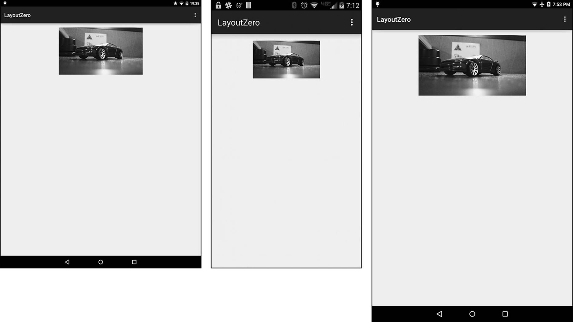
Figure 6.1 The image is set to 640px by 360px; however, it displays in a different size on a 9" 281ppi tablet (left), a 5” 565ppi phone (middle), and an 8” 283ppi tablet (right).
To alleviate this particular issue, the density-independent pixel was created. This measurement unit comes built in with a little extra math to figure out the pixel density of the screen and runs that against the entered number of dp units that a layout or object should take. This solves the pixel measurement problem by always returning the exact number of pixels to use.
You may find when you are developing that even though you are using dp units, your design or layout will not fit or starts to look a bit ridiculous on very large or small screens. Starting with Android 3.2, screens were grouped together based on the amount of dp units they contain. This makes it possible for you to use different layout files that fit the screen used to view your application.
The size groupings are as follows:
 ldpi: 120dpi
mdpi: 160dpi
hdpi: 240dpi
xhdpi: 320dpi
xxhdpi: 480dpi
xxxhdpi: 640dpi
Using these groupings, you can provide not only layouts, but also other assets such as images. To provide these resources, you need to create folders and place the resources you want loaded for devices that match that screen size. For example, if you want to provide a special layout for extra-dense devices, you could create a folder called layout-xhdpi in your /res folder. You would then place your layout XML file there. Note that it must be the same name as the layout XML file in the /res/layout folder.
As you are defining the size of the elements in your layout, you should be aware of the wrap_content and match_parent settings. When you have an element that is going to be dynamic in size, you may want to use wrap_content because this will allow the view or widget to expand based on the content it contains. If you would like to force content to be constricted by the size of the parent container or view group, you should use match_parent.
When working with text, you should use scale-independent pixels (sp), which will scale displayed text based on user preferences as well as the screen density of the device. Because the sp unit will take into consideration user preferences, it is not a safe unit of measurement to use when setting the dimensions of layouts.
Layout Coordinates
Each layout type or container has a way of allowing you to place specific items; however, you can also get specific positioning information programmatically by using the getTop() and getLeft() methods. Similar to how web developers position elements, views are treated as rectangular objects that are placed on an X/Y axis, with 0 being the very top and left locations. Figure 6.2 shows a view positioned at 0,0 on an X/Y axis.
Figure 6.2 Using getTop() and getLeft() would return 0 for each function because the view is placed at the very top-left location.
You can leverage two helper functions, getBottom() and getRight(), to figure out the bottom and right locations of a view. These are helper functions because they are shortcuts to combining two functions to determine view placement. Using getBottom() is a shortcut to using getTop() + getHeight(). Using getRight() is a shortcut to using getLeft() + getWidth().
Now that you are aware of the properties and values that are used when adding elements to your layout XML, it is time to learn about the various layout styles that you can use in your application.
Layout Containers
Each layout starts with a basic container that you use to fill with child views. Each layout style has a reason why it should be used, as well as reasons why it might not be the best choice for your application. In this section, you learn about linear, relative, table, and frame layouts, as well as WebView, which is a special container that is used to display web content.
Linear Layout
The linear layout is named after the way it uses direction to align child elements. You can align child elements in either a horizontal or vertical fashion. This orientation is adjusted by setting the value of the android:orientation property in the <LinearLayout> element.
The following shows the contents of a layout XML file using a linear layout with buttons and text:
<LinearLayout xmlns:android="http://schemas.android.com/apk/res/android"
xmlns:tools="http://schemas.android.com/tools"
android:layout_width="match_parent"
android:layout_height="match_parent"
android:paddingLeft="@dimen/activity_horizontal_margin"
android:paddingRight="@dimen/activity_horizontal_margin"
android:paddingTop="@dimen/activity_vertical_margin"
android:paddingBottom="@dimen/activity_vertical_margin"
tools:context=".MainActivity"
android:orientation="vertical">
<Button
android:layout_width="match_parent"
android:layout_height="wrap_content"
android:text="Button 1"/>
<Button
android:layout_width="match_parent"
android:layout_height="wrap_content"
android:text="Button 2"/>
<Button
android:layout_width="match_parent"
android:layout_height="wrap_content"
android:text="Button 3"/>
<TextView
android:layout_width="match_parent"
android:layout_height="wrap_content"
android:text="This is vertical orientation"
android:gravity="center"/>
</LinearLayout>
The android:orientation has been set to vertical, which allows all child elements to be stacked vertically. It is also important to note that elements have had the android:layout_width property set to match_parent. This allows the elements to be full width.Figure 6.3 shows this layout displayed on an Android device.
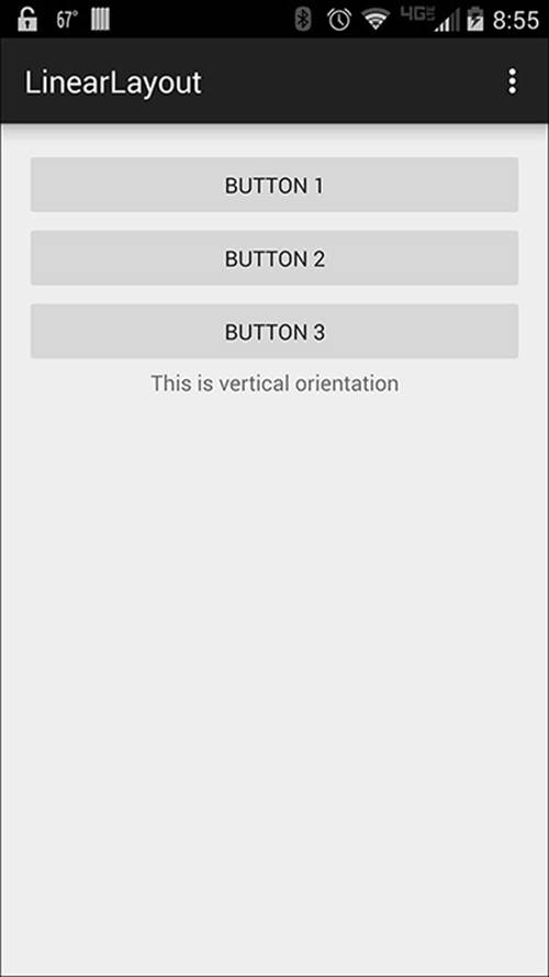
Figure 6.3 The buttons and text are positioned starting at the top of the layout and continuing down vertically.
It is not possible to use android:layout_height="match_parent" when displaying elements vertically because every element would stretch to fill the screen and leave each element stacked on top of the other.
You can adjust how much room each child view takes by setting the android:layout_weight property. This takes a numeric value that is then used to decide how much space a particular child view should be allowed to take. If you decide that you want all child views to take the same amount of space, you can either set each view to android:layout_height with a value of 0dp for an equal vertical orientation or you can set each view to android:layout_width with a value of 0dp for an equal horizontal orientation.
To change the orientation to horizontal, you should change the value of the android:orientation property to horizontal, and then each child element will need to have the android:layout_height and android:layout_width properties adjusted.
Figure 6.4 demonstrates the same layout adjusted to be displayed horizontally.
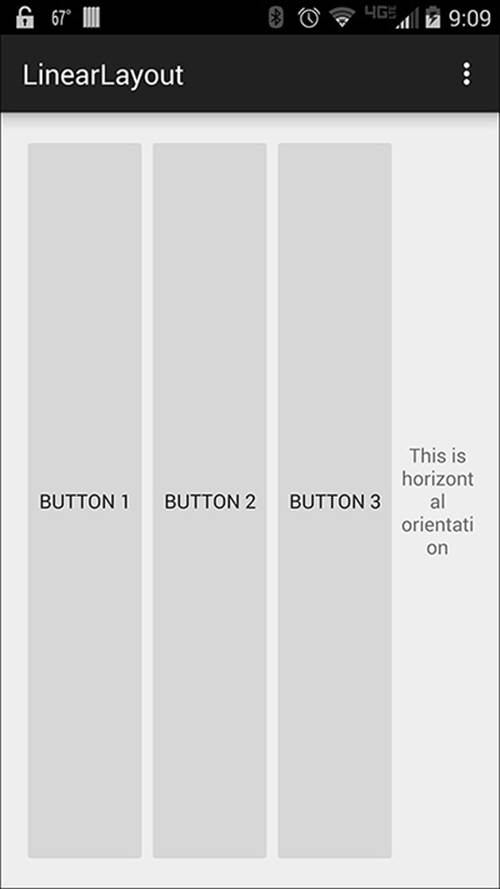
Figure 6.4 Text becomes almost impossible to read when there are too many elements being forced into a cramped area.
Relative Layout
The relative layout is used when you have a complex user interface that requires specific sizing and relies on knowing where a view or layout element will be. It thus is named because elements are placed based on the relative proximity or position of other elements in the layout as well as to the containing layout.
The relative layout provides a somewhat flexible and adaptable interface. Elements can be told to position based off of the center, left, right, top, or bottom of the parent view. This can also be combined with placement values off of other child views that are already positioned.
The following shows a layout XML file that uses a relative layout to position text and four buttons:
<RelativeLayout xmlns:android="http://schemas.android.com/apk/res/android"
xmlns:tools="http://schemas.android.com/tools"
android:layout_width="match_parent"
android:layout_height="match_parent"
android:paddingLeft="@dimen/activity_horizontal_margin"
android:paddingRight="@dimen/activity_horizontal_margin"
android:paddingTop="@dimen/activity_vertical_margin"
android:paddingBottom="@dimen/activity_vertical_margin"
tools:context=".MainActivity">
<TextView
android:text="Relative layouts allow flexible positioning"
android:layout_width="wrap_content"
android:layout_height="wrap_content"
android:layout_alignParentTop="true"
android:layout_centerHorizontal="true" />
<Button
android:layout_width="wrap_content"
android:layout_height="wrap_content"
android:text="Button 1"
android:id="@+id/button"
android:layout_centerVertical="true"
android:layout_centerHorizontal="true" />
<Button
android:layout_width="wrap_content"
android:layout_height="wrap_content"
android:text="Button 2"
android:id="@+id/button2"
android:layout_below="@id/button"
android:layout_alignParentLeft="true"
android:layout_alignParentStart="true" />
<Button
android:layout_width="wrap_content"
android:layout_height="wrap_content"
android:text="Button 3"
android:id="@+id/button3"
android:layout_alignTop="@id/button2"
android:layout_alignParentRight="true"
android:layout_alignParentEnd="true" />
<Button
android:layout_width="wrap_content"
android:layout_height="wrap_content"
android:text="Button 4"
android:id="@+id/button4"
android:layout_below="@id/button2"
android:layout_centerHorizontal="true" />
</RelativeLayout>
Rather than use gravity to adjust how text is displayed, the TextView is placed at the top of the page in the center by using android:layout_alignParentTop="true" and android:layout_centerHorizontal="true". Buttons 2, 3, and 4 are positioned based off of Button 1, which is placed directly in the center of the layout. Some extra properties are also used to align Buttons 2 and 3 to the left and right sides of the layout. Figure 6.5 demonstrates what the layout appears like when viewed on an Android device.
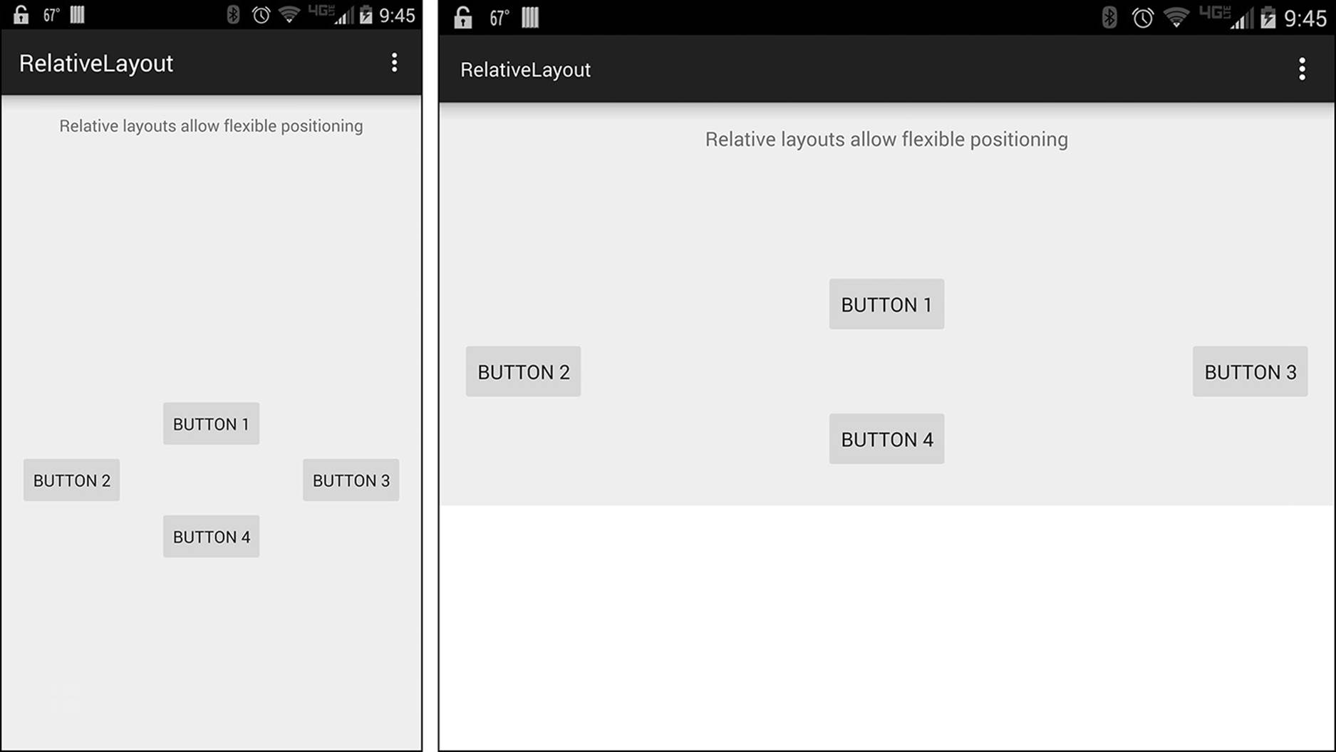
Figure 6.5 Regardless of device orientation, Button 1 is always at the center of the screen.
Another reason you should consider using a relative layout is that rather than create complex layouts by nesting multiple linear layouts, you can create the same type of interface without complicating the layout. By avoiding nesting layouts, you are able to keep the layout “flat.” This decreases the amount of processing needed to display your layout and speeds up the screen rendering of your layout.
Table Layout
Table layouts are similar to how HTML table elements work. A table layout aligns child elements into rows and columns. Unlike tables in HTML, cell borders are never displayed and cells may be empty.
The table layout introduces some interesting formatting logic. By using android:gravity, you can adjust the text layout for elements. This may be needed as the size of columns is determined by the column that needs the most width or has the largest content.
You may think that you will just adjust the width of each element manually, but each child added to the table layout will default to a width of match_parent. The height is changeable, but has a default value of wrap_content. The following demonstrates a table layout with two rows containing TextViews and Buttons:
<TableLayout xmlns:android="http://schemas.android.com/apk/res/android"
android:layout_width="match_parent"
android:layout_height="match_parent"
android:stretchColumns="1"
android:padding="10dp">
<TableRow>
<TextView
android:text="Name:"
android:padding="5dp"/>
<TextView
android:text="Jonathan Generic"
android:gravity="end"
android:padding="5dp"/>
</TableRow>
<TableRow>
<Button
android:text="Button 1"
android:id="@+id/button"/>
<Button
android:text="Button2"
android:id="@+id/button2" />
</TableRow>
</TableLayout>
Although you cannot set explicit widths for child elements, you can create columns that are the same width by adding android:layout_width="0dp" and android:layout_weight="1" to elements in a row to force the table to render the columns with an equal width. The following shows the properties applied to the <Button> elements:
<TableRow>
<Button
android:layout_width="0dp"
android:layout_weight="1"
android:text="Button 1"
android:id="@+id/button"/>
<Button
android:layout_width="0dp"
android:layout_weight="1"
android:text="Button2"
android:id="@+id/button2" />
</TableRow>
This also requires that the <TableLayout> element contains a property of android:stretchColumns="1". Figure 6.6 shows how this fix was used to change the button alignment.
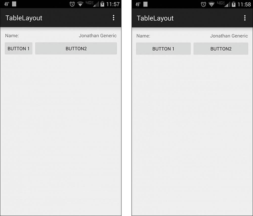
Figure 6.6 The buttons auto-align, leaving one small and the other large (left). With properties set, the buttons take an equal full column width (right).
Table layouts are best for displaying tabular data. This is data or visuals that require a grid or specific spacing to allow the user to read and comprehend data quickly without trying to decipher a design to get the data they are looking for.
Frame Layout
The frame layout is used either when you would like to reserve screen space for a single view or when you are creating overlays that have a z-index effect. The spatial effect is achieved due to how the frame layout handles child elements. It positions them into a stack, with the first item added on the bottom and the last item added on the top.
The following demonstrates a frame layout that contains two TextViews and an ImageView:
<FrameLayout
xmlns:android="http://schemas.android.com/apk/res/android"
android:layout_width="fill_parent"
android:layout_height="fill_parent">
<TextView
android:layout_width="match_parent"
android:layout_height="wrap_content"
android:text="This text is under the image in the stack"/>
<ImageView
android:layout_width="match_parent"
android:layout_height="wrap_content"
android:src="@drawable/car"
android:layout_gravity="center"/>
<TextView
android:layout_width="wrap_content"
android:layout_height="wrap_content"
android:text="This text is over the image"
android:textColor="#ffffff"
android:id="@+id/textView"
android:layout_gravity="center" />
</FrameLayout>
The z-index or layering effect occurs in a first-in, first-out fashion. The first TextView is placed on the very first level, or the bottom of the stack. The ImageView is placed in the middle, above the first TextView but below the last TextView. Figure 6.7 shows this layout in two different orientations to help show how the layering is rendered.
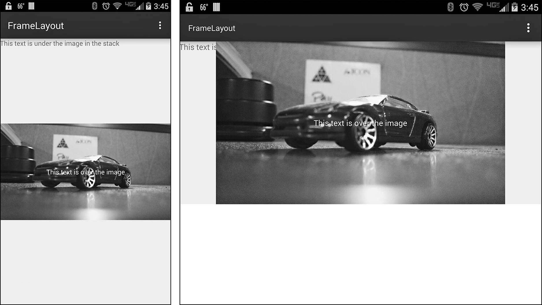
Figure 6.7 When rotated to landscape, the first TextView appears cut off as the text goes behind the ImageView.
A frame layout can be used for overlay information or can be used with animation to add a little visual flair to your application. You should keep the child views contained in the layout to as few as possible in order to minimize managing the views in the stack. You can nest<FrameLayout> elements should you need to manipulate different sets or combine views together.
WebView
A WebView is not specifically a layout container; instead, it is a special view that allows you to display a web page inside of your application. This view is typically used to provide a help page or show the End-User License Agreement, or it is used inside of applications that allow you to open links in a browser without leaving the application. These applications are commonly social network or news applications. By allowing users to view web content without leaving your application, you are giving them a more powerful application that becomes an all-in-onesolution for their needs. WebViews are also special because they get their own update through Google Play, which is similar to how Google Play Services are kept up to date.
A WebView also has the unique ability to pass some information between web page and device. This allows some features of the device to be triggered from the web page. This does not impede security because WebViews are still sandboxed to prevent full system access.
To add a WebView to your application, you need to add the following code to your layout XML file:
<WebView xmlns:android="http://schemas.android.com/apk/res/android"
android:id="@+id/webview"
android:layout_width="match_parent"
android:layout_height="match_parent" />
Note that if you are loading data from an Internet resource, you must also include the following permission in your application manifest:
<uses-permission android:name="android.permission.INTERNET" />
The URL that you want to load can then be passed to the view through your application logic by using the .loadUrl() method.
Tip
By default, WebView will not allow JavaScript to execute. If you require JavaScript processing, including triggering native functions such as a toast in your application, you must set the application to allow it. This can be done by adjusting the WebView settings like so:
WebView myWebView = (WebView) findViewById(R.id.webview);
WebSettings webSettings = myWebView.getSettings();
webSettings.setJavaScriptEnabled(true);
Methods that you want to be accessible via JavaScript must be public and must use the @JavascriptInterface annotation. The annotation is required when working with Android API level 17 and above.
Summary
In this chapter, you learned about how layouts can be created and managed for your application. You learned about different size values and that pixels may be calculated differently depending on the device a user has. This means that using dp values is a safe way to adjust layout sizing.
You learned about how linear, relative, table, frame layout elements are added to your application layout XML and how they can be used. This included examples of when each type of layout is beneficial and should be considered.
Finally, you learned that a special view called a WebView can be used to display web content and why you may want to include a WebView in your application.