Extending Bootstrap (2014)
Chapter 4. LESS is More
In this chapter, you will learn the basics of LESS and understand why it is better than traditional CSS. You will compile your own build from the Bootstrap source, replace the CSS in your project with LESS, and learn to customize Bootstrap with LESS and use its mixins.
Why use LESS?
LESS is a dynamic style sheet language that is compiled into CSS. The compiler itself is written in JavaScript and is quite fast compared to its alternatives, SASS and Stylus.
LESS comes with a wide range of useful features that are not available in traditional CSS, such as variables, mixins, nested rules, functions, and operators. Let's face it. Writing CSS is tiresome and includes a lot of repetition. When you write your styles in LESS instead of traditional CSS, you can use the following features to improve your styles:
· Variables: Variables have always been missing from CSS. By using LESS, you can define your own variables to make your styles more dynamic and configurable.
· Mixins: Mixins are named methods that can be used over and over again to repeat an operation. They can also take arguments and support default values for these arguments. Mixins are a great way to get rid of browser-specific CSS prefixes.
· Nested rules: Instead of writing the same selector over and over again, you can use a parent selector and declare your rules for child elements within that rule to reduce the need for repetition.
· Functions: LESS includes a number of color functions, for example, darken and lighten functions that ease working with colors. You can also switch between different color schemes, such as HSL and RGB, with ease.
· Operators: With LESS, you can perform simple mathematical operations to calculate widths, margins, paddings, and so on. This comes really handy when you want to customize a grid in Bootstrap or write your own grid.
Compiling your first LESS file
The easiest way to compile LESS files is to install Node.js and use its package manager NPM to install RECESS. There are Node.js installers available for both OS X and Windows. In case you are running Linux, visit https://github.com/joyent/node/wiki/Installing-Node.js-via-package-manager for instructions on how to install Node.js via package managers.
Once you have Node.js up and running, you can run the npm command to install RECESS, which is a CSS hinter written by Jacob Thornton himself. It is the only compiler officially supported by Bootstrap, and it can compile LESS into CSS among other things. You can install RECESS by running the following command:
npm install -g recess
This will install RECESS globally on your system. Now that you have RECESS installed, its time to create your first LESS file. Create a new folder named less in the project root and then create a file named styles.less in it. Add the following code to your newly created file:
@font-family: Arial;
@text-color: red;
body {
font-family: @font-family;
color: @text-color;
}
To compile the file, navigate to your project root and run the following command:
recess styles.less --compile > styles.css
Note
The latest version of Bootstrap, v3.1.x, will not compile using RECESS anymore since they moved to use grunt-contrib-less for compilation.
This will compile the code in your styles.less file and place the result in a file named styles.css. If you look into the file created by the compiler, you should see the following:
body {
font-family: Arial;
color: #ff0000;
}
Tip
You can also compress the style by running RECESS with the --compress option in the following way:
recess styles.less --compress > styles.css
This will produce the following output:
body{font-family:Arial;color:#f00}
To learn more about what RECESS can do for you, visit the project website at https://github.com/twitter/recess.
Building Bootstrap from the source
Before you can build Bootstrap from source, you need to download the source from the project website. Once you have downloaded the source and opened the package, you will see that the source package contains a large number of directories and files. You need to perform the following steps in order to build Bootstrap from source:
1. Unzip the package you downloaded in a location where you can easily find it. Create a new folder named less for the LESS files in your project and a bootstrap folder within that folder. Copy the contents of the less folder from the files that you just unzipped, and place it in the bootstrap folder, which is inside the less folder.
2. Create an entry LESS file called main.less under the less directory and add the following content:
@import "bootstrap/bootstrap";
This will include the Bootstrap entry file, which includes all of the Bootstrap features and produces exactly the same result as when you use the default bootstrap.css file.
3. Run the following command in the root of your project to use RECESS to compile your styles:
4. recess less/main.less --compile > css/main.css
This will compile your LESS file, including all of the Bootstrap features into a main.css file under the css directory in your project.
5. Open index.html and remove the following lines:
6. <link href="css/bootstrap.min.css" rel="stylesheet"/>
<link href="css/custom.css" rel="stylesheet"/>
7. Add the following line instead:
<link href="main.css" rel="stylesheet"/>
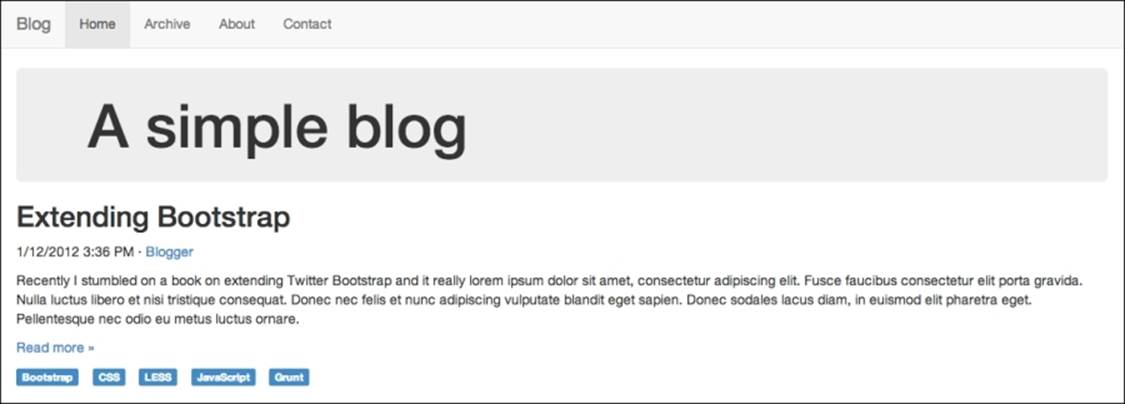
Now, when you reload the project, it will look exactly like it did before you added any customizations, and it now uses your own custom build of Bootstrap that you just compiled with RECESS, as shown in the following screenshot:
Next, you will restore the customizations that you already created in Chapter 2, Applying a Custom Theme, and add a few new ones. Now that you are using LESS, it will be easier to apply customizations to your project.
Customizing variables
The easiest way to customize Bootstrap through LESS is to customize its variables. To do this, you need to perform the following few modifications to your project:
1. Create a new LESS file named custom-variables.less in the less directory. Open main.less and add the following line to import the new file:
@import "custom-variables";
You can now override Bootstrap variables easily by redeclaring them in custom-variables.less, and Bootstrap will use the overridden values instead of the defaults when it is compiled into CSS.
2. Open custom-variables.less and add the following line:
@brand-color: #bada55;
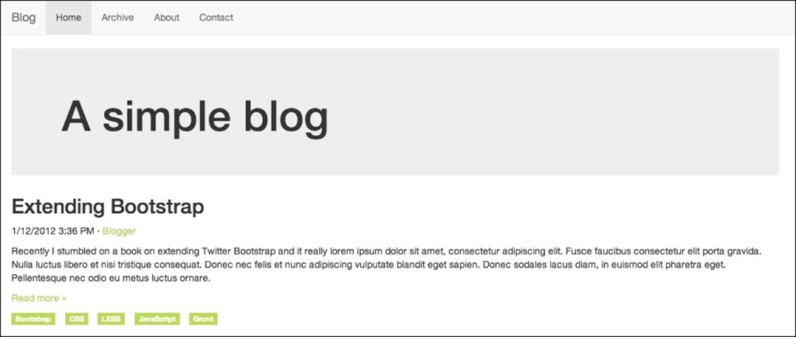
This will override the primary color in Bootstrap with the same greenish color that you used in the previous chapter. As you can see, instead of overriding a lot of rules, we simply need to change the value of a single LESS variable in order to apply the customization to all of the elements that use the primary color across Bootstrap. It is also worth mentioning that back when you used CSS, you only added rules for those components that were used on the page. It would take a lot more rules to override all of the elements to use your own primary color.
3. It is time to get rid of your custom.css and use LESS to apply the customizations instead. Create a new LESS file named custom-theme.less in the less directory and copy the following content from custom.css to it, after which you can delete custom.css:
4. .container .jumbotron {
5. border-radius: 0;
6. }.
7. .label {
8. border-radius: 0;
}
9. Now, add the following line to import your theme at the end of main.less:
@import "custom-theme";
When you now recompile main.less and reload your project, you will see that you have reapplied all the customizations to it from earlier, as shown in the following screenshot:
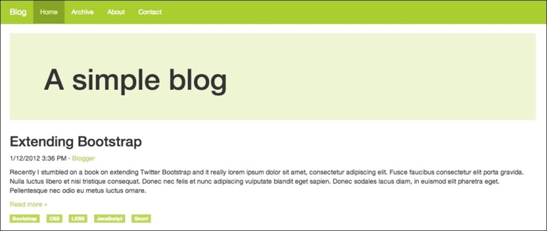
10. Now that you are at it, you could add some more advanced customizations to your project. Let us start by customizing the colors a bit. Add the following to custom-variables.less:
11.@navbar-default-bg: darken(@brand-primary, 10%);
12.@navbar-default-brand-hover-color: #fff;
13.@navbar-default-link-color: #fff;
14.@navbar-default-link-active-color: lighten(@brand-primary, 25%);
15.@navbar-default-link-active-bg: darken(@brand-primary, 20%);
16.
@jumbotron-bg: lighten(@brand-primary, 30%);
17. Save the file, compile your styles, and reload your project. You should see the following screenshot:
18. Let us step up the game a bit by adding some more HTML to the page. Replace the contents of your outermost div element .container div with the following code:
19.<div class="row">
20. <div class="content">
21. <div class="jumbotron">
22. <div class="container">
23. <h1>A simple blog</h1>
24. </div>
25. </div>
26. <article>
27. <header>
28. <h2>Extending Bootstrap</h2>
29. <p><time pubdate="pubdate">1/12/2012 3:36 PM</time> · <a href="#">Blogger</a></p>
30. </header>
31. <p>Recently I stumbled on a book on extending Twitter Bootstrap and it really ...</p>
32. <p class="read-more"><a href="#">Read more »</a></p>
33. <footer>
34. <ul class="list-inline">
35. <li><a href="#" class="label label-primary">Bootstrap</a></li>
36. <li><a href="#" class="label label-primary">CSS</a></li>
37. <li><a href="#" class="label label-primary">LESS</a></li>
38. <li><a href="#" class="label label-primary">JavaScript</a></li>
39. <li><a href="#" class="label label-primary">Grunt</a></li>
40. </ul>
41. </footer>
42. </article>
43. </div>
44. <aside class="sidebar">
45. <img class="sidebar-avatar" src="http://lorempixel.com/400/400/cats" alt="Avatar"/>
46. <p class="sidebar-bio">Christoffer is a web developer that Lorem ipsum dolor sit amet, consectetur adipisicing elit. Asperiores, maxime, neque? Assumenda at commodi et eum illum, incidunt ipsa laborum molestias, necessitatibus numquam quod ratione sint vero. Amet, facilis iusto. </p>
47. </aside>
</div>
48. Add the following style to custom-theme.less:
49..content {
50. .make-md-column(9);
51.
52. article {
53. margin-bottom: 40px;
54. }
55.}
56..sidebar {
57. .make-md-column(3);
58.}
59..sidebar-avatar {
60. display: block;
61. margin-bottom: 20px;
62. max-width: 100%;
63.}
64..sidebar-bio {
65. color: @gray;
}
Now if you compile your styles and reload the project, it should look something like the following:
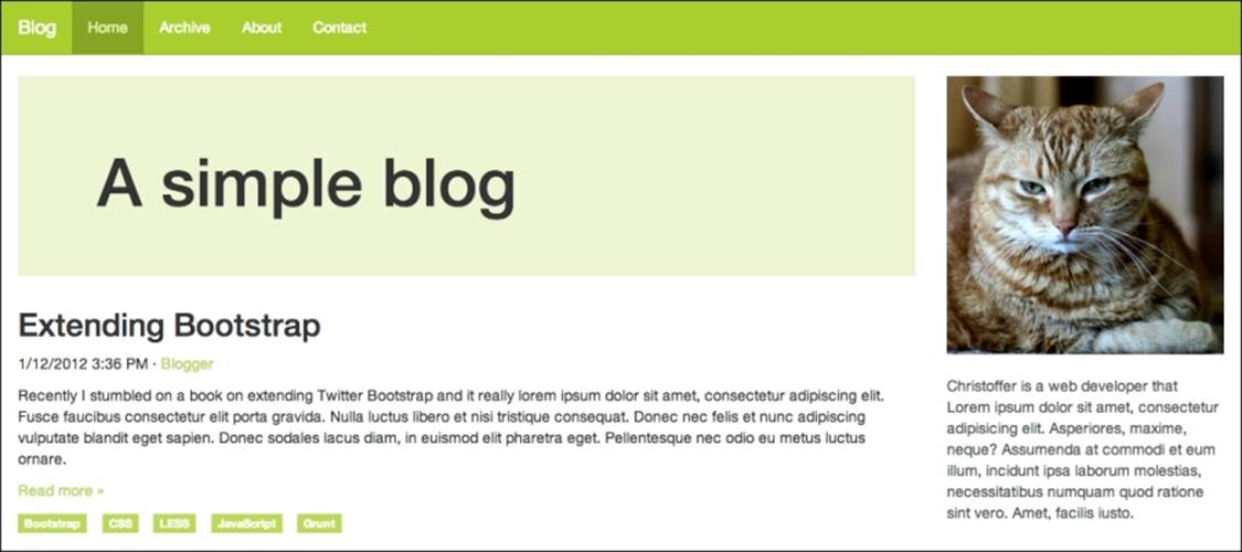
Let us walk through what you just did. You added some HTML and CSS for the sidebar and used two mixins to turn the .content and .sidebar elements into grid elements. A grid in Bootstrap consists of 12 columns by default, so adding .make-md-column(9) to .contentmakes it span three quarters; leaving one quarter for the sidebar and adding .make-md-column(3) to .sidebar makes use of the rest of the space.
Tip
In case you have not noticed, your project is fully responsive. You can try resizing your browser window to see how the grid responds when the window size is adjusted.
Bootstrap comes with a large collection of useful mixins, such as gradients, CSS3 properties, various components, and grid, for various purposes. All of these are great once you learn how to use them; they are listed as follows:
· Gradients: Bootstrap supports many kinds of gradients, such as horizontal, vertical, directional, radial, striped, and both horizontal and vertical gradients with three colors. When you use Bootstrap mixins for gradients, you do not need to worry about browser compatibility because Bootstrap adds all browser-specific rules automatically, even for Internet Explorer 8.
· CSS3 properties: Bootstrap comes with mixins for the most commonly used CSS properties, such as box-shadow, transition, transform (rotate, scale, and translate), perspective, animation, backface-visibility, box-sizing, use-select, content-columns, and hyphens. These CSS3 mixins also work across all browsers.
· Component: Component-specific mixins are handy when you want to perform more advanced customizations to Bootstrap components. Components such as panels, alerts, tables, list groups, buttons, labels, the navbar, and progress bar have their own mixins in Bootstrap.
· Grid: Bootstrap uses mixins to build its grid. It is considered as a good practice to avoid vendor-specific classes such as .col-md-6 in your HTML in order to allow for the separation of structure and layout. You can achieve this by adding custom classes to your elements and using mixins such as .make-md-column(6) to make them act like grid columns instead.
Summary
You have now learned the basics of LESS—why you should use it, how to build Bootstrap from source, and how to customize it using LESS.
In this chapter, you customized Bootstrap using LESS by compiling it from source and applying your modifications by customizing variables and using Bootstrap mixins.
In the next chapter, you will learn about Grunt, a task runner for Node.js that can do many things, such as watch your LESS files for change, compile your LESS file, and even automatically reload the browser after it has compiled your LESS file.