Mobile HTML5 (2013)
Chapter 12. Designing Mobile Applications
Designing mobile websites and mobile applications is different from developing for desktops, and not just in terms of the visual design. The mobile environment—in terms of screen size, lack of pointing device, restricted download speed, and differences in user goals—all affect design and implementation decisions.
While many have argued that mobile websites should be limited in scope, this is not true. You want to make available all the information to your mobile users that you would want to make available to your desktop users. You just might not want to stick all that content on the mobile site’s home page.
Yes, with some websites the goals of the average desktop visitor may be different than the goal of the average mobile visitor, but you have a lot of visitors who aren’t average. The argument is that the mobile site visitor has less time, and just needs your phone number[81] or address. Realize that a growing number of people only access the Web via mobile devices. Your mobile visitor may just need your phone number. Or she may be looking up your site on the trading floor wanting to make a huge investment. She needs to be able to access your annual reports, press releases, and board of directors from her smartphone. Just because her screen size is smaller, doesn’t mean she needs less information or functionality. The mobile website should have all the content and all the functionality of the “full” website, though layout, hierarchy, and paths to discovery may be different.
Include all the information of your full site while making sure it is usable no matter how your user accesses the Web.
You don’t want to overwhelm visitors with too much information, but you want all of the information to be available. Similarly, you don’t want to overwhelm your desktop user either. So don’t limit the scope of your mobile site. Rather, build your website as a mobile site first: including all the information any visitor may need in a non-overwhelming manner. By building with mobile in mind, or even mobile first, your desktop experience will likely be a better experience as well. By making just a few edits to your all-inclusive mobile site, your desktop site will likely be easier to navigate and less overwhelming than had you developed for desktop first.
The mobile environment has the constraints of varying sizes, sometimes tiny screen sizes, varied pointing devices (mouse, stylus, skinny fingers, fat thumbs), restricted download speeds, connectivity may not be consistent or persistent, metered bandwidth, and differing methods of data entry. But unlike the desktop, we’re not as restricted by lackluster browser capabilities. On the desktop, we’ve been limited by the lack of support for CSS3, HTML5, and associated JavaScript APIs in older versions of the almost ubiquitous browser, Internet Explorer. With the iPhone, Blackberry, Firefox mobile, Android and mobile Chrome browsers, we don’t have the same browser limitations. Mobile WebKit browsers, IE10 mobile, Opera Mobile, Firefox for Android, and Boot2Gecko, and almost all smartphones provide support for new web technologies. When it comes to HTML5, these mobile browsers are definitely grade A. When it comes to CSS3, mobile browsers are some of the most advanced browsers currently available.
Considerations Before You Start
Like on the desktop, and even more important with limited real estate, you have to consider your audience. Before designing, you need to determine who your audience is and their goals in visiting your site. The main constant is that you know they’re mobile: their device is wireless, battery operated, always on, always with the user, and generally, only used by a single user.
What you must consider is your population: are you targeting boys, girls, men, or women? Are you targeting teens, professionals, hipsters, parents? Who? If you know who your audience is, and exactly what you expect them to do with your application or site, you’ll be much better able to determine the look, feel, functionality, and flow of your user interface.
Just because your current usage statistics show low web usage from a certain demographic, that does not mean that the members of that demographic aren’t interested in your product, it may mean that the current user experience is not adequate. With improvements in performance and usability, you may gain usage in previously untapped markets.
There is no “typical” user. The number of people who don’t have laptop or desktop computers and who access the Web only via their mobile phone is growing. Their phone is their primary device. Obviously, then, mobile devices are not just for people who are “on-the-go,” but those who use their phone’s browser in short spurts is still an important demographic.
Your mobile phone users may be multitasking. They may be tweeting, checking into Facebook, Foursquare, and their beer, checking stock quotes or sports scores all while in a meeting or class. They may be waiting in line at the sub shop or on a 15-minute bus ride into work or school, making the time pass in a hotel lobby or airport terminal, or even pooping.
Depending on the type of applications, the attention of your users may be for very short. The most successful native applications—whether on mobile or on desktop—do exactly what the user needs while delighting the user, without extraneous bells and whistles that can detract from the user’s mission or findability of their goal. Mobile websites and applications should do the same. No matter the device, your web application or site needs to be simple, understandable, and relevant:
Simple
Users don’t have time to dawdle: they need to be able to immediately understand how to use your application or navigate your site, and complete their task with it. Otherwise, they’re going to move on to the next application.
Understandable
Make it obvious how your application works by minimizing controls, and making it abundantly clear what each control does with minimal text and immediately understandable iconography. Do not reinvent the wheel: opt for features, controls, and icons that have become a standard.[82]
Relevant
Put the most vital information at the top of the screen where it is most visible and most read, getting progressively general as you go down the page.
In terms of actions, put the most important call to action near the top of the screen. On handheld devices, put the most frequently used controls on the lefthand side of the control bar at the bottom of the screen.
Design Considerations
Former Apple CEO Steve Jobs would have been happy if all web applications on the iPhone looked as good as Apple iPhone’s native applications. The Apple user experience team defined colors, navigation, and graphical standards for each application depending on the application type. These standards are still best practices for the iPhone, iPod, and iPad. Similarly, other operating systems have design patterns. Links to Apple, Android, BlackBerry, Windows Phone, Firefox OS, and other operating systems design patterns are in the online chapter resources.
To determine which application style to use, there are several considerations: what is the user’s motivation for using the application? What is the purpose, goal, or focus of the application? What is the intended user experience?
Determine what type of application you are creating, and design your application based on the defined standards for that type of application. Is your application considered to be serious or fun? Is it a productivity tool, entertainment, or a utility?
The majority of applications are either for productivity, utility, or entertainment. Some applications are intended to be fun, others serious.
We can break most mobile applications into five categories: fun or serious productivity applications, fun or serious immersive applications, and utility applications. These application types should help you clarify design decisions. While there is no rigid classification scheme that all mobile software must follow, these guidelines will help you create effective applications. Depending on the seriousness of the application, you will want to stylize differently.
Tools: Productivity Applications
People use productivity applications, or tools, to accomplish important tasks, such as read, compose, and sort emails. Successful productivity applications or tools keep the user experience focused on the task, provide for quickly findability, and provide a user interface that enables the user to quickly and easily perform the necessary tasks.
Productivity applications tend to organize information hierarchically. In this way, people can find information by making progressively more specific choices until they arrive at the desired level of detail, then perform tasks with the information on that level.
Productivity applications tend to use multiple views, usually displaying one level of the hierarchy per view. The user interface should be simple, uncluttered, and composed of standard views and controls. The focus is on the information and the task, rather than the environment or experience.
Productivity tools may include a preferences or settings page that the user can specify. You can store these settings server side, or as we learned in Chapter 6, in localStorage. Productivity applications may work with lots of information and, potentially, different ways to access and manage the information.
Similar to how native applications allow you to access the phone’s settings tools, you may want to re-create such a settings page, to remember the user preferences: remember the settings locally in localStorage if there is no login required, and server side as well if there is a log-in. Keep this information as a cookie if you need to pass the information back and forth to the server, or in localStorage if you don’t.
If you do include a settings or preferences page, remember that this is a screen that will rarely need to be accessed and altered. Simple configuration changes should be handled in the main user interface. Preference changes should be separated out in separate screens accessible via a menu link.
A serious tool generally uses a limited color palette, like the blue/gray of the native iPhone application. Serious tools focus on the data, generally minimizing images and using a limited color palette. Use standard navigation, top and bottom. Create clear divisions in your design, and include blocks of related data and/or behavior.
NOTE
Whether you use a monochromatic palette or more colors, check your colors for contrast. A substantial percentage of the population has various level of color blindness.
Examples of a serious tool include settings and/or account pages such as the iPhone language picker we emulated, Dropbox, and the Yahoo! calendar for mobile. With serious tools, the focus is solely on the content, not on the application’s appearance—as is very evident from the various unattractive Yahoo! and Google mobile versions of web applications. Yuck!
There are serious tools, and then there are fun tools. Fun tools should make moderate use of color and graphics. Fun tools encourage leisurely productivity. They are similar to serious tools, but use a different, funner color scheme. Fun tools, like serious tools, should be designed with a simple hierarchy of information.
Entertainment: Immersive Applications
Immersive applications are fullscreen, visually rich environments that focus on the user’s experience with the application’s content. Tasks that present a unique environment, minimize textual information, and reward users for their attention are considered immersive.
Immersive applications include games, media, and other entertainment. Our CubeeDoo game fits into this category. The user’s focus is on the visual content and the experience, not on the data behind the experience. While games fit into this category, immersive applications are not necessarily games.
An immersive application tends to hide much of the device’s user interface, replacing it with a custom user interface that strengthens the user’s sense of entering the world of the application. Some mobile browsers allow for the hiding or changing of the browser chrome and status bar to enhance the immersive feeling. Users expect seeking and discovery to be part of the experience of an immersive application, so the use of nonstandard controls may be appropriate.
Immersive applications may work with large amounts of data, but they do not usually expose it. Instead, immersive applications present information in the context of the gameplay, story, or experience. Also for this reason, immersive applications often present custom navigational methods that complement the environment, rather than the standard, data-driven methods used in utility or productivity applications. There may be tons of information in the application, but users are not expected to view it sequentially or drill down through it.
NOTE
With limited and/or metered bandwidth and battery power being of greater concern in the mobile space, loading of large assets should be sequential, with express user permission or the ability to set preferences.
Fun entertainment
Fun entertainment, like games, are often very graphical. This is the only web application type that may use sound without getting the express permission (hitting the play button) of the user.[83] We learned about <audio> and <video> in Chapter 5. Fun entertainment web applications are the only time you may use play() without specifically asking permission. Like all applications of any type, there should be a simple hierarchy of information.
Serious entertainment
Serious entertainment is entertainment with a goal. Unlike fun entertainment, where you may be aiming for a higher score, serious entertainment gets something done. Examples of serious entertainment applications include the iTunes Store, Netflix, Flickr, YouTube, and other photo and video viewing and uploading applications. Serious entertainment should incorporate a moderate use of graphics. Instead of being graphics focused, like games, serious entertainment is content focused. These applications often incorporate tabbed data. A standard navigation at both the top and bottom of the screen might make sense for this application type.
Utility
The last category of applications are ones that serve a single purpose, providing all the information a user needs at a glance. Utilities are graphically rich, single-screen applications with little or no hierarchy (no drilling down to find information), such as a weather application or a native stock application.
Utility applications display a narrowly focused amount of information in an easy-to-scan summary. Yes, these applications have more than one screen, but secondary screens are for setting user preferences. User settings can be stored locally with localStorage (see Chapter 6). If there is a login mechanism, you can also include server-side storage settings.
Utility applications are generally applications that are quickly glanced at rather than interacted with. You may check the weather five times a day and your stocks 100 times a day on your phone. However, you only change the location of which city you are looking at when traveling. And unless you’re a day trader, you may change your stocks as infrequently.
Utility applications include an information button, usually on the bottom right, providing an additional screen where the settings can be updated. Don’t forget the Done button on that second screen to return back to the main screen. Also, in hybrid applications, allowing the user to set how often an application updates enables the user to have some control over battery usage.
Utility applications should be visually attractive, but like all applications, the information provided should not be overshadowed, but rather enhanced, by the design. The user interface should be uncluttered with simple, standard views and controls.
What Is Right for You?
After reading about productivity, utility, and immersive application styles, think about the type of information your application displays and the task it enables. Before deciding on a style, define what your application does.
You may think that the type of application you should create is obvious and you’re ready to get started, but take a step back. It’s usually not that simple. You’re not restricted to a single application style. You may find that your application idea makes the most sense by being a combination of characteristics from different application styles. Whatever you choose to do, make it simple. Pare the feature list to the minimum and create an application that does one simple thing. Observe how people use and respond to the application, and reiterate based on those observations.
If you have an existing computer application, don’t just port it to the mobile web. People use phones very differently from how they use desktop and laptop applications. People also have different expectations for the user experience on different devices. Consider how they may be interacting with it differently in a small-screen mobile manner. Don’t remove any desktop features. Instead, if there are features that are definitely more likely to be a priority for mobile device users, surface those features.
NOTE
Surface the features that are more likely to be a priority for mobile device users.
Apply the 80–20 rule to the design of your application. Estimate that the largest percentage of users (at least 80 percent) will use a very limited number of features in an application, while only a small percentage (no more than 20 percent) will use all the features. Then, consider carefully whether you want to preload your mobile application with the power features that only a small percentage of users want, or make them only available on demand (I recommend the latter). Be aware that a desktop computer application might be the better environment in which to offer those features up front, and that it’s usually a good idea to focus your mobile application on the features that meet the needs of the greatest number of people.
Definitely make all the desktop features available on mobile, too. Just don’t necessarily preload them. There is an increasing number of users who only access the Web on mobile devices. They need to be able to do everything a desktop user would do. Make sure those features are findable and usable, though they don’t have to take center stage on initial load. Only download them if needed, remembering to manage battery, memory, and bandwidth. If it makes sense for your application, you can enable the user to change their settings so the features generally less used on mobile can be surfaced for them.
NOTE
An increasing minority in the United States and a good majority in some emerging markets are mobile only.
The Mobile Platform: Rich with Possibilities
As you plan your mobile web application, there are design and device characteristics that you have to consider. A smartphone application is not the same as a desktop application, though the mobile version may be (or is) the best starting point for designing the accompanying desktop companion site. It is important to keep this in mind as you develop your web application for the small screen.
Small Screen
Although mobile devices may have great resolution, they are still very small. With the small size, it’s important to focus the user interface on the essentials. Don’t include elements in the user interface that aren’t necessary. Learn to say “No” to your client, be they a product manager, stakeholder, or voice in your head. A crowded user interface makes desktop websites and applications confusing and unattractive. This is amplified on smartphones, when the screen is less than 25% of a desktop’s screen size. And learning to say no to “features” when designing and developing the mobile interface will help you keep the desktop version less cluttered as well.
Less Memory
Your desktop may have 4 GB to 16 GB of RAM, but your user’s original iPad doesn’t. My iPad had 256 MB of RAM. My Android phone, one of my more powerful mobile devices, has 768 MB of RAM.
Note that our web applications are running in a browser, and are not themselves native applications. The browser is a native application. Running the browser uses memory. Running the web application uses memory. Running the mobile device’s operating system uses memory. We have to remember that the operating system, browser, and web application are not the only applications likely running on a device. And all these applications that you have no control over are using up the device’s memory. And battery. The more processes that the RAM and device chips are running, the more load and therefore drain to the device’s battery.
When I first purchased my 768 MB HTC phone, it only had 222 MB of RAM available in its default state because of all the software running on it by default. That is not a lot of memory. And when the phone runs out of memory, it runs out of memory. Most mobile devices don’t reallocate memory. When the browser runs out of memory, it crashes.
While there is little you can do to ensure that your users’ browsers are responsive to memory usage warnings and cleans up memory in a timely manner, avoiding memory leaks in your code is even more important with limited CPU.
Make sure your resource files are as small as possible: don’t load resources you don’t need, and be careful of features that, unbeknownst to the user, use memory.
In the previous chapters, when we introduced features that may use up memory or CPU, like radial gradients, inset shadows, and images over 1024 px, we discussed the feature’s shortcomings within the feature description. Browser vendors are constantly updating the capacity of their browsers and improving the performance. Soon radial gradients, inset shadows, and huge images may not drain a phone’s memory. The online chapter resources provide links to resources listing some of the current mobile browser pitfalls.
Manage memory
Limited memory should be a concern throughout the entire development process. We all develop our web applications on our desktops where memory is not as limited, so you may forget to think about it: don’t forget!
When developing on desktop, pay attention to the memory consumption of your web application. The Chrome browser allows you to keep track of memory consumption and performance, as shown in Figure 12-1.
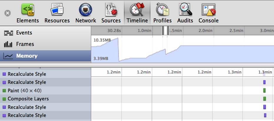
Figure 12-1. Memory in Chrome developer tools
Chrome provides information on how much memory each browser tab is using. To observe your memory usage, open the developer tools in your Chrome desktop browser (View → Developer → Developer Tools). Select the Timeline tab, then select Memory within the Timeline view, which is the tab and subsection displayed in Figure 12-1.[84]
To measure memory consumption, select the record button (the gray circle at the bottom of the developer tools). When the record button is red, it means it is recording. Play with your application. Watch the memory increase as DOM nodes or assets are added, and decrease with garbage collection.
Remember that while your crazy web application may be using 80 MB, your web application is not the only thing running on your user’s device. They are running their OS, their browser, their phone. They have other applications running in the background. All of these applications use up memory.
During development, you’ll be using desktop tools for testing. When device testing there are also mobile OS specific apps that will measure memory and battery load with application and mobile web usage. These tools are discussed in Chapter 14.
While the Timeline Memory feature in the development tools can help you gauge how much memory your application is consuming, you still have to test your applications in various devices. Those devices should have numerous native applications installed with notifications turned on, as this is how your users are experiencing your web application.
As a developer, you need to consider site latency, memory usage, battery consumption, and bandwidth usage of your sites. Don’t forget to test on mobile networks, which generally aren’t as fast as WiFi. I’ll cover performance in greater detail in Chapter 14.
One Window, One Application at a Time
Your mobile users may only be able to see one browser window at a time. On most mobile platforms, even if your web application contains multiple screens, your users will see them sequentially, not simultaneously.
While your mobile web application should make available the entire feature set of the full application, instead of trying to replicate a wider feature set at once, focus on a single task at a time. With limited memory, space, and sequential page viewing, provide the most useful information on the main view, supplying access to additional functionality through additional screens, or More or i-buttons linking to the larger feature set, providing access to the larger, less frequently used feature set only when necessary.
When interacting with most smartphones (less true with some tablets), only one application is visible in the foreground at a time. When users switch from one application to another, the application sometimes quits completely, while other times it continues in the background.
Some devices allow for multitasking: the application losing focus transitions to the background, allowing applications to remain in the background until they are launched again or until they are terminated. This means when a user clicks on a link to YouTube, a phone number, or a Google map, your browser, and therefore your web application, may quit completely, or more commonly, it will continue as a background process. Because you don’t know if your user is on a device that allows for multitasking or not, you can’t make assumptions about whether the browser and web application will quit or not.
Minimal Documentation
Like most people, I only look at the IKEA instructions after I finish putting furniture together and wonder why I have three pieces left over. I am even less likely to read an FAQ or other instructions on my phone than I am to review the printed manual on the piece of furniture I just destroyed.
Similarly, users won’t read your instructions or help documentation before using your application. To succeed, your application needs to be easy to use, the functionality needs to be immediately obvious and your application and user experience need to meet your users’ expectations. This is true no matter the device.
Use standard controls. Present information in a logical and predictable manner. Make sure the path back is as obvious as the path forward in your application. Design your applications to behave in a consistent, predictable fashion.
Even if you work for a design firm, or especially if you work for a design firm, don’t try to be innovative in your interactions and UI: use standard user experience best practices and design. This will make your application more intuitive. Intuitive applications are more successful. If you must be innovative (and even if you aren’t), test, test, and retest, with diverse users. UI and UX innovation can be good, or even very good, if the iterations are thoroughly tested on users with a wide range of mobile literacy.
Development Considerations
Remember that your user may be mobile. Users need to be able to download your web application quickly and see relevant content immediately within the viewable browser window, whether that window is in portrait or landscape orientation. It’s not that scrolling isn’t allowed. Rather, you should have relevant information and a main call to action visible without scrolling.
The user needs to be able to achieve their goals with very few finger gestures. Always remember that your users may not have a mouse, scroll button, or keyboard available to navigate your application. They may only have the use of one or two fingers available for interacting with your site, navigating with one hand, as the other may be holding the device, or maybe aren’t using their fingers at all. They may be using their voice for navigation, which is not only for Google Glass.
User interface should focus on providing the right categories and making it easy to perform common tasks, without asking for a lot of details that aren’t central to the task.
Distill the list of features into a single statement, a product definition statement, that describes both the solution your product offers and defines the target market. Stay within your definition for all of your main features.
Yes, you can and should include all lesser used features, but make those secondary features. The context should always be the actions you expect your user to take, targeted to your defined audience.
If a feature isn’t core to the goals of your users, don’t include it on your web application landing page: say “No” to your marketing and sales teams. The real estate of the mobile phone is too small, download speeds are to slow, and user interactions are too difficult to spread your application thin. Mobile device real estate provides no room for functionality that doesn’t focus on the primary task. And by developing for mobile first, your desktop application will benefit.
By defining your audience, you can refine your product definition for your application to meet your audience’s main need. Through this refined product definition, you will be better able to siphon your list of features. Eliminate features that, while they might be useful, don’t fit into the product definition of your application. Do one thing, and do it well. Port this logic over to the desktop: your users will love the simplicity there, too!
Targeting Mobile WebKit
To create a web application that looks like a native mobile application, there are several features to consider. There are <meta> tags and <link> relationships that appear to be proprietary to Apple, but some work on Android, Chrome for Android, BlackBerry 10, and iOS. We discussed these<meta> tags and <link> relationships in Chapter 2, but let’s look at them again.
On iOS, you can tell the browser that we want to be an offline application:
<meta name="apple-mobile-web-app-capable" content="yes"/>
This will only work if the user has saved your web application as a bookmark with an icon on their home screen and has accessed your web application via that bookmark rather than navigating to it via the browser address bar. While this may seem limited, it does enable your application to go fullscreen and look like a truly native application, even though it is really a web application. This <meta> tag removes standard navigation and controls in iOS WebKit browsers when the user has accessed your web application from their saved bookmark.
While this tells the browser that you want it to look like a native application with native application features, you still have to tell the browser what those native features are. You can control the status bar color and navigation bar when the application is offline.
Status Bar
The status bar displays important information about the user’s device, including signal strength, network connection, and battery life. When your site or application is viewed within a browser on a mobile device, you cannot hide the 20-pixel-high status bar (Figure 12-2).

Figure 12-2. iPhone status bar
The ability to hide the status bar should not be a differentiating factor in your decision whether to build a native or web application. While you can hide the status bar when developing a native application in some devices, you shouldn’t. Requiring a user to quit an application to see how much battery power they have left, or to see if they have connectivity is not a good user experience.
In iOS, you can change the color of the status bar from the default appearance as shown in Figure 12-2 to black or translucent black by setting the application to run in full-screen mode and setting the status bar style meta tag to default, black, or black-translucent, which displays the status bar as gray (the default color), opaque black, or translucent black (rgba(0,0,0,0.5)):
<meta name="apple-mobile-web-app-capable" content="yes"/>
<meta name="apple-mobile-web-app-status-bar-style" content="black">
This meta tag only works if you have set the page to be web-app-capable.
When the apple-mobile-web-app-capable meta tag content is set to yes, the web application runs in fullscreen mode; otherwise, it does not. This does nothing if the user navigated to your site through the browser. It only behaves like a native application if it was accessed like a native application.
The black-translucent makes the status bar 50% translucent above the content of the web page or application, providing for some additional screen space, which can be useful if your application is a game like Tetris with items coming in from the top of the screen.
We’ve included these <meta> tags in CubeeDoo. However, you may not be seeing them. To be able to view this feature in action, you will need to add CubeeDoo as a bookmark link on your home screen, and access the web application by clicking on that icon, in a browser on a device that supports this feature.
Navigation Bar
The navigation bar is the address bar that appears at the top of the screen, just below the status bar (Figure 12-3). By default, some mobile browsers like Safari on the iOS and the Firefox OS browser display the contents of the <title> of your web page along with the search and address bars in a 60-pixel-high navigation bar. Chrome for mobile displays the URL, tools linking to more information about the page, other tabs that are open, and a drop-down toolbar. Chrome for larger mobile devices, like the Nexus Galaxy, displays tabbed browsing like a desktop browser.
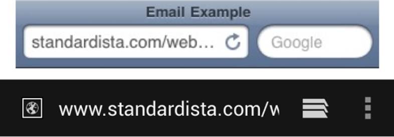
Figure 12-3. Safari (top) and Android Chrome (bottom) navigation bars
To create a native-looking web application, we can hide the default navigation bar and add our own application navigation bar. In our Chapter 7 example, we used CSS to emulate the original iPhone’s native navigation bar, as shown in Figure 12-4.

Figure 12-4. CSS navigation bar emulating the original iPhone native application navigation bar
With a little magic, you can hide the big Safari navigation toolbar even if the user hasn’t saved your bookmark to their desktop. The fallback method is to hide the navigation bar with JavaScript.
To hide the Safari navigation bar,[85] include window.scrollTo(0, 1); in your web application. The following script will hide the Safari navigation bar when the page loads:
<script>
addEventListener("load", function() {
setTimeout(hideURLbar, 0);
}, false);
function hideURLbar() {
window.scrollTo(0,1);
}
</script>
UX of navigation bar
When creating a navigation bar to emulate a native application’s look and feel, the initial or home view should display only your application title, as the user hasn’t navigated into the application yet. If your application is only one page, the home page navigation bar can also contain controls that manage the content in the view. If your application is more than one page, all other screens should include the title of the new location with a Back button labeled with the title of the previous location, or the word “back” to the left of the title.
This “back” button provides for a standard way to return to the previous screen. This is expected user experience, so don’t alter it unless you have a very compelling reason to. Always remember, a frustrated user can be driven to use the home button and may not return. The navigation bar can contain a second button to the right of the title that manages the content in the view.
Apple provides for standardized buttons. As you can see in Figure 12-4, buttons in a navigation bar include a bezel around them. All Apple iOS controls in a navigation bar use the bordered style. All iOS UI icons are 30 × 30 pixels for tab bar icons with a touchable area of 44 × 44 pixels. Apple employs 20 × 20 pixels for toolbar and navigation icons.
Android design patterns recommend a pattern of a 48-device independent pixel rhythm. 48 DP translates to about 9 millimeters (0.35 inches) with some variability, providing touch areas in the range of recommended 7–10 millimeters target size.
Design elements that are at least 48 DP high and wide guarantee targets will never be smaller than the minimum recommended target size of 7 mm regardless of the screen, and 48 DP provides for good overall information density and targetability of UI. Spacing between each UI element should be 8 DP.
Page controls
The page controls should be in a 44- to 48-pixel-high bar going across the bottom of the screen, with the controls going from most used controls on the lefthand side to less frequently used controls on the right. Don’t create touch gestures too close to the browser edge as some mobile devices will capture the gesture for a device or native browser action.
Do not place controls you wouldn’t want a user to accidentally hit in the bottom bar. The bottom bar should be reserved for the most commonly used user actions. Include items that may be clicked less often, like settings or delete, elsewhere, such as on the top navigation or on a separate screen if rarely used.
In CubeeDoo, we put our page controls, even ones we expect to be hit often, at the top of the screen. Why? Because this web app is a game. 99% of the time will be spent playing the game, not checking high scores or other menu features. Users wouldn’t want to accidentally press any of the controls midgame. So while the bottom page control strip makes sense for many web applications, there is no steadfast rule. The only real rule is use common sense (oh, and provide preferably 44 × 44 px, but at minimum 22 × 22 px, buttons and interactive areas if you want a user to successfully hit something).
Navigation bar size and color
Changing the device orientation from portrait to landscape can change the height of the navigation bar automatically (you should not specify the height programmatically). In landscape orientation, the thinner navigation bar provides more space for your screen contents. Be sure to take the difference in heights into account when you design icons for navigation bar controls and when you design the layout of your screens.
Strive for consistency in the appearance of navigation bars and other bars in your application. If you use a translucent navigation bar, for example, don’t combine it with an opaque toolbar. Also, avoid changing the color or translucency of the navigation bar in different screens in the sameorientation.
Startup Image
If the user clicks on a home screen icon, the web application will launch immediately, perhaps before all the files are received from the server. In some browsers, including iOS native Safari browsers, we can control what the browser displays while waiting for the site to be downloaded by providing a startup image.
You can also tell the browser to display a particular image while the browser is waiting to load, parse, and lay out all your assets:
<link rel="apple-touch-startup-image" href="/screenshot.jpg"/>
This is a URL pointing to the startup image. By default, a screenshot of the web application the last time it was launched is used, but with this tag you can define your own image.
This is not a splash screen. In fact, don’t use a splash screen. Your users want to get to your content. They don’t want to be delayed (and charged bandwidth fees) because your marketing team or CEO really like Flash-like intros.
Home Screen Icons
<link rel="apple-touch-icon"…
This is the pointer to the image that we want to be the icon of the site that resides on the device’s home screen, should they bookmark our site. Not all devices require the same size image or resolution, however. There are even differences between devices from the same manufacturer. As discussed in Chapter 2, we have a new attribute for the <link> tag that helps handle this situation:
<link rel="apple-touch-icon" href="touch-icon-iphone.png" />
<link rel="apple-touch-icon" sizes="72x72"
href="touch-icon-ipad.png" />
<link rel="apple-touch-icon" sizes="114x114"
href="touch-icon-hiresolution.png" />
The device will convert your icon into an icon reflective of the OS. On iOS 6 and earlier, it will add rounded corners and a glow. If you want to create your own corners and glow or lack of glow, include the key term precomposed in your relationship value. Use:
<link rel="apple-touch-icon-precomposed" href="path/image.png"/>
Take the time to design a beautiful icon. Users should be able to tell, just by looking at your icon, what your site or application is about. Unless you are a very well-known company with a very well-known brand name (think CNN), be wary of including text in your icon.
The default iPhone icon (pre-iOS 7) is 57 × 57 pixels, with a 10 px border radius. For the iPad, it’s 74 × 74 pixels with a 12 px radius. The icon for the iTunes Store is 512 × 512 pixels.
If you are indeed hoping to be in the App Store, a few notes: Apple loves tactile backgrounds, subtle shadows, highlighted text, glossy buttons, subtle gradients, and clean, crisp icons. If you are submitting to the App Store, or even if you aren’t submitting to the App Store, don’t use Apple icons, imagery, or trademarks in any applications.[86]
Minimize Keyboard Entry
While there is a high cost ratio for data entry on all devices, it’s even more acute on touch devices. If you require a user to enter data, make sure it’s worth their while. Yes, sometimes information is required. If your marketing team is pushing for a ZIP code when a user ZIP code is not required, say “No.” Do not add barriers to entry that aren’t absolutely necessary. This is important for mobile and desktop!
When data entry is required, make it as simple as possible. Unless security requirements prohibit it, if you require a username and password, remember the user information! If the user has to enter data, whenever possible, create a select list or other form of picker, so that the user can use any method other than keyboard entry to provide the information. If a user needs to enter a phone number or an email, use the proper input types (see Chapter 4) so that they get the right keyboard.
Generally, forms place labels before input fields and hints after the form field. Make sure that these wrap on smaller devices. Or better yet, place the label above the input area, and hints below. When devices pop-up the virtual keyboard, many simultaneously zoom in on the focused form field, which will hide what is to the left and right of the form field on narrow screens.
Be Succinct
That’s it. Be succinct.
Your users are staring at tiny little fonts on tiny little devices. Even on desktop, users don’t like to read. Get to the point. Do it succinctly.
To summarize succinctly:
Make it Obvious
Your users don’t have the time or the attention to figure out complex interactions and application. Make your application instantly understandable to users.
Minimize Required Input
Inputting information takes users’ time and attention. If your application requires a lot of user input before anything useful happens, you’re basically asking them to move on to a different site or application.
Minimize Text
When your user interface text is short and direct, users can absorb it quickly and easily. Identify the most important information, express it concisely, and display it prominently.
Other User Experience Considerations
Avoid hidden content that is only made visible (and possibly obscured by your user’s hand) when hovered. Fingers are fat. Hands are big. When you only display something between touch start and touch end, or only on hover, that information may not be fully available to the touch user.
There are certain conventions that are bad on desktop and even worse on mobile. Drop-down menus with submenus that pop-out on hover are bad for desktop and even worse for mobile.
When you require a user to utilize a hover drop-down or pop-out menu to navigate your site, you are requiring them to stay on top of the menu, without exiting or hovering out of it, until they reach their destination. Users don’t hover on touch devices: they touch. On some devices, your CSS show on :hover will work, but you will need to handle the touch scripts necessary for these menus so that all devices display the menus and don’t let the submenus slip away.
As you’ll note in Figure 12-5, the fastest way to go from the “Dropdown” to “Pick Me” would take the user outside of the pop-out menu, thereby closing it. That is, if a user’s fat finger and hand don’t obscure the contents of the page. Even with a mouse, while the content is more readily visible, the direct line from one link to the next is partially outside of the menu, and navigating off of the navigation generally hides it.
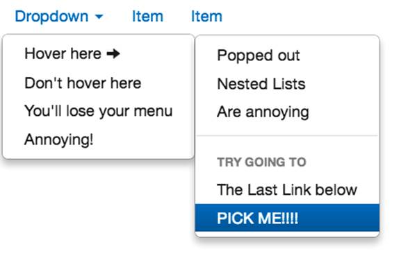
Figure 12-5. Example of a common drop-down menu
Move away from drop-down pull-out menu patterns, and opt for click-based menus instead. Additionally, dynamically loading additional content when lists or navigations are too long can be a best practice. Killing excessive content above the currently visible list may also be good practice, especially with infinite scroll,[87] to reduce memory consumption and the number of DOM nodes, which slows down reflows.
The user experience considerations covered in this entire chapter hold true not just for mobile websites and applications, but for desktop sites and native mobile applications as well.
[81] The phone number should be a telephone link, with <a href="tel:4155551212">415.555.1212</a> as discussed in mobile-specific link handling in Chapter 3.
[82] While it is important to have as consistent and universal as possible a graphical language, don’t assume users are familiar with an OS-specific icon. For example, the iOS share icon may look like an expand-to-fullscreen icon to a user of another OS.
[83] Why? (1) Because I said so, and (2) because you don’t want to get bad reviews or have people hate you.
[84] Safari Developer Tools, Opera DragonFly, Firebug the FireFox add-on, and IE F12, starting with IE11, have similar tools.
[85] iOS 7 does not allow for hiding the navigation bar.
[86] Glyfish works, but popular stock icons will be looked down upon.
[87] Google’s proposal for lazy block loading may ameliorate this.
All materials on the site are licensed Creative Commons Attribution-Sharealike 3.0 Unported CC BY-SA 3.0 & GNU Free Documentation License (GFDL)
If you are the copyright holder of any material contained on our site and intend to remove it, please contact our site administrator for approval.
© 2016-2026 All site design rights belong to S.Y.A.