Microsoft Press Programming Windows Store Apps with HTML, CSS and JavaScript (2014)
Appendix B WinJS Extras
In this appendix:
• Exploring WinJS.Class Patterns
• Obscure WinJS Features
• Extended Splash Screens
• Custom Layouts for the ListView Control
Exploring WinJS.Class Patterns
Much has been written in the community about object-oriented JavaScript, and various patterns have emerged to accomplish with JavaScript’s flexible nature the kinds of behaviors that are built directly into languages like C++. Having done more C++ than functional programming in the past, I’ve found the object-oriented approach to be more familiar and comfortable. If you are in the same camp, you’ll find that the WinJS.Class API encapsulates much of what you need.
WinJS.Class.define
One place object-oriented programmers quickly hit a bump in JavaScript is the lack of a clear “class” construct—that is, the definition of a type of object that can be instantiated. JavaScript, in short, has no class keyword. Instead, it has functions, and only functions. Conveniently, however, if you create a function that populates members of its this variable, the name of that function works exactly like the name of a class such that you can create an instance with the new operator.
To borrow a snippet of code from Eloquent JavaScript (a book I like for its depth and brevity, and which is also available for free in electronic form—thank you Marijn!), take the following function named Rabbit:
function Rabbit(adjective) {
this.adjective = adjective;
this.speak = function (line) {
print("The ", this.adjective, " rabbit says '", line, "'");
};
}
By itself, this function doesn’t do anything meaningful. You can call it from wherever and thiswill end up being your global context. Maybe handy if you like to pollute the global namespace!
When used with the new operator, on the other hand, the function becomes an object constructor and effectively defines a class as we know in object-oriented programming. For example:
var fuzzyBunny = new Rabbit("cutie");
fuzzyBunny.speak("nibble, nibble!");
As Marijn points out, using new with a constructor function like this has a nice side effect that assigns the object’s constructor property with the constructor function itself. This is not true if you just create a function that returns a newly instantiated object.
To make our class even more object-oriented, the other thing that we typically do is assign default values to properties and assign methods within the class, rather than on individual instances. In the first example above, each instance gets a new copy of the anonymous function assigned to speak. It would be better to define that function such that a single copy is used by the different instances of the class. This is accomplished by assigning the function to the class’s prototype:
function Rabbit(adjective) {
this.adjective = adjective;
}
Rabbit.prototype.speak = function (line) {
print("The ", this.adjective, " rabbit says '", line, "'");
};
Of course, having to write this syntax out for each and every member of the class that’s shared between instances is both cumbersome and prone to errors. Personally, I also like to avoid messing with prototypebecause you can really hurt yourself if you’re not careful.
WinJS provides a helper that provides a cleaner syntax as well as clear separation between the constructor function, instance members, and static members: WinJS.Class.define:
var ClassName = WinJS.Class.define(constructor, instanceMembers, staticMembers);
where constructor is a function and instanceMembers and staticMembers are both objects. The general structure you see in code looks like this (you can find many examples in the WinJS source code itself):
var ClassName = WinJS.Class.define(
function ClassName_ctor() { //adding _ctor is conventional
},
{
//Instance members
},
{
//Static members
}
);
Because many classes don’t have static members, the third parameter is often omitted. Also, if you pass null as the constructor, WinJS will substitute an empty function in its place. You can see this in the WinJS source code for define (base.js, comments added):
function define(constructor, instanceMembers, staticMembers) {
constructor = constructor || function () { };
//Adds a supportedForProcessing property set to true. This is needed by
//WinJS.UI.process[All], WinJS.Binding.process, and WinJS.Resources.process.
WinJS.Utilities.markSupportedForProcessing(constructor);
if (instanceMembers) {
initializeProperties(constructor.prototype, instanceMembers);
}
if (staticMembers) {
initializeProperties(constructor, staticMembers);
}
return constructor;
}
You can also see how define treats static and instance members (initializeProperties is a helper that basically iterates the object in the second parameter and copies its members to the object in the first). Static members are specifically added as properties to the class function itself,constructor. This means they exist singularly on that object—if you change them anywhere, those changes apply to all instances. I consider that a rather dangerous practice, so I like to consider static members as read-only.
Instance members, on the other hand, are specifically added to constructor.prototype, so they are defined just once (especially in the case of methods) while still giving each individual instance a copy of the properties that can be changed without affecting other instances.
You can see, then, that WinJS.Class.define is just a helper: you can accomplish everything it does with straight JavaScript, but you end up with code that’s generally harder to maintain. Indeed, the team that wrote WinJS needed these structures for themselves to avoid making lots of small mistakes. But otherwise there is nothing magical about define, and you can use it in your own app code or not.
Along these lines, people have asked how define relates to the class structures of TypeScript. When all is said and done, they accomplish the same things. In fact, you can derive WinJS classes from TypeScript classes and vice versa because they all end up working on the prototype level.
The one exception is that call to WinJS.Utilities.markSupportedForProcessing in WinJS. This is a requirement for functions that are used from other parts of WinJS (see Chapter 5, “Controls and Control Styling,” in the section “Strict Processing and processAll Functions”) and is the only “hidden” benefit in WinJS. If you use TypeScript or other libraries to create classes, you’ll need to call that function directly.
Sidebar: Asynchronous Constructors?
The constructors created through WinJS.Class.define are inherently synchronous, and there’s no simple pattern to create an asynchronous constructor. Instead, use the usual synchronous constructor and then include an initializeAsync method in the class that must be called to make the rest of the instance usable. Your async construction work then happens within initializeAsync, which should return a promise that’s completed when initialization is done.
WinJS.Class.derive
The next part of object-oriented programming that we typically need is the ability to create derived classes—that is, to add instance and static members to an existing class. This is the purpose of WinJS.Class.derive. The syntax is:
WinJS.Class.derive(baseClass, constructor, instanceMembers, staticMembers);
where baseClass is the name of a class previously defined with WinJS.Class.defineor WinJS.Class.derive, or, for that matter, any other object. The other three parameters are the same as those of define, with the same meaning.
Peeking into the WinJS sources (base.js), we can see how derive works:
if (baseClass) {
constructor = constructor || function () { };
var basePrototype = baseClass.prototype;
constructor.prototype = Object.create(basePrototype);
WinJS.Utilities.markSupportedForProcessing(constructor);
Object.defineProperty(constructor.prototype, "constructor", { value: constructor, writable:
true, configurable: true, enumerable: true });
if (instanceMembers) {
initializeProperties(constructor.prototype, instanceMembers);
}
if (staticMembers) {
initializeProperties(constructor, staticMembers);
}
return constructor;
} else {
return define(constructor, instanceMembers, staticMembers);
}
You can see that if baseClass is null, derive is just an alias for define, and if you indicate null for the constructor, an empty function is provided. Otherwise you can see that the derived class is given a copy of the base class’s prototype so that the two won’t interfere with each other. After that, deriveadds the static and instance properties as did define.
Because baseClass already has its own instance and static members, they’re present in its prototype, so those members carry over into the derived class, as you’d expect. But again, if you make later changes to members of that original baseClass, those changes affect only the derivation and not the original.
Looking around the rest of WinJS, you’ll see that derive is used in a variety of places to centralize implementation that’s shared between similar controls and data sources, for example.
Mixins
Having covered the basics of WinJS.Class.defineand WinJS.Class.derive, we come to the third method in WinJS.Class: the mix method.
Let’s first see what differentiates a mixin from a derived class. When you derive one class from another, the new class is the combination of the base class’s members and those additional ones you specify for the derivation. In WinJS.Class.derive, you can specify only one base class.
Object-oriented programming includes the concept of multiple inheritance whereby you can derive a class from multiple base classes. This is frequently used to attach multiple independent interfaces on the new class. (It’s used all the time in Win32/COM programming, where an interface is typically defined as a virtual base class with no implementation and supplies the necessary function signatures to the derived class.)
JavaScript doesn’t have object-oriented concepts baked into the language—thus necessitating helpers like WinJS.Class.define to play the necessary tricks with prototypes and all that—so there isn’t a built-in method to express multiple inheritance.
Hence the idea of a mix or mixin, which isn’t unique to WinJS, as evidenced by this mixin article on Wikipedia. WinJS.Class.mix is a way to do something like multiple inheritance by simply combining all the instance members of any number of other objects. The description in the documentation for WinJS.Class.mixputs it this way: “Defines a class using the given constructor and the union of the set of instance members specified by all the mixin objects. The mixin parameter list is of variable length.”
Here we see two other differences between a mix and a derivation: a mix does not operate on static members, and it does not concern itself with any constructors other than the one given directly to mix. (This is also why it’s not multiple inheritance in the strict object-oriented sense.)
WinJS itself uses the mixin concept for its own implementation. If you look in the docs, you’ll see several mixins in WinJS that you can use yourself:
• WinJS.UI.DOMEventMixin contains standard implementations of addEventListener, removeEventListener, dispatchEvent, and setOptions, which are commonly used for controls. All the WinJS controls bring this into their mix.
• WinJS.Utilities.eventMixinis the same as DOMEventMixin but without setOptions. It’s meant for objects that don’t have associated UI elements and thus can’t use the listener methods on an element in the DOM. The mixin supplies its own implementation of these methods.
• WinJS.Binding.observableMixinadds functionality to an object that makes it “observable,” meaning that it can participate in data binding. This consists of methods bind, unbind, and notify. This is used with the WinJS.Binding.List class (see Chapter 6, “Data Binding, Template, and Collections”).
• WinJS.Binding.dynamicObservableMixinbuilds on the observableMixin with methods called setProperty, getProperty, updateProperty, addProperty, and removeProperty. This is helpful for wiring up two-way data binding, something that WinJS doesn’t do but that isn’t too difficult to pull together. The Declarative binding sample in the Windows SDK shows how.
With events (in the first two mixins) you commonly use WinJS.Utilities.createEventProperties to also create all the stuff a class needs to support named events. createEvent-Properties returns a mixin object that you can then use with WinJS.Class.mix. For example, if you pass this method an array with just ["statusChanged"], you’ll get a function property in the mixin named onstatuschanged and the ability to create a listener for that event.
Mixins, again, are a way to add pre-canned functionality to a class and a convenient way to modularize code that you’ll use in multiple classes. It’s also good to know that you can call WinJS.Class.mix multiple times with additional mixins and the results simply accumulate (if there are duplicates, the last member mixed is the one retained).
Obscure WinJS Features
In the main chapters of this book we generally encounter the most common features of WinJS, but if you dig around in the documentation you’ll find that there are a bunch of other little features hanging off the WinJS tree like pieces of fruit. To enjoy that harvest a bit, let’s explore those features, if for no other reason than to make you aware that they exist!
Wrappers for Common DOM Operations
The first set of features are simple wrappers around a few common DOM operations.
WinJS.Utilities.QueryCollection is a class that wraps an element.querySelectorAll or document.querySelectorAll with a number of useful methods. An instance of this class is created by calling WinJS.Utilities.query(<query>[, ]) where <query> is a usual DOM query string and the optional <element> scopes the query. That is, if you provide <element>, the instance wraps element.querySelectorAll(<query>); if you omit <element>, the instance uses document.querySelectorAll(<query>). Similarly, WinJS.Utilities.QueryCollection(<id>) does adocument.getElementById(<id>) and then passes the result to new WinJS.Utilities.-QueryCollection. WinJS.Utilities.QueryCollection creates a QueryCollection that contains children of a specified element.
Anyway, once you have a QueryCollection instance, it provides methods to work with its collection—that is, with the results of the DOM query that in and of itself is just an array. As such, you’d normally be writing plenty of loops and iterators to work with the items in the array, and that’s exactly what QueryCollection provides as a convenience. It follows along with other parts of WinJS, which are utilities that most developers end up writing anyway, so it might as well be in a library!
We can see this in what the individual methods do:
• forEach calls Array.prototype.forEach.apply on the collection, using the given callback function and thisargument.
• get returns [<index>] from the array.
• setAttribute iterates the collection and calls setAttribute for each item.
• getAttribute gets an attribute for the first item in the collection.
• addClass, hasClass, removeClass, toggleClass each iterates the collection and calls WinJS.Utilities.addClass, hasClass, removeClass, or toggleClass for each item, respectively.
• listen, removeEventListener iterates the collection, calling addEventListener or removeEventListener for each item.
• setStyle and clearStyle iterate the collection, setting a given style to a value or "", respectively.
• includeadds other items to this collection. The items can be in an array, a document fragment (DOM node), or a single item.
• queryexecutes a querySelectorAll on each item in the collection and calls include for each set of results. This could be used, for instance, to extract specific children of the items in the collection and add them to the collection.
• control, given the name of a control constructor (a function) and an options object (as WinJS controls typically use), creates an instance of that control and attaches it to each item in the collection. It’s allowable to call this method with just an options object as the first argument, in which case the method calls WinJS.UI.process on each item in the collection followed by WinJS.UI.setOptions for each control therein. This allows the collection to contain elements that have WinJS control declarations (data-win-control attributes) that have not yet been instantiated.
• template renders a template element that is bound to the given data and parented to the elements included in the collection. If the collection contains multiple elements, the template is rendered multiple times, once at each element per item of data passed.
As for WinJS.Utilities.addClass, removeClass, hasClass, and toggleClass, as used above, these are helper functions that simply add one or more classes (space delimited) to an element, remove a single class from an element, check whether an element has a class, and add or remove a class from an element depending on whether it’s already applied. These operations sound simple, but their implementation is nontrivial. Take a look at the WinJS source code (in base.js) to see what I mean! Good code that you don’t have to write.
WinJS.Utilities.data, convertToPixels, and Other Positional Methods
The next few methods in WinJS to look at are WinJS.Utilities.data and WinJS.Utilities.-convertToPixels.
WinJS.Utilities.data is documented as “gets a data value associated with the specific element.” The data value is always an object and is attached to the element by using a property name of _msDataKey. So WinJS.Utilities.data(<element>) always just gives you back that object, or it creates one if one doesn’t yet exist. You can then add properties to that object or retrieve them. Basically, this is a tidy way to attach extra data to an arbitrary element, knowing that you won’t interfere with the element otherwise. WinJS uses this internally in various places.
WinJS.Utilities.convertToPixels sounds fancier than it is. It’s just a helper to convert a CSS positioning string for an element to a real number. In CSS you often use values suffixes like “px” and “em” that aren’t meaningful values in any computations. This function converts those values to a meaningful number of pixels. With “px” values, or something without suffixes, it’s easy—just pass it to parseInt, which will strip “px” automatically if it’s there. For other CSS values—basically anything that starts with a number—this function assigns the value to the element’sleftproperty (saving the prior value so that nothing gets altered) and then reads back the element’s pixelLeft property. In other words, it lets the DOM engine handle the conversion, which will produce 0 if the value isn’t convertible.
Along these same lines are the following WinJS.Utilities methods:
• getRelativeLeft gets the left coordinate of an element relative to a specified parent. Note that the parent doesn’t have to be the immediate parent but can be any other node in the element’s tree. This function then takes the offsetLeft property of the element and keeps subtracting off the offsetLeft of the next element up until the designated ancestor is reached.
• getRelativeTop does the same thing as getRelativeLeft except with offsetTop.
• getContentWidth returns the offsetWidth of an element minus the values of borderLeftWidth, borderRightWidth, paddingLeft, and paddingRight, which results in the actual width of the area where content is shown.
• getTotalWidth returns the offsetWidth of the element plus the marginLeft and marginRight values.
• getContentHeight returns the offsetHeight of an element minus the values of borderTopWidth, borderBottomWidth, paddingTop, and paddingBottom, which results in the actual height of the area where content is shown.
• getTotalHeight returns the offsetHeight of the element plus the marginTop and marginBottom values.
• getPosition returns an object with the left, top, width, and height properties of an element relative to the topmost element in the tree (up to document or body), taking scroll positions into account.
Again, take a look in base.js for the implementation of these functions so that you can see what they’re doing and appreciate the work they’ll save you!
WinJS.Utilities.empty, eventWithinElement, and getMember
Before leaving the WinJS.Utilities namespace, let’s finish off the last few obscure methods found therein. First, the empty method removes all child nodes from a specified element. This is basically a simple iteration over the element’s childNodes property, calling removeNode for each in turn (actually in reverse order). A simple bit of code but one that you don’t need to write yourself.
Next is eventWithinElement. To this you provide an element and an eventArgs object as you received it from some event. The method then checks to see if the eventArgs.relatedTarget element is contained within the element you provide. This basically says that an event occurredsomewhere within that element, even if it’s not directly on that element. This is useful for working with events on controls that contain some number of child elements (like a ListView).
Finally there’s getMember, to which you pass a string name of a “member” and a root object (this defaults to the global context). The documentation says that this “Gets the leaf-level type or namespace specified by the name parameter.” What this means is that if you give it a name like “navigate”, it will look within the namespace of the root you give for that member and return it. In the case of “navigate”, it will find WinJS.Navigation.navigate. Personally, I don’t know when I’d use this, but it’s an interesting function nonetheless!
WinJS.UI.scopedSelect and getItemsFromRanges
Wrapping up our discussion of obscure features are two members of the WinJS.UI namespace that certainly match others in WinJS.Utilites for obscurity!
The first is WinJS.UI.scopedSelect, to which you provide a CSS selector and an element. This function is documented like this: “Walks the DOM tree from the given element to the root of the document. Whenever a selector scope is encountered, this method performs a lookup within that scope for the specified selector string. The first matching element is returned.” What’s referred to here as a “selector scope” is a property called msParentSelectorScope, which WinJS sets on child elements of a fragment, page control, or binding template. In this way, you can do aquerySelector within the scope of a page control, fragment, or template without having to start at the documentlevel. The fact that it keeps going up toward the document root means that it will work with nested page controls or templates.
The other is WinJS.UI.getItemsFromRanges, which takes a WinJS.Binding.List and an array of ISelectionRange objects (with firstIndex and lastIndex properties). It then returns a promise whose results are an array of items in that data source for those ranges. This exists to translate multiple selections in something like a ListView control into a flat array of selected items—and, in fact, is what’s used to implement the getItems method of a ListView’s selection property. So if you implement a control of your own around a WinJS.Binding.List, you can usegetItemsFromRanges to do the same. The method is provided, in other words, to work with the data source because that is a separate concern from the ListView control itself.
Extended Splash Screens
In most cases, it’s best for an app to start up as quickly as it can and bring the user to a point of interactivity with the app’s home page, as discussed in “Optimizing Startup Time” in Chapter 3, “App Anatomy and Performance Fundamentals.” In some scenarios, though, an app might have a great deal of unavoidable processing to complete before it can bring up that first page. For example, games must often decompress image assets to optimize them for the device’s specific hardware—the time spent at startup makes the whole game run much smoother from then on. Other apps might need to process an in-package data file and populate a local database for similar reasons or might need to make a number of HTTP requests. In short, some scenarios demand a tradeoff between startup time and the performance of the app’s main workflows.
It’s also possible for the user to launch your app shortly after rebooting the system, in which case there might be lots of disk activity going on. As a result, any disk I/O in your activation path could take much longer than usual.
In all these cases, it’s good to show the user that something is actually happening so that she doesn’t think to switch away from the default splash screen and risk terminating the app. You might also just want to create a more engaging startup experience than the default splash screen provides.
An extended splash screen allows you to fully customize the splash screen experience. In truth, an extended splash screen is not a system construct—it’s just an implementation strategy for your app’s initial page behind which you’ll do your startup work before displaying your real home page. In fact, a typical approach is to just overlay a full-sized div on top of your home page for this purpose and then remove that div from the DOM (or animate it out of view) when initialization is complete.
The trick (as described on Guidelines for splash screens) is to make this first app page initially look exactly like the default splash screen so that there’s no visible transition between the two. At this point many apps simply add a progress indicator with some kind of a “Please go grab a drink, do some jumping jacks, or enjoy a few minutes of meditation while we load everything” message. Matching the system splash screen, however, doesn’t mean that the extended splash screen has to stay that way. Because the entire display area is now under your control, you can create whatever experience you want: you can kick off animations, perform content transitions, play videos, and so on. And because your first page is up, meaning that you’ve returned from your activated handler, you’re no longer subject to the 15-second timeout. In fact, you can hang out on this page however long you need, even waiting for user input (as when you require a login to use the app).
I recommend installing and running various apps from the Store to see different effects in action. Some apps gracefully slide the default splash screen logo up to make space for a simple progress ring. Others animate the default logo off the screen and pull in other interesting content or play a vido. Now compare the experience such extended splash screens to the static default experience that other apps provide. Which do you prefer? And which do you think users of your app will prefer, if you must make them wait?
Making a seamless transition from the default splash screen is the purpose of the args.detail.-splashScreen object included with the activated event. This object—see Windows.Application-Model.Activation.SplashScreen—contains an imageLocation property (a Windows.Foundation.-Rect) indicating the placement and size of the splash screen image on the current display. (These values depend on the screen resolution and pixel density.) On your extended splash screen page, then, initially position your default image at this exact location and entertain your users by animating it elsewhere. You also use imageLocation to determine where to place other messages, progress indicators, and other content relative to that image.
The splashScreen object also provides an ondismissed event so that you can perform specific actions when the system-provided splash screen is dismissed and your extended splash screen comes up. This is typically used to trigger the start of on-page animations, starting video playback, and so on.
Important Because an extended splash screen is just a page in your app, it can be placed into any view at any time. As with every other page in your app, make sure your extended splash screen can handle different sizes and orientations, as discussed in Chapter 8, “Layout and Views.” See also “Adjustments for View Sizes” later in this appendix.
For one example of an extended splash screen, refer to the Splash screen sample in the Windows SDK. Although it shows the basic principles in action, all it does it add a message and a button that dismisses the splash screen (plus the SDK sample structure muddies the story somewhat). So let’s see something more straightforward and visually interesting, which you can find in the ExtendedSplash-Screen1 example in the companion content for the appendices. The four stages of this splash screen (for a full landscape view) are shown in Figure B-1, and you can find a video demonstration of all this in Video B-1. (The caveat is that this example doesn’t handle other views, but we’ll come back to that in the next section.)
The first stage, in the upper left of Figure B-1, is the default splash screen that uses only the logo image. The pie graphic in the middle is 300x300 pixels, with the rest of the PNG file transparent so that the background color shows through. Now let’s see what happens when the app gets control.
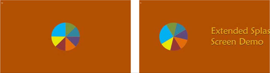
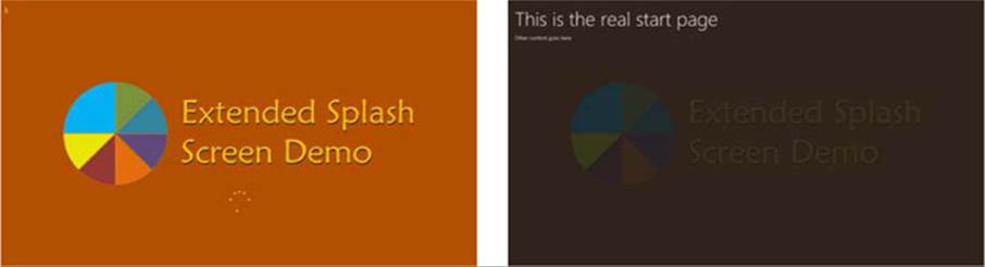
FIGURE B-1 Four stages of the ExtendedSplashScreen1 example: (1) the default splash screen, upper left, (2) animating the logo and the title, upper right, (3) showing the progress indicator, lower left, and (4) fading out the extended splash screen to reveal the main page, lower right. A 10-second countdown in the upper left corner of the screen simulates initialization work.
The home page for the app, default.html, contains two div elements: one with the final (and thoroughly unexciting) page contents and another with the contents of the extended splash screen:
<div id="mainContent">
<h1>This is the real start page</h1>
<p>Other content goes here.</p>
</div>
<div id="splashScreen">
<p><span id="counter"></span></p>
<img id="logo" src="/images/splashscreen.png"/>
<img id="title" src="/images/splashscreentitle.png"/>
<progress id="progress" class="win-ring win-large"></progress>
</div>
In the second div, which overlays the first because it’s declared last, the counter element shows a countdown for debug purposes, but you can imagine such a counter turning into a determinate progress bar or a similar control. The rest of the elements provide the images and a progress ring. But we can’t position any of these elements in CSS until we know more about the size of the screen. The best we can do is set the splashScreen element to fill the screen with the background color and set the position style of the other elements to absolute so that we can set their exact location from code. This is done in default.css:
#splashScreen {
background: #B25000; /*Matches the splash screen color in the manifest*/
width: 100%; /*Cover the whole display area*/
height: 100%;
}
#splashScreen #counter {
margin: 10px;
font-size: 20px;
}
#splashScreen #logo {
position: absolute;
}
#splashScreen #title {
position: absolute;
}
#splashScreen #progress {
position: absolute;
color: #fc2; /*Use a gold ring instead of default purple*/
}
In default.js now, we declare some modulewide variables for the splash screen elements, plus two values, one to control how long the extended splash screen is displayed (simulating initialization work) and one that indicates when to show the progress ring:
var app = WinJS.Application;
var activation = Windows.ApplicationModel.Activation;
var ssDiv = null; //Splash screen overlay div
var logo = null; //Child elements
var title = null;
var progress = null;
var initSeconds = 10; //Length in seconds to simulate loading
var showProgressAfter = 4; //When to show the progress control in the countdown
var splashScreen = null;
In the activated event handler, we can now position everything based on the args.detail.-splashScreen.imageLocation property (note the comment regarding WinJS.UI.processAll and setPromise, which we’re not using here):
app.onactivated = function (args) {
if (args.detail.kind === activation.ActivationKind.launch) {
//WinJS.UI.processAll is needed ONLY if you have WinJS controls on the extended
//splash screen, otherwise you can skip the call to setPromise, as we're doing here.
//args.setPromise(WinJS.UI.processAll());
ssDiv = document.getElementById("splashScreen");
splashScreen = args.detail.splashScreen;//Need this for later
var loc = splashScreen.imageLocation;
//Set initial placement of the logo to match the default start screen
logo = ssDiv.querySelector("#logo");
logo.style.left = loc.x + "px";
logo.style.top = loc.y + "px";
//Place the title graphic offscreen to the right so we can animate it in
title = ssDiv.querySelector("#title");
title.style.left = ssDiv.clientWidth + "px"; //Just off to the right
title.style.top = loc.y + "px"; //Same height as the logo
//Center the progress indicator below the graphic and initially hide it
progress = ssDiv.querySelector("#progress");
progress.style.left = (loc.x + loc.width / 2 - progress.clientWidth / 2) + "px";
progress.style.top = (loc.y + loc.height + progress.clientHeight / 4) + "px";
progress.style.display = "none";
At this stage, the display still appears exactly like the upper left of Figure B-1, only it’s our extended splash screen page and not the default one. Thus, we can return from the activated handler at this point (or complete the deferral) and the user won’t see any change, but now we can do something more visually interesting and informational while the app is loading.
To simulate initialization work and make some time for animating the logo and title, we have a simple countdown timer using one-second setTimeout calls:
//Start countdown to simulate initialization
countDown();
}
};
function countDown() {
if (initSeconds == 0) {
showMainPage();
} else {
document.getElementById("counter").innerText = initSeconds;
if (--showProgressAfter) {
progress.style.display = "";
}
initSeconds--;
setTimeout(countDown, 1000);
}
}
Notice how we show our main page when (our faked) initialization is complete and how the previously positioned (but hidden) progress ring is shown after a specified number of seconds. You can see the progress ring on the lower left of Figure B-1.
To fade from our extended splash screen to the main page (a partial fade is shown on the lower right of Figure B-1), the showMainPage function employs the WinJS Animations Library as below, where WinJS.UI.Animation.fadeOut takes an array of the affected elements. fadeOut returns a promise, so we can attach a completed handler to know when to hide the now-invisible overlay div, which we can remove from the DOM to free memory:
function showMainPage() {
//Hide the progress control, fade out the rest, and remove the overlay
//div from the DOM when it's all done.
progress.style.display = "none";
var promise = WinJS.UI.Animation.fadeOut([ssDiv, logo, title]);
promise.done(function () {
ssDiv.removeNode(true);
splashScreen.ondismissed = null; //Clean up any closures for this WinRT event
});
}
Refer to Chapter 14, “Purposeful Animations,” for details on the animations library. Keep in mind is that animations run in the GPU (graphics processing unit) when they affect only transform and opacity properties; animating anything else runs on the CPU and generally performs poorly.
To complete the experience, we now want to add some animations to translate and spin the logo to the left and to slide in the title graphic from its initial position off the right side of the screen. The proper time to start these animations is when the args.detail.splashScreen.ondismissedevent is fired, as I do within activated just before calling my countDown function. This dismissed event handler simply calculates the translation amounts for the logo and title and sets up a CSS transition for both using the helper function WinJS.UI.executeTransition:
//Start our animations when the default splash screen is dismissed
splashScreen.ondismissed = function () {
var logoImageWidth = 300; //Logo is 620px wide, but image is only 300 in the middle
var logoBlankSide = 160; //That leaves 160px to either side
//Calculate the width of logo image + separator + title. This is what we want to end
//up being centered on the screen.
var separator = 40;
var combinedWidth = logoImageWidth + separator + title.clientWidth;
//Final X position of the logo is screen center - half the combined width - blank
//area. The (negative) translation is this position minus the starting point (loc.x)
var logoFinalX = ((ssDiv.clientWidth - combinedWidth) / 2) - logoBlankSide;
var logoXTranslate = logoFinalX - loc.x;
//Final X position of the title is screen center + half combined width - title width.
//The (negative) translation is this position minus the starting point (screen width)
var titleFinalX = ((ssDiv.clientWidth + combinedWidth) / 2) - title.clientWidth;
var titleXTranslate = titleFinalX - ssDiv.clientWidth;
//Spin the logo at the same time we translate it
WinJS.UI.executeTransition(logo, {
property: "transform",delay: 0,duration: 2000,timing: "ease",
to: "translateX(" + logoXTranslate + "px) rotate(360deg)"
});
//Ease in the title after the logo is already moving (750ms delay)
WinJS.UI.executeTransition(title, {
property: "transform",delay: 750,duration: 1250,timing: "ease",
to: "translateX(" + titleXTranslate + "px)"
});
}
This takes us from the upper left of Figure B-1 through the upper right stage, to the lower left stage. To really appreciate the effect, of course, run the example!
This code structure will likely be similar to what you need in your own apps, only use a single setTimeout call to delay showing a progress control, replace the countDown routine with your real async initialization work, and set up whatever elements and animations are specific to your splash screen design. Take special care that the majority of your initialization work happens either asynchronously or is started within the dismissed handler so that the default splash screen is dismissed quickly. Never underestimate a user’s impatience!
As for handling different views, this is a matter of handling the window.onresize event and adjusting element positions accordingly.
Adjustments for View Sizes
The ExtendedSplashScreen1 example we saw in the previous section works great for full screen activation or when the app is launched into a smaller width or portrait mode to begin with. If the view is changed while the extended splash screen is active, however—to a narrower landscape view, a very narrow portrait view, or full screen portrait, for instance—we get dreadful results:
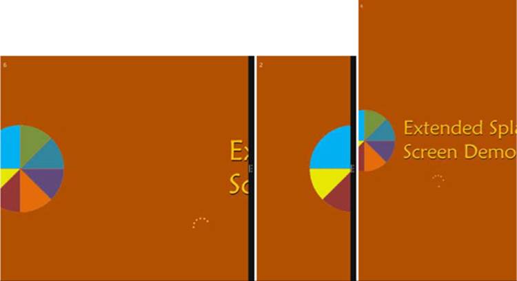
If we used only static content on the extended splash screen, we could take care of these situations with CSS. Our example, however, uses absolute positioning so that we can place elements relative to the default splash screen image and animate them to their final positions. What we need to pay attention to now is the fact that the default position might be different on startup and can then change while the extended splash screen is visible. (While testing all this, by the way, I set the countdown timer to 100 seconds instead of 10, giving me much more time to change the view’s size and position.)
Here’s how we can handle the important events:
• Within the activated event, where we receive the default splash screen image location, we initially move the logo, title, and progress ring to positions relative to that location, scale them if needed, and set up the splash screen dismissed handler.
• While the default splash screen is still visible, we use window.onresize to reposition and rescale those elements as needed. That is, the user can modify the view in the short time the default splash screen is visible.
• Once the splash screen’s dismissed event fires, we check if the view has a landscape aspect ratio that’s 1024px or wider. If so, we can place the logo and title side by side as we did originally, using the same animations as before. Otherwise we’re in a view that’s too narrow for that design, so we stack the logo and title vertically and instead of animating the logo to the left we animate it upwards.
• Once we get the extended splash screen going, we change the window.onresize handler to reposition the elements in their final (post-animation) locations. If a resize happens while animations are in progress, those animations are canceled (by canceling their promises). A resize can switch the view between the wide landscape layout and the vertical layout, so we just change element positions accordingly.
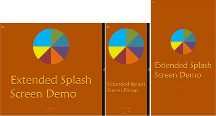
These changes are demonstrated in the ExtendedSplashScreen2 example, which now adapts well to different views:
Not quite perfect The one case in this example that still doesn’t work is when you resize the default splash screen in the short time before the extended splash screen appears. The problem is that Windows does not (in my tests) update the splashScreen.imageLocation coordinates, so the placement of your extended splash screen elements is inaccurate. I have not found a workaround for this particular issue, unfortunately.
Custom Layouts for the ListView Control
For everything that the GridLayout, ListLayout, and CellSpanningLayout classes provide for a ListView, they certainly don’t support every layout your designers might dream up for a collection, such as a cell-spanning ListLayout, a vertically panning cell-spanning layout, or nonlinear layouts.
What’s very important to understand about this model is how much the ListView is still doing on your behalf when a custom layout is involved. HTML and CSS let you create any kind of layout you want without a ListView, but then you’d have to implement your own keyboarding support, accessibility, data binding, selection and invocation behaviors, grouping, and so forth. By using a custom layout, you take advantage of all those features, so you need concern yourself with only the positional relationships of the items within the ListView and a few layout-specific details like virtualization and animation, if needed.
Fortunately, it’s straightforward to create a custom layout by using some CSS and a class with a few methods through which the ListView talks to the layout. The simplest custom layout, in fact, doesn’t require much of anything: just a class with one method called initialize, which can itself be empty. But to understand this better, let’s first look at the general structure of the layout object and how the ListView uses it.
Did you know? Custom layouts were possible with WinJS 1.0 but were exceeding difficult to implement because of the ListView’s use of absolute positioning and the fact that it wasn’t designed for layout extensibility. ListView was revamped for WinJS 2.0 to use a straight-up CSS layout (grid or flexbox), a change that enables you to write custom layouts without a WinJS Ph.D.! This change is also responsible for the removal of item recycling within template functions, if you care to know that detail.
A layout class selectively implements the methods and properties of the WinJS.UI.ILayout2 interface.143 The one read-write property is orientation, which can have a value from the WinJS.UI.Orientation interface (horizontal or vertical); the methods are as follows:
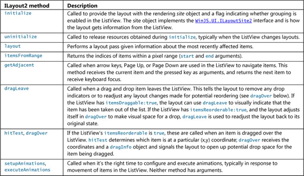
Fortunately, the ListView magnanimously allows you to implement only those parts of a layout class that you really need and ignore the rest (the ListView will provide no-op stubs for methods you don’t implement). We call this a “pay for play” model. In the following table, the required method, initialize, is shaded in orange, the recommended methods in green (to support the most flexibility depending on your scenario), and truly optional methods in blue:
All this means again that the most basic custom layout object need only support initialize and possibly uninitialized, which will produce a vertical layout by default. To do a horizontal or nonlinear layout, you’ll need the layout method, and then you can add others as you like to support additional features. Let’s look at a number of examples.
Minimal Vertical Layout
Our first example is scenario 1 of the HTML ListView custom layout sample, whose data source (of ice cream flavors once again!) is a WinJS.Binding.List defined in js/data.js and accessed through the Data.list and Data.groupedList variables.
The custom layout object in scenario 1 is named SDKSample.Scenario1.StatusLayout and is created with WinJS.Class.define (js/scenario1.js):
WinJS.Namespace.define("SDKSample.Scenario1", {
StatusLayout: WinJS.Class.define(function (options) {
this._site = null;
this._surface = null;
},
{
// This sets up any state and CSS layout on the surface of the custom layout
initialize: function (site) {
this._site = site;
this._surface = this._site.surface;
// Add a CSS class to control the surface level layout
WinJS.Utilities.addClass(this._surface, "statusLayout");
// This isn't really used, create an orientation property instead
return WinJS.UI.Orientation.vertical;
},
// Reset the layout to its initial state
uninitialize: function () {
WinJS.Utilities.removeClass(this._surface, "statusLayout");
this._site = null;
this._surface = null;
},
})
});
And if you look in css/default.css you’ll see that the styles assigned to the statusLayout class are also quite minimal (everything else in css/scenario1.css is for the item templates, not the layout):
.listView.statusLayout {
position: static; /*This isn't explicitly needed as it's the default anyway */
}
.listView.statusLayout.win-container {
width: 250px;
margin-top: 10px;
}
.listView.statusLayout.win-item {
width: 250px;
height: 100%;
background-color: #eee;
}
Together, then, you can see that this custom layout doesn’t do much in terms of customization: it merely defines a set width and background color but doesn’t say anything specific about where items are placed. It simply relies on the default positioning provided by the app host’s layout engine, just as it provides for all other HTML in your app.
The rest of the code in js/scenario1.js and css/scenario1.css is all about setting up and styling item templates for the ListView and doesn’t affect the layout portion that we’re concerned with here. The same is true for most of html/scenario1.html, the bulk of which are the declarative item templates. The one line we care about with our layout is the ListView declaration at the end:
<div class="listView" data-win-control="WinJS.UI.ListView"
data-win-options="{itemDataSource: Data.list.dataSource,
layout: {type: SDKSample.Scenario1.StatusLayout}}"></div>
Here you can see that we specify a custom layout just as we would a built-in one, using the ListView.layout option. Remember from Chapter 7, “Collection Controls,” that layout is an object whose type property contains the name of the layout object constructor. Any other properties you provide will then be passed to the constructor as the options argument. That is, the following markup:
layout: { type: <layout_class>, <option1>: <value1>, <option2>: <value2>, ...}
is the same thing as using the following code in JavaScript:
listView.layout = new<layout_class>({ <option1>: <value1>, <option2>, <value2>, ... });
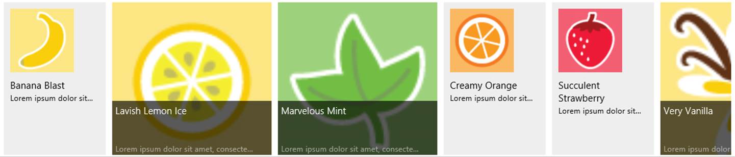
And that’s it! Running the sample with this layout now in portrait mode, as shown in Figure B-2, we see that the result is a simple vertically oriented ListView, with each item’s height determined naturally by its item template. What’s impressive about this is that it took almost no code to effectively create the equivalent of a variable-size vertical ListLayout, something that was amazingly difficult to do in WinJS 1.0 (and was one of the most requested features for WinJS 2.0!).
The reason for this is that the ListView builds up a DOM tree of div elements for the items in the list, but otherwise it leaves it to the layout to define their positioning. Because our layout doesn’t do anything special, we end up with the default layout behavior of the app host. Because divelements use block layout by default (position:static), they are rendered vertically like any other markup.
In running the sample, also notice that all the usual ListView item interactions are fully present within the custom layout. The layout, in other words, has no effect on item 'margin-top:6.0pt;margin-right:0cm;margin-bottom:6.0pt; margin-left:0cm;text-indent:.1pt'>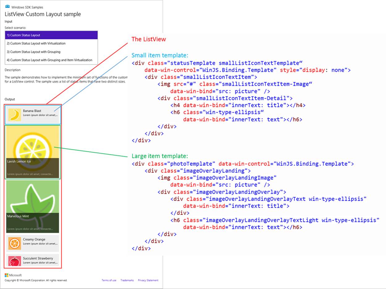
FIGURE B-2 Scenario 1 of the HTML ListView custom layout sample, shown in portrait view so that we can see more of the control. The templates as defined in html/scenario1.html are also shown here. Because each item in the list is rendered in a div and a div uses block layout in the rendering engine, the items render vertically by default.
Minimal Horizontal Layout
Given the default vertical behavior, how would we change scenario 1 of the sample to do a horizontal layout? It’s mostly just a matter of styling:
• Style the win-itemscontainer class to use a horizontal layout, such as a flexbox with a row direction. This is the most essential piece because it tells the rendering engine to do something other than the default vertical stacking. You could also use a CSS grid.
• Define an orientation property in the layout class with the value of “horizontal”. This tells the ListView to use the win-horizontal style on itself rather than win-vertical (the default). Note that the return value from the layout’s initialize method doesn’t have an effect here, though for good measure it should return WinJS.UI.Orientation.horizontal as well.
• Change the app’s styles for the ListView to be appropriate for horizontal, such as using width:100% instead of height:100%.
• Implement the layout class’s layout method as needed.
These changes are implemented in scenario 1 of the Custom Layout Extras example in the companion content for the appendices. We first change the statusLayout class set within the layout’s initialize method to statusLayoutHorizontal and return the horizontal orientation. Let’s also add the orientation property (other code omitted):
WinJS.Namespace.define("SDKSample.Scenario1", {
StatusLayoutHorizontal: WinJS.Class.define(function (options) {
// ...
this.orientation = "horizontal";
},
{
initialize: function (site) {
// ...
WinJS.Utilities.addClass(this._surface, "statusLayoutHorizontal");
return WinJS.UI.Orientation.horizontal;
},
// ...
})
});
Hint Make sure that orientation is spelled correctly in your property name or else the ListView won’t find it. I made the mistake of leaving out the last i and was scratching my head trying to understand why the ListView wasn’t responding properly!
Note The sample uses a listView style class in css/default.css across all its scenarios, so making changes in default.css will apply everywhere. It’s best to change the class in html/scenario1.html on the ListView to something like listview_s1 and keep scenario-specific styles in css/scenario1.css.
Next, taking the note above into account, let’s style the ListView as follows in css/scenario1.css:
.listView_s1 {
width: 100%; /*Stretch horizontally*/
height: 270px; /*Fixed height */
}
/*Change the layout model for the ListView*/
.listView_s1.statusLayoutHorizontal.win-itemscontainer {
height: 250px;
display: -ms-flexbox;
-ms-flex-direction: row;
}
/*These are for the items, same as the vertical orientation*/
.listView_s1.statusLayoutHorizontal.win-item {
width: 100%;
height: 100%;
background-color: #eee;
}
I also figured that we’ll want variable widths on the items rather than heights. Making some CSS changes for the small items, we get the following result:
The one problem we have, however, is that the ListView doesn’t pan horizontally, nor do scrollbars appear. This is because the win-itemscontainer element with the flexbox gets a computed width equal to the width of the win-surface element that contains it. To correct this, we need to make sure that this element has a width appropriate to all the items it contains. Of course, unless we know we have a fixed number of items in the underlying data source, we won’t know this ahead of time to specify directly in CSS.
This is where the layout method comes into play, because it’s where the layout object receives the tree of elements that it’s working with:
layout: function (tree, changedRange, modifiedElements, modifiedGroups) {
// ...
return WinJS.Promise.as();
}
The first argument is clearly the element tree. The other three signal when changes happen because of items being added and moved, allowing you to minimize the modifications you need to make to other items (and thus to reduce rendering overhead). The return value of layout is a promise that’s fulfilled when the layout is complete. Or, for more optimization, you can return an object with two promises, one that’s fulfilled when the layout of the modified range is complete and the other when all layout is complete.
Anyway, in this particular layout we need to add up the item sizes and set the width of the win-itemscontainer element. To do this, we iterate the item list and do a lookup of each item’s size by using an itemInfo method and a size map:
layout: function (tree, changedRange, modifiedElements, modifiedGroups) {
var container = tree[0].itemsContainer;
var items = container.items;
var realWidth = 0;
var itemsLength = items.length;
var type;
for (var i = 0; i < itemsLength; i++) {
type = this._itemInfo(i).type;
realWidth += this._itemSizeMap[type].width;
}
//Set the true width of the itemscontainer now.
container.element.style.width = realWidth + "px";
// Return a Promise or {realizedRangeComplete: Promise, layoutComplete: Promise};
return WinJS.Promise.as();
},
Tip Remember that a style.width property must include units. In my first tests I left off the “px” on the second-to-last line of code above, so nothing worked, much to my confusion!
If you’ve played around with the CellSpanningLayout in WinJS, the idea of an itemInfo function will be familiar. To generalize for a moment, the ILayout2 interface is what the ListView uses to communicate with the layout object, but that same layout object can provide other methods and properties through which it can communicate with the app. After all, the app must create the layout object and supply it to the ListView, so the layout can supply added members.
In this case, the StatusLayoutHorizontal class that we’re implementing here supports two additional properties, itemInfo and itemSizeMap, with internal defaults, of course:
/*
* These members are not part of ILayout2
*/
// Default implementation of the itemInfo function
_itemInfo: function (i) {
return"status";
},
//Default size map
_itemSizeMap: {
status: { width: 100 },
},
// getters and setters for properties
itemInfo: {
get: function () {
return this._itemInfo;
},
set: function (itemInfoFunction) {
this._itemInfo = itemInfoFunction;
}
},
itemSizeMap: {
get: function () {
return this._itemSizeMap;
},
set: function (value) {
this._itemSizeMap = value;
}
}
You can see that if the app doesn’t supply its own itemInfo and itemSizeMap properties, each item will be set to a width of 100. In the example, however, the layout is created this way:
this._listView.layout = new CustomLayouts.StatusLayoutHorizontal({itemInfo: this._itemInfo,
itemSizeMap: itemSizeMap });
where the app’s _itemInfo and itemSizeMap are as follows:
var itemSizeMap = {
status: { width: 160 }, // plus 10 pixels to incorporate the margin
photo: { width: 260 } // plus 10 pixels to incorporate the margin
};
// Member of the page control
_itemInfo: function (i) {
var item = Data.list.getItem(i);
return { type: item.data.type };
}
When the layout processes the items within its layout method, it will get back widths of either 160 or 260, allowing the layout to compute the exact width and style the container accordingly.
The key here is that we have a clear interface between the layout and the app that’s using it. We could easily write the layout to draw from app variables directly, which could be more efficient if you’re really sensitive to performance. For good reusability of your layout, however, using a scheme like the one shown here is preferable.
Two-Dimensional and Nonlinear Layouts
Having seen basic vertical and horizontal layouts, let’s see what other creative ideas we can implement. Let’s start with a grid layout like WinJS.UI.GridLayout but one that pans vertically and populates items across and then down (instead of down and across). The easiest way to do this is with a CSS flexbox with row wrapping. (It’s also possible to do something similar with a CSS grid, but it gets more complicated because you need to figure out how many rows and columns to use in styling.)
The flexbox approach can be done completely in CSS, as demonstrated in scenario 2 of the Custom Layout Extras example, where CustomLayouts.VerticalGrid_Flex is implemented in js/scenario2.js with only the skeletal methods that adds the class verticalGrid_Flex to the ListView’swin-surface element. The declared ListView in html/scenario2.html references this layout and uses a simple item template that just shows a single image. What makes it all work are just these bits in css/scenario2.css:
.listView_s2.verticalGrid_Flex.win-itemscontainer {
width: 100%;
height: 100%;
display: -ms-flexbox;
-ms-flex-direction: row;
-ms-flex-wrap: wrap;
}
/*Tighten the default margins on the ListView's per-item container*/
.listView_s2.verticalGrid_Flex.win-container {
margin: 2px;
}
We can clearly see that the items are being laid out left to right and then top to bottom (this is panned down a little so we can see the wrapping effect):
Now let’s go way outside the box and implement a circular layout, as shown in Figure B-3 and implemented in scenario 3 of the example (thanks to Mike Mastrangelo of the WinJS team for this one, although I added the spiral option). Note that you may need to run on a larger monitor to see a good effect; on 1366x768 it gets rather cramped. Video B-2 also shows the animation effect.
FIGURE B-3 Scenario 3 of the Custom Layout Extras example, showing a circular layout in the middle of animating new items into the list.
With this layout, all that’s needed is a little CSS and a layout function. First, here’s the extent of the markup in html/scenario3.html:
<div class="itemTemplate_s3" data-win-control="WinJS.Binding.Template">
<img data-win-bind="src: picture; title: title" height="72" width="72" draggable="false"/>
</div>
<div class="listView_s3" data-win-control="WinJS.UI.ListView" data-win-options="{
itemDataSource: Data.smallList.dataSource,itemTemplate: select('.itemTemplate_s4'),
layout: { type: CustomLayouts.CircleLayout }}">
</div>
and the full extent of the CSS, where you can see we’ll use absolute positioning for the layout (css/scenario3.css):
.listView_s3.win-container {
position: absolute;
top: 0;
left: 0;
transform: rotate(180deg);
transition: transform167mslinear, opacity167mslinear;
}
.listView_s3img {
display: block;
}
Note that the win-container selector here targets the individual items, not the whole layout surface. Also note the small transition set up on the transform property, which is initially set to 180 degrees. This, along with some of the JavaScript code in layout, creates the fade-in spinning effect seen in Video B-2.
I’ll leave it to you to look at the layout code in detail; it’s mostly just calculating a position for each item along the circle. The spiral option that I’ve added plays a little with a variable radius as well.
What’s very powerful with this example is that even in the circular layout you still get all the other ListView behaviors, such as selection, invocation, keyboarding, and so forth. Again, this is the main advantage of custom layouts over implementing your own collection control from scratch!
Virtualization
The next bit you can add to a custom layout is the itemsFromRange method to support virtualization. Virtualization means that the layout has a conversation with the ListView about what items are visible, because the ListView is creating and destroying elements as panning happens (clearly this isn’t important for something like the circular layout where all the items are always in view). The layout, for its part, needs to have an understanding about instructing the app host how and where to render those visible items. The essence of that conversation is as follows:
• When the ListView is panned, it asks the layout about which items are visible for a particular pixel range through itemsFromRange, because the layout understands how big its items are and where they’re placed.
• Once the ListView knows what items are visible, it calls layout with only those items in the tree argument. The layout, accordingly, sets the necessary styles and positioning on those items.
Scenario 2 of the HTML ListView custom layout sample now (the one from the Windows SDK, not the example in the companion content) shows the addition of virtualization support. The ListView’s options, including the layout and its options, are also set from JavaScript in js/scenario2.js:
this._listView.layout = new SDKSample.Scenario2.StatusLayout(
{ itemInfo: this._itemInfo, cssClassSizeMap: cssClassSizeMap });
this._listView.itemTemplate = this._statusRenderer.bind(this);
this._listView.itemDataSource = Data.list.dataSource;
The custom layout here has two options: an itemInfo function and a cssClassSizeMap (very much like we did with the horizontal layout earlier). It uses these to perform size lookup on a per-item basis:
_itemInfo: function (itemIndex) {
var item = Data.list.getItem(itemIndex);
var cssClass = "statusItemSize";
if (item.data.type === "photo") {
cssClass = "photoItemSize";
}
return cssClass;
}
var cssClassSizeMap = {
statusItemSize: { height: 90 }, // plus 10 pixels to incorporate the margin-top
photoItemSize: { height: 260 } // plus 10 pixels to incorporate the margin-top
};
Again, be very, very clear that such constructs are entirely specific to the custom layout and have no impact whatsoever on the ListView itself except as the layout implements methods like layout and itemsFromRange. In the sample, layout just uses this to cache various information about the items to improve performance. itemsFromRange, for its part, uses that cached size information to translate pixels to indexes for items. Here’s how it’s implemented in js/scenario2.js:
itemsFromRange: function (firstPixel, lastPixel) {
var totalLength = 0;
// Initialize firstIndex and lastIndex to be an empty range
var firstIndex = 0;
var lastIndex = -1;
var firstItemFound = false;
var itemCacheLength = this._itemCache.length;
for (var i = 0; i < itemCacheLength; i++) {
var item = this._itemCache[i];
totalLength += item.height;
// Find the firstIndex
if (!firstItemFound && totalLength >= firstPixel) {
firstIndex = item.index;
lastIndex = firstIndex;
firstItemFound = true;
} elseif (totalLength >= lastPixel) {
// Find the lastIndex
lastIndex = item.index;
break;
} elseif (firstItemFound && i === itemCacheLength - 1) {
// If we are at the end of the cache and we have found the firstItem,
// the lastItem is in the range
lastIndex = item.index;
}
}
return { firstIndex: firstIndex, lastIndex: lastIndex };
},
The most important thing to keep in mind with itemsFromRange is to make it fast. This is why the sample employs a caching strategy, which would become essential if you had a large data source.
Along these lines, be careful about the properties you access on HTML elements—some of them can trigger layout passes especially if other layout-related properties have been changed. That is, the accuracy of dimensional properties requires that the layout is up to date before values can be returned, and clearly you don’t want this to happen inside a method like itemsFromRange.
Grouping
When a ListView has a group data source in addition to its item data source, what changes for a custom layout is that the tree argument to the layout method will contain more than one item. Each item in tree is a single group that contains whatever items belong to that group. That is, we’ve been using code like this to look at the items:
var container = tree[0].itemsContainer;
but now we need to process the whole tree array instead. Scenarios 3 and 4 of the HTML ListView custom layout sample (again, the SDK sample) do this, as shown here from js/scenario3.js:
layout: function (tree, changedRange, modifiedElements, modifiedGroups) {
var offset = 0;
var treeLength = tree.length;
for (var i = 0; i < treeLength; i++) {
this._layoutGroup(tree[i], offset);
offset += tree[i].itemsContainer.items.length;
}
return WinJS.Promise.wrap();
},
// Private function that is responsible for laying out just one group
_layoutGroup: function (tree, offset) {
var items = tree.itemsContainer.items;
var itemsLength = items.length;
for (var i = 0; i < itemsLength; i++) {
// Get CSS class by item index
var cssClass = this._itemInfo(i + offset);
WinJS.Utilities.addClass(items[i], cssClass);
}
}
All this is again a matter of adding CSS styles to various elements; the layout of the group headers themselves are defined by the headerTemplate element in html/scenario3.html and applicable styles in css/scenario3.css. As shown below, this is just a large character for each group (the groups are arranged vertically; I’m showing portions of each horizontally here):
In short, support for grouping isn’t tied to the implementation of specific ILayout2 methods—it’s primarily a matter of how you implement the layout method itself.
You can, of course, implement both grouping and virtualization together by including itemsFromRange, as we saw in the previous section. Scenario 4 of the sample demonstrates this by basically combining the code from scenarios 2 and 3.
The Other Stuff
Let’s now look at the remaining methods of ILayout2, most of which are demonstrated in scenario 4 of the Custom Layout Extras example, which extends the minimum horizontal layout in scenario 2.
Some of these methods must return an object that contains an item index and a type (a value from WinJS.UI.ObjectType). This object doesn’t have an assigned class but looks like these examples:
return { type: WinJS.UI.ObjectType.item, index: itemIndex };
return { type: WinJS.UI.ObjectType.groupHeader, index: headerIndex };
The hitTest method should also include an insertAfterIndex in the object it returns so as to indicate the actual insertion point of a moved item.
Keyboard Support: getAdjacent
The ListView calls getAdjacent in response to the arrow keys as well as page up and page down, because the layout object is what knows how items are arranged in relation to one another. Without this method, the default behavior (as you can see in scenario 2) is that the right arrow, down arrow, and page down move the focus to the next item in the list, and left arrow, up arrow, and page up go to the previous item. (Home and End always go to the first and last item.)
In a top-to-bottom grid layout, however, we want the up, down, page up, and page down to work by rows (one row or three rows at a time). We implement getAdjacent, then, which accepts an item object (containing index and type properties as in the return object) and aWinJS.UtilitiesKey and which returns an object describing the next item to get the focus. (If you simply return an object with index set to item.index+1 or item.index-1, for forward and backward keys, respectively, and type:WinJS.UI.ObjectType.item, you’ll duplicate the default behavior.)
In our case we need to determine how many items are in a row. This is fairly straightforward. Remember the site object we get through initialize? It contains a viewportSize property whose width tells us the width of the ListView. If we divide this by the item width—and it’s best to have a property on the layout object through which the app can specify this as a fixed size—we get the items per row. Because this value will change only when the layout is recomputed, we can do this in the layout method:
layout: function() {
this._itemsPerRow = Math.floor(this._site.viewportSize.width / this._itemWidth);
this._totalRows = Math.floor(this._site.itemCount._value / this._itemsPerRow);
//We don't need to do anything else.
return WinJS.Promise.as();
},
Assuming that we have an itemWidth property on the layout that’s been set appropriately for the real item size (content size + borders, etc.), we can implement getAdjacent as follows. Here, page up and page down move three rows at a time, and up/down arrow one row:
getAdjacent: function (item, key) {
var Key = WinJS.Utilities.Key;
var index = item.index;
var curRow = Math.floor(index / this._itemsPerRow);
var curCol = index % this._itemsPerRow;
var newRow;
//The ListView is gracious enough to ignore our return index if it's out of bounds,
//so we don't have to check for that here.
switch (key) {
case Key.rightArrow:
index = index + 1;
break;
case Key.downArrow:
index = index + this._itemsPerRow;
break;
case Key.pageDown:
//If we page down past the last item, this will go to the last item
newRow = Math.min(curRow + 3, this._totalRows);
index = curCol + (newRow * this._itemsPerRow);
break;
case Key.leftArrow:
index = index - 1;
break;
case Key.upArrow:
index = index - this._itemsPerRow;
break;
case Key.pageUp:
newRow = Math.max(curRow - 3, 0);
index = curCol + (newRow * this._itemsPerRow);
break;
}
return { type: WinJS.UI.ObjectType.item, index: index };
},
With this, we get good keyboard navigation within the layout. Note the comment that the ListView will ignore invalid index values; we don’t have to sweat over validating what we return.
Drag and Drop: dragLeave, dragOver, and hitTest
One drag-and-drop scenario for a ListView is that it can serve as a general drop source by setting its itemsDraggable property to true. If so, the ListView will check for and call the layout’s dragLeave method whenever an item is dragged out of the ListView control, as well as when an item is dragged and dropped back in the list.
This method has no arguments and no return value, so it’s simply a notification for the layout to take any desired action. To be honest, there’s not too much it can do in this case. It’s more interesting when items are reorderable as well—that is, when the ListView’s itemsReorderableproperty is also true (html/scenario4.html):
<div class="listView_s4" data-win-control="WinJS.UI.ListView"
data-win-options="{
itemDataSource: Data.list.dataSource,
itemTemplate: select('.itemTemplate_s4'),
itemsDraggable: true,
itemsReorderable: true,
layout: {type: CustomLayouts.VerticalGrid_Flex4, itemWidth: 65, itemHeight: 65}}">
</div>
Here you must also implement hitTest and dragOver together. hitTest is pretty simple to think about: given x/y coordinates within the layout surface, return an item object for whatever is at those coordinates where the object contains type, index, and insertAfterIndex properties, as described earlier. In scenario 4 of the example, we can use the same itemWidth/itemHeight properties that help with getAdjacent (js/scenario4.js):
_indexFromCoordinates: function (x, y) {
var row = Math.floor(y / this._itemHeight);
var col = Math.floor(x / this._itemWidth);
return (row * this._itemsPerRow) + col;
},
hitTest: function (x, y) {
var index = this._indexFromCoordinates(x, y);
//Only log the output if the index changes.
if (this._lastIndex != index) {
console.log("hitTest on (" + x + ", " + y + "), index = " + index);
this._lastIndex = index;
}
return { type: WinJS.UI.ObjectType.item, index: index, insertAfterIndex: index - 1 };
},
Note If you support variable item sizes, you can’t rely on fixed values here and need to have an itemInfo function to retrieve these dimensions individually. You’d want to cache these values within the layout method as well so that hitTest can return more quickly.
The insertAfterIndex is important for reordering the ListView, because the control automatically moves an item dragged within the list to this index. Note that insertAfterIndex should be set to -1 to insert at the beginning of the list.
With hitTest in place, the dragOver method is then called whenever the index from hitTest changes. It receives the x/y coordinates of the drag operation (along with an object called dragInfo that’s for the ListView’s internal use). The method doesn’t have a return value, so its whole purpose is to give your layout an opportunity to visually indicate the result of a drop. For example, you can highlight the insertion point, show a little wiggle room in the layout (the built-in layouts move hit-tested items by 12px), or whatever else you want. You then use dragLeave, of course, to reset that indicator. (If you want to look at what the built-in layouts do for dragOver, look in the ui.js file of WinJS for the _LayoutCommon_dragOver function.)
In the example (still in scenario 4) I just rotate the item at the drop point a little (see Video B-3) and make sure to clear that transform on dragLeave:
dragOver: function (x, y, dragInfo) {
//Get the index of the item on which we’re dropping
var index = this._indexFromCoordinates(x, y);
console.log("dragOver on index = " + index);
//Get the element and scale it a little (like a button press)
var element = this._site.tree[0].itemsContainer.items[index];
element &&this._addAnimateDropPoint(element);
this._lastRotatedElement&&this._clearAnimateDropPoint(this._lastRotatedElement);
this._lastRotatedElement = element;
},
dragLeave: function () {
console.log("dragLeave");
if (this._lastRotatedElement) {
this._clearAnimateDropPoint(this._lastRotatedElement);
this._lastRotatedElement = null;
}
},
_addAnimateDropPoint: function (element) {
element.style.transition = "transform ease 167ms";
element.style.transform = "rotate(-20deg)";
},
_clearAnimateDropPoint: function (element) {
element.style.transition = "";
element.style.transform = "";
}
With this, the ListView will automatically take care of moving items around in the data source without any other special handling. In the example, I’ve added identification numbers to each of the items in the list so that you can see the effects.
Animations: setupAnimations and executeAnimations
The last two members of ILayout2 are setupAnimations and executeAnimations, whose purpose is to animate the layout in response to a change in the data source, as when an item is dragged within the ListView.
These are somewhat involved, however, and the best place to learn about these is in the WinJS source code itself. Search for “Animation cycle,” and you’ll find a page-long comment on the subject!
143 There are ILayoutand ILayoutSite interfaces in WinJS 1.0 that are used with the WinJS 1.0 ListView. These are much more complicated and should not be confused with the WinJS 2.0 interfaces.