Essential SharePoint 2013: Practical Guidance for Meaningful Business Results (2014)
Part II. Optimizing
Chapter 18. Planning for Business Intelligence
Business intelligence (BI) is the art and science of transforming data and information into knowledge and wisdom. BI requires both attention to detail and big-picture thinking. And SharePoint 2013 can make it all possible through a nicely improved toolset—definitely the most comprehensive and well-performing set of tools on the Microsoft platform to date.
Before we get deeper into what SharePoint itself has to offer, let’s take a closer look at BI in general. Ask any CxO what his or her number-one need is for enabling solid business decisions, and the answer will most likely come down to one word: information. These people need the right information, in just the right amount, at just the right time. Understanding what has happened in the past, and what is happening right now, can help in the process of determining what an executive should do next. This, of course, assumes two key elements about the available data: quality and timeliness. Organizations today need to have real-time, visual cues that tell them how they are performing, both operationally and strategically. If reports are generated too far after the fact, or without proper cross-correlation, it may be too late to change course if there is a problem. If your organization can’t react fast, your competition probably can, and that’s a problem.
This transformation of data into actionable information is at the heart of business intelligence. And while quality and timeliness are essential to building a BI solution, it is also very important to decide how best to present the information gathered. Do you use a report? A chart? A scorecard? A dashboard? Telling a story through data is a big part of success with BI. SharePoint 2013 helps in this way by providing users with several options to analyze information and help facilitate decision making.
First, let’s discuss what SharePoint 2013 is not. It is not a data warehouse for storing large amounts of corporate data. Nor is it a data-cleansing tool that will automatically correct bad or incomplete data. SQL Server’s Analysis Services and Data Transformation Services are in charge of those items. Instead, think of SharePoint as both the facilitator and the presentation tier for business intelligence data. SharePoint is becoming the presentation hub for all Microsoft Business Intelligence solutions, from Excel to SQL Server Reporting Services to PerformancePoint. For users, SharePoint is the common destination to find the business information they need to make decisions. In short, SharePoint is there to help present key data to users to help them make the right decisions faster and more easily.
This chapter provides an overview of key business intelligence capabilities that are provided by SharePoint 2013, including report delivery, dashboards, scorecards, key performance indicators, and server- and client-side Excel calculations and charting. Full coverage is well beyond the scope of this book, so we’ll stick to providing advice on the best way to think about BI in the context of SharePoint. The key topics covered in the chapter are
![]() What’s new in SharePoint 2013?
What’s new in SharePoint 2013?
![]() Planning for business intelligence
Planning for business intelligence
![]() Which presentation tool is right for you?
Which presentation tool is right for you?
![]() Excel Services
Excel Services
![]() Excel BI and PowerPivot
Excel BI and PowerPivot
![]() PerformancePoint Services
PerformancePoint Services
![]() Visio Services
Visio Services
What’s New in SharePoint 2013?
The BI enhancements in SharePoint 2013 are quite compelling. At first glance, it might appear that Microsoft hasn’t changed much in the feature set since SharePoint 2010, but that’s not the case. Microsoft has significantly polished the overall quality and usability of the toolset. The overall goal of the core Microsoft BI tools hasn’t changed much, but the execution has improved significantly. The full set of tools includes Excel 2013 (the client application), Excel Services in SharePoint 2013, PerformancePoint Services in SharePoint Server 2013, Visio Services in SharePoint 2013, and Microsoft SQL Server 2012. The following BI feature changes are of particular note:
![]() Excel Client BI provides additional capabilities to analyze and visually explore data of any size, including data sets with millions of rows.
Excel Client BI provides additional capabilities to analyze and visually explore data of any size, including data sets with millions of rows.
![]() Excel Services enables users to view and interact with Excel workbooks that have been published to SharePoint sites with a number of improved features and better analysis support.
Excel Services enables users to view and interact with Excel workbooks that have been published to SharePoint sites with a number of improved features and better analysis support.
![]() PerformancePoint Services enables users to create much better interactive dashboards for key performance indicators (KPIs) and data visualizations in the form of scorecards, reports, and filters, including a new BI Center template and support for iPad.
PerformancePoint Services enables users to create much better interactive dashboards for key performance indicators (KPIs) and data visualizations in the form of scorecards, reports, and filters, including a new BI Center template and support for iPad.
Planning for Business Intelligence
Business intelligence is very personal. Independent of the challenges of getting corporate data collected, completed, and cleansed, the “right” delivery method is highly subjective. One user may be satisfied with a static report that simply delivers information; another user wants the ability to drill down into specific sections of a report to interact with more detail; still another may want to spend no more than three seconds looking at a picture to determine whether action is required.
Given all of that, how do you get started? The first step is to recognize that delivery around BI has evolved. It used to be that you needed to know all user requirements and know exactly what users wanted to see. That’s changed. Now, business intelligence is much more about putting tools in the hands of the users and letting them have control over what they see. This is sometimes called “BI for the masses.” In the next few sections, we highlight various options for BI delivery in SharePoint, including report storage and delivery, charts, dashboards, scorecards, and KPIs. In a later section, we discuss the options and how to select the delivery choice that is most appropriate for your organization.
Reports
It is pretty safe to say that every person in an organization, independent of roles or responsibilities, interacts with some type of report. In the “old days,” reports were delivered in paper form, perhaps through interoffice mail. With technology advances, this has changed so that most reportdelivery occurs through e-mail attachments or interactively via a real-time online system.
At the highest level, there are two types of reports: static and dynamic. A static report is a presentation of information in a locked-down view, meaning the reader can see the information only in the format that is shown and is exposed only to the level of detail provided on that report. The report itself may have been generated from any enterprise database, or perhaps an accounting system. For example, your bank statement might be delivered as a .pdf file. A dynamic report, on the other hand, is more flexible. It allows the user to manipulate the presentation of data and/or access detail that may not be presented in the default view. Think of a sales performance report available in a spreadsheet. Perhaps the presentation is revenue per region, but the user is allowed to drill into an individual office’s detail. Or, the user may be able to request additional information by clicking a check box. Again, this report may have been generated from any number of external systems, but since there’s a “live” link to the data (which is not likely real-time itself but more likely an aggregation of many transactions over time), the report is more flexible.
From a SharePoint perspective, the type of report or the data source is irrelevant. Again, think of SharePoint as the delivery tool. While SharePoint is not typically a data repository for report information, it is a document repository. And reports are documents. This means that you can deliver corporate reports by storing them in SharePoint. You may get the reports into SharePoint manually or provide access to a reporting source like SQL Server Reporting Services (SSRS) or through custom development. The value of placing reports in SharePoint versus e-mailing them directly to users or placing them on a network drive is significant. A SharePoint document (report) library
![]() Can be secured, at either the library or the item (report) level. This allows you to easily apply permissions so the reports are seen by only the appropriate resources.
Can be secured, at either the library or the item (report) level. This allows you to easily apply permissions so the reports are seen by only the appropriate resources.
![]() Is crawled by SharePoint’s search engine so reports can be returned in search results.
Is crawled by SharePoint’s search engine so reports can be returned in search results.
![]() Has version control; as reports are updated, the new version overlays the old and there is no confusion about which is the most current version.
Has version control; as reports are updated, the new version overlays the old and there is no confusion about which is the most current version.
![]() Can meet compliance requirements through defined document management workflows to control approval, publication, and disposition.
Can meet compliance requirements through defined document management workflows to control approval, publication, and disposition.
![]() Is familiar to users in an existing SharePoint environment, so it is easier to train users on how to access new reports.
Is familiar to users in an existing SharePoint environment, so it is easier to train users on how to access new reports.
![]() Has alerts; specific users can be notified of new or updated reports automatically without having to spam every employee.
Has alerts; specific users can be notified of new or updated reports automatically without having to spam every employee.
In addition, SharePoint has tight integration with SSRS so that reports generated in SSRS can be shown in the context of a SharePoint site and can provide users with a single access point for reports and supplemental structured and unstructured data.
Charts
Reports typically contain mostly text—characters and numbers formatted in a certain way for presentation. Another way to show data is in a graph (see Figure 18-1). A pie chart or bar graph can “tell a story” with fewer words and numbers than a traditional report. The value of a chart is that it leverages a visual indicator to quickly highlight specific data elements (i.e., sales are way down this year because the current-year bar is much smaller than last year’s). Business users have long been familiar with charts through their use of Microsoft Excel. Excel provides an easy way to transform data into a picture.
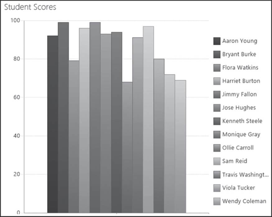
Figure 18-1 Most business users are familiar with Excel-based charts, which can describe data in a visual way
From a SharePoint perspective, there are three main ways to present charts as part of a business intelligence solution. The first and simplest is to store the spreadsheet that contains the chart(s) in a document library (similar to the Reports section). This requires very little effort but forces the user to click the correct file and launch Excel on the desktop. A second choice is to use a charting tool, such as the SharePoint 2010 Chart Web Part, that offers SharePoint integration where the charts themselves are actually Web Parts that have been configured to point to a specific data source and present results in a specific way. The benefit here is that the user interface is much richer, and access to the visual indicators is faster. The challenge is that this requires an additional purchase and at least some training in the third-party solution. The final choice is to use Excel Services, which is part of SharePoint and discussed in more detail later in this chapter. Excel Services requires that the organization have the Enterprise version of SharePoint Server 2013. It allows users to publish a chart or collection of charts directly from Excel and have them rendered directly into a SharePoint Web page. This offers the rich and instant presentation without the overhead of an additional software solution.
Dashboards
A dashboard contains a collection of BI elements such as reports, filters, and scorecards, typically in real time. Dashboards are used to show how an organization (or, more often, a part of an organization) is performing against real-time, tactical goals as of this moment. Most often, the metrics that are displayed in a dashboard reflect data that is constantly changing (How many support calls do we have in queue? How many units have we manufactured today?). Dashboards are most often watched by members of the organization who are responsible for specific day-to-day goals.
The information used in a dashboard is usually “raw” data, but in an effective dashboard it is displayed in such a way that there is instant recognition of performance against a target. So, for instance, if there are fewer than five support calls in queue, we can show the number 5 in green; if there are six to 20, we can show the number in yellow; and if there are more than 20, we can show the number in red. This commonly understood color scheme provides instant feedback to supervisors or staff members on how they are doing at any moment in time. Additional cues such as shapes or symbols can be used to clarify indicators for users who are colorblind or who have visual limitations. At a glance, someone can look at a dashboard to spot the trouble areas and investigate further or take action. The use of gauges or progress bars or charts can also provide visual cues about the information that changes regularly. In our example, we can see at a glance that Northwind Traders is falling short of revenue targets (see Figure 18-2).
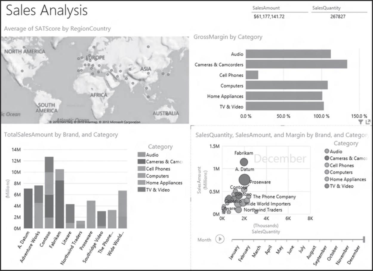
Figure 18-2 PerformancePoint Services in SharePoint 2013, which is vastly improved over SharePoint 2010, provides a way to build sophisticated dashboards without programming effort
The most critical action to perform before setting up a dashboard is to identify which metrics are going to help drive the organization’s performance. Too often, information like the current weather or the company’s stock ticker is dropped onto a dashboard because dashboards are easy to create. However, unless you are in the snowplow business, a weather dashboard is not likely to provide a metric that drives performance.
Dashboards are not “one size fits all.” Different people in the organization need to see different information to understand performance. Sometimes this just means a different level of granularity (how many support calls for software product X versus software product Y versus for all software products), but it can also mean different metrics for different parts of the organization. Because of this, you need to carefully plan so that you are sure that you are providing the right information to the right people at the right time in your dashboards.
Scorecards
Many people use the terms dashboard and scorecard interchangeably, but there is a significant difference between them. Whereas a dashboard is a container for a related group of report views and other indicators that are organized together, a scorecard is a specific type of report that displays a collection of KPIs together with performance targets for each KPI.
Often, scorecards are used to show how an organization is performing against strategic goals, rather than day-to-day tactical goals. In addition, the metrics are generally from a snapshot in time (“this fiscal year”) rather than in real time. The metrics that are contained in a scorecard also can be viewed from an overall organizational level (How are we doing against our revenue goals for the year?) or cascaded down to the individual level (How much have I sold this year?). Scorecards are usually watched most closely at the top level of an organization.
The most important step in creating a scorecard is to do careful analysis. An organization’s strategy is almost always difficult to articulate outside the boardroom. Scorecards are a way to make strategy real to everyone in the organization. If your organization’s strategy is to be the best and best-known service provider in a specific industry, you need to identify which metrics the organization should monitor to understand how it is doing against that strategy. Scorecards have been around for a long time, and many organizations think that they have a handle on theirs if they are watching financial metrics. However, it is just as important to watch metrics that show how the organization is performing from a customer perspective, from a business process perspective, and from a learning and growth perspective. The reasons for this are many. Revenue might be going through the roof, but if the staff is leaving in droves, there’s a problem. If profits are way up but no one can understand when they should report a critical defect, there is a problem that might impact future profits.
The visual representation of scorecards is similar to that of dashboards but is usually simpler. The red/yellow/green approach is the most common, given that users are interested in how they are performing against a fixed set of metrics in a specific time period. The visuals won’t change in real time but will change on a periodic basis, whatever period makes sense for the overall organization. Usually these periods are monthly or quarterly since they coincide with financial reporting periods, and monthly/quarterly reporting is well ingrained in the corporate psyche.
Let’s assume that you have done all of the up-front analysis for your dashboards and scorecards (no small feat, but too large a set of topics to cover here). Once you have SharePoint up and running, enabling collaboration and teamwork across the enterprise, it’s time to consider using the platform as a basis for business intelligence. SharePoint provides a rich set of new tools to facilitate building up your dashboards and scorecards.
Key Performance Indicators
A key performance indicator is one element of a scorecard (see Figure 18.3). Organizations use KPIs to monitor business activity and performance. Simply stated, KPIs are metrics (data values) that are compared against a benchmark and scored. KPI indicators (also known as status indicators) are intended to spur action. If the sales KPI is red, it indicates that an issue has arisen and that action is required. Status indicator lists are one way to implement a simple dashboard or scorecard. A scorecard is more formal and has more rollup and drill-down capabilities that allow for views into supporting metrics. Status indicator lists in SharePoint are meant to be simpler. They are linear and represent the presentation of a group of items that share a common data point (that is, they all relate to the organization).
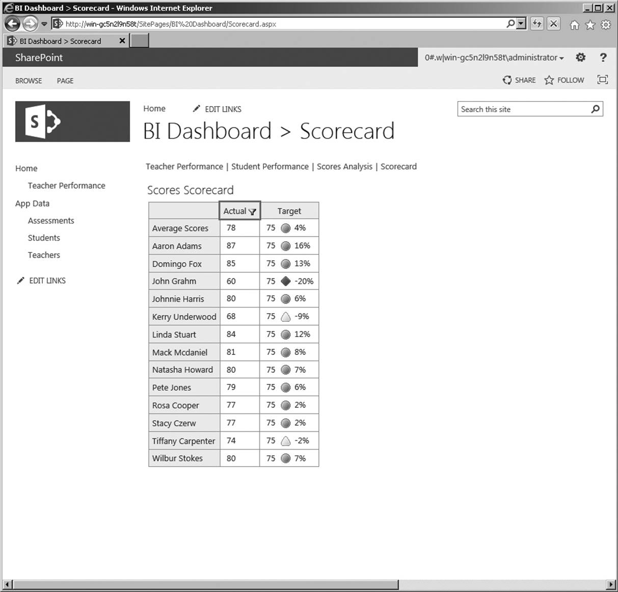
Figure 18-3 PerformancePoint services provides the facility to create KPIs, enabling easy-to-use scorecards
Traditionally, corporate executives have used KPIs to “take the pulse” of business performance. Examples include sales pipeline, revenue, and products sold (all for a specific point in time). Increasingly, however, all levels of an organization are being exposed to KPI lists as a way to present performance data. Think of project teams being exposed to project performance (utilization or budget versus actual) in a master list. The power of a KPI list is that it presents, in a very simple interface, information about collected data measured against predefined goals. One of the key challenges of any sort of dashboard or scorecard is that it seeks to aggregate a wide variety of data—data that may come from multiple systems. Worse yet, the necessary data may not exist in any systems, or it may be very complex to calculate or locate. Presenting the red/yellow/green on a scale is often the easy part. Defining and locating the actual data is the hard part.
In SharePoint Server 2013, KPIs are typically created within PerformancePoint Services. Like scorecards, a traditional KPI list typically has three main color codings (although it is possible to use a number of graphical icons, including smiley and sad faces):
![]() Green: positive results against a measurement
Green: positive results against a measurement
![]() Yellow: borderline results
Yellow: borderline results
![]() Red: poor results
Red: poor results
Which Presentation Tool Is Right for You?
Reports, charts, dashboards, or scorecards—which is best for your users? Remember, business intelligence is highly subjective, so you may need to use some or all in an overall deployment. Table 18-1 may help in your decision-making process.
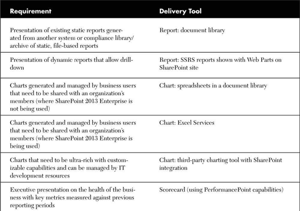
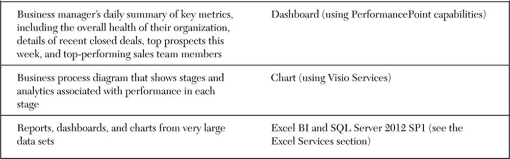
Table 18-1 Selecting the Right BI Delivery Tool
Excel and Excel Services
We have seen two main trends in business intelligence adoption within organizations: (1) the vast majority of companies have implemented or are implementing a strategy for BI, and (2) the most popular tool for delivering BI data continues to be Microsoft Excel. Excel offers users (typically business analysts or knowledge workers who work closely with specific business data) a familiar environment for manipulating corporate data. For years, many software companies have tried to recreate this experience in a Web-based environment with the goal of better leveraging workbook-based results in a broader medium. Most solutions failed because they could not effectively mimic the simplicity that Excel offers users.
Excel Services, a BI component of the SharePoint 2013 Enterprise Edition, addresses that need by validating what business users have known all along—that Excel is a great tool for ad hoc manipulation of business data. Excel Services takes the concept to a new level by allowing data owners not only to acquire and manipulate business data but, ultimately, to publish it to a Web-based environment that is highly secure. One of the biggest strengths of Excel Services is that it not only allows users to publish Excel-based content (entire workbooks, individual worksheets, or even a single chart), but it also offers the ability to publish only what the data owner wants to be seen. For example, a business analyst may use specific formulas and business logic to take raw data and deliver a set of charts to make predictions or show trends. The analyst would like to share these results with a broader audience but cannot e-mail the workbook without the risk of compromising the formulas and proprietary logic. Excel Services offers a solution by allowing the business analyst to create the chart using native Excel capabilities in an Excel workbook and then to publish only the content (the specific chart or perhaps the single worksheet) from the spreadsheet that the analyst wants to share to a SharePoint portal, all without exposing the detailed data and formulas (see Figure 18-4).
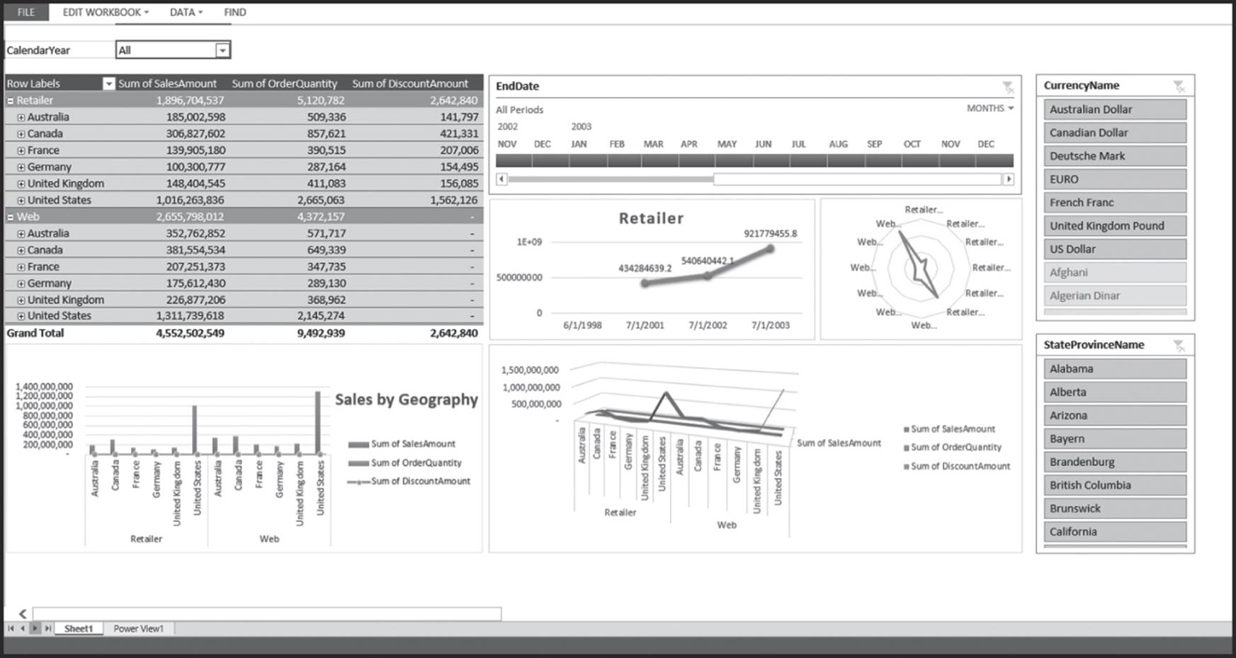
Figure 18-4 Excel Services can render interactive dashboards that are based on Excel; this provides a way for business users to create their own reports and publish them via a Web page
Excel Services in SharePoint 2013 continues to be a major component of the business intelligence integration into SharePoint technologies. It truly offers business users the best of both worlds; users can continue to build and analyze using a tool that is very familiar and are empowered to publish results without having to work through an IT department to build custom Web pages or dashboards.
Getting Started with Excel Services
One of the first things to look at is the three core components of Excel Services:
![]() Excel Calculation Engine. This is the main engine responsible for managing the data and calculations associated with workbooks.
Excel Calculation Engine. This is the main engine responsible for managing the data and calculations associated with workbooks.
![]() Excel Web Access. This is the Web Part within SharePoint that allows the rendering of Excel-based content in a browser-based environment. It can be associated with dashboards and can be connected to other Web Parts.
Excel Web Access. This is the Web Part within SharePoint that allows the rendering of Excel-based content in a browser-based environment. It can be associated with dashboards and can be connected to other Web Parts.
![]() Excel Web Services. These are APIs that developers can use to build custom solutions that leverage Excel workbooks.
Excel Web Services. These are APIs that developers can use to build custom solutions that leverage Excel workbooks.
How Does Excel Services Work?
Let’s take a look at how to publish Excel-based content to SharePoint. One of the first things you need to do is tell Excel Services where to look for the Excel workbooks you want to render as HTML on your portal. When you define a trusted source file location, you can specify a path to a specific SharePoint-based site or file system file (UNC path) or an HTTP location that is Internet-based.
Note that when you work with SharePoint-based sites, you can enable Excel Services workbook acquisition in all underlying child sites as well. The advantage of doing so is that it allows administrators to apply more granular security on sub-sites when maintaining navigation among Excel charts. There are several options associated with setting a trusted connection, including limits on a workbook’s size and number of calculations.
A trusted file location acts as a master address book that indicates the portal sections or file system locations that are enabled for Excel Services consumption. One of the important things to note is that this capability is an administrative task. It is assumed that the definition of trusted locations will be managed by a SharePoint administrator and not the business users, mainly since Excel Services is not intended to give business users full control or management of SharePoint security or administration, but to focus on the content itself.
Let’s assume a sample Excel file contains a worksheet dedicated to salesperson bonus calculations. In this scenario, a manager is using Excel to manage employee compensation based on performance. He or she is using a formula based on some personal definitions to calculate bonusamounts and show the data in a simple pie chart. The goal is to share the data with the team but not share the formulas associated with the results. How does Excel Services enable this outcome?
![]() Business process. Without Excel Services, the manager would be forced to take manual steps to separate the pie chart from the calculations. This would have included things like hiding a calculation worksheet, copying the chart to another workbook, or generating a .pdf file with the chart. All of these require manual steps every time the data changes. Obviously, it is an inefficient process. Excel Services, on the other hand, allows for publishing and protection within the same environment.
Business process. Without Excel Services, the manager would be forced to take manual steps to separate the pie chart from the calculations. This would have included things like hiding a calculation worksheet, copying the chart to another workbook, or generating a .pdf file with the chart. All of these require manual steps every time the data changes. Obviously, it is an inefficient process. Excel Services, on the other hand, allows for publishing and protection within the same environment.
![]() Presentation. Let’s say that the table associated with salesperson data has graphical indicators for performance. This is done using Excel’s conditional formatting, which looks like a KPI list. Conditional formatting in Excel is another way of publishing performance data.
Presentation. Let’s say that the table associated with salesperson data has graphical indicators for performance. This is done using Excel’s conditional formatting, which looks like a KPI list. Conditional formatting in Excel is another way of publishing performance data.
![]() Security. The goal of the publishing portion of the process is not just to display the pie chart, but also to protect the formulas and business logic. Excel Services allows a user to publish an entire workbook, a single worksheet, or any chart. This is a very powerful tool. Consumers of the content cannot edit the data; the transmission is unidirectional. They can, however, do many things with the end results. This includes sorting and filtering, recalculation, and PivotTable capabilities.
Security. The goal of the publishing portion of the process is not just to display the pie chart, but also to protect the formulas and business logic. Excel Services allows a user to publish an entire workbook, a single worksheet, or any chart. This is a very powerful tool. Consumers of the content cannot edit the data; the transmission is unidirectional. They can, however, do many things with the end results. This includes sorting and filtering, recalculation, and PivotTable capabilities.
![]() Ease of maintenance. Manual manipulation of Excel files is manageable but not very scalable. Yes, it is possible to manipulate the workbook or segment charts through a manual process. This process, however, requires the same effort every time data needs to be republished. One of the biggest advantages of the Excel Services model is that it allows for a continuous “dialog” between producer and consumers through the connection it provides to the data.
Ease of maintenance. Manual manipulation of Excel files is manageable but not very scalable. Yes, it is possible to manipulate the workbook or segment charts through a manual process. This process, however, requires the same effort every time data needs to be republished. One of the biggest advantages of the Excel Services model is that it allows for a continuous “dialog” between producer and consumers through the connection it provides to the data.
In this example, the business user was able to create the data presentation, secure the business logic, and publish the results to the intended audience—all with no code or direct IT involvement other than initial administration settings. That is the true power and value of Excel Services. It empowers business users to leverage the tools they have (and know) to effectively and securely publish results, all in an effective and efficient manner.
Excel Services can be a great accelerator of BI activity for a business that has invested in a SharePoint environment. As mentioned earlier in this chapter, however, it is not a substitute for coordinated activities between business and technical resources. In a standard corporate setting, business users will continue to “own” and manage the data in an Excel environment. They should be supported by an IT staff that helps them easily connect to back-end corporate data as well as provides them with the necessary SharePoint support to securely store Excel files. While the advertisement around Excel Services states a “no code” deployment, it does not include a “no IT” process. It is important to leverage the value of this new and exciting tool within a framework of coordinated business and technology activities.
What’s New in Excel Services with SharePoint 2013?
If you’re familiar with Excel Services from SharePoint 2010, you’ll be pleasantly surprised to know that while Excel Services operates basically as before in SharePoint 2013, there are a number of improvements and additions that make it an appealing BI tool—both on the server side with Excel Services, and on the client side with Excel.
Let’s review each of the aforementioned features in more detail. Table 18-2 describes the features you get for Excel and Excel Services when combined with SQL Server 2012 SP1.
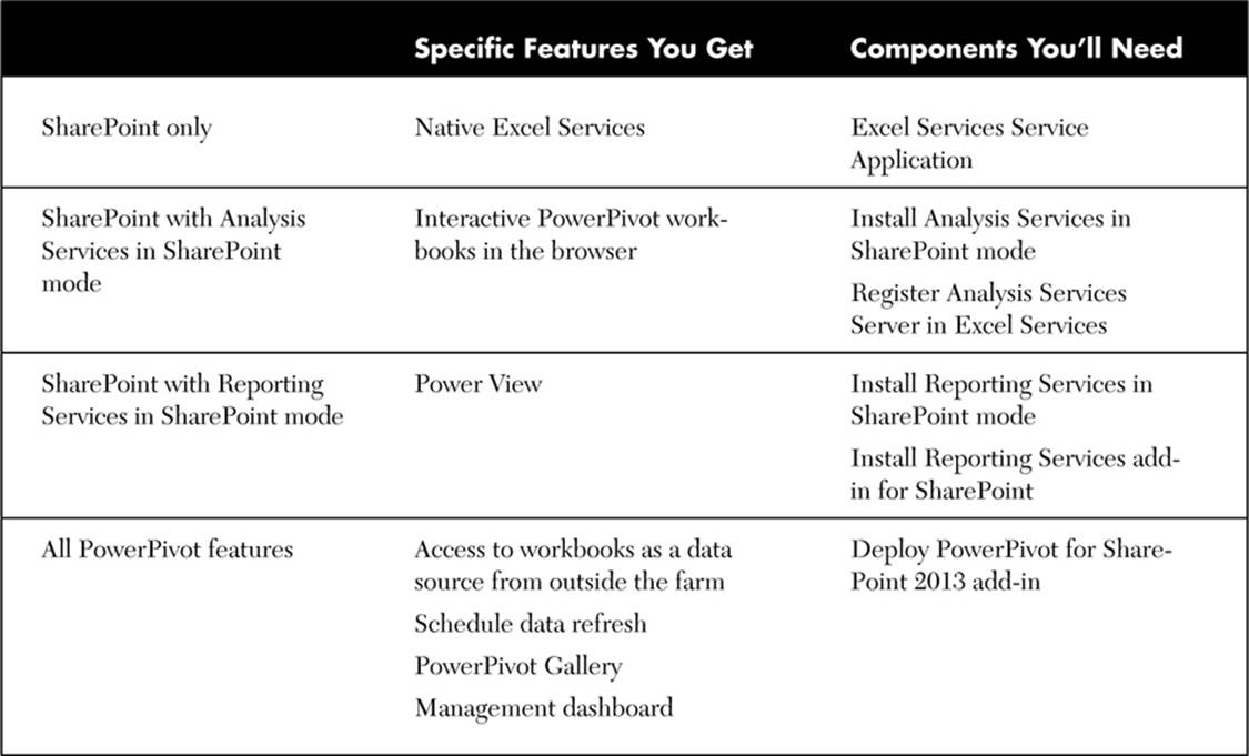
Table 18-2 Key SharePoint and SQL Server Features and Components
Excel BI (Client Features)
In SharePoint 2013, Excel BI offers certain new features to support business intelligence applications. These include the following:
![]() In-Memory BI Engine (IMBI). The in-memory multidimensional data analysis engine allows for almost instant analysis of millions of rows and is a fully integrated feature in the Excel 2013 client.
In-Memory BI Engine (IMBI). The in-memory multidimensional data analysis engine allows for almost instant analysis of millions of rows and is a fully integrated feature in the Excel 2013 client.
![]() Power View add-in for Excel. Power View enables users to visualize and interact with modeled data by using highly interactive visualizations, animations, and smart querying. Users can present and share insights with others through rich storyboard presentation capabilities.
Power View add-in for Excel. Power View enables users to visualize and interact with modeled data by using highly interactive visualizations, animations, and smart querying. Users can present and share insights with others through rich storyboard presentation capabilities.
![]() Decoupled PivotChart and PivotTable reports. Users can now create PivotChart reports without having to include a PivotTable report on the same page.
Decoupled PivotChart and PivotTable reports. Users can now create PivotChart reports without having to include a PivotTable report on the same page.
Excel Services (Server Features)
Excel Services offers new features to support business intelligence applications. These include:
![]() Data exploration improvements. People can more easily explore data and conduct analysis in Excel Services reports that use SQL Server Analysis Services data or PowerPivot data models. For example, users can point to a value in a PivotChart or PivotTable report and see suggested ways to view additional information. Users can also use commands such as Drill Down to conduct analysis. Users can also apply the Drill Down command by using a single mouse click.
Data exploration improvements. People can more easily explore data and conduct analysis in Excel Services reports that use SQL Server Analysis Services data or PowerPivot data models. For example, users can point to a value in a PivotChart or PivotTable report and see suggested ways to view additional information. Users can also use commands such as Drill Down to conduct analysis. Users can also apply the Drill Down command by using a single mouse click.
![]() Field list and field well support. Excel Services enables people to easily view and change which items are displayed in rows, columns, values, and filters in PivotChart reports and PivotTable reports that have been published to Excel Services.
Field list and field well support. Excel Services enables people to easily view and change which items are displayed in rows, columns, values, and filters in PivotChart reports and PivotTable reports that have been published to Excel Services.
![]() Calculated measures and members. Excel Services supports calculated measures and calculated members that are created in Excel.
Calculated measures and members. Excel Services supports calculated measures and calculated members that are created in Excel.
![]() Enhanced timeline controls. Excel Services supports timeline controls that render and behave as they do in the Excel client.
Enhanced timeline controls. Excel Services supports timeline controls that render and behave as they do in the Excel client.
![]() Application BI servers. Administrators can specify SQL Server Analysis Services servers to support more advanced analytic capabilities in Excel Services.
Application BI servers. Administrators can specify SQL Server Analysis Services servers to support more advanced analytic capabilities in Excel Services.
![]() Business Intelligence Center update. The Business Intelligence Center site template has been streamlined. It not only has a new look, but it is also easier to use.
Business Intelligence Center update. The Business Intelligence Center site template has been streamlined. It not only has a new look, but it is also easier to use.
PerformancePoint Services
Those who tried using PerformancePoint Services in SharePoint 2010 might have been a bit disappointed by some of the bugs in the product—we were.
PerformancePoint Services in SharePoint 2013 is vastly improved. In short, PerformancePoint Services is a performance management tool that an organization can leverage to monitor and analyze its business. In an earlier section, we talked about building dashboards and scorecards for graphical presentations of key decision-making data. In SharePoint Enterprise, the definition, construction, and management of dashboards and scorecards are done with PerformancePoint Services. The high-value proposition here is that because PerformancePoint Services provides a rich and easy-to-use way to construct dashboards, scorecards, and KPIs, and SharePoint offers a natural presentation tier for this data, the bar has been raised on the business intelligence capabilities that can be originated within SharePoint. Remember, we talked earlier about using SharePoint to store reports or present information gathered in other places, like Excel. With PerformancePoint Services, we’re actually talking about a front-to-back business intelligence solution that offers a full range of tools for gathering, analyzing, and presenting corporate metrics—all for any data source.
How Does PerformancePoint Services Work?
PerformancePoint Services stores its data in SharePoint document libraries and lists. Because of this, it can naturally take advantage of the features that exist natively with SharePoint, the most compelling being security integration. Very much like Excel Services, PerformancePoint Services is a service within SharePoint 2013 that is integrated with the SharePoint software; when you have the Enterprise version of SharePoint 2013 enabled in your environment, you have full access to the capabilities of PerformancePoint without having to install or configure anything new, aside from a client tool that helps create and display key reports and dashboards.
Why Use PerformancePoint Services?
PerformancePoint Services is specifically targeted as a performance management solution. Performance management allows business users to monitor and analyze their businesses by presenting key data and metrics that can facilitate change (from business process to product development to staffing).
With PerformancePoint Services:
![]() An organization can use a single platform for “pushing” key business metrics to all employees. The “outreach” component of the PerformancePoint Services tool (and thus SharePoint) is very important in that a company can get data in the hands of decision makers of all levels more quickly and efficiently.
An organization can use a single platform for “pushing” key business metrics to all employees. The “outreach” component of the PerformancePoint Services tool (and thus SharePoint) is very important in that a company can get data in the hands of decision makers of all levels more quickly and efficiently.
![]() Individual business users can take advantage of metrics presented via PerformancePoint Services as one component of their collective business activities, meaning that it can be integrated with native collaborative tools in SharePoint to offer context and execution outside the data that is shown.
Individual business users can take advantage of metrics presented via PerformancePoint Services as one component of their collective business activities, meaning that it can be integrated with native collaborative tools in SharePoint to offer context and execution outside the data that is shown.
![]() IT can provide the business with a single tool for showcasing data that has been aggregated through a master repository such as a data warehouse. By using a tool like SharePoint, which is already highly leveraged for collaboration and communication, IT has fewer systems to support and less effort associated with monitoring and training users in diverse business applications.
IT can provide the business with a single tool for showcasing data that has been aggregated through a master repository such as a data warehouse. By using a tool like SharePoint, which is already highly leveraged for collaboration and communication, IT has fewer systems to support and less effort associated with monitoring and training users in diverse business applications.
PerformancePoint Services provides all of the functionality needed for performance management, including scorecards, dashboards, management reporting, and analytics. Reporting is also integrated with PerformancePoint Services to provide planning, budgeting, and forecasting output. As mentioned before, all of this is done within the context of an existing SharePoint environment, offering business users a single interface for collaboration and analysis. The main advantage of PerformancePoint Services is that users can see more robust scorecards and dashboards and then click a metric to drill down to sub-dashboards or even the raw data.
Visio Services
What does Visio have to do with business intelligence? Well, if you recall an earlier definition that stated business intelligence is mostly about “telling a story” with few words, then showing information in Visio diagrams is just as impactful. Business users have used Microsoft Visio for some time to represent corporate data. One of the challenges, however, has been that not all content consumers had Visio on their desktops, so distribution of Visio charts was sometimes a challenge. Visio Services operates very much the same way as Excel Services or PerformancePoint Services in that it acts as a service in the context of a SharePoint environment and provides a view of the information in a browser-friendly format.
Why Use Visio Services?
There are three main benefits to using Visio Services:
![]() A business user can share a presentation of data created in Microsoft Visio in the browser without requiring the content consumer to have Visio installed on his or her desktop.
A business user can share a presentation of data created in Microsoft Visio in the browser without requiring the content consumer to have Visio installed on his or her desktop.
![]() Once a diagram from Visio has been deployed, information can be refreshed so that changes made in Visio can automatically be refreshed in the browser presentation. This is great for workflow visualization, for example.
Once a diagram from Visio has been deployed, information can be refreshed so that changes made in Visio can automatically be refreshed in the browser presentation. This is great for workflow visualization, for example.
![]() Much like Excel Services and PerformancePoint Services, Visio diagrams can be shown in the context of an already familiar SharePoint environment.
Much like Excel Services and PerformancePoint Services, Visio diagrams can be shown in the context of an already familiar SharePoint environment.
Visio Services supports diagrams connected to one or more of the following data sources:
![]() SQL Server
SQL Server
![]() SharePoint lists
SharePoint lists
![]() Excel workbooks that are stored in SharePoint
Excel workbooks that are stored in SharePoint
![]() Any ODBC data source that you can normally connect to
Any ODBC data source that you can normally connect to
Visio Services is an effective tool that offers business users an easy way to share diagrams. Because it operates as a service within SharePoint, Visio Services has a very low overhead for IT in terms of management and support. It is important to remember that Visio Services does require both the Enterprise version of SharePoint 2013 for presentation and Microsoft Visio 2013 on the desktop of users who will create diagrams that will be published to SharePoint.
Putting It All Together
At this point, you should have an appreciation for how dashboards and scorecards (and perhaps even Visio diagrams) can be used within SharePoint through Excel Services, PerformancePoint Services, and Visio Services. But what are the benefits of these technologies?
The business benefits of using Excel Services are many. When an analyst can take a key set of charts based on Excel spreadsheets into the portal for wider consumption, he or she is able to inform the organization in ways that are not always possible when a spreadsheet is distributed by e-mail. Having a single place where a spreadsheet is stored and can be viewed by the people who are allowed to see it ensures that everyone is getting the same message. Is the spreadsheet that you e-mailed to me on Tuesday the right one, or is it the one that Bob said he got from you on Wednesday? What changed? Do I need to compare the two? If it’s in only one place, there is only one answer. In addition, Excel Services allows an analyst to control and protect the published information. The user is not simply uploading a spreadsheet into a document library; a subset of the data is shared in a controlled and secure manner.
PerformancePoint Services can provide an additional visual layer on top of large amounts of information. Are we trending up or down? Are we more productive or less? Again, with a single glance, you can tell. If you see a problem, you can click on the indicator and see what’s driving the trend, and most important, you can then do something about it in an informed way. It’s all about what the numbers mean, not what the numbers are. There’s a reason that visual representations are more helpful than long lists of numbers. With a single glance, you can tell whether things are good, not so good, or bad.
Visio Services offers the ability to present business intelligence data in a diagram format. Think of the presentation of a business process (or workflow) now integrated with back-end data that shows performance at each phase in the process. That is a very compelling presentation that is not easily done with a chart or scorecard or dashboard. That’s where Visio adds another layer of value.
As you start to think about how all this hangs together and how you might deploy business intelligence solutions in your organization using SharePoint, keep a few things in mind:
![]() Understand your strategy. Many times dashboards and scorecards can enforce exactly the opposite behavior from what is intended. Think about a scorecard that tracks the number of new accounts. What is going to happen to your existing accounts? Will they get neglected inadvertently? Isolating your metrics without respect for the overall picture can potentially have an adverse impact somewhere else. Make sure it is all strategic and will influence the right behavior.
Understand your strategy. Many times dashboards and scorecards can enforce exactly the opposite behavior from what is intended. Think about a scorecard that tracks the number of new accounts. What is going to happen to your existing accounts? Will they get neglected inadvertently? Isolating your metrics without respect for the overall picture can potentially have an adverse impact somewhere else. Make sure it is all strategic and will influence the right behavior.
![]() Keep it simple. Giving people hundreds of metrics to watch regularly will hide the important messages. Decide which metrics (or more likely a combination of metrics) indicate good performance and use those. Build up a high-level dashboard or scorecard for general consumption, listen to what people find helpful or not, and go from there. Don’t try to build the be-all and end-all solution from Day 1.
Keep it simple. Giving people hundreds of metrics to watch regularly will hide the important messages. Decide which metrics (or more likely a combination of metrics) indicate good performance and use those. Build up a high-level dashboard or scorecard for general consumption, listen to what people find helpful or not, and go from there. Don’t try to build the be-all and end-all solution from Day 1.
![]() Expect things to change. When the novelty wears off, dashboards can get dull. They need to evolve both to keep people’s focus but also to reflect any changes in the organization’s underlying strategy or business processes. Having agility in your dashboard and scorecard development capabilities will translate into agility against your competition and in the marketplace.
Expect things to change. When the novelty wears off, dashboards can get dull. They need to evolve both to keep people’s focus but also to reflect any changes in the organization’s underlying strategy or business processes. Having agility in your dashboard and scorecard development capabilities will translate into agility against your competition and in the marketplace.
![]() Make sure the data is accurate. A dashboard or scorecard is useless (and dangerous) if it’s wrong. Ensure that data delivery is complete and accurate. Remember, this presentation is driving business decisions.
Make sure the data is accurate. A dashboard or scorecard is useless (and dangerous) if it’s wrong. Ensure that data delivery is complete and accurate. Remember, this presentation is driving business decisions.
![]() Target an audience. A dashboard tells a story. That story is specific to certain data elements and is presented to convey a certain message. Keep the messaging focused and target a specific set of users. If dashboard viewers want more metrics, maybe a new dashboard is required.
Target an audience. A dashboard tells a story. That story is specific to certain data elements and is presented to convey a certain message. Keep the messaging focused and target a specific set of users. If dashboard viewers want more metrics, maybe a new dashboard is required.
![]() Business intelligence, especially in SharePoint, is not about “one size fits all.” Know your users and target the right presentation of corporate data with the one that tells the story in the easiest and most useful way. For example, if you want to stress the number of new clients acquired in a given quarter, your charts and graphs should emphasize growth—so use a bar graph, not a pie chart. Take advantage of the robustness and integration that SharePoint offers to map the solutions one-to-few (versus one-for-all). Provide a generic data source and teach people how to make their own reports—doing so will empower business users without overburdening IT.
Business intelligence, especially in SharePoint, is not about “one size fits all.” Know your users and target the right presentation of corporate data with the one that tells the story in the easiest and most useful way. For example, if you want to stress the number of new clients acquired in a given quarter, your charts and graphs should emphasize growth—so use a bar graph, not a pie chart. Take advantage of the robustness and integration that SharePoint offers to map the solutions one-to-few (versus one-for-all). Provide a generic data source and teach people how to make their own reports—doing so will empower business users without overburdening IT.
Key Points
Bringing business intelligence to your knowledge workers is a key feature of SharePoint. Features such as SSRS report delivery, Excel Services, Excel BI, and PerformancePoint Services provide fantastic ways to harness and distribute analytics information. When using SharePoint for business intelligence, remember these key points:
![]() BI is the art and science of transforming data and information into knowledge and wisdom; it requires both attention to detail and big-picture thinking.
BI is the art and science of transforming data and information into knowledge and wisdom; it requires both attention to detail and big-picture thinking.
![]() Dashboards are used to present a summary of information, typically in real time, on how certain measures are performing against tactical goals—typically with a collection of charts, KPIs, and report snippets.
Dashboards are used to present a summary of information, typically in real time, on how certain measures are performing against tactical goals—typically with a collection of charts, KPIs, and report snippets.
![]() Scorecards are typically used to show how an organization is performing against strategic goals by using KPIs.
Scorecards are typically used to show how an organization is performing against strategic goals by using KPIs.
![]() KPIs are a simple way to map business metrics to existing data values to provide a green/yellow/red presentation of performance.
KPIs are a simple way to map business metrics to existing data values to provide a green/yellow/red presentation of performance.
![]() Excel Services empowers business users to publish Excel-based content in an environment that offers visibility without compromising security.
Excel Services empowers business users to publish Excel-based content in an environment that offers visibility without compromising security.
![]() PowerPivot is a component within Excel BI that enables the ability to work with millions of rows of data in a fast, efficient manner.
PowerPivot is a component within Excel BI that enables the ability to work with millions of rows of data in a fast, efficient manner.
![]() PerformancePoint Services allows you to create more advanced business intelligence presentations and to create and manage metrics for scorecards, dashboards, and KPIs, all with drill-down capabilities.
PerformancePoint Services allows you to create more advanced business intelligence presentations and to create and manage metrics for scorecards, dashboards, and KPIs, all with drill-down capabilities.
![]() Visio Services allows users to publish Visio diagrams to a browser and to connect those diagrams to corporate data, thus providing a different type of business intelligence solution.
Visio Services allows users to publish Visio diagrams to a browser and to connect those diagrams to corporate data, thus providing a different type of business intelligence solution.