Responsive Theming for Drupal (2014)
Chapter 3. A Short Primer on Sass and Compass
Any conversation about responsive design would be remiss to leave out Sass and Compass. These little guys have slowly crept their way into the Drupal world (thankfully) and we’ll go into more detail about that in the next chapter. But first, you (being the astute reader that you are) might find yourself wondering what these words mean. Worry not—it’s actually pretty simple:
Sass
Sass stands for “Syntactically Awesome Stylesheets” and it can be an absolute godsend to anyone who writes a good bit of CSS. It’s basically an extension of CSS that adds some great features on top of it and smartly compiles down to regular old CSS so that the browser doesn’t know the difference. Some of the nicer parts include nested rules, variables, and mixins, but it brings a lot more than just that to the table.
SCSS
There are two basic flavors of Sass: Sass (the original) and SCSS (the more CSS-ish alternative). The difference is that SCSS looks and feels a lot like CSS (and any valid CSS is also valid SCSS since it’s just a superset of CSS), whereas Sass has a completely different syntax. Sass, like its older brother Haml, uses indentation rather than sticking with curly braces and semicolons to identify blocks. SCSS tends to be more comfortable for those familiar with CSS (which is why the examples in this book use it), but Sass is a little more concise and easily readable once you get used to it.
Compass
Compass takes things even further. It’s a framework built on top of Sass that adds a ton of helpers, pre-build mixins, layout tools, and lots of other cool stuff. It’s also a command-line tool (a Ruby gem, specifically) that can watch your Sass files for changes, and automatically compile raw CSS for the browser on the fly.
Installation of Sass/Compass
Before you can do anything fun with Sass/Compass, you’ll need to install it to your computer or server first. This should be done wherever you develop; if you develop in a virtual machine (VM), then you’ll want to install them there.
The steps required depend on your OS.
Windows users need to first install Ruby using RubyInstaller and can then open up a Ruby command prompt and run:
gem install compass
OS X users already have Ruby installed, so all you need to do is open up a Terminal window and run:
sudo gem install compass
Linux users, being naturally intelligent and good looking, know that installation depends on the distribution you’re using. Here are Ubuntu instructions if that’s your flavor:
sudo apt-get install ruby-full rubygems1.8
sudo gem install sass
sudo gem install compass
Otherwise, you’ll likely want to Google “install compass <distroname>” to find distro-specific instructions.
All that said, it’s worth noting that there are some easier-to-use GUI solutions that can automate installation for you as well as provide some nice features such as automatic browser reloading. Here are a few worth checking out:
§ Scout: Available for Windows and Mac. Free.
§ Compass.app: Available for Windows, Mac, and Linux. Currently costs $10.
§ CodeKit: Mac only. Currently costs $28.
Learning Your Way Around Sass/Compass
To start, it’s important to get a feel for the cool stuff you can do with Sass. To do this, we will take a chunk of raw CSS and rewrite it with SCSS. Here’s our fairly basic-looking CSS:
.nav {
background: #131313;
border: 1px solid #fafafa;
}
.nav ul {
list-style-type: none;
}
.nav ul li {
margin: 0;
padding: 0;
display: inline;
background: #fafafa;
}
.nav ul li a {
color: #131313;
}
So let’s identify some crappy CSS-isms of this code.
§ There are hardcoded hex colors repeated in different places.
§ Selectors get long and repetitive once you’re a few levels deep.
§ There are some repeated declarations in both the second and third rules.
Let’s convert it to SCSS and see how it can be improved. First, we can rewrite the code, taking advantage of Sass’s nesting support:
.nav {
background: #131313;
border: 1px solid #fafafa;
ul {
list-style-type: none;
li {
margin: 0;
padding: 0;
display: inline;
background: #fafafa;
a {
color: #131313;
}
}
}
}
Whew, that really cleaned things up! Now let’s see what we can do about those hardcoded colors:
$lightgray: #fafafa;
$darkgray: #131313;
.nav {
background: $darkgray;
border: 1px solid $lightgray;
ul {
list-style-type: none;
li {
margin: 0;
padding: 0;
display: inline;
background: $lightgray;
a {
color: $darkgray;
}
}
}
}
Nice! Now we can add those colors to more elements without having to memorize or copy/paste the hex value. And if we need to change one of them sitewide, we’re only changing it in one place.
How about taking advantage of some Compass goodies for common tasks, such as forcing the <ul> to be laid out horizontally?
$lightgray: #fafafa;
$darkgray: #131313;
.nav {
background: $darkgray;
border: 1px solid $lightgray;
ul {
@include inline-list; /* Yay! See below. */
li {
background: $lightgray;
a {
color: $darkgray;
}
}
}
}
The awesomeness that is inline-list is a mixin from Compass that outputs the CSS necessary to make a list appear inline. Specifically, this is what you get:
@mixin inline-list {
list-style-type: none;
&, & li {
margin: 0px;
padding: 0px;
display: inline; } }
Feeling the Power
The previous section covered just the tiniest tip of the Sass/Compass iceberg. Let’s see some of the other things we can take advantage of.
Let Sass Calculate Your Colors For You
How often do you need to make a link or button a little bit darker when hovered? Instead of opening up a color picker to find a slightly darker color, do something like this:
button, .button {
background: $color-purple;
&:hover {
background: darken($color-purple, 20%);
}
}
Or maybe you’re looking to build a quick color palette without the manual work? Give this a try:
$color-primary: #bada55;
$color-secondary: complement($color-primary);
There are lots of useful Sass functions to check out.
Generate CSS Image Sprites with Compass
Compass can build an image sprite out of a directory of images, generate the SCSS needed to make use of it, and even update things as images in the directory are added/removed/modified.
Is your mind fully blown yet? If not, maybe you’d be interested to know that it can automatically generate active, target, and hover selectors once you append those words to the images’ filenames.
Write Your Own Mixins
Anything from time-savers like combining width and height into the same property to full-blown, awesome-looking speech bubbles can be stuck into a mixin and reused wherever you’d like. Mixins can even take parameters, such as telling it which corner should anchor the arrow on the speech bubble.
Here’s one of my favorites. Can you tell what it does?
@mixin vendorize($property, $value) {
-webkit-#{$property}: $value;
-moz-#{$property}: $value;
-ms-#{$property}: $value;
-o-#{$property}: $value;
#{$property}: $value;
}
Know Your Plug-ins
If the greatness that Sass and Compass give you just isn’t doing it for you, check out the bevy of plug-ins you can make use of to save even more time. Things like grids, buttons, gradients, and slideshows all have some great plug-ins to drop in. But as always, watch out for bloat!
Again, we’re really just scratching the surface here. Take a gander at the documentation for Sass and the Compass reference to see what else you can take advantage of.
Debugging Notes
A slight downside to using Sass is that the CSS that your browser sees isn’t CSS that you wrote—it’s CSS that was generated from the Sass that you wrote. The reason this is bad is if you inspect an element in your browser’s development tools, the line numbers and code are different than in your Sass source.
For example, say you want to reduce the padding on an element. So you open up Firebug or Chrome’s developer tools and inspect the element. You can see the CSS selector that targets it and the rule that sets the padding, and you can change it within the dev tools. But that’s not the same code that’s in your Sass, so you have to figure out where that code is in your source files, or even worse, maybe you’re using a mixin or a variable rather than a raw “padding: 10px” property so that’s another level.
Luckily, this is no longer an issue due to Sass source maps. Chrome is smart enough to connect to your Sass source files and transparently use them instead of the compiled CSS when inspecting elements.
To enable this killer feature, open up the developer tools (F12 or Tools → Developer Tools) and click the settings cog icon at the bottom right, then turn on “Enable CSS source maps” and “Auto-reload generated CSS” (see Figure 3-1).
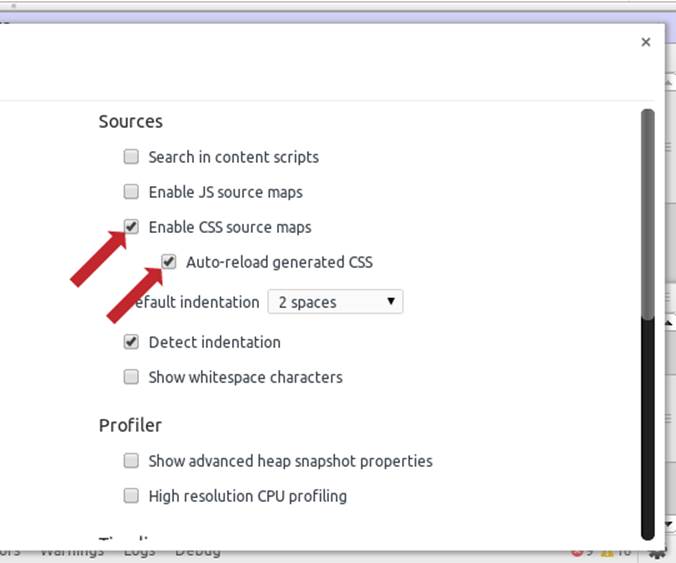
Figure 3-1. Turn on “Enable CSS source maps” and “Auto-reload generated CSS” to enable Sass support
More specifically, what this gives you is the ability to live edit preprocessor source files and view the results without having to leave dev tools or refresh the page. When inspecting any element, the links provided link to the source (in this case, .scss) files directly rather than the generated CSS files that the browser is actually using (see Figure 3-2).
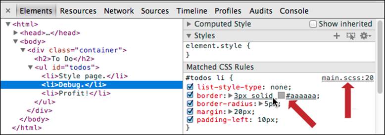
Figure 3-2. Notice that the links to the files are the source .scss files rather than .css
To jump to the source file, you have two options: you can Control + click (or Command + click for Macs) any CSS property name or value to open the source file and jump to the appropriate line for the source of that property; or you can click the provided link to the .scss file, which is to the right of the code block (second arrow in Figure 3-1).
Either way will take you directly to the relevant section of the relevant source file, as illustrated in Figure 3-3:
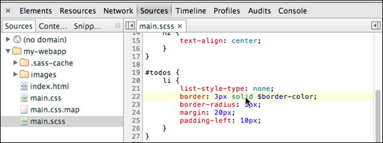
Figure 3-3. You’re able to go straight to the Sass source file rather than the CSS file that the browser uses
Moving Right Along
And there we have it—Sass and Compass are really not tough nuts to crack. And once you’ve cracked them, oh what a world you’ve found. In the next chapter, we’ll apply these technologies to Drupal using the Aurora theme.