Test Scoring and Analysis Using SAS (2014)
Chapter 5. Classical Item Analysis
Introduction
This chapter investigates some traditional methods of determining how well items are performing on a multiple-choice (or true/false) test. A later chapter covers advances in item response theory.
Point-Biserial Correlation Coefficient
One of the most popular methods for determining how well an item is performing on a test is called the point-biserial correlation coefficient. Computationally, it is equivalent to a Pearson correlation between an item response (correct=1, incorrect=0) and the test score for each student. The simplest way for SAS to produce point-biserial coefficients is by using PROC CORR. Later in this chapter, you will see a program that computes this value in a DATA step and displays it in a more compact form than PROC CORR. The following program produces correlations for the first 10 items in the statistics test described in Chapter 2.
Program 5.1: Computing Correlations Between Item Scores and Raw Scores
title "Computing Point-Biserial Correlations";
proc corr data=score nosimple;
var Score1-Score10;
with Raw;
run;
When you supply PROC CORR with a VAR statement and a WITH statement, it computes correlations between every variable listed on the VAR statement and every variable listed on the WITH statement. If you only supply a VAR statement, PROC CORR computes a correlation matrix—the correlation of every variable in the list with every other variable in the list.
Output from Program 5.1:
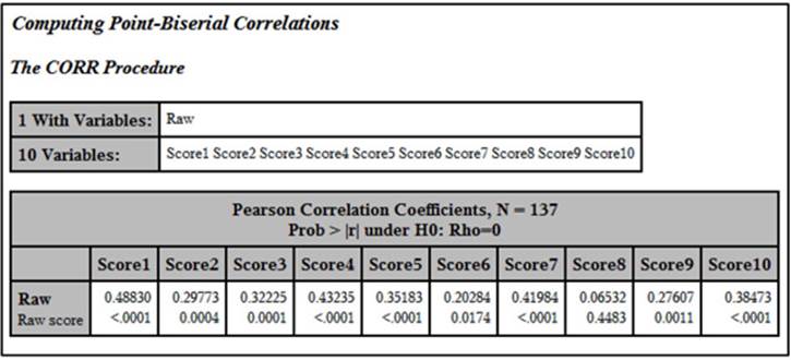
The top number in each box is the correlation between the item and the raw test score, referred to as a point-biserial correlation coefficient. The number below this is the p-value (significance level). How do you interpret this correlation? One definition of a "good" item is one where good students (those who did well on the test) get the item correct more often than students who do poorly on the test. This condition results in a positive point-biserial coefficient. Since the distribution of test scores is mostly continuous and the item scores are dichotomous (0 or 1), this correlation is usually not as large as one between two continuous variables. What does it tell you if the point-biserial correlation is close to 0? It means the "good" and "poor" students are doing equally well answering the item, meaning that the item is not helping to discriminate between good and poor students. What about negative coefficients? That situation usually results from several possible causes: One possibility is that there is a mistake in the answer key—good students are getting it wrong quite frequently (they are actually choosing the correct answer, but it doesn't match the answer key) and poor students are guessing their answers and getting the item right by chance. Another possibility is a poorly written item that good students are “reading into” and poor students are not. For example, there might be an item that uses absolutes such as "always" or "never" and the better students can think of a rare exception and do not choose the answer you expect. A third possibility is that the item is measuring something other than, or in addition to, what you are interested in. For example, on a math test, you might have a word problem where the math is not all that challenging, but the language is a bit subtle. Thus, students with better verbal skills are getting the item right as opposed to those with better math skills. Sometimes an answer that you thought was incorrect might be appealing to the better students, and upon reflection, you conclude, “Yeah, that could be seen as correct.” There are other possibilities as well, which we will explore later.
Making a More Attractive Report
Although the information in the previous output has all the values you need, it is hard to read, especially when there are a lot of items on the test. The program shown next produces a much better display of this information.
Program 5.2: Producing a More Attractive Report
proc corr data=score nosimple noprint
outp=corrout;
var Score1-Score10;
with Raw;
run;
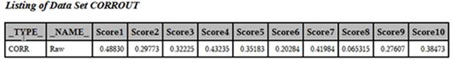
The first step is to have PROC CORR compute the correlations and place them in a SAS data set. To do this, you use an OUTP= procedure option. This places information about the selected variables, such as the correlation coefficients and the means, into the data set you specify with this option. The NOPRINT option is an instruction to PROC CORR that you do not want any printed output, just the data set. Here is a listing of data set CORROUT:
Listing of Data Set CORROUT
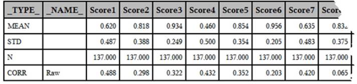
Note: The last few columns were deleted to allow the table to fit better on the page.
This data set contains the mean, the standard deviation, N, and a correlation for each of the Score variables. The SAS created variable, _TYPE_, identifies which of these values you are looking at—the variable _NAME_ identifies the name of the WITH variable. In this example, you are only interested in the correlation coefficients. An easy way to subset the CORROUT data so that it only contains correlation coefficients is with a WHERE= data set option following the data set name. The following program is identical to Program 5.2 with the addition of the WHERE= data set option. Here is the modified program, followed by a listing of the CORROUT data set:
Program 5.3: Adding a WHERE= Data Set Option to Subset the SAS Data Set
proc corr data=score nosimple noprint
outp=corrout(where=(_type_='CORR'));
var Score1-Score10;
with Raw;
run;
By using the WHERE= data set option, you now have only the correlation data in the output data set.
Listing of Data Set CORROUT (Created by Program 5.3)
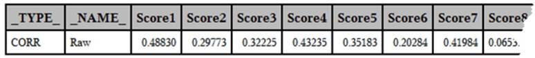
Note: The last few columns were deleted to allow the table to fit better on the page.
Program 5.3 is a good example of programming efficiently—using a WHERE= data set option when the data set is being created rather than writing a separate data set to create the subset.
The Next Step: Restructuring the Data Set
The next step in creating your report is to restructure (transpose) the data set above into one with one observation per item. Although you could use PROC TRANSPOSE to do this, an easier (at least to these authors) method is to use a DATA step, as follows:
Program 5.4: Restructuring the Correlation Data Set to Create a Report
data corr;
set corrout;
array Score[10];
do Item=1 to 10;
Corr = Score[Item];
output;
end;
keep Item Corr;
run;
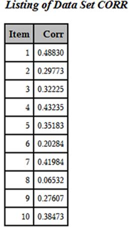
You read in one observation from data set CORROUT and, inside the DO loop, you write out one observation for each of the 10 correlations. The newly created data set (CORR) looks like this:
Listing of Data Set CORR
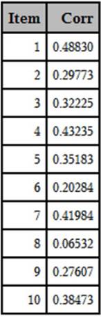
You now have the 10 point-biserial coefficients in a more compact, easier-to-read format. In a later section, this information is combined with item frequencies in a single table.
Displaying the Mean Score of the Students Who Chose Each of the Multiple Choices
One interesting way to help you determine how well your items are performing is to compute the mean score for all of the students choosing each of the multiple-choice items.
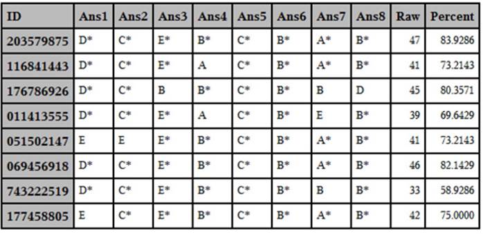
To demonstrate this, let’s start out with test data from a real test (a biostatistics test taken by students at a medical school in New Jersey—all the IDs have been replaced with random digits). A listing of the first 10 students with responses to the first eight items on the test are shown below:
Listing of the First Eight Items for 10 Students
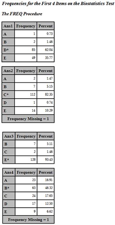
In this data set, the correct answer choice includes the letter (A through E) followed by an asterisk (as described in Chapter 3). You can run PROC FREQ on the answer variables like this. (Note: Frequencies for only the first four items were requested to limit the size of the output.)
Program 5.5: Using PROC FREQ to Determine Answer Frequencies
title "Frequencies for the First 4 Items on the Biostatistics Test";
proc freq data=score;
tables Ans1-Ans4 / nocum;
run;
You now have answer frequencies with the correct answer to each item displayed with an asterisk.
Answer Frequencies for the First Four Items on the Biostatistics Test
The next step is to compute the mean score for all students who chose each of the multiple-choice answers. To do this, you must first restructure the SCORE data set so that you have one observation per student per item. The program to accomplish this restructuring is displayed next:
Program 5.6: Restructuring the Score Data Set with One Observation per Student per Question
data restructure;
set score;
array Ans[*] $ 2 Ans1-Ans10;
do Item=1 to 10;
Choice=Ans[Item];
output;
end;
keep Item Choice Percent;
run;
For each observation in the SCORE data set, you output 10 observations in the RESTRUCTURE data set, one observation for each item. Here are the first few observations in the RESTRUCTURE data set:
First 20 Observations in Data Set RESTRUCTURE
Using this data set, you can now compute the mean score for all students who chose each of the answers. You can use PROC MEANS to do this, using the item number and the answer choice as class variables. That is, you want to compute the mean value of Percent for each combination of Item and Class. Here is the code:
Program 5.7: Using PROC MEANS to Compute the Mean Percent for Each Combination of Item and Choice
proc means data=restructure mean std maxdec=2;
class Item Choice;
var Percent;
run;
The resulting output is listed next (only the first few values are displayed here):
Output from Program 5.7
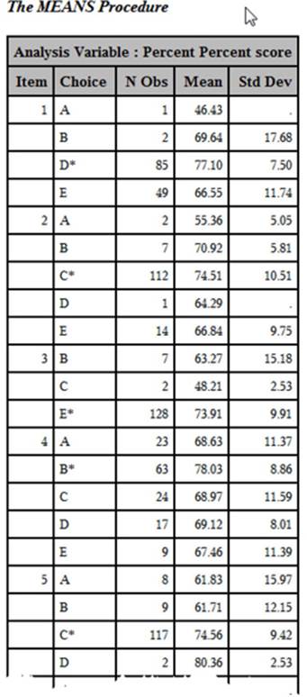
In each of the first four items, the mean score of all students choosing the right answer is higher than for any other choice. However, you can see that students choosing B for item two have a mean score (70.92) almost as high as that for students choosing the correct answer (C average score = 74.51). You might want to examine choice D to see if you want to make changes.
Combining the Mean Score per Answer Choice with Frequency Counts
To make the above display even more useful, you can combine the mean score per answer choice with the answer frequencies. The best way to do this is with PROC TABULATE. This SAS procedure can combine statistical and frequency data in a single table. The PROC TABULATE statements are shown in the next program:
Program 5.8: Using PROC TABULATE to Combine Means Scores and Answer Frequencies
proc format;
picture pct low-<0=' ' 0-high='009.9%';
run;
title "Displaying the Student Mean Score for Each Answer Choice";
proc tabulate data=restructure;
class Item Choice;
var Percent;
table Item*Choice,
Percent=' '*(pctn<Choice>*f=pct. mean*f=pct.
std*f=10.2) / rts=20 misstext=' ';
keylabel all = 'Total'
mean = 'Mean Score' pctn='Freq'
std = 'Standard Deviation';
run;
The picture format in this program prints percentages to a tenth of a percent and adds the percent sign to the value. Two class variables, Item and Choice, are used to show statistics and counts for each combination of Item and Choice (the same as with PROC MEANS, described earlier). The VAR statement lists all the variables for which you want to compute statistics. Because you want to see the mean percentage score for each item and choice, you list Percent on the VAR statement. Finally, the TABLES statement defines the rows and columns in the table. We will skip some details and only indicate that the rows of the table contain values of Choice nested within Item and the columns of the table contain percentages (the keyword PCT does this), means, and standard deviations. The remainder of the statements select formats for the various values as well as labels that you want to associate with each statistic. The resulting table is shown next:
Output from Program 5.8 (Partial Listing)
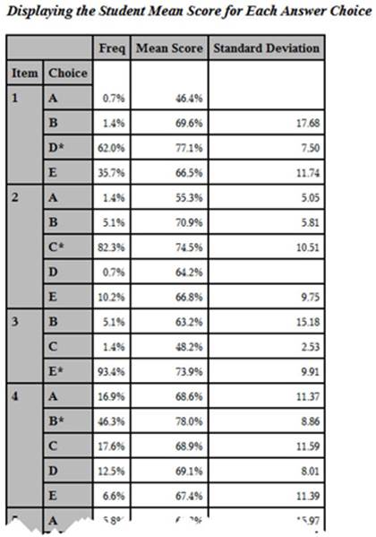
You now have the answer frequencies and the student mean scores for each answer choice for each item on the test in a single table. Take a look at item one. Notice that the students who answered this item correctly (answer D) had a mean test score of 77.10, which is higher than the mean test score for any of the incorrect responses.
Later sections of this chapter will build on this and add even more item information in a single table.
Computing the Proportion Correct by Quartile
Besides inspecting the point-biserial correlations (a single number), you will gain more insight into how an item is performing by dividing the class into quantiles. The number of quantiles will depend on how many students took the test—if you have a relatively small sample size, you may only want three or four quantiles. For much larger samples, you may want as many as six. Once you have divided the class into quantiles, you can then compute the proportion of students answering an item correctly in each quantile. What you hope to see is the proportion correct increasing, going from the lowest quantile to the highest. You can examine the proportions correct by quantile in tabular form or produce a graphical plot of this information. Such a plot is called an item characteristic curve.
In this example, you are going to use a 56-item statistics test administered to 137 students. For this sample size, dividing the class into quartiles (four groups) works well. You can use the SAS RANK procedure to divide a data set into any number of groups. Here is the first step:
Program 5.9: Dividing the Group into Quartiles
*Dividing the group into quartiles;
proc rank data=score(keep=Raw Score1-Score10) groups=4 out=quartiles;
var Raw;
ranks Quartile;
run;
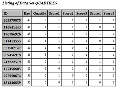
You use the GROUPS= option to tell PROC RANK to divide the data set into four groups, based on the value of the variable Raw. The RANKS statement names the variable that will contain the group numbers. For some completely unknown reason, when you ask PROC RANK to create groups, it numbers the groups starting from 0. Because you are requesting four groups, the variable Quartile will have values from 0 to 3, as shown below:
Output from Program 5.9 (First 10 Observations)
You can now compute the mean score for each quartile, like this:
Program 5.10: Computing the Mean Scores by Quartile
title "Mean Scores by Quartile - First 10 Items";
proc means data=quartiles mean maxdec=2;
class Quartile;
Var Score1-Score10;
run;
Here is the output:
Output from Program 5.10
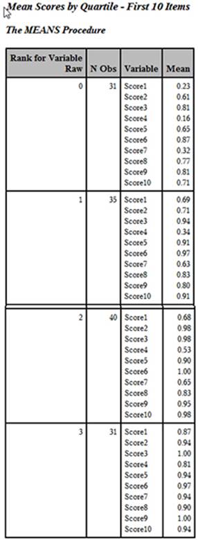
Although this listing contains the mean score for each of the four quartiles for the first 10 items on the test, the layout is inconvenient. You would rather see each item in order, with the percent correct by quartile displayed on a single line. The program to restructure and combine the answer frequencies for each of the test items, the item difficulty, the point-biserial coefficient, and the proportion correct by quartile is the subject of the next section.
Combining All the Item Statistics in a Single Table
In order to demonstrate this final program, the data from the 56-item statistics test is used. However, only the first 10 items on the test are analyzed (to reduce the size of the generated reports). The scores used to divide the class into quartiles are based on all 56 items.
The programming to combine all of the item statistics into a single table takes a number of steps and is not for the faint of heart. You can skip right to the output and its interpretation if you wish. For those readers who want to understand the programming details, the program contains callouts that link to descriptions following the program.
Program 5.11: Combining All the Item Statistics in a Single Table
%let Nitems=56; ➊
data score;
infile 'c:\books\test scoring\stat_test.txt' pad;
array Ans[&Nitems] $ 1 Ans1-Ans&Nitems; *Student Answers;
array Key[&Nitems] $ 1 Key1-Key&Nitems; *Answer Key;
array Score[&Nitems] 3 Score1-Score&Nitems; *1=right,0=wrong;
retain Key1-Key&Nitems;
if _n_=1 then input @11 (Key1-Key&Nitems)($1.);
input @1 ID $9.
@11 (Ans1-Ans&Nitems)($1.);
do Item = 1 to &Nitems;
Score[Item] = Key[Item] eq Ans[Item];
end;
Raw=sum (of Score1-Score&Nitems);
Percent=100*Raw / &Nitems;
keep Ans1-Ans&Nitems Key1-Key&Nitems ID Raw Percent Score1-Score&Nitems;
label ID = 'Student ID'
Raw = 'Raw score'
Percent = 'Percent score';
run;
*Divide the group into quartiles; ➋
proc rank data=score groups=4 out=quartiles;
var Raw;
ranks Quartile;
run;
*Restructure the data set so that you have one item per
observation; ➌
data tab;
set quartiles;
length Choice $ 1 Item_Key $ 5;
array Score[10] Score1-Score10;
array ans[10] $ 1 Ans1-Ans10;
array key[10] $ 1 Key1-Key10;
Quartile = Quartile + 1;
do Item=1 to 10;
Item_Key = cat(right(put(Item,3.))," ",Key[Item]);
Correct=Score[Item];
Choice=Ans[Item];
output;
end;
keep Item Item_Key Quartile Correct Choice;
run;
*Sort by item number; ➍
proc sort data=tab;
by Item;
run;
*Compute correlation coefficients; ➎
proc corr data=score nosimple noprint
outp=corrout(where=(_type_='CORR'));
var Score1-Score10;
with Raw;
run;
*Restructure correlation data set; ➏
data corr;
set corrout;
array Score[10];
do Item=1 to 10;
Corr = Score[Item];
output;
end;
keep Item Corr;
run;
*Combine correlations and quartile information; ➐
data both;
merge corr tab;
by Item;
run;
*Print out final table;
proc tabulate format=7.2 data=both order=internal noseps;
title "Item Statistics";
label Quartile = 'Quartile'
Choice = 'Choices';
class Item_Key Quartile Choice;
var Correct Corr;
table Item_Key = 'Num Key'*f=6. ,
Choice*(pctn<Choice>)*f=3.
Correct=' '*mean='Diff.'*f=percent5.2
Corr=' '*mean='Corr.'*f=5.2
Correct=' '*Quartile*mean='Prop. Correct'*f=percent7.2/
rts=8;
keylabel pctn='%' ;
run;
➊ You start out by scoring the test in the usual way. Instead of hard coding the number of items on the test, you use the macro variable &Nitems and assign the number of items (56) with a %LET statement. Using %LET is another way of assigning a value to a macro variable. There is one other small difference in this program compared to the scoring programs displayed previously: The variables in the Score array are stored in 3 bytes (notice the 3 before the list of variables in this array). Since the values of the Score variables are 0s and 1s, you do not need to store them in 8 bytes (the default storage length for SAS numeric values). Three bytes is the minimum length allowed by SAS.
➋ You use PROC RANK to create a variable (that you call Quartile) that represents quartiles of the Raw score. Remember that the values of Quartile range from 0 to 3. Below are the first few observations from data set QUARTILES (with selected variables displayed):
First Few Observations in Data Set Quartiles (Selected Variables Displayed)
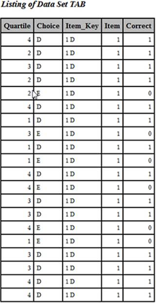
➌ You need to restructure this data set so that there is one observation per test item. That way it can be combined with the correlation data and later displayed in a table with one item per row. In this DATA step, you accomplish several goals. First, you add 1 to Quartile so that the values now range from 1 to 4 (instead of 0 to 3). Next, you create a new variable (Item_Key) that puts together (concatenates, in computer jargon) the item number and the answer key. Each of the item scores (the 0s and 1s) is assigned to the variable Correct. Finally, each answer choice is assigned to a variable you call Choice.
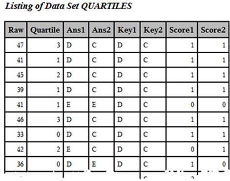
➍ You sort the TAB data set by item (so that you can combine it with the correlation data). Here are the first 20 observations from the sorted data set. Looking at this listing should help you understand step 3:
First 20 Observations from Data Set TAB after Sorting
The mean of the variable Correct for Item would be the proportion of the entire class that answered the item correctly. If you compute the mean for each of the four quartiles of the class, you have the proportion correct by quartile, one of the values you want to display in the final table.
➎ You use PROC CORR to compute the point-biserial correlations for each of the items and place these correlations in a data set called CORROUT. Here is the listing of this data set:
➏ You now restructure the correlation data set so that there is one observation per item. Here is the listing:
➐ You can now combine the data from the two data sets (TAB and CORR) since they are now in Item order.
➑ You use PROC TABULATE to compute the mean value of Correct for each of the quartiles and display all the statistics for each item. PROC TABULATE allows you to format each of the cells in the table. After all this work, here is the final table:
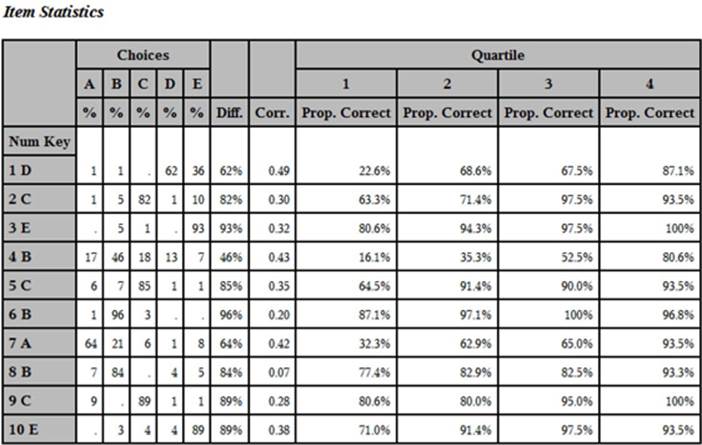
Yes, that was a lot of work, but you can now see all of the item information (the percent of the class choosing each of the answer choices, the item difficulty, the point-biserial coefficient, and the proportion correct by quartile) in a single table. SAS macros (pre-packaged programs) to accomplish all the tasks described in this book can be found in Chapter 11.
Interpreting the Item Statistics
The definition of a “good” item depends somewhat on why you are testing people in the first place. If the test is designed to rank students by ability in a class, you would like items with high point-biserial correlations and an increasing value of the percent-by-quartile statistic. For example, take a look at item 4. Notice that all of the answer choices have been selected. This indicates that there are no obvious wrong answers that all the students can reject. Next, notice that this is a fairly difficult item—only 46% of the students answered this item correctly. As a teacher, you may find this disappointing, but as a psychometrician, you are pleased that this item has a fairly high point-biserial correlation (.43) and the proportion of the students answering the item correctly increases from 16.1% to 80.6% over the four quartiles.
Let’s look at another item. Most students answered item 3 correctly (difficulty = 93%). Items that are very easy or very hard are not as useful in discriminating student ability as other items. Item 3, although very easy, still shows an increase in the proportion by quartile but, because this increase is not as dramatic as item 4, the point-biserial correlation is a bit lower. Suppose you had an item that every student answered correctly. Obviously, this item would not be useful in discriminating good students from poor students (the point-biserial correlation would be 0). If your goal is to determine whether students understand certain course objectives, you may decide that it is OK to keep items that almost all students answer correctly.
Conclusion
Each of us has taken tests with poorly written items. We see a question that uses words like "every" or "never." You can think of one or two really rare exceptions and wonder: Is the teacher trying to trick me or am I reading into the question? Not only are poorly written items frustrating to the test taker, but they also reduce the test's reliability. Using the methods and programs described in this chapter is a good first step in identifying items that need improvement.
All materials on the site are licensed Creative Commons Attribution-Sharealike 3.0 Unported CC BY-SA 3.0 & GNU Free Documentation License (GFDL)
If you are the copyright holder of any material contained on our site and intend to remove it, please contact our site administrator for approval.
© 2016-2026 All site design rights belong to S.Y.A.