Building an Information Security Awareness Program: Defending Against Social Engineering and Technical Threats, First Edition (2014)
CHAPTER 13. Measuring Effectiveness
Valerie Thomas Securicon, Lorton, VA, USA
Abstract
Measuring effectiveness of an awareness program can be challenging, especially for those without a risk management background. This chapter covers selecting valuable measurements and creating useable metrics. Proper reporting and presentation of metrics is discussed in detail, as it is critical to gaining understanding and support from senior management.
Keywords
Measurements
Metrics
Metrics program
Charts
Reporting
Measuring Effectiveness
An often forgotten part of an awareness program is a method of tracking progress and measuring impact. These metrics are to be used as a guide for making adjustments to the program and reporting progress to senior management. If your organization has a risk management team, consult with them on their current metrics program. It's likely that a portion of their collected data could be used for awareness training metrics.
Measurements vs. Metrics
These information types are often used interchangeably; however, they are not the same.
A measurement is a value determined at a specific time that is generated by counting [1]. An example of a measurement is the number of infected computers reported last month.
Metrics are generated by the analysis of measurements. A metric is a comparison of two or more measurements taken over a certain amount of time and compared to a predetermined baseline [1]. For example, the number of infected computers increased by 5% in the second quarter from the first quarter. Useable metrics are dependent on accurate measurements.
Creating Metrics
Successful metrics programs include well-defined measurements and the necessary steps to obtain them. Documentation of required measurements and responsible individuals is key. The following example is from the SANS community website [2]. Many awareness program resources are available, including a sample metrics matrix at https://www.securingthehuman.org/resources/security-awareness-roadmap/. Each metric should have the following segments at minimum.
Metric Name
The metric name should be a high-level topic that can be calculated from one or more types of measurements. For this example, we'll use phishing detection.
What is Measured
Measurements are objective raw data, meaning no human interpretation is required to obtain the measurement value. A measurement for phishing detection is the number of suspicious e-mails reported to the security team. This measurement is designed to evaluate the number of employees who followed the proper procedure for reporting suspicious messages. While this measurement alone is sufficient, an additional measurement can provide more insight. Measuring the number of help desk calls or e-mails about suspicious e-mail can also be useful, as it can indicate the number of employees who did not follow the proper procedure.
There is no limit on the number of measurements that can be collected. Some additional measurements for phishing detection associated with an assessment are
■ number of e-mails sent
■ number of e-mails opened
■ number of employees that clicked the link
■ number of employees that entered information
How it's Measured
A common way to obtain phishing detection measurements is to perform an assessment. To continue with the phishing detection example, a measurement of how many suspicious e-mails were reported to security would be collected at the end of each phishing assessment (Figure 13.1). If you're using a commercial tool, the number of e-mails sent during each assessment is available from the reporting screen.
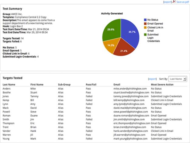
FIGURE 13.1 Reporting menu of PhishingBox.
When it's Measured
Phishing exercise measurements should be obtained at the end of each assessment. If your organization performs biannual assessments, then collect the data biannually. However, not all reported e-mails are assessment-related. Therefore, nonassessment data should be collected on a monthly basis.
Who Measures
Multiple information sources exist for this metric. The security team collects the number of suspicious e-mails received. Phishing assessment-related data are collected by the assessment point of contact. The help desk collects the number of e-mails and phone calls received in reference to phishing e-mails.
Additional Measurements
Now that we've covered an example, here are some other useful measurements:
■ Number of infected machines
■ Number of employees that have completed awareness training
■ Number of lunch and learn attendees
■ Number of hits on the security awareness website
■ Number of general questions e-mailed to the security group
■ Employee test scores throughout the year
■ Number of sensitive documents left in public areas
■ Number of unattended computers that are unlocked
■ Number of employees wearing their badges outside the building
If your awareness program is new, it's likely your measurements will focus more on deployment. Even if your awareness program isn't fully implemented, collecting operational measurements is important to demonstrate improvement over time.
Reporting Metrics
Metrics are designed to provide viewers with the information they need to make decisions. However, if the metrics are presented incorrectly, they will be considered ineffective and reflect poorly on the awareness program. The secret to properly presenting metrics is understanding the target audience.
One popular presentation style is the tiered approach [3]. At the top tier, senior management is interested in high-level information that provides insight into program maturity, cost, and benefits. It's essential to show that the awareness program is having a positive impact on the overall security culture of the organization. The middle tier, middle management, requires information at a department level to evaluate performance levels and potential business impact. The lowest tier consists of awareness program managers and personnel. This tier requires detailed information in order to adjust program content for better performance.
Building Your Presentation
Once your audience has been determined and appropriate metrics selected, it's time to build your presentation. Some key elements of presenting metrics are the following:
Introduction
Provide a short introduction of the program. If the program is in deployment, provide a brief synopsis of the deployment plan, key milestones, and achievements to date.
How Metrics were Derived
Explain at a high level what measurements were obtained and how they were collected. Time is an essential factor for decision-making, so include how often measurements were obtained as well.
The Metrics
As discussed above, only include metrics that are relevant to your audience. Charts are the most popular style of metric reporting. However, a chart is only useful if it depicts the data in a meaningful way. Selecting the correct type of chart for you data is essential. The three main categories of charts are comparison, transition, and composition [4].
Comparison charts are best for identifying highs and lows of numbers. The number of reported suspicious e-mails per quarter over a two-year period is best represented in this format (Figure 13.2). Clustered bar charts and column charts are the most popular representations.
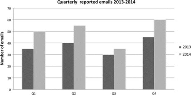
FIGURE 13.2 Clustered column chart.
Transition charts are ideal for time-based data to understand the rate of change. The number of visits to the security awareness website and the number of employees who fell prey to a phishing exercise are both excellent candidates for a transition chart (Figure 13.3). Line and area charts are best suited to represent this type of data.
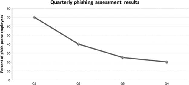
FIGURE 13.3 Line chart with data points.
Composition charts represent how a data value breaks down into segments. Awareness training completed by each department is best represented as a composition chart. Many phishing assessment details can also be presented this way. The percentage of employees that opened a phishing e-mail, the percentage of employees that clicked the enclosed link, and the percentage of employees that did not open the e-mail can be represented in a composition chart (Figure 13.4). Pie charts are the most popular representation of this type of data; however, a stacked bar chart can also be utilized.
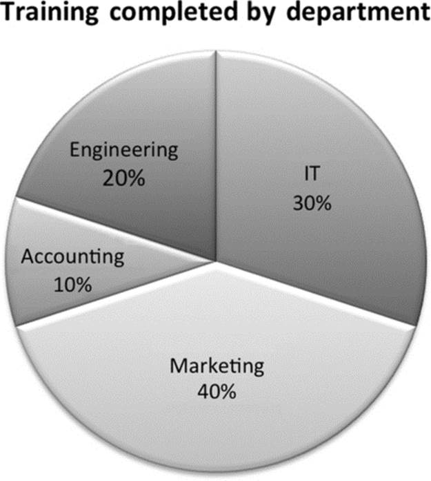
FIGURE 13.4 Pie chart with percentages.
Use basic colors that are easy to see in color and gray scale. While vibrant color choices are tempting, they are often difficult to see if projected. Above all, keep slides and report sections simple. One slide should discuss one subject only. Mixing subjects and metrics on a slide often distracts the viewer, making the presentation difficult to understand.
Notes
[1] Guide To Security Metrics http://www.docstoc.com/docs/7264928/Guide-to-Security-Metrics-SHIRLEY-C-PAYNE-DIRECTOR-IT/.
[2] Security Awareness Roadmap https://www.securingthehuman.org/resources/security-awareness-roadmap/.
[3] Developing Metrics for Effective Information Security Governance http://www.isaca.org/Journal/Past-Issues/2007/Volume-2/Pages/Developing-Metrics-for-Effective-Information-Security-Governance1.aspx.
[4] Selecting the Right Chart Type for your Data, http://www.tutorial9.net/tutorials/web-tutorials/selecting-the-right-chart-type-for-your-data/.