Mobile User Experience: Patterns to Make Sense of it All (2014)
Chapter 9. The Future of Mobile UX is in Using Performance Metrics
Abstract
The current trend in mobiles is to attack the performance problem at the tail end of the mobile pipeline. It is to take an experience we already have and try to optimize it to make it faster. It has become the new game in mobile to add more JavaScript, add another CSS hack, or add expensive content acceleration to an existing mobile experience to gain ourselves a half a second or two. With performance being such a critical problem in mobile, attacking it with this approach equates to shaving off pieces of ice little by little. What we really need is to hack a large chunk off the page’s performance to see a noticeable difference. Only by starting the design of our user experience with performance in mind can we attain this goal. This chapter presents mobile patterns focused on optimized mobile performance.
Keywords
mobile; performance; user experience; CSS; pattern; failure; availability; speed; responsive web design; social
Introduction
Let’s walk through an ideal user experience project together. In the beginning, we interview and capture data from real users. After that, we build site maps, wireframes, and a prototype to gather feedback on all of those deliverables. We test these beginning structures with test users, take that feedback, and optimize our user experience design. As the user interface design is completed, we create another prototype and measure user reactions again. We gather and collect data about buttons, user impressions, how colors change conversion rates, whether images increase traffic, and more metrics. We test and collect metrics on everything about our user experience design from start to finish. With this seemingly thorough collection of data, we did not measure one of the fundamental differences of what makes the mobile different from the desktop. How fast is our mobile user experience?
MOBILE MANTRA #4: SPEED IS KING!
The last mobile mantra is an important one. No user experience can be fully usable without the single most import experience design criteria: it needs to be fast.
We are spoiled desktop users. We use web experiences that include several video files, large images, streaming audio, and multiple pages of content—and these experiences are only getting bigger. As monitors get wider, so do our web experiences; web experiences are now being optimized for a 1200-pixel width. Apple has even introduced the retina display format for websites to make the display of images appear at a higher resolution than the traditional 72 dpi, and the file sizes for these images are even larger. Our Internet pipeline is getting larger as well, which has allowed for these experiences to be realized. It is 25 Mbps1 one day and growing to 50 Mbps the next; by the time you read this, the Internet pipeline could be up to 100 Mbps in your home.
The creation of a desktop website is now a science. We install analytics, measure conversions (how long it takes for a user to become a paid customer), analyze online shopping trends, and build web pages to optimize to a perfect transaction or experience. If a website like Amazon.com loses one second of performance it can cost them $1.6 billion in sales over the course of a year2; web performance is a serious business. So much is done for desktop users behind the scenes to make the performance better, and we don’t even know it. We really are spoiled desktop users who expect the world, and have it delivered, when it comes to our web experiences.
Compared to the desktop world, the mobile can be considered uncharted territory. New devices, new screen sizes, new network speeds, and new operating system versions are being introduced almost every month. It can be like a race trying to catch up with all of the changes. As the mobile matures, we have observed the desktop users’ patterns of shopping, surfing, accessing data, and optimized them for the mobile experience. With all of these variables in the mobile, one thing remains constant; the users’ expectation of a mobile experience is that it needs to be fast. If they have just bought the phone with the fastest process on the fastest network, who will be to blame when their experience fails; it will be the app or mobile website they were last looking at.
Failure Redefined

Desktop Versus Mobile Failure.
Failure to a desktop user means they get a blue screen of death (Windows) or a page failure when their web page is not loaded. For desktop users, it is a mere shrug of the shoulders when a web page fails. More than likely, they will be back surfing in no time. Desktop users are sitting at home or work for a “purpose-driven” experience. They are focused on doing tasks, buying items, signing up for a newsletter, searching the web, or reading their email. These users have some patience when they get to a roadblock.
The mobile, on the other hand, features an audience that has traditionally been more “perusal-driven,” while on a bus, or in a cab, or on a train, users open their smartphones to search, tag photos, or even browse the web. Just because mobile users have much more access to the web from anywhere or any place doesn’t mean they have more patience. Rather, it is the opposite. A frustrated mobile user presses the home button on their iPhone to quit the website or app they are on in less than a second; and in that second, they have left your experience frustrated. As we trend to more “purpose” driven mobile usage, a user’s expectation and immediacy of having their experience load quickly becomes more critical to them. Failure to a mobile user looks different than what we as web designers are accustomed to, it is not a page loading as in the desktop, it is the mobile web or app they are on that does not load quickly enough; it is not getting to buy their items fast enough. Failure also derives from too many screens to go through to finish their task; not getting to their content or email within just a few touches. It is that extra second of loading, or that extra page in the user experience that will cost you your mobile users; this is the real failure of a mobile experience.
Start Differently
The current trend in mobiles is to attack this performance problem at the tail end of the mobile pipeline. It is to take an experience we already have and try to optimize it to make it faster. It has become the new game in the mobile to add more JavaScript, add another CSS hack, or add expensive content acceleration to an existing mobile experience to gain ourselves half a second or two. With performance being such a critical problem in the mobile, attacking it with this approach equates to shaving off pieces of ice little by little. What we really need, is to hack a large chunk off the page’s performance to see a noticeable difference. Only by starting the design of our user experience with performance in mind can we attain this goal.
How can we solve this mobile dilemma? Let’s add three more mobile patterns into our set of tools. Each of these will describe common use cases where a user experience can be redesigned with performance in mind. Use these three mobile performance patterns as you start designing your mobile user experience.
Performance Pattern 1: Limiting Social Interactions
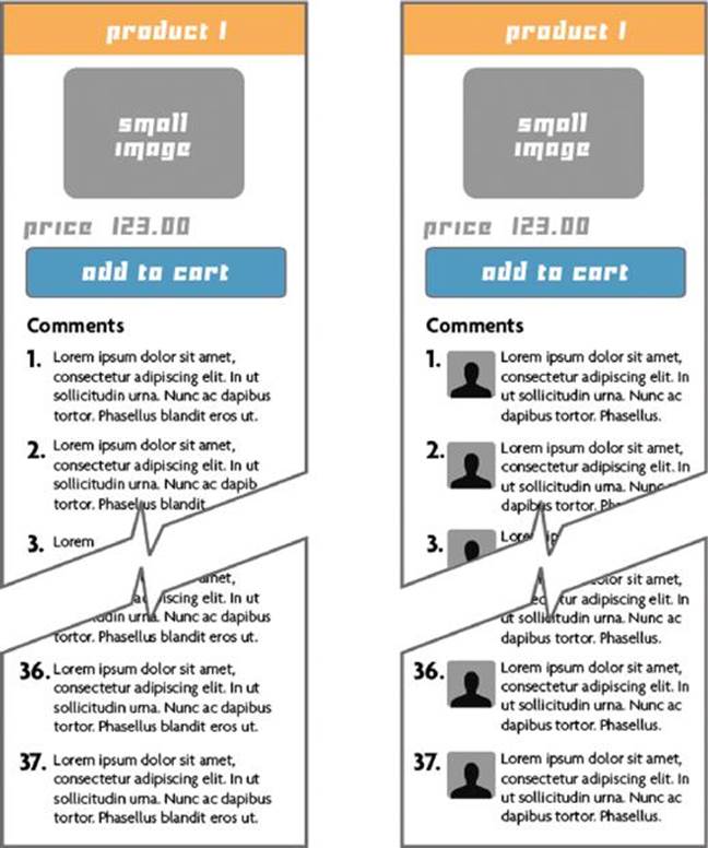
Examples of Page with Long Comments.
Being social has gone from connecting with old friends to getting every users’ feedback on every topic. When building a mobile experience, it helps to have your new social family post comments, pictures, or even reviews on locations, products, or experiences. Yet there are times where being social is too social; and your mobile performance will suffer. An uncontrolled list of comments or user feedback will cause two experience problems that we will need to solve.
1. A long list of comments causes users to have to scroll too much on a page—a good user experience needs to keep scrolling to a minimum. Expect frustrated users if they need to scroll to the very bottom to read all of the comments or post their own comment. Limiting this scrolling to two screens maximum can help soften this experience. Our goal is to keep pages small and compact. Let’s look at how to compact the images and text next.
2. Every comment and image will hurt you—every time you load in an image or comment, this increases the download size of your page. The more you think you are giving your users, the more you are slowing down the page. Longer pages mean longer load times. Try adding pagination to pages and displaying six to eight images or comments maximum per page. Adding a “show more” feature can help you to limit what’s displayed on the screen. If you need to display hundreds, then you have too much content; archive some of this data you have collected. The goal is to keep what you load on the screen as small as possible. If a user requests a page or content they want, they are willing to wait longer than when the page first loads.
Performance Results
Average Load Times of Pattern #1
■ Example of page with long comments—1.92 seconds
■ Example of page with long comments (with user profile images)—3.24 seconds
■ Example of page with paginated comments—1.11 seconds
See more details of this performance test in Appendix D
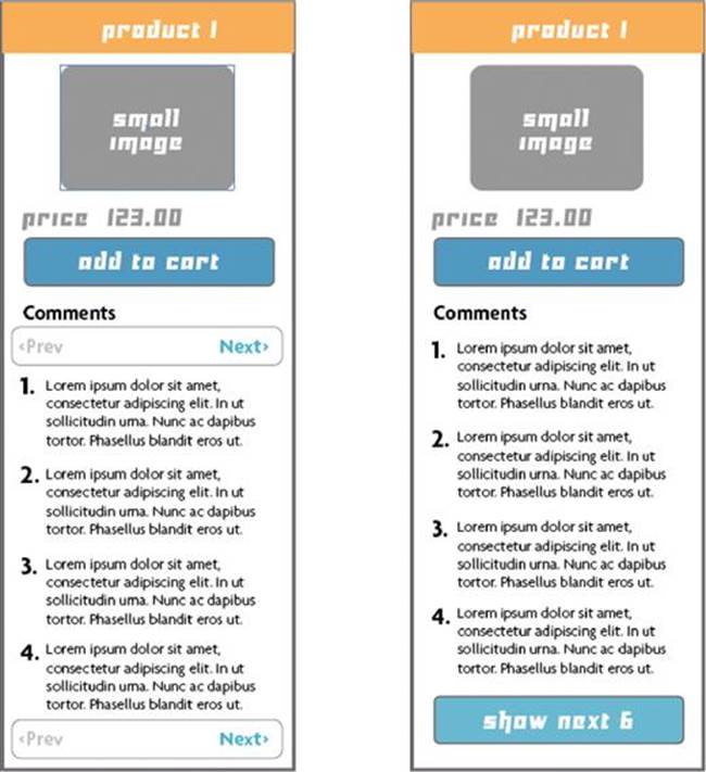
Examples of Page with Pagination.
Performance Pattern 2: Limiting Products or Images

Example of Page with Multiple Images.
Like the social media page example, we need to create a limit to what we want to display to our users when we show images. Heavier than a text file, images are large, more colorful, more prominent, and can help enhance our experience,3 but they are also our biggest performance inhibitor.
1. Every time you display images of products to sell, or friends’ photographs, you are making your mobile experience slower and slower. If you are loading 40 images, you will need to contact a web server to download each one. Each request (called an http request) slows down your experience. Now imagine trying to display thirty or forty of these images on a page. This may work well on a desktop when you have the screen real estate and bandwidth, but is a sure way to frustrate your mobile user when they need to wait. In this case, we need to keep our images down to eight to ten images on each screen. We need to make each thumbnail small enough to keep, but also large enough to allow a user’s thumb to touch it.
2. How can we handle more images than just eight or ten? We need to add a “Load More” button to give the users the option of what to see next. We can also give them some method of filtering up front, buying them the ability to load in the images they are expecting and want to see first.

Example of Page with Paginated Images.
Performance Results
Average Load Times of Pattern #2
■ Example of page with multiple images—4.3 seconds
■ Example of page with paginated images—1.51 seconds
See more details of this performance test in Appendix D
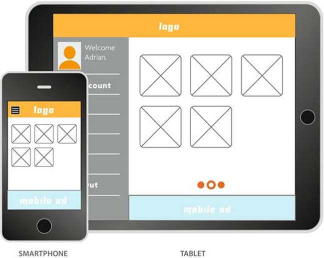
Performance Pattern 3: Designing Responsive Web Design (RWD) with Intent for Every Platform
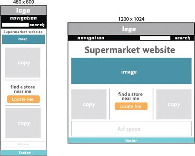
RWD Example of Mobile Site as Copy of Desktop Website.
One of the problems with responsive web design is the performance issue of squashing and stretching a page to work at different break points. One of the main design flaws of this technique is to try to show all of the same content images into the same size frame across all widths.4
1. Don’t try to scale your images from 100 pixels wide to 400 wide. The act of doing so will cause your page to come to a screeching halt. It will work when resizing to a tablet version, but not when doing large leaps of widths. Use another set of images for a mobile version, not just what you have on the desktop version.
2. Don’t bring all your text over because you can. Try to hide or limit the copy on your mobile experience. No one wants to read through large paragraphs of text on pages that scroll through eternity. Every time you load those large pages, you increase your page load time of your site, and risk losing the attention of your user, who is juggling other tasks.
3. Ask yourself the tough questions. If you have such a large experience that you want to load in on a mobile browser, is it really necessary? If designing RWD for mobile seems impossible, then why use it? No one says you can’t use RWD for anything about 800 pixels wide and a mobile only version for anything lower. Our goal for the mobile is to design small and clean experiences.
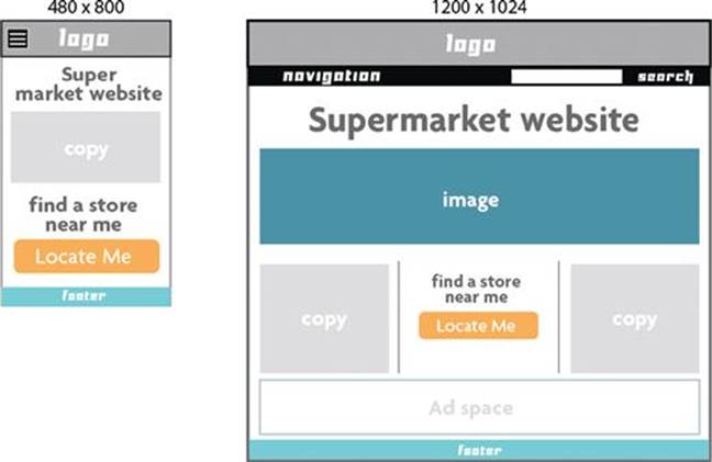
RWD Example of Mobile Site as Unique Website.
Making a Plan to Test on Devices
MOBILE MANTRA #2: BE ON THE DEVICE!
Any good mantra is worth repeating again and again. Remember always tell yourself to start and end on a real device.
There is a big gap between creating a user experience and building it in real life. Part of this gap is filled with creating prototypes to test out our mobile experience. I am an adamant believer of testing these experiences on a real device from the real view of our users. If we are already using a device to test a prototype, why not use it to test our user experience performance as well? Start by creating a testing plan for yourself using some real content and images, then build a page you can open on several different devices. If you are designing a mobile app or mobile web page you are looking at how long your page will load on both devices. Want to see what ten images versus five images look like loading on your smartphone; test it out in a prototype of that page. Looking to see what size your images need to be on your mobile home page? Test them out in another prototype. Remember the dangers of the prototype trap (As discussed in Chapter 7); focus on creating small prototypes to test a page or look and feel of an experience. The more you use these prototypes in real world scenarios, opening the page on a train, bus, or as you are walking, the more you can create performance guidelines for yourself. How has does the page load on a WiFi device versus a 3G device? How does it load on different carriers or devices? Be creative, use my exercise of visiting a carrier store to load your experience onto multiple devices. If your goal is to create a testing plan of devices for the QA of your app when it is being developed, why not use the same testing plan for measuring the performance of your user experience as well?
Proving a Point
User experience designers are commonly brought in to settle an argument when decisions for users have to be made. What does user experience say about breadcrumbs, what does user experience tell us about increasing conversions, or what is our opinion of a user flow, are the a few of the decisions that we are regularly asked to make. But who or what will help prove the decisions made by the user experience designer when it comes to creating a mobile experience? Performance can settle these arguments when it comes to designing user experience for mobile. Why are there only ten images instead of twenty? Why are we showing limited icons at a certain size? Why does the flow of pages work in a certain manner? I am a big believer that mobile user experience is about having apoint of view. That point of view can be even more powerful when you have performance metrics to base your decisions on.
A Call to Action
Having a network of friends and family to test your experiences or a bag full of smartphones at your house can only take you so far. What we need is a large network of devices that we can use to test our mobile user experience on. If it’s part of your social family, a co-op of shared devices, or a potential product; the future is in sharing the testing of our user experiences across the country. Our pages need to be smarter, faster, and to travel and be tested across borders. The mobile has exposed our user experiences internationally, and at scales we cannot imagine; as mobile usage explodes so will the exposure of the experiences we create. Forget about getting traffic in the thousands; be prepared to have your mobile experience visited by hundreds of thousands or millions of users. If this is the case, why would you test your mobile experience on a single phone in your drawer?
1Mbps—megabits per second, a term used to measure data transfer.
2Kit Eaton, “How one second could cost Amazon $1.6 billion in sales.” Fast Company March 15, 2012. http://www.fastcompany.com/1825005/how-one-second-could-cost-amazon- 16-billion-sales.
3The Web Usability Blog, “Use pictures to direct the user’s gaze,” August 5, 2010. http://webusability-blog.com/use-pictures-to-direct-the-users-gaze/.
4Guy Podjarny, “Real World RWD Performance – Take 2,” March 7, 2013. http://www.guypo.com/uncategorized/real-world-rwd-performance-take-2/.