Mobile User Experience: Patterns to Make Sense of it All (2014)
Chapter 7. How to Prototype in Mobile
Abstract
Returning to the practical approach of this book, the goal of this chapter is to discuss methods of and approaches to prototyping a mobile user experience on and off the device. Prototyping, especially in mobile, is critical to creating an opportunity to see how the experience changes with different device characteristics (different screen sizes, device sizes, screen resolutions, tablets vs. smartphones). More important, how do our actual users interact with the mobile experience before we move forward with building it? Understanding how to gather this feedback by using a prototype is critical to optimizing a mobile experience. This chapter presents tools, exercises, and different methods (physical and digital) to gather and present our experiences to our users.
Keywords
prototype; paper; mobile; desktop; device; clickable prototype; notecards; user interface; interaction
Introduction
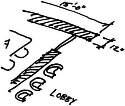
In a previous life (as an architect), I had an opportunity to lay out the interior of an office space. One of the most visible areas was a conference room next to the lobby; this was a perfect opportunity to design something that would connect both spaces. I sketched a floor plan and then an elevation drawing and had them drawn up. It looked great on paper and in drawings. I was excited to try out something unique that I had played with only on blueprints and never had a chance to build; here was my chance. Once construction was completed, I finally got to see my vision. In reality something was off and the design did not fit into the space well. This definitely wasn’t something that could get fixed with paint. Ten years later that wall is still standing ….
Looking back, that project was a perfect opportunity for a prototype: to have built a scale model of the wall. Had I taken the extra time to create a prototype of my solution I could have saved a lot of cost in the long run and come up with a more appropriate solution for the space.
MOBILE MANTRA #3: TEST, TEST, AND TEST AGAIN
What is Mobile Prototyping?
By definition prototyping is the process of creating a sample before a final version is made. In the case of the wall, a scale model of the space before construction would have sufficed. In the design of software, prototyping is used to create a version of the software that we can test drive and learn from. The end goal is to “work the kinks out” before a final version is made. Mobile prototyping is crucial to getting user experiences correct. Ideally, we want mobile prototyping to give us feedback on three aspects:
1. Page Flow—Does the flow of pages and screens make sense to the user? Is it easy to learn and navigate? Do we need to shorten or change the experience in any way? Does our user experience pattern fit into the users’ expectations or conceptual model? We can use this feedback to optimize the overall user experience.
2. User Interface Interaction—Are our touch gestures clear? When we call a keyboard or picker from the device does the logic make sense? Are we using the UI element a user expects to see? With this feedback, we can focus on optimizing the mechanics of a specific screen, task, action, or function.
3. Device Interaction—What do our screens look like on the actual device? Is the use of the accelerometer clear? If you are rotating the screen, how does that look on the device? If you designed your experience for multiple screens, does it adapt well? We can use this feedback from actual devices to help us optimize the scale, proportion, and interaction of our experience with the device.
As we collect different types of feedback we can begin to revise the mobile user experience. My goal with this chapter is to introduce some methods of collecting that feedback. You will be introduced to different mediums that are available to you and how to use them for optimal feedback. As a result, plan on borrowing, editing, and using these to spark new ideas.
Tool Tip
Aren’t Using Wireframes Enough? Why Can’t I Just Use Those?
Wireframes can take us only so far. In fact, be wary of showing these to clients or reviewers when you want feedback. Wireframes are not visual design; as a result, they might confuse or distract your reviewers from giving you the actual feedback you are looking for. For example, someone might ask why the mobile experience is in black and white, why there are no images on each screen, and why there are three screens on each page. If you do want to show your wireframe deck, make sure you preface the conversation with an explanation of what a wireframe is and what it is used for.
Methods of Prototyping
Prototyping can come from several methods or mediums. Architects use 3D models, industrial designers use wax, and user interface designers use pixels. With mobile prototyping we will look at using a mix of paper and digital models to get results.
Paper Prototyping
Nothing says going “old school” like using paper to prototype a digital experience. As silly as it sounds, prototyping on paper can make it easier to gather quick feedback on the fly or to generate multiple ideas. It also sets the stage for team collaboration when sharing ideas. Remember, the goal of the exercise is to capture feedback.
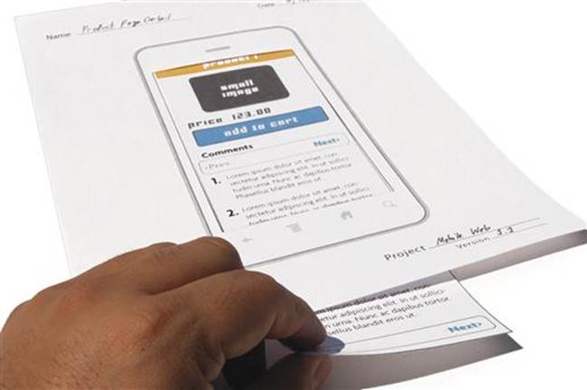
The Mobile Sheet
The idea behind the mobile sheet to is place one screen on a single sheet of paper. Sounds simple enough right? Imagine what that single sheet can give you. That sheet gives you real estate to write down feedback as someone gives it to you, enough space to sketch or draw an idea you get while you review the sheet, the ability to arrange and shuffle the sheets as need be. With that single sheet you have the power to throw away or hide a screen at a moment’s notice. Now imagine you are showing your experience to a group of people in one day, you have a collection of numerous sheets per person and per screen. Staple them together and now you have a wealth of knowledge and feedback for your user experience. Not too bad for a single sheet of paper.
The Mobile Sheet—Clean Version and Example with Mark Ups.
Let’s start creating your own. First, choose a page size. I recommend using a standard letter size (81⁄2" × 11" or A4); this makes it easy to photocopy or print if you need quick copies. Second, choose a device skin for your mobile sheet, use one that matches the right screen size and project type. Third, place the device skin and screen onto the page. Give yourself enough space if you are planning to draw or take notes in the border. Now your mobile sheet is ready to add your layouts!
As you add your layouts for your mobile user experience, here are more recommendations. Use black and white for your layouts; this makes it easy to reproduce. When you do print, make sure to print out some empty layouts to add or rework screens later. You will likely encounter the scenario of someone saying … “I wish the screen could do something like this. …” You can quickly sketch out the screen and respond with “does it look something like this? …” (This is a crowd pleaser.)
Now that you are done printing, make sure to use a paper or binder clip to hold them together, you want the ability to shuffle the sheets around, if need be.
But what if you want to show more interaction? This is a mobile paper prototype, isn’t it? One of the great thing about paper prototyping is its flexibility … no seriously, that’s not a joke. The great thing about paper is you can cut, tear, rip, and tape together if you need to without feeling like you have to formally move screen elements around or rebuild your UX. Changing and editing is instant. Here are some exercises you can use to help.
Making the Screen Scroll
What You Need Before You Begin
■ Exact-o blade or utility knife
■ Legal or long sheet of paper
Concerned that you are not showing the screen scrolling on the mobile sheet and want to demonstrate this? Try this little trick.
1. Cut the top and bottom of the screen area; use an Exact-o blade or utility knife to get a nice clean cut.
2. Print out your entire long screen on a legal-sized paper (81⁄2" × 14").
3. Fold and trim to make sure it matches the width of the cut you made.
4. Insert the folded paper into the two cuts with the screen side facing up.
Cutting Top and Bottom of Mobile Sheet.
Slide the screen up and down. In a few steps you can quickly show the scroll of the screen in a mobile sheet. It’s simple and quick, but very powerful.
Running Screen through the Cut Mobile Sheet.
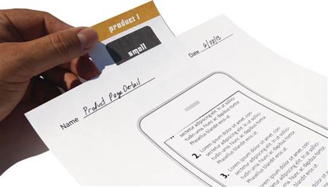
Showing Inputs, Keyboards, and UI
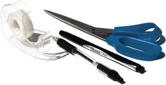
What You Need Before You Begin
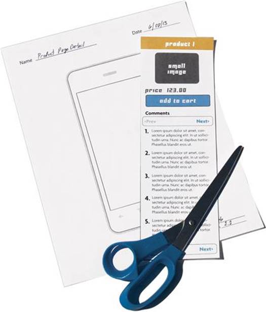
■ Scissors
■ Tape
Do you want to show a keyboard or menu overlay on the screen? Try this next exercise. You will need to do some prep work before you begin.
1. Scale and print several of your UI elements before you begin. Make sure they are the same width and scale as your mobile sheet.
2. Once printed, cut them out with scissors. Make sure you cut out some extras.
3. Add a piece of tape to each paper UI element.
4. Attach each UI element in its appropriate location and fold over face down.
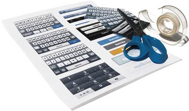
Cutting Paper Inputs.
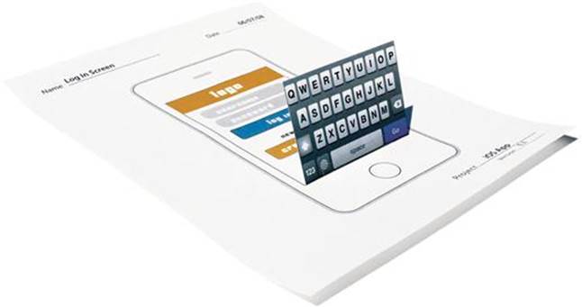
Mobile Sheet with Paper Inputs.
Once you have this ready, you can begin to experiment folding over each paper UI element. If you want to show how and where the keyboard folds over on the screen, simply fold over your paper keyboard. If you want to show how your menu comes in from a tray to the left of the screen; fold over the tray from the left. This is a fast and quick way to show how a screen changes without shuffling through numerous pages. Even better, if you find yourself with a user who thinks you need a different keyboard or picker; grab from your paper cutouts of UI elements and tape over it. If you find a user who thinks the tray should come in from the right, then remove it from the left and reattach on the right! This is the quick way to change your navigation or UI in an instant.
Tool Tip
These Paper Prototyping Methods Are Great! Can I Use These Mobile Sheets for Creating Wireframing as Well?
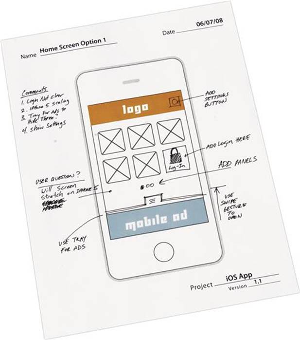
The mobile sheet gives us the ability to draw and sketch out ideas on them as well. Print out a clean copy to use as a base for sketching wireframes of screens and functionality. For sketching out wireframes, I recommend using a wireframe sheet with the three-screen flow. You can also use the cut out inputs to add to your wireframe sketches. This method is perfect for collaborating with other designers or developers on how a screen may or may not work. Make sure you date each sheet when you are finished.
For sample mobile sheets see Appendix C.
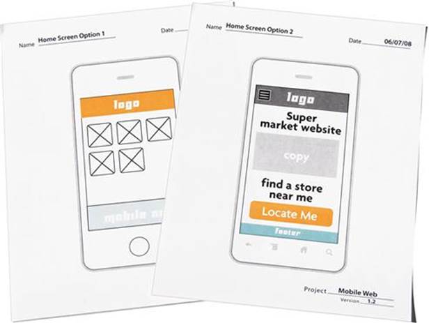
Mobile Sheet Example #1 for Wireframing
Mobile Sheet Example #2 for Wireframing.
The Notecard
What You Need Before You Begin
■ A set of notecards—get a stack of 100 (I recommend the smaller 3" × 5" size)
■ Push pins
■ A good set of markers
One of my favorite paper prototyping exercises is the use of the notecard. One of the reasons for this is that it allows for the most collaboration when laying out or editing a mobile user experience. This also takes some prep work, but the feedback you will get from it pays off tenfold. Plan on setting up several group exercises to share, collaborate,
Mobile Notecards.
and get feedback on your user experience. I will walk you through some of these exercises so you can set them up on your own.
Before you start any group exercises you will need to do some preparation. Start by transferring all of your screens onto the notecards. Either draw them on each notecard or tape a copy of your printed out screens. You could also just print out your screens on regular paper, but I recommend using a heavier paperweight to be able to shuffle and handle these screens. Your mobile notecards might get bent or folded if you are conducting an exercise with several participants. I recommend making two or three copies of your mobile user experience notecards.
Exercise 1—Group
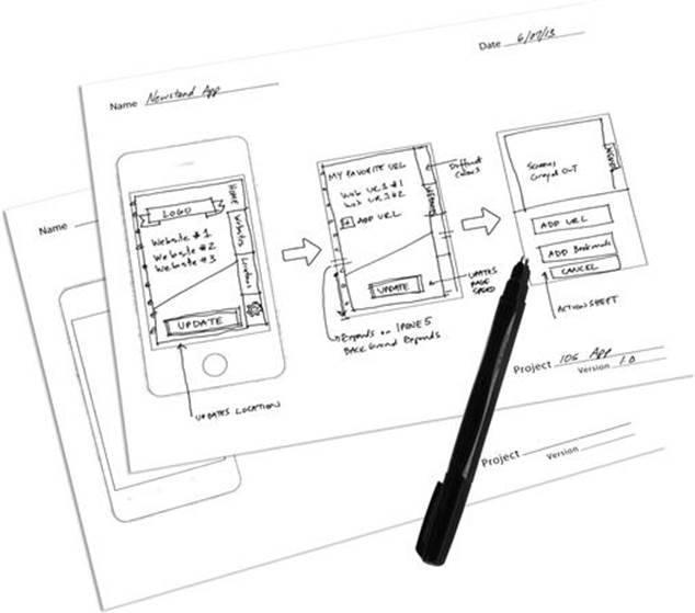
Find a room with a nice wall or board you don’t mind punching pinholes into. You can use tape, but from my experience notecards don’t always stick well. On your wall arrange your screens from left to right as shown in your wireframes. Make sure every row represents each unique page or function in your mobile experience. If this activity looks and sounds familiar it’s because it closely resembles storyboarding sessions for animation.
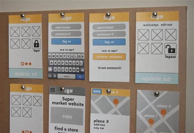
Example of a Storyboard Layout of Notecards.
Once you have them up, review andwalk through each function or navigation path with the group. If something doesn’t make sense, feel free to remove or rearrange the notecards. The goal of this exercise is to see the entirety of the mobile experience. How does a user first enter? Are the interactions consistent? Is the navigation path consistent? Is the mobile experience too much? Ask questions like these to spark the group conversation. If you want to allow for more collaboration and activity, have the group members walk through the experience themselves. Use sticky notes to add annotations or mark areas of interest or problems. Once you’re done BE SURE TO PHOTOGRAPH THE RESULTS; yes, this sentence is in all caps. Document the results of the session, once the notecards are down, you will lose all of your feedback and any changes to screen position or edits. If you are lucky enough to have a wall that you can keep your cards up on, then this is helpful. Even though these might get changed, always document your progress.
Exercise 2—Individuals
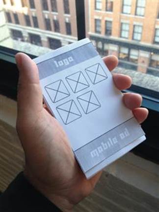
Mobile Notecards Scaled for an On-the-Go Testing.
The next exercise is focused on using your stack of notecards to show your mobile user experience to an individual. In this case you will be using your notecards like a deck of playing cards. Before the reviewer comes in, organize the deck of UX screens in the order you want to present them. You can then present your mobile experience one screen at a time. You can also lay out the screens in order on a table. The great thing about this notecard prototype deck is you can present it anywhere (on a train, in a park, or on the go)! In fact, the size of the notecards and their portability is very reminiscent of a certain mobile device you are trying to emulate; see my point? If want to take it one step further you can even scale and trim the notecards to match the size of a mobile screen.
Desktop Prototyping
The next step to paper prototyping is doing so on your desktop. There are no hard and fast rules here. I will show you two methods that may help with presenting your mobile experience wireframes. These will include a simple and an advanced method.
The Simple Method
Use whatever presentation software you feel most comfortable with to lay out each screen on a single page. Once you have done so you can use the presentation mode to act as a click through. Simple enough? All you really need is a simple method to create a walk through for your wireframes. If you want to add a device skin to give the screens some content, go ahead. Whatever you choose, try to adhere to these rules.
1. Is it simple?—Choose software or a file type that is simple and easy enough to move or edit a screen.
2. Is it portable?—Choose software or a file type that is portable. Make sure you can quickly email or send it to someone and have him or her open it.
Remember that you are not trying to replace your wireframing tool. Most wireframing tools have a presentation mode as well. I recommend keeping a separate format or method just for presenting these screens. You don’t want to have someone tinker with your designs as you try to present them. Use Microsoft PowerPoint or Apple Keynote as your simple presentation method or to create PDFs to email.
The Advanced Method
If you want to take this one step further, there are an infinite number of software packages that allow you to wireframe and then build a clickable prototype. Most wireframing packages like Omnigraffle or Axure give you the ability to link pages from within each screen. Just do a search on the web for “desktop mobile prototyping” and you will find a slew of web-based wireframe/prototyping packages. Choosing a package is like choosing a flavor of ice cream, everyone has a favorite and everyone will have an opinion. The choice will be up to you.
As you explore choices, keep in mind the two rules of thumb from the simple method: is it simpleand is it portable? I love the idea of web-based packages, but then you need web access when you present. I love the idea of using a software package I already own and do not need to learn, but then I cannot send a presentation to anyone. I love the idea of sending someone a pdf, but then it’s not really interactive. Here is an anecdote from my own experience.
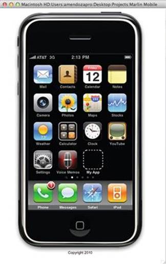
Screen Capture of My Actual Flash Prototype.
A long time ago (a long time in mobile years was 2010), I worked on a project that required us to do a prototype of our mobile user experience. The client required that we be able to send this prototype to be reviewed by different business teams and get final approval from a legal team in another city. Would we have to send them an iPhone or mockup an app? This was a dilemma. On a whim I built a quick prototype in Adobe Flash. This was a great ongoing joke with the team as I had just built a virtual iPhone on a platform that it didn’t support. I even added the functionality of the home button to turn the screen on and off and a space to add a clickable app icon as well. Once we had a good laugh, we realized the power of this prototype. It was simple enough to drag and drop in a screen, edit a frame to remove a screen, and even export it as an application and send it over email; no special software required! This was a hit. A few years later, I talked to someone who told me that the flash prototype was still floating around at that company.
Looking back with what I know now, here is how I would have changed my approach and what I do to mock up my own user experiences today. For starters I would go the route of using a simple method to present the screens. PowerPoint can be your friend as everyone has a copy (or access to one). Second, as most people now have a smartphone, I skip the desktop prototyping all together. The more I can show on the device the better.
Tool Tip
Why don’t you use the SDK iOS simulator or Android emulator on the desktop for prototyping?
All mobile SDKs provide an emulator for testing and debugging of apps and code. In order to use them you will need to download, install, and setup a development environment for each mobile platform. These tools give you a very limited view of the operating system and include only a basic set of functions. They only allow you to install your own apps directly from the SDK and do not allow any outside apps to be installed. They include access to the browser and some methods of activating on-screen gestures (i.e.,, in the iOS simulator, the shake can be triggered from the desktop menu).
Using these tools is great in theory, but you are limited when it comes to using them to show a prototype. You can easily run your compiled app from the SDK, but cannot load in your own screen shots or images to look at from inside the emulator. In order to do so, you will need to create a web page to view images or pages and open them through the emulator’s browser. These tools do not include an offline mode so you must be connected to the web from your desktop to open these pages. At that point it is easier to open them up directly on your own device. The emulator will also not have the same performance compared to an actual device. For example, the Android emulator is notoriously slow even after several upgrades over the years.
When I plan to test a prototype, app, or mobile website I skip the emulators and use a physical device first.
Using the Device to Prototype
As you remember, Mobile Mantra #2 is Be on the device! Once I am on the device I can get feedback on three things that paper or desktop prototyping will never give me:
1. The correct size and proportion once it is on the device.
2. The correct colors and feel of the screen.
3. The feel of the device as it sits in my hand and as I look at the screen.
Here are the two prototyping methods that you can use on your own devices.
The Image Prototype
This method is the simplest, most time effective, and packs the biggest punch. Start by taking your screens and scaling them to the right screen size; for example, if you intend to show them on your iPhone 4 scale them to 640 × 960 pixels. Save them as PNG images so they do not have compression. Next, send them to your smartphone over email or by any other method you use to get images to your phone (cloud storage, text, etc.). Finally, save them to your camera roll and arrange them as you want. Now, walk around like you own the place!
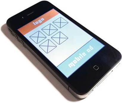
Image of Wireframe Image on iPhone.
Image of the Same Wireframe Image on Android.
Congratulations! You have just put your wireframes on your mobile device. Sounds too good to be true? Yes it is. As simple as this is, I cannot tell you the times that I have used this simple method to show off screens. You can quickly swipe from screen to screen and get quick feedback on what a screen looks like. Want to edit or change a screen? Just email yourself a new screen and replace it. Want to test it on Android? Just send it to an Android device! You can even use your mobile device to record audio of your users’ feedback. Again, this method is perfect for gathering quick feedback on a design, for anything more complicated and clickable look at creating a clickable prototype.
Creating a Clickable Prototype
Want to create something more interactive? I suggest creating an HTML5 version of a click through prototype. It’s easy to maintain, editable, and best of all, it’s free! Here is how you start. Using an html editor to create an html page and make sure to set the width to the screens you will be testing on (tip: HTML5 does not require you to set the doc type to mobile). Don’t over think or over do this. Use simple linking to connect pages together. Your goal is to create a simple click through and give the user a basic navigation path. Want to add more depth? Add in clickable areas to allow the user to explore pages. Or add some simple fields to allow you to launch the keyboard or dialer. Once you are done, uploaded them onto a web server. Now you can load them onto your device’s browser; bookmark these pages to make them easier to open multiple times. One of the advantages of this method is that you can use these prototypes to gauge the performance of these pages while on the device (see Chapter 9 to learn more).
Tool Tip
What if I want to create something to show gestures and touch events?
Do a quick search on the iOS or Android markets and you will find several apps designed for the sole purpose of creating a clickable prototype. As a result, a whole new series of apps are now available to download; some free, others you will need to purchase. If you are building apps or mobile websites for mobile, why not create your prototype on the actual device? You can also use these same apps to create wireframes as well. I have collected just a few here:www.mobileuxpatterns.com/prototyping.
As you work on your clickable prototype of choice, keep this in the back of your mind; beware the prototype trap.
The Prototype Trap
As you build your clickable prototype you will begin to think to yourself, “What if I add just one more function, just one more click, just one more page.” In fact you are starting down the steep road that most prototypes travel down … the downward spiral of the prototype trap. Many have fallen prey to this scenario. Here are some hints that show you are travelling down that road. Is your prototype so large that it requires hours to edit? Does it require several people to maintain? Do you have as much functionality in it as the final product does? Do you have to add release numbers to your prototype? Did your mobile developer say, “I can build a prototype in the Android or iPhone SDK”? Is it over 100 MBs? If you answered yes to any of these, then you are in the danger zone, time to take a step back. A good prototype should be made fast and repeatable. Translation: it should be disposable. The prototype is about the feedback and not the technology or the method that made it. For mobile user experience especially, you should be able to produce one quickly, gather feedback from a user, and be able to change it. If it is on the device, even better. This needs to be a fluid cycle, like the mobile, it will always be changing.