Don’t Make Me Think, Revisited: A Common Sense Approach to Web Usability (2014)
Part I. Guiding Principles
Chapter 3. Billboard Design 101
DESIGNING FOR SCANNING, NOT READING
If you / Don’t know / Whose signs / These are You can’t have / Driven very far / Burma-Shave!
—SEQUENCE OF ROADSIDE BILLBOARDS PROMOTING SHAVING CREAM, CIRCA 1935
Faced with the fact that your users are whizzing by, there are some important things you can do to make sure they see and understand as much of what they need to know—and of what you want them to know—as possible:
 Take advantage of conventions
Create effective visual hierarchies
Break pages up into clearly defined areas
Make it obvious what’s clickable
Eliminate distractions
Format content to support scanning
Conventions are your friends
One of the best ways to make almost anything easier to grasp in a hurry is to follow the existing conventions—the widely used or standardized design patterns. For example:
Stop signs. Given how crucial it is that drivers see and recognize them at a glance, at a distance, in all kinds of weather and lighting conditions, it’s a really good thing that all stop signs look the same. (Some of the specifics may vary from country to country, but overall they’re remarkably consistent around the world.)
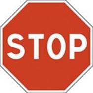
The convention includes a distinctive shape, the word for “Stop,” a highly visible color that contrasts with most natural surroundings, and standardized size, height, and location.
Controls in cars. Imagine trying to drive a rental car if the gas pedal wasn’t always to the right of the brake pedal, or the horn wasn’t always on the steering wheel.
In the past twenty years, many conventions for Web pages have evolved. As users, we’ve come to have a lot of expectations about
Where things will be located on a page. For example, users expect the logo identifying the site to be in the top-left corner (at least in countries where reading is left-to-right) and the primary navigation to be across the top or down the left side.
How things work. For example, almost all sites that sell products use the metaphor of a shopping cart and a very similar series of forms for specifying things like your method of payment, your shipping address, and so on.
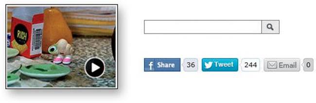
How things look. Many elements have a standardized appearance, like the icon that tells you it’s a link to a video, the search icon, and the social networking sharing options.
Conventions have also evolved for different kinds of sites—commerce, colleges, blogs, restaurants, movies, and many more—since all the sites in each category have to solve the same set of problems.
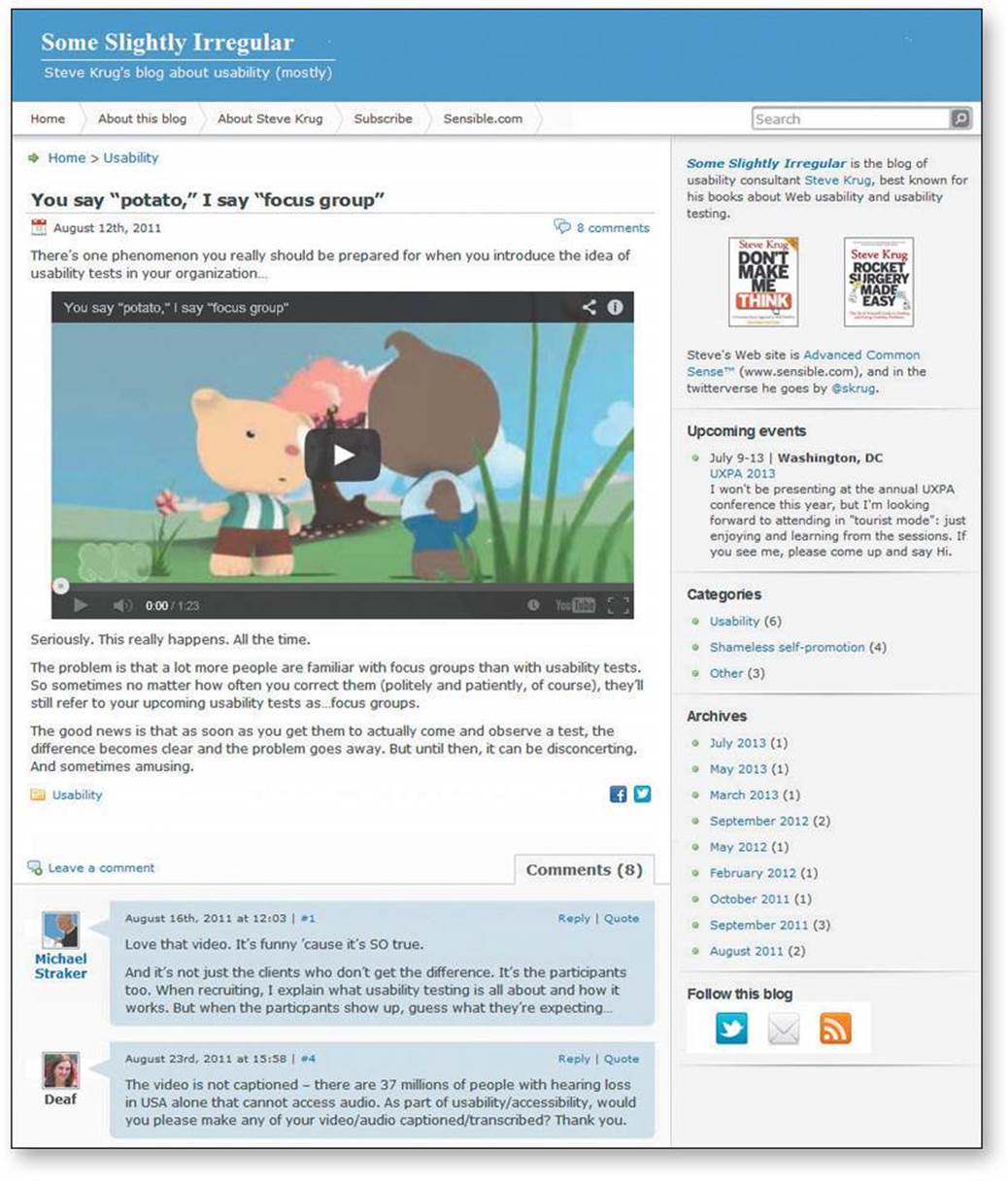
SomeSlightlyIrregular.com
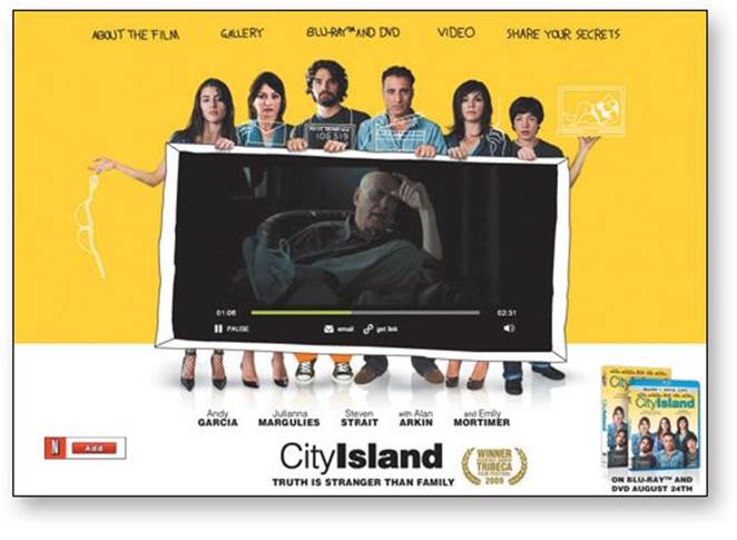
cityislandmovie.com
These conventions didn’t just come out of thin air: They all started life as somebody’s bright idea. If an idea works well enough, other sites imitate it and eventually enough people have seen it in enough places that it needs no explanation.
When applied well, Web conventions make life easier for users because they don’t have to constantly figure out what things are and how they’re supposed to work as they go from site to site.
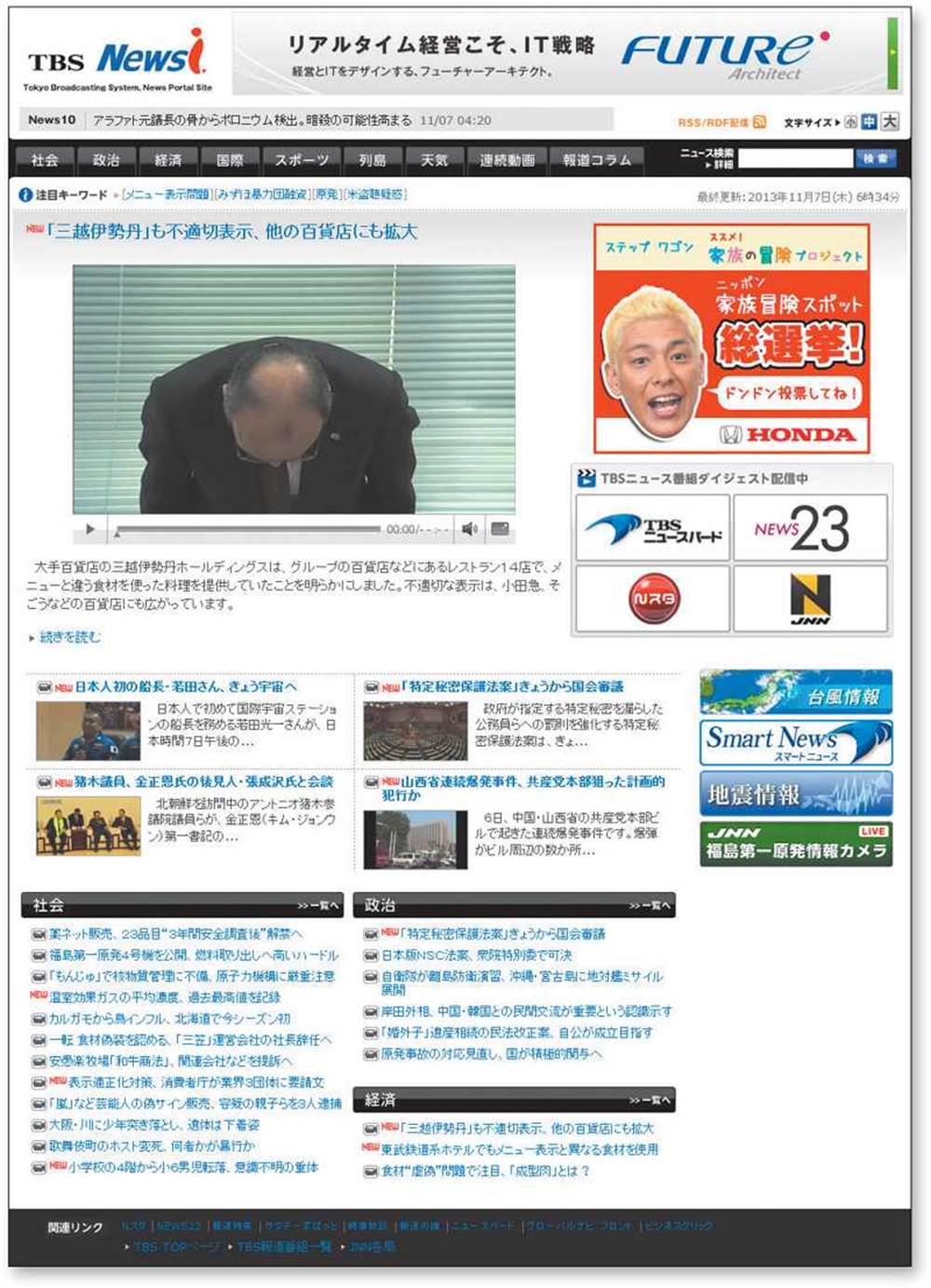
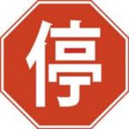
Want proof that conventions help? See how much you know about this page—even if you can’t understand a word of it—just because it follows some conventions.
One problem with conventions, though: Designers are often reluctant to take advantage of them.
Faced with the prospect of following a convention, there’s a great temptation for designers to try reinventing the wheel instead, largely because they feel (not incorrectly) that they’ve been hired to do something new and different, not the same old thing. Not to mention the fact that praise from peers, awards, and high-profile job offers are rarely based on criteria like “best use of conventions.”
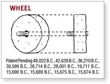
Occasionally, time spent reinventing the wheel results in a revolutionary new rolling device. But usually it just amounts to time spent reinventing the wheel.
If you’re going to innovate, you have to understand the value of what you’re replacing (or as Dylan put it, “To live outside the law, you must be honest”), and it’s easy to underestimate just how much value conventions provide. The classic example is custom scrollbars. Whenever a designer decides to create scrollbars from scratch—usually to make them prettier—the results almost always make it obvious that the designer never thought about how many hundreds or thousands of hours of fine tuning went into the evolution of the standard operating system scrollbars.
If you’re not going to use an existing Web convention, you need to be sure that what you’re replacing it with either (a) is so clear and self-explanatory that there’s no learning curve—so it’s as good as the convention, or (b) adds so much value that it’s worth a small learning curve.
My recommendation: Innovate when you know you have a better idea, but take advantage of conventions when you don’t.
Don’t get me wrong: I’m not in any way trying to discourage creativity. I love innovative and original Web design.
One of my favorite examples is Harlem.org. The whole site is built around Art Kane’s famous photo of 57 jazz musicians, taken on the steps of a brownstone in Harlem in August 1957. Instead of text links or menus, you use the photo to navigate the site.
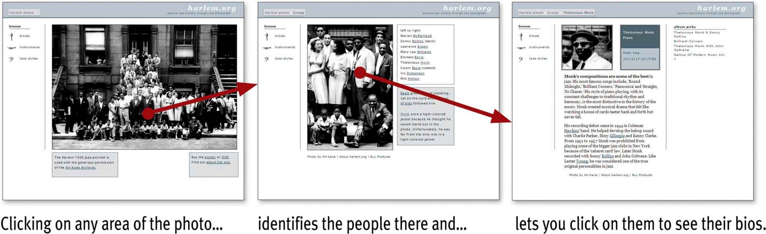
Not only is it innovative and fun, but it’s easy to understand and use. And the creators were smart enough to understand that the fun might wear off after a while so they also included a more conventional category-based navigation.
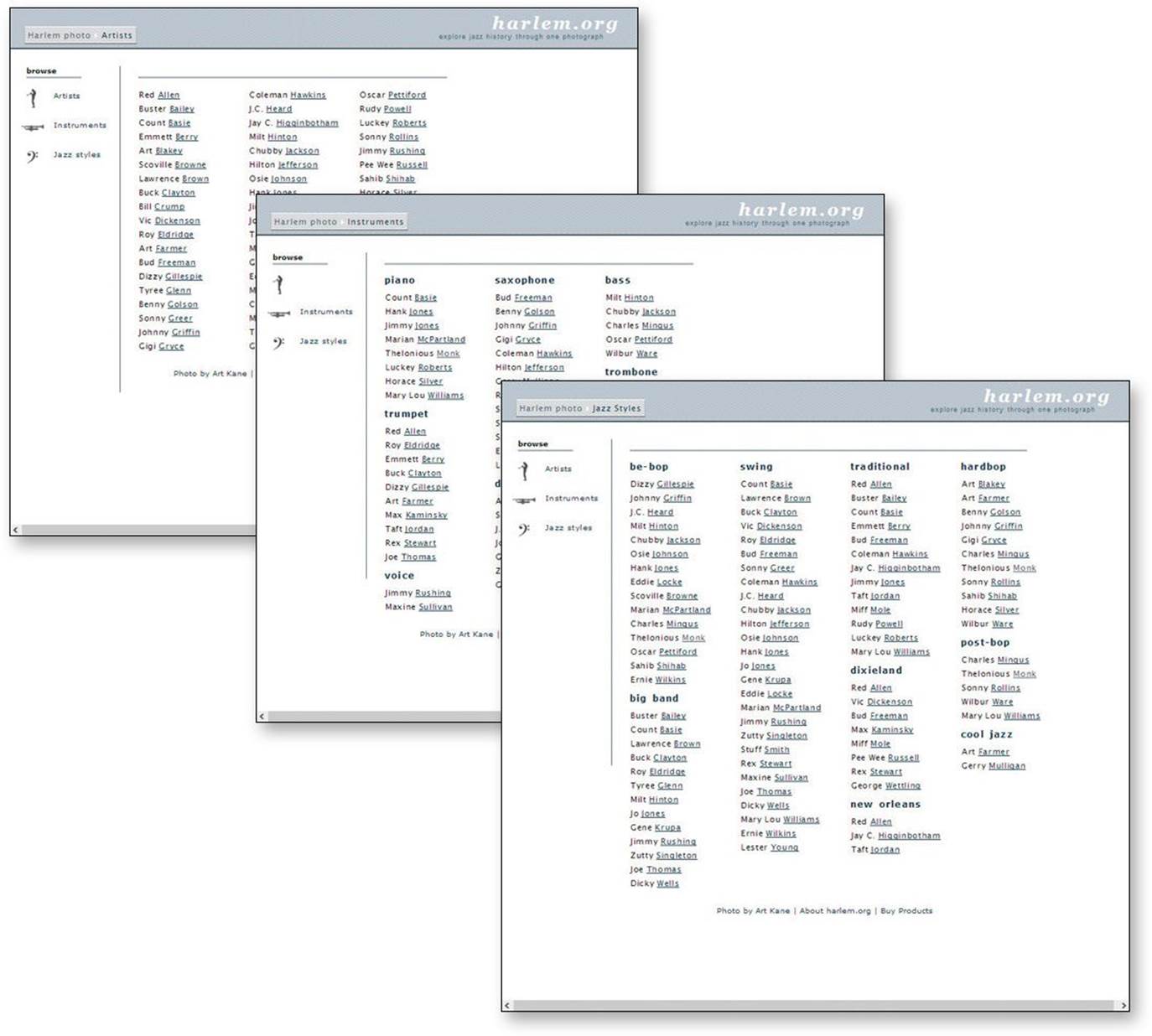
You can also browse the musicians by name, instrument, or jazz style.
The rule of thumb is that you can—and should—be as creative and innovative as you want, and add as much aesthetic appeal as you can, as long as you make sure it’s still usable.
And finally, a word about consistency.
You often hear consistency cited as an absolute good. People win a lot of design arguments just by saying “We can’t do that. It wouldn’t be consistent.”
Consistency is always a good thing to strive for within your site or app. If your navigation is always in the same place, for instance, I don’t have to think about it or waste time looking for it. But there will be cases where things will be clearer if you make them slightly inconsistent.
Here’s the rule to keep in mind:
CLARITY TRUMPS CONSISTENCY
If you can make something significantly clearer by making it slightly inconsistent, choose in favor of clarity.
Create effective visual hierarchies
Another important way to make pages easy to grasp in a hurry is to make sure that the appearance of the things on the page—all of the visual cues—accurately portray the relationships between the things on the page: which things are most important, which things are similar, and which things are part of other things. In other words, each page should have a clear visual hierarchy.
Pages with a clear visual hierarchy have three traits:
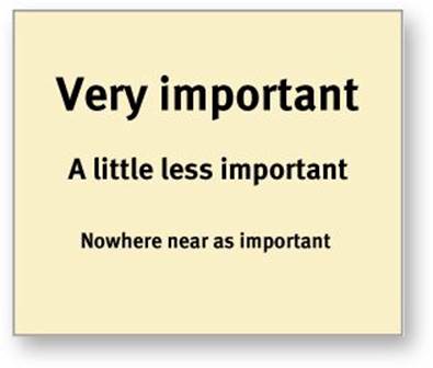
The more important something is, the more prominent it is. The most important elements are either larger, bolder, in a distinctive color, set off by more white space, or nearer the top of the page—or some combination of the above.
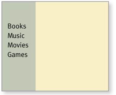
Things that are related logically are related visually. For instance, you can show that things are similar by grouping them together under a heading, displaying them in the same visual style, or putting them all in a clearly defined area.
Things are “nested” visually to show what’s part of what. For instance, a site section name (“Computer Books”) would appear above the titles of the individual books, reflecting the fact that the books are part of the section. And each book title in turn would span all the elements that make up the description of that book.
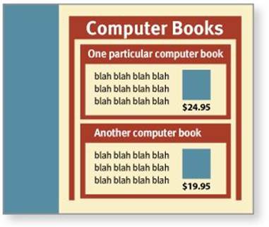
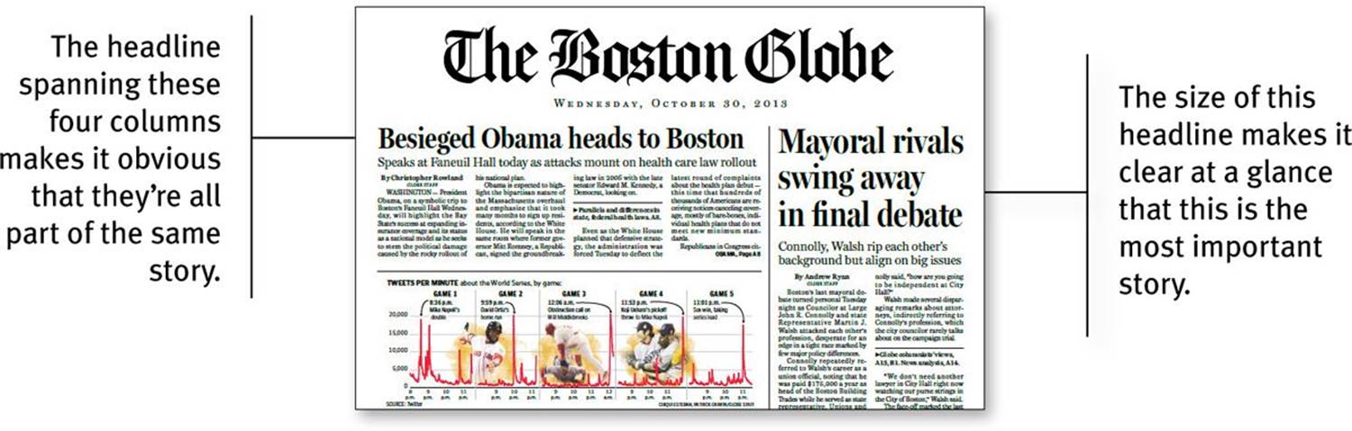
There’s nothing new about visual hierarchies. Every newspaper page, for instance, uses prominence, grouping, and nesting to give us useful information about the contents of the page before we read a word. This picture goes with this story because they’re both spanned by this headline. Thisstory is the most important because it has the biggest headline and a prominent position on the page.
We all parse visual hierarchies every day, but it happens so quickly that the only time we’re even vaguely aware that we’re doing it is when we can’t do it—when the visual cues (or absence of them) force us to think.
A good visual hierarchy saves us work by preprocessing the page for us, organizing and prioritizing its contents in a way that we can grasp almost instantly.
But when a page doesn’t have a clear visual hierarchy—if everything looks equally important, for instance—we’re reduced to the much slower process of scanning the page for revealing words and phrases and then trying to form our own sense of what’s important and how things are organized. It’s a lot more work.
Parsing a page with a visual hierarchy that’s even slightly flawed—where a heading spans things that aren’t part of it, for instance—is like reading a carelessly constructed sentence (“Bill put the cat on the table for a minute because it was a little wobbly”).
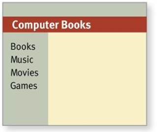
This flawed visual hierarchy suggests that all the major sections of the site are part of the Computer Books subsection.
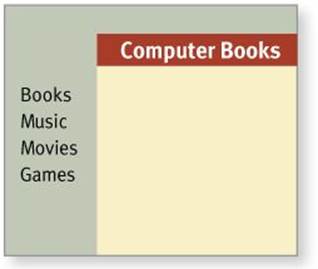
Putting the heading where it belongs makes the relationship clearer.
Even though we can usually figure out what the sentence is supposed to mean, it still throws us momentarily and forces us to think when we shouldn’t have to.
Break up pages into clearly defined areas
Ideally, on any well-designed Web page users can play a variation of the old TV game show $25,000 Pyramid.1 Glancing around, they should be able to point at the different areas of the page and say, “Things I can do on this site!” “Links to today’s top stories!” “Products this company sells!” “Things they’re eager to sell me!” “Navigation to get to the rest of the site!”
1 Contestants had to get their partners to guess a category like “Things a plumber uses” by giving them examples (“a wrench, a pipe cutter, pants that won’t stay up...”).
Dividing the page into clearly defined areas is important because it allows users to decide quickly which areas of the page to focus on and which areas they can safely ignore. Eye-tracking studies of Web page scanning suggest that users decide very quickly in their initial glances which parts of the page are likely to have useful information and then rarely look at the other parts—almost as though they weren’t there. (Banner blindness—the ability of users to completely ignore areas they think will contain ads—is just the extreme case.)
Make it obvious what’s clickable
Since a large part of what people are doing on the Web is looking for the next thing to click, it’s important to make it easy to tell what’s clickable.
As we scan a page, we’re looking for a variety of visual cues that identify things as clickable (or “tappable” on touch screens)—things like shape (buttons, tabs, etc.), location (in a menu bar, for instance), and formatting (color and underlining).2
2 People also rely on the fact that the cursor in a Web browser changes from an arrow to a hand when you point it at a link, but this requires deliberately moving the cursor around, a relatively slow process. Also, it doesn’t work on touch screens because they don’t have a cursor.
This process of looking for clues in the appearance of things that tell us how to use them isn’t limited to Web pages. As Don Norman explains so enjoyably in his recently updated usability classic The Design of Everyday Things, we’re constantly parsing our environment (like the handles on doors) for these clues (to decide whether to pull or push). Read it. You’ll never look at doors the same way again.
Easily identifying what’s clickable on a page has waxed and waned as a problem since the beginning of the Web.
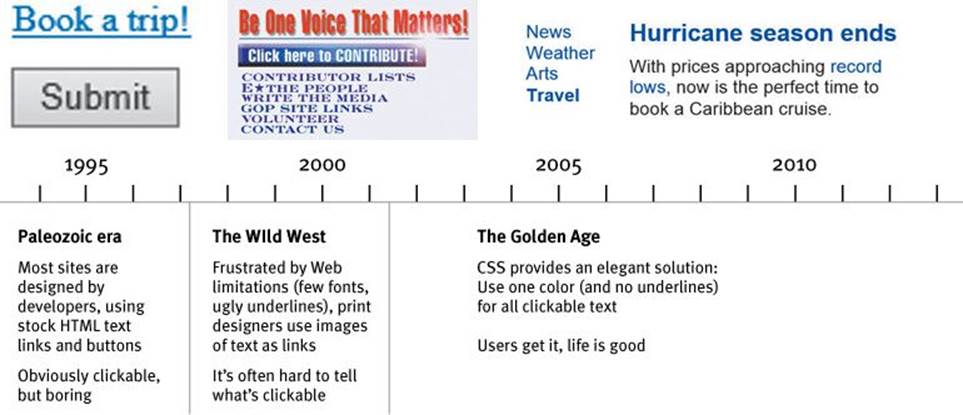
It’s currently resurfacing as an issue in mobile design, though, as you’ll see in Chapter 10.
In general, you’ll be fine if you just stick to one color for all text links or make sure that their shape and location identify them as clickable. Just don’t make silly mistakes like using the same color for links and nonclickable headings.
Keep the noise down to a dull roar
One of the great enemies of easy-to-grasp pages is visual noise.
Users have varying tolerances for complexity and distractions; some people have no problem with noisy pages, but many find them downright annoying. Users have even been known to put Post-its on their screen to cover up animation that’s distracting them while they’re trying to read.
There are really three different kinds of noise:
Shouting. When everything on the page is clamoring for your attention, the effect can be overwhelming: Lots of invitations to buy! Lots of exclamation points, different typefaces, and bright colors! Automated slideshows, animation, pop-ups, and the never-ending array of new attention-grabbing ad formats!
The truth is, everything can’t be important. Shouting is usually the result of a failure to make tough decisions about which elements are really the most important and then create a visual hierarchy that guides users to them first.
Disorganization. Some pages look like a room that’s been ransacked, with things strewn everywhere. This is a sure sign that the designer doesn’t understand the importance of using grids to align the elements on a page.
Clutter. We’ve all seen pages—especially Home pages—that just have too much stuff. The net effect is the same as when your email inbox is flooded with things like newsletters from sites that have decided that your one contact with them has made you lifelong friends: It’s hard to find and focus on the messages you actually care about. You end up with what engineers call a low signal-to-noise ratio: Lots of noise, not much information, and the noise obscures the useful stuff.
When you’re editing your Web pages, it’s probably a good idea to start with the assumption that everything is visual noise (the “presumed guilty until proven innocent” approach) and get rid of anything that’s not making a real contribution. In the face of limited time and attention, everything that’s not part of the solution must go.
Format text to support scanning
Much of the time—perhaps most of the time—that users spend on your Web pages is spent scanning the text in search of something.
The way your text is formatted can do a lot to make it easier for them.
Which one would you rather scan?
Here are the most important things you can do to make your pages scan-friendly:
Use plenty of headings. Well-written, thoughtful headings interspersed in the text act as an informal outline or table of contents for a page. They tell you what each section is about or, if they’re less literal, they intrigue you. Either way they help you decide which parts to read, scan, or skip.
In general, you’ll want to use more headings than you’d think and put more time into writing them.
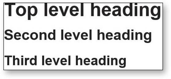
Also, be sure to format headings correctly. Two very important things about the styling of headings that people often overlook:
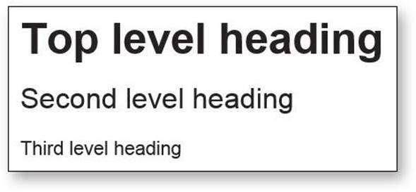
If you’re using more than one level of heading, make sure there’s an obvious, impossible-to-miss visual distinction between them. You can do this by making each higher level larger or by leaving more space above it.
Bad
Better
Even more important: Don’t let your headings float. Make sure they’re closer to the section they introduce than to the section they follow. This makes a huge difference.
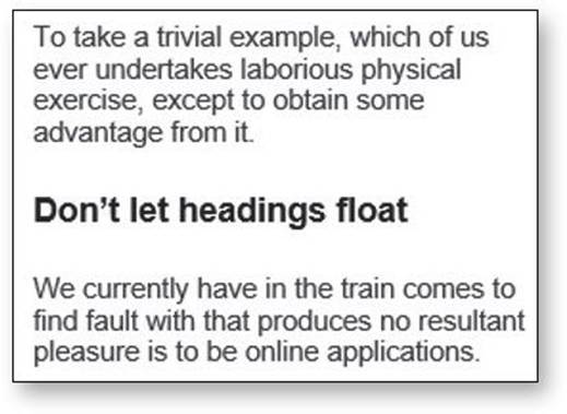
Bad
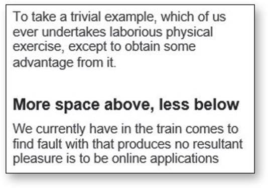
Better
Keep paragraphs short. Long paragraphs confront the reader with what Caroline Jarrett and Ginny Redish call a “wall of words.” They’re daunting, they make it harder for readers to keep their place, and they’re harder to scan than a series of shorter paragraphs.
You may have been taught that each paragraph has to have a topic sentence, detail sentences, and a conclusion, but reading online is different. Even single-sentence paragraphs are fine.
If you examine a long paragraph, you’ll almost always find that there’s a reasonable place to break it in two. Get in the habit of doing it.
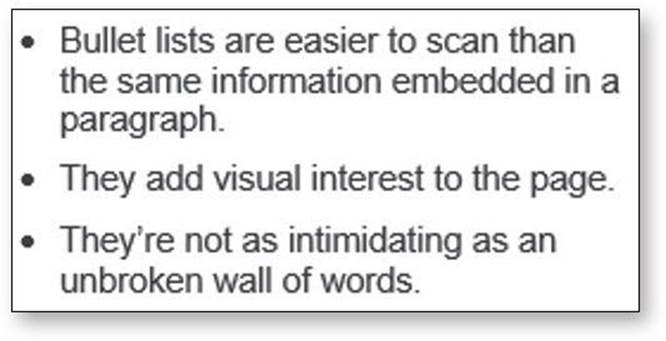
Use bulleted lists. Think of it this way: Almost anything that can be a bulleted list probably should be. Just look at your paragraphs for any series of items separated by commas or semicolons and you’ll find likely candidates.
And for optimal readability, there should be a small amount of additional space between the items in the list.
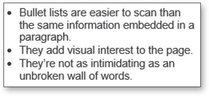
Bad
Better
Highlight key terms. Much page scanning consists of looking for key words and phrases. Formatting the most important ones in bold where they first appear in the text makes them easier to find. (If they’re already text links, you obviously don’t have to.) Don’t highlight too many things, though, or the technique will lose its effectiveness.
If you really want to learn about making content scannable (or about anything related to writing for screens in general), run, do not walk, to an Internet-connected device and order Ginny Redish’s book Letting Go of the Words.
And while you’re at it, order a copy for anyone you know who writes, edits, or has anything to do with creating digital content. They’ll end up eternally indebted to you.